

Web_Designer_UK__May_2018

You also want an ePaper? Increase the reach of your titles
YUMPU automatically turns print PDFs into web optimized ePapers that Google loves.
GET PRO DESIGN SKIL<br />
5<br />
USE A SCALE<br />
It’snowtimetodefinea<br />
rangeofreusablefont<br />
sizesbasedonascaleandthe<br />
most common way to do that is<br />
to use a modular scale. Go to<br />
modularscale.com, enter your<br />
base font size and choose a scale.<br />
Itwillgiveyouarangeoffont<br />
sizestochoosefrom.Defininga<br />
scaleandtryingtosticktoitadds<br />
meaningtofontsizechoicesand<br />
prevents the chaos that often<br />
arises from randomly assigning<br />
them instead.<br />
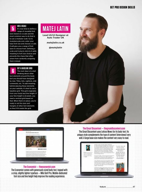
MATEJ LATIN<br />
Lead UX/UI <strong>Designer</strong> at<br />
Auto Trader <strong>UK</strong><br />
matejlatin.co.uk<br />
@matejlatin<br />
6<br />
SET A BASELINE GRID<br />
The next step is to start<br />
thinking about other<br />
text elements around the body<br />
text you should have designed<br />
by now. Titles, lists, captions, side<br />
comments, etc. To add meaning<br />
behind placing these elements<br />
on your website, it’s best to use a<br />
baseline grid. This grid originates<br />
from your body text line height. If<br />
your line height is 22 pixels, you<br />
need a vertical grid based on<br />
that. When that is in place, you’re<br />
ready to set the sizes and<br />
margins of other text elements<br />
so they’ll fit inside this grid.<br />
The Great Discontent — thegreatdiscontent.com<br />
The Great Discontent uses Leitura News for its body text. Its<br />
unique style complements the type of content (interviews) very<br />
well. A large base size makes the content very easy to read.<br />
The Economist — theeconomist.com<br />
The Economist comes with generously sized body text, topped with<br />
a crisp, slightly lighter typeface — Milo Serif Pro. Mobile-dedicated<br />
font size and line height help improve the reading experience.<br />
feature _________________________________________________47