The Verbier Collection - Brand Guide
Developed by Pretzel's Creative Unit.
Developed by Pretzel's Creative Unit.

You also want an ePaper? Increase the reach of your titles
YUMPU automatically turns print PDFs into web optimized ePapers that Google loves.
3.1. PRIMARY COLORS<br />
01 <strong>The</strong> Story<br />
02 Logos<br />
03 Colors<br />
04 Typography<br />
05 Photography<br />
06 Pattern<br />
07 In Practice<br />
08 Social Media<br />
09 Contact<br />
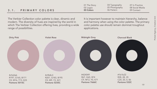
<strong>The</strong> <strong>Verbier</strong> <strong>Collection</strong> color palette is clear, dinamic and<br />
modern. <strong>The</strong> diversity of hues are inspired by the world in<br />
which <strong>The</strong> <strong>Verbier</strong> <strong>Collection</strong> offering lives, providing a wide<br />
range of possibilities.<br />
It is important however to maintain hierarchy, balance<br />
and harmony when using the color palette. <strong>The</strong> primary<br />
color palatte use should remain dominat troughout<br />
applications.<br />
Dirty Pink Violet Rose Midnight Grey Charcoal Black<br />
Pretzel Agency, Creative Unit<br />
#c5a5ab<br />
R197, G165, B171<br />
C0, M16, Y13, K23<br />
Pantone 5015C<br />
#c9b8c3<br />
R201, G183, B195<br />
C0, M9, Y3, K21<br />
Pantone 5235C<br />
#424049<br />
R67, G65, B74<br />
C9, M12, Y0, K71<br />
Pantone 7666C<br />
#1b1b22<br />
R28, 28, 35<br />
C20, 20, 0, 86<br />
Pantone 532C<br />
19