The Verbier Collection - Brand Guide
Developed by Pretzel's Creative Unit.
Developed by Pretzel's Creative Unit.

Create successful ePaper yourself
Turn your PDF publications into a flip-book with our unique Google optimized e-Paper software.
3.3. COLORS – PRIMARY USAGE<br />
01 <strong>The</strong> Story<br />
02 Logos<br />
03 Colors<br />
04 Typography<br />
05 Photography<br />
06 Pattern<br />
07 In Practice<br />
08 Social Media<br />
09 Contact<br />
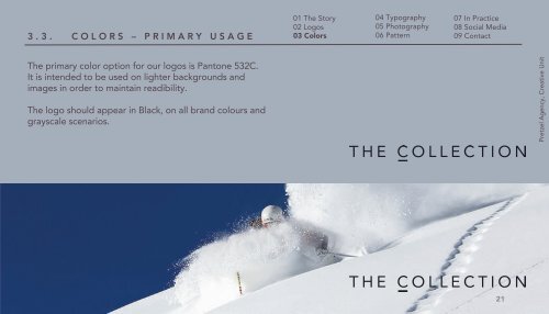
<strong>The</strong> primary color option for our logos is Pantone 532C.<br />
It is intended to be used on lighter backgrounds and<br />
images in order to maintain readibility.<br />
<strong>The</strong> logo should appear in Black, on all brand colours and<br />
grayscale scenarios.<br />
Pretzel Agency, Creative Unit<br />
21