The Verbier Collection - Brand Guide
Developed by Pretzel's Creative Unit.
Developed by Pretzel's Creative Unit.

Create successful ePaper yourself
Turn your PDF publications into a flip-book with our unique Google optimized e-Paper software.
3.5. COLORS – SECONDARY USAGE<br />
01 <strong>The</strong> Story<br />
02 Logos<br />
03 Colors<br />
04 Typography<br />
05 Photography<br />
06 Pattern<br />
07 In Practice<br />
08 Social Media<br />
09 Contact<br />
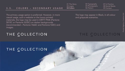
<strong>The</strong> primary usage option is preferred. However, in more<br />
casual usage, such a website or the luxury printed<br />
materials, the logo may be used in DIRTY PINK (Pantone<br />
5015C or Pantone 5235C) on darker backgrounds<br />
(recommended – Pantone 7666C and Pantone 532C) and<br />
images.<br />
<strong>The</strong> logo may appear in Black, in all colour<br />
and grayscale scenarios.<br />
Pretzel Agency, Creative Unit<br />
23