

Web_Designer_UK__May_2018

You also want an ePaper? Increase the reach of your titles
YUMPU automatically turns print PDFs into web optimized ePapers that Google loves.
GET PRO DESIGN SKILLS<br />
RESOURCES<br />
GOOGLE WEB DESIGNER<br />
bit.ly/2DCT2uk<br />
Best used for creating Google Ads<br />
but also a neat little tool to create<br />
dynamic displays whereby you can<br />
animate textual elements.<br />
SLIDER REVOLUTION<br />
bit.ly/2avbF9a<br />
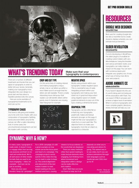
WHAT’S TRENDING TODAY<br />
Thereareanumberofdifferent<br />
treatments and trends that you can<br />
apply to typography in order to<br />
better tell your stories. Generally,<br />
making your typography more<br />
integrated into your design is a<br />
good start and less about a<br />
headline plonked onto the canvas.<br />
Here are some examples of<br />
typographical treatments to try<br />
and look out for:<br />
TYPOGRAPHY CHAOS<br />
This trend is still going and enables<br />
you to be a bit more chaotic with your<br />
composition of typography. Splitting<br />
words and even letters around the<br />
canvas can offer a really interesting<br />
look. In some cases, the<br />
unconventional arrangement can test<br />
the readers with curiosity.<br />
CROP AND CUT TYPE<br />
On the same lines of creating interest<br />
and making typography unique,<br />
simply crop or cut letters up within a<br />
word. Make sure it’s enough that the<br />
letters are still readable. There’s a really<br />
interesting neuro behaviour that<br />
readers can still identify letters within<br />
words, even if characters are missing.<br />
Take Hangman for example.<br />
Make sure that your<br />
typography is contemporary<br />
NEGATIVE SPACE<br />
Mostly using artwork within your<br />
typography creates negative space.<br />
This is a wonderful way of really<br />
integrating artwork within your<br />
typography and making your text<br />
stand out. A great technique when<br />
using negative space is it enable<br />
graphical elements to pop out of the<br />
type, creating a dimensional space.<br />
GRAPHICAL TYPE<br />
Typography can be a little flat so<br />
enhancing your typography<br />
graphically makes and textual<br />
elements stronger on the page. It<br />
might be that your typography is<br />
made furry or even paint like. The<br />
objective here is to make your<br />
typography more like an object as<br />
opposed to a character.<br />
If you’re developing in WordPress,<br />
this slider plugin is incredible for<br />
creating custom sliders with very<br />
little limitations. Using the timeline<br />
and various animation styles, your<br />
typography can really make an<br />
impact on the page. You can work<br />
with numerous layers and<br />
integrate your graphics too. A truly<br />
smart way of bring more life to<br />
your web projects.<br />
ADOBE ANIMATE CC<br />
adobe.ly/2rb71Vs<br />
If you haven’t dipped into this yet,<br />
it’s worth doing and not being put<br />
off the association with Flash. You<br />
can export HTML5 canvases and<br />
achieve a higher level of animation.<br />
When it comes to typography and<br />
more complex graphic directions,<br />
Adobe Animate will help you out.<br />
DYNAMIC: WHY & HOW?<br />
In many cases, typography is<br />
really static. It doesn’t move<br />
or engage other than serving<br />
one purpose and that’s to be<br />
read and understood. We’re<br />
all well aware of other media<br />
formats that are used to be<br />
more engaging — video, for<br />
example — but text can be<br />
just as exciting.<br />
Have you ever seen<br />
Honda’s ‘Keep Up’ campaign?<br />
For a 2015 campaign, it’s still<br />
a great example on how<br />
words can be the focus point<br />
and heart of a campaign. The<br />
campaign projects words<br />
quickly in the video forcing<br />
you to read in order to keep<br />
up. The central alignment<br />
and placement of the text<br />
makes it easier to read.<br />
Speed reading is the core<br />
method used here, causing<br />
viewers to focus entirely on<br />
the words that are displayed.<br />
There are many methods<br />
other than speed reading to<br />
make textual elements more<br />
engaging, but thinking more<br />
about movement and<br />
integration within a design<br />
can be really effective<br />
and creative.<br />
How? Well there are tools<br />
out there to help, but it all<br />
depends on what you’re<br />
executing and where it’s<br />
going. The easiest way is<br />
to use video, but if you can<br />
achieve animations through<br />
web languages such as<br />
JavaScript and CSS3, then<br />
go for it!<br />
Honda - ‘Keep up’<br />
bit.ly/2rjtDU0<br />
feature _________________________________________________45