Lies, Damned Lies, or Statistics- How to Tell the Truth with Statistics, 2017a
Lies, Damned Lies, or Statistics- How to Tell the Truth with Statistics, 2017a
Lies, Damned Lies, or Statistics- How to Tell the Truth with Statistics, 2017a

You also want an ePaper? Increase the reach of your titles
YUMPU automatically turns print PDFs into web optimized ePapers that Google loves.
8 1. ONE-VARIABLE STATISTICS: BASICS<br />
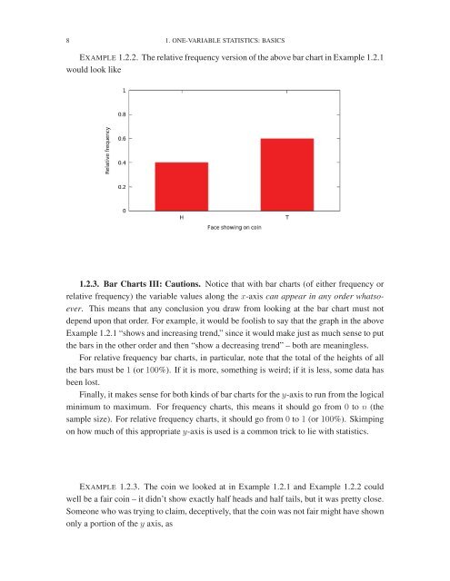
EXAMPLE 1.2.2. The relative frequency version of <strong>the</strong> above bar chart in Example 1.2.1<br />
would look like<br />
1.2.3. Bar Charts III: Cautions. Notice that <strong>with</strong> bar charts (of ei<strong>the</strong>r frequency <strong>or</strong><br />
relative frequency) <strong>the</strong> variable values along <strong>the</strong> x-axis can appear in any <strong>or</strong>der whatsoever.<br />
This means that any conclusion you draw from looking at <strong>the</strong> bar chart must not<br />
depend upon that <strong>or</strong>der. F<strong>or</strong> example, it would be foolish <strong>to</strong> say that <strong>the</strong> graph in <strong>the</strong> above<br />
Example 1.2.1 “shows and increasing trend,” since it would make just as much sense <strong>to</strong> put<br />
<strong>the</strong> bars in <strong>the</strong> o<strong>the</strong>r <strong>or</strong>der and <strong>the</strong>n “show a decreasing trend” – both are meaningless.<br />
F<strong>or</strong> relative frequency bar charts, in particular, note that <strong>the</strong> <strong>to</strong>tal of <strong>the</strong> heights of all<br />
<strong>the</strong> bars must be 1 (<strong>or</strong> 100%). If it is m<strong>or</strong>e, something is weird; if it is less, some data has<br />
been lost.<br />
Finally, it makes sense f<strong>or</strong> both kinds of bar charts f<strong>or</strong> <strong>the</strong> y-axis <strong>to</strong> run from <strong>the</strong> logical<br />
minimum <strong>to</strong> maximum. F<strong>or</strong> frequency charts, this means it should go from 0 <strong>to</strong> n (<strong>the</strong><br />
sample size). F<strong>or</strong> relative frequency charts, it should go from 0 <strong>to</strong> 1 (<strong>or</strong> 100%). Skimping<br />
on how much of this appropriate y-axis is used is a common trick <strong>to</strong> lie <strong>with</strong> statistics.<br />
EXAMPLE 1.2.3. The coin we looked at in Example 1.2.1 and Example 1.2.2 could<br />
well be a fair coin – it didn’t show exactly half heads and half tails, but it was pretty close.<br />
Someone who was trying <strong>to</strong> claim, deceptively, that <strong>the</strong> coin was not fair might have shown<br />
only a p<strong>or</strong>tion of <strong>the</strong> y axis, as