TIAPS ALB_Module 2E. Data Analytics for Internal Auditing
- No tags were found...

You also want an ePaper? Increase the reach of your titles
YUMPU automatically turns print PDFs into web optimized ePapers that Google loves.
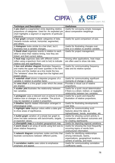
Technique and Description<br />
A pie chart is a segmented circle depicting relative<br />
proportions of categories. Used <strong>for</strong>. An exploded pie<br />
chart highlights a segment or segments of particular<br />
relevance.<br />
A bar graph compare multiple categories of data.<br />
Variants include vertical, horizontal, segmented,<br />
and others.<br />
A histogram looks similar to a bar chart, but it<br />
illustrates how a variable changes.<br />
A Gantt chart organizes events in relation to each<br />
other to show their relative timing, how they are<br />
linked, and their current status.<br />
A heat map organizes data with different colors<br />
(often using a spectrum from cold to hot) to indicate<br />
relative size and significance.<br />
A box and whisker diagram illustrates frequency<br />
and marks the upper and lower quartiles in the <strong>for</strong>m<br />
of a box and the median as a line inside the box.<br />
The “whiskers” show the range from the highest and<br />
lowest values.<br />
A waterfall chart shows a stepwise progress of a<br />
variable in relation to another factor.<br />
An area chart is a line graph under which the areas<br />
are shaded.<br />
A scatter plot illustrates the relationship between<br />
two variables.<br />
A pictogram uses a relevant icon or picture to show<br />
relative size or changes in a variable. The picture<br />
may be repeated or scaled in proportion.<br />
A timeline depicts related in<strong>for</strong>mation arranged in<br />
chronological order.<br />
A highlight table deploys colors within a data grid<br />
to show areas of significance.<br />
A bullet graph variation of a simple bar graph to<br />
show live data variances with benchmarks, targets,<br />
or expected values.<br />
A choropleth map is a shaded geographical map.<br />
A word cloud is an array of words using font size to<br />
show relative frequency.<br />
A network diagram comprises nodes and links that<br />
illustrate connections between different points.<br />
A correlation matrix uses colors to emphasize<br />
emphasis and appeal.<br />
Usefulness<br />
Useful <strong>for</strong> conveying simple messages<br />
about comparative weightings<br />
Useful <strong>for</strong> quick comparison of size.<br />
Useful <strong>for</strong> illustrating changes over<br />
time or in relation to another variable.<br />
Useful <strong>for</strong> project management.<br />
Among other applications, heat maps<br />
are often used to show risk data.<br />
Useful <strong>for</strong> communicating frequency<br />
data and its relative spread.<br />
Useful <strong>for</strong> communicating significant<br />
moments of change in values.<br />
Provides a visual cue of relative<br />
proportions.<br />
Useful <strong>for</strong> a quick visual determination<br />
if there is a direct, indirect, or negligible<br />
relationship between two variables.<br />
Useful <strong>for</strong> a quick and impactful<br />
illustration of relative proportions.<br />
Useful <strong>for</strong> illustrating developments<br />
over time.<br />
Useful <strong>for</strong> communicating such<br />
features about the data as<br />
highest/lowest, trends, anomalies, etc.<br />
Useful <strong>for</strong> showing current activity in<br />
comparison with desired outcomes and<br />
<strong>for</strong> creating dashboards.<br />
Useful <strong>for</strong> depicting regional variations.<br />
Useful <strong>for</strong> showing the most frequently<br />
occurring topics or words from<br />
unstructured in<strong>for</strong>mation.<br />
Useful <strong>for</strong> identifying relationships<br />
among individuals, teams,<br />
organizations, geographical locations,<br />
centers of activity, and more<br />
Useful <strong>for</strong> communicating correlation<br />
coefficients easily.<br />
78