leonardo - Probat
leonardo - Probat
leonardo - Probat

Create successful ePaper yourself
Turn your PDF publications into a flip-book with our unique Google optimized e-Paper software.
Trade Fair Dates<br />
Here you can find information<br />
about current trade fair dates<br />
and events.<br />
30 Jan–2 Feb 2007<br />
Upakowka, Moscow, Russia<br />
www.messe-duesseldorf.de/upakovka/de<br />
9–13 Feb 2007<br />
7th German Barista Championship<br />
and 2nd German Roasting<br />
Championship during the Ambiente,<br />
Frankfurt, Germany<br />
www.ambiente.messefrankfurt.com<br />
15–17 Feb 2007<br />
4th African Fine Conference &<br />
Exhibition, Addis Abeba, Ethiopia<br />
www.eafca.org<br />
23–25 Feb 2007<br />
IICF India International Coffee<br />
Festival, Bangalore, India<br />
www.iicf.in<br />
Show Your Colours<br />
Insights and Outlook 11<br />
PROBAT is moving into the future with a structured and distinct corporate<br />
design. A new concept for internal and external communication<br />
provides an improved orientation for customers and staff. Accents are<br />
placed on a clear colour scheme as well as a well-structured dispartment<br />
of company departments.<br />
The social scientist Jürgen Habermas talks about an age of „new ambiguity“.<br />
The background to this statement is the realisation that the identity<br />
of a company is less and less apparent via its products. National and international<br />
mergers, diversification of production, opening up new areas of business<br />
and sectors are some of the reasons for this. The resulting increasing loss<br />
of orientation, however, stands in contrast to basic human needs for orientation.<br />
In this way, the decisions at PROBAT are backed up by sensible and technically<br />
sound considerations.<br />
In order to address the circumstances described by Habermas adequately in the<br />
forefront, PROBAT has decided to introduce a new corporate design. The new<br />
coherent communications concept is oriented on the results of the above-mentioned<br />
developments. It offers PROBAT’s customers as well as staff members<br />
the best possible communication structure and also aims at strengthening the<br />
market leader’s position. The high level of quality of products and services remains<br />
untouched.<br />
Colours, script and lucid design language will be given a new structure and link<br />
up with the quality claims of PROBAT’s products.<br />
The colour grey stands for the company at large, whereby everything having to<br />
do with technology takes place with the colour blue. Red represents the area of<br />
emotions which presents coffee as a natural stimulant with various facets.<br />
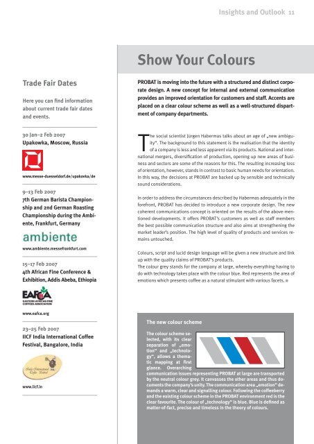
The new colour scheme<br />
The colour scheme selected,<br />
with its clear<br />
separation of „emotion“<br />
and „technology“,<br />
allows a thematic<br />
mapping at first<br />
glance. Overarching<br />
communication issues representing PROBAT at large are transported<br />
by the neutral colour grey. It canvasses the other areas and thus documents<br />
the company’s unity. The communication area „emotion“ demands<br />
a warm, clear and signalling colour. Following the coffeeberry<br />
and the existing colour scheme in the PROBAT environment red is the<br />
clear favourite. The colour of „technology“ is blue. Blue is defined as<br />
matter-of-fact, precise and timeless in the theory of colours.