

Painting Fine-Art Cartoons in Oils - Enchanted Images
Painting Fine-Art Cartoons in Oils - Enchanted Images
Painting Fine-Art Cartoons in Oils - Enchanted Images

You also want an ePaper? Increase the reach of your titles
YUMPU automatically turns print PDFs into web optimized ePapers that Google loves.
cartoon pa<strong>in</strong>t<strong>in</strong>gs: “Color<br />
Surprise,” “Gray to Rest the<br />
Eye,” and “Warm Aga<strong>in</strong>st<br />
Cool.” “Color Surprise” is<br />
the technique of add<strong>in</strong>g<br />
adjacent colors on the color<br />
wheel to create lighter<br />
and darker t<strong>in</strong>ts – NOT by<br />
add<strong>in</strong>g black and white.<br />
While add<strong>in</strong>g black and<br />
white will change the value<br />
of a hue, they also dilute the<br />
color’s vibrancy, creat<strong>in</strong>g<br />
dull, washed-out colors.<br />
Here’s an example (opposite<br />
page). Let’s say I need a<br />
range of greens, go<strong>in</strong>g from<br />
light to dark. If I add white<br />
to create the lighter t<strong>in</strong>ts,<br />
the green does get lighter,<br />
but it also becomes more<br />
pale. If I add black to create<br />
the darker t<strong>in</strong>ts, the green<br />
does get darker, but it gets<br />
more dull and murky as<br />
well. Us<strong>in</strong>g the technique<br />
of Color Surprise, I don’t<br />
add black and white, but<br />
colors that are adjacent to<br />
green on the color wheel. To<br />
make it lighter, add yellow<br />
or yellow green. To make<br />
the green darker, add blue<br />
green or blue. Compar<strong>in</strong>g<br />
these two ranges of color,<br />
it’s easy to see why Barks<br />
used this technique. His<br />
pa<strong>in</strong>t<strong>in</strong>gs were famous for<br />
their rich, vibrant color,<br />
which he achieved by<br />
avoid<strong>in</strong>g the dull<strong>in</strong>g effects<br />
of black and white.<br />
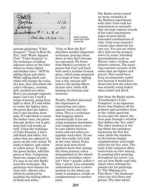
Garé’s <strong>in</strong>ventory<br />
notes Carl’s stock<br />
of gray oils.<br />
“Gray to Rest the Eye”<br />
describes another important<br />
technique: gray<strong>in</strong>g colors<br />
down so they don’t become<br />
too saturated. We know<br />
from Barks’s <strong>in</strong>ventory of<br />
pa<strong>in</strong>ts that Carl and Garé<br />
both used a number of stock<br />
grays, which come premixed<br />
<strong>in</strong> a range of t<strong>in</strong>ts. Add<strong>in</strong>g<br />
just a t<strong>in</strong>y amount will<br />
remove the garish effects<br />
of pure color, while still<br />
keep<strong>in</strong>g its richness and<br />
<strong>in</strong>tensity.<br />
F<strong>in</strong>ally, Enabnit discussed<br />
the importance of<br />
contrast<strong>in</strong>g cool colors<br />
aga<strong>in</strong>st warm, and vice<br />
versa. This is a technique<br />
that happens almost<br />
automatically if you are<br />
us<strong>in</strong>g analogous harmonies<br />
and complementary colors<br />
<strong>in</strong> your palette because<br />
warm and cool colors are<br />
opposite each other. To see<br />
how this works, let’s look<br />
at the color wheel. Every<br />
artist (and most thirdgraders)<br />
know that mix<strong>in</strong>g<br />
the three primary colors<br />
(triangulated on the wheel)<br />
produces secondary colors:<br />
red + blue = purple; yellow +<br />
blue = green. Less commonly<br />
understood is how a color’s<br />
position on the wheel can<br />
make it analogous, triadic or<br />
complementary to another<br />
color.<br />
204<br />
The Barks estate turned<br />
up many examples of<br />
the Barkses experiments<br />
with color. Garé took her<br />
experiments so seriously<br />
that she kept copious records<br />
of her color experiments:<br />
pages of notes detail<br />
successful comb<strong>in</strong>ations of<br />
color. Garé even created a<br />
custom color wheel for her<br />
own use. You can see where<br />
she’s laid out the primary<br />
colors by name, <strong>in</strong>clud<strong>in</strong>g<br />
<strong>in</strong>termediaries such as<br />
W<strong>in</strong>sor violet, viridian, and<br />
alizar<strong>in</strong> crimson. The <strong>in</strong>ner<br />
r<strong>in</strong>g conta<strong>in</strong>s versions of the<br />
colors that are lighter and<br />
grayer. This would have<br />
been an immensely useful<br />
tool because it would have<br />
shown her how the colors she<br />
was actually us<strong>in</strong>g looked<br />
when mixed and dried.<br />
Also from the Barks estate,<br />
“Grumbacher’s Color<br />
Computer” is an <strong>in</strong>genious<br />
device that displays all the<br />
primary and secondary hues<br />
<strong>in</strong> the visible spectrum.<br />
As you sp<strong>in</strong> the wheel, the<br />
hues pass through a w<strong>in</strong>dow<br />
that def<strong>in</strong>es the “key color.”<br />
The other w<strong>in</strong>dows at the<br />
top def<strong>in</strong>e the analogous<br />
harmonies for that key<br />
color, while the w<strong>in</strong>dows<br />
at the bottom display<br />
complementary and triadic<br />
colors for the key color. The<br />
back of the computer offers<br />
<strong>in</strong>struction on color mix<strong>in</strong>g.<br />
In pa<strong>in</strong>t<strong>in</strong>g after pa<strong>in</strong>t<strong>in</strong>g,<br />
throughout his career, you<br />
can see how Barks used this<br />
wheel when ref<strong>in</strong><strong>in</strong>g the<br />
palettes for his pa<strong>in</strong>t<strong>in</strong>gs.<br />
In “The Mak<strong>in</strong>gs of a<br />
Fish Story,” the dom<strong>in</strong>ant<br />
colors are rich blues and<br />
greens. The color wheel