

Painting Fine-Art Cartoons in Oils - Enchanted Images
Painting Fine-Art Cartoons in Oils - Enchanted Images
Painting Fine-Art Cartoons in Oils - Enchanted Images

Create successful ePaper yourself
Turn your PDF publications into a flip-book with our unique Google optimized e-Paper software.
shows why Barks chose<br />
his specific accent colors:<br />
The warm golds <strong>in</strong> the<br />
treasure and mermaid’s<br />
hair are harmonious triadic<br />
colors; Scrooge’s deep-red<br />
div<strong>in</strong>g suit, the light-orange<br />
seahorses, the warm-purple<br />
fish, are all pa<strong>in</strong>ted <strong>in</strong> colors<br />
that are complementary to<br />
blue green.<br />
Also prom<strong>in</strong>ent on Barks’s<br />
studio bookshelf <strong>in</strong> the<br />
1960s was Walter Foster’s<br />
How to Do Watercolors.<br />
This was an important book<br />
because Foster emphasized<br />
the immense power of the<br />
primary palette, of us<strong>in</strong>g just<br />
red, yellow and blue, and<br />
mix<strong>in</strong>g secondary colors and<br />
grays from those. By limit<strong>in</strong>g<br />
his palette to the primaries,<br />
Foster was able to create<br />
stunn<strong>in</strong>g effects, surfaces<br />
and textures. In the example<br />
on page 203, Foster is able<br />
to pa<strong>in</strong>t a richly colored<br />
scene of brightly colored<br />
apples, sh<strong>in</strong>y-metallic<br />
copper, opulent platters and<br />
a golden table cloth, with<br />
noth<strong>in</strong>g but primary colors.<br />
Foster also emphasized the<br />
purity of color: Lights and<br />
shadows are all achieved by<br />
layer<strong>in</strong>g <strong>in</strong>tensity of color<br />
– t<strong>in</strong>ts are never created<br />
us<strong>in</strong>g black and white. These<br />
are all concepts that Barks<br />
followed throughout his<br />
career: On several occasions<br />
Barks compla<strong>in</strong>ed that<br />
the lithographers couldn’t<br />
capture his palette: “Why<br />
can’t they take a pa<strong>in</strong>t<strong>in</strong>g<br />
like the one of Uncle Scrooge<br />
and the money bag on the<br />
old chair, that’s pa<strong>in</strong>ted with<br />
the same colors they use to<br />
mix their three <strong>in</strong>k colors<br />
– the same red, blue and<br />
yellow – and duplicate them?<br />
I mix the colors together <strong>in</strong><br />
different values [but] they<br />
can’t do it with their big,<br />
clumsy lithographic plates”<br />
(CBL, Set 3, Vol. 1, 65). He<br />
would go on to elaborate: “I<br />
realized that the basic colors<br />
of all those comic books were<br />
just the three primaries, red,<br />
blue and yellow, so I tried<br />
to keep my palette as close<br />
to the primaries as possible,<br />
and to get my grays and<br />
the <strong>in</strong>termediate colors by<br />
mix<strong>in</strong>g. I still pa<strong>in</strong>t with a<br />
very simple palette. I figured<br />
that if I couldn’t get brilliant<br />
colors with the colors you’re<br />
supposed to get brilliant<br />
colors with, I’d better not<br />
even t<strong>in</strong>ker with them” (FA,<br />
66).<br />
This didn’t mean that Barks<br />
limited his palette to just<br />
three colors. Even from the<br />
beg<strong>in</strong>n<strong>in</strong>g of his pa<strong>in</strong>t<strong>in</strong>g<br />
career, Barks’s palette<br />
was more complex than he<br />
would have had us believe.<br />
206<br />
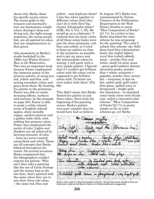
In August 1971 Barks was<br />
commissioned by Norma<br />
Clemens of the Publications<br />
Department at the Walt<br />
Disney Studios to pa<strong>in</strong>t<br />
“Blue Composition of Ducks”<br />
(21-71). In a letter to her,<br />
Barks described the color<br />
scheme he was propos<strong>in</strong>g<br />
for the pa<strong>in</strong>t<strong>in</strong>g: “For color I<br />
submit this scheme: sky (left)<br />
deep royal blue (ultramar<strong>in</strong>e<br />
base); sky (right) lighter<br />
royal blue (cobalt added);<br />
moon – powder blue and<br />
white; small 24-carat moon<br />
– green gold (umber); distant<br />
mounta<strong>in</strong> peaks, powder<br />
blue + white; m<strong>in</strong>arets +<br />
pagodas, powder blue; money<br />
b<strong>in</strong> – turquoise; $ sign on<br />
b<strong>in</strong>, amber gold, gold under<br />
blue glaze; spilled co<strong>in</strong>s <strong>in</strong><br />
foreground – bright gold;<br />
the characters – <strong>in</strong> standard<br />
comic-book colors with bluish<br />
cast, called a saturated color<br />
scheme.” “Blue Composition<br />
of Ducks”(21-71) is pretty<br />
simple as far as color<br />
schemes go, yet Barks<br />
Barks’s color notes for “Blue Composition of Ducks.” No less than seven shades of blue are<br />
mentioned, evidence that Barks’s claims of a limited palette were exaggerated.