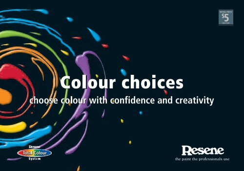
Colour Choices - choose colour with creativity and ... - Resene
Colour Choices - choose colour with creativity and ... - Resene
Colour Choices - choose colour with creativity and ... - Resene

Create successful ePaper yourself
Turn your PDF publications into a flip-book with our unique Google optimized e-Paper software.
<strong>Resene</strong> Rock N Roll<br />
<strong>Resene</strong> Daredevil<br />
<strong>Resene</strong> Flashback<br />
<strong>Resene</strong> Spotlight<br />
<strong>Resene</strong> Howzat<br />
<strong>Resene</strong> Free Spirit<br />
<strong>Resene</strong> Relax<br />
<strong>Resene</strong> Lone Ranger
Contents<br />
Page<br />
Confidence <strong>with</strong> <strong>colour</strong> 2<br />
Underst<strong>and</strong>ing <strong>colour</strong> 6<br />
Using <strong>colour</strong> 16<br />
<strong>Colour</strong> technology 26<br />
See the light 32<br />
<strong>Colour</strong> personality 40<br />
General tips 46<br />
NB: Due to printing limitations, <strong>colour</strong>s printed in this booklet may vary from the same <strong>colour</strong> shown in <strong>Resene</strong> <strong>colour</strong> charts.
2<br />
Confidence <strong>with</strong> <strong>colour</strong><br />
<strong>Resene</strong> Lonestar
<strong>Colour</strong> is a truly magical property. It can transform<br />
an environment, create a style, set a mood <strong>and</strong> alter<br />
perceptions. <strong>Colour</strong> is very personal <strong>and</strong> an expression<br />
of our <strong>creativity</strong>.<br />
<strong>Resene</strong> offers all customers a selection of valuable aids to enable you<br />
to <strong>choose</strong> the right <strong>colour</strong>s for you. And of course, <strong>Resene</strong> ColorShops<br />
<strong>and</strong> Resellers are available nationwide to provide helpful <strong>and</strong> professional<br />
advice on <strong>colour</strong> selection.<br />
Like a virtual library of <strong>colour</strong>, the <strong>Resene</strong> online <strong>colour</strong> library available<br />
on the <strong>Resene</strong> website enables you to view an extensive range of <strong>Resene</strong><br />
<strong>colour</strong> swatches on your computer, then download the ones you like. Over<br />
3000 <strong>Resene</strong> <strong>colour</strong>s are available as electronic <strong>colour</strong> jpegs for direct<br />
viewing on this website. Once you have found the <strong>colour</strong>s you like, you<br />
can order testpots of your favourites at our online testpot shop <strong>and</strong> try<br />
them out for yourself.<br />
You can also find a huge range of <strong>colour</strong> tools online on the <strong>Resene</strong><br />
website. With services from <strong>colour</strong> chart <strong>and</strong> testpot ordering to virtual<br />
painting software, a <strong>Resene</strong> <strong>colour</strong> swatch library, decorating inspiration<br />
gallery, project guides <strong>and</strong> lots of great hints <strong>and</strong> tips on selecting <strong>colour</strong>,<br />
you’ll find everything you need to design your next <strong>colour</strong> scheme. Best of<br />
all, you can access all these <strong>colour</strong> tools <strong>and</strong> information whenever it suits<br />
you. Just log onto the <strong>Resene</strong> website (www.resene.co.nz (NZ) or www.<br />
resene.com.au (Australia)) of your choice <strong>and</strong> get clicking.<br />
<strong>Resene</strong> X Factor<br />
Confidence <strong>with</strong> <strong>colour</strong><br />
When it comes to finding inspiration for <strong>colour</strong> there are no strict rules.<br />
However, the more knowledge you have about <strong>colour</strong> <strong>and</strong> its influence on<br />
your living environment, the better placed you will be to <strong>choose</strong> <strong>colour</strong>s<br />
that will be right for you. <strong>Colour</strong>s generally work best when related to<br />
their surroundings, <strong>with</strong> the final result of a successful <strong>colour</strong> scheme<br />
being one of harmony, visual order <strong>and</strong> a feeling of continuity.<br />
Choosing a precise paint <strong>colour</strong> from postage stamp sized printed samples<br />
has always been difficult. The <strong>colour</strong> looks okay in a small swatch but<br />
what will it look like once the entire room is painted? Subtle differences<br />
that may seem unimportant on <strong>colour</strong> charts are glaringly obvious once<br />
the <strong>colour</strong> is painted onto a wall.<br />
Many people who are confident <strong>and</strong> assured about most aspects of their<br />
lives lose all confidence when trying to mix <strong>and</strong> match <strong>colour</strong>s. You should<br />
always follow your own instincts. Decide what appeals to you <strong>and</strong> what<br />
you feel good about <strong>and</strong> use this as your starting point.<br />
There are no fixed rules about <strong>colour</strong>. It pays to forget all those old adages,<br />
such as blue is cold, red <strong>and</strong> orange clash, blue <strong>and</strong> green should never<br />
be seen <strong>and</strong> so on. The finished look is affected not just by the <strong>colour</strong>, but<br />
by the shape, texture <strong>and</strong> amount of <strong>colour</strong> used, as well as the amount<br />
<strong>and</strong> type of lighting.<br />
Humans respond psychologically to <strong>colour</strong>. While we associate yellow <strong>with</strong><br />
happy faces, smiles <strong>and</strong> cheerfulness <strong>and</strong> white as neutral <strong>and</strong> restful,<br />
too much black may depress the spirits. By manipulating the <strong>colour</strong>s in<br />
a scheme, we can change a room from a happy welcoming room into a<br />
clinical, cold room. Think of the cosy dining room of a local café painted<br />
in rich <strong>colour</strong>s to create a feeling of warmth <strong>and</strong> trigger a desire to eat.<br />
3
4<br />
Contrast this <strong>with</strong> the hallways of most hospitals, traditionally painted<br />
stark white, a neutral <strong>colour</strong> often considered clean <strong>and</strong> clinical. When<br />
developing a <strong>colour</strong> scheme, think about what the area will be used<br />
for <strong>and</strong> the emotions you would like to encourage. For example, restful<br />
<strong>colour</strong>s in a bedroom to encourage sleeping or bright reds <strong>and</strong> yellows in<br />
a children’s rumpus room to energise <strong>and</strong> lift spirits. Each <strong>colour</strong> scheme<br />
is appropriate in the right place.<br />
There is generally some existing feature that either dictates or can be used<br />
as an inspiration for the basis of a <strong>colour</strong> scheme. This may be a view from<br />
a window, a work of art, nature, carpets, soft furnishings, stained glass,<br />
art books <strong>and</strong> magazines, a fashion trend or <strong>Resene</strong> <strong>colour</strong> charts. Unless<br />
you have the luxury of decorating from scratch, your starting point for a<br />
<strong>colour</strong> scheme is likely to come from something you already own – a sofa,<br />
curtains or even a favourite painting.<br />
When selecting <strong>colour</strong>s consider lighting, what the room is used for, who<br />
spends the most time using the room, adjacent room <strong>colour</strong> schemes,<br />
whether you want to change perceptions of the room shape or size, what<br />
kind of mood you want to create, <strong>and</strong> any existing furniture or furnishings<br />
that will be part of the finished <strong>colour</strong> scheme. When developing a <strong>colour</strong><br />
scheme, collect pictures of rooms that you find appealing <strong>and</strong> a good<br />
range of samples. Experiment <strong>with</strong> them to determine your final selection<br />
<strong>and</strong> the appropriate accent <strong>colour</strong> or <strong>colour</strong>s.<br />
Most <strong>colour</strong> schemes are improved by the addition of accents, the final<br />
touches that can make a room come to life. Avoid using the same accent<br />
<strong>colour</strong> in too many places or too many accent <strong>colour</strong>s in one room –<br />
sometimes subtlety gives the best result.<br />
How much there is of a <strong>colour</strong> affects how you see it <strong>with</strong> <strong>colour</strong>s tending<br />
to look darker than they appear on <strong>colour</strong> charts. When used in large<br />
quantities or in a small room, strong <strong>colour</strong>s will appear even stronger <strong>and</strong><br />
more intense. If in doubt use a shade lighter than your original choice.<br />
Surface textures also change the way you perceive <strong>colour</strong>. Smooth surfaces<br />
reflect light <strong>and</strong> heavily textured surfaces absorb light. Therefore, the same<br />
<strong>colour</strong> painted in a gloss acrylic paint on a wall will look lighter than the<br />
same <strong>colour</strong> in a heavy woven carpet.<br />
One of the simplest ways of carrying a theme throughout your home is to<br />
use a common <strong>colour</strong> palette. Choose a selection of <strong>colour</strong>s for the entire<br />
home <strong>and</strong> then use different combinations of those <strong>colour</strong>s in each room.<br />
The commonality of the <strong>colour</strong>s will link the entire scheme together.<br />
Lighting<br />
Check <strong>and</strong> select <strong>colour</strong> under the actual lighting conditions of the space<br />
to be painted to avoid disappointment, as the same <strong>colour</strong> may look very<br />
different when compared under artificial <strong>and</strong> natural lighting. Consider<br />
when you use the room most <strong>and</strong> select your <strong>colour</strong> scheme using those<br />
lighting conditions.<br />
<strong>Colour</strong> also behaves entirely differently on a ceiling surface than on a wall<br />
surface. A <strong>colour</strong> painted on a ceiling looks darker than the same <strong>colour</strong><br />
on a wall. Likewise window walls will appear darker as they do not receive<br />
direct light.<br />
White <strong>and</strong> off-whites are usually the safest <strong>colour</strong>s to use as they distort<br />
less under various types of light, however they will reflect other <strong>colour</strong>s
in the room. If you have a bright green carpet, you can expect your white<br />
walls to reflect the carpet <strong>colour</strong> <strong>and</strong> look light green.<br />
Furnishings<br />
Furniture, pictures <strong>and</strong> ornaments absorb <strong>and</strong> reflect <strong>colour</strong> in different<br />
ways affecting the final <strong>colour</strong> you see. It is always best to view <strong>colour</strong>s<br />
in a fully furnished room to get a true picture of how the finished scheme<br />
will look. If you are forced to develop a <strong>colour</strong> scheme using an empty<br />
room as a base, start by determining how much of the wall surface will be<br />
visible after furnishings are added to the room.<br />
When developing your <strong>colour</strong> scheme, remember the most successful<br />
schemes usually have a limited palette of two or three principal <strong>colour</strong>s,<br />
<strong>with</strong> perhaps additional touches of other <strong>colour</strong>s in small doses.<br />
As <strong>with</strong> everything in life, the more <strong>colour</strong> schemes you create over your<br />
lifetime of decorating, the more confident you will become. And, if worse<br />
comes to worse <strong>and</strong> you just can’t st<strong>and</strong> your new <strong>colour</strong> scheme, you can<br />
always paint over it!<br />
<strong>Resene</strong> Calypso<br />
<strong>Resene</strong> Lush<br />
Confidence <strong>with</strong> <strong>colour</strong><br />
5
6<br />
Underst<strong>and</strong>ing <strong>colour</strong><br />
<strong>Resene</strong> Triple Hillary
Light, stimulating the retina of the eye, is what<br />
creates our perception of <strong>colour</strong>. Without light<br />
there is no <strong>colour</strong>, <strong>and</strong> light reflects how we see<br />
<strong>colour</strong>. Because <strong>colour</strong> is so powerful we tend to<br />
look for rules for its use, but there are no hard <strong>and</strong><br />
fast rules. How you use <strong>colour</strong> is a very individual<br />
<strong>and</strong> creative choice, but underst<strong>and</strong>ing how <strong>colour</strong><br />
works will help you use it more effectively.<br />
<strong>Resene</strong> Sisal<br />
Underst<strong>and</strong>ing <strong>colour</strong><br />
Properties of <strong>colour</strong><br />
Hue: Hue is pure <strong>colour</strong> – any primary, secondary or tertiary <strong>colour</strong> that<br />
is unmixed <strong>with</strong> black or white. It can be another name for <strong>colour</strong>.<br />
Intensity: This is the brightness or dullness of <strong>colour</strong>s. Less intense<br />
<strong>colour</strong>s (blue) have a calmer effect <strong>and</strong> are easier to live <strong>with</strong> than<br />
the more intense <strong>colour</strong>s (red). Intense <strong>colour</strong>s are often used as<br />
highlights <strong>and</strong> contrast.<br />
Light reflectance value: This is the degree of lightness or darkness<br />
of a tint, shade or tone. White has the highest light reflectance value<br />
<strong>and</strong> black the lowest.<br />
Shade: A shade is the pure <strong>colour</strong> (hue) <strong>with</strong> black added. This new<br />
<strong>colour</strong> has a lower light reflectance value (is darker) than the original<br />
hue.<br />
Tint: A tint is the pure <strong>colour</strong> (hue) <strong>with</strong> white added. This new <strong>colour</strong><br />
has a higher light reflectance value (is lighter) than the original hue.<br />
Tone: This is pure <strong>colour</strong> (hue) <strong>with</strong> grey added. This new <strong>colour</strong> is a<br />
softer variation of the original.<br />
7
8<br />
<strong>Resene</strong> Green Room<br />
Warm <strong>and</strong> cool <strong>colour</strong>s<br />
Cool – Blues <strong>and</strong> greens can introduce a cool mood into a room. The<br />
level of coolness will depend on the intensity of the <strong>colour</strong>s. Cool <strong>colour</strong>s<br />
may also be used to change the appearance of a room, pushing back<br />
walls <strong>and</strong> furnishings <strong>and</strong> making the room appear more spacious. They<br />
look best in a room <strong>with</strong> a sunny exposure, where the <strong>colour</strong>s counteract<br />
some of the strength of the direct sun. They should be avoided in shaded<br />
rooms.<br />
Warm – Warm <strong>colour</strong>s, such as red <strong>and</strong> apricot, have an opposite effect,<br />
closing in the walls of a room. If the room is large, its dimensions seem<br />
decreased. Warm <strong>colour</strong>s look their best in a not so bright room <strong>with</strong><br />
southern light, so that the bright effect of the sunny <strong>colour</strong>s is not too<br />
overbearing.<br />
<strong>Resene</strong> Avalanche
<strong>Resene</strong> Jumpstart<br />
Guidelines for using <strong>colour</strong><br />
Nature conditions us to expect balance <strong>and</strong> harmony. It offers us guidelines<br />
for the use of <strong>colour</strong> <strong>and</strong> provides us <strong>with</strong> some basic principles.<br />
The darkest value at our feet e.g. forest floor<br />
The medium level at eye level e.g. tree trunks<br />
The lightest value above us e.g. sky<br />
Underst<strong>and</strong>ing <strong>colour</strong><br />
Consider carefully before deviating from these natural guidelines. Use<br />
the most intense hues <strong>and</strong> values in areas occupied for short periods of<br />
time, such as formal dining rooms, hallways, staff lunchrooms, laundries<br />
<strong>and</strong> entrances. Avoid monotony <strong>and</strong> treat the eye <strong>and</strong> psyche to at least<br />
a moderate variety. Visual stimulus or relief is vital. Harmonious <strong>colour</strong><br />
selections are created by a pleasing relationship of the three dimensions<br />
of <strong>colour</strong>: hue, intensity <strong>and</strong> value.<br />
Using correct proportions of <strong>colour</strong> ensures that your scheme will be<br />
aesthetically pleasing. A touch of contrasting <strong>colour</strong> may be lively <strong>and</strong><br />
exciting but too much can become uncomfortable. On the other h<strong>and</strong>, too<br />
much moderation produces dullness. Personal taste <strong>and</strong> preferences are<br />
the most important considerations in choosing a <strong>colour</strong> scheme.<br />
Think of <strong>colour</strong> as a chameleon:<br />
• It changes depending upon accent <strong>colour</strong>s.<br />
• It is influenced by adjacent <strong>colour</strong>s.<br />
• White or beige <strong>colour</strong>s will take on the tint of adjacent hues.<br />
• Large areas intensify <strong>colour</strong>s.<br />
Finally, think about proportions of <strong>colour</strong>s. A basic rule using two thirds<br />
one <strong>colour</strong> <strong>and</strong> one third another is always successful.<br />
9
10<br />
<strong>Colour</strong> balance<br />
When a <strong>colour</strong> dominates its immediate surroundings in terms of hue,<br />
intensity or value, it may create imbalance. If we visualise <strong>colour</strong> in terms of<br />
weight, we can readily imagine that an area of dominant <strong>colour</strong> is ‘heavier’<br />
than an equal area of subordinate <strong>colour</strong>. In developing a balanced <strong>colour</strong><br />
scheme, it is important to take into account the ‘weight’ of each <strong>colour</strong>.<br />
These two <strong>colour</strong>s (1) have<br />
the same intensity, but the<br />
blue <strong>colour</strong> is darker in<br />
value. Even if equal areas<br />
of both <strong>colour</strong>s are used,<br />
blue will be dominant.<br />
1 2<br />
If two <strong>colour</strong>s have the same value (2), they may still be unbalanced if there<br />
is a difference in intensity of <strong>colour</strong>. Here the darker <strong>colour</strong> dominates.<br />
Proportion, contrast <strong>and</strong> effects <strong>with</strong> <strong>colour</strong><br />
Use <strong>colour</strong> to create an illusion. <strong>Colour</strong> can highlight the good features of<br />
a room <strong>and</strong> camouflage defects. Different <strong>colour</strong>s affect the way we view a<br />
room. Warm <strong>colour</strong>s, such as yellows <strong>and</strong> reds, tend to advance <strong>and</strong> make<br />
the walls seem closer. They are therefore a good choice for large, uninviting<br />
rooms you want to make more intimate <strong>and</strong> welcoming. Cool <strong>colour</strong>s, such<br />
as greens <strong>and</strong> blues, tend to recede <strong>and</strong> make the walls seem further away.<br />
This makes them a good choice for small, narrow rooms that you want to<br />
seem more spacious.<br />
The way you combine <strong>colour</strong>s can also significantly alter your perception<br />
of a room.<br />
<strong>Resene</strong> Innocence
For example...<br />
Use a strong <strong>colour</strong> on the<br />
lower part of the walls,<br />
from picture rail down,<br />
<strong>and</strong> a lighter <strong>colour</strong> above<br />
<strong>and</strong> over the ceiling. This<br />
will make the room appear<br />
more enclosed.<br />
A dark <strong>colour</strong> on ceiling <strong>and</strong><br />
walls down to dado height,<br />
<strong>with</strong> a lighter <strong>colour</strong> on the<br />
lower part of the walls to<br />
match the floor, changes a<br />
room’s proportions.<br />
Make a room look wider<br />
by painting the floor <strong>and</strong><br />
ceiling in a similar <strong>colour</strong><br />
<strong>and</strong> the walls in a lighter<br />
<strong>colour</strong>.<br />
<strong>Resene</strong> Rice Cake<br />
Underst<strong>and</strong>ing <strong>colour</strong><br />
Lower a ceiling visually by<br />
painting the ceiling <strong>and</strong> the<br />
walls above the picture rail<br />
in a deep tone. Paint the<br />
walls, from the picture rail<br />
down, a light <strong>colour</strong>.<br />
To give the feeling of<br />
airiness <strong>and</strong> space, paint<br />
the walls to match the floor<br />
<strong>and</strong> use pale, cool <strong>colour</strong>s.<br />
A warm, deep <strong>colour</strong><br />
on short end walls <strong>with</strong><br />
a lighter <strong>colour</strong> on the<br />
adjoining longer walls will<br />
help make a long, narrow<br />
room appear more evenly<br />
proportioned.<br />
11
12<br />
Create <strong>colour</strong> harmony <strong>with</strong> a <strong>colour</strong> wheel<br />
The best way to create <strong>colour</strong> harmony is <strong>with</strong> a <strong>colour</strong> wheel. The wheel<br />
was developed from the <strong>colour</strong> spectrum <strong>and</strong> helps decorators <strong>and</strong><br />
designers co-ordinate <strong>colour</strong> <strong>and</strong> develop different types of schemes.<br />
The twelve hue wheel is divided into the three <strong>colour</strong> areas below:<br />
1. Primary <strong>colour</strong>s<br />
2. Secondary <strong>colour</strong>s<br />
3. Tertiary <strong>colour</strong>s<br />
<strong>Colour</strong> wheels are available for purchase from your <strong>Resene</strong> ColorShop.
Monochromatic<br />
A one-<strong>colour</strong> scheme can<br />
incorporate several values of<br />
that <strong>colour</strong> to keep it from<br />
looking monotonous. Various<br />
textures can help enhance the<br />
single <strong>colour</strong> scheme.<br />
Complementary<br />
These schemes use <strong>colour</strong>s that<br />
are opposite each other on the<br />
wheel, such as blue green <strong>and</strong><br />
red orange. The result is usually<br />
vibrant <strong>and</strong> lively. It works best<br />
if one <strong>colour</strong> dominates <strong>and</strong> the<br />
other serves as contrast.<br />
Split complementary<br />
This scheme is one that uses any<br />
<strong>colour</strong> from the <strong>colour</strong> wheel<br />
in combination <strong>with</strong> the two<br />
<strong>colour</strong>s that are directly on either<br />
side of the <strong>colour</strong> opposite the<br />
one chosen, such as blue <strong>and</strong><br />
violet <strong>with</strong> yellow orange.<br />
<strong>Resene</strong> Fast Lane<br />
<strong>Resene</strong> Cherish<br />
<strong>Resene</strong> Party Dress<br />
<strong>Resene</strong> Push Play<br />
<strong>Resene</strong> X Factor<br />
<strong>Resene</strong> Vision<br />
<strong>Resene</strong> Wild Thing<br />
<strong>Resene</strong> Chi<br />
Related/analogous<br />
This scheme uses three to five<br />
<strong>colour</strong>s <strong>and</strong> includes one of<br />
the three primary <strong>colour</strong>s. The<br />
related/analogous <strong>colour</strong>s are<br />
the <strong>colour</strong> segments showing on<br />
either side of the primary <strong>colour</strong>.<br />
Varying the value <strong>and</strong> intensity<br />
of the <strong>colour</strong>s is beneficial.<br />
Triadic<br />
This scheme uses three <strong>colour</strong>s<br />
that are equidistant on the<br />
<strong>colour</strong> wheel, such as red<br />
orange, yellow green <strong>and</strong> blue<br />
violet. One <strong>colour</strong> can be used<br />
as the dominant <strong>colour</strong> <strong>and</strong> the<br />
other two as accents.<br />
Achromatic<br />
These are <strong>colour</strong>s in the<br />
white through to black range.<br />
Achromatic schemes are<br />
restrained <strong>and</strong> sophisticated.<br />
Underst<strong>and</strong>ing <strong>colour</strong><br />
<strong>Resene</strong> Moonbeam<br />
<strong>Resene</strong> Afterglow<br />
<strong>Resene</strong> Limelight<br />
<strong>Resene</strong> Midnight Oil<br />
<strong>Resene</strong> Flair<br />
<strong>Resene</strong> Woodstock<br />
<strong>Resene</strong> Blackout<br />
<strong>Resene</strong> Zulu<br />
<strong>Resene</strong> Archive Grey<br />
13
14<br />
Underst<strong>and</strong>ing <strong>Resene</strong> Total <strong>Colour</strong> System codes<br />
The <strong>Resene</strong> Total <strong>Colour</strong> System codes follow a format of B63-084-258,<br />
enabling specifiers <strong>and</strong> decorators to make direct comparisons on three<br />
attributes between multiple <strong>colour</strong>s. The first letter or letters tells you<br />
what <strong>colour</strong> group the <strong>colour</strong> is from:<br />
B = Blue, BR = Brown, G = Green, M = Metallics, N = Neutral,<br />
O = Orange, R = Red, V = Violet, Y = Yellow.<br />
The first digits denote the <strong>colour</strong>’s luminance, <strong>with</strong> 0 being approximately<br />
black <strong>and</strong> 100 being approximately white.<br />
The second set of digits denotes the saturation of the <strong>colour</strong> or how far<br />
from grey the <strong>colour</strong> is. That is, the lower the number the more grey in<br />
the <strong>colour</strong>, the higher the number the cleaner the <strong>colour</strong> is. For example,<br />
<strong>Resene</strong> Black (black) has a value of 000 while <strong>Resene</strong> Turbo Y84-198-087<br />
(bright yellow) has a value of 198.<br />
The last set of digits tells you where the <strong>colour</strong> sits on a wheel of <strong>colour</strong> of<br />
0 to 360 degrees. This allows you to place multiple <strong>colour</strong>s into a sequence<br />
<strong>and</strong> determine the relative positioning of <strong>colour</strong>s.<br />
By comparing multiple <strong>colour</strong>s using the <strong>Resene</strong> Total <strong>Colour</strong> System<br />
codes you can establish whether a <strong>colour</strong> is greyer or cleaner, brighter or<br />
darker <strong>and</strong> where they sit on a <strong>colour</strong> wheel.<br />
palette<br />
B63-084-258<br />
<strong>Resene</strong> Limitless<br />
<strong>Resene</strong> Havelock Blue<br />
greyness/<br />
saturation<br />
B63-084-258<br />
luminance <strong>colour</strong> wheel<br />
position<br />
palette<br />
<strong>Colour</strong> wheel position<br />
<strong>Resene</strong> Turbo<br />
greyness/<br />
saturation<br />
Y84-198-087<br />
luminance <strong>colour</strong> wheel<br />
position<br />
Y84-198-087
Where <strong>colour</strong> groups lie<br />
R (Red) = 357-39 inclusive<br />
O (Orange) = 40-69 inclusive<br />
Y (Yellow) = 70-90 inclusive<br />
G (Green) = 91-204 inclusive<br />
B (Blue) = 205-284 inclusive<br />
V (Violet) = 285-356 inclusive<br />
N (Neutral) = Saturation of 0-8<br />
BR (Brown) = Luminance of 0-39, saturation of 4-10<br />
or luminance of 40-80, saturation of 4-25<br />
M (Metallic) = <strong>Colour</strong>s derived from metallic tones<br />
Luminance<br />
Luminance is a brightness measure <strong>and</strong> describes the amount of light that<br />
is reflected from a flat, painted surface. Luminance is an indicator of how<br />
bright the paint will appear. Luminance decreases when adding grey or<br />
black paint to either a pure <strong>colour</strong> or lighter hues of a <strong>colour</strong>.<br />
Saturation<br />
Saturation means purity <strong>and</strong> refers to the intensity of a specific hue<br />
(<strong>colour</strong>). It is based on the <strong>colour</strong>’s purity; a highly saturated hue has a<br />
vivid, intense <strong>colour</strong>, while a less saturated hue appears more muted <strong>and</strong><br />
grey. With no saturation at all, the hue becomes a shade of grey.<br />
The purest <strong>colour</strong> is achieved by using clean undiluted <strong>colour</strong>. If the<br />
intensity drops the saturation also drops.<br />
To desaturate a <strong>colour</strong> in a paint system you can add tints of white, grey,<br />
black or the hue’s complementary (opposite) <strong>colour</strong>.<br />
Underst<strong>and</strong>ing <strong>colour</strong><br />
15
16<br />
Using <strong>colour</strong><br />
<strong>Resene</strong> Artefact
A room by room guide to selecting <strong>colour</strong><br />
Bathrooms<br />
Bathrooms are one of the smallest rooms in the house <strong>and</strong> are generally<br />
cluttered <strong>with</strong> towel rails, basins <strong>and</strong> showers/baths. While this can make<br />
them a decorator’s nightmare, it also means you can afford to be a little<br />
more courageous <strong>with</strong> <strong>colour</strong>. If your original <strong>colour</strong> choice doesn’t work,<br />
you can repaint a small bathroom quickly.<br />
Avoid using too many <strong>colour</strong>s if your bathroom feels small. Instead, paint<br />
a dado on the bottom third of each wall in your chosen <strong>colour</strong> <strong>and</strong> paint<br />
the remaining two-thirds in white. Blues <strong>and</strong> greens being tranquil <strong>and</strong><br />
clean are popular choices for bathrooms. Being cool <strong>colour</strong>s, they can also<br />
make a small bathroom appear more spacious.<br />
<strong>Resene</strong> Quarter Spanish White <strong>Resene</strong> Comfort Zone<br />
Using <strong>colour</strong><br />
Bedrooms<br />
When selecting <strong>colour</strong>s for bedrooms it is important to <strong>choose</strong> <strong>colour</strong>s<br />
that are conducive to sleeping. You are also likely to spend more time<br />
looking at the ceiling than you would in other rooms.<br />
As a general rule you should avoid using very bright <strong>colour</strong>s <strong>and</strong> save them<br />
for other parts of your home. Most light <strong>and</strong> pastel shades are ideal for<br />
bedrooms. Blue is a popular <strong>colour</strong> choice for bedrooms because of its<br />
soothing qualities. However, if you have trouble getting up in the morning,<br />
you may wish to add an invigorating accent to get you out of bed.<br />
17
18<br />
Dining rooms<br />
Separate dining rooms tend to be reserved for special occasions so they<br />
are a good opportunity to experiment <strong>with</strong> <strong>colour</strong> that you might not<br />
be brave enough to use elsewhere. Red stimulates the appetite <strong>and</strong> is<br />
a good choice for dining rooms. Combined <strong>with</strong> gold cutlery, a dramatic<br />
air of formality will result. Midnight blue or aubergine <strong>and</strong> gold are also<br />
dramatic <strong>colour</strong> schemes for night-time dining.<br />
Remember, in any dining room the table will be the focal point.<br />
Family rooms<br />
Family rooms call for a tough durable finish that can take the inevitable<br />
wear <strong>and</strong> tear. Families tend to spend a lot of time in this part of the<br />
home, so a bright uplifting <strong>colour</strong> scheme is recommended. Use one or<br />
two dominant <strong>colour</strong>s <strong>and</strong> add accents for interest.<br />
Choose mid tone <strong>colour</strong>s that will minimise the appearance of finger<br />
marks, animal fur <strong>and</strong> general light scuffing. Avoid using very dark or very<br />
light <strong>colour</strong>s. Use patterned curtains <strong>and</strong> furnishing fabric in place of plain<br />
fabrics.<br />
<strong>Resene</strong> Matakana <strong>Resene</strong><br />
Lemon Grass
Hallways <strong>and</strong> entrances<br />
First impressions count! As hallways <strong>and</strong> entrances are transition areas<br />
<strong>and</strong> you spend only a short amount of time in them, you can usually afford<br />
to be a little more adventurous. Ideally hallways should be treated as<br />
linking spaces to help give continuity to your interior <strong>colour</strong> scheme.<br />
To make a long hall look shorter, paint the end wall a vibrant warm shade.<br />
To make a hallway look longer, paint the end wall a light cool <strong>colour</strong>.<br />
<strong>Colour</strong> can provide a bridge between adjoining areas. It can be difficult to<br />
change <strong>colour</strong> when adjoining spaces are viewed together, so a feature<br />
area of <strong>colour</strong> may be a good way to create a natural <strong>colour</strong> break.<br />
When visualising a hallway or entrance <strong>colour</strong> scheme, leave the doors<br />
of adjoining rooms open so that you can see how the hallway will work<br />
as the focal point.<br />
<strong>Resene</strong> Innocence <strong>Resene</strong><br />
Pohutukawa<br />
Kitchens<br />
The kitchen is where you will tend to spend a lot of time, especially if you<br />
are the main chef in your household. Make sure you are comfortable <strong>with</strong><br />
your chosen <strong>colour</strong> scheme. Bright, invigorating <strong>colour</strong> schemes can boost<br />
energy levels when you have a lot of cooking <strong>and</strong> cleaning to get through.<br />
As kitchens are dominated by cabinetry, benches <strong>and</strong> the floor, treat these<br />
elements as the starting point for your <strong>colour</strong> scheme.<br />
The appearance of <strong>colour</strong>s in the kitchen will depend on the properties<br />
<strong>and</strong> textures of each of the surfaces. Glossy surfaces, such as laminated<br />
cabinetry, will reflect more light <strong>and</strong> look different to low sheen painted<br />
walls, so it is important to be careful when trying to match <strong>colour</strong>s in<br />
different materials. Sometimes it is better to select a tone lighter or darker<br />
rather than trying to create an exact <strong>colour</strong> match.<br />
<strong>Resene</strong> Felix<br />
Using <strong>colour</strong><br />
19
20<br />
Living rooms<br />
Today’s living rooms are often open spaces that link through to dining<br />
<strong>and</strong> kitchen areas. Knowing where to start <strong>and</strong> finish the <strong>colour</strong> scheme<br />
between each part of an open plan space can be very difficult. There are<br />
two techniques that you can use:<br />
• Paint a feature area in an area between the two adjoining rooms or<br />
spaces to create a natural <strong>colour</strong> break.<br />
• Use a progression of <strong>colour</strong>s, then paint a unifying <strong>colour</strong> throughout<br />
the spaces <strong>and</strong> accent <strong>with</strong> the other progressional <strong>colour</strong>s.<br />
Living rooms are the ideal place to create focal points or feature areas.<br />
Traditionally fireplaces acted as the focal point of most living rooms. If<br />
you don’t have a fireplace, select a focal point for your room <strong>and</strong> decorate<br />
around that. The focal point may be a feature area, lounge suite or<br />
similar.<br />
As living rooms are usually subject to less wear <strong>and</strong> tear than family<br />
rooms, you can <strong>choose</strong> light <strong>and</strong> dark <strong>colour</strong>s if desired.<br />
Remember no matter what room you are painting, artificial lighting can<br />
be used very successfully to complement your <strong>colour</strong> scheme <strong>and</strong> it is<br />
worth reviewing your lighting plan prior to painting.<br />
<strong>Resene</strong> Evolution
<strong>Resene</strong> Blackout<br />
Using <strong>colour</strong><br />
21
22<br />
Inject <strong>colour</strong> <strong>with</strong> a feature area<br />
Redecorating an entire room can be time-consuming, so if all you want is<br />
a quick way of changing the mood of a room <strong>with</strong>out redoing the entire<br />
<strong>colour</strong> scheme, designate yourself a feature area <strong>and</strong> start painting! A<br />
feature area is simply one wall or area picked out as an accent by painting<br />
it in a different manner to the rest of the space.<br />
If you have a predominantly neutral <strong>colour</strong> scheme, a feature area is the<br />
perfect opportunity to add a splash of <strong>colour</strong> <strong>with</strong>out overpowering the<br />
rest of the room scheme that you have worked hard to achieve. While<br />
feature areas are most commonly used as a highlight in a neutral schemed<br />
room, they can also be used to define space in open plan areas rather than<br />
having expanses of the same <strong>colour</strong> for the entire area.<br />
There are no hard <strong>and</strong> fast rules to selecting the right area for your feature<br />
– after all, you are the one who has to live <strong>with</strong> it. An easy way to select a<br />
feature area is to st<strong>and</strong> in the middle of the room <strong>and</strong> <strong>choose</strong> a dominant<br />
wall, preferably one <strong>with</strong> interesting angles, curves, a fireplace or lighting.<br />
It is generally best to avoid walls <strong>with</strong> windows <strong>and</strong> doors, as these will<br />
distract attention from the feature you are creating.<br />
Feature areas may be created by simply overcoating the space <strong>with</strong> an<br />
accent <strong>colour</strong> in a low sheen or flat finish. You can select a favourite <strong>colour</strong><br />
or use existing furnishings as inspiration <strong>and</strong> select a feature <strong>colour</strong> from<br />
room curtains, furniture, artworks or floor rugs.<br />
If you are looking for something a little more unique, be a bit more<br />
adventurous <strong>and</strong> experiment <strong>with</strong> a sparkling <strong>Resene</strong> metallic finish, a<br />
light Mediterranean style finish such as <strong>Resene</strong> S<strong>and</strong>tex or a completely<br />
personalised <strong>Resene</strong> Paint effects finish.<br />
A feature area will have a dramatic effect on the whole space – a metallic<br />
feature can add sizzle, a deep red feature area depth <strong>and</strong> warmth, <strong>and</strong> a<br />
<strong>Resene</strong> S<strong>and</strong>tex feature area can add a natural textured earthy touch.<br />
Remember, a dark <strong>colour</strong> will make the feature area advance <strong>and</strong> appear<br />
closer, while a lighter shade will make the wall recede <strong>and</strong> appear further<br />
away. If you want to make a long room appear squarer, paint the far wall<br />
in a dark <strong>colour</strong> to draw the wall into the room.<br />
You can ‘see’ your feature area before you start painting <strong>with</strong> <strong>Resene</strong><br />
EzyPaint virtual painting software. Download <strong>Resene</strong> EzyPaint free from<br />
the <strong>Resene</strong> website, scan in a photo of your room, path the area you wish<br />
to paint <strong>and</strong> virtually paint your new feature area using your choice of<br />
over 3000 <strong>Resene</strong> <strong>colour</strong>s. <strong>Resene</strong> EzyPaint is the ideal way to see the<br />
effect different <strong>colour</strong>s will have on the entire room scheme, helping you<br />
to narrow down your <strong>colour</strong> choices.<br />
As <strong>colour</strong>s are influenced by other room <strong>colour</strong>s <strong>and</strong> lighting, it is always<br />
best to trial your chosen <strong>colour</strong> using a <strong>Resene</strong> testpot on the actual area<br />
you are planning to paint. View the painted area at different times of day<br />
to ensure that you like the <strong>colour</strong> as it changes from day to night.<br />
It only takes a few litres to create a feature area, which means it can be<br />
easily changed to suit your mood, the season or a change in decorating<br />
plans. Don’t be afraid to allocate one wall or area as a permanent feature<br />
area <strong>and</strong> change it regularly as your tastes <strong>and</strong> <strong>colour</strong> trends develop.<br />
Feature areas are designed for you to experiment <strong>with</strong> <strong>colour</strong>s, so make<br />
the most of the blank canvas – after all you can always repaint if you don’t<br />
like the first <strong>colour</strong> you <strong>choose</strong>.<br />
<strong>Resene</strong> Double Hillary
<strong>Resene</strong> Whizz Bang <strong>Resene</strong> Hillary<br />
<strong>Resene</strong> Fahrenheit<br />
Using <strong>colour</strong><br />
<strong>Resene</strong> Malta<br />
23
24<br />
Paint effects<br />
If you want something a little out of the ordinary, different paint techniques<br />
may be used to create a wonderful variety of textured effects <strong>and</strong> they<br />
offer an exciting alternative to plain, painted walls or wallpaper.<br />
There are four basic techniques:<br />
<strong>Colour</strong>washing<br />
<strong>Colour</strong>washing produces a soft, dappled effect, which is achieved by a<br />
two-step process. A <strong>colour</strong>ed basecoat is washed (brushed) over <strong>with</strong><br />
a premixed coat of diluted <strong>colour</strong>. The end result can provide striking<br />
contrasts depending on the combination of <strong>colour</strong>s you <strong>choose</strong>.<br />
Sponging<br />
Sponging creates a gentle, mottled or cloud-like effect <strong>with</strong> multi-<strong>colour</strong><br />
finishes, either stimulating or restful, depending on your <strong>colour</strong>s. The<br />
number of effects you can achieve depends on the type of sponge, the<br />
way you use it <strong>and</strong> your choice of <strong>colour</strong>s, making this technique ideal for<br />
co-ordinating furnishings <strong>and</strong> fabrics.<br />
Limewash effect<br />
The washed out fresco <strong>and</strong> the soft patina look associated <strong>with</strong><br />
Mediterranean <strong>and</strong> adobe architecture can be reproduced by using the<br />
<strong>Resene</strong> Limewash effect. The limewash effect is achieved by using a twostep<br />
process similar to <strong>colour</strong>washing. The mood <strong>and</strong> image created lends<br />
itself particularly well to slightly textured surfaces where an aged or<br />
traditional look is desired.<br />
Rag rolling<br />
Rag rolling can replicate the appearance of suede or crushed velvet,<br />
creating the subtle or rich finishes normally associated <strong>with</strong> the most<br />
expensive wallcoverings. Distinctive effects can be obtained by rag rolling<br />
<strong>with</strong> successive <strong>colour</strong>s. These may be either ragged on or ragged off. The<br />
effect is obtained by using a bunched rag, which is rolled or dabbed over<br />
the surface.<br />
Added sparkle<br />
If paint effects sounds like too much work, you may prefer to select a<br />
shimmering metallic finish from the <strong>Resene</strong> Metallics <strong>and</strong> special effects<br />
range. Pick up a <strong>colour</strong> chart from your local <strong>Resene</strong> ColorShop or Reseller<br />
or order online from the <strong>Resene</strong> website.<br />
<strong>Resene</strong> Emerge
Confidence <strong>with</strong> <strong>colour</strong><br />
25
26<br />
<strong>Colour</strong> technology
Tinting<br />
We all know how it works. You agonise over the<br />
<strong>colour</strong> charts <strong>and</strong> then settle on the ideal shade. You<br />
watch as the <strong>Resene</strong> ColorShop professional measures<br />
the perfect combination of <strong>colour</strong> into the can <strong>and</strong><br />
locks it into that frenetic mixing machine, where it<br />
shudders itself into the blend you were after.<br />
Most <strong>Resene</strong> paint consists of a tone <strong>colour</strong>, which is then tinted <strong>with</strong><br />
measured units of <strong>colour</strong>ants, depending on the final required shade.<br />
There are limits to how much tinter you can add to each tone. If you<br />
fall under that limit, you can affect the opacity of the paint <strong>and</strong> make it<br />
more difficult to get a good, even finish. If you go over the limit, you can<br />
interfere <strong>with</strong> its film-forming properties <strong>and</strong> therefore its longevity.<br />
The rule of thumb is that tinters affect paint durability, so the less tinter<br />
you use, the longer the <strong>colour</strong> will last. <strong>Colour</strong>s are formulated to be tinted<br />
from certain tones. If you try to tint a <strong>colour</strong> from a tone it’s not designed<br />
for, while you might be able to get the correct shade, chances are you will<br />
have over-tinted it <strong>and</strong> it will fail faster.<br />
So, don’t try getting a dark <strong>colour</strong> tinted into a white paint – it may save<br />
you money today, but it will turn out a false economy when you have to<br />
repaint earlier than usual.<br />
Every paint company uses different tinters to make up their <strong>colour</strong>s. To<br />
capture the true essence of the <strong>colour</strong> you like, you really need to buy it<br />
tinted into the br<strong>and</strong> of paint it was developed for.<br />
You can also add depth of <strong>colour</strong> by using tinted undercoats beneath the<br />
topcoat, but the same criteria apply.<br />
Paint quality also has a bearing on the tinting issue. High quality paints use<br />
more concentrated tinters, so the paint keeps its <strong>colour</strong> <strong>and</strong> integrity for<br />
longer. Good quality tinters provide good coverage too, so that you only<br />
usually need to apply two topcoats to get the shade you want, whereas<br />
it may take more coats of a lower grade paint to give you a true <strong>colour</strong>.<br />
High quality paints also tend to have more complex <strong>colour</strong>ways <strong>and</strong> will<br />
change subtly in changing lights.<br />
Certain individual <strong>colour</strong>s also tend to be less durable than others, due<br />
to the make-up of their <strong>colour</strong>ants. Bright oranges, yellows <strong>and</strong> reds still<br />
tend to fade faster than other shades. The best <strong>colour</strong>s for longevity are<br />
the earthier tones, which are made from oxide tinters.<br />
If you do get offered a significantly cheaper price for the same <strong>colour</strong> in<br />
another br<strong>and</strong>, it definitely pays to check out the difference – the cheaper<br />
option will almost certainly not last as long <strong>and</strong> therefore not represent the<br />
best value in the long-term. The most expensive part of a paint job, in terms<br />
of money <strong>and</strong> time, is the painting, not the paint itself, so it makes sense<br />
to invest in a high quality product at the start, get it tinted properly, <strong>and</strong><br />
minimise maintenance <strong>and</strong> repainting further down the track.<br />
<strong>Resene</strong> Kidman<br />
<strong>Colour</strong> technology<br />
27
28<br />
Ever thought a house or building would look great<br />
painted in a sleek, dark <strong>colour</strong> – then had to shelve<br />
plans for fear of the heat damaging the substrate or<br />
the building getting unbearably hot in summer?<br />
<strong>Resene</strong> Cool<strong>Colour</strong> TM technology makes painting exterior surfaces in<br />
dark <strong>colour</strong>s both easier <strong>and</strong> safer. It can be used on all sorts of exterior<br />
materials <strong>and</strong> applications, from weatherboards <strong>and</strong> concrete to<br />
windowsills. A <strong>Resene</strong> Cool<strong>Colour</strong> looks like a normal <strong>colour</strong> but thanks<br />
to special pigment technology it reflects more heat, so it doesn’t get as a<br />
hot as a st<strong>and</strong>ard <strong>colour</strong> would.<br />
When looking at the role paint can play in temperature control in<br />
buildings it comes down to <strong>colour</strong>. The ability of white to reflect visible<br />
light extends through the infra-red <strong>and</strong>, because of this, white surfaces<br />
remain relatively cool to touch, even in direct sunlight. The opposite is<br />
true of black <strong>and</strong> dark <strong>colour</strong>s, which absorb light in this infra-red area,<br />
resulting in significant heat build-up in the surface. As the emissivity of<br />
paints is not particularly good, the surface heat is conducted into the<br />
substrate <strong>and</strong> then radiated into the building.
Sunlight energy is made up of 44% visible light, 5% ultra-violet light <strong>and</strong><br />
51% infra-red light.<br />
Traditionally light reflectance values have been used to define what<br />
<strong>colour</strong>s are suitable for heat prone substrates, however visible light<br />
reflectance values only measure a proportion of the light <strong>and</strong> ignore the<br />
effects of ultra-violet <strong>and</strong> infra-red light. Total Solar Reflectance (TSR)<br />
values take into account all three forms of light to give a better measure<br />
of the reflectance of the <strong>colour</strong>. A <strong>Resene</strong> Cool<strong>Colour</strong> uses pigments<br />
that reflect more of the sun’s energy resulting in the same visible light<br />
reflectance value as the st<strong>and</strong>ard <strong>colour</strong> but a considerably higher Total<br />
Solar Reflectance value.<br />
The solar spectrum includes infra-red radiation that <strong>Resene</strong> Cool<strong>Colour</strong><br />
pigments are designed to reflect. Replacing the st<strong>and</strong>ard black pigment<br />
that absorbs all infra-red <strong>with</strong> a <strong>Resene</strong> Cool<strong>Colour</strong> black pigment reduces<br />
the heat absorption. Some blues, greens <strong>and</strong> reds are transparent to infrared<br />
radiation so are best used <strong>with</strong> a <strong>Resene</strong> Quick Dry or <strong>Resene</strong> Galvo-<br />
Prime to reflect infra-red that passes through these hues.<br />
In terms of technology, the <strong>Resene</strong> Cool<strong>Colour</strong> effect can also be seen<br />
in plants. Most plants have leaves of a very high chroma green. If those<br />
leaves reached the same temperature when exposed to solar radiation<br />
as those of a similarly <strong>colour</strong>ed paint they would shrivel <strong>and</strong> die. The fact<br />
they don’t is because that pigment – chlorophyll – absorbs what it needs<br />
from the visible range to photosynthesise but reflects the infra-red range,<br />
keeping the plant cool.<br />
<strong>Colour</strong> technology<br />
29
30<br />
Over the past decades, there have been vigorous efforts to create heat<br />
resistant pigments in the ceramics industry, as most tints break down at<br />
the very high temperatures under which ceramics are fired. Novel ways<br />
were discovered of doping refractory metal oxides of titanium, zirconium,<br />
chromium, <strong>and</strong> so on, <strong>with</strong> other metal ions to produce a wide selection<br />
of high temperature <strong>colour</strong>s. The behaviour of these mixed oxides were<br />
examined under infra-red <strong>and</strong> the results showed an ability to <strong>with</strong>st<strong>and</strong><br />
a range of very high temperatures. Focusing on this aspect, further<br />
refinements were made to maximise this for use in various commercial<br />
applications.<br />
Using these findings <strong>Resene</strong> took the very popular roofing <strong>colour</strong><br />
Karaka <strong>and</strong> incorporated into it these new infra-red reflecting pigments.<br />
Comparing the new blend against traditional coatings over a five minute<br />
st<strong>and</strong>ard <strong>Resene</strong> test revealed a 12°C drop in temperature. The 12°C<br />
difference can make a tremendous difference to the stresses exerted on<br />
the substrate <strong>and</strong> can have a telling effect on its stability <strong>and</strong> heat gain.<br />
When it comes to roofs, having a darker shade in winter will not make<br />
much difference to how hot your roof – <strong>and</strong> home or building will get – as<br />
when it is cold they will be cold too, however in summer it will make a<br />
difference as to how hot your home or building will get by reflecting heat<br />
away from the building.
First developed for high gloss roof coatings, <strong>Resene</strong> Cool<strong>Colour</strong> is<br />
now available in a range of paints <strong>and</strong> stains. These include <strong>Resene</strong><br />
Lumbersider waterborne satin, <strong>Resene</strong> Sonyx 101 waterborne semi-gloss,<br />
<strong>Resene</strong> Hi-Glo waterborne gloss, <strong>Resene</strong> Summit Roof waterborne satin,<br />
<strong>Resene</strong> Enamacryl waterborne gloss enamel, <strong>Resene</strong> Lustacryl semi-gloss<br />
waterborne enamel, <strong>Resene</strong> SpaceCote Flat waterborne enamel, <strong>Resene</strong><br />
X-200 waterproofing membrane, <strong>Resene</strong> AquaShield mineral effects,<br />
<strong>Resene</strong> Waterborne Sidewalk paving paint <strong>and</strong> <strong>Resene</strong> Waterborne<br />
Woodsman wood stain.<br />
<strong>Resene</strong> Cool<strong>Colour</strong> technology works best in dark shades most prone to<br />
heat build-up, including popular <strong>colour</strong>s such as <strong>Resene</strong> Nero,<br />
<strong>Resene</strong> Karaka <strong>and</strong> <strong>Resene</strong> Napa. A wide range of <strong>Resene</strong> Cool<strong>Colour</strong><br />
hues are now available – see <strong>colour</strong>s marked <strong>with</strong> a CC on <strong>Resene</strong> <strong>colour</strong><br />
charts or view the list online on the <strong>Resene</strong> website in the <strong>Resene</strong> <strong>colour</strong><br />
library. Check <strong>with</strong> your <strong>Resene</strong> ColorShop or representative to see if a<br />
<strong>Resene</strong> Cool<strong>Colour</strong> is right for your project.<br />
<strong>Resene</strong><br />
Nero<br />
<strong>Resene</strong><br />
Karaka<br />
<strong>Resene</strong><br />
New Denim Blue<br />
<strong>Colour</strong> technology<br />
Although it may be hard to believe, these two <strong>colour</strong>s behave<br />
the same in test procedures. The test procedure involves fixing<br />
thermocouples onto the backs of these panels (ensuring a good<br />
thermal contact); shining an infra-red light onto the painted side<br />
of the panels <strong>and</strong> plotting the temperature rise of the panels on<br />
the thermocouples.<br />
The grey panel is a st<strong>and</strong>ard coating. The black panel uses <strong>Resene</strong><br />
Cool<strong>Colour</strong> pigments. The black <strong>Resene</strong> Cool<strong>Colour</strong> panel has the<br />
same infra-red (heat) absorption as the st<strong>and</strong>ard paint finish on<br />
the grey panel, demonstrating the reflective benefits of <strong>Resene</strong><br />
Cool<strong>Colour</strong> technology.<br />
31
32<br />
See the light
From natural to artificial, from bulb to fluorescent,<br />
how do different kinds of light affect the way we<br />
perceive <strong>colour</strong>?<br />
Have you ever wondered why your stunning new chocolate brown jumper<br />
suddenly adopts an off-putting muddy hue when you try it on in front<br />
of your bedroom mirror? Or why the red wall in your lounge looks burnt<br />
orange at night?<br />
And why your <strong>Resene</strong> ColorShop staff will advise you to paint your testpot<br />
of <strong>colour</strong> onto a piece of card or firm paper <strong>and</strong> move it about the room<br />
you intend to paint so that you can see it under different lights? Also, to<br />
view your sample at night under artificial light as well as during the day?<br />
To underst<strong>and</strong> the intricacies of <strong>colour</strong>, the first thing to remember is that<br />
we can only see different shades if they are illuminated. In order for them<br />
to be anything other than degrees of black <strong>and</strong> white, light has to hit the<br />
surface <strong>and</strong> be reflected back.<br />
The brightness of that light is measured in units called lumens – the more<br />
lumens, the brighter the light. One lumen is equivalent to one lux, which<br />
is the brightness of four full moons. Humans need a quarter of a lux to be<br />
able to see at all.<br />
See the light<br />
In the daytime, under the bright light of the sun, we see the world around<br />
us reflected in combinations of the three primary <strong>colour</strong>s of light: red,<br />
green <strong>and</strong> blue. All shades are created from these three hues. When equal<br />
amounts of red, blue <strong>and</strong> green are reflected, the brain perceives the result<br />
as white; when they are absent, we get black.<br />
While red, yellow <strong>and</strong> blue are the primary <strong>colour</strong>s for items like paint,<br />
the primary <strong>colour</strong>s of light include red <strong>and</strong> blue but replace yellow <strong>with</strong><br />
green.<br />
Natural versus artificial<br />
In an ideal scenario, ‘true <strong>colour</strong>’ is the shade closest to that reflected<br />
directly by the sun, which contains the full spectrum of the rainbow. We<br />
can achieve this by using as much natural light as possible in our living,<br />
working <strong>and</strong> commercial spaces.<br />
There are numerous artificial light sources available to us today, <strong>with</strong> many<br />
more in the process of being developed. These are used to compensate for<br />
lack of natural light or to achieve deliberate <strong>colour</strong> effects. As a general<br />
rule of thumb, warm light (pink, red, yellow…) accentuates warm <strong>colour</strong>s,<br />
while cold tones (blues, greens, white, grey…) enhance colder tones.<br />
<strong>Resene</strong> Mondo<br />
33
34<br />
The FACE rules<br />
It’s easy to identify what you need the light to achieve, by following the<br />
FACE rules. They are:<br />
F st<strong>and</strong>s for function. What do you want to achieve <strong>with</strong> the light? Do<br />
you want to bring out the best in the <strong>colour</strong>s of your interiors <strong>and</strong> sofa<br />
cushions? Do you want to light up an entire sports field? Does the light<br />
have to be practical, for example, in a study?<br />
A for ambience. This is particularly important in hotels or restaurants,<br />
where you want to create a certain atmosphere to draw in customers; or<br />
in retail, to make merch<strong>and</strong>ise look appealing <strong>and</strong> expensive. Or, perhaps<br />
you want to create a relaxed mood in a casual living area. Cool, blue light<br />
will enhance an indoor pool, while warm pinks will set the scene in your<br />
meditation room.<br />
C for comfort. Do you see a glare? Does the light feel too hot?<br />
E for economy. In other words, what is the most affordable lighting<br />
solution for your needs?<br />
Artificial light sources<br />
Inc<strong>and</strong>escent light, which Thomas Edison invented around 1879, is where<br />
an electrical current heats a thin filament in the bulb, <strong>and</strong> so produces<br />
light. Halogen lights are a type of inc<strong>and</strong>escent but have a more directed<br />
light so are better for task lighting.<br />
Pros: Inc<strong>and</strong>escent light bulbs have perfect <strong>colour</strong> rendering, are cheap<br />
to produce <strong>and</strong> work well on alternating or directing a current. They are<br />
commonly used in households, commercial setups, portable lighting, for<br />
decorative purposes <strong>and</strong> in advertising lighting.<br />
Cons: Inc<strong>and</strong>escent lighting is hideously expensive as a lot of power is<br />
required to produce the energy – one light bulb only lasts roughly 1000<br />
hours. The heat it generates makes them too hot to touch <strong>and</strong> so they are<br />
dangerous in certain situations.<br />
<strong>Resene</strong> Upstage
Inc<strong>and</strong>escent (warm light)<br />
Compact fluorescent (cool light)<br />
<strong>Resene</strong> Dynamite<br />
Halogen (most accurate)<br />
Compact fluorescent (cool light)<br />
See the light<br />
35
36<br />
Inc<strong>and</strong>escent light bulbs are gradually being replaced in many applications<br />
by sources that produce more light but use less electricity, such as<br />
fluorescent lighting…<br />
Fluorescent lighting uses electricity generated through gas discharge – in<br />
a nutshell, a tiny amount of mercury in a phosphor-lined glass tube emits<br />
ultraviolet (U.V.) light. The phosphor absorbs the U.V. light <strong>and</strong> re-emits it<br />
as light the human eye can see.<br />
Pros: Compact fluorescent lamps are super energy efficient – they<br />
produce a quarter of the heat per lumen of an inc<strong>and</strong>escent light bulb <strong>and</strong><br />
last about six times longer (about 6000 hours).<br />
Cons: To the conventional eye, fluorescents sometimes seem too bright<br />
<strong>and</strong> appear to make <strong>colour</strong>s look unnatural <strong>and</strong> garish. To combat this,<br />
opt for the yellow-tubed fluorescents (such as ‘warm white’) instead of<br />
pure white ones, or an extremely low wattage lamp. Also, fluorescent light<br />
cannot be used in dimmers.<br />
Light-emitting diodes (LED). This is expected to be the most practical light<br />
source in the years to come. Generated by a semi-conductor, it’s the light<br />
you see in flashlights <strong>and</strong> cell phones.<br />
Pros: LEDs are five times as power-efficient as fluorescent lighting but<br />
there is a catch – at present, the microchip inside the LED light only emits<br />
light in one direction. It doesn’t reflect it back, which means it doesn’t<br />
allow us to see <strong>colour</strong>. The solution is to design lenses that go on top of<br />
the LED <strong>and</strong> disperse the light.<br />
<strong>Resene</strong> Warrior
Inc<strong>and</strong>escent (warm light)<br />
Compact fluorescent (cool light)<br />
<strong>Resene</strong> Poprock<br />
Halogen (most accurate)<br />
Compact fluorescent (cool light)<br />
See the light<br />
37
38<br />
When light tricks our sight<br />
Most of us will have experienced the navy sock/black sock scenario. You<br />
take a pair of apparently black socks out of the drawer, then realise later<br />
that one of them is actually blue. Don’t worry, it doesn’t mean you’re<br />
<strong>colour</strong> blind – it’s a common phenomenon called sample metamerism.<br />
The reason for the optical illusion is that the wavelength emission between<br />
various light sources, such as inc<strong>and</strong>escent <strong>and</strong> fluorescent light, differs.<br />
Inc<strong>and</strong>escent light bulbs emit very few short blue wavelengths, which<br />
makes it hard to tell whether a <strong>colour</strong> we see in such light is dark blue or<br />
black. Fluorescent light, on the other h<strong>and</strong>, emits more short-wavelength<br />
light, <strong>and</strong> so it’s easier to distinguish the two <strong>colour</strong>s.<br />
On the flipside, you can also have two identical <strong>colour</strong> samples that look<br />
vastly different when viewed under different lights. This phenomenon,<br />
called illuminant metamerism, explains how retailers (or homeowners)<br />
can use light to present their product (or your interiors) in the most<br />
flattering light.<br />
There are various other ‘metamerisms’. One is observer metamerism –<br />
the fact that individuals perceive <strong>colour</strong> slightly differently. Another is<br />
geometric metamerism – the different appearance of <strong>colour</strong>s when seen<br />
from different angles, distances <strong>and</strong> light positions. Did you know that one<br />
reason men <strong>and</strong> women often see <strong>colour</strong> differently is that the distance<br />
between a woman’s eyes is usually slightly less than a man’s?<br />
Metamerism also affects the way we view paint <strong>colour</strong> charts, which is<br />
why <strong>Resene</strong> uses actual <strong>Resene</strong> Environmental Choice approved paint on<br />
many of its <strong>colour</strong> charts, such as The Range f<strong>and</strong>eck series. The next time<br />
you have a <strong>colour</strong> chart <strong>and</strong> a testpot that you think don’t match, try<br />
w<strong>and</strong>ering outdoors – you’ll often find they are a perfect match <strong>and</strong> it is<br />
just the interior lighting that is making them appear different.<br />
Wherever possible, it is best to develop a lighting plan at the same time as<br />
your paint scheme. For example, if you decide to paint any of the rooms in<br />
a dark <strong>colour</strong>, you are likely to need more lighting than if your walls were<br />
pale <strong>and</strong> would therefore reflect the light.<br />
<strong>Resene</strong> Drumbeat
Inc<strong>and</strong>escent (warm light) Halogen (most accurate)<br />
Compact fluorescent (cool light)<br />
<strong>Resene</strong> Spanish White<br />
Compact fluorescent (cool light)<br />
See the light<br />
39
40<br />
<strong>Colour</strong> personality
Science has long recognised that <strong>colour</strong> affects our<br />
behaviour <strong>and</strong> the way we feel. After all, it’s the first<br />
thing we register <strong>and</strong> that we use to help assess the<br />
things around us, such as whether certain foods, such<br />
as blue ones, might be poisonous, for example.<br />
To underst<strong>and</strong> these responses, we need to look at how <strong>colour</strong> works.<br />
Essentially, when the light reflected from <strong>colour</strong>ed objects strikes the<br />
retinas in our eyes, the wavelengths are converted into electrical impulses.<br />
These pass into the part of the brain that rules our hormones <strong>and</strong> endocrine<br />
system, which are instrumental in regulating our moods. Unconsciously,<br />
then, our eyes <strong>and</strong> bodies constantly adapt to these stimuli, influencing<br />
our impulses <strong>and</strong> perceptions.<br />
While the scientific study of <strong>colour</strong> is as old as time, the study of <strong>colour</strong>’s<br />
effects on our psyche is only about a century young.<br />
Even until only about two decades ago, the common perception was that,<br />
because our response to <strong>colour</strong> is subjective, it must also be unpredictable.<br />
Why, for example, did people respond differently to the same shade?<br />
<strong>Colour</strong> personality<br />
It was leading UK <strong>colour</strong> psychologist Angela Wright who, by studying<br />
<strong>colour</strong> harmonies <strong>and</strong> the often unconscious thought processes related<br />
to them, developed a means of predicting our responses to <strong>colour</strong> <strong>with</strong><br />
remarkable accuracy.<br />
It’s called the <strong>Colour</strong> Affects System <strong>and</strong> works on two levels: The<br />
psychological properties of each of the 11 basic <strong>colour</strong>s; <strong>and</strong> the roles<br />
that variations in tones, hues <strong>and</strong> tints can play in achieving a desired<br />
psychological effect. A key factor in this, Angela recognised, is that it is not<br />
one <strong>colour</strong> that triggers our responses, but a combination of the millions<br />
of <strong>colour</strong>s, hues, tones <strong>and</strong> tints the human eye can distinguish. For<br />
example, a grey sky over a summer cornfield will evoke quite a different<br />
emotion than will a grey winter’s sky downtown. Therefore, there are no<br />
wrong <strong>colour</strong>s per se, but different <strong>colour</strong> schemes do prompt different<br />
responses.<br />
To apply <strong>colour</strong> psychology successfully, Angela also recognised the need<br />
to match the individual’s personality <strong>with</strong> the appropriate tonal <strong>colour</strong><br />
family. There are four of these, each reflecting nature’s patterns, <strong>and</strong> every<br />
shade can be categorised into one of them. Once we have made this<br />
connection, she says, we can create <strong>colour</strong> combinations that will help turn<br />
our homes into spaces that reflect <strong>and</strong> support the personalities of those<br />
living there. Even if very different characters live together in one house,<br />
the right <strong>colour</strong> palette can ease tensions <strong>and</strong> help create harmony.<br />
<strong>Resene</strong> Cocktail<br />
41
42<br />
The four personality types <strong>and</strong> their tonal families<br />
Spring<br />
Personality type: These people are spirited, energetic, motivated,<br />
charming <strong>and</strong> eternally young. They are never dark or heavy,<br />
<strong>and</strong> usually work in people professions, such as the media,<br />
entertainment or caregiving. They have a natural affinity for the<br />
young <strong>and</strong> love the outdoors, <strong>and</strong> are clever, but not interested<br />
in heavy academic debate. On the downside, they can be singleminded,<br />
do too many things at once <strong>and</strong> be superficial.<br />
Matching <strong>colour</strong>s: Warm, clear <strong>colour</strong>s, sometimes bright. They<br />
need stimulus as well as ease, so their ideal palette will include<br />
soft cream, peach or turquoise, as well as brighter scarlets,<br />
cobalt or sky blues, <strong>and</strong> emerald greens <strong>and</strong> pure yellows.<br />
Supporting neutral <strong>colour</strong>s include light camel, French navy <strong>and</strong><br />
light, warm greys.<br />
Summer<br />
Personality type: Cool, calm, collected, gentle <strong>and</strong> internally<br />
motivated. Their humour is subtle <strong>and</strong> they loathe vulgarity.<br />
They enjoy creating order out of chaos <strong>and</strong> keeping peace, have<br />
a great sense of touch <strong>and</strong> often have an analytical nature. They<br />
make good diplomats, artists, musicians <strong>and</strong> doctors. On the<br />
flipside, they can seem aloof <strong>and</strong> unfriendly.<br />
Matching <strong>colour</strong>s: Cool <strong>and</strong> subtle; sometimes dark, but never<br />
heavy, such as maroon, raspberry, rose pink, grapefruit <strong>and</strong> sage<br />
green. Good neutrals to support them include taupe, dove grey<br />
<strong>and</strong> cool navy.<br />
<strong>Resene</strong> Zulu
Autumn<br />
Personality type: Like summer people, they are externally<br />
motivated, but are fiery, intense, strong <strong>and</strong> possibly flamboyant.<br />
They have a rigorous sense of justice <strong>and</strong> environmental<br />
awareness. Careers include ones that dig beneath the surface,<br />
such as police officers, psychiatrists <strong>and</strong> investigative journalists.<br />
Physical comfort is a must, which is why they can’t st<strong>and</strong> flimsy<br />
furniture.<br />
Matching <strong>colour</strong>s: The preferred <strong>colour</strong> palette is off-beat <strong>and</strong><br />
devoid of pure primary <strong>colour</strong>s. Examples include tomato,<br />
burnt orange, olive green, terracotta <strong>and</strong> aubergine. Supportive<br />
neutrals are most shades of brown.<br />
Winter<br />
Personality type: Most winter personalities are internally<br />
motivated, objective, super-efficient, confident <strong>and</strong> abhor<br />
clutter. They often pursue careers in government, finance, film<br />
or theatre, or the medical professions. On the negative side, they<br />
can appear elitist, cold <strong>and</strong> uncaring.<br />
Matching <strong>colour</strong>s: In winter, natural <strong>colour</strong>s are far <strong>and</strong> few<br />
between, hence the winter personality will often wear black all<br />
winter <strong>and</strong> white all summer. The thing is, they can actually pull<br />
it off. <strong>Colour</strong>s that work well <strong>with</strong> black are dramatic hues like<br />
jade green, royal purple <strong>and</strong> lemon yellow. Supportive neutrals<br />
are black, white <strong>and</strong> clerical grey.<br />
To find out what season you are, try out the <strong>Resene</strong> <strong>Colour</strong> personality game at<br />
www.resene.co.nz/<strong>colour</strong>personality.htm<br />
43
Pink<br />
(red tint)<br />
Positive – Pink<br />
soothes, rather than<br />
stimulates. In fact,<br />
research shows it can<br />
reduce anger – hence<br />
its use in prisons. A<br />
nurturing <strong>colour</strong> <strong>with</strong> a<br />
childlike appeal, it is a<br />
good choice for a young<br />
girls’ room, especially<br />
when combined <strong>with</strong><br />
lavender.<br />
Negative – Can smack<br />
of inhibition, emotional<br />
claustrophobia <strong>and</strong><br />
physical weakness.<br />
44<br />
<strong>Resene</strong><br />
Paper Doll<br />
Red: Physical<br />
Positive – Red<br />
represents physical<br />
courage, strength,<br />
warmth, energy <strong>and</strong><br />
excitement. It raises<br />
our blood pressure,<br />
stimulates appetite<br />
<strong>and</strong> tends to make<br />
us lose track of time.<br />
Pure red is powerful,<br />
<strong>and</strong> so is best used<br />
as an accent, such as<br />
one red signature wall.<br />
Elevating your heart<br />
rate by painting your<br />
bedroom red probably<br />
isn’t such a gr<strong>and</strong> idea,<br />
but more subdued<br />
hues, such as burnt<br />
orange <strong>and</strong> terracotta,<br />
can be comforting <strong>and</strong><br />
cosy in a bedroom or<br />
living area.<br />
Negative – When<br />
misused or overused,<br />
red can trigger<br />
aggression.<br />
<strong>Resene</strong><br />
Pursuit<br />
Orange<br />
(yellow + red)<br />
Positive – Orange<br />
is warm, passionate,<br />
sensual <strong>and</strong> fun.<br />
The brighter shades<br />
are cheerful <strong>and</strong><br />
tend to stimulate<br />
the appetite,<br />
making them ideal<br />
for kitchens <strong>and</strong><br />
dining rooms, where<br />
they also create a<br />
comfortable, cosy<br />
atmosphere.<br />
Negative – Feelings<br />
of deprivation – most<br />
likely when orange<br />
is combined <strong>with</strong><br />
black – frustration,<br />
immaturity <strong>and</strong> lack<br />
of intellectual values.<br />
<strong>Resene</strong><br />
Galliano<br />
Yellow:<br />
Emotional<br />
Positive – Yellow<br />
is the <strong>colour</strong><br />
of optimism,<br />
confidence,<br />
extraversion,<br />
emotional strength,<br />
friendliness <strong>and</strong><br />
<strong>creativity</strong>. It tends<br />
to make people feel<br />
happy <strong>and</strong> energetic.<br />
Buttery shades of<br />
yellow are easier to<br />
live <strong>with</strong>.<br />
Negative – Too<br />
much yellow or the<br />
wrong tone can<br />
prompt irrational<br />
behaviour. It can<br />
also induce fear,<br />
depression <strong>and</strong><br />
anxiety.<br />
<strong>Resene</strong><br />
Wild Thing<br />
Green: Balance<br />
Positive – Green<br />
is at the centre of<br />
the spectrum <strong>and</strong> so<br />
represents harmony,<br />
balance <strong>and</strong> peace. It<br />
soothes <strong>and</strong> relaxes,<br />
<strong>and</strong> is therefore<br />
also a healing <strong>and</strong><br />
reassuring <strong>colour</strong>.<br />
Olive <strong>and</strong> sage greens<br />
have a neutral,<br />
timeless character<br />
<strong>and</strong> are therefore a<br />
popular office <strong>colour</strong>.<br />
Negative – Green<br />
can elicit boredom,<br />
stagnation <strong>and</strong><br />
bl<strong>and</strong>ness.<br />
<strong>Resene</strong><br />
Green Room<br />
Blue: Intellectual<br />
Positive – Blue is the<br />
<strong>colour</strong> of intelligence.<br />
Strong hues denote<br />
clear thought; lighter<br />
ones, mental focus. It<br />
improves productivity,<br />
<strong>and</strong> so might be a<br />
good choice for a study.<br />
Certain shades of blue<br />
relax, soothe <strong>and</strong> make<br />
us feel calm, which<br />
is why they are often<br />
a preferred bedroom<br />
<strong>colour</strong>. Blue is also<br />
considered to be clean,<br />
<strong>and</strong> so works well in<br />
bathrooms <strong>and</strong> laundry<br />
areas.<br />
Negative – Blue can<br />
exude coldness <strong>and</strong><br />
aloofness. In kitchens,<br />
it seems to be less<br />
desirable, possibly<br />
because of our primitive<br />
instinct to avoid blue<br />
foods – in fact, it can<br />
act as an appetite<br />
suppressant.<br />
<strong>Resene</strong><br />
Optimist
Purple: Spiritual<br />
Positive – Purple is<br />
the <strong>colour</strong> of royalty.<br />
It is opulent <strong>and</strong> often<br />
associated <strong>with</strong> mystery<br />
<strong>and</strong> spiritual awareness,<br />
vision, luxury, authenticity,<br />
truth <strong>and</strong> quality.<br />
Saturated, dark purple<br />
can add powerful punch<br />
to a room, while as a<br />
lavender tint, it’s popular<br />
<strong>with</strong> little girls.<br />
Negative – Excessive<br />
use can create an<br />
introverted aura, <strong>and</strong><br />
pitching it wrongly<br />
can scream decadence,<br />
suppression <strong>and</strong><br />
inferiority, or appear<br />
cheap <strong>and</strong> nasty.<br />
<strong>Resene</strong><br />
Effortless<br />
Grey<br />
Positive – Grey can<br />
enhance <strong>creativity</strong>, so it’s<br />
a good office <strong>colour</strong>. As<br />
a neutral, it provides an<br />
unobtrusive <strong>and</strong> stylish<br />
background for all sorts of<br />
<strong>colour</strong> combinations <strong>and</strong><br />
furnishings in all kinds of<br />
looks.<br />
Negative – Used<br />
excessively, grey can<br />
exude a lack of confidence<br />
<strong>and</strong> fear. Pure grey can<br />
be suppressive <strong>and</strong><br />
depressing.<br />
<strong>Resene</strong><br />
Archive Grey<br />
White<br />
Positive – Visually,<br />
white heightens our<br />
perception of space, so<br />
it’s ideal for small rooms.<br />
Representing hygiene<br />
<strong>and</strong> cleanliness, it’s also<br />
a popular choice for<br />
kitchens <strong>and</strong> bathrooms.<br />
Other traits include purity,<br />
simplicity, sophistication<br />
<strong>and</strong> efficiency.<br />
Negative – Can indicate<br />
sterility, coldness, barriers,<br />
unfriendliness <strong>and</strong> elitism,<br />
<strong>and</strong> can make warm<br />
<strong>colour</strong>s look garish.<br />
<strong>Resene</strong><br />
Barely There<br />
Brown<br />
(red + yellow + black)<br />
Positive – Brown<br />
is associated <strong>with</strong><br />
seriousness, warmth,<br />
nature, reliability <strong>and</strong><br />
support. It is a soothing,<br />
comfortable <strong>colour</strong><br />
<strong>and</strong> wears well, so<br />
it’s ideal for a family<br />
room. Combined <strong>with</strong><br />
shades like pale blue or<br />
fuchsia, browns can also<br />
be exciting <strong>and</strong> ooze<br />
sophistication. They work<br />
well <strong>with</strong> spicy or warm<br />
<strong>colour</strong>s, too, <strong>and</strong> you’ll<br />
find a shade that’ll work<br />
well in most rooms.<br />
Negative – Picking<br />
it wrong gives an<br />
impression of lack<br />
of humour <strong>and</strong><br />
sophistication, <strong>and</strong><br />
heaviness.<br />
<strong>Resene</strong><br />
Felix<br />
Black<br />
<strong>Colour</strong> personality<br />
Positive – Black can be<br />
timeless <strong>and</strong> glamorous.<br />
It is also the <strong>colour</strong> of<br />
emotional safety, efficiency,<br />
substance <strong>and</strong> excellence.<br />
Psychologically, black<br />
creates protective barriers,<br />
as it totally absorbs all<br />
the other <strong>colour</strong>s of the<br />
spectrum. Combine it <strong>with</strong><br />
white <strong>and</strong> bright <strong>colour</strong>s<br />
for a modern look, or use<br />
black furniture in a neutral<strong>colour</strong>ed<br />
room for elegance.<br />
Negative – Black<br />
represents oppression,<br />
coldness, seriousness <strong>and</strong><br />
weight. It makes rooms<br />
seem smaller too.<br />
<strong>Resene</strong><br />
All Black<br />
45
46<br />
General tips<br />
<strong>Resene</strong> Zibibbo
Like gloss level, the <strong>colour</strong> paint you <strong>choose</strong> to use<br />
will also show surface defects to varying degrees.<br />
Darker <strong>colour</strong>s accentuate surface imperfections,<br />
while lighter <strong>colour</strong>s soften the effects of any surface<br />
irregularities by absorbing less light.<br />
This doesn’t mean you can’t use gloss paints <strong>and</strong> dark <strong>colour</strong>s inside...<br />
however if you wish to use either you will need to take extra care to ensure<br />
wall surfaces are smooth <strong>and</strong> well prepared to minimise the appearance<br />
of surface imperfections. Use <strong>Resene</strong> Broadwall Surface Prep & Seal (or<br />
<strong>Resene</strong> Broadwall 3 in 1 if you are hiring a professional spray applicator)<br />
over new paperfaced plasterboard to provide a smooth surface ready for<br />
painting. If you plan to use dark <strong>colour</strong>s, use a flat or low sheen paint. If<br />
you would like a gloss finish, consider using a light <strong>colour</strong> to minimise the<br />
appearance of surface defects.<br />
Special paint effects can be used to hide minor surface defects: however<br />
they cannot be expected to disguise major irregularities.<br />
Paint awkward shapes the same <strong>colour</strong> as the rest of the room. This will<br />
help them to blend in.<br />
When planning a <strong>colour</strong> scheme, consider the adjacent rooms <strong>and</strong> the<br />
environment surrounding your home. If you have already selected other<br />
room furnishings, bring samples <strong>with</strong> you when choosing the paint <strong>colour</strong>.<br />
You may even wish to follow the fabric pattern to balance the <strong>colour</strong><br />
palette for the room. There should be some relationship between that <strong>and</strong><br />
the newly decorated room to provide continuity.<br />
If an important feature of your home is a sea view or l<strong>and</strong>scape panorama<br />
you may like to bring the <strong>colour</strong>s you see outside into your home’s <strong>colour</strong><br />
scheme to provide a natural link between the two. If you want to highlight<br />
the view, <strong>choose</strong> a lighter <strong>colour</strong> palette. If you want to distance the view<br />
make your interior <strong>colour</strong> scheme more contrasting against the exterior.<br />
When choosing <strong>colour</strong>s keep three things in mind:<br />
<strong>Colour</strong>s look different when<br />
1. In different types of light,<br />
2. Next to different <strong>colour</strong>s, <strong>and</strong><br />
3. Depending how much there is of the <strong>colour</strong>.<br />
General tips<br />
Select <strong>colour</strong>s that reflect the mood you are trying to create. For example,<br />
if you want to develop a calm atmosphere consider using greens <strong>and</strong><br />
blues <strong>and</strong> steer clear of the bold high energy reds. If high energy is what<br />
you desire, a palette of reds, oranges <strong>and</strong> yellows will brighten the room<br />
<strong>and</strong> encourage activity.<br />
<strong>Resene</strong> Gondwana<br />
47
48<br />
Blue is cool, refreshing <strong>and</strong> soothing, making it the ideal choice to cool<br />
a sunny room.<br />
A popular <strong>colour</strong> for bedrooms, due to its ability to relax the mind, blue<br />
should generally be avoided in the dining room as it tends to suppress the<br />
appetite. Change your perceptions of a room’s size <strong>and</strong> lighting through<br />
the use of pale <strong>and</strong> pastel blues that will ‘open up’ the space.<br />
Green is soothing, calm <strong>and</strong> harmonious, ideal in high stress areas,<br />
such as hospitals, schools <strong>and</strong> workplaces to calm the atmosphere. We<br />
are all comfortable living <strong>with</strong> green due to its prevalence in the natural<br />
environment, making it an easy <strong>colour</strong> to use anywhere indoors, either in<br />
a scheme of its own or to connect other <strong>colour</strong>s. The selection of varied<br />
hues will offer a mood from relaxing <strong>and</strong> calm <strong>with</strong> a warm light green<br />
to freshness <strong>and</strong> invigoration <strong>with</strong> a bright lime green. Lighter hues are<br />
ideal in living rooms <strong>and</strong> bathrooms to promote a relaxing environment,<br />
while mid greens can give a clean accent in kitchens <strong>and</strong> dining areas.<br />
Green light is focused almost precisely by the eye lens on the retina of<br />
the eye making it a very good <strong>colour</strong> to work in especially for patient<br />
concentration on manual work.<br />
Orange is cheerful, friendly, lively <strong>and</strong> dynamic, but be warned, it’s a<br />
<strong>colour</strong> people tend to have a love/hate relationship <strong>with</strong>. Ideal for high<br />
activity, social areas such as kitchens <strong>and</strong> family rooms, it is also a popular<br />
choice in bold living room <strong>and</strong> children’s bedroom schemes. Avoid orange<br />
in hot sunny rooms, as the addition of orange may make the room seem<br />
unbearably warm.<br />
Red stimulates activity, increases blood pressure <strong>and</strong> heart rate making it<br />
the highest energy <strong>colour</strong>. An appetite stimulator, red is a popular choice<br />
in dining rooms <strong>and</strong> restaurant <strong>and</strong> high-energy areas, such as business<br />
foyers. It is generally best to keep red out of the bedroom as it can make<br />
relaxing more difficult.<br />
Yellow is bright, bold, invigorating <strong>and</strong> guaranteed to attract attention.<br />
Like road signs <strong>and</strong> highlighters, yellow is difficult to miss. Uplifting in a<br />
cold room, yellow may be overpowering in a sunny room. Yellows vary<br />
from green yellows through to orange yellows so trial your <strong>colour</strong> <strong>with</strong> a<br />
testpot first to make sure you have chosen the right hue. If in doubt, most<br />
rooms will work <strong>with</strong> buttery <strong>and</strong> golden yellows.<br />
For more information on <strong>colour</strong> groups visit the <strong>Resene</strong><br />
website.<br />
No matter what <strong>colour</strong>s you like, successful <strong>colour</strong> schemes have<br />
one thing in common – balance. Try to use no more than two to three<br />
principal <strong>colour</strong>s <strong>with</strong> touches of other accent <strong>colour</strong>s to lift the scheme.<br />
Sometimes it pays to start <strong>with</strong> a simple scheme of two <strong>colour</strong>s <strong>and</strong> an<br />
accent, then introduce other <strong>colour</strong>s into the room as you gain confidence.<br />
If you are a novice decorator you may prefer to keep to one <strong>colour</strong> type<br />
(monochromatic) or select related <strong>colour</strong>s (harmonious) to ensure a<br />
balanced scheme.<br />
<strong>Resene</strong> Tall Poppy
<strong>Resene</strong> Awash<br />
<strong>Resene</strong> Lucky Break<br />
<strong>Resene</strong> Clockwork Orange<br />
General tips<br />
<strong>Resene</strong> Jalapeno<br />
<strong>Resene</strong> Wild Thing<br />
49
50<br />
Most people find pastel <strong>colour</strong>s easy to use in a <strong>colour</strong> scheme. Pastel<br />
<strong>colour</strong>s are pure <strong>colour</strong>s <strong>with</strong> the addition of white, taking a bright yellow<br />
to a light yellow <strong>and</strong> so on. The common element, white, between all<br />
these <strong>colour</strong>s means that you can successfully combine any pastels into a<br />
<strong>colour</strong> scheme. The addition of clean white also means that most pastels<br />
appear soft <strong>and</strong> fresh, making them a very popular choice for decorators.<br />
Light <strong>and</strong> texture will impact on the total <strong>colour</strong> scheme. If you change a<br />
room’s <strong>colour</strong> from bright lime green to navy blue, the light reflectance of<br />
the room will decrease, making the room appear darker.<br />
Similarly, matt surfaces absorb the light <strong>and</strong> will always appear darker <strong>and</strong><br />
deeper than glossy reflective surfaces. Light <strong>colour</strong>s <strong>and</strong> glossy finishes<br />
are perfect for rooms you wish to appear larger, however you may prefer<br />
to use darker <strong>colour</strong>s, heavier textures <strong>and</strong> matt finishes in areas such as<br />
the dining room, to draw the walls in <strong>and</strong> make the room seem cosier.<br />
If you have painted a wall <strong>with</strong> matt paint <strong>and</strong> find it is too flat you can<br />
paint over the top <strong>with</strong> a glaze to increase the light reflectance.<br />
A good balance of tones is employed in the best <strong>colour</strong> schemes. If you<br />
think of a newspaper clipping, the most interesting pictures are those<br />
that have a good balance of light, mid <strong>and</strong> deep tones. Aim for a balance<br />
across the different tones to ensure your scheme is visually interesting.<br />
Always keep in mind when developing a <strong>colour</strong> scheme who will be using<br />
the space the most. There is no point using bright orange because it is in<br />
fashion if the entire family dislikes the <strong>colour</strong>. Similarly, the best homes are<br />
decorated <strong>with</strong> the owner’s personality. Nature lovers may prefer greens<br />
<strong>and</strong> blues to bright reds, while a vibrant owner may prefer bright <strong>and</strong> bold<br />
feature areas that reflect their bubbly personality.<br />
To help you visualise the effect different paint, flooring <strong>and</strong> furnishing<br />
<strong>colour</strong>s will have on your room, download <strong>Resene</strong> EzyPaint virtual painting<br />
software. With <strong>Resene</strong> EzyPaint, you can virtually paint one of the gallery<br />
of room <strong>and</strong> building pictures or scan in your own room <strong>and</strong> virtually paint<br />
that. With over 3000 <strong>colour</strong>s to <strong>choose</strong> from, selecting the right <strong>colour</strong><br />
combination is easy. <strong>Resene</strong> EzyPaint is available as a free download from<br />
the <strong>Resene</strong> Website, www.resene.com/ezypaint.<br />
If you like changing your environment, the best idea may be to use a<br />
neutral <strong>colour</strong> scheme <strong>and</strong> provide accents through replaceable items,<br />
such as cushions <strong>and</strong> flowers. This will enable you to change the mood of<br />
the room <strong>with</strong> a simple change of the accent items.<br />
Use a grey paint <strong>colour</strong> viewfinder (get one free from your <strong>Resene</strong><br />
ColorShop) to isolate <strong>colour</strong> on the paint chart you are viewing. If you<br />
look at all the <strong>colour</strong>s together, the <strong>colour</strong>s will affect one another <strong>and</strong><br />
you won’t get a true feeling of each individual <strong>colour</strong>. Once you have<br />
narrowed down your <strong>colour</strong> choices, use testpots to confirm your <strong>colour</strong><br />
scheme on the surface you are planning to paint. Apply two coats, leaving<br />
a border around it so the <strong>colour</strong> is not influenced by anything else. When<br />
the paint is dry, pin your <strong>colour</strong> to the wall <strong>and</strong> view it in daylight <strong>and</strong><br />
artificial light, moving it around different areas of the room <strong>and</strong> folding it<br />
into the corner of the room for a true feel of the finished effect.<br />
<strong>Resene</strong> Innocence
General tips<br />
Remember that paint is your most versatile medium <strong>and</strong> may be easily<br />
changed when you feel the need for a new look. Once you have decided<br />
<strong>and</strong> applied your <strong>colour</strong> scheme, make sure you take a note of the<br />
<strong>colour</strong>s used for future reference. <strong>Resene</strong> have developed an interior/<br />
exterior <strong>colour</strong> scheme page so that you can keep this important<br />
information in one h<strong>and</strong>y location. Copies of this <strong>colour</strong> scheme<br />
page are available online from: www.resene.co.nz/homeown/<br />
use_colr/paintsch2.htm.<br />
Finishing touches<br />
If you wish to paint each side of a door different <strong>colour</strong>s, take care when<br />
painting the edges, as the edges of the door will be visible when the<br />
door is left ajar. We recommend you paint the opening edge of the door<br />
the same <strong>colour</strong> as the face of the door that opens into the room, <strong>and</strong><br />
paint the hinged edge to match the other face. This way when the door<br />
is left open, the <strong>colour</strong> of the visible edge <strong>and</strong> the face of the door are<br />
continuous from whichever room they are viewed.<br />
Remember<br />
Never rush into a <strong>colour</strong> scheme, as you will only regret hasty choices<br />
later. Give yourself time to learn about your <strong>colour</strong> likes <strong>and</strong> dislikes <strong>and</strong><br />
develop these into a personalised scheme.<br />
Use testpots to try out your chosen <strong>colour</strong> scheme – the cost is minimal<br />
compared to the time <strong>and</strong> money you will waste if you have to repaint a<br />
wall you don’t like.<br />
And the most important thing to remember is... have fun!<br />
51
These <strong>colour</strong>s have one thing in common...<br />
Minimise the effect of your decorating on the environment by choosing to use a <strong>Resene</strong><br />
Environmental Choice approved paint available in thous<strong>and</strong>s of <strong>colour</strong>s to suit your project. Get<br />
your paint tinted free of unwanted volatile organic compounds (VOCs) <strong>with</strong> <strong>Resene</strong> non VOC tinters<br />
for better indoor air quality. Improved air quality can help prevent headaches, asthma, nausea,<br />
respiratory complaints <strong>and</strong> allergic reactions. Once the painting is done, bring any unwanted paint<br />
<strong>and</strong> paint packaging back to the <strong>Resene</strong> PaintWise paint <strong>and</strong> paint packaging recovery service <strong>and</strong><br />
let us take care of it for you.<br />
See the <strong>Resene</strong> Make a sustainable choice brochure for more information on how you can minimise<br />
the effect of your decorating on the environment <strong>with</strong> <strong>Resene</strong>. Let’s keep our environment green.
...they’re all green
In Australia:<br />
1800 738 383<br />
www.resene.com.au<br />
advice@resene.com.au<br />
In New Zeal<strong>and</strong>:<br />
0800 RESENE (737 363)<br />
www.resene.co.nz<br />
advice@resene.co.nz<br />
© Copyright <strong>Resene</strong> Paints Ltd, February 2000. Printed on environmentally responsible paper, sourced from sustainable managed PEFC certified fibre,<br />
<strong>and</strong> compliant <strong>with</strong> the requirements of environmental management system st<strong>and</strong>ard ISO14001, using vegetable-based inks. Please recycle.