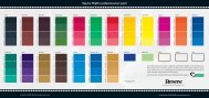
Colour Choices - choose colour with creativity and ... - Resene
Colour Choices - choose colour with creativity and ... - Resene
Colour Choices - choose colour with creativity and ... - Resene

Create successful ePaper yourself
Turn your PDF publications into a flip-book with our unique Google optimized e-Paper software.
48<br />
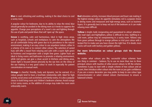
Blue is cool, refreshing <strong>and</strong> soothing, making it the ideal choice to cool<br />
a sunny room.<br />
A popular <strong>colour</strong> for bedrooms, due to its ability to relax the mind, blue<br />
should generally be avoided in the dining room as it tends to suppress the<br />
appetite. Change your perceptions of a room’s size <strong>and</strong> lighting through<br />
the use of pale <strong>and</strong> pastel blues that will ‘open up’ the space.<br />
Green is soothing, calm <strong>and</strong> harmonious, ideal in high stress areas,<br />
such as hospitals, schools <strong>and</strong> workplaces to calm the atmosphere. We<br />
are all comfortable living <strong>with</strong> green due to its prevalence in the natural<br />
environment, making it an easy <strong>colour</strong> to use anywhere indoors, either in<br />
a scheme of its own or to connect other <strong>colour</strong>s. The selection of varied<br />
hues will offer a mood from relaxing <strong>and</strong> calm <strong>with</strong> a warm light green<br />
to freshness <strong>and</strong> invigoration <strong>with</strong> a bright lime green. Lighter hues are<br />
ideal in living rooms <strong>and</strong> bathrooms to promote a relaxing environment,<br />
while mid greens can give a clean accent in kitchens <strong>and</strong> dining areas.<br />
Green light is focused almost precisely by the eye lens on the retina of<br />
the eye making it a very good <strong>colour</strong> to work in especially for patient<br />
concentration on manual work.<br />
Orange is cheerful, friendly, lively <strong>and</strong> dynamic, but be warned, it’s a<br />
<strong>colour</strong> people tend to have a love/hate relationship <strong>with</strong>. Ideal for high<br />
activity, social areas such as kitchens <strong>and</strong> family rooms, it is also a popular<br />
choice in bold living room <strong>and</strong> children’s bedroom schemes. Avoid orange<br />
in hot sunny rooms, as the addition of orange may make the room seem<br />
unbearably warm.<br />
Red stimulates activity, increases blood pressure <strong>and</strong> heart rate making it<br />
the highest energy <strong>colour</strong>. An appetite stimulator, red is a popular choice<br />
in dining rooms <strong>and</strong> restaurant <strong>and</strong> high-energy areas, such as business<br />
foyers. It is generally best to keep red out of the bedroom as it can make<br />
relaxing more difficult.<br />
Yellow is bright, bold, invigorating <strong>and</strong> guaranteed to attract attention.<br />
Like road signs <strong>and</strong> highlighters, yellow is difficult to miss. Uplifting in a<br />
cold room, yellow may be overpowering in a sunny room. Yellows vary<br />
from green yellows through to orange yellows so trial your <strong>colour</strong> <strong>with</strong> a<br />
testpot first to make sure you have chosen the right hue. If in doubt, most<br />
rooms will work <strong>with</strong> buttery <strong>and</strong> golden yellows.<br />
For more information on <strong>colour</strong> groups visit the <strong>Resene</strong><br />
website.<br />
No matter what <strong>colour</strong>s you like, successful <strong>colour</strong> schemes have<br />
one thing in common – balance. Try to use no more than two to three<br />
principal <strong>colour</strong>s <strong>with</strong> touches of other accent <strong>colour</strong>s to lift the scheme.<br />
Sometimes it pays to start <strong>with</strong> a simple scheme of two <strong>colour</strong>s <strong>and</strong> an<br />
accent, then introduce other <strong>colour</strong>s into the room as you gain confidence.<br />
If you are a novice decorator you may prefer to keep to one <strong>colour</strong> type<br />
(monochromatic) or select related <strong>colour</strong>s (harmonious) to ensure a<br />
balanced scheme.<br />
<strong>Resene</strong> Tall Poppy