Colour Choices - choose colour with creativity and ... - Resene
Colour Choices - choose colour with creativity and ... - Resene
Colour Choices - choose colour with creativity and ... - Resene

You also want an ePaper? Increase the reach of your titles
YUMPU automatically turns print PDFs into web optimized ePapers that Google loves.
50<br />
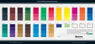
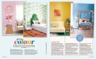
Most people find pastel <strong>colour</strong>s easy to use in a <strong>colour</strong> scheme. Pastel<br />
<strong>colour</strong>s are pure <strong>colour</strong>s <strong>with</strong> the addition of white, taking a bright yellow<br />
to a light yellow <strong>and</strong> so on. The common element, white, between all<br />
these <strong>colour</strong>s means that you can successfully combine any pastels into a<br />
<strong>colour</strong> scheme. The addition of clean white also means that most pastels<br />
appear soft <strong>and</strong> fresh, making them a very popular choice for decorators.<br />
Light <strong>and</strong> texture will impact on the total <strong>colour</strong> scheme. If you change a<br />
room’s <strong>colour</strong> from bright lime green to navy blue, the light reflectance of<br />
the room will decrease, making the room appear darker.<br />
Similarly, matt surfaces absorb the light <strong>and</strong> will always appear darker <strong>and</strong><br />
deeper than glossy reflective surfaces. Light <strong>colour</strong>s <strong>and</strong> glossy finishes<br />
are perfect for rooms you wish to appear larger, however you may prefer<br />
to use darker <strong>colour</strong>s, heavier textures <strong>and</strong> matt finishes in areas such as<br />
the dining room, to draw the walls in <strong>and</strong> make the room seem cosier.<br />
If you have painted a wall <strong>with</strong> matt paint <strong>and</strong> find it is too flat you can<br />
paint over the top <strong>with</strong> a glaze to increase the light reflectance.<br />
A good balance of tones is employed in the best <strong>colour</strong> schemes. If you<br />
think of a newspaper clipping, the most interesting pictures are those<br />
that have a good balance of light, mid <strong>and</strong> deep tones. Aim for a balance<br />
across the different tones to ensure your scheme is visually interesting.<br />
Always keep in mind when developing a <strong>colour</strong> scheme who will be using<br />
the space the most. There is no point using bright orange because it is in<br />
fashion if the entire family dislikes the <strong>colour</strong>. Similarly, the best homes are<br />
decorated <strong>with</strong> the owner’s personality. Nature lovers may prefer greens<br />
<strong>and</strong> blues to bright reds, while a vibrant owner may prefer bright <strong>and</strong> bold<br />
feature areas that reflect their bubbly personality.<br />
To help you visualise the effect different paint, flooring <strong>and</strong> furnishing<br />
<strong>colour</strong>s will have on your room, download <strong>Resene</strong> EzyPaint virtual painting<br />
software. With <strong>Resene</strong> EzyPaint, you can virtually paint one of the gallery<br />
of room <strong>and</strong> building pictures or scan in your own room <strong>and</strong> virtually paint<br />
that. With over 3000 <strong>colour</strong>s to <strong>choose</strong> from, selecting the right <strong>colour</strong><br />
combination is easy. <strong>Resene</strong> EzyPaint is available as a free download from<br />
the <strong>Resene</strong> Website, www.resene.com/ezypaint.<br />
If you like changing your environment, the best idea may be to use a<br />
neutral <strong>colour</strong> scheme <strong>and</strong> provide accents through replaceable items,<br />
such as cushions <strong>and</strong> flowers. This will enable you to change the mood of<br />
the room <strong>with</strong> a simple change of the accent items.<br />
Use a grey paint <strong>colour</strong> viewfinder (get one free from your <strong>Resene</strong><br />
ColorShop) to isolate <strong>colour</strong> on the paint chart you are viewing. If you<br />
look at all the <strong>colour</strong>s together, the <strong>colour</strong>s will affect one another <strong>and</strong><br />
you won’t get a true feeling of each individual <strong>colour</strong>. Once you have<br />
narrowed down your <strong>colour</strong> choices, use testpots to confirm your <strong>colour</strong><br />
scheme on the surface you are planning to paint. Apply two coats, leaving<br />
a border around it so the <strong>colour</strong> is not influenced by anything else. When<br />
the paint is dry, pin your <strong>colour</strong> to the wall <strong>and</strong> view it in daylight <strong>and</strong><br />
artificial light, moving it around different areas of the room <strong>and</strong> folding it<br />
into the corner of the room for a true feel of the finished effect.<br />
<strong>Resene</strong> Innocence