


Create successful ePaper yourself
Turn your PDF publications into a flip-book with our unique Google optimized e-Paper software.
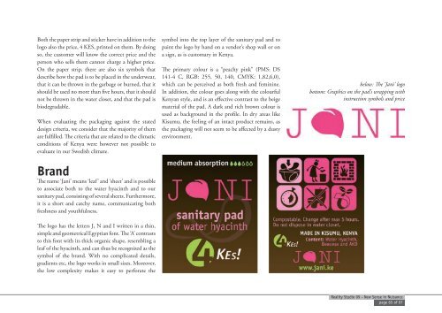
Both the paper strip and sticker have <strong>in</strong> addition to the<br />
logo also the price, 4 KES, pr<strong>in</strong>ted on them. By do<strong>in</strong>g<br />
so, the customer will know the correct price and the<br />
person who sells them cannot charge a higher price.<br />
On the paper strip, there are also six symbols that<br />
describe how the pad is to be placed <strong>in</strong> the underwear,<br />
that it can be thrown <strong>in</strong> the garbage or burned, that it<br />
should be used no more than five hours, that it should<br />
not be thrown <strong>in</strong> the water closet, and that the pad is<br />
biodegradable.<br />
When evaluat<strong>in</strong>g the packag<strong>in</strong>g aga<strong>in</strong>st the stated<br />
design criteria, we consider that the majority of them<br />
are fulfilled. The criteria that are related to the climatic<br />
conditions of Kenya were however not possible to<br />
evaluate <strong>in</strong> our Swedish climate.<br />
Brand<br />
The name ‘Jani’ means ‘leaf’ and ‘sheet’ and is possible<br />
to associate both to the water hyac<strong>in</strong>th and to our<br />
sanitary pad, consist<strong>in</strong>g of several sheets. Furthermore,<br />
it is a short and catchy name, communicat<strong>in</strong>g both<br />
freshness and youthfulness.<br />
The logo has the letters J, N and I written <strong>in</strong> a th<strong>in</strong>,<br />
simple and geometrical Egyptian font. The ‘A’ contrasts<br />
to this font with its thick organic shape, resembl<strong>in</strong>g a<br />
leaf of the hyac<strong>in</strong>th, and can thus be recognized as the<br />
symbol of the brand. With no complicated details,<br />
gradients etc, the logo works <strong>in</strong> small sizes. Moreover,<br />
the low complexity makes it easy to perforate the<br />
symbol <strong>in</strong>to the top layer of the sanitary pad and to<br />
pa<strong>in</strong>t the logo by hand on a vendor’s shop wall or on<br />
a sign, as is customary <strong>in</strong> Kenya.<br />
The primary colour is a “peachy p<strong>in</strong>k” (PMS: DS<br />
141-4 C, RGB: 255, 50, 140, CMYK: 1,82,6,0),<br />
which can be perceived as both fresh and fem<strong>in</strong><strong>in</strong>e.<br />
In addition, the colour goes along with the colourful<br />
Kenyan style, and is an effective contrast to the beige<br />
material of the pad. A dark and rich brown colour is<br />
used as background <strong>in</strong> the profile. In dry areas like<br />
Kisumu, the feel<strong>in</strong>g of an <strong>in</strong>tact product rema<strong>in</strong>s, as<br />
the packag<strong>in</strong>g will not seem to be affected by a dusty<br />
environment.<br />
below: The ‘Jani’ logo<br />
bottom: Graphics on the pad’s wrapp<strong>in</strong>g with<br />
<strong>in</strong>struction symbols and price<br />
Reality Studio 09 - <strong>New</strong> <strong>Sense</strong> <strong>in</strong> <strong>Nuisance</strong><br />
page 65 of 97