Quick Start to StatTools
Quick Start to StatTools
Quick Start to StatTools

You also want an ePaper? Increase the reach of your titles
YUMPU automatically turns print PDFs into web optimized ePapers that Google loves.
Here is the result. You can read more about box plots in <strong>StatTools</strong> help, but this plot makes it clear that<br />
females tend <strong>to</strong> make smaller salaries than males (the female box is slightly <strong>to</strong> the left), and their<br />
salaries tend <strong>to</strong> have less variation the male salaries (the female box is narrower). Note that the red<br />
points are called outliers.<br />
Third, you might want <strong>to</strong> see whether there is a relationship between Age and Salary, or between Years<br />
(of experience) and Salary. The best way <strong>to</strong> do this graphically is with scatterplots.<br />
To create one or more scatterplots:<br />
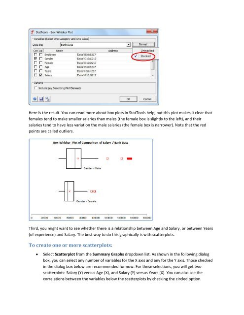
Select Scatterplot from the Summary Graphs dropdown list. As shown in the following dialog<br />
box, you can select any number of variables for the X axis and any for the Y axis. Those checked<br />
in the dialog box below are recommended for now. For these selections, you will get two<br />
scatterplots: Salary (Y) versus Age (X), and Salary (Y) versus Years (X). You can also see the<br />
correlations between the variables below the scatterplots by checking the circled option.