Quick Start to StatTools
Quick Start to StatTools
Quick Start to StatTools

You also want an ePaper? Increase the reach of your titles
YUMPU automatically turns print PDFs into web optimized ePapers that Google loves.
<strong>Quick</strong> <strong>Start</strong> <strong>to</strong> <strong>StatTools</strong><br />
Step 1: Review the Data and Plan the Analysis<br />
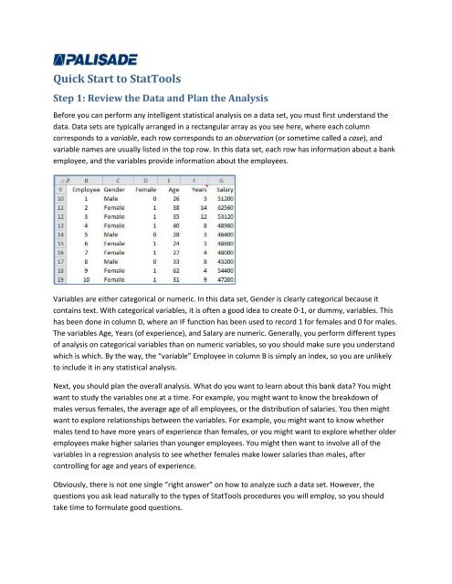
Before you can perform any intelligent statistical analysis on a data set, you must first understand the<br />
data. Data sets are typically arranged in a rectangular array as you see here, where each column<br />
corresponds <strong>to</strong> a variable, each row corresponds <strong>to</strong> an observation (or sometime called a case), and<br />
variable names are usually listed in the <strong>to</strong>p row. In this data set, each row has information about a bank<br />
employee, and the variables provide information about the employees.<br />
Variables are either categorical or numeric. In this data set, Gender is clearly categorical because it<br />
contains text. With categorical variables, it is often a good idea <strong>to</strong> create 0-1, or dummy, variables. This<br />
has been done in column D, where an IF function has been used <strong>to</strong> record 1 for females and 0 for males.<br />
The variables Age, Years (of experience), and Salary are numeric. Generally, you perform different types<br />
of analysis on categorical variables than on numeric variables, so you should make sure you understand<br />
which is which. By the way, the “variable” Employee in column B is simply an index, so you are unlikely<br />
<strong>to</strong> include it in any statistical analysis.<br />
Next, you should plan the overall analysis. What do you want <strong>to</strong> learn about this bank data? You might<br />
want <strong>to</strong> study the variables one at a time. For example, you might want <strong>to</strong> know the breakdown of<br />
males versus females, the average age of all employees, or the distribution of salaries. You then might<br />
want <strong>to</strong> explore relationships between the variables. For example, you might want <strong>to</strong> know whether<br />
males tend <strong>to</strong> have more years of experience than females, or you might want <strong>to</strong> explore whether older<br />
employees make higher salaries than younger employees. You might then want <strong>to</strong> involve all of the<br />
variables in a regression analysis <strong>to</strong> see whether females make lower salaries than males, after<br />
controlling for age and years of experience.<br />
Obviously, there is not one single “right answer” on how <strong>to</strong> analyze such a data set. However, the<br />
questions you ask lead naturally <strong>to</strong> the types of <strong>StatTools</strong> procedures you will employ, so you should<br />
take time <strong>to</strong> formulate good questions.
Now it’s your turn<br />
Take a quick look at the data in this data set. Are there any missing data (blanks)? Do there appear <strong>to</strong> be<br />
any data values that are “wrong” (out of the ordinary)? Actually, this data set is “clean,” but these are<br />
the types of questions you should ask about real data sets before you dive in.<br />
Step 2: Create a <strong>StatTools</strong> Data Set<br />
Before you can analyze any data set with <strong>StatTools</strong>, you must first perform one very simple step: You<br />
must create a <strong>StatTools</strong> data set.<br />
To create a <strong>StatTools</strong> data set:<br />
Select any cell inside the data set. Then click the Data Set Manager but<strong>to</strong>n on the <strong>StatTools</strong><br />
ribbon. Respond Yes <strong>to</strong> whether you want <strong>to</strong> create a <strong>StatTools</strong> data set, and you will see the<br />
following dialog box. It provides quite a few options, such as giving a descriptive name <strong>to</strong> the<br />
data set (like Bank Data), changing the data range (although <strong>StatTools</strong> usually guesses it<br />
correctly), and applying cell formatting (for emphasis). There are also options in the Variables<br />
section, but you can generally accept the defaults and then click OK.<br />
Once you click OK, you will see several changes:<br />
If you checked Apply Cell Formatting, the <strong>to</strong>p row of the data set will be painted blue, and other<br />
minor formatting changes will be apparent. This reminds you that this is a <strong>StatTools</strong> data set.<br />
The columns will have range names, such as ST_Gender, ST_Age, and so on.
Most importantly, you will be able <strong>to</strong> perform <strong>StatTools</strong> statistical procedures on the data set, as<br />
explained shortly. In fact, the rest of this tu<strong>to</strong>rial works as shown only if you have created the<br />
<strong>StatTools</strong> data set in this step.<br />
If you save the file and then reopen it, the <strong>StatTools</strong> data set will still be in effect. This means that you<br />
have <strong>to</strong> perform this step only once per data set. However, you are allowed <strong>to</strong> create multiple <strong>StatTools</strong><br />
data sets in the same file. This is a good reason for giving each a descriptive name.<br />
Now it’s your turn.<br />
Create a <strong>StatTools</strong> data set for the bank data.<br />
Step 3: Perform One-Variable Analyses<br />
The rest of the steps in this tu<strong>to</strong>rial indicate a logical progression of analyses you might perform on this<br />
data set and on many other data sets. You don’t necessarily have <strong>to</strong> follow this exact progression, but<br />
keep in mind that you are using <strong>StatTools</strong> <strong>to</strong> learn about the data. Therefore, this progression is natural.<br />
A good first step is <strong>to</strong> examine the variables one at a time. You can do this with tables of summary<br />
statistics, such as means, standard deviations, quartiles, and others, or you can do it with charts, the<br />
most common being a his<strong>to</strong>gram. You can do all of this quickly and easily with <strong>StatTools</strong>.<br />
To see summary statistics for one or more variables:<br />
Select One-Variable Summary from the Summary Statistics dropdown list, and in the resulting<br />
dialog box, check the variables and summary statistics of interest <strong>to</strong> you. Those checked in the<br />
dialog box below are recommended for now. Actually, <strong>StatTools</strong> will ignore choices of<br />
categorical variables such as Gender; it requires numeric variables here. Also, if you happen <strong>to</strong><br />
see two columns of check boxes in the variable list section, click the Format but<strong>to</strong>n and select<br />
Unstacked. This purpose of this option will be explained shortly.
This dialog box is typical of most other <strong>StatTools</strong> dialog boxes. The <strong>to</strong>p section lets you choose a data set<br />
and check one or more variables of interest. The bot<strong>to</strong>m section lets you choose how you want the<br />
analysis <strong>to</strong> be performed. Note the three but<strong>to</strong>ns at the bot<strong>to</strong>m. You will see these but<strong>to</strong>ns in all<br />
<strong>StatTools</strong> dialog boxes.<br />
The left but<strong>to</strong>n is for help. The middle but<strong>to</strong>n allows you <strong>to</strong> save selections for later analyses. For<br />
example, if you typically want only the summary statistics checked here, you can save these choices for<br />
later one-variable analyses. The right but<strong>to</strong>n is especially useful. It brings up the following Application<br />
Settings dialog box where, among other things, you can choose from four possible report placements.<br />
For example, if you want each report <strong>to</strong> be placed on a new worksheet in the current workbook, you can<br />
select ActiveWorkbook.
Here are the resulting summary statistics.<br />
For example, the mean and standard deviation of Salary are $63,875 and $18,010, and 75% of the<br />
employees’ salaries are below $70,400, the 3 rd quartile. Also, the mean of the 0-1 Female variable<br />
implies that about 67% of the employees are females.<br />
To see the distribution of one or more variables graphically, you can create his<strong>to</strong>grams.<br />
To create a his<strong>to</strong>gram of one or more variables:<br />
Select His<strong>to</strong>gram from the Summary Graphs dropdown list, and select the variables of interest<br />
(again, numeric only). Those checked in the dialog box below are recommended for now. Each<br />
his<strong>to</strong>gram is a column chart of counts of observations in various categories, called bins. The<br />
bot<strong>to</strong>m of this dialog box indicates that <strong>StatTools</strong> can choose these bins au<strong>to</strong>matically, and this<br />
is often a good choice, although you can supply your own bins if you like. (Again, if you see two<br />
columns of check boxes in the variable list section, click the Format but<strong>to</strong>n and select<br />
Unstacked.)<br />
This produces a worksheet with four his<strong>to</strong>grams, one for each checked variable. For example, here is the<br />
his<strong>to</strong>gram of Salary. As you can see, this distribution is skewed <strong>to</strong> the right. Most employees are in the<br />
lower salary ranges, but a few make considerably higher salaries.
Now it’s your turn<br />
Create the summary statistics and his<strong>to</strong>grams illustrated above. Experiment with report placements. You<br />
can change this report placement setting as often as you like—or you can always stick with your<br />
favorite.<br />
Step 4: Examine Relationships Between Variables<br />
Once you understand how each variable varies individually, using the <strong>to</strong>ols in the previous step, you can<br />
then look for relationships between variables. Three <strong>to</strong>ols will be illustrated here: (1) a table of summary<br />
statistics for a numeric variable, broken down by categories of a categorical variable, (2) side-by-side box<br />
plots for seeing how the distribution of a numeric variable varies over categories of a categorical<br />
variable, and (3) scatterplots of numeric variables versus other numeric variables. Again, <strong>StatTools</strong><br />
performs all of these quickly and easily, so you have time <strong>to</strong> explore plenty of potential relationships.<br />
First, you might want <strong>to</strong> break the Salary summary statistics down by Gender. To do this in <strong>StatTools</strong>,<br />
you first need <strong>to</strong> understand the difference between stacked and unstacked formats. The data would be<br />
unstacked if there were two separate Salary columns, one for males and one for females. However, this<br />
data set is stacked, meaning that there are two “long” variables, Salary and Gender. The male and<br />
females salaries are stacked in<strong>to</strong> one Salary column, and the Gender column indicates the category of<br />
each.<br />
To get summary statistics of one variable broken down by category:<br />
In the One-Variable Summary dialog box, click the Format but<strong>to</strong>n and choose Stacked. This<br />
creates two lists of check boxes, one for the “Cat” (or categorical) variable and one for the “Val”<br />
(or value) variable. Check Gender for the categorical variable, and Salary for the value variable.<br />
Then click OK.
The resulting summary statistics are as follows. For example, the means and standard deviations<br />
indicate that male salaries are larger on average, and are more spread out, than female salaries.<br />
Second, you might want <strong>to</strong> compare the male and female salary distributions graphically. You can do<br />
this with his<strong>to</strong>grams in <strong>StatTools</strong>, again using the Stacked format option, but unless you change the bins<br />
for these two his<strong>to</strong>grams, they will be on slightly different scales, which makes a comparison across<br />
gender difficult. A better way <strong>to</strong> compare salaries across gender is with side-by-side box-whisker plots<br />
(commonly shortened <strong>to</strong> box plots).<br />
To create side-by-side box plots:<br />
Select Box-Whisker Plot from the Summary Graphs dropdown list, select Stacked as the Format,<br />
and choose the Cat and Val variables as before.
Here is the result. You can read more about box plots in <strong>StatTools</strong> help, but this plot makes it clear that<br />
females tend <strong>to</strong> make smaller salaries than males (the female box is slightly <strong>to</strong> the left), and their<br />
salaries tend <strong>to</strong> have less variation the male salaries (the female box is narrower). Note that the red<br />
points are called outliers.<br />
Third, you might want <strong>to</strong> see whether there is a relationship between Age and Salary, or between Years<br />
(of experience) and Salary. The best way <strong>to</strong> do this graphically is with scatterplots.<br />
To create one or more scatterplots:<br />
Select Scatterplot from the Summary Graphs dropdown list. As shown in the following dialog<br />
box, you can select any number of variables for the X axis and any for the Y axis. Those checked<br />
in the dialog box below are recommended for now. For these selections, you will get two<br />
scatterplots: Salary (Y) versus Age (X), and Salary (Y) versus Years (X). You can also see the<br />
correlations between the variables below the scatterplots by checking the circled option.
Here are the two scatterplots. Both variables Age and Years are positively correlated with Salary, but<br />
Years is more strongly related <strong>to</strong> Salary. You can see this from the tighter upward scatter in the second<br />
plot, and from the higher correlation shown at the bot<strong>to</strong>m (0.616 for Years versus 0.384 for Age). Of<br />
course, both of these make sense. The chances are that a given employee’s salary will increase as he or<br />
she gets older and gains more experience.
Now it’s your turn.<br />
Perform the statistical analyses shown here: summary statistics of Salary broken down by Gender, box<br />
plots of Salary broken down by Gender, and scatterplots of Salary versus Age and Years. Of course, you<br />
can try a few more on your own if you like. By this time, you should be seeing that you can do a lot of<br />
analysis with <strong>StatTools</strong> very quickly.<br />
Step 5: Perform Further Analyses<br />
The advantage of using <strong>StatTools</strong> is that it lets you perform many statistical analyses very quickly and<br />
easily. As mentioned earlier, it is up <strong>to</strong> you <strong>to</strong> ask the right questions about the data set and then run<br />
the appropriate <strong>StatTools</strong> procedures. Of course, these depend on the objectives of the analysis.<br />
However, <strong>StatTools</strong> has many <strong>to</strong>ols, some relatively simple and others more complex, for analyzing data.<br />
One particular <strong>to</strong>ol will be examined here: regression analysis.<br />
So far, you have seen that on average, the male salaries are larger than the female salaries. This clearly<br />
raises the question of gender discrimination at this bank. But the bank might provide a counterargument<br />
that males get paid more because they are older and have more years of experience. The analysis so far<br />
has not “controlled” for these two other variables when comparing males <strong>to</strong> females, but regression<br />
can. And best of all, <strong>StatTools</strong> can run one or more regressions in a matter of seconds.<br />
To run a regression:<br />
Select Regression from the Regression and Classification dropdown list <strong>to</strong> bring up the<br />
following dialog box. There are many options here, but <strong>to</strong> keep it simple for this quick start<br />
tu<strong>to</strong>rial, you can accept all of the defaults and simply choose the dependent (D) variable and<br />
independent (I) variables as shown.
This immediately produces the following results.
Although this is a lot <strong>to</strong> digest, and you need some background in regression analysis <strong>to</strong> understand it<br />
all, two key numbers have been circled. First, the R-Square value indicates that about 49% of the<br />
variation in salaries has been explained by the variables in the regression equation (gender, age, and<br />
years of experience). Second, the coefficient of the Female variable indicates that, even after controlling<br />
for age and years of experience, females average close <strong>to</strong> $13,000 less in salary than males. (By this<br />
time, you might have noticed that the 0-1 Female variable was created in the first place so that it could<br />
be entered in this regression equation for Salary. Otherwise, it wouldn’t be possible <strong>to</strong> measure the<br />
effect of Gender on Salary with regression.)<br />
Now it’s your turn.<br />
Run this regression analysis or other statistical analyses with <strong>StatTools</strong>, and using your knowledge of<br />
statistics, interpret the results.<br />
More <strong>StatTools</strong> Examples<br />
This completes the tu<strong>to</strong>rial. However, we urge you <strong>to</strong> learn more. One way is <strong>to</strong> examine the example<br />
models packaged with <strong>StatTools</strong>. To see them, choose Example Spreadsheets from the Help dropdown<br />
list. This opens a file with a variety models that illustrate the statistical procedures available in <strong>StatTools</strong>.<br />
To see any of them, just click the corresponding link.<br />
In addition, there is extensive documentation on all <strong>StatTools</strong> features under the Help dropdown list,<br />
there are many more resources on the Palisade web site www.palisade.com, and Palisade offers a range<br />
of training, consulting, and cus<strong>to</strong>mization services. We hope these will help you <strong>to</strong> become one of the<br />
increasing number of people who are able <strong>to</strong> make sense of all the data in <strong>to</strong>day’s data-driven world.