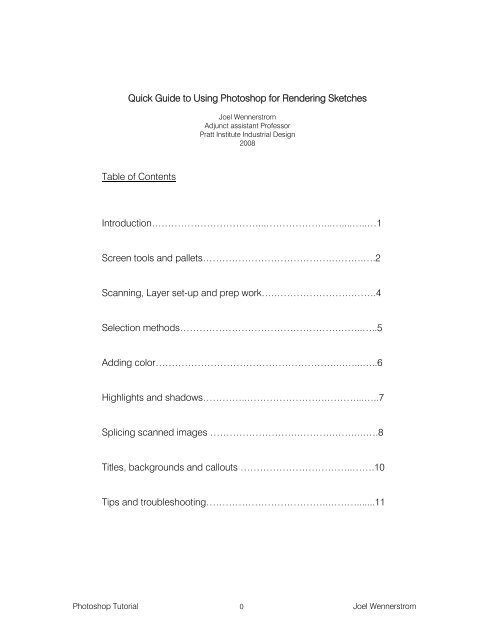
Quick Guide to Using Photoshop for Rendering ... - Pratt Institute
Quick Guide to Using Photoshop for Rendering ... - Pratt Institute
Quick Guide to Using Photoshop for Rendering ... - Pratt Institute

Create successful ePaper yourself
Turn your PDF publications into a flip-book with our unique Google optimized e-Paper software.
<strong>Quick</strong> <strong>Guide</strong> <strong>to</strong> <strong>Using</strong> Pho<strong>to</strong>shop <strong>for</strong> <strong>Rendering</strong> Sketches<br />
Table of Contents<br />
Joel Wennerstrom<br />
Adjunct assistant Professor<br />
<strong>Pratt</strong> <strong>Institute</strong> Industrial Design<br />
2008<br />
Introduction……………………………...………………...…....…..…1<br />
Screen <strong>to</strong>ols and pallets………………………………….……….….2<br />
Scanning, Layer set-up and prep work….…………………….…….4<br />
Selection methods………………………………………….……..…..5<br />
Adding color……………………………………………….….…...…..6<br />
Highlights and shadows…………..…………………….………...…..7<br />
Splicing scanned images ……………………….……….…….….….8<br />
Titles, backgrounds and callouts ……………………………..…….10<br />
Tips and troubleshooting………………………………..……….......11<br />
Pho<strong>to</strong>shop Tu<strong>to</strong>rial 0 Joel Wennerstrom
INTRODUCTION: PHOTOSHOP TUTORIAL<br />
This tu<strong>to</strong>rial covers the bare essentials <strong>to</strong> using Pho<strong>to</strong>shop as it pertains <strong>to</strong> Industrial design rendering.<br />
Pho<strong>to</strong>shop has all but replaced traditional marker rendering and is a much sought-after skill in the design field<br />
<strong>to</strong>day- however different firms use Pho<strong>to</strong>shop in different ways. As you begin <strong>to</strong> work in your chosen field- be it<br />
product design, shoes, transportation, interiors- you will learn techniques specific <strong>to</strong> the industry that will help<br />
you get your ideas across quickly. There is no single way <strong>to</strong> use Pho<strong>to</strong>shop, but this beginning tu<strong>to</strong>rial will get<br />
you started on your path.<br />
STYLUS, MOUSE OR TABLET PC?<br />
Pho<strong>to</strong>shop is great <strong>for</strong> adding color, highlights, backgrounds and texture effects <strong>to</strong> drawings done by hand on<br />
paper, newsprint, tracing paper or any other flat medium. You can also use the program <strong>to</strong> re-size, clean up,<br />
and combine various drawings <strong>to</strong> create a powerful presentation page of your ideas. Pho<strong>to</strong>shop is NOT<br />
recommended <strong>to</strong> physically draw in unless you are using it on a “Tablet PC”- a computer screen that allows you<br />
<strong>to</strong> draw directly on the screen. If you have a couple thousand dollars <strong>to</strong> spare, Wacom sells a nice tablet PC<br />
called a Cintiq, which allows you <strong>to</strong> draw with a pen-like <strong>to</strong>ol- called a stylus- directly on your screen. It is an<br />
immediate, real-time experience, and allows one <strong>to</strong> draw quickly and accurately without fear of drawing the<br />
wrong line (you can always hit “undo”). You can draw your line work on the screen, then immediate add colors<br />
and highlights <strong>to</strong> your drawings.<br />
At the time of this writing (Spring-08), <strong>Pratt</strong> Studios Computer Lab has 3 Cintiq Tablet PC’s available <strong>to</strong> ID<br />
students, but if you want <strong>to</strong> draw in your own apartment or studio and can’t af<strong>for</strong>d a Cintiq, I recommend buying<br />
an inexpensive Wacom pen tablet as an accessory that works with your computer or lap<strong>to</strong>p. But because you<br />
are drawing with a pressure sensitive stylus on a different surface than where your marks appear- the screen in<br />
front of you- there is a an awkward disconnect that makes drawing anything but scribbles difficult (though I’m<br />
sure with time and practice, anyone can overcome this). There<strong>for</strong>e, these relatively inexpensive tablets are not<br />
<strong>for</strong> drawing with, but are great <strong>for</strong> rendering your drawings once you scan them in<strong>to</strong> Pho<strong>to</strong>shop.<br />
The Wacom “Bamboo” and “Bamboo Fun” tablets give you the bare essentials <strong>for</strong> rendering your concepts in a<br />
computer program. The Bamboo Fun is currently $100 (2008), and comes with Pho<strong>to</strong>shop Elements- a light<br />
duty version of Pho<strong>to</strong>shop that is more than adequate <strong>for</strong> basic rendering. The Bamboo is $79, and comes<br />
with just the basic tablet and stylus. You must supply your own rendering program with this model.<br />
You can also use a standard mouse <strong>to</strong> render with, but you do not have any pressure sensitivity, which is a nice<br />
feature of pen tablets. Still, it’s a viable alternative <strong>for</strong> those who can’t af<strong>for</strong>d <strong>to</strong> spend any more money on<br />
computer gadgets, and will certainly get you by as you familiarize yourself with the program.<br />
NOTE: The methods covered in this tu<strong>to</strong>rial can be used with Pho<strong>to</strong>shop 6 and later versions, and the keyboard<br />
commands are from a PC (as opposed <strong>to</strong> a Mac). (Of course, those who prefer <strong>to</strong> use Macs should be able <strong>to</strong><br />
find the equivalent keyboard shortcuts with relative ease.) The <strong>to</strong>ols covered in this tu<strong>to</strong>rial are pretty basic, but<br />
effective. The intended results are <strong>for</strong> your renderings <strong>to</strong> look like they were hand-done- quickly and with<br />
passion! It is the author’s intent <strong>to</strong> convince you <strong>to</strong> drop the “realistic” effects and concentrate on getting more<br />
ideas on the wall <strong>for</strong> others <strong>to</strong> comment on. If realism is the objective, you may be better off building a 3D model<br />
in Alias or SolidWorks and render it in that program instead.<br />
Pho<strong>to</strong>shop Tu<strong>to</strong>rial 1 Joel Wennerstrom
PHOTOSHOP SCREEN TOOLS AND PALLETS<br />
When you open Pho<strong>to</strong>shop you will see a screen similar <strong>to</strong> the one shown above, except it will not have the<br />
sketch in the middle of the screen- you’ll import yours later. The basic areas you will be using are:<br />
TOOLBOX PALLET: The vertical group of icons on the left side of the screen. It contains <strong>to</strong>ols such as the<br />
brush, background and <strong>for</strong>eground colors, text, lines, dodge and burn <strong>to</strong>ols, eraser, zoom, and various means<br />
of selecting areas on your drawing such as the “Magic Wand” <strong>to</strong>ol, and the “lasso” <strong>to</strong>ols. Some icons have a<br />
little black triangle at the bot<strong>to</strong>m right corner, which indicates more <strong>to</strong>ols underneath. Click and hold down your<br />
pointing device on the icon <strong>to</strong> see the additional <strong>to</strong>ols.<br />
TOOL SETTINGS: Along the <strong>to</strong>p of your screen is the Tool Settings area. When you select a <strong>to</strong>ol, you can make<br />
adjustments <strong>to</strong> the <strong>to</strong>ol in this area so it does exactly what you want it <strong>to</strong>. For example, you’ll set the brush size<br />
and flow control here, or the sensitivity of the selection <strong>to</strong>ols, etc.<br />
HISTORY PALLET: On the right side of your screen are another set of pallets stacked on <strong>to</strong>p of each other.<br />
The His<strong>to</strong>ry Pallet (usually near the <strong>to</strong>p of the stack) keeps track of every move you make and allows you <strong>to</strong><br />
undo up <strong>to</strong> 20 consecutive moves, depending on your settings. Un<strong>for</strong>tunately you can’t go back and undo just<br />
the 3 rd command- <strong>for</strong> example- and then have everything else after that remain intact. You lose all your changes<br />
from the 3 rd one on.<br />
LAYERS PALLET: The Layers Pallet displays your layers and their settings/modes. Layers are a key component<br />
<strong>to</strong> rendering in Pho<strong>to</strong>shop. They are much like sheets of clear acetate or tracing paper on which you apply<br />
color, reflections, shadows, backgrounds, etc. It is best <strong>to</strong> have your line work as a separate layer and apply<br />
color <strong>to</strong> another layer. Layers can be confusing <strong>to</strong> keep track of, but they can be labeled, hidden, linked <strong>to</strong><br />
each other, deleted, copied, and put in<strong>to</strong> “folders”.<br />
Pho<strong>to</strong>shop Tu<strong>to</strong>rial 2 Joel Wennerstrom
TOOLBOX PALLET<br />
LAYERS PALLET<br />
Commonly used layer controls:<br />
TO COPY A LAYER, click and drag the layer <strong>to</strong> the “new layer” icon at the bot<strong>to</strong>m of the layers pallet.<br />
TO HIDE A LAYER, click the “eye” icon next <strong>to</strong> the layer. To show it again, click in the blank box.<br />
TO DELETE A LAYER, drag it <strong>to</strong> the “trashcan” icon at the bot<strong>to</strong>m of the layers pallet.<br />
TO LINK TWO OR MORE LAYERS TOGETHER, select the layers while holding down the shift key<br />
and click on the “chain link” icon at the bot<strong>to</strong>m of the layers pallet.<br />
Pho<strong>to</strong>shop Tu<strong>to</strong>rial 3 Joel Wennerstrom
SCANNING, LAYER SET-UP AND PREP WORK<br />
1. SCAN YOUR WORK: Use a computer with a scanner attached <strong>to</strong> it and open Pho<strong>to</strong>shop. Go <strong>to</strong> the pulldown<br />
menu at the <strong>to</strong>p and go <strong>to</strong> “File-Import” <strong>to</strong> find the scanner and scan your line work at 120-150 DPI,<br />
full color output and save as a JPEG, following the directions in the scanner program. Your sketch will<br />
appear on the screen in Pho<strong>to</strong>shop.<br />
2. CHECK IMAGE MODE: Check the MODE of your image at “Image-Mode.” It should be in RGB mode. If it<br />
was scanned in as a bitmap instead of a JPEG, or as a black and white image, RGB mode may not be<br />
accessible. If not, change it <strong>to</strong> GRAYSCALE mode, say “yes” <strong>to</strong> the size ratio, then go back again <strong>to</strong><br />
“Image-Mode” and RGB will be accessible (it may be best <strong>to</strong> just re-scan your image, though).<br />
3. CHECK DPI AND FILE SIZE OF IMAGE: Go <strong>to</strong> “Image-Image size” <strong>to</strong> see the physical size of your image<br />
and the Dots Per Inch, or “Resolution”. Also see the “Pixel Dimensions” <strong>to</strong> see how large the file is in<br />
megabytes (M). A small image is under 5M, a medium size one is 10-20M, and anything over that, check<br />
your DPI or physical dimensions and reduce one or both of the settings <strong>to</strong> reduce the overall file size.<br />
4. ADJUST THE IMAGE CONTRAST APPROPRIATELY: Go <strong>to</strong> “Image-Adjustments”, and use the Au<strong>to</strong><br />
Levels, Levels, or Brightness/Contrast <strong>to</strong> remove finger smudges and dark areas. Your goal is <strong>to</strong> make the<br />
background white and the lines as black as possible, but not overly thick. DO NOT ERASE stray lines or<br />
specs; rather, use the BRUSH TOOL and paint them WHITE <strong>to</strong> match the background.<br />
5. RENAME THE “BACKGROUND” LAYER TO “LINE WORK”: In your layers pallet on the right side of the<br />
screen, double click the blue box named “Background” and change the name <strong>to</strong> “Line Work” and hit OK.<br />
This makes the layer fully editable and allows you <strong>to</strong> move the layer, which is about <strong>to</strong> happen in step 7.<br />
6. MAKE A NEW LAYER AND NAME IT “COLORS”: Click the “New Layer” icon in the lower right corner of the<br />
Layers pallet and a new layer will appear above the layer you just renamed. This new layer is labeled<br />
“Layer 1” and it is now selected and blue. This will be the layer you put colors on. Double click the word<br />
“Layer 1” and rename <strong>to</strong> “Colors”.<br />
7. MOVE THE LINEWORK LAYER ABOVE THE COLORS LAYER: Click and drag the line work layer above the<br />
Color layer.<br />
8. SET THE BLENDING MODE OF THE LINE WORK LAYER FROM “NORMAL” TO “MULTIPLY”: Make sure<br />
the line work layer is selected and click in the little box above it where it says “Normal”, and change it <strong>to</strong><br />
“Multiply”, near the <strong>to</strong>p of the list.<br />
9. LOCK THE LINEWORK LAYER: Make sure the line work layer is still selected and lock it by clicking on the<br />
little padlock symbol above it. This will let you see the layer, will allow you <strong>to</strong> select areas on the layer, but<br />
won’t allow you <strong>to</strong> paint on it or erase anything from it.<br />
NOTE: Once you lock this layer, the box that used <strong>to</strong> say “Multiply” now says “Normal”. Don’t believe it.<br />
It’s a lie.<br />
NOTE: There are other approaches <strong>to</strong> setting up your layers, which may be more useful depending on how you<br />
choose <strong>to</strong> apply colors, highlights and shadows, but this is a good place <strong>to</strong> start and can suffice <strong>for</strong> the<br />
majority of the time when working in Pho<strong>to</strong>shop.<br />
Pho<strong>to</strong>shop Tu<strong>to</strong>rial 4 Joel Wennerstrom
SELECTION METHODS<br />
SELECTION METHODOLOGY: Although it is possible <strong>to</strong> apply color <strong>to</strong> your sketches without masking off or<br />
selecting areas on your sketch, most often you will want <strong>to</strong> have more control over where the color is going and<br />
s<strong>to</strong>pping. Selecting areas <strong>for</strong> applying color is probably the most beneficial -but at the same time- the most<br />
time consuming aspect of working with Pho<strong>to</strong>shop. There are various means of selecting areas:<br />
1. POLYGONAL LASSO TOOL: My personal favorite <strong>for</strong> quick, sketchy rendering over relatively thick line<br />
work. You can quickly click around the perimeter of the area you want <strong>to</strong> color, and the thick line work will<br />
hide the jagged edges in the selection.<br />
2. MAGNETIC LASSO: Attempts <strong>to</strong> read your mind, and attaches itself <strong>to</strong> the border of your object as you<br />
drag your selection device around your drawing. Sometimes it works.<br />
3. MAGIC WAND: Click on any area bound by a line and it selects everything inside the boundary. Only<br />
works on closed areas- i.e. line work that has no open ends. Can require time consuming adjustments <strong>to</strong><br />
your line work- sometimes pixel by pixel- as you try <strong>to</strong> figure out where that little opening is. This <strong>to</strong>ol can<br />
also leave “ghosting” around the image as you apply color. To avoid this, go <strong>to</strong> “Select-Modify-Expand”<br />
and expand the selection by one or two pixels be<strong>for</strong>e applying color.<br />
4. QUICK MASK: Use any mark-making <strong>to</strong>ol (eraser, brush, pencil, etc.) <strong>to</strong> mask off an area and add or<br />
subtract from it. You’ll know you’re in this mode when everything else in your sketch turns pink.<br />
5. SELECT “COLOR RANGE”: In the pull down menu under “Select”. Selects anything red, <strong>for</strong> example.<br />
6. PATHS MADE INTO SELECTIONS: Use the pen <strong>to</strong>ol <strong>to</strong> make a closed “path” and then make it in<strong>to</strong> a<br />
selection. Paths can be the most precise means of selecting an area, and also the most time consuming<br />
until you get the hang of it.<br />
7. SUBTRACTING AND ADDING TO SELECTED AREAS: Use the shift key <strong>to</strong> add <strong>to</strong>, and the alt key <strong>to</strong><br />
subtract from an already made selection.<br />
8. SAVING AND LOADING SAVED SELECTIONS: If it takes you a long time <strong>to</strong> select an area and you think<br />
you’ll need this again, you can name, save and load your selections by going <strong>to</strong> “Select-Save” or “Select-<br />
Load”.<br />
9. MODIFYING SELECTED AREAS: To alter a selection without actually altering what is selected, go <strong>to</strong><br />
“Select-Modify” or “Select-Trans<strong>for</strong>m Selection” and change the size, shape, rotation or hardness of the<br />
selection.<br />
10. INVERSE SELECTION: Select what you don’t want, then go <strong>to</strong> “Select-Inverse” <strong>to</strong> select everything else.<br />
11. TO DESELECT AN AREA: Hit “Ctrl” and “D” at the same time.<br />
Pho<strong>to</strong>shop Tu<strong>to</strong>rial 5 Joel Wennerstrom
ADDING COLOR<br />
RENDERING METHODOLOGY: By using the “multiply” setting on the line work layer, everything on it is seethrough-including<br />
the white background. This allows your colors and any other layers you add below it <strong>to</strong> show<br />
through. If you simply painted color on <strong>to</strong>p of your line work, the color would cover up your line work unless<br />
you were careful <strong>to</strong> mask off the lines with the selection <strong>to</strong>ols covered on the previous page.<br />
1. SELECT YOUR “COLOR” LAYER: Although you are coloring on this layer, it should be BELOW your line<br />
work layer and set <strong>to</strong> “Normal” blending mode. It’s important <strong>to</strong> keep track of what layer you have selected<br />
and are there<strong>for</strong>e coloring on.<br />
2. SELECT THE BRUSH TOOL IN THE TOOLBOX PALLET (or press B key): Then, in the <strong>to</strong>ol settings area<br />
along the <strong>to</strong>p of your screen, choose the brush size, style and diameter by clicking on the box <strong>to</strong> the right<br />
of the word “Brush”. Some pointers:<br />
Leave the “mode” set <strong>to</strong> “Normal”.<br />
Keep “flow” at 100%: This keeps your strokes from “stuttering”.<br />
Drop “opacity” <strong>to</strong> 25%: Slowly build up color instead of going full color all at once. Each time you click<br />
your mouse or lift your pen stylus, you will add <strong>to</strong> the opacity and there<strong>for</strong>e add more color, even if you<br />
have this set <strong>to</strong> 25%. If you leave your mouse but<strong>to</strong>n or pen stylus down when painting, you will maintain a<br />
constant opacity.<br />
For a pastel look: Use a large brush size and move the hardness slider all the way <strong>to</strong> the left.<br />
For a marker look: Use a small “splatter” brush in the pull down styles list. Bump up the opacity <strong>to</strong> around<br />
50%.<br />
3. APPLY COLOR TO SELECTED AREA: Use a pen stylus or mouse as you would a marker or a pastelcovered<br />
cot<strong>to</strong>n ball. Use your whole arm, and start be<strong>for</strong>e the selected area and end after you pass the<br />
selected area. This will give you a smooth looking surface. If you start your strokes inside the selected<br />
area, your surface will look “dented” and undefined.<br />
OTHER TECHNIQUES FOR APPLYING COLOR ARE:<br />
1. APPLYING COLOR IN A STRAIGHT LINE BETWEEN TWO POINTS: Click your mouse/pen at the beginning<br />
of the line, hold down the shift key, and click again where you want the color <strong>to</strong> s<strong>to</strong>p. To make more<br />
straight lines that are connected <strong>to</strong> each other, keep the shift key down and continue clicking. To make a<br />
line that is locked vertically, horizontally, or at a 45-degree angle, click and drag your mouse with the shift<br />
key pressed.<br />
2. APPLYING COLOR USING THE GRADIENT TOOL: The gradient <strong>to</strong>ol allows you <strong>to</strong> choose two colors and<br />
apply color over a surface that blends one color in<strong>to</strong> the other. If you choose white as one color, it can<br />
look as though the surface has a highlight or fades away as it recedes in<strong>to</strong> the background.<br />
Pho<strong>to</strong>shop Tu<strong>to</strong>rial 6 Joel Wennerstrom
HIGHLIGHTS AND SHADOWS<br />
Once a base color is placed on a separate layer from your line work, you can bring depth <strong>to</strong> your rendering by<br />
highlighting surfaces and edges that are facing your light source and by darkening surfaces that are away from<br />
your light source.<br />
HIGHLIGHT METHODOLOGY: There are many ways <strong>to</strong> add a highlight <strong>to</strong> an edge or surface of an object, and<br />
the best method <strong>to</strong> use depends on the shape and finish of the surface you wish <strong>to</strong> depict. To add highlights,<br />
you have two basic approaches: you can either add white or subtract color <strong>to</strong> expose a white background<br />
underneath. There is only one way <strong>to</strong> add white, and two ways <strong>to</strong> subtract color, leaving white. These are:<br />
1. ADD WHITE WITH THE BRUSH TOOL: The most obvious way <strong>to</strong> get a highlight- simply add white paint<br />
with a brush. The advantage of this is that you can add highlights <strong>to</strong> a separate layer, which can be turned<br />
on or off, and moved above or below your line work layer, depending on whether you want <strong>to</strong> cover your<br />
edge lines or leave them visible.<br />
For highlighting sharp, shiny edges: A small diameter, semi-hard edge setting on the brush will make the<br />
edge look like a small radiused edge reflecting light. NOTE: The success of this technique depends a lot<br />
on the thickness of the lines you placed on this edge. You may have <strong>to</strong> go in and erase the black edge<br />
line on your line work layer in order <strong>for</strong> the highlight <strong>to</strong> show through.<br />
For highlighting a larger radiused edge: Use a larger diameter brush. A soft edged brush will give your<br />
edge a mat surface. A hard-edged brush will make it look shiny, especially if you break up the reflection<br />
with a series of thinner, parallel highlights instead of a solid, thick highlight. Look at shiny plastic <strong>for</strong><br />
reference.<br />
2. USE THE ERASER TOOL AND REMOVE THE COLOR: This will work only if you have no other colors<br />
underneath your color layer, and the background of your line work layer is set <strong>to</strong> white.<br />
3. THE “DODGE TOOL”: This <strong>to</strong>ol lightens the value of the base color. You won’t necessarily get a white<br />
reflection, but a more realistic reflection than if you just used a white brush. NOTE: Set the “range” in the<br />
<strong>to</strong>ol settings <strong>to</strong> “SHADOWS”. (The default setting is “Mid<strong>to</strong>nes”, but that setting gives inconsistent results.)<br />
Disadvantage of using Dodge <strong>to</strong>ol: changes your color layer and once the highlights are there, you can’t<br />
remove them. The dodge <strong>to</strong>ol (icon looks like a fuzzy ball on a stick) is located underneath the “Burn” <strong>to</strong>ol<br />
(the icon looks like a hand making the “OK” sign), which is used <strong>for</strong> adding shadows.<br />
SHADOW METHODOLOGY: You have similar choices <strong>for</strong> adding shade or shadows <strong>to</strong> surfaces. The most<br />
common ways of adding shade and shadows are:<br />
1. THE BURN TOOL: The counterpart <strong>to</strong> the dodge <strong>to</strong>ol, this <strong>to</strong>ol requires a base color <strong>to</strong> darken; you must<br />
make sure you are working on the layer that has color. Use a soft edged brush <strong>for</strong> larger radii, harder<br />
brush <strong>for</strong> sharper radii. NOTE: Set the range <strong>to</strong> “HIGHLIGHTS”. (This makes NO SENSE, but it works!)<br />
The disadvantage of this <strong>to</strong>ol is that it makes changes <strong>to</strong> your base color and if you want <strong>to</strong> remove the<br />
shadow, you have <strong>to</strong> recreate your color layer.<br />
2. USE A DARKER VALUE OF YOUR BASE COLOR: Use the eye dropper <strong>to</strong> select the existing color of your<br />
object’s surface, and darken it by going in<strong>to</strong> the color editing window (double click the <strong>for</strong>eground color<br />
box). The disadvantage of using this is that sometimes your color changes along a surface and you have<br />
<strong>to</strong> keep changing colors <strong>to</strong> make the shadow. It also makes changes <strong>to</strong> your color layer, which may be<br />
undesirable.<br />
3. ADD GRAY VALUES WITH THE BRUSH ON ANOTHER LAYER: Make a new layer named “Shadows”.<br />
Place it anywhere BELOW your line work layer and change the setting <strong>to</strong> “Multiply”. (You may need <strong>to</strong><br />
change the settings of your color layer <strong>to</strong> “multiply” as well.) Use the brush <strong>to</strong>ol and a medium gray color<br />
<strong>to</strong> add darker values <strong>to</strong> your existing color base. The advantage of this set-up is that it allows you <strong>to</strong> add<br />
shade/shadows without actually messing with your color layer. The disadvantage is that you start using<br />
more layers and that can be confusing and you have more chances of coloring on the wrong layer.<br />
Pho<strong>to</strong>shop Tu<strong>to</strong>rial 7 Joel Wennerstrom
SPLICING SCANNED IMAGES<br />
Although it’s easiest <strong>to</strong> draw on smaller pieces of paper (8-1/2” by 11”), sometimes you want <strong>to</strong> draw larger, or<br />
you have a complex ideation page on large paper where the drawings overlap each other. If your sketch is <strong>to</strong>o<br />
large <strong>for</strong> your scanner, you can scan the image in parts and splice the pieces <strong>to</strong>gether in Pho<strong>to</strong>shop.<br />
1. SCAN YOUR WORK INTO PHOTOSHOP: Scan your drawing repeatedly until all images are imported in<strong>to</strong><br />
Pho<strong>to</strong>shop. Your scans will come in as separate files stacked on <strong>to</strong>p of each other on your screen. Make<br />
sure <strong>to</strong> overlap the images when scanning so there are no gaps when you splice them <strong>to</strong>gether. NOTE:<br />
Make sure you scan each part of your drawing at the same settings, DPI and orientation on the page.<br />
2. CHOOSE ONE IMAGE TO IMPORT YOUR OTHER IMAGES INTO AND ENLARGE THE CANVAS: Choose<br />
the upper left image and enlarge the canvas by going <strong>to</strong> “Image-Canvas size…” A window will appear:<br />
3. SET THE ANCHOR LOCATION: The location you move it <strong>to</strong> depends on which of your images you are<br />
using as your “main canvas”. If you chose part of your drawing that is in the upper left corner of the<br />
original drawing, then select the upper left anchor box in the fly-out window shown above. The white box<br />
(default is in the middle) will move <strong>to</strong> the upper left corner. The canvas will then enlarge away from this<br />
anchor point.<br />
4. SET THE WIDTH AND HEIGHT TO SLIGHTLY LARGER THAN THE ORIGINAL DRAWING: If you scanned<br />
in a drawing that was on 14” by 17” paper, then make your canvas 15” by 18”. You can crop it later.<br />
5. MAKE SURE THE CANVAS EXTENSION COLOR IS SET TO WHITE<br />
6. DOUBLE CLICK THE WHITE HAND IN THE TOOLBOX PALLET: To zoom <strong>to</strong> full extents and see all of your<br />
newly sized canvas, double click the hand. (See Toolbox Pallet, P. 3) DO NOT click the “maximize” box in<br />
the corner of your image; you will not be able <strong>to</strong> access the other images if you do this.<br />
7. CLICK AND DRAG YOUR OTHER IMAGES INTO YOUR MAIN CANVAS: Click in another scanned image<br />
<strong>to</strong> activate it. Click and drag the “Background” layer of this partial image on<strong>to</strong> your main canvas and let<br />
go. This partial image is now a new layer inside the larger image. Repeat until all images are inside this<br />
main canvas. Delete the other image files, as you will not be using them anymore. Save your work.<br />
Pho<strong>to</strong>shop Tu<strong>to</strong>rial 8 Joel Wennerstrom
SPLICING SCANNED IMAGES CONT’D<br />
Example of two partial images in one Pho<strong>to</strong>shop file, ready <strong>to</strong> be positioned.<br />
8. SET OPACITY OF THE NEW LAYER TO 50%: With the new layer selected, change the opacity from 100%<br />
<strong>to</strong> 50%. (Use the little box in the layers pallet.) Do not change any other settings, and do not change<br />
anything on the background layer.<br />
9. USE THE “MOVE” TOOL TO POSITION THE NEW LAYER ON TOP OF THE BACKGROUND LAYER: The<br />
move <strong>to</strong>ol is the little arrowhead icon at the <strong>to</strong>p of the <strong>to</strong>olbox pallet. (See Toolbox Pallet, P.3) Zoom in <strong>to</strong><br />
see exactly where the images are lining up. If you scanned your drawings in and one is crooked, then<br />
you’ll have <strong>to</strong> rotate the layer. Go <strong>to</strong> “Edit-Trans<strong>for</strong>m-Rotate” <strong>to</strong> rotate your image. You can use the <strong>to</strong>ol<br />
settings in the menu or you can rotate it by clicking and dragging your curser OUTSIDE OF THE<br />
SELECTION BOUNDING BOX. You may also have <strong>to</strong> move the order of your layers in the Layers Pallet so<br />
you can see them. Repeat until all layers are positioned.<br />
10. CHANGE OPACITY BACK TO 100% ON ALL LAYERS: Once all layers are positioned, select each layer<br />
and change the opacity setting <strong>to</strong> 100%. Make sure you do this be<strong>for</strong>e proceeding <strong>to</strong> step 11.<br />
NOTE: An alternative way <strong>to</strong> line up scanned layers is <strong>to</strong> set the layer-blending mode on the layer you are<br />
positioning <strong>to</strong> “Difference” instead of setting the opacity <strong>to</strong> 50%. When the two halves are exactly lined up,<br />
all white lines will disappear and all you’ll see is black. Set the blend mode back <strong>to</strong> “Normal”.<br />
11. FLATTEN THE IMAGE, THEN ADJUST BACKGROUND/CONTRAST: Right click on any of your layers and<br />
choose “Flatten Image” from the pop-up menu. Everything is now on one layer named “Background”.<br />
NOW adjust your brightness and contrast <strong>to</strong> make the background white and your lines black. Proceed<br />
with your layer set-up from there.<br />
Pho<strong>to</strong>shop Tu<strong>to</strong>rial 9 Joel Wennerstrom
TITLES, BACKGROUNDS AND CALL-OUTS<br />
What rendering would be complete without a vignette, call-out or title? Replacing a poorly handwritten call-out<br />
with a nice computerized font (Kirby’s Hand) can add a good deal of professionalism <strong>to</strong> your presentations.<br />
This can be done in Pho<strong>to</strong>shop, but it is important <strong>to</strong> keep in mind that Pho<strong>to</strong>shop is a pixel based rendering<br />
program, (also known as “raster-based”). Pixels are the little boxes you see in your images when you zoom in<br />
close. And any words and letters typed in<strong>to</strong> Pho<strong>to</strong>shop will also be pixilated. This is a major difference<br />
between other graphics programs such as Adobe Illustra<strong>to</strong>r, or word-processing programs such as MS Word,<br />
which are “vec<strong>to</strong>r-based” programs. If you zoom in on a word in a vec<strong>to</strong>r-based program, the text gets larger<br />
but you do not see it get more pixilated; it remains smooth edged If you are using small fonts in Pho<strong>to</strong>shop<br />
and your resolution is low (as I have suggested), you may not be happy with the quality of the call-outs. But a<br />
larger title should be fine. Sometimes it’s better <strong>to</strong> import your rendering in<strong>to</strong> a vec<strong>to</strong>r-based program and add<br />
call-outs from there.<br />
ADDING TEXT: To add words <strong>to</strong> your drawings in Pho<strong>to</strong>shop, use the text <strong>to</strong>ol in the <strong>to</strong>olbox. You can set the<br />
style, font size and color of the text in the text <strong>to</strong>olbar. You can also warp text or do vertical text. These options<br />
are either underneath the text <strong>to</strong>ol in the <strong>to</strong>olbox, or along the <strong>to</strong>ol settings bar.<br />
BACKGROUNDS: Backgrounds such as vignettes can be added <strong>to</strong> your drawings, but the procedure depends<br />
on how your layers are set up and whether they are set <strong>to</strong> “multiply” or “Normal.” Since most of this tu<strong>to</strong>rial is<br />
based on using the “multiply” setting, you will not be able <strong>to</strong> just place a new layer underneath your color layer<br />
and color in a rectangular selection. Doing this will allow your vignette color <strong>to</strong> show through your object<br />
instead of it looking like it is behind your object. Below are two ways <strong>to</strong> add a rectilinear vignette, regardless as<br />
<strong>to</strong> your layer settings. Both of them are the same amount of work, but they can give you different effects,<br />
depending on your layer set-up:<br />
METHOD 1: Make a new layer, move it <strong>to</strong> the bot<strong>to</strong>m of the layers pallet. <strong>Using</strong> the rectilinear marquee <strong>to</strong>ol,<br />
make a rectilinear selection the size of your vignette. Choose the “Polygonal Lasso” <strong>to</strong>ol and press the “Alt”<br />
key while going around the perimeter of your object. Close the loop and the shape of your object is now<br />
deselected from the rectilinear shape. <strong>Using</strong> this new selection area, add color <strong>to</strong> the rectangle (minus the<br />
outline of your object). It is possible <strong>to</strong> move this layer higher up in the layers pallet, depending on your desired<br />
effect.<br />
METHOD 2: Make a new layer, move it <strong>to</strong> the bot<strong>to</strong>m of the layers pallet. <strong>Using</strong> the rectilinear marquee <strong>to</strong>ol,<br />
make a rectilinear selection the size of your vignette. Color the entire rectangle with your vignette color. It will<br />
show through the object, but you’ll fix that next. Choose the “Polygonal Lasso” <strong>to</strong>ol and go around the<br />
perimeter of your object <strong>to</strong> select it. Fill this area with white, and the original color of your object will show<br />
through. This layer can also be moved <strong>to</strong> another location in your layers pallet if desired.<br />
Pho<strong>to</strong>shop Tu<strong>to</strong>rial 10 Joel Wennerstrom
TIPS FOR WORKING MORE EFFICIENTLY, TROUBLESHOOTING<br />
1. Sketch on white paper with dark colored pencil, felt tip pen or ballpoint pen. Do not shade or add middle<br />
value <strong>to</strong>nes <strong>to</strong> your drawings. Draw only outside edges, parting lines, light con<strong>to</strong>ur lines and shadows.<br />
Add the value in Pho<strong>to</strong>shop instead of your paper.<br />
2. Sketch as large as you can, but small enough <strong>to</strong> fit on your scanner bed <strong>to</strong> avoid having <strong>to</strong> piece drawings<br />
<strong>to</strong>gether in Pho<strong>to</strong>shop.<br />
3. Scan at 120 DPI and be aware of file size as you work.<br />
4. Make a copy of your line work layer after it is scanned and adjusted and hide and lock it so you have a<br />
spare copy if you accidentally work on it.<br />
5. Work in a consistent loose style throughout your drawing <strong>to</strong> avoid incongruent looking work where one are<br />
is sketchy and another area is pho<strong>to</strong> realistic.<br />
6. Save often, and back up your work.<br />
7. Print out your work <strong>to</strong> see how your drawing looks on paper and make adjustments.<br />
8. Use the bracket keys: “[“ and “]” on your keyboard <strong>to</strong> enlarge and reduce your brush size.<br />
9. Familiarize yourself with shortcut keys and settings on your pen tablet if you have one.<br />
10. Use the “Fade” feature. This feature lets you go back and or reduce whatever effect you just did, instead<br />
of completely undoing it. Go <strong>to</strong> “Edit- Fade…” If you went <strong>to</strong>o far with your affect, you can fade it back<br />
anywhere from 0 <strong>to</strong> 100% of it’s value, or simply “Undo” <strong>to</strong> remove it completely.<br />
11. When using the Polygonal Lasso <strong>to</strong>ol <strong>to</strong> select an area and you want <strong>to</strong> undo the last position you clicked,<br />
hit the DEL key. Hit DEL again <strong>to</strong> continue backing up.<br />
12. To zoom in or out while in the selection process (Polygonal lasso or other), Use keyboard commands such<br />
as “CTRL +” or “CTRL -“.<br />
13. To undo only the last completed step or effect, hit “CTRL+Z”. To undo additional steps, hit<br />
“CTRL+ALT+Z” repeatedly.<br />
TROUBLESHOOTING:<br />
1. If you are executing a command and don’t see anything “happen” on your screen, check <strong>to</strong> see if you are<br />
working on a visible layer, or the correct layer. Also, check <strong>to</strong> see if you have an area selected on another<br />
part of your sketch and are trying <strong>to</strong> apply color <strong>to</strong> an unselected area. You may have <strong>to</strong> zoom all the way<br />
out <strong>to</strong> see if this is the case. Deselect all, or reselect what you want <strong>to</strong> paint.<br />
Pho<strong>to</strong>shop Tu<strong>to</strong>rial 11 Joel Wennerstrom
2. If you see an error message saying that your “scratch disk is full”, or that you are low on memory, go <strong>to</strong><br />
Edit-Preferences in the pull down menu <strong>to</strong> change Pho<strong>to</strong>shop settings and increase memory devoted <strong>to</strong><br />
the program under “Plug-ins and Scratch Disks”. It is best <strong>to</strong> have the secondary scratch disks on a<br />
different hard drive or partition than where Pho<strong>to</strong>shop is located. (If Pho<strong>to</strong>shop is located on your C: drive,<br />
then list your D: drive <strong>for</strong> a secondary scratch disk location. You may need <strong>to</strong> restart Pho<strong>to</strong>shop <strong>for</strong> the<br />
changes <strong>to</strong> take place.<br />
3. If you see white “ghosting” between your color and your line work, it is probably from using the Magic<br />
Wand and having your <strong>to</strong>lerance set <strong>to</strong>o low. All line work will have some light gray around it, and you want<br />
<strong>to</strong> select this light gray area ALONG WITH the white area you are selecting. You may also want <strong>to</strong> adjust<br />
your contrast/brightness of the line work layer <strong>to</strong> reduce the amount of light gray around it.<br />
4. If you are getting inconsistent effects when you use the dodge or burn <strong>to</strong>ol, change the “Range” settings in<br />
the <strong>to</strong>ol settings menu. Contrary <strong>to</strong> what you might think, use the “Highlights” setting <strong>for</strong> adding<br />
SHADOWS with the Burn <strong>to</strong>ol. Use the “Shadows” setting <strong>for</strong> adding HIGHLIGHTS with the Dodge <strong>to</strong>ol.<br />
This makes absolutely NO SENSE, but that’s what works consistently <strong>for</strong> all colors. Also, check <strong>to</strong> see that<br />
you are using this <strong>to</strong>ol on a layer that ALREADY HAS COLOR. This <strong>to</strong>ol can only work off of existing color;<br />
it does not create color.<br />
5. When adding highlights with the brush <strong>to</strong>ol around a curved surface with the opacity set lower than 100%<br />
using the “shift-click method”, you will get light spots where you clicked the mouse repeatedly. To avoid<br />
this, use the Dodge <strong>to</strong>ol instead. The spotting effect is significantly reduced. The same is true <strong>for</strong> adding<br />
shadows with the Burn <strong>to</strong>ol.<br />
6. If you are using any brush <strong>to</strong>ol and you can’t see the circle indicating the diameter of your brush (you see a<br />
“+” sign instead), it’s either because your diameter is set so large it’s outside your view, or it’s because<br />
you have the CAPS lock set <strong>to</strong> “on” on your keyboard. Turn it off and you’ll see your diameter again.<br />
Pho<strong>to</strong>shop Tu<strong>to</strong>rial 12 Joel Wennerstrom