

Volume 11–4 (Low Res).pdf
Volume 11–4 (Low Res).pdf
Volume 11–4 (Low Res).pdf

You also want an ePaper? Increase the reach of your titles
YUMPU automatically turns print PDFs into web optimized ePapers that Google loves.
AaBbCcDdEeFfGgHhIhijKkLIMmNoOoPp<br />
UPPER AND LOWER CASE THE INTERNATIONAL JOURNAL OF TYPOGRAPHICS<br />
ABERCROMBY<br />
ALBA<br />
ALCIBIADES<br />
ALVA<br />
AMHERST<br />
BEAUREGARD<br />
BONAPARTE<br />
BRADLEY<br />
BRAGG<br />
BURGOYNE<br />
CHANG<br />
CLARK<br />
CORNWALLIS<br />
CROMWELL<br />
CUSTER<br />
DE GAULLE<br />
DE KALB<br />
EISENHOWER<br />
FENG<br />
FOCH<br />
FORREST<br />
FRANCO<br />
GAGE<br />
GATES<br />
GOETHALS<br />
GRANT<br />
GREENE<br />
HANNIBAL<br />
HOOD<br />
HOUSTON<br />
HOWE<br />
JODL<br />
KEARNY<br />
LEE<br />
MAC ARTHUR<br />
MC CLELLAN<br />
MEADE<br />
MILTIADES<br />
MONCK<br />
MOREAU<br />
MOULTRIE<br />
NEY<br />
NICIAS<br />
PATTON<br />
PEMBERTON<br />
PERSHING<br />
PICKETT<br />
PIKE<br />
RIDGWAY<br />
ROCHAMBEAU<br />
RUPERT<br />
SCOTT<br />
SHERIDAN<br />
SHERMAN<br />
SMITH<br />
SPAATZ<br />
STARK<br />
STILWELL<br />
SULLIVAN<br />
TAYLOR<br />
THEMISTOCLES<br />
TOJO<br />
WAINWRIGHT<br />
WASHINGTON<br />
WELLINGTON<br />
WOOD<br />
YAMASHITA<br />
YASUDA<br />
YEN<br />
YEREMENKO<br />
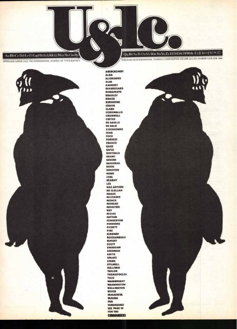
SEE PAGE 18<br />
FOR THE<br />
COMMANDERS<br />
Qq Rr SsTt UuVv WwXxYy Zz 1234567890&fECE$4( E.%!?( )[I<br />
PUBLISHED BY INTERNATIONAL TYPEFACE CORPORATION, VOLUME ELEVEN, NUMBER FOUR, FEB 1985
VOLUME ELEVEN. NUMBER FOUR, FEBRUARY,1985<br />
EDITOR: EDWARD GOTTSCHALL<br />
ART DIRECTOR: BOB FARBER<br />
EDITORIAL DIRECTORS: AARON BURNS. EDWARD RONDTHALER<br />
ASSOCIATE EDITOR: MARION MULLER<br />
ASSISTANT EDITOR: JULIET TRAVISON<br />
CONTRIBUTING EDITOR: ALLAN HALEY<br />
RESEARCH DIRECTOR: RHODA SPARBER LUBALIN<br />
BUSINESS MANAGER: JOHN PRENTKI<br />
ADVERTISING/PRODUCTION MANAGER: HELENA WALLSCHLAG<br />
ASSISTANT ART DIRECTOR: ILENE MEHL<br />
ART/PRODUCTION: TERRI BOGAAR DS, SID TIMM<br />
SUBSCRIPTIONS: ELOISE COLEMAN<br />
0 INTERNATIONAL TYPEFACE CORPORATION 1985<br />
U&LC (ISSN 0362 6245) IS PUBLISHED QUARTERLY BY INTERNATIONAL TYPE-<br />
FACE CORPORATION. 2 DAG HAMMARSKJOLD PLAZA, NEW YORK, N.Y. 10017.<br />
A JOINTLY OWNED SUBSIDIARY OF LUBALIN, BURNS & CO., INC. AND PHOTO-<br />
LETTERING, INC. U.S. SUBSCRIPTION RATES 510 ONE YEAR: FOREIGN SUBSCRIP-<br />
TIONS, 515 ONE YEAR: U.S FUNDS DRAWN ON U.S. BANK. FOREIGN AIR MAIL<br />
SUBSCRIPTIONS-PLEASE INQUIRE. SECOND-CLASS POSTAGE PAID AT NEW YORK,<br />
N.Y. AND ADDITIONAL MAILING OFFICES. POSTMASTER: SEND ADDRESS<br />
CHANGES TO U&LC, SUBSCRIPTION DEPARTMENT, 866 SECOND AVENUE.<br />
NEW YORK. N.Y. 10017.<br />
ITC FOUNDERS:<br />
AARON BURNS, PRESIDENT<br />
EDWARD RONDTHALER, CHAIRMAN EMERITUS<br />
HERB LUBALIN, EXECUTIVE VICE PRESIDENT 1970-1981<br />
ITC OFFICERS 1985:<br />
GEORGE SOHN, CHAIRMAN<br />
AARON BURNS. PRESIDENT<br />
EDWARD GOTTSCHALL, EXECUTIVE VICE PRESIDENT<br />
BOB FARBER, SENIOR VICE PRESIDENT<br />
JOHN PRENTKI, SENIOR VICE PRESIDENT AND GENERAL MANAGER<br />
EDWARD BENGUIAT, VICE PRESIDENT<br />
ALLAN HALEY, VICE PRESIDENT<br />
MICROFILM COPIES OF U&LC MAY BE OBTAINED FROM MICRO PHOTO DIVISION,<br />
BELL & HOWELL, OLD MANSFIELD ROAD, WOOSTER, OH 44691<br />
EDITORIAL<br />
When typists become type directors. Page 2<br />
THOUGHTS<br />
Plain talk from plain Twain. Page 3<br />
ALICE, A WONDERHAND IN WONDERLAND<br />
All about a woman who "owns" a special corner of<br />
The Morgan Library. Page 4<br />
ALPHABET PUZZLE<br />
This alphabet goes beyond A-B-C. Page 8<br />
MAN BITES MAN<br />
Heller on Osborn, and Osborn on the world. Page 10<br />
TYPOGRAPHIC MILESTONES<br />
The legend of John Baskerville, the unattractive man with<br />
the endearing face. Page 14<br />
WHO'S IN CHARGE HERE?<br />
This search is for commanders. Page 18<br />
FYMI<br />
A little knowledge about typography is better than none at<br />
all. Herein, a bit of history and character analysis. Page 20<br />
COLLOQUIALISMS OF THE COFFEE SHOP<br />
It's English...but what does it mean? Page 22<br />
THE METAMORPHOSIS OF A BOOK<br />
An artist's endless search for form and meaning. Page 24<br />
FATE OF THE EARTH CONTEST<br />
A student design competition. Page 28<br />
WHAT'S NEW FROM ITC<br />
ITC Leawood:" an alphabet with classic typeface proportions,<br />
small, well defined serifs for close character fit and<br />
easy legibility. Page 30<br />
THE UPS AND DOWNS OF THE HOT AIR BALLOON<br />
From the first launch to the most recent transatlantic flight,<br />
with fun and games in between. Page 36<br />
BOOK SHELF<br />
The new crop of publications. Page 45<br />
B. Martin Pedersen designed this issue of U&Ic.<br />
INDEX TO ITC TYPEFACES<br />
ITC AMERICAN TYPEWRITER* 28<br />
ITC AVANT GARDE GOTHIC* 20, 28, 29, 36. 40<br />
ITC AVANT GARDE GOTHIC CONDENSED 41<br />
ITC BAUHAUS* 42.43<br />
ITC BOOKMAN" 10 -13<br />
ITC / LSC CASLON NO. 223 6 22.24<br />
ITC CASLON NO. 224* 20. 21. 24.27<br />
ITC CHELTENHAM CONDENSED' 38. 39<br />
ITC FRANKLIN GOTHIC° 2. 21, 22. 23. 38<br />
ITC GARAMOND* 22<br />
ITC KABEL* FRONT COVER. 18 -19<br />
ITC LEAWOOD 2. 3. 30-35<br />
ITC LUBALIN GRAPH BACK COVER<br />
ITC MACHINE" FRONT COVER<br />
ITC MODERN NO. 216* 8 . 9<br />
ITC NEW BASKERVILLE" 14.17<br />
ITC NEWTEXT 2<br />
ITC SOUVENIR* 44<br />
ITC TIFFANY 20<br />
ITC USHERWOOD" 45.46<br />
ITC WEIDEMANN* 36.37<br />
ITC ZAPF CHANCERY* 4. 5. 7<br />
MASTHEAD: ITC NEWTEXT REGULAR TABLE OF CONTENTS: ITC LEAWOOD BOOK WITH BOLD<br />
EDITORIAL: BOOK WITH ITALIC. BOLD INDEX TO ITC TYPEFACES: ITC FRANKLIN GOTHIC BOOK<br />
EDITORIAL<br />
TYPEFACES<br />
YESTERDAY,<br />
TODAY,<br />
TOMORROW<br />
B eneath the surface of the visible<br />
changes in typeface designs and<br />
typesetting technology a profound<br />
user-oriented transformation has been<br />
taking place.<br />
The best printed communications in<br />
all media, for many centuries, have been<br />
designed by people knowledgeable<br />
about printing processes, letterforms and<br />
typesetting. Taste, craft skill, judgment,<br />
and a design sense combined with sensitivity<br />
and affection for typographic<br />
nuance to make the best pieces a wonderful<br />
blend of beauty and communication<br />
effectiveness.<br />
Just as the painter can choose colors<br />
from a palette affording thousands of<br />
colors/tints/shades so can a typographic<br />
designer select from a library offering<br />
thousands of type styles.<br />
Many designers drew widely across<br />
the spectrum of available type styles to<br />
choose the most appropriate typefaces<br />
for this book or that advertisement or<br />
promotional piece. Others studied the<br />
large typeface pool and chose to work<br />
with just a few.<br />
But now we are entering an era when<br />
typeface decisions—which faces to use<br />
and how to use them—will be made, for<br />
some years, by people less knowledgeable<br />
about, and less sensitive to, the<br />
beauty and the power of typefaces. During<br />
the transition period, while they<br />
learn to enjoy type and use it effectively,<br />
they could be further handicapped by<br />
not having available to them the full<br />
typographic palette, nor even a wisely<br />
chosen basic-spectrum typeface library.<br />
As non-impact printers and computers<br />
incorporate typesetting abilities<br />
into their hardware, and typefaces into<br />
their software, they hazard bringing to<br />
the user machines with skewed abilities.<br />
After all, it is the output of the machine<br />
that one must live with, and if the output—the<br />
available typefaces—are too few<br />
or not well chosen, the value of the<br />
machine, regardless of its technological<br />
attributes, may be seriously limited.<br />
It behooves typesetters, printers, and<br />
computer manufacturers, today and<br />
tomorrow, as it has typesetter manufacturers<br />
over these many decades, to offer<br />
their market an adequate and well balanced<br />
selection of typefaces. This would<br />
be in everyone's interest.<br />
But mere availability is not enough.<br />
Good food brings no nourishment until it<br />
is wisely eaten. And so it is with typefaces.<br />
The industry owes its customers<br />
not on a large library, but also a typographic<br />
education, so that the library may<br />
be used to nourish communications that<br />
are both effective and beautiful. E.G.
THOUGHTS<br />
MARK TWAIN<br />
ILLUSTRATION COURTESY NEW YORK PUBLIC LIBRARY<br />
"The man with<br />
anew idea is a<br />
crank until the<br />
idea succeeds"<br />
3
4<br />
Mice, a Wonderhand in Wonderland Anyone who has never visited the Pielpont Morgan Library in New York City has something<br />
to look forward to in life. Everyone who knows the place might very well wish to keep<br />
its existence a secret, as this mansion on the corner of 36th Street and Madison Avenue is a<br />
very special -place—one of the very few remaining uncrowded, uncommerciafized treasures of<br />
New York<br />
Once you step inside the bronze gates of this marble Renaissance wonderland, you are<br />
transported to another time and another place. Pierpont Morgan commissioned the budding<br />
to house his priceless collection of early and rare books, musical instruments, Master drawings<br />
and ancient written records. In addition to the books and manuscripts, the great rooms<br />
are filled with Ancient, Medieval and Renaissance sculpture, works in enamel - and gordfrom<br />
the Middle Ages, treasuredpkers of majolica, porcelain and faience, oriental rugs, elegantly<br />
carved and polished paneling and fresh flowers.<br />
g5titor<br />
„.q) s<br />
110 DIZAWI cs<br />
(FROM THE (WSMUSEUM<br />
071-1E OUTC1-1COLLECTION-S<br />
Oi tem er ctoker5,197.
All in one the Morgan is a museum, dedicated to the art of the book and works on paper;<br />
a research library for serious scholars, and a gracious private mansion. It takes an astute and<br />
knowing hand to design posters and display material that do their proper job, are consistent<br />
with the themes of the exhibitions and express the character of the place. Display material<br />
must inform without intruding. Posters must entice without being pushy.<br />
Enter Alice Koeth who, after years of providing the proper pronunciation of her surname,<br />
simplj) dropped it, an. c fprers to be known as just plain Alice. Since 1967, this graphic<br />
designer, letter stylist and calligrapher has been the official scribe of the Morgan Library—<br />
the designer of posters and display lettering for all the library exhibitions.<br />
You might imagine that it takes a certain amount of daring to take on lettering jobs for<br />
an institution that is a repository for sumptuous, historic illuminated manuscripts. But Alice<br />
is undaunted, and from the sample posters we see here, she has every right to be sanguine<br />
about her work. It is not just her agile pen and brush that make these posters so beguiling; it<br />
is the complete cornmand of des ign, with letteorms choreographed to flow andfiff the space<br />
like dancers on a stage.<br />
Her work, like Alice herself, is a woncleut mix of sense and sensibility, to borrow a phrase.<br />
Alice, who has been in the lettering and calligraphy world for a long time, smiles benignly at<br />
the sudden fashionable uproar about calligraphy and the pyrotechnics employed by some<br />
practitioners. Her materials are the traditionalpens and brushes, reeds and quiffs, inks and<br />
fine paper. Yes, she likes to work on vellum, but only when the purpose is appropriate for the<br />
expense involved. Her object is to do a beautiful job... and in the case of the Morgan Library,<br />
ale one. As Alice explained, her posters for the Library are installed in an outdoor<br />
display case, and they must be read by passing pedestrians as well as by passengers rolling<br />
by on a moving Madison Avenue bus.<br />
OLD<br />
A LOAN<br />
MASTER<br />
EXHIBITION<br />
DRAWINGS<br />
OF 131 DRAWINGS<br />
FROM<br />
FROM THE COLLECTION OF<br />
CHATSWORTH<br />
THE DUKE OF DEVONSHIRE<br />
FEBRUARY 1-- MARCH 14,1970<br />
0:wog"<br />
cirrogcAN<br />
AN The<br />
cOOOLE<br />
Aptzsl- 26 - Kay 31 197+<br />
(RI OHN USK1N<br />
Seeir<br />
ate4t to iven<br />
111(61.64 oeit<br />
e4 3 TAM<br />
TON<br />
(Ents<br />
*fitstribiter-<br />
('- nc75 -34,30 1977<br />
CfassicatI<br />
(7Tuptitiott<br />
neL<br />
aintit15<br />
DECENWER 7,1976<br />
10,FEBRI. /ARV :5,1974<br />
5
For all their eloquence and beauty, site does not spend an inordinate amount of time on<br />
these posters. From layout design to finished piece takes her no more than a day. And<br />
although she has had her hand in more calligraphy and lettering design jobs than she can<br />
count, these posters for the Pierpont Morgan Library are especially rewarding, because<br />
they are one-of-a-kind .. and also because of the special empathy she feels for the museum<br />
and its purpose.<br />
Alice is a total New York talent. A graduate of Washington Irving High School, she went<br />
on to study letter design, calligraphy and art history at the Brooklyn Museum Art School<br />
with Arnold Bank.<br />
She has applied her lettering skids to cutting marquetry for wooden cabinets, inscriptions<br />
for stone-cutting, and drawings for decorative walls arufpliques for churches, temples, libraries<br />
and museums. Alice provided the drawing for the Douglas MacArthur Memorial - at West<br />
WINGS<br />
CH1 DREN/sY/BooKs<br />
aevatManuSce<br />
(PRINTED-13thKs<br />
,_ltutoorapitfrianits- ts-<br />
1ND1NG<br />
ermq<br />
FRENCH PAINTING<br />
IN MAN VSCR1PTS<br />
1420.1530<br />
IS NOV011611'1932 30 jaillitity 19S3<br />
Point and incised the patrons' plaque for The Museum of Modern Art, started in 1953.<br />
She has also been active in the publishing world. Her lettering has appeared on book jacket<br />
designs and she contributed the research and drawings of the alphabet headings for the<br />
American. Heritage Dictionary of the English Language, published 6y Houghton Mifflin.<br />
Aside from her pen-in-hand activities, she was the moving force behind the establishment<br />
of the "Lotus Eaters," a coterie of New York City calligraphers. She is aftequent contributor<br />
to exhibitions, including ITC's own "International Calligraphy Today" And she has unselfishly<br />
shared her expertise with others as a member of the faculty of "The Calligraphy Connection."<br />
This international assembly of lettering and calligraphy artists conducted a lecture<br />
and workshop program, in June 1983, at St. Johns University, near Minneapolis, Minnesota<br />
If the words were not already appropriated by the microchip people, we would be tempted<br />
to caff Alic e a most dazzling "word processor."<br />
Marion Muller<br />
HEADLINE ITC ZAPF CHANCERY BOLD<br />
7<br />
TEXT . LIGHT ITALIC
8<br />
ALPHABET<br />
PUZZLE<br />
Boo 04-17#74f-,41ijr..,..4 ,,,..o<br />
,v=4P4173'.'<br />
IVO 4 vil<br />
,,,$.1.illt.faAb ,<br />
r ;',1<br />
,.<br />
.A;tilfr4: 4:1'31.)<br />
gkige.<br />
ol," .<br />
II<br />
\ f<br />
41i/4..1 ,,....!,—<br />
r, .1.4/tA11:47:701■; ''''<br />
. 'i,o, ''<br />
iktyloo red/i);,-%'ir<br />
,I, rah ir),-Atiw .0-<br />
;,<br />
'''',/*Viii.)03icA" ' 4,<br />
-f,;!f.1.0.eek.1,4: / , '<br />
...; fr" i44<br />
1<br />
bask.,7%<br />
,e<br />
.--* ."--.v i!IfIr A oh..A.)b,, Ihrzscpqr<br />
...----,,,,,4.',.,..<br />
,V.V.41Nti,<br />
.0.494,*;...t.t.vt;) ehrlt ,01,-,,,1,4<br />
vAigltsez<br />
#?,19), 1 t'''.11":11k ■V■1,01<br />
tank t,...,:. '..!;',... -<br />
sfidei/P4:::::4111.,,P)),,,,-- ;,-,:4-0.7%.i,4,,,,:::.?4.-;,=„<br />
t',N10,1P4',-.40:4,!,,Aie.<br />
fti o ci;',',,-.-; „...-;-.e , k, V'<br />
,..fr0 oi,<br />
4.1_,;..s.,e.L.......,<br />
rirrx‘c -----tft,. 1.41. niittN'iik 4<br />
,,,,,,,,...4„tz,.;.,,%<br />
To4/00.1tVl4ts:,<br />
, .,.. ..-,g.00lril<br />
..1..tti,44/41,1`.14,14,.3.,. 4<br />
-;' -<br />
"-erif',1„1: !it11::tri,.<br />
■-140.04,141.41/4<br />
fr . `,0444.‘ riAl.,*.3`-,rovArts, 4kt.. 1104.±-_ ,, ,t;.!%1<br />
A<br />
tx, k 1 02A. (4 , '...t.V<br />
..;), labial_ 4<br />
. ,,,,.,, 7,- .4.,„<br />
,,,,'.. .,,.., 44<br />
.6*. ,,,Alv,:-(4......:-<br />
Ard4144,1kell '7&;<br />
-,..roidirsd,-- - -<br />
■-:;;;:4<br />
.... ‘k -11kliegi 1,ffiitto4*.iiital*:<br />
: ‘'<br />
, '-..-..istmwk ',441mge-.4w,sikutto<br />
'N... vhstp*.NN , AVAIVOIftligaik<br />
■ .t, ,,:-.„-_,:-.... .w.v..0,to-t==,nr.: -‘4, -;1,..„„ ;;:.,:;;;;;..--,_-<br />
t4<br />
It's obvious from this alphabet<br />
submitted by illustrator Bob<br />
Byrd, that his clients get their<br />
money's worth. There is nothing<br />
economical about his style. His<br />
drawings are exuberant in imagi-<br />
nation and detail, and it's clear he<br />
takes pleasure in every stroke of<br />
his pen. I suspect he takes plea-<br />
sure in teasing his audience, as<br />
well; for, I must admit, I did not get<br />
the hang of this alphabet right off.<br />
It was simple enough to recognize<br />
the letterforms, A . B . C. . . and so<br />
on. But it was only after some con-<br />
sideration that I made the associa-<br />
tion between the letterforms and<br />
the words they represented. Once I<br />
got the clue that A was for alliga-<br />
tor, B for bricks and C for computer,<br />
it was clear sailing. True, L slowed<br />
me down for a while and, to be<br />
perfectly honest, I had to call his<br />
home for an interpretation of X and<br />
Y. Well, see how many you can deci-<br />
pher without checking the answers.<br />
Bob Byrd has been a freelance
illustrator since 1967. His work has<br />
appeared in magazines—Fortune,<br />
Esquire and Graphis, among others<br />
—as well as in children's books<br />
published by Windmill/Dutton,<br />
Houghton Mifflin, Macmillan and<br />
World Book/Child Craft, as well as<br />
in ads and posters. He has exhibited<br />
with the Society of Illustrators, the<br />
New York Art Directors Club, the<br />
Philadelphia Art Alliance, Philadel<br />
phia College of Art, Moore College<br />
of Art (where he currently teaches<br />
Senior Illustration) and the Rosen-<br />
feld Gallery in Philadelphia. In<br />
New York he is represented by<br />
Richard Mendelsohn of American<br />
Artists, Inc.<br />
\<br />
Marion Muller<br />
_r:Ali<br />
,..,„„„t,......__,<br />
,..,<br />
4„,„,famiz<br />
-1777 . 117:: ps-iflavo t , ., 4 /,-/(!,_- „,„,,, ,,,,)<br />
- ,t, ■;Lr.4*,,,,, - .<br />
N.., IOW ,<br />
--r 4 '<br />
' , ' - .<br />
. . C7-e-4k.tilki ,-!-<br />
111V<br />
Pe E _, I e . . - , k s<br />
WIRI k<br />
wim. ummilk-- - '11-'.ftEN -41‘11 1111'<br />
Keu to Alphabet<br />
A Alligator G Gargoyle N Nutcracker U Unicorn<br />
B Bricks Honey 0 Owl V Vampire<br />
C Computer I Ionic column P Parrots W Wheat<br />
D Dancer Jester Q Quill X X-ray<br />
E Edison K King R Robot Y Yankee Doodle<br />
F Frog L Leonardo S Sousaphone Z Zeus<br />
(r (r% 1/W -':---:<br />
-<br />
1<br />
* /((/ ,. .. .,V , - /- ---,--z. -,--<br />
--..::<br />
, ,(.-.,i,,.7E, ... ''') .04<br />
( 7,-;-. 4.4., k....,,<br />
,((,-<br />
-,,..... .<br />
,,,,__,....__,:.<br />
-.._,..., .... ..::......<br />
....._ ..,. , , ,.....1-,<br />
:, ....„,..... D<br />
/) ,)<br />
M Mermaid<br />
T 7bwer<br />
9
10<br />
Osborn on Conflict<br />
Man<br />
RifDc +<br />
am. a... a.0 14, G11.<br />
C H 11<br />
MEN WHO SHOULD KNOW BETTER SPEAK CASUALLY OF THEIR VARIOUS BOMBS. THEY IGNORE WHAT EVEN ONE BOMB<br />
By the end of World War II, Robert Osborn had<br />
made over 40,000 drawings for United States<br />
Navy aviator training manuals. Within eight<br />
months after the bombing of Hiroshima he pub-<br />
lished War Is No Damn Good!, the first antiwar<br />
book of the nuclear age. Now, almost thirty-<br />
seven years after that first impassioned state-<br />
ment, Osborn on Conflict, his acerbic visual cri-<br />
tique of mankind's ultimate folly, is complete.<br />
It is not difficult to rationalize the apparent<br />
incongruity of the first and last efforts men-<br />
tioned above. While Osborn is a vociferous critic<br />
of all warfare he is, moreover, a committed dem-<br />
ocrat. His progressive principles are rooted deep<br />
in the soil of his Oshkosh, Wisconsin upbring-<br />
ing, and in 1938 their limits were tested. While<br />
tutoring two young Austrian girls in a small<br />
town near the German border, he witnessed an<br />
unforgettable event: "My students took me to a<br />
Hitler rally," he recalls. "I had never seen such a<br />
CAN PRESENTLY DO TO ALL LIFE... LET ALONE THEIR EVER INCREASING 29.000 BOMBS<br />
sight before. The large stadium was draped with<br />
huge swastika banners; the crowd was packed<br />
like sardines; and as the frightful sound of<br />
countless bugles was heard announcing the<br />
arrival of the German Fuhrer, the audience flew<br />
into an orgiastic frenzy. As Hitler spoke of his<br />
plans for a united aryan race, his voice modulatedfrom<br />
conversational tones to a highpitched<br />
screech, and I noticed that my two<br />
charges were weeping tears of pride. I was sickened.<br />
I was convinced that before us was a demon;<br />
and, I was determined to go to war if that<br />
was the only way to rid the world of this evil.<br />
Hitler, who would destroy all but his own idea of<br />
culture, was as bad as any atomic bomb."<br />
The Spanish Civil War further concretized<br />
Osborn's belief that Fascism would destroy art<br />
and culture. "Like many others in the United<br />
States, I was glad when Spain elected a republican<br />
government to replace its longstanding<br />
monarchy. And I was outraged when the ousted<br />
oligarchy—the military, monarchy and church<br />
—with the aid of Germany and Italy, waged war<br />
against its own, to regain power. I volunteered<br />
to fight, but was told I would be more useful to<br />
the republican cause helping the war effort at<br />
home."A few years later, when America entered<br />
World War II, Osborn enlisted in the Navy, determined<br />
to become an aviator. Instead he was<br />
assigned to an information unit headed by<br />
famed photographer Edward Steichen. There<br />
Osborn mastered the art of speed drawing for<br />
training manuals;forced by necessity to render<br />
scores of pictures in a single sitting; showing all<br />
the forms of potential aircraft disasters. "I<br />
would spend hours with pilots and mechanics<br />
making shorthand drawings of every error,<br />
problem, complaint, and other bits of useful<br />
information they would impart about combat<br />
flying."He created Dilbert, a comic character
EACH DAY THEY ADD 3 NEW WAR HEADS TO THEIR ARSENALS.<br />
THE PENTAGON-THE KREMLIN FEEL CONFIDENT.<br />
whose flubs and near fatal pratfalls were object<br />
lessons. But, the comicalities were deadly serious.<br />
"I was a teacher and my curriculum was<br />
designed to keep the men alive. If the ideas<br />
therein were absorbed and remembered, every<br />
little drawing could give them an edge on the all<br />
too commonplace wartime catastrophes."<br />
Curiously, Osborn's Navy drawings are not too<br />
dissimilar from his later and more recent work.<br />
It was under wartime conditions that he not<br />
only developed confidence in his medium, but<br />
also evolved a now emblematic calligraphy and<br />
a swift, expressionistic line. Most importantly,<br />
though, he acquired the rare ability to teach<br />
through art. In this light the only difference<br />
between the wartime manuals and the postwar<br />
War Is No Damn Good! are the circumstances<br />
in which they were made—both are decidedly<br />
lessons in survival.<br />
War Is No Damn Good!,published by Double-<br />
day, Inc., was Osborn's first really critical work<br />
—however, by the time it was conceived he was<br />
decidedly one of the war's seasoned veterans. In<br />
the manner of renowned artist/commentators<br />
of the past, such as Callot, Goya, Daumier, Grosz<br />
and Masereel, who witnessed the unspeakable<br />
battlefield horrors of their respective ages,<br />
Osborn, too, eloquently and stridently cautioned<br />
against further conflagrations. Though Osborn<br />
fought in the last "good" war, he saw the birth of<br />
a new, terrifying specter unleashed in the Hiroshima<br />
and Nagasaki atomic blasts. It was, therefore,fitting<br />
that for the final picture in his book<br />
Osborn enlisted the human skull, an age-old<br />
symbol of destruction, and emblazoned it on the<br />
mushroom cloud, the new icon of doom. His simple<br />
drawing was the first critical image of the<br />
nuclear age. Many more were to follow.<br />
After World War II, Osborn's career as a<br />
cartoonist, illustrator and author grew con-<br />
DISCUSSIONS PROCEED, BUT PROVE FRUITLESS.<br />
THEY HAVE THE EQUIVALENT OF 10 TONS OF T.N.T. FOR EACH PERSON ON EARTH.<br />
11<br />
siderably. He was, decidedly, one of the most<br />
influential and prolific graphic satirists of the<br />
Fifties and Sixties, with creative progeny such<br />
as Tomi Ungerer and Ralph Steadman borrowing<br />
extensively from his gut felt approach.<br />
Osborn had sinecures in significant American<br />
magazines; covers and spreads in many others;<br />
and produced numerous satirical books on various<br />
aspects of the comedie humain—from greed<br />
to sloth, from phobias to vanity. (For more on<br />
his career, read Osborn on Osborn,published in<br />
1982 by Ticknor and Fields.)But, war recurred<br />
in Osborn's art as much as it did in life. During<br />
the Vietnam period he was vengefully prolific.<br />
Even after the peace was signed Osborn could<br />
find none for himself. Now in his late seventies,<br />
not a single ounce of Osborn's youthful indignation<br />
is gone. And when Ronald Reagan entered<br />
the presidential race, and then the arms race,<br />
leaving the human race fearful for its future,
12<br />
AND SO IT BEGINS.<br />
MEN WILL DIE SCREAMING ON PLANNED IMPALEMENTS.<br />
NEUTRON BOMBS WILL GIVE WAY TO HYDROGEN BOMBS. AND YOU WILL NOT ESCAPE.
Osborn began to draw resonant images of protest<br />
in unprecedented numbers. Many of these<br />
pictures were resurrections from the past—<br />
better crafted and more finely tuned revisions of<br />
work done years before. But, as he drew, the old<br />
icons became interwoven with new expressions<br />
of anger—new symbols emerged, and a continuity<br />
took form. Osborn almost automatically<br />
saw in his drawings of primeval beasts the beginning<br />
of human conflict; in those of Roman<br />
gladiators he saw the roots of modern-day military<br />
regalia; in a skeleton dressed as a bullfighter<br />
he described all violent sports and, by<br />
extension, the psychosis of war. His picture-making<br />
was compulsive; each morning, every afternoon<br />
for months and months he added more to<br />
the growing pile. They defied categorization;<br />
some were cartoons and caricatures, others<br />
were paintings; all embodied that unmistakable<br />
emotional vigor. They were large-scale—almost<br />
two by three feet—indictments of humanity's<br />
inhumanity. Osborn on Conflict, a traveling ex-<br />
THE SPECTER WILL BE EVERYWHERE.<br />
hibition and catalogue, is editedfrom these<br />
crayon and brush drawings. The forty-two images<br />
are captioned with brief yet powerful<br />
captions, such as that under the second in the<br />
series, a half-man/half-animal seething with<br />
anger: "Man's ID five million years later still<br />
makes powerful DEMANDS"; and the banally<br />
simple one under the growing pyramid of U.S.<br />
and U.S.S.R. endeavor: "Each day they add 3<br />
new warheads to their arsenals." The pacing of<br />
these short narratives causes tension to slowly<br />
boil, while the drawings become more and more<br />
heated: "The dogs of war spring forth"... "AND<br />
SO IT BEGINS"... "men will die screaming on<br />
planned impalements."<br />
Osborn on Conflict illustrates real "war<br />
fever"; not the erotic frenzy ignited by governments<br />
and fanned by people who yearn for the<br />
false, patriotic exhilaration of war, but rather<br />
the disease that is ever present, yet dormant, in<br />
AND THERE WILL BE NO ONE TO REMEMBER THAT WE WERE EVER HERE.<br />
most of humankind—and which recurs in virtually<br />
every generation. Osborn's image/captions<br />
call forth repressed, but very commonplace feelings:<br />
"Man's follies will defy belief" and"Our<br />
repressed hatreds will engulf us... but this time<br />
the deadly Fantasy will end in animal debris."<br />
Osborn's total statement is, at once, like Otto<br />
Dix's horrific, graphic reportage of the Great<br />
War, and James Thurber's slyly sardonic visual<br />
fable, The Last Flower. But, comparisons are illadvised<br />
in this case. Robert Motherwell describes<br />
the work best in the catalogue introduction:<br />
"... in these drawings by Osborn, the eternal<br />
human erupts in such an unbridled way,<br />
even with their knowing control, that we find<br />
ourselves confronted by one of the most marvelous<br />
of artistic achievements, the unexpected!<br />
And how marvelous to see an old artist shooting<br />
the works!" Osborn has exploded a bomb of his<br />
own, but we have not heard nor seen the last of<br />
him. For as long as there is folly, Osborn will<br />
be taking aim.<br />
13<br />
HEADLINE: ITC BOOKMAN LIGHT ITALIC TEXT/SUBHEAD DEMI ITALIC CAPTIONS: LIGHT
14<br />
TYPOGRAPHIC MILESTONES<br />
JOHN<br />
BAS KERVILLE<br />
OF BIRMINGHAM<br />
LETTER-FOUNDER<br />
& PRINTER<br />
BY ALLAN HALEY<br />
JOHN BASKERVILLE was cranky, vain, and scorned convention. He has<br />
been called a dilletante, an eccentric, and unattractive. His peers<br />
disapproved of him, his type and his printing. Clearly,Baskerville<br />
was not popular.<br />
HE broke the rules of his craft to create what he believed was perfect<br />
printing and, in doing so, alienated almost all of his contempo-<br />
raries.While not enhancing his popularity rating, it was his<br />
breaking with the accepted traditions of printing that changed<br />
the course of typographic development.
IT began with his type design.The face he created was light and delicate,<br />
much more so than previous styles; and had contrasts in<br />
stroke weights which were more pronounced than any current<br />
face. Baskerville's type could not be reproduced properly with<br />
accepted printing technology, so he began to improve the technology.<br />
Baskerville refined the design of the printing press, had<br />
paper developed specially for his needs, and invented the hotpressing<br />
process. His method of printing was so closely connected<br />
with the design and effect of his type that they should not be<br />
considered separately.<br />
JOHN BASKERVILLE was never to know the profound impression he<br />
made on the printing craft. Printers and typophiles of the day<br />
poked fun at his smooth paper, and claimed his light type was<br />
unreadable.<br />
BENJAMIN FRANKLIN was one of the few on Baskerville's side. He met<br />
the Birmingham printer during one of his trips to England.<br />
Franklin purchased several of Baskerville's books, fonts of his<br />
type, and frequently championed his cause among American<br />
printers who also felt that Baskerville's type was unfit for reading.<br />
Franklin and Baskerville corresponded often, and in one<br />
such letter Franklin relates a trick he played on an American<br />
friend. Upon hearing the friend complain that Baskerville's type<br />
could be `:..the means of blinding all the readers in the Nation<br />
owing to the thin and narrow strokes of the letters," Franklin<br />
decided to test the validity of the complaint.<br />
PROBABLY with a twinkle in his eye, he gave the friend a specimen<br />
sheet of Caslon, calling it Baskerville's, and asked for specific<br />
criticism. Franklin wrote that his friend eagerly undertook the<br />
challenge and `!..went over several Fonts, showing me everywhere<br />
he thought Instances of that Disproportion" and declared before<br />
he finished that his eyes were suffering from "Baskerville<br />
Pains."<br />
UNDAUNTED by such feelings, Baskerville persisted in the development<br />
and use of his type. In fact, in the design, production and<br />
use of his type, he set an example of thoroughness which few<br />
have equaled. He worked for over six years on the design, drawing<br />
and re-drawing the basic shapes thousands of times.Only<br />
when he was completely satisfied did he establish his own type<br />
foundry and employ a punch cutter.In the process Baskerville<br />
became the first type designer—as distinct from punch cutter.<br />
IT would be two years more before his first types were cut, and<br />
several more before the first book using them was printed.One<br />
of the reasons Baskerville was able to be so thorough, to take<br />
such pains in developing and using his faces, was that he was an<br />
amateur; this work was for pleasure. He did not accumulate<br />
his sizable fortune from the sale of his books and type.Those<br />
items usually found their way into the "red-column" of his<br />
ledger sheet.<br />
BASKERVILLE'S livelihood derived from the production of japanned<br />
goods, one of Birmingham's chief industries.Japanning is the<br />
decoration of metal articles (candle holders, tea-trays,bread-baskets,<br />
etc.) with multiple coats of varnish.The articles are then<br />
further decorated with paintings of fruits, flowers, and pastoral<br />
scenes.Baskerville had many rivals in the japanning trade and<br />
must have had to concentrate much of his time and commercial<br />
acumen to keep ahead of them.The intensive effort in japan-<br />
ning forced Baskerville to move slowly in his typographic<br />
endeavors—and to work out of love rather than monetary<br />
motivation. It has been suggested that the japanning trade also<br />
gave Baskerville the idea for hot-pressing, a process which he felt<br />
was vital to the proper printing from his types.When paper is<br />
made by hand, as it was in Baskerville's time, it has a rough, uneven<br />
surface. Handmade paper is also so strong and resistant that<br />
it must be dampened prior to printing, which tends to roughen<br />
the surface even more. None of this was compatible with the<br />
printing of Baskerville's delicate types, so he hit on the idea of<br />
pressing the wet sheets between hot copper plates after they<br />
left the press.This smoothed the paper considerably, and also<br />
helped to set the ink.<br />
15<br />
BASKERVILLE had a ready supply of copper plates available as part of<br />
the goods used to manufacture the japanned articles. He was<br />
also familiar with the process of heating and baking the metal in<br />
the decoration process.<br />
WE would find little difference between Baskerville's hot-pressed<br />
paper and the bond paper commonly used today. His contemporaries,<br />
however, found little room for comparison with even<br />
their finest papers.It was referred to as being`:..so glossy and of<br />
such perfect polish that one would suppose the paper made of<br />
silk rather than linen."<br />
BUT then, this provided another area for complaint.Baskerville's<br />
critics argued that his paper was so shiny that it compounded<br />
the problem of dazzling caused by his typeface designs.<br />
INK was the only product of Baskerville's typographic efforts that<br />
escaped criticism. It was the envy of his peers. One printer<br />
almost lovingly described it as `!..partaking of a peculiarly soft<br />
luster, bordering upon a deep purple."<br />
IN the 18th century printers didn't buy ink; they made their own.<br />
Many of the recipes were closely guarded secrets. Baskerville's<br />
was such a secret. It was claimed, for instance, that one of his<br />
tricks was to age the ink for three years prior to putting it to use;<br />
but whatever the total process was, it worked. Even today, few<br />
inks are as dark and as rich as Baskerville's.<br />
BUT making the ink was just the first step. Next, it had to be transferred<br />
from the type to the paper. No easy task in the middle<br />
1700s. Few improvements had been made on the printing press<br />
since Gutenberg's day.It was still essentially two flat surfaces<br />
forced together by a hand-screw, and certainly was too inaccurate<br />
and unreliable to faithfully reproduce Baskerville's type. As<br />
he did with ink, Baskerville made his own printing press.It was<br />
state-of-the-art in 18th century England.<br />
BASKERVILLE himself, with characteristic lack of modesty, describes it<br />
as `!..exactly on the same Construction of other Peoples but perhaps<br />
more accurate than any ever formed since the Invention of<br />
the Art of Printing..:'<br />
Finally, there was paper. Again, the standard product of the day<br />
was not suited to the faithful printing of Baskerville's type. As a<br />
result he spent many hours experimenting with paper and paper<br />
making. He even had a small paper mill built on his property.<br />
Because of those extensive experiments, and the fact that he<br />
was the first to use what is now called"wove" paper in books,<br />
Baskerville is often credited with its invention.<br />
WOVE paper is formed on a closely-woven thin-wire mesh that leaves<br />
the finished sheet quite smooth. In contrast, laid paper (the common<br />
paper of the 18th century) is textured because the fibers lie<br />
on a crude wire mesh as the sheets form.<br />
WHILE Baskerville's name is almost always associated with the introduction<br />
of wove paper, and he certainly had a hand in its development,<br />
records of the paper merchant he dealt with indicate<br />
that the invention was the combined work of several hands.<br />
Thus it was Baskerville who first made ink, printing technology,<br />
and paper conform to the needs of typeface design, instead of<br />
vice versa; a feat that has rarely been matched. It is especially sad<br />
that despite all his time, labor and expense, Baskerville's types<br />
did'not meet with much approval.<br />
THIS, however, may have been for moral as much as esthetic reasons.<br />
18th century Britishers had particular disdain for deviants from<br />
two accepted moral standards: agnostics and adulterers. Baskerville<br />
was both.<br />
IT did not matter that the woman Baskerville lived with had been<br />
deserted by her husband. She was married; but not to the Birmingham<br />
typefounder and japanned goods trader. Baskerville<br />
did marry Sahra Eaves shortly after her husband died,but the<br />
sixteen years of adulterous living could not go unnoticed nor<br />
uncensured in 18th century British society.<br />
THE other flawed aspect of John Baskerville's character was his<br />
opposition to Christianity; an aversion which was lifelong and<br />
consistent.Typical of his feelings are those represented in his<br />
will, `1..I have a hearty contempt for all superstition, the farce of
16<br />
Double Pica Roman.<br />
TANDEM aliquando, Quirites<br />
! L. Catilinam furentem<br />
audacia, fcelus anhelantern, pe-<br />
ABCDEFGHIJKLMN.<br />
Great Primer Roman.<br />
TANDEM aliquando, Quirites! L.<br />
Catilinam furentem audacia, fcelus<br />
anhelantem, peflem patrize nefarie molientem,<br />
vobis atque huic urbi ferrum flam-<br />
ABCDEFGHIJKLMNOP.<br />
Double Pica Italic.<br />
AN DEM aliquando, Quirites! L.<br />
Catilinam furentem audacia, fcelus<br />
anhelantem, pellem patriee nefarie moli-<br />
A B CD E FG HI KL M<br />
Great Primer Italic.<br />
TANDEM aliquando, quirites! L. Catilinam<br />
furentem audacia, fcelus anhelantem,<br />
peflem patrie nefarie molientem, vobis<br />
atque huic urbi ferrum fiammamque minitan-<br />
ABCDEFGHIIKLMNOPQR.<br />
TYPES FROM BASKERVILLE'S BORDERED BROADSIDE SPECIMEN, BIRMINGHAM, C. 1762 TITLE-PAGE OF THE 1763 BIBLE<br />
a consecrated ground, the Irish barbarism of sure and certain<br />
hopes, etc.I also consider revelation as it is called, exclusive of<br />
the scraps of morality casually intermixed with it, to be the most<br />
impudent abuse of common sense whichever was invented to<br />
befool mankind." The will continues for several more sentences<br />
to expound on the "...ignorant and bigoted, who...profess to<br />
believe as they call it certain absurd doctrines and mysteries..:'<br />
JOHN BASKERVILLE was the last child of John and Sahra Baskerville.<br />
(It is interesting to note that John shared his father's; and his<br />
wife, his mother's, name.) He was born late in 1704 or early 1705<br />
in Worcestershire, England. His family was, what we would call<br />
today, upper-middle class.<br />
HE received his first professional recognition at seventeen when his<br />
remarkable calligraphic skill was noticed and he was given the<br />
duties of writing master in the parish school. During this time<br />
he also began to cut gravestones.There are no known examples<br />
of his work extant, but there is a slate slab preserved in the Birmingham<br />
Reference Library which was intended as an advertisement<br />
for his services.<br />
WHEN he was approximately thirty-four, Baskerville's father died,<br />
leaving him a substantial sum of money. It was also about this<br />
time that he entered the japanning trade, which provided him<br />
with a handsome living for the rest of his life.<br />
BASKERVILLE was well past forty when he began to interest himself in<br />
THE<br />
CONTAINING "TIE<br />
OLD TESTAMENT<br />
A N<br />
THE NEW'<br />
A N D<br />
With the former TRANSLATIONS<br />
Diligently Compared - and Revifed,<br />
By His Af A JES T r'5 Special Command.<br />
4444444444 ,444.4444,4,..r4.1,4:4-4.44.1.444:44. 414-4,;,44.4.<br />
APPOINTED TO BE READ IN CHURCHES.<br />
CAMBRIDGE,<br />
Printed by JOHN BASKERVILLE, Printer to the UNIVERSITY.<br />
M DCC LXIII.<br />
CON PRIVILZGIO.<br />
typography.The first example of his work (the Latin Virgil) was<br />
published in 1757.In 1758 he followed with a two-volume edition<br />
of Milton. In the preface he wrote, "Amongst the several<br />
mechanical Arts that engaged my attention, there is no one<br />
which I have pursued with so much steadiness and pleasure, as<br />
that of Letter-Founding. Having been an early admirer of the<br />
beauty of Letters,I became insensibly desirous of contributing<br />
to the perfection of them.I formed to my self Ideals of greater<br />
accuracy than had yet appeared, and have endeavored to produce<br />
a Sett of Types according to what I conceived to be their<br />
true proportion:'<br />
BY 1758, Baskerville had produced eight fonts of type. It was now<br />
that he offered his designs for sale and received the rebuff<br />
which later caused him to repent the day he entered the printing<br />
and typefounding business. Nevertheless, he continued to<br />
practice his craft until his death at age 69. He was buried in a<br />
mausoleum he had erected on his own grounds.<br />
THE story, however, is not complete. Several years after his death,<br />
Baskerville's estate was sold and eventually converted to canal<br />
wharves. Sometime during this period the mausoleum was demolished.The<br />
remains, however, lay undisturbed or undetected,<br />
until 1820 when workers discovered the grave while digging for<br />
gravel. At this time the coffin was moved to a warehouse where it<br />
was opened, the contents viewed, and then resealed.The coffin
PUBLII VIRGILII<br />
MARONIS<br />
BUCOLICA,<br />
GEORGICA,<br />
AENEIS.<br />
BIRMIIV - GHAMIAE:<br />
Typis JOHANNIS BASKERVILLE.<br />
TITLE-PAGE OF BASKERVILLE'S VIRGIL<br />
MDCCLVII.<br />
remained in the warehouse for eight years.It was then moved to<br />
the shop of a plumber, where it was again opened and a local<br />
artist made a pencil sketch of the body.It is said that a number<br />
of those present at the opening became severely ill; and one, a<br />
Dr. Male, died after putting a torn piece of the death shroud in<br />
his pocket.<br />
THE casket was moved again before reinterment in the Church of<br />
England cemetery, in a vault below the chapel.This was in February<br />
of 1898.Finally,Baskerville was laid to a peaceful rest.<br />
As with Baskerville the man, his type was also a long time achieving<br />
a peaceful rest. After his death, his wife turned over much of<br />
Baskerville's type to Robert Martin, his senior workman.Four<br />
years later Mrs. Baskerville sold the type and foundry equipment<br />
to a publisher for the purpose of printing the works of<br />
Voltaire. Fifteen years after his death Baskerville's type, punches<br />
and matrices were moved to Paris where they were used for<br />
printing during the revolutionary period. Gradually the type fell<br />
into disuse and was passed from one French printer to another<br />
until the French foundry of Deberny and Peignot purchased the<br />
punches and matrices in 1936. Finally in 1953,Deberny and<br />
Peignot presented all the punches to the Cambridge University<br />
Press.<br />
BASKERVILLE'S typefaces were the catalyst for more than a new style<br />
of typeface design; they changed the course of typographic<br />
PREFACE.<br />
AMONGST the feveral mechanic Arts<br />
that have engaged my attention, there is<br />
no one which I have purfued with fo much<br />
fteadinefs and pleafure, as that of Letter-Founding.<br />
Having been an early admirer of the beauty<br />
of Letters, I became infenfibly defirous of contributing<br />
to the perfe&ion of them. I formed<br />
to my felf Ideas of greater accuracy than had<br />
yet appeared, and have endeavoured to produce<br />
a Sett of Types according to what I conceived<br />
to be their true proportion.<br />
Mr. Callon is an Artift, to whom the Republic<br />
of Learning has great obligations; his ingenuity<br />
has left a fairer copy for my emulation,<br />
than any other matter. In his great variety of<br />
Charagers I intend not to follow him; the Roman<br />
and Italic are all I have hitherto attempted;<br />
if in thefe he has left room for improvement,<br />
it is probably more owing to that variety<br />
which divided his attention, than to any other<br />
caufe. I honor his merit, and only with to<br />
derive fome fmall (hare of Reputation, from<br />
an Art which proves accidentally to have been<br />
the object of our mutual purfuit.<br />
After having fpent many years, and not a<br />
A 3<br />
little<br />
PAGE OF BASKERVILLE'S PREFACE TO MILTON, BIRMINGHAM,I758<br />
development. If he had merely imitated, or even improved upon,<br />
his contemporaries' work, there would be little to say about him<br />
today.John Baskerville, however, abandoned tradition and began<br />
a movement which was to revolutionize printing and typography<br />
of the 18th century. Although his faces were not used,<br />
indeed they were not even liked, his typographic arrangements<br />
and design style became a primary influence on the work of<br />
Bodoni and Didot.Baskerville's typefaces stand almost alone as<br />
a representation of the "transitional style" of typeface design;<br />
bridging the gap between the"Oldstyles" of designers like<br />
Caslon, and the "Moderns" of Bodoni and Didot.<br />
BASKERVILLE'S "unattractive and painful" typeface is today one of the<br />
most popular and most used serif typestyles.It is represented in<br />
virtually every type library and can be reproduced on practically<br />
any form of type imaging device. Baskerville has become a staple<br />
of text typographic communication.<br />
PERHAPS Baskerville's scorn for convention was not, in itself, admirable;but<br />
the positive and innovative steps he took to replace<br />
typographic convention certainly were. Many sources refer to<br />
Baskerville as tenacious. He was that, and more. Baskerville was a<br />
positive thinker and doer. He replaced the wrong, inaccurate<br />
and imperfect, with definite and justified improvements. In addition<br />
to his beautiful, and now popular typeface, we should<br />
remember John Baskerville for his spirit and positive drive.<br />
HEADLINE ITC NEW BASKERVILLE ROMAN WITH ITALIC<br />
17<br />
TEXT/SUBHEAD/BYLINE/CAPTIONS' ROMAN WITH SMALL CAPS
18<br />
A WORD SEARCH BY JULIET TRAVISON<br />
WHO'S<br />
IN<br />
CHARGE<br />
HERE?<br />
How to play: Find and encircle, in<br />
the puzzle body, the words appearing<br />
in the Puzzle Word List. They<br />
appear vertically, horizontally, diagonally<br />
and even backwards. Don't<br />
cross letters out—they may be used<br />
again as part of another name!<br />
To give you a head start, we have<br />
shaded one of the puzzle words.<br />
While these words may be spelled<br />
differently in other languages,<br />
please follow the versions in our<br />
Puzzle Word List.<br />
Lissungsanweisungen: Sie mfissen in<br />
dem Ratsel die in dem Worterverzeichnis<br />
angegebenen Miner finden<br />
und umkreisen. Diese konnen<br />
senkrecht, waagerecht, diagonal<br />
und sogar riickwarts vorkommen.<br />
Streichen Sie keine Buchstaben aus<br />
—sie konnten als Teil eines anderen<br />
Wortes gebraucht warden.<br />
Um lhnen zu einem Anfang zu<br />
verhelfen, haben wir eines der Ratselworter<br />
schattiert.<br />
Obwohl Wrier in anderen Sprachen<br />
unterschiedlich geschrieben<br />
werden mogen, halten Sie sich bitte<br />
an die englische Schreibweise.<br />
lela■mmemazika-a=monimammisimim<br />
ALCIBIADES CROMWELL CORNWALLIS TOJO<br />
ALL THE HEADSHOTS OF THE COMMANDERS ADORNING THIS PUZZLE ARE COURTESY OF THE BETTMANN ARCHIVE, NYC. SEE PAGE 45 FOR A REVIEW OF TWO VERY EXCITING BETTMANN BOOKS<br />
Regle du jeu: Retrouvez dans le<br />
puzzle et entourez d'un trait les mots<br />
qui figurent dans le Puzzle Word List.<br />
Its se lisent verticalement, horizontalement,<br />
diagonalement et<br />
mime a I'envers. Ne barrez aucune<br />
lettre! Chacune peut resservir dans<br />
un autre mot.<br />
Pour vous mettre sur la voie, nous<br />
avons teinte un des mots du puzzle.<br />
Les mimes mots peuvent avoir des<br />
orthographes differentes salon les<br />
langues. Tenez-vous en a l'orthographe<br />
que donne le Puzzle Word<br />
List.<br />
SOLUTION TO PUZZLE ON PAGE 46.
PICKETT<br />
ABERCROMBY<br />
ABERCROMBY CUSTER HOOD NICIAS STARK<br />
ALBA DE GAULLE HOUSTON PATTON STILWELL<br />
ALCIBIADES DE KALB HOWE PEMBERTON SULLIVAN<br />
ALVA EISENHOWER JODL PERSHING TAYLOR<br />
AMHERST FENG KEARNY PICKETT THEMISTOCLES<br />
BEAUREGARD FOCH LEE PIKE TOJO<br />
BONAPARTE FORREST MAC ARTHUR RIDGWAY WAINWRIGHT<br />
BRADLEY FRANCO MC CLELLAN ROCHAMBEAU WASHINGTON<br />
BRAGG GAGE MEADE RUPERT WELLINGTON<br />
BURGOYNE GATES MILTIADES SCOTT WOOD<br />
CHANG GOETHALS MONCK SHERIDAN YAMASHITA<br />
CLARK GRANT MOREAU SHERMAN YASUDA<br />
CORNWALLIS GREENE MOULTRIE SMITH YEN<br />
CROMWELL HANNIBAL NEY SPAATZ YEREMENKO<br />
L SUNJODL ABERCROMBYASUDAW<br />
YPSEDA I T L IMROUS EDA I B ICLA<br />
EADY EN I A L EONRP EMBER TONDS<br />
L AWORHCMEMOKNEME R E Y TNU T H<br />
D T F GS EOHWA I NWR I G H T W T AAA<br />
F I<br />
AZOADR E E L YGGAT E S AHNER C RN<br />
RNMJ E I L R I S U L L IVANEBKDL AG<br />
B AAAOL R S T SMAL KCNOMUCGANT<br />
Y F U L EGEGK<br />
T SHERIDANA! R I NR CO<br />
B OKWLOR GOOANSH I HCSGP I K ON<br />
O RESL EOENWD I HOC THTOIHCAL<br />
N RAUUTL E E E E S COT T AOYKSMHA<br />
AERGAHA CNN F CR DWANCNE R DCB<br />
P<br />
SNLGAGECCEUNEV EGLEEE 10 I<br />
ATYLELHT IMSSALBAREHGPOFN<br />
RWOODS A I C I N T AAY<br />
L OR S PA T TON<br />
T L DDR AG E R U A EBWE L L I N G TONA<br />
E I R TL UOMAC AR THURMNOT S UOH<br />
RIDGWAY WASHINGTON LEE<br />
19
20<br />
MOST people think Johann Gutenberg<br />
invented printing. He didn't. Nor was he<br />
responsible for the invention of the printing<br />
press. In fact, contrary to a majority<br />
of history books, he didn't even invent<br />
movable type; it was first used in China<br />
hundreds of years before his time.<br />
GUTENBERG developed a way to create<br />
in metal the many diverse letters used in<br />
European languages using an adjustable<br />
mold. (A much more complex task<br />
than making molds for the consistently<br />
square word symbols used in Korean)<br />
Gutenberg's invention is so momentous<br />
it is ranked in stature with the creation<br />
of the wheel.<br />
THE reason movable type is held in such<br />
high esteem is that its use made, for the<br />
first time, centuries of knowledge and information<br />
available to Western civilization.<br />
For the first time in history we were<br />
able to record, and interpret, our findings,<br />
and cross the boundaries of time<br />
and space. Movable type was a catalyst<br />
of the cultural and educational revolution<br />
which freed us from the Dark Ages.<br />
The invention of movable type made the<br />
INTRODUCTION<br />
for<br />
your<br />
(typographic)<br />
information.<br />
BY ALLAN HALEY<br />
Renaissance possible, and paved the<br />
way for all modern technology.<br />
IN the process, type has become one of<br />
our most effective and efficient communicators;<br />
few media have its range and<br />
capability. Yet type does not work by<br />
magic; it must be used properly to communicate<br />
best. Which is why fy(t)i was<br />
developed: to help those responsible for<br />
establishing and maintaining the quality<br />
of typeset communication to increase<br />
the effectiveness of that communication.<br />
fy(t)i will be a learning package aimed at<br />
helping those who work with type professionally<br />
to use type efficiently.<br />
EACH fy0i feature will be devoted to a<br />
different aspect of the typographic spectrum.<br />
A wealth of pertinent information<br />
will be provided. Each section will be<br />
clear, concise, and heavily illustrated.<br />
Sections will be released in a sequence<br />
designed to best meet immediate and<br />
long-range informational needs.<br />
THE goal of fy(t)i is to make the many<br />
facets of typographic communication<br />
easy to understand, simple to take<br />
advantage of and rewarding to use.
PARTS OFA CHARACTER<br />
"THE thingamajig with the little bump" could describe an automobile<br />
shift lever, a record player turntable, the ear and bowl of a lowercase g,<br />
or any number of a variety of other things. Using correct nomenclature<br />
is vital to communication—especially technical communication; which<br />
is why most people who use automobiles and record players would<br />
choose the correct terms to describe a shift lever or turntable; it makes<br />
for simpler, more efficient communication.<br />
FOR the same reasons, if you use type, it makes sense to use the correct<br />
terms in your type-related communication. There are not that many<br />
terms to learn, and most have simple and obvious meanings. The terminology<br />
of type is not difficult—but it is necessary. Since letters are the<br />
foundation of all typographic communication, they are the logical place<br />
to begin to build your typographic vocabulary.<br />
CONTRARY to most typographic terms, the parts of a character can<br />
appear to have somewhat arbitrary names. The ear of a g could just as<br />
well be called a "knob" or "handle" The names of the different parts of a<br />
character, however, have a long and well-documented history. Reams of<br />
paper have been consumed describing and identifying the various parts<br />
of the letterform; manuscripts exist which date back to the fifteenth century.<br />
Many of those terms, however, have become outdated or are too<br />
technical for normal use. What follows is a condensed version of many<br />
previous lists of letterform nomenclature. The twenty, or so, terms presented<br />
will provide you with enough letterform vocabulary for all but the<br />
most erudite of typographic discussions.<br />
Arm<br />
Ascender<br />
Hairline<br />
Spur<br />
Stem<br />
HEADLINE' ITC TIFFANY HEAVY<br />
Link<br />
Stress<br />
ARM—a horizontal stroke that is free on one end.<br />
ASCENDER—the part of the lowercase letters b,df,h,k,I and t that<br />
extends above the height of the lowercase x.<br />
BAR—the horizontal stroke in the A,H,e,t, and similar letters.<br />
BOWL—a curved stroke which makes an enclosed space within a<br />
character. The bump on a P is a bowl.<br />
COUNTER—the fully or partially enclosed space within a character.<br />
DESCENDER—the part of the letters g,j,p,q,y, and sometimes J, that<br />
extends below the baseline.<br />
EAR—the small stroke projecting from the top of the lowercase g.<br />
HAIRLINE—a thin stroke usually common to serif typestyles.<br />
LINK—the stroke connecting the top and bottom of a lowercase g.<br />
LOOP—the lower portion of the lowercase g.<br />
SERIF—a line crossing the main strokes of a character. There are many<br />
varieties.<br />
SHOULDER—the curved stroke of the h,m, and n.<br />
SPINE—the main curved stroke of a lowercase or capital S.<br />
SPUR—a small projection off a main stroke; found on many capital G's.<br />
STEM—a straight vertical stroke, or main straight diagonal stroke in<br />
a letter which has no vertical strokes.<br />
STRESS—the direction of thickening in a curved stroke<br />
STROKE—a straight or curved line.<br />
SWASH—a fancyflourish replacing a terminal or serif.<br />
TAIL—the descender of Q or short diagonal stroke of the R.<br />
TERMINAL—the end of a stroke not terminated with a serif.<br />
X-HEIGHT—the height of the lowercase letters excluding ascenders and<br />
descenders.<br />
Terminal<br />
BYLINE ITC AVANT GARDE GOTHIC BOLD<br />
Counter<br />
Stroke<br />
Descender<br />
x A<br />
x-Height<br />
S houlder<br />
Swash<br />
21<br />
TEXT' ITC CASLON NO 224 BOOK ITALIC WITH ROMAN SUBHEADS: BOOK CALL-OUTS . ITC FRANKLIN GOTHIC BOOK
COLLOQVIALISMS<br />
22<br />
COFFEE<br />
SHOP<br />
It's a generally accepted fact tbat, al:bough English is tbe official<br />
language of the United States, not everybody in the U.S.A.<br />
speaks it quite the same way. Easterners sound different from<br />
Midwesterners, who sound different from Westerners. Nobody<br />
sounds quite like Southerners, and Bostonians make their own unique<br />
sounds. Beyond differences in pronunciation, vocabularies<br />
differ from region to region. —from age group to age group. . .from<br />
occupation to occupation. One American phenomenon is the<br />
fast food restaurant, or "coffee shop," where countermen, chefs and<br />
fountain men (or women) speak a language all their own.<br />
Some of these expressions go back decades, and even here, some are<br />
strictly regional.<br />
M. M .<br />
P<br />
III_<br />
7--------WIremellmemWIlmem11.11w ee meedullinele IMEM 11 11 11111111 111 1 1. 11N1<br />
■<br />
IniN N.<br />
IV<br />
M<br />
%<br />
III A HAMBURGER NI.<br />
A<br />
ITC AMERICAN TYPEWRITER BOLD CONDENSED N. ■<br />
DOWN<br />
U<br />
... .. %<br />
■<br />
HAM AND CHEESE ON TOAST<br />
ITC C KORINNA HEAVY I<br />
MI<br />
■■<br />
i ■ ON . ■ STACK E. I<br />
0<br />
■<br />
■IN<br />
■<br />
l<br />
M TWO FRIED EGGS ON TOAST II:<br />
N ITC CHELTENHAM ULTRA CONDENSED<br />
■ AN ORDER OF PANCAKES<br />
■<br />
ITC KABEL ULTRA ■ MI<br />
M<br />
■<br />
:<br />
■ s<br />
M ■<br />
N<br />
JUICE<br />
I<br />
■<br />
U M<br />
■<br />
O<br />
0 0 11:<br />
■ FRIED EGGS TURNED OVER BRIEFLY ITALIA BOLD ■ MILK II<br />
■ ITC FRANKLIN GOTHIC HEAVY M.<br />
_ III<br />
11-11-<br />
■ 1■ ■<br />
In<br />
■ ■■■■■■■■■■■ ■ .. MI mmill.m.. 11____ _ IN ■ _MLR_ Emom......<br />
On A COMBO ..<br />
UN D . : A M & EvE ..<br />
A T<br />
1 : OVER EASY<br />
N. N.<br />
N..<br />
.
11% rn omm mi.m. ■■=ire.L.M.E.E.11N<br />
2. AC ■<br />
:z: AWHISKEY ::<br />
■ AMERICAN CHEESE SANDWICH ITC/LSC CASLON NO.223 X-BOLD ■<br />
■ .:<br />
. 1: DO<br />
AN ORDER OF RYE TOAST ITC GARAMOND ULTRA CONDENSED<br />
._. 1 T BOVVN<br />
.<br />
%<br />
.. .<br />
BACON, LETTUCE AND TOMATO ON TOAST TC CENTURY ULTRA CONDENSED<br />
% I IIII<br />
: CB<br />
■<br />
.<br />
■ ■<br />
% GRILLED AMERICAN CHEESE SANDWICH ITC MACHINE BOLD % U.<br />
Nii : .<br />
■ M. B<br />
M I . CHEESEBURGER<br />
Ill<br />
M<br />
ITC AVANT GARDE GOTHIC BOLD<br />
M; ,<br />
A GLASS OF WATER<br />
■ r ,<br />
■ 7: BRIT" H<br />
. 86<br />
.<br />
.<br />
■<br />
I I:I II<br />
6 0 OR Sil<br />
ITC/LSC CASLON NO.223 X-BOLD II<br />
BLACK C olvv, ITC FRANKLIN GOTHIC HEAVY<br />
TOASTED ENGLISH MUFFIN ITC BENGUIAT BOLD WE'RE OUT OF IT (RHYMES WITH NIX)<br />
.;<br />
MELT ■<br />
GRILLED CHEESE SANDWICH<br />
I , , COLA DRINK WITH VANILLA ICE CREAM<br />
.<br />
1<br />
i<br />
: 1 WRECK<br />
■<br />
11.- A<br />
ITC BAUHAUS BOLD<br />
CHOCOLATE SODA WITH CHOCOLATE ICE CREAM<br />
ITC/LSC CASLON NO.223 X-BOLD<br />
: IR A SH ■<br />
ITC BOOKMAN BOLD e<br />
ITC MANHATTAN U. A SMALL COKE<br />
. 0<br />
BLONDE<br />
.<br />
ii:<br />
■<br />
leis<br />
ITC ERAS ULTRA<br />
% COFFEE WITH CREAM<br />
PAIR . . , ,<br />
BOSSY IN I<br />
II ,<br />
I<br />
■ A ■ I<br />
, BOWL .<br />
CHOCOLATE SODA WITH COFFEE ICE CREAM<br />
ITC SERIF GOTHIC BLACK<br />
I<br />
1■. I<br />
ITC LUBALIN GRAPH BOLD<br />
BEEF STEW<br />
1 1 1<br />
noBoKEN ... .. BRuNETTE III<br />
% TWO SCRAMBLED EGGS ITC CLEARFACE BLACK ME MI<br />
:: BROADWAY<br />
■<br />
mi<br />
■<br />
PINEAPPLE SODA WITH CHOCOLATE ICE CREAM<br />
Ms ... C H I CAG 0<br />
■<br />
.<br />
ALL PINEAPPLE SODA OR SUNDAE<br />
ITC TIFFANY HEAVY<br />
■<br />
II COFFEE WITH NO CREAM<br />
i<br />
ITC CHELTENHAM ULTRA ■MU<br />
A Fumr Ell A BOWL OF CEREAL<br />
'<br />
11111<br />
.<br />
■<br />
111<br />
II<br />
.<br />
■<br />
■<br />
I<br />
■<br />
ITC QUORUM BLACK %<br />
A BOWL OF %<br />
..<br />
BIRD SEED<br />
II<br />
■<br />
■ ■<br />
■ .<br />
■<br />
ITC BENGUIAT GOTHIC HEAVY MI<br />
M<br />
ROOT BEER WITH VANILLA ICE CREAM ITC/LSC BOOK X-BOLD ROMAN ME ■<br />
. I.■...- LACK &<br />
:i<br />
. :<br />
M<br />
■ THE ORDER IS IN PREPARATION<br />
.<br />
. A TEAR(<br />
■ ITC CENTURY ULTRA<br />
CHOCOLATE SODA WITH VANILLA ICE CREAM<br />
ITC SOUVENIR BOLD II TWO OF ANYTHING<br />
ii STRETCH .<br />
ONE,<br />
■ A LARGE COKE<br />
■ ■ ■ ■ ■ ■ ■ ■ ■<br />
ITC FAT FACE THREE OF ANYTHING<br />
11.. ■■■■■ ..11...111mmmm e<br />
ITC BOLT BOLD<br />
■<br />
■<br />
■<br />
1 ;<br />
.<br />
.1<br />
.<br />
.<br />
ITC GARAMOND ULTRA 111 .<br />
HEADLINE ITC CASLON NO 223 X-BOLD TEXT. ITC GARAMOND BOLD CONDENSED ITALIC CAPTIONS ITC FRANKLIN GOTHIC BOOK WITH ASSORTED ITC DISPLAY TYPEFACES
24<br />
metamorphosis amorphosis<br />
of a book<br />
"FAMILY ALBUM" COMBINES FAMILY PORTRAITS WITH DIARY NOTATIONS; THE PAPER IS HANDMADE AND ELEMENTS OF BINDING PROCESS ARE VISIBLE.
I first encountered Lois Polansky's work in the Alexander<br />
Millikin Gallery in New York City, and to be perfectly honest,<br />
I was perplexed. Here was an array of "creations"—kimonos,<br />
capes, skirts and similar forms that looked for all the<br />
world like liturgical garments, but weren't. There were also<br />
objects that looked like fans, but weren't; and books that<br />
looked like books, but weren't—at least not in the sense we<br />
normally think of books. Yet the assemblage of work, the<br />
luminous color, intricate design and cryptic notations on<br />
some pieces were intriguing enough to warrant a visit with<br />
Mrs. Polansky, and an explanation of her work.<br />
Contrary to the enigmatic nature of her art forms, Lois<br />
Polansky is absolutely logical about what she does. Her dénouement<br />
of the evolution of her work is so intelligent and<br />
frank, it makes a fascinating story in and of itself.<br />
Her career as an artist started prosaically enough at Queens<br />
College of the City University of New York. By her own account,<br />
she received an excellent education in the philosophy<br />
of art and theories of form and color. But the thrust of art<br />
education, in those days, was toward self expression and creativity...and<br />
away from training in specific skills. Something<br />
in Lois hankered for a mastery of techniques and<br />
agility with the basic materials of art. She sought out a private<br />
teacher and began to hone her skills in etching and<br />
lithography. From the printmaking experience, it was only<br />
natural she would be seduced into a course in papermaking.<br />
(Along with grinding your own pigments, you can't get much<br />
closer to basics than that.)<br />
Lois dipped into a small inheritance from her grandmother<br />
and plunked down $500for a one-week course in Paper Making<br />
at Bennington College in Vermont. If she had any doubts<br />
about the venture, her confidence was restored when she<br />
found that Riva Castleman, a staff member of The Museum<br />
of Modern Art, and Kenneth Noland, the painter, were fellow<br />
students. Papermaking turned out to be an exhilarating experience.<br />
She worked enthusiastically, mascerating cotton<br />
linters, adding color and plant fragments for a variety of<br />
effects. But when the course was over, and she returned home<br />
with her handmade paper samples, they looked like nothing<br />
at all. In fact, she pronounced them ugly, andfound it hard to<br />
justify the week away from her family, not to mention frittering<br />
away $500 of her grandmother's diligently nurtured savings.<br />
But one day, as she sat examining her paper samples,<br />
she inadvertently arranged them in two piles, side by side. In<br />
a true flash of inspiration, she saw the most obvious use for<br />
them: paper was for making books! Thus began an adventure<br />
that took her far beyond her initial vision.<br />
In her work process, Lois Polansky is like a great flowing<br />
river, with streams and springs feeding in from all directions.<br />
Everything that happens peripherally contributes to<br />
her constantly changing body of work. When she first embarked<br />
on her bookworks, the Women's Movement was in full<br />
swing. Lois read Colette and Simone de Beauvoir. She mulled<br />
over women's role in history... in contemporary society... in<br />
her own family. Her first book was a combination family album<br />
and personal diary. She combined her handmade paper<br />
with etchings of her grandmother and grandfather, and of<br />
her mother in stages of growing up. lb the images, she added<br />
a running personal commentary. The book turned out to be<br />
not only a social and personal document, but also a folio of<br />
her etching techniques.<br />
25
26<br />
FANS DERIVED FROM EARLY BOOK FORM; LEAVES ARE SPLAYED TO REVEAL CON-<br />
TENTS. UPPER: "THE CRYSTAL PALACE FAN" OF HANDMADE PAPER IMPREGNATED<br />
WITH LEAVES. CENTER: "THREE FLORAL FANTASIES:' A FAN WITH FLORAL PARTS<br />
IMPREGNATED IN HANDMADE PAPER. BELOW: A FAN. EXTENDED TO ALMOST<br />
FULL CIRCLE, A FORERUNNER OF THE CAPE AND SKIRT FORMS THAT FOLLOWED.<br />
OPPOSITE: "THE HOLOCAUST ALBUM" DRAMATIZES THE CARNAGE OF THE<br />
HITLER ERA; ASH GRAY HANDMADE PAPER WITH CUTOUT VOIDS WHERE HUMAN<br />
IMAGES SHOULD BE.
Early on in her papermaking experiments, Lois recognized<br />
the possibilities of impregnating actual objects in her paper.<br />
Her second book was dedicated to the tree outside her living<br />
room window. In addition to etchings of the tree in its bare<br />
form and in full foliage, Lois impregnated leaves from the<br />
tree in the leaves of her book, to complete the story.<br />
In another one of her bookworks, she impregnated flower<br />
forms, herbs, leaves and grasses—a symbolic representation<br />
of nature. She also alluded to social and historic events in<br />
some of her books. A Victorian book,for instance, is a synthesis<br />
of romantic flowers, ribbons and decorative embellishments,<br />
reminiscent of the era. In contrast, a Holocaust book<br />
is ashen gray, and the center of each page is cut out, like a<br />
family album with the people missing.<br />
Not one to do anything in a half-baked way, Lois delved into<br />
the history of books and bookbinding. She learned that the<br />
first books were made of palm leaves with written notations<br />
on them. The leaves,fastened together at one end, could be<br />
spread out in a fan shape and read consecutively. (Hence the<br />
word "leaves "for pages of a book.) This discovery of the fan<br />
format had double significance for her. It provided her with<br />
anotherformfor her bookworks, and solved the problem of<br />
how to display her work in a gallery, so that every page could<br />
be seen without being handled.<br />
Her next series of books, in fanform, combined her handmade<br />
paper with leaf and flower parts, and sometimes words<br />
and tidbits of personal ephemera crept into the designs also.<br />
She persisted with the fan motif, and variations of it, until<br />
the sight of a Japanese kimono, hung outstretched, set her off<br />
in yet another direction. She saw the kimono as something<br />
that, like a book, opened and closed... revealed and concealed<br />
...information.<br />
And so she flowed—from books to fans...from fans to kimonos...from<br />
kimonos to capes...from capes to skirts—it is all a<br />
logical metamorphosis to her. In all of these forms she combines<br />
her papermaking, collage, etching, letterforms and<br />
trimmings. The work exudes a mystical quality that speaks of<br />
ancient rites and secret codes. Lois does not trouble herself<br />
with rational explanations of the pieces themselves. The<br />
truth is, she admits, it is all an excuse for making art—something<br />
she simply can't stop doing.<br />
Marion Muller<br />
Lois Polansky is represented by the Alexander Milliken Gallery in New York City. Her work has<br />
been exhibited internationally, and has made its way into corporate collections. Among them<br />
are: The International Paper Company, New York, NY; Johnson and Johnson Corp., New<br />
Brunswick, NJ; Citibank Corp., Philadelphia, PA; The Chemical Bank, New York, NY; The<br />
American Consulate, Leningrad, Russia.<br />
HEADLINE: ITC. CASLON NO 223 BOLD (DISPLAY ONLY) TEXT: ITC CASLON NO 224 BLACK ITALIC CAPTIONS' MEDIUM<br />
BIOGRAPHY BLACK<br />
27
A CALL FOR ENTRIES TO "THE FATE OF THE EARTH': ..<br />
EINLADUNG ZUM WETTBEWERB "DAS SCHICKSAL DER ERDE':<br />
LE CONCOURS "THE FATE OF THE EARTH': ..<br />
Entry Form / Teilnahmeformular I Bulletin De Participation<br />
Please type or print neatly I Bitte mit Maschine oder in kiarer Druckschritt schreiben I A taper ou a ecrire en caracteres d'imprimerie<br />
Name of Entrant / Name des Teilnehmers / Nom et prenoms<br />
Entrant's complete home mailing address / Volistdndige Postanschrift / Adresse complete<br />
Medium (ink, silk screen, gouache, pencil, etc.) / Medium (Tinte, Siebdruck, Gouache, Bleistift, usw.) / Technique utilisee (encre, silkscreen, gouache, crayon, etc.)<br />
Typeface: ITC I Schrift: ITC I Caractere: ITC Size I SchriftgroBe I Dimensions<br />
School / Lehranstait / Ecole Instructor Professor/ Professeur<br />
School's complete mailing address / Genaue Adresse der Lehranstalt / Adresse complete de l'ecole<br />
PHOTOGRAPH: IMAGE BANK,1
his is the first in a series of Herb Lubalin international<br />
Student Design Competitions to be sponsored<br />
T by International Typeface Corporation to honor and<br />
perpetuate the memory of Herb Lubalin, internationally<br />
famed graphic designer, a founder and principal of<br />
ITC, editor of U&Ic, teacher, and concerned citizen of<br />
the world.<br />
For this first competition the theme is The Fate of the<br />
Earth, the title of the book by Jonathan Schell that has<br />
made people the world over aware that nuclear proliferation<br />
could bring about extinction of the human race<br />
and of all life on earth except for some grasses, mosses,<br />
and insects.<br />
Who can enter? Undergraduate, graduate or special<br />
students of bona fide art or graphic design schools or<br />
departments any place in the world.<br />
The jury: Cipe Burtin, Louis Dorfsman, George Lois, Paul<br />
Rand, and Bradbury Thompson.<br />
Prizes: First prize, the Herb Lubalin medal and $5,000.<br />
Second prize, $2,500. Eight prizes of $500 each. Certificates<br />
will be issued for all pieces selected for inclusion<br />
in the exhibition which will be held in the ITC Center in<br />
New York, in the Fall of 1985. The selected pieces will be<br />
featured in a special issue of U&Ic and it is possible that<br />
a book, an audio-visual or a film will be based on them.<br />
School certification: Each entrant must submit a note<br />
from the school on the school's letterhead certifying<br />
that the entrant is a student.<br />
Entry/hanging fees: None.<br />
Format: Format is at the artist's/designer's choice—an<br />
advertisement, booklet, poster, blotter, game, sculpture,<br />
three dimensional piece—all are acceptable so<br />
long as the mandatory copy is included. Entries larger<br />
than 3' x 4' or heavier than 15 lbs. are not acceptable<br />
but color slides or reproduction quality photographic<br />
prints of them will be accepted. All typeset reading<br />
matter should be set in an ITC typeface. Calligraphic or<br />
handlettered reading matter will also be accepted.<br />
Photographic entries should be shot against a black<br />
background.<br />
Copy: The theme of the competition is The Fate of the<br />
Earth and the following statement must appear in each<br />
piece submitted. The copy may be set in English or a<br />
language of the designer's choice.<br />
"In weighing the fate of the earth and, with it, our own<br />
fate, we stand before a mystery, and in tampering with<br />
the earth we tamper with a mystery. We are in deep<br />
ignorance. Our ignorance should dispose us to wonder,<br />
our wonder should make us humble, our humility should<br />
inspire us to reverence and caution, and our reverence<br />
and caution should lead us to act without delay to withdraw<br />
the threat we now pose to the earth and to<br />
ourselves."<br />
—From The Fate of the Earth by Jonathan Schell<br />
Point of view: The subjects of nuclear proliferation, of a<br />
nuclear freeze, of global disarmament are controversial.<br />
Entrants, by their graphic treatment, may express<br />
any point of view they hold. Pieces will be selected for<br />
graphics and for how well the chosen point of view is<br />
presented, not for the particular stand taken.<br />
Artist/designer releases: All artwork submitted to this<br />
competition becomes the property of the International<br />
Typeface Corporation and cannot be returned. Students<br />
should make copies of their entries if they want a record<br />
of them. By submitting work, you are granting permission<br />
for ITC to use the art for any presentation or publication<br />
authorized by ITC. The designer/artist will receive proper<br />
credit for any piece that is reproduced.<br />
Deadline for entries: All entries must be received by<br />
April 15,1985.<br />
Entry form: Please make copies of the entry form and<br />
attach one securely to each entry, preferably on the<br />
back or in a margin safely away from the design. If the<br />
entry is a slide or a small piece or a sculpture, print your<br />
name and a key number on the frame or the back or<br />
under the base and key it by number to an entry form.<br />
Where to send: THE FATE OF THE EARTH<br />
ITC Center, 2 Hammarskjold Plaza, NY, NY 10017 USA<br />
Mailing/shipping: Costs to be borne by entrant. Please<br />
use protective mailers to ensure that artwork does not<br />
arrive damaged. All flat art should be sent unmounted.<br />
All entries must be able to withstand handling by<br />
exhibit personnel, jurors, and press photographers.<br />
Postage/customs requirements: Please be sure the<br />
postage is adequate and that your package has the<br />
proper customs information and forms so that it will<br />
leave your country and be properly received in the<br />
United States. The phrase "Material for Contest. No<br />
Commercial Value" on the package normally will<br />
expedite it through customs.<br />
ieses 1st der erste international Herb-Lubalin-<br />
Studentendesignwettbewerb unter der<br />
D Schirmherrschaft der International Typeface<br />
Corporation zum Geddchtnis an Herb Lubalin, den<br />
international beriihmten grafischer Gestalter,<br />
Mitbegrander und Vorstandsmitglied von ITC,<br />
Schriftleiter von U&Ic, Lehrer und besorgtenr Weltbarger.<br />
Das Thema dieses ersten Wettbewerbs ist Das Schicksal<br />
der Erde (The Fate of The Earth ), Titel des Buchs von<br />
Jonathan Schell, das Leser in der ganzen Welt davor<br />
warnt, daB nukleare Proliferation zur Vernichtung der<br />
menschlichen Rasse und alles Lebens auf der Erde—mit<br />
Ausnahme einiger GrOser, Moose und Insekten —fahren<br />
kOnnte.<br />
Wer kann teilnehmen? Studenten an Kunstschulen oder<br />
Hochschulen mit Abteilungen far grafische Gestaltung<br />
in der ganzen Welt.<br />
Die Jury: Cipe Burtin, Louis DorIsman, George Lois, Paul<br />
Rand und Bradbury Thompson.<br />
Preise: Erster Preis 1st die Herb-Lubalin-Medaille und<br />
$5000. Zweiter Preis $2500. Acht Preise von Je $500. Far<br />
jede Arbeit, die far die Ausstellung im ITC Center in New<br />
York im Herbst 1985 auserwohlt worden 1st, wird eine<br />
Urkunde ausgestellt. AuBerdem werden diese Arbeiten<br />
in einer Sonderausgabe von U&Ic verOffentlicht werden,<br />
und es ist moglich, daB sie Gegenstand eines Buchs,<br />
Films oder audio-visuellen Programms werden.<br />
Beglaubigung der Schule: Jeder Teilnehmer muB eine<br />
Bescheinigung mit dem Briefkopf seiner Lehranstalt<br />
vorlegen, die bestatigt, daB der Teilnehmer ein<br />
Schaler/Studentist.<br />
Teilnahmegebahr: Keine.<br />
Format der Eingabe: Die Art des Entwurfs steht dem<br />
Teilnehmer frei. Eine Anzeige, Broschare, ein Plakat,<br />
Werbezettel, Spiel oder eine Skulptur...alle werden<br />
angenommen, so lange sie den vorgeschriebenen Text<br />
enthalten. Arbeiten, die groBer als 90 x 120 cm oder<br />
schwerer ais 7 kg sind, kOnnen nicht angenommen<br />
werden. Diapositive oder druckreife Fotografien solcher<br />
Arbeiten sind jedoch akzeptabel. Gedruckter Text muB<br />
in einer ITC-Schrift gesetzt sein. Kalligrafische oder<br />
handgeschriebene Entwarfe werden ebenfalls<br />
angenommen. Fotografische Eingaben massen einen<br />
schwarzen Hintergrund haben.<br />
Text: Das Thema des Wettbewerbs 1st Das Schicksal der<br />
Erde, und das folgende Zitat muB auf alien eingereichten<br />
Arbeiten erscheinen. Der Text kann in Englisch oder in jeglicher<br />
vom Entwerfer gewanschten Sprache gesetzt werden.<br />
THE FATE OF THE EARTH<br />
"In weighing the fate of the earth and, with it, our own fate,<br />
we stand before a mystery, and in tampering with the<br />
earth we tamper with a mystery. We are in deep ignorance.<br />
Our ignorance should dispose us to wonder, our wonder<br />
should make us humble, our humility should inspire us to<br />
reverence and caution, and our reverence and caution<br />
should lead us to act without delay to withdraw the threat<br />
we now pose to the earth and to ourselves."<br />
— From The Fate of the Earth by Jonathan Schell<br />
Designthema: Das Thema der nuklearen Proliferation,<br />
eines nuklearen Rastungsstops und weitweiter Abrastung<br />
1st sehr umstritten. Teilnehmer am Wettbewerb kOnnen mit<br />
ihrer Arbeit jeglichen Standpunkt vertreten. Die Stacke<br />
werden nicht aufgrund eines vertretenen Standpunktes<br />
auserwdhlt, sondern aufgrund der Art und Weise, wie<br />
dieser Standpunkt grafisch dargestelit wird.<br />
Freigabe durch den Kanstler: Alle far den Wettbewerb<br />
eingereichten Arbeiten werden das Eigentum der<br />
International Typeface Corporation und kOnnen nicht<br />
zurackgegeben werden. Wettbewerbsteilnehmer, die<br />
einen Nachweis ihrer Arbeit wanschen, werden<br />
gebeten, eine Kopie anfertigen zu iassen. Durch das<br />
Einreichen einer Arbeit wird Erlaubnis gegeben, diese<br />
kanstierische Arbeit far jegliche Darstellung oder<br />
Verdffentlichung zu gebrauchen, die von ITC genehmigt<br />
wird. Fiir jades veraffentlichte Stuck wird dem Urheber<br />
die gebtihrende Anerkennung gegeben.<br />
AnnahmeschluB: Alle Eingaben massen bis 15. April 1985<br />
eingegangen sein.<br />
Wettbewerbsformular: Wir bitten darum, eine Kopie des<br />
Formulars zu machen und an jeder Eingabe zu befestigen,<br />
wenn mbglich an der Rackseite oder am Rand in einiger<br />
Entfernung vom Entwurf. Im Falie von Diapositiven oder<br />
Skulpturen, bitte Name und eine Identifizierungsnummer<br />
am Rahmen, auf der Rack- oder Unterseite anbringen und<br />
diese Nummer im Wettbewerbsformular wiederholen.<br />
Anschrift: Bitte einsenden an THE FATE OF THE EARTH<br />
ITC Center, 2 Hammarskjold Plaza, NY, NY 10017 USA<br />
Versandkosten: Die Kosten des Versands sind vom<br />
Wettbewerbsteilnehmer zu tragen. Bitte sichere<br />
Verpackung benutzen, um zu verhindern, daB die<br />
eingereichten Arbeiten beim Transport beschddigt<br />
werden. Flache Stacke soliten nicht aufgezogen<br />
werden. Alle Shicke massen haufigem Anfassen und<br />
Herumreichen durch Austellungspersonal, Preisrichter<br />
und Pressefotografen standhalten kOnnen.<br />
Porto/Zollvorschriffen: Bitte darauf achten, daB die<br />
Einsendungen mit gentigend Porto und den erforderlichen<br />
Zollformularen versehen sind, damit sowohl bairn Versand<br />
ais ouch beim Eintreffen in den USA keine Schwierigkeiten<br />
entstehen. Die Aufschrift "Material for Contest. No<br />
Commercial Value" 1st normalerweise far die Erfordernisse<br />
der hiesigen ZolibehOrden genagend.<br />
V<br />
oid' le premier concours dans la serie Herb Lubalin<br />
International Student Design Competitions<br />
organisee par International Typeface Corporation<br />
en hommage a Herb Lubalin dont elle veut perpetuer le<br />
souvenir: parce qu'il etait un graphiste celebre dans le<br />
monde entier; parce qu'il etait le fondateur at le doyen<br />
de ITC; l'editeur de U&Ic; un enseignant exemplaire et<br />
un citoyen responsable de la Planate Terre.<br />
Ce premier concours aura justement pour theme le titre<br />
du livre The Fate of the Earth (Le destin de la Terre) de<br />
Jonathan Schell, qui a fait comprendre dans le monde<br />
entier que la proliferation nuclealre pourrait bien<br />
detruire la race humaine et effacer toute trace de vie<br />
soul quelques herbes, mousses ou insectes.<br />
Qui peut participer? Les etudlants, diplOrnes ou non, et<br />
les bourslers inscrits aupres d'une ecole d'art ou dans<br />
la section graphique d'une ecoie n'importe 00 dans<br />
le monde.<br />
Le Jury: Cipe Burtin, Louis Dorfsman, Georges Lois, Paul<br />
Rand et Bradbury Thompson.<br />
Les prix: Le premier prix consiste en la medaille Herb<br />
Lubalin, plus $5000. Le deuxieme prix, $2500. Viennent<br />
ensuite hult prix de $500 chacun. Des attestations<br />
seront donnees pour tous les envois qui auront eta<br />
retenus pour ('exposition qui se tiendra au ITC Center a<br />
New York an automne 1985.11s seront egalement publies<br />
dans un numero special de U&Ic, at it est bien possible<br />
qu'on en fasse un !lyre, un film ou une video-cassette.<br />
Garantie: Tout envoi dolt etre accompagne d'une<br />
attestation ecrite a l'en-tete de I'etabiissement oil<br />
l'etudiant poursuit ses etudes.<br />
Drafts d'inscription: Neant.<br />
Format: Le format at la presentation sont au choix du<br />
participant: annonce, brochure, affiche, agenda, jeu,<br />
sculpture ou tout autre objet tri-dimensionnel, peu<br />
importe, des ('instant ou le texte impose y figure. Les<br />
dimensions superieures a 90 x 120 cm, les poids<br />
superieurs a 6,795 kilos sont exclus. Mats on peut<br />
envoyer des reproductions sous forme de diapositives<br />
ou de photos an couleurs de bonne quality. Tous les<br />
textes doivent etre composes en caracteres ITC.<br />
Seront egalement acceptes les textes calligraphies<br />
ou dessines. Pour les photos, un fond noir s'impose.<br />
Texte impose: Le theme est The Fate of the Earth at le<br />
texte suivant dolt figurer dans tout envoi, en anglais ou<br />
dans toute autre longue au choix du participant:<br />
THE FATE OF THE EARTH<br />
"In weighing the fate of the earth and, with it, our own<br />
fate, we stand before a mystery, and in tampering with<br />
the earth we tamper with a mystery. We are In deep<br />
Ignorance. Our Ignorance should dispose us to wonder,<br />
our wonder should make us humble, our humility should<br />
inspire us to reverence and caution, and our reverence<br />
and caution should lead us to act without delay to<br />
withdraw the threat we now pose to the earth and to<br />
ourselves."<br />
—From The Fate of the Earth by Jonathan Schell<br />
Question d'opinion: En matiere de proliferation<br />
nucieaire, de desarmement at de mettre fin aux<br />
experiences atomiques, les opinions sont partagees.<br />
Chaque participant est libre d'exprimer la sienne par<br />
la maniere dont it traite le theme at le texte imposes.<br />
Les envois seront juges sur leurs qualites graphiques,<br />
sur l'habilete de ieur presentation et non sur ('opinion<br />
exprimee.<br />
Les droits: Tous les travaux qui seront soumis a ce<br />
concours deviennent la propriete de l'International<br />
Typeface Corporation at ne seront pas retournes. C'est<br />
aux participants a faire les copies qu'ils veulent en<br />
conserver. En nous soumettant vos travaux vous nous<br />
cedez le droit de les utiliser sous n'importe quelle forme<br />
at dans n'importe quelle publication autorisee par ITC.<br />
Le nom du createur accompagnera toute reproduction<br />
qui sera lane d'un envoi quelconque.<br />
Delais: Tous les envois dolvent nous parvenir pour le 15<br />
avril 1985.<br />
Bulletin d'inscription: Veuillez faire autant de copies du<br />
bulletin d'inscription qu'il y a de travaux que vous<br />
vouiez nous faire parvenir. Fixez-en une, de preference<br />
au dos de chaque envoi, ou blen en marge du projet.<br />
S'il s'agit d'une diapositive, d'un objet de petite<br />
dimension ou d'une sculpture, imprimez votre nom et un<br />
numero de code sur l'encadrement, au dos ou sur le<br />
socle, et ajoutez le numero de code a votre nom sur le<br />
bulletin d'inscription.<br />
Adresse: THE FATE OF THE EARTH<br />
ITC Center, 2 Hammarskjold Plaza, NY, NY 10017 USA<br />
Expedition: Les frais de port sont a charge des<br />
participants. Velliez au conditionnement afin que vos<br />
envois nous arrivent en bon etat. Tout ce qui est a plat<br />
dolt etre envoye non encadre. Tout envoi quel qu'il soft<br />
dolt pouvoir resister aux manipulations du Jury, du<br />
personnel d'exposition at des photographes de presse.<br />
Frais de port. Douane: VeuIlIez affranchir correctement<br />
et n'omettez aucune des informations at des formalites<br />
douanieres qui permettront 8 votre envoi de quitter<br />
votre pays et de nous parvenir aux Etats-Unis.<br />
La formula: OBJET DE CONCOURS—SANS VALEUR<br />
VENALE, facilifera le passage en douane.
30<br />
7CliAii"665
ITC Leawood" is available in<br />
Book,_Medium, Bold and Black<br />
weights with corresponding<br />
italics. Small caps have been<br />
created for the Book and<br />
Medium weights. Oldstyle<br />
figures are available for the<br />
roman and italic designs in<br />
all weights. Only licensed ITC<br />
Subscribers are authorized to<br />
reproduce, manufacture, and<br />
offer for sale these and other<br />
ITC typefaces shown in this<br />
issue. This license is your<br />
guarantee of authenticity:<br />
These new typefaces will be<br />
available to the public on or<br />
after February 15, 1985, depending<br />
on each manufacturer's<br />
release schedule.<br />
ITC Leawood marks a<br />
special place in the history of<br />
ITC typeface releases. It is the<br />
first typeface that ITC has<br />
created as a joint effort of type<br />
design talent and computer<br />
technology.<br />
The design of ITC Leawood<br />
was begun by the late Les<br />
Usherwood. His untimely<br />
death, however, interrupted<br />
the project with only a small<br />
portion of the work completed.<br />
Usherwood's talented staff<br />
was able to continue his work,<br />
and provided ITC with the<br />
basic alphabet design in two<br />
extreme weights with their<br />
corresponding italic counterparts.<br />
Under close direction<br />
and careful guidance, the<br />
skilled technicians and<br />
Computer Aided Design<br />
(CAD) capabilities of a major<br />
typographic software house<br />
developed the intermediate<br />
weights. The CAD system also<br />
allowed subtle and far-reach- - -<br />
ing design changes to be<br />
made with comparative ease.<br />
The result is a typeface<br />
family which, we believe, would<br />
have satisfied Les Usherwood's<br />
demanding quality standards<br />
and discriminating taste while<br />
it, at the same time; retains<br />
the spirit and personality of<br />
his original drawings.<br />
ITC Leawood has small,<br />
yet well-defined serifs which<br />
aid readability and allow<br />
close character fit. Much like<br />
Optima, character strokes are<br />
stressed and have a slight<br />
flare. As in other Usherwood<br />
designs, the ascenders in ITC<br />
Leawood are somewhat taller<br />
than the capitals. This design<br />
trait allows classic typeface<br />
proportions and a large x-height.<br />
The italic is unusual in that<br />
it combines the qualities of an<br />
- inclined - roman and a true cursive.<br />
The lowercase m, n, g and<br />
e reflect the roman design;<br />
while the a, b, f and y are<br />
based on more free-flowing<br />
letterforms.<br />
ITC Leawood is the second<br />
ITC release from Les Usherwood.<br />
It was preceded by ITC<br />
Usherwood in 1983. Born in<br />
England, Les Usherwood was<br />
the founder and President of<br />
Typsettra in Toronto, Canada.
BOOK<br />
ABCDEFGHIJKL<br />
MNOPQRSTUV<br />
WXYZabcdefghij<br />
klmnopqrstuvw<br />
xyz1234567890&<br />
123456789oWf<br />
%c0/ECES(0<br />
I"-"---/#1[tt§»«12345<br />
67890]aeilmnorst<br />
BOOK ITALIC<br />
ABCDEFGHIJKL<br />
MNOPQRSTUV<br />
WXYZabcdefghij<br />
klmnopqrstuvwx<br />
yz12345678906z<br />
123456789oWE%<br />
cOfECEfio& -wtf<br />
/#*fft §» 0234567890]<br />
aeilmnorst<br />
MEDIUM<br />
ABCDEFGHIJK<br />
LMNOPQRSTU<br />
VWXYZabcdef<br />
ghijklmnopqrst<br />
uvwxyz1234567<br />
890&123456789<br />
oWf%c0/ECE<br />
gOisoe'fffiflffiffl<br />
§»«1234567890]<br />
aeilmnorst<br />
MEDIUM ITALIC<br />
ABCDEFGHIJK<br />
LMNOPQRSTU<br />
VWXYZabcdefg<br />
hijklmnopqrstu<br />
vwxyz12345678<br />
906z1234567890<br />
Wf%covEcEfi<br />
‘'°(/°;! 7 21-ILL/# *)tt<br />
f§» (023456789 0]<br />
aeilmnorst
BOLD<br />
ABCDEFGHIJK<br />
LMNOPQRSTU<br />
VWXYZabcdef<br />
ghijklmnopqrs<br />
tuvwxyz12345<br />
67890&123456<br />
7890$citcrocia<br />
ifEcEsoace. ff<br />
fififfiarl.,:;!?/-1<br />
A2!./#*)[tf§>)«123<br />
45678901aeilmnorst<br />
BOLD ITALIC<br />
ABCDEFGHIJ<br />
KLMNOPQRS<br />
TUVWXYZabc<br />
defghijklmnop<br />
qrstuvwxyz123<br />
45678904:R1234<br />
56789o$ff%<br />
cef/ECEfiOieile )<br />
1234567890]<br />
aeilmnorst<br />
BLACK<br />
ABCDEFGHIJ<br />
KLMNOPQRS<br />
TUVWXYZabc<br />
defghijklmnop<br />
qrstuvwxyz12<br />
34567890&12<br />
34567890W<br />
E0/09201ECEr3<br />
co&weefffiflffiffl<br />
-‘1. 1:; 11 7 ! 1-1 "2 1#*)[<br />
fit§))(
34<br />
ITC LEAWOODTM<br />
BOOK<br />
Excellence in typography is the result of nothing more tha<br />
n an attitude. Its appeal comes from the understanding use<br />
d in its planning; the designer must care. In contemporary<br />
advertising the perfect integration of design elements ofte<br />
n demands unorthodox typography. It may require the use<br />
of compact spacing, minus leading, unusual sizes and wei<br />
ghts; whatever is needed to improve appearance and impa<br />
ct. Stating specific principles or guides on the subject of ty<br />
6 POINT<br />
Excellence in typography is the result of nothing m<br />
ore than an attitude. Its appeal comes from the und<br />
erstanding used in its planning; the designer must<br />
care. In contemporary advertising the perfect integ<br />
ration of design elements often demands unorthod<br />
ox typography. It may require the use of compact sp<br />
acing, minus leading, unusual sizes and weights; w<br />
hatever is needed to improve appearance and imps<br />
7 POINT<br />
Excellence in typography is the result of noth<br />
ing more than an attitude. Its appeal comes f<br />
rom the understanding used in its planning; t<br />
he designer must care. In contemporary adv<br />
ertising the perfect integration of design ele<br />
ments often demands unorthodox typograph<br />
y. It may require the use of compact spacing<br />
minus leading, unusual sizes and weights; w<br />
8 POINT<br />
Excellence in typography is the result of<br />
nothing more than an attitude. Its appeal<br />
comes from the understanding used in it<br />
s planning; the designer must care. In co<br />
ntemporary advertising the perfect integ<br />
ration of design elements often demand<br />
s unorthodox typography. It may require<br />
the use of compact spacing, minus leadi<br />
9 POINT<br />
Excellence in typography is the resul<br />
t of nothing more than an attitude. It<br />
s appeal comes from the understand<br />
ing used in its planning; the designe<br />
r must care. In contemporary advert<br />
ising the perfect integration of desig<br />
n elements often demands unorthod<br />
ox typography. It may require the us<br />
10 POINT<br />
Excellence in typography is the re<br />
suit of nothing more than an attit<br />
ude. Its appeal comes from the un<br />
derstanding used in its planning; t<br />
he designer must care. In contem<br />
porary advertising the perfect int<br />
egration of design elements often<br />
demands unorthodox typography<br />
11 POINT<br />
Excellence in typography is th<br />
e result of nothing more than a<br />
n attitude. Its appeal comes fro<br />
m the understanding used in i<br />
is planning; the designer must<br />
care. In contemporary advertis<br />
ing the perfect integration of d<br />
esign elements often demands<br />
12 POINT<br />
Excellence in typography i<br />
s the result of nothing mor<br />
e than an attitude. Its appe<br />
al comes from the underst<br />
anding used in its plannin<br />
g; the designer must care. I<br />
n contemporary advertisin<br />
g the .perfect integration of<br />
14 POINT<br />
MEDIUM<br />
Excellence in typography is the result of nothing more<br />
than an attitude. Its appeal comes from the understand<br />
ing used in its planning; the designer must care. In con<br />
temporary advertising the perfect integration of design<br />
elements often demands unorthodox typography. It ma<br />
y require the use of compact spacing, minus leading, u<br />
nusual sizes and weights; whatever is needed to impro<br />
ve appearance and impact. Stating specific principles<br />
Excellence in typography is the result of nothing<br />
more than an attitude. Its appeal comes from th<br />
e understanding used in its planning; the design<br />
er must care. In contemporary advertising the p<br />
erfect integration of design elements often dem<br />
ands unorthodox typography. It may require the<br />
use of compact spacing, minus leading, unusual<br />
sizes and weights; whatever is needed to improv<br />
Excellence in typography is the result of n<br />
othing more than an attitude. Its appeal co<br />
mes from the understanding used in its pla<br />
nning; the designer must care. In contemp<br />
orary advertising the perfect integration o<br />
f design elements often demands unortho<br />
dox typography. It may require the use of c<br />
ompact spacing, minus leading, unusual s<br />
Excellence in typography is the result<br />
of nothing more than an attitude. Its a<br />
ppeal comes from the understanding u<br />
sed in its planning; the designer must<br />
care. In contemporary advertising the<br />
perfect integration of design elements<br />
often demands unorthodox typograph<br />
y. It may require the use of compact s<br />
Excellence in typography is the re<br />
suit of nothing more than an attitu<br />
de. Its appeal comes from the und<br />
erstanding used in its planning; th<br />
e designer must care. In contempo<br />
rary advertising the perfect integr<br />
ation of design elements often dem<br />
ands unorthodox typography. It m<br />
Excellence in typography is the<br />
result of nothing more than an<br />
attitude. Its appeal comes from<br />
the understanding used in its pl<br />
anning; the designer must care<br />
In contemporary advertising th<br />
e perfect integration of design e<br />
lements often demands unorth<br />
Excellence in typography is t<br />
he result of nothing more tha<br />
n an attitude. Its appeal corn<br />
es from the understanding u<br />
sed in its planning; the desig<br />
ner must care. In contempor<br />
ary advertising the perfect in<br />
tegration of design elements<br />
Excellence in typography<br />
is the result of nothing m<br />
ore than an attitude. Its a<br />
ppeal comes from the un<br />
derstanding used in its p<br />
lanning; the designer mu<br />
st care. In contemporary<br />
advertising the perfect in<br />
BOLD<br />
Excellence in typography is the result of nothing mor<br />
e than an attitude. Its appeal comes from the underst<br />
anding used in its planning; the designer must care. I<br />
n contemporary advertising the perfect integration o<br />
f design elements often demands unorthodox typogr<br />
aphy. It may require the use of compact spacing, min<br />
us leading, unusual sizes and weights; whatever is ne<br />
eded to improve appearance and impact. Stating spe<br />
Excellence in typography is the result of nothi<br />
ng more than an attitude. Its appeal comes fro<br />
m the understanding used in its planning; the<br />
designer must care. In contemporary advertisi<br />
ng the perfect integration of design elements<br />
often demands unorthodox typography. It may<br />
require the use of compact spacing, minus lea<br />
ding, unusual sizes and weights; whatever is n<br />
Excellence in typography is the result of<br />
nothing more than an attitude. Its appeal<br />
comes from the understanding used in it<br />
s planning; the designer must care. In co<br />
ntemporary advertising the perfect integ<br />
ration of design elements often demand<br />
s unorthodox typography. It may require<br />
the use of compact spacing, minus leadi<br />
Excellence in typography is the resu<br />
It of nothing more than an attitude. It<br />
s appeal comes from the understand<br />
ing used in its planning; the designer<br />
must care. In contemporary advertis<br />
ing the perfect integration of design<br />
elements often demands unorthodo<br />
x typography. It may require the use<br />
Excellence in typography is the r<br />
esult of nothing more than an atti<br />
tude. Its appeal comes from the u<br />
nderstanding used in its plannin<br />
g; the designer must care. In cont<br />
emporary advertising the perfect<br />
integration of design elements o<br />
ften demands unorthodox typogr<br />
Excellence in typography is th<br />
e result of nothing more than a<br />
n attitude. Its appeal comes fr<br />
om the understanding used in<br />
its planning; the designer mus<br />
t care. In contemporary adver<br />
tising the perfect integration o<br />
f design elements often dema<br />
Excellence in typography is<br />
the result of nothing more t<br />
han an attitude. Its appeal c<br />
omes from the understandi<br />
ng used in its planning; the<br />
designer must care. In cont<br />
emporary advertising the p<br />
erfect integration of design<br />
Excellence in typograph<br />
y is the result of nothing<br />
more than an attitude. It<br />
s appeal comes from th<br />
e understanding used in<br />
its planning; the design<br />
er must care. In contem<br />
porary advertising the p<br />
BLACK<br />
Excellence in typography is the result of nothing m<br />
ore than an attitude. Its appeal comes from the un<br />
derstanding used in its planning; the designer mus<br />
t care. In contemporary advertising the perfect int<br />
egration of design elements often demands unorth<br />
odox typography. It may require the use of compac<br />
t spacing, minus leading, unusual sizes and weight<br />
s; whatever is needed to improve appearance and i<br />
Excellence in typography is the result of not<br />
hing more than an attitude. Its appeal comes<br />
from the understanding used in its planning<br />
the designer must care. In contemporary ad<br />
vertising the perfect integration of design el<br />
ements often demands unorthodox typogra<br />
phy. It may require the use of compact spaci<br />
ng, minus leading, unusual sizes and weight<br />
Excellence in typography is the result o<br />
f nothing more than an attitude. Its app<br />
eal comes from the understanding use<br />
d in its planning; the designer must car<br />
e. In contemporary advertising the per<br />
fect integration of design elements oft<br />
en demands unorthodox typography. It<br />
may require the use of compact spacin<br />
Excellence in typography is the res<br />
ult of nothing more than an attitud<br />
e. Its appeal comes from the under<br />
standing used in its planning; the d<br />
esigner must care. In contemporar<br />
y advertising the perfect integratio<br />
n of design elements often demand<br />
s unorthodox typography. It may re<br />
Excellence in typography is the<br />
result of nothing more than an<br />
attitude. Its appeal comes from<br />
the understanding used in its p<br />
lanning; the designer must car<br />
e. In contemporary advertising<br />
the perfect integration of desig<br />
n elements often demands uno<br />
Excellence in typography is t<br />
he result of nothing more tha<br />
n an attitude. Its appeal com<br />
es from the understanding u<br />
sed in its planning; the desig<br />
ner must care. In contempor<br />
ary advertising the perfect in<br />
tegration of design elements<br />
Excellence in typography i<br />
s the result of nothing mor<br />
e than an attitude. Its appe<br />
al comes from the underst<br />
anding used in its plannin<br />
g; the designer must care. I<br />
n contemporary advertisin<br />
g the perfect integration o<br />
Excellence in typograp<br />
by is the result of nothi<br />
ng more than an attitu<br />
de. Its appeal comes fr<br />
om the understanding<br />
used in its planning; th<br />
e designer must care. I<br />
n contemporary adver
BOOK ITALIC<br />
Excellence in typography is the result of nothing more than a<br />
n attitude. Its appeal conies from the understanding used in i<br />
ts planning; the designer must care. In contemporary adverti<br />
sing the perfect integration of design elements often demand<br />
s unorthodox typography It may require the use of compact s<br />
pacing, minus leading, unusual sizes and weights; whatever i<br />
s needed to improve appearance and impact. Stating specific<br />
principles or guides on the subject of typography is difficult b<br />
6 POINT<br />
Excellence in typography is the result of nothing more<br />
than an attitude. Its appeal comes from the understa<br />
nding used in its planning; the designer must care. In<br />
contemporary advertising the perfect integration ofd<br />
esign elements often demands unorthodox typograph<br />
y It may require the use of compact spacing, minus le<br />
ading, unusual sizes and weights; whatever is needed<br />
to improve appearance and impact. Stating specific p<br />
7 POINT<br />
Excellence in typography is the result of nothin<br />
g more than an attitude. Its appeal comes from<br />
the understanding used in its planning; the des<br />
igner must care. In contemporary advertising t<br />
he perfect integration of design elements often<br />
demands unorthodox typography It may requir<br />
e the use of compact spacing, minus leading, u<br />
nusual sizes and weights; whatever is needed t<br />
8 POINT<br />
Excellence in rypography is the result of n<br />
othing more than an attitude. Its appeal co<br />
mes from the understanding used in its pl<br />
arming; the designer must care. In contem<br />
porary advertising the perfect integration o<br />
f design elements often demands unortho<br />
dox rypography. It may require the use of c<br />
ompact spacing, minus leading, unusual s<br />
9 POINT<br />
Excellence in typography is the result<br />
of nothing more than an attitude. Its a<br />
ppeal comes from the understanding<br />
used in its planning; the designer mus<br />
t care. In contemporary advertising th<br />
e perfect integration of design element<br />
s often demands unorthodox rypograp<br />
hy. It may require the use of compact s<br />
10 POINT<br />
Excellence in typography is the res<br />
ult of nothing more than an attitud<br />
e. Its appeal comes from the under<br />
standing used in its planning; the d<br />
esigner must care. In contemporar<br />
y advertising the perfect integratio<br />
n of design elements often demand<br />
s unorthodox rypography. It may re<br />
11 POINT<br />
Excellence in typography is the r<br />
esult of nothing more than an at<br />
titude. Its appeal comes from th<br />
e understanding used in its plan<br />
ning; the designer must care. In<br />
contemporary advertising the p<br />
erfect integration of design elem<br />
ents often demands unorthodox<br />
12 POINT<br />
Excellence in typography is<br />
the result of nothing more t<br />
han an attitude. Its appeal c<br />
omes from the understandi<br />
ng used in its planning; the<br />
designer must care. In cont<br />
emporary advertising the p<br />
erfect integration of design e<br />
14 POINT<br />
MEDIUM ITALIC<br />
Excellence in typography is the result ofnothing more tha<br />
n an attitude. Its appeal comes from the understanding u<br />
sed in its planning; the designer must care. In contempor<br />
ary advertising the perfect integration of design element<br />
s often demands unorthodox typography It may require t<br />
he use of compact spacing, minus leading, unusual sizes<br />
and weights; whatever is needed to improve appearance<br />
and impact. Stating specific principles or guides on the s<br />
Excellence in typography is the result of nothing m<br />
ore than an attitude. Its appeal comes from the un<br />
derstanding used in its planning; the designer mu<br />
st care. In contemporary advertising the perfect in<br />
tegration of design elements often demands unort<br />
hodox typography. It may require the use of comp<br />
act spacing, minus leading, unusual sizes and wei<br />
ghts; whatever is needed to improve appearance a<br />
Excellence in typography is the result of not<br />
hing more than an attitude. Its appeal come<br />
s from the understanding used in its planni<br />
ng; the designer must care. In contemporary<br />
advertising the perfect integration of design<br />
elements often demands unorthodox typogr<br />
aphy. It may require the use of compact spat<br />
ing, minus leading, unusual sizes and weigh<br />
Excellence in typography is the result o<br />
f nothing more than an attitude. Its app<br />
eal comes from the understanding used<br />
in its planning; the designer must care<br />
In contemporary advertising the perfec<br />
t integration of design elements often d<br />
emands unorthodox typography. It may<br />
require the use of compact spacing, mi<br />
Excellence in typography is the resu<br />
It of nothing more than an attitude<br />
Its appeal comes from the understa<br />
nding used in its planning; the desi<br />
gner must care. In contemporary ad<br />
vertising the perfect integration of d<br />
esign elements often demands unor<br />
thodox typography. It may require t<br />
Excellence in typography is the r<br />
esult of nothing more than an at<br />
titude. Its appeal comes from the<br />
understanding used in its planni<br />
ng; the designer must care. In co<br />
ntemporary advertising the perfe<br />
ct integration of design elements<br />
often demands unorthodox typo<br />
Excellence in typography is th<br />
e result of nothing more than<br />
an attitude. Its appeal comes f<br />
rom the understanding used i<br />
n its planning; the designer m<br />
ust care. In contemporary adv<br />
ertising the perfect integratio<br />
n of design elements often de<br />
Excellence in typography i<br />
s the result of nothing mo<br />
re than an attitude. Its ap<br />
peal comes from the unde<br />
rstanding used in its plan<br />
ning; the designer must c<br />
are. In contemporary adv<br />
ertising the perfect integr<br />
BOLD ITALIC<br />
Excellence in typography is the result of nothing more<br />
than an attitude. Its appeal comes from the understan<br />
ding used in its planning; the designer must care. In c<br />
ontemporary advertising the perfect integration of de<br />
sign elements often demands unorthodox typography<br />
It may require the use of compact spacing, minus lead<br />
ing, unusual sizes and weights; whatever is needed to<br />
improve appearance and impact. Stating specific prin<br />
Excellence in typography is the result of nothin<br />
g more than an attitude. Its appeal comes from<br />
the understanding used in its planning; the des<br />
igner must care. In contemporary advertising t<br />
he perfect integration of design elements often<br />
demands unorthodox typography. It may requir<br />
e the use of compact spacing, minus leading, u<br />
nusual sizes and weights; whatever is needed to<br />
Excellence in typography is the result of n<br />
othing more than an attitude. Its appeal c<br />
omes from the understanding used in its<br />
planning; the designer must care. In cont<br />
emporary advertising the perfect integrat<br />
ion of design elements often demands un<br />
orthodox typography. It may require the u<br />
se of compact spacing, minus leading, un<br />
Excellence in typography is the result<br />
of nothing more than an attitude. Its a<br />
ppeal comes from the understanding<br />
used in its planning; the designer mu<br />
st care. In contemporary advertising t<br />
he perfect integration of design elem<br />
ents often demands unorthodox typo<br />
graphy. It may require the use of com<br />
Excellence in typography is the re<br />
suit of nothing more than an attit<br />
ude. Its appeal comes from the un<br />
derstanding used in its planning; t<br />
he designer must care. In contemp<br />
orary advertising the perfect inte<br />
gration of design elements often d<br />
emands unorthodox typography. I<br />
Excellence in typography is the<br />
result of nothing more than an<br />
attitude. Its appeal comes from<br />
the understanding used in its p<br />
lanning; the designer must car<br />
e. In contemporary advertising<br />
the perfect integration of desig<br />
n elements often demands uno<br />
Excellence in typography is t<br />
he result of nothing more th<br />
an an attitude. Its appeal co<br />
mes from the understanding<br />
used in its planning; the des<br />
igner must care. In contemp<br />
orary advertising the perfect<br />
integration of design elemen<br />
BLACK ITALIC<br />
Excellence in typography is the result of nothing mor<br />
e than an attitude. Its appeal comes from the underst<br />
anding used in its planning; the designer must care. I<br />
n contemporary advertising the perfect Integration o<br />
f design elements often demands unorthodox typogr<br />
aphy. It may require the use of compact spacing, min<br />
us leading, unusual sizes and weights; whatever is ne<br />
eded to Improve appearance and Impact. Stating spe<br />
Excellence in typography is the result of nothi<br />
ng more than an attitude. Its appeal comes fro<br />
m the understanding used in its planning; the<br />
designer must care. In contemporary advert's'<br />
ng the perfect integration of design elements o<br />
ften demands unorthodox typography. It may r<br />
equire the use of compact spacing, minus lead<br />
ing, unusual sizes and weights; whatever is ne<br />
Excellence in typography is the result ofn<br />
othing more than an attitude. Its appeal<br />
comes from the understanding used in it<br />
s planning; the designer must care. In co<br />
ntemporary advertising the perfect integ<br />
ration of design elements often demands<br />
unorthodox typography. It may require t<br />
he use of compact spacing, minus leadin<br />
Excellence in typography is the resul<br />
t of nothing more than an attitude. It<br />
s appeal comes from the understand<br />
ing used in its planning; the designe<br />
r must care. In contemporary advert'<br />
sing the perfect integration of design<br />
elements often demands unorthodox<br />
typography. It may require the use of<br />
Excellence in typography is the re<br />
suit of nothing more than an atti<br />
tude. Its appeal comes from the u<br />
nderstanding usectin its plannin<br />
g; the designer must care. In cont<br />
emporary advertising the perfect<br />
integration of design elements of<br />
ten demands unorthodox typogra<br />
Excellence in typography is th<br />
e result of nothing more than<br />
an attitude. Its appeal comes f<br />
rom the understanding used i<br />
n its planning; the designer m<br />
ust care. In contemporary adv<br />
ertising the perfect integratio<br />
n of design elements often de<br />
Excellence in typography is<br />
the result of nothing more t<br />
han an attitude. Its appeal c<br />
omes from the understandi<br />
ng used in its planning; the<br />
designer must care. In cont<br />
emporary advertising the p<br />
erfect integration of design<br />
Excellence in typograph Excellence in typograph<br />
y is the result of nothing y is the result ofnothing<br />
more than an attitude. It more than an attitude. I<br />
s appeal comes from the ts appeal comes from th<br />
understanding used in it e understanding used in<br />
s planning; the designer its planning; the design<br />
must care. In contempo er must care. In contem<br />
rary advertising the perf porary advertising the d<br />
35
36<br />
IT WAS BOUND<br />
TO HAPPEN<br />
The more our technology speeds, automates,<br />
and removes us from our daily tasks, the more<br />
we seem to delight in old-fashioned labors we<br />
can dig our hands into and manipulate by<br />
ourselves. Electronic typewriters and word<br />
processors touched off a renaissance of calligraphy.<br />
Pre-packaged, ready-to-eat meals whetted<br />
our appetites for home-baked bread and<br />
home-grown bean sprouts. And now, in an age<br />
when missiles, rockets and space ships are<br />
launched by pushbutton, we are witnessing a<br />
craze for the most elementary, do-it-yourself<br />
form of air travel—the hot-air balloon.<br />
IT ALL STARTED<br />
IN FRANCE,<br />
well over a hundred years before the Wright<br />
brothers lifted their wobbly little flying<br />
machine off the ground In the United States.<br />
Although legends and myths and designs for<br />
hypothetical flying contraptions can be traced<br />
back to ancient civilizations, the first actual<br />
man-made aircraft was a balloon, constructed<br />
by Joseph and Etienne Montgolfier, in France,<br />
in the early 1780s.<br />
A capsule history of ballooning, pieced together<br />
from various sources, goes this way: The<br />
Montgolfier brothers were partners in a paper<br />
manufacturing business, and always on the<br />
lookout for new uses for their product. One<br />
November day, in 1782, Joseph—a man with an<br />
inventive turn of mind—was inspired by something<br />
he noticed in his fireplace. He observed<br />
that smoke, rising from the flames, carried bits<br />
of paper up with it. On the spot, he constructed<br />
a miniature cloth balloon from some scraps<br />
borrowed from his landlady, filled it with hot<br />
smoke and watched it flutter aloft. From that<br />
simple model he and his brother, Etienne,<br />
started to experiment, using paper bags filled<br />
with smoke. They soon discovered it was not<br />
the smoke, but the heated air that provided the<br />
lift for their miniature balloons. They went on<br />
to construct a full-scale balloon made of linen<br />
with a lining of paper. By June of 1783, their<br />
first hot-air balloon was completed and ready<br />
for a test run. They inflated it with air heated<br />
by a fire that was fed with sheep's wool and<br />
damp straw, which provided heat and a controllable<br />
flame. The balloon took off and rose<br />
some 6,000 feet into the air, to the amazement<br />
and delight of the enormous crowd that had<br />
turned out to watch the launching in the<br />
Montgolfiers' home town of Annonay.<br />
When news of their accomplishment<br />
reached the Academy of Sciences in Paris, its<br />
members prevailed upon the brothers to produce<br />
a balloon capable of manned flight. This<br />
they did; but King Louis XVI mandated that<br />
animals should take the risk before humans<br />
did, and so a sheep, a duck and a rooster were<br />
the first airborne travelers. They were launched<br />
from Versailles, in September 1783, and enjoyed<br />
(?) free flight for eight minutes, landing<br />
two miles from their starting point.<br />
At the same time that the Montgolfier brothers<br />
were experimenting with hot-air balloons, a<br />
physicist at the Academie Francaise, Jacques<br />
Charles, was investigating the lifting power of<br />
hydrogen gas, which had recently been discovered.<br />
Working with the Robert brothers, a pair<br />
of mechanics, the three men constructed and<br />
launched a gas balloon on August 27th—a<br />
month before the Montgolfier demonstration.<br />
This was truly an advancement in air travel, for<br />
the balloon took off and floated for 15 miles<br />
before it came to rest in a peasant's field. More<br />
terrified than impressed, the farmers attacked<br />
and destroyed the behemoth, just as we might<br />
do today with an intruder from outer space.<br />
THE STAGE WAS SET<br />
FOR HUMAN FLIGHT<br />
The spectacular demonstrations of the hot-air<br />
and gas balloons aroused public interest and<br />
private adventurers. One young scientist,<br />
Pilatre de Rozier, volunteered to take the first<br />
manned voyage. On November 21,1783, he and<br />
an army major, the Marquis d'Arlandes, were<br />
launched in a Montgolfier hot-air balloon, from<br />
the Bois de Boulogne, with Louis XVI and<br />
Marie Antoinette in attendance. This remarkably<br />
successful flight (they stayed aloft for 25<br />
minutes) was also a near disaster, as sparks<br />
from the fire ignited the balloon, and the two<br />
aeronauts spent the nightmarish voyage beating<br />
out the flames. They returned to earth<br />
safely, though minus a few crucial garments<br />
and their composure.<br />
Not to be outdone, on December 1st of the<br />
same year, acques Charles and one of the<br />
Robert brothers launched another of their<br />
hydrogen balloons from the Tuileries gardens in<br />
Paris. It rose 9,000 feet in the air and landed,<br />
two hours later, 27 miles away. This was serious<br />
flight, and ballooning soon became the craze of<br />
Europe.<br />
ILLUSTRATION COURTESY NEW YORK PUBLIC LIBRARY THE ST. GEORGE'S FIELDS BALLOON-1785
FANCIFUL AND<br />
UNRESTRAINED<br />
It is hard to name another field of human<br />
activity in which both science and esthetics are<br />
so intimately joined. The ingenuity and experimentation<br />
with the design of the balloons<br />
was matched by the elaborate and fanciful<br />
decorative accoutrement. Some designers used<br />
multiple balloon assemblages, combining gas<br />
with hot-air units. Some augmented their<br />
balloons with mechanical beating wings.<br />
Others resorted to constructions that resembled<br />
ships at sea, and provided oars for the<br />
aeronauts to help them direct their flight. The<br />
surfaces were colored and decorated lavishly<br />
with garlands and tassels resembling jeweled,<br />
giant-sized Faberge easter eggs.<br />
Not only did people turn out full force for the<br />
launchings, but balloons occupied their minds<br />
and every aspect of their daily lives. Balloon<br />
motifs appeared on tableware, in clock designs,<br />
on bookbindings, in coiffures and wall decorations,<br />
and so on.<br />
BALLOONING, A<br />
BLOSSOMING BUSINESS<br />
As one might expect, such a popular entertainment<br />
was bound to be turned into a profitable<br />
commercial enterprise. Two men, Jean Pierre<br />
Blanchard and Vicenzo Lunardi, were responsible<br />
for providing many ballooning spectacles<br />
throughout Europe and England. They arranged<br />
for exhibition flights, enhanced with parachute<br />
jumps, and for daring crossings of the English<br />
Channel. And it was during one of these crossings<br />
that the courageous Piratre de Rozier, the<br />
first man to be airborne, would also become<br />
the first man to die in the air—when his hydrogen<br />
balloon blew up over the Channel.<br />
As flights increased, so did accidents, and for<br />
a while the enthusiasm for ballooning became<br />
somewhat subdued. But great showmen were<br />
not about to let the enterprise die. The peak<br />
period in aeronaut exhibitions came after<br />
1850, when two French families, the Godards<br />
and the Poitevins, competed for attention with<br />
their daredevil stunts aloft. The acts included<br />
ballerinas, acrobats and fancy horseback hijinks.<br />
In London, the balloon craze gave birth to toy<br />
rubber balloons for children, and also the largest<br />
vehicular balloons ever to be constructed at<br />
that time.<br />
For all the fun and games balloons provided,<br />
they were not useful for travel. They could be<br />
manipulated up and down, but for horizontal<br />
movement they were at the mercy of the winds.<br />
Not until the turn of the century, when Count<br />
von Zeppelin, a retired German cavalry officer,<br />
integrated the internal combustion engine with<br />
balloon design, did a balloon-type vehicle become<br />
feasible for commercial travel. His design,<br />
a series of balloons enclosed in a rigid framework,<br />
was called a dirigible, but such airships<br />
were popularly referred to as "zeppelins:'<br />
ASIDE FROM SPORT<br />
AND ENTERTAINMENT,<br />
balloons were actually put to limited but practical<br />
use by scientists and the military. Scientists<br />
studying weather conditions have used balloons,<br />
equipped with appropriate instruments,<br />
to measure wind velocities, temperature and<br />
the chemistry of the atmosphere. Military uses<br />
for balloons go back as far as the Napoleonic<br />
Wars in Europe. Then, and also during the<br />
American Civil War and the Boer War in South<br />
Africa, gas balloons hovered over battlefields.<br />
Out of range of bullets, they could float for<br />
hours, locating enemy positions and surveying<br />
the course of battle. They also provided an<br />
excellent perch for mapping terrain. As recently<br />
as World War II, England launched barrage<br />
balloons, tethered at 10,000 ft. by strong metal<br />
cables, to form a curtain of steel across the sky<br />
to interfere with enemy aircraft attacks.<br />
HEADLINE: ITC AVANT GARDE GOTHIC BOLD TEXT/ SUBHEADS: ITC WEIDEMANN MEDIUM CREDITS: BOOK WITH ITALIC<br />
AFTER 160 YEARS,<br />
OUT WITH A BANG<br />
Although hot air, gas and motor driven balloons<br />
of varying designs were in production and use<br />
for 160 years, their life span came to an abrupt<br />
end in the early 1940s.There were several<br />
reasons. The disastrous explosion of the<br />
Hindenburg—a helium-filled "zeppelin"—in<br />
1937, cast a pall over that form of air travel.<br />
Secondly, airplane design had advanced mercurially.<br />
Finally, hydrogen was highly flammable,<br />
and helium was in short supply and expensive.<br />
Other than the tethered barrage balloons<br />
hovering over the English coast, there was<br />
virtually no balloon activity anywhere in the<br />
world during World War II.<br />
THE COLD WAR AND<br />
THE HOT-AIR REVIVAL<br />
Oddly enough, it was during the cold war of<br />
the 1950s that hot-air ballooning had its rebirth,<br />
due mainly to the efforts and enthusiasm<br />
of one man, Ed Yost. Yost, an engineer, was<br />
employed by a company engaged by Radio<br />
Free Europe to drop propaganda leaflets behind<br />
the Iron Curtain. In the process of developing<br />
a balloon to carry their payload of<br />
leaflets, without using expensive helium or<br />
inflammable hydrogen, Yost experimented with<br />
a plumber's blowtorch to provide the heat and<br />
the lift. In a succession of experiments, he<br />
increased the number of blowtorches and the<br />
size of the balloon, until he reached an equation<br />
that could easily lift a man into the air.<br />
In 1956, Yost formed his own company, Raven<br />
Industries, with three other partners. Their<br />
business was the construction of high altitude<br />
balloons, and research in man-carrying hot-air<br />
balloons. As it happened, the U.S. Office of<br />
Naval <strong>Res</strong>earch took an interest in Yost's work<br />
on the premise they could use his man-carrying<br />
ILLUSTRATION COURTESY NEW YORK PUBLIC LIBRARY<br />
37<br />
balloons for coastal surveillance. For a while<br />
they funded his research, and Yost and his<br />
partners focused their investigations on a<br />
variety of burners and the emerging new synthetic<br />
fabrics that were light, tough, flameresistant<br />
and reusable. When, after a few years,<br />
the Navy cancelled their project and the funding,<br />
Yost and his partners were too committed<br />
to their venture to let go. They saw the potential<br />
for hot-air ballooning as a sport to rival<br />
parachute-Jumping and hang-gliding. And in<br />
the fall of 1960, when Ed Yost lifted off in a<br />
40,000 cubic ft. balloon near Sioux Falls, South<br />
Dakota, and stayed aloft for half an hour, it was<br />
the first blast in the revival of hot-air ballooning.<br />
In 1963, Yost teamed up with Don Piccard, an<br />
experienced gas balloonist, and together they<br />
made the first crossing of the English Channel<br />
by hot-air balloon.Yost, Piccard, and another<br />
American, Tracy Barnes, are directly responsible<br />
for reviving the hot-air balloon craze. All<br />
three men have designed balloons approved by<br />
the Federal Aviation Administration, and have<br />
promoted hot-air ballooning throughout the<br />
world. They literally "lit the fire" that started it<br />
up. From a dozen active balloons in the mid-<br />
60s, the number grew to 500 in the mid-70s,<br />
and today there are well over a thousand in the<br />
United States alone—and more than twice that<br />
many certified pilots.
38<br />
THE ANATOMY OF A HOT-AIR BALLOON<br />
Hot-air balloons operate on the very simple<br />
principle that hot air is *ter than cold air,<br />
and in the presence of cooler air; the hot air<br />
rises. That was the simple discovery made by<br />
Joseph Montgolfiet; and the basic design of<br />
hot-air balloons today is not too different<br />
from his original one. The major advance-<br />
ments have been in the materials modern<br />
science has made available.<br />
THE ENVELOPE is the professional term for the<br />
fabric part, which most people refer to as the<br />
balloon. Literally it is an envelope that encloses<br />
and holds the air. Thanks to the new synthetic<br />
fabrics, nylon, dacron and polyester, modern day<br />
balloonists have the advantage of durable, nonporous,<br />
flame-resistant, lightweight envelopes.<br />
The synthetics can withstand temperatures of<br />
250-300 degrees Fahrenheit, and 50-70 pounds of<br />
air pressure per square inch. They are so light in<br />
weight that the 1200 yards of fabric that go into<br />
an average envelope weigh only between 120 and<br />
165 pounds, and fold into a three-foot-square<br />
carrying case.<br />
The envelopes are, on the average, 60 feet in<br />
diameter and 80 feet long. They are constructed<br />
in vertical panels, called gores, and there may be<br />
anywhere from 8 to 32 or more. The seams are<br />
double folded and double stitched. Reinforcing<br />
these seams, from the apex of the envelope to the<br />
mouth, are supporting load tapes, each with a<br />
4,000 lb. test strength. These tapes interconnect<br />
INSTRUMENTS/DASHBOAR<br />
PROPANE TANKS<br />
PADDED SUEDE OR LEATHER<br />
FOR PASSENGER COMFORT<br />
with steel cables that connect to the passenger<br />
compartment; it is the tapes that support most of<br />
the weight of the basket and passengers. In<br />
addition to the vertical seams and load tapes,<br />
there are also similar horizontal divisions which<br />
add structural strength, though they are not as<br />
crucial as the vertical supports.<br />
Envelopes are also equipped with venting<br />
systems which the pilot must have to expel hot<br />
air and let cool air in as necessary. Some vents<br />
pop out the top of the envelope. Some resemble<br />
mushroom-type valves located at the apex of the<br />
envelope, just inside the opening. Others are flap<br />
arrangements worked into the vertical seams.<br />
In all cases pilots operate the vents by pull cords,<br />
as necessary.<br />
To spectators, the most noticeable features<br />
of the envelopes are the exuberant colors and<br />
designs—the chevrons, stripes and herringbone<br />
patterns. Actually, the colors are not so capricious<br />
as they are practical. Strong dark colors are often<br />
chosen to help absorb the rays of the sun and<br />
maintain the internal heat and buoyancy of the<br />
envelope.<br />
Just below the envelope, between the base and<br />
the burner, there is an additional panel of cloth<br />
called the skirt. It is made of fireproof material,<br />
and its purpose is to keep the flame of the burner<br />
from being distorted by prevailing winds.<br />
THE BASKET is the cockpit and passenger compartment.<br />
It may be constructed of aluminum,<br />
steel tubing, heavy canvas or traditional wicker,<br />
just as the name "basket" implies. The floors are<br />
made of heavy plywood, with sturdy wooden<br />
skids on the under side to protect the bottom<br />
from impact on landings. The upper rim of the<br />
basket is foam-padded and lined with suede or<br />
leather for the passengers' comfort. The lower,<br />
outer rim, is edged in rawhide to protect the<br />
basket itself Baskets are equipped with handles<br />
for carrying by the ground crew. The basket has a<br />
stainless steel superstructure or load frame which<br />
supports the propane burners, and the whole<br />
arrangement is attached to the envelope by<br />
stainless steel cables.<br />
PROPANE BURNERS. These enlarged versions of a<br />
plumber's blowtorch, are located on the harnesslike<br />
superstructure above the basket. They provide<br />
flame to heat the air in the envelope. The<br />
fuel used is propane, liquefied petroleum gas,<br />
which is stored in fuel tanks in the basket. Each<br />
burner has its own valve and operating system to<br />
control the flow of gas and size of the flame. The<br />
burners are often gimballed—set in a rotating<br />
cradle-like arrangement—so the pilot can direct<br />
them accurately even when the envelope leans<br />
in the wind.<br />
FUEL TANKS. As with the burners, two or more<br />
are carried in flight. Rectangular tanks are<br />
strapped to the floor and equipped with a cushion<br />
on top to make a seat for a passenger. Cylindrical<br />
aluminum tanks, when used, are strapped<br />
to the corners of the basket.<br />
INSTRUMENTS. The entire instrument panel of a<br />
hot-air balloon consists of three simple devices:<br />
An altimeter to indicate altitude. (Prior to lift-off<br />
the pilot must set the altimeter at the field elevation,<br />
as the instrument indicates height above<br />
sea-level; and without this adjustment, he would<br />
have a false reading. A second instrument is the<br />
vertical speed indicator which indicates the rate<br />
of ascent and descent. This is an extremely valuable<br />
instrument because it is very difficult to<br />
gauge speed at high altitudes. The third necessity<br />
is a temperature gauge. The instrument panel<br />
may be permanently installed in a corner of the<br />
basket, or carried aboard separately in a selfcontained<br />
package.<br />
PHOTOGRAPHS COURTESY THE IMAGE BANK DIAGRAMS COURTESY MARSHALL EDITIONS LTD.
Going up and down in a hot-air balloon is a<br />
fairly simple, clean cut operation. To go up, you<br />
fill the envelope with sufficient hot air to displace<br />
the surrounding cooler air... and off it goes. To<br />
descend, you reduce the hot air by venting, to<br />
introduce cool air into the envelope. Going sideways—toward<br />
a destination—is another matter.<br />
Aeronauts have no steering mechanism. They<br />
must rely on wind currents to take them where<br />
they want to go. The challenge for a pilot is not to<br />
drift along with any ill wind that blows, but to<br />
explore the wind direction at different altitudes.<br />
That's why pilots live by the passwords: Right<br />
with height, which obviously means that to find<br />
the right wind current, you must find the right<br />
altitude at which to float. Hot-air ballooning is<br />
essentially a matter of controling your ups<br />
and downs.<br />
TO LAUNCH. Aside from the balloon, the next<br />
most important possession of an aeronaut is a<br />
good ground crew—five or six able-bodied men,<br />
plus a car. Without them, no aeronaut can get off<br />
the ground.<br />
HOW IT WORKS<br />
First, the 160 pounds or so of envelope must be<br />
dumped out of the storage bag and spread out on<br />
the ground. Next, with the basket lying on its<br />
side, the cables must be connected to the burner<br />
assembly.<br />
The fabric is then spread out, and with several<br />
members of the crew at the apex, and others at<br />
the throat, they hold it taut while cold air is<br />
pumped through the mouth by a gasoline-driven<br />
blower. When the envelope is packed with air, the<br />
pilot ignites the propane and blasts bursts of hot<br />
air through the throat opening. When nearly<br />
inflated, the pilot enters the balloon and inspects<br />
the condition of the envelope, being careful not to<br />
damage the fabric with his shoes. The crew now<br />
has its hands full controling the monster plaything<br />
which, though it floats like a feather in the<br />
breeze, is an ungainly leviathan on the ground.<br />
The members of the crew, hanging on firmly, walk<br />
it into an upright position and hold it down while<br />
the passengers and pilot take their places in the<br />
basket. When the pilot checks out all his equipment<br />
and gives the signal, the crew lets go of the<br />
basket, and the balloon immediately drifts off in<br />
the direction of the prevailing wind.<br />
MANEUVERING. If you don't like where you're<br />
going, you have plenty of time to change your<br />
mind. There are no quick stops or sharp turns<br />
with a balloon. You maneuver in slow motion. The<br />
sky is just an ocean of air, with layers, or currents,<br />
of wind running in different directions, at<br />
different speeds. If the pilot doesn't like the<br />
direction at one altitude, he tries another. To<br />
climb higher, he uses his propane burner to inject<br />
a few more blasts of hot air into the envelope. To<br />
descend to a lower level, he uses the vent to<br />
release hot air and admit cool air in its place.<br />
A popular altitude for flying is anywhere from<br />
200 to 1000 feet. Daredevil pilots and adventure<br />
seekers like to float low and brush treetops,<br />
leapfrog over bushes and call to friends and<br />
spectators on the ground. The danger in such low<br />
flying is not from tearing the fabric on a tree<br />
limb, but more in heat loss which can cause rapid<br />
deflation and rough landing. While in flight the<br />
pilot must constantly monitor fuel consumption.<br />
Depending on air temperature, it's consumed at<br />
HEADLINE/TEXT/SUBHEAD/CREDITS: ITC CHELTENHAM BOOK CONDENSED WITH ITALIC<br />
an average of 10 gallons per hour. Once a pilot<br />
has gone below 15% of the balloon's fuel capacity,<br />
the craft must be landed.<br />
39<br />
LANDING AND RETRIEVAL. Here, as in the lift-off,<br />
the pilot had better be the best of friends with the<br />
ground crew, for without them, pilot and passengers<br />
are in limbo. There is no way to land without<br />
their help. While the pilot is searching for a nice<br />
open field in which to land, (which may be miles<br />
away from the launching site) the ground crew<br />
has been tracking the balloon in an auto. Once<br />
the pilot has picked his spot, he starts venting hot<br />
air to descend. Passengers don helmets, face the<br />
direction of flight, and with knees bent, they<br />
grasp the rim of the basket with their hands. The<br />
pilot drops a drag line to the ground crew, by<br />
which they hold on to the descending balloon.<br />
The grace and comfort of the landing depends on<br />
the weather and ground winds. A high wind can<br />
flip a basket, collapse an envelope, and send the<br />
passengers sprawling along the ground. But on a<br />
quiet day, it is possible to have a beautiful standup<br />
landing with the envelope still fully inflated.<br />
CALL-OUTS: ITC FRANKLIN GOTHIC BOOK WITH MEDIUM
c:g<br />
40<br />
Z<br />
0<br />
0
PHOTOGRAPH COURTESY THE IMAGE BANK<br />
PHOTOGRAPH COURTESY JERRY YOUNG<br />
41<br />
Hot-air ballooning obviously<br />
is more fun in groups than<br />
solo.Floating on air is not<br />
only a transcending physical<br />
experience for the participant,<br />
but to spectators, a sky<br />
filled with colorful travelers is<br />
a sight out of fantasyland.<br />
The best time to fly is in the<br />
early morning, just before<br />
dawn or late in the day, before<br />
dusk. The winds are still<br />
then, the air is cool and the<br />
hot air gets better lift.<br />
The best places for lift-off are<br />
open fields—with no trees, no<br />
fences, no animals to startle<br />
and no hostile landowners to<br />
distress.<br />
In Albuquerque, New Mexico,<br />
The World Balloon Corporation<br />
operates year 'round,<br />
providing early morning and<br />
late evening voyages with<br />
trained pilots and a balloon<br />
fleet that is fully licensed by<br />
the Federal Aviation<br />
Administration.<br />
HEADLINE. ITC AVANT GARDE GOTHIC BOLD TEST/CREDITS: BOLD CONDENSED
42<br />
Hare balloon is visible to hound<br />
Hound is sucked into hillside<br />
HARE AND HOUND OR ROAD RUNNER AND COYOTE. This is a spot<br />
landing contest. The object for participants is to follow a leader,and<br />
land as close as possible to the leader's final landing spot.<br />
PHOTOGRAPH COURTESY JERRY YOUNG ALL DIAGRAMS COURTESY MARSHALL EDITIONS LTD / RANDOM HOUSE, INC<br />
Drops marker declaringt'>"<br />
second target<br />
JUDGE DECLARED GOAL. In this game, a pilot flies to a goal downwind<br />
and drops a marker. The competing balloonists follow after<br />
and drop their own markers, trying to get as close as possible to the<br />
leader's mark. This contest often combines with FIFO (Fly In, Fly Out)<br />
in which the leader continues, dropping a series of successive markers<br />
while the others follow suit.
Hot-air ballooning provides something for everybody.It's an entertainment for the<br />
tourist, adventure for the sportsperson, and there even are races and games for<br />
those who can't live without a little competitive challenge in their lives. The races<br />
and games do not imply speed so much as completion of assigned tasks. Even<br />
spectators become actively involved in the games, as they are on the move,<br />
tracking the balloonists and checking on their performance. Among the more<br />
popular games indulged in by adventurous aeronauts are:<br />
Flies on zig zag course until<br />
finds valley wind to take him in<br />
to target<br />
Gains height to avoid ground<br />
wind<br />
CNTE. The name, Controlled Navigational Trajectory Event, sounds<br />
ominous, but the event is fun for spectators as well as pilots. In the<br />
Southwest, its known by the more poetic description, Tumbleweed<br />
Drop. In a large open area, a fixed target is selected and marked<br />
with an X.Then each competing pilot selects a launch site three miles<br />
from the target, in any direction. The object is to float over the<br />
target and drop a marker as close as possible to the X. The challenge<br />
is to choose a launch site that will lead the pilot directly over<br />
the target. Points are won for proximity to the fixed mark.<br />
Finds wind left at ground<br />
level. Hugs ground until<br />
minimum distance is<br />
covered<br />
Drops marker from 1,000 ft<br />
Balloon 2 miles high lookin<br />
for right wind<br />
\<br />
Start<br />
c,T;PAtV<br />
BIG BENDER OR ELBOW. The object of this contest is to see how<br />
sharply and accurately a pilot can change course, a difficult maneuver<br />
in a balloon. The balloons fly out for a specified distance—<br />
about five miles—drop a marker to indicate their position,then fly a<br />
second leg attempting to reverse course with as sharp an angle, or<br />
bend, as possible. The secret is in getting right with height.<br />
Start<br />
BAROGRAPH RACE. Unlike the others, this is a more serious event.<br />
Each pilot receives a prescribed flight plan and a sealed barograph<br />
which serves as a flight recorder. The flight plan specifies the time of<br />
level flight,altitude to reach,and specifics about ascent and descent<br />
control. The pilot's progress is recorded on the drum of the barograph,<br />
so it can be studied by the judges. The inherent problem in<br />
this arrangement is that unscrupulous pilots can cheat by tapping<br />
the instrument to make the recording pen move, even if they haven't.<br />
Fastest wind is at altitude b<br />
total distance is longer<br />
Most direct route is low, but<br />
slowest<br />
RACE-TO-A-LINE. This is the standard type of speed race in which<br />
pilots seek to cross an imaginary line between two landmarks. It is<br />
sometimes combined with a Le Mans start and an Antique Auto<br />
Race. In that case, the race starts with the balloons laid out before<br />
lift-off and doesn't end until the pilot is retrieved by the ground<br />
crew, usually in an antique auto.<br />
43<br />
HEADLINE: ITC BAUHAUS HEAVY TEXT. BOLD CREDIT: LIGHT
44<br />
DOUBLE EAGLES AND ROSIE O'GRADY'S<br />
While hot-air ballooning is all<br />
fun and games, enjoyed in<br />
short hops of three to four<br />
hours at a time, gas ballooning is<br />
more serious business. Gas balloon<br />
flights are more ambitious, longer in<br />
duration and far more expensive. They<br />
are also the stuff that heroes and history<br />
are made of.<br />
Gas balloons operate on the principle<br />
that certain gases are lighter than air,<br />
and an envelope filled with such a gas<br />
will rise. The first gas used was hydrogen,<br />
the lightest element known. But<br />
hydrogen is highly flammable. Helium,<br />
another light gas, has only half the<br />
lifting power of hydrogen, is very expensive,<br />
but blessedly inert. For long<br />
distance and serious adventure, it is<br />
the only way to travel.<br />
A gas balloon must lift off with an<br />
excess of buoyancy, controled by a<br />
ballast of sandbags. As the balloon<br />
ascends, the pilot jettisons his ballast<br />
judiciously; making sure to keep<br />
enough in reserve to help control the<br />
descent and landing. The pilot is also<br />
equipped with a supply of gas to further<br />
inflate the envelope when necessary.<br />
But aside from the gas, the<br />
ballast and a few simple instruments,<br />
balloon pilots have very little in the<br />
way of technical controls over their<br />
vehicles. And that makes their accomplishments<br />
all the more<br />
extraordinary.<br />
TRANSOCEANIC AND TRANS-<br />
CONTINENTAL TRIUMPHS<br />
Since 1873 there have been at least<br />
seventeen aborted flights across the<br />
Atlantic by balloon. Five pilots died in<br />
the attempt. Two men, who finally<br />
completed the feat, nearly lost their<br />
lives in their first effort. In 1977, Max<br />
Anderson and Ben Abruzzo, two selfmade<br />
businessmen from Albuquerque,<br />
New Mexico, set out to make the<br />
crossing. They christened their craft<br />
The Double Eagle, commemorating<br />
Charles Lindbergh, The Lone Eagle,<br />
who crossed the Atlantic fifty years<br />
earlier. Unfortunately, the balloonists<br />
did not enjoy the same good fortune<br />
Lindbergh did. They were forced down<br />
into the sea off Iceland and were<br />
lucky to survive. One year later, in<br />
1978, they were joined by a third businessman<br />
and adventurer, Larry Newman,<br />
for their second attempt. They<br />
took off once again from Presque Isle,<br />
Maine, in their balloon, the Double<br />
Eagle H, and landed in a barley field in<br />
Miserey, France, 137 hours and 18<br />
minutes later. At that time, the 3200<br />
mile voyage set three world records:<br />
One for crossing the Atlantic, a second<br />
for length of time aloft and a third<br />
for distance traveled.<br />
Subsequently in 1980 and 1981, these<br />
men and others were responsible for<br />
other record-setting balloon flights: a<br />
transpacific flight established a new<br />
mileage record; a transcontinental<br />
flight was another first.<br />
But there is nothing so vulnerable as<br />
a "record." On September 17, 1984,<br />
another American balloonist, Joe W.<br />
Kittinger, astonished the world by<br />
completing the first solo crossing of<br />
the Atlantic. Kittinger, a veteran balloonist<br />
and parachute jumper, took<br />
off from Caribou, Maine, on Friday,<br />
September 14th, and 84 hours later,<br />
crash-landed in northern Italy. While<br />
his landing and a broken ankle were<br />
something of an embarrassment, his<br />
achievement in his balloon, Rosie<br />
O'Grady's, was one for the record<br />
books. Not only was it the first solo<br />
crossing of the Atlantic, but the 3525<br />
miles he traveled was a record for<br />
solo distance in a balloon.<br />
So here we are—two hundred years<br />
after the first lift-off into space — right<br />
back at the beginning. Never mind<br />
that we have all the engineering wizardry<br />
to move astronauts, rockets and<br />
spaceships through the universe by<br />
computers and pushbuttons; there are<br />
still some stubborn souls who prefer<br />
to do it themselves — in a basket, with<br />
nothing to lean on but the wind and<br />
their wits. Marion Muller<br />
Left: Joe W Kittinger flashes the victory sign<br />
after completing the first solo balloon crossing<br />
of the Atlantic. Courtesy UPI Photo Library.<br />
Diagrams from the book "Ballooning," by Dick<br />
Worth. Major photography by Jerry Young.<br />
Edited and designed by Marshall Editions Ltd.,<br />
London, England ©1980. Published by Random<br />
House, Inc., USA. Reprinted by permission of<br />
Marshall Editions Ltd. Color separations by<br />
Profile Separations, Inc., Plainview, NY<br />
HEADLINE/TEXT: ITC SOUVENIR DEMI<br />
CAPTION' MEDIUM ITALIC
The U&Ic Book Shelf reviews new<br />
books believed to be of interest to<br />
U&Ic readers and lists the publisher,<br />
with address, and the price<br />
of the book so that the books may<br />
be ordered directly. All prices are<br />
for delivery within the U.S.A. or<br />
Canada. Prices listed are based on<br />
payment accompanying order. If<br />
payment is not included, you will<br />
be billed for handling and shipping<br />
charges. Please add your local and<br />
state sales tax wherever applicable.<br />
For books to be delivered<br />
outside the U.S.A. or Canada,<br />
please request the price and shipping<br />
charges from the publisher.<br />
Please note: U&Ic does not sell books.<br />
All orders should be placed directly with the publisher(s) concerned.<br />
Art Against War<br />
by D.J.R. Bruckner, Seymour Chwast,<br />
Steven Heller<br />
This is a stimulating, provocative collection<br />
of about 150 illustrations by more than 100<br />
artists. The works cover the 17th-20th centuries<br />
and show how artists have sought to<br />
strip war of its pseudo-glory and reveal it as<br />
the madness it really is. Some of the artists<br />
presented are: Breughel, Goya, Grosz,<br />
Kandinsky, Manet, Picasso. Informative text<br />
accompanies the illustrations.<br />
Abbeville Press, Inc., 505 Park Avenue,<br />
New York, NY 10022.128 pages. 9 x 12':50<br />
full color illustrations. $16.95, paperbound.<br />
The Art of Satire<br />
by Ralph E. Shikes and Steven Heller<br />
A critical/pictorial review of painters as<br />
caricaturists and cartoonists, from Delacroix<br />
to Picasso. Covers thirty-four painters (including<br />
Manet, Monet, Grosz, Toulouse-<br />
Lautrec, John Sloan, Stuart Davis) who "may<br />
not have toppled tyrants, but they stirred<br />
consciences, enlightened the discontented,<br />
and played out the comedy of manners,<br />
titillating and amusing the populace."<br />
Horizon Press, 156 Fifth Avenue, New York,<br />
NY 10010.125 pages. 91/4 x 12 V4 Cloth,<br />
$20.00. Paper, $10.95.<br />
Fanciful Victorian Initials<br />
Edited by Carol Belanger Grafton<br />
The author has selected 1,142 initial letters<br />
from three quarters of a century of Punch.<br />
A delight.<br />
Dover Publications, Inc., 31 East Second<br />
Street, Mineola, NY 11501.128 pages.<br />
8 Ys x 11 1/4 '! Paperbound. $4.95.<br />
ANCIFUL<br />
1,142 I )ecordtivc<br />
'Ater, Irom<br />
"PINCH ..<br />
ICTORIAN<br />
Edited by<br />
Carol Belanger<br />
Grafton<br />
NITIALS<br />
Classic Roman Alphabets<br />
Selected and arranged by Dan X. Solo<br />
Shown are 100 complete fonts from the<br />
Solotype Typographers Catalog. Most fonts<br />
provide both upper- and lowercase letters, in<br />
addition to numerals and punctuation marks.<br />
Copyright free!<br />
Dover Publications, Inc., 31 East Second<br />
Street, Mineola, NY 11501.104 pages.<br />
8'/e x 1 I". Paperbound. $4.50.<br />
Treasury of Authentic Art Nouveau<br />
Alphabets, Decorative Initials,<br />
Monograms, Frames and Ornaments<br />
Edited by Ludwig Petzendorfer<br />
This versatile volume offers a copyright-free<br />
collection of Art Nouveau typographic material:<br />
137 complete alphabets (upper- and<br />
lower case); 23 uppercase fonts; 33 sets of<br />
decorative initials; 1951 monograms; 246<br />
signet designs; 297 miscellaneous designs<br />
(many with borders) and numerous ornaments.<br />
In addition to purely art nouveau<br />
typography, users will also find a choice<br />
selection of Gothic, Roman and Italic faces.<br />
In the pages of this volume can be found<br />
the timeless creations of some of the most<br />
influential type designers of the early twentieth<br />
century: Georges Auriol, Peter Behrens,<br />
Otto Eckmann, George Montague Ellwood,<br />
M. J. Gradl, Eugene Grasset, William Morris,<br />
Bruce Rogers, A. A. Turbayne and many<br />
others.<br />
Dover Publications, Inc.,31 East Second<br />
Street, Mineola, NY 11501.141 plates. 9 x 12".<br />
Paper. $6.50.<br />
Treasury of<br />
fluthentic<br />
flrt Rouueau<br />
fllphabets,<br />
Morgue Initials,<br />
Monograms, Frames<br />
and Ornaments<br />
Contemporary British Lettering<br />
Some 37 scribes and lettercutters contributed<br />
examples of their work to this collection.<br />
A full page is given to each, with a brief<br />
bio and caption information. A collection of<br />
fine lettering, and a display of available<br />
calligraphic styles.<br />
Michael Taylor Rare Books, 18 Kersley<br />
Road, London, N16 ONP, England. 8 x 10 1/4"<br />
Paper. To U.S.: Seamail $10.00, Air Mail<br />
$14.00.<br />
A Selected Bibliography:<br />
Color Scanners Vol.1,1980'83<br />
Includes about 244 abstracts of articles from<br />
54 sources.<br />
T&E Center of Graphic Arts, Rochester<br />
Institute of Technology, One Lomb Memorial<br />
Drive, P.O. Box 9807, Rochester, NY 14623-<br />
0887. 50 pages. 8'h x 11". Paper. $15.00.<br />
Designer's Guide to Color<br />
Introduction by James Stockton<br />
This remarkable book assists with choices of<br />
over 1,000 color combinations in several<br />
ways. It takes the guesswork out of putting<br />
colors together by showing in advance what<br />
they will look like. Tint percentages for every<br />
color insure correct reproduction. The inclusion<br />
of screen values of the four process<br />
colors will help anyone who needs to confirm<br />
color ideas or to find color combinations.<br />
Suggestions and examples are<br />
presented in a straightforward, pure and<br />
neutral way.<br />
Chronicle Books,1870 Market Street, San<br />
Francisco,CA94102.135 pages. 6 x 7". Paper.<br />
$9.95.<br />
Herbert Bayer<br />
by Arthur A. Cohen<br />
Critics have hailed this as the best book on<br />
Herbert Bayer ever written. It is more than<br />
that. A lot more.<br />
Herbert Bayer is the last surviving master<br />
of the Bauhaus, where he directed the typographic<br />
workshop. He was a major force in<br />
introducing and developing the powerful<br />
and communication-effective typography of<br />
today. He is also one of the few total artists of<br />
this century. For the past half century he has<br />
been doing pioneering work in a wide range<br />
of fine and applied arts, including painting,<br />
sculpture, environmental art, exhibition<br />
design, industrial design, typography, architecture,<br />
graphic design, lithography, photography<br />
and tapestry. Since 1938 he has been<br />
one of the major design and advertising<br />
consultants to American industry, notably to<br />
the Container Corporation of America and<br />
the Atlantic Richfield Company.<br />
Author Cohen presents a comprehensive,<br />
exciting, exquisitely illustrated survey of<br />
Herbert Bayer's work. Mr. Bayer designed the<br />
book and checked all data for accuracy.<br />
Every serious artist and designer should read<br />
and enjoy and be inspired by it. It details, in<br />
words and pictures, Bayer's six decades of<br />
creativity and is correctly subtitled "The<br />
Complete Work:'<br />
The MIT Press, 28 Carleton Street, Cambridge,<br />
MA 02142. 429 pages. 9'/z x 111/2 "<br />
386 illustrations (45 in color). $65.00.<br />
Graphis Packaging 4<br />
Edited by Walter Herdeg<br />
The 918 packages illustrated are classified by<br />
ten marketing areas: foods; beverages, tobacco<br />
products; cosmetics, toiletries; textiles, clothing,<br />
accessories; household cleaning products;<br />
stationery, carrier bags, wrapping paper;<br />
industrial packaging, shipping containers,<br />
paints, hardware; sports, pastimes, education;<br />
pharmaceutical products, professional samples;<br />
promotional packaging. Indexes to<br />
artists and photographers, designers, art<br />
directors, agencies and studios, clients.<br />
Beautifully printed, many photographs in<br />
full color.<br />
Watson-Guptill Publications, Inc.,1515<br />
Broadway, New York, NY 10036. 304 pages.<br />
91/2 x 12". $59.50.<br />
The Bettmann Archive Picture History<br />
of the World<br />
45<br />
Every art director and designer and artist<br />
knows the Archive as a prime source of<br />
pictures of all subjects, times, and places.<br />
Now to make life easier for picture hunters,<br />
and to help them through rainy weekends<br />
Bettmann has published two books representing<br />
slices of its boundless archive.<br />
"The Bettmann Archive Picture History of<br />
the World" retells the story of western civilization<br />
in 4,460 pictures from you know<br />
where. It's a beautiful oversized book with<br />
just enough words to identify the pictures<br />
and to thread them into an extraordinary<br />
visual history. This is the kind of book your<br />
children would thrill to if they could get it<br />
away from you. It begins with the Creation (a<br />
William Blake drawing) and a Gustave Dore<br />
engraving of the creation of light, with God<br />
using the golden compass, plus a relevant<br />
quotation from John Milton. The last pictures<br />
deal with hopes and fears and juxtapose a<br />
caveman and a moon walker.<br />
Random House, Inc., 201 East 50th Street,<br />
New York, NY 10017. 224 pages. 9 1 /4 x 12 3/4".<br />
$19.95.<br />
The Bettmann Portable Archive<br />
The "Bettmann Portable Archive" is a<br />
graphic history of almost everything. Its<br />
3,669 illustrations culled from the Bettmann<br />
Archive are topically arranged and crossreferenced<br />
to serve as an idea stimulator<br />
and image finder.<br />
Picture House Press, Inc., 136 East 57th<br />
Street, New York, NY 10022. 230 pages.<br />
9'/2 x 9 3/4". $35.00.<br />
Advertising Art In the Public Domain<br />
Compiled by Harold H. Hart<br />
Reproducible line art in 22 categories such<br />
as attention getters, dining and drinking,<br />
gestures, sitting, etc.<br />
Hart Publishing Co., Inc., 24 Fifth Avenue,<br />
New York, NY 10011. 96 pages. 93/4 x 121/4<br />
Paper, $29.00. Hardbound, $59.00.<br />
The TypEncyclopedia<br />
by Frank J. Romano<br />
A desktop quick-reference guide to better<br />
typography. A visual dictionary, from<br />
Accents to Zero. Emphasis is on good typographic<br />
practice. More than 100 diagrams<br />
and examples. Includes type specimen<br />
showings and a type cross-reference index<br />
linking basic typeface design names with<br />
various names given them by different<br />
manufacturers.<br />
Customer Service, R. R. Bowker Co.,<br />
P.O. Box 1807, Ann Arbor, MI 48106.<br />
188 pages. 81/2 x II". Paper. $24.95.
46<br />
How lb Typeset From<br />
A Word Processor<br />
by Ronald Labuz<br />
The Interface Data Book for<br />
Word Processing/Typesetting<br />
by Ronald Labuz<br />
The first book is a practical manual for type<br />
buyers. It tells why, if, when, how to establish<br />
a WP/typesetting interface, how to select a<br />
typesetter, how to build translation tables,<br />
how to choose typesetting and telecommunications<br />
hardware. The Interface Data Book<br />
is filled with comparative data on WP hardware<br />
and software, interfacing devices and<br />
software, phototypesetting machinery, translation<br />
tables, vendor directories and a directory<br />
of type houses with interfacing<br />
capability.<br />
Customer Service, R. R. Bowker Co.,<br />
P.O. Box 1807, Ann Arbor, MI 48106. How To<br />
Typeset: 220 pages. 6 5/e x 10". Paper. $24.95.<br />
The Interface Data Book: 195 pages.<br />
81/2 x II". Paper. $15.00.<br />
lbtal Design<br />
Total Design is an Amsterdam based design<br />
studio. As its name implies,TD is active in a<br />
wide spectrum of applied design areas. An<br />
exhibition of twenty years' output of the<br />
studio was held in the Netherlands in 1983. It<br />
is currently traveling and an excellent catalog<br />
with full text and captions is available.<br />
The text explains the purposes of the pieces<br />
and the thinking behind the design solutions.<br />
TD is one of the world's truly great<br />
design organizations, not merely because its<br />
output spans many years and many media<br />
but because it blends beauty and eye-catching<br />
graphics to propel messages. TD's work<br />
is consistently a remarkable blend of communication<br />
clarity and visual vitality.<br />
Uitgeverij Reflex, Achter' St. Pieter 4, 3512<br />
HS Utrecht, Netherlands. 96 pages plus cover.<br />
10%8 x 111/4 " $13.50 plus postage.<br />
Product Design<br />
Edited by Akiko Busch and Editors of<br />
Industrial Design Magazine<br />
Featured here are the American and International<br />
award winners of the 1982-83 year in<br />
competitions such as: The Society of Interior<br />
Designers Competition, apan Design Foundations<br />
Award, The Braun Prize of West<br />
Germany.<br />
Arranged by product categories. Each<br />
chapter opens with an explanation of the<br />
unique design problems and their solutions.<br />
Categories covered include: appliances,<br />
housewares and tools; home electronics and<br />
entertainment; lighting; contract and residential<br />
furnishings; textiles; business equipment;<br />
medical equipment; industrial equipment<br />
and transportation; recreation and sports<br />
equipment and designs for the handicapped.<br />
Robert Silver Associates, 307 East 37th<br />
Street, New York, NY 10016. 240 pages. 9 x 12"<br />
375 color photographs. Indexed by product.<br />
Hardbound, cloth covered. $45.00.<br />
Office Systems<br />
by Samuel Jay Kalow & Ercole Rosa<br />
This is a manager's guide to integrating word<br />
processing, data processing and telecommunications<br />
for the automated office. Not a<br />
shopping list of available machines and<br />
programs. Relates office automation planning<br />
to corporate strategy and to operations,<br />
personnel, department organization. Covers<br />
project control tools, personnel training,<br />
measuring system's progress. Emphasizes<br />
human and organizational aspects of implementing<br />
new technologies.<br />
Prentice-Hall, Inc., Englewood Cliffs, NJ<br />
07632. 212 pages. 7 x 9'/ ". Paper, $10.95.<br />
Cloth, $18.95.<br />
The 20th Century Book<br />
(Revised Edition)<br />
by John Lewis<br />
Explores the changes and developments<br />
which have taken place in book design and<br />
illustration in Europe and the USA since the<br />
last years of the nineteenth century. Discussed<br />
and illustrated are such conflicts of<br />
ideas as that between the Art Nouveau<br />
movement and the followers of William<br />
Morris, and that between the protagonists of<br />
Die Neue Typographie in Germany and the<br />
supporters of the renaissance of printing in<br />
England and the United States.<br />
The works of Slevogt, Kokoschka, Georg<br />
Grosz, Paul Klee and Max Ernst are among<br />
many covered. A final chapter traces the<br />
development of the modern paperback<br />
book, showing how its design has influenced<br />
the look of hardcover books.<br />
Van Nostrand Reinhold Company, Inc., 135<br />
West 50th Street, New York, NY 10020. 81/2 x<br />
111/2 " 271 pages. Every page is illustrated.<br />
Indexed. Paperbound. $22.50.<br />
Gapes. que van sive. Rolgurnp,<br />
Est ..ce que la mart vous<br />
Po:spans de la melancofie.<br />
Illustrated Dictionary of<br />
Historic Architecture<br />
Edited by Cyril M. Harris<br />
A unique tour through the history of architecture,<br />
presented in an extraordinary compendium<br />
of clear, concise definitions for over<br />
5,000 architectural terms. Accurate and<br />
comprehensive knowledge is complemented<br />
by over 2,000 line drawings, cutaway views,<br />
close-ups of intricate details and precisely<br />
rendered plans. Covers architecture's rise<br />
and development through the Ancient Greek<br />
and Hellenistic, Roman, Early Christian,<br />
Renaissance, Japanese, Islamic, Mesoamerican,<br />
Romanesque, Gothic, Chinese, Indian<br />
and Modern times.<br />
For the architect, artist, historian, student,<br />
as well as teacher or architectural enthusiast.<br />
Dover Publications, Inc. 31 East Second<br />
Street, Mineola, NY 11501.7'/ x 91/2 " 581<br />
pages. Paperbound. $14.95.<br />
Photographis '84<br />
Edited by Walter Herdeg<br />
Each issue of this series is an exciting visual<br />
experience as well as a record of the year's<br />
best advertising and editorial photography<br />
from nineteen countries. Stanley Manson's<br />
preface traces the roots of today's photography<br />
to the art/design movements of the<br />
early 1900s, and summarizes its metamorphosis<br />
over the ensuing decades.<br />
Watson-Guptill Publications, Inc.,1515<br />
Broadway, New York, NY 10036.228 pages.<br />
91/2 x 12 "120 color pages. 534 illustrations.<br />
$59.50.<br />
Address correction:<br />
Running Press Book Publishers<br />
125 South Twenty-Second Street<br />
Philadelphia, PA 19103<br />
TEXT: ITC USHERWOOD BOON WITH BLACK<br />
1. TITLE OF PUBLICATION<br />
U&lc (Upper and lower case)<br />
A. PUBLICATION NO.<br />
ISSN 03826245<br />
2. DATE OF FILING<br />
9/14/84<br />
3. FREQUENCY OF ISSUE<br />
Quarterly<br />
A. NO. OF ISSUES<br />
PUBLISHED ANNUALLY.<br />
4<br />
B. ANNUAL SUB-<br />
SCRIPTION PRICE<br />
$10.00<br />
4. COMPLETE MAILING ADDRESS OF KNOWN OFFICE OF PUBLICATION<br />
(Street. Citl< County State and ZIP Code) (Not printers)<br />
2 Dag Hammarskjold Plaza, New York, NY 10017<br />
S. COMPLETE MAILING ADDRESS OF THE HEADQUARTERS OR GENERAL BUSINESS<br />
OFFICES OF THE PUBLISHERS (Not printers)<br />
same as above<br />
6. FULL NAMES AND COMPLETE MAILING ADDRESS OF PUBLISHER. EDITOR. AND<br />
MANAGING EDITOR (This item MUST NOT be blank)<br />
PUBLISHER (Name and Complete Mailing Address)<br />
International 9ypeface Corp., 2 Dag Hammarskjold Plaza, NewYork, NY 10017<br />
EDITOR (Name and Complete Mailing Address)<br />
Edward Gottschall — International lypeface Corp., 2 Dag Hammarskjold Plaza, New York, NY 10017<br />
MANAGING EDITOR (Name and Complete Mailing Address)<br />
Aaron Burns — International 7ypeface Corp., 2 Dag Hammarskjold Plaza, New York, NY 10017<br />
7. OWNER (If owned by a corporation, its name and address must be stated and also immediately<br />
names and addresses of stockholders owning or<br />
thereunder<br />
holding<br />
the<br />
a corporation,<br />
I percent or more of total<br />
the names and addresses<br />
amount of stock. If<br />
of the<br />
not<br />
individual<br />
owned by<br />
unincorporated<br />
owners must be given. If owned by<br />
firm, its name and address,<br />
a partnership or other<br />
as well as that<br />
published by a nonprofit<br />
of each individual must be given. If the publication is<br />
organization, its name and address must be stated.) (Item must be completed)<br />
FULL NAME<br />
COMPLETE MAILING ADDRESS<br />
International Typeface Corporation<br />
2 Dag Hammarskjold Plaza, New York, NY 10017<br />
Stockholders.<br />
Lubalin, Burns & Co., Inc. 60% 2 Dag Hammarskjold Plaza, New York, NY 10017<br />
Electrographic Corp. 50% 812 W. Van Buren, Chicago, IL 60607<br />
8.<br />
KNOWN BONDHOLDERS, MORTGAGEES. AND OTHER SECURITY HOLDERS OWNING OR HOLDING I PERCENT<br />
OR MORE OF TOTAL AMOUNT OF BONDS. MORTGAGES OR OTHER SECURITIES (If there are none, so state)<br />
FULL NAME<br />
COMPLETE MAILING ADDRESS<br />
None<br />
11. I certify that the statements made by<br />
me above are correct and complete<br />
PS Form<br />
June 1980 3526 (Page 1)<br />
U.S. POSTAL SERVICE<br />
STATEMENT OF OWNERSHIP MANAGEMENT AND CIRCULATION<br />
(Required by 39 U. S.C. 3685)<br />
9. FOR COMPLETION BY NONPROFIT ORGANIZATIONS AUTHORIZED TO MAIL AT SPECIAL<br />
RATES (Section 411.3, DMM only) The purpose, function, and nonprofit status of this organization<br />
and the exempt status for Federal Income tax purposes (Check one)<br />
Non-applicable<br />
(1) (2)<br />
ID tig;LENSIT,Z;LlZSNDUING ❑<br />
10. EXTENT AND NATURE OF CIRCULATION<br />
A. TOTAL NO. COPIES (Net Press Run)<br />
B. PAID CIRCULATION<br />
AVERAGE NO. COPIES ACTUAL NO. COPIES<br />
EACH ISSUE DURING OF SINGLE ISSUE<br />
PRECEDING PUBLISHED NEAREST<br />
12 MONTHS TO FILING DATE<br />
179,104 181,665<br />
1. SALES THROUGH DEALERS AND CARRIERS,<br />
STREET VENDORS AND COUNTER SALES<br />
none<br />
none<br />
2. MAIL SUBSCRIPTION 1,500<br />
1,400<br />
C. TOTAL PAID CIRCULATION (Sum of 1081<br />
and 1082)<br />
1,500<br />
1,400<br />
D. FREE DISTRIBUTION BY MAIL, CARRIER<br />
OR OTHER MEANS. SAMPLES,COMPLI-<br />
MENTARY AND OTHER FREE C OPIES<br />
169,217<br />
170,665<br />
E. TOTAL DISTRIBUTION (Sum of C and D) 170,717<br />
172,065<br />
F. COPIES NOT DISTRIBUTED<br />
1. OFFICE USE, LEFT OVER, UNAC-<br />
COUNTED, SPOILED AFTER PRINTING<br />
8,387<br />
9,600<br />
G. TOTAl'Su o.4 of E, Fl 2 —should equal net<br />
press run<br />
HAS CHANGED DURING<br />
PRECEDING 12 MONTHS<br />
2. RETURN FROM NEWS AGENTS none<br />
179,104<br />
(If changed, publisher must submit<br />
explanation of change with this<br />
statement.)<br />
none<br />
181,665<br />
SIGNATURE AND TITLE OF ED/TOR, PUBLISHER, BUSINESS<br />
MANAGER, OR OWNER.<br />
John Prentki, V.P.<br />
(See instruction on reverse)
AM international, Inc.<br />
Varityper Division<br />
11 Mt. Pleasant Avenue<br />
East Hanover, N.J. 07936<br />
(201) 887-8000<br />
Phototypesetters and Photolettering<br />
Systems<br />
Adobe Systems, Inc.<br />
1870 Embarcadero<br />
Palo Alto, Calif. 94303<br />
(415) 852-0271<br />
Interactive Software Tools for<br />
Graphic Arts<br />
Aiphatype Corporation<br />
7711 N. Merrimac Avenue<br />
Niles, Illinois 60648<br />
(312) 965-8800<br />
AlphaSette and AlphaComp<br />
Phototypesetting Systems<br />
CRS Digital Phototypesetter<br />
Artype, Inc.<br />
3530 Work Drive<br />
P0. Box 7151<br />
Fort Myers, Fla. 33901<br />
(813) 332-1174<br />
800-237-4474<br />
Dry Transfer Letters<br />
Cut Out Letters<br />
Autologic, Inc.<br />
1050 Rancho Conejo Blvd.<br />
Newbury Park, Calif. 91320<br />
(213) 889-7400<br />
APS-4/APS-5 CRT Phototypesetter<br />
Composition and<br />
Typesetting Systems<br />
Autoiogic SA<br />
1030 Bussigny Pres Lausanne<br />
Switzerland<br />
021/89.29.71<br />
Bobst Graphic Products and<br />
Phototypesetting Systems<br />
H. Berthold AG<br />
Teltowkanalstrasse 1-4<br />
D-1000 Berlin 46<br />
West Germany<br />
(030) 7795-1<br />
Diatronic, ADS 3000, Diatext,<br />
Diatype, Staromatic,<br />
Staromat, Starograph<br />
Berthold of North America<br />
610 Winters Avenue<br />
Paramus, N.J. 07652<br />
(201) 262-8700<br />
Diatronic, ADS, Diatype,<br />
Staromat, Diasetter,<br />
RepromatiC<br />
Cello-Tak Mfg., Inc.<br />
35 Alabama Avenue<br />
Island Park, L.I., NY.11558<br />
(516) 431-7733<br />
Dry Transfer Letters<br />
Chartpak<br />
One River Road<br />
Leeds, Mass. 01053<br />
(413) 584-5446<br />
Dry Transfer Letters<br />
Compugraphic Corporation<br />
200 Ballardvale Street<br />
Wilmington, Mass. 01887<br />
(617) 944-6555<br />
EditWriters, CompuWriters,<br />
Text Editing Systems,<br />
MCS T" 8200, 8400, 8600,<br />
Accessories and Supplies<br />
FOR FURTHER INFORMATION WRITE OR CALL:<br />
ONLY THE FOLLOWING<br />
SUBSCRIBER COMPANIES ARE<br />
LICENSED TO MANUFACTURE AND SELL<br />
Digital Visions, Inc.<br />
454 West 46 St.<br />
New York, N.Y. 10036<br />
(212) 581-7760<br />
Interactive Computer Graphics<br />
Software<br />
Flimotype<br />
7711 N. Merrimac Avenue<br />
Niles, Illinois 60648<br />
(312) 965-8800<br />
Film Fonts<br />
Fonts<br />
Hardy/Williams (Design) Ltd.<br />
300A High St.<br />
Sutton, Surrey<br />
SM1 PQ England<br />
01-636-0474<br />
Font Manufacturer<br />
Fundicibn Tipografica<br />
Neuiville, S.A.<br />
Puigmarti, 22<br />
Barcelona-12<br />
Spain<br />
219 50 00<br />
Poster Types<br />
Geographics, Inc.<br />
P.O. Box R-1<br />
Blaine, WA 98230<br />
(206) 332-6711<br />
Dry Transfer Letters<br />
Graphic Products Corporation<br />
3601 Edison Place<br />
Rolling Meadows, Ill. 60008<br />
(312) 392-1476<br />
Formatt Cut-out Acetate Letters<br />
and Graphic Art Aids<br />
Graphics, Inc.<br />
16001 Industrial Drive<br />
Gaithersburg, Maryland 20877<br />
(301) 948-7790<br />
Manufacturer of Dry Transfer<br />
Systems<br />
Harris Corporation<br />
Harris Composition Systems<br />
Division<br />
P.O. Box 2080<br />
Melbourne, Florida 32901<br />
(305) 259-2900<br />
Fototronic 4000,TXT, 1200, 600<br />
CRT 7400,7450<br />
Dr.-Ing Rudolf Hell GmbH<br />
Grenzstrasse 1-5<br />
D2300 Kiel 14<br />
West Germany<br />
(0431) 2001-1<br />
Digiset Phototypesetting<br />
Equipments and Systems,<br />
Digiset-Fonts<br />
Information International<br />
5933 Slauson Avenue<br />
Culver City, Calif. 90230<br />
(213) 390-8611<br />
Phototypesetting Systems<br />
international Business<br />
Machines Corporation<br />
Old Orchard Road<br />
Armonk, NY.10504<br />
Electronic Printing Systems<br />
TYPEFACES<br />
International Type Fonts ApS<br />
c/o Cooper & Beatty, Limited<br />
401 Wellington Street West<br />
Toronto M5V 1E8<br />
(416) 364-7272<br />
Type Discs for Harris 600,<br />
1200, 4000,TXT Typesetters<br />
Kok Composition<br />
Systems Division<br />
34 Cellu Drive<br />
Nashua, N.H. 03060<br />
(603) 889-1400<br />
Phototypesetting Systems and<br />
Equipment, Film Strips,<br />
Standard and Segmented Discs,<br />
and Digitized Fonts<br />
Esselte Letraset<br />
Letraset Limited<br />
St. Georges House<br />
195/203 Waterloo Road<br />
London SE1 84J<br />
England<br />
(01) 930-8161<br />
Dry Transfer Letters<br />
Letraset USA Inc.<br />
40 Eisenhower Drive<br />
Paramus, N.J. 07652<br />
(201) 845-6100<br />
Dry Transfer Letters<br />
Linographics<br />
770 N. Main Street<br />
Orange, California 92668<br />
(714) 639-0511<br />
Display Typesetters,<br />
2' Film Fonts<br />
Mecanorma<br />
78610 LePerray-en-Yvelines<br />
Paris, France<br />
483.90.90<br />
Dry Transfer Letters<br />
MegaCom, Inc.<br />
3925 Coconut Palm Drive<br />
Suite 115<br />
Tampa, Florida 33619<br />
(813) 626-6167<br />
Non-Impact Page Printing Systems<br />
Mergenthaler Linotype<br />
Company<br />
201 Old Country Road<br />
Melville, NY. 11747<br />
(516) 673-4197<br />
Linoterm,V-I-P Linotron, Omnitech<br />
CRTronic, Phototypesetting<br />
Equipment and Systems<br />
Metagraphics<br />
Division of Intran Corp.<br />
4555 W. 77th St.<br />
Edina, Minn. 55435<br />
(612) 835-5422<br />
Digital Fonts for Xerox 9700<br />
Microtype<br />
8 Faubourg St. Jean<br />
21200 Beaune<br />
France<br />
Film Fonts Manufacturer<br />
Alphabet Designers<br />
The Monotype Corporation Ltd.<br />
Salfords, Redhill, Surrey,<br />
England<br />
Redhill 6 5959<br />
Visual Communications<br />
Equipment<br />
Officine Slmoncini s. p. a.<br />
Casella Postale 776<br />
40100 Bologna<br />
Italy<br />
(051) 744246<br />
Hot Metal Composing Matrices<br />
and Phototypesetting Systems<br />
PhotoVislon Of California, Inc.<br />
P.O. Box 552<br />
Culver City, Calif. 90230<br />
(213) 870-4828<br />
Toll Free: 800-421-4106<br />
Spectra Setter 1200, Visual<br />
Display Setter, and T Film Fonts<br />
Pressure Graphics, Inc.<br />
1725 Armitage Court<br />
Addison, Illinois 60101<br />
(312) 620-6900<br />
Dry Transfer Letters<br />
Prestype, Inc.<br />
194 Veterans Blvd.<br />
Carlstadt, N.J. 07072<br />
(201) 933-6011<br />
Dry Transfer Letters<br />
Purup Electronics<br />
28 Jens Juuls Vej<br />
DK 8260 VIBYJ<br />
Denmark<br />
Tel: 456-28 22 11<br />
Laser Forms Printer<br />
Quante! Ltd.<br />
Kenley House<br />
Kenley Lane<br />
Kenley, Surrey<br />
CR2 5Yr<br />
England<br />
01-668-4151<br />
Designers and Manufacturers<br />
of Digital Television Broadcasting<br />
Equipment; the Paint Box.<br />
Ryobl Limited<br />
762 Mesaki-Cho<br />
Fuchu-Shi<br />
Hiroshima-Ken 726<br />
Japan<br />
Text/Display Phototypesetters<br />
Scangraphic Dr. Boger GmbH<br />
Rissener Strasse 112-114<br />
West Germany<br />
(04103) 6021-25<br />
Manufacturer of the Scantext<br />
Phototypesetting System,<br />
Frontend, Typesetter, Graphic<br />
Page, Logoscanner, Interfaces<br />
and Digital Fonts<br />
Simulation Excel A.S.<br />
Dag Hammarskjolds vei 15<br />
Oslo 5<br />
Norway<br />
Tel: 47-2-15 66 90<br />
PAGEscan Digital Typesetter<br />
PAGEcomp Interactive Ad<br />
and Page Make-up Terminal<br />
Southern Systems, Inc.<br />
2841 Cypress Creek Road<br />
Ft. Lauderdale, Fla. 33309<br />
(305) 979-1000<br />
Electronic Printing Systems<br />
Special Graphic Lettering<br />
Systems Holland B.V.<br />
Lijnbaanstraat 13<br />
P.O. Box 525<br />
2220 AM KATWIJK<br />
Holland<br />
01718-26114/22871<br />
Dry Transfer Lettering<br />
D. Stempel AG<br />
Hedderichstrasse 106-114<br />
D-6000 Frankfurt 70<br />
West Germany<br />
(069) 6068-0<br />
Typefaces and Fonts for Analog<br />
and Digital Typesetters and other<br />
Visual Communication Equipment<br />
Tactype, Inc.<br />
12 West 26th Street<br />
New York, NY. 10001<br />
(212) 924-1800<br />
Dry Transfer Letters<br />
Technographics/Film Fonts<br />
P.O. Box 552<br />
Culver City, Calif. 90230<br />
(213) 870-4828<br />
Toll Free: 800-421-4106<br />
Film Fonts, Studio Film Kits,<br />
and Alphabet Designers<br />
URW Untemehmensberatung<br />
Karow Rubo Weber GmbH<br />
Harksheider Strasse 102<br />
2000 Hamburg 65<br />
West Germany<br />
(040) 602 1071<br />
IKARUS—Digital Type Production<br />
SIGNUS—Type Setting with Foils<br />
Visi-Graphics<br />
8119 Central Avenue<br />
Washington, D.C. 20027<br />
(301) 366-1144<br />
Dry Transfer Letters<br />
Visual Graphics Corporation<br />
5701 N.W. 94th Avenue<br />
Tamarac, Florida 33321<br />
(305) 722-3000<br />
Manufacturer of Photo Typositor<br />
and Original Typositor<br />
Film Fonts<br />
Xerox Corporation<br />
Corporate Font Center<br />
701 South Aviation Blvd.<br />
El Segundo, Calif. 90245<br />
Mail Stop A3-23<br />
(213) 536-9721<br />
Zipatone, Inc.<br />
150 Fencl Lane<br />
Hillside, Illinois 60162<br />
(312) 449-5500<br />
Dry Transfer Letters<br />
AUTHORIZED DISTRIBUTORS<br />
OF ITC TYPEFACES<br />
AG FA-GEVAERT N.V.<br />
BITSTREAM, INC.<br />
DATALOGICS INCORPORATED<br />
DELPHAX SYSTEMS<br />
DICOMED CORPORATION<br />
DIGITAL EQUIPMENT CORPORATION<br />
DIGITIZED INFORMATION SYSTEMS<br />
CORPORATION (GHENT, BELGIUM)<br />
EOCOM<br />
GENERAL OPTRONICS<br />
CORPORATION<br />
KANEMATSU ELECTRONICS<br />
LIMITED<br />
SCITEX CORPORATION LTD.<br />
INTERNATIONAL TYPEFACE CORPORATION 2 HAMMARSKIOLD PLAZA, NEW YORK, NEW YLIKR MUM/ (.U.$) s r i-woow I CL.GA. ‘1%PUdf.<br />
47
48<br />
Specimen booklets for each text/display typeface can be purchased from ITC. The order form for these specimen booklets appears on page 82 of this issue of U&lc.<br />
DISPLAY FACES<br />
ITC AK! LINES ®<br />
JIM ,zulazekmisa UnDewritaz Moncl QO lei<br />
ITC Bauhaus Heovy®<br />
041313QuAQrago lird&irw @igVicioe<br />
ITC Bernase Homan'<br />
ITC Bat Cad®<br />
ITC/LSC Book Regular Roman®<br />
ITC/LSC Book Regular Italic ®<br />
ITC/LSC Book Bold Roman.®<br />
/TC/LSC Book Bold Italic®<br />
ITC/LSC Book X-Bold Roman®<br />
ITC/LSC Book X-Bold Italic ®<br />
Licdh-ineam CATRam@<br />
ITC Bookman Contour with Swash®<br />
ITC 13UCOI4D14 LICH-1®<br />
ITC DUSOVIMFIMEDIUM ®<br />
ITC BUSORAMA BOLD ®<br />
ITC Caslon Headline®<br />
ITC/LSC Caslon Light No.223®<br />
ITC/LSO Caslon Light No.223 Italic®<br />
ITC/LSC Casloii Regular No.223®<br />
ITC/LSC Caslon Regular No.223 Italic®<br />
ITC/LSC Caslon Bold No.223®<br />
ITC/LSC Caslon Bold No.223 Italie®<br />
ITC/LSC Caslon X-Bold No.223®<br />
ITC/L.SC Caslon X-Bold No.223 Italic®<br />
RTC Chetwham 011llh8®<br />
RTC Cheltenham Ontlfine Shadow®<br />
ITC Cheltenham Contour ®<br />
RTC Cie 'ace OutIliimis®<br />
ITC Clearface Contour ®<br />
ITC Charface Ontline S h aoloote<br />
ITC LS( Cninsed®<br />
ITC ISC Coultzted<br />
ITC Didi®<br />
[TT II mo Oenelldag®<br />
ITC Bras Contour ®<br />
ITC FM her<br />
ITC Firenze®<br />
RUC Fftnicilln adidg 0 utdine<br />
m mai& Gothic Outline Shadow<br />
ITC Franklin Gothic Contour<br />
ITC Gorilla®<br />
ITC Grizzly*<br />
ITC Grouch-<br />
ITC Honda"<br />
U1 Rabe OunlbuiG®<br />
ITC Babel Contour®<br />
II^II3o> 13oild °Rake<br />
ITC MACHINE ®<br />
ITC MACHINE<br />
Ill 1St Manhattan'"'<br />
ITC Milano Roman®<br />
ITC NEON ®<br />
IONE<br />
ITC Rondo Light .'"<br />
ITC Ronda"<br />
ITC Ronda Bold TM<br />
EC 4 Chug BM Waling®<br />
ITC/L &C Stymie Hairline®<br />
ITC Tom's Roman®<br />
ITC Uptight Regular®<br />
ITC Uptight neon®<br />
TEXT/DISPLAY FACES<br />
THE ITC<br />
TYPEFACE<br />
COLLECTION<br />
The typefaces shown on these pages represent the complete collection of ITC Typefaces as of May 14, 1984.<br />
NEW FROM ITC<br />
ITC Leawood'<br />
Book<br />
Book Italic<br />
Medium<br />
Medium Italic<br />
Bold<br />
Bold Italic<br />
Black<br />
Black Italic<br />
ITC Symbol'"<br />
Book<br />
Book Italic<br />
Medium<br />
Medium Italic<br />
Bold<br />
Bold Italic<br />
Black<br />
Black Italic<br />
ITC Veljovie"<br />
Book<br />
Book Italic<br />
Medium<br />
Medium Italic<br />
Bold<br />
Bold Italic<br />
Black<br />
Black Italic
ITC American<br />
Typewriter'<br />
Light<br />
Medium<br />
Bold<br />
Light Condensed<br />
Medium Condensed<br />
Bold Condensed<br />
ITC Avant Garde<br />
Gothic®<br />
Extra Light<br />
Extra Light Oblique<br />
Book<br />
Book Oblique<br />
Medium<br />
Medium Oblique<br />
Demi<br />
Demi Oblique<br />
Bold<br />
Bold Oblique<br />
Book Condensed<br />
Medium Condensed<br />
Demi Condensed<br />
Bold Condensed<br />
ITC Barcelona-<br />
Book<br />
Book Italic<br />
Medium<br />
Medium Italic<br />
Bold<br />
Bold Italic<br />
Heavy<br />
Heavy Italic<br />
ITC Bauhaus®<br />
Light<br />
Medium<br />
Demi<br />
Bold<br />
ITC Benguiat ®<br />
Book<br />
Book Italic<br />
Medium<br />
Medium Italic<br />
Bold<br />
Bold Italic<br />
Book Condensed<br />
Book Condensed Italic<br />
Medium Condensed<br />
Medium Condensed Italic<br />
Bold Condensed<br />
Bold Condensed Italic<br />
ITC Benguiat Gothic ®<br />
Book<br />
Book Italic<br />
Medium<br />
Medium Italic<br />
Bold<br />
Bold Italic<br />
Heavy<br />
Heavy italic<br />
ITC Berkeley Oldstyler"<br />
Book<br />
Book Italic<br />
Medium<br />
Medium Italic<br />
Bold<br />
Bold Italic<br />
Black<br />
Black Italic<br />
ITC Bookman<br />
Light<br />
Light Italic<br />
Medium<br />
Medium Italic<br />
Demi<br />
Demi Italic<br />
Bold<br />
Bold Italic<br />
ITC Caslon No. 224-<br />
Book<br />
Book Italic<br />
Medium<br />
Medium Italic<br />
Bold<br />
Bold Italic<br />
Black<br />
Black Italic<br />
ITC Century®<br />
Light<br />
Light Italic<br />
Book<br />
Book Italic<br />
Bold<br />
Bold Italic<br />
Ultra<br />
Ultra Italic<br />
Light Condensed<br />
Light Condensed Italic<br />
Book Condensed<br />
Book Condensed Italic<br />
Bold Condensed<br />
Bold Condensed Italic<br />
Ultra Condensed<br />
Ultra Condensed Balk<br />
ITC Cheltenham'<br />
Light<br />
Light Italic<br />
Book<br />
Book Italic<br />
Bold<br />
Bold Italic<br />
Ultra<br />
Ultra Italic<br />
Light Condensed<br />
Light Condensed Italic<br />
Book Condensed<br />
Book Condensed Italic<br />
Bold Condensed<br />
Bold Condensed Italic<br />
Ultra Condensed<br />
Ultra Condensed Italic<br />
ITC Clearface°<br />
Regular<br />
Regular Italic<br />
Bold<br />
Bold Italic<br />
Heavy<br />
Heavy Italic<br />
Black<br />
Black Italic<br />
ITC Cushing`"<br />
Book<br />
Book Italic<br />
Medium<br />
Medium Italic<br />
Bold<br />
Bold Italic<br />
Heavy<br />
Heavy Italic<br />
ITC Eras®<br />
Light<br />
Book<br />
Medium<br />
Demi<br />
Bold<br />
Ultra<br />
ITC Fenice°<br />
Light<br />
Light Italic<br />
Regular<br />
Regular Italic<br />
Bold<br />
Bold Italic<br />
Ultra<br />
Ultra Italic<br />
ITC Franklin Gothic'<br />
Book<br />
Book italic<br />
Medium<br />
Medium Italic<br />
Demi<br />
Demi Italic<br />
Heavy<br />
Heavy Italic<br />
Friz Quadrata<br />
Friz Quadrata<br />
Friz Quadrata Bold<br />
ITC Galliar&<br />
Roman<br />
Roman Italic<br />
Bold<br />
Bold Italic<br />
Black<br />
Black Italic<br />
Ultra<br />
Ultra Italic<br />
ITC Gararnond"<br />
Light<br />
Light Italic<br />
Book<br />
Book Italic<br />
Bold<br />
Bold Italic<br />
Ultra<br />
Ultra Italic<br />
Light Condensed<br />
Light Condensed Italic<br />
Book Condensed<br />
Book Condensed Italic<br />
Bold Condensed<br />
Bold Condensed Italic<br />
Ultra Condensed<br />
Ultra Condensed Italic<br />
ITC Isbell®<br />
Book<br />
Book Italic<br />
Medium<br />
Medium Italic<br />
Bold<br />
Bold Italic<br />
Heavy<br />
Heavy Italic<br />
Italia<br />
Book<br />
Medium<br />
Bold<br />
ITC Kabel®<br />
Book<br />
Medium<br />
Demi<br />
Bold<br />
Ultra<br />
ITC Korinna®<br />
Regular<br />
Kursiv Regular<br />
Bold<br />
Kursiv Bold<br />
Extra Bold<br />
Kursiv Extra Bold<br />
Heavy<br />
Karam Heavy<br />
ITC Lubalin Graph'<br />
Extra Light<br />
Extra Light Oblique<br />
Book<br />
Book Oblique<br />
Medium<br />
Medium Oblique<br />
Demi<br />
Demi Oblique<br />
Bold<br />
Bold Oblique<br />
ITC Modern No. 216'<br />
Light<br />
Light Italic<br />
Medium<br />
Medium Italic<br />
Bold<br />
Bold Italic<br />
Heavy<br />
Heavy Italic<br />
ITC New Baskerville-<br />
Roman<br />
Italic<br />
Semi Bold<br />
Semi Bold Italic<br />
Bold<br />
Bold Italic<br />
Black<br />
Black Italic<br />
ITC Newtext ®<br />
Light<br />
Light Italic<br />
Book<br />
Book Italic<br />
Regular<br />
Regular Italic<br />
Demi<br />
Demi Italic<br />
ITC Novarese®<br />
Book<br />
Book Italic<br />
Medium<br />
Medium Italic<br />
Bold<br />
Bold Italic<br />
Ultra<br />
ITC Quorum®<br />
Light<br />
Book<br />
Medium<br />
Bold<br />
Black<br />
ITC Serif Gothic ®<br />
Light<br />
Regular<br />
Bold<br />
Extra Bold<br />
Heavy<br />
Black<br />
ITC Souvenir ®<br />
Light<br />
Light Italic<br />
Medium<br />
Medium Italic<br />
Demi<br />
Demi Italic<br />
Bold<br />
Bold Italic<br />
ITC Tiffany<br />
Light<br />
Light Italic<br />
Medium<br />
Medium Italic<br />
Demi<br />
Demi Italic<br />
Heavy<br />
Heavy Italic<br />
ITC Usherwood-<br />
Book<br />
Book Italic<br />
Medium<br />
Medium Italic<br />
Bold<br />
Bold Italic<br />
Black<br />
Black Italic<br />
ITC Weidemann-<br />
Book<br />
Book Italic<br />
Medium<br />
Medium Italic<br />
Bold<br />
Bold Italic<br />
Black<br />
Black Italic<br />
ITC Zapf Book'<br />
Light<br />
Light Italic<br />
Medium<br />
Medium Italic<br />
Demi<br />
Demi Italic<br />
Heavy<br />
Heavy Italic<br />
.7TC Zapf C1iancey®<br />
Light<br />
Light Italu<br />
Medium<br />
Medium Italic<br />
Demi<br />
Bold<br />
49<br />
ITC Zapf International ®<br />
Light<br />
Light Italic<br />
Medium<br />
Medium Italic<br />
Demi<br />
Demi Italic<br />
Heavy<br />
Heavy Italic
50<br />
Comp Edit and Varityper are registered trademarks and<br />
Spirascan and type are trademarks of AM International Inc<br />
*1984 AM International Inc
igital type?<br />
There is a unique reason why Varityper digital type<br />
is the highest quality in the world.<br />
The reason is the Spirascan technology. This<br />
patented process is based on the innovative Purdy &<br />
McIntosh spiral development. It assures the creation of<br />
high-precision images that are essential to perfectly<br />
formed characters in every size and style.<br />
And with Varityper digital, there are a lot of sizes<br />
and styles to choose from: 163 standard on-line sizes<br />
from 4 to 85 point (characters without descenders can<br />
be set as large as 99 point). Today, the growing Varityper<br />
digital library is one of the largest in the world.<br />
You get tremendous design versatility, too. You<br />
can expand or condense type, and slant it to the left or<br />
right in one-degree increments up to 45 degrees.<br />
With Varityper digital, the possibilities for outstanding<br />
work go to the very limits of your creative imagination.<br />
We'd like you to see for yourself just how outstanding<br />
Varityper digital is. For an actual sample, return the<br />
coupon or call toll-free 800-526-0709 or 800-526-0767;<br />
in New Jersey, 800-452-9763; Canada, 416-298-2700.<br />
NM I= ONII MEM MN =II MN NM MI<br />
Mail coupon to<br />
Varityper, 11 Mount Pleasant Ave. East Hanover, NJ 07936.<br />
❑ Please send me an actual sample of Varityper digital type.<br />
0 Please send me more information on Varityper digital typesetters.<br />
0 I'd like a demonstration on the Varityper digital typesetters.<br />
U&Ic 2'85<br />
51
52<br />
Allied Typographers<br />
New York, New York<br />
212-246-6940<br />
Composing Room of<br />
New England<br />
Boston, Massachusetts<br />
617-742-4866<br />
Gorman's Typesetting<br />
Bradford, Illinois<br />
309-897-4051<br />
Photocomp RB<br />
Montreal, Quebec<br />
514-933-6789<br />
Skil-Set Typographers<br />
Los Angeles, California<br />
213-749-8066<br />
Typesetting Service<br />
Providence, Rhode Island<br />
401-421-2264<br />
Alphabet Shop<br />
Atlanta, Georgia<br />
404-892-6500<br />
Composition Systems<br />
Falls Church, Virginia<br />
703-237-1700<br />
Granite Graphics<br />
New York, N.Y.<br />
212-772-0364<br />
Rutherford, N.J.<br />
201438-7398<br />
4:0<br />
Andresen Typographies Andresen Typographics Archetype Arrow Typographers<br />
Los Angeles, California Orange County, California Minneapolis, Minnesota Newark, New Jersey<br />
6th Street 213-384-2525 714-540-7144 612-292-8527 201-622-0111<br />
Melrose Ave. 213-464-4121<br />
Gu<br />
Connell Typesetting<br />
Kansas City, Missouri<br />
816-842-1484<br />
Graphic Composition<br />
Menasha, Wisconsin<br />
414-739-3152<br />
Photographic Design Phototype House<br />
Syracuse, New York Hollywood, California<br />
315-474-5308 213-933-9124<br />
Southwestern<br />
Typographies<br />
Dallas, lexas<br />
214-748-0661<br />
Typeware<br />
Austin, Texas<br />
512-346-4331<br />
DeLine-O-Type<br />
Orange, California<br />
714-639-2562<br />
Great Faces<br />
Minneapolis, Minnesota<br />
612-339-2933<br />
PM Typography<br />
Campbell, California<br />
408-374-0743<br />
Spectrum Composition Stamford Typesetting<br />
New York, New York Stamford, Connecticut<br />
212-391-3940 203-327-1441<br />
Typographical Service<br />
Fort Lauderdale, Florida<br />
305-772-4710<br />
Typographic Service<br />
Los Angeles, California<br />
213-749-8383<br />
Design Typographers<br />
Chicago, Illinois<br />
312-329-9200<br />
Harlowe Typography<br />
Cottage City, Maryland<br />
301-277-8311<br />
PolaGraphics<br />
Vancouver, B.C.<br />
604-685-6592<br />
Design & Type<br />
San Francisco, California<br />
415-495-6280<br />
J&L Graphics<br />
Northbrook, Illinois<br />
312-272-8560<br />
Queen City<br />
TypeGraphics<br />
Cincinnati 513-621-4480<br />
Louisville 502-585-3413<br />
Techni-Process Limited The Firm of<br />
lbronto, Ontario Christopher Wren<br />
416-363-2493 Newport Beach, California<br />
714-851-2211<br />
Typography Plus<br />
Dallas, Texas<br />
214-630-2800<br />
Typotronics<br />
St. Louis, Missouri<br />
314-647-8880<br />
For more information and a complete listing of all the characters in TIA, contact Typographers International Association, 2262 Hall Place NW, Washington, DC (202) 965-3400.
Artspec Imaging<br />
Auckland, New Zealand<br />
649-790-272<br />
■.\\--<br />
DG&F Typography Eastern Typesetting<br />
Columbia, South Carolina Hartford, Connecticut<br />
803-799-9140<br />
203-528-9631<br />
C O<br />
/<br />
—<br />
Chiles & Chiles<br />
Dallas, Texas<br />
214-690-4606<br />
Better Graphics Bold Faces Burns Typesetting<br />
Cliff Typographers<br />
Los Angeles, California<br />
Crystal Lake, Illinois Santa Monica, California Inglewood, California<br />
213-487-4452<br />
815-455-3830<br />
213-938-9160<br />
213-678-7763<br />
favorite characters.<br />
0094_<br />
, s ,<br />
( A Li V '<br />
Elizabeth Typesetting Estelle Bair etCETERA Typography<br />
Kenilworth, New Jersey Composition Orlando, Florida<br />
201-241-6161 Blue Bell, Pennsylvania 305-8410384<br />
215-542-7790<br />
General<br />
Typographers<br />
Washington, D.C.<br />
202-546-1400<br />
– --<br />
L.A.FontsTypography Mercury Typography Monotype Composition Omnicomp Pearson Typographers Phil's Photo<br />
Los Angeles, California San Francisco, California Boston, Massachusetts San Francisco, California Chicago, Illinois Washington, D.C.<br />
213-204-2777 415-864-1338 617-269-4188 415-398-3377 312-449-5200 202-293-2214<br />
Rapid Typographers<br />
San Francisco, California<br />
415-982-6071<br />
—L<br />
The TypeCasters<br />
Evanston, Illinois<br />
312-328-2211<br />
>.\<br />
U. S. Lithograph<br />
New York, New York<br />
212-673-3210<br />
Rochester Mono/<br />
Headliners<br />
Rochester, New York<br />
716-546-1690<br />
The Type-Gallery<br />
Seattle, Washington<br />
206-285-6333<br />
00 111<br />
Valley Typesetting<br />
Hyattsville, Maryland<br />
301-699-3333<br />
Weimer Typesetting<br />
Indianapolis, Indiana<br />
317-635-4487<br />
J<br />
Ruttle Shaw & Wetherffi Set to Fit<br />
Philadelphia, Pennsylvania Stamford, Connecticut<br />
215-627-5710 - 203-325-8800<br />
The Type House +<br />
Duragraph<br />
Minneapolis, Minnesota<br />
612-588-7511<br />
Total Typography<br />
Chicago, Illinois<br />
312421-4313<br />
sharpgraphics<br />
Kansas City, Missouri<br />
816-931-1683<br />
(<br />
Trade Typographers<br />
Washington, D. C.<br />
202-667-3420<br />
Shore Typographers<br />
Chicago, Illinois<br />
312-588-4383<br />
–--------<br />
Woodland Graphics Wrightson York Typographers<br />
Bedford, Massachusetts Typographers Don Mills, Ontario<br />
617-275-1600 Newton, Massachusetts 416-445-3830<br />
617-964-7700<br />
Typographers International Association.<br />
We set the standards.<br />
Typesetting Service<br />
Cleveland, Ohio<br />
216-2412647<br />
e<br />
53
54<br />
PRUDUGTtV1TY PLUS71<br />
( owl, It■ rxo.<br />
1.1 In 1oual l ∎ wtmv<br />
and Wrc<br />
tiptl 111<br />
Snmix ttattlt.le<br />
tturt,mitall ,<br />
4 t<br />
ABCDE G<br />
treimt.<br />
ex raordinary type of quality<br />
exclusively from Mergenthaler Linotype, of course!<br />
The Linotronic 300 character reproduced above<br />
is magnified 400%, yet the edges are crisp and<br />
sharp...no stairstepping, no jaggies. Try this with<br />
any competitive digital typesetter ... you'll be<br />
amazed.<br />
If you count yourself among the graphic industry's<br />
meticulous professionals, the Linotronic 300 was<br />
designed for you — an ingenious combination of<br />
new font technology, lasers and raster image processing<br />
has resulted in a breakthrough in digital<br />
image quality.<br />
The Linotronic 300 is a perfect complement<br />
to the continually expanding CRTronic family.<br />
Flexibility and capacity for growth are built<br />
in...each Linotronic 300 will accommodate up to<br />
four workstations. You can use your existing<br />
CRTronic fonts with the Linotronic 300 plus<br />
Mergenthaler Linotype's exclusive new fonts.<br />
These fonts have been developed to maximize<br />
the exceptional capabilities of the Linotronic 300<br />
typesetter.<br />
Excellence in type...an easy to use system that<br />
grows with you...a century of innovation and<br />
leadership...Mergenthaler Linotype!<br />
If you'd like to know more, call us<br />
collect at (516) 673-4031 or write: Allied<br />
Mergenthaler Linotype, 201 Old Country Rd.,<br />
Melville, NY 11747.<br />
ALLIED Mergenthaler<br />
Linotype
"Walter, how about<br />
using Letraset's<br />
Corinthian in the series? "<br />
"Too cold, eh? How<br />
about softening the<br />
look with Edwardian<br />
"Walter? I've been<br />
thinking. Ambassador<br />
terrifically fire h.<br />
"O.K. I've got it no<br />
Absolutely no do<br />
Bramley... 5 weights.<br />
soft, le: ible.“<br />
"Crillee:s on the<br />
national news, Walter" "Use it"<br />
Choosing type is a tough business.<br />
That's why we design so<br />
many faces ourselves, Because<br />
we know the problems you face,<br />
we design the solutions into the<br />
letters. We do that a lot — there<br />
designs in our type range On<br />
average, we introduce more<br />
original typefaces per year than<br />
just about anybody else. he<br />
next time you need a fresi type<br />
solution, look to Letraset Instant<br />
"Use Helvetica."<br />
"Use Helvetica."<br />
deserve our letters.<br />
0 ESSELTE<br />
r5<br />
5 5
56<br />
Mergenthaler Linotype is<br />
typographic excellence.<br />
Nearly 100 years ago, Ottmar Mergenthaler demonstrated the first<br />
line-casting typesetter to the publisher of The New York Tribune. "Ottmar,"<br />
he exclaimed, "you've done it. A line o'type!" Today, Mergenthaler<br />
Linotype continues to set the world's standard of excellence in typography.<br />
When you specify Mergenthaler type, you are selecting the world's most<br />
comprehensive library from Mergenthaler, Linotype, Stempel, Haas'''. We<br />
are the only typesetting equipment manufacturer in the United States who<br />
regularly commissions typeface designs. We have enlisted the services of<br />
the world's top typographic designers to enlarge our library and increase<br />
your productivity and creativity — names like Matthew Carter who designed<br />
ITC Galliard' and Snell Roundhand'". In addition, we license the best<br />
typefaces from studios and foundries throughout the world. We offer<br />
original designs from Benguiat, Benton, Cassandre, Dwiggins, Excoffon,<br />
Gill, Goodhue, Goudy, Griffith, Giirtler, Hollenstein, Lubalin, Miedinger,<br />
Morison, Novarese, Renner, Ruzicka, Tracy, Tschichold, Weiss, Zapf<br />
and more.<br />
It was a Mergenthaler Linotype product that established the artistic<br />
credentials of each new typesetting technology. The Linotype, for<br />
Versailles TM<br />
Versailles is an eight weight type family designed by Adrian<br />
Frutiger in 1982. Before he started working on it, Frutiger made<br />
a thorough study of the French Latin typefaces of the 19th century.<br />
The common feature of these typefaces, which are the most<br />
popular in the romance countries of Europe, are their so-called<br />
triangular serifs. In his Versailles, Frutiger gives the forms of last<br />
century's Latin typefaces a modern interpretation. A union of old<br />
and new in the most complete library of original typefaces.<br />
Versailles Light<br />
ABCDEFGHIJKLMNOPQRSTUVWXYZ<br />
abcdefghijklmnopqrstuvwxyz 12345678910<br />
Versailles Light Italic<br />
ABCDEFGHIJKLMNOPQRSTUVWXYZ<br />
abcdefghijklmnopqrstuvwxyz 12345678910<br />
Versailles<br />
ABCDEFGHIJKLMNOPQRSTUVWXYZ<br />
abcdefghijklmnopqrstuvwxyz 12345678910<br />
Versailles Italic<br />
ABCDEFGHIJKLMNOPQRSTUVWXYZ<br />
abcdefghijklmnopqrstuvwxyz 12345678910<br />
Versailles Bold<br />
ABCDEFGHIJKLMNOPQRSTUVWXYZ<br />
abcdefghijklmnopqrstuvwxyz 12345678910<br />
Versailles Bold Italic<br />
ABCDEFGHIJKLMNOPQRSTUVWXYZ<br />
abcdefghijklmnopqrstuvwxyz 12345678910<br />
Versailles Black<br />
ABCDEFGHIJKLMNOPQRSTUVWXYZ<br />
abcdefghijklmnopqrstuvwxyz 12345678910<br />
Versailles Black Italic<br />
ABCDEFGHIJKLMNOPQRSTUVWXYZ<br />
abcdefghijklmnopqrstuvwxyz 12345678910<br />
This ad was set on a Mergenthaler Linotype typesetter. Mergenthaler, Linotype, Stempel, Haas, Snell<br />
Roundhand, Linotron, and Versailles are trademarks of the Allied Corporation.<br />
Copyright 1984 Allied Corporation.<br />
example, convinced typographic purists that machines could indeed set<br />
beautiful type. OurVIP proved that fine typography could be created<br />
photographically. And Mergenthaler's line of LinotronTM CRT products<br />
moved the world into the era of invisible, digital fonts.<br />
Just as an artist needs a near-infinite palette of colors to select precisely<br />
the right hue for printing, an art director needs an enormous palette of<br />
typefaces. Mergenthaler Linotype continues to enhance your palette with<br />
new, high quality type designs. Two inspirational additions to our digital<br />
library, Versailles and Clearface Gothic, appear below.<br />
Mergenthaler Linotype's commitment to 'excellence in type' means<br />
providing you, the high quality segment of the graphic arts community,<br />
with the faces, equipment and support needed to create fine typography.<br />
For information about these type designs or any of the faces in our library,<br />
call one of our type specialists. Toll free, 800-645-5764. In New York State,<br />
800-832-5288. In Canada, 800-268-2674.<br />
Clearface Gothic<br />
Clearface Gothic is a five weight type family based on M. F. Benton's 1908<br />
design. The Clearface Gothic family has been produced by D. Stempel AG,<br />
of Frankfurt, Germany. Contemporary computer technology has been used to<br />
develop the light, medium, bold and black weight. We think it is a fine<br />
addition to your library.<br />
Clearface Gothic 45 Light<br />
ABCDEFGHIJKLMNOPQRSTUVWXYZ<br />
abcdefghijklmnopqrstuvwxyz 12345678910<br />
Clearface Gothic 55 Roman<br />
ABCDEFGHIJKLMNOPQRSTUVWXYZ<br />
abcdefghijklmnopqrstuvwxyz 12345678910<br />
Clearface Gothic 65 Medium<br />
ABCDEFGHIJKLMNOPQRSTUVWXYZ<br />
abcdefghijklmnopqrstuvwxyz 12345678910<br />
Clearface Gothic 75 Bold<br />
ABCDEFGHLIKLMNOPQRSTUVWXYZ<br />
abcdefghijklmnopqrstuvwxyz 12345678910<br />
Clearface Gothic 95 Black<br />
ABCDEFGHIJKLMNOPQRSTUVWXYZ<br />
abcdefghijklmnopqrstuvwxyz 12345678910<br />
^WED Linotype
There's No Place<br />
Like...S.A.<br />
Recently, Patricia Kiesling<br />
went to South America for her<br />
own freelance project on the<br />
Amazon Indians. On a more<br />
regular basis, this Philadelphia<br />
school graduate can be<br />
found at HBO (Home Box Office),<br />
doing graphic design.<br />
Design du Jour!<br />
Lee Corey, a Fort Lauderdale<br />
graduate, served up this<br />
poster for the Art Directors<br />
Club of New York. Lee now<br />
heads his own Madison Avenue<br />
design studio.<br />
"Red" Is in the Black<br />
Laura Weldon, better known<br />
as "Red," really knows how to<br />
take care of business. Even<br />
her telephone answering machine<br />
gets to the point. "At the<br />
sound of the beep, you have<br />
one minute to speak, and<br />
thank you for calling Red<br />
Crayon Graphics." A 1978<br />
Art Institute of Atlanta graduate,<br />
"Red" built her own<br />
business based on her concept<br />
of the ideal studio: small, artfully<br />
decorated, fun and<br />
growing. She's been quite<br />
successful and working hard,<br />
and has cause to celebrate.<br />
After completing an outdoor<br />
billboard for her first national<br />
advertiser, she invited friends<br />
and clients alike on a car trip<br />
to view her handiwork!<br />
Senior Designer<br />
Changes<br />
His Stripes<br />
After four years with Ballantine<br />
Books in New York, John<br />
Manders has joined Zebra<br />
Books. There, heading his<br />
own department, he'll ride<br />
herd on every promotional<br />
assignment from brochures to<br />
point-of-purchase materials.<br />
After graduating from the<br />
Pittsburgh school in 1979,<br />
John decided to go where the<br />
grass was greener and migrated<br />
to the Big Apple.<br />
ESIGN<br />
The James Gang Rides Again<br />
Two Colorado Institute of Art<br />
graduates have come to roost<br />
in and around Phoenix. Both,<br />
as chance would have it, are<br />
named James: James Hoeschler<br />
and James Rendek. And<br />
She's at Home<br />
In Model Homes<br />
Lorre Rother, Art Institute of<br />
Houston graduate, is a production<br />
artist for the Quest<br />
Corporation in Houston. She<br />
knows model homes from the<br />
inside out and skillfully prepares<br />
camera-ready art of<br />
floor plans and vicinity maps.<br />
Lorre returns to school sometimes<br />
for Portfolio Reviews.<br />
both are art directors at Hutelmyer<br />
and Lavidge, where<br />
their many talents are called<br />
upon for advertising, marketing<br />
and public relations assignments.<br />
Made in America<br />
Design Contest<br />
Is Won Handily<br />
While a student at the Seattle<br />
school, and working part time<br />
for Wes Design, talented Joan<br />
Nielsen created the nation's<br />
first universal "Made in<br />
America" symbol. This is no<br />
small feat, as entries came<br />
from more than 50 schools.<br />
We teach our students more than design and art. We teach work.<br />
Career preparation: That's what The Design Schools are all about. Students here<br />
receive intensive classroom instruction, including professional-level assignments<br />
that challenge them to solve art, design and production problems under deadline<br />
pressures. Students attend classes five days a week, all year round. After two years,<br />
they graduate, fully prepared to work productively for you the first day on the job.<br />
The Design Schools Employment Assistance Offices in eight cities are ready to<br />
help fill your staffing needs. Fast. Call the toll-free number or mail the coupon.<br />
The<br />
Design<br />
Schools<br />
Art Institute of Atlanta<br />
Art Institute of Dallas<br />
Art Institute of Fort Lauderdale<br />
Art Institute of Houston<br />
Art Institute of Philadelphia<br />
Art Institute of Pittsburgh<br />
Art Institute of Seattle<br />
Colorado Institute of Art<br />
For immediate attention to your staffing needs, call<br />
Toll free 1-800-245-6710<br />
II<br />
NAME<br />
Please contact me—<br />
I have a current<br />
(or future) job opening.<br />
COMPANY<br />
ADDRESS<br />
CITY<br />
STATE<br />
I I<br />
Please send the free<br />
bulletin about<br />
The Design Schools<br />
graduates and talent pool.<br />
BUS. PHONE<br />
Send to: Edward A. Hamilton, Design Director<br />
The Design Schools<br />
101 Park Avenue, New York, NY 10178<br />
ZIP<br />
57<br />
29
58<br />
"If I want to make it in New York, is it<br />
alright to say I still like Ryder?"<br />
Marcia Wilk has many fond memories of working in<br />
Chicago. Especially, while she's being overworked in NewYork.<br />
"When I first came to NewYork, I thought everyone here was<br />
pushy and aggressive.<br />
"They are. Wanna make something of it?<br />
But one thing about us NewYorkers. We<br />
respect good work no matter where it comes from.<br />
"Ryder is a good type house and I miss them.<br />
The quality of their work was terrific.The service<br />
was great. And the lady who answered the phone<br />
was friencLy.<br />
"I came to NewYork looking for fame and<br />
fortune. But it took a typographer in Chicago for me to get my<br />
picture in the paper"<br />
RyderTypes, Inc., 500 North Dearborn Street<br />
Chicago, Illinois 60610. Telephone (312) 467-7117<br />
Exclusive Chicago area agents for Headliners® and Identicolor® processes. Member, Advertising Typographers Association.
WALBAUM STANDARD<br />
BERTHOLD EXCLUSIVE TYPEFACES<br />
ab cdefghij klmnop qrstuvwxyz<br />
AB CDEFGHIJKLMNOPQRSTUVWXYZ<br />
adaeooceBUAAIEOOCEU123456 7890 %<br />
(. ,-; : !i ?e--) [ 14 "„"»«]+------/sit*&s<br />
ERTHOLD'S<br />
BROWN F<br />
JUMPS OVE<br />
THE LAZY<br />
Berthold Exclusive Typefaces are a range of designs for<br />
photosetting which you will find nowhere else. Our<br />
unique program now comprises 25 type families with a<br />
total of 125 fonts, and Walbaum Standard is among them.<br />
A free specimen is as near as your nearest mailbox.<br />
YES<br />
Please write to:<br />
Berthold AG, Teltowkanalstr.1-4,<br />
D-1000 Berlin 46, West Germany<br />
Or from overseas to:<br />
Alphatype Corporation,<br />
7711 N. Merrimac Avenue,<br />
Niles, Illinois 60648<br />
Name<br />
Address<br />
NOW<br />
FROM BERTHOLD ONLY<br />
QUICK<br />
WW<br />
albaum Standard is the contemporary<br />
version of the 8 and 10 point faces cut by<br />
hand in 1804 by J. G. Justus Erich<br />
Walbaum of Weimar. Walbaum Standard is available<br />
from Berthold only.<br />
59
60<br />
Building a strongly com-<br />
petitive working type<br />
library is one of the most<br />
important decisions a<br />
typographer has to make.<br />
Whether you operate<br />
your own typesetter or<br />
specify type, Compu-<br />
graphic Corporation<br />
offers one of the largest<br />
digital type libraries in<br />
the industry.<br />
You can choose from<br />
over 1,500 of the most<br />
versatile and accepted<br />
(91.1111<br />
TYPE CLASSIFICATION CLASSIFICATION DES POLICES DE CARACTERES<br />
SUDDIVISIONE PER CARATTERE KLASSIFIKATION DER SCHRIFTEN<br />
.<br />
ull ,s, N 1,1101<br />
I<br />
., 1-1,1r.,<br />
,.. L.<br />
W-----<br />
,.<br />
,a.,.<br />
.--..<br />
‘..,.,<br />
OA+, 4<br />
.., ,<br />
■.., FAO* Irma.<br />
Z,I... ,....<br />
..,<br />
.....,—<br />
=<br />
,........<br />
,.....,,„.<br />
........... .x........... '''''.<br />
...<br />
,,....,. CAA=<br />
%v ... We i, 1%, .<br />
'..". .."'-‘ (44. 76 .. mit<br />
Beke<br />
II. ,,,„,<br />
..,,<br />
6.11.10<br />
.........<br />
......... ........<br />
Gar.mk.<br />
4.<br />
4.10.13.<br />
...<br />
r<br />
sr<br />
....<br />
,,,,,,,,,,,, San...,<br />
....<br />
..., 6L<br />
L',...<br />
,......<br />
.....<br />
.........<br />
sr*.<br />
...a.<br />
v..<br />
.......<br />
■..........<br />
....''' ., ...,.....,<br />
umun ....."...<br />
.,,,IriiII.SF Ili<br />
Milliailia Sty.,<br />
wcane.,,se 1,1*.<br />
...... m.eage<br />
....<br />
I.e.<br />
11..11....1<br />
Rak<br />
'..".....<br />
'''""<br />
at<br />
;1 1Ii si<br />
allIllega Clamarloo Rcdrrool:<br />
h..<br />
.1,1,....., Ni.,..<br />
./..a.es<br />
gy.<br />
n ndichr<br />
ter.<br />
= '''''''<br />
.........<br />
,11.....<br />
S. ...,,,, 1111418<br />
...<br />
=<br />
Aquaria<br />
III<br />
....1 ■ ■<br />
Gra<br />
.......<br />
W.0 M.*<br />
mamma ,.<br />
II.<br />
A.M..<br />
maws Dere* /Wee , 0111111<br />
1116n II tIrm,,K,Armon<br />
NMI<br />
Rye,<br />
I Itency n Nop<br />
1111/11Mag<br />
=-<br />
IImech<br />
*Nu<br />
leaRaltl<br />
111.11.<br />
Zona.<br />
.,,,PERPLA E<br />
U411.17M Wt.<br />
MOW.<br />
BIWA<br />
IDAT1101110bIl<br />
II I Ihd ■<br />
r<br />
Nam, Poem Said .....<br />
+1,1 rvt1.1<br />
beAve Inifne sours<br />
am use<br />
rm.<br />
"40."`"<br />
typefaces in use today:<br />
the industry favorites,<br />
newer families that are<br />
in demand, as well as ITC<br />
typefaces and licensed<br />
designs fromfoundries<br />
throughout the world.<br />
To learn how Compu-<br />
graphic's specially priced<br />
typeface packages can be<br />
a revenue generator for<br />
your business, contact<br />
your Compugraphic Type<br />
Specialist or call today at<br />
I (800) 225-0924.<br />
compugraphic®<br />
Compugraphic Corporation, Type Division, 66 Concord Street, Wilmington, MA 01887
Nothing, absolutely nothing,<br />
sets display type better than a<br />
Introducing the incredible new Photo Typositor<br />
3200—"The Professional':<br />
With advances that make it faster, easier, and<br />
more convenient to operate than ever before.<br />
Advances such as a single-wheel font drive,<br />
internal 2-solution processing, electronic solution<br />
feed, indexed composition bed, and simpler<br />
paper drive.<br />
All this— plus a tremendous versatility<br />
that actually enabled us to produce<br />
the headline in this ad from just one<br />
alphabet, in normal room light, without<br />
a darkroom or plumbing!<br />
Characters were enlarged to 144 pt.,<br />
reduced to 18 pt., bounced and staggered,<br />
visually spaced tight and loose,<br />
expanded and condensed, italicized<br />
and backslanted. We even set one letter<br />
inside another.<br />
In fact, you can actually get<br />
over 2800 wonderful variations<br />
from a single inexpensive 2"<br />
film font!<br />
And there are more than<br />
2500 different super designs in<br />
the Photo Typositor 3200 library,<br />
including textures,<br />
shadows, borders,<br />
symbols, dingbats,<br />
r<br />
\59<br />
VISUAL GRAPHICS CORPORATION<br />
VGC Park, 5701 N.W. 94th Ave., Tamarac, FL 33321<br />
I Call Us Toll-Free<br />
I 1-800-327-1813<br />
I<br />
1....<br />
IN CANADA (416) 533-2305.<br />
hotoPppositot<br />
and hundreds of fonts that can be used to set<br />
foreign languages.<br />
If you are intrigued with the possibilities of<br />
this unique typesetting instrument, call or send in<br />
the handy coupon. We'll see that you get more<br />
information.<br />
pht*Npoiltor 3200<br />
Please tell me more about the new Photo Typositor 3200.<br />
Name<br />
Organization<br />
Title<br />
Address I<br />
City/State/Zip<br />
Phone<br />
U&Ic 2 85<br />
I<br />
I<br />
_1<br />
61
62<br />
Crescent<br />
Drawing Boards & Ft<br />
Send For<br />
Scmp<br />
Crescent Cardboard Company. P.O. Box XD, 100 W. Willow Road , Wheeling, Illinois 60090
WANT A<br />
COLLECTION<br />
OF FACES<br />
THAT RAISE<br />
THOUGHTS<br />
TO NEW<br />
HEIGHTS?<br />
THIS<br />
HIGH-<br />
Now you can have Alphatype's most current typeface information at<br />
your fingertips to use as a reference tool, or when<br />
FLYING you spec or order type. Just take your choice of the<br />
typebooks listed in the coupon below, and mail it to Alphatype.<br />
OFFER Many of the faces featured in our CRS typebooks are available<br />
IS JUST only from your local CRS Type Master, a member of a select group<br />
that uses the Alphatype<br />
YOUR CRS typesetter. We'll be<br />
TYPE . glad to send you the name<br />
of your nearest Type Master on request.<br />
You might also want to order an<br />
assortment of world famous Berthold<br />
typebooks which feature over 827 text<br />
faces and over 1400 display faces. But<br />
whatever books you choose, you'll get a<br />
❑ The Alphatype<br />
Type Master's Book of<br />
One-line Showings. A<br />
compilation of all current<br />
CRS typefaces displayed<br />
in 14 point type.<br />
$10.00 each.<br />
collection that's just your type.<br />
Name<br />
Title<br />
alphatype. WE'RE JUST YOUR TYPE.<br />
Alphatype Corporation, a member of the Berthold group, 7711 N. Merrimac Avenue, Niles, IL 60648, 312/965-8800,<br />
Alphatype Canada, Inc., a member of the Berthold group, 190 Amber Street, Markham, Ontario L3R 3J8, 416/475-8570.<br />
CAlphatype Corporation 1984<br />
Please rush me the following<br />
typebooks, in the quantities listed below:<br />
Company<br />
Address<br />
❑ The Alphatype Type<br />
Master's Book of Faces. A<br />
two-volume typebook set<br />
displaying each CRS typeface in<br />
all available point sizes.<br />
$75.00 per two-volume set.<br />
City State Zip<br />
Send to Alphatype Corporation, 7711 N. Merrimac Avenue, Niles, IL 60648.<br />
❑ Berthold Body Types E2<br />
Book. A compilation of typeface<br />
showings for the Berthold<br />
Diatronic font grids.<br />
$50.00 per book.<br />
❑ Berthold Headlines E3 Book.<br />
A compilation of typeface showings<br />
for the Berthold Staromat headline<br />
setter. $40.00 per book.<br />
❑ Please send an international<br />
listing of the Alphatype Type Masters.<br />
❑ A personal or business check<br />
made payable to Alphatype is<br />
enclosed. (Please include $2.00 per<br />
book for postage and handling.)<br />
Allow four weeks for delivery.<br />
U&Ic 2 85
64<br />
Monotype Typography<br />
Typographical and Technological Leaders since 1897<br />
Monotype introduced the first typesetter in 1897 with<br />
advanced technology. Today we lead the graphic arts with<br />
the advanced technology of Lasercomp.<br />
Monotype Typography for Newspapers<br />
We have supported the newspaper industry since 1933.<br />
Monotype now leads with NIMROD, the typeface developed<br />
specifically as digital type for modern newspaper print technology.<br />
Monotype Typography for Books and Magazines<br />
Our high reputation has been built on the long-standing<br />
mastery of typographic excellence.<br />
Monotype Typography for Business Equipment<br />
Our skillfully modified low resolution output enhances<br />
computer and electronic media in today's competitive<br />
business machine market.<br />
Monotype Typography for Language Setting<br />
We pioneered typesetting in non-Latin alphabets,<br />
helping to spread literacy in cultures outside the Western World.<br />
k<br />
mo.al;<br />
WhoatYP,<br />
Monatype<br />
Monotype<br />
Monotype<br />
Monotype<br />
Monotype<br />
Monotype<br />
Monotype<br />
Monotype<br />
Monotype<br />
Monotype<br />
Monotype<br />
Monotype<br />
Monotype<br />
Monotype<br />
A<br />
4 174.1.3,<br />
, )Pog.PhY<br />
typography<br />
typography<br />
IYPegraPhY<br />
typography<br />
typography<br />
typography<br />
typography<br />
typography<br />
typography<br />
typography<br />
typography<br />
typography<br />
typography<br />
^Its ion&;<br />
& erican Typewriter & American Typewriter & American ( 1 & American Typewriter & - i , ' , '<br />
American Typewriter & Apollo & Apollo ir Apollo & Ashley Script& Avant Garde Gothic & Avant Gar t , &<br />
Avant Garde Gothi &<br />
Avant Garde Gothic & Av<br />
Avant Garde othic & Avant Garde Gothic & Avant Garde Gothic : Avant Garde Gothic &<br />
I --' Garde Gothic &<br />
Avant Garde<br />
Avoni Garde Gothic & Avant Garde Gothic & Avant Garde Gothic & Avant G , de Gothic & Avant Garde Gothic &<br />
Baskervi le & B.ac aer 'ille &<br />
:as ervi<br />
Baskerville & 1 askerville & Baskerville & Baskerville &Bell Got ic &<br />
Bembo<br />
Bell Gothic & Beinbo& Be<br />
Bembo& mguiat&<br />
mbo& Bern<br />
Benguiat& i' enguiat & Benguiat& Benguiat & Benguiat& Ben guia Gothic & ,iiki<br />
Benguiat<br />
benguiat Gothic & 13<br />
Gothic &<br />
nguiat Go&<br />
guiat Gothic & Ben mat Gothic & Blado& Bodoni& Bodoni&Bodoni& t odoni & 13 oni & Bodoni &<br />
Bookmai &<br />
Bo okman &Be<br />
Book sl.n &Bookman &11 aokman & Bookman & Bookman & Bookm 4 & Boo an &<br />
Caledoni E wa Sot<br />
&Caledo & C<br />
& Caledonia &<br />
ledonia & C<br />
Cale ,e nia & Calvert &Calvert & Candida & Candid 0 & Candi<br />
Century<br />
Candida & Cand<br />
Century.. Mry &<br />
da &Centu<br />
Cent ury & lentury Schoolbook & Century Schoolbook z Century oolbook & Century ,<br />
Century choolbook<br />
choolbook 8<br />
tury Schoolboo ' & Century Schoolbook & Century Sch oolbook & criort &<br />
Clarendo &Clearf,a<br />
Clarion & Cli:<br />
e&<br />
rendon &CI<br />
, earface&Clearface & Clearface & Clearface&Clearface &Clearf ice & Cle e & Clearface Gothic .<br />
Clearfac Gothic &<br />
Clearfacel<br />
00p r Black &<br />
ipt & Egyptian & Egyptienne 'F' & Egypt enne 'F'(. : .tienne'r & Egyp<br />
Egyptie ne 'F' &<br />
Jenne 'F' &<br />
hrhard &Ehrhardt &Ehrha t & Ehrhardt &Enigraurro MO English & & Era. &Era , & Eras & Eras &Ert<br />
Euros rile& Eu<br />
s &<br />
osti<br />
Euro;<br />
& Excelsior & Ex elsior & Excelsior & Falstaff' & F , fficc & l''( nice& F1 nice & Fenice &<br />
Fenice & 'enice<br />
Fe<br />
& Fenice<br />
ice<br />
Figaro &Folio<br />
&Fenic(<br />
& Folio,: Folio &Forte & Fournier & Fournier & Lranklin )othic & ranklin<br />
Franklin othic<br />
Gothic &<br />
'anklin G<br />
nklin Gothi<br />
ethic & Franklin Got', ic & Franklin Gothic & Franklin thic & F anklin k oth & French<br />
French Bruno' Face :<br />
Itt and Face &<br />
Futura rutura & Futura & Futu & Futura & Futura & Garamond Z.(,,tramono' & Garamo rd & Garamond & G 'ramond &<br />
Gill Sans Sons & Gill Sans Gill<br />
G<br />
Sans & Gill Sans & Gill Sans &Gill Sans & Gill San. & Gill ns & L & Gloucester I<br />
Gloucestc r &Glo<br />
Id Style &<br />
cester &<br />
G<br />
oucester & Gloucester & Goudy Modern & goudy Modern C3outlo_ t&Goudy &Goudy& Goudy<br />
coudy Old StNle. &G<br />
otesque &<br />
Id<br />
otesq ue &<br />
Style &<br />
Grotesque Grotesque & Grotesque & rotesquex Grotesq e &Grotesque &He<br />
Helvetica &He/vet/cc:<br />
dline & Hely<br />
&Helvetica elvetica& Helvetica & Helvetica & Helvetica & elvetica Helvetica &H .Ivetica & Helvetica Helvetica<br />
Helvetic &Helveti a & Helvetica Helvetica & H liretlea & Helvetica &lielv tica & Hely UP & Helvetica & Helvetica Inserat &<br />
HehmUiczi: & Icone<br />
JwsUcis &<br />
Icone & Impri t & Imprint<br />
lc<br />
& nt & imprint& Ionic & Ionic Isbell &Isbel &Isbell &Isbell &.<br />
Italia & It. Ha & kat & Italian Old S<br />
talia & Italie<br />
le &Italian Old Styl e & Italian Old Style Italian ld Style & KIa ig & Korinna & Korin<br />
Korinna Z, Korinna<br />
la & Korinne<br />
Korinna & Kon a & Korinna & arinna & Lightline Got is & Meli r &Melior &Me ior & Mercurius Bo<br />
Meridie & Meridie<br />
si Script &.<br />
& Meridien & N eridien & & Vattern &Moder & Hodei n & Modern &M<br />
illonatine &N<br />
dern &Aludern &Mot ern & Meridi<br />
iuzeit'S' &Neuzeit 'S' & New Clarendo & New Claren on & Ne s Gothic & Ne s Gothic & News Got is &News<br />
News Gothic & Ne s Gothic &News Pla tin &News Plantin News Plantin ' News P' antin & Newtex - & Newtext & Ne<br />
Newtex 7 & Newt<br />
text &Ne ,<br />
& Newtext & Ne text & Newtext 0: Nimrod &A imrod & imrod & Nimr d & Octavian & Octav<br />
engl Text<br />
an &CO Cn<br />
& Old Style & Old Style 4. Old Style & Gild tylle & Optir &Opu rt a &Optima &Optim & ,/,/ &Pal<br />
Palatino &<br />
tino<br />
alatino &<br />
&Palatin<br />
etiatino&peeit&-Perp t urf & Peri;ct & Perp tua &Perp tua &PI16 tina & Photina & Pho ina & Photina & tina & PIM Ph<br />
&PI card & Pla<br />
Plocort<br />
tin &Plantin&Planti & Plantin & Planti & Plan _in& Pla itin & Plantin & Pla tin & Poliphilus & Qu rum &Quon<br />
Quorum Quorum Rockwell & Rockwel & Rockwell & Rock well & '.ockwell & ockwell & Rockwe l& Rockwell & Roc<br />
Sabon &Sabon & Sab o n<br />
well &So<br />
&S.c,cipt 3-301d&Serif G rhic &Serif Gothic & S rif G ethic & Seri Gothic & Serif Gothic<br />
Souvenir<br />
Serif Gothic & Souv<br />
Souveni<br />
nir & Souver<br />
& Souvenir & Souvenir Souvenir& Souve, it nSouve ir&SPARTAN&SP RTAN&SPART N&SPAR<br />
SPAR AN&Spc trum &Spectrum& Spectrum ,‘,S,,,.4.419. Raid &Tiffany Iffany & iffany Tiffany & Time New Roman & Tin<br />
Times Ne t . Roman<br />
es New Ron<br />
Times New Roman & Ti nes New Roman& , es New 'man O &Times New Rom n & Times New Rot<br />
Times New Roman &<br />
an &<br />
T mes New<br />
Times<br />
Roman & Times New R man &TIMES NE ROMA &Typewriter &Univ ers & Univers&<br />
Univers & us<br />
hniver., & Univers & Vii<br />
&Univ- rs & Univers &Univers &Un vers &Univers& Univers &Unive rs &Univers & Univer & Univers<br />
Univers &<br />
&Univers c'<br />
nivers &Univers<br />
Univers & Ut<br />
&Univers &Un vers& Windsor & Windso Elongated & Wolters Map Face 4 Zapf Book & Zapf<br />
Zapf Bo ok &<br />
ook &Zapf<br />
Zapf Bo ok & Zapf Book & Zapf Boo & Zapf Book & Zapf It ok & Zapf Chancery &Zapf Chc & Zapf Internal<br />
Zapf International&<br />
onal & Zap<br />
Zapf International & Zapf I nternational & 20th C ntury & 20th Century & 20th Cen tury & 20th<br />
20th Century & 20th Cer<br />
Century & ,<br />
fury &<br />
0th Century &:<br />
20th Century & 20th Century '- 20th Century & 2 ith Century& 20th Century 20th Century &<br />
Ara PIC &<br />
0th Century<br />
rabic & Arabic & tA4; Arabic & "111:111 4-1.11' Armenian & C.1 0 3 GD g Burmese & Chine e & KylITTAIOCos ptic &<br />
ft ` t-IffT41<br />
Dewar Deva r agari & cirl1 4 1 ,a Devanagari & Color-C111C Gaelic & COIM-CIIIC Gaelic & b a qo My)<br />
71: nTh &HMV X &VIM<br />
IV lagolitic & Gujerathi & 3ereRtft Gujer_athi & ;WM nix Q<br />
Hebrew & Nastaliq & CA<br />
" 11 PHAAHII,<br />
Old Bulgarian<br />
Syriac Estrangelo & bi/ , y Tam! :c`lj LI 5 Tamil „ z T<br />
Kuptet.tutta Cyrillic & Kliptia.11411a yrillic & Kuptiniunia Cyrillic<br />
Cyrillic & Kup unnuua<br />
`1.:i.ivr ,n.x--rix. Greek &1:2.2.Iirt::.fr-i(1 Gree &TAArpot.wija Greek & `EA 7vocija Greek 8, `EAATIVIKfia Greek & EA<br />
- EariV1Kfl (1 Greek & E i)..111'1K reek & 'EUrivticfia Greek &' i.i.11111(710 reek & 'EXArivuoja Greek &<br />
-1 Georgian & by,<br />
s Old Bulgarian &<br />
1 a &Klipru nHua & /4 ' i i<br />
cyriaic &Kmpiinniiu,a Gr<br />
neio-iy.. t Greek ATIVLKfloa Greek &IAACIV IKr)<br />
`EAArivuctja Greek &&&&&&&&& more to come<br />
Fk AI Monotype<br />
'Monotype'. 'Lasereomp' and 'Nimrod' are registered trademarks of the Monotype Corporation Ltd<br />
ENGLAND FRANCE GERMANY<br />
Monotype Typography Societe Anonyme Monotype Monotype GmbH<br />
A division of 127, Avenue de la Republique Postfach 60 05 80<br />
The Monotype Corporation limited 92129 Montrouge Arnsburger Strasse 68-70<br />
Salfords, Redhill RH1 5JP 6000 Frankfurt 60<br />
Telephone 0737-65959 Telephone 1-6541054 Telephone 069-490016<br />
Telex 917125 Telex 270516 Telex 412687<br />
USA<br />
Monotype, Inc.<br />
509 W. Golf Road<br />
Arlington Heights<br />
Illinois 60005<br />
Telephone (312) 593-5262<br />
Telex 206583<br />
Worldwide<br />
subsidiaries and<br />
agents in all<br />
major countries<br />
© 198471ae Monntype Corporation lid
WHAT THIS<br />
PRINTER'S CAMERA<br />
USED TO DO FOR$9.39,<br />
THE MINOLTA<br />
BETA COPIER DOES<br />
FOR 4t.<br />
AM.<br />
MINOLTA<br />
The copier is the Beta 450Z from Minolta. And it's<br />
revolutionizing the way printers all over the country<br />
size type and artwork for layouts, paste-ups, mechanicals<br />
and more. Because they don't have to go to the<br />
camera nearly as often.<br />
The reason is Minolta's exclusive Beta zoom lens.<br />
It can reduce and enlarge to a virtually limitless<br />
range of copy sizes. From almost 50% larger than the<br />
original to 50% smaller.<br />
The dramatic cost saving isn't the only reason<br />
why more and more printers are choosing the Beta<br />
450Z.There's also the time saved. At many printers,<br />
up to an hour or two a day.<br />
And Minolta copy quality is, as always, superior.<br />
Whether the 450Z is doing the office copying jobs<br />
other copiers do. Or the special sizing jobs it alone<br />
can do.<br />
For more on how the Beta 450Z can make your<br />
life easier, see your Minolta dealer. Look in the<br />
Yellow Pages under the Minolta trademark. Or call<br />
toll-free 800-526-5256.In New Jersey, 201-342-6707.<br />
The Minolta Beta 450Z.The first copier in the<br />
world that sizes like a camera:<br />
r<br />
El Please have my dealer contact me for a demonstration of the Minolta Beta 450Z's<br />
I sizing capabilities.<br />
❑ Please send me more information.<br />
I<br />
I Name<br />
I<br />
Title<br />
I<br />
Company<br />
I Address<br />
City<br />
I State Zip Telephone<br />
I Mail to Minolta Corporation, Business Equipment<br />
Division, 101 Williams Drive, Ramsey, N.I.07446.<br />
I<br />
BETA. THERE'S NO OTHER COPIER ON EARTH LIKE IT.<br />
L<br />
00ffr<br />
°<br />
--1<br />
461 U8dc 2/85 J<br />
© 1984 Minolta Corporation<br />
I<br />
I<br />
65
66<br />
E T R A<br />
Baskerville Captured in Xerox *Electronic Printer<br />
Last Friday, world famous John Baskerville was<br />
found rummaging through 256K memory<br />
boards harassing integrated circuits. This was<br />
in spite of rumors that he had been forced<br />
into retirement because of an allergic reaction<br />
to design marker fumes.<br />
Xerox *EP users became suspicious the week<br />
before, when footprints and neatly scrawled<br />
incoherent messages had been found scattered<br />
throughout sensitive documents. Accusations<br />
were flying as the scandalous activity persisted.<br />
Local authorities were notified.<br />
They surrounded the printer on<br />
Friday night, demanding the suspect<br />
to surrender peacefully. According<br />
to an eyewitness, "When<br />
he (Baskerville) refused, they<br />
used tear gas to flush him out."<br />
Evidence of Baskerville's bizarre<br />
lifestyle was confiscated at the<br />
scene. A stylish living room set,<br />
matching Ferrari roadsters, several<br />
sequin suits, and eight Merg font<br />
families were removed from the<br />
printer. The suspect was charged<br />
with possession of goods and<br />
residing in a printer not zoned<br />
for housing.<br />
abcdefghij klmnopqrstuvwxyz<br />
ABCDEFGHIJKLMNOPQRSTUV<br />
WXYZ 1234567890 4-fifl8c$0?!{}00<br />
ii§tt%%o@#/ \<br />
+—x÷
NOM<br />
CHRISTMAS ART<br />
Plan ahead and save now! About 175 illustrations,<br />
cartoons, borders, designs and<br />
decorative pieces in the greatest collection of<br />
Christmas art ever assembled. Everything<br />
imaginable and all the art you'll need to handle<br />
Christmas 1984. Loaded with handsome blackand-white<br />
camera-ready art 36 one-sided pages<br />
impeccably lithographed on cast-coated<br />
"Kromekote" reproduction stock in size 81/2x11<br />
inches. Completely indexed.<br />
1001 GREAT GRAPHICS<br />
DESIGNS - ILLUSTRATIONS - CARTOONS - ONLY EACH<br />
It's the biggest "Clip Book" we've ever done with a total<br />
of 180 one-sided pages, with 1001 incredible blackand-white<br />
line illustrations and especially lettered<br />
headlines! Designed especially for the custom printer<br />
with classifications ranging from A to Z, but it's a windfall<br />
for anyone in advertising and printing.<br />
The pages are 81/2 x 11 inches with the 180 one-sided<br />
pages printed with our usual care on glossy"Kromekote"<br />
reproduction stock. Punched for the sturdy,<br />
three-ring binder with pages easily removed for<br />
the camera. Fully indexed so that you can locate<br />
what you need in an instant.<br />
An amazing collection of the very best illustrations<br />
from recent books plus hundreds and hundreds<br />
of brand new pieces. Hundreds of animals and<br />
team mascots, occupations, sports, borders and<br />
d rop-ins. Art for all seasons and of every description.<br />
All top quality Volk Art—the choice of<br />
professionals for over 30 years.<br />
Best of all, it's only $89.95 including the binder.<br />
44<br />
BUY ONLY 14HE<br />
44°44fr<br />
INDIVIDUAL CLIP BOOKS<br />
YOU NEED MOST!<br />
Send for sample book<br />
and our long list of<br />
180 to choose from...<br />
Now! Those who use cameraready<br />
art only occasionally or<br />
whose art needs are confined to<br />
only one or two categories, may<br />
now order individual "Clip Books"!<br />
If you're big into sports, we've<br />
eight different "SPORTS" books<br />
for you. Best of all, we offer 180<br />
different "Clip Books"—everything<br />
from "Announcers" to<br />
"Zanies"—for as little as $4.50<br />
each.<br />
Choose from many hard-working<br />
titles such as Holidays, Food,<br />
Menu, Symbols, Design Devices,<br />
ri,tv<br />
Graphic Arts, Ad Starters, Communications,<br />
Education, Drop-<br />
I ns, Executives, Industry, etc., etc.<br />
All with typically fine Volk art and<br />
impeccably lithographed on one<br />
side of "Kromekote"reproduction<br />
stock. Naturally, they're all in the<br />
easily filed 5x8-inch size.<br />
The current books are, of<br />
course, reserved for subscribers<br />
only as they're the commuters<br />
who keep this railroad running!<br />
But your selection is vast and<br />
each illustration is quite valid and<br />
the price is right! An entire book<br />
of illustrations for less than you'd<br />
pay for a sheet of rub-down lettering.<br />
CLIP BOON OF UNE ART<br />
4<br />
So send for your free sample<br />
book and the list of 180 others<br />
right now. Please enclose $2.00<br />
in a check or cash which will be<br />
credited on your first purchase.<br />
This is to cover handling and first<br />
class postage. You've really<br />
nothing to lose but a long look,<br />
so send today!<br />
NOSTALGIC ART<br />
Not tired, old public domain engravings, but<br />
fresh, crisp line drawings, rendered expressly<br />
for us by top-flight illustrators. About half of the<br />
100 are costly scratchboards—an almost<br />
extinct art. Every imaginable scene or situation<br />
of the gaslight era. All are impeccably lithographed<br />
on cast-coated reproduction STOCK-<br />
40 one-side pages, 5x8 inches. Simply clip,<br />
paste, shoot and print for great graphics.<br />
HOLIDAY ART COLLECTION<br />
OVER 400 ILLUSTRATIONS OF 27 ANNUAL HOLIDAYS<br />
The newest of our specialty books contains 400 illustra-<br />
tions, designs and cartoons covering 27 different annual<br />
holidays: April Fools - Christmas - Columbus Day -<br />
Easter - Election Day - Father's Day - Flag Day -Ground<br />
Hogs - Halloween - Hannukkah - Independence Day-<br />
Labor Day - Lincoln's Birthday - Martin Luther King -<br />
Memorial Day - Mother's Day - New Year's - Palm<br />
Sunday - Passover - Rosh Hashanna - St. Patrick's<br />
Day - Secretary's Day - Thanksgiving - Valentine's<br />
Day- Veterans Day-Yom Kippur-George Washing-<br />
ton. All of these occasions are depicted in a festive<br />
and appropriate style to reflect each specific<br />
holiday. Printed on Kromekote repro stock, fully<br />
indexed and housed in a sturdy 3-ring binder:<br />
each 8 1/2 x 11 inch page is numbered, titled and<br />
guaranteed top-quality art. The entire collection<br />
5 includes about one-half vintage Volk Art and<br />
one-half fresh, new illustrations.<br />
PRE-PUBLICATION SAVINGS OF $10<br />
VOLK CLIP ART, INC., BOX 72L<br />
PLEASANTVILLE, NEW JERSEY 08232<br />
Please rush us the "Clip Books" checked<br />
below. Our covering purchase order is enclosed.<br />
Charge to our active, established<br />
account and invoice us at rates below plus<br />
UPS shipping charges.<br />
❑ Our check is enclosed—you absorb all<br />
shipping charges. (Outside USA: payment in<br />
US funds, with order. In N.J., include 6%<br />
sales tax.)<br />
❑ BORDERS, 49.95 after Feb. 15 $39.95<br />
❑ FREE SAMPLE BOOK, handling<br />
& postage<br />
$ 2.00<br />
❑ 1001 ILLUSTRATIONS& DESIGNS $89.95<br />
❑ HOLIDAY ART COLLECTION $59.95<br />
❑ KING-SIZE CHRISTMAS, was $29.95 $19.95<br />
❑ GOOD OLD DAYS, was $16.50 $10.95<br />
Firm Name<br />
Authorized by<br />
Street Address Please for UPS<br />
NI "<br />
THE KING-SIZE CLIP BOOK OF<br />
67<br />
365 BORDERS<br />
READY TO CLIP, 95<br />
PASTE & PRINT<br />
49.95 AFTER FEBRUARY 15, '85<br />
Back again! The third generation of the<br />
greatest border collection of all time. First<br />
printing was 36 pages (8 1/2 x1 1) impeccably<br />
lithographed on one side of "Kromekote"<br />
reproduction stock. It sold out. We added<br />
12 pages of contemporary borders to the<br />
original 36 in the second printing. Now<br />
we've added 24 pages of today's borders to<br />
bring the forthcoming third printing to 72<br />
pages!<br />
Each border is complete, finished and<br />
ready to use— no mitering to do unless you<br />
wish to change proportion. All borders are<br />
hand-drawn or photo composed. No ordinary<br />
metal rules. Ten pages with more than<br />
50 ornate certificates—use just one and<br />
you've paid for the entire book. Art deco,<br />
art nouveau, classic, geometric. Seasonal,<br />
holiday, thrift. Ovals, circles, squares, rectangles.<br />
Frames, boxes, cartouches, coupons.<br />
Indexes show all borders in miniature.<br />
Order now and save $10.00!<br />
CLIP & MAIL YOUR ORDER TODAY!<br />
16City, State, Zip Code<br />
Please Print Clearly
68<br />
Identicolor<br />
first!<br />
Totally New!<br />
After 2 years of research and development,<br />
Identicolor has now added another<br />
innovation to their already superior transfer<br />
system.<br />
<strong>Res</strong>idue-free Identi/cals.<br />
These Identi/cals can be made to<br />
any specification, shape or size and on a<br />
new clearer, easy-to-handle base sheet that<br />
assures you of a perfect registration and<br />
immaculately clean transfers everytime.<br />
And since this is produced by the<br />
same unique Identi/cal system that is so well<br />
known in the industry, it also assures you<br />
of the same unmatched quality reproduction.<br />
Precise Color Matching!<br />
Identicolor has also redesigned their<br />
inks with new and finer resins in order to<br />
attain the highest color quality in all ranges<br />
of the spectrum. They have been specifically<br />
blended to work with all the universal<br />
color matching systems making it easier<br />
and faster to produce your job exactly as<br />
ordered and always on time.<br />
And unlike other decal systems,<br />
Identi/cal guarantees you any degree of<br />
transparency up to total opacity with no<br />
chance of show through.<br />
New Easier Release!<br />
We have also blended a new "easyoff"<br />
adhesive that is almost free of tack.<br />
This adhesive allows you to position<br />
your ldenti/cal accurately in the place you<br />
want and with just enough grab to hold it<br />
there while you softly burnish your image.<br />
And when special requirements are<br />
involved our experts can determine the best<br />
Identi/cal adhesive for your specific needs.<br />
Now it can be said that no one can<br />
customize a decal for you like Identicolor.<br />
And what this means to you is that<br />
the best has just become better.<br />
Amsterdam<br />
Ploeger Lettering B.V.<br />
31-20 276-451<br />
Atlanta<br />
Identicolor of Atlanta<br />
404 953-3252<br />
Auckland<br />
Identicolor of New Zealand<br />
Rothmans Industries Ltd.<br />
64-9 778-990<br />
Baltimore<br />
MarkColor Inc.<br />
301 687-1222<br />
Berlin<br />
Layout Satz<br />
49-030-261-4203<br />
Boston<br />
Composing Room<br />
of New England Inc.<br />
617 742-4866<br />
Chicago<br />
Ryder Types Inc.<br />
312 467-7117<br />
Cincinnati<br />
Typo-Set Inc.<br />
513-751-5116<br />
Cleveland<br />
Bohme & Blinkmann Inc.<br />
216-621-5388<br />
Cologne<br />
Typographische Werkstatt<br />
49-211 403-028<br />
Dallas<br />
Jaggars-Chiles-Stovall Inc.<br />
214 363-5600<br />
Dayton<br />
Dayton Typographic<br />
Service Inc.<br />
513 223-6241<br />
Denver<br />
ldentiColorado Inc.<br />
303 832-7156<br />
Dusseldorf<br />
Typographische Werkstat<br />
49-211 370-943<br />
Essen<br />
Typographische Werkstatt<br />
49-201 775-057<br />
Hamburg<br />
Prasentations Service<br />
Identicolor<br />
49-40 234-14<br />
Houston<br />
Typografiks Inc.<br />
713 861-2290<br />
Indianapolis<br />
Typoservice Corp.<br />
317 634-1234<br />
London<br />
Advertising Art Studio, Ltd.<br />
44-1 580-7045<br />
Los Angeles<br />
Headliners/ldenticolor<br />
of Los Angeles Inc.<br />
213 938-3668<br />
Louisville<br />
Advertisers Production<br />
Service, Inc.<br />
502 451-0341<br />
Melbourne<br />
All Graphic Industries Ltd.<br />
61-3 690-6788<br />
Minneapolis<br />
Headliners of Twin Cities Inc.<br />
612 339-0615<br />
Montreal<br />
McLean Brothers Ltd,<br />
514 861-7231<br />
New York<br />
Advertising Agencies/<br />
Headliners Inc.<br />
212 687-0590<br />
Omaha<br />
Western Graphics Inc.<br />
402-565-6333<br />
Paris<br />
LaTypographie Internatio<br />
33-1 337-8000<br />
Philadelphia<br />
Armstrong, Inc.<br />
215 592-7474<br />
Philadelphia<br />
Stallone. Type<br />
Services Inc<br />
215 568-63<br />
Pittsburgh<br />
Headliners of Pittsburgh Inc.<br />
412 391-3778<br />
Rochester<br />
Cousins/Shurtleff Inc.<br />
716 337-0483<br />
San Diego<br />
Central Graphics Inc.<br />
619 234-6633<br />
San Francisco<br />
Headliners/Identicolor<br />
of San Francisco Inc.<br />
of California<br />
415 864-1338<br />
Seattle<br />
Type Gallery In<br />
206-285-6333<br />
Stockholm<br />
Typografen 2<br />
46-8 349-255/109-816<br />
Stuttgart<br />
Prasentations Service<br />
49-711 610-853<br />
Sydney<br />
Hartland & Hyde Pty Ltd.<br />
61-2 290-1122<br />
Toronto<br />
Cooper & Beatty Ltd.<br />
416 593-7272<br />
Washington, D.C.<br />
Harlowe Typographers Inc.<br />
301-277-8311<br />
Wiesbaden<br />
Typo-Studio<br />
49-6121 444 267<br />
Zurich<br />
Prasentations Service<br />
' 351-120
on you<br />
AMERICAS GRAPHIC DESIGN MAGAZINE<br />
PRINT is #1 Showcase for the Newest and the Best in<br />
Visual Communication around the World<br />
Take advantage now of this Special Introductory Offer. You will receive the all-color PRINT's Regional Design Annual '84 + one year<br />
subscription to PRINT, America's Graphic Design Magazine!<br />
,;PrInb<br />
0491 041 1<br />
PRINT is read by art directors illustrators graphic artists typographic designers art production managers<br />
commercial photographers electronic graphic designers advertising and sales promotion managers<br />
PRINT Subscribers automatically receive PRINT's Regional Design Annual.<br />
Prhis is the most comprehensive Graphic Design Annual ever published. It has been called . . . the<br />
1 bible of the industry, . . . the nicest, the best and most interesting annual of them all, . . . it opens<br />
a door to some rarely seen innovative work, . . . it shows how much sophisticated work is being done<br />
all over the country. It is the only Annual to survey American graphic design strictly from a regional<br />
standpoint. Published as the July/August issue of PRINT it presents in six separate editorial sections — all<br />
in full color, with over 1,400 illustrations — the major regions of the country: The Far West The<br />
Southwest The Midwest The South The East New York City. (List price $24.00)<br />
PRINT, America's Graphic Design Magazine<br />
Keeps you current on how ideas and concepts are given visual expression . . . lavishly illustrated and Get both Regional Design Annuals. Order your<br />
superbly edited PRINT is easily the most original, candid and readable design magazine. You will find subscription now and we will send you the current<br />
in PRINT up-to-date coverage of the constantly changing graphic design field. You will see what is taking Regional Design Annual immediately. As part ofyour<br />
place in advertising and promotion, corporate identity, illustration and photography, design, television, subscription you will also receive PRINT's Regional<br />
film, computer-aided design and more.<br />
Design Annual '85 published as the July/ August issue<br />
of PRINT<br />
We are celebrating our new look . . . and you can benefit!<br />
Each issue of PRINT is now printed in full color — and to introduce you to these improvements we are offering you this special opportunity to get PRINT at over<br />
40% savings. Subscribe now to PRINT and you will receive the all-new Regional Design Annual '84 plus one year of PRINT Magazine including PRINT's Regional<br />
Design Annual '85. This is a total value of $77.50. Subscribe now and save $33.00<br />
An Exclusive Offer from PRINT Magazine — A Special Discount on<br />
TYPOGRAPHY 5: The all-new 1984/85 Annual of The Type Directors Club<br />
Clip and mail today!<br />
Mail to PRINT, 6400 Goldsboro Road, Bethesda, MD 20817<br />
The only Annual devoted exclusively to typographic design! TYPOGRAPHY 5 shows the highest achievements in the<br />
effective use of typography. 202 brand-new and outstanding examples of typographic excellence in advertising, promotion, editorial<br />
design, corporate graphics, logotype, packaging, trademarks, and many unique pieces.<br />
TYPOGRAPHY 5's winning entries well-chosen by an outstanding jury. The winners of the 30th Annual competition sponsored<br />
by The Type Directors Club were selected from over 3,500 entries by designers, typographers, calligraphers, and graphic artists<br />
with national and international reputations.<br />
TYPOGRAPHY 5 is designed to inspire and serve as a specimen of typographic excellence. This is one of the better design<br />
annuals published. It showcases all winners in large format to clearly show the typographic design. Each piece is identified by<br />
designer, typographic supplier, agency/studio, client, dimensions and principal type used.<br />
216 pages, 8 1A x 11, (21 x 28 cm). 40 color plates. 215 black and white illustrations. Index. List price $27.50. PRINT'S SPECIAL DISCOUNT PRICE $23.95<br />
❑ YES, please send me PRINT's REGIONAL DESIGN ANNUAL '84<br />
and enter my subscription to PRINT, America's Graphic Design<br />
Magazine for one year at the special introductory price of $44.50<br />
(newsstand price $77.50). Maryland residents add 5% sales tax.<br />
Canada and other foreign countries add $8.00 for postage.<br />
(U.S. currency only)<br />
❑ Please send me TYPOGRAPHY 5 at Print's Special Discount<br />
Price.<br />
copy(ies) @ $23.95 (list price $27.50)<br />
❑ Enclosed is my check for $<br />
(PRINT PAYS<br />
SHIPPING) Maryland residents add 5% sales tax. Canadian residents<br />
add 30% for currency exchange. All other countries payable in<br />
U.S. funds only.<br />
SAVINGS CERTIFICATE for Print Magazine and 'Wpography 5<br />
PRINT'S TOTAL<br />
COVER PRICE<br />
YOUR COST<br />
YOU SAVE<br />
$77.50<br />
Name<br />
Title<br />
$44.50 Company<br />
$33.00<br />
Signature<br />
Address<br />
(please print)<br />
Phone (<br />
City State Zip<br />
❑ Charge my credit card plus<br />
❑ American Express<br />
CREDIT CARD NUMBER<br />
(ALL CREDIT CARD ORDERS MUST BE SIGNED)<br />
postage and handling<br />
❑ Visa ❑ MasterCard<br />
GOOD THROUGH<br />
MONTH<br />
YEAR<br />
69
70<br />
TflE r COMETH.<br />
At 7:56 a.m., the streets are<br />
pretty empty. In fact, the<br />
only sign of life out there is<br />
a lone, approaching figure.<br />
Your ATA typeman, right on<br />
schedule. As always, he's<br />
been undeterred by hail,<br />
gale or gloom of night.<br />
Atlanta, Georgia Action Graphics, Inc. Bloomfield, Connecticut New England Typographic Service, Inc.<br />
Boston, Massachusetts Berkeley Typographers, Inc.; Composing Room of New England; Typographic<br />
House, Inc. Cedar Rapids, Iowa Type 2, Inc. Chicago, Illinois J.M. Bundscho, Inc.; RyderTypes, Inc.<br />
Total Typography, Inc. Cincinnati, Ohio Typo-Set, Inc. Cleveland, Ohio Bohme & Blinkmann, Inc.<br />
Columbia, South Carolina DG&F Typography Dallas, Texas Jaggars-Chiles-Stovall, Inc.<br />
Southwestern Typographics, Inc.; Typography Plus, Inc. Detroit, Michigan The Thos. P.<br />
Henry Company; Willens +Michigan Corp. Fort Worth, Texas Fort Worth Linotyping Co. Grand<br />
Rapids, Michigan Acraforms, Inc. Houston, Texas Typografiks, Inc. Indianapolis, Indiana<br />
Typoservice Corporation Kansas City, Missouri Uppercase, Inc. Los Angeles, California Andresen<br />
Typographics; Typographic Service Co., Inc. Memphis, Tennessee Graphic Arts, Inc. Miami, Florida<br />
Wrightson Typographics, Inc. Minneapolis, Minnesota Dahl & Curry, Inc.; Type House + Duragraph,<br />
Inc. Mission, Kansas. The Pica Place Newark, New Jersey Arrow Typographers, Inc. New Orleans,<br />
And, as promised, he's got<br />
your Qoudy Extra Bold<br />
Condensed and Times<br />
Roman text, just the way<br />
you ordered it. With the<br />
ATA, you see, your type-<br />
work always arrives like<br />
clockwork. Before the<br />
Advertising Typographers Association<br />
5 Penn Plaza, New York, New York 10001. Walter A. Dew, Jr, Executive Secretary<br />
beginning of your busi-<br />
ness day. So you can rest<br />
easy tonight and every<br />
night. You know that<br />
when tomorrow cometh-<br />
cometh rain or shine—<br />
your ATA typeman will be<br />
there when you need him.<br />
Louisiana F lm-A-Graphics New York, New York Advertising Agencies/Headliners; Royal Composing<br />
Room, Inc. Philadelphia, Pennsylvania Armstrong, Inc. Phoenix, Arizona Morneau Typographers, Inc.<br />
Pittsburgh, Pennsylvania Davis & Warde, Inc.; Headliners of Pittsburgh, Inc. Portland, Oregon Paul 0.<br />
Giesey/Adcrafters, Inc. Rochester, New York Rochester Mono/Headliners San Francisco, California<br />
Headliners/Identicolor, Inc.; Mercury Typography, Inc. Seattle, Washington Thomas & Kennedy;<br />
Typographers, Inc.; The Type Gallery, Inc. St. Joseph, Michigan Type House, Inc. St. Louis, Missouri<br />
Master Typographers, Inc. Montreal, Canada McLean Brothers, Ltd. Toronto, Canada Cooper & Beatty,<br />
Ltd. Winnipeg, Canada B/W Type Service, Ltd. Amsterdam, Netherlands Ploeger Lettering BV<br />
Brisbane, Australia Savage & Co. Brussels, Belgium Graphiservice Paris, France Societe De<br />
Creations Graphiques Gothenburg, Sweden Fototext/Typografen AB Stockholm, Sweden<br />
Typografen AB Frankfurt, West Germany Typo-Gartner GmbH Stuttgart, West Germany<br />
Layout-Setzerei Stulle GmbH
The best creative solutions of tlr 80s...<br />
delivered ■<br />
f-7‘<br />
to your<br />
door each<br />
month!<br />
12 times a year, Clipper<br />
Creative Art Service® brings you<br />
a fresh supply of camera-ready<br />
art and ideas that will save you<br />
time, energy, and money—<br />
while maintaining your high<br />
standards of professional<br />
quality.<br />
NOTE: Offer applies in North America only. In<br />
Europe, contact Dynamic Graphics. U.K Ltd..<br />
17 Rodney Way, Widford Industrial Estate,<br />
Chelmsford, Essex, CM1 3BY, England, for<br />
complete details. All other areas, contact<br />
Dynamic Graphics. Inc. (U.S.)<br />
Try Clipper<br />
FREE of charge<br />
When you complete and mail<br />
in the coupon, we'll send you<br />
a FREE trial Issue of Clipper.<br />
Use its $14,000 worth of<br />
original art, and adapt the<br />
application ideas to your own<br />
projects.<br />
a<br />
Clipper® brings a new level of sophistication to<br />
camera-ready art. It's always contemporary, constantly<br />
updated and consistently original.<br />
Tbp-quality art that's unparalleled. "Average"<br />
just isn't good enough for Clipper. The art we offer<br />
you has to be the very best. So we've scoured the<br />
nation to find today's most dynamic artists. These<br />
top illustrators contribute to Clipper, giving you a<br />
wide variety of artistic styles to choose from—<br />
illustrations, graphics, symbols, headings and borders in<br />
styles from stipple and crosshatch to bold silhouettes<br />
and airbrush renderings. Clipper art can be modified easily<br />
to fit your specific needs. Enlarge it, reduce it, crop it, flop it,<br />
reverse it, add color to it—use it to its fullest potential!<br />
Contemporary, original suggestions to give you ideas.<br />
Clipper is the only art service that provides top-quality<br />
art, then suggests creative ways you can use it. Eight<br />
pages of Clipper show you clear examples of how you can<br />
use the art in each issue. You'll see examples of ads, brochures,<br />
newsletters, logos, letterheads, AV slides, menus,<br />
billboards, T-shirts, package designs and much more—<br />
complete with professionally written copy, so you may<br />
use them just as they are. These idea pages are designed<br />
to eliminate creative blocks so productivity can flow!<br />
Make Clipper your complete creative SYSTEM. With<br />
your subscription to Clipper, you'll receive:<br />
■ 12 issues of the 24-page (121/2" x 19") Clipper filled<br />
with contemporary, professional camera-ready art and<br />
ideas.<br />
I 12 issues of "Clip Bits"—your indispensable "how-to"<br />
magazine filled with tips, shortcuts, and informational<br />
articles for artists, production people, copywriters, and<br />
creative managers. (20 pages, 81/2" x 11")<br />
II Unlimited access to our 10-year, 8,000-subject Master<br />
Art Library and its 64-page Cross Reference Index—<br />
available exclusively to Clipper subscribers.<br />
II Monthly pictorial indexes to help you locate art quickly<br />
and easily.<br />
■ Sturdy vinyl-clad binders—one to protect your valuable<br />
Clipper issues and the other for your "Clip Bits"<br />
magazines.<br />
Send for your FREE Thal Issue of Clipper<br />
Creative Art Service today!<br />
■<br />
Dynamic Graphics. Inc.<br />
6000 N. Forest Park Drive<br />
P.O. Box 1901<br />
Peoria, IL 61 65 6-1 901<br />
84AR-80000<br />
SEND NO MONEY NOW<br />
YES! I'd like a FREE Trial Issue of Clipper®. Please enter my order for a<br />
one-year, 12-issue subscription to Clipper Creative Art Service® at<br />
$29.50 per month, plus $2.15 postage and handling ($3.90 per month<br />
postage and handling in Canada, payable in U.S. funds), beginning with the<br />
current issue. After the first 12 issues, continue to ship monthly, subject<br />
to my written cancellation notice 30 days prior to publication (20th of<br />
every month).<br />
However, first send me the Trial issue of Clipper. which I may review and<br />
use. If I decide Clipper is not for me. I may cancel my order within 15<br />
days. keep the FREE ISSUE and owe nothing.<br />
I agree to complete the order as follows (please check one):<br />
❑ I prefer to save 3% of the subscription price by prepaying. Please bill<br />
me now. Net 10 days.<br />
❑ Please bill me monthly as the year's issues are shipped. Terms are<br />
net 10 days.<br />
IsioxklArevallolopineallw,4%®,00:49!VeNaalrOgNak air'<br />
Note: Coupon must be completely filled out and payment option checked before we can send your Trial Issue.<br />
ATTENTION<br />
TITLE<br />
COMPANY (if applicable)<br />
STREET<br />
CITY<br />
TYPE OF BUSINESS<br />
AUTHORIZED BY<br />
FOR OFFICE USE<br />
(please print or type)<br />
(Signature and title)<br />
STATE<br />
MAIL TO: Dynamic Graphics. Inc.. 6000 N. Forest Park Drive. P.O. Box 1901, Peoria. IL 61656-1901<br />
ZIP<br />
BUSINESS PHONE (area code)<br />
84AR-80000<br />
71<br />
■<br />
■
72<br />
13 pounds.200 do lam<br />
The beautiful new two-volume set of display --<br />
typeface catalogs from TypeMasters.<br />
lactedre<br />
TypeMasters. One of<br />
the most respected,<br />
least known quality<br />
typefounders/designers<br />
But not for long.<br />
Rk hroond light<br />
Richmond Mediu<br />
Richmond Bold<br />
'Richmond Extra<br />
' Richmond Black<br />
More than just incredibly<br />
stunning specimen<br />
books, they're designed<br />
to be ready for a workout<br />
whenever you are.<br />
They're so useful, in<br />
fact, that five major typographers<br />
adopted them for their own use.<br />
Even before we hit the presses.<br />
928 pages. Four years' work.<br />
1600 alphabets. The good stuff All the<br />
popular ITC designs, plus many other<br />
licensed and redrawn styles and families.<br />
Dozens of brand new alphabets peppered<br />
with sample headline bloc
MO<br />
Send copies of Designer's Dictionary 2 at $28.00 each.<br />
Please check your<br />
method of payment:<br />
❑ Payment enclosed<br />
❑ Send COD. US only<br />
❑ VISA<br />
❑ MasterCard<br />
ST Publications<br />
407 Gilbert Avenue<br />
Cincinnati, OH 45202<br />
NAME<br />
COMPANY<br />
ADDRESS<br />
Charge customers: list all digits from card.<br />
MasterCard: also list four digits above name.<br />
11111111111<br />
Expiration Date<br />
Signature<br />
2000 OF THEM<br />
IN BRUCE BARBER'S<br />
DESIGNER'S DICTIONARY 2<br />
For the working designer commercial artist,<br />
editor or student . this book is a one-volume<br />
library of ideas to help you be more creative, productive<br />
and effective in your job. Within 58 subject<br />
categories are suggestions for retail displays<br />
and product promotion, as well as illustrations in<br />
a variety of techniques from hundreds of artists .<br />
Every one of the 407 pages in this indispensable<br />
professional reference has something to stirnulat<br />
the creative juices, Its like getting 58 different<br />
III<br />
required using charge card<br />
cut out all<br />
that cutting 4p<br />
Maniacal Over Doing Mechanicals? Free<br />
yourself from all that manual labor. Order your fine<br />
typography from Granite, made up on VISION.<br />
More Exact Than Exacto, Faster Than<br />
Freelance. When we do your work on VISION,<br />
you get camera ready, computer accurate, onepiece<br />
in-position repros, complete with crop<br />
marks, ready to go to the printer.<br />
The Proof Is In Our Portfolio.<br />
Like ads, brochures, catalogs, manuals,<br />
monographs. With contours, wraps,<br />
rules, charts, graphs. Visionary work<br />
done on VISION.<br />
You Can Cut Out All That<br />
Cutting Up. Plus receive a FREE<br />
VISION tee shirt" for letting us<br />
prove it to you. Now, that's<br />
a fitting offer from a<br />
fine typographer.<br />
Chartpak airbrush<br />
products... superior<br />
for a lot of reasons.<br />
Send for a sample.<br />
FRISKET FILM<br />
GRANITE GRAPHICS<br />
Fine Typography<br />
19 Franklin Place<br />
Rutherford, N.J. 07070<br />
201-438-7398.212-772-0364<br />
Offer good only in NYC metro area of<br />
N Y., N.J., Conn. Limited quantities.<br />
1-Subject to G.G. job acceptance .<br />
Tinted Adhesive:<br />
Frisket Film -- A new concet i<br />
tinted<br />
adhesive allows<br />
artist to easily identify the area that is<br />
masked -- this prevents damagin the<br />
art or the possibility of inadvertently<br />
g<br />
finished. leaving any film on the work when<br />
Specific<br />
Adhesive Proper<br />
adhesive leaves no residue o ties:<br />
t This<br />
n<br />
It passes all photo emersion tests ar work.<br />
silhouetting<br />
in photo sts for<br />
has low tack,<br />
retouching.<br />
It also<br />
forgiving properties.<br />
2 mil<br />
su rfac e Ma tta Vinyl:<br />
r easy Flexible, durable<br />
Matte surface accpe lication and removal.<br />
writing utensils,<br />
ap<br />
and<br />
pis<br />
has<br />
pencil<br />
some<br />
and<br />
tooth<br />
most<br />
pigments. (which prevents pooling) for liquid<br />
Cat. No<br />
FF811<br />
FF115<br />
FF225<br />
Size<br />
Quantity<br />
81/2" x 11"<br />
11" x yds. 10 Sheets<br />
22" x 5 5 yd. roll<br />
5 yds. 5 yd. roll<br />
Type enclosed to do on VISIONt.<br />
I I Send shirt, size<br />
Call so I can see VISION samples.<br />
I Bring shirt, size<br />
Call so I can come for a VISION<br />
I I demo and get shirt, size<br />
Name, Title<br />
Company<br />
Address<br />
City, State, Zip<br />
LPhone<br />
This ad was typeset, then made up, in one piece, on VISION.<br />
Free Red VISION<br />
Tee Shirt' with "Cut<br />
out" message boldly<br />
emblazoned across the<br />
front. See coupon for<br />
details. Sizes available,<br />
Medium, Large, X-Large.<br />
AQUA DYE WATERCOLOR DYES<br />
Completely homogenized for optimum<br />
color consistency, with no residue to<br />
clog technical pens or airbrushes. The<br />
60 vivid colors are odorless and can be<br />
diluted with distilled water to produce<br />
graduated tones. Bottles are fitted with a<br />
convenient dropper cap to eliminate<br />
mess and are sold individually in a 1 oz.<br />
!<br />
size.<br />
....................<br />
Just fill out the coupon, enclose $1.00<br />
for postage and handling and mail in<br />
for your sample of Chartpak Frisket<br />
Film and Aqua Dye Watercolor Dye.<br />
Name<br />
Company<br />
Address<br />
City<br />
I State<br />
Zip<br />
Mail to: Chartpak, P.O. Box 286, Leeds, MA 01053.<br />
I expires June 1, 1985.<br />
Allow 6 weeks tor delivery. Of<br />
I<br />
chartPak<br />
.................... J<br />
1<br />
73
74<br />
5 PLY MEANS IT'S SELF-HEALING, PLIABLE, SUPER SMOOTH.<br />
VYCO vinyl drawing board<br />
covers . . . they're tops in<br />
quality and durability. 5 ply<br />
strength makes the difference.<br />
Surface bounces back from<br />
tack and instrument damage.<br />
VYCO . . . there's no better<br />
protection. From Alvin .. .<br />
the name that tops the<br />
competition.<br />
Artograph<br />
1000J:<br />
The Graphic<br />
Design Tool<br />
for Visual<br />
Communication<br />
Professionals<br />
Instantly visualize your<br />
layout, in full color, before<br />
spending time and money<br />
on type and stats with<br />
Artograph's professional art projector,<br />
the 1000J. Featuring the widest<br />
scale range in vertical projectors,<br />
the 1000J accurately projects all<br />
forms of artwork from opaque copy,<br />
slides and transparencies* to 3-D<br />
objects with ease.<br />
Front-loading to accept oversize copy.<br />
Pinpoint sharp images in full color.<br />
Speeds up design time.<br />
*A variety of accessories are available to extend<br />
the performance and capabilities of the 1000J. The<br />
bellows accessory is shown here.<br />
Artograph, Inc.<br />
Dept. UJ-285, 2626 N. Second Street<br />
Minneapolis, MN 55411 612/521 2233<br />
artograph<br />
Write or call for FREE sample<br />
and literature TODAY.<br />
Corporate Headquarters<br />
P.O. Box 188UL<br />
Windsor, CT 06095<br />
(203) 243-8991<br />
ALVIN<br />
WE DRAW PERFECTION.<br />
❑ Please send brochure with complete specifications and price.<br />
Divisions in Dallas, TX<br />
and Sacramento, CA. For drafting,<br />
engineering & graphic arts<br />
supplies.<br />
Name Phone( )<br />
Title/Position<br />
Company<br />
Address<br />
City State Zip<br />
Myartsupplierdealer is Location<br />
UL-J Artograph, Inc., 2626 N. Second St., Minneapolis, MN 55411 285<br />
L J<br />
Fla &wrap*, ir hte al nobSI g mote OW so &Wolfe.<br />
ritosaf cams from me undastendig rased I lir filseolng<br />
Rust ara & cootesspasry adrift*, ffie per<br />
hot Istsffslim Odes*/ elemots Men demands waft*:<br />
NNW Mob wig snow hi* er/14/ **ens h<br />
ak, Nit wine paretrillsa "raft h fact<br />
deft swift' lat k mmied Memo 11#11IMIVAINN<br />
Swat Stlategmeal frpimlabs sap*" sole Wyse, of<br />
4fpopapipt a practice to le aspeacied may waft a goodly<br />
measure et msfralet There shoal/ be im arm mama aware<br />
gess of the pmpose le salved, the meal he hspfred, the<br />
message to he moseyed //e ode Is metal It Malts Of<br />
resfricts theultimate pepase of me design. fine 4rpegraghy<br />
Is the result of nothing more than an attitude. its appeal<br />
comes from the understanding used in its planning; the<br />
designer mat care. In contemporary advertising the perfect<br />
iktegration of design elements often demands unorthodox<br />
i)rpograply. It may require ming wrong fonts, cutting by<br />
piens in n4 using smaller than noima/panctaaffon marks;<br />
fac4 doing anything that& neededto it appearance<br />
and impact. Stating specific pm-Ix/pies or guides on the<br />
subject of typography is a practice to be approached only<br />
with a goodly measure of restraint. There should be an ever<br />
presentawareness ofthepurpose to be served, the moodto<br />
Step up to<br />
kteNgent typography.<br />
The first step to successful<br />
graphics is expert specification,<br />
The 24 type sizes and special<br />
angling shown above were accomplished<br />
in one pass through<br />
our digitized equipment. It didn't<br />
just happen. Call us for professional<br />
counsel—we're problem<br />
solvers,<br />
mb i<br />
(212) 687-8840 1YFOGR4PHY<br />
216 E 45 ST NEW YORK NIY 10D17
NEW TOOLS AND PRODUCTS FOR<br />
LAYOUT, DESIGN AND DRAWING<br />
NEW GRAPHIC PRODUCTS<br />
CORPORATION CATALOG<br />
SUPPLEMENT FEATURES<br />
Graphic Products Corporation<br />
PROFESSIONAL PRODUCTS AND TOOLS FOR<br />
LAYOUT DESIGN DRAWING<br />
CATALOG SUPPLEMENT No. 7A<br />
PICK UP YOUR FREE COPY<br />
AT YOUR LOCAL ART DEALER<br />
OR MAIL IN COUPON TODAY.<br />
STATIONERY BOARD is a complete artwork<br />
production board and guide for<br />
business stationery. Non-repro blue grids<br />
provided for letterhead, envelope, shipping<br />
label and business cards.<br />
BOARDMATE is a precision, plastic<br />
template for quick and consistent ruling<br />
of crop marks and keylines for production<br />
art for any page or spread size.<br />
VELART Cotton Velour Designer<br />
Papers have a richly textured surface for<br />
creating unique visual presentations and<br />
illustration. Paper size is 20 x 26 inches.<br />
16 colors available.<br />
Company<br />
Attention<br />
Street<br />
City<br />
TOOLS AND PRODUCTS<br />
WHICH WILL TURN YOUR<br />
CREATIVE DESIGN IDEAS<br />
INTO FINISHED ARTWORK.<br />
32 NEW BORDER BOARDS have been<br />
added to the popular line of preprinted<br />
borders with 8 1/2 x 11 inch non-repro blue<br />
paste-up grid. Ideal for quick creative<br />
solutions to many design projects.<br />
PUT-LINES is a new drawing tool with<br />
precision-engineered rollers for the accurate<br />
drawing of parallel lines, center<br />
lines, and angles. Inch, metric and<br />
engineering scales available.<br />
PLEASE RUSH MY FREE COPY OF<br />
NEW CATALOG SUPPLEMENT NO. 7A<br />
State<br />
LAYOUT PLANNERS are innovative new<br />
layout pads with miniature spreads for<br />
quick visualization of brochures and<br />
catalogs. Two sizes available: 8 1/2 x 11<br />
and 11 x 17 inches.<br />
NEW FORMALINE Tapes added to the<br />
existing tape line include new point size<br />
corners, matte printed border tapes and<br />
pattern tapes. Useful for keylining artwork<br />
and visual presentations.<br />
Mail to: GRAPHIC PRODUCTS CORPORATION, 3601 Edison Pl., Rolling Meadows, IL 60008<br />
Zip<br />
U8dc 2 85<br />
THIS IS NOT DUMMY COPY. IT IS MEANT TO BE READ. IT IS<br />
NOT A SUBSTITUTE FOR THE FINAL COPY WHICH WILL BE<br />
INSERTED ATA LATER DATE, BUT THE ACTUAL COPY WHICH<br />
HAS BEEN WRITTEN SPECIFICALLY FOR THIS AD. THIS AD<br />
WAS SET BY PHOTO-LETTERING, INC. THAT'S RIGHT, WE SET<br />
TYPE! IN FACT, MANY PEOPLE DON'T REALIZE THAT PHOTO-<br />
LETTERING, INC. HAS BEEN SETTING TEXT SINCE THE LATE<br />
60'S. OVER THE LAST FOURTEEN YEARS WE HAVE UPGRADED<br />
AND GREATLY EXPANDED OUR TEXT SETTING FACILITIES AND<br />
CAPABILITIES. NOW, WITH AN EVER-GROWING LIBRARY OF<br />
OVER 700 TEXT FACES INCLUDING EVERY ITC TEXT FACE, WE<br />
ARE SETTING COMPLETE ADS. (WE HAVE BEEN FOR YEARS!)<br />
WE ALSO DO COMPLETE MECHANICALS OF ADS—HEADLINES,<br />
TEXT SETTING,<br />
CLIENT'S ART, ETC.<br />
WE'VE REALIZED<br />
THAT FOR MANY<br />
YEARS WE HAVE<br />
BEEN KNOWN FOR<br />
OUR HEADLINES,<br />
PHOTO-EFFECTS,<br />
AND EVEN OUR SPECTRAKROME "ONE-OF-A-KIND" COLOR<br />
PREVIEW PRINT PROCESS; AND WE ARE PROUD OF THAT<br />
REPUTATION. SOME OF OUR SPECIAL PHOTO-EFFECTS ARE<br />
UNPARALLELED ANYWHERE IN THE WORLD. BUT EQUALLY<br />
IMPORTANT TO US IS THE FAST GROWING KNOWLEDGE THAT<br />
PHOTO-LETTERING, INC. IS A COMPETITIVE "TYPOGRAPHER"<br />
WITH COMPETITIVE TEXT SETTING FOR ALL OF YOUR TEXT<br />
COMPOSITION NEEDS THIS IS NOT DUMMY COPY. IT IS MEANT<br />
TO BE READ. IT IS NOT A SUBSTITUTE FOR THE FINAL COPY<br />
WHICH WILL BE INSERTED AT A LATER DATE, BUT THE ACTUAL<br />
COPY WHICH HAS BEEN WRITTEN SPECIFICALLY FOR THIS AD.<br />
THIS AD WAS TYPESET BY PHOTO -LETTERING, INC.,YOUR ONE<br />
STOP, FULL SERVICE TYPOGRAPHER. 216 EAST 45TH STREET,<br />
NEW YORK CITY, NEW YORK 10017. TELEPHONE 212-490-2345.<br />
...and join over 150,000<br />
satisfied Daige customers<br />
who cut paste-up time<br />
and cost by 50%.<br />
Don't let paste-ups cost you more or take<br />
longer than they should. Rubber cement is time<br />
consuming. Hand waxers are slow and leave a<br />
messy, lumpy wax coating. Today, more than<br />
ever before, you need a Daige! World wide,<br />
more artists find it's the fastest, easiest way to<br />
paste-up.<br />
DAIGE is fully automatic.<br />
Just turn your Daige on and you're ready for<br />
consistently foolproof waxing. Unlike other<br />
waxers, there are no dials to turn, blinking lights<br />
or adjustments to make! The Daige Speedcote<br />
features:<br />
automatic warm-up<br />
automatic wax coating control<br />
automatic stock thickness control<br />
automatic temperature control<br />
DAIGE Guarantees smooth even<br />
coating<br />
No stripes , hills or bumps! The Daige coating<br />
lir."--<br />
,<br />
_:,-----roller<br />
is made of a special alloy which applies<br />
an even smooth micro-thin wax coating over<br />
the entire surface at a precise temperature.<br />
E very little dot and comma ets a full strength<br />
coating for ultra-tight adhesion.<br />
gollp PIPPP-<br />
DAIGE means quality!<br />
Made in the USA, Daige has 20 years of experience<br />
providing top-notch quality, heavy duty<br />
performance and maintenance free operation.<br />
Our rigid quality control procedure assures you<br />
a lifetime of trouble-free service. That's why<br />
we're the only wax coater that can offer a full 2year<br />
parts and labor warranty.<br />
For more information call Toll-free<br />
800-645-3323, (516) 621-2100 (in NY) or<br />
mail coupon today.<br />
r U2<br />
DAIGE Products, Inc.<br />
212 Mineola Avenue<br />
Roslyn Heights, NY 11577<br />
Name<br />
Company<br />
Address<br />
City<br />
'State Zip<br />
75
76<br />
Neenah ad director called and wants you<br />
to write one about ARTONE*Cover and Text.<br />
Mention all 12 colors, the white, the deckled<br />
edge, the town of Neenah, national<br />
distribution, and something<br />
about Classic ® papers.<br />
Oh, and keep it short.<br />
Neenah Paper ARTONE ® from Neenah.<br />
1984 K.C.C. What more can we say?<br />
Registered Trademark<br />
of Kimberly-Clark Corporation At+ Kimberly-Clark Neenah Paper Division<br />
TM<br />
It its your body and expresses your type.<br />
(103)<br />
Blue on White.<br />
(101)<br />
Red on White.<br />
Bodytype T-shirts are<br />
top-quality 50% cotton<br />
50% polyester. Great<br />
as a gift or for yourself.,<br />
Available in sizes: S, M<br />
L, XL. $10.00 each.<br />
(104) (105)<br />
(102)<br />
Black on White<br />
ner<br />
T ORDER,: Please include a postage-handling fee of $2.50 per order<br />
and N. Y Tax ( if any). Include your names and addresses for UPS. shipping.<br />
For fast delivery use MasterCard, Visa, or money order. NO C. O. D.<br />
FOR ARTHOUSE SPECIALS WRITE TO: P. O. BOX 1413, BROOKLYN, NEW YORK 11202.<br />
(106 )<br />
Green on White.<br />
RTHOUSE<br />
P.O.BOX 671<br />
‘,/ F. D. R. STATION<br />
NEW YORK, NY. 10150<br />
Amt. Enclosed S<br />
Sizes:<br />
Sizes.<br />
Charge my: ❑ Visa ❑ Mastercard<br />
Name<br />
Acct Number<br />
Exp. Date<br />
Signature<br />
Ship to:<br />
Name<br />
Address<br />
City<br />
State_Zip<br />
© 1984 Arthouse Co. al<br />
WEEKEND WORKSHOPS<br />
MARCH & APRIL<br />
NEW YORK, HAWTHORNE, CHICAGO<br />
SPRING WEEKEND IN NY<br />
SEMINARS/TUTORIALS/EXHIBITS<br />
MAY 18 & 19<br />
GRAND HYATT NEW YORK<br />
For more information: Pratt Center - Dept U<br />
9 Skyline Drive<br />
Hawthorne, NY 10532<br />
914-592-1155<br />
III PRATT CENTER FOR COMPUTER GRAPHICS IN DESIGN II<br />
THREE<br />
WAYS<br />
TO MAKE<br />
MONEY<br />
with P&P<br />
a Color Proofing System<br />
from Europe<br />
Over the last few years, transfer<br />
techniques have brought about a<br />
silent but farreaching revolution in<br />
the work of designers and typographers,<br />
comparable with the<br />
impact of felt-tip pens and photosetting<br />
twenty years ago.<br />
Like all innovations, the color<br />
proof systems available today<br />
exhibit a wide range of variation,<br />
both in the details of their application<br />
and in the quality of the<br />
results.<br />
We put years of steady work<br />
into developing a color proofing<br />
system that enables designers and<br />
typographers to take black and<br />
white originals and rapidly produce<br />
colored version in the exact shades<br />
specified by creator or client The<br />
colors can be transparent, opaque,<br />
fluorescent or metallic — with effects<br />
extending to mirror-finish gold and<br />
silver, airbrush color transitions<br />
and relief effects.<br />
The European success of this system<br />
is due to the outstanding color<br />
quality, with hitherto unattamable<br />
depth, the quality of the equipment<br />
itself — with its attractive, professional<br />
design was developed and<br />
manufactured in Switzerland — and,<br />
of course, the intrinsic simplicity and<br />
reliability of the system itself.<br />
The simplest way of making money<br />
with our system is to use it yourself.<br />
The equipment costs little more than<br />
a photocopier and there are no royalties<br />
to pay. The technique is easy to<br />
learn, and your roughs — packaging,<br />
advertisements, complete campaigns<br />
for presentations — can look like the<br />
final printed versions, right from the start,<br />
eliminating the need to subcontract<br />
r Mail coupon to :<br />
Grobena AG, Schafflanserstr. 491,<br />
CH-8052 Zneridi, Schweiz<br />
❑ I would like information about your system: please send me literature, samples and price list<br />
Current position<br />
Current color proofing system (if any):<br />
❑ I am interested in using your color proofing system to provide a service to designers, advertising<br />
agencies and publishers: please send me further information.<br />
Current position<br />
❑ I am interested in becoming the distributor for your system in the following region:<br />
Please contact me at the following address:<br />
As a typesetter; printer or artwork<br />
studio, you can make a lot<br />
more money by providing a color<br />
proofing service to other designers,<br />
advertising agencies or publishers.<br />
Finally, you can really make<br />
money by becoming a national distributor<br />
for our system.<br />
If you're interested in one<br />
(or more) of these, just fill in the<br />
coupon below and send it to us —<br />
we'll get in touch right away.
" I' m<br />
'Big Shot<br />
Type'<br />
I've got lots of<br />
faces. Lots of<br />
service. Everything<br />
you need...<br />
heh, heh. But<br />
you'll pay<br />
through the<br />
nose or my nam<br />
ain't BS Type!"<br />
"I'm<br />
Arnold<br />
& Debel.<br />
I also have a lot<br />
of faces...and<br />
I'll have your<br />
type on your<br />
desk tomorrow<br />
morning. But<br />
you won't<br />
end up paying<br />
$200 for $120<br />
worth of type!"<br />
cel<br />
It's tough to make a buck... and the Big Shot type houses make it even<br />
tougher. They give you service... but they also give you a devil of a time<br />
with their prices. Bills that look like the national debt...and AA costs that<br />
can drive you bananas! So if you're serious about making money, you<br />
ought to try us Angels.<br />
We have 1000 faces on computer...and 3000 on typositor. Plus complete<br />
mechanical and custom rubdown transfer departments. And we work<br />
like 'demons' round the clock—to give you early morning delivery. Every<br />
morning! Best of all, our prices for advertising quality type are absolutely<br />
heavenly— a whole lot less than those devils charge. So if your Big Shot type<br />
house has you between heaven and hell ...call Ivan Debel at (212) 889-3711<br />
or (800) 232-3312. We promise you a divine experience!<br />
(2) 1985 Ivan Debel<br />
AD<br />
ARNOLD & DEBEL INC<br />
TYPOGRAPHERS<br />
270 MADISON AVENUE<br />
NEW YORK, N.Y. 10016<br />
(212) 889-3711<br />
Strobelettering<br />
Create:<br />
photolettering, display headlines, layouts, signage, film positives,<br />
sublimation originals, logos, mascots, designer graphics...and more.<br />
Choose: from 3 distinct models—starting at $660.00...from over 3200 alphabets<br />
and graphics, including licensed designs from ITC and Letraset.<br />
Discover:<br />
Compose display<br />
type and layouts,<br />
completely in position,<br />
on a large 9 1/2" x 19 1/2"<br />
layout table.<br />
why strobe photolettering is faster, easier, and more cost effective than<br />
your present method of operation.<br />
F immi■ aw IN=<br />
,JuNwmt<br />
Linographics<br />
"uses any of your<br />
existing 2" film fonts"<br />
770 N. Main, Orange, CA 92668<br />
in CA (714) 639-0511 Toll Free U.S.A. (800) 854-0273 Canada (416) 366-8868<br />
MAKE TYPE<br />
SPECIFICAT<br />
SIMPLE! The<br />
WITH<br />
Vo/<br />
V.)<br />
‘111 Nita<br />
‘"4<br />
0<br />
Oti)<br />
.NA Vis QO<br />
RapidType Computer<br />
is hardware-based<br />
opnocthketSchoamrppuPtCelr2. 50A<br />
IiI;E COMPUTER<br />
And increase accuracy as well. The RapidType Computer is not a modified calculator, but<br />
a genuine computer that prompts you through each step of the type specification process.<br />
The RapidType Computer comes in two models to suit your particular needs. Model TS2<br />
computes type depth, character count and type size, and includes an electronic proportion<br />
scale as well. Model TS2A3 does everything the TS2 does, and also adds a measurement<br />
converter. Both models come complete with type gauge, instruction manual and limited<br />
warranty.<br />
Why not order a RapidType Computer today?<br />
Send to: THE WORKS/Computer Division, P.O. Box 1023, Aurora, IL 60507<br />
❑ Yes, I'm ready to start avoiding the drudgery of specing type.<br />
Please send me<br />
RapidType Model TS2 @ $120.00 each<br />
RapidType Model TS2A3 @ $160.00 each<br />
I am enclosing a check or money order for $ US Illinois residents please add 61/4% tax.<br />
Name<br />
Company<br />
Address<br />
City<br />
❑ Please send additional information<br />
State Zip<br />
THE WORKS<br />
COMPUTER DIVISION<br />
Dick Blick's new catalog<br />
brings art & design together<br />
Before now, we had a<br />
catalog for fine artists and<br />
another catalog for graphic<br />
designers.<br />
This year there is just one<br />
Dick Blick catalog, a completely<br />
revised, large-format,<br />
448-page book, one-third in<br />
4-color. It features the finest<br />
oil paints and the newest in<br />
technical pens, tools for<br />
ceramics and weaving, as well<br />
as sign paints and airbrushes.<br />
This catalog just may be<br />
the best you'll see all year for<br />
the art materials you need for<br />
your job — and your hobbies.<br />
It's worth more than $2.00, but<br />
that's all we're asking.<br />
Dick Blick __-■4767/ /<br />
Dept. UL, Box 1267<br />
Galesburg, IL 61401<br />
16'6\6<br />
"Glick Ships Quick”<br />
from 4 locations<br />
,q\enationwide!<br />
99)<br />
vs66 cp-A<br />
77
78<br />
co<br />
co<br />
Name Nom<br />
Company Firme Firma<br />
Title Fonction Beruf<br />
Street Address Rue at n° Strasse<br />
City Ville Postleitzahl und Orf<br />
Country Pays Land<br />
Gesamtprels (in U.S,W5hrung) $<br />
ZuzOglich Porto, 104 pro Heft $<br />
Belgefugte Zahlanweisung (in U.S.-Wahrung) $<br />
Code Postal Zip Code<br />
Quantity Unit Price Total<br />
Quantite Prix unitaire Total<br />
Anzahl Einzelpreis Gesamtprels<br />
ITC BOOKLETS:<br />
ITC American Typewriter° $1.00<br />
ITC Avant Garde Gothic° with Oblique 1.00<br />
_ITC Avant Garde Gothic® Condensed 1.00<br />
_ITC Barcelona'® 1.00<br />
__ITC Bauhaus® 1.00<br />
ITC Benguiat® 1.00<br />
ITC Benguiat® Condensed 1.00<br />
_ITC Benguiat Gothic® 1.00<br />
__ITC Berkeley Oldstyle® 1.00<br />
_ITC Bookman® 1.00<br />
ITC Caslon No. 224® 1.00<br />
ITC Century® with Condensed 1.00<br />
ITC Cheltenham® with Condensed 1.00<br />
_ITC Clearface® 1.00<br />
__ITC Cushing' 1.00<br />
ITC Eras® 1.00<br />
ITC Fenice® 1.00<br />
ITC Franklin Gothic® 1.00<br />
Friz Quadrata 1.00<br />
ITC Gaillard' 1.00<br />
_ITC Garamond ® with Condensed 1.00<br />
ITC Isbell® 1.00<br />
_Italia 1.00<br />
ITC Kabel® 1.00<br />
ITC Korinna® with Kursiv 1.00<br />
ITC Leawood' 1.00<br />
ITC Lubalin Graph® with Oblique 1.00<br />
ITC Modern No.216' 1.00<br />
ITC New Baskervjlle'® 1.00<br />
ITC Newtext® 1.00<br />
ITC Novarese® 1.00<br />
ITC Quorum® 1.00<br />
ITC Serif Gothic® 1.00<br />
ITC Souvenir® 1.00<br />
ITC Symbol' 1.00<br />
ITC Tiffany with Italic 1.00<br />
_ ITC Usherwood'® 1.00<br />
_ITC VeljovicTM 1.00<br />
_ ITC Weidemarrn'® 1.00<br />
_ITC Zapf Book® 1.00<br />
_ITC Zapf Chancery® 1.00<br />
_ITC Zapf Dingbats® 1.00<br />
_ ITC Zapf International® 1.00<br />
Wick BACK COPIES: Foreign U.S. Price<br />
_U&Ic,Vol.3,No.4 $2.50 $1.50<br />
_U&Ic,Vol.4,No.4 4.00 1.50<br />
U&Ic,Vol.5,No.4 2.50 1.50<br />
_U&Ic,Vol.6,No.1 2.50 1.50<br />
_U&Ic,Vol.6,No.3 2.50 1.50<br />
U&Ic,Vol.6,No.4 2.50 1.50<br />
_U&Ic, Vol. 7, No.2 5.00 2.50<br />
U&Ic, Vol. 7, No.3 2.50 1.50<br />
__U&Ic,Vol.8,No.3 2.50 1.50<br />
_U&Ic,Vol.8,No.4 2.50 1.50<br />
__U&Ic,Vol.9,No.1 2.50 1.50<br />
_U&Ic,Vol.9,No.2 2.50 1.50<br />
_U&Ic,Vol.9,No.4 2.50 1.50<br />
U&Ic,Vol.10,No.1 2.50 1.50<br />
U&Ic,Vol.10,No.2. 2.50 1.50<br />
U&Ic,Vol.10,No.3 2.50 1.50<br />
_U&Ic,Vol.10,No.4 2.50 1.50<br />
U&Ic, Vol. 11, No. 1 2.50 1.50<br />
U&Ic, Vol. 11, No.2. 2.50 1.50<br />
U&Ic, Vol. 11, No. 3 2.50 1.50<br />
____U&Ic, Vol. 11, No. 4 2.50 1.50<br />
Total Order, in U.S. funds$<br />
Add postage, 104 per booklet $<br />
N.Y. <strong>Res</strong>idents add state sales tax $<br />
Remittance in U.S. funds enclosed $<br />
Montant de la commande $<br />
Ajoutez $.10 Americains De Timbres Par Livret $<br />
Paiement ci-joint (en $ americains), total $<br />
Now You can order these<br />
ITC Type Specimen Booklets<br />
To obtain these handsomely designed, colorful ITC type specimen booklets,<br />
just complete this order form and mail it to us. All orders must be<br />
accompanied by a remittance. Please make checks payable, in U.S. funds,<br />
to ITC at: 2 Hammarskjold Plaza, Newyork, NY.10017, USA<br />
En vente Ces brochures-specimens<br />
ITC sont livrables de stock<br />
Pour obtenir ces jolies brochures-specimens ITC, il suffit de remplir ce bon<br />
de commande et de nous le retourner. Toute commande doit etre accompagnee<br />
d'un avis de paiement acquitte. Priere de payer en $ americains<br />
au nom de ITC: 2 Hammarskjold Plaza,NewYork,NY.10017,USA<br />
Nunmehr kennen Sie diese<br />
ITC-Schriftmusterhefte bestellen<br />
Wenn Sie diese attraktiv entworfenen, farbvollen ITC-Schriftmusterhefte<br />
erhalten mochten,fullen Sie bitte den Bestellschein aus.Alle Bestellungen<br />
mOssen vorbezahlt werden. Senden Sie lhre Zahlanweisung (in U.S.-<br />
Wahrung und zahlbar an ITC) zusammen mit dem Bestellschein an:<br />
2 Hammarskjold Plaza, New York, N.Y. 10017, USA<br />
Notice to typographers: for purchase of 100 or more ITC specimen booklets, contact Richard Conway for special typographer's price,
Free subscriptions to U&Ic are shipped<br />
by surface mail. If you wish to receive<br />
copies by airmail, please forward the<br />
following appropriate amount to cover<br />
airmail costs for one year in US funds,<br />
complete this form and mail to:<br />
U&Ic Subscription Dept.<br />
International Typeface Corporation<br />
2 Dag Hammarskjold Plaza<br />
New York, NY 10017, U.S.A.<br />
Europe $20.00 Far East $24.00<br />
South America . . . 20.00 Canada 8.00<br />
Africa 24.00 Mexico 10.00<br />
❑ I want to receive U&Ic<br />
Note: U&Ic is published quarterly. Please allow<br />
four months before anticipating first copy.<br />
Please Print<br />
SURNAME<br />
TITLE<br />
COMPANY<br />
GIVEN NAME<br />
DELIVER TO. BUSINESS HOME<br />
ADDRESS<br />
cm<br />
STATE<br />
SIGNATURE<br />
DATE<br />
ZIP CODE<br />
My organization and/or I am involved in the visual communications<br />
field yes no<br />
I am a student yes no<br />
BUSINESS CLASSIFICATION:<br />
(Check One Only)<br />
(a)<br />
(b)<br />
(c)<br />
(d)<br />
(e)<br />
(f)<br />
(g)<br />
(h)<br />
(i)<br />
Printing (Commercial, Instant. etc.).<br />
Typesetting (Commercial).<br />
Advertising Agency, Art Studio, Design. Freelance.<br />
Newspaper, Magazine, Book Publishing.<br />
In-plant or corporate typesetting and other<br />
reproduction services.<br />
Education and/or Libraries.<br />
Government.<br />
Corporation Advertising. Design, Promotion.<br />
Communication and information processing.<br />
Other<br />
MY PRIMARY JOB FUNCTION IS:<br />
(Check One Only)<br />
(k)<br />
Artist, Illustrator.<br />
(I)<br />
Graphic Mist, Art Director Creative Director<br />
(m)<br />
Display and Package Design.<br />
(n)<br />
Pasteup Artist,Typographer, Keyboarder.<br />
(o)<br />
Type Director. Type Buyer<br />
(p)<br />
Advertising Manager, Sales Promotion Manager<br />
(q)<br />
Production Manager Office Manager<br />
(r)<br />
Printing Buyer. Purchasing Agent.<br />
(s)<br />
Editor. Writer.<br />
(t)<br />
Teacher Instructor.<br />
(u) _Audio Visual.<br />
(v)<br />
Principal Officer<br />
(w)<br />
Secretary. Typist. etc.<br />
(x)<br />
Other.<br />
NUMBER OF PERSONS EMPLOYED<br />
IN YOUPOROANIZAMON<br />
(1)<br />
1-9<br />
(2) 10-19<br />
(3) 20-49<br />
(4) 50-99<br />
(5)<br />
100-249<br />
(6)<br />
250 and over<br />
U&Ic 2%85<br />
Tousles abonnements a U&Ic sont<br />
expedies gratuitement par courtier<br />
ordinaire. Si vous souhaitez recevoir le<br />
votre par avion, veuillez consulter le twit,<br />
reinplir le formulaire et addresser le<br />
montant correspondant aux frail de port<br />
annuels a l'adresse suivante:<br />
U&Ic Subscription Dept.<br />
International Typeface Corporation<br />
2 Dag Hammarskjold Plaza<br />
New York, NY 10017, U.S.A.<br />
Europe $20.00 Extreme<br />
Amerique du Orient $24.00<br />
Sud 20.00 Canada 800<br />
Afrique 24.00 Mexique 10.00<br />
❑ J'aimerais recevoir U&Ic.<br />
N.B.: U&Ic est une publication trimestrielle.<br />
Considerez 4 mois avant de recevoir le premier<br />
numero.<br />
Impnmez vous Plait<br />
NOM<br />
FONCTION<br />
FIRMS<br />
PRENOM<br />
DELIVREZ A TRAVAIL RESIDENCE PRIVEE<br />
ADDRESSE<br />
VILLE<br />
PAYS<br />
SIGNATURE<br />
DATE<br />
CODE POSTAL<br />
Mon organization et/ou je fais partit de communications visuelles<br />
oui non.<br />
Je suis etudiant oui _ non.<br />
CLASSIFICATION PAR PROFESSIONS<br />
(Ne cocher qu'une seule fonction)<br />
(a)<br />
(b)<br />
(c)<br />
(d)<br />
(e)<br />
(g)<br />
(h)<br />
(i)<br />
(1)<br />
Impression (Commerciale, Instantanee, etc.).<br />
Composition (Commerciale).<br />
_Agence de publicite, Studio dart, Conception.<br />
Independant<br />
—Journal, Revue. Edition de livres.<br />
Composition faite sur place ou par une societe<br />
et autres services de reproduction.<br />
Enseignement et/ou bibliotheques.<br />
Governement.<br />
Publicite de societe, Conception, Promotion.<br />
Traitement de communications et d'informations.<br />
_Autres.<br />
MON ACTIVITI PRIMO-WALE EST:<br />
(Ne cocher qu'une seule fonction)<br />
(k) Artiste, Illustrateur.<br />
(I)<br />
_Artiste graphique, Directeur artistique, Directeur<br />
de creation.<br />
(m)<br />
Conception de ('exposition et de rempaquetage.<br />
(n) ____Metteur en pages,Typographe, Claviste.<br />
(o)<br />
Directeur de composition, Acquereur de<br />
caracteres d'imprimerie.<br />
(p)<br />
Directeur de publicite, Directeur de la promotion<br />
des ventes.<br />
(q)<br />
Directeur de production, Directeur de bureau.<br />
(r)<br />
_Acquereur de produits d'imprimerie, Agent<br />
prepose 6 rachat<br />
(s) Redacteur. Auteur<br />
(t)<br />
Professeur, Instructeur.<br />
(u)<br />
Audio-visuel.<br />
(v) Agent principal.<br />
(w)<br />
(x)<br />
_Secretaire, Dactylographe, etc.<br />
NOMIRE DE-PERSONNES EMPLOYEES<br />
DANS VOTRE FIRME<br />
(I) 1 -9<br />
(2) 40-19<br />
(3)<br />
(4)<br />
(5)<br />
(6)<br />
U&Ic 2,85<br />
20-49<br />
50-99<br />
400-249<br />
250 et plus<br />
Ihre kostenlose Ausgabe von U&Ic wird<br />
mit normaler Post versandt. Falls Sie Zustellung<br />
per Luftpost wunschen, senden<br />
Sie bitte den entsprechenden Betrag zur<br />
Deckung der Luftversandkosten fUr ein<br />
Jahr, fUllen Sie bitte diesen Coupon aus<br />
und senden ihn an:<br />
U&Ic Subscription Dept.<br />
International Typeface Corporation<br />
2 Dag Hammarskjold Plaza<br />
New York, NY 10017, U.S.A.<br />
Europa $20.00 Ferner Osten . $24.00<br />
aidamerika 20.00 Kanada 8 00<br />
Afrika 24.00 Mexiko 10.00<br />
❑ Ich machte U&Ic beziehen.<br />
ANMERKUNG: U&Ic wird viertel jahrlich veraffentlicht.<br />
Bitte erlauben Sie 4 Monate, ehe Sie die<br />
erste Nummer erhalten.<br />
Bitte In Druckschrift schreiben<br />
ZUNAME<br />
BERUF<br />
FIRMA<br />
VORNAME<br />
LIEFERUNG AN FIRMA PRIVAT<br />
STRASSE<br />
POSTLEITZAHL UND ORT<br />
LAND<br />
UNTERSCHRIFT<br />
DATUM<br />
Meine Firma und/oder ich sind auf dem Gebiet der visuellen<br />
Kommunikation tatig ja nein.<br />
Ich bin Student ja nein.<br />
FIRMENKLASSIFIZIERUNG<br />
(Bitte eine ankreuzen)<br />
(a)<br />
(b)<br />
(c)<br />
(d)<br />
(e)<br />
(f)<br />
(g)<br />
(h)<br />
(i)<br />
Druckerei (Alaidenzdruck, Schnelldruck, usw).<br />
Schriftsetzerei (Werk- oder Layoutsatz).<br />
Werbeagentur, Grafikdesignatelier,<br />
Freischaffender.<br />
7eitungs-, Zeitschriften- oder Buchverlag.<br />
Firmeneigene Schriffsetzerei, Reproduktion oder<br />
Druckerei.<br />
Bildungsanstalt oder Bibliothek.<br />
BehOrde.<br />
Werbe-.VerkaufsfOrderungs- oder Designabteilung<br />
von Industrie- oder Handelsfirma.<br />
Kommunikation und Datenverarbeitung.<br />
Sonstiges.<br />
MEINE HAUPTSERUFSTATIGKSIT:<br />
(Bitte eine ankreuzen)<br />
(k)<br />
(I)<br />
(m)<br />
(n)<br />
(o)<br />
(p)<br />
(q)<br />
(r)<br />
(s)<br />
(t)<br />
(u)<br />
(v)<br />
(w)<br />
(x)<br />
KOnstler, Illustrator<br />
Grafiker. Art-Direktor, Kreativ-Director<br />
Entwurf von Verpackungen oder Auslagen.<br />
Reinzeichner, Schriftsetzer<br />
Typograf,Type-Direktor. Einkaufer von Schrittsatz.<br />
Werbe- oder VerkaufsfOrderungsleiter<br />
Produktionsleiter, Burovorsteher<br />
Drucksacheneinkaufer<br />
Redakteur, Texter.<br />
Lehrer. Ausbilder<br />
FirmeneigentUmer, leitender Angestellter<br />
Sekretarin, Stenotypistin, usw.<br />
Sonstiges.<br />
ZAHL DER BESCHAFTIGTEN MEINER<br />
FIRMAODER BEHoRDE:<br />
(1)<br />
1-9<br />
(2)<br />
10-19<br />
(3)<br />
20-49<br />
(4)<br />
50-99<br />
(5)<br />
100-249<br />
(6) uber 250<br />
U&Ic 2 , 85<br />
79
80<br />
ITC Center Calendar of Events<br />
The ITC Center was established to<br />
introduce new and exciting typo/<br />
graphic arts experiences. It is a<br />
growing resource for students and<br />
professionals.<br />
STA<br />
-March<br />
MOVING? CHANGE OF ADDRESS:<br />
Send this address label<br />
(or a copy including the account number)<br />
with your corrections to:<br />
U&lc Subscription Dept.<br />
2 Hammarskjold Plaza<br />
New York, NY 10017<br />
Allow 8 weeks for any changes. For new subscriptions,<br />
use subscription application included in this issue.<br />
The seventh annual design competition<br />
sponsored by the STA in Chicago<br />
includes 100 examples of graphic<br />
design, package design, book<br />
design, illustration and photography,<br />
selected from more than 1,800<br />
entries submitted from throughout the<br />
United States, Canada, Europe and<br />
the Far East.<br />
April 10-May 24<br />
Typographic Treasures:<br />
The Calligraphy and Type Design<br />
of Friedrich Poppl<br />
75 pieces are included in this retrospective<br />
exhibition of the work of<br />
German calligrapher, type designer<br />
and teacher, Friedrich Poppl. Prior to<br />
his death in 1982, Friedrich Poppl designed<br />
more than 40 text and display<br />
typefaces for the German foundry,<br />
H. Berthold AG, the organizers of this<br />
exhibition. Mr. Poppl was also a<br />
teacher at the Wiesbaden College<br />
of Applied Art for 25 years. "Typographic<br />
Treasures, The Calligraphy<br />
and Type Design of Friedrich Poppl"<br />
was originally exhibited in 1983 at<br />
H. Berthold AG in West Berlin.<br />
Hours: 12 noon-5:00 p.m.<br />
Open Monday-Friday (Closed<br />
February 18)<br />
Admission, Free<br />
ITC Center<br />
2 Hammarskjold Plaza<br />
(866 Second Avenue, between<br />
46th and 47th Streets) 3rd Floor<br />
New York, NY 10017<br />
For more information and group<br />
reservations call (212) 371-0699.<br />
CONTROLLED CIRCULATION POSTAGE PAID AT FARMINGDALE, N.Y. 11735 AND NEW YORK. N.Y. 10017 USTS PUBL 073430


