

Volume 19–4 (Low Res).pdf
Volume 19–4 (Low Res).pdf
Volume 19–4 (Low Res).pdf

You also want an ePaper? Increase the reach of your titles
YUMPU automatically turns print PDFs into web optimized ePapers that Google loves.
AaBbCcDdEeFfGgHhliJjKkL1MmNnOo Pp I RrSsTtUuVvWwXxYyZz12345678908dECE$$0£.%!?00<br />
UPPER AND LOWER CASE. THE INTERNATIONAL JOURNAL OF TYPE AND. GRAPHIC DESIGN<br />
The<br />
Electronic Age<br />
Magazine 2000<br />
WINTER 1992. $5.00 U.S. $9.90 AUD
THE ALPHABET ACCORDING TO<br />
PRECISION TYPE<br />
ET A is for frn, m,, o,,„<br />
0<br />
f AARDVARK4,<br />
% B is for Boy tra m<br />
Bureau/ I'<br />
r y 10',1<br />
C is for Columbus<br />
i D is for Bill's ,,Trations ""'"Pe<br />
-71%i --<br />
4;07c'rc<br />
from U Design Type found ,/<br />
E is for [111 at A<br />
F is for Flyer '\<br />
Gis for Game Pi<br />
A<br />
H is for llotElllodErn(<br />
I is for 117LstroE from<br />
Treacyfaces<br />
t om inotyp<br />
J is for JUNIPER<br />
trom Adobe<br />
0 K<br />
L is for 1.4i<br />
.<br />
1p<br />
is for Ir5 r f P T-Lfrom ,,,,E,,,,,,e,‘<br />
no;<br />
H, H A<br />
M is for S B I Ivoun IFIF<br />
Nis for Normande<br />
hem 13,tstrearn<br />
Ois for Oz Brush<br />
Pelican<br />
from A', Alphabets Inc<br />
P is for<br />
()is for 1). F TIIMA<br />
Isom Fetraset<br />
[Hp yts<br />
R is for Meg<br />
Np<br />
(4,'S<br />
(11111',<br />
9<br />
rye<br />
4T is for THUNDERBIRD<br />
u is thr UME kk\<br />
0 4-4 is for Vine Leaves<br />
.„,„..WCO3nWY<br />
NIFIN i s fo r WO 0 (1 1111)0 01114?0<br />
2<br />
S is for 5(01,0 ,r_<br />
X i s for e<br />
Y is for<br />
Z is for ITC<br />
qfroMcor?: es4 I<br />
Zapf Dtrgbats from Monotype<br />
N<br />
ThEFEIS HOKE DEED<br />
Reference<br />
Guide<br />
Version 0<br />
56.95<br />
■tita<br />
JA<br />
The Complete Font Software <strong>Res</strong>ourte<br />
An thin<br />
GuitELIKE It<br />
THE PRECISION TYPE REFERENCE GUIDE VERSION 4.0<br />
AMAZING! INUEDIBLE!<br />
It's one of the largest and most<br />
informative font resources ever<br />
published! Thousands of fonts<br />
from the Major Type Libraries<br />
plus Designer foundries and<br />
Specialty (ollections.<br />
The Precision Type Reference<br />
Guide also features (D-ROM<br />
Type Libraries, font Software<br />
Applications & Tools, font<br />
Products for HP Printers,<br />
Typographic Reference Books<br />
and the quick and easy-to-use<br />
tool for finding any font in the<br />
Reference Guide: the<br />
exculusive font family Index.<br />
Precision Type prices are<br />
discounted up to 40%. Multiprinter<br />
licenses are available<br />
for all foundries. (all today to<br />
order the Precision Type<br />
Reference Guide. It's limning!<br />
/10 togEs of fonts,<br />
(11-11011s, SoftworE<br />
Tools 0 much more.,<br />
All for onlg SOU<br />
THE $6.95 COST OF THE REFERENCE GUIDE IS<br />
FULLY REFUNDED WITH YOUR FIRST ORDER FROM<br />
PRECISION TYPE. (HAKE YOUR REFERENCE GUIDE<br />
O RDER TO VI MASTERCARD,<br />
E A , D<br />
AMERI<br />
Circle 254 on Reader Service Card<br />
CAN EXPRESS CREDIT<br />
(ARDS.<br />
( IF Y<br />
OR<br />
ONE OF THE THOUSANDS OF CUSTOMERS WHO<br />
OU'RE<br />
(Al].<br />
8 T."3668<br />
ALREADY BUY FONTS FROM PRECISION TYPE, SEND To ORDER YOUR COPY Or TIE GUIDE<br />
No MONEY, MAKE No (ALL! YOUR COPY OF THE<br />
REFERENCE GUIDE IS IN THE MAIL.)<br />
Precision Type is an Authorized <strong>Res</strong>ellet for Fonts and Font Software<br />
from these Type foundries and Software Manufarturers:<br />
ADOBE AGFA Al ALPHABETS INC ALTUS ARES - AWN BEAR R0(1(<br />
DIESTREAM DRODDIBUND D101E1011 EMDASH Firm GENERATION<br />
THE FONT BUREAU THE FONT 1ONIPANY FONT WORLD - HEADLINERS<br />
INTONATIONAL HEWLETT - Pawn IMAGE FLUB LANSTON TYPE FOMPANY<br />
LASERMASTER InRASET LETTER Fermi FINDIYPETFElL MA(ACADEMY<br />
MONOTYPE PALIEI( DATA PAGE STUDIO POLAR RUSSIAN TYPE FOUNDRY<br />
TREMYEACES TYPE SOLUTIONS U - DESIGN TYPE FOUNDRY - URW<br />
The principal fonts used in this ad are flotEllttlfrnE from<br />
Treacyf ores and BODEGA kw from The foul Bureau.<br />
Precision Type, Precision Type Reference Guide ti font family Index<br />
are trademarks of Precision Typt, Inc. All other trademarks don the<br />
property of their respective owners.©1993 Precision Type Inc.<br />
Precision<br />
Type<br />
47 mall Drive<br />
commack New York<br />
11725.57o3<br />
TEL<br />
800.248.3668<br />
516.864.0167<br />
FACSIMILE<br />
516.543.5721
Aa Bb<br />
CcDd<br />
EeFfG<br />
gHhIi<br />
KkL<br />
1MmN<br />
nOop<br />
pQc111<br />
rS sTt<br />
lju VV<br />
11VwXx<br />
YYZz<br />
The Art of<br />
the Type<br />
Specimen<br />
in the<br />
Twentieth<br />
Century<br />
An exhibition to be held at the ITC Center<br />
866 Second Avenue, Third Floor<br />
New York, NY 10017<br />
March 1- May 21,1993<br />
Admission free.<br />
Open Monday- Friday, noon to 5:00 p.m.<br />
Special limited edition book on<br />
Twentieth Century Type Specimens<br />
available at the show, or through<br />
the U&Ic BookShop.<br />
Sponsored by:<br />
NEW YORK 1993<br />
3
011iei<br />
* Aleed an economical a2 Player? eall 6or orkeinf Moormation.<br />
XoiLS9crat i1 a refilietel ttahmad oe -46Ge 2rtene, AticinioJA is a refilterel irahmati -Opiok C2ompuier, gne.<br />
ahettilemeni was compolel wing 10 2 W lipeWorb PafeAtaier E Tremilaa<br />
Circle 268 on Reader Service Card<br />
3000 actnti aot only $895.<br />
11.XW tpe Wo-tb type wo-d.i.<br />
ilere; Aaw. 1'.-eh bully unlade/ 2 "0 Xon.z * comes with 500<br />
ultta-AiyA 6uality trueeut de.14ni plus 5 vadat/owl. You fez' the<br />
outline, inline, relieo, JAahw ana f roun/ versions that allow you<br />
to feat graphic lei4n with our oonti g your lootware.<br />
C2oinparei<br />
Anuideturer Taal<br />
-Ovailag<br />
Kerning<br />
Pahl<br />
PuksAet<br />
Price<br />
Unit<br />
Price<br />
1172W 3000 /000 8895. .30<br />
4a,<br />
fitlirennt<br />
These nitYetipt ° "type /<br />
aonti oot the AacintoiP or<br />
include the elassies, the hottest<br />
_0721g.i4n3 an/ otifinaG<br />
Gy the /del of 7.4 2enfulat,<br />
an/ G_Pilta. 411 we 've<br />
incluhl kernui our /000 pair<br />
ietninf program to enhance the other eacel in your likcary.<br />
2ounc4 too yool to Ge true?<br />
&II 800'99-7112U/i and well send you a sample o6 the<br />
(879/)<br />
eace oO your dreams plus 1,999 more.<br />
URA"<br />
1350<br />
1039<br />
200-400<br />
300-500<br />
8 /4,000.<br />
89,995.<br />
8 /0.37<br />
59.16<br />
-41 1900 150-350 829,000. 8 /5.74<br />
titcrifiae 1024 128 '17,000. 8 /6.60<br />
lonotype 1560 400 $26,000. 8 16.67<br />
The Vifital "type Tounity that aye/oiled the<br />
2yitem oat (7;nt Pe.ii,yn an/ 24ohetion 2o6tware
Finally J you can have new typeface specimen sheets<br />
from all the leading foundries and designers around the<br />
world in a single, handy loose-leaf, quarterly publication.<br />
Each Type Specimen Page shows you what you need to see<br />
Complete ABCDEFGHIJICLMNOPQRSTUVWXYZ<br />
Names of the<br />
other faces<br />
in the font<br />
alphabet abcdefghijklmmpqrstuvwxy2<br />
family so you<br />
1234567890;',./1@#$M2& *0--+ ,”"<br />
ABCDEFGHIJKLMNOPQRSTUVWXYZ<br />
abalefghijklmnopqrstuvwxyz<br />
1234567890;',./1@#$E967&-0— +,—<br />
ABCDEFGHIJKLMNOPQRSTUWXYZ<br />
can see how<br />
this will work<br />
with faces<br />
you already<br />
have or are<br />
Selection abcdefghijIdmnopgrstuvwxyz of considering<br />
1234567890-,',.P@#$B9P8a—+:"*<br />
symbols<br />
Text blocks<br />
showing<br />
various<br />
weights<br />
(Roman,<br />
Italic, Bold,<br />
Bold Italic)<br />
Text blocks<br />
showing<br />
variety of<br />
leading<br />
ABCDEFGHWahitiOPQRSTUVWXYZ<br />
abcdefghiffidalutormatuvwxyz<br />
1234567890;',41@#$C9678e0—+ ,'"<br />
17.7791.0.10MISTILIF<br />
,..,,, ,,S.131-ousIne ,esult<br />
moved,. an mot appeal comes<br />
fronl.undernan plan.<br />
ID MUM,<br />
ra raga,,aa,<br />
lulnwon.<br />
um,<br />
*mow<br />
wog,. u...suaratans tams<br />
(mt.(<br />
111 ■0111117.11rASSWOULCV ,2<br />
aarS.<br />
o.<br />
u resusurnua.<br />
more usgueeLts<br />
front. underStarng wed<br />
Great<br />
fit. the umeernmulung ...din its plan ,<br />
..,,,,,,,uggiefadahaullee nag, the desigueirdus ■ uue,<br />
LAST CHANCE!<br />
Half Price<br />
Charter Offer<br />
Ends 2/21/93<br />
ISSUE #2 SHIPS<br />
3/15/93<br />
The Directory of NewTypefaces<br />
r 1<br />
: Makes your job easier This publication brings you Specimen Pages of new typefaces as foundries around the<br />
world release them. So now you can have all the new and interesting typefaces—right at your fingertips.<br />
:Builds the most complete resource This i is the only industry<br />
wide update service for the type community.<br />
Every issue adds to your collection<br />
and serves as your official guide to<br />
the best new typography. The Directory<br />
also makes it easy to access what you<br />
want for your work. [Keeps you current]<br />
FREE Binder and tabs Your directory is always current because you<br />
receive quarterly updates that include new typefaces and new<br />
index pages. [Keeps you informed] In addition to the featured<br />
new faces, there are technical "how-to's" articles by wellknown<br />
type designers, news about new font-related software,<br />
new output devices, and examples<br />
of designing with type by today's<br />
UVWXYlabcdefehijklmn<br />
opqrstuvwxyz123456789<br />
0.;',./!St%?6*():""<br />
TYPOGR iiihy is i<br />
tiP06111<br />
iii061INNY raultof„,,,<br />
IUMIS111181 1"1-Z(tegal.k 11 1.<br />
(("m■n(tmes.loo<br />
7'7<br />
TYPIARIPIY 1116 malt Oa<br />
JQaf359&<br />
Jafg359<br />
Joefgp<br />
Technical<br />
data<br />
<strong>Res</strong>ource<br />
information-<br />
800 numbers<br />
and where<br />
to get the<br />
typefaces<br />
Distinguishing<br />
characters<br />
to help you<br />
recognize<br />
the face<br />
top designers. [Find what you need quickly] 6 indexes include alphabetical listings of new<br />
[Free Binder] This<br />
typefaces by Name, Designer, Serif, Sans Serif, Script, and Display.<br />
handy 3-ring binder is yours if you respond now. It will protect your Type Specimen<br />
Pages and keep them organized, so you can quickly and easily find what you need.<br />
- [Free Subscriptions] Free x-height subscription—$18 value, plus Free U&Ic, plus Electronic<br />
Publishing and Typeworld, plus a copy of Adobe's Font &Function.<br />
Charter Subscriber Double Guarantee You are guaranteed the lowest sub-<br />
At least 25-0 3 typefaces,<br />
often more—New<br />
each quarter scription rate available, in perpetuity, and you have a 100% Money-back<br />
Send for the 64 page<br />
Guarantee for the unused portion of your subscription.<br />
Premiere Issue Today<br />
PREMIER ISSUE AND CHARTER SUBSCRIPTION FORM<br />
Yes, Please send me the 64 Specimen Page Premier Issue and the next 3 quarterly issues, making 4 in all, of<br />
The ITC Directory of New Typefaces for the Charter price of only $75. I understand I save $75 off the regular<br />
subscription rate of $150. I further understand that as a Charter Subscriber, I can always cancel at any<br />
time for any reason and receive a complete 100% refund for all unmailed issues.<br />
In addition, as a Charter Subscriber I am guaranteed the lowest renewal rate available on the Directory as<br />
long as I am as a Subscriber.<br />
Name Title<br />
(PLEASE PRINK) )<br />
Company<br />
Address<br />
City State Zip<br />
Please check the appropriate boxes:<br />
To qualify for the half price savings mail today to:<br />
❑ Check enclosed ❑ Please bill my credit card THE MMG/ITC DIRECTORY OF NEW TYPEFACES<br />
❑ Visa ❑ MasterCard % ITC<br />
866 Second Avenue<br />
New York, NY 10017<br />
ACCOUNT SUMMER<br />
SIGNATURE<br />
ESP DAT E<br />
Or call today 1-800-634-9325 (9:30Am-4:00 PA,I EST)<br />
In New York State call 212-371-0699.<br />
Or FAX your order any time to 212-752-4752.<br />
ALL PAYMENTS MUST BE MADE ON U.S. BANKS ONLY. EUROPEAN SUBSCRIBERS ADD $28 FOR SHIPPING AND HANDLING,<br />
FAR FAST, AUSTRAILIA & NEW ZEALAND ADD $40.<br />
Circle 271 on Reader Service Card<br />
Participating Foundries<br />
Adobe Systems Inc.<br />
Agfa<br />
Applied Arabic Ltd.<br />
Bitstream, Inc.<br />
Carter & Cone Type Inc.<br />
Casady & Greene Inc.<br />
Elsner & Flake<br />
Emigre<br />
Esselte Letraset Ltd.<br />
FontHaus Inc.<br />
FontShop<br />
The Font Bureau<br />
Linotype-Hell Corp.<br />
Meta Design<br />
Panache<br />
Photo-Lettering Inc.<br />
Stone Type Foundry Inc.<br />
URW<br />
..plus many others<br />
6 INDEXES plus articles by type<br />
designers, and portfolios with<br />
how-to's—NEW every quarter<br />
CALL<br />
TOLL-FREE<br />
800-634-9325<br />
9:30-4:00 EST<br />
In NY call<br />
212-371-0699<br />
5
MESSAGE FROM ITC<br />
THE FUTURE OF THE TYPESETTING INDUSTRY<br />
Mark 1. Batty, President and CEO, ITC; Vice-President, ATypi<br />
A summary of the recent keynote address for the Annual TIA (Typo-<br />
graphers International Association) conference "The Color of Type<br />
held in Toronto."<br />
he changes in typesetting technology have significantly<br />
altered the way type users work, the structure of the market<br />
and the nature and demand for the services of typographers. Typesetting has<br />
already moved from metal to phototypesetting to digital typesetting. This<br />
progression has affected who gets involved in the setting of type since it is<br />
no longer done exclusively by professionals. For example, with PostScript<br />
as the operating system for the graphic arts market the professional typographer<br />
has gradually lost control of some jobs that would have previously<br />
been set professionally and which are now being done by clients in-house.<br />
Beyond this market, other type formats like TrueType are competing with<br />
PostScript, and the concept of having type "move" with a document is<br />
becoming a reality. These "open systems" for an office environment bypass<br />
both designers and typographers.<br />
Changes in technology and the way technology is used by professionals<br />
and their customers is influenced by the economy. This has in turn changed<br />
the pricing of typesetting and has caused a cutback in all graphic arts work.<br />
But good typography does have value. Here are some suggestions for<br />
promoting it:<br />
Provide value-added services such as kerning and typographic<br />
design to increase billing and to help reinforce ideas of service<br />
and quality.<br />
Provide secondary services such as advice on typeface use.<br />
Educate on how to create good typography.<br />
Promote the value of new typefaces in conjunction with good<br />
typography in sales messages and brochures.<br />
For creating more of a market for typographic services in the future,<br />
I recommend the following strategies:<br />
Get detailed profiles of clients and their specific needs.<br />
Concentrate on service—provide exactly what is needed, on<br />
time, and on budget.<br />
Diversify the range of services offered, including developing<br />
skills needed to back clients' needs, e.g. page layout technology.<br />
Promote service rather than just typography. Do your customers<br />
need unusual alphabets, custom typographic work, work on logos?<br />
Much has been said about typographers becoming full service shops.<br />
This can mean many things ranging from a shop that takes in output and<br />
cleans it up by professionally correcting kerning and page layout to a shop<br />
that offers color proofs, separations, short run printing and so on.<br />
Another suggestion is changing the structure of your business by adding<br />
to it, by taking on partners or colleagues, but always being careful that service<br />
levels do not fall as a result.<br />
Contact a wide customer base through marketing projects such as advertising<br />
in trade journals, involvement in trade and client organizations, market<br />
research on clients and their needs, telemarketing and distribution of<br />
brochures and catalogs. The more unusual the marketing projects, the more<br />
that they actively enforce the idea of perfect service, the better.<br />
The process of making type easily available to all at low prices will continue.<br />
Since this has taken work away from typographers, type shops will<br />
have to work harder. With new technology those who are type specifiers do<br />
more in-house, but when quality matters, typographers have an important<br />
opportunity. More opportunity can come from exploring diversification,<br />
finding new customers, and adding new services.<br />
In the meantime, the typographer should really understand customers<br />
and their needs, provide perfect service, offer a range of services for the customer<br />
base, and professionally market the range of services offered.<br />
Doing all these things will win clients, and generate more business.<br />
For a copy of the complete text of this speech, please write to Larraine<br />
Andreoni, ITC, 866 Second Avenue, New York, NY 10017.<br />
Editor's Note: It was most certainly not our intention to offend any of our readers with the presentation<br />
of Lee Harvey Oswald as an icon in the last issue of U&Ic. For those who took exception to this page, we<br />
offer our sincerest regrets.<br />
IN THIS ISSUE<br />
6<br />
Message from ITC<br />
Mark Batty discusses the future of the typesetting industry.<br />
7<br />
Magritte<br />
The exhibition and his influence.<br />
8<br />
The Letters U,V,W,Y<br />
Allan Haley traces the relationship of these four<br />
diverse letters of the alphabet.<br />
10<br />
Typographic Milestones: Jan van Krimpen<br />
A master of typography and creator of typefaces.<br />
14<br />
A Conversation with Neil Postman<br />
The author of Technopoly discusses how the influence of<br />
the past impacts on the future.<br />
16<br />
Magazine 2000<br />
Editorial art directors design their fantasies.<br />
22<br />
The Digital Dilemma: Who Owns the Image?<br />
Since images can now be digitally manipulated, what are<br />
the implications for illustration,<br />
photography, type and graphic design?<br />
26<br />
What's New from ITC<br />
ITC Legacy" is a new, classic typeface.<br />
34<br />
Medium Hot: A Portfolio<br />
New computer-generated illustration from the Center for<br />
Creative Imaging.<br />
37<br />
Ruled by Tools<br />
Russell Baker looks at the computer.<br />
40<br />
Tech Talk<br />
41<br />
ITC Center<br />
Upcoming exhibits and announcements.<br />
55<br />
U&lc Colophon<br />
How this issue was designed and produced.<br />
THE DESIGNERS<br />
International Typeface Corporation would like to thank Paul Davis, Myrna Davis,<br />
Lisa Mazur, Angela Esposito, Chalkley Calderwood, Doug Rugh, and Haruetai<br />
Muodtong of Paul Davis Studio, New York for the design of this issue of U8-1c.<br />
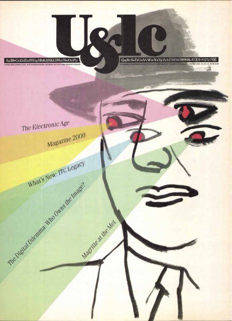
Cover design: Paul Davis<br />
VOLUME NINETEEN, NUMBER FOUR WINTER 1992<br />
EXECUTIVE PUBLISHER: CHARLES M. WILHELM<br />
EDITOR: MARGARET RICHARDSON<br />
MANAGING EDITOR: JOYCE RUTTER KAYE<br />
EDITORIAL DIRECTOR: ALLAN HALEY<br />
CONSULTING EDITOR: EDWARD GOTTSCHALL<br />
GRAPHIC DESIGN: PAUL DAVIS STUDIO<br />
ART/PRODUCTION MANAGER: JANE DI BUCCI<br />
ART/PRODUCTION: CLIVE CHIU, JAMES MONTALBANO, SID TIMM<br />
OPERATIONS: REBECCA L. PAPPAS<br />
PUBLIC & MEDIA RELATIONS: SHARON BODENSCHATZ<br />
SUBSCRIPTIONS: ELOISE A. COLEMAN<br />
ADVERTISING SALES: CALHOUN & ASSOCIATES<br />
(404) 594-1790 FAX: (404) 594-1849<br />
© INTERNATIONAL TYPEFACE CORPORATION 1992. U&Ic (ISSN 0362 6245)<br />
IS PUBLISHED QUARTERLY BY INTERNATIONAL TYPEFACE CORPORATION, 866 SECOND AVENUE.<br />
NEW YORK, NY 10017. ITC IS A SUBSIDIARY OF ESSELTE LETRASET. U.S. SUBSCRIPTION RATES. $30 FOR<br />
THREE YEARS; FOREIGN AIRMAIL SUBSCRIPTIONS. $60 U.S. FOR THREE YEARS; U.S. FUNDS DRAWN ON U.S. BANK.<br />
FOR ADDITIONAL INFORMATION CALL (212) 371-0699. SECOND-CLASS POSTAGE PAID AT NEW YORK, NY<br />
AND ADDITIONAL MAILING OFFICES, POSTMASTER: SEND ADDRESS CHANGES TO<br />
U&Ic, SUBSCRIPTION DEPARTMENT, 866 SECOND AVENUE, NEW YORK, NY10017.<br />
ITC OPERATING EXECUTIVE BOARD 1992<br />
MARK J. BATTY, PRESIDENT AND CEO<br />
ALLAN HALEY, EXECUTIVE VICE PRESIDENT<br />
MAUREEN A. MOCKLER, CONTROLLER<br />
CHARLES M. WILHELM, DIRECTOR, CORPORATE COMMUNICATIONS<br />
ILENE STRIZVER, DIRECTOR OF TYPEFACE DEVELOPMENT<br />
PAT KRUGMAN, DIRECTOR OF CREATIVE SERVICES<br />
ITC FOUNDERS:<br />
AARON BURNS, HERB LUBALIN, EDWARD RONDTHALER<br />
ITC, U&Ic AND THE U&Ic LOGOTYPE ARE REGISTERED TRADEMARKS OF INTERNATIONAL TYPEFACE CORPORATION.<br />
MICROFILM COPIES OF U&Ic MAY BE OBTAINED FROM MICRO PHOTO DIVISION,<br />
BELL & HOWELL. OLD MANSFIELD ROAD, WOOSTER, OH 44691<br />
V BPA MEMBER<br />
6 HEADLINE: ITC AVANT GARDE GOTHIC BOLD SUBHEAD: ITC FRANKLIN GOTHIC BOOK CONDENSED TABLE OF CONTENTS: HEADLINE/NUMERALS: ITC AVANT GARDE GOTHIC BOLD TEXT: ITC NOVARESE BOOK, ITALIC<br />
DROP LETTER: ITC FRANKLIN GOTHIC HEMP( TEXT: ITC NOVARESE BOOK, ITALIC, MEDIUM ITALIC FRONT COVER: ITC FENICE LIGHT ITALIC MASTHEAD: ITC NEWTEXT REGULAR, DEMI
BY<br />
STEVEN<br />
HELLER<br />
DEJA<br />
ONCE<br />
AGAIN:<br />
AI<br />
THE<br />
MET<br />
A<br />
Walking into the rooms of New York<br />
City's Metropolitan Museum of Art<br />
filled with canvases by Rene Magritte,<br />
the Belgian painter, was positively<br />
surreal. All at once I was reminded of<br />
the fact that virtually one of every<br />
ten portfolios I've reviewed as an art<br />
director over the past twenty years<br />
includes work based on Magritte. An<br />
equal ratio of illustrations published<br />
in the United States and Europe is<br />
either influenced by or pays homage<br />
to Magritte's distinctive methods.<br />
Being surrounded by these major<br />
and minor works was eerie because<br />
I was amidst the mother lode of original<br />
images so commonly pilfered<br />
and parodied by my generation. For<br />
the average exhibition-goer, the<br />
Met's extraordinary, definitive retrospective<br />
of Magritte's life and work<br />
must be an enjoyable experience, but<br />
for me it raised nagging questions<br />
concerning honesty and originality.<br />
Rene Magritte was practically<br />
unknown in the United States until<br />
R<br />
the mid-1960s when publisher Ian<br />
Ballantine introduced a new, largeformat<br />
softcover book known in the<br />
industry as a trade paperback. This<br />
book was as lavishly produced as any<br />
hardcover coffee-table book but was<br />
sold in greater quantity for half of the<br />
price. One of Ballantine's first titles<br />
was a collection of Magritte's now classic<br />
paintings. At that time, only the<br />
cognoscenti knew of the painter: photographer<br />
Duane Michals shot portraits<br />
of Magritte which appeared in<br />
Esquire and Print magazines, and certain<br />
of Magritte's paintings were often<br />
reproduced in some other publications.<br />
Indeed, while a 12-year-old art<br />
student I myself gravitated toward<br />
his few paintings then on permanent<br />
exhibition at the Museum of Modern<br />
Art, although I had no idea who the<br />
artist was. But in the mid '60s he was<br />
still unknown to the masses, and the<br />
widespread publication of Magritte's<br />
work was truly a revelation for anyone<br />
interested in making art.<br />
Before Magritte, Salvador Dali was<br />
considered the undisputed king of<br />
surrealism. But as Magritte opened<br />
symbolic windows and doors with<br />
his canvases, he opened literal ones<br />
for illustrators who were tired of traditional<br />
realism. Paul Davis, who in<br />
the '60s was a member of Pushpin<br />
La Clairvoyance, 1936, oil on canvas, (21/2 X 25 '/2"), Private Collection, courtesy, Gallerie Isey Brachot, Brussels.<br />
Studios, was the first one to show the<br />
influence of Magritte. In fact, his surrealisms<br />
were a synthesis of the Belgian<br />
master's imagery with American<br />
folk art and Davis' own penchant for<br />
fantasy. Other illustrators followed<br />
suit. Whether influenced by Davis or<br />
Magritte or a combination of the two,<br />
the dominant method of American<br />
illustration quickly transformed from<br />
narrative to conceptual, wherein the<br />
surreal juxtaposition of forms to convey<br />
an idea served to replace the literal<br />
scene or vignette.<br />
As with popular culture in general,<br />
it might have been predicted that<br />
even though Magritte was a dominant<br />
influence in commercial art, he was<br />
also a passing trend. And while some<br />
of the Magritte school of illustrators<br />
did evolve beyond that influence, the<br />
trend became a convention. Certain<br />
aspects of Magritte's visual language,<br />
if not the actual images themselves,<br />
were (and still are) ubiquitous in editorial<br />
and advertising art. Attesting<br />
to the widespread appropriation of<br />
his emblematic imagery is Georges<br />
Rogue's Ceci n'est pas un Magritte, a<br />
book published in France (Flammarion,<br />
1983), whose title is a pun on<br />
one of Magritte's most famous paintings,<br />
entitled "The Treachery of<br />
Images" (1929), in which the artist<br />
look' asp(<br />
depicts an image of a pipe with the<br />
caption, "Ceci n'est pas une pipe:'<br />
suggesting that reality is not always<br />
what it seems. Indeed the plethora<br />
of Magritte "students" are not what<br />
they seem either.<br />
With so many imitations appearing<br />
on the market, I grew tired of the<br />
reasoning that if the work is so simple<br />
to pilfer then perhaps it is merely<br />
simplistic art. The exhibition at the<br />
Met proves this assumption wrong.<br />
Magritte was a master of communicating<br />
complexity through simplicity.<br />
Seeing the originals as they were<br />
intended to be seen showed me that<br />
no manner of parody or homage<br />
could improve upon them. Magritte's<br />
ironies cannot be made more profound<br />
and less provocative. Although<br />
he has given illustrators (and painters)<br />
the generous gift of a distinctive<br />
vocabulary, many have taken his originality<br />
and made it cliche. FeW have<br />
used it as he has: with intelligence,<br />
humor and irony.<br />
The Magritte exhibition is at the Menil Collection,<br />
Houston, until February 21, and at the Art<br />
Institute of Chicago, from March 16 through May<br />
30. The exhibition catalogis available from the<br />
Metropolitan Museum of Art.<br />
Steven Heller is a senior art director of The<br />
New York Times. His most recent book is Borrowed<br />
Design: The Use and Abuse of Historical<br />
Form (Van Nostrand Reinhold, 1992).<br />
HEADLINE: ITC BERKELEY MEDIUM; ITC ERAS MEDIUM TEXT/CREDIT: ITC BERKELEY BOOK, ITAUC 7<br />
THE TYPOGRAPHY IN THIS ARTICLE WAS CREATED USING DESKTOP PUBUSHING TECHNOLOGY
the LETTERS<br />
UVWY<br />
8<br />
t_ slYv<br />
Egyptian Phoenician waw Greek Etruscan
The story of the letter U is also the story of the letters V, W<br />
and Y. In fact, the origin of the U is also related to the letter F,<br />
the sixth letter of our alphabet.<br />
In ancient times, a snake-like mythical creature called<br />
Cerastes was depicted by the Egyptians as a hieroglyph to represent<br />
a consonant sound roughly equivalent to our F. This<br />
was the forerunner of the Phoenician waw, the most prolific of<br />
all their letters. The waw gave birth to our F, U, V, W and Y. It<br />
looked like our present day Y, and represented the semi-consonantal<br />
sound of w, as in the words "know" or "wing!'<br />
Sometime between 900-800 B.C. the Greeks adopted the<br />
Phoenician waw, and used it as the basis for not one, but two<br />
letters in their alphabet: the upsilon, for the vowel U sound,<br />
and the digamma, for sound that equates to our present F.<br />
The upsilon form was used by the Etruscans and later by the<br />
Romans. The Romans used it for both the semi-consonant<br />
W and the sound of U, but again, the form looked more like a<br />
Y than either the U or the V. In Roman times the sounds of U,<br />
V and W, as we currently use them, were not systematically distinguished;<br />
context usually determined the correct pronunciation.<br />
As a result their sharp-angled Monumental Capital V<br />
was used as a W in words like VENI (pronounced wainey)<br />
and as the vowel U in words like IVLIVS (pronounced as Julius).<br />
What happened to the Y? After the Roman conquest of<br />
Greece in the first century B.C., the Romans added the Greek<br />
Y to the Latin alphabet for use in the Greek words which<br />
they began to use. The sound value given to it by the Greeks<br />
LETTER<br />
The U is categorized as<br />
a medium width letter, but<br />
since it does not occur on<br />
the Trajan inscriptions there<br />
is no Monumental model<br />
for it. The U can take on three<br />
forms. For example, it may<br />
be an enlarged version of the<br />
lowercase u where the left<br />
stroke curves to meet a verti-<br />
cal right stroke. This design<br />
appears in typefaces like Cor-<br />
vinus and Trajanus, where the<br />
right stroke also has a base-<br />
line serif which extends to the<br />
right. The letter U may also<br />
appear as a symmetrical form<br />
of the character, found in<br />
typefaces like ITC Novarese'<br />
and Joanna. Here two verti-<br />
cal strokes of equal weight<br />
are connected by a baseline<br />
curve. And finally, there is<br />
the thick and thin version of<br />
the letter in which the left<br />
stroke is heavy and the right<br />
stroke is a hairline. Exam-<br />
ples of this style include such<br />
faces as Caslon 540 and<br />
ITC Benguiat. The thick and<br />
thin version with no bottom<br />
serif is, by far, the most popu-<br />
lar design.<br />
The V is considered to be a<br />
medium width character,<br />
about three-fourths as wide<br />
as it is high. In serif typefaces<br />
its apex is practically<br />
always pointed. When this<br />
is the case the point must<br />
extend below the baseline<br />
about as far as round characters<br />
to insure the correct<br />
optical height of the letter,<br />
and to maintain a consistent<br />
baseline in text copy.<br />
In certain typefaces the<br />
designer has drawn the top<br />
serifs longer on the inside<br />
of the letter than the outside<br />
in an attempt to compensate<br />
for some of the<br />
inherent spacing problems<br />
of the character. For examples<br />
of this, take a look<br />
at faces such as Letraset's<br />
Caxton and ITC Century."'<br />
was unknown in the Latin language, and when used in the<br />
adopted Greek words it took on the same sound as the letter I.<br />
The early English scribes frequently used y in place of i; particularly<br />
when the minuscule (which then did not have a dot)<br />
fell in close proximity to the m, n, or u, potentially causing<br />
confusion to the reader.<br />
In the Medieval period two forms of the U represented the V<br />
sound: one with a rounded bottom and one which resembled<br />
our V. It wasn't until relatively modern times that the angular<br />
V was retained to represent our V sound, and the version with<br />
the rounded bottom was officially relegated to the sole func-<br />
tion of representing the vowel U.<br />
The graphic form of W was created by the Anglo-Saxons<br />
in about the 13th century. They called their letter wen. This<br />
"invention" developed from their habit in writing, of trying<br />
to distinguish among the various sounds represented by the<br />
inherited letter. They used a V for both the U and V sounds,<br />
but wrote the V doubly for the sound of W. Eventually the two<br />
Vs were joined to form a single character. This early ligaature<br />
took hold and became part of the common alphabet<br />
rather than an accessory. The French, however, rather than<br />
use a foreign letter in their alphabet, preferred to double one<br />
of their own characters. They chose the U and called the<br />
letter double vay. To the English it became a "double U." The<br />
double V form is retained in typographic letterforms, but<br />
due to the need for speed in writing, the handwritten letter<br />
is more like a double U.<br />
w<br />
LETTER<br />
There are many ways to con-<br />
struct a W It can look like<br />
two Vs set side by side which<br />
share a middle serif, such<br />
as in Della Robbia or ITC Souvenir.'<br />
It can also be drawn<br />
as two wider Vs that cross<br />
over each other in the center<br />
of the character resulting<br />
in four serifs on the cap line.<br />
The W in Bembo and Jenson<br />
Old Style take on this characteristic.<br />
Sometimes in a W<br />
of this style the four center<br />
serifs are joined together by<br />
a single horizontal line. In<br />
other cases, the center serifs<br />
are eliminated and a pointed<br />
apex takes their place. Palalino<br />
and Baskerville use this<br />
kind of W. There is also a<br />
version in which the second<br />
V appears to cut off the right<br />
diagonal of the first. Janson<br />
and ITC Isbell' were drawn<br />
to contain this sort of W. But<br />
no matter how it is handled,<br />
the W is normally a wide letter,<br />
and many times it is the<br />
widest in the alphabet.<br />
HEADLINE/SUBHEADS: ac CENTURY BOLD, ac NOVARESE BOLD, ITC ISBELL MEDIUM, ITC BABEL DEMI, ITC AVANT GARDE GOTHIC BOLD CONDENSED TEXT, ITC AVANT GARDE GOTHIC BOLD,<br />
BOLD ITALIC, BOOK CONDENSED, BOOK CONDENSED ITALIC; ITC NOVARESE BOLD, ITC CENTURY BOLD, ITC ISBELL BOLD, DC BABEL DEMI CAPTIONS, ITC FRANKLIN GOTHIC DEMI CONDENSED<br />
The Y is clearly related to the V<br />
and W, but it is better to con-<br />
sider it as a cousin rather than<br />
a sibling. The point is, while<br />
the Y has a V as an important<br />
part of its design, this part<br />
should not be as wide as a nor-<br />
mal V. The Y is one of those<br />
characters that look decep-<br />
tively easy to construct—but is<br />
not. There is a delicate bal-<br />
ance that must be maintained<br />
among its three parts. Too<br />
much emphasis in one place or<br />
another will make the letter<br />
look awkward and will detract<br />
from its legibility. The most<br />
common mistake is to make<br />
the vertical stem too short.<br />
This in turn makes the top part<br />
too big and the bottom opti-<br />
cally incapable of supporting<br />
it. Generally a Y is a Y is a Y,<br />
with very little deviation from<br />
the standard model. There<br />
are, however, a couple of not-<br />
able exceptions. Zapf's Pala-<br />
tino, for example, has an<br />
elegant swash to its left diag-<br />
onal, and ITC Kabel takes<br />
on the characteristics of a<br />
lowercase letter.<br />
CsT) 15<br />
-L- CL)<br />
CD 2 N . 0 0<br />
a)<br />
a) T.: - —<br />
_a a) ID w 0 °<br />
I— cn 0.) _a a.
TYPOGRAPHIC MILESTONES<br />
by Allan Haley<br />
VranDEFGHIJKL<br />
abcd efshijklmn<br />
DUTCH TYPE DESIGNER JAN VAN KRIMPEN wrote extensively about<br />
the virtues of cutting type by hand, extolling it as the<br />
highest form of type development. Countless times<br />
in his career, he asserted that it was the punchcutter's<br />
job to take a rough alphabet design and turn it into<br />
a usable font of type.<br />
For years, he worked closely with the same punchcutter<br />
on each typeface he drew for the Enschede<br />
type foundry in Haarlem. In all his voluminous writings,<br />
however, Van Krimpen only once gave credit<br />
to his punchcutter, and even then, never mentioned<br />
0<br />
the artisan by name.<br />
Although Van Krimpen is remembered by some<br />
00<br />
as a delightful host and companion who was very<br />
generous with his time, he was also known for being<br />
suspicious, obstinate and possessing an ego which<br />
El\ interfered with personal and business relationships.<br />
While not everyone was in complete agreement<br />
("4 about his character, nearly all were in accord regarding<br />
Van Krimpen's ability as a typographer. Even<br />
some of his harshest critics would contend that Jan<br />
van Krimpen was perhaps one of the greatest book<br />
typographers of the 20th century.<br />
THE BIG BREAK<br />
Van Krimpen was born in Gouda, Holland, in January<br />
of 1892. After studying at the Academy of Art in<br />
The Hague, he worked as a freelance designer and<br />
gradually established an impressive network of friends<br />
and associates. It was one such friend at the Dutch<br />
Post Office who provided Van Krimpen with the project<br />
that was to begin his career as a world renowned<br />
type designer.<br />
In 1923 a special issue of postage stamps was being<br />
prepared for the 25th jubilee in honor of Queen<br />
Wilhelmina, and the artist who was commissioned to<br />
create the stamp art was having trouble with the lettering.<br />
Van Krimpen's friend was general secretary of<br />
the Dutch Post Office and suggested that the promising<br />
lettering artist be asked to help.<br />
The prestigious Haarlem printing company of<br />
Enschede en Zonen printed the stamp and Van Krimpen's<br />
lettering caught the attention of its director,<br />
Dr. Johannes Enschede, who was at that time looking<br />
for ways to improve the company's book and letterpress<br />
division. Dr. Enschede decided that a new typeface<br />
created by such a talented young designer as<br />
Van Krimpen might be just what the business needed.<br />
Van Krimpen was asked to design a new typeface<br />
for the firm, to be cut by P. H. Radisch, Enschede's
venerable punchcutter, and to be cast at the company's<br />
foundry. Van Krimpen eagerly accepted this<br />
commission and quickly produced trial drawings<br />
for the new type. These were approved and followed<br />
up in record time with a set of finished renderings,<br />
and handed over to Radisch, who produced punches<br />
for the hand-set type. In just a little more than a<br />
year from his first meeting with Van Krimpen, Dr.<br />
Enschede had his font of type.<br />
This quick turnaround was necessary because<br />
Dr. Enschede intended to use the new type for setting<br />
all the official entries for an industrial design exhibition<br />
to be held in Paris in 1925. He rightfully felt that<br />
this would provide both an excellent opportunity<br />
to announce the release and the perfect venue to gain<br />
maximum European market exposure. The finished<br />
design was called Lutetia, the Roman name for the<br />
city of Paris, and its release in Paris succeeded in fulfilling<br />
Enschede's hopes.<br />
qr s tu v wxy z<br />
ALMOST UNANIMOUS APPROVAL<br />
Stanley Morison, the typographic director of Monotype,<br />
reviewed the new face in a 1928 issue of The<br />
Fleuron, praising Van Krimpen's work as being fresh<br />
and original at a time when most new designs were<br />
either copies or revivals of older work. Dr. Enschede<br />
was apparently equally pleased with the type design<br />
because he hired Van Krimpen to create additional<br />
typefaces for his company.<br />
But not everybody agreed with Morison and Dr.<br />
Enschede. Walter Tracy, the eminent British typophile<br />
and former head of type design for the British<br />
Linotype Company, was almost gleeful in his criticism<br />
of Lutetia. He felt that numerous letters were<br />
out of proportion, poorly rendered or inappropriate<br />
for the style of the face. Tracy also wrote that the<br />
alternative swash characters in the italic "prettify<br />
the text only at the expense of comfortable reading!'<br />
But most agreed that Lutetia was a refreshing<br />
new addition to the typographic spectrum. It earned<br />
Van Krimpen esteem as a type designer, and the<br />
types he created during the following 25 years were<br />
received with the greatest of respect.<br />
A CLOSE WORKING RELATIONSHIP<br />
In addition to creating new types for Enschede, Van<br />
Krimpen was responsible for designing the specimen<br />
sheets publicizing the printing house's historic and<br />
contemporary typefaces. He quickly earned , an international<br />
reputation as a result of this work, which<br />
brought him additional projects at Enschede and the<br />
beginnings of a substantial freelance business. Over<br />
the years the relationship between Dr. Enschede and<br />
Van Krimpen grew from that of employer/employee<br />
into a friendship of deep mutual respect and admiration,<br />
and Van Krimpen remained associated with the<br />
Enschede printing house until his death in 1958.<br />
3 4 5 6 7 8
ABCDEFGHIJKLMNOPQRSTUH<br />
ABCDEFGHIJKLYINOPQRSTW<br />
ABCDEFGHIJKLMNOPQ<br />
Like many other type designers, Van Krimpen did<br />
not restrict his freelance work to doing alphabets. He<br />
also drew several series of stamps, lettered a number<br />
of book jackets known for their elegance and simplicity,<br />
wrote many articles and monographs, and often<br />
lectured on type and typography.<br />
ANTIGONE AND ROMANEE<br />
Van Krimpen's second typeface design was a Greek<br />
style called Antigone. Unfortunately, like Sophocles'<br />
heroine, the design never reached old age. Antigone<br />
was intended to be the first part of a large type offering<br />
providing all the characters and symbols necessary<br />
for setting mathematical textbooks. However, only<br />
alphabetical characters were produced, which eliminated<br />
any practical applications for the face.<br />
Another short-circuited design by Van Krimpen<br />
is Romanee. It was drawn in 1928 as a companion to<br />
an 18th century italic font created by one of Holland's<br />
greatest punchcutters.<br />
Although punches, matrices and other tools necessary<br />
for creating fonts were still extant for the italic,<br />
and specimen showings were still intact for the original<br />
roman, the punches and matrices for this latter<br />
face were long gone. Van Krimpen's goal was to revive<br />
the "missing" roman. Although it would have been<br />
logical to recreate the roman face by photographically<br />
enlarging the surviving prints of the roman type from<br />
old specimen showings, he did not agree with the<br />
idea of type revivals. Instead, he decided to create the<br />
new roman design retaining only the proportions<br />
and basic features of the original, but the end product<br />
bore virtually no family resemblance. It was, even to<br />
Van Krimpen, a "distinct failure"--although he did<br />
later claim that his design was just "too perfect" to<br />
complement the existing italic. Apparently printers<br />
and typesetters agreed only with the first part of his<br />
critique because after its initial release Roman&<br />
disappeared into typographic obscurity.<br />
In 1932 Van Krimpen began working on a type<br />
family that was to be his most ambitious, innovative<br />
and troublesome work. Several years before beginning<br />
the design, Van Krimpen met Stanley Morison,<br />
the typographic director of Monotype. The two<br />
men became close friends who collaborated on several<br />
projects, and occasionally enjoyed an argument—<br />
especially if it took place after a good meal.<br />
One of the subjects on which they did not argue<br />
was Morison's theory that the ideal basis for a typographic<br />
family include the following: roman,<br />
sloped roman (as opposed to cursive italic), and<br />
script (Chancery italic).<br />
AN EXTENDED FAMILY<br />
Van Krimpen started to work on the type family in<br />
1932. Called Romulus, it took into account Morison's<br />
philosophy—and then some. In Van Krimpen's<br />
words, "I set out on what I thought to have been a<br />
more ambitious scheme than, either before or since,<br />
has ever been tackled in the history of producing<br />
printing type. The idea was to create a complete type<br />
famiOtomprising roman, sloped roman, bold, and<br />
condensed bold, at least four weights of sans serif, a<br />
script type, and a number of Greek characters!'<br />
The first release in this extended Romulus family<br />
(the basic roman) was met with enthusiasm. Van<br />
Krimpen was satisfied with his work, and the typographic<br />
community was unanimous in their acceptance<br />
of the type style.<br />
Design of the Romulus italic began shortly after<br />
the roman was completed, but was not released until<br />
1936. It followed Morison's preference for a sloped<br />
roman, rather than the more traditional cursive style.<br />
The resulting italic companion to the roman was<br />
released—but it enjoyed about as much success as<br />
the Ford Edsel.<br />
ABCDEFGHIJKLMNOPQRSTUVWXYZ<br />
Cancelleresca Bastarda<br />
abcdefghijklmnopqrstuvwxyz<br />
1 2 3 4 5 6 7 8 9 0<br />
Romulus Rc<br />
WHAT'S IN A NAME<br />
Van Krimpen's cursive design for the Romulus family<br />
also ran into trouble. First, Morison and Van Krimpen<br />
decided that the design should be patterned after<br />
a traditional calligraphic style, Cancelleresca Bastarda<br />
(pronounced batarda), and adopted this name for<br />
the face. Some felt that just the name of the face was<br />
too big a hurdle for most potential buyers.<br />
Morison and Van Krimpen then decided that a<br />
variety of swash and alternate characters should<br />
be offered with the face, to allow a certain amount<br />
of latitude in producing composition that echoed<br />
calligraphic writing. The number of alternate characters<br />
they decided on proved, however, to be excessive.<br />
In addition to the basic alphabet, there were no<br />
fewer than 90 swash and alternate letters, an amount<br />
that would be hard enough to handle with today's<br />
computer technology; but virtually impossible with<br />
hand-set type.<br />
The third strike against Cancelleresca Bastarda was<br />
more technical in nature. Because the swash letters<br />
were designed with such flourish, the ascenders and<br />
descenders of the face were dramatically out of proportion<br />
with most other types. This meant that Cancelleresca<br />
Bastarda had to be cast on a point-body<br />
25 percent larger than the corresponding Romulus<br />
roman. For example, a 12 point Romulus roman<br />
would require Cacelleresca Bastarda to be available<br />
at 15 point, not a standard size in metal type, and<br />
a 10 point roman would also yield a 12.5 point Cancelleresca<br />
Bastarda— clearly a problem for any traditional<br />
type casting. And to make matters worse, if<br />
Cancelleresca Bastarda were to be used in conjunction<br />
with Romulus roman, additional spacing would<br />
have to be added above and below the roman words<br />
to make up the additional space required by the<br />
script—which was not an exciting proposition for<br />
busy compositors.<br />
Romanee<br />
0 if
YZ<br />
Lutetia Roman<br />
In the beginning was the Word, & the Word was<br />
JUST A GOOD, SOLID DESIGN<br />
Van Krimpen's most successful typeface is a design<br />
he initially created for the production of a new Bible.<br />
The design brief called for a face which was exceptionally<br />
legible, and space-economical. The finished<br />
product successfully met both criteria—and did<br />
not suffer from technical or philosophical misdirections.<br />
The style was named Spectrum, and was cut<br />
as hand-set type by Radisch at the Enschede foundry.<br />
In 1950, Monotype licensed the design and released<br />
it as a machine-set type.<br />
ARTISTS, CRAFTSPEOPLE AND<br />
TYPEFACE DESIGN<br />
Some critics have suggested that Van Krimpen was<br />
too much the artist, and others contend that he overintellectualized<br />
his work. The end result was the<br />
same: too much of Van Krimpen was apparent in his<br />
type designs. This made the finished product too<br />
much a personal statement. History has proved that<br />
the best typefaces are those drawn by an inspired<br />
craftsperson or an artist who was able to sublimate<br />
any need to make a personal design statement. Van<br />
Krimpen was clearly talented and inspired; unfortunately<br />
his typefaces also clearly show this was not<br />
a person who could easily sublimate his ego.<br />
His typography, however, always looked right.<br />
Van Krimpen used his own types with greater<br />
distinction than did any of his peers. Graphic communicators<br />
throughout the world have reason<br />
to remember Van Krimpen and his work. He provided<br />
us with a rich heritage of original, if not<br />
completely uncontroversial type designs, and excellent<br />
examples of how these and other typefaces<br />
are used best.<br />
HEADLINE: ITC AVANT GARDE GOTHIC BOLD; ITC GALLIARD ROMAN<br />
BYLINE/CAPTIONS, ITC GALLIARD BOLD SUBHEADS: ITC GALLIARD BOLD ITALIC<br />
TEXT/CREDIT: ITC GALLIARD ROMAN, ITALIC<br />
THE TYPOGRAPHY IN THIS ARTICLE WAS CREATED USING DESKTOP PUBLISHING TECHNOLOGY<br />
Antigone<br />
ABFAEZHOIKAMN<br />
011PETY(I)X`V U<br />
In the //inning was the Word, and the Word was<br />
with God, and the Word was God. The same was in<br />
the beginning with God. All things were made by him;<br />
and without him was not any thing made that was<br />
made. In him was life; and the life was the light of men.<br />
And the light shineth in darkness; and the darkness<br />
comprehended it not.<br />
Lutetia Italic<br />
ABCDEFGHIJKLMN<br />
OPQRSTLIVIVXYZ<br />
abcdefghijklmnopqrstuvwxyz<br />
albffMhfifilkfifiliCht<br />
12345678<br />
go<br />
ocpy6E4118iKApvoTtp6c
14<br />
0<br />
1<br />
ty:<br />
O'<br />
tr<br />
el)<br />
ti<br />
TAMING TECHNOLOGY<br />
tto<br />
A CONVERSATION WITH NEIL POSTMAN<br />
0<br />
0<br />
V<br />
ti<br />
0<br />
0<br />
401<br />
Neil Postman is a social<br />
critic and communications<br />
theorist. Since 1990 he<br />
has held the position of<br />
Chair of the Department<br />
of Communication Arts<br />
and Sciences at New York<br />
University. In his latest<br />
book, Technopoly: The Sur-<br />
render of Culture to Tech-<br />
nology (Knopf, 1992), he<br />
advocates an inquisitive,<br />
critical, informed stance<br />
toward new technolo-<br />
gies, believing that "The<br />
uncontrolled growth<br />
of technology destroys<br />
the vital sources of our<br />
humanity."
Leslie Sherr: It has been said that quences of television. They paper. For many writers this conthe<br />
print media is a doomed and wonder if they should educate tact is essential. For others it is a<br />
outdated technology destined for their children to have certain burden because they think faster<br />
library shelves. How accurate is this defenses against television. Should than they can write. A computer,<br />
prediction? they implement new policies or however, has such a powerful<br />
laws to control the development of<br />
advantage in the preparation and<br />
Neil Postman: That prediction television? They ask the same ques- editing of manuscripts, that it may<br />
is wrong if people are sufficiently tions about computers. become a monopoly. Technology<br />
interested in preserving literacy, tends to be imperialistic. It drives<br />
in keeping magazines, books and LS: What questions should we out alternatives by saying, this<br />
newspapers as an important part be asking of technology? other way is gone and you must<br />
of the culture. At the moment<br />
now use this. That is a problem.<br />
though, no one is talking seriously<br />
NP: One important question is<br />
about what steps need to be taken based on the idea that every new LS: What must our eyes be open to<br />
to preserve the printed word. I technology favors some people and as we move from print to electronic<br />
suspect that if we do as little as we harms others. We have to ask which media?<br />
have been doing, then you will<br />
groups of people are being helped<br />
end up with basically two kinds of by this technology and which NP: People have to seriously ask<br />
reading: reading for information groups are being harmed. Do the themselves what is being lost in this<br />
as in computer printouts, and read- groups that are being harmed know new arrangement. Is there some<br />
ing for entertainment like the air- they are being harmed, and should sense of connection with the mateport<br />
paperback. More serious reading they be given some decision-making rial that gave to the old way a spirit<br />
would then become obsolete or powers to determine whether they that the new way doesn't allow<br />
reserved for specialists. want this or not? What social institu- for? I don't mean that everything we<br />
tions are needed to facilitate the lose is of great and equal value. We<br />
LS: Can the computer help to comfortable integration of a new all know that any technology that is<br />
redress the decline of literacy? technology? What social institutions widely accepted has something to<br />
will be destroyed? We always have offer us. Still, we have to ask our-<br />
NP: The computer could be a great to consider the possibility of unfore- selves if what seems to be a great<br />
ally of literacy, but that depends seen consequences. We know from benefit really is. I'm not sure that the<br />
on how we use computers in schools. the history of technology that no mat- fact that the word processor func-<br />
If we just teach kids word processing ter how aware we try to be about the tions at a rate closer to the speed at<br />
or other trivial uses, then the corn- effects of technology, there are which we think is such an advantage.<br />
puter will have no substantially benefi- always unpredictable consequences. Maybe it just produces more junk.<br />
cial effect. One of the wonderful things We have to be prepared for sudden<br />
about programming a computer is revelations and have some mechan- LS: How do you envision the future<br />
that you have to think about thinking isms by which we can address them as of the magazine?<br />
which means that it is a very analyt- they come up. The overarching quesical<br />
process. Writing is also a very ana- tion we must focus on is not what NP: I'm optimistic about the future of<br />
lytical process. If we teach children a new technology will do, but what a magazines because the form of the<br />
to understand the intellectual process new technology will undo. magazine is one of its greatest advanof<br />
programming a computer, then tages. There are many things I think<br />
it is possible for the computer to help LS: If some form of improved exis- I would not be interested in that,<br />
preserve and even strengthen not tence is the hallmark of a new tech- in fact, I turn out to be interested in<br />
only literacy but the whole printing nology, should we not also be through reading a magazine. And<br />
industry. looking for ways to empower it is magnificently mobile. I think it<br />
everyone equally with its use? will endure.<br />
LS: Isn't it also true that the computer,<br />
like the book, is only as good<br />
as the mind that programs it?<br />
NP: No technology is just a tool.<br />
Every technology has an "agenda;'<br />
an intrinsic function that its very<br />
structure implies. Take television.<br />
You can use television as they have<br />
done in Europe, as a form of radio<br />
where you just have interesting<br />
people talking on it. You can use<br />
television as an electronic billboard,<br />
with lists of information. Television,<br />
however, works best when it is<br />
showing pictures; moving, exotic<br />
pictures. The structure of television<br />
cries out to be used in this way.<br />
LS: Is this "agenda" something that<br />
we are not sufficiently aware of?<br />
NP: Americans are almost totally<br />
uneducated about the social, psychic<br />
and political effects that technologies<br />
have on their culture. We fail<br />
to reflect on what kind of peo-<br />
ple the technologies are making us<br />
become. Europeans, because they<br />
have seen how mindless Ameri-<br />
cans have been in relation to technol-<br />
ogy, are more aware of these issues.<br />
They want television but they also<br />
want to avoid the negative conse-<br />
NP: It is naive to think that everyone<br />
can be equally empowered. You<br />
can't have important social or technological<br />
change without losers. For<br />
example, the automobile did not<br />
empower blacksmiths. It made them<br />
obsolete. Television in the long run<br />
undermines the power of teachers<br />
and education. The computer is obvi -<br />
ously a great advantage to large-<br />
scale organizations like banks and<br />
government agencies. It is essential<br />
to scientific research where prob-<br />
lems can now be solved in a week<br />
that previously would have taken<br />
months. But the computer has not<br />
really been a great advantage to<br />
the quality of life of the average person.<br />
All change is a kind of Faustian<br />
bargain. To get something, you have<br />
to give something up.<br />
LS: As for designers and writers, how<br />
is the computer changing the way<br />
we create?<br />
NP: I don't compose on a typewriter,<br />
much less a word processor.<br />
I compose longhand on legal pads.<br />
For me there is a sensuous, intimate<br />
connection between my thoughts<br />
and my words through the tactile<br />
contact between my hand and the<br />
LS: Can computers be used humanistically?<br />
NP: [Philosopher] Paul Goodman had<br />
a nice phrase: technological modesty.<br />
What he meant was that we should<br />
not allow technology to control more<br />
of our lives than is warranted. If we<br />
use the computer to do for us things<br />
that cannot be done in any other<br />
way, then I'd say it was being used<br />
humanistically and intelligently.<br />
LS: Clearly you are trying to promote<br />
a certain relationship between culture<br />
and technology. Do you have an<br />
ideal balance in mind?<br />
NP: I don't have a fixed vision of<br />
what that relationship would be and<br />
I certainly am not against technology.<br />
I am interested in people having a<br />
serious understanding of how technology<br />
changes their lives. Armed<br />
with that understanding, they can<br />
then actively determine the scope<br />
of technology's control so that it<br />
best serves their needs.<br />
Leslie Sherr, former editor of Graphls,<br />
writes on architecture and design for a<br />
range of international publications.<br />
HEADLINE: ITC AVANT GARDE GOTHIC BOLD CONDENSED, BOOK CONDENSED INTRO/PULL QUOTE/TEXT: ITC ERAS DEMI, BOLD 15
avid Carson is tired of the celebrity photo formula in magazines. He wants a<br />
magazine which is a reality check editorially and visually.<br />
The magazine he proposes would be thematic and focused on socially rel-<br />
evant issues with strong visuals as well as perceptive text. He explains, "Arrow<br />
would be a magazine dealing with contemporary themes. It would juxtapose<br />
art and music with significant social issues since I believe these are all related. It<br />
would emphasize substance rather than fluff, and I intend to use graphic artists, illustrators,<br />
photographers and computer artists to highlight and interpret the material in<br />
a significant way"<br />
Carson refers to Arrow as "self-driven" and "purpose-driven" by which he means<br />
each issue would change according to its content. With no grid and a loose format,<br />
each edition of Arrow would have a design "driven largely by the visuals," says Carson,<br />
explaining, "The artists commissioned would not only interpret through illustrations<br />
or photographs, but would contribute to the inherent editorial message:<br />
The typography, too, would be more than neat columns with typeset text and headlines.<br />
"Today, people are less willing to attack a gray page of type: he states. The type<br />
must be interpretive. According to Carson, "Type should be expressive and convey<br />
the mood and the content through what it looks like as well as what the words say.<br />
'Type as type cannot not communicate. Each typeface has a personality. Type should<br />
also be readable, but not necessarily in the usual sense—people will read what looks<br />
interesting or what interests them':<br />
Carson's approach to typography is nothing<br />
if not emotional, He manipulates type and shapes<br />
it almost illustratively so that it forces a reader to<br />
see shapes and forms and jarring constructs as<br />
well as words. "I want the typography to reveal<br />
the feeling of the story immediately, so that the<br />
readers are drawn into the type and then<br />
rewarded with great writing when they start to<br />
read the text'<br />
Carson predicts that there is an urban, savvy,<br />
international audience who are waiting to have<br />
a magazine deal with issues while having them<br />
presented in a memorable and unpredictable<br />
way. This is an untapped audience, he feels, who<br />
were reading Beach Culture (an award-winning,<br />
16<br />
1,,n a recent tOwision inter<br />
iew,<br />
(--5?-ish said chat<br />
son's appuintrren<br />
the Lommission wool<br />
a tha<br />
or jest<br />
sex at<br />
the way<br />
workanna<br />
YDenki tote:<br />
,Inc ou.'to Group in<br />
january 2000<br />
work<br />
1;itti ri 5 ae<br />
1 t 1,., rn ,p.-t i _ zomple .1 I ea<br />
w<br />
"Mr s)ohnson, .wbat<br />
'O' r, p otrot u IA 2 icjr 1 1%"Ph ailYeanYg e w / so u ? ni<br />
amd cha l lenge you to eo chat the lclonmpirse s iodn h as<br />
CO(_ Td<br />
by Margaret Richardson<br />
ARROW<br />
41 fige4brsiauis dy.-1G a<br />
lialerkg.e him to provi. e 2 l e<br />
TB erei rilaB ni il E chisfilFii Iflidiqrtlie<br />
Ir, sprry to say, it proba-<br />
COVER: ART DIRECTOR: DAVID CARSON<br />
GRAPHIC DESIGNER: MARTIN VENEZKY<br />
now defunct cult magazine he designed). These<br />
readers he believes are also anxious to find sub<br />
jects with the energy associated with the eclectic<br />
Beach Culture.<br />
In some ways, the new style and music mag<br />
azine ray Gun (Carson is the design consultant)<br />
moves in this direction with an impudent use of<br />
type and arresting visuals (like a photographic<br />
essay by Matt Mahurin). But Arrow Carson points<br />
out, would have a more socially conscious and<br />
serious role; it would be the thinking person's<br />
version of contemporary culture, counter culture,<br />
politics and relevant issues. For Carson, Arrow<br />
is the medium for integrating music, art and pro<br />
gressive ideas through expressive design.<br />
Carson's editorial design style is inherent in Arrow—layouts which are dense and<br />
overlayed; expressive computer-manipulated type which dramatically portrays the<br />
content; a passionate use of illustration and photography. His style of working—which<br />
involves using a computer, then arranging and rearranging type, images and texts on<br />
board, montaging the layouts so to speak—he intends to continue.<br />
An added feature proposed for Arrow is the inclusion of a music CD in its music<br />
review section. "The reader should be able to hear what is being reviewed," Carson<br />
states. And Carson is definite that Arrow will still be produced and printed as a maga.<br />
zine as opposed to becoming a disk since he feels people still need to hold a magazine,<br />
to smell it, turn the pages and feel they can browse, observe, read, and return to it.
Three editorial designers turn the<br />
medium on its spine with their<br />
magazine designs for the Year 2000.<br />
If you turnEd to this pAgE ExpEcting T& A, rEAd<br />
ILLUSTRATION BY ANITA KUNZ<br />
illuminated by the<br />
dusky reddish glerr<br />
emanating from hon.<br />
dreds of burning build<br />
logs. The structures<br />
have been n ogre M<br />
insurrectionists and<br />
rioters. Martial law in<br />
Aupposedty in effect.<br />
yet there is no police<br />
presence. The National<br />
Guard has been called<br />
in but they possess nit<br />
bullet,. All<br />
have broken down and<br />
all bets are off ..<br />
noes the nev social<br />
ordm.<br />
'ft, absurdi-<br />
ty or this paradox<br />
would be amusing if it<br />
weren't so sick. I find it<br />
eskemeld dintressing<br />
that an average of three<br />
Peokle a day are shot<br />
dead in Lon Angeles.<br />
That Mends and family<br />
members have been<br />
wounded or 'plied by<br />
gunfire. t hat I personal<br />
ht have been under<br />
attack in a drivpby<br />
shooting. that my wife<br />
has been fired upsn,<br />
and that bullets, on<br />
occasion, hit the house<br />
In .1,, we tire I have<br />
wimemed police beat<br />
downs so severe the(<br />
tingle tne nauseous.<br />
I've keen Mega,'<br />
.9traMAR.<br />
Rolling down the kee-<br />
way toward LAX in the<br />
autommit mode. locked<br />
And loaded with a spa,<br />
clip backup. Earlier<br />
the day officials at the<br />
Department of sore:<br />
passport division had<br />
insued me a Ravel warn.<br />
6tg regarding my<br />
intended destination.<br />
the island of East Tonor<br />
in the Republic of<br />
ImMnesik<br />
The -active<br />
unrest . of Indonetra's<br />
sr. war in Timor it<br />
extremely dangerous<br />
kr US. citirens to Pavel<br />
there. - rat told. "More<br />
than 200.000 people<br />
have died there in the<br />
last decade According<br />
to the State Department.<br />
my safety cannot he<br />
guaranteed In this<br />
remote island proOnce<br />
On my way to<br />
the airpo.. OR sky is<br />
DAVID CARSON,<br />
design director, Surfer;<br />
design consultant, ray Gun<br />
TITLE: Arrow<br />
EDITORIAL STATEMENT:<br />
Specialized consumer magazine<br />
filling a current void in<br />
three areas of editorial content:<br />
social issues, art and music.<br />
These would be integrated,<br />
with artists providing visual<br />
commentaries on social issues<br />
and relevant music documented<br />
and included on CD<br />
in each issue.<br />
TARGETED READERSHIP:<br />
Urban college students and<br />
college-educated readers<br />
from 18-45.<br />
ESTIMATED CIRCULATION:<br />
50,000-100,000.<br />
FREQUENCY:<br />
Bi-monthly with an option to<br />
go monthly.<br />
DISTRIBUTION:<br />
Small independent magazine<br />
distributor. Sold in specialty<br />
shops, better bookstores, selected<br />
newsstands.<br />
ADVERTISING:<br />
Would appeal to the record<br />
industry, book publishers, art,<br />
photography and design<br />
advertisers, movie distributors<br />
and some clothing manufacturers.<br />
UNIQUE DESIGN<br />
SPECIFICATIONS:<br />
Format:10 inches by 12 inches<br />
printed on matte recycled<br />
paper with soy-based ink. No<br />
rigid grid, with every page<br />
dependent on content with<br />
photos and art. Logo and<br />
format would be loose,<br />
changing from issue to issue.<br />
The key is interpretive design<br />
with type, photos and art.<br />
17
y Joyce Rutter Kaye<br />
MONOGRAM<br />
ince the mid-1980s, specialized maga-<br />
zines have proliferated, satisfying devo-<br />
tees of even the most arcane and<br />
obscure pastimes. Somewhere in Amer-<br />
ica people are pensively thumbing<br />
through the latest issues of Bassin: Cigar<br />
Aficionado, Chili Pepper and Women and Guns.<br />
For D.J. Stout, art director at Texas Monthly, magazines<br />
can never be too specialized or personalized.<br />
He envisions each copy of Monogram, his generalist magazine of the future,<br />
to be as unique as the thumbprints left on its pages by readers. By employing selective<br />
binding and computerized, interactive reader-response technologies, Monogram<br />
will enable subscribers to tailor the magazine to their own interests by pre-selecting<br />
the stories they would like to read each month. Therefore, a Texas housewife like<br />
Shirley Sue Wharton could choose an article about pie making, while a biker like<br />
Randy "Bubba" Simpson could opt for an in-depth feature about the art of tattooing,<br />
as the mock layouts here illustrate.<br />
Stout is intrigued by the notion of giving people a say in the products and services<br />
they use. He says Monogram was inspired by several factors, including newsweeklies<br />
which recently experimented with ink-jetting subscribers' names on covers, and<br />
the emergence of The Box, a new cable video music channel which operates like a<br />
jukebox, allowing viewers to select and pay for videos they would like to watch at<br />
home. "It occured to me that more and more people want to be offered a choice: says<br />
Stout. "Why not apply that to magazines?"<br />
While Stout realizes the technology for Monogram already exists, he acknowledges<br />
that the logistics would be more nettlesome. Since he proposes offering readers<br />
a choice of six stories per issue, selected from four subject categories, at least 24 articles<br />
would need to be written, edited, designed and produced each month. These<br />
would include choices from entertainment, politics, travel, food and other general-<br />
18<br />
interest areas. Stout resolved the economic and manpower problems involved in producing<br />
such volume by turning Monogram into a digest reminiscent of the Utne<br />
Reader, in which issues would be planned to combine original work with reprints of<br />
published articles.<br />
The prototype for Monogram reveals the designer's evenhanded application of<br />
quirkiness and elegance at Texas Monthlywith its liberal use of white space and illustrative<br />
headline type. To keep the design streamlined from copy to copy, he prefers to<br />
keep the layouts simple. "I would give it a pretty rigid design format, by keeping certain<br />
elements, such as body type, consistent;' he says. Monogram's most creative<br />
attribute, he adds, is the potential diversity of subject matter. To highlight this feature<br />
in the premier issue, Stout proposes publishing a photo of each reader on his or her<br />
own personal copy. The portrait would appear below a monogram of their own initials,<br />
an element which would remain as the logo on subsequent issues. Coverlines<br />
would be unnecessary, as subscribers know what they have selected to read.<br />
With this variety of editorial choices and a diverse audience of readers, Monogram<br />
would greatly appeal to advertisers as well. In addition to easily finding their target<br />
audiences, advertisers would also have the option of inserting value-added products<br />
each month. Shirley Sue Wharton's personal copy, for example, would include<br />
recipe cards, coupons, and listings of local restaurants, while Randy "Bubba" Simpson<br />
would receive listings of tattoo parlors and sheets of temporary tattoos to sample in<br />
his issue. The one drawback Stout sees is a dangerously intimate coexistence between<br />
*** *Ty editorial and advertising departments. "You would<br />
00, 400, have to find a way to draw the line: he says.<br />
But Stout feels in the end, readers would ultimately<br />
benefit from being able to pick and choose<br />
what they want in each magazine, from perfume<br />
scent strips to coupons to blow-in subscription<br />
cards, "This way" he says, "you could take all those<br />
annoying things that fill magazines and make<br />
them advantageous:<br />
odio oodo 000 se* too. 000 000 0oo *se<br />
S.. oleo 41041 555 froo *so woo roo oof
The meaning<br />
Pants are just pants, but Dickies are a way of life.<br />
Consider Nathan Peck, the Paul Prudhornme-like<br />
proprietor and head chef of Nato's, a steak-and-<br />
seafood place in Addison. Peck, who wears a size 38-<br />
30, prefers Dickies—those unabashedly unhip pants<br />
Everything<br />
you always<br />
wanted to<br />
know about<br />
pie but<br />
were afraid<br />
to ask.<br />
D.J. STOUT,<br />
art director, Texas Monthly<br />
TITLE: Monogram<br />
EDITORIAL STATEMENT:<br />
General interest consumer<br />
magazine with the capability<br />
to customize and tailor itself<br />
to the interests of its individual<br />
readers. Through the use of<br />
new selective binding technologies<br />
the publication would<br />
provide its readers with a<br />
choice of subjects. Subscribers<br />
would have the ability to communicate<br />
and interact with<br />
the magazine by using an editorial<br />
"menu" to pre-select<br />
their preferred choices of articles<br />
in advance of every issue.<br />
TARGETED READERSHIP:<br />
The publication could target<br />
a variety of readers. But the<br />
high quality of editorial design<br />
and production would attract<br />
sophisticated, affluent, educated<br />
and inquisitive readers.<br />
ESTIMATED CIRCULATION:<br />
2 million.<br />
FREQUENCY:<br />
Monthly.<br />
DISTRIBUTION:<br />
Subscription only<br />
ADVERTISING:<br />
The magazine would accommodate<br />
a wide variety of<br />
advertisers because the advertising<br />
could be selectively<br />
matched to the editorial subject<br />
matter and the targeted<br />
readers.<br />
UNIQUE DESIGN<br />
SPECIFICATIONS:<br />
A standard-size magazine.<br />
The premier issue would feature<br />
a portrait of the individual<br />
subscriber on his or her personalized<br />
cover. Every cover<br />
would also include a unique<br />
three-letter monogram of<br />
that subscriber's initials. The<br />
typographic style of the monograms<br />
would vary with the<br />
individual. Subsequent issues<br />
would have other customized<br />
cover images and messages.<br />
A strict but flexible design<br />
format and grid would be<br />
implemented with a selective<br />
choice of type styles for headings,<br />
subheads and body copy.<br />
19
VR:<br />
The Magazine<br />
of Celebrities<br />
& Shopping<br />
Hi, reader:<br />
VR: THE MAGAZINE OF CELEBRITIES & SHOPPING<br />
is the interactive, multimedia, computer-generated<br />
magazine that brings you a new celebrity every<br />
week—plus shopping!<br />
WORLD WITHOUT WALLS<br />
Haven't you always wanted to know what goes<br />
on behind the gates of Bel Air—where your favorite<br />
celebrities do the same funny, touching, human<br />
things the rest of us do when we think no one's<br />
watching? Now, thanks to the Military Conversion<br />
Program that will keep America solvent, all of us<br />
can take advantage of the sophisticated technology—satellite<br />
signals that pierce ceilings, longdistance<br />
bugs, remote wire taps—that have kept<br />
America safe. The happy result: Anyone can be<br />
monitored. Without knowing it. Even celebrities!<br />
In each issue VR spends a week with a different glamorous celebrity. All week—<br />
every day and every minute. Wherever they go, we go. Undetected.<br />
THE MODERN WAY TO READ<br />
VR is modern: it comes to you through your computer. Turn VR on, and at first it looks<br />
like a traditional magazine. Text and photographs. We call this section "The Week<br />
in Review' —a day-by-day synopsis of the celebrity's week. But that's only the beginning.<br />
VR is a multimedia magazine!<br />
DON'T MISS A MOMENT<br />
Intrigued by an item in "The Week in Review"? Want to know more about "Thursday,<br />
4:00-5:03 p.m.: Nicholson has coronary. Bumps into Cesar Romero in Cedars-Sinai<br />
emergency room"? Then tell VR to turn print into film—and call up documentaryquality<br />
coverage.<br />
If you have the time, watch—and hear—your favorite celebrity live out the entire<br />
week. Nothing is missed—not a meal, bath or seizure. (Fast-forward through the dull<br />
spots.) So real it will seem to be happening in front of you!<br />
LIVE LIKE A CELEBRITY — REALLY!<br />
Through the technological marvel of Virtual Reality, you can actually enter the world<br />
of your favorite celebrities. If Charles Durning wins an Oscar, you can be up on the<br />
podium with him. And if he loses, you can still be with him when he 'suddenly turns<br />
20<br />
foul and curses out the men's room attendant<br />
at Spago.<br />
NEVER BE LONELY AGAIN<br />
Holographic imaging turns celebrities into what<br />
they were always meant to be—your personal<br />
playthings. From every issue you can retrieve<br />
vivid, lifelike, 3-D facsimiles of that week's<br />
celebrity. In any position you want—or, at least,<br />
any position they appeared in during the week.<br />
Take one with you wherever you go. Need a<br />
date? Why hunt around for a last-minute, lastditch<br />
kind of gal when you could be out with<br />
the spitting image of—Juliet Prowse!<br />
SOCIAL SIGNIFICANCE<br />
But VR is about more than celebrities and shopping.<br />
It's about the fast-paced, ever-changing<br />
world we live in today. To make sense of that<br />
world, you can call up color commentary from<br />
our award-winning analysts. Like Leon Edel<br />
on Marky Mark ("I mean, I do not think Henry<br />
James would have simply left his towel on the<br />
bathroom floor") and William F. Buckley on the<br />
Queen Mother ("This is an attractive enough<br />
woman, so why, by God, is she sitting home on<br />
a Saturday night eating a quart of rum raisin<br />
ice cream out of the container?"). Thought-provoking<br />
insights from the world's finest minds.<br />
SHOP TILL YOU DROP — AT HOME!<br />
Do you sweat easily in crowds? Do salesclerks make you nervous? Do you have an<br />
eating disorder? Then VR is the magazine for you. Never again risk the humiliation<br />
of going out to a store. VR brings the store to you. In other magazines you only see<br />
the ads. In VR you can experience them. Using Virtual Reality, you can browse through<br />
drawers of jewelry, sample perfume (without having the whole magazine reek of<br />
it), go for a test drive—and never leave home.<br />
And with holographic imaging, you can actually try on clothes without ever<br />
leaving your chair!<br />
But words aren't enough. You have to try VR to believe it. Sign up now for a free<br />
sample. No obligations. We'll even throw in our commemorative pamphlet, "Three<br />
Days in the Life of Angel Cordero7 How can you lose?<br />
Bye for now,<br />
Alexander Kaplen<br />
Myrna Davis<br />
Paul Davis<br />
Editors<br />
P.S. Special rates for prisoners! ! !<br />
HEADLINE: ITC FRANKLIN GOTHIC DEMI X-COMPRESSED, ITC AVANT GARDE GOTHIC DEMI SUBHEADS: ITC LUBALIN GRAPH BOLD CONDENSED OBLIQUE<br />
INITIAL CAPS: DEMI CONDENSED TEXT: BOOK CONDENSED, OBLIQUE, MEDIUM CONDENSED, OBLIQUE, BOLD CONDENSED BYLINES: BOOK CONDENSED CREDITS: BOLD CONDENSED
VR isn't just a magazine.<br />
Through the marvel<br />
of holography, it's also<br />
a dating service.<br />
Interactive and multimedia!<br />
With a simple command<br />
you can turn print into film,<br />
and learn more about<br />
celebrity living than you ever<br />
wanted to know.<br />
Why risk the humiliation of going<br />
outside? With Virtual Reality,<br />
panic attacks are a thing of the<br />
past, because the store actually<br />
comes to you.<br />
Using the technology<br />
that has kept America safe,<br />
VR keeps an eye on<br />
your favorite celebrities.<br />
Wherever they go.<br />
PAUL DAVIS,<br />
Art Director, Normal, Wigwag<br />
SUBSCRIPTIONS:<br />
Every week a reminder of a new<br />
VR arrives by E-Mail. Subscribers<br />
tell their computer to retrieve<br />
the issue by modem, and, as the<br />
issue is being transmitted, the<br />
computer traps it. This way, the<br />
subscribers—not VR—pays for<br />
transmission costs. After a week<br />
the issue disappears, except for<br />
library editions, which remain<br />
indefinitely.<br />
NEWSSTANDS:<br />
Instead of going out to a newsstand,<br />
people now stay at home,<br />
call up computer-generated<br />
newsstands, and browse among<br />
computer-generated magazine<br />
racks. The portion of VR available<br />
for browsing is set by The<br />
VR Magazine group, but, at a<br />
minimum, includes the cover<br />
and the contents page.<br />
SCREENS:<br />
Although VR is retrieved on a<br />
central terminal, other screens<br />
around the house, like extensions<br />
on a phone system, can<br />
also read it. And like a print<br />
magazine, VR can be read outside<br />
the house—in cars, on<br />
buses—by copying the issue<br />
onto a disk and inserting the<br />
disk into a notebook (a generation<br />
more flexible and powerful<br />
than '93 models).<br />
ADS:<br />
No more fractionals. Rates are<br />
set by (1) the amount of time<br />
an ad is on the screen and (2)<br />
the type of presentation. A commercial<br />
that's been filmed, for<br />
instance, costs more than a<br />
photograph, but less than something<br />
using holographic imaging<br />
or virtual reality.<br />
Unlike a print magazine, VR<br />
isn't linear, so ads are built into<br />
the system another way. To go<br />
from article to article—or from<br />
medium to medium (say, from<br />
text to film)—readers have to<br />
pass through a block of time<br />
during which an ad or a group<br />
of ads appears. In VR, the ads<br />
can't be edited out, fast-forwarded<br />
through, or otherwise<br />
gotten around.<br />
21
The Digi .1 I )i emma:<br />
Digital technology has made it easier to copy, manipulate and tions, but they all center on the availability of images. "We are<br />
distribute images. How is the graphic design community beginning to see artwork and art styles as parts which are interresponding<br />
to issues of copyright, licensing and usage rights in changeable in some ways',' Davis says. "This opens up possibilities<br />
the electronic age? Here, U&lc exploresfour different areas: that are wonderful and possibilities that are horrible." He pointed<br />
illustration, photography, type and graphic design. out that illustrators can now send out drawings all over the<br />
country on a computer disk with the potential that their<br />
ILLUSTRATION by Karen Chambers style could become pervasive, "like McDonald's in a way?'<br />
"The interesting thing about computers is that everything that's in In Davis' view, computer technology makes it possible<br />
there is digitized. You've got digitized images and digitized type, to market illustration in a new way. While this may make<br />
digitized artwork. You can draw within the computer. Everything better artwork available to more people, it may also limit<br />
is really flowing together. It's sort of like this digital river;' says diversity. Davis could see how one hot illustrator's work could<br />
Paul Davis, illustrator and art director. sweep the country, allowing art directors, t-shirt manufacturers<br />
Davis, known for his sophisticated and stylishly realistic illus- and other image users to adapt that illustrator's drawings for their<br />
trations for New York's Public Theater and PBS, views the com- own purposes, presumably at a cost that would be less than computer<br />
as the newest weapon in his artistic arsenal. missioning an original drawing. They could have an example of<br />
Davis became aware of the allure of the computer when his his or her style at an affordable price instead of commissioning a<br />
son started college in 1985 and wanted one: "We bought an Apple. lesser known illustrator to do something specifically for them.<br />
It was a primitive little thing, but it was wonderful?' Davis soon A new artistic and commercial criterion for illustrators may<br />
learned that "whatever's possible anywhere else is possible on a be adaptability. "There will be artists who will figure out ways<br />
computer. You can draw. You can color. You can do retouching. to adapt to the computer and to the ways that computer art is<br />
You can set type. Manipulate type. You can take drawings and pho- marketed," says Davis.<br />
tographs and transform them into other things. You can take a<br />
photograph and make it look like a watercolor or a pastel drawing. PHOTOGRAPHY by Karen Chambers<br />
You can collage very easily on a computer?' "The most powerful medium that we have for instruction, for<br />
Davis now teaches at the Center for Creative Imaging in Cam- spreading the truth, for protecting the First Amendment, and peoden,<br />
Maine (see related article on page 34). Sponsored by Kodak, ple's right to know is documentary photographs;' says John Long,<br />
the Center offers design professionals workshops in computer past president of the National Press Photographers Association.<br />
technology with state-of-the-art equipment. "The students do a But the documentary photograph may be an extinct species<br />
N<br />
fl<br />
111 10<br />
lot of work in a very short period of time;' explains Davis. "They<br />
learn one or two programs and go home basically knowing what<br />
they want. Many of them plan to buy between $20,000 and<br />
in the very near future thanks to advances in electronic technology.<br />
It is now possible to feed "photographic" images directly into<br />
computers so that not only does a print on paper not exist, nei-<br />
$100,000 worth of equipment in the next few years?' ther does a negative.<br />
This seems to confirm that a computer revolution in the The revolution started about four years ago with the introduc-<br />
1 1 graphic design industry is well underway. It has many implica- tion of the Leafax Transmitter. It was a portable negative trans-<br />
I I<br />
CC Z<br />
L6.1 <<br />
kw;<br />
‘e
o Owns le Image?<br />
mitter that digitized color negatives and sent them to newspapers should be the criteria for judging what may be done electroni-<br />
over telephone lines. Then AP converted from its wire photo syscally to a photograph."<br />
tem to a new system in which all photographs were fed directly Although the computer makes manipulation of a photo-<br />
into the computer. "At the 1992 Republican convention this year, graph more easily achieved and raises the question of authen-<br />
AP was shooting with digital cameras, no film, pumping them ticity, those ethical questions have always existed. In Fred<br />
straight into the Mac, uploading in four minutes, bypassing film Ritchin's insightful and informative book on the subject, In<br />
altogether," says Long. Now virtually every newspaper in the Our Own Image (Aperture Foundation, 1989) he quotes<br />
country has converted to electronic technology.<br />
Hal Buell, assistant general manager of newsphotos at AP as<br />
With this new technology the photographic image can be saying, "Ethics is in the mind. It is not limited to electronics.<br />
manipulated in ways that might have been possible in the con- Electronics have opened up a new avenue for screwing up, but<br />
ventional darkroom, but with computers, can be done much they're by no means the only way."<br />
more easily and quickly. Elements can be rearranged, added or<br />
deleted, colors can be modified, images can be extended in a GRAPHIC DESIGN by Joyce Rutter Kaye<br />
virtually undetectable way. "Now the problem is that once you've For graphic designers, the digital dilemma is twofold. Not<br />
got an electronic file, you can manipulate that file and leave no only are designers asking, "Who owns the image?" but also,<br />
way to trace it',' says Long. "There's no way to prove that it has not "How do we protect our role in the creative process?"<br />
been manipulated." It's also flawless. "Anybody trained or<br />
Although many designers regard the computer as "just<br />
untrained, from copy desk, writing desk or photo desk, can another tool," they cannot ignore the impact and implications<br />
change a picture because the systems are that easy to use." of the digital environment in their industry. The computer<br />
This question has been the focus of much discussion by pro- has penetrated every nook and cranny of the profession, influfessional<br />
organizations such as American Society of Magazine encing the creative process, design practices and legal and<br />
Photographers (ASMP) and National Press Photographers Associ- ethical standards. Attitudes about design are changing rapidly.<br />
ation (NPPA). Slowly, these and other groups are adopting The accessibility of desktop publishing technology has delivawareness<br />
campaigns. In Norway, a Code of Ethics for print media ered design tools into the hands of many users—most notably<br />
publishers, photographers and journalists was adopted in 1990 clients—who are unschooled in graphic arts. This has supcalling<br />
for the use of a symbol with manipulated photographs; this posedly demystified the design process and has made it easier<br />
would be an "M" in a circle representing "montage" and would<br />
be placed inside the photographic image.<br />
The NPPA has taken a different approach, focusing on princifor<br />
clients to lose perspective of the creative process by concentrating<br />
more on what can be output from a computer, not<br />
input from a designer, points out Clement Mok, of Clement<br />
ples. A statement adopted by the Board of Directors in 1991 states: Mok designs, San Francisco. "Clients start to realize, 'we have<br />
"As journalists we believe the guiding principle of our profession is this all in-house, why don't we do this ourselves?" Mok says.<br />
accuracy, therefore, we believe it is wrong to alter the content of a "The creative component is not thrown in the mix...it's seen as<br />
photograph in any way that deceives the public...We believe<br />
the photojournalistic guidelines for fair and accurate reporting<br />
one big homogeneous mass."<br />
Designers are realizing that they need to defend their roles by<br />
1_4<br />
r.<br />
23
educating clients about the value of their most prized and intangi- up to four design axes of a Multiple Master font. And Apple's<br />
ble asset: creativity. For decades, design firms have marketed upcoming Truetype GX system software enhancement will autothemselves<br />
by trumpeting their specializations in areas such as matically add ligatures and adjust kerning and word spacing<br />
annual reports or packaging design. In the 1990s, says Mok, on the fly. In addition, Altsys' Fontographer, Letraset's FontStudio<br />
designers need to build value into their profession by marketing or URW's Ikarus M can be used to assist in the creation of new<br />
themselves as analytical, perceptive generalists who use both typeface designs.<br />
sides of their brains. "If a client is changing the layout of a spread- For manufacturers, designers and suppliers of typefaces, howsheet,<br />
we need to dig a little deeper and ask why?' ever, times are difficult. Cheap typefaces are hurting the vendor's<br />
The computer has further complicated the role of the designer bottom line. Digital typefaces are very easy to pirate; it is estiby<br />
bringing in-house the jobs he or she once commissioned mated that each font software program is illegally copied at least<br />
from outside vendors. Now designers may sometimes find them- six times. Typefaces are not protected under United States<br />
selves handling not only the design of a piece, but also the typeset- copyright laws because they are considered to be useful tools of<br />
ting, color separation, photography and illustration. Not only is communication, rather than artistic works. Because fonts are<br />
it possible for the designer to perform all of those functions, it is so easily copied and stolen, typeface designers can lose the incenoften<br />
expected by the client. tive to create new typeface designs. "It's a great tragedy that<br />
Computers have also made ownership rights a stickier issue. typefaces are not protected" says type designer Sumner Stone,<br />
Now that clients can take an electronic file and easily manipulate of the Stone Type Foundry, San Francisco. "This has put a great<br />
it, repurpose it and redistribute it, designers are pressured to damper on the typeface design world—no question about it."<br />
clearly specify usage rights at the outset of a project. After treat- There is also the question of the esthetics of type. Now any<br />
ing a logo for The Mirage, a Las Vegas hotel/casino, which fea- user can take an original typeface design and with font maniputured<br />
a simple, illustrative image of palm trees above the Mirage lation and editing programs, can rescale letters, adjust stroke<br />
name in script, Mok later discovered that the image had been weights and alter serifs. Typeface designers seem resigned to the<br />
manipulated and merchandised. A dolphin was added to his logo, fact that they have no control over the manipulation of their creand<br />
then silk-screened on t-shirts. Because he had essentially ations by average users. "I'm much more concerned about somehanded<br />
over the image at the outset, he had no control over the one copying my designs and selling it as his own;' says Stone.<br />
image in subsequent merchandising agreements, nor did he Rudy Vanderlans of Emigre Graphics concurs, adding, "We are<br />
receive monetary compensation from them. more concerned that people buy legal copies of our fonts. It's<br />
Of course, these issues have existed for years. But with com- the people who are stealing our fonts that we worry about. After<br />
puters, it is easier and faster to manipulate work, and this has someone has purchased the type, [he or she] can squeeze it,<br />
given many people a casual attitude about design, says Rudy Van- condense it, boldface it...we have no hold on the esthetic of the<br />
derlans of Emigre Graphics, San Francisco. "Clients feel graphic design. It would be arrogant of us to say that they are using it<br />
design is negotiable. It's not like architecture, where if you take right or wrong?'<br />
one floor out, the whole building will collapse?' Perhaps not. But Manufacturers are making efforts to educate users about the<br />
in the future, designers will need to lay a firmer foundation for long-term damage of piracy on the industry. They are also remindrights<br />
to their work. ing us of the axiom that you get what you pay for. "People will<br />
TYPEFACES by Joyce Rutter Kaye<br />
It is the best of times and the worst of times in the typeface indusrecognize<br />
the importance of brand names;' says Hollandsworth.<br />
"If you don't know where your type is coming from, you can't<br />
complain when the job you are working on crashes in the middle<br />
try. For typeface users, things couldn't be better. The prolifera-<br />
tion of desktop publishing technology has created an enormous<br />
demand for new typefaces. Type manufacturers and suppliers<br />
have responded by flooding the market with thousands of type-<br />
faces in a wide variety of styles. Cynthia Hollandsworth, U.S. Type<br />
Marketing Manager for Agfa, estimates that at least 10,000 Type 1<br />
typefaces alone exist today. This supply has led manufacturers<br />
to devalue fonts to a point where many unessential typefaces can<br />
be purchased for as little as 99 cents per font.<br />
Digital type also affords users a great deal of flexibility and freedom<br />
with the way fonts appear in the documents they create.<br />
Desktop designers are becoming adept at using type. With existing<br />
page layout programs, users can fine-tune their type elec-<br />
tronically by adjusting kerning, word spacing and leading. New<br />
technologies such as Adobe's Multiple Master allow one to adjust<br />
41 ■ ■ ■ ■ ■■<br />
.e<br />
. ■<br />
aa.00. woo..<br />
.<br />
of the night, or if the type looks bad"<br />
iNTERLAC D<br />
5CANNIN
ENSING INDEX<br />
The following organizations, seminars<br />
and books can provide more<br />
information about licensing and<br />
copyright issues.<br />
ORGANIZATIONS<br />
Advertising Photographers of<br />
America (APA)<br />
National Office:<br />
7201 Melrose Ave.<br />
Los Angeles, CA 90046<br />
(213) 935-2056<br />
President: Doree Laughlin<br />
Conducts Digital Imaging Seminars.<br />
Provides to non-members upon<br />
request a copy of their estimate/<br />
invoice form which includes a statement<br />
on ethics and professional<br />
conduct. Chapter offices provide limited<br />
legal counsel and Business<br />
Practices Committees monitor copyright<br />
issues.<br />
1725 West North Ave.<br />
Chicago, IL 60622<br />
(312) 342-1717<br />
Chapter President: Sandy Hedrich<br />
27 West 20th Street, Room 601<br />
New York, NY 10011<br />
(212) 807-0399<br />
Chapter President: Chris Callis<br />
American Center for Design<br />
233 East Ontario, Suite 500<br />
Chicago, IL 60611<br />
(312) 787-2018<br />
Contact: Rob Dewey<br />
An information source on all issues<br />
of importance to designers, they provide<br />
access to publications on various<br />
legal matters and sell reprints for<br />
a nominal fee. Annual Design Practice<br />
Workshops are videotaped and<br />
copies can be purchased through<br />
the Center.<br />
American Institute of Graphic Arts<br />
(AJGA)<br />
National Office:<br />
1059 Third Ave.<br />
New York, NY 10021<br />
(212) 752-0813<br />
Contact: Allen Payne<br />
Copies of a Contract/Standard Form<br />
HEADLINE: ITC MONA LISA RECUT SUBHEADS: ITC CASLON NO. 224 BLACK; BOLD<br />
BYLINE/CAPTION: ITC CASLON NO. 224 BOOK ITALIC TEXT ITC CASLON NO. 224 BOOK; ITALIC<br />
THE TYPOGRAPHY IN THIS ARTICLE WAS CREATED USING DESKTOP PUBLISHING TECHNOLOGY<br />
of Agreement for Graphic Design<br />
Services and a Code of Ethics and Pro -<br />
fessional Conductfor Graphic Designers<br />
are available upon request. To<br />
order a transcript of Bit by Bit, a 1991<br />
Licensing symposium jointly sponsored<br />
by The Smithsonian Institution,<br />
the ALGA and ITC, send $10.00.<br />
American Society of Magazine<br />
Photographers (ASMP)<br />
419 Park Ave. South<br />
New York, NY 10016<br />
(212) 889-9144<br />
Contact: Pat Caulfield<br />
Promotes high ethical standards<br />
among photographers from every discipline.<br />
Membership includes a legal<br />
referral system and publications that<br />
contain legal and business information.<br />
The ASMP Licensing Agency<br />
shapes terms and conditions for new<br />
electronic media practices.<br />
Association for the Development of<br />
Electronic Publishing Technique<br />
(ADEPT)<br />
360 North Michigan Ave.<br />
Chicago, IL 60601<br />
(312) 609-0577<br />
Contact: Liane Sebastian<br />
A user group for desktop publishers.<br />
Will conduct a business and ethical<br />
practices seminar at the CONCEPPTS<br />
Show (a conference with exhibits<br />
for the pre-press industry), February<br />
24-27, 1993, in Orlando, FL.<br />
Association Typographique<br />
Internationale (ATypI)<br />
For information write to: ATypI, c/o<br />
International Typeface Corporation<br />
866 Second Ave.<br />
New York, NY 10017<br />
This international organization of<br />
type manufacturers, designers and<br />
educators devised a strategy to sensitize<br />
type users to respect and protect<br />
the work of type designers. The<br />
ATypI Font Software Anti-Piracy<br />
Initiative includes a definitive policy<br />
statement against piracy, an information<br />
and awareness campaign<br />
from ATypI member corporations and<br />
a commitment to penalize those<br />
who ignore the legal ramifications of<br />
illicitly copying software.<br />
Graphic Artists Guild<br />
11 West 20th St.<br />
New York, NY 10011<br />
(212) 463-7730<br />
Contact: Paul Batista<br />
Represents the interests of professional<br />
practitioners in the graphic<br />
arts, whetherfreelance or staff by<br />
improving the economic conditions<br />
of the industry and promoting high<br />
professional standards of ethics and<br />
practice. Benefits include an Attorney<br />
Referral System and a Professional<br />
Practices Committee. A member<br />
organization of the Joint Ethics<br />
Committee.<br />
Interactive Telecommunications<br />
Program (ITP)<br />
Copyright and New Technologies<br />
Program<br />
New York University<br />
Tisch School of the Arts<br />
721 Broadway<br />
New York, NY 10003<br />
(212) 998-1885<br />
Contact: Donna Demac<br />
These are two-year Masters Programs<br />
within the Tisch School of the Arts<br />
thatfocus on applications and new<br />
technologies. Acts as an academic<br />
think tank and is the center of a<br />
strong public outreach program.<br />
International Association of Business<br />
Communicators (IABC)<br />
One Hallidie Plaza<br />
Suite 600<br />
San Francisco, CA 94102<br />
(415) 433-3400 or (800) 776-4222<br />
Contact: Christy Francis, ext. 126<br />
Represents 11,500 business communicators<br />
worldwide. Reprints from<br />
their resource library and communications<br />
bank and a handbook are<br />
made available to members and nonmembers.<br />
Joint Ethics Committee<br />
P.O. Box 179<br />
Grand Central Station<br />
New York, NY 10163<br />
(212) 966-2492.<br />
All inquiries must be made by mail.<br />
lb order their booklet Code of Fair<br />
Practice, send a $4.00 check or<br />
money order made out to the Joint<br />
Ethics Committee along with a<br />
SASE bearing 52 cents postage.<br />
Software Publishers Association<br />
(SPA)<br />
1730 M Street, NW, Suite 700<br />
Washington, DC 20036-4510<br />
(202) 452-1600;<br />
(800) 388-7478 (Anti-piracy Hotline)<br />
To order theirfree Self-Audit Kit<br />
which includes the software program<br />
Spot-It, dial the 800 number. To<br />
order the video, "It's Just Not Worth<br />
the Risk," send a $10.00 check or<br />
money order which includes shipping,<br />
made out to the Software Publishers<br />
Association. To order their<br />
Software Management Guide which<br />
includes the video and Spot-It, send<br />
an $80.00 check or money order,<br />
which includes shipping, made out to<br />
the Software Publishers Association.<br />
United States. Office of Copyrighting<br />
(202) 707-3000<br />
SYMPOSIA/CONFERENCES:<br />
American Center for Design<br />
January 1993<br />
Chicago, IL<br />
Coordinator: Rob Dewey<br />
Design Practice Workshops focus on<br />
changing business roles and responsibilities<br />
in electronic publishing;<br />
in particular, how electronic tools<br />
have changed the profession.<br />
CONCEPPTS Show<br />
February 24-27, 1993<br />
Orlando, FL<br />
Coordinator: Michael Gallagher<br />
Graphic Arts Show Company,<br />
<strong>Res</strong>ton, VA. (703) 264-7200.<br />
A conference with exhibits for the<br />
prepress industry.<br />
Software Publishers Association<br />
March 3-6, 1993<br />
San Diego, CA<br />
Coordinator: Penny Perlman<br />
International Association of Business<br />
Communicators<br />
June 1993<br />
Chicago, IL<br />
Coordinator: Chris Grossgart, V.P. of<br />
Professional Development, Ext. 116<br />
Interactive Telecommunications<br />
Program<br />
Spring 1993<br />
New York University, New York, NY<br />
Coordinator: Donna Demac<br />
Roundtable discussion on authors'<br />
rights in the electronic publishing era<br />
ALGA<br />
Fall 1993<br />
Miami, FL<br />
Coordinator: Irene Bareis<br />
Graphic Artists Guild<br />
June 1994<br />
New York, NY<br />
Coordinator: Yvonne Perano<br />
PUBLICATIONS:<br />
Assignment Photography Monograph.<br />
New York: ASMP, 1991<br />
Crawford, Tad.<br />
Legal Guide for the Visual Artist.<br />
New York: Allworth Press, 1990.<br />
$18.95<br />
Crawford, Tad.<br />
Protecting Your Rights and Increasing<br />
Your Income.<br />
New York: Allworth Press, 1990.<br />
$12.95 (Videotape)<br />
To order Allworth Press books and<br />
videotapes, send check (plus $3 UPS)<br />
to: 10 East 23rd St., Suite 400, New<br />
York, NY 10010 or call (212) 777-8395.<br />
Order with VISA/Mastercard toll free<br />
(800) 247-6553.<br />
Ethics, Copyright and the Bottom Line<br />
Camden: Center for Creative Imaging,<br />
1991<br />
Transcript of a roundtable discussion<br />
between: Ray DeMoulin, Nathan Benn,<br />
John Sculley, Brad Kahin, Fred<br />
Ritchin, Dr. Adriaan Ligtenberg, Mark<br />
Godfrey, Robert Stein, Charles<br />
Aultschul, Timothy Druckrey and<br />
John Garrett. Order with VISA/<br />
(Continued on page 49)<br />
25
26<br />
onald Arnholm's interest in letter-<br />
forms dates back to his childhood in Barre,<br />
Vermont, when he would watch his brother<br />
apply pinstriping and lettering on antique cars<br />
and trucks. To the youngster, the process was<br />
magic. He would marvel as the letters seem-<br />
ingly transferred by themselves from the brush<br />
to the vehicles.<br />
Arnholm's first real job was in fact as a sign<br />
painter in a small two-person shop during college<br />
breaks. In general, most apprentice sign painters<br />
do not become type designers, and they<br />
usually remain in the lettering, rather than<br />
typographic arts. Not so for Arnholm. He<br />
recalls, "It was during this time that I started<br />
to develop a deep interest in type. I thor-<br />
oughly enjoyed analyzing the design structure<br />
of individual typefaces and incorporating<br />
them into all kinds of signage whenever I could."<br />
Arnholm designed his first typeface for Photo-<br />
Lettering, Inc. in New York City, in 1958<br />
when he was in his second year at the Rhode<br />
Island School of Design, and he has been creat-<br />
ing designs for major type foundries on a custom<br />
order basis ever since. To date, over so typefaces<br />
are to his credit.<br />
The genesis of ITC<br />
Legacy actually began in<br />
the early 196os when<br />
Arnholm was in a grad-<br />
uate design program<br />
at Yale University.<br />
In a history of typography class he was able to<br />
study firsthand a copy of the 1470 Eusebius, set<br />
in the roman type of Nicolas Jenson. It was<br />
(typographic) love at first<br />
sight. With this inspiration<br />
Arnholm decided that a<br />
revival design of Jenson's<br />
work would be an excit-<br />
ing and worthwhile chal-<br />
lenge—and the perfect<br />
subject for his master's<br />
thesis. After extensive<br />
ClC fpgNSpAr<br />
research, guidance from the eminent design<br />
staff of Yale, and months of hard work, the<br />
design was completed. Arnholm received his<br />
M.F.A., and the typeface, Jenson Roman, even-<br />
tually became part of the Linotype type library.<br />
AS WITH MANY OTHER DESIGNERS, ARNHOLM IS<br />
RARELY COMPLETELY SATISFIED WITH HIS WORK. IN<br />
1982 HE DECIDED THAT HIS FIRST JENSON DESIGN HAD<br />
NOT CAPTURED ALL THE QUALITIES OF THE ORIGINAL,<br />
AND THAT IT NEEDED A COMPANION ITALIC TO COM-<br />
PLETE THE FAMILY. FOR HIS MODEL HE WENT BACK TO<br />
THE 1470 EUSEBIUS-THIS TIME AT THE EMORY UNI-<br />
VERSITY SPECIAL COLLECTION IN ATLANTA, GEORGIA.<br />
ARNHOLM WAS ABLE<br />
DO EXTENSIVE STUDY OF THE<br />
JENSON TYPE, PHOTOGRAPH THE BOOK AT VERY<br />
CLOSE RANGE, AND MAKE HUNDREDS OF TRIAL DRAW-<br />
INGS JUST TO GET A PROPER "FEEL" FOR THE TYPE.<br />
NEXT CAME MORE DRAWINGS, AND TEST FONTS; THEN<br />
EDIT, REWORK, AND MORE TEST FONTS. THE FINAL<br />
RESULT IS SEEN HERE AS ITC LEGACY.<br />
Arnholm is no stranger to current<br />
design technology, but he chose not<br />
to use a computer as a design tool for<br />
the Jenson revival that was to become<br />
ITC Legacy. He feels that "the beauty<br />
and perfection of the Jenson roman<br />
is due in part to its imperfection and<br />
inconsistency of details!' His extensive<br />
study revealed that serif design, stroke<br />
weight and angle, and individ-<br />
ual character curves all varied<br />
subtly from letter to letter. He<br />
believed that "this subtle contrast<br />
between similar parts on one let-<br />
ter relative to another is one of the<br />
contributing factors to the mellow<br />
appearance ofJenson!' Arnholm<br />
wanted to retain as much of the char-<br />
acter and personality of the original<br />
Jenson in his work as possible, and felt<br />
that the use of a computer would have<br />
made this difficult.<br />
The toughest question to answer when reviving<br />
a Jenson type is: What should be the design model<br />
for the italic? The problem is that there were no italic<br />
typefaces when Jenson cast his type. Past revivals based<br />
their italics on Renaissance calligraphy or the italic<br />
types of Aldus Manutius which were used early in<br />
the 16th century. Arnholm, however, chose to base the<br />
italics for ITC Legacy Serif on the work of Claude<br />
Garamond. "Other historic forms didn't seem to work<br />
well with Jenson, they seemed too regular in their<br />
overall detailing," says Arnholm.<br />
"The Garamond, on the other<br />
hand, had some of the irreg-<br />
ularities and inconsistencies<br />
found in the Jenson:'<br />
While working on the Jenson type Arnholm<br />
became intrigued with the concept of a<br />
companion series of sans serif faces having<br />
the essential skeletal structure of the<br />
oldstyle serif types in his revival. A large<br />
pad of tracing paper and a day's worth<br />
of trial renderings later, Arnholm was<br />
satisfied that his idea was sound. It wasn't until<br />
he was in the final stages of the serif design,<br />
however, that he began to concentrate in earn-<br />
est on the sans serif design. Although both are<br />
based on the same design model, ITC Legacy<br />
Serif would be classified as an exceptionally<br />
sensitive interpretation of an earlier style, while<br />
ITC Legacy Sans could only be called an orig-<br />
inal design statement. Perhaps because it is<br />
based on proven oldstyle letter shapes and pro-<br />
portions, ITC Legacy Sans is a remarkably<br />
legible typeface. Character shapes are easy to<br />
read and their face's proportions add to its<br />
legibility and make it applicable to a wide range<br />
of graphic uses. While counters are open,<br />
the lowercase x-height is kept to modest propor-<br />
tions, which also results in an easy to read,<br />
but not overpowering design.<br />
Both ITC Legacy Serif and ITC Legacy Sans are<br />
available in Book, Medium, Bold and Ultra with<br />
corresponding italic weights for all but the Ultra.<br />
Small caps have been created for the Book and<br />
Medium weights of ITC Legacy and oldstyle figures<br />
are available for the roman and italic designs<br />
in all weights of this series. Only licensed ITC Sub-<br />
scribers are authorized to reproduce, manufac-<br />
ture and offer for sale these and other ITC typefaces<br />
shown in this issue. This license is your guarantee<br />
of authenticity:<br />
THESE TYPEFACES WILL BE AVAILABLE TO THE PUBLIC AFTER NOVEMBER<br />
17, 1992, DEPENDING ON EACH MANUFACTURER'S RELEASE SCHEDULE.
c.*<br />
27
"I am the voice of today, the herald of tomorrow... I coin for you the<br />
enchanting tale, the philosopher's moralizing, and the poet's visions...<br />
I am the leaden army that conquers the world—I am TYPE!'<br />
FREDERIC VVILLAM GOUDY<br />
"Costard, 0! They have lived long<br />
on the alms-basket of<br />
words. I marvel thy master<br />
hath not eaten thee<br />
for a word; for thou art not<br />
so long by the head as<br />
honorificabilitudinitatibus;<br />
thou art easier swallowed<br />
than a flap-dragon:'<br />
Will iam<br />
Shakespeare
4<br />
4<br />
a<br />
4<br />
a<br />
-A<br />
a<br />
a<br />
4<br />
a<br />
*v-<br />
"GENIUS, IN TRUTH,<br />
MEANS LITTLE MORE<br />
THAN THE FACULTY<br />
OF PERCEIVING IN AN<br />
U N HABITUAL WAY:'<br />
W I LLM JAMES<br />
"ALL I KNOW IS JUST WHAT I READ IN THE PAPERS." wi LI, ROGERS<br />
am not sorry for having wrought<br />
in common, crude material so<br />
much; that is the right American stuff;<br />
and perhaps hereafter,<br />
when my din is done, if anyone is<br />
curious to know what that<br />
noise was, it will be found to have<br />
proceeded from a small<br />
insect which was scraping about<br />
on the surface of our life and<br />
trying to get into its meaning for<br />
the sake of the other insects<br />
*MOTO!<br />
WILL IAM DEAN HOWELLS<br />
LLLL eEee GgGg aAAa<br />
""moll,WSIWW111114111,0144041mairarrnmaimmaamarraminworaagrm.ormr.rvmmv-mmu ,<br />
a<br />
29
ITC LEGACY SANS<br />
Excellence in typography is the result of nothing more than an attitu<br />
de. Its appeal comes from the understanding used in its planning; the<br />
designer must care. In contemporary advertising the perfect integra<br />
tion of design elements often demands unorthodox typography. It m<br />
ay require the use of compact spacing, minus leading, whatever is ne<br />
8/9<br />
30<br />
Excellence in typography is the result of nothing more t<br />
han an attitude. Its appeal comes from the understand<br />
ing used in its planning; the designer must care. In cont<br />
emporary advertising the perfect integration of design<br />
elements often demands unorthodox typography. It ma<br />
10/11<br />
Book<br />
ABCDEFGHIJKL<br />
MNOPQRSTU<br />
VWXYZabcdefghij<br />
klmnopqrstuvw<br />
xyz1234567890&$<br />
(tE(YoceVECERco<br />
(:;,. ! ?--""<br />
6789*BcDEFGH I J<br />
KLM NOPQRSTUV<br />
WXYZ<br />
Excellence in typography is the result of nothin<br />
g more than an attitude. Its appeal comes from<br />
the understanding used in its planning; the de<br />
signer must care. In contemporary advertising<br />
the perfect integration ofdesign elements ofte<br />
n demands unorthodox typography. It may req<br />
12/13<br />
Excellence in typography is the result of<br />
nothing more than an attitude. Its appe<br />
al comes from the understanding used i<br />
n its planning; the designer must care. In<br />
contemporary advertising the perfect in<br />
tegration of design elements often dem<br />
14/15<br />
Excellence in typography is the result of nothing more than an attitude. Its ap<br />
peal comes from the understanding used in its planning; the designer must car<br />
e. In contemporary advertising the perfect integration ofdesign elements often<br />
demands unorthodox typography. It may require the use of compact spacing, m<br />
inus leading, whatever is needed to get the job done. Excellence in typography<br />
8/9<br />
Excellence in typography is the result of nothing more than an<br />
attitude. Its appeal comes from the understanding used in its<br />
planning; the designer must care. In contemporary advertising<br />
the perfect integration ofdesign elements often demands unor<br />
thodox typography. It may require the use of compact spacing<br />
10/11<br />
Book Italic<br />
ABCDEFGHUKLM<br />
NOPQRSTUV<br />
WXYZabcdefghijklm<br />
nopqrstuvwxyz12<br />
34567890 &$ (tE%<br />
calECEflcodee<br />
#*)[tt§›>
Excellence in typography is the result of nothing more than an attitude. Its<br />
appeal comes from the understanding used in its planning; the designer mu<br />
st care. In contemporary advertising the perfect integration of design elem<br />
ents often demands unorthodox typography. It may require the use ofcomp<br />
act spacing, minus leading, whatever is needed to get the job done. Excelle<br />
8/9<br />
Excellence in typography is the result of nothing more than<br />
an attitude. Its appeal comes from the understanding used<br />
in its planning; the designer must care. In contemporary ad<br />
vertising the perfect integration ofdesign elements often de<br />
mands unorthodox typography. It may require the use of co<br />
10/11<br />
Medium Italic<br />
ABCDEFGHIJKL<br />
MNOPQRSTU<br />
VWXYZabcdefghij<br />
klmnopqrstuvwx<br />
yz1234567890&$(t<br />
E%cOVECEIgco&<br />
-#'9[1.-1-4.0«1234<br />
567890]<br />
Excellence in typography is the result ofnothingm<br />
ore than an attitude. Its appeal comes from the un<br />
derstanding used in its planning; the designer must<br />
care. In contemporary advertising the perfect inte<br />
gration ofdesign elements often demands unorth<br />
odox typography. It may require the use of compa<br />
12/13<br />
Excellence in typography is the result ofno<br />
thing more than an attitude. Its appeal com<br />
es from the understanding used in its plann<br />
ing; the designer must care. In contempora<br />
ry advertising the perfect integration ofde<br />
sign elements often demands unrthodox ty<br />
14/15<br />
Excellence in typography is the result of nothing more than an at<br />
titude. Its appeal comes from the understanding used in its plan<br />
ning; the designer must care. In contemporary advertising the p<br />
erfect integration of design elements often demands unorthodo<br />
x typography. It may require the use of compact spacing, minus<br />
8/9<br />
Excellence in typography is the result of nothing mo<br />
re than an attitude. Its appeal comes from the unde<br />
rstanding used in its planning; the designer must ca<br />
re. In contemporary advertising the perfect integrat<br />
ion of design elements often demands unorthodox<br />
10/11<br />
Bold<br />
ABCDEFGHIJKL<br />
MNOPQRSTU<br />
VWXYZabcdefgh<br />
ijklmnopqrstuv<br />
wxyz1234567890<br />
&$(PE%c0./ECE<br />
fgcott:efifl w°(:;,.!<br />
01234567890]<br />
Excellence in typography is the result of not<br />
hing more than an attitude. Its appeal com<br />
es from the understanding used in its plann<br />
ing; the designer must care. In contempora<br />
ry advertising the perfect integration of de<br />
sign elements often demands unorthodox<br />
12/13<br />
Excellence in typography is the result<br />
of nothing more than an attitude. Its<br />
appeal comes from the understandin<br />
g used in its planning; the designer m<br />
ust care. In contemporary advertising<br />
the perfect integration of design elem<br />
14/15<br />
Excellence in typography is the result of nothing more than an attitude. It<br />
s appeal comes from the understanding used in its planning; the designer<br />
must care. In contemporary advertising the perfect integration ofdesign<br />
elements often demands unorthodox typography. It may require the use<br />
ofcompact spacing, minus leading, whatever is needed to get the job don<br />
8/9<br />
Excellence in typography is the result of nothing more than<br />
an attitude. Its appeal comes from the understanding use<br />
din its planning; the designer must care. In contemporary<br />
advertising the perfect integration of design elements of<br />
n de mands unorthodox typography. It may require the use<br />
10/11<br />
Bold Italic<br />
ABCDEFGHIJKL<br />
MNOPQRSTU<br />
VWXYZabcdefghij<br />
klmnopqrstuv<br />
wxyz 1234567890<br />
CEfkocieefifl "(:;<br />
,- 1 ?-111Y#V1<br />
tc»o]<br />
Excellence in typography is the result ofnothing<br />
more than an attitude. Its appeal comes from the<br />
understanding used in its planning; the designer<br />
must care. In contemporary advertising the pert<br />
ect integration ofdesign elements often demands<br />
unorthodox typography. It may require the use o<br />
12/13<br />
Excellence in typography is the result ofn<br />
othing more than an attitude. Its appeal<br />
comes from the understanding used in its<br />
planning; the designer must care. In conte<br />
mporary advertising the perfect integrati<br />
on ofdesign elements often demands uno<br />
tuvwxyz1234567890&$4£%c0/ECE50iiififl<br />
In of the Jenson roman is due in part to its imperfection and<br />
fitter relative to another is one of the contributing factors to the mellow<br />
style, while ITC Legacy Sans could only be called an original design statement.<br />
14/15<br />
31
ITC LEGACY SERIF"<br />
Excellence in typography is the result of nothing more than an atti<br />
tude. Its appeal comes from the understanding used in its plannin<br />
g; the designer must care. In contemporary advertising the perfect<br />
integration of design elements often demands unorthodox typogr<br />
aphy. It may require the use of compact spacing, minus leading, wh<br />
8/9<br />
Excellence in typography is the result of nothing mo<br />
re than an attitude. Its appeal comes from the under<br />
standing used in its planning; the designer must care<br />
In contemporary advertising the perfect integration<br />
of design elements often demands unorthodox typo<br />
10/11<br />
Book<br />
ABCDEFGHIJKL<br />
MNOPQRSTU<br />
VWXYZabcdefghij<br />
klmnopqrstuvw<br />
xyz1234567890&$<br />
(£,°/0c0/ECEEco<br />
dE ° (:;,.!?--""<br />
/#4) [#§»«12345<br />
678901ABCDEFGHIJ<br />
KLMNOPQRSTUV<br />
WXYZ<br />
Excellence in typography is the result of noth<br />
ing more than an attitude. Its appeal comes f<br />
rom the understanding used in its planning<br />
the designer must care. In contemporary adv<br />
ertising the perfect integration of design elem<br />
ents often demands unorthodox typography<br />
12/13<br />
Excellence in typography is the result<br />
of nothing more than an attitude. Its a<br />
ppeal comes from the understanding<br />
used in its planning; the designer mu<br />
st care. In contemporary advertising t<br />
he perfect integration of design elemen<br />
14/15<br />
Excellence in typography is the result of nothing more than an attitude. I<br />
is appeal comes from the understanding used in its planning; the designer<br />
must care. In contemporary advertising the perfect integration of design<br />
elements often demands unorthodox typography. It may require the use<br />
of compact spacing, minus leading, whatever is needed to get the job don<br />
8/9<br />
Excellence in typography is the result of nothing more than<br />
an attitude. Its appeal comes from the understanding used<br />
in its planning; the designer must care. In contemporary a<br />
dvertising the perfect integration of design elements often<br />
demands unorthodox typography. It may require the use of<br />
10/11<br />
Book Italic<br />
ABCDEFGHIJKL<br />
MNOPQRSTU<br />
VWXYZabcdefghij<br />
klmnopqrstuvw<br />
xyz1234567890&$<br />
(E%cOlECEfico<br />
6ieefifl'<br />
/# ,91-14.§,,
Excellence in typography is the result ofnothing more than an attitude. I<br />
is appeal comes from the understanding used in its planning; the design<br />
er must care. In contemporary advertising the perfect integration ofdes<br />
ign elements often demands unorthodox typography. It may require the<br />
use ofcompact spacing, minus leading, whatever is needed to get the job<br />
8/9<br />
Excellence in typography is the result of nothing more than<br />
an attitude. Its appeal comes from the understanding used<br />
in its planning; the designer must care. In contemporary a<br />
dvertising the perfect integration of design elements often<br />
demands unorthodox typography. It may require the use o<br />
10/11<br />
Medium Italic<br />
ABCDEFGHIJKL<br />
MNOPQRSTU<br />
VWXYZabcdefghij<br />
klmnopqrstuvwx<br />
yz1234567890&$0<br />
£%c0i 2ECEficoie<br />
&fill off.,!? ""/<br />
567890]<br />
Excellence in typography is the result ofnothing<br />
more than an attitude. Its appeal comes from the<br />
understanding used in its planning; the designer<br />
must care. In contemporary advertising the perf<br />
ect integration ofdesign elements often demands<br />
unorthodox typography. It may require the use o<br />
12/13<br />
Excellence in typography is the result of<br />
nothing more than an attitude. Its appeal<br />
comes from the understanding used in its<br />
planning; the designer must care. In cont<br />
emporary advertising the perfect integrat<br />
ion of design elements often demands uno<br />
14/15<br />
Excellence in typography is the result of nothing more than an<br />
attitude. Its appeal comes from the understanding used in its<br />
planning; the designer must care. In contemporary advertisin<br />
g the perfect integration of design elements often demands u<br />
northodox typography. It may require the use of compact spa<br />
8/9<br />
Excellence in typography is the result of nothing<br />
more than an attitude. Its appeal comes from the<br />
understanding used in its planning; the designer<br />
must care. In contemporary advertising the perf<br />
ect integration of design elements often demands<br />
10/11<br />
Bold<br />
ABCDEFGHIJKL<br />
MNOPQRSTU<br />
VWXYZabcdefgh<br />
ijklmnopqrstuv<br />
wxyz1234567890&<br />
$4£,%cOlECEgc<br />
citiefiflA<br />
1234567890]<br />
Excellence in typography is the result of n<br />
othing more than an attitude. Its appeal<br />
comes from the understanding used in it<br />
s planning; the designer must care. In con<br />
temporary advertising the perfect integr<br />
ation of design elements often demands<br />
12/13<br />
Excellence in typography is the res<br />
ult of nothing more than an attitud.<br />
e. Its appeal comes from the under<br />
standing used in its planning; the d<br />
esigner must care. In contemporary<br />
advertising the perfect integration<br />
14/15<br />
Excellence in typography is the result ofnothing more than an attitude<br />
Its appeal comes from the understanding used in its planning; the de<br />
signer must care. In contemporary advertising the perfect integration<br />
ofdesign elements often demands unorthodox typography. It may req<br />
uire the use ofcompact spacing, minus leading, whatever is needed to<br />
8/9<br />
Excellence in typography is the result ofnothing more th<br />
an an attitude. Its appeal comes from the understanding<br />
us ed in its planning; the designer must care. In contem<br />
porary advertising the perfect integration ofdesign elem<br />
ents often demands unorthodox typography. It may req<br />
10/11<br />
Bold Italic<br />
ABCDEFGHIJKL<br />
MNOPQRSTU<br />
VWXYZabcdefghij<br />
klinnopqrstuv<br />
wxyz1234567890<br />
CEficolitifijr v 00;<br />
y!? --`11V#'91 -1.<br />
*§»«]<br />
Excellence in typography is the result ofnothin<br />
g more than an attitude. Its appeal comes from<br />
the understanding used in its planning; the de<br />
signer must care. In contemporary advertisin<br />
g the perfect integration ofdesign elements of<br />
ten demands unorthodox typography. It may r<br />
12/13<br />
Excellence in typography is the result of<br />
nothing more than an attitude. Its appe<br />
al comes from the understanding used i<br />
n its planning; the designer must care. In<br />
contemporary advertising the perfect in<br />
tegration ofdesign elements often dema<br />
14/15<br />
Iqrstuvwxyz1234567890&$OvrogmaccidefiflA w 0<br />
of the Jenson roman is due in part to its imperfection<br />
n one letter relative to another is one of the contributing factors to<br />
an earlier style, while ITC Legacy Sans could only be called an original design statement.<br />
33
34<br />
PO41
These elegant and simple works<br />
represent the "second wave" of com-<br />
puter art. They were produced<br />
at the year-old Center for Creative<br />
Imaging in Camden, Maine, where<br />
artists, graphic designers, photogra-<br />
phers and others in the visual arts<br />
are immersing themselves in digital<br />
technology and discovering what it<br />
can offer to their creative processes.<br />
Today the practiced eye gravitates<br />
to work distinguished by esthetic<br />
intentionality, rather than just the<br />
effects of filters, juxtaposition, dis-<br />
tortion and general excess char-<br />
acterized by the first generation of<br />
computer art. As this medium of<br />
remarkable capabilities settles into<br />
familiarity as a tool for artists, it<br />
extends them into new and original<br />
forms of expression: In Jean-Michel<br />
Folon's stylized depiction of a<br />
dove, or Paul Davis' cubist portrait,<br />
the computer is used as directly<br />
as a pencil. In Kenneth Harrison's<br />
two works, he creates layered<br />
effects that build on his complex<br />
painting techniques but would<br />
not be the same in his traditional<br />
medium. Tim Durfee and Julie<br />
Pincus employ cutting, pasting and<br />
rendering in the forms we have<br />
come to associate with contempo-<br />
rary collage and yet have at their<br />
fingertips the additional power to<br />
transform the colors and shapes of<br />
their given materials. These six<br />
works are at the exciting point where<br />
the tricks of technology become<br />
invisible and the magic of the artist<br />
emerges. Myrna Davis<br />
w-pub, The ZBA un- mi.<br />
officer Jeff Nis opinion peoploi<br />
► usittegl subtni bY<br />
ere'<br />
" maid<br />
on I<br />
in<br />
y‘t<br />
anythiy<br />
le want to see us<br />
ti-Sea Dog send<br />
wary. I can't tell<br />
°plc have been. The su ham br<br />
,erwhelming. That'A.<br />
anti-c<br />
hang in sr ilecani to<br />
' Ur,<br />
-d fi<br />
1 a<br />
t ;IT liPot<br />
PAUL DAVIS © 1992<br />
35
HEADLINE: ITC ANNA TEXT/CAPTIONS: ITC FRANKLIN GOTHIC DEMI/BOOK<br />
KENNETH HARRISON © 1992
Ruled By<br />
Tools<br />
New York Times<br />
columnist Russell Baker<br />
ponders computers, junk mail, and the<br />
"silliness of progress"<br />
fter using my powerful word processor<br />
to write a letter to a friend, I<br />
printed it on my state-of-the-art<br />
laser printer. What a professional<br />
look it had! It didn't look like a letter<br />
at all. It looked like a piece of junk mail.<br />
Every day brings a dozen documents that<br />
look exactly like this letter. Every day they flutter<br />
into my trash can unread. One knows their<br />
messages too well:<br />
An astounding new shampoo is available.<br />
An officeholder praises his own achievements.<br />
A sales pitch disguised as a lottery advises<br />
recipient to steel himself for the arrival of an<br />
armored truck full of dollars. A friend of the<br />
President says a contribution of $10,000 is<br />
imperative though $25 will not be sneered at.<br />
My beautifully printed letter showed me<br />
caught in the American comedy about the silliness<br />
of progress. Just look at this letter: Writing<br />
it required several thousand dollars' worth<br />
of electronic machinery, not to mention a<br />
supply of electricity provided by vast corporations<br />
whose hot wiry tentacles stretched across<br />
thousands of miles.<br />
With all these resources, what emerged?<br />
A letter that looked so like junk mail that my<br />
friend would probably toss it away unread.<br />
What's more, it was a poorly written letter—not<br />
a graceful phrase in it, too much stiffness in the<br />
prose joints, and twice as long as it needed to be.<br />
Such gassiness is characteristic of writing<br />
done on computers. Computers make the physical<br />
toil of writing so negligible that the writer<br />
can write on forever, and often does, as I am<br />
currently doing at this very particular and precious<br />
point in time, a.k.a. now. Many books<br />
only 290 pages routinely wheeze on nowadays<br />
to 800, 900, 999.<br />
My second-rate letter with the junk-mail look<br />
is a typical child of progress. With a goose quill,<br />
Thomas Jefferson could have written a letter at a<br />
fraction of the cost. It would have looked like<br />
the work of a human being, and it would have<br />
been a better letter than mine.<br />
It would have been better not only because<br />
Jefferson had the more interesting mind, but<br />
also because writing with goose-feathers is such<br />
messy work that a writer has to put his mind<br />
in order before starting. With a computer, he<br />
merely flips a switch, then lets his brain<br />
mosey around in the fog on the chance it may<br />
bump into an idea.<br />
My second-rate letter produced at great<br />
expense reminds me of those silly men who<br />
drive around with one hand on the steering<br />
wheel and the other holding a telephone. Don't<br />
they realize the horror of living in a world<br />
where there is no haven anywhere, even in the<br />
sweet, sensuous privacy of your automobile,<br />
from the accursed telephone?<br />
Apparently not. The high cost of car telephones<br />
suggests that people who have them<br />
will pay big money to avoid being alone<br />
with themselves. Often they are so desperate<br />
to experience communication that they call<br />
talk-radio shows, phoning in from the highway<br />
to abuse Congressmen or explain what's<br />
wrong with the hometown baseball team.<br />
The plight of the modern American is comic,<br />
not tragic as the overwrought quality of the<br />
daily news report would have us believe. The<br />
guy using $3000 worth of machinery to write<br />
a pal a letter that will look like a piece of junk<br />
mail is part of the national comedy. So is the<br />
man driving down the highway, phone in hand,<br />
telling Radio World what's on his mind.<br />
Both these people have the same problem.<br />
Technological genius has provided them with<br />
wonderful machinery which, used discretely,<br />
will bless their lives. -Yet they let the machinery<br />
use them, and so become its victims, one<br />
depriving himself of peace of mind by letting<br />
the telephone get out of control, the other turning<br />
friendly letters into junk-mail facsimiles<br />
simply because electronics makes it possible.<br />
The criticism often made of progress is that it<br />
makes life ever more complicated, ever more<br />
stressful and ever more demanding. All true, but<br />
its blessings are also considerable, or would<br />
be if we could stop being progress' servants and<br />
make progress start serving us. At present, alas,<br />
we are in the comic position of being tools. And<br />
we yearn to be tragic, not comic. Prince Hamlet,<br />
not Falstaff.<br />
Copyright 1992 by The New York Times<br />
Company. Reprinted by permission.<br />
(TECH TALK BEGINS ON PAGE 40)<br />
Alphabets, Inc. offers a new look at an<br />
old friend, original faces inspired by the<br />
lettering of Oz Cooper. Designer Bob<br />
McCamant has developed a widely<br />
useful family from Cooper's hand drawn<br />
posters and brush lettering.<br />
Oz Brush - E.? Oz Poster" Family 374 95<br />
ABCDEFGHIJKLMNOPQR StOVWXY7<br />
abcdefghijklmnopqrstuv,,,yz 411 tiff 12345<br />
A BCD EF6HIALMNOPQRSIVVWXYZ<br />
abcdefshijklmnopqriluvwxyz WI X18 67890<br />
z os<br />
Oz Porter Condensed<br />
Prosper(' Pros era<br />
atsCrlegilij mnnpqr tuvWxy<br />
*I Piro an<br />
final dhunt<br />
['baba. finder<br />
))e-ter Fraterdeus.<br />
ciw a i cod<br />
'Thou crttt 12345<br />
ALPHABETS. INC.<br />
In the US call s 800 326 4083 / 708 328 2733<br />
PO Box 5448, Evanston, IL 60204 USA<br />
CIS: 73306.2703 / AppleLink: Alphabets<br />
Fax: 708 328 1922<br />
literature and in<br />
artistic contexts. All<br />
five fonts include In<br />
'r ligatures, accents<br />
and outer spccial,<br />
Egypti an BoldCondensed<br />
Display & Text Optical Styles<br />
KOCH NEULANDum<br />
A I Koch MILANO'<br />
A-774946,N71.1S.111,,Y411**<br />
WITH DINGBATS s ASTROLOCICALS s44.95<br />
Nock /A I<br />
Koc h A<br />
A Al Koch Antioua;—.<br />
oc h /Antigua 00<br />
nttqua<br />
Multiple "aster4TFO<br />
I A True Type 3 74.95<br />
Koch /Antigua 700<br />
Order Nowto take advantage of these<br />
limited Special Offersl*<br />
Al Oz Family and Al Prospera II Family 5109.95<br />
Al Koch Antigua and Al Koch Neuland 5109.95<br />
Al Koch Antigua and Al Prospera II Family $134.95<br />
Al Egyptian Bold Condensed and Al Koch Neuland $74.95<br />
* Offer available direct from Alphabets only, until March 1,1993<br />
Ask for Al Fonts at FontShop & Rodsion Typd<br />
By the Way, our initials are Al Alpha Island not A.1 Alpha One!<br />
VISA r MASTERCARD ACCEPTED<br />
FONTS PROVIDED IN MACINTOSH OR WINDOWS FORMAT<br />
ON 3.5 INCH DISKS<br />
DISK INCLUDES POSTSCRIPT AND TRUETY PE VERSIONS OF THE FAMILIES<br />
PROSPERA, Oz BRUSH. OZ POSTER, A, AND THE ALPHABETS II ARE<br />
TRADEMARKS OF ALPHABETS, INC.<br />
OTHER TRADEMARKS ARE PROPERTY OF THEIR RESPECTIVE OWNERS.<br />
Circle 244 on Reader Service Card 37
38<br />
Who's New at ITC<br />
Apply Design Group<br />
Apply Design Group (Lehrte, Germany)<br />
manufactures and distributes high-quality<br />
typefaces for the graphic arts industry.<br />
Apply' Fonts are available in PostScript® and<br />
TrueType' formats for Apple Macintosh;<br />
NeXT® and IBM PC' compatible computers.<br />
After signing a licensing agreement with<br />
International Typeface Corporation (ITG),<br />
the Apply Design Group added ITC' typefaces<br />
to its own exclusive typeface library.<br />
Apply Design Group<br />
Am Gehrkamp 45<br />
D-3160 Lehrte<br />
Germany<br />
Phone (05132) 1228<br />
Fax (05132) 1051<br />
Lincoln & Co.<br />
Lincoln & Co. (Concord, Massachusetts)<br />
produces LincPage; a high-speed interpre-<br />
ter of PostScript' files used for printing,<br />
imagesetting, fax conversion or other appli-<br />
cations. Under a licensing agreement<br />
with International Typeface Corporation<br />
(ITC), Lincoln & Co. will now provide<br />
ITC" typefaces with LincPage for all output<br />
file formats.<br />
Lincoln & Co.<br />
29 Domino Drive<br />
Concord, MA 01742<br />
Phone (508) 369-1441<br />
Fax (508) 371-2287<br />
New ITC Subscribers* Include:<br />
Carter & Cone<br />
Type Inc.<br />
Carter & Cone Type Inc. (Cambridge,<br />
Massachusetts) designs and manufactures<br />
innovative fonts in a variety of international<br />
and expert character sets for users of<br />
both the Macintosh' and IBM PC® platforms.<br />
After signing a licensing agreement<br />
with International Typeface Corpora-<br />
tion (ITC), Carter & Cone Type Inc's first<br />
release is ITC Galliard®' roman and italic<br />
with expert sets.<br />
Carter & Cone Type Inc.<br />
2155 Massachusetts Avenue<br />
Cambridge, MA 02140<br />
Phone (617) 576-0398<br />
Fax (617) 354-4146<br />
ParaGraph<br />
International<br />
ParaGraph International (Moscow, Russia and<br />
Boulder, Colorado) is a leading developer<br />
of cursive handwriting recognition technologies;<br />
associated hardware and software<br />
applications are being developed. ParaGraph<br />
International signed an agreement with<br />
International Typeface Corporation (ITC)<br />
allowing ParaGraph to create Cyrillic extensions<br />
for ITC® typeface designs. The<br />
Cyrillic typefaces will be available in both<br />
HP Laser-Jet and PostScript® formats.<br />
ParaGraph International<br />
23 Petrovsky Boulevard<br />
Moscow, 103051 Russia<br />
Phone (7095) 200 -2566<br />
Fax (7095) 928-2768<br />
pa<br />
ParaGraph USA<br />
1034 Pearl St., Suite 304<br />
Boulder, CO 80302<br />
Phone (303) 443-8777<br />
Fax (303) 449-2773<br />
*ITC Subscriber companies are those companies which have a licensing agreement with International Typeface Corporation to manufacture and sell ITC' typefaces.<br />
All product names are trademarks or registered trademarks of their respective manufacturers.
or<br />
ANIL The flew [inns NEU are LEWIlifig Ur.<br />
ID NEU ever wally OE she Elhelli agata<br />
CaLI Naia §x beawIlen 9a1M--)8P1N1 e§a (1:3-11<br />
800 946-910<br />
FontHaus is known for being not only the best resource for name-brand PostScript<br />
fonts at great prices, we are also gaining a reputation as the best resource for new<br />
releases. Most of these releases are exclusive to FontHaus (FoundryExclusives) and repre-<br />
sent some of the finest new typeface designs in the industry. As an example, this text is<br />
ABCDEGHIJ<br />
KLMNOPQR<br />
ST U VWXYZ<br />
abcdef s hijklm<br />
nop 9 rstuvwx y z<br />
1234667890$&fifl<br />
Nicolas Cochin—available in Regular ex Italic $109.00 (FE)<br />
ABCDErcuulUMHOPG<br />
RSTUVWXYZABUCHL<br />
MNPQAY1234567090c<br />
kitrummitom<br />
YcYJctk!L! 0! 4 "7<br />
ABCDEFGHIJ<br />
KLMNOPQRST<br />
UVWXYZabcde<br />
fghijklmnop<br />
qrstuvwxyz<br />
1234567890&<br />
Old Typewriter—available in 3 weights. $59 per weight (FE)<br />
FONT<br />
HAUS<br />
ABC.De94410<br />
71CCMTIOPQR<br />
S7UVWX1ST<br />
alndetqhijklm<br />
nopcin9tuvwx43<br />
12345678904V<br />
Futura Script—one weight $79.00 (FE)<br />
ABCDEFGHIJ<br />
KLMNOPQRS<br />
TUVWXYZabc<br />
defghijklmnopq<br />
rst -u_v-w_xyz12<br />
345678908-fifl<br />
Parade Script—one weight $79.00 (FE)<br />
ABCDEFGAHla<br />
IROPORSTUVWXYZ<br />
IBCDEF6111JKLIN<br />
\OPQRSTUVWXYZ<br />
12345678900c<br />
set in Scangraphic's Today—a beautifully crafted sans serif design. The Today family has<br />
six weights with corresponding italics. Another example is the humorous typeface we<br />
used for our headline, named Mystery. It is available in three styles for $119.00. Below,<br />
are examples of 13 more new typefaces that we have just released in PostScript.<br />
ABCDEFGHIjkL<br />
mNoPQRS -TMAJ<br />
Xyzotv)ceke-P3kiiki<br />
tmvtopersi-LAvvcyz_<br />
12345090$&-R41<br />
ABCDUGHIMM<br />
NOPQRSTUVWXY1<br />
abcdeighijklmno<br />
pqrstuvwxyz$IM1<br />
Gill Sans Bold Extra Condensed—one weight $79<br />
P\0(1)(f6NM<br />
1_11NOPUSIUVW0/<br />
AB(IMGRI.IN<br />
hIPOPUSTul/VX kl<br />
ILas Ltas 3—avaditable 3 we‘ights.1$59 ID8er we!ht F?) I S<br />
ABCDEFGHIJKL<br />
MNOPQRSTUVW<br />
Mabedeighijkl<br />
mnopqrstuvwxyz<br />
1231567890&M!<br />
FB Bodoni Compressed—one weight $79.00<br />
A13(PEFG-1-i VKL<br />
frW0PQR5T-vv<br />
wxyze.bcclizi,k<br />
i k(",),ones(t.wwx<br />
/7.34567g9osec<br />
d'?!ttres Eclateles—one weight wi h alternates $79.00 (FE)<br />
AlalEfOHIM<br />
UONASTUVW<br />
Xllubcdohillijklth<br />
nopqrstilvWXP<br />
!_rois?. e3wn 117 8 9 (18<br />
FontHaus Inc. FontHaus WEST FontHaus Britain FontHaus Canada FontHaus France FontHaus Germany, FontHaus Sweden, Finland<br />
15 Perry Avenue 4912 Verdugo Way Signus Ltd. Rhyscon Systems TypoGabor Switzerland @ Austria @ Norway<br />
Suite A7 Suite 130 South Bank Technopark PO Box 245 Clarkson PO 5 rue du 8 Mai 1945 E+F Fontinform GmbH Font Bolajet<br />
Norwalk, CT 06850 Camarillo, CA 93012 90 London Road Mississauga 92586 Clichy BillstraRe 103 Kungstengatan 18<br />
800.942.9110 805.488.2605 London SE1 6LN Ontario L.5_13Y1 (Paris) 2000 Hamburg 26 113 57 Stockholm<br />
Fax 203.849.8527 Fax 805.488.3215 71.922.8805 416.278.2600 1.47.39.66.00 40.789.2608 46.8.16.81.00<br />
Prices shown in SUS. Price and product availability subject to change without notice. Some typefaces on this page may not be available from some FontHaus Authorized Distributors. FontHaus, The FontHaus logo and FoundryExclusives (FE) are trademarks of FontHaus Inc PostScript is a registered trademark<br />
of Adobe Systems, Inc. Headline set in Mystery White, Bloch Pe Mixed with the exception of the letter "D". This letter is from GrecoDeco Wine. Typeface names are trademarks of their respective holders. Design ©FHI 1992.<br />
Circle 223 on Reader Service Card<br />
39
40<br />
24 reasons why the<br />
FoNTShop Catalog is<br />
the best type reference<br />
that money can buy:<br />
LI<br />
6<br />
0 El<br />
Ape Pc<br />
Coonerviate Bothi,<br />
.6xxxly.<br />
ABCDEFGHLIKLMNDPORSTuvWxYz[AOOssikOkcEci<br />
ABCDEFGH1JKLMNOPQRSTUVWXYZ<br />
I 234567890( .,;:?!$&-*)(AOLAZECEc<br />
Ii aaa<br />
EtTsx77<br />
Coppastair OoltAr.<br />
RHO, Bd, Hwy, Con,<br />
&Kan<br />
CIF<br />
Ent/Awes Sothic<br />
SOrtro<br />
aaa<br />
Orr*,<br />
Carom, Rog, Ha, SA.<br />
Sdta<br />
SS<br />
Aurora ExreKW<br />
Komori ionk.<br />
ORInomorextipe<br />
Call 1-800-36- FONTS<br />
(800 363 668,)<br />
0%1 11111<br />
IMMEMMELtaabrl Yr<br />
8<br />
am<br />
29AB<br />
3eAB<br />
THE QUICK BROWN FOX JUMPS THE QUICK BROWN FOX JUMPS<br />
OVER A DOG. ZWEI BOX KAMP- OVER A DOG. ZWEI BOX KAMP-<br />
PER JAGEN EVA DURCH SYLT PER JAGEN EVA DURCH SYLT<br />
PORTEZ CE VIEUX WHISKEY PORTEZ CE VIEUX WHISKEY<br />
3518<br />
THE QUICK BROWN FOX<br />
JUMPS OVER A DOG.<br />
ZWEI BOX KAMPFER<br />
JAGEN EVA OURCH<br />
2980<br />
THE QUICK BROWN FOX JUMPS OVER A<br />
DOG. ZWEV 00x KAMPFER JAGEN EVA<br />
MACH SPIT PORTF2 CE vIEOX WHIS-<br />
EEO /HOMO OW FUME War RIPS MICA<br />
318E<br />
THE QUICK BROWN PDX JUMPS<br />
OVER A Doe. Xwat Box KAMP-<br />
PER JAGEH EVA OURCH STET<br />
PORTEZ CE VIEUX WHISKEY<br />
338C<br />
THE QUICK BROWN FOX<br />
JUMPS OVER A DOG. zwe,<br />
BOX KEMPFER JAGER EVA<br />
OURCH SYLT PORTEZ or<br />
littx6o .F Her C.H. (XItOth<br />
tnrata<br />
abedefghijklmnopqrstuvwxyz[doti8A(meecl<br />
ABCDEFGHIJ KLMNOPQRSTUVWXYZ<br />
1234567890(.,;:?!$&-*){AO0A01E(Ec}<br />
Regular<br />
The quick brown fox jumps<br />
over a Dog. Zwei Box<br />
kampfer jagen Eva durch<br />
Sylt portez re vieux Whis-<br />
Bold<br />
The quick brown fox jumps<br />
over a Dog. Zwei Box tampter<br />
jagen Eva dutch Sylt<br />
porter ce vieux Whiskey<br />
fig pg pug ma 18 19 20<br />
o Order number with easy-to- 0 Alternative industry names<br />
remember supplier prefix shown where necessary<br />
0 All fonts are available for GI (a denotes 'see also': other<br />
Mac, most for PC<br />
faces of similar or comple-<br />
0 Design classification (> 18)<br />
o Year of design, designer (and<br />
mentary design<br />
NOT SHOWN:<br />
original designer where<br />
denotes companion<br />
appropriate)<br />
faces: e.g. Blado italic<br />
0 Family name<br />
references Poliphitus roman.<br />
o Full alphabet showing of a 0 Full color divider pages, each<br />
representative weight of each by a different type designer,<br />
family<br />
o aaa denotes faces available<br />
from additional sources (dupfrom<br />
Albert Boton to<br />
Hermann Zapf<br />
10 Loose-leaf format to hold<br />
licate typefaces are shown update pages as issued<br />
only if design differs l Four sections: alphabetical,<br />
significantly: saves trees!)<br />
o Black pointer shows weight<br />
pi & symbols, non-romans,<br />
and miscellaneous.<br />
used for alphabet setting<br />
() Identified text samples for all<br />
i Over 7,000 legitimate highquality<br />
fonts referenced,<br />
weights: expert, non-roman, across 400+ pages<br />
pi & symbol fonts also GI Strong, sturdy binder,<br />
32AB<br />
shown in full detail<br />
Get yours now!<br />
9<br />
THE QUICK BROWN FOX<br />
JUMPS OVER A DOG<br />
ZWEI BOX KAMPFER<br />
JAGEN EVA DURCH SYLT<br />
308E<br />
TIE QUICK BROWN PDX JUMPS OVER A<br />
DOG. ZWEI sox Omen* JAGEN EVA<br />
0055$ SW POIDET CC VIEUX RNIS<br />
KEr SLOW> DUI HMS UNE PIPE MIER<br />
328C<br />
Circle 260 on Reader Service Card<br />
THE Oti MK BROWN FOX JUMPS<br />
OVER A 00e. Ewer Box KAMP-<br />
FER JAGEN EVA OURCH SYLT<br />
PORTEZ CE VIEUX WHISKEY<br />
Italic<br />
The quick brown fox jumps<br />
over a Dog. Zwei Box Wimp-<br />
,fer jagen Etta dutch SyLl<br />
portez ee vieux Whiskey<br />
Bold Italic<br />
The quick brown fox jumps<br />
over a Dog. Ztvei Box Wimpfer<br />
jape's Eva dutch Spit<br />
portez ce vieux Whiskey<br />
EBEE12162<br />
10<br />
Fastream +0010<br />
designed by Neville Brody<br />
0 Full page size is 12x6<br />
ADDITIONAL COMPONENTS:<br />
li StyleFinder: an alphabetical<br />
one-line showing of faces<br />
categorized by classification<br />
FontFinder: an alphabetical<br />
one-line showing of faces<br />
classified by manufacturer<br />
0 Comprehensive price list,<br />
with full pricing, ordering<br />
and shipping details<br />
0 During the life of each<br />
printing, updates are free<br />
0 Bargain price: ONLY $49<br />
(plus shipping)<br />
0 There's simply nothing else<br />
remotely similar: nothing as<br />
comprehensive, nothing so<br />
carefully researched, nothing<br />
so good-looking, nothing so<br />
up-to-date, nothing so<br />
accessible.<br />
T E C H<br />
talk<br />
by Barry Zuber<br />
Hardware<br />
New Scanners<br />
Santos Technology Inc. has introduced a<br />
35mm slide scanner. The Mira 35- captures<br />
the entire image in a single scan,<br />
and this reduces registration error and<br />
greatly improves image quality. With a<br />
resolution of 2700 dots-per-inch, the<br />
Mira 35 matches the grain resolution of<br />
standard film, providing clearer images.<br />
For Macintosh. $2695. Santos Technology<br />
Inc., 383 Van Ness, Suite 1604,<br />
Torrance, CA 90501. (800) 966-9960, or<br />
(310) 320-8888.<br />
Prices keep falling in the scanner market<br />
as resolutions continue to get greater.<br />
UMAX Technologies, Inc. has introduced<br />
a 24-bit scanner with a resolution of 800<br />
dots-per-inch. The UC840 can scan up to<br />
16.8 million colors as well as gray scale,<br />
halftone or line art modes. The UC840<br />
is bundled with Photoshop for the Macintosh<br />
or Image-In Color for IBM/compatibles<br />
running Windows. $1995. UMAX<br />
Technologies, Inc., 3170 Coronado Drive,<br />
Santa Clara, CA 95054. (800) 562-0311,<br />
or (408) 982-0771.<br />
Pressure Sensitive Tablet<br />
Wacom Technology now offers the<br />
world's first pressure-sensitive tablet<br />
that connects directly to the Apple keyboard.<br />
High-speed data input from the<br />
tablet is essential in color graphics for<br />
responsive screen display. The tablet provides<br />
120 pressure levels, so the harder<br />
you press, the thicker a line becomes.<br />
For Macintosh. $449. Wacom Technology<br />
Corporation, 501 S.E. Columbia Shores<br />
Boulevard, Suite 300, Vancouver, WA<br />
98661. (206) 750-8882.<br />
Dynamic Documents<br />
MediaTime," by RasterOps Corporation,<br />
is a new video adapter that allows users<br />
to manipulate live video and edit audio<br />
recordings. Finished presentations can<br />
then be played back in full 16-bit fidelity.<br />
Completely QuickTime compatible,<br />
MediaTime allows people to create highimpact<br />
business presentations and interactive<br />
training programs. For Macintosh.<br />
$2799. RasterOps Corporation, 2500<br />
Walsh Avenue, Santa Clara, CA 95051.<br />
(408) 562-4200.<br />
New Color Printers<br />
The CorrectPrint 300- is a dye-sublimation<br />
printer that produces photorealistic<br />
images. The CorrectPrint 300<br />
features a 300 dot-per-inch cyan-magenta-yellow-black<br />
(CMYK) four-color process<br />
to produce photorealistic output.<br />
The dye-sublimation technology allows<br />
the highest quality color output on the<br />
desktop from a proofing printer since it<br />
uses continuous tone in every pixel<br />
without dithering. The printer includes<br />
35 resident fonts, supports PostScript®<br />
and includes a fast processor that accelerates<br />
the printing of large 24-bit image<br />
files. For Macintosh and IBM/compatibles.<br />
$10999. RasterOps Corporation,<br />
2500 Walsh Avenue, Santa Clara, CA<br />
95051. (408) 562-4200.<br />
Seiko Instruments Inc. has released the<br />
Personal ColorPoint" PSE, a Post-<br />
Script-compatible color printer for users<br />
in the graphic design and publishing<br />
fields. The ColorPoint printer connects to<br />
PCs, Macs and workstations using its<br />
serial, parallel and Apple LocalTalk ports.<br />
All three ports can be simultaneously<br />
active. The Personal ColorPoint PSE<br />
prints using a thermal transfer process<br />
onto cut-sheet, high-quality plain paper<br />
and overhead transparencies. For<br />
Macintosh and IBM/compatibles. $3999.<br />
Seiko Instruments USA Inc., 1130<br />
Ringwood Court, San Jose, CA 95131.<br />
(408) 922-5840.<br />
Network -ready Printers<br />
NewGen Systems Corporation has<br />
designed a new line of PostScript-compatible<br />
laser printers for high volume<br />
printing applications in networked<br />
environments. The TurboPS/440N is a<br />
17 page-per-minute, 400 dot-per-inch<br />
printer that comes with connections for<br />
serial, parallel, LocalTalk (Macintosh),<br />
and Ethernet interfaces. Automatic<br />
Recognition Technology (ART) determines<br />
whether to use Adobe PostScript<br />
or Hewlett-Packard® software emulations<br />
so that users don't have to configure<br />
the printer. The TurboPS/440ND<br />
provides automated duplex printing<br />
right out of the box. The NewGen printers<br />
support all fonts from Adobe Type 1<br />
and 3, TrueType," Cassady and Greene,<br />
the Font Company, Altsys, Kingsley/ATF,<br />
Emigre and many others. NewGen<br />
Systems Corporation, 17580 Newhope<br />
Street, Fountain Valley, CA 92708. Call<br />
(714) 641-8600.<br />
Affordable Typesetting<br />
The Unity 1200XI:' brings 1200 dotper-inch<br />
camera-ready output on plain<br />
paper with sizes up to 11" x 17." Other<br />
features of the printer include an internal<br />
hard disk with 135 pre-installed Type<br />
1 typefaces, SmartSense" automatic<br />
emulation sensing between PostScript<br />
and HP PCL, HotPort" automatic port<br />
switching between computers and<br />
TurboGray" halftone-enhancement. The<br />
Unity 1200XL allows users to print camera-ready<br />
two-page spreads, oversized<br />
graphics and 8 1h" x 11" page layouts with<br />
crop marks. The printer is designed to<br />
work with Apple Macintosh and IBM networks.<br />
$9995. LaserMaster Corporation,<br />
6900 Shady Oak Road, Eden Prairie, MN<br />
55344. (612) 944-9457.<br />
Video Cards<br />
RasterOps Corporation has brought its<br />
continued on page 44
ITC CENTER ANNOUNCEMENTS<br />
March I - May 21<br />
The Art of the Type Specimen<br />
in the 20th Century<br />
The Art of the Type Specimen in the<br />
20th Century is a collection of type specimens<br />
produced by leading and lesser-known<br />
type foundries in Europe and North America, including the<br />
Caslon Foundry, American Type Founders, Klingspor, Deberny<br />
& Peignot, Mergenthaler Linotype, ITC, Adobe and The Village<br />
Letter Foundery.<br />
For over 500 years, type specimens have been used to advertise<br />
and promote typefaces. With the technological advances of<br />
the twentieth century, competition among type manufacturers<br />
grew and so did the importance of the type specimen.<br />
Throughout this century, world-renowned designers had been<br />
commissioned to design and typographically portray the type<br />
specimens. Some type manufacturers established in-house<br />
printing offices while others hired only the most careful printers<br />
to produce the specimens.<br />
The specimens in this exhibition have been chosen by curator<br />
Jerry Kelly of The Stinehour Press to represent the finest material<br />
of the century.<br />
An illustrated, limited-edition book will accompany this exhibition.<br />
The book includes an introduction by Kelly and an essay<br />
by David Pankow, curator of The Cary Collection, a library of<br />
books on printing and the graphic arts at the Rochester Institute<br />
of Technology.<br />
Opening June 9<br />
TDC 39<br />
The 39th Annual Type Directors<br />
Club awards exhibition is a compilation<br />
of international work chosen<br />
for its typographic excellence.<br />
This exhibition is sponsored by<br />
the Type Directors Club.<br />
The ITC Center is located at 866 Second Avenue, third<br />
floor, New York City. Hours are Monday through Friday,<br />
noon to 5:00 p.m. Admission is free. The gallery will be<br />
closed Friday, April 9, 1993.<br />
1992-93 Herb Lubalin International Student<br />
Design Competition<br />
In the last issue of U&/c, we announced the upcoming student<br />
design competition. Regrettably, ITC has had to discontinue<br />
the competition.<br />
g a<br />
Postscript isn't one of<br />
our foreign languages<br />
Although we translate and typeset into most of the world's<br />
tongues, PostScript isn't the least bit foreign to us.<br />
When you need to produce foreign language versions of<br />
material you've created in English on the Mac, our<br />
PostScript Partnership' services save you time, money, and<br />
aggravation because they're uniquely coordinated<br />
to your PostScript operations.<br />
Spectrum can provide quality translations as files designed to<br />
be imported directly into your page make-up program<br />
(in some cases, we can even include hidden coding that allows<br />
your program to hyphenate the language correctly).<br />
If you prefer, we'll do a complete "turnkey" conversion<br />
of your English page files, returning the job with all the text<br />
changed to the foreign languages you require.<br />
Our new brochure explains it all. Fax, phone, or<br />
write for a free copy.<br />
SPECTRUM<br />
MULTILANGUAGE COMMUNICATIONS<br />
225 West 39th Street New York 10018<br />
Phone: (212) 391-3940 Fax: (212) 921-5246<br />
PostScript is a trademark of Adobe Systems, Inc.<br />
Circle 212 on Reader Service Card<br />
Sponsor<br />
Index<br />
ET 2<br />
Advertiser RSC # Page #<br />
Precision Type 254 2<br />
ITC Center 274 3<br />
URW 268 4<br />
ITC Directory of New Typefaces 271 5<br />
Alphabets, Inc. 244 37<br />
FontHaus 223 39<br />
FontShop 260 40<br />
Spectrum 212 41<br />
Letraset 228 44<br />
Daige 245 45<br />
Graphic Products, Inc. 272 45<br />
Cassady Sr Greene 242 49<br />
Paper Direct 230 53<br />
Carter Sr Cone Type, Inc. 267 54<br />
TDC 273 54<br />
Letraset 265 55<br />
URW Icaris M 269 56<br />
HEADLINE: ITC FRANKLIN GOTHIC HEAVY SUBHEADS: ITC CASLON NO. 224 BOLD ITALIC TEXT: BOOK, BOOK ITALIC, BOLD 41
42<br />
ITC<br />
International Typeface<br />
Corporation is a developer<br />
and marketer<br />
of high quality typeface<br />
designs that are<br />
applicable to a wide<br />
variety of graphic<br />
communication needs.<br />
ITC has a professional<br />
understanding of<br />
both the esthetics<br />
& business of type.<br />
As a result, we have<br />
established a business<br />
relationship with<br />
the companies listed<br />
to the right of this<br />
column. Purchasing<br />
fonts and type<br />
imaging equipment<br />
from any of these<br />
companies assures<br />
authenticity of ITC<br />
typefaces & opti-<br />
mal quality design<br />
representation.<br />
These Subscriber<br />
companies are licensed<br />
to manufacture and<br />
sell ITC typefaces.<br />
ACCENT Software, Inc.<br />
902 Veneto<br />
Irvine, CA 92714<br />
(714) 552-7672<br />
High-Quality Graphics and<br />
Typefaces for Use with Computer<br />
Aided Design/Drafting on<br />
Macintosh, IBM PC and UNIX<br />
Platforms<br />
Adobe Systems Inc.<br />
1585 Charleston Road<br />
P.O. Box 7900<br />
Mountain View, CA 94039-7900<br />
(415) 961-4400<br />
Interactive Software Tools for<br />
Graphic Arts<br />
Aim Graphics, Inc.<br />
6 White Plains Drive<br />
Chesterfield, MO 63017<br />
(314) 536-2855<br />
Developer for AIM-3D Computer<br />
Animation System for 80386<br />
and 80486 PCs<br />
Alphatype Corporation<br />
220 Campus Drive<br />
Suite 103<br />
Arlington Heights, IL 60004<br />
(312) 259-6800<br />
Workstation III and<br />
AlphaComposer Phototypesetting<br />
System, CRS Digital<br />
Phototypesetter<br />
Ampex Corporation<br />
401 Broadway<br />
Redwood City, CA 94063-3199<br />
(415) 367-2011<br />
AVA-3 (Video Graphic<br />
Art Generator)<br />
Anagraph, Inc.<br />
3580 Cadillac Avenue<br />
Costa Mesa, CA 92626<br />
(714) 540-2400<br />
Graphic Design Systems,<br />
Plotting and Cutting Systems<br />
Apple Computer, Inc.<br />
20525 Mariani Avenue<br />
Cupertino, CA 95014<br />
(408) 996-1010<br />
Manufacturer of Apple's<br />
Macintosh Equipment<br />
Applied Arabic Limited<br />
South Bank TechnoPark<br />
90 London Road<br />
London SE1 6LN<br />
England<br />
01922-8803<br />
Distributors of Arabic Typefaces<br />
and Suppliers of Digital<br />
Information for Arabic Typefaces<br />
Apply Design Group<br />
Am Gehrkamp 45<br />
D-3160 Lehrte<br />
Germany<br />
011 49 51 32 12 28<br />
Supplier and Manufacturer of<br />
Digital Typefaces<br />
Architext Inc.<br />
121 Interpark Boulevard<br />
Suite 1101<br />
San Antonio, TX 78216<br />
(512) 490-2240<br />
The Architext OmniFont Library &<br />
Digitization Services. Fonts for HP,<br />
IBM, Kodak, PostScript, Siemens<br />
and Xerox Laser Printers. Custom<br />
Fonts for IBM & Okidata Desktop<br />
Printers<br />
Artype, Inc.<br />
3530 Work Drive<br />
Fort Myers, FL 33901<br />
(813) 332-1174<br />
Toll Free: 800-237-4474<br />
Dry Transfer Letters,<br />
Cut Out Letters<br />
ASIBA GmbH<br />
Ostengasse 7<br />
8400 Regensburg<br />
Germany<br />
(0941) 52240<br />
Letterplot 33 (Software<br />
for Signage)<br />
Aston Electronic Designs Ltd.<br />
125/127 Deepcut Bridge Road<br />
Deepcut, Camberley, Surrey<br />
GU16 6SD England<br />
(0252) 836221<br />
Video Character Generators<br />
Autologic, Inc.<br />
1050 Rancho Conejo Boulevard<br />
Newbury Park, CA 91320<br />
(805) 498-9611<br />
Phototypesetting and Laser<br />
Imaging System Photo Units,<br />
Digital Photo Units/Digital<br />
Recorders, Laser Recorders,<br />
Headline Typesetters, Scanners<br />
Autologic SA<br />
1030 Bussigny Pres Lausanne<br />
Switzerland<br />
021/89.29.71<br />
Bobst Graphic Products and<br />
Phototypesetting Systems<br />
Avo's Type and Lettering, Inc.<br />
17562 Eddy Drive<br />
Santa Ana, CA 92705<br />
(714) 669-1327<br />
2" Film Fonts<br />
H. Berthold AG<br />
Teltowkanalstrasse 1-4<br />
D-1000 Berlin 46<br />
Germany<br />
(030) 7795-1<br />
Front-Ends, Optomechanical<br />
Photo Units, Digital Photo Units/<br />
Digital Recorders, Laser<br />
Recorders, Headline Typesetters,<br />
Scanners<br />
Berthold Inc.<br />
60 McPherson Street<br />
Markham, Ontario L3R 3V6<br />
Canada<br />
(416) 475-8575<br />
Front-Ends, Optomechanical<br />
Photo Units, Digital Photo Units/<br />
Digital Recorders, Laser<br />
Recorders, Headline Typesetters,<br />
Scanners<br />
Bitstream Inc.<br />
Athenaeum House<br />
215 First Street<br />
Cambridge, MA 02142<br />
(617) 497-6222<br />
High Quality Digital Type for the<br />
Macintosh and IBM PC<br />
British Broadcasting Corporation<br />
Broadcasting House<br />
London W1A 1M<br />
England<br />
01-580-4468<br />
Video Fonts for the BBC<br />
CADCAM PUNCH LTD.<br />
43, Arkwright Street<br />
Nottingham NG2 2JR<br />
England<br />
0602 862561<br />
CADCAM Textile Designing<br />
Systems<br />
Camex, Inc.<br />
75 Kneeland Street<br />
Boston, MA 02111<br />
(617) 426-3577<br />
SuperSetter Digital Imaging<br />
Systems for Text<br />
Carter & Cone Type Inc.<br />
2155 Massachusetts Avenue<br />
Cambridge, MA 02140<br />
(617) 576-0398<br />
Independent Type Designers and<br />
Font Makers<br />
Casady & Greene Inc.<br />
22734 Portola Drive<br />
Salinas, CA 93908-1119<br />
(408) 484-9228<br />
FAX: (408) 484-9218<br />
Manufacturer of Bitmap<br />
and PostScript Typefaces<br />
for Macintosh<br />
Cello-Tak Mfg., Inc.<br />
35 Alabama Avenue<br />
Island Park, NY 11558<br />
(516) 431-7733<br />
Dry Transfer Letters<br />
Chartpak<br />
One River Road<br />
Leeds, MA 01053<br />
(413) 584-5446<br />
Dry Transfer Letters<br />
Color Image Products Company<br />
1116 Manheim Pike<br />
Lancaster, PA 17601<br />
(717) 393-2591<br />
Manufacturer of<br />
Dry Transfer Letters<br />
Computer Associates<br />
International, Inc.<br />
Great Valley Corporate Center<br />
40 Valley Stream Parkway<br />
Malvern, PA 19355<br />
(215) 251-9890<br />
Manufacturer of Graphic<br />
Software for Apple Macintosh<br />
Computer<br />
Computer Associates<br />
International, Inc.<br />
Max-Stromeyer-Strasse 116<br />
D-7750 Konstanz<br />
Germany<br />
(07531) 87-4433<br />
Laserset-Laser Typesetter<br />
OCR-Equipment<br />
Computer Output Printing, Inc.<br />
4828 Loop Central Drive<br />
Houston, TX 77081<br />
(713) 666-0911<br />
High End Electronic Printing<br />
Systems and Digital Fonts<br />
Crosfield Lightspeed Inc.<br />
47 Farnsworth Street<br />
Boston, MA 02210<br />
(617) 338-2173<br />
Lightspeed Color Layout<br />
Systems, Lightspeed<br />
Interactive Kerning Editor<br />
Dainippon Screen Mfg. Co., Ltd.<br />
Overseas Division<br />
12-2 Bohjoh-cho, Chudoji<br />
Shimokyo-ku, Kyoto, 600 Japan<br />
(81) 75/365-3131<br />
Color Scanners, Imagesetters,<br />
Color Prepress Systems<br />
and Graphic Arts Equipment<br />
Dawlex Software<br />
Halesowan<br />
West Midland B63 3XE<br />
England<br />
021 585 6897<br />
DIGI-FONTS, Inc.<br />
528 Commons Drive<br />
Golden, CO 80401<br />
(303) 526-9435<br />
Manufacturer of Scalable<br />
Outline Fonts and Font Utility<br />
Software for HP LaserJet<br />
Family and PostScript Printers<br />
Digital Composition Systems, Inc.<br />
1715 West Northern<br />
Suite 201<br />
Phoenix, AZ 85021<br />
(602) 870-7666<br />
Database Publishing Software for<br />
Microcomputer Users<br />
Digital Typeface Corporation<br />
9955 West 69th Street<br />
Eden Prairie, MN 55344<br />
(612) 944-9264<br />
High-Quality Typefaces from<br />
URW, ITC and Other World-Class<br />
Type Libraries<br />
dtp Types Limited<br />
13 Nurserylands Gossops Green<br />
Crawley West Sussex RH11 8RH<br />
England<br />
0293 615469<br />
Manufacturers of Software and<br />
Font Products for Electronic<br />
Publishing and Graphic Arts<br />
Dubner Computer Systems, Inc.<br />
6 Forest Avenue<br />
Paramus, NJ 07652<br />
(201) 845-8900<br />
Broadcast TV Equipment<br />
Electra Font Technologies<br />
1601 Trapelo Road<br />
Waltham, MA 02154<br />
(617) 890-1288<br />
Distribution of High Quality<br />
Image Printers/Fonts<br />
(Standard/PostScript)<br />
Eisner+ Flake Designstudios<br />
DorfstraKe 11<br />
D-2081 Langeln<br />
Germany<br />
04123/4843<br />
ETP Systems, Inc.<br />
2906 North East Glisen Street<br />
Portland, OR 97232<br />
(503) 234-5522<br />
Manufacturers of Laser<br />
Publishing Systems Incorporating<br />
Typesetting and Fonts into<br />
Unit Based Computer System<br />
Filmotype Supplies, Inc.<br />
2952 Peachgate Court<br />
Glenview IL 60025<br />
(708) 998-0871<br />
Film Fonts and Digital Headline<br />
Machines<br />
The Font Company<br />
12629 North Tatum Boulevard<br />
Suite 210<br />
Phoenix, AZ 85032<br />
(602) 998-9711<br />
PostScript Publisher of the Font<br />
Company Type Library for Mac,<br />
Next and PC<br />
The Font Factory<br />
2400 Central Parkway<br />
Suite A<br />
Houston, TX 77092<br />
(713) 682-8973<br />
Desktop Publishing Typefaces<br />
for Ventura Publisher and<br />
Window/Pagemaker<br />
FontHaus Inc.<br />
15 Perry Avenue<br />
Suite A7<br />
Norwalk, CT 06850<br />
PostScript Font <strong>Res</strong>ellers and<br />
Software Developers Supporting<br />
Macintosh and IBM Formats<br />
FONTS<br />
Hardy-Williams (Design) Ltd.<br />
300A High Street<br />
Sutton, Surrey<br />
SM1 PQ England<br />
01-636-0474<br />
FontShop international<br />
BergmannstraSe 1102<br />
D-1000 Berlin 61<br />
Germany<br />
30 69 00 62 57<br />
Font World, Inc.<br />
2021 Scottsville Road<br />
Rochester, NY 14623-2021<br />
(716) 235-6861<br />
Supplier of Multiple Language<br />
Publishing Systems<br />
Fundicien Tipograflca<br />
Neufvilie, S.A.<br />
Puigmarti, 22<br />
Barcelona-12<br />
Spain<br />
219 50 00<br />
Poster Types<br />
GDT Softworks Inc.<br />
Suite 188<br />
4664 Lougheed Highway<br />
Burnaby<br />
British Columbia V5C 6B7<br />
Canada<br />
(604) 291-9121<br />
Developer of Macintosh Printer<br />
Driver, Employs Outline Font<br />
Technology for HP Deskjet, HP<br />
Laserjet Series, and HP Laser<br />
Compatible Printers<br />
General Parametrics Corp.<br />
1250 Ninth Street<br />
Berkeley, CA 94710<br />
(415) 524-3950<br />
Genicom Corporation<br />
Genicom Drive<br />
Waynesboro, VA 22980<br />
1 (800) 4-GENICOM<br />
(1 (800) 443-6426)<br />
Genigraphics Corporation<br />
2 Corporate Drive<br />
Suite 340<br />
Shelton, CT 06484-6206<br />
(203) 926-8808<br />
Computer Generated<br />
Graphic Production<br />
Geographics, Inc.<br />
P.O. Box R-1<br />
Blaine, WA 98230<br />
(206) 332-6711<br />
Dry Transfer Letters<br />
Gepeto Electronica Ltda<br />
Praia de Botafog 440-16 andar<br />
Rio de Janeiro CEP 22250<br />
Brazil<br />
(021) 286-8284<br />
Telex 021-33499<br />
Digital Phototypesetters,<br />
Photocomposition Systems<br />
Glyph Systems, Inc.<br />
2 Stevens Street<br />
Andover, MA 01810<br />
(508) 474-8087<br />
Graphic Products Corporation<br />
1480 South Wolf Road<br />
Wheeling, IL 60090<br />
(708) 537-9300<br />
Format Cut-Out Acetate Letters<br />
and Graphic Art Aids<br />
GST Software Products Limited<br />
Meadow Lane, St. Ives<br />
Huntington, Cambridgeshire<br />
PE17 4LG<br />
England<br />
44-480-496789<br />
(603) 329-5076<br />
Software for Typesetting on<br />
Personal Computers
Heidelberg-PMT Co., Ltd. LeBaugh Software Corporation<br />
3-21-4 Minami Oi<br />
Shinagawa-ku, Tokyo<br />
Japan<br />
(03) 763-4141<br />
Hampstead Computer Graphics<br />
378 Emerson Avenue<br />
Hampstead, NH 03841<br />
10824 Old Mill Road<br />
Suite 6<br />
Omaha, NE 68154<br />
(402) 334-4820<br />
Manufacturer of LePrint<br />
Software<br />
Esselte Letraset<br />
Letraset Limited<br />
Helix Limited St. George's House<br />
P.O. Box 15<br />
Lye Stourbridge<br />
West Midlands DY9 7AJ<br />
England<br />
(0384) 424441<br />
Dr.-Ing Rudolf Hell GmbH<br />
D-2300 Kiel 14<br />
Grenzstrasse 1-5<br />
Germany<br />
(0431) 2001-1<br />
Digiset Phototypesetting<br />
Equipment and Systems,<br />
Digiset-Fonts<br />
195-203 Waterloo Road<br />
London SE1 8XJ<br />
England<br />
071 928 7551/3411<br />
Dry Transfer Letters, TrueType<br />
and Type 1 Format Fonts<br />
Letraset USA Inc.<br />
40 Eisenhower Drive<br />
Paramus, NJ 07652<br />
(201) 845-6100<br />
Dry Transfer Letters, TrueType<br />
and Type 1 Format Fonts<br />
Lexmark international, Inc.<br />
Hewlett Packard 740 New Circle Road<br />
Vancouver Division, Washington<br />
18110 S.E. 34th Street<br />
Camas, WA 98607<br />
(206) 944-8110<br />
High Technology Solutions<br />
P.O. Box 3426<br />
Poughkeepsie, NY 12603<br />
(914) 473-5700<br />
MPS Front End System and<br />
Fastsetter Typesetter<br />
Image Club Graphics Inc.<br />
#5 1902 11th Street Southeast<br />
Calgary, Alberta T2G 2G2<br />
Canada<br />
(403) 262-8008<br />
Manufacturer of PostScript<br />
Typefaces<br />
Lexington, KY 40511<br />
(606) 232-2000<br />
A. J. Lincoln & Co., Inc.<br />
29 Domino Drive<br />
Concord, MA 01742<br />
(508) 369-1441<br />
LincPage? High-Speed<br />
Interpreter of PostScript for<br />
Printing, Imagesetting, Fax<br />
Conversion, and Other<br />
Applications<br />
Miles Inc.<br />
Agfa Division<br />
90 Industrial Way<br />
Wilmington, MA 01887<br />
(508) 658-0200<br />
AgfaType" CD ROM; ProSet"<br />
Series: 9400, 9550, and 9800<br />
Laser Imaging Devices;<br />
SelectSet" 5000 Laser Imaging<br />
Device; StudioSet" 2000 Plus<br />
Laser Imaging Device; 9000 PS<br />
MAX Plus/1 Kanjii PostScript RIP;<br />
5000 and 9000 PS Star<br />
PostScript RIPs; Aga Color<br />
Scape" Color Electronic Prepress<br />
Systems; Focus' Scanner family;<br />
PostScript Slidemakers<br />
The Monotype Corporation Ltd.<br />
Salfords, Redhill, Surrey<br />
England<br />
(737) 65959<br />
Visual Communications<br />
Equipment<br />
NEC Corporation<br />
7-1, Shiba 5-Chome<br />
Minato-Ku, Tokyo 108-01<br />
Japan<br />
0423 641111<br />
NEC Information Systems, Inc.<br />
1414 Massachusetts Avenue<br />
Boxborough, MA 01719<br />
(508) 264-8000<br />
Personal and Small Business<br />
Computer Systems, Printers<br />
and Peripherals<br />
Neo-Visuals, Inc.<br />
Linographics 1200 Eglington Avenue E<br />
770 N. Main Street<br />
Orange, CA 92668<br />
(714) 639-0511<br />
Display Typesetters, T Film Fonts<br />
Linotype-Hell Company<br />
Information International, Inc. Linotype-Hell Company<br />
5933 Slauson Avenue<br />
Culver City, CA 90230<br />
(213) 390-8611<br />
Phototypesetting Systems<br />
International Business<br />
Machines Corporation<br />
Old Orchard Road<br />
Armonk, NY 10504<br />
(303) 924-4807<br />
Electronic Printing Systems<br />
International Digital Fonts<br />
1431 6th Street Northwest<br />
Calgary, Alberta T2M 3E7<br />
Canada<br />
(403) 284-2288<br />
Digital Fonts for Laser Printers<br />
Available in PostScript Type 1<br />
and TrueType Formats<br />
Itek Graphix Corp.<br />
Composition Systems Division<br />
34 Cellu Drive<br />
Nashua, NH 03063<br />
(603) 889-1400<br />
Phototypesetting Systems and<br />
Equipment, Film Strips, Standard<br />
and Segmented Discs, and<br />
Digitized Fonts<br />
425 Oser Avenue<br />
Hauppauge, NY 11788<br />
(516) 434-2074<br />
Linotype-Hell Limited<br />
Chelham House<br />
Bath Road<br />
Cheltenham-Glos. GL53 7LR<br />
England<br />
(0242) 222 333<br />
Linotype-Hell AG<br />
Mergenthaler Allee 55-75<br />
D-6236 Eschborn bei Frankfurt<br />
Germany<br />
(06196) 982 260<br />
Typefaces and Fonts of Digital<br />
Typesetters (CRT and Laser), and<br />
other Visual Communication<br />
Equipment (e.g. PostScript<br />
LaserPrinters). Linotronic Laser<br />
Imagesetters, CRTronic<br />
Imagesetting Equipment and<br />
Systems<br />
Management Graphics, Inc.<br />
1401 79th Street East<br />
Minneapolis, MN 55425<br />
(612) 854-1220<br />
Manufacturer of<br />
Slide-Making System<br />
Mecanorma<br />
lzumiya Co., Inc. 14 Route de Houdan<br />
Ebisu Subaru Building 4F<br />
20-08, Ebisu 1-chome<br />
Shibuya-ku, Tokyo 150<br />
Japan<br />
011-81-3-440-1531<br />
Kagema AG<br />
Postfach 422 CH-8051<br />
Zurich, Switzerland<br />
(1321) 0600<br />
Kroy<br />
Scottsdale Airpark<br />
14555 N. Hayden Road<br />
Scottsdale, AZ 85260<br />
(602) 948-2222<br />
LaserGo, Inc.<br />
9369 Carroll Park<br />
Suite A<br />
San Diego, CA 92121<br />
(619) 450-4600<br />
PostScript Interpreter Software<br />
GoScript, GoScript Plus, and<br />
GoScript Select<br />
LaserMaster Corporation<br />
7156 Shady Oak Road<br />
Eden Prairie, MN 55344<br />
(612) 944-9330<br />
Manufacturer of Printer<br />
Controllers/Typesetters for PC<br />
Compatibles/Macintosh<br />
78610 Le Perray-en-Yvelines<br />
Paris, France<br />
(1) 34 83 92 66<br />
Dry Transfer Letters<br />
MephistophelesSystems Design<br />
3629 Lankershim Boulevard<br />
Hollywood, CA 90068-1217<br />
(818) 762-8150<br />
MSD Fonts<br />
Mesac GmbH<br />
Saarstrasse 29<br />
6360 Friedberg/H.<br />
Germany<br />
06031/3677<br />
UNI.LET (CAD-CAM System)<br />
Micrografx, Inc.<br />
1303 Arapaho<br />
Richardson, TX 75081-2444<br />
(214) 234-1769<br />
Microtype<br />
8 Faubourg St. Jean<br />
21200 Beaune<br />
France<br />
Film Fonts Manufacturer,<br />
Alphabet Designers<br />
Suite 404<br />
Don Mills, Ontario<br />
Canada M3C 1H9<br />
(416) 443-9811<br />
High End 3D Computer Graphics<br />
and Animation<br />
Nippon Information<br />
& Science Ltd.<br />
Sumire Building 4F<br />
5-4-4 Koishikawa<br />
Bunlwo-ku, Tokyo 112<br />
Japan<br />
033 814 3201<br />
Digital Fonts, Latin and Non-<br />
Latin Alphabets, Including Kanji<br />
Characters<br />
Officine Simoncini<br />
Casella Postale 776<br />
40100 Bologna<br />
Italy<br />
(051) 744246<br />
Hot Metal Composing Matrices<br />
and Phototypesetting Systems<br />
Pacific Data Products, Inc.<br />
9125 Rehco Road<br />
San Diego, CA 92121<br />
(619) 552-0880<br />
Panache Graphics Limited<br />
50-54 Clerkenwell Road<br />
London EC1M 5PS<br />
England<br />
071 251 3746<br />
ParaGraph<br />
1035 Pearl Street<br />
Suite 304<br />
Boulder, CO 80302<br />
(303) 443-8777<br />
ParaGraph International<br />
23 Petrovsky Boulevard<br />
Moscow 103061<br />
Russia<br />
095 200 2566<br />
Developer of Cursive Handwriting<br />
Recognition Technology/Fonts<br />
(Including Cyrillic Fonts) and Type<br />
Management Software<br />
Phoenix Technologies Ltd.<br />
846 University Avenue<br />
Norwood, MA 02062<br />
(617) 551-4000<br />
Multiple Printer Language<br />
Interpreter and Operation System<br />
for Laser Printer<br />
PhotoVision of California, Inc.<br />
P.O. Box 552<br />
Culver City, CA 90230<br />
(213) 870-4828<br />
Toll Free: 800-421-4106<br />
Spectra Setter 100, Visual<br />
Display Setter, and 2' Film Fonts<br />
Polycutters Limited<br />
25 Bridge Street<br />
Rothwell, Kettering<br />
Northants NN14 2JW<br />
England<br />
(0536) 712627<br />
Presentation Technologies, Inc.<br />
743 North Pastoria Avenue<br />
Sunnyvale, CA 94086<br />
(408) 749-1959<br />
Image-Maker Slide-Making<br />
System<br />
Pressure Graphics, Inc.<br />
1725 Armitage Court<br />
Addison, IL 60101<br />
(708) 620-6900<br />
Dry Transfer Letters<br />
PROSOFT<br />
Tesler Software Corporation<br />
7248 Bellaire Avenue<br />
No. Hollywood, CA 91605<br />
(818) 764-4555<br />
"Fontasy" Software<br />
Purdy and Associates, Inc.<br />
100 Perimeter Road<br />
Nashua, NH 03063<br />
(603) 883-9796<br />
Device Independent Computer<br />
Board for Printers<br />
Pump Electronics<br />
5 Sonderskowej<br />
DK-8520 Lystrup<br />
Denmark<br />
4586 222522<br />
Purup PrePress Products: High<br />
<strong>Res</strong>olution Laser Image Setters,<br />
Interactive Graphic Systems for<br />
Forms and Label/Packaging,<br />
Purup Typeface Libraries, High<br />
<strong>Res</strong>olution PostScript: Purup<br />
Image Maker<br />
QMS, Inc.<br />
One Magnum Pass<br />
Mobile, AL 36618<br />
(205) 633-4300<br />
QMS/Imagen Corporation<br />
2650 San Tomas Expressway<br />
Santa Clara, CA 95052-8101<br />
(408) 986-9400<br />
Electronic Printing Systems<br />
Quantel Limited<br />
31 Turnpike Road<br />
Newbury<br />
Berkshire RG13 2NE<br />
England<br />
(0635) 48222<br />
Designers and Manufacturers of<br />
Digital Television Broadcasting<br />
Equipment; the Paint Box<br />
Qume Corporation<br />
500 Yosemite Drive<br />
Milpitas, CA 95035<br />
1-800-223-2479<br />
Manufacture and Distribute<br />
Electronic Office Printing<br />
Systems<br />
Ryley Communications Limited<br />
39 Haviland Road<br />
Femdown Industrial Estate<br />
Wimborne Dorset BH21 7SA<br />
England<br />
(0202) 871313<br />
Television Character Generators<br />
Ryobi Limited<br />
Printing Equipment Division<br />
762 Mesaki-cho<br />
Fuchu-shi<br />
Hiroshima-ken 72<br />
Japan<br />
03 257 1502<br />
Text Display Phototypesetters<br />
Scangraphlc Dr. Boger GmbH<br />
Rissener Strasse 112-114<br />
2000 Wedel/Hamburg<br />
Germany<br />
(04103) 6021-25<br />
Manufacturer of the Scantext<br />
Phototypesetting System,<br />
Frontend, Typesetter, Graphic<br />
Page, Logoscanner, Interfaces<br />
and Digital Fonts<br />
Seaside Software Incorporated<br />
Clio Chigasaki 2-bankan #301<br />
1-21-3 Higashikaigan-minami<br />
Chigasaki, Kanagawa<br />
Japan 253<br />
81-467-83-4372<br />
Simulation Excel A.S.<br />
Dag Hammarskjolds vei 15<br />
Oslo 5, Norway<br />
47-2-15 66 90<br />
PAGEscan Digital Typesetter<br />
PAGEcomp Interactive Ad<br />
and Page Make-up Terminal<br />
SoftCraft, Inc.<br />
227 N. El Camino Real #201<br />
Encinitas, CA 92024<br />
(619) 944-0151<br />
SoftCraft Font Library<br />
SoftWood, Inc.<br />
7776 Pointe Parkway West<br />
Suite 270<br />
Phoenix, AZ 85044<br />
(602) 431-9151<br />
Special Graphic Lettering<br />
Systems Holland B.V.<br />
P.O. Box 211<br />
2160 AE Lisse<br />
The Netherlands<br />
01718-26114/22871<br />
Dry Transfer Lettering<br />
Straightforward<br />
15000 Halldale Avenue<br />
Gardena, CA 90249<br />
(213) 324-8827<br />
Z-Font Software<br />
Strata Inc.<br />
2 West St. George Boulevard<br />
Ancestor Square, Suite 210<br />
St. George, UT 84770<br />
(801) 628-5218<br />
Sumitomo Bakelite Co., Ltd.<br />
2-2, 1-chome, Uchisaiwai-cho<br />
Chiyoda-ku, Tokyo 100, Japan<br />
(03) 595-9391<br />
Printwheels, Daisy Wheels and<br />
Thimbles<br />
Sun Microsystems/Folio<br />
100 View Street<br />
Suite 106<br />
Mountain View, CA 94042<br />
(415) 960-1300<br />
Technology for Digital Typography<br />
Synapsis Corporation<br />
5460 White Oak Avenue<br />
Suite A336<br />
Encino, CA 91316-2407<br />
(818) 906-1596<br />
Electronic Forms Vendor<br />
Focusing in All CPU Hardware<br />
Environments/50 Page Per<br />
Minute/Below Non-Impact<br />
Printers<br />
Technographics/Film Fonts<br />
P.O. Box 552<br />
Culver City, CA 90230<br />
(213) 870-4828<br />
Toll Free: 800-421-4106<br />
Film Fonts, Studio Film Kits, and<br />
Alphabet Designers<br />
Tegra, Inc.<br />
Middlesex Technology Center<br />
900 Middlesex Turnpike<br />
Billerica, MA 01821<br />
(508) 663-7435<br />
Electronic Printing and Imaging<br />
Systems<br />
Tektronix, Inc.<br />
Wilsonville Industrial Park<br />
26600 S.W. Parkway<br />
Wilsonville, OR 97077<br />
(603) 682-3411<br />
Ink Jet Printers 4692/4695/<br />
4696, Laser Printer 4636,<br />
Thermal Wax Printer 4693<br />
Models, Phaser Printer Card<br />
4530 and Quick Draw Printer<br />
Driver<br />
TypeMasters, Inc.<br />
15 Union Hill Road<br />
West Conshohocken, PA 19428<br />
(215) 834-7840<br />
Full Graphic Services<br />
Typesoft Limited<br />
17 Willow Close<br />
Hamworthy, Poole<br />
Dorset, England<br />
(0202) 631590<br />
TypoGabor<br />
5 Rue Du Mai 1945<br />
92586 Clichy-Cedex<br />
France<br />
33 1 47 39 66 00<br />
Typogram, Inc.<br />
900 Broadway<br />
New York, NY 10003<br />
(212) 505-1640<br />
URW Unternehmensberatung<br />
Karow Rubow Weber GmbH<br />
Harksheider Strasse 102<br />
2000 Hamburg 65<br />
Germany<br />
(040) 60 605-0<br />
IKARUS-Digital Type Production<br />
SIGNUS-Type Setting with Foils<br />
U.S. Lynx<br />
853 Broadway<br />
New York, NY 10003<br />
(212) 673-3210<br />
Lynx Laser Plain-Paper<br />
Proofing System<br />
Varitronic Systems, Inc.<br />
300 Shelard Tower<br />
600 South County Road 18<br />
Minneapolis, MN 55426<br />
(612) 542-1500<br />
Merlin Electronic Lettering<br />
Systems for the Office<br />
Varityper Inc.<br />
A Tegra Company<br />
11 Mt. Pleasant Avenue<br />
East Hanover, NJ 07936<br />
(201) 887-8000<br />
Electronic Prepress Systems<br />
VCG Holdings<br />
Berkshire House<br />
56 Herschel Street<br />
Slouth SL1 1PY<br />
England<br />
(404) 956-0325<br />
Software Developers for<br />
Presentation Graphics for<br />
Macintosh and IBM Systems<br />
VideoSoft, Inc.<br />
2103 South Broadway<br />
P.O. Box 165920<br />
Little Rock, AR 72206<br />
(501) 376-2083<br />
Supplier and Manufacturer of<br />
Digital Fonts for Electronic<br />
Systems<br />
Visi-Graphics<br />
8119 Central Avenue<br />
Washington, DC 20027<br />
(301) 366-1144<br />
Dry Transfer Letters<br />
Visual Graphics Corporation<br />
5701 N.W. 94th Avenue<br />
Tamarac, FL 33321<br />
(305) 722-3000<br />
Manufacturer of Photo Typositor<br />
and Original Typositor Film Fonts<br />
Wang Laboratories, Inc.<br />
One Industrial Avenue<br />
<strong>Low</strong>ell, MA 01851<br />
(508) 459-5000<br />
Document Processing and Office<br />
Automation Specialist<br />
Xenotron, S.A.<br />
3, Rue Sandoz<br />
B.P. 118<br />
93130 Noisy-le-Sec<br />
France<br />
(1) 48 91 78 33<br />
Manufacturer of Laser<br />
Imagesetters<br />
Xerox Corporation<br />
Xerox Font Center<br />
880 Apollo Street<br />
MS P2-83<br />
El Segundo, CA 90245<br />
(21.3) 333-6612<br />
Fonts for Xerox Printing Systems<br />
Xerox Corporation<br />
Intran Operation<br />
8400 Normandale Lake Boulevard<br />
Bloomington, MN 55431<br />
(612) 831-0342<br />
Digital Fonts, Xerox High-End<br />
Printing Systems<br />
Zenographics, Inc.<br />
4 Executive Park Circle<br />
Irvine, CA 92714<br />
(714) 851-6352<br />
Professional Graphics Software<br />
and Windows-Based Printing<br />
Solutions<br />
Zipatone, Inc.<br />
150 Fend Lane<br />
Hillside, IL 60162<br />
(708) 449-5500<br />
Dry Transfer Letters<br />
FOR FURTHER INFORMATION WRITE OR CALL: INTERNATIONAL TYPEFACE CORPORATION 866 SECOND AVENUE, NEW YORK, NEW YORK 10017 (212) 371-0699 TELEX: 669204<br />
43
44<br />
0<br />
R oD Cl<br />
FOUR NEW.TEXT FACES<br />
FoR decades, LETRASET has<br />
been the leading influence in<br />
display typeface design. Now,<br />
we proudly announce our<br />
entry into the text arena.<br />
THESE four exclusive new text<br />
families were created by<br />
talented designer Michael Gills<br />
in the Letraset Type Studio<br />
to the highest creative and<br />
technical standards.<br />
THE success of our FONTEK®<br />
digital typeface library has<br />
come from an ability to provide<br />
the designer with a constant<br />
flow of new and exclusive display<br />
typefaces which are in step with<br />
the very latest trends.<br />
WE are equally pleased to<br />
announce eight exciting<br />
new display designs.<br />
FOR a free catalog featuring all<br />
our FONTEK typefaces, call the<br />
toll free numbers below.<br />
a)<br />
Letraset®<br />
ElysiumTM<br />
Letraset®<br />
Elysium Book<br />
Elysium Book Italic<br />
Elysium Medium<br />
Elysium Bold<br />
ELYSIUM SMALL CAPS<br />
mural<br />
Figural Book<br />
Figural Book Italic<br />
Figural Medium<br />
Figural Bold<br />
FIGURAL SMALL CAPS<br />
Letraset®<br />
CharlotteTM<br />
Charlotte Book<br />
Charlotte Book Italic<br />
Charlotte Medium<br />
Charlotte Bold<br />
CHARLOTTE SMALL CAPS<br />
Letraset®<br />
Charlotte-<br />
Sans<br />
Charlotte Sans Book<br />
Charlotte Sans Book Italic<br />
Charlotte Sans Medium<br />
Charlotte Sans Bold<br />
CHARLOTTE SANS SMALL CAPS<br />
AN D EIGHT NEW DISPLAY FACES<br />
iPOKHAm<br />
taw<br />
RETIVIBPLD MEWED<br />
Lembadoi<br />
lia-88Tm<br />
a<br />
tambi<br />
Circle 228 on Reader Service Card<br />
LETRASET USA<br />
40 EISENHOWER DRIVE<br />
PARAMUS NJ 07653<br />
USA<br />
To LEARN MORE ABOUT<br />
OUR TYPEFACES AND PROGRAMS<br />
OR TO ORDER TYPEFACES<br />
CALL 1-800-343-TYPE<br />
To LEARN MORE ABOUT OUR<br />
UNIQUE CHARACTER CHOOSER<br />
UTILITY CALL OUR TECHNICAL<br />
SUPPORT DEPARTMENT AT<br />
1-800-634-3463<br />
APPLELINK: D0696<br />
Letraset®<br />
TECH<br />
t a l k continued from page 40<br />
24-bit color technology to the Windows '"<br />
environment. The PaintBoard PCT"<br />
is RasterOps' first true color accelerated<br />
display adapter for graphic artists on<br />
the PC. The PaintBoard PC provides high -<br />
resolution, 24-bit color in a low-cost<br />
single-slot solution. The video adapter<br />
displays images with a resolution up<br />
to 1024 x 768 pixels with 16.7 million<br />
colors on monitors ranging from 13 to<br />
21 inches. For IBM/compatibles. $1299.<br />
RasterOps Corporation, 2500 Walsh<br />
Avenue, Santa Clara, CA 95051. Call<br />
(408) 562 -4200.<br />
Photoshop Accelerators<br />
Adobe Photoshop" users can blast<br />
through their image editing work with -<br />
the PhotoPro`" accelerator card. The<br />
PhotoPro is a dedicated card that accelerates<br />
the processing of Photoshop<br />
effects. The accelerator works with all<br />
24-bit display products and can increase<br />
the speed of your computer to that of<br />
a Macintosh Quadra 950. For Macintosh.<br />
$999. RasterOps Corporation, 2500<br />
Walsh Avenbe, Santa Clara, CA 95051.<br />
(408) 562 -4200.<br />
The Radius PhotoBooster" offers<br />
Photoshop filter processing that is up<br />
to 800 percent faster than a Macintosh<br />
Quadra 950. The PhotoBooster is a<br />
daughter card that plugs into the Processor<br />
Direct Slot of the Radius Rocket<br />
family of products. Special software<br />
modules accelerate specific application<br />
processes that require the most power<br />
such as unsharp mask, sharpen and<br />
sharpen more, find edges, blur and blur<br />
more and Gaussian blur modules. For<br />
Macintosh. $899. Radius Inc., 1710<br />
Fortune Drive, San Jose, CA 95131. Call<br />
(408) 434- 1010.<br />
Prepress Speed Increase<br />
CYMaK Technologies has announced<br />
a combination of hardware and software<br />
which allows prepress CMYK operations<br />
to be performed more quickly and accurately<br />
than before. The CymaKolor<br />
System is comprised of a Color Acceleration<br />
Card, a CMYK Color Matching<br />
card and software. Photoshop users will<br />
immediately see a two- to five-fold<br />
increase in speed during CMYK operations.<br />
Another benefit to the CymaKolor<br />
System is that color on all output devices<br />
can be calibrated to match the monitor.<br />
This means that colors you see on the<br />
screen are what you get from your color<br />
proofer. For Macintosh and IBM/compatibles.<br />
$8000. CYMaK Technologies, 950<br />
N. Rengstorff, Mountain View, CA 94043.<br />
(415) 968-9336.<br />
Software<br />
Quark Enhancements<br />
Quark has announced over 20 new features<br />
to their award-winning layout program,<br />
QuarkXPress version 3.2. The new<br />
version of QuarkXPress for Macintosh<br />
runs substantially faster than version 3.1.<br />
QuarkXPress 3.2 features include: save<br />
for service bureau, auto-backup, save<br />
page as EPS, color swatch drag, support<br />
of the EFI" color system, new Pantone®<br />
color sets, font creator, box skew, vertical<br />
character scale, events scripting and cool<br />
blends. For Macintosh. Quark, Inc., 300<br />
South Jackson Street, Denver, CO 80209.<br />
(303) 894 -8888.<br />
Windows Page Layout<br />
Ventura Software Inc. has announced its<br />
new suite of Publisher's PowerTools',' a<br />
portfolio of Windows-based page layout<br />
products. The portfolio includes new<br />
versions of Ventura Publisher,® Ventura<br />
DataBase Publisher,® Ventura ColorPro"<br />
and the new Ventura PicturePro" and<br />
Ventura AdPro" Ventura Publisher 4.1<br />
for Windows adds an enhanced graphical<br />
user interface. Included with the upgrade<br />
are new features such as multiple zoom<br />
levels, frame tags, interactive tab and<br />
indent editing. In addition, Ventura Scan"<br />
and Ventura Separator are now included<br />
as part of the upgrade package. Ventura<br />
DataBase Publisher 4.0 now supports<br />
access to virtually all common database<br />
and spreadsheet formats. Other new<br />
features include one-button publishing<br />
for greater automation, multiple database<br />
joins, graphics importing, calculated<br />
fields and trial publishing. Ventura<br />
ColorPro 1.1 is an image color correction<br />
and separation program that provides<br />
prepress and color correction controls.<br />
Ventura PicturePro is a professionallevel<br />
graphics tool that includes 24-bit<br />
image editing, vector drawing and scanning<br />
tools all in one product. Ventura<br />
AdPro fills the gap between desktop publishing<br />
and illustration programs. The<br />
product combines the most often used<br />
tools for advertising, brochure and display<br />
ad production. For IBM/compatibles.<br />
Ventura Publisher 4.0 $795, Ventura Data-<br />
Base Publisher 4.0 $295, Ventura<br />
ColorPro 1.1 $895, Ventura PicturePro<br />
$795, Ventura AdPro $695. Ventura Software<br />
Inc., 15175 Innovation Drive,<br />
San Diego, CA 92128. (619) 673 - 0172.<br />
Multimedia Applications<br />
HSC InterActive is a completely integrated<br />
solution for creating multimedia<br />
applications on the Windows platform.<br />
HSC InterActive supports full-motion<br />
video and CD-quality audio. The program<br />
also includes a paint program, an animation<br />
module, a screen capture and color<br />
conversion utility and a license-free<br />
runtime module. To help new users get<br />
started, HSC InterActive comes with a<br />
large collection of buttons, bullets, photographic<br />
backgrounds, sound and music<br />
files, as well as a tutorial, sample application<br />
and animation files. For IBM/compatibles.<br />
$495. HSC Software, 1661 Lincoln<br />
Boulevard, Suite 101, Santa Monica, CA<br />
90404. Call (310) 392 - 8441.<br />
Photoshop Plug-Ins<br />
Now there's a better way to work with<br />
Adobe Photoshop when making color<br />
corrections for prepress applications.<br />
Pre-Press Technologies, Inc. has<br />
announced a set of plug-in filters for<br />
Photoshop that add professional level
CMYK color correction, density masking<br />
as well as sophisticated unsharp masking<br />
functions. For Macintosh. $495. Pre-<br />
Press Technologies, Inc. 2443 Impala<br />
Drive, Carlsbad, CA 92008. (619) 931-2695.<br />
Unlimited Color Output Devices<br />
Freedom of Press® Pro for the Macintosh<br />
is a high performance software<br />
product that allows users to print Post-<br />
Script files on devices from Sony, Canon,<br />
Kodak, JVC and Agfa Corporation. With<br />
the addition of these devices, Freedom<br />
of Press Pro enables designers to use<br />
the PostScript language to create color<br />
documents on over 70 different non-<br />
PostScript printers, film recorders and<br />
plotters. For Macintosh. $1495. ColorAge,<br />
Inc., 900 Technology Park Drive, Billerica,<br />
MA 01821. (508) 667-8585.<br />
Accents & Borders Clip Art<br />
3G Graphics offers an exciting new collection<br />
of clip art images with the release<br />
of Accents & Borders- 2. Many designs<br />
were inspired by historical motifs from a<br />
variety of cultures and periods including<br />
Primitive, Native American, Greek,<br />
Egyptian, Victorian, Art Nouveau and Art<br />
Deco. Containing over 300 decorative<br />
and representational images, Accents St.<br />
Borders 2 includes a variety of cuttingedge<br />
contemporary images including<br />
woodcut and high-tech styles. For Macintosh<br />
and IBM/compatibles. $149.95.<br />
3G Graphics, Inc., 114 Second Avenue<br />
South, Suite 104, Edmonds, WA 98020.<br />
(800) 456-0234, (206) 774-3518.<br />
Marble & Granite on CD -ROM<br />
Artbeats has announced the availability<br />
of a double CD-ROM set containing a<br />
comprehensive library of digitized marble<br />
and granite images. Marble &<br />
Granite is designed for use by graphic<br />
designers, slide and multimedia presentation<br />
developers. The CD-ROM provides<br />
medium and high resolution TIFF images<br />
for use in prepress production, the creation<br />
of 35mm slides and 300 dot-perinch<br />
laser printers. For Macintosh and<br />
IBM/compatibles. $349. Artbeats, 2611<br />
Myrtle Road, Myrtle Creek, OR 97457.<br />
(503) 863-4429.<br />
3D Graphics<br />
Now you can create freeform 3D illustrations<br />
on the Mac with Alias Sketch' by<br />
Alias <strong>Res</strong>earch. Sketch version 1.5 allows<br />
direct import of any 2D curve, including<br />
text outlines created in Adobe Illustrator®<br />
or Aldus FreeHancr The program has the<br />
ability to apply photo-realistic materials<br />
to objects with automatic generation of<br />
accurate shadows, reflections and refractions<br />
when the 3D images are rendered.<br />
Alias Sketch lets users draw combinations<br />
of freeform lines and curves anywhere<br />
in 3D space using tools similar<br />
to those found in 2D illustration programs.<br />
This way of working in 3D means<br />
users don't need to think about xyz<br />
coordinates. For Macintosh. $995. Alias<br />
<strong>Res</strong>earch, 110 Richmond Street East,<br />
Toronto, Canada M5C1P 1. (416) 362-9181.<br />
Multimedia Screen Saver<br />
Now there's a multimedia screensaver<br />
that plays QuickTime movies. Pixel-<br />
Play" turns your screen into a collage of<br />
multimedia imagery by playing back any<br />
combination of video, sound, 2D and 3D<br />
animations. Relying on Apple's Quick-<br />
Time technology, PixelPlay lets you customize<br />
the selection and playback of<br />
QuickTime movies in any order while<br />
they are floating around on your screen.<br />
For Macintosh. $49.95. Silicon Sports,<br />
324 High Street, Palo Alto, CA 94301. Call<br />
(415) 327-7900.<br />
Trends<br />
Donate Your Outdated Computers<br />
The East West Education Development<br />
Foundation, a not-for-profit organization<br />
dedicated to recycling computer equipment<br />
for educational settings in the<br />
United States, Eastern Europe, the former<br />
Soviet Union and other developing countries,<br />
is currently seeking donations of<br />
used computers. The Foundation will<br />
refurbish them and ship them to schools<br />
and educational organizations that need<br />
them. For more information, contact East<br />
West Education Development Foundation,<br />
49 Temple Place, Boston, MA 02111.<br />
(617) 542-1234.<br />
Barry Zuber is a consultant and computer<br />
instructor for the Electronic Publishing &<br />
Design Center based in Schenectady, NY.<br />
He is also principal of Egeland Wood &<br />
Zuber Inc., a graphic design and advertising<br />
agency.<br />
+<br />
T E C H<br />
talk<br />
—Part 2—<br />
New Product Reviews<br />
Given the vast array of new computer<br />
software products on the market, it helps<br />
to rely on advice from experts when<br />
making purchasing decisions. The following<br />
is an excerpt from "Minifinders," a<br />
directory of current Macintosh hardware<br />
and software products reviewed and<br />
rated in MacUser. This excerpt includes<br />
reviews of programs for fonts and typography.<br />
For a complete listing, refer to<br />
The Macuser 1500, a 1993 buying guide.<br />
Fonts and Typography Software<br />
ASCII Chart<br />
ASCII Chart is a DA that shows all 256<br />
characters for a font. Fonts can be easily<br />
changed with the Font menu. Can display<br />
characters at 72 points. Quickly finds<br />
hidden characters, keystrokes, and hex<br />
equivalents. Doesn't print. Version 2.0<br />
reviewed. Version 4.2 shipping. Shareware<br />
$10; available from online services<br />
such as ZiffNet/Mac.<br />
continued on page 49<br />
Switch to<br />
A Faster, Cleaner<br />
Adhesive System<br />
THE DAIGE WAXING SYSTEM<br />
Available in<br />
12" & 18" Width<br />
Just Press Then wax Individually<br />
the switch your material wrapped<br />
Wax bars<br />
Stop wrestling with rubber cement, spray adhesives or old fashioned waxers. The<br />
Speedcote wax coater and BB9 adhesive wax provide optimum performance:<br />
y Faster: With the Speedcote, it takes literally one second to apply a smooth,<br />
microthin wax coating to 11 x 17 material.<br />
rwr Cleaner: BB9 wax is non toxic and emits no odors. Wax coated material is<br />
immediately dry to the touch for cleaner handling.<br />
y<br />
Superior Adhesion: BB9's unique formula ensures easy repositioning, plus the<br />
strongest adhesion possible. Its higher melt point, ensures a secure bond in<br />
warmer environments.<br />
Da' e<br />
Only the Speedcote is fully automatic for perfect waxing<br />
everytime. Its precision temperature control eliminates<br />
bleedthrough on the thinnest laser paper. For more Products,<br />
information call Daige at 800-645-3323<br />
The Name To Stick With<br />
1 Albertson Ave., Albertson, NY 11507 516-621-2100 800-645-3323<br />
18 Precision Measuring Tools<br />
In The All-In-One<br />
GRAPHIC TOOLKIT !<br />
Ideal For:<br />
Graphic Designers,<br />
Desktop Publishers,<br />
Typographers, Printers,<br />
Illustrators and Students.<br />
Circle 245 on Reader Service Card<br />
The GRAPHIC TOOLKIT Features:<br />
Rulers , Bullets & Boxes Gauge Sans Serif Type Size Gauge<br />
Screen Finder Centering Ruler (inch, centimeters & picas)<br />
Screen Tint Percentage Inch, Agate & Centimeter Ruler<br />
Leading Gauge Inch, Pica & Point Ruler<br />
Serif Type Size Gauge Alignment Guide<br />
Available From Leading Art & Graphic Supply Dealers<br />
Graphic Products Corporation, Wheeling, Illinois 60090 U.S.A. Phone: 708-537-9300<br />
Circle 272 on Reader Service Card<br />
45
B<br />
46<br />
ITC<br />
ITC American<br />
Typewriter ®<br />
Light<br />
Light Italic<br />
Medium<br />
Medium Italic<br />
Bold<br />
Bold Ratio<br />
Light Condensed<br />
Medium Condensed<br />
Bold Condensed<br />
IN ANNA'<br />
ITC Avant Garde<br />
Gothic®<br />
Extra light<br />
Extra Light Oblique<br />
Book<br />
Book Oblique<br />
Medium<br />
Medium Oblique<br />
Demi<br />
Demi Oblique<br />
Bold<br />
Bold Oblique<br />
Book Condensed<br />
Medium Condensed<br />
Demi Condensed<br />
Bold Condensed<br />
ITC Barcelona®<br />
Book<br />
BookItalic<br />
Medium<br />
Medium Italic<br />
Bold<br />
Bold Italic<br />
Heavy<br />
Heavy Italic<br />
ITC Bouhcius®<br />
Light<br />
Medium<br />
Demibold<br />
Bold<br />
Heavy<br />
TypefaceCollection<br />
HE TYPEFACES ACES SHOWN ON THESE PAGES REPRESENT THE COMPLETE COLLECTION OF C TYPEFACES AS OF NOVEMBER 20, 1992 .<br />
OCC/IeNCer<br />
ITC Benguiat®<br />
Book<br />
Book Italic<br />
Medium<br />
Medium Italic<br />
Bold<br />
Bold Italic<br />
Book Condensed<br />
Book Condensed Italic<br />
Medium Condensed<br />
Medium Condensed Italic<br />
Bold Condensed<br />
Bold Condensed Italic<br />
ITC Benguiat Gothic ®<br />
Book<br />
Book Italic<br />
Medium<br />
Medium Italic<br />
Bold<br />
Bold Italic<br />
Heavy<br />
Heavy Italic<br />
ITC Berkeley Oldstyle ®<br />
Book .<br />
Book Italic<br />
Medium<br />
Medium Italic<br />
Bold<br />
Bold Italic<br />
Black<br />
Black Italic<br />
ITC Bookman®<br />
Light<br />
Light Italic<br />
Medium<br />
Medium Italic<br />
Demibold<br />
Demibold Italic<br />
Bold<br />
Bold Italic<br />
ITC Caslon No. 224 ®<br />
Book<br />
Book Italic<br />
Medium<br />
Medium Italic<br />
Bold<br />
Bold Italic<br />
Black<br />
Black Italic<br />
ITC Century ®<br />
Light<br />
Light Italic<br />
Book<br />
Book Italic<br />
Bold<br />
Bold Italic<br />
Ultra<br />
Ultra Italic<br />
Light Condensed<br />
Light Condensed Italic<br />
Book Condensed<br />
Book Condensed Italic<br />
Bold Condensed<br />
Bold Condensed Italic<br />
Ultra Condensed<br />
Ultra Condensed Italic<br />
E<br />
rrc Cheltenham®<br />
Light<br />
Light Italic<br />
Book<br />
Book Italic<br />
Bold<br />
Bold Italic<br />
Ultra<br />
Ultra Italic<br />
Light Condensed<br />
Light Condensed Italic<br />
Book Condensed<br />
Book Condensed Italic<br />
Bold Condensed<br />
Bold Condensed Italic<br />
Ultra Condensed<br />
Ultra Condensed Italic<br />
ITC Clearface®<br />
Regular<br />
Regular Italic<br />
Bold<br />
Bold Italic<br />
Heavy<br />
Heavy Italic<br />
Black<br />
Black Italic<br />
ITC Cushing®<br />
Book<br />
Book Italic<br />
Medium<br />
Medium Italic<br />
Bold<br />
Bold Italic<br />
Heavy<br />
Heavy Italic<br />
ITC Elan®<br />
Book<br />
Book Italic<br />
Medium<br />
Medium Italic<br />
Bold<br />
Bold Italic<br />
Black<br />
Black Italic<br />
ITC Eras®<br />
Light<br />
Book<br />
Medium<br />
Demi<br />
Bold<br />
Ultra<br />
ITC Esprit®<br />
Book<br />
Book Italic<br />
Medium<br />
Medium Italic<br />
Bold<br />
Bold Italic<br />
Black<br />
Black Italic<br />
ITC Fenice®<br />
Light<br />
Light Italic<br />
Regular<br />
Regular Italic<br />
Bold<br />
Bold Italic<br />
Ultra<br />
Ultra Italic<br />
ITC FIorc®<br />
Medium<br />
Bold<br />
ITC Franklin Gothic®<br />
Book<br />
Book Italic<br />
Medium<br />
Medium Italic<br />
Demi<br />
Demi Italic<br />
Heavy<br />
Heavy Italic<br />
Book Condensed<br />
Book Condensed Italic<br />
Medium Condensed<br />
Medium Condensed Italic<br />
Demi Condensed<br />
Demi Condensed Italic<br />
Book Compressed<br />
Book Compressed Italic<br />
Demi Compressed<br />
Demi Compressed Italic<br />
Book X-Compressed<br />
Demi X-Compressed<br />
Friz Quadrata<br />
Friz Quadrata<br />
Friz Quadrata Bold<br />
G ITC Gaillard®<br />
Roman<br />
Italic<br />
Bold<br />
Bold Italic<br />
Black<br />
Black Italic<br />
Ultra<br />
Ultra Italic<br />
ITC Gamma®<br />
Book<br />
Book Italic<br />
Medium<br />
Medium Italic<br />
Bold<br />
Bold Italic<br />
Black<br />
Black Italic<br />
ITC Garamond ®<br />
Light<br />
Light Italic<br />
Book<br />
Book Italic<br />
Bold<br />
Bold Italic<br />
Ultra<br />
Ultra Italic<br />
Light Narrow<br />
Light Narrow Italic<br />
Book Narrow<br />
Book Narrow Italic<br />
Bold Narrow<br />
Bold Narrow Italic<br />
Light Condensed<br />
Light Condensed Italic<br />
Book Condensed<br />
Book Condensed Italic<br />
Bold Condensed<br />
Bold Condensed Italic<br />
Ultra Condensed<br />
Ultra Condensed Italic<br />
ITC Giovanni®<br />
Book<br />
Book Italic<br />
Bold<br />
Bold Italic<br />
Black<br />
Black Italic<br />
ITC Golden Type<br />
Original<br />
Bold<br />
Black<br />
ITC Goudy Sans®<br />
Book<br />
Book Italic<br />
Medium<br />
Medium Italic<br />
Bold<br />
Bold Italic<br />
Black<br />
Black italic<br />
lisaclara®<br />
rakwular<br />
Bald
ITC Isbell®<br />
Book<br />
Book Italic<br />
Medium<br />
Medium Italic<br />
Bold<br />
Bold Italic<br />
Heavy<br />
Heavy Italic<br />
Italia<br />
Book<br />
Medium<br />
Bold<br />
ITC Jamille®<br />
Book<br />
Book Italic<br />
Bold<br />
Bold Italic<br />
Black<br />
Black Italic<br />
ITC Kabel®<br />
Book<br />
Medium<br />
Demi<br />
Bold<br />
Ultra<br />
ITC Korinna ®<br />
Regular<br />
Kursiv Regular<br />
Bold<br />
Kursiv Bold<br />
Extra Bold<br />
Kursiv Extra Bold<br />
Heavy<br />
Kursiv Heavy<br />
ITC Leawood®<br />
Book<br />
Book Italic<br />
Medium<br />
Medium Italic<br />
Bold<br />
Bold Italic<br />
Black<br />
Black Italic<br />
ITC Legacy Sans`"<br />
Book<br />
Book Italic<br />
Medium<br />
Medium Italic<br />
Bold<br />
Bold Italic<br />
Ultra<br />
ITC Legacy Serif<br />
Book<br />
Book Italic<br />
Medium<br />
Medium Italic<br />
Bold<br />
Bold Italic<br />
Ultra<br />
M<br />
N<br />
ITC Lubalin Graph®<br />
Extra Light<br />
Extra Light Oblique<br />
Book<br />
Book Oblique<br />
Medium<br />
Medium Oblique<br />
Demi<br />
Demi Oblique<br />
Bold<br />
Bold Oblique<br />
Book Condensed<br />
Book Condensed Oblique<br />
Medium Condensed<br />
Medium Condensed Oblique<br />
Demi Condensed<br />
Demi Condensed Oblique<br />
Bold Condensed<br />
Bold Condensed Oblique<br />
ITC Mendoza<br />
Roman'"<br />
Book<br />
Book Italic<br />
Medium<br />
Medium Italic<br />
Bold<br />
Bold Italic<br />
ITC Mixage®<br />
Book<br />
Book Italic<br />
Medium<br />
Medium Italic<br />
Bold<br />
Bold Italic<br />
Black<br />
Black Italic<br />
ITC Modern<br />
No. 216®<br />
Light<br />
Light Italic<br />
Medium<br />
Medium Italic<br />
Bold<br />
Bold Italic<br />
Heavy<br />
Heavy Italic<br />
ITC Mona Lisa Recur"<br />
ITC Mona Lisa Solid'<br />
ITC New<br />
Baskerville®<br />
Roman<br />
Italic<br />
Semi Bold<br />
Semi Bold Italic<br />
Bold<br />
Bold Italic<br />
Black<br />
Black Italic<br />
ITC Newtext ®<br />
Light<br />
Light Italic<br />
Book<br />
Book Italic<br />
Regular<br />
Regular Italic<br />
Demi<br />
Demi Italic<br />
0<br />
Q<br />
ITC Novarese°<br />
Book<br />
Book Italic<br />
Medium<br />
Medium Italic<br />
Bold<br />
Bold Italic<br />
Ultra<br />
ITC Officina Sans"<br />
Book<br />
Book Italic<br />
Bold<br />
Bold Italic<br />
ITC Officina Serif"<br />
Book<br />
Book Italic<br />
Bold<br />
Bold Italic<br />
ITC 41:10zwatlet"<br />
ITC Pacella®<br />
Book<br />
Book Italic<br />
Medium<br />
Medium Italic<br />
Bold<br />
Bold Italic<br />
Black<br />
Black Italic<br />
ITC Panache®<br />
Book<br />
Book Italic<br />
Bold<br />
Bold Italic<br />
Black<br />
Black Italic<br />
ITC Quay Sans'<br />
Book<br />
Book Italic<br />
Medium<br />
Medium Italic<br />
Black<br />
Black Italic<br />
ITC Quorum®<br />
Light<br />
Book<br />
Medium<br />
Bold<br />
Black<br />
ITC Serif Gothic'<br />
'191 Light<br />
Regular<br />
Bold<br />
Extra Bold<br />
Heavy<br />
Black<br />
ITC Slimbach®<br />
Book<br />
Book Italic<br />
Medium<br />
Medium Italic<br />
Bold<br />
Bold Italic<br />
Black<br />
Black Italic<br />
ITC Souvenir®<br />
Light<br />
Light Italic<br />
Medium<br />
Medium Italic<br />
Demi<br />
Demi Italic<br />
Bold<br />
Bold Italic<br />
ITC Stone Informa1® u<br />
Medium<br />
Medium Italic<br />
Semi Bold<br />
Semi Bold Italic<br />
Bold<br />
Bold Italic<br />
ITC Stone<br />
Phonetic'" Sans<br />
[ai ti: si: staun<br />
fauinEtik's&nz]<br />
ITC Stone<br />
Phonetic Serif<br />
[ai ti: si: staun<br />
fau'nEtik'sEnt]<br />
ITC Stone Sans®"<br />
Medium<br />
Medium Italic<br />
Semi Bold<br />
Semi Bold Italic<br />
Bold<br />
Bold Italic<br />
ITC Stone Serif'<br />
Medium<br />
Medium Italic<br />
Semi Bold<br />
Semi Bold Italic<br />
Bold<br />
Bold Italic<br />
110 SIctio Ecrpf'<br />
ITC Symbol®<br />
Book<br />
Book Italic<br />
Medium<br />
Medium Italic<br />
Bold<br />
Bold Italic<br />
Black<br />
Black Italic<br />
ITC Syndor'<br />
Book<br />
Book Italic<br />
Medium<br />
Medium Italic<br />
Bold<br />
Bold Italic<br />
ITC Tiepolo®<br />
Book<br />
Book Italic<br />
Bold<br />
Bold Italic<br />
Black<br />
Black italic<br />
W<br />
ITC Tiffany<br />
Light<br />
Light Italic<br />
Medium<br />
Medium Italic<br />
Demi<br />
Demi Italic<br />
Heavy<br />
Heavy Italic<br />
ITC Usherwood®<br />
Book<br />
Book Italic<br />
Medium<br />
Medium Italic<br />
Bold<br />
Bold Italic<br />
Black<br />
Black Italic<br />
ITC Veljovic®<br />
Book<br />
Book Italic<br />
Medium<br />
Medium Italic<br />
Bold<br />
Bold Italic<br />
Black<br />
Black Italic<br />
ITC Weidemann®<br />
Book<br />
Book Italic<br />
Medium<br />
Medium Italic<br />
Bold<br />
Bold Italic<br />
Black<br />
Black Italic<br />
ITC Zapf Book®<br />
Light<br />
Light Italic<br />
Medium<br />
Medium Italic<br />
Demi<br />
Demi Italic<br />
Heavy<br />
Heavy Italic<br />
ITC Zapf Chancery<br />
Light<br />
Light Italic<br />
Medium<br />
Medium Italic<br />
Demi<br />
Bad<br />
ITC Zapf International®<br />
Light<br />
Light Italic<br />
Medium<br />
Medium Italic<br />
Demi<br />
Demi Italic<br />
Heavy<br />
Heavy Italic<br />
INTERNATIONAL TYPEFACE CORPORATION OPERATES UNDER THIS NAME DOMESTICALLY AND IN FOREIGN COUNTRIES AND IS KNOWN AS "ITC:' ITC AND ITS TYPEFACE NAMES ARE REGISTERED TRADEMARKS OF<br />
INTERNATIONAL TYPEFACE CORPORATION IN CERTAIN COUNTRIES. IN ADDITION, ITC TYPEFACES ARE PROTECTED BY DESIGN LEGISLATION AND COPYRIGHTS IN CERTAIN COUNTRIES. (SEE ITC SPECIMEN BOOKLETS.)<br />
*PROTECTED BY UNITED STATES PATENT DES. 317,621, 324,535, 323,849, 322,985, 325,042, 325,219.<br />
47
48<br />
ITC Boutros Calligraphy"<br />
ITC AKI LINES®<br />
tw Bold Oo<br />
ITC Bauhaus Heavy®<br />
UT @aq9u9z G[@@ww ©Taw<br />
ITC Bemuse Roman®<br />
ITC Bolt Bold®<br />
ITC/LSC Book Regular Roman®<br />
ITC/LSC Book Regular Italic®<br />
ITC/LSC Book Bold Roman®<br />
ITC/LSC Book Bold Italic®<br />
ITC/LSC Book X-Bold Roman®<br />
ITC / LSC Book X-Bold Italic®<br />
DOCkffEE151. ©MULE® WAa],<br />
ITC Bookman Contour with Swash®<br />
ITC ISOPAYA LIGHT®<br />
ITC DUSOIAMMEDIUV<br />
ITC BUSORAIMA BOLD®<br />
ITC Caslon Headline®<br />
ITC/LSC Caslon Light No. 223®<br />
ITC/LSC Gaston Light No.223 Italic®<br />
ITC/LSC Caslon Regular No. 223®<br />
ITC/LSC Caslon Regular No.223 Italic®<br />
ITC / LSC Caslon Bold No.223®<br />
ITC /LSC Caslon Bold No.223 Italic®<br />
ITC/LSC Caslon X-Bold No.223®<br />
ITC/LSC Gaston X -Bold No.223 Italic®<br />
11TC Cheiltenham 011®<br />
ETC Mate Id IR a DM ORM= 311naTIor<br />
ITC Cheltenham Contour.<br />
11TC Cllth© Outlaw<br />
ITC Clearface Contour ®<br />
Ill Cl t© Duane Maxim®<br />
ITC Boutros Setting-<br />
LIGHT jc-s) LIGHT<br />
LIGHT ITALIC Ao 3n.1;\ Lyz LIGHT ITALIC<br />
MEDIUM J="Ls.910 06-2 4° LYJA' MEDIUM<br />
MEDIUM ITALIC MEDIUM ITALIC<br />
31A-* b- -0<br />
BOLD J3.1.01 jios4 BOLD<br />
BOLD ITALIC Stto 494AA ‘i2a.ao 1/40..5.12.1 BOLD ITALIC<br />
LIGHT<br />
LIGHT ITALIC<br />
4="6,J1 ;;).3:6.4 l.PJJJa7) MEDIUM<br />
3.L4 3C6.6:,14 1,-)C4 )4Z4 MEDIUM ITALIC<br />
3.9"111 .6.6"4" U4Q4:1■1 BOLD<br />
SAL4 44,)"$C6"" 041.)41264<br />
BOLD ITALIC<br />
313<br />
ITC Arabic<br />
ITC Boutros Kufic -<br />
0-y* LIGHT<br />
LIGHT ITALIC<br />
-14-11193-0 7A 9-6 (y9-144 MEDIUM<br />
Jam s^ )11.),\=14 MEDIUM ITALIC<br />
oio-k4 BOLD<br />
SA-0-11 ►11A )14.0=t4 BOLD ITALIC<br />
ITC Display Typefaces<br />
ITC Boutros Modern Kufic'<br />
ITC/LSO Condensed®<br />
ITC/LSC Condensed<br />
ITC Didi®<br />
Ini1C Omeffitage<br />
ITC Eras hi t r®<br />
ITC ral her<br />
:ITC Firenze®<br />
FrankMn aciahb Ougns®<br />
UO Fait0AID<br />
ITC Franklin Gothic Contour®<br />
ITC Gorilla®<br />
ITC Grizzly®<br />
ITC Grouch®<br />
ITC Honda®<br />
E Edp@fl @W ho)<br />
ITC Kobel Contour<br />
ETC EatrnE Dad Ougar<br />
ITC MACHINE®<br />
ITC MACHINE IOW<br />
Manhattan®<br />
ITC MilanoRoman®<br />
ITC NEON°<br />
IYM IALLatL®<br />
ITC Ronda Light®<br />
ITC Ronda®<br />
ITC Ronda Bold®<br />
(3efigeotth* [3©llc1 audit®.<br />
ITC/&C Stymie Ioir1ine®<br />
ITC Tom's Roman®<br />
ITC Upright Regular<br />
ITC Upright fleon®<br />
LIGHT<br />
LIGHT ITALIC<br />
.6-Lugio MEDIUM<br />
6-mAgio =4=1- 141564 MEDIUM ITALIC<br />
ag.ml Jam! BOLD<br />
m*.mil '04,.tgokm BOLD ITALIC<br />
ITC Boutros Rokaa "<br />
-<br />
..4..4.0 444/ L.)—:/..4, MEDIUM
TECH<br />
talk continued from page 45<br />
ATM (Adobe Type Manager)<br />
Adobe Type Manager is a must-have utility<br />
that creates smooth PostScript type<br />
fonts at any size on-screen and when<br />
printed on Quick-Draw prints such as<br />
Apple's ImageWriter II. Not quite perfect<br />
(has some problems with Microsoft Word<br />
and smaller point sizes) and has slow<br />
performance on 68000-based Macs.<br />
Version 1.01 reviewed. Version 2.0 shipping.<br />
Requires Macintosh Plus or later<br />
system 6.03 or later. $99. Adobe Systems,<br />
Licensing Index<br />
Continued from page 25)<br />
Mastercard at (800) 428-7400 or by<br />
$10.00 check including shipping,<br />
payable to: The Center for Creative<br />
Imaging, 51 Mechanic Street,<br />
Camden, ME 04843<br />
Graphic Artists Guild Handbook,<br />
Pricing and Ethical Guidelines<br />
7th edition.<br />
New York: Graphic Artists Guild, 1991.<br />
To order send $22.95 plus $3.50 shipping<br />
and handling along with your<br />
name and address to the Graphic Artists<br />
Guild, 11 West 20th Street, New<br />
York, NY 10011-3704. NY residents add<br />
8 1/4% sales tax of $1.89<br />
A Guide to Copyright in the<br />
Multimedia Age<br />
(Scheduled for publication Fall 1993)<br />
An ITP publication, the guide will be a<br />
trade reference book for all people<br />
involved in the policymaking process. It<br />
will provide essential background information<br />
on copyright for all categories of<br />
expression covered by U.S. copyright<br />
law, and will cover contemporary issues<br />
in emerging areas, such as digital photography,<br />
the manipulation of scanned<br />
images, multimedia and CD-ROM.<br />
Leland, Caryn R.<br />
Licensing Art & Design,<br />
New York: Allworth Press,1990. $12.95<br />
Ritchin, Fred.<br />
In Our Own Image,<br />
New York: Aperture Foundation, 1989.<br />
To order In Our Own Image by credit<br />
card or check, or to order a catalog call:<br />
(212) 505-5555 or write to:<br />
Aperture Foundation, 20 East 23rd St.,<br />
New York, NY 10010<br />
Sebastian, Liane.<br />
Electronic Design and<br />
Publishing: Business Practices.<br />
New York: Allworth Press, 1992. $19.95<br />
Weisgrau, Richard and Remer, Michael<br />
Copyright Guide for Photographers.<br />
New York: ASMP, 1991<br />
Wilson, Lee.<br />
Make it Legal.<br />
New York: Allworth Press, 1990. $18.95<br />
White, Jan V.<br />
Color for the Electronic Age.<br />
New York: Watson-Guptill, 1990.<br />
White, Jan V.<br />
Graphic Design for the Electronic Age<br />
New York: Watson-Guptill 1988.<br />
Compiled by Leslie Sherr<br />
1585 Charleston Road., P.O. Box 7900<br />
Mountain View, CA 94039. (800) 833-6687<br />
or (415) 961-4400.<br />
Classic Textures<br />
Classic Textures is an advanced implementation<br />
of TeX, a popular standard<br />
among code-based typesetting programs.<br />
Used extensively for complex long-document<br />
publishing, especially in the legal<br />
profession and with large databases.<br />
Handles mathematical typesetting well.<br />
Good for people trained on mainframes<br />
in the early days. Steep learning curve.<br />
Version 1.0 reviewed. Version 2.5 shipping.<br />
Requires Macintosh Plus or later<br />
The last time<br />
you could buy<br />
120 topquality<br />
fonts for $179.95,<br />
you could have<br />
bought the<br />
building for the<br />
same price.<br />
Fluent Laser<br />
Fonts Library 2<br />
120 typefaces. A<br />
wide variety of<br />
text, display, script,<br />
and headline fonts.<br />
Sug. retail price<br />
$179.95<br />
ABILEIIE<br />
Alexandria Regular<br />
Alexandria Italic<br />
Alexandria Bold<br />
Alexandria Bold Italic<br />
Black it sink<br />
Bodoni Roman<br />
Bodoni Italic<br />
Bodoni Bold<br />
Bodoni Bold Italic<br />
Bodoni Ultra<br />
Bodoni Ultra Italic<br />
Boleti Ultra Wessel<br />
PAW Ultra Umfassen Balk<br />
Bonnard<br />
11111111Meer<br />
AaBbCcDdEeFfGgHldi<br />
JjKkL1MmNnOoPpQqRr<br />
SsTtUuVvWwXxYyZz<br />
AaB6BBFrAzteE }KA33<br />
PhicitbdInMsoHHOolln<br />
PpCcT TYy(Dcl3XxLiu<br />
3a1OloSIsteJjJb.rb<br />
Hu-b'), khhUur<br />
CerrytiliSs<br />
0123456789 # & * , . ? !<br />
Caliitrapity<br />
Caliph<br />
CirilLEMISZTB 1:10112HE<br />
Cowman BLAcz<br />
Couinurn<br />
COLLEGIATE INSIDE<br />
Wovemity AO/<br />
Cat Oats<br />
DESPERADO<br />
t)01-0Vo.-1- Co-T01.1.5<br />
with 2 MB of RAM. $695; education-discount<br />
price, $495. Blue Sky <strong>Res</strong>earch, 534<br />
S.W. Third Avenue, Portland, OR 97204.<br />
(800) 622-8398 or (508) 222-9571.<br />
Evolution<br />
Evolution is an easy-to-use conversion<br />
utility for translating fonts among Type 1,<br />
Type 3, and EPS formats. Doesn't produce<br />
AFM (Adobe Font Metrics) files, and fonts<br />
are unhinted. Sensitivity controls help<br />
with different conversions, and Evolution<br />
can output character sets as printer fonts.<br />
Version 1.02 reviewed. Version 2.0 shipping.<br />
Requires Macintosh Plus or later,<br />
System 6.04 or later, and a hard drive.<br />
--- --s - ""TR,NR■■111■ ARRERE.T.T, T".,15%% 1 1I<br />
Never before have you been offered so much for so little. Casady & Greene offers top quality,<br />
handcrafted typefaces at an unbeatable price. All three libraries contain both PostScript®<br />
Type 1 and TrueType" fonts and are available for the Macintosh or IBM PC compatible.<br />
Contact your favorite software dealer or call.<br />
GLASNOST CYRILLIC LIBRARY 2<br />
17 typefaces-supporting Russian, Bulgarian, Byelorussian,<br />
Macedonian, Serbian, Ukrainian and English. Includes Keyboard<br />
Drivers, Language Module Support, & Keymapping.<br />
Sug. retail price $200<br />
«» - - ® $ I<br />
No%704,0p+_ ±<br />
.= >.A<br />
Glasnost Light<br />
Glasnost Demibold<br />
Glasnost Extrabold<br />
.W.ya<br />
MURMANSk<br />
Bodoni Cyrillic<br />
Bodoni Cyrillic Bold<br />
Bodoni Cyrillic Italic<br />
Bodoni Cyrillic<br />
Bold Italic<br />
FletC0er (AI*<br />
Galileo Roman<br />
Galileo Italic<br />
Galileo Bold<br />
Galileo Bold<br />
Oat , by<br />
Gat.shy Italic<br />
6otsby bold<br />
6etsby bold Italic<br />
E azelle<br />
iig tiff<br />
WI ill<br />
gresorizm<br />
Harlequin Regular<br />
Harlequin Bold<br />
Harlequin Extra Bold<br />
Highland Gothic Light<br />
Highland Gothic<br />
Highland Bold<br />
Jott Casual<br />
Jott Italic<br />
Joff Bold<br />
Jot,' Bold /to/ic<br />
Svoboda<br />
Svoboda Oblique<br />
Svoboda Bold<br />
Svoboda Bold Oblique<br />
Vremya<br />
Vremya Italic<br />
Vremya Bold<br />
Vremya Bold Italic<br />
Kasse Bold<br />
Kassa Ultra<br />
kettes<br />
La Perua Regular<br />
La Peruta Bold<br />
La Panto Uhra<br />
Meath<br />
HICHLLLL<br />
141€111EDLADED BOLD<br />
Micro<br />
Micro Italic<br />
Micro Bold<br />
Micro Bold Italic<br />
Micro Extended<br />
Micro Extended<br />
Italic<br />
Micro Bold Extended<br />
Micro Extended<br />
Bold Italic<br />
MONTEREY<br />
MONTEREY ITALIC<br />
MONTEREY MEdillN1<br />
MONTEREY Bold<br />
MONTEREY Bold ITALIC<br />
1-800-359-4920<br />
CASADY<br />
GREENE<br />
$79. Image Club Graphics Inc., 1902<br />
Eleventh Street S.E., Suite 5, Calgary,<br />
Alberta T2G 3G2 Canada. (800) 661-9410<br />
or (403) 262-8008.<br />
Fontina<br />
Fontina greatly enhances a font menu by<br />
showing all your fonts simultaneously, in<br />
multiple columns if needed. No scrolling<br />
is required. Correctly organizes font families.<br />
Can show fonts in any face and size.<br />
Trouble-free, and performance is excellent.<br />
Knapsack feature lets you put<br />
favorite fonts at top of menu. Version 1.0<br />
reviewed. Requires Macintosh Plus or<br />
later. $69.95 continued on page 52<br />
Moulin Rouyn<br />
Rouvenu<br />
Nimes<br />
Noe/as &sot<br />
Fkeluck Bold<br />
Asioui goliArAt<br />
.5P'301<br />
✓Rao<br />
Bun<br />
Ritz Regular<br />
Ritz Haft<br />
WU Condensed<br />
Rocko Regular<br />
Rocko Bold<br />
Rocko Ultra<br />
licialto Ultra Bold<br />
Sans. Serif Regular<br />
Sons Serif Italic<br />
Sans Serif Book<br />
Sons Serif Book Italic<br />
Sans Serif Demi-Bold<br />
EASTERN EUROPEAN LIBRARY<br />
26 fonts. Backs Albanian, Croatian, Czech, German , Hungarian.<br />
Polish, Romanian, Slovenian, Slovak, and English. Set supports<br />
IBM code page 1250. Includes keyboard drivers. PC version<br />
includes Language Module support for Windows"<br />
Sug. retail price $200<br />
Alexandria<br />
Alexandria Italic<br />
Alexandria Bold<br />
Alexandria Bold Italic<br />
Calligraphy<br />
914#<br />
tan-crvaa- Coarolat<br />
tlar-anarar-<br />
Heliodor<br />
Heliodor Oblique<br />
Heliodor Bold<br />
Heliodor Bold Oblique<br />
Jon- Casual<br />
Jott Bold<br />
22734 Portola Drive, Salinas, CA 939081119 Technical Support: (408) 484-9228 Fax: (408) 484-9218<br />
Circle 242 on Reader Service Card<br />
Sons Serif Demi-Bold Italic<br />
Sans Serif Bold<br />
Sans Serif Bold ;talk<br />
Sans Serif Extra Bold<br />
Sans Serif Extra Sold<br />
Balk<br />
Seas Setif Bold Oxidated<br />
Son Serif lad Gad Italic<br />
Seas Serlf Extra Bell tandenied<br />
Sail Sall Ears Beld teed Oa<br />
slin/ergolf<br />
Vertigo<br />
Vertigo Bold<br />
Vertigo Plus<br />
Vertigo Plus bold<br />
24414 Se441<br />
Check Bee<br />
Button I<br />
Chicago<br />
MEI DOM<br />
Sans Serif<br />
Sans Serif Italic<br />
Sans Serif Bold<br />
Sans Serif Extrabold<br />
Topaz Roman<br />
Topaz Italic<br />
Topaz Bold<br />
Topaz Bold Italic<br />
49
50<br />
Pt f D<br />
1<br />
>.<br />
CC<br />
0<br />
i—<br />
0<br />
LLI<br />
=<br />
TYPEFACE 0<br />
1<br />
Adobe IBM<br />
Systems Inc. mac<br />
2 II<br />
Agfa<br />
Corporation mac<br />
3 IBM<br />
Autologic Inc. Mac<br />
I<br />
F3<br />
c-<br />
:4<br />
■:72 ITC Anna"<br />
■<br />
ITC Avant Ga rde Gothic ®<br />
■<br />
■<br />
■<br />
ype ace irectory for<br />
ITC Barcelona ®<br />
.snegnee<br />
ITC Beesknees"<br />
1<br />
1. ■<br />
■<br />
ITC Bengu iat ®<br />
1<br />
ITC Benguiat Gothic®<br />
■<br />
ITC Berkeley Oldstyle ®<br />
■<br />
■<br />
■<br />
ITC Bookman ®<br />
■<br />
■<br />
■<br />
ITC Caslon No. 224®<br />
,kinluao oil<br />
ITC Cheltenham®<br />
.00e4eal0 Oil<br />
X it4sno<br />
■ ■<br />
■ ■■<br />
■<br />
■<br />
■<br />
■<br />
■<br />
■ ■ ■<br />
■ ■<br />
■<br />
■<br />
■ ■<br />
■<br />
■<br />
■<br />
■ ■<br />
■<br />
N]<br />
■<br />
■<br />
■<br />
■<br />
■<br />
■<br />
■<br />
■<br />
■<br />
■<br />
1 ■<br />
■<br />
■<br />
■<br />
■<br />
■<br />
■<br />
■<br />
■<br />
■ ■<br />
■<br />
■<br />
.L1 e13<br />
ITC Eras®<br />
.1pds3 Oil<br />
ITC Fenice®<br />
ITC Flora ®<br />
ITC Fran klin Gothic®<br />
■<br />
■<br />
■<br />
■<br />
■<br />
■<br />
■<br />
■<br />
■<br />
Friz Quad rata<br />
id<br />
■<br />
.0-uweD 011<br />
1<br />
.p.le 1 lle9 Oil<br />
■<br />
■<br />
■<br />
■<br />
■ 1<br />
■ I<br />
■<br />
ITC Garamond®<br />
ITC Giovann i-<br />
i<br />
ITC Golden Type-<br />
■ 1<br />
■ ]<br />
■<br />
ITC Goudy Sans®<br />
„,alopesi au<br />
diocisi au I<br />
e!lell I<br />
1TC Jamille®<br />
1<br />
■ 1<br />
■<br />
■<br />
ITC Korinna ®<br />
odocie i oil<br />
■ ■<br />
■<br />
1<br />
■<br />
■<br />
I<br />
■<br />
1<br />
■ ■<br />
4 IBM<br />
H. Berthold A<br />
Mac ■<br />
5 IBM<br />
Bitstream Inc. Mac<br />
6 Digital IBM<br />
9<br />
8<br />
Typeface Corp. Mac<br />
Elsner + Flake IBM<br />
Designstudios Mac<br />
IBM<br />
FontHaus Inc. Mac<br />
Image Club IBM<br />
Graphics Inc.<br />
lac<br />
10<br />
Linotype-Hell BM<br />
Company<br />
Mac<br />
ii<br />
Monotype IBM<br />
Typography Inc.<br />
Mac<br />
12<br />
13<br />
14<br />
QMS Inc.<br />
IBM<br />
Mac<br />
IBM<br />
Scangraphic Mac<br />
IBM<br />
Varityper Inc. Mac<br />
■<br />
■<br />
■<br />
■<br />
■<br />
■<br />
■<br />
■<br />
■<br />
■ ■ ■<br />
■<br />
■<br />
■<br />
I<br />
■<br />
■<br />
■<br />
■<br />
■<br />
■<br />
■<br />
■<br />
■<br />
■<br />
■<br />
■<br />
■ ■<br />
■<br />
■<br />
■<br />
■<br />
■<br />
■<br />
■<br />
■<br />
■<br />
■<br />
■<br />
■<br />
■<br />
■<br />
■<br />
■ ■<br />
■<br />
■<br />
■<br />
■<br />
■<br />
■<br />
■ ■<br />
■<br />
■<br />
■<br />
■<br />
■<br />
■<br />
■<br />
■<br />
■<br />
■<br />
■<br />
I<br />
■<br />
■<br />
■<br />
■<br />
■<br />
I<br />
■<br />
■<br />
■<br />
■<br />
■<br />
■<br />
■<br />
■<br />
■<br />
■<br />
■<br />
■<br />
■<br />
■<br />
■<br />
■<br />
■<br />
■<br />
■<br />
■<br />
■<br />
■<br />
■<br />
■<br />
■<br />
■<br />
■<br />
■<br />
■<br />
■<br />
■<br />
■<br />
■<br />
■<br />
■<br />
■<br />
■<br />
III ■<br />
■ ■<br />
■<br />
■<br />
■<br />
■<br />
■<br />
■<br />
■<br />
■<br />
■<br />
■<br />
■<br />
■<br />
■<br />
■<br />
■<br />
■<br />
■<br />
■<br />
qpoomeei Oil<br />
■<br />
I<br />
■<br />
■<br />
■<br />
■<br />
■<br />
■<br />
■<br />
■<br />
■<br />
■<br />
■<br />
■<br />
■<br />
■<br />
■<br />
■<br />
■<br />
■<br />
■<br />
■<br />
■<br />
■<br />
■<br />
■<br />
■<br />
■<br />
■<br />
■<br />
■ ■ ■ ■ ■ ■ ■ ■ ■ ■ ■ ■ ■ ■ ■ ■ ■ ■ ■ ■ ■ ■ ■ ■<br />
■<br />
■<br />
■<br />
■<br />
■<br />
■<br />
■<br />
■<br />
■<br />
■<br />
■<br />
■<br />
■<br />
■<br />
■<br />
■<br />
■<br />
■<br />
■<br />
■<br />
■<br />
■<br />
I ■<br />
■<br />
■<br />
■<br />
■<br />
■<br />
■ complete family partial family Bold Face—New Release! Valid as of November 1<br />
International Typeface Corporation (ITC) is pleased to offer the ITC® Typeface Directory, which details all ITC® typeface families available<br />
for both IBM and Macintosh computer environments from ITC licensed Subscribers. In the chart, squares ■ indicate that the<br />
Subscriber offers the complete ITC typeface family. Circles indicate a partial availability for that family. For more information, call the<br />
Typeface Directory at (800) 634-9325 or Fax (212) 752-4752.
wwwwrisunr---<br />
ITC Lu ba lin Graph ®<br />
ITC Mendoza Roman "<br />
esktop Publishing<br />
ITC Mixage ®<br />
ITC Modern No. 216®<br />
■ 1<br />
■ 1<br />
1<br />
■<br />
ITC Mona Lisa Recut"<br />
1 ITC Mona Lisa So lid "<br />
I ITC New Baskerville®<br />
1 ITC Newtext ®<br />
■ 1<br />
■<br />
■<br />
1<br />
■<br />
■ 1<br />
■ 1<br />
.1<br />
■<br />
■<br />
.asalenoN au 1<br />
■<br />
■<br />
1 ITC Officina Sans-<br />
■<br />
■<br />
■<br />
■<br />
■<br />
■<br />
1<br />
■ 1<br />
■ 1<br />
ITC Officina Serif "<br />
.P lemzo Oil<br />
.eliabed 011<br />
III ■<br />
■<br />
ITC Panache ®<br />
■<br />
■<br />
■<br />
■ 1<br />
■ 1<br />
■ 1<br />
■ 1<br />
■ 1<br />
ITC Quay Sans"<br />
ITC Serif Gothic ®<br />
.wruonb Oil<br />
■<br />
■<br />
■<br />
Apecipts ■ ■ 311 ■<br />
■<br />
ITC Souven ir ®<br />
ITC Stone Informa l "<br />
ITC Stone Phonetic Sans<br />
ITC Stone Phonetic" Serif<br />
ITC Stone Sans '"<br />
ITC Stone Serif '"<br />
ITC Studio Script"<br />
■ ■ ■ ■<br />
■ ■ ■ ■<br />
■ ■ ■ ■ ■<br />
■<br />
■ ■ ■ ■ ■<br />
■ ■ ■<br />
■ ■ ■ ■ ■ ■ ■ ■<br />
■ ■ ■<br />
■ ■ ■ ■<br />
■<br />
■<br />
■<br />
■<br />
■<br />
■<br />
■<br />
■<br />
■<br />
■<br />
■<br />
■<br />
■<br />
■<br />
■<br />
■<br />
■<br />
■<br />
■<br />
III ■<br />
■<br />
■<br />
III ■<br />
■<br />
■<br />
■<br />
■<br />
■<br />
■<br />
■<br />
[ ■ ■<br />
■<br />
■<br />
■<br />
■<br />
■<br />
■<br />
■<br />
■<br />
I ■<br />
■<br />
I ■<br />
■<br />
■<br />
ITC Syndor"<br />
dociwAs Oil<br />
ITC Tiepolo ®<br />
ITC Tiffany<br />
■<br />
■<br />
■ ■<br />
■<br />
■<br />
■<br />
■<br />
■<br />
■<br />
■<br />
■<br />
■<br />
■<br />
■<br />
1 ■<br />
I ■<br />
■<br />
■<br />
[ ■<br />
■<br />
■<br />
■<br />
I<br />
■<br />
■<br />
■<br />
■<br />
■<br />
ITC Usherwood ®<br />
■ ■<br />
■<br />
■ ■<br />
■<br />
ITC Veljovic®<br />
■<br />
■<br />
ITC Weidemann ®<br />
■<br />
■<br />
■<br />
■<br />
■<br />
■<br />
■ ■<br />
■<br />
■ ■<br />
■<br />
ITC Zapf Dingbats ®<br />
■<br />
■<br />
■<br />
■<br />
■<br />
■<br />
■<br />
■<br />
■<br />
■<br />
■<br />
■<br />
■<br />
■<br />
■<br />
■<br />
I ■ ■<br />
■<br />
■<br />
■<br />
■<br />
■<br />
L■ ■<br />
■<br />
■<br />
■<br />
■<br />
■<br />
■<br />
1<br />
1 ■<br />
■<br />
■<br />
■<br />
1 ■<br />
1<br />
1 ■<br />
■<br />
■<br />
■<br />
1 ■<br />
I<br />
■<br />
I 1 ■<br />
■<br />
1 ■<br />
1 ■ ■<br />
■ ■ ■ ■ ■ ■ ■ ■ ■ ■ ■ ■ ■ ■ ■ ■<br />
■<br />
■<br />
■<br />
■<br />
■<br />
■<br />
■<br />
■<br />
I ■<br />
■<br />
1 ■<br />
IBM is a registered trademark of International Business Machines. Macintosh is a registered trademark of Apple Computer Incorporated.<br />
INTERNATIONAL TYPEFACE CORPORATION OPERATES UNDER THIS NAME DOMESTICALLY AND IN FOREIGN COUNTRIES AND IS KNOWN AS "ITC: ITC AND ITS TYPEFACE NAMES ARE<br />
REGISTERED TRADEMARKS OF INTERNATIONAL TYPEFACE CORPORATION IN CERTAIN COUNTRIES. IN ADDITION, ITC.TYPEFACES ARE PROTECTED BY DESIGN LEGISLATION AND COPY<br />
RIGHTS IN CERTAIN COUNTRIES. (SEE ITC SPECIMEN BOOKS)<br />
THIS DIRECTORY WAS PRODUCED USING DESKTOP PUBLISHING TECHNOLOGY. IT WENT FROM DISK TO FILM TO PRINTER.<br />
1 ■<br />
1 ■<br />
1 ■<br />
1 ■<br />
■<br />
■<br />
1 ■<br />
■<br />
■<br />
Adobe Systems Inc.<br />
1585 Charleston Road<br />
PO Box 7900<br />
Mountain View, CA<br />
94039-7900<br />
(800) 833-6687<br />
■<br />
■<br />
Agfa Corporation<br />
90 Industrial Way<br />
Wilmington, MA 01887<br />
(508) 658-5600<br />
■<br />
■<br />
Autologic Inc.<br />
1050 Rancho Conejo Blvd.<br />
Thousand Oaks, CA 91320<br />
(805) 498-9611<br />
■<br />
4 H. Berthold AG<br />
Teltowkanalstrasse 1-4<br />
D-1000, Berlin 46, Germany<br />
011-49-30-7795-439<br />
■<br />
111 Bitstream Inc.<br />
Athenaeum House<br />
215 First Street<br />
Cambridge, MA 02142<br />
(617) 497-6222<br />
6 Digital Typeface Corp.<br />
9955 West 69th Street<br />
Eden Prairie, MN 55344<br />
(612) 944-9264<br />
■<br />
El Elsner+ Flake<br />
Designstudios<br />
Dorfstrasse 11, D-2081<br />
Langeln, Germany<br />
011-49-4-123-4843<br />
8 FontHaus Inc.<br />
15 Perry Avenue, Suite A8<br />
Norwalk, CT 06850<br />
(800) 942-9110<br />
9 Image Club<br />
Graphics Inc.<br />
#5,1902-11 Street Southeast<br />
Calgary, Alberta<br />
T2G 3G2, Canada<br />
(403) 262 8008<br />
10 Linotype-Hell<br />
Company<br />
425 Oser Avenue<br />
Hauppauge, NY 11788<br />
(800) 633-1900<br />
Monotype<br />
Typography Inc.<br />
53 West Jackson Boulevard<br />
Suite 504 Chicago<br />
IL 60604<br />
(800) MONOTYPE<br />
QMS Inc.<br />
1 Magnum Pass<br />
Mobile, AL 36618<br />
(205) 633-4300<br />
Scangraphic<br />
Rissener Strasse 112-114<br />
Postfach 220<br />
D-2000 Wedel bei Hamburg<br />
Germany<br />
(04103) 801-0<br />
14 Varityper Inc.<br />
11 Mount Pleasant Avenue<br />
East Hanover, NJ 07936<br />
(800) 526-0767<br />
51<br />
■<br />
■
U.S. POSTAL SERVICE<br />
STATEMENT OF OWNERSHIP, MANAGEMENT AND CIRCULATION<br />
(Required by 39 U.S.C. 3685)<br />
1A. TITLE OF PUBLICATION<br />
B. PUBLICATION NO.<br />
2. DATE OF FILING<br />
U&Ic (Upper and lower case)<br />
068/330<br />
10/1/92<br />
A. NO. OF ISSUES<br />
B. ANNUAL SUB-<br />
3. FREQUENCY OF ISSUE<br />
PUBLISHED ANNUALLY<br />
SCRIPTION PRICE<br />
4<br />
$20.00<br />
Quarterly<br />
4. COMPLETE MAILING ADDRESS OF KNOWN OFFICE OF PUBLICATION (street, City, County, State and Zip Code) (Not printers)<br />
866 Second Avenue, 3rd R., New York, NY 10017 -2991<br />
5. COMPLETE MAILING ADDRESS OF THE HEADQUARTERS OR GENERAL BUSINESS<br />
OFFICES OF THE PUBLISHERS (Not printers)<br />
866 Second Avenue, 3rd R., New York, NY 10017 -2991 (Contact Maureen A. Mockler, 212/371-0699)<br />
6. FULL NAMES AND COMPLETE MAILING ADDRESS OF PUBLISHER, EDITOR, AND<br />
MANAGING EDITOR (This item MUST NOT be blank)<br />
PUBLISHER (Name and Complete Mailing Address)<br />
International Typeface Corporation, 866 Second Avenue, 3rd R., New York, NY 10017 -2991<br />
EDITOR (Name and Complete Mailing Address)<br />
Margaret Richardson, International Typeface Corporation, 866 Second Avenue, 3rd R., New York, NY 10017 -2991<br />
MANAGING EDITOR (Name and Complete Mailing Address)<br />
Joyce R. Kaye, International Typeface Corporation, 866 Second Avenue, 3rd R., New York, NY 10017 -2991<br />
7. OWNER (If owned by a corporation, its name and address must be stated and also immediately thereunder the names and addresses of stockholders owning or holding<br />
1 percent or more of total amount of stock. If not owned by a corporation, the names and addresses ofthe individual owners must be given. If owned by a partnership or other<br />
unincorporated firm, its name and address, as well as that of each individual most be given. If the publication is published by a nonprofit organization, its name and address<br />
must be stated.) (Item must be completed)<br />
FULL NAME<br />
COMPLETE MAILING ADDRESS<br />
Esselte Letraset<br />
Esselte House<br />
4 Buckingham Gate<br />
I certify that the statements made by<br />
me above are correct and complete<br />
PS Form<br />
January 1991 3526 (Page 1) (See instruction on reverse)<br />
SIGNATURE AND TITLE OF EDITOR, PUBLISHER, BUSINESS<br />
MANAGER, OR OWNER.<br />
Charles M. Wilhelm, Executive Publisher<br />
index to<br />
ITC TYPEFACES<br />
ITC Anna''<br />
ITC Avant Garde Gothic®<br />
ITC Berkeley Oldstyle®<br />
ITC Caslon No. 224®<br />
ITC Century®<br />
ITC Cheltenham®<br />
ITC Eras®<br />
ITC Fenice®<br />
ITC Franklin Gothic®<br />
ITC Galliard®<br />
ITC Isbell®<br />
ITC Kabel®<br />
ITC Legacy®<br />
ITC Lubalin Graph®<br />
ITC Mona Lisa Recut"<br />
ITC Newtext®<br />
ITC Novarese®<br />
ITC Usherwood®<br />
London SW 1E 61R<br />
United Kingdom<br />
8. KNOWN BONDHOLDERS, MORTGAGEES, AND OTHER SECURITY HOLDERS OWNING OR HOLDING 1 PERCENT<br />
OR MORE OF TOTAL AMOUNT OF BONDS, MORTGAGES OR OTHER SECURITIES (If there are none, so state)<br />
FULL NAME<br />
COMPLETE MAILING ADDRESS<br />
None<br />
9. FOR COMPLETION BY NONPROFIT ORGANIZATIONS AUTHORIZED TO MAIL AT SPECIAL<br />
RATES (Section 411.3, DMM only) The purpose, function, and nonprofit status of this organization and the exempt status for Federal income<br />
tax purposes (Check one)<br />
Non-applicable<br />
(1)<br />
HAS NOT CHANGED DURING<br />
PRECEDING 12 MONTHS<br />
(2)<br />
HAS CHANGED DURING<br />
❑ PRECEDING 12 MONTHS<br />
(If changed, publisher must submit<br />
explanation of change with this<br />
Statement.)<br />
10. EXTENT AND NATURE OF CIRCULATION<br />
AVERAGE NO. COPIES<br />
EACH ISSUE DURING<br />
PRECEDING<br />
12 MONTHS<br />
ACTUAL NO. COPIES<br />
OF SINGLE ISSUE<br />
PUBLISHED NEAREST<br />
TO FILING DATE<br />
A. TOTAL NO. COPIES (Net Press Run)<br />
157,625<br />
158,500<br />
B. PAID AND/OR REQUESTED CIRCULATION<br />
1. SALES THROUGH DEALERS AND CARRIERS,<br />
STREET VENDORS AND COUNTER SALES<br />
894<br />
675<br />
2. MAIL SUBSCRIPTION<br />
149,797<br />
141,042<br />
C. TOTAL PAID AND/OR REQUESTED CIRCULATION<br />
(Sum of 10B1 and 10B2)<br />
150,691<br />
141,717<br />
D. FREE DISTRIBUTION BY MAIL, CARRIER<br />
OR OTHER MEANS. SAMPLES, COMPLIMENTARY<br />
AND OTHER FREE COPIES<br />
9,384<br />
9,128<br />
E. TOTAL DISTRIBUTION (Sum of C and D)<br />
160,075<br />
150,845<br />
F. COPIES NOT DISTRIBUTED<br />
1. OFFICE USE LEFT OVER, UNAC-<br />
COUNTED, SPOILED AFTER PRINTING<br />
7,550<br />
7,655<br />
2. RETURN FROM NEWS AGENTS<br />
N/A<br />
N/A<br />
G. TOTAL (Sum of E, F1 and 2-should equal net<br />
press run shown in A)<br />
167,625<br />
158,500<br />
52<br />
34<br />
6, 9, 10<br />
6, 16, 18, 20-21, 34-36, 37<br />
37, 40, 44-45, 49, 52-54<br />
7<br />
22-25, 49<br />
8-9<br />
54<br />
7<br />
Front Cover<br />
10-13<br />
8-9<br />
8-9<br />
26-33<br />
16-21<br />
22, 23<br />
6<br />
8-9<br />
TECH<br />
talk<br />
continued from page 49<br />
direct. Eastgate Systems, P.O. Box 1307,<br />
Cambridge, MA 02238. (800) 562-1638 or<br />
(617) 924-9044.<br />
Font Monger<br />
Font Monger is a robust font-alteration<br />
tool that can convert fonts among<br />
PostScript Type 1, Type 3, and TrueType<br />
formats. Alterations include small caps;<br />
inferior, superior, and slanted characters;<br />
and fractions and other composite characters.<br />
Characters from different fonts<br />
can be combined into a single font, and<br />
EPS images can be imported as characters.<br />
Alteration interface is excellent, but<br />
conversion dialog boxes are often confusing.<br />
Can export character shapes as<br />
EPS or PICT outlines; PICT images are frequently<br />
unusable. Incomplete manual.<br />
Version 1.03 reviewed. Version 1.5 shipping.<br />
Requires System 6.03 or later and<br />
2MB of RAM; hard drive recommended.<br />
$149.95. Ares Software, P.O. Box 4667, 561<br />
Pilgrim Drive, Suite D, Foster City, CA<br />
94404. (800) 783-2737 or (415) 578-9090.<br />
Fontographer<br />
Fontographer is an excellent PostScriptfont<br />
editor/generator. Features include<br />
an integrated screen-font editor, autotracing,<br />
pen tool, and automatic or editable<br />
hinting. Can create PostScript and<br />
TrueType fonts, and supports Adobe's<br />
Multiple Master format. Features two<br />
pressure-sensitive freehand drawing<br />
modes that work well with digitizing<br />
tablets such as those from Wacom and<br />
CalComp. Can scale fonts mathematically<br />
or automatically interpolate between<br />
two different font weights, although<br />
results normally require some touching<br />
up. Easy to learn but powerful enough for<br />
demanding pros. Version 3.5 reviewed.<br />
Requires Macintosh Plus or later and<br />
System 6.03 or later. $495. Altsys Corp.,<br />
269 W. Renner Road, Richardson, TX<br />
75080. (214) 680-2060.<br />
FontSizer H<br />
FontSizer II creates high-quality screen<br />
fonts of any downloadable PostScript<br />
typeface in sizes up to 96 points. Excellent<br />
utility for producing large font<br />
sizes with true WYSIWYG. Version 1.7<br />
reviewed. Version 2.0 shipping. Requires<br />
Macintosh Plus or later, System 5.1 or<br />
later, and a PostScript printer. $99.95.<br />
American Microelectronics, 1611 Headway<br />
Circle, Building 3, Austin, TX 78754.<br />
(512) 339-0001.<br />
FontStudio<br />
FontStudio provides a fully integrated<br />
environment for typography on the Mac.<br />
If you want a font-production system,<br />
FontStudio might be irresistible, because<br />
of its ability to store character parts in a<br />
library, its excellent bitmap editor, and<br />
strong kerning-pairs interface. Supports<br />
Adobe Type 1, Bitstream, Fontographer,<br />
LetraFont, and TrueType fonts. Provides<br />
automatic and manual hinting plus automatic<br />
interpolation between two existing<br />
font weights. Lets you select either Adobe<br />
Type Manager, TrueType, or a built-in-rasterizer<br />
to display outline characters during<br />
design process. Has the ability to<br />
import Illustrator 1.1 artwork or use PICT<br />
and TIFF files as templates. The interface<br />
is dense, precise, and sometimes confusing.<br />
Version 2.0 reviewed. Requires<br />
Macintosh Plus or later and a hard drive.<br />
$595. Letraset USA, Inc. 40 Eisenhower<br />
Drive, Paramus, NJ 07653. (800) 343-8973<br />
or (201) 845-6100.<br />
Hermes & Tribune Fonts<br />
Hermes & Tribune Fonts are specially<br />
designed fonts that come in sizes up to<br />
120 points. Optimized for the Image-<br />
Writer IISC, and fax modems, these fonts<br />
look better than Apple's fonts and can<br />
replace Helvetica and Times. Requires a<br />
non PostScript high-resolution printer.<br />
$44.95. Miles & Miles, 704 N. Water, Suite<br />
1, Ellensburg, WA 98926. (509) 925-5280.<br />
KernEdit<br />
KernEdit is an excellent ke'npair editor<br />
that lets you alter the kerning data for<br />
both PostScript and TrueType fonts. Word<br />
View feature greatly simplifies kerningtable<br />
creation. Maximum resolution is<br />
1/1000 em. Version 1.06 reviewed. Version<br />
2.0 shipping. $149; additional kerning-table<br />
packages, $95 each. Agfa<br />
Division, Miles Inc. (Type Products), 200<br />
Ballardvale Street, Wilmington, MA<br />
01887. (800) 227-2780 or (508) 658-5600.<br />
LetraStudio<br />
LetraStudio is a type-customization<br />
program for creating headlines, logos,<br />
signs and other display type. Can create<br />
unique distortion effects. Works with<br />
LetraFont typefaces and TrueType or<br />
Adobe Type 1 fonts. Lets you edit imported<br />
Adobe Illustrator drawings. Interface<br />
may seem awkward to some users.<br />
Exports files in Illustrator, EPS and other<br />
formats. Can open multiple documents.<br />
Adequate color support. Version 2.01<br />
reviewed. Requires Macintosh Plus or<br />
later and a hard drive. $249. Letraset USA,<br />
Inc., 40 Eisenhower Drive, Paramus, NJ<br />
07653. (800) 343-8973 or (201) 845-6100.<br />
LetrTuck<br />
LetrTuck is a kerning utility that lets you<br />
add, delete or modify the kern pairs<br />
for any installed screen font in the System<br />
file, Font/DA Mover suitcases, or<br />
QuarkXPress documents. Version 1.04<br />
reviewed. Version 3.0 LetrTuck Plus shipping.<br />
$99. EDCO Services, 12410 N. Dale<br />
Marbry Highway, Tampa, FL 33618. (800)<br />
523-8973 or (813) 962-7800.<br />
Letterforms and Illusion<br />
Letterforms and Illusion is a set of fonts<br />
and figures that leads you into exciting<br />
typographic explorations. Includes a limited<br />
version of MacPaint. Requires Mac<br />
Plus or later. $39.95. W. H. Freeman &<br />
Co., 41 Madison Avenue, New York, NY<br />
10010. (800) 877-5251 or (212) 576-9400.<br />
MacTbgraphy Type Sampler<br />
and Type Listing<br />
The MacTography Type Sampler and<br />
Type Listing combination is a classic art<br />
director's type book that has samples
of all PostScript laser fonts. The material<br />
is searchable on-disk, but the screen resolution<br />
is poor. The printed version of<br />
Type Sampler is the more valuable part of<br />
this package. Requires Mac Plus or later;<br />
Type Listing requires Microsoft Works.<br />
$75; one year of printed updates, $80.<br />
MacTography, 326-D N. Stonestreet Avenue,<br />
Rockville, MD 20850. (301) 424-3942.<br />
Metamorphosis Professional<br />
Metamorphosis Professional is a utility<br />
that converts fonts among PostScript<br />
Type 1, Type 3, and TrueType formats on<br />
the Mac. Can also produce PostScript<br />
fonts for the PC and NeXT platforms,<br />
TrueType fonts for the PC, and Fontographer<br />
databases. Can access PostScript<br />
fonts located in printer ROM and save<br />
them on your hard disk. Also can export<br />
EPS and PICT outlines of Font characters.<br />
Elegant interface is powerful yet flexible.<br />
Can't create bit maps for TrueType-to-<br />
Type-1 conversions and can't convert<br />
Adobe Expert series. Version 2.01<br />
reviewed. Version 2.04 shipping.<br />
Requires Macintosh Plus or later; hard<br />
drive recommended. $149. Altsys Corp.,<br />
269 W. Renner Road, Richardson, TX<br />
75080. (214) 680-2060.<br />
Publishing Packs<br />
Publishing Packs bundles three Adobe<br />
typefaces that work well together for specific<br />
publishing projects. The packages<br />
offer substantial savings over purchasing<br />
the typefaces individually, and the documentation<br />
has useful information on<br />
typeface characteristics. Requires Macintosh<br />
Plus or later. Publishing Pack 1<br />
(Newsletters), $395; Publishing Pack 2<br />
(Forms and Schedules), $475; Publishing<br />
Pack 3 (Presentations), $475. Adobe<br />
Systems, 1585 Charleston Road, P.O. Box<br />
7900, Mountain View, CA 943039. (800)<br />
833-6687 or (415) 961-4400.<br />
SPECtacular<br />
SPECtacular is a flexible typesampler<br />
program that prints a variety of handsome<br />
specimen sheets. Shows typefaces<br />
in one-and two-page layouts. Incomplete<br />
documentation. Version 1.1.6 reviewed.<br />
Version 1.2 shipping. $79.95. Omega<br />
System, P.O. Box 7633, Chico, CA 95927.<br />
(916) 894-6351.<br />
the TypeBook<br />
This simple type-sampler program<br />
includes four layouts: a specimen page;<br />
a key-caps table; a complete character<br />
set; and sample lines-which prints a<br />
two-line sample of each selected font.<br />
Provides a fast, easy way to compare<br />
installed fonts. No frills but offers lots of<br />
information about fonts and typography.<br />
Good Support. Version 2.2 reviewed.<br />
Version 3.04 shipping. Requires Mac Plus<br />
or later with System 6.04 or later. Free<br />
from on-line-services such as ZiffNet/<br />
Mac; customized version, $45; or send<br />
postage-prepaid disk mailer and an 800K<br />
disk. Golden State Graphics, 2137 Candis<br />
Avenue, Santa Ana, CA 92706. (714) 542-<br />
5518.<br />
TypeAlign<br />
TypeAlign is an INIT/DA utility that is<br />
helpful for DTP work if you use Adobe<br />
Type Manager. TypeAlign lets you quickly<br />
place text along circular, angled or arbitrary<br />
paths. The program could use the<br />
Clipboard better, but the simple effects<br />
are easy to control, and the results are<br />
striking. Version 1.0.2 reviewed. Version<br />
1.04 shipping. Requires Macintosh Plus<br />
or later, System 6.03 or later, ATM, and<br />
a hard drive. $99. Adobe Systems, 1585<br />
Charleston Road, P.O. Box 7900, Mountain<br />
View, CA 94039. (800) 833-6687 or<br />
(415) 961-4400.<br />
TypeStyler<br />
This easy-to-use type-customization pro-<br />
A.,„<br />
Rolls are 2" wide x 25 feet<br />
long offering an average of<br />
100 applications.<br />
Price Per Roll<br />
1 - Roll $19.95<br />
2 - 4 Rolls $16.95<br />
5 - Rolls w/tray $13.95<br />
Blue #DF2013<br />
Gold Prism #DF2003<br />
Silver Glitter #DF2016<br />
Silver #DF2010<br />
Red #DF2017<br />
Gold (not shown) #DF2011<br />
10 more colors available!<br />
Assortment Pack<br />
8" x 11" ColorFoil sheets<br />
Includes an assortment of<br />
16 different colors.<br />
#DF2001 $19.95<br />
PAPE<br />
"40111111111'<br />
Desktop ColorFoil TM<br />
205 Chubb Avenue<br />
Lyndhurst, NJ 07071-0618<br />
gram lets you transform TrueType or<br />
Adobe Type 1 fonts into complex display<br />
type. Uses Bezier-curve editing controls<br />
to distort either individual letter characters<br />
or entire blocks of text. Supports<br />
8-bit or 24-bit color and can output files<br />
as spot-or process-color separations.<br />
Supports RGB, CMY, or CMYK colors but<br />
not Pantone colors. Overprint feature<br />
handles color-registration problems<br />
when printing simple graphics. Letter<br />
Fusion feature quickly creates striking<br />
special effects such as graduated color<br />
fills. Includes Adobe Type Manager.<br />
Version 2.01 reviewed. Requires Macintosh<br />
Plus or later and System 6.03 or<br />
INTRODUCTORY OFFER<br />
Order any 5 rolls of Desktop ColorFoil and receive a<br />
convenient storage tray free! Special Price - $69.75<br />
ORDER TOLL FREE 1-800-A-PAPERS<br />
Or Fax Us: (201) 507-0817<br />
ORDERING INFORMATION<br />
O Our minimum order is $30<br />
and includes a free PaperKit.<br />
We accept Visa, MC, AMEX,<br />
Discover, and Checks.<br />
NJ <strong>Res</strong>idents add 7% tax<br />
O UPS ground - $6 / Fed Ex - $7<br />
Call Us: Weekdays 8 am - 8 pm<br />
Saturdays 10 am - 4 pm EST<br />
-1,n0S<br />
orante<br />
Circle 230 on Reader Service Card<br />
NEXT DAY DELIVERY<br />
JUST $1 MORE<br />
Now, for just $1<br />
more than our regular<br />
$6 shipping charge, we<br />
will ship any size order<br />
by 3:00pm EST, via FedEx<br />
Standard Overnight Service<br />
(Some restrictions may apply).<br />
later. $219.95. Broderbund Software, Inc.,<br />
500 Redwood Boulevard, P.O. Box 6125,<br />
Novato, CA 94948. (800) 521-6263 or<br />
(415) 382-4400.<br />
World Class Fonts!<br />
World Class Fonts! are bitmapped screen<br />
fonts that come with three useful utilities.<br />
Eight separate volumes are available.<br />
$89.95 per volume. Dubl-Click Software,<br />
Inc., 22521 Styles Street, Woodland Hills,<br />
CA 91367. (800) 775-2068.<br />
Reprinted from MacUser, January 1993<br />
Copyright 1993 Ziff Communications<br />
Company<br />
Turn Your Laser Printer into a<br />
Color Printer for just $19.95!<br />
How do you make the black type from your laser printer into type that's even<br />
more brilliant than a color printer can produce? Use Desktop ColorFoil!<br />
If you're responsible for producing effective communications in print, you should<br />
have several of our exclusive new roll dispensers with ColorFoil for every<br />
occasion. It's easy, inexpensive and a must for laser printer user!<br />
Great for:<br />
Brochures Certificates<br />
Invitations Labels<br />
Code #ULC0193<br />
53
54<br />
MATFIEW- CART Ks<br />
MANTIN IA<br />
ANEW-DESIGN<br />
WITH- CAPITALS<br />
TALL- CAPITALS<br />
ALT RNATIVE S<br />
LIGATURES<br />
Fonts from Carter & Cone Type Inc.<br />
2155 Massachusetts Avenue, Cambridge MA 02140<br />
Fax 617 354 4146<br />
F 8 00 - 952-2129<br />
Circle 267 on Reader Service Card<br />
WE INVITE<br />
1 3<br />
YOU TO JOIN THE<br />
TYPE DIRECTORS CLUB<br />
INTERNATIONAL MEMBERSHIP<br />
The TDC is an international association of individuals with a<br />
passion for "the love of letters:' its forms, effects, its history<br />
and future. ❖ We explore all aspects of typography through<br />
presentations and discussions that range from the aesthetics<br />
of type design to the impact of computer technology, along with TDC publications<br />
of current news of typographic interest. ❖ Members will receive our<br />
annual, Typography, as well as our newsletter, TDC Letterspace. ❖ In addition,<br />
the TDC holds a prestigious annual competition. As a Type Directors<br />
Club member, your hanging fees will be waived if your work is selected for<br />
the annual competition. + For additional membership information, please<br />
contact: Ms. Carol Wahler, Executive Director, 60 East 42nd Street, Suite<br />
721, New York, New York 10165. Phone (212) 983-6042 or Fax (212) 983-6043.<br />
Circle 273 on Reader Service Card<br />
For more than a year now U&k has been produced<br />
electronically, using the latest desktop publishing<br />
technology. In many ways, this technology has redefined<br />
the way U&lc is designed, edited, produced<br />
and printed.<br />
This colophon sheds some light on the production<br />
of some editorial features in each issue of U&/c,<br />
and shares with readers the problems and inspiration<br />
that the new technologies offer in publishing<br />
today. Working with the design team from Paul Davis<br />
Studio, the production team responsible for these<br />
pages includes: Jane DiBucci, art/production manager,<br />
U&/c; Clive Chiu, production assistant, U&/c;<br />
and designer and type consultant James Montalbano,<br />
president, Terminal Design, New York.<br />
U&/c, Issue 19.4, Winter, 1992-1993<br />
COVER<br />
Hardware: Macintosh 2X, FX; Quadra 900; Microtek<br />
scanner; QMS/810 printer, LaserMaster Turbo<strong>Res</strong> 800<br />
printer, Apple Laserwriter (for in-house proofing);<br />
Linotronic Imagesetter (output to film).<br />
Software: Adobe Photoshop; QuarkXPress.<br />
Notes and Comments: To dramatize the the visual<br />
excitement and variety of the electronic age, Paul<br />
Davis did a portrait of a man with multiple eyes. He<br />
then scanned his painting into the computer with a<br />
Microtek scanner and brought it into Photoshop. He<br />
provided art at 150 dpi to James Montalbano, who<br />
resampled the image to 220 dpi in Photoshop. (U&lc<br />
art uses a halftone screen of 110 lines per inch, so artwork<br />
must be delivered twice that, at 220 dpi.)<br />
Because the file was quite large at 39.5 MB, and would<br />
be slow to print, Montalbano created a small, lowresolution<br />
(53 dpi) file of the artwork for proofing.<br />
This cover also features the debut of the U&lc<br />
logo in digital form. Montalbano recreated the logo<br />
using URW's Ikarus M with an Aristo digitizing tablet,<br />
and converted it to an EPS file. The logo and alphabet<br />
bar were assembled in Adobe Illustrator. QuarkXPress<br />
was used to create cover lines and type, and the piece<br />
was imaged directly to four-color film via a Linotronic<br />
Imagesetter.<br />
PAGE 7<br />
Article: "Deja Vu, Once Again: Magritte at the Met"<br />
Hardware: Macintosh 2X and FX; LaserMaster 800<br />
printer and QMS/810 (for internal proofing), Linotronic<br />
Imagesetter (for final output).<br />
Software: QuarkXPress.<br />
Notes and Comments: Type was created using<br />
QuarkXpress; mechanicals were produced by traditional<br />
means.<br />
PAGE 8<br />
Article: "The Letters U, V, W & Y'<br />
Hardware: Macintosh 2X and FX; Quadra 900;<br />
Microtek scanner; QMS/810 printer, LaserMaster 800<br />
printer, Apple Laserwriter (all three for in-house<br />
proofing); Linotronic Imagesetter (film output).<br />
Software: QuarkXPress, Adobe Illustrator, URW<br />
Linus M, Photoshop.<br />
Notes and Comments: Lisa Mazur of Paul Davis<br />
Studio found the engraving of the snake in an old<br />
encyclopedia and silhouetted it using Photoshop. The<br />
individual letters were enlarged and colored in Photo<br />
shop, then the bitmapped edges were retouched<br />
pixel by pixel to erase the jagged edges. Given the<br />
slow-to-print large file size-39.5 MB—Montalbano<br />
then created a low-resolution file at 53 dpi for page<br />
proofing during production.<br />
Montalbano traced the ancient letter symbols by<br />
using an Apple scanner to scan original art at 300 dpi.<br />
They were then autotraced using URW's Linus M<br />
auto-tracing software, saved as an EPS file and<br />
imported to QuarkXPress. The file was imaged directly<br />
to four-color film via a Linotronic Imagesetter.<br />
PAGE 10<br />
Article: "Typographic Milestones"<br />
Hardware: Macintosh 2X, FX; QMS/810 printer,<br />
LaserMaster 800 printer (for in-house proofing);<br />
Linotronic Imagesetter (for final repro).<br />
Software: QuarkXPress.<br />
Notes and Comments: Type was created using<br />
QuarkXPress. Mechanicals were produced by traditional<br />
means.<br />
PAGE 14<br />
Article: "Taming Technology: A conversation with<br />
Neil Postman"<br />
Hardware: Macintosh 2X, FX; Quadra 900; QMS/810<br />
printer, LaserMaster 400 printer, Apple Laserwriter<br />
(for in-house proofing); Linotronic Imagesetter (for<br />
final film output); Aristo digitizing tablet.<br />
Software: Adobe Photoshop; QuarkXPress, URW<br />
Ikarus M, Adobe Illustrator.<br />
Notes and Comments: The letter T artwork was<br />
digitized using Ikarus M and an Aristo digitizing tablet<br />
It was saved as an EPS file in Illustrator for use in<br />
QuarkXPress. The text type was created using Quark-<br />
XPress. The curved pull quote was created using<br />
Adobe Illustrator.<br />
PAGE 16<br />
Article: "Magazine 2000"<br />
Hardware: Macintosh 2X, FX; Quadra 900; Microtek<br />
scanner; QMS/810 printer, LaserMaster 400 printer,<br />
Apple Laserwriter (for in-house proofing); Linotronic<br />
Imagesetter; Scitex Dolev imagesetter.<br />
Software: Adobe Photoshop; QuarkXPress, Adobe<br />
Illustrator.<br />
Notes and Comments: Arrow was created in<br />
QuarkXPress, output to working film negatives, and<br />
then artwork was stripped in traditionally. Monogram<br />
was created in QuarkXPress, output to working film<br />
negatives, then artwork was stripped in traditionally.<br />
VR art was created electronically, and resampled at<br />
220 dpi and output directly to film via the Linotronic<br />
Imagesetter.<br />
PAGE 22<br />
Article: "The Digital Dilemma: Who Owns the<br />
Image?"<br />
Hardware: Macintosh 2X, FX; QMS/810 printer<br />
LaserMaster 800 printer, (for in-house proofing);<br />
Linotronic Imagesetter (for final repro).<br />
Software: Adobe Photoshop; QuarkXPress, Adobe<br />
Illustrator.<br />
Notes and Comments: The headline's type was<br />
distorted using Illustrator to reflect the potential use<br />
of electronic technology. Text was created in Quark-<br />
XPress. Mechanicals were produced traditionally.<br />
PAGE 26<br />
Article: "What's New from ITC: ITC Legacy"<br />
Hardware: Macintosh 2X, FX; QMS/810 printer,<br />
LaserMaster 800 printer, (for in-house proofing);<br />
Linotronic Imagesetter (for final repro).<br />
Software: QuarkXPress.<br />
Notes and Comments: Text was created in Quark-<br />
XPress. Mechanicals were produced traditionally.<br />
PAGE 34<br />
Article: "Medium Hot: A Portfolio"<br />
Hardware: Macintosh 2X, FX; QMS/810 printer,<br />
LaserMaster 800 printer, (for in-house proofing);<br />
Linotronic Imagesetter (for final film output).<br />
Software: Adobe Photoshop.<br />
Notes and Comments: Most artwork was provided<br />
on Syquest disks from artists. Many of these<br />
images were selected from workshops Paul Davis<br />
conducted at the Center for Creative Imaging.<br />
(compiled by Joyce Rutter Kaye)<br />
Throughout this colophon, trademarks are used.<br />
Rather than place a trademark symbol at every<br />
occurrence of a trademarked name, we state here<br />
that we are using the names in an editorial<br />
fashion with no intention of infringement of the<br />
trademark.
lum. Boo<br />
ltiaulimc<br />
tEilyssiiuumm*Boomkeci<br />
Elysium- gold<br />
Lig-SMALL CAPS<br />
"I Unique fonts in classic<br />
and innovative styles from<br />
Letraset's world renowned<br />
display type library—typefaces<br />
that are unavailable from any<br />
other type foundry!<br />
■ Superior typographic<br />
quality—faithful to the<br />
library's original type designs<br />
in every detail, on screen and<br />
in print.<br />
ravw\ ...<br />
Introducing 20 Exciting<br />
New Display Fonts and 4<br />
Versatile Text Families<br />
■ New! 4 magnificent text<br />
families now available to<br />
enhance your creative typographic<br />
expression.<br />
■ Every FONTEK Digital<br />
Display Font and Text Family<br />
disk features a complete<br />
character set plus a Character<br />
Chooser Utility for accessing<br />
alternatives and accents—all in<br />
TrueType and PostScript Type<br />
1 formats.<br />
To obtain a copy of our latest FONTEK Specification Brochure,<br />
featuring the newest display and text font releases,<br />
or a FREE demo disk, call 1-800-343-TYPE, or write<br />
Letraset USA, 40 Eisenhower Drive, Paramus, NJ 07652<br />
Ad design and digital illustration by Marcolina Design Inc., Philadelphia, PA<br />
>SgC DE1' 6hQ JY, 111...Z 0. P R . . 41: 7'
RETURN ADDRESS<br />
INTERNATIONAL TYPEFACE CORPORATION<br />
2 Hammarskjold Plaza<br />
New York, NY 10017<br />
U RW<br />
URW America<br />
4 Manchester Street, Nashua<br />
New Hampshire 03060<br />
Phone: 603-882 7445<br />
Fax: 603-882 7210<br />
Circle 269 on Reader Service Card<br />
Name Title<br />
Company Address<br />
City State Zip Code<br />
Country Phone<br />
* The words "I think" were auto-traced with LINUS M<br />
and the letter "n" was edited with IKARUS M.<br />
THIS PAGE WAS PRODUCED USING URW SOFTWARE. IT WENT FROM DISK TO FILM TO PRINTER. TYPEFACE: LATIENNE. CALLIGRAPHY: JOVICA VELJOVIC<br />
Ikaruat<br />
SECOND CLASS POSTAGE PAID<br />
IKARUS®, the system used by the world-leading<br />
type foundries, sets the standard for quality in<br />
type design and production. Now, URW® has<br />
concentrated its most useful and professional<br />
design programs into a single package for the<br />
Macintosh®. About the features of IKARUS M:<br />
Create models by scanning, auto-tracing or<br />
import from PostScript® Type-1 & Type-3 fonts.<br />
Compatible with your Wacom or Aristo tablet.<br />
Interpolate and exterpolate to create an entire<br />
typeface family... from a single design!<br />
Oblique, then refine using automatic aesthetic<br />
balance to correct electronic weight distortion.<br />
Create multiple kern and width tables for text<br />
setting, touching and overlapping display type<br />
for highly specialized advertising typography.<br />
15,000 x 15,000 units to the em ensures<br />
maximum accuracy. Precise numerical editing<br />
of widths and sidebearings via built-in tables.<br />
Other professional functions: scale, expand &<br />
condense, antique, rotate, mirror, symmetrize<br />
fold, and measure, to name only a few of many.<br />
Select modification of a single character or, in<br />
batch-mode, character groups and entire faces.<br />
Create Type-1, Type-3, TrueTypeTM, EPS files<br />
and any number of tuned bitmaps. Transport files<br />
into other programs. ATMTM compatible. In short,<br />
IKARUS M is the professional's tool for precise and<br />
faithful reproduction built on renowned programs<br />
of typographic integrity.<br />
/ c Alt 0<br />
With conventional auto-tracing programs,<br />
conversion of lively ideas into digital format may<br />
sacrifice the integrity and immediacy of your<br />
original sketch. Now, such degradations are totally<br />
avoidable. LINUS M captures and preserves the<br />
freshness of original sketches while quickly and<br />
accurately converting them into IKARUS® contour<br />
format.<br />
LINUS M is a high quality automatic tracing<br />
program for the Macintosh® that is fine-tuned for<br />
accuracy by numerical parameter controls for<br />
optimum conversion of complex artwork. Quickmode<br />
design and editing functions are also<br />
provided for production of logos, artwork and<br />
alphabets. LINUS M may be used to create color<br />
separations by isolating those elements in the<br />
artwork to be used for various tints.<br />
Output capabilities include: PostScript® Type-1,<br />
Type-3, EPS files and TrueTypeTM.<br />
Credits: IKARUS and LINUS are registered trademarks of URW Unternehmensberatung, Karow<br />
Rubow Weber GmbH. Macintosh and TrueType are registered trademarks of Apple Computer,<br />
Inc. PostScript and Adobe Type Manager (ATM) are registered trademarks of Adobe Systems<br />
Incorporated. Other descriptive product references are trademarks of their respective holders.<br />
Suggested Retail Prices:<br />
IKARUS M $598.<br />
LINUS M $349.<br />
Package Price: $895.


