

Volume 19–4 (Low Res).pdf
Volume 19–4 (Low Res).pdf
Volume 19–4 (Low Res).pdf

Create successful ePaper yourself
Turn your PDF publications into a flip-book with our unique Google optimized e-Paper software.
ABCDEFGHIJKLMNOPQRSTUH<br />
ABCDEFGHIJKLYINOPQRSTW<br />
ABCDEFGHIJKLMNOPQ<br />
Like many other type designers, Van Krimpen did<br />
not restrict his freelance work to doing alphabets. He<br />
also drew several series of stamps, lettered a number<br />
of book jackets known for their elegance and simplicity,<br />
wrote many articles and monographs, and often<br />
lectured on type and typography.<br />
ANTIGONE AND ROMANEE<br />
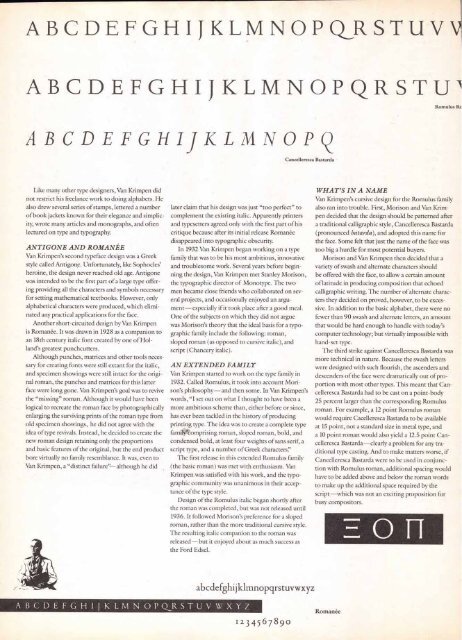
Van Krimpen's second typeface design was a Greek<br />
style called Antigone. Unfortunately, like Sophocles'<br />
heroine, the design never reached old age. Antigone<br />
was intended to be the first part of a large type offering<br />
providing all the characters and symbols necessary<br />
for setting mathematical textbooks. However, only<br />
alphabetical characters were produced, which eliminated<br />
any practical applications for the face.<br />
Another short-circuited design by Van Krimpen<br />
is Romanee. It was drawn in 1928 as a companion to<br />
an 18th century italic font created by one of Holland's<br />
greatest punchcutters.<br />
Although punches, matrices and other tools necessary<br />
for creating fonts were still extant for the italic,<br />
and specimen showings were still intact for the original<br />
roman, the punches and matrices for this latter<br />
face were long gone. Van Krimpen's goal was to revive<br />
the "missing" roman. Although it would have been<br />
logical to recreate the roman face by photographically<br />
enlarging the surviving prints of the roman type from<br />
old specimen showings, he did not agree with the<br />
idea of type revivals. Instead, he decided to create the<br />
new roman design retaining only the proportions<br />
and basic features of the original, but the end product<br />
bore virtually no family resemblance. It was, even to<br />
Van Krimpen, a "distinct failure"--although he did<br />
later claim that his design was just "too perfect" to<br />
complement the existing italic. Apparently printers<br />
and typesetters agreed only with the first part of his<br />
critique because after its initial release Roman&<br />
disappeared into typographic obscurity.<br />
In 1932 Van Krimpen began working on a type<br />
family that was to be his most ambitious, innovative<br />
and troublesome work. Several years before beginning<br />
the design, Van Krimpen met Stanley Morison,<br />
the typographic director of Monotype. The two<br />
men became close friends who collaborated on several<br />
projects, and occasionally enjoyed an argument—<br />
especially if it took place after a good meal.<br />
One of the subjects on which they did not argue<br />
was Morison's theory that the ideal basis for a typographic<br />
family include the following: roman,<br />
sloped roman (as opposed to cursive italic), and<br />
script (Chancery italic).<br />
AN EXTENDED FAMILY<br />
Van Krimpen started to work on the type family in<br />
1932. Called Romulus, it took into account Morison's<br />
philosophy—and then some. In Van Krimpen's<br />
words, "I set out on what I thought to have been a<br />
more ambitious scheme than, either before or since,<br />
has ever been tackled in the history of producing<br />
printing type. The idea was to create a complete type<br />
famiOtomprising roman, sloped roman, bold, and<br />
condensed bold, at least four weights of sans serif, a<br />
script type, and a number of Greek characters!'<br />
The first release in this extended Romulus family<br />
(the basic roman) was met with enthusiasm. Van<br />
Krimpen was satisfied with his work, and the typographic<br />
community was unanimous in their acceptance<br />
of the type style.<br />
Design of the Romulus italic began shortly after<br />
the roman was completed, but was not released until<br />
1936. It followed Morison's preference for a sloped<br />
roman, rather than the more traditional cursive style.<br />
The resulting italic companion to the roman was<br />
released—but it enjoyed about as much success as<br />
the Ford Edsel.<br />
ABCDEFGHIJKLMNOPQRSTUVWXYZ<br />
Cancelleresca Bastarda<br />
abcdefghijklmnopqrstuvwxyz<br />
1 2 3 4 5 6 7 8 9 0<br />
Romulus Rc<br />
WHAT'S IN A NAME<br />
Van Krimpen's cursive design for the Romulus family<br />
also ran into trouble. First, Morison and Van Krimpen<br />
decided that the design should be patterned after<br />
a traditional calligraphic style, Cancelleresca Bastarda<br />
(pronounced batarda), and adopted this name for<br />
the face. Some felt that just the name of the face was<br />
too big a hurdle for most potential buyers.<br />
Morison and Van Krimpen then decided that a<br />
variety of swash and alternate characters should<br />
be offered with the face, to allow a certain amount<br />
of latitude in producing composition that echoed<br />
calligraphic writing. The number of alternate characters<br />
they decided on proved, however, to be excessive.<br />
In addition to the basic alphabet, there were no<br />
fewer than 90 swash and alternate letters, an amount<br />
that would be hard enough to handle with today's<br />
computer technology; but virtually impossible with<br />
hand-set type.<br />
The third strike against Cancelleresca Bastarda was<br />
more technical in nature. Because the swash letters<br />
were designed with such flourish, the ascenders and<br />
descenders of the face were dramatically out of proportion<br />
with most other types. This meant that Cancelleresca<br />
Bastarda had to be cast on a point-body<br />
25 percent larger than the corresponding Romulus<br />
roman. For example, a 12 point Romulus roman<br />
would require Cacelleresca Bastarda to be available<br />
at 15 point, not a standard size in metal type, and<br />
a 10 point roman would also yield a 12.5 point Cancelleresca<br />
Bastarda— clearly a problem for any traditional<br />
type casting. And to make matters worse, if<br />
Cancelleresca Bastarda were to be used in conjunction<br />
with Romulus roman, additional spacing would<br />
have to be added above and below the roman words<br />
to make up the additional space required by the<br />
script—which was not an exciting proposition for<br />
busy compositors.<br />
Romanee<br />
0 if


