

Volume 19–4 (Low Res).pdf
Volume 19–4 (Low Res).pdf
Volume 19–4 (Low Res).pdf

You also want an ePaper? Increase the reach of your titles
YUMPU automatically turns print PDFs into web optimized ePapers that Google loves.
The story of the letter U is also the story of the letters V, W<br />
and Y. In fact, the origin of the U is also related to the letter F,<br />
the sixth letter of our alphabet.<br />
In ancient times, a snake-like mythical creature called<br />
Cerastes was depicted by the Egyptians as a hieroglyph to represent<br />
a consonant sound roughly equivalent to our F. This<br />
was the forerunner of the Phoenician waw, the most prolific of<br />
all their letters. The waw gave birth to our F, U, V, W and Y. It<br />
looked like our present day Y, and represented the semi-consonantal<br />
sound of w, as in the words "know" or "wing!'<br />
Sometime between 900-800 B.C. the Greeks adopted the<br />
Phoenician waw, and used it as the basis for not one, but two<br />
letters in their alphabet: the upsilon, for the vowel U sound,<br />
and the digamma, for sound that equates to our present F.<br />
The upsilon form was used by the Etruscans and later by the<br />
Romans. The Romans used it for both the semi-consonant<br />
W and the sound of U, but again, the form looked more like a<br />
Y than either the U or the V. In Roman times the sounds of U,<br />
V and W, as we currently use them, were not systematically distinguished;<br />
context usually determined the correct pronunciation.<br />
As a result their sharp-angled Monumental Capital V<br />
was used as a W in words like VENI (pronounced wainey)<br />
and as the vowel U in words like IVLIVS (pronounced as Julius).<br />
What happened to the Y? After the Roman conquest of<br />
Greece in the first century B.C., the Romans added the Greek<br />
Y to the Latin alphabet for use in the Greek words which<br />
they began to use. The sound value given to it by the Greeks<br />
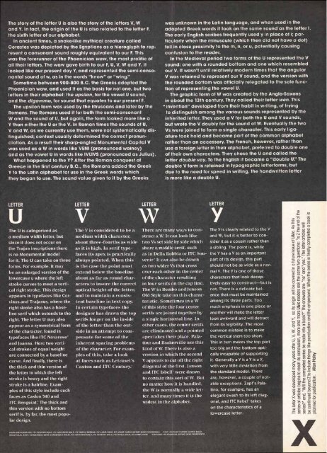
LETTER<br />
The U is categorized as<br />
a medium width letter, but<br />
since it does not occur on<br />
the Trajan inscriptions there<br />
is no Monumental model<br />
for it. The U can take on three<br />
forms. For example, it may<br />
be an enlarged version of the<br />
lowercase u where the left<br />
stroke curves to meet a verti-<br />
cal right stroke. This design<br />
appears in typefaces like Cor-<br />
vinus and Trajanus, where the<br />
right stroke also has a base-<br />
line serif which extends to the<br />
right. The letter U may also<br />
appear as a symmetrical form<br />
of the character, found in<br />
typefaces like ITC Novarese'<br />
and Joanna. Here two verti-<br />
cal strokes of equal weight<br />
are connected by a baseline<br />
curve. And finally, there is<br />
the thick and thin version of<br />
the letter in which the left<br />
stroke is heavy and the right<br />
stroke is a hairline. Exam-<br />
ples of this style include such<br />
faces as Caslon 540 and<br />
ITC Benguiat. The thick and<br />
thin version with no bottom<br />
serif is, by far, the most popu-<br />
lar design.<br />
The V is considered to be a<br />
medium width character,<br />
about three-fourths as wide<br />
as it is high. In serif typefaces<br />
its apex is practically<br />
always pointed. When this<br />
is the case the point must<br />
extend below the baseline<br />
about as far as round characters<br />
to insure the correct<br />
optical height of the letter,<br />
and to maintain a consistent<br />
baseline in text copy.<br />
In certain typefaces the<br />
designer has drawn the top<br />
serifs longer on the inside<br />
of the letter than the outside<br />
in an attempt to compensate<br />
for some of the<br />
inherent spacing problems<br />
of the character. For examples<br />
of this, take a look<br />
at faces such as Letraset's<br />
Caxton and ITC Century."'<br />
was unknown in the Latin language, and when used in the<br />
adopted Greek words it took on the same sound as the letter I.<br />
The early English scribes frequently used y in place of i; particularly<br />
when the minuscule (which then did not have a dot)<br />
fell in close proximity to the m, n, or u, potentially causing<br />
confusion to the reader.<br />
In the Medieval period two forms of the U represented the V<br />
sound: one with a rounded bottom and one which resembled<br />
our V. It wasn't until relatively modern times that the angular<br />
V was retained to represent our V sound, and the version with<br />
the rounded bottom was officially relegated to the sole func-<br />
tion of representing the vowel U.<br />
The graphic form of W was created by the Anglo-Saxons<br />
in about the 13th century. They called their letter wen. This<br />
"invention" developed from their habit in writing, of trying<br />
to distinguish among the various sounds represented by the<br />
inherited letter. They used a V for both the U and V sounds,<br />
but wrote the V doubly for the sound of W. Eventually the two<br />
Vs were joined to form a single character. This early ligaature<br />
took hold and became part of the common alphabet<br />
rather than an accessory. The French, however, rather than<br />
use a foreign letter in their alphabet, preferred to double one<br />
of their own characters. They chose the U and called the<br />
letter double vay. To the English it became a "double U." The<br />
double V form is retained in typographic letterforms, but<br />
due to the need for speed in writing, the handwritten letter<br />
is more like a double U.<br />
w<br />
LETTER<br />
There are many ways to con-<br />
struct a W It can look like<br />
two Vs set side by side which<br />
share a middle serif, such<br />
as in Della Robbia or ITC Souvenir.'<br />
It can also be drawn<br />
as two wider Vs that cross<br />
over each other in the center<br />
of the character resulting<br />
in four serifs on the cap line.<br />
The W in Bembo and Jenson<br />
Old Style take on this characteristic.<br />
Sometimes in a W<br />
of this style the four center<br />
serifs are joined together by<br />
a single horizontal line. In<br />
other cases, the center serifs<br />
are eliminated and a pointed<br />
apex takes their place. Palalino<br />
and Baskerville use this<br />
kind of W. There is also a<br />
version in which the second<br />
V appears to cut off the right<br />
diagonal of the first. Janson<br />
and ITC Isbell' were drawn<br />
to contain this sort of W. But<br />
no matter how it is handled,<br />
the W is normally a wide letter,<br />
and many times it is the<br />
widest in the alphabet.<br />
HEADLINE/SUBHEADS: ac CENTURY BOLD, ac NOVARESE BOLD, ITC ISBELL MEDIUM, ITC BABEL DEMI, ITC AVANT GARDE GOTHIC BOLD CONDENSED TEXT, ITC AVANT GARDE GOTHIC BOLD,<br />
BOLD ITALIC, BOOK CONDENSED, BOOK CONDENSED ITALIC; ITC NOVARESE BOLD, ITC CENTURY BOLD, ITC ISBELL BOLD, DC BABEL DEMI CAPTIONS, ITC FRANKLIN GOTHIC DEMI CONDENSED<br />
The Y is clearly related to the V<br />
and W, but it is better to con-<br />
sider it as a cousin rather than<br />
a sibling. The point is, while<br />
the Y has a V as an important<br />
part of its design, this part<br />
should not be as wide as a nor-<br />
mal V. The Y is one of those<br />
characters that look decep-<br />
tively easy to construct—but is<br />
not. There is a delicate bal-<br />
ance that must be maintained<br />
among its three parts. Too<br />
much emphasis in one place or<br />
another will make the letter<br />
look awkward and will detract<br />
from its legibility. The most<br />
common mistake is to make<br />
the vertical stem too short.<br />
This in turn makes the top part<br />
too big and the bottom opti-<br />
cally incapable of supporting<br />
it. Generally a Y is a Y is a Y,<br />
with very little deviation from<br />
the standard model. There<br />
are, however, a couple of not-<br />
able exceptions. Zapf's Pala-<br />
tino, for example, has an<br />
elegant swash to its left diag-<br />
onal, and ITC Kabel takes<br />
on the characteristics of a<br />
lowercase letter.<br />
CsT) 15<br />
-L- CL)<br />
CD 2 N . 0 0<br />
a)<br />
a) T.: - —<br />
_a a) ID w 0 °<br />
I— cn 0.) _a a.


