

Volume 19–4 (Low Res).pdf
Volume 19–4 (Low Res).pdf
Volume 19–4 (Low Res).pdf

Create successful ePaper yourself
Turn your PDF publications into a flip-book with our unique Google optimized e-Paper software.
avid Carson is tired of the celebrity photo formula in magazines. He wants a<br />
magazine which is a reality check editorially and visually.<br />
The magazine he proposes would be thematic and focused on socially rel-<br />
evant issues with strong visuals as well as perceptive text. He explains, "Arrow<br />
would be a magazine dealing with contemporary themes. It would juxtapose<br />
art and music with significant social issues since I believe these are all related. It<br />
would emphasize substance rather than fluff, and I intend to use graphic artists, illustrators,<br />
photographers and computer artists to highlight and interpret the material in<br />
a significant way"<br />
Carson refers to Arrow as "self-driven" and "purpose-driven" by which he means<br />
each issue would change according to its content. With no grid and a loose format,<br />
each edition of Arrow would have a design "driven largely by the visuals," says Carson,<br />
explaining, "The artists commissioned would not only interpret through illustrations<br />
or photographs, but would contribute to the inherent editorial message:<br />
The typography, too, would be more than neat columns with typeset text and headlines.<br />
"Today, people are less willing to attack a gray page of type: he states. The type<br />
must be interpretive. According to Carson, "Type should be expressive and convey<br />
the mood and the content through what it looks like as well as what the words say.<br />
'Type as type cannot not communicate. Each typeface has a personality. Type should<br />
also be readable, but not necessarily in the usual sense—people will read what looks<br />
interesting or what interests them':<br />
Carson's approach to typography is nothing<br />
if not emotional, He manipulates type and shapes<br />
it almost illustratively so that it forces a reader to<br />
see shapes and forms and jarring constructs as<br />
well as words. "I want the typography to reveal<br />
the feeling of the story immediately, so that the<br />
readers are drawn into the type and then<br />
rewarded with great writing when they start to<br />
read the text'<br />
Carson predicts that there is an urban, savvy,<br />
international audience who are waiting to have<br />
a magazine deal with issues while having them<br />
presented in a memorable and unpredictable<br />
way. This is an untapped audience, he feels, who<br />
were reading Beach Culture (an award-winning,<br />
16<br />
1,,n a recent tOwision inter<br />
iew,<br />
(--5?-ish said chat<br />
son's appuintrren<br />
the Lommission wool<br />
a tha<br />
or jest<br />
sex at<br />
the way<br />
workanna<br />
YDenki tote:<br />
,Inc ou.'to Group in<br />
january 2000<br />
work<br />
1;itti ri 5 ae<br />
1 t 1,., rn ,p.-t i _ zomple .1 I ea<br />
w<br />
"Mr s)ohnson, .wbat<br />
'O' r, p otrot u IA 2 icjr 1 1%"Ph ailYeanYg e w / so u ? ni<br />
amd cha l lenge you to eo chat the lclonmpirse s iodn h as<br />
CO(_ Td<br />
by Margaret Richardson<br />
ARROW<br />
41 fige4brsiauis dy.-1G a<br />
lialerkg.e him to provi. e 2 l e<br />
TB erei rilaB ni il E chisfilFii Iflidiqrtlie<br />
Ir, sprry to say, it proba-<br />
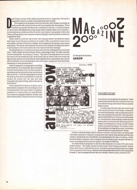
COVER: ART DIRECTOR: DAVID CARSON<br />
GRAPHIC DESIGNER: MARTIN VENEZKY<br />
now defunct cult magazine he designed). These<br />
readers he believes are also anxious to find sub<br />
jects with the energy associated with the eclectic<br />
Beach Culture.<br />
In some ways, the new style and music mag<br />
azine ray Gun (Carson is the design consultant)<br />
moves in this direction with an impudent use of<br />
type and arresting visuals (like a photographic<br />
essay by Matt Mahurin). But Arrow Carson points<br />
out, would have a more socially conscious and<br />
serious role; it would be the thinking person's<br />
version of contemporary culture, counter culture,<br />
politics and relevant issues. For Carson, Arrow<br />
is the medium for integrating music, art and pro<br />
gressive ideas through expressive design.<br />
Carson's editorial design style is inherent in Arrow—layouts which are dense and<br />
overlayed; expressive computer-manipulated type which dramatically portrays the<br />
content; a passionate use of illustration and photography. His style of working—which<br />
involves using a computer, then arranging and rearranging type, images and texts on<br />
board, montaging the layouts so to speak—he intends to continue.<br />
An added feature proposed for Arrow is the inclusion of a music CD in its music<br />
review section. "The reader should be able to hear what is being reviewed," Carson<br />
states. And Carson is definite that Arrow will still be produced and printed as a maga.<br />
zine as opposed to becoming a disk since he feels people still need to hold a magazine,<br />
to smell it, turn the pages and feel they can browse, observe, read, and return to it.


