

Volume 19–4 (Low Res).pdf
Volume 19–4 (Low Res).pdf
Volume 19–4 (Low Res).pdf

You also want an ePaper? Increase the reach of your titles
YUMPU automatically turns print PDFs into web optimized ePapers that Google loves.
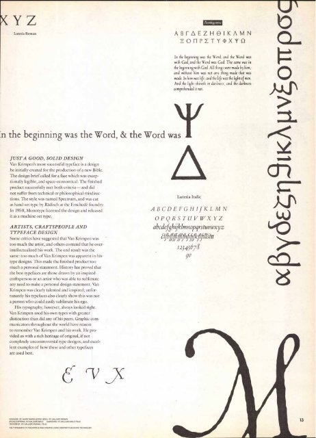
YZ<br />
Lutetia Roman<br />
In the beginning was the Word, & the Word was<br />
JUST A GOOD, SOLID DESIGN<br />
Van Krimpen's most successful typeface is a design<br />
he initially created for the production of a new Bible.<br />
The design brief called for a face which was exceptionally<br />
legible, and space-economical. The finished<br />
product successfully met both criteria—and did<br />
not suffer from technical or philosophical misdirections.<br />
The style was named Spectrum, and was cut<br />
as hand-set type by Radisch at the Enschede foundry.<br />
In 1950, Monotype licensed the design and released<br />
it as a machine-set type.<br />
ARTISTS, CRAFTSPEOPLE AND<br />
TYPEFACE DESIGN<br />
Some critics have suggested that Van Krimpen was<br />
too much the artist, and others contend that he overintellectualized<br />
his work. The end result was the<br />
same: too much of Van Krimpen was apparent in his<br />
type designs. This made the finished product too<br />
much a personal statement. History has proved that<br />
the best typefaces are those drawn by an inspired<br />
craftsperson or an artist who was able to sublimate<br />
any need to make a personal design statement. Van<br />
Krimpen was clearly talented and inspired; unfortunately<br />
his typefaces also clearly show this was not<br />
a person who could easily sublimate his ego.<br />
His typography, however, always looked right.<br />
Van Krimpen used his own types with greater<br />
distinction than did any of his peers. Graphic communicators<br />
throughout the world have reason<br />
to remember Van Krimpen and his work. He provided<br />
us with a rich heritage of original, if not<br />
completely uncontroversial type designs, and excellent<br />
examples of how these and other typefaces<br />
are used best.<br />
HEADLINE: ITC AVANT GARDE GOTHIC BOLD; ITC GALLIARD ROMAN<br />
BYLINE/CAPTIONS, ITC GALLIARD BOLD SUBHEADS: ITC GALLIARD BOLD ITALIC<br />
TEXT/CREDIT: ITC GALLIARD ROMAN, ITALIC<br />
THE TYPOGRAPHY IN THIS ARTICLE WAS CREATED USING DESKTOP PUBLISHING TECHNOLOGY<br />
Antigone<br />
ABFAEZHOIKAMN<br />
011PETY(I)X`V U<br />
In the //inning was the Word, and the Word was<br />
with God, and the Word was God. The same was in<br />
the beginning with God. All things were made by him;<br />
and without him was not any thing made that was<br />
made. In him was life; and the life was the light of men.<br />
And the light shineth in darkness; and the darkness<br />
comprehended it not.<br />
Lutetia Italic<br />
ABCDEFGHIJKLMN<br />
OPQRSTLIVIVXYZ<br />
abcdefghijklmnopqrstuvwxyz<br />
albffMhfifilkfifiliCht<br />
12345678<br />
go<br />
ocpy6E4118iKApvoTtp6c


