

Volume 16–1.pdf
Volume 16–1.pdf
Volume 16–1.pdf

You also want an ePaper? Increase the reach of your titles
YUMPU automatically turns print PDFs into web optimized ePapers that Google loves.
e o<br />
Qq Rr Ss Tt UuVvWw XxYy Zz 1234567890&/E03W £%!?(<br />
PUBLISHED BY INTERNATIONAL TYPEFACE CORPORATION, VOLUME SIXTEEN, NUMBER ONE, WINTER 1989<br />
P e<br />
ol0<br />
T1ONS TODAY<br />
04 Major New<br />
Bode,<br />
eLUewed &<br />
Summarized im<br />
tfii& 116,6,ue.<br />
raw 30.
ITC EXHIBITION SCHEDULE<br />
HEADLINE: ITC AVANT GARDE GOTHIC DEMI<br />
Continuing through March 16th<br />
PAINTING WITH WORDS<br />
ritish calligrapher, Donald Jackson, M.V.O., is<br />
scribe to Her Majesty's Crown Office at the House of Lords, London.<br />
This retrospective exhibit of his work is comprised of more<br />
than 50 pieces that were created using methods and techniques that<br />
have not been altered since the 14th century. Included in<br />
this display of writing, illuminating and gilding are heraldic devices,<br />
peerages, charters, jewelry, a family tree, hand-bound books .<br />
and a tapestry. Modern adaptations of traditional forms of the art of<br />
calligraphy are a part of the exhibition as well.<br />
Alphabet: The Story of Writing (produced by Chatsworth Films, Ltd.,<br />
London) is being shown on video throughout the day.<br />
This exhibition was organized by the London Link, St. Paul, Minnesota.<br />
March 17—June 6<br />
The ITC Center will be closed for renovation.<br />
June 7 through August 24<br />
TDC 35<br />
The 35th Annual Typographic Design Competition<br />
Sponsored by the Type Directors Club<br />
Hours: 12:00 noon-5:00 p.m.<br />
Open Monday—Friday<br />
Closed Monday, February 20<br />
Admission: Free<br />
ITC Center<br />
2 Hammarskjold Plaza<br />
(866 Second Avenue, between 46th and 47th Streets)<br />
Third Floor<br />
New York, NY 10017<br />
Morning hours available for schools and professional organizations by reservation only-<br />
For more information and group reservations call (212) 371-0699.<br />
SUBHEAD/INITIALS: ITC NOVARESE MEDIUM ITALIC<br />
TEXT. ITC SLIMBACH BOOK, BOOK ITALIC, BOLD<br />
At the ITC Exhibition Center<br />
A retrospective of the work of British<br />
calligrapher Donald Jackson, scribe to Her<br />
Majesty's Crown Office at the House of<br />
Lords, London.<br />
The Letter E<br />
A troublesome character with a<br />
questionable past - it turns out to be our<br />
most useful vowel.<br />
The Annual Report... a Perennial<br />
Headache<br />
The average reader spends a total of nine<br />
minutes with it, so why all the angst?<br />
Al Hirschfeld: Last of the Broadway<br />
Caricaturists<br />
His caricatures of Broadway stars document<br />
60 years of New York theatre history.<br />
Families to Remember<br />
Kaye and Fine, and ITC Caslon® - two enduring,<br />
universally appreciated families.<br />
Typographic Milestones: Jan Tschichold<br />
How a radical thinker almost singlehandedly<br />
changed the course of<br />
typographic design in the 20th century.<br />
"Trustees of the Future" Prize Winners<br />
First, second and third prize-winners<br />
in the fourth annual Herb Lubalin<br />
International Student Design Competition.<br />
What's New from ITC?<br />
(Good things come in threes).<br />
One, ITC American Typewriter ® Italic,<br />
at long last, is now here to round out<br />
that family. Two, ITC Isadora;" a script<br />
especially designed for digital bitmap<br />
typesetting. Three, ITC Flora,- a unique<br />
upright sans serif cursive face.<br />
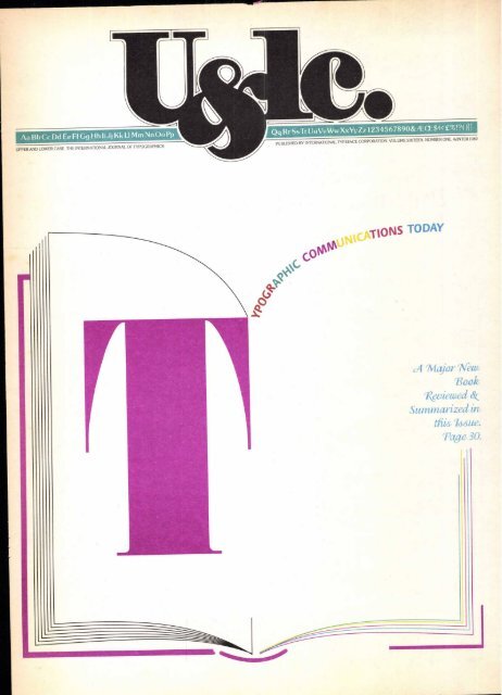
"Typographic Communications Today"<br />
by Ed Gottschall.<br />
A new all-encompassing book about<br />
typography as a communications tool<br />
covers the evolution and revolutions,<br />
pioneers and practitioners and a critique<br />
of the past 100 years' designs. Herein, a 17page<br />
summary of the 256-page book which<br />
is to be released shortly.<br />
Three Thoughtful Alphabets<br />
Cool logic and light-hearted whimsy do not<br />
usually co-exist, but here they do.<br />
Take Off Your Glasses...<br />
The physically impaired may lack<br />
mobility, but not taste. Designers offer<br />
some considerate, handsome devices for<br />
people with disabilities.<br />
Illiteracy-the Price<br />
A call for entries in the fifth annual Herb<br />
Lubalin International Student Design<br />
Competition.<br />
VOLUME SIXTEEN, NUMBER ONE, WINTER 1989<br />
EDITOR: EDWARD GOTTSCHALL<br />
ART DIRECTOR: WEISZ YANG DUNKELBERGER INC.<br />
EDITORIAL DIRECTOR: ALLAN HALEY<br />
ASSISTANT EDITOR. RESEARCH DIRECTOR: JULIET TRAVISON<br />
ASSOCIATE EDITOR: MARION MULLER<br />
ART PRODUCTION MANAGER: ILENE STRIZVER<br />
ART/PRODUCTION: PAT KRUGMAN, KIM VALERIO, SID TIMM<br />
ADVERTISING MANAGER: CAROL MARGOLIN<br />
ADVERTISING PRODUCTION MANAGER: HELENA WALLSCHLAG<br />
SUBSCRIPTIONS: ELOISE COLEMAN<br />
12<br />
16<br />
20<br />
24<br />
30<br />
47<br />
48<br />
52<br />
© INTERNATIONAL TYPEFACE CORPORATION 1989<br />
U&LC (ISSN 0362 6245)15 PUBLISHED QUARTERLY BY INTERNATIONAL TYPE-<br />
FACE CORPORATION, 2 HAMMARSKJOLD PLAZA, NEW YORK, NY 10017.<br />
ITC IS A SUBSIDIARY OF ESSELTE LETRASET. U.S. SUBSCRIPTION RATES 510 ONE<br />
YEAR: FOREIGN SUBSCRIPTIONS, 515 ONE YEAR: U.S. FUNDS DRAWN ON U.S.<br />
BANK. FOREIGN AIR MAIL SUBSCRIPTIONS-PLEASE INQUIRE. SECOND-CLASS<br />
POSTAGE PAID AT NEW YORK, NY AND ADDITIONAL MAILING OFFICES. POST-<br />
MASTER: SEND ADDRESS CHANGES TO U&LC, SUBSCRIPTION DEPARTMENT,<br />
2 HAMMARSKJOLD PLAZA, NEW YORK, NY 10017.<br />
ITC FOUNDERS:<br />
AARON BURNS, HERB LUBALIN, EDWARD RONDTHALER<br />
ITC OPERATING EXECUTIVE BOARD 1989<br />
MARK J. BATTY, PRESIDENT AND CEO<br />
AARON BURNS, CHAIRMAN<br />
EDWARD GOTTSCHALL, VICE CHAIRMAN<br />
ALLAN HALEY, EXECUTIVE VICE PRESIDENT<br />
ANN OLSEN, CONTROLLER<br />
LAURIE BURNS, PUBLIC RELATIONS AND EDUCATIONAL ACTIVITIES<br />
MICROFILM COPIES OF U&LC MAY BE OBTAINED FROM MICRO PHOTO DIVISION,<br />
BELL & HOWELL, OLD MANSFIELD ROAD, WOOSTER, OH 44691<br />
FRONT COVER: ITC FAT FACE, ITC FLORA BOLD, ITC ISADORA REGULAR<br />
TABLE OF CONTENTS:<br />
ITC AMERICAN TYPEWRITER BOLD, MEDIUM ITALIC<br />
MASTHEAD: ITC NEWTEXT REGULAR
ave you ever noticed that the<br />
Tuesday morning meeting which is<br />
supposed to answer everybody's<br />
questions rarely does? This is not a<br />
new phenomenon; it has long been<br />
prevalent in business. Now, unfortu-<br />
nately, it is beginning to creep into<br />
other aspects of our lives. There are<br />
less and less simple answers to ques-<br />
tions like: "Why doesn't my car<br />
startr "Why isn't my report worth<br />
an 'A'r or "What do you mean, you<br />
can't balance the checkbook?"<br />
So it is with the origins of<br />
our alphabet. The seemingly simple<br />
question is,"What's the origin of the<br />
letter 'E'?" Sorry, no simple answer.<br />
Several experts believe that<br />
our "E',' or at least some of the sounds<br />
it represents, was once indicated by<br />
the Egyptian hieroglyph for a house.<br />
Others contend that it grew out of<br />
the sign represented as a window<br />
And others still, attribute the "E's"<br />
ancestry to the Egyptian symbol of<br />
a courtyard. To further complicate<br />
matters, our "E',' one of the most<br />
commonly used vowels, actually<br />
started life as a consonant.<br />
The Phoenician writing sys-<br />
tem is generally credited as the first<br />
step toward the creation of our cur-<br />
rent "phonetic" alphabet. Phoeni-<br />
1:16<br />
cian writers were among the first to<br />
use symbols to represent sounds,<br />
rather than employing different sym-<br />
bols or pictures to signify a particular<br />
word. The Phoenician language<br />
was based on 22 consonant sounds<br />
(vowels were relatively unimportant),<br />
each with a name—and a symbol to<br />
represent that sound in writing.<br />
One of these 22 sound-sym-<br />
bols was the precursor to our "E'.' The<br />
Phoenician which they called<br />
he, and roughly represented the<br />
sound of our "h," was probably the<br />
great-great grandparent of the fifth<br />
letter in our alphabet.<br />
When the Greeks adopted<br />
the Phoenician writing system, they<br />
had difficulty pronouncing about<br />
half of the Phoenician letter names;<br />
and so they modified the trouble-<br />
some characters to bring them into<br />
sync with the Greek language. Some<br />
were altered only slightly, others<br />
drastically, and still others were<br />
dropped altogether.<br />
The Phoenician )■\ was<br />
one of the problem characters. The<br />
Greeks could not pronounce the<br />
first sound of the letter name. Being<br />
pragmatic people, and living in less<br />
complicated times, their answer to<br />
the problem was just to drop the<br />
part of the name that was causing<br />
the difficulty. As a result the Phoeni-<br />
cian "he" became simply "e" —and<br />
thus our most useful vowel was born.<br />
Overtime, the Greeks gradu-<br />
ally simplified the design of the<br />
Phoenician character, and flopped it<br />
so that its arms were pointed to the<br />
right. The end result looked remark-<br />
ably like the E found in typefaces<br />
like Helvetica - or ITC Avant Garde<br />
Gothic!' The final version was given<br />
the name epsilon and represented a<br />
short e sound.<br />
The "E" is normally<br />
drawn as a somewhat narrow<br />
letter. Its width, without serifs, is<br />
approximately one-half of its<br />
height.<br />
The middle horizontal<br />
stroke (or arm) is almost always<br />
drawn above the true center of<br />
the character. This gives the letter<br />
both balance and proportion. In<br />
some mannered designs, espe-<br />
cially those with art nouveau<br />
overtones, the middle stroke is<br />
placed quite high.<br />
FA ITC Fen ice® Regular<br />
The middle stroke is also<br />
normally the shortest of the three<br />
horizontals. The differences<br />
should be subtle (in many cases<br />
not even optically apparent), but<br />
the center stroke should be<br />
slightly shorter than the top, and<br />
the top not as long as the baseline<br />
stroke. Although not as obvious,<br />
these differences are also found<br />
in sans serif designs.<br />
While simple answers<br />
may be becoming a rare occur-<br />
rence, the simple beauty of our<br />
alphabet endures.<br />
ITC Benguiat® Book<br />
E ITC Avant Garde Gothic® Book<br />
— Allan Haley<br />
HEADLINE ITC GALLIARD BOLD ITALIC WITH ROMAN<br />
TEXT ITC STONE SANS MEDIUM. ITC STONE SERIF BOLD ITALIC<br />
BYLINE: ITC STONE SERIF BOLD CAPTIONS: ITC FRANKLIN GOTHIC BOOK
Pied*<br />
lieoPn<br />
Ai<br />
prior -<br />
„).ty<br />
co02 06"<br />
00 a-2, C<br />
oar a3 :<br />
03 co<br />
0 o 02, oo<br />
-40a .-oZ, oo<br />
oo ac ad'<br />
recent exhibit at<br />
the Cooper-Hewitt<br />
Museum in New York<br />
City reviewed 475 years<br />
of annual reports. What<br />
started as a simple,<br />
hand-written financial<br />
statement has evolved<br />
into a super graphic<br />
challenge for designers—<br />
and made...
(IINGORPOkAl<br />
"The Company OF the People Y<br />
ASSETS.<br />
aicipal and R. R. Bonds , and Stocks ..<br />
As and Mortgages. ,<br />
.1 Estate ...<br />
.<br />
as to<br />
,<br />
ariums, deferred and in course of collection 1 "<br />
rued Interest, Rents, etc,<br />
otal Outstanding Insurance (larger than that of<br />
any other company in the world)..<br />
H AIL<br />
Above left: handwritten minutes of<br />
the annual meeting of the Mercers Company<br />
London, date back to the 1650s. Such simple<br />
records were the precursors of our contemporary<br />
elaborate annual reports.<br />
Left: U.S. West, a spinoff from AT&T<br />
sought to link its name symbolically with the<br />
West by packaging and tying its annual report<br />
with a western-inspired feathered string.<br />
Above right along with the idea of<br />
joint-ownership of companies came investors'<br />
demands for annual financial reports. Shown<br />
here are a collection of annual reports issued<br />
from the 16th to 19th century.<br />
Background image, this page: a no-frills<br />
1912 annual report of the Metropolitan Life<br />
Insurance Company<br />
Right: in keeping with its product, the<br />
Norlin Corporation, a producer of musical<br />
instruments, packaged its 1979 annual report<br />
in a record jacket.<br />
Company<br />
$150,530,10', px<br />
140,343,953.89<br />
23,740,237,24<br />
4,382,270,90<br />
10,536.20. 8,35<br />
6,792,.5.53.19<br />
52,197.00<br />
CO N T. )<br />
443,28<br />
0 0<br />
2,399,878,087.0<br />
WORKHOUSE.<br />
",<br />
rue g 1.061.1,1{ the great Number of 'Pr.e, yeri<br />
alto of the other ,rryry And her ter sad 1.b,<br />
Edheateri, tinintarned, arid hyployed by the fb .Yor ,irerthe<br />
I' 00 I( of the City of Lmi. the We: ta-ti Quote<br />
Number of Policy Claims paid in 1.91. '<br />
cAverag.Mg orte policy paid fur every 55 seconds of each business day (,f 8 hours,)<br />
Amount paid on the Above, . ,<br />
.. .<br />
(Averaging 1(,7.82 a minute of each business day of 8 hours.)<br />
Polio-Claims, Dividends and Surrender-Values<br />
paid Policy-holders in 1911, plus addition to<br />
id Policy-holders since organization, plus<br />
amount now invested for their security<br />
■111111<br />
111 1■ ■<br />
526 per day in Number of Claims Paid.<br />
0,432 per day in Number of Policies Issued and Revived.<br />
$1,524,208 per day in New Insurance Issued and Revived.<br />
033,386.44 per day in Payments to Policy-holders and addition<br />
to Reserve.<br />
er day in Increase of Asset,<br />
It happens every year.<br />
Like tax season to an accountant<br />
()?<br />
$70,482,700.49<br />
S678,013,740.19<br />
...harvest time to a farmer...<br />
Christmas in the retail world,<br />
annual report season has<br />
become frantic-time in the<br />
graphic design world. All other<br />
projects grind to a halt. Designers<br />
don't answer their phones;<br />
they hole up behind locked<br />
doors to contemplate how to turn<br />
dry statistics into an adventure<br />
in reading.<br />
Why all the anguish? All a<br />
stockholder really wants to know
is: "How'm I doing? Who's running the company, and what are<br />
their plans for the future?" Actually, it can all be told in a few words<br />
and numbers; and that's exactly how the earliest financial state-<br />
ments were rendered.<br />
The very first annual reports in the Cooper-Hewitt exhibition<br />
were financial records of old English guilds. One, dating back to<br />
1515, was merely a handwritten transcript of the minutes of oral<br />
business done at a guild meeting, indicating receipts and payments.<br />
With the expansion of commerce in the early 1600s, the need for<br />
capital led to the formation of joint-stock companies. Investors in<br />
such business ventures naturally needed to be apprised of their<br />
company's financial status, and so in England and America (which<br />
followed English business customs) the governments decreed that<br />
publicly owned trading companies must issue annual reports to<br />
their constituents. Through the centuries, for the most part these<br />
annual reports were simple printed statements containing only skeletal<br />
information; company executives often used their own discretion<br />
in choosing what to report and what to withhold from investors<br />
and potential stockholders.<br />
But in America, the resounding 1929 stock market crash put<br />
an end to such discretionary disclosures. To prevent misrepresentation<br />
and future financial chaos, the Securities and Exchange Act was<br />
passed in 1934. It required all companies trading publicly to provide<br />
complete financial statements annually to their stockholders and<br />
would-be investors. Though such government intervention usually<br />
stuck in the craw of big business, some companies began to see how<br />
the nuisance annual report could be turned into a corporate asset.<br />
Left: written annual reports go back to the<br />
early 16th century. This leather bound minute<br />
book from an English painters and stainers<br />
guild contains records from 1510 to 1810.<br />
Below: cover of an 1878 annual report<br />
issued by the Pennsylvania Railroad.<br />
in of -Itlitniors<br />
Pennsylvania Railroad Co.<br />
C F.:1T 01,T)<br />
ot the A I:Wing. had<br />
PROCEEDIN.n,' -:<br />
ANNuAL NI ET 1N;;<br />
LKx;LLY 3 seX PRIX TECS, AM LI MIX :.T X ELT<br />
157E .<br />
HEADLINE: ITC CHELTENHAM BOOK CONDENSED. BOLD CONDENSED ITALIC. ULTRA LEAD-INS: ULTRA CONDENSED TEXT: BOOK CONDENSED CAPTIONS/BYLINE: BOOK CONDENSED ITALIC<br />
Annual Reports and the Corporate Image. Like<br />
the architecture it chose for its headquarters...like its interior decor<br />
...its corporate art collection... its civic and cultural contributions, a<br />
company's annual report could become another vehicle for projecting<br />
a noble public image.<br />
It didn't seem to matter that a 1945 survey by Financial<br />
World magazine indicated that all stockholders wanted in an annual<br />
report was: a convenient magazine-size format, detailed financial<br />
information in simple charts and non-technical language, and an<br />
indication of the company's future plans. They could be quite content<br />
with a 2-color job and required no elaborate embellishments.<br />
Nevertheless, in the mid-'40s and '50s, many prominent<br />
companies began to seek out distinguished designers to project a<br />
touch of class in their annual reports. They willingly shelled out<br />
funds for fine art; for photographers to fly halfway 'round the world<br />
for the perfect location shot; for the most luxurious paper. Fine<br />
typography, unique diecuts, embossing—every nuance of design<br />
that might connote the company's lofty standards and values was<br />
endorsed. Budgets for annual reports soared. Today, among the<br />
Fortune 500 companies, quarter-million to million-dollar expenditures<br />
for annual reports are not uncommon.<br />
The Designer's Dilemma. Regardless of the generous<br />
budgets allocated, and the almost certain guarantee of repeat business,<br />
for most designers the annual report is a mixed blessing. The<br />
project can be a straitjacket. The contents are basically the same<br />
Above center: a London design firm, the Michael<br />
Peters Group, projected an image of creativity with the<br />
imaginative pop-up spread dramatizing its varied<br />
enterprises.<br />
Far right Domino's Pizza has captured attention<br />
with its dramatic annual reports. One year it was<br />
packaged in a box of dominoes, another year in a pizza<br />
box. Shown here is a recent annual report distributed in<br />
a canvas newsboy sack.
year-in, year-out. Opportunities for adventurous design ideas are<br />
decidedly limited by the personality the corporation must project, by<br />
the whims of the CEO and the countless lesser executives who also<br />
get into the act. And aside from all the esthetic design decisions,<br />
there are, according to Lou Dorfsman, renowned former creative<br />
director of CBS, Inc., subtle psychological problems to resolve:<br />
"How, for instance, to represent the company's financial health without<br />
making the stockholders nervous? If you've had a better-thanexpected<br />
year and are tempted to produce a prosperous-looking<br />
report, they may be contentious about the undue expense. On the<br />
other hand, if the company has had a bad year, you certainly don't<br />
want to squander funds on a showy job. But neither do you want<br />
to rub the bad news in the stockholders' faces by going cheap:'<br />
Ironically, in spite of all the angst and efforts expended<br />
on the annual report, it's an accepted fact that the average reader<br />
spends very little time reading it—about 9 minutes total. That being<br />
the case, special effort goes into making a speedy but memorable<br />
impression. Probably no other single element gets as much consideration<br />
as the cover or package in which the report is sent.<br />
Unusual Formats. Although the Cooper-Hewitt exhibit<br />
gave equal attention to photography, illustration, typography, and<br />
the handling of charts and graphs, the most arresting reports<br />
were those presented in unusual formats.<br />
Among those designed to intrigue a busy executive were<br />
a series designed in the early 1980s for the Domino Pizza company.<br />
The exhibition and accompanying 36-page full color<br />
publication, available from the Cooper-Hewitt<br />
Museum Shop for $3.95, plus tax, was made possible<br />
with a grant from the Northwest Paper Division of<br />
the Potlatch Corporation.<br />
One report was packaged in a wooden box, complete with a set<br />
of dominos. Another year, it was designed in-the-round, like a pizza<br />
pie, and delivered in a Domino Pizza box. A third year, the report<br />
was printed in newspaper format and packaged in a canvas<br />
newsboy-type bag.<br />
A food chain, Red Owl Stores, packaged its 1970 report<br />
in a plain brown paper bag with a cashier's slip attached. Norlin,<br />
a producer of musical instruments, issued its 1974 report in a record<br />
album sleeve. And a design company involved in package design<br />
and marketing of a variety of products and services, went all out on<br />
a center spread with expensive pop-up illustrations of their compa-<br />
ny's projects.<br />
Not every designer gets the opportunity to be innovative<br />
and playful. Most clients' images require sterner stuff. But conversely,<br />
those who get the green light to let their imaginations soar and<br />
come up with a stunning, novel format one year, had better be<br />
prepared to match it or top it the next time around.<br />
For designers who are jaded and have mixed emotions<br />
about the "perennial annual report" there seems to be no end in<br />
sight. Even though the Securities and Exchange Commission<br />
recently ruled for allowing companies to issue short-form reports,<br />
no company has taken up the option. There is hope though. Judg-<br />
ing from the way communication technology has influenced design<br />
in the past, we may be heading into an era when scriptwriters,<br />
animators, and camera crews will take over from graphic designers,<br />
and annual reports will be dramatized on videotapes, ready to be<br />
popped into VCRs. It's possible. Marion Muller
8<br />
Fifty years ago<br />
New York City had more major<br />
morning, afternoon and evening<br />
newspapers than could fit on a<br />
newsstand at any one time. Now<br />
there are only three. Fifty years ago<br />
New York City also had more theatrical<br />
caricaturists than these many<br />
newspapers could absorb. Now<br />
there is only one; and he is the master.<br />
Since 1925, Al Hirschfeld has<br />
been documenting, in pen and ink,<br />
America's plays and players for<br />
the drama section of the New York<br />
Times. At 85 years of age, this<br />
redoubtable artist, with his mane of<br />
flowing white hair and long, pointed<br />
beard can still be found at almost<br />
any Broadway premiere in a first row<br />
aisle seat making feverish sketches<br />
in the dark. He is the last of the<br />
Broadway caricaturists, and also<br />
the most legendary. The odds are<br />
that in the foreseeable future no<br />
one will be able to fill his well-worn<br />
shoes.<br />
"I never wanted to be a cartoonist:'<br />
said Hirschfeld during a<br />
recent interview at his New York<br />
studio. "Actually, I started out as a<br />
sculptor and then a painter. I don't<br />
consider myself a cartoonist either.<br />
You see, a cartoon is something<br />
that has a literal idea —a point of<br />
view. I've done them, but as the<br />
years went on I just worried about<br />
line and form and space:' For<br />
Hirschfeld the distinction between<br />
the cartoon and caricature is profound.<br />
"A cartoon doesn't depend<br />
on the quality of the drawing so<br />
much as on the idea. If it's a good<br />
idea, anyone can do it. But a caricature<br />
has another quality. The word<br />
'abstract: I suppose, is the only one<br />
I can use. Are Picasso, Lautrec<br />
and Hokusai caricaturists, graphic<br />
artists or painters? They were all<br />
caricaturists, in my view."<br />
After a long stay in Paris<br />
during the early '20s, Hirschfeld<br />
began his career as a journalist,<br />
contributing political cartoons to<br />
left-wing periodicals, including the<br />
New Masses. At one time he was<br />
even asked to replace Caesar, the<br />
last political cartoonist for the<br />
by<br />
Steven<br />
Helier<br />
Joel Grey and Liza Minnelli, "Cabaret," 1972.<br />
Mary Martin and Ezio Pinza, "South Pacific," 1949.<br />
fflBs
Times. He refused because the constraints<br />
of the form worried him:<br />
"For me doing political cartoons was<br />
a great responsibility to the reader.<br />
You're influencing a lot of people,<br />
particularly young people. And<br />
unless you really believe in what<br />
you're saying, be careful:' Though<br />
he had never joined any party, he<br />
was an ardent supporter of labor<br />
unions and fervent enemy of fascism<br />
both here and abroad. And<br />
unlike some of his artist colleagues<br />
who used pseudonyms to circumvent<br />
the reach of red-hunting congressional<br />
committees, Hirschfeld<br />
proudly signed his name to all drawings.<br />
His disillusionment came<br />
when one of his drawings — a caricature<br />
of Father Coughlin, the depression-era<br />
spokesman for the ultra<br />
right wing—was censored by the<br />
editors of the New Masses. Despite<br />
their avowed antipathy towards<br />
Coughlin's racist principles, they<br />
deemed Hirschfeld's drawings<br />
as offensive to Catholic unions.<br />
The hypocrisy of that, he felt, was<br />
intolerable.<br />
"I realized that to do political<br />
things you have to be able to switch<br />
with the times. You can be prounion<br />
one day and anti-union the<br />
next. I'm no good at that. I had a<br />
point of view about what I wanted to<br />
do and say, and I've stood by it all<br />
these years. Though politics"; continues<br />
Hirschfeld, "is a field that has<br />
not yet been properly mined, it's<br />
not for me. I'd much rather have<br />
the villains and heros made by the<br />
playwright. That's his worry not<br />
mine. My worry is to do a decent<br />
drawing, and interpret what the<br />
playwright intends to say."<br />
In 1927 Hirschfeld spent a<br />
year in Moscow enthusiastically<br />
reporting on the Soviet theatre. A<br />
decade after the revolution, there<br />
was still an air of excitement, albeit<br />
short-lived, on the streets and on<br />
the stage. Under the auspices of<br />
Anatoly Lunacharsky, the leading<br />
advocate of Russian avant garde<br />
art, he drew interpretations of the<br />
productions by Meyerhold and others,<br />
which were printed in the Russian<br />
newspaper Izvestia and sent<br />
9
10<br />
Rex Harrison, The Fighting Cock," 1959.<br />
back by boat to The New York Herald<br />
Tribune. He also wrote and illustrated<br />
a book on Soviet theatre<br />
which was unforgivably lost by an<br />
American publisher, Boni and<br />
Liveright.<br />
He has trouble remembering<br />
when his fluid linear style was<br />
developed. It was probably sometime<br />
in the late '20s or early '30s<br />
and was definitely a response to the<br />
constraints of the media. "It<br />
asserted itself after many years of<br />
trial and error..." recalls Hirschfeld,<br />
"I discovered that the safest way to<br />
reproduce on the toilet paper that<br />
newspapers are printed on—which<br />
they haven't improved since the<br />
process was invented — was to stick<br />
with pure line. I kept eliminating<br />
and eliminating, and getting down<br />
to the bare essentials. I still do,<br />
in a way."<br />
While plying his craft as a<br />
caricaturist for many New York<br />
newspapers during the early '30s,<br />
he co-edited, with Alexander King, a<br />
satirical journal called Americana,<br />
which included contributions by<br />
Nathaniel West, e.e. cummings,<br />
George Grosz and S.J. Perelman.<br />
With Sid Perelman a<br />
"mutual admiration society" developed.<br />
They wrote a musical<br />
together and, later, a successful<br />
book. The musical called "Sweet<br />
Bye and Bye,' was their first collabo-<br />
Lillian Gish, "The Trip to Bountiful," 1953.<br />
))((<br />
r<br />
€1>c (1.,1(,tC —)(<br />
))<br />
((<br />
(,<br />
')<br />
, J)<br />
Sammy Davis, Jr., Humphrey Bogart, Judy Garland, Laurel and Hardy, John Wayne and Katherine Hepburn (date unknown).<br />
ration, and had lyrics by Ogden<br />
Nash, music by Vernon Duke, and<br />
sets by Boris Aronson. A great combination,<br />
yet a memorable disaster.<br />
"Sid and I were the culprits:' recalls a<br />
bemused Hirschfeld. "We wrote a<br />
musical about the future. Well, you<br />
can do that visually. But the thing<br />
that didn't work was the music. How<br />
do you write music for the future?<br />
I mean, these fellows (the composers),<br />
naturally want to get their<br />
stuff played. But once you start<br />
being satirical about music, you're<br />
out of business:' Shortly after their<br />
flop, Perelman and Hischfeld had<br />
lunch with Ted Patrick, the brilliant<br />
editor of Holiday Magazine, who<br />
suggested that the duo travel<br />
around the world and record in picture<br />
and word their experiences.<br />
They agreed, since, "after this<br />
stinker we had to leave the country<br />
anyway." And within a week the idea<br />
was also signed on as a book for<br />
Simon and Schuster. The wonderful<br />
expedition lasted two months, and<br />
the resulting Westward Ha! became<br />
a runaway bestseller.<br />
Hirschfeld did drawings for<br />
most of the major American magazines,<br />
including Life, The Saturday<br />
Evening Post, The American Mer-<br />
cury, and TV Guide. For Collier's he
Raul Julia,<br />
"Threepenny Opera: .<br />
George Bums and Carol Channing<br />
(date unknown).<br />
regularly collaborated with John<br />
O'Hara, but Hirschfeld was somewhat<br />
disillusioned with this: "His<br />
column, Appointment with O'Hara,<br />
was terrible. Not that O'Hara was a<br />
bad writer, but these things were<br />
really unreadable. Yet they were<br />
apparently so popular with the<br />
readers that they raised my fee<br />
without me even having to ask:'<br />
Sinecure with The New York Times<br />
came in the '30s when the uncompromising<br />
Sunday Editor, Lester<br />
Markel, who was annoyed that the<br />
artist appeared elsewhere with<br />
such frequency, approached Hirschfeld<br />
and said, "We're beginning to<br />
look like all the other papers. We<br />
would like it if you'd just work for<br />
us:' "So I said, well, all you've got to<br />
do is cross my palm with silver and<br />
I'm your fella. In fact I much preferred<br />
to work for the Times,<br />
because in those years the other<br />
papers didn't pay for the drawings;<br />
the press agent or producer did. I<br />
didn't have full control, and always<br />
felt corrupted by that in some way."<br />
11<br />
About his decidedly original<br />
drawings (made even more distinctive<br />
by the camouflaged name of his<br />
daughter, Nina, strategically placed<br />
in every drawing) Hirschfeld says: "I<br />
try to communicate to the reader<br />
pretty much what the play is about,<br />
if it's possible. If not, just some kind<br />
of witty juxtaposition of lines in<br />
itself is reason enough for the drawing:'<br />
But Hirschfeld admits that in<br />
the early days, "I don't know why,<br />
the Times ever printed my drawings.<br />
When I look back it was pretty daring,<br />
since it wasn't in their spirit at<br />
all:' Fifty years is a long time for<br />
people to get used to a radical<br />
approach. "Apparently it's been<br />
accepted;' he says modestly, "and<br />
it's almost become conventional by<br />
now." This, of course, is an understatement.<br />
His art is so indelible<br />
that one cannot think of Broadway<br />
without conjuring up the curvilinear<br />
magic of Al Hirschfeld.<br />
The Margo Feiden Gallery in New York City has<br />
a collection spanning over 60 years— the life's<br />
work — of Al Hirschfeld.<br />
HEADLINE. ITC PANACHE BLACK. BOOK LEAD-IN. BLACK TEXT . BOLD WITH BOLD ITALIC CAPTIONS/BYLINE. BOOK ITALIC
12<br />
Danny with a handful of love.<br />
FAMILIES TO REMEMBER<br />
He didn't tell jokes. He wasn't really a vocalist, a dancer,<br />
or a genuine mime. But when Danny rattled off one of<br />
his tongue-twister songs, when he parodied an opera star<br />
with hay fever, a crazed cossack dancer, a shlemiel cowboy,<br />
when he spouted streams of nonsense syllables in<br />
perfect Japanese, French or German intonations, mascara<br />
flowed and grown men wept with laughter. And<br />
when, with manic frenzy, he conducted a symphony<br />
orchestra in The Flight of the Bumble Bee with a fly swatter,<br />
he so convulsed the musicians they could barely read<br />
their scores or blow their horns. He made children giggle,<br />
and he charmed the royal family of England into beating<br />
time and singing along with him.<br />
Danny Kaye was one of those born entertainers who<br />
comes our way once in a lifetime. And working alongside<br />
him—writing his musical material and guiding his career<br />
for 40 years—was his partner and wife, Sylvia Fine.<br />
Danny and Sylvia first worked together at a summer<br />
resort where Sylvia, an accomplished pianist, helped<br />
whip material together for the weekend entertainment.<br />
ILLUSTRATIONS 1988 WILLIAM BRAMHALL<br />
AYE &FINE &<br />
Aside from playing the piano, she was a sophisticated lyricist<br />
with a sassy wit and style in the Gilbert and Sullivan<br />
mode. Danny's expressive face and gymnastic tongue<br />
made him the perfect vehicle for her scintillating patter<br />
songs. Their professional affinity soon blossomed into a<br />
personal partnership; they were married in 1940.<br />
One year later, Danny, who had been trotting his act<br />
around from clubs, to cabarets, to the Borscht Circuit, to<br />
vaudeville for nearly ten years, became an overnight star.<br />
In the 1941 Broadway production of Lady in the Dark he<br />
stopped the show at every performance with his rendition<br />
of Tchaikovsky, a song in which he reeled off 49<br />
polysyllabic Russian composers' names in 38 seconds.<br />
Before long, Hollywood beckoned, and he starred in a<br />
succession of hit movies; The Secret Life of Walter Mitty<br />
(1947), The Inspector General (1949), Hans Christian<br />
Andersen (1951), among others.<br />
In the course of his career, Sylvia wrote more than 100<br />
songs especially for him which he performed on stage,<br />
screen, radio, television, in night clubs and recording studios.<br />
She was his mentor, severest critic and enduring<br />
security blanket.<br />
When their little girl Dena was born, Danny became<br />
acutely sensitized to the needs and pleasures of children.<br />
In the mid-1950s, he took a holiday from Hollywood and<br />
committed himself to make a film for UNICEF (United<br />
Nations International Children's Emergency Fund) to<br />
help raise funds to immunize third world children against<br />
killer diseases. The project took him on a 40,000 mile trek<br />
through India, Burma, Thailand, Indonesia, Hong Kong,<br />
Africa, Turkey, Israel and Italy. The film documented<br />
the ravages of leprosy, tuberculosis and other preventable<br />
illnesses, and also demonstrated Danny's intuitive<br />
gift for entertaining children. He clowned, charmed<br />
them and eased the sting of the vaccinating needle.<br />
Though Danny continued his UNICEF activities for<br />
the next 30 years, he also found time to become a master<br />
Chinese cuisine chef, an expert golfer, a pilot and a baseball<br />
statistician. Television, too, gobbled up his talents. In<br />
addition to his own TV variety show, he also appeared in<br />
the children's specials, Peter Pan and Pinocchio . Later, in<br />
a total turnabout he played an unrelieved dramatic role<br />
as a Holocaust survivor in Skokie. In 1981, when Sylvia<br />
Fine produced and narrated a TV special on the history<br />
of the American musical theatre, it was the first time she
TC CASLON NO.224<br />
Danny, his daughter Dena and wife Sylvia.<br />
and Danny appeared on-stage together. It was also one of<br />
his last public appearances. He died in 1987 at the age of<br />
74, after a serious illness following open-heart surgery.<br />
In the end, Danny and Sylvia—for all the brilliance of<br />
their careers as entertainers—may be remembered as<br />
much for their philanthropy. Danny raised some $6 million<br />
for musicians' pension funds and inestimable sums<br />
for UNICEF. He received humanitarian awards from the<br />
Motion Picture Academy, from UNICEF and the government<br />
of Israel, as well as the Kennedy Center medal for<br />
his contribution to performing arts. For her part, Sylvia<br />
Fine's recent $1 million gift to Hunter College (one of<br />
her alma maters) to restore its Playhouse, will be a longlasting<br />
testimonial to her prodigious and profitable songwriting<br />
career.<br />
HEADLINE: ITC CASLON NO. 224 BOLD SUBHEAD: BOOK TEXT: BOOK WITH BOOK ITALIC. BLACK CAPTIONS. BOOK ITALIC<br />
Few typefaces have enjoyed the<br />
longevity, success, and prominence<br />
as that designed by England's first<br />
great typefounder, William Caslon.<br />
Caslon has been a favorite of typographers<br />
and lovers of type virtually<br />
since it was first released in the<br />
18th century.<br />
Benjamin Franklin admired<br />
Caslon; which is probably why both<br />
the Declaration of Independence<br />
and the Constitution of the United<br />
States were first printed in this<br />
typestyle. Another famous lover of<br />
type, George Bernard Shaw, insisted<br />
that all his works be set in Caslon.<br />
And among the not so famous, the<br />
motto "when in doubt, use Caslon"<br />
has a long-standing tradition.<br />
Six years ago ITC undertook the<br />
project of melding the best traits<br />
of this milestone design with one<br />
of its most popular display typeface<br />
releases, ITC/LSC Caslon No. 223':<br />
The design goal was a typeface<br />
family which exemplified the most<br />
functional and beautiful qualities<br />
of both faces. ITC Caslon No. 224<br />
is the result.<br />
The task of creating this typeface<br />
revival was awarded to Ed Benguiat,<br />
the designer of many ITC typestyles.<br />
He undertook a demanding program<br />
of exhaustive study and trial<br />
development prior to settling on<br />
his final renderings. The result of<br />
Mr. Benguiat's efforts is a highly<br />
readable typeface, alive with both<br />
warmth and dignity. A large x-height,<br />
smooth weight transitions, and<br />
careful structuring of hairline<br />
strokes have made ITC Caslon No.<br />
224 exceptionally suitable to a wide<br />
variety of typographic applications.<br />
Text copy, from simple columns of<br />
basic information in newsletters, to<br />
elaborate and sophisticated sales<br />
brochures, is a natural for ITC<br />
Caslon No. 224. Its ample x-height<br />
and highly legible character shapes<br />
contribute to what is ultimately a<br />
very reader-friendly type style.<br />
Still, it is a distinctive type which<br />
rises above more mundane choices.<br />
In addition, ITC Caslon No. 224<br />
successfully bridges the gap<br />
between text and display usage. It<br />
is a charming, versatile, and effective<br />
display type.<br />
ITC Caslon No. 224 is legible,<br />
readable, versatile, and ultimately<br />
usable; certainly a family to<br />
remember.<br />
13
14<br />
ITC CASLON NO. 224<br />
BOOK<br />
He didn't tell jokes. He was really a vocalist... or a d<br />
ancer... or a genuine mime. But when Danny rattl<br />
ed off one of his tongue-twister songs, when he par<br />
odied an opera star with hay fever, a crazed cossac<br />
k dancer, a shlemiel cowboy... when he spouted st<br />
reams of nonsense syllables in perfect Japanese, F<br />
rench or German intonations, mascara flowed an<br />
d grown men wept with laughter. And when, with<br />
manic frenzy, he conducted a symphony orchestr<br />
a in The Flight of the Bumble Bee with a fly swatte<br />
r, he so convulsed the musicians they could barely<br />
read their scores or blow their horns. He made chil<br />
dren giggle, and he charmed the royal family of En<br />
gland into beating time and singing along with hi<br />
m. Danny Kaye was one of those born entertainers<br />
who comes our way once in a lifetime. And workin<br />
g alongside him—writing his musical material and<br />
guiding his career for 40 years—was his partner an<br />
d wife, Sylvia Fine. Danny and Sylvia first worked t<br />
BOOK ITALIC<br />
He didn't tell jokes. He was really a vocalist. . . or a<br />
dancer. . . or a genuine mime. But when Danny ra<br />
ttled off one of his tongue-twister songs, when he<br />
parodied an opera star with hay fever, a crazed c<br />
ossack dancer, a shlemiel cowboy. . .when he spo<br />
uteri streams of nonsense syllables in perfect Jap<br />
anese, French or German intonations, mascara<br />
flowed and grown men wept with laughter. And<br />
when, with manic frenzy, he conducted a symph<br />
ony orchestra in The Flight of the Bumble Bee wit<br />
h afly swatter, he so convulsed the musicians the<br />
y could barely read their scores or blow their hor<br />
ns. He made children giggle, and he charmed the<br />
royalfamily of England into beating time and sin<br />
ging along with him. Danny Kaye was one of rhos<br />
e born entertainers who comes our way once in a<br />
lifetime. And working alongside him—writing hi<br />
s musical material and guiding his career for 40<br />
years—was his partner and wife, Sylvia Fine. Da<br />
MEDIUM<br />
He didn't tell jokes. He was really a vocalist ... or a<br />
dancer... or a genuine mime. But when Danny ra<br />
ttled off one of his tongue-twister songs, when he<br />
parodied an opera star with hay fever, a crazed co<br />
ssack dancer, a shlemiel cowboy... when he spout<br />
ed streams of nonsense syllables in perfect Japan<br />
ese, French or German intonations, mascara fib<br />
wed and grown men wept with laughter. And whe<br />
n, with manic frenzy, he conducted a symphony o<br />
rchestra in The Flight of the Bumble Bee with a fl<br />
y swatter, he so convulsed the musicians they cou<br />
id barely read their scores or blow their horns. He<br />
made children giggle, and he charmed the royal fa<br />
mily of England into beating time and singing alo<br />
ng with him. Danny Kaye was one of those born e<br />
ntertainers who comes our way once in a lifetim<br />
e. And working alongside him—writing his music<br />
al material and guiding his career for 40 years—w<br />
as his partner and wife, Sylvia Fine. Danny and Sy<br />
MEDIUM ITALIC<br />
He didn't tell jokes. He was really a vocalist. . . or<br />
a dancer. . . or a genuine mime. But when Danny<br />
rattled off one of his tongue-twister songs, when<br />
he parodied an opera star with hay fever, a craz<br />
ed cossack dancer, a shlemiel cowboy.. .when h<br />
e spouted streams of nonsense syllables in perfe<br />
ct Japanese, French or German intonations, in<br />
ascaraflowed and grown men wept with laught<br />
er. And when, with manic frenzy, he conducted<br />
a symphony orchestra in The Flight of the Bumb<br />
le Bee with afly swatter, he so convulsed the mus<br />
icians they could barely read their scores or blo<br />
w their horns. He made children giggle, and he c<br />
harmed the royalfamily of England into beating<br />
time and singing along with him. Danny Kaye w<br />
as one of those born entertainers who conies ou<br />
r way once in a lifetime. And working alongside<br />
him—writing his musical material and guiding<br />
his career for 40 years—was his partner and wif
BOLD<br />
He didn't tell jokes. He was really a vocalist... or a<br />
dancer... or a genuine mime. But when Danny rat<br />
tied off one of his tongue-twister songs, when he<br />
parodied an opera star with hay fever, a crazed co<br />
ssack dancer, a shlemiel cowboy...when he spout<br />
ed streams of nonsense syllables in perfect Japan<br />
ese, French or German intonations, mascara fib<br />
wed and grown men wept with laughter. And whe<br />
n, with manic frenzy, he conducted a symphony o<br />
rchestra in The Flight of the Bumble Bee with a fl<br />
y swatter, he so convulsed the musicians they cou<br />
ld barely read their scores or blow their horns. H<br />
e made children giggle, and he charmed the royal<br />
family of England into beating time and singing al<br />
ong with him. Danny Kaye was one of those born<br />
entertainers who comes our way once in a lifetim<br />
e. And working alongside him—writing his music<br />
al material and guiding his career for 40 years—w<br />
as his partner and wife, Sylvia Fine. Danny and Sy<br />
BOLD ITALIC<br />
He didn't tell jokes. He was really a vocalist. . . o<br />
r a dancer. . . or a genuine mime. But when Dan<br />
ny rattled off one of his tongue-twister songs, w<br />
hen he parodied an opera star with hay fever, a<br />
crazed cossack dancer, a shlemiel cowboy. . .w<br />
hen he spouted streams of nonsense syllables i<br />
n perfect Japanese, French or German intonati<br />
ons, mascara flowed and grown men wept with<br />
laughter. And when, with manic frenzy, he con<br />
ducted a symphony orchestra in The Flight of t<br />
he Bumble Bee with a fly swatter, he so convuls<br />
ed the musicians they could barely read their sc<br />
ores or blow their horns. He made children gig<br />
gle, and he charmed the royal family of Englan<br />
d into beating time and singing along with hi<br />
m. Danny Kaye was one of those born entertain<br />
ers who comes our way once in a lifetime. And<br />
working alongside him—writing his musical<br />
material and guiding his career for 40 years—<br />
BLACK<br />
He didn't tell jokes. He was really a vocalist o<br />
r a dancer... or a genuine mime. But when Dan<br />
ny rattled off one of his tongue-twister songs, w<br />
hen he parodied an opera star with hay fever, a<br />
crazed cossack dancer, a shlemiel cowboy...w<br />
hen he spouted streams of nonsense syllables i<br />
n perfect Japanese, French or German intonati<br />
ons, mascara flowed and grown men wept with<br />
laughter. And when, with manic frenzy, he con<br />
ducted a symphony orchestra in The Flight of t<br />
he Bumble Bee with a fly swatter, he so convuls<br />
ed the musicians they could barely read their sc<br />
ores or blow their horns. He made children gig<br />
gle, and he charmed the royal family of England<br />
into beating time and singing along with him.<br />
Danny Kaye was one of those born entertainers<br />
who comes our way once in a lifetime. And wor<br />
king alongside him—writing his musical mater<br />
ial and guiding his career for 40 years—was his<br />
BLACK ITALIC<br />
He didn't tell jokes. He was really a vocalist...<br />
or a dancer... or a genuine mime. But when D<br />
anny rattled off one of his tongue-twister song<br />
s, when he parodied an opera star with hayfev<br />
er, a crazed cossack dancer, a shlemiel cowbo<br />
y...when he spouted streams of nonsense sylla<br />
bles in perfect Japanese, French or German i<br />
abcdefghij klmnopqrstuvwxyz<br />
ABC DEFGHIJKLMNOPQRSTUVWXYZ<br />
1234567890&$¢£<br />
cOlECE13-0 - e<br />
abcdefghijklmnopqrstuvwxyz<br />
ABCDEFGHLIKLMNOPQRSTUVWXYZ<br />
1234567890&$OX%<br />
cOlECEBO&&<br />
15
cL,<br />
0<br />
Milestones<br />
Jan<br />
Tschichold<br />
a<br />
by<br />
Allan<br />
Haley<br />
To look at him, you might think that he<br />
was a kindly professor of Latin, or perhaps<br />
classical literature. Jan Tschichold appears<br />
to be a scholarly, gentle man. Certainly not<br />
someone given to harsh words or radical<br />
thought.<br />
True to his image, Jan Tschichold was a<br />
scholar and an educator. He wrote over<br />
50 books and spent much of his free time<br />
teaching. His educational contribution<br />
was not, however, in Latin or Greek. Tschi-<br />
chold's expertise was in typography and<br />
typographic communication. However,<br />
antithetical to his image, much of his work<br />
was quite radical. And to muddy the pic-<br />
ture even further, Tschichold was guilty<br />
of contradicting himself on some very<br />
basic issues.<br />
fUf dEN NEUEN MENSChEN EXiSTiffT NU( dos<br />
glEichgEwich -r zwisc hENNOTUr UNd OfiST<br />
b<br />
fill dEN NOiEN MEN1EN EKSiSTifT NUf dos<br />
qtaihNEviij-r TSVON NOTUf UNTOOiST TSU<br />
JEdEM TSOiTpUIKT clEr fEr9auNhai -rvarEN<br />
alf VOfiCITSJONEN dES °LIEN >NOi abEr fS<br />
Vaf NitT1 >dos< Nal(' Vif OUffEN Nihr fEICySEN<br />
das Vif ON OiNEf VENdE dEf KULTUf fTEhEN'<br />
afll ENdE OLE OLTEN di fOldUl fOLTSIT Slh hir<br />
absolur UNT ENTOULTIK (MONdfiON)<br />
Tschichold the Revolutionary<br />
In the early part of this century, Jan Tschichold<br />
revolutionized typography by virtu-<br />
ally single-handedly making asymmetric<br />
typographic arrangement the style of<br />
choice among young designers. In doing<br />
so he also vehemently attacked symmetry<br />
as being an archaic and ineffectual typo-<br />
graphic style. Twenty-five years later<br />
Tschichold began the Herculean task of<br />
redesigning, and restyling, the complete<br />
library of Penguin Books. By the time<br />
he was done, over 500 titles had been<br />
reworked —almost every one of them<br />
arranged typographically symmetrical!<br />
When he was young, Tschichold drew<br />
typefaces which were bold statements<br />
of typographic reform; constructed sans<br />
serifs, and calligraphic faces which broke<br />
traditional rules. Late in life he created<br />
Sabon, a classic example of traditional<br />
typeface design.<br />
How It All Began<br />
From boyhood, Tschichold was exposed to<br />
type, typography, and letterform design.<br />
His father, a designer and sign painter,<br />
enjoyed his son's company and encour-<br />
aged him to spend time at his small shop.<br />
When he was 12, as a treat, Tschichold's<br />
father took him to a big printing and<br />
graphic arts trade exposition. It was here<br />
that the future typographic radical first<br />
saw the work of Europe's best calligra-<br />
phers and lettering artists. Tschichold was<br />
hooked! He knew then that type and let-<br />
ters would always be important to him.<br />
First he tried calligraphy. Practicing when-<br />
ever he had a chance, Tschichold tried to<br />
develop his own writing style. As his skills<br />
developed, so did his interest in the works<br />
of past and present calligraphic masters.<br />
The young designer began to study the<br />
lettering manuals of Edward Johnston as<br />
well as, the equally famous in Germany,<br />
Rudolf von Larish. By the time he was<br />
accepted into the Leipzig Academy of<br />
Graphic Art and Book Crafts, Tschichold<br />
had developed into a capable and prolific<br />
calligrapher. He was a serious pupil: he<br />
worked hard, practiced his lettering, stud-<br />
ied the accepted rules of calligraphy and<br />
learned traditional typographic theory. As<br />
a result of his efforts, Tschichold eventually<br />
became a graduate student at the academy<br />
under the highly regarded German type<br />
designer, Walter Tiemann; and was entrusted<br />
with the responsibility of teaching a class<br />
in lettering and calligraphy.<br />
Up until his 22nd year, Tschichold's calli-<br />
graphic and typographic style developed<br />
along conservative, if not entirely tradi-<br />
tional, lines. He was a "good young<br />
An<br />
attempt<br />
to develop<br />
a sans serif<br />
firm<br />
of the<br />
alphabet,<br />
1926-29.<br />
ILLUSTRATION © 1988 MARK SUMMERS
332<br />
DEUTSCHER SUCH- UND STEINDRUCKER<br />
Der ✓inzeigented des D. B.. u. St.<br />
.on al.<br />
risen<br />
rem nultnerlr”rn durrnsrunrerr tvereltn<br />
ndtuns, Iris Terre, Er erginsi sir Surat An,. verlraut s<br />
ft''',,"4"741"::"Z't."„V=.`":<br />
.die b"este 'Obers:A t fiber graphis'A e<br />
designer," just avant garde enough to be<br />
perceived as one of the new generation,<br />
but nowhere near radical enough to cause<br />
his mentors any concern.<br />
A New School of Thought<br />
Then everything changed. In 1923 Tschi-<br />
chold saw the first major exhibition of the<br />
Bauhaus at Weimar—and virtually became<br />
an instantaneous convert to the Bauhaus<br />
teaching. Like many young converts, Tschi-<br />
chold not only embraced his new religion<br />
with zeal, he also felt compelled to<br />
renounce vehemently all his earlier ideals.<br />
Tschichold completely changed his typo-<br />
graphic style, adopting uncompromis-<br />
ingly the new attitudes preached by the<br />
Bauhaus. He began to write passionate<br />
tracts and articles condemning traditional<br />
typographic style. He even temporarily<br />
Russianized his name to Ivan in an attempt<br />
to further identify himself with the left-<br />
wing stance of the Weimar school.The<br />
difference between Tschichold and many<br />
otheryoung impassioned converts was<br />
that people paid attention to him. Tschi-<br />
chold's pleas made a difference. One of his<br />
articles,"ElementareTypographie," marks<br />
the changing of the face of modern typographic<br />
style. In it, and in Die Neue Typographie,<br />
a small book he published later,<br />
Tschichold advocated scrapping all the<br />
then popular German types and replacing<br />
them with a single sans serif style; and in<br />
addition the abandonment of the fashion-<br />
able style of symmetrical typographic<br />
arrangement for asymmetry. His writing<br />
and teaching at this period cast Tschichold<br />
in the role of a radical. (The contradictions<br />
were to come later.)<br />
In the late 1920s Tschichold emerged as<br />
one of the most ardent and uncompromis-<br />
ing advocates of modern typography. No<br />
dilettante, he was also one of its most<br />
skillful exponents. In numerous articles,<br />
and hundreds of actual examples, he<br />
codified and demonstrated the principles<br />
of asymmetrical typographic arrange-<br />
ment. He also designed a "mono-case"<br />
(incorporating either capital or lowercase<br />
letterforms) sans serif typeface, and pub-<br />
lished fervent arguments in favor of the<br />
use of sans serif type.<br />
xx"" Example<br />
ofthe<br />
kind of<br />
I typography<br />
Tschichold<br />
was<br />
reacting to<br />
during<br />
the early<br />
1900s.<br />
Revolution Against What?<br />
To be fair, Tschichold had a lot of bad<br />
typography to react to. The "freie richtung"<br />
(free typography) movement of the late<br />
1890s and the jugenstijl (art nouveau)<br />
movement of the early 1900s cluttered<br />
German graphic communication with<br />
decorative typefaces which at times were<br />
almost unreadable, and with a set of typo-<br />
graphic rules which hindered, rather than<br />
supported, effective communication.<br />
Tschichold was reacting to a typographic<br />
style that was overly decorative, self-<br />
aware, and fussy; at best mediocre typog-<br />
raphy. He believed that one well-designed,<br />
straightforward typeface was an infinitely<br />
better communicator than all the "fancy<br />
types" put together; and that facile typo-<br />
graphic tricks and affectations should be<br />
replaced with the simple dynamism of<br />
asymmetrics. Tschichold's work of this<br />
period was a perfect reflection of his teaching.<br />
His graphic design had an energy and<br />
strength which was unprecedented.<br />
Perhaps the most characteristic of Tschi-<br />
chold's work during this period is his<br />
poster for the Exhibition of Constructivism,<br />
which he designed in 1937. In this piece his<br />
exceptionally subtle use of line, graphic<br />
elements and typographic arrangement<br />
creates asymmetric dynamism at its best.<br />
For over 15 years, Tschichold created<br />
posters, book covers, advertisements and<br />
even letterheads which were quintessen-<br />
tial examples of asymmetric design. His<br />
work not only created a new typographic<br />
genre, it also served as the benchmark of<br />
those who followed in his footsteps.<br />
kunsthalle based<br />
Poster designed for the Exhibition of Constructii i sm, 1937<br />
konstruktivisten<br />
vom 16 Januar bis 14. februar 1937<br />
van doeston<br />
gab°<br />
kandinsky<br />
lissitzky<br />
moholy-nagy<br />
mondrian<br />
pevsner<br />
taeuber<br />
vantongerloo<br />
vordemberge<br />
u a
18<br />
NORMA TALMADGE<br />
I"KiKi<br />
PHOEBUS<br />
PALACE<br />
SNOWING AT . . . 400 $ 15 830<br />
SUNDAYS . . 1 45 4 00 8 15 8 50<br />
But then something happened. After<br />
changing the typographic world, and<br />
converting countless designers to his way<br />
of thinking, Jan Tschichold changed his<br />
own mind!<br />
Actually, what Tschichold experienced was<br />
more akin to a slow conversion than it was<br />
to a spur of the moment change of heart.<br />
The results, however, were no less drastic.<br />
Why the Change<br />
Tschichold's transformation began when<br />
he took on commissions to design mass-<br />
market books: textbooks, novels, historical<br />
fiction, biographies, etc., instead of<br />
posters and his own manuals on typography<br />
and graphic design. These were items<br />
produced for, and published by, conserva-<br />
Cinema<br />
poster,<br />
1928.<br />
tive-minded people. Over time this line of<br />
work became Tschichold's main source of<br />
income. The more books he designed, the<br />
more he realized that one typographic<br />
style could not answer the needs of<br />
all typographic applications; and that<br />
to insist the opposite was true was<br />
roughly the equivalent of typographic<br />
dictatorship.<br />
Tschichold realized that good typography<br />
has to be perfectly legible and, as such, the<br />
choices of classical types like Garamond,<br />
Jenson, and Baskerville are not only the<br />
traditional choice, but also the logical<br />
choice for most books. Typographic state-<br />
ments from Tschichold also became much<br />
more conservative: "Sans serif is good for<br />
certain cases of emphasis, but is now used<br />
to the point of abuse. The occasions for<br />
using sans serif are as rare as those for<br />
wearing obtrusive decorations': As for<br />
asymmetry, Tschichold still considered it to<br />
be the most vibrant and stimulating typo-<br />
graphic arrangement, but he learned that<br />
few of his peers had the talent or discipline<br />
to use it correctly. Asymmetric typographic<br />
arrangement still held a special attraction<br />
for Tschichold, but he became less and less<br />
evangelical about converting the world to<br />
this design style.<br />
Sadly, Tschichold became the object of<br />
typographic ridicule simply for changing<br />
his mind. His followers saw in his books,<br />
articles, and teaching a way of providing<br />
solutions to all typographic problems.<br />
Many of them blindly set him up as their<br />
"typographic god" —and gods fall very<br />
hard from grace.<br />
Followers Speak Out<br />
One disciple, the Swiss architect and<br />
designer, Max Bill, writing in a German<br />
trade magazine, made the impassioned<br />
accusation that Tschichold was a rene-<br />
gade from his own teaching, and went on<br />
to great lengths to show the contra-<br />
dictions between the gospel of 1928 and<br />
Tschichold's later work.<br />
Making his reply some time later in the<br />
same periodical, Tschichold sympathizes<br />
with the disillusionment felt by his earlier<br />
supporters, but asks, in effect, if they<br />
would rather he suppress his enlightened<br />
beliefs and continue to teach what he no<br />
longer felt to be true? He then went on in<br />
the article, in a manner typical of the kind<br />
teacher, to produce further examples of his<br />
contradictions: ones missed by Max Bill.<br />
Tschichold's circumstance proves, once<br />
again, that there is a heavy price to pay if<br />
you are a revolutionary (especially a suc-<br />
cessful one) and continue to seek the truth<br />
beyond simple answers.<br />
A Change Completed<br />
Tschichold's new classical style was per-<br />
fected just after World War II. In August of<br />
1946, the founder of Penguin Books pro-<br />
vided him the opportunity to redesign the<br />
complete Penguin product offering. This<br />
was to be the most extensive, and the most<br />
difficult challenge of Tschichold's career.<br />
At the time the publishers of Penguin<br />
Books commissioned Tschichold, they had<br />
been using printers scattered throughout<br />
England to produce their books. Penguin<br />
was not staffed for making regular visits<br />
to these printers, nor were they able to<br />
respond quickly to the varied typographic<br />
problems they ran into in the regular<br />
course of book production. As a result the<br />
printers began to rely more and more on<br />
their own house style (or in too many<br />
cases, whim) to solve design and typo-<br />
graphic problems. The books suffered. At<br />
best they were inconsistent in design and<br />
quality; more often, they were poor exam-<br />
ples of typographic communication.<br />
Immediately upon beginning his employ-<br />
ment at Penguin, Tschichold produced a<br />
typographic style manual: a small booklet<br />
which began to outline the basic require-<br />
ments he required. Tschichold recalled<br />
that, "It was comparatively easy to per-<br />
suade the machine compositors to observe<br />
these rules" but that the hand compositors<br />
"obviously understood nothing of what I<br />
meant... " He clearly had no small task on<br />
his hands.<br />
One of the guidelines Tschichold sought<br />
was the even spacing of capital letters on<br />
title pages. (When setting metal type by<br />
hand, this is a somewhat tedious and<br />
difficult task of hand insertion or deletion<br />
of spacing material —something which the<br />
Penguin compositors preferred to save<br />
themselves the trouble of doing.) Since<br />
Tschichold edited the typography of every<br />
book, he first tried to make simple sugges-<br />
tions to improve character spacing, but<br />
soon was forced to have a rubber stamp<br />
made which printed "Equalize Letter<br />
Spacing According to Their Optical Value!<br />
This tack did not work either. Tschichold<br />
complained that, "This stamp was practi-<br />
cally never noticed': In frustration, he<br />
began the tedious, and time consuming,<br />
task of writing by hand individual instruc-<br />
tions for every occasion that he sought<br />
letter spacing improvement. Proof pages<br />
were sent back to the printers littered with<br />
phrases like, "one-half pt. in'/ or "2 pts.<br />
out!" — and these were only the notes<br />
pertaining to character spacing!<br />
Tschichold edited every page of every<br />
book that Penguin produced. At first,<br />
pages were sent back to printers with<br />
more red than black ink! Gradually, how-<br />
ever, the printers began to understand<br />
Tschichold's requirements and book qual-<br />
ity improved.<br />
After he was satisfied that his most basic of<br />
composition rules for book production<br />
"...had been settled and duly propagated,"
Tschichold went on to reform the design of<br />
every Penguin book.<br />
More Choices<br />
First he made sweeping changes to the<br />
typeface repertoire formally supported by<br />
Penguin. For the sake of consistency, and<br />
probably convenience, all previous Pen-<br />
guin books were set in Times Roman.<br />
Tschichold felt that Times was a good<br />
newspaper face (indeed, it was originally<br />
created as such) but that it was somewhat<br />
lacking when it came to book typography.<br />
Not "to throw out the baby with the bath;'<br />
Tschichold did continue to use Times<br />
(about 20 percent of the Penguin books<br />
continued to be set in the face), but he<br />
also widened the composition spectrum to<br />
include faces such as Baskerville, Bembo,<br />
Garamond, Caslon.Even the Penguin<br />
trademark did not escape Tschichold's<br />
attention. After a number of his changes to<br />
the book format, the old trademark looked<br />
out of place. Tschichold's answer to the<br />
problem? Redesign.<br />
Tschichold worked at the Penguin book<br />
project for 29 months. At the end, well in<br />
excess of 500 books were prepared for<br />
printing by his skilled hand —most on a<br />
page by page basis. Tschichold, himself,<br />
stated that his work must have set some<br />
kind of typographic world record! During<br />
the whole process he never wavered from<br />
his standards, and never provided any-<br />
thing less than 100 percent commitment<br />
to the project. And, as a result, was com-<br />
pletely satisfied with the results. Of the<br />
project he wrote,"A publishing firm, that<br />
manufactures books in millions to mil-<br />
lions, has in any case been able to prove<br />
that the cheapest of books can be just as<br />
beautifully set and produced as more<br />
expensive ones, indeed, even better than<br />
most of them!"<br />
Tschichold the Type Designer<br />
In addition to being a teacher, typogra-<br />
pher, book designer, and rebel, Tschichold<br />
was also a typeface designer. While his<br />
mono-case sans was not cast as type, and<br />
only remains in reproductions of his draw-<br />
ings, two typefaces were designed (and<br />
released) in his younger, less conservative,<br />
years.Transito is a sans serif in the tradition<br />
of Futura Black and was created for the<br />
Amsterdam type foundry early in the<br />
1930s. It is strictly a display face and saw<br />
little use when first issued—and less con-<br />
tinued popularity. Shortly after the release<br />
of Transito, Tschichold drew Saskia for the<br />
Schelter & Giesecke foundry of Leipzig.<br />
This too, was a sans serif design, but with<br />
much more of calligraphic overtones than<br />
his previous design. in fact, the final ren-<br />
derings for the punch cutters were based<br />
on letter forms Tschichold drew with a<br />
broad edged pen. The completed design<br />
was released in 6 to 60 point type and was<br />
more stylish than practical, and enjoyed<br />
little popularity outside of a small group of<br />
Tschichold's followers. Tschichold also<br />
produced a number of phototype faces for<br />
Uhertype of Berlin, but none survived the<br />
second World War.<br />
Sabon, a typographic tour de force, is the<br />
face which establishes Tschichold's reputa-<br />
tion as a type designer.<br />
In the early 1960s a group of German<br />
printers approached Tschichold with a<br />
decidedly unique and exceptionally dif-<br />
ficult design problem. They sought a type<br />
which could be set on either Monotype or<br />
Linotype composition equipment, or as<br />
hand-set foundry type, with no percepti-<br />
ble difference in the final product. This<br />
meant that all the drawbacks of both<br />
Monotype and Linotype composing<br />
machines, such things as varying point-<br />
bodies, kerning restrictions, different unit<br />
systems, and duplexing character sets,<br />
had to be contended with.<br />
The completed design, released in 1966,<br />
not only solved the imposed design prob-<br />
lem, it is also an exceptionally beautiful<br />
(and useful) design in its own right. Such<br />
that it, unlike his earlier faces, continues to<br />
be used today; in metal —and in photo and<br />
digital form.<br />
Sabon has been called "modern Gara-<br />
mond" which is somewhat misleading.<br />
Actually it's not a Garamond, but its own<br />
design which was patterned loosely on<br />
specimen sheets of the early Frankfurt<br />
printer and typefounder, Konrad Berner.<br />
The story is told that Berner married the<br />
widow of Jacques Sabon (hence the type-<br />
face name) who, it is also said, brought<br />
some of Garamond's original matrices to<br />
Frankfurt (hence the design similarity with<br />
Garamond).<br />
The Teacher's Simple Rule<br />
When Jan Tschichold died in 1974, the<br />
typographic community lost one of its<br />
kindest teachers and most gifted practi-<br />
tioners. Tschichold was an artist and crafts-<br />
person of the highest order, one who<br />
practiced what he preached. He ultimately<br />
demanded only one obligation of his<br />
followers and students: to organize typo-<br />
graphic communication so that it is easy<br />
to read and pleasant to view "Grace in typog-<br />
raphy," he wrote, "comes of itself when<br />
the compositor brings a certain love to<br />
his work. Whoever does not love his work<br />
cannot hope that it will please others'.'<br />
SA SI< IA<br />
frohe Farben in das sonnigeBild des Sommers<br />
zu tragen, und alle modischen PastelltOne<br />
linden die anderen, die fur ihre Erscheinung<br />
eine ruhigere Note lieben. Kurz- oder lang-<br />
drmelige Pckchen werden zu diesen duftigen<br />
Kleidern getragen und haben die Aufgabe,<br />
THE PENGUIN' POETS<br />
The<br />
Centuries<br />
Poetry<br />
BRIDGES<br />
TO THE PRESENT<br />
DAY<br />
"Saskia"<br />
drawn<br />
for the<br />
Schelter &<br />
Giesecke<br />
foundry<br />
in the<br />
early<br />
1930s.<br />
One of<br />
the many<br />
covers<br />
Tschichold<br />
designed<br />
for<br />
Penguin<br />
Books,<br />
1946-48.<br />
HEADLINE: ITC STONE SANS MEDIUM, BOLD TEXT. MEDIUM SUBHEADS. ITC GALLIARD BOLD CAPTIONS' ITALIC BYLINE. BOLD ITALIC<br />
19
20<br />
Trustees of the<br />
Future<br />
T H E F OUR T H A N NU A L<br />
S econd Prize<br />
Ms. Evelyn Ter Bekke<br />
St. Joost Academyfor Art and Design,<br />
Breda, the Netherlands<br />
3 x 5 1/2"<br />
A selection ofIn Memoriam cards illustrate<br />
animal species which are either<br />
extinct or at risk of extinction.
Herb Lubalin<br />
International<br />
Student Design<br />
Competition<br />
The above quotation could be a<br />
newspaper editorial printed anywhere<br />
in the world in these days<br />
of polluted rivers and oceans,<br />
acid rain, Chernobyl, other<br />
nuclear power generators that<br />
leak radioactive waste, strip<br />
mining and rural over-development.<br />
However, "Trustees of the<br />
Future:' by Scottish mountaineer,<br />
statesman, diplomat and<br />
historian, James Bryce, first<br />
appeared in the Sierra Club Bulletin<br />
in 1913.<br />
At the end of the 1980s we are<br />
asking if recent droughts and<br />
unusually hot summers are due<br />
to the "greenhouse effect" resulting<br />
from the damage mankind<br />
has done to the fragile ozone<br />
layer that surrounds our planet<br />
and protects us from ultraviolet<br />
radiation. The burning of fossil<br />
fuels has increased the amount<br />
of carbon dioxide in our atmo-<br />
-First Prize<br />
Ms. Petra Kneffel<br />
Fachhochschule Dusseldorf, Dusseldorf,<br />
West Germany<br />
5 1/4 x 9 1/2"<br />
English and German texts are printed on translucent<br />
paper with subsequent pages visible to the<br />
viewer. As the reader turns the pages of the book,<br />
the texts move towards the center of the page—<br />
where they meet at the end of Dr. King's quotation.<br />
sphere which, with chloroflourocarbons,<br />
trap the sun's<br />
rays and heat the earth. We wonder<br />
about possible global effects<br />
of the large-scale deforestation of<br />
tropical rain forests. We know<br />
that, among other things, the<br />
depleted ozone layer makes<br />
human beings more susceptible<br />
to certain kinds of skin cancers.<br />
We are faced with the problem of<br />
where and how to dump the<br />
toxic and non-biodegradable<br />
garbage our industrialized society<br />
generates.<br />
Seventy-five years after "Trustees<br />
of the Future" was published,<br />
ITC invited students<br />
from around the world to graphically<br />
interpret Mr. Bryce's statement<br />
in the fourth annual Herb<br />
Lubalin International Student<br />
Competition. Nearly 1,000 students<br />
from 32 countries<br />
answered this call.<br />
The students reminded us of<br />
the importance of preserving<br />
animal species that are threatened<br />
with extinction. They<br />
alerted us to the dangerous<br />
"The love of nature is happily increasing among us, and it therefore<br />
becomes all the more important to find means For safeguarding nature...<br />
Let us remember that the quantity of natural beauty in the world, the<br />
number of spots calculated to give enjoyment in the highest Form, are<br />
limited, and are constantly encroached upon... Let us think of the<br />
Future. We are the trustees of the Future. We are not here For ourselves<br />
alone. All these gifts were not given to us to be used by one generation,<br />
or with the thought of one generation only before our minds. We are<br />
the heirs of those who hove gone before, and charged with the duty we<br />
owe to those who come after, and there is no duty which seems clearer<br />
or higher than that of handing on to them undiminished Facilities For the<br />
enjoyment of some of the best gifts that the Creator has seen Fit to<br />
bestow upon His children."<br />
degree to which we have become<br />
a "disposable" society—we use<br />
things once and then discard<br />
them—when we ought to be a<br />
"recycling" society. The students<br />
not-so-gently reminded us that<br />
we cannot hold others responsible<br />
for the future of this planet<br />
and this universe—that responsibility<br />
rests with each of us.<br />
Ms. Petra Kneffel, a student at<br />
the Fachhochschule Dusseldorf,<br />
Dtisseldorf, West Germany, was<br />
awarded the first prize of $5,000<br />
and the 1988 Herb Lubalin<br />
Medal. The $2,500 second prize<br />
was awarded to Ms. Evelyn Ter<br />
Bekke, a student at the St. Joost<br />
Academy for Art and Design,<br />
Breda, the Netherlands. Seven<br />
third prizes of $500 each were<br />
awarded to: Mr. Edward J. Scully<br />
(University of Hawaii at Manoa,<br />
Honolulu, Hawaii); Mr. David A.<br />
Candlena (State University of<br />
New York, College at Buffalo,<br />
Buffalo, New York); Mr. Kirk<br />
Payne (University of Kansas,<br />
Lawrence, Kansas); Mr. William<br />
Tinto (Northern Virginia Community<br />
College, Alexandria,<br />
Virginia); Ms. Polly Kernen<br />
(University of Cincinnati, Cincinnati,<br />
Ohio); Ms. Corien Anne<br />
van Hekke (St. Joost Academy<br />
for Art and Design, Breda, the<br />
Netherlands); and Ms. Sheena<br />
Calvert (Yale University, New<br />
Haven, Connecticut). An eighth<br />
third prize of $500 was shared<br />
by Ms. Debra Bandelin and Mr.<br />
William K. Melin (Syracuse University,<br />
Syracuse, New York).<br />
The ten prize winners are<br />
shown on the following pages.<br />
Members of the jury were: Peter<br />
Bradford (Peter Bradford and<br />
Associates, New York City); Gene<br />
Federico (Lord, Geller, Federico,<br />
Einstein, New York City); Alan<br />
Fletcher (Pentagram Design<br />
Limited, London); James Miho<br />
(Art Center College of Art and<br />
Design, Pasadena, California);<br />
and Eileen Hedy Schultz (Design<br />
International, New York City).<br />
The Herb Lubalin Medal is<br />
awarded annually to the winner<br />
of the student design competition<br />
sponsored by International<br />
Typeface Corporation. Herb<br />
Lubalin was one of the founders<br />
of ITC and an internationlly honored<br />
typographic and typeface<br />
designer, as well as the original<br />
editor of U&/c. It was his deep<br />
concern for students that led to<br />
the establishment of this award<br />
competition.<br />
Trustees of the Future was<br />
exhibited at the ITC Center from<br />
November 16, 1988 through<br />
January 5, 1989.<br />
The call for entries for this<br />
year's contest, "Illiteracy—the<br />
Price" appears on page 52.<br />
Laurie Burns<br />
21
22<br />
Third Prize<br />
Ms. Debra Bandelin and<br />
Mr. William K. Melin<br />
Syracuse University,<br />
Syracuse, New York<br />
4 114x 4 1/4x 6"<br />
Afrog lies in a substitutefor<br />
its natural<br />
habitat. Thejar's label<br />
reads: Natural Wildlife<br />
Preserves.<br />
Additional artists included in the exhibition:<br />
Ms. Susan Barr (University of Hawaii at<br />
Manoa. Honolulu, Hawaii);<br />
Ms. Gudrun Ehrbar (Fachhochschule Dusseldorf,<br />
Dusseldorf, West Germany):<br />
Mr. Serge Caron (Concordia University.<br />
Montreal, Canada);<br />
Ms. Terri Lee Chilton (Florida State University,<br />
Tallahassee, Florida):<br />
Mr. Jean-Francois Couvignou (University of<br />
Quebec at Montreal. Montreal, Canada):<br />
Ms. Giselle Cuello (Syracuse University.<br />
Syracuse. New York);<br />
Ms. Lisa D'Amico (St. Thomas Aquinas<br />
College, Sparkill, New York):<br />
Ms. Toni Frederick (Atlanta College of Art.<br />
Atlanta. Georgia);<br />
Ms. Alicia M. Hill (Atlanta College of Art,<br />
Atlanta. Georgia);<br />
Ms. Yvette Hinkel (East Texas State University.<br />
Commerce. Texas);<br />
Mr. David R. Kamm (University of Iowa,<br />
Iowa City, Iowa);<br />
Mr. Samuel Lazay (Fachhochschule Diisseldorf,<br />
Diisseldorf, West Germany);<br />
Ms. Lisa Lehman (University of Cincinnati,<br />
Cincinnati, Ohio);<br />
Ms. Christina Lucke (Lancashire Polytechnic,<br />
Preston, England):<br />
Mr. Frank McShane (University of the Arts,<br />
Philadelphia, Pennsylvania);<br />
Ms. Arline Mortensen (Weber State College,<br />
Ogden, Utah);<br />
Mr. Chun Wo Pat (Cooper Union, New York<br />
City. New York);<br />
Ms. Katie Quinn (Randwick College of<br />
TAPE, Randwick, Australia);<br />
Mr. Harald Schroder (Fachhochschule<br />
Wiesbaden. Wiesbaden, West Germany)<br />
Ms. Caroline Toufflin (Ecole de Communication<br />
Visuelle, Paris, France).<br />
Third Prize<br />
Corien Anne van Hekke<br />
St. JoostAcademyfor Art and<br />
Design, Breda, the Netherlands<br />
33 1/4x 26 1/4"<br />
The temptation, fall and<br />
punishment ofAdam and Eve<br />
follow the creation and<br />
paradise of Genesis. The artist<br />
warns us of another<br />
punishment should we not<br />
protect our environment.<br />
Third Prize<br />
Ms. Polly Kernen<br />
University of Cincinnati, Cincinnati, Ohio<br />
253/4 X 7 5/8"<br />
As the word "nature'fades from a living, spring green to a dying,<br />
greenish-black, the letters begin to erode; some of the reasons<br />
given are disrespect, indifference, negligence, extinction, and<br />
deterioration.<br />
TJi 1. 8001. UI<br />
GENESIS<br />
Third Prize<br />
Mr. William Tinto<br />
Northern Virginia Community College,<br />
Alexandria, Virginia<br />
6 1/4 x 9 1/2 x 2 1/2"<br />
Dr. King's words are printed on a mirror in<br />
order to tell the reader that he or she is a<br />
trustee of thefuture; theface of the clock is<br />
painted to represent clouds in a blue sky;<br />
the clock's hands are madefrom a twig and<br />
afeather.<br />
HEADLINE: ITC BOOKMAN LIGHT ITALIC SUBHEADS: MEDIUM. MEDIUM ITALIC QUOTATION: ITC BAUHAUS LIGHT<br />
TEXT: ITC BOOKMAN LIGHT BYLINE: DEMI CAPTIONS: LIGHT ITALIC WITH DEMI ITALIC
Third Prize<br />
Mr. Kirk Pay ne<br />
University of Kansas,<br />
Lawrence, Kansas<br />
8 1/2 x 11 x 1 '/8" (closed); 17 1/4 x<br />
8 1/2 x 15/16" (opened)<br />
Yellowstone National Park was<br />
founded in 1872 to protect and<br />
preserve nature. The plexiglas<br />
case contains waste products<br />
that were recently collected in<br />
the park.<br />
Third Prize<br />
Mr. Edward J. Scully<br />
University of Hawaii at Manoa,<br />
Honolulu, Hawaii<br />
7 x 43/2x 3 1/4"<br />
The entire text is printed<br />
on accordion-folded recycled<br />
paper. Only one word of the<br />
text appears per page; the<br />
word "recycled" appears on<br />
the facing page.<br />
Third Prize<br />
Mr. David A. Candlena<br />
State University of New York,<br />
College at Buffalo,<br />
Buffalo, New York<br />
T-shirt comparing the<br />
definitions of a dodo ("a<br />
simpleton, foolish" or "extinct<br />
bird") and Homo sapien (a<br />
simpleton, foolish, see dodo")<br />
1<br />
am.<br />
Our me..<br />
WwWWWWWWbew www lew lew et eat* WI,* WwWWW.<br />
thwelow bewesee ope We were tewenwit WW1 eme. *pee.,<br />
senew..lo w a*, dat fee qwwWW W ewe. boweW ix We web. Obt<br />
- Wm. et . weseiewe w.wew w we, wow,* ert Yee.<br />
We hay, *ow* *wee* wwwelet et We Mum We ere 21,<br />
Ste.. nab.< Yr ow*. Owe, Mire gas I yaw<br />
e ormiet,i oar wo..<br />
ffine elww.<br />
e:Z=14,7=2...<br />
anftwetittreZerit00611.<br />
We Mew<br />
(.1■110ea<br />
fvcT°<br />
Third Prize<br />
Ms. Sheena Calvert<br />
Yale University, New Haven,<br />
Connecticut<br />
6x6 x3"<br />
The large numbers refer to statistical statements<br />
about our environment which are<br />
printed in small type on each glass tile. For<br />
example, the numberfour tile cites radioactivefallout<br />
resulting from the explo-<br />
sion at Chernobyl Reactor Number 4<br />
(April 26, 1986).<br />
F''<br />
W.Wew
ITC American Typewriter Light Italic,<br />
Medium Italic, and Bold Italic, in addition<br />
to previously released roman and<br />
condensed designs are only available<br />
from licensed ITC Subscribers. These<br />
Subscribers are authorized to reproduce,<br />
manufacture, and offer for sale these<br />
and other ITC typefaces shown in this<br />
issue. This license is your guarantee of<br />
authenticity: CZ itz These new type -<br />
LICENSED<br />
faces will be available on or<br />
after February 20, 1989, depending on<br />
each manufacturer's release schedule.<br />
New from ITC<br />
American<br />
Some thing sjust go together: movies and pop-<br />
corn, Tupperware and macaroni, hot summer<br />
nights and convertible cars - roman and<br />
italic type.<br />
Typefaces need both roman and italic coun-<br />
terparts to be complete. In fact, with both they<br />
are more than complete; a classic example of the<br />
total being equal to more than the sum of its<br />
parts. ITC American Typewriter, when first<br />
released, was lacking in these two most logi-<br />
cal counterparts. It had romans, but no italic<br />
designs. For over 14 years ITC American Type-<br />
writer was forced to journey through its typo-<br />
graphic life without an italic companion. As a<br />
result, typographers have been limited in their<br />
ability to create variety, structure and empha-<br />
sis in their work. In addition they have had no<br />
family contrast to the romans' homespun feel.<br />
Good news! ITC American Typewriter Italic<br />
has just been released. Over many years ITC has<br />
received a steady stream of requests to add the<br />
missing italics to the ITC American Typewriter<br />
family. We delayed in this introduction for<br />
several reasons: many of us at ITC felt that it<br />
would be impossible to draw cursive designs that<br />
would successfully complement the existing<br />
roman variants; we did not want to overburden<br />
our Subscribers with the production of new<br />
film masters for phototype fonts, and because<br />
it would be exceptionally difficult to find a<br />
designer who could successfully build on the<br />
original ITC American Typewriter designs of<br />
Joel Kaden and the late Tony Stan.<br />
Give enough time, apply enough tenacity,<br />
and generally the right things will happen: phototype<br />
gave way to digital technology (which<br />
inherently provides for more flexible font production),<br />
Ed Benguiat became intrigued with creating<br />
the italics for our "Typewriter" family - and<br />
all the while the requests kept coming in. Once<br />
the project was finally confirmed, Ed Benguiat<br />
became the obvious, and most logical choice as<br />
the designer. After several months, the much<br />
needed italics for ITC American Typewriter were<br />
complete. The results are a series of true cursive<br />
designs, which meld perfectly with the already<br />
available members of the family. Now ITC American<br />
Typewriter is complete.<br />
ypeuriteritattc
Excellence in typography is the result of nothing more th<br />
an an attitude. Its appeal comes from the understanding<br />
used in its planning; the designer must care. In contemp<br />
orary advertising the perfect integration of design eleme<br />
9/10<br />
Excellence tin typography is the result of not<br />
hing more than an attitude. Its appeal corn<br />
es from the understanding used tin its plan<br />
ning ; the designer must care. In contempor<br />
12/13<br />
abcdefgh,ijklimnopqrstumoxy2ABCD1 -ill-i'G<br />
HIJKT MNOPQRS'I'UV7/XY71234567890Se$Ofo€%<br />
c0/'CE' ; , I ?`*/#‹
26<br />
ITC<br />
'Way/frail/I, ITC<br />
ITC Typographica<br />
With these offerings of ITC Flora and ITC<br />
Isadora, ITC presents a new concept in typeface<br />
designs—the ITC Typographica Series.<br />
ITC Typographica typefaces offer a palette<br />
targeted to jobs using small blocks of text<br />
in the mid-range point sizes — from 14 to 24<br />
points. They differ from conventional text<br />
typefaces in that their designs are more<br />
stylized than is feasible with typefaces that<br />
have to work in large copy blocks in the<br />
6 to 14 point size range.<br />
wography is the re<br />
cult of mare than an attitu<br />
de. Us, appeal camedfram the rind<br />
erstanding used in its planning,. t<br />
fie demel/ler mucst care. in cantemp<br />
°Taw advertiding the perfect integ<br />
18/20 Regular<br />
oft<br />
Excellence iritypeigrctpfiyi&tfier<br />
exults maretfiaa ale att<br />
itude. `(t& appeal camesfrara ttie<br />
understanding used itt<br />
ng; Me/designer must care. 'Fuca<br />
81,t;oernparctrjfr advertising tfie peat
cthaVgitijklianopqr&tuvwxyz<br />
(7473 CM-TOM larAirArOTQ7KPFUvwxyz<br />
1234567890 k$ Off %C00 1150<br />
Regular<br />
17-C lsztolora, proves that excel° tianal design,<br />
talent can overcame wet -<br />
S $41<br />
re&trictians, withgrace and verve.<br />
'in the case f ITC sadara , the e/xce_ptianal<br />
talent is Ms,. Kris, Ifalmes, and the overwfwhning<br />
resixictiems, were those imposed by the digital<br />
pesetting imaging process,.<br />
AU. I-Pabnee self-imposed design, tasle, was<br />
the creottion 0,14illal script r ace<br />
would express, bath, nwdern calligraphic ideals<br />
and *finest traditianal awn, e#'the 17th' and<br />
18tfi, century rErglisA writing masters. Thi& in<br />
itself alarmidable j , but her project<br />
wet&further camplicated b y tfiejact that sfte was<br />
endeavarirg ta design a script, the lively<br />
andfree- spirited Ap es„ far the r and,<br />
at times„ limiting $ °I ital hit nap<br />
twesetting<br />
The end result sflow& none fthe restrictian&<br />
one would eixpectfraat tfu desig a process,. M.<br />
Vali/nes,' letter&hap es, are asfree- spirited and<br />
vibrant a& any script 6tpfface designedfar any<br />
reproduction/ proces&. ITC isadara isnata timid<br />
design,. it make& ct . 04 large x- height<br />
combined w ith/ relatively abbreviated ascender&<br />
and descender& create& aface that i bag on its<br />
point 12ody. The desig,a i& aka. simple and<br />
straightforward where it neecl& Labe<br />
The name kaolara.? M&. lealme& chase the<br />
name in &mar of sadarct Duncan. 04canrclitg ta<br />
acallmt&b# her contemporaries, Isadora<br />
Duncan;& dancing wa& strew as well as/graceful<br />
and delicate: herfarmal inspiratian was classical,<br />
but her ideas were modern and lil2eratirg.<br />
lrolme& saqq,fizt thzesesame qualities in her design<br />
of Isadarct.<br />
1sadara, is available in ikwular and<br />
Bold weights,. These design& are partof ITC's/<br />
Typographicot Serie& They are intended to<br />
complement text setting, or to be set in larger<br />
size& as 19lock,s, display aipy. Only licensed<br />
ITC Subs ethers are authorized ta reproduce,<br />
mate facture, andeerier sale these and athex<br />
ITC tgfaces shown iatfiti& issue. This license is<br />
your guara nie&ff La06 The new<br />
t^ypface& will be available tothe publican or<br />
(*ex Telarugry 20, 1989, depending on each<br />
MaillOCtUrell release schedule.<br />
abcolefg;fiijldmnopqrstuutvx,xz<br />
0173CDETW77,77(01W079P7KTVIVWXYZ<br />
1234567890 k$OffroMECIE:fi<br />
27
New from ITC<br />
ITC Typogra ph ica<br />
"Unique" is a rare typographic word. Rarely is anything really new<br />
under the typographic sun. I TC Flora is not only something new— it is<br />
also something quite unique. The design has been described as an<br />
"upright sans serif cursive,' a "round-nibbed cursive type" and even a<br />
"Chancery sans:' Obviously this is not an easy type to pigeonhole.<br />
ITC Flora has its beginnings in the hand-lettering exercises<br />
of the gifted Dutch type designer, Gerard Unger. Even these basic<br />
sketches were somewhat special. They were particular experiments he<br />
performed exploring the use of a felt-tip pen as a lettering tool. This<br />
was in 1971. Initially not much was clone with the experiments. They<br />
were probably filed in a drawer and forgotten about— until 1978. It<br />
was then that the Dr. -Ing Rudolph Hell Company, in Kiel, Germany,<br />
directed Mr. Unger to create a new round-nibbed script type.<br />
Armed with his original felt-tip pen sketches, Mr. Unger<br />
attacked the Dr. Hell challenge with fervor. However, these were not<br />
the only source for the new design's foundation; another was an<br />
obscure type from the famed German teacher and type designer,<br />
F.H. E. Schneidler. The end result was Flora: a new type of remarkable<br />
character, simplicity and strength, released by Dr. -Ing Hell in 1985.<br />
Now, in 1989, ITC is pleased to announce that it is making this<br />
design available, under special license from Dr. Hell, to graphic communicators<br />
throughout the world.<br />
ITC Flora's two weights make a strong typographic family, and<br />
should be a welcome addition to the graphic communicator's tool box.<br />
b ra<br />
ITC Flora is available in Medium and Bold weights. These designs are<br />
part of ITC's Typographica Series. They are intended to complement<br />
text setting, or to be set in larger sizes as blocks of display copy. Only<br />
licensed ITC Subscribers are authorized to reproduce, manufacture,<br />
and offer for sale these and other ITC typefaces shown in this issue.<br />
This license is your guarantee of authenticity:Ca uca D These new<br />
typefaces will be available to the public on or after February 20,1989,<br />
depending on each manufacturer's release schedule.
Excellence in typography is the result of noth<br />
ing more than an attitude. Its appeal comes<br />
from the understanding used in its plannin<br />
g; the designer must care. in contemporary<br />
advertising the perfect integration of design<br />
14/16<br />
Excellence in typography is the res<br />
ultofnothing more than an attitud<br />
e. Its appeal comes from the [Anders<br />
tanding used in its planning; the de<br />
signer must care. In contemporary<br />
18,2 0<br />
alocciefghijklmnopqrstuvwxyz<br />
ABCDEFGHIJKLMNOPQRSTUVWXYZ<br />
12345678905 -$CfE%c0/ECEi3<br />
VoEeffrififfiffiC:ii.P 1-1111 */#«») il<br />
abcdefghi jklmnopqrstuvwxyz<br />
ABCDEFGHIJKLMNOPQRSTUVWXYZ<br />
1234567890&$Cfr/ocOME13<br />
Excellence in typography is the result of<br />
nothing more than an attitude. Its appe<br />
al comes from the understanding used i<br />
n its planning; the designer must care. I<br />
n contemporary advertising the perfec<br />
14/16<br />
Excellence in typography is the r<br />
esult of nothing more than an a<br />
ttitude. Its appeal comes from t<br />
he understanding used in its pla<br />
nning; the designer must care. I<br />
18/20<br />
29
30<br />
TYPOGRAPHIC<br />
COMMUNICATIONS<br />
Typographic<br />
Communications TOday,<br />
a special review produce4<br />
and sponsored by<br />
International Typeface<br />
Corporation and USelc,<br />
Edward M. Gottschall,<br />
editor and author.<br />
256 pages. 103/4" x14 3/4 1:<br />
Over 900 illustrations,<br />
more than 500 in col<br />
plus full alphabet<br />
showings of over 20<br />
typefaces. Hardbound.<br />
The MIT Press.<br />
$55.00 until June 30.<br />
$75.00 thereafter.<br />
TODAY<br />
oday, thanks to<br />
typographic design work of<br />
this century and a pleasurable<br />
reminder of the many<br />
different and successful<br />
approaches to communication<br />
problems.<br />
Typographic<br />
Communications Today II. ROOTS—EVOLUTION<br />
computers and is not a tutorial, not a how- AND REVOLUTION<br />
computer con- to. It is a critical review of FROM CONSTABLE<br />
trolled devices, hun- twentieth century typo- TO KANDINSKY<br />
dreds of thousands, graphic design. It aims to The painting/typograperhaps<br />
millions, open eyes and minds to the phy connection. Traditional<br />
of people with little or no potential power of typogra- representational painting.<br />
art/design training or expe- phy when it is skillfully Impressionism. Postrience<br />
are called upon to handled, and to do so by Impressionism. Expressionmake<br />
typographic design examining the roots of con- ism. Fauvism. Art Nouveau.<br />
decisions. temporary typographic Cubism. Futurism. Dadaism.<br />
The aim of Typo- design and the work of out- Surrealism. Abstraction.<br />
graphic Communications standing typographic Non-Objective Art.<br />
Today is dual—to:<br />
1. Develop in people new<br />
designers all over the world.<br />
The table of contents of<br />
the book indicates its scope<br />
III. ORDER OUT OF<br />
CHAOS<br />
VI. FINE TUNING:<br />
CLARITY AND THE GRID<br />
SYSTEM<br />
What is a grid? The<br />
influence of Theo Balmer,<br />
Max Bill, Emil Ruder, Josef<br />
Muller-Brockmann, Armin<br />
Hoffmann, Walter Herdeg,<br />
in Switzerland. The grid<br />
system emigrates. The Italian<br />
connection and the role<br />
of Studio Boggeri, Max<br />
Huber, Xanti Schawinsky,<br />
Carlo Vivarelli, Albe Steiner,<br />
Bruno Munari, Giovanni<br />
Pintori, and others. Anton<br />
Stankowskii, work in Stutt-<br />
Available from the<br />
publisher and its<br />
outlets or from the<br />
BookShop. This<br />
presentation in [WIc<br />
is a synopsis and a<br />
review of the book.<br />
to communication design a<br />
respect for the power of<br />
and approach:<br />
The Russian Avant<br />
Garde. Suprematism. Con-<br />
typography to— PREFACE,<br />
structivism. Fine art/<br />
■make information BY AARON BURNS graphic design links. The gart. Typographies of Ernst<br />
more attractive, more<br />
noticed, more widely read;<br />
■be more legible, more<br />
readable;<br />
save money by occupying<br />
less space than typewritten<br />
documents, and<br />
reducing reproduction,<br />
filing, distribution costs;<br />
enhance the tone of a<br />
message by employing the<br />
appropriate typeface and<br />
weaving it into a design well<br />
suited to the message, the<br />
medium and the audience;<br />
is achieve the desired<br />
emphasis of key points in a<br />
message;<br />
■improve message com-<br />
INTRODUCTION<br />
I. THE MANY FACES OF<br />
TYPOGRAPHIC DESIGN<br />
Vitality and dynamism.<br />
Clarity and order. Disorder<br />
for its own sake. Typographic<br />
irregularity with a<br />
purpose. Customized nondogmatic<br />
typographies.<br />
Vitality/clarity, a blend.<br />
Order and graphic redundancy.<br />
Complexity and distinctiveness.<br />
Symbology,<br />
directness, uniqueness,<br />
appropriateness. What is<br />
ideal? Typographic noise.<br />
A myriad of looks.<br />
De Stijl movement in the Schneidler, Ladislav<br />
Netherlands. Theo van Sutnar, Karel Teige, Karl<br />
Doesburg. Piet Mondrian. Gerstner.<br />
Piet Zwart. Paul Schuitema.<br />
VII. THE NEW<br />
H. N. Werkman. Art Deco.<br />
TYPOGRAPHY CROSSES<br />
IV. THE FOCAL POINT— THE OCEAN<br />
THE BAUHAUS Thumbnail sketches of<br />
Origins. Concept. dozens of the influential<br />
Typography at the Bauhaus. typographic designers who<br />
Johannes Itten, Laszlo brought their approaches to<br />
Moholy-Nagy, Herbert contemporary typography<br />
Bayer, Joost Schmidt. The to the United States and<br />
roles of van Doesburg and Canada.<br />
El Lissitzky. The end of the<br />
VIII. AMERICAN<br />
Bauhaus. Its impact then<br />
DESIGN PIONEERS<br />
and now.<br />
Paul Rand. Bradbury<br />
V. SPREADING Thompson. Lester Beall.<br />
THE WORD: William Golden.<br />
prehension and retention.<br />
JAN TSCHICHOLD<br />
2. Offer to art directors,<br />
designers and all type specifiers<br />
and users a one-stop<br />
review of some of the best<br />
Tschichol& role in<br />
teaching and practicing<br />
typographic orderliness,<br />
asymmetry, and the use<br />
of sans serif typefaces.<br />
HEADLINE/INITIAL: ITC MODERN NO 216 LIGHT, MEDIUM ITALIC BYLINE: MEDIUM ITALIC TEXT: MEDIUM SUBHEADS. BOLD
A critical review of<br />
the past 100 years'<br />
and today's<br />
typographic design:<br />
its roots, its many<br />
faces, its role in<br />
empowering today's<br />
communications.<br />
by Edward M. Gottschall<br />
200<br />
„<br />
TYPOGRAPHIC COMMUNICATIONS TODAY<br />
Chapter<br />
The Mzmy Ewes orlYpography Tbd,,y<br />
ran<br />
/9 i,<br />
rf raeirth,,,,,V0/11,070<br />
„„:/,',z/Z<br />
IX. THE INFLUENCE OF<br />
THE PRIVATE PRESS<br />
The major late-19th and<br />
20th century private presses<br />
in England and the United<br />
States, and how they<br />
influenced typography<br />
there.<br />
X. TYPEFACE<br />
MILESTONES 1896-1960<br />
Some of F. W. Goudyk<br />
observations about the<br />
beauty and importance of<br />
typefaces. Major typefaces<br />
and typeface design directions<br />
in the heyday and<br />
twilight years of metal<br />
typography.<br />
Full alphabets of 97<br />
typefaces are shown and<br />
grouped by design characteristics.<br />
Experimental<br />
typeface trends by de-<br />
cades. Ten newspaper text<br />
typefaces.<br />
ipIncs In arc 1 'nit.<br />
carph.tsmecolltInt<br />
—Iypt °aril and ill, Pk<br />
lork ■ loognct s.<br />
tr. style. but ro line<br />
,,,ennnednott and f hen ,Iry<br />
rubdela it v dna vit<br />
. ,nnent mg- on tilt. 1 , 4<br />
rIvsignct 1‘1,<br />
Htie Eric<br />
tivIhet t .Spent<br />
I<br />
r.kol<br />
Ken aril:: t he<br />
I n1710011 pl, h<br />
ir.d 1.4 Vst,Karl Ger:.<br />
.1dt ion P .m<br />
kcrJns<br />
0gcr,<br />
fo,*ohl.larepo, G,,10 1(<br />
Mr ♦ Prippol. It, k.<br />
and 'final I<br />
Ile rho/ a, timji,r int<br />
'Stott, l!"11 &nut I<br />
”1102.., It oldc<br />
11. Mithuoto<br />
imb,.It.<br />
wrne<br />
comment./ th,<br />
trLittonship r lir<br />
toclqy "lhea<br />
Spenecr,<br />
:hc "'Mau -1km °file., r'<br />
th,,hould not impurk.<br />
Ili. believes (kir 'II<br />
000111y of utts<br />
t ,',,,,,dimgoded. I It<br />
and riot .,yore<br />
.. maetnno,youn.I.LN<br />
nuldesh red tt, ',Mon<br />
7h0 117.11,<br />
grrphicsand pqv<br />
to the t.,k ofpropellin,r.<br />
Ihinlonv, such a des<br />
than is divorce,<br />
colo nrrnie:itiuns h<br />
analop.,wrerr ,<br />
n ;Ind to.-1,1<br />
A's<br />
't Hop, the epirarnc ■ , 1<br />
o4 td<br />
orhrr<br />
1 '11<br />
hue- no<br />
;;;;;;1<br />
l'etrAionnn 2, roots go bac ' k le<br />
- nJ7oFlasher. !°behcs sod Gi11. Ii<br />
,111,1 chttect Tht,<br />
t 17 07 1 7C,. I<br />
i:.,. 1,'717:1.:',1:t; )1 ;te:r"s' t'gt<br />
ktChl,, KCIPM,(1<br />
vW ferv■ K Itrin<br />
VISAI..11111.;I<br />
00■ 101, 01 bes. Peter fhb-mot" XI. TYPEFACES 1970—<br />
The impact of computers<br />
and laser technologies<br />
on typeface designs and<br />
typesetting. Typeface<br />
design systems: Ikarus,<br />
Letter IP, PM Digital Spiral,<br />
Monotype, others. Low resolution<br />
output. Monospace<br />
typefaces. Full alphabets of<br />
more than 90 typefaces are<br />
shown and grouped by<br />
design characteristics. The<br />
influence of ITC. The role of<br />
A.TYP.I. Thoughts about<br />
typefaces.<br />
XII. BITS, BYTES AND<br />
TYPOGRAPHIC DESIGN<br />
A wide spectrum of<br />
technologies in the '70s and<br />
'80s that have revolutionized<br />
typographies and<br />
expanded the number of<br />
people who set and compose<br />
type from the tens of thousands<br />
to over a million. A<br />
consideration of the implications<br />
of the entry of typographic<br />
novices to the world<br />
of typographic communications.<br />
How the new technologies<br />
have changed what<br />
can be done, how itk done,<br />
and how budgets, timetables,<br />
communication effectiveness<br />
and lines of<br />
authority have been<br />
affected.<br />
11,d<br />
31<br />
XIII. THE MANY FACES<br />
OF TYPOGRAPHY TODAY<br />
How many outstanding<br />
designers around the world<br />
are striving for typographic<br />
excellence and communication<br />
effectiveness. A look at<br />
the most recent decades and<br />
the many different roads to<br />
achieving visual vitality,<br />
communication impact and<br />
clarity, or an appropriate<br />
blend of these very reconcilable<br />
attributes.<br />
)13V. THOUGHTS<br />
Thoughts about how to<br />
use type more effectively, by<br />
Otl Aicher, Herbert Bayer,<br />
Lester Beall, Will Burtin,<br />
Max Caflisch, Ivan Chermayeff,<br />
Louis Dorfsman,<br />
Max Huber, Allen F.<br />
Hurlburt, Vance Jonson,<br />
Herb Lubalin, Paul Rand,<br />
Klaus Schmidt, Herbert<br />
Spencer, and others.<br />
ACKNOWLEDGMENTS<br />
PERMISSIONS<br />
SELECT BIBLIOGRAPHY<br />
INDEX<br />
COLOPHON<br />
The following fifteen pages<br />
present highlights from<br />
the book.
TYPOGRAPHIC<br />
COMMUNICATIONS TODAY<br />
isual vitality,<br />
dynamism, explosive<br />
graphics.<br />
These are words that<br />
can be used to<br />
describe many printed<br />
pieces produced in the past 100<br />
years.<br />
Clarity, orderliness, readability.<br />
These also are words that<br />
can be used to describe many<br />
printed pieces produced in the<br />
past 100 years.<br />
Typographic Communications<br />
Today looks at typographic<br />
1<br />
2<br />
design from 1890 on to discover<br />
the many paths designers all over<br />
the world have taken to maximize<br />
clarity or vitality, sometimes<br />
one at the expense of the other,<br />
or to achieve the best of both<br />
worlds--a visually fresh, appealing,<br />
beautiful, even exciting piece<br />
that is highly readable and has<br />
carefully controlled copy flow.<br />
Naturally, the work shown<br />
also reveals the personal approach<br />
of each designer to the problem,<br />
and a great many captions shed<br />
light on what the designer did,<br />
and why.<br />
Is there some ideal blend of<br />
graphic vitality and clarity that all<br />
designers should strive for and<br />
that would best serve all communication<br />
problems?<br />
Of course not.<br />
The key consideration is<br />
appropriateness. Some messages<br />
and the audiences to which they<br />
are directed must maximize<br />
visual vitality and excitement,<br />
even at considerable compromise<br />
with readability. Others must risk<br />
some degree of visual dullness to<br />
optimize clarity and readability.<br />
If one thinks of clarity and vitality<br />
as being on opposite ends of a<br />
1 "True-to-life” was a guiding principle of<br />
the 19th century painters who studied<br />
nature carefully so as to render it realistically,<br />
yet romantically and often dramatically,<br />
as in Salisbury Cathedral from the<br />
Bishop's Garden byJohn Constable.<br />
Constable painted his landscapes on the<br />
site, not by synthesizing idealized bits<br />
and imagined scenes in a studio as<br />
some predecessors had done. From the<br />
Metropolitan Museum of Art, New York.<br />
Bequest of Mary Stillman Harkness,<br />
1959. (50.145.8)<br />
linear scale, many jobs—perhaps<br />
most—will need to fall somewhere<br />
near the center of the scale<br />
to achieve maximum communication<br />
effectiveness.<br />
While many designers successfully<br />
handle a wide range<br />
of problems, most— like illustrators—<br />
have a general style. It is<br />
the responsibility of the person<br />
choosing a designer to properly<br />
match the designer to the problem.<br />
This is akin to good casting<br />
in the theater. After that, it is<br />
the designer's responsibility to<br />
achieve the most appropriate<br />
blend of clarity and vitality for the<br />
job at hand.<br />
From Constable to<br />
Kandinsky<br />
The roots of contemporary<br />
design really gathered strength in<br />
the 1890s and the early decades<br />
of the 20th century. The major<br />
stimuli were supplied by artists —<br />
painters, architects, poets. Swiss<br />
typographer Hans Rudolf Bosshard<br />
believes that "The laws of<br />
creative typography are nothing<br />
but the practical application of<br />
the laws of creation discovered<br />
by the new painters:'<br />
What do Picasso, Mondrian,<br />
or Kandinsky, for example, have<br />
to do with the design of new<br />
typefaces and the way type and<br />
illustrations are deployed in a<br />
layout for an advertisement or a<br />
booklet?<br />
Artists, architects and poets<br />
in the late 19th and early 20th<br />
centuries developed new ways of<br />
representing spatial relations,<br />
shapes, colors, textures. Their<br />
spirit of innovation, of presenting<br />
images and words in new ways,<br />
was contagious. Typographic<br />
designers saw the new art, read<br />
the new poets, had their eyes and<br />
minds opened to new ideas, and<br />
their spirit and sense of creativity<br />
was stimulated to apply fresh<br />
thinking to their work.<br />
But the influence of the fine<br />
arts was not as subtle and remote<br />
as that. Poets like Guillaume<br />
Apollinaire, artists like El Lissitzky<br />
and Theo van Doesburg, architects<br />
like Henri van de Velde,<br />
used type and graphic elements<br />
in new ways and mingled and<br />
worked with typographic design<br />
students, teachers, and practitioners.<br />
Their ideas and enthusi-<br />
PAROLE cv.. NURIERI 0.N:o.NANTI IN LIBERTA<br />
1)11 rollmop. li prOSSitlitl pubblicrtzione: I PAROLIBERI FIJTURIIIITI .0<br />
■AURO DALBA, BALLA, BETUDA, BOCGIONI, SOUL CAMPIOLI, CANGIULLO, CARRA CAVALLI, BRUNO COMA,<br />
D. CORRENTI, M. DEL GUERRA, DELLA MOREAU. I. POLGORE, A. MANCH!, C. 000001. GUIZZIDOMA ITTAR,<br />
JANNELLI. MARINETTI, ARMANDO MAMA. PRESENZINI-MATTOLL RADIANTS, SETTIMELLA, TODINI. A/<br />
f,...<br />
ill? Ik ?'<br />
0'<br />
'it s".<br />
.4 ,<br />
+++<br />
X X i E<br />
x 4- x L<br />
BEL + - .<br />
+4-+<br />
" ,-<br />
„ X<br />
'?7, x X<br />
Cp- 1-<br />
+<br />
0 ,<br />
....<br />
of g<br />
1<br />
Yo s'''..<br />
P PR , + 7 ;17<br />
S IENs x .k, `'. „ 41<br />
4 4 4.<br />
c.".* Lot,<br />
tat% ...<br />
... .„ .<br />
....<br />
, , .,4'<br />
4- ..is<br />
# - 0 s<br />
$. 4-<br />
x ,.... 4,1 0<br />
■ ,.. t. 4<br />
+ , + ,,, IP<br />
..,.,' / og ,.,4' ,§1<br />
x 4_ °<br />
/<br />
ss 1<br />
Is<br />
X<br />
I<br />
i c<br />
X<br />
e<br />
eizoxr 4 44, ,i.<br />
1‘,-...„, ..<br />
mocamtnnar Rebmann don)<br />
V Ierblis at lei<br />
Joni dont x x + X vrortkap<br />
yum i ve<br />
de<br />
ii flide<br />
.ronkap x x X X X =PIO<br />
angoll angole angolln wonky<br />
+ duo= diranku falai) fetasteth<br />
%dose picpic vIttAAAR<br />
ymmelokranu bimbim<br />
'1' i . nu ranu = = = on +<br />
remote vlu ems vier<br />
MARINETTI, parolibero. — Montague + Vallata + Stade x Jere<br />
2 Where is reality? Van Gogh and many<br />
other post-impressionists still aimed to<br />
represent reality in their paintings, but to<br />
them reality was not on the surface of<br />
things. Their minds and spirits looked<br />
beyond the apparent to discover and<br />
depict the reality as they saw it.<br />
The Starry Night by Vincent Van Gogh.<br />
The Museum of Modern Art, New York.<br />
Acquired through the Lillie P Bliss<br />
Bequest.<br />
3 A futuristic free-word composition. By<br />
F. T. Marinetti. 1919. The text tells of the<br />
route taken by Marshall Joffre's automobile<br />
on a visit to the front after the battle<br />
of the Marne. Sounds of the automobile<br />
on its journey are symbolized and<br />
blended with the text. Marinetti intended<br />
this to be read aloud; performed, in fact.<br />
4 Early expressive typography. Guillaume<br />
Apollinaire. From his Calligrammes,<br />
1917. The type is a bird, a water fountain,<br />
and an eye.<br />
4<br />
asms were contagious. Designers<br />
were learning to rely less and less<br />
on previously accepted formats,<br />
and more and more on evolving<br />
customized solutions that were<br />
inspired and called for by a specific<br />
communication problem.<br />
The progression from socalled<br />
traditional representational<br />
painting, as epitomized by Constable,<br />
to totally abstract and<br />
then non-representational painting,<br />
as developed by Kandinsky,<br />
can be summarized in these steps.<br />
I A faithful picture of an<br />
object (scene, person, thing,<br />
etc.). This is art as imitation of<br />
nature, human action and passions,<br />
for example.<br />
2 A picture of how one feels<br />
about, or what one sees, in an<br />
object. (Of course all paintings<br />
reveal how an artist feels about a<br />
subject: the difference is a matter<br />
of degree.) This is art as selfexpression<br />
of the artist, as an<br />
expression of emotions evoked<br />
by the object.<br />
3 A picture of how one feels.<br />
(No object is involved.) Art as<br />
form.<br />
La colombe poignardie et le jet d'eau<br />
de:<br />
OR<br />
Douces Dom pOr. Goes urns lIcurics<br />
MIA MAREYE<br />
YETTE LORIE<br />
ANNIE 04101 MARIE<br />
etcs.<br />
BAAS<br />
6<br />
km= Wes<br />
Of MS<br />
plevre et ,le , Pne<br />
cent colconbe s'extaste<br />
lei co<br />
so' .A.,,,i,<br />
pity<br />
r '''<br />
,, "N.<br />
'a.<br />
g) °V'e r,<br />
c" s, mi/.,,,o<br />
.<br />
'<br />
Pa,<br />
'''..<br />
,' ? e e<br />
'9. '<br />
9"..<br />
.<br />
''' 4 41(i C‘ '''.<br />
.3' ,or. ,I* en ! r':de "I., ems .'" 94,..,<br />
0 ' au, gle! ° A,<br />
.1<br />
,,,, M a I., ,._ M. '. 7 .°13..— ...e::,,,..P:.<br />
... 4 #<br />
r,-....w.que et gri.,, J .,,E.„).. , ,ce mon ,,,,,...<br />
„on our ,,,.. cri,<br />
cf.' ,co n 66) ...m,"):,1,1 ) ,,,, t<br />
c, ''''<br />
CI"'‘ :15<br />
C1P<br />
Is<br />
." "IUZ " .B<br />
4..„I"" 0 1<br />
444, 04"<br />
U<br />
u'otabawene,.. 4.1.001.1""<br />
HEADLINE/INITIAL: ITC GOUDY SANS BOLD TEXT: MEDIUM WITH BLACK HEADER: ITC MODERN NO. 216 LIGHT
4 A constructed picture that<br />
neither evolves from nor depicts<br />
an object (non-objective).<br />
5 Non-objective, unconstructed,<br />
sometimes accidental,<br />
painting.<br />
Each of the many art<br />
movements around the turn of<br />
the century and since have<br />
influenced designers as well as<br />
artists to see things and to<br />
express themselves in new ways.<br />
Just how each influenced designers<br />
is discussed in detail in Typographic<br />
Communications Today.<br />
5 Striped, oil with sand on canvas,<br />
1934. Fine-grained painted sand adds<br />
texture to the painting. Here geometric<br />
shapes give way to freer forms in glowing<br />
colors. Rectangular zones contrast with<br />
the overlying curving biomorphic forms<br />
of surrealism. Wassily Kandinsky. The<br />
Solomon R. Guggenheim Museum,<br />
New York.<br />
6<br />
ypography,<br />
after all,<br />
is primarily con-<br />
cerned with aiding<br />
the communication<br />
of ideas and information.<br />
The art movements<br />
of the late 1800s and early<br />
1900s awakened not only<br />
painters but typographic<br />
designers to the excitement<br />
and visual vitality inherent<br />
in the blank canvas or the<br />
white page. But some of the<br />
most exciting and blatant<br />
works of the futurists and<br />
dadaists caused a counterreaction<br />
among non-futurist,<br />
non-dadaist designers.<br />
Many such thoughtful<br />
graphic communicators<br />
sought to blend the newly<br />
rediscovered power of the<br />
printed message with a disciplined<br />
presentation that<br />
might improve message<br />
readability and comprehension.<br />
The object was to<br />
achieve the best of both<br />
worlds: graphic beauty,<br />
charm, excitement that<br />
would command attention,<br />
and graphic structure that<br />
would contribute message,<br />
clarity and impact.<br />
7<br />
:.-----.:. _mil.. 17..1.. . 1.11 rittgrarx<br />
:r:; : emel.., . II =Isms<br />
SW VOORU1 ALI, STUKKEN<br />
LING VOO : WIJD LAN DE MODER. yowl oa AVM.<br />
,:: NE BEELDENDE VAKKEN EN KULTUUR<br />
aora,olsamaria REDACTIE : THEO VAN DOESBUR G. Lctrata,ou.ardo:<br />
,..■■■ C11G MGM.. IINOP113.0CHTTIIN YUMA. 2<br />
GTJXLLAIINIE APOLLINAIRE +<br />
PARIJS. NOVEMBER MM.<br />
rim; ir-1.11<br />
.1<br />
5 5. ..<br />
151,,11,<br />
emso VOOPI r, MAANDGLAO VOOR DE REELDENDE 1■ 11,[01.<br />
VAKKEN. REDACTIE THEO VAN DOES- I::711,7=rj<br />
oaR 111T“ FR BURG. UITGAVE X. HARMS TIEPEN. 00.<br />
6 Piet Mondrian, Composition II. 1929.<br />
The Museum of Modern Art, New York.<br />
The relationship between Mondrian's<br />
painting and Vilmos Huszar's title page<br />
for De Stijl is obvious.<br />
The key movements,<br />
schools and players in this<br />
blending of visual excitement<br />
andformalism in<br />
painting and in applied and<br />
communication art's were:<br />
■Russian avant garde<br />
artists, including the constructivists<br />
and suprematists<br />
and particularly El<br />
(Lazar Markovich) Lissitzky.<br />
■The Bauhaus, where<br />
all the art and cultural<br />
forces emerging throughout<br />
Europe in thefirst two decades<br />
of the century came<br />
together and developed a<br />
coherent platform for both<br />
fine and applied arts.<br />
■The De Stijl movement<br />
in the Netherlands and particularly<br />
the work and<br />
influence of its founder,<br />
Theo van Doesburg.<br />
■New Objectivity in<br />
Germany and its art of<br />
social protest.<br />
■Art Deco and its<br />
expression of industrial<br />
forms. There was nothing<br />
avant gardeist about art<br />
deco. It was, rather, a reaction<br />
against the radicalist<br />
tendencies, an opportunistic<br />
and conformist trend in art<br />
and design.<br />
MUMMER .<br />
8<br />
7,8 Vilmos Huszar, title pages for De<br />
Stijl. Compare this with Mondrian's<br />
Composition. The logo, constructed from<br />
an open grid of squares, was designed<br />
by van Doesburg. Even the text type<br />
forms neat rectangles.<br />
9<br />
Thefirst major movements<br />
to seek clarity and<br />
order in art and in graphic<br />
communications were by the<br />
De Stijl and Constructivist<br />
artists and designers. It is<br />
significant that such leading<br />
painting pioneers as El<br />
Lissitzky, Alexander Rodchenko,<br />
Filippo Marinetti<br />
and Theo van Doesburg<br />
became typographic, poster,<br />
and book designers. As<br />
early as 1917 they understood<br />
that art had a social<br />
function and could be,<br />
should be, used to serve the<br />
welfare of society.<br />
Piet Zwart, although he<br />
knew and met with van<br />
Doesburg, Piet Mondrian<br />
and others of the De Stijl<br />
group was not a member of<br />
the group. His typographics<br />
were freer, more individualistic,<br />
and most influential.<br />
His was a new blend of readability<br />
and typographic<br />
excitement. He also was one<br />
of the first to regard white<br />
space as a graphic element,<br />
not merely a canvas to be<br />
filled.<br />
In the 1920s, side by side<br />
with the growth of the De<br />
Stijl and constructivist<br />
movements and the work of<br />
Piet Zwart, were several<br />
other art movements that<br />
were to influence graphic<br />
designers. The art deco artists<br />
sought to visually<br />
express modern technology<br />
in their work, much of which<br />
was characterized by angularity,<br />
a reduction of natural<br />
images to basic geometric<br />
forms (as cubes, spheres,<br />
and cones) and the use of<br />
flat tones to capture<br />
machine-like sleekness. In<br />
Poland the Mechano-Faktur<br />
artists practiced functional<br />
typographics. Henryk<br />
Berlewi, who founded the<br />
group in Warsaw in 1924,<br />
had met van Doesburg, El<br />
Lissitzky and others in<br />
Berlin and brought their<br />
sense of typographic design<br />
to Poland. This was also the<br />
period of artfor social protest,<br />
the period of George<br />
Grosz, Otto Dix, and Max<br />
Bechman in Germany,<br />
and of Diego Rivera, Jose<br />
Orozco and David Siqueiros<br />
in Mexico.<br />
33<br />
9 El Lissitzky, pages from For the Voice,<br />
1923. Note the die-cut tabs that index<br />
the poems for easy reference. The<br />
poems were written to be read aloud.<br />
The designer comments: "To make it<br />
easier for the reader to find any particular<br />
poem, I use an alphabetical index.<br />
The book is created with the resources of<br />
the compositor's type-case alone. The<br />
possibility of two-color printing... [has]<br />
been exploited to the full. My pages<br />
stand in much the same relationship to<br />
the poems as an accompanying piano to<br />
a violin':<br />
HEADLINE/TEXT: ITC CENTURY BOLD ITALIC
TYPOGRAPHIC<br />
COMMUNICATIONS TODAY<br />
ego<br />
10 Piet Zwart's advertisements often<br />
followed De Stijl principles but just as<br />
often departed from them, using diagonals,<br />
curves, circles, freely handled<br />
photographs. He, as did the other De<br />
Stijl artists and designers, preferred the<br />
primary colors of yellow, red and blue.<br />
HEADLINE/TEXT: ITC BAUHAUS MEDIUM HEADER: ITC MODERN NO. 216 LIGHT<br />
verything came<br />
together in Weimar,<br />
Germany, in 1919. A<br />
new kind of school<br />
opened its door<br />
there. It was on interdisciplinary<br />
blending of fine and<br />
applied arts. It was at once<br />
pragmatic and idealistic. It<br />
emphasized crafts and excellence<br />
of craftsmanship. It was a<br />
blend of hands-on, learn-bydoing<br />
workshops and new attitudes<br />
towards artistic expression<br />
of all kinds. In architecture,<br />
pointing, sculpture, product and<br />
graphic design, it sought to<br />
blend order in presentation with<br />
vigor and relevance in expression.<br />
The Bauhaus quickly became<br />
a compelling cultural magnet.<br />
Artists and designers from every<br />
part of Europe journeyed to it and<br />
exchanged ideas and concepts,<br />
then, as teachers or students,<br />
migrated and spread Bauhaus<br />
thinking throughout the civilized<br />
world. Typographic design, one<br />
of the concerns at the Bauhaus,<br />
metamorphosed there, never to<br />
BAUHAUSBCICHER<br />
SOHRIFTLEITUNG<br />
WALTER GROPIUS<br />
L. MOHOLV-NAGV<br />
be the same again. Although<br />
the surface appearance of<br />
today's communication design<br />
often bears little resemblance to<br />
the typographies produced at<br />
the Bauhaus, many of today's<br />
approaches to typographic<br />
design are offshoots of the work<br />
done under the influence of<br />
Bauhaus masters Johannes<br />
Itten, Laszlo Moholy-Nagy, Herbert<br />
Bayer and Joost Schmidt as<br />
well as the influence of Theo van<br />
Doesburg and El lissitzky.<br />
Walter Gropius was the<br />
school's principal when it was<br />
named Das Staatliches Bauhaus<br />
in March 1919. The school was a<br />
modernization and a merging of<br />
the Weimar Arts and Crafts Institute<br />
and the Weimar Academy<br />
of Fine Arts.<br />
Typography was not<br />
included in the school's original<br />
manifesto and program, but it<br />
soon played an important role in<br />
the curriculum, and in posters<br />
and publications. Here, as never<br />
before, typography was achieving<br />
a new, effective, and exciting<br />
balance between orderly, clear<br />
presentation and eye-appealing<br />
treatment.<br />
L. M OHOLY-NAGY:<br />
MALEREI<br />
L. MOHOLY-NAGY,<br />
MAIJERICI,PHOTOGRAPHiE,FILM PH OTOG RAPH I E<br />
8<br />
11<br />
abcdefghijill<br />
mnpqrstuvw<br />
xyzag dd<br />
abcdefghi<br />
jKlmnopqr<br />
s tuvwxyz<br />
a d d<br />
FILM<br />
1,1.16 AAAAAA IMOINCMKR1<br />
11 Title-spread of Painting, Photography<br />
Film. 1925. This was the eighth<br />
volume in the series of 14 Bauhaus<br />
books designed and edited by Moholy-<br />
Nagy and Gropius. At a time when the<br />
Bauhaus still did not have a graphic<br />
design workshop, these books, by their<br />
teaching and by their design, were<br />
creating a Bauhaus style.<br />
12 Simplicity and clarity were being<br />
sought in typefaces as well as in graphic<br />
design.<br />
1 1 x' O<br />
llr.<br />
io(<br />
i n<br />
IQ m<br />
r g<br />
Z m<br />
1(1)<br />
1 ();<br />
1, ,<br />
j<br />
I 111<br />
it<br />
z<br />
in<br />
F<br />
t:\ v.<br />
me<br />
10-<br />
1 '<br />
c<br />
z c<br />
0 0)<br />
HE<br />
SPREA<br />
THE<br />
OR<br />
1<br />
t has been said that every<br />
cause, to be successful,<br />
needs a passionate<br />
advocate. If the Bauhaus<br />
was the focal point where<br />
new ideas and new practices<br />
in painting and typographic<br />
design came<br />
together, the passionate<br />
advocate, the apostle for<br />
spreading the gospel of the<br />
new typography was Jan<br />
)<br />
711/4, ig )<br />
ai<br />
16. owoolomoo<br />
. , 00001600600<br />
mow oty000l000cou<br />
l0000vo wootko (moo°<br />
1 0 60 0110 1 0 007oul onoom<br />
006000lo0X16.)0110..000<br />
10000001000000 1. 016000<br />
100000010000001000000<br />
10000001000000 000000<br />
10000 (*WO! 000n0O<br />
1,000i 1 , d ,<br />
7000000 Mark zahlt die Kasse<br />
derTharingischenStaatsbankdem<br />
ainlieferer dieses Notgeldschel -<br />
nes. — Vom 1. September 1923 ab<br />
nn dteses Notgeid aufgerufen<br />
d gegen Umtausch ,n Reichsbanknoten<br />
eingezogen warden.<br />
Wer Banknotes nachr.r.ac.4 oder verfa.lscht<br />
oder nachgernachte oder verfalschte sick<br />
verschafftund in den Verkehr brine, wird ?nit<br />
Zuchtha us nicht tinter zwei J ahren bestraft.<br />
13 Herbert Bayer, 1923. One of a series<br />
of banknotes designed for the State<br />
Bank of Thuringia. Functional, readable,<br />
and very alive.
Tschichold. This is ironic, considering<br />
that he was neither a<br />
student nor a teacher at the<br />
Bauhaus.<br />
His major book, Die Neue<br />
Typographie (The New Typography),<br />
was published in 1928.<br />
It was a challenge to "the<br />
general mediocrity of German<br />
typography in the 1920s:'<br />
a result of too many badly<br />
designed typefaces and<br />
"undisciplined arrangements:'<br />
In his book, Tschichold advocated,<br />
as had El Lissitzky and<br />
the Bauhaus, a complete<br />
break with traditional<br />
typography. His book was<br />
widely read and extremely<br />
influential.<br />
Of it he wrote:<br />
"I thought the solution to<br />
be in a single typeface only,<br />
for all purposes, namely that<br />
which is called in German<br />
`grotesk,' in English 'sans serif,'<br />
and in the United States<br />
AATLICHES<br />
AU11AUS<br />
1923<br />
`gothic.' For the arrangement,<br />
I suggested total asymmetry<br />
instead of centering the lines."<br />
He favored sans serif<br />
typefaces, not for their novelty<br />
but for their function.<br />
Nevertheless he recognized<br />
that their growing popularity<br />
was due to their fashionableness<br />
and that their "success<br />
has less to do with merit than<br />
their association with a prevailing<br />
fad, a kind of 'pop' art:'<br />
Earlier, in 1925, in Elementare<br />
Typographie, Tschichold,<br />
who was young (23), enthusiastic,<br />
and full of new ideas,<br />
advocated asymmetrical<br />
typography.<br />
As Tschichold saw it, the<br />
traditional center axial<br />
typography with its classic<br />
ornaments dominated typography<br />
in the 1900-1920 period.<br />
If it was too rule-bound, much<br />
of the reaction in the 1920s<br />
was chaotic,"wilder and<br />
wilder," a period when too<br />
many rules gave way to no<br />
rules. Tschichold believed<br />
that "What was badly needed<br />
was a new typography which<br />
15<br />
kunathalle basal<br />
-_-_-_-__ -- --^<br />
would not depend on readymade<br />
layouts and would<br />
express the spirit, the life and<br />
the visual sensibility of its day."<br />
The pre-war attempt to<br />
improve typography had<br />
failed because it focused on<br />
designing new typefaces,<br />
whereas the real problem<br />
was with layout and design,<br />
how typefaces were used.<br />
He wrote:<br />
"In centered typography,<br />
pure form comes before the<br />
meaning of words."<br />
"Contrast is perhaps the<br />
most important element in all<br />
modern design."<br />
"Sans serif is the type of<br />
the present day."<br />
"The new typography is<br />
not a fashion."<br />
The purpose of the new, or<br />
functional, typography was to<br />
make reading easy, as well as<br />
to appear easy, to read. This<br />
was considered essential to<br />
avoid loss of readership as<br />
printed matter proliferated.<br />
He also opposed typographic<br />
ornament because it<br />
distracted from the message<br />
and compromised the<br />
graphic interrelationship of<br />
key elements in the design.<br />
Tschichold also opposed<br />
letterspacing of lowercase<br />
copy whether to justify lines or<br />
for emphasis, and felt words<br />
should rarely be set in allcaps.<br />
For emphasis he turned<br />
to bold weights or italics.<br />
Much of this thinking dictated<br />
the use of ragged-right<br />
typography.<br />
Tschichold's writings,<br />
teaching, and his own typographic<br />
designs spread El<br />
Lissitzky's constructivist typography<br />
and the typographic<br />
thinking of the Bauhaus<br />
through Western Europe and<br />
eventually across the Atlantic<br />
to the United States and Canada.<br />
Years later, commenting<br />
on Tschichold's impact, Herbert<br />
Spencer wrote,"Asymme-<br />
JAN TSCHICHOLO<br />
DIE NEUE TYPOORAPHIE<br />
konstruktivisten 16<br />
15 Poster by Jan Tschichold, 1937.<br />
Dynamically balanced. All lowercase.<br />
White space used generously as a<br />
design element.<br />
16 Title spread for Die Neue Typographie.<br />
Jan Tschichold. Berlin, 1928.<br />
HEADLINE/INITIAL: ITC AVANT GARDE GOTHIC BOLD<br />
35<br />
try and contrast provide the<br />
basis of modern typography."<br />
Tschichold was the voice<br />
and the conscience of the<br />
new typography and his own<br />
consummate, refined typography<br />
did as much to impress<br />
the combined vitality and<br />
order of the new typography<br />
as did his teaching and<br />
writing.<br />
As he grew older,<br />
Tschichold became more<br />
conservative. His work<br />
became symmetrical and he<br />
employed serifed and script<br />
typefaces, even designing<br />
one, Sabon, that is used and<br />
admired today. In 1959, in a<br />
letter to the Type Directors<br />
Club, Tschichold wrote,"I am<br />
the most severe critic of the<br />
young Tschichold of 1925-28:'<br />
Nevertheless, the writings<br />
and the designs of the young<br />
Tschichold had taken root<br />
and their influence is felt<br />
worldwide to this day.<br />
TEXT DEMI WITH DEMI OBLIQUE
TYPOGRAPHIC<br />
COMMUNICATIONS TODAY<br />
Juni-Fulani* are 1951<br />
1410le Grassy' Sul<br />
Orenslin. hex 13. Juni 1351. 20 15 Dr<br />
C. lit v. Weber Otrvertirn Ope .Eunsi<br />
Eugen Ormandy P. gin; r<br />
mak) Seca* alr.4 . lroeln. a<br />
SqM<br />
19<br />
Alexander Brailowsky<br />
Nlna<br />
Karim rift 5.50 w WO w Verwinf<br />
arbielcani.M1Gukshaulali<br />
0<br />
rder and organization.<br />
The striving<br />
for these two qualities<br />
that was initiated<br />
by El Lissitzky,<br />
further developed by<br />
van Doesburg, Moholy-Nagy and<br />
Bayer, and broadcast throughout<br />
Western Europe, and eventually<br />
the United States and Canada by<br />
Jan Tschichold, reached its<br />
zenith in the 1930s in Switzerland.<br />
There, in schools in Zurich<br />
and Basel, what had been an<br />
emphasis on functionalism in<br />
communication typography<br />
became an overriding concern,<br />
with the emphasis on communication<br />
clarity and systematically<br />
orderly typography. Typographic<br />
functionalism of the 1920s was<br />
fine-tuned to become typographic<br />
clarity in the 1930s. Just<br />
as painting had run the gamut<br />
from Constable to Kandinsky, so<br />
typographics, an art for aiding<br />
18<br />
19 One of many concert posters by Josef<br />
Muller-Brockmann for The Tonhalle<br />
Gesellschaft, Zurich. These posters<br />
illustrate the designer's ability to combine<br />
design orderliness with beautiful,<br />
exciting, eye-appealing graphics.<br />
Rich colors are employed. Eye-flow is<br />
controlled.<br />
communication, ran a reverse<br />
gamut from the explosiveness of<br />
futurism to the orderliness of the<br />
grid systems.<br />
One can trace the roots of<br />
grid systems to the classical<br />
architecture of Japanese Zen-<br />
Buddhism or, more recently to<br />
the architect Le Corbusier. Major<br />
contributors to the early development<br />
of the grid in 20th century<br />
graphic design included<br />
Herbert Bayer, Max Bill, Richard<br />
Paul Lohse and Karl Gerstner.<br />
The grid system divided the area<br />
to be used into blocks or modules<br />
by a series of horizontal and<br />
vertical lines. All elements of<br />
the job, illustrations as well as<br />
type, are lined up with these<br />
lines rather than being freely<br />
positioned.<br />
A grid can be applied to any<br />
graphic design problem but is<br />
most useful in multi-page work<br />
such as newspapers, magazines,<br />
books, annual reports,<br />
catalogs. Grids can be customized<br />
for any job if so desired. The<br />
use ofgrids need not produce<br />
dull nor look-alike graphics.<br />
17,18 A grid with 20 grid fields. Empty<br />
spaces, as between title and text, are<br />
equal to one line of type to assure that<br />
columns align with each other. Lines can<br />
be set centered, flush left and right, or<br />
ragged. The same grid is here applied to<br />
text/graphics pages. Only by a few of the<br />
possible variations with such a grid are<br />
shown. Note how the position of all the<br />
elements is controlled by the grid.<br />
Good designers can use a grid<br />
to bring order to the job without<br />
stifling its visual vitality.<br />
Some of the thinking of the<br />
Swiss pioneers of the Swiss grid<br />
system is revealed by teacher<br />
and typographer Emil Ruder<br />
(1914-1970). Although he<br />
focused on the need for clarity<br />
and order in typography, Ruder<br />
felt that the typographic<br />
designer must be receptive to<br />
novelty. He advocated experimental<br />
workshops and stressed<br />
the need to produce vital work<br />
reflecting the spirit of the times<br />
while avoiding the excessively<br />
modish. Stressing the crucial<br />
role of readability, he wrote:<br />
"Typography has one plain duty<br />
before it and that is to convey<br />
information in writing. No argument<br />
or consideration can<br />
absolve typography from this<br />
duty. A printed work which cannot<br />
be read becomes a product<br />
without a purpose': Ruder also<br />
stressed the importance of<br />
manipulating white space in<br />
creating an effective design and<br />
in building visual rhythm into a<br />
typographic composition.<br />
Josef Muller-Brockmann,<br />
through his design, his books<br />
and his teaching, also<br />
influenced the acceptance and<br />
understandings of the grid system.<br />
Like Karl Gerstner and<br />
others he showed how spirited<br />
graphics could be produced<br />
with it.<br />
The grid system, widely<br />
used and taught in Switzerland,<br />
soon was adopted by designers<br />
in Italy and Germany, some of<br />
whom had studied in the schools<br />
in Basel and Zurich, and eventually<br />
throughout the world. It is<br />
widely, albeit selectively,<br />
employed today.<br />
20 Max Huber, in Milan, integrated type<br />
with photography in this 1940-41 pharmaceutical<br />
piece. Huber, from Switzerland,<br />
was a major force in bringing Swiss<br />
grid thinking to Italy via Milan's Studio<br />
Boggeri but his approach was less<br />
dogmatic than that practiced in Basel or<br />
Zurich.<br />
HEADLINE/TEXT. ITC FRANKLIN GOTHC BOOK ITALIC INITIAL: MEDIUM ITALIC HEADER: ITC MODERN NO. 216 LIGHT
The New<br />
Typography<br />
Crosses<br />
the Ocean<br />
21<br />
depth of field? - no camera problem since Sinar exists<br />
volt ?<br />
Ito<br />
w©<br />
EJ) 6 1<br />
.. Amgen Sie unser° elaktroni then F011etand-Meaagerate<br />
for Flassigkeiten and SchOlitgOter in Silos, Bun ern, Tank- and Lagerbehaltern.<br />
Endres.. Hauser GmbH +Co Larrach/ Baden, an dor Int rkama Halle F2 Stand 6149<br />
22<br />
111 he writings of<br />
Tschichold,<br />
the magazine, Neue<br />
Graphik, the exous<br />
from Europe to<br />
the United States<br />
of many leading European<br />
typography designers, and the<br />
influence of the pocket-size<br />
magazine, PM, introduced<br />
American designers to what<br />
was then the best contemporary<br />
design thinking and<br />
practice.<br />
The roster of European<br />
design talent that came to the<br />
United States in the 1930s and<br />
1940s is a notable "who's who"<br />
of that era. Following is an<br />
impressive, albeit partial,<br />
list. It includes just a few who<br />
crossed the ocean more<br />
recently.<br />
The influx of European<br />
designers to the United States<br />
in the 1930s and 1940s worked<br />
in many ways to change the<br />
face of, and the thinking<br />
behind, designs. At first the<br />
-<br />
1d<br />
21,22 Two advertisements designed by<br />
Karl Gerstner. The type literally expresses,<br />
illustrates, the message. The Sinar lens<br />
features excellent depth of field. Voll<br />
(full) and leer (empty) makes the message<br />
instantly clear and memorable.<br />
23 As he so often did, Alexey Brodovitch<br />
relates the type to the illustration, here<br />
capturing the obliqueness of Man Ray's<br />
model. Note the use of sans serif type in<br />
various weights and sizes.<br />
24 Huge initials are effectively used by<br />
many designers to get attention, to<br />
provide drama a mandatory illustration<br />
may lack, to tie the elements of a piece<br />
together while providing a focal point.<br />
Leo Lionni.<br />
newcomers were commissioned<br />
by a few key people for<br />
particular projects. Then they<br />
secured positions of high visibility<br />
and became teachers and<br />
lecturers, and their influence,<br />
as well as that of their students,<br />
accelerated the spread of a new<br />
kind of typographic design that<br />
rapidly replaced the traditional<br />
graphics of the preceding<br />
decades.<br />
The 1940s, '50s and '60s<br />
were decades when art directors<br />
and graphic designers<br />
were asserting their talents for<br />
evolving graphic statements to<br />
powerfully, and sometimes<br />
subliminally, make statements<br />
formerly reserved for words.<br />
Copy became more concise,<br />
more supportive of a psychologically<br />
aimed illustration or<br />
design, and the art director<br />
and designer moved from a<br />
stool and a drawing board to<br />
the executive-client conference<br />
room, so that he or she would<br />
hear the message-marketing<br />
problem first hand, and make<br />
a more intelligent, more fundamental<br />
contribution to its solution.<br />
The designers whose<br />
25 Few designers matched Cipe Pineles'<br />
blend of vigor and readability and<br />
graphic freshness derived from a keen<br />
understanding and feeling for the message<br />
problem. Formula free, her work<br />
has many faces. Here she works totally<br />
with type in a powerful cover for the<br />
Lincoln Center Journal.<br />
works are illustrated in this<br />
section of Typographic Communications<br />
Thclay were key<br />
figures (along with the activity<br />
of the Art Directors Club of<br />
New York) in establishing the<br />
importance of the art director<br />
and graphic designer in communication<br />
and, as a by-product,<br />
the importance of expertly<br />
handled typographies.<br />
Brief biographies of the<br />
following emigres are included<br />
in Chapter VII of Typographic<br />
Communications Tbday:<br />
Mehemed Fehmy Agha,<br />
JosefAlbers, Walter Allner,<br />
Herbert Bayer, Lucian<br />
Bernhard, Joseph Binder, Marcel<br />
Breuer, Alexey Brodovitch,<br />
Will Burtin,Jean Carlu, A.M.<br />
Cassandre, George Gusti, Walter<br />
Gropius, Gyorgy Kepes,<br />
Albert Kner, Fernand Leger,<br />
Leo Lionni, Herbert Matter,<br />
Laszlo Moholy-Nagy, Erik<br />
Nitsche, Cipe Pineles, Ladislav<br />
Sutnar.<br />
.44<br />
And More, and More,<br />
and More<br />
There were many more<br />
European designers, architects,<br />
and artists who came to<br />
the United States and to Canada,<br />
and whose presence gave<br />
design west of the Atlantic a<br />
new vitality, a new personality,<br />
or, more accurately, new personalities.<br />
But enough has<br />
been said here to convey and<br />
impress the importance to<br />
design of the emigres of the<br />
1930s and 1940s from across<br />
the ocean. The following is<br />
only a partial listing of others<br />
who came then and later. The<br />
work of some is reviewed elsewhere<br />
in the book.<br />
Marc Chagall, Serge Chermayeff,<br />
Marcel Duchamp,<br />
Fritz Eichenberg, Max Ernst,<br />
Erte (Romain de Tirtof), Steff<br />
Geissbuhler, Albert Gleizes,<br />
Fritz Gottschalk, George<br />
Grosz, Jacques Lipschitz, Piet<br />
Mondrian, Martin Munkacsi,<br />
Amadeo Modigliani, Francis<br />
Picabia, Man Ray, Mies van<br />
der Rohe, Saul Steinberg, Xanti<br />
Schawinsky, Yves Tanguy,<br />
George Tscherny, Massimo<br />
Vignelli, Henry Wolf.<br />
PARIS /935<br />
26 Ad for American Type Founders. Will<br />
Burtin, 1958. From the Graphic Design<br />
Archive, Rochester Institute of Technology,<br />
Rochester, New York.<br />
HEADLINE/INITIAL: ITC ZAPF INTERNATIONAL DEMI<br />
37<br />
TEXT: MEDIUM
TYPOGRAPHIC<br />
COMMUNICATIONS TODAY<br />
merican<br />
eszgn<br />
zoneers<br />
lthough the emi-<br />
gres from Europe<br />
numerically<br />
dominated the<br />
field of distin-<br />
guished designers<br />
in the United States, in the late<br />
1930s and the 1940s there were a<br />
small number of Americanborn-and-educated<br />
designers<br />
whose work equaled the best<br />
created anywhere in the world.<br />
Their influence was to be profound<br />
and enduring, and their<br />
ranks were to be swelled until the<br />
27 The egg-shaped copy block discusses<br />
the life of malarial parasites. Red<br />
superior numbers in the text key the copy<br />
to the pictures. For Scope magazine, the<br />
Upjohn Company, No. 7, June 1944.<br />
Lester Beall.<br />
28 Here Bradbury Thompson catches the<br />
evolution of a sneeze in a powerful and<br />
witty spread that borders on great<br />
surrealistic art, as it brings sound to the<br />
printed page. Westvaco Inspirations, No.<br />
177, 1949.<br />
number of top-flight typographic<br />
designers in the United States<br />
transformed the country from a<br />
Johnny-come-lately in contemporary<br />
design, to the position of<br />
leadership it enjoys today. Two of<br />
these American design pioneers,<br />
Paul Rand and Bradbury<br />
Thompson, are still active in the<br />
mid-1980s as designers and<br />
teachers. Here we will look at<br />
some of their early work, and the<br />
work of Lester Beall and William<br />
Golden. Together they<br />
helped set a new tone and personality<br />
for American typographic<br />
design in the '40s.<br />
American born and bred<br />
designers like Beall, Golden,<br />
Rand, and Thompson, though<br />
deeply influenced by the 20th<br />
century European art movements<br />
and European designers,<br />
were also influenced by contemporary<br />
American culture, by<br />
Thomas Hart Benton, Reginald<br />
Marsh, Edward Hopper, Alfred<br />
Ke chop o o<br />
Stieglitz, Georgia O'Keeffe, to<br />
name just a few. With hindsight<br />
one can see how they blended the<br />
best of European and American<br />
art developments to evolve typographic<br />
design that was vigorous<br />
yet clear, derivative yet original,<br />
beautiful yet functional.<br />
The Follow-Up Was Fast<br />
and Powerful<br />
Lester Beall, William<br />
Golden, Paul Rand and Bradbury<br />
Thompson were the first of<br />
the American design pioneers<br />
in the '30s and '40s. Just a few<br />
years after their careers had<br />
started, and while the émigré<br />
designers from Europe were<br />
establishing themselves in the<br />
United States, a larger group<br />
of Americans were striking<br />
new design chords with new<br />
personalities and their fresh<br />
approaches to blending vigor<br />
and clarity for communication<br />
and typographic design. Their<br />
work, the later work of Paul<br />
Rand and Bradbury Thompson,<br />
and the work of many other<br />
designers in the United States<br />
and abroad are reviewed in<br />
Chapter XIII of Typographic<br />
Communications Today.<br />
29 This bell swings in process colors and<br />
the type comes alive with it. Bradbury<br />
Thompson, Westvaco Inspirations, No.<br />
194, 1953.<br />
30 A multiple exposure of a saxophone<br />
player and off-register overprinting in<br />
primary colors vitalizes image. Bradbury<br />
Thompson, Westvaco Inspirations, No.<br />
210, 1958.<br />
Paul Rand<br />
Paul Rand's professional<br />
career began in 1937, when, at<br />
the age of 23, he became art<br />
director for Apparel Arts magazine<br />
and then of Esquire.<br />
In his book, Thoughts on<br />
Design, Rand wrote:<br />
"Graphic design—which<br />
fulfills esthetic needs, complies<br />
with the laws of form and the<br />
exigencies of two-dimensional<br />
space: which speaks in semiotics,<br />
sans-serifs, and geometries;<br />
which abstracts, transforms,<br />
translates, rotates, dilates,<br />
repeats, mirrors, groups, and<br />
regroups—is not good design if<br />
it is irrelevant.<br />
"Graphic design—which<br />
evokes the symmetria of Vitruvius,<br />
the dynamic symmetry of<br />
Hambidge, the symmetry of<br />
Mondrian; which is a good<br />
gestalt; which is generated by<br />
intuition or by computer, by<br />
invention or by a system of coordinates—is<br />
not good design<br />
if it does not co-operate as an<br />
instrument in the service of<br />
communication.<br />
"Visual communications of<br />
any kind, whether persuasive<br />
or informative, from billboards<br />
to birth announcements, should<br />
be seen as the embodiment of form<br />
and function: the integration of<br />
the beautiful and the useful...<br />
"Ideally, beauty and utility<br />
are mutually generative. In<br />
the past, rarely was beauty an<br />
end in itself The magnificent<br />
stained glass windows of<br />
Chartres were no less utilitarian<br />
than was the Parthenon or the<br />
Pyramid of Cheops. The function<br />
of the exterior decoration of<br />
the great Gothic cathedrals was<br />
to invite entry; the rose windows<br />
inside provided the spiritual<br />
mood. Interpreted in the light of<br />
our own experiences, this philosophy<br />
still prevails:"<br />
A New Way of Seeing...<br />
New Ways of Showing<br />
The tremendous impact of<br />
Bradbury Thompsons typographics<br />
developed through the<br />
pages of Westvaco Inspirations,<br />
a four-color magazine demonstrating<br />
the capabilities qfprinting<br />
papers. Thompson combined<br />
a hands-on knowledge of typography<br />
and printing with an
adventurous spirit. He wasn't<br />
going to do what had been done,<br />
yet his innovations would be<br />
purposeful, appropriate to the<br />
communication problem. With a<br />
limited budget, he would work<br />
with existing color plates (these<br />
were the great days of letterpress<br />
printing) and cut them apart,<br />
reassemble them, team them up<br />
with tint plates, overprint to<br />
create action and new colors. He<br />
used large shapes for their symbolism<br />
and power, often greatly<br />
enlarged letter forms, blended<br />
old art (such as prints from the<br />
Diderot encyclopedia) with new<br />
color combinations and symbolic<br />
shapes. Pattern, movement,<br />
color, excitement, were combined<br />
and harnessed to reinforce the<br />
message. No obscurity, no blatancy<br />
for its own sake here.<br />
Thompson strove for and<br />
achieved a wonderful blend of<br />
vitality and clarity. He employed<br />
dynamic balance, often avoiding<br />
the usual columns of type. He<br />
did not hesitate to mix several<br />
typefaces when he thought doing<br />
so would strengthen the message.<br />
Page 1<br />
The First Book Moses called Genesis<br />
Genesis<br />
td In the beginning<br />
God created the heaven and the earth.<br />
And the earth was without form, and void:<br />
and darkness was upon the fart of the deep<br />
And the Spirit of God<br />
moved upon the face of the waters.<br />
t And God said.<br />
In there be light:<br />
and there was light.<br />
e And God woo the light, that it was good:<br />
and God divided the light from the darkness.<br />
s And God called the light Day,<br />
and the darkness he called Night.<br />
And the evening and the morning<br />
were the rst day,<br />
6 And God haul,<br />
let there be a firmament<br />
in the midst of the waters,<br />
and let it divide the waters from she waters.<br />
7 And God made the firmament,<br />
and divided the waters<br />
which were under the firmament<br />
from tht waters<br />
which v ere above the firmament:<br />
and it was so.<br />
31 The entire King James text of this<br />
Bible is set in lines of varying length,<br />
each a complete phrase, just as the<br />
words might be spoken. Text is set in 14<br />
point Sabon Antigua roman. Bradbury<br />
Thompson. USA.<br />
g And God called the firmament Heaven.<br />
And the evening and the morning<br />
were the second day.<br />
And God said,<br />
Let the waters under the heaven<br />
be gathered together unto one place,<br />
and let the dry land appear:<br />
and it was so.<br />
o And God called the dry land Earth:<br />
and the gathering together of the waters<br />
called he Seas:<br />
and God saw that it was good.<br />
ii And God said<br />
Let the earth bring forth grass,<br />
the herb yielding wed,<br />
and the fruit tree yielding fruit after his kind,<br />
whose seed is in itself, upon the earth:<br />
and it was so.<br />
And the earth brought forth grass,<br />
and herb yielding seed after his kind,<br />
and the tree yielding fruit,<br />
whose wed was in itrtlf, after his kind.<br />
and God saw that it was good.<br />
He used white space generously<br />
and judiciously. He grouped<br />
graphic elements by units (message<br />
related) rather than in<br />
conventional columns or blocks.<br />
Where others were busy making<br />
certain that four-color plates<br />
were precisely registered, Thompson<br />
would throw the colors<br />
obviously off register to focus<br />
attention on a given spot or<br />
achieve a sense of action. He<br />
often used simple and inexpensive<br />
line art, perhaps printed in<br />
one of the primary colors, to<br />
extend the size and impact of a<br />
small four-color process plate.<br />
He used tint plates of unusual<br />
shapes to add color economically<br />
to enliven otherwise dull areas<br />
and to counter the staticism of<br />
square halftones. But always his<br />
type was not only compelling but<br />
very legible and readable. For all<br />
the flare and vigor, the result was<br />
a design unit with graphic coherence<br />
and controlled eye-flow.<br />
Lester Beall<br />
"Lester was first of all an<br />
artist, not only because of a<br />
vital and important talent, but<br />
because of an emotional spiritual<br />
quality, a very special attitude.<br />
He was a pioneer in his application<br />
of graphic design to advertising,<br />
publishing and related<br />
creative activities. He was<br />
acutely aware of the effects of<br />
graphic design on the human<br />
environment and of the social<br />
responsibilities of the designer."<br />
—Dorothy M. (Mrs. Lester)<br />
Beall<br />
It was not until the mid and<br />
late 1930s that the graphic<br />
innovativeness and vitality in<br />
Europe made an impact on<br />
graphic design in the United<br />
States. Traditional illustrations<br />
dominated the scene. An early<br />
exception to this situation was<br />
Lester Beall (1903-1969). Born<br />
in Kansas City, he earned a doctorate<br />
in art history at the University<br />
of Chicago in 1926. He<br />
was a self-taught designer.<br />
He fully appreciated the<br />
need for organized yet strong,<br />
clear yet exciting, design. He<br />
developed a sense for random<br />
32 Book jacket for Wittenborn, 1951 .<br />
Paul Rand.<br />
organization—an intuitive<br />
selection and placement of<br />
graphic elements without creating<br />
graphic chaos. He blended<br />
in his work his sense of European<br />
graphics with a feeling for American<br />
wood types,flat planes of<br />
color, old woodcuts, photograms<br />
and original typographic effects,<br />
and simple signs and symbols<br />
combined with photographs. By<br />
the 1950-1960s Beall was one of<br />
the country's best known designers<br />
and a leader in the development<br />
of corporate design.<br />
Beall took pleasure in the<br />
unusual in illustrations, juxtaposing<br />
and angling of elements,<br />
contrasts in scale, color, texture,<br />
and mixing of line and tone art<br />
and photography. Yet all were<br />
knit together to form a coherent<br />
entity.<br />
39<br />
His work was recognized in<br />
Europe and in Gebrauchsgraphik<br />
in the 1930s. In 1937<br />
the Museum of Modern Art in<br />
New York dedicated a special<br />
exhibition to his graphics. He<br />
was the first commercial designer<br />
to be so honored. By 1941 his<br />
innovative graphics had won<br />
him the title "typographic surrealist:'<br />
Throughout his career<br />
Beall won many honors, and<br />
magazines in the United States<br />
and abroad reviewed his work.<br />
Exhibitions of his designs took<br />
place all over Europe, in the<br />
United States, the USSR, and in<br />
Japan.<br />
William Golden<br />
In the 1940s corporations in<br />
the United States became "corporate<br />
identity" conscious. They<br />
were concerned with the image<br />
they projected to their markets,<br />
their stockholders, their employees,<br />
the public, and they became<br />
aware that typographic design<br />
played a role in helping them<br />
project the desired image.<br />
In the early days of corpo-<br />
rate image awareness three com-<br />
panies set a fast pace: Container<br />
Corporation of America (art-<br />
oriented ads and the Great Ideas<br />
33 Paul Rand often makes type move,<br />
but always with a reason and without<br />
sacrificing readability.
TYPOGRAPHIC<br />
COMMUNICATIONS TODAY<br />
of Western Man series by key<br />
designers), IBM (projecting<br />
itself as the extremely advanced<br />
technology leader), and Columbia<br />
Broadcasting System.<br />
In each case the corporation<br />
head set the tone for the program:<br />
Walter Paepcke at CCA,<br />
Thomas Watson, Jr. at IBM,<br />
and Frank Stanton at CBS.<br />
Stanton initiated the CBS<br />
approach, and in 1937 brought<br />
in William Golden to execute<br />
it. Golden did this supremely<br />
for 23 years.<br />
Golden Words<br />
Perhaps the best way to<br />
understand Bill Golden is<br />
through his own words. He was<br />
as fluent with words as he was<br />
with graphic elements. In April<br />
1959, the Type Directors Club of<br />
New York sponsored a forum,<br />
Typography-USA. Panelistdesigners<br />
contributed statements<br />
to a booklet issued as part of the<br />
seminar. Following are excerpts<br />
from Golden statement.<br />
"Type is to read.<br />
"If there is such a thing as a<br />
34 The CBS Television symbol as used in<br />
a 1955 trade show. William Golden.<br />
35 CBS trade ad, 1954. William Golden.<br />
`New American Typography'<br />
surely it speaks with a foreign<br />
accent. And it probably talks too<br />
much. Much of what it says is<br />
obvious nonsense. A good deal of<br />
it is so pompous that it sounds<br />
like nonsense, though if you listen<br />
very carefully it isn't—quite.<br />
It is just overcomplicated.. .<br />
"More and more typography<br />
was designed on a layout pad<br />
rather than in metal. Perhaps<br />
the greatest change in American<br />
typography was caused by this<br />
simple act—the transfer of the<br />
design function of the printer to<br />
the graphic designer.<br />
"The designer was able to<br />
bring a whole new background<br />
and a new set of influences to the<br />
printed page. He could 'draw' a<br />
page. There was more flexibility<br />
in the use of a pencil than in the<br />
manipulation of a metal form. It<br />
became a new medium for the<br />
designer.<br />
TARP<br />
HEADLINE/INITIAL/TEXT. ITC NEW 8ASKERVILLE ITALIC SUBHEADS: BOLD ITALIC HEADER: ITC MODERN NO. 216 LIGHT<br />
"Under the twin impact<br />
of the functionalism of the<br />
Bauhaus and the practical<br />
demands of American business,<br />
the designer was beginning to<br />
learn to use the combination of<br />
word and image to communicate<br />
more effectively.<br />
"Under the influence of the<br />
modern painters, he became<br />
aware (perhaps too aware) of the<br />
textural qualities and color values<br />
of type as an element of<br />
design.<br />
"And surely a dominating<br />
influence on American typography<br />
in the pre-war years was<br />
exerted by the journalists...<br />
"The skillful development of<br />
the use of headline and picture<br />
was afar more prevalent<br />
influence than the European<br />
past. The newspaper taught us<br />
speed in communication...<br />
"The magazine communicated<br />
at a more leisurely pace<br />
and could be more provocative<br />
since it addressed a more selective<br />
audience. Because the magazine<br />
dealt more in concepts than in<br />
news it was far more imaginative.<br />
There was more opportunity<br />
here to design within the framework<br />
of the two-page spread.<br />
But still, the devices that bore the<br />
main burden of interesting the<br />
reader were the `terrific headline'<br />
and the 'wonderful picture'...<br />
36 Cover design for Design Quarterly,<br />
1984. Paul Rand. USA.<br />
"But what gave it a new<br />
direction and style was not so<br />
purely American. I think it was<br />
men like Agha and Brodovitch.<br />
These importations from Europe<br />
set a pace that not only changed<br />
the face of the magazine and<br />
consequently advertising design,<br />
but they changed the status of the<br />
designer: They did this by the simple<br />
process of demonstrating that<br />
the designer could also think...<br />
"The designer will find that<br />
the most satisfying solutions to a<br />
graphic problem come from its<br />
basic content. He will find it<br />
unnecessary and offensive to<br />
superimpose a visual effect on<br />
an unrelated message... he will<br />
want to be sure that what he<br />
has to say will be clearly understood—that<br />
this is his primary<br />
function...<br />
"I do not argue for the return<br />
to any form of traditionalism. I<br />
do argue for a sense of responsibility<br />
on the part of the designer,<br />
and a rational understanding of<br />
his function.<br />
"I think he should avoid<br />
designing for designers!"<br />
,Haul rant/<br />
micrtio/Lontit<br />
Bits,<br />
Bytes,and<br />
Typo-<br />
graphic<br />
Design<br />
n the first half of the<br />
20th century, the<br />
driving forces that<br />
affected the look of<br />
typographic designs<br />
came from the new<br />
schools of painting, poetry<br />
and architecture. They continue<br />
to influence today's<br />
designers. But since the late<br />
1960s, the influence of the<br />
new technologies on typesetting<br />
and typographic<br />
design has been even<br />
greater.<br />
Of course the fine arts<br />
and new technologies were<br />
not the only forces affecting<br />
typographic design.<br />
Among the other forces<br />
were the work done in private<br />
presses in England,<br />
Europe, and in the United<br />
States, as well as the design<br />
of new typefaces. Private<br />
presses, by their willingness<br />
to experiment and innovate,<br />
affected the courses of<br />
both typeface and typographic<br />
design. (This story<br />
is summarized in Chapter IX<br />
of Typographic Communications<br />
Today)<br />
The design of typefaces<br />
was both a cause and an<br />
affect of other trends in the<br />
graphic design world. (This<br />
story is told in considerable<br />
detail in Chapters X and XI;<br />
over 200 typeface families<br />
are illustrated with full<br />
alphabets. They are
arranged by design categories<br />
and the characteristics<br />
of each category are<br />
graphically illustrated. New<br />
ways of designing type are<br />
described and typeface<br />
and typographic experiments<br />
are illustrated and<br />
discussed.)<br />
A word of caution. What<br />
follows here and in the book<br />
is only a summary report. It<br />
would take a multi-volume<br />
work to cover these developments<br />
in depth and, by<br />
the time such a book could<br />
be published, it would be<br />
partially obsolete, due to<br />
the rapid pace of significant<br />
technological<br />
advances.<br />
Today's Technological<br />
Spectrum<br />
Every step of the process<br />
has been affected.<br />
Text originators—<br />
authors, editors and copywriters<br />
have been keyboarding<br />
on terminals that<br />
relay the keystrokes to editing,<br />
makeup and output<br />
stations, bypassing re-keyboarding.<br />
The word originator<br />
keyboards, and<br />
sometimes specifies, the<br />
type. Now, WYSIWYG (What<br />
You See Is What You Get)<br />
terminals are simplifying<br />
this process.<br />
Typefaces used to<br />
be drawn for each size<br />
required. They were also<br />
drawn in all their necessary<br />
weights and a full complement<br />
of characters was<br />
created in every size and<br />
weight by the typeface<br />
designer. Today the<br />
designer need only create<br />
one size and only draw<br />
the heaviest and lightest<br />
weights in a family; computer<br />
driven, software-controlled<br />
devices interpolate<br />
the missing weights. Most<br />
printers and typesetters<br />
create the full range of<br />
desired sizes from one master<br />
font. Furthermore, the<br />
designer may often draw<br />
only about 120 characters<br />
for a font of 250 characters.<br />
Computers and software<br />
can create the remaining<br />
characters from the strokes<br />
and serifs in the basic characters.<br />
Personal computers<br />
with word processing and<br />
typesetting software are<br />
bringing considerable<br />
typesetting ability to offices,<br />
studios, advertising agencies<br />
and departments, and<br />
editorial staffs. The combination<br />
of a PC and software<br />
programs is making desktop<br />
publishing affordable<br />
and practicable. In fact,<br />
some of the same PC/software<br />
front-ends are so<br />
capable, they meet the<br />
needs of larger and more<br />
demanding users.<br />
The computer/software<br />
front-end is being used at<br />
all levels of composition<br />
now Such systems often<br />
include spell-check packages,<br />
thesaureses, and the<br />
ability to select fonts and<br />
sizes from a growing library.<br />
They can produce special<br />
effects, such as sizing, rotating,<br />
stretching of letters as<br />
well as offer kerning and<br />
hyphenation and justification<br />
programs, draw boxes<br />
and rules, and electronically<br />
make up pages with<br />
all elements in position.<br />
Inputting Images<br />
Electronic technology<br />
has made it possible to<br />
"typeset" art. Until recently,<br />
interactive makeup terminals<br />
linked to typesetters,<br />
enabled the typesetter to<br />
output a page with all the<br />
type in position, and with<br />
holes or windows left for the<br />
insertion of illustrations.<br />
Today's imagesetters (successors<br />
to typesetters) and<br />
laser printers can accept<br />
digital information describing<br />
illustrations and then<br />
output the pictures in position.<br />
No more windows, no<br />
more manual stripping<br />
when such systems are used.<br />
Page Description<br />
Languages (PDLs)<br />
Adobe's PostScript is a<br />
language for describing the<br />
appearance of text, graphics,<br />
and images on the<br />
printed page. It is software<br />
used by many raster laser<br />
printers and some typesetters.<br />
It builds the pages at<br />
the resolution of the available<br />
printer or imagesetters.<br />
The program can also be<br />
used as an electronic camera<br />
capable of zooming,<br />
rotating, magnifying any<br />
portion of the page. Other<br />
comparable kinds of software<br />
include Xerox's<br />
Interpress and Hewlett-<br />
Packard's DDL. Unlike PDLs,<br />
DDL is a document description<br />
language that can<br />
describe the format for a<br />
large multi-page document.<br />
What's Next?<br />
Major developments in<br />
the near future will greatly<br />
expand the power, increase<br />
the speed and capacity,<br />
and reduce the cost of computer<br />
systems. Some of these<br />
are:<br />
Bigger bytes. The 8-bit<br />
byte, permitting 8 bits to be<br />
processed as a unit, is being<br />
superseded by 16-bit and<br />
32-bit bytes.<br />
Parallel computers.<br />
The sequential processing<br />
of several computers has<br />
nearly reached its speed<br />
limit. Parallel processing,<br />
whereby many related calculations<br />
are performed<br />
simultaneously, is breaking<br />
this barrier and some such<br />
computers are on the market<br />
now The Connection<br />
Machine, for example, can<br />
perform 64,000 calculations<br />
at a time.<br />
VHSIC (Very High<br />
Speed Integrated Circuit) is<br />
a superchip. Where today's<br />
best chips pack thousands<br />
of transistors onto a tiny<br />
silicon square, the new chip<br />
can store tens of millions in<br />
the same space. Gallium<br />
arsenide chips are being<br />
developed to replace silicon<br />
chips. They will transmit<br />
electrons several times<br />
faster then silicon chips can.<br />
Photons instead of<br />
electrons. AT&T's Bell Laboratories,<br />
among others, is<br />
working on an optical computer.<br />
Computing with light<br />
(photons) instead of electricty<br />
(electrons) could<br />
speed processing from 100<br />
to 1,000 times faster than is<br />
presently possible. Silicon<br />
cuts the speed of electrons<br />
to less than one percent of<br />
its potential but would not<br />
slow down photons. This is a<br />
wave of the future. We may<br />
see a primitive prototype<br />
soon but a working fullscale<br />
model may not be<br />
ready until the early 1990s.<br />
Optical storage.<br />
Today's 3 1/2" storage disk<br />
can hold 20 megabytes of<br />
data. A 5 1/4" optical disk<br />
holds 400 megabytes of<br />
data. Next breakthrough is<br />
to increase the access<br />
speed of optical disks and<br />
to make them erasable.<br />
CD ROM hard disks.<br />
These are the computer<br />
version of the audio compact<br />
disk. They have a large<br />
storage capacity and can<br />
mix media. One disk can<br />
mix text, music, speech,<br />
photography, graphics,<br />
and animation.<br />
Super conductors conduct<br />
the flow of electrons<br />
(electricity) with virtually no<br />
resistance. Until 1987 they<br />
could only operate at such<br />
extremely low temperatures<br />
as to be commercially<br />
unfeasible. Breakthroughs<br />
in 1987 and 1988 are enabling<br />
them to work at<br />
higher temperatures. The<br />
final breakthrough is being<br />
worked for feverishly in laboratories<br />
in the United<br />
States, Europe and Japan.<br />
Voice input. Driving<br />
a computer by voice commands<br />
is done today but<br />
the systems are primitive,<br />
the vocabulary limited, and<br />
micros or mainframes are<br />
needed. Estimates are that<br />
by the mid-1990s more useful<br />
voice input systems will<br />
have evolved.<br />
41<br />
Networking. Computer<br />
users in all areas are<br />
demanding that their PC or<br />
computer-controlled terminal,<br />
processor or printer be<br />
able to talk to others from<br />
the same or a different manufacturer.<br />
Interface devices<br />
are available, but the trend<br />
is toward networks that<br />
both connect devices and<br />
enable them to talk a common<br />
language. Micro and<br />
mainframe links are being<br />
demanded. A number of<br />
LANs (Local Area Networks)<br />
are on the market already<br />
at a wide range of capabilities<br />
and prices. Also wanted<br />
are products that can link<br />
different LANs to each other.<br />
Many companies, including<br />
IBM and AT&T, Xerox,<br />
Wang and Apple are in this<br />
market and much progress<br />
can be expected in the near<br />
future.<br />
X-ray chip etching.<br />
A major breakthrough in<br />
vastly expanding chip<br />
power and speed is moving<br />
off the drawing boards and<br />
into the research labs. Presently<br />
chips can only be<br />
enhanced by reducing the<br />
space between the micronthick<br />
circuits. Chip circuits<br />
are made by etching silicon<br />
with ultraviolet light waves.<br />
The etching pattern is<br />
driven by a large size master<br />
drawing that is drastically<br />
reduced in size and<br />
transferred onto a photographic<br />
negative or mask.<br />
The bright UV light shining<br />
through this mask etches<br />
the circuits atop the silicon.<br />
The shorter the wave length,<br />
the finer the etching. The<br />
plan is to shift from UV light<br />
to soft x-rays. Presently a<br />
chip can hold a million<br />
circuits. An x-ray etched<br />
chip might hold a billion.<br />
A minimum of $500 million<br />
would be needed to get this<br />
project off the ground. No<br />
one company, not even IBM<br />
or AT&T, is expected to handle<br />
this unaided. Government<br />
financing is needed.<br />
HEADLINE. ITC LUBALIN GRAPH DEMI TEXT. MEDIUM INITIAL/SUBHEADS: BOLD HEADER: ITC MODERN NO. 216 LIGHT
TYPOGRAPHIC<br />
COMMUNICATIONS TODAY<br />
HE MANY<br />
ACES OF<br />
YPO-<br />
RAPHY<br />
ODAY<br />
ypographic design of<br />
the last several decades<br />
is a reflection of all the<br />
influences discussed in<br />
Typographic Communi-<br />
cations Today. All the different<br />
ways of striving for vitality,<br />
or for clarity, or for some ideal<br />
blend of both, are alive today. All<br />
the influences of the art movements<br />
of the early decades of<br />
this century, of the subsequent<br />
design schools, and of the new<br />
and still evolving technologies<br />
have combined to offer today's<br />
graphic designers a vast arsenal<br />
of approaches with which to<br />
attack a communications problem;<br />
as well as finer tools with<br />
which to execute a chosen solution.<br />
The result today, evolving<br />
since the 1940s, is a broad spectrum<br />
of typographic design<br />
styles, if style is the correct term.<br />
Now let us look at the works of<br />
leading designers from many<br />
parts of the world, to see how<br />
each approaches and solves a<br />
variety of graphic communications<br />
problems.<br />
We don't see any dominating<br />
trends. Perhaps that is<br />
because we see so many trends.<br />
One way to understand and<br />
evaluate the graphic design of<br />
recent decades is to think of a<br />
graphic design grid — not the<br />
Swiss grid discussed earlier, but<br />
an analytical grid in which the<br />
horizontal axis runs from absolute<br />
focus on clarity to absolute<br />
focus on vitality, and the vertical<br />
axis represents the personality<br />
or style of a particular designer.<br />
Of course, many graphic<br />
designers strive for the best of<br />
both worlds, for some ideal<br />
blend of clarity and vitality, and<br />
all good designers are flexible<br />
enough to embrace a segment<br />
of the clarity-vitality axis in their<br />
work, and to flow within that<br />
segment as each job requires.<br />
Consciously or subconsciously<br />
they seek the balance of clarity<br />
and vitality most appropriate to<br />
the problem at hand. In striving<br />
for communication effectiveness,<br />
appropriateness of style<br />
and of the clarity-vitality blend is<br />
crucial. An approach that is just<br />
right for one problem many be<br />
totally inappropriate for another.<br />
Appropriateness<br />
An understanding of the<br />
crucial role of appropriateness in<br />
evaluating the communication<br />
effectiveness of a particular<br />
graphic design leads to an<br />
appreciation of why we have so<br />
many design approaches and<br />
styles today. Neither the Swiss<br />
grid nor the so-called "new wave"<br />
is the answer to all problems,<br />
nor is any other style or blend of<br />
styles. One should look at the<br />
work shown here with these<br />
thoughts in mind. Some are<br />
beautiful. Some are visually<br />
exciting. Some pieces are graphically<br />
quiet. Some are full of<br />
humor and personality, and<br />
others are dry and impersonal.<br />
But graphic designs, to be truly<br />
understood and appreciated,<br />
should be viewed in terms<br />
of how well they convey the<br />
intended message to the audience<br />
at which they are aimed.<br />
After all, that is their reason<br />
for being.<br />
Typographic design is a vital<br />
force in visual communications.<br />
It does not exist for its own sake,<br />
and should not be evaluated as if<br />
it were design for design's sake.<br />
The sheer beauty of a piece of<br />
communication may contribute<br />
to its effectiveness, may distract<br />
or detract from it, or may merely<br />
be irrelevant. The graphic<br />
designer is first and foremost a<br />
communicator, and only within<br />
that framework an artist.<br />
HEADLINE/INITIAL: ITC SYMBOL MEDIUM TEXT: BOOK SUBHEAD: BOLD HEADER: ITC MODERN NO. 216 LIGHT<br />
37<br />
the forty-winlreducing pia<br />
37 One shouldn't use a device simply<br />
because it's in fashion. Perhaps it takes<br />
even more courage to use a visual<br />
cliché, but to use it so very well. Perhaps<br />
the measure of how well it is used, of its<br />
communication effectiveness, is how<br />
well it fits the specific message and how<br />
well it is executed. Here, after years<br />
of shaping type blocks to pictures, is<br />
one of the very best. By Otto Storch for<br />
McCall's. USA.<br />
39 A Sudler, Hennessey & Lubalin<br />
pharmaceutical ad. Herb Lubalin. USA.<br />
M R<br />
MAFIIAGE<br />
38 Remember the Slinky toy? Here the<br />
type literally adds bounce to the message<br />
and the ad, yet everything is<br />
perfectly readable. Otto Storch, for<br />
McCall's. USA.<br />
40 One of Herb Lubalin's many pieces<br />
using the "0" as a receptacle for the<br />
illustration. 1957. USA.<br />
41,42 Symbology, directness, uniqueness<br />
and appropriateness characterize<br />
these Herb Lubalin designs for Curtis<br />
Publications (1966) and Visual Graphics<br />
Corporation (1965). Often, in Herb<br />
Lubalin's work, the graphics don't simply<br />
organize the message, they help express<br />
it. USA.
46 While designing this magazine cover,<br />
Franco Grignani became thirsty and<br />
decided to immerse the title in a glass of<br />
water. 1955. Italy.<br />
N thing<br />
ils ahrhvg the, to 40 the hcat17,-,,tht ttelliht2 ..! If till the IIYIVA hi tHirertise,<br />
tthrtitt ',ohm,* IYIdifl ...<br />
Mt , Comm,'" ,Sat...; etthipemy cht,,' the ( .1; /1,11/i,, r‘),,,,,,,k ,,,h,.,/,,,t y . ii,<br />
..4/ 4,,ydv 11,,,huing (.'(lady (hiring Iii,I Ji,/,,,1 ,11",,,ct.ron. /WO:<br />
(., 59.7% illtIVIINP III M111%. hill I. Milli, 1,011 . Intl IIIPIIN1117' media.<br />
what 'mutts 111(101 1,1 It healthy allot.<br />
50<br />
43 Editorial spread for Raposa magazine.<br />
Art director, illustrator, Oswaldo<br />
Miranda (Miran), Brazil.<br />
47<br />
Sce<br />
el<br />
OP'<br />
...Sanaa<br />
45 Three advertisements for Scherz,<br />
publishers. 1962-64. Anton Stankowski.<br />
Federal Republic of Germany.<br />
ever<br />
Hier hotunronii Raw<br />
'ala *en<br />
SAO<br />
OMMSO<br />
AZ% nom 07.T<br />
44 Willy Fleckhaus' work for Twen magazine,<br />
done in the mid '60s, influenced<br />
publication design all over the world.<br />
Much of his typography was either bold<br />
and simple or small and simple. Federal<br />
Republic of Germany.<br />
Sche<br />
;cherz<br />
Schen<br />
Scherz<br />
Scherz<br />
Scherz<br />
Scherz<br />
Scherz<br />
Scherz sth;;e' rz<br />
sch* SCherz<br />
Scherz roihr<br />
Scher,<br />
48 A page from Moya Rossiya (My<br />
Russia), an ABC book by Serghey<br />
Pozharsky, 1967. Moscow.<br />
49 One of a series of trade advertisements<br />
in which typography is the major<br />
ingredient. The purpose of the series<br />
was to prove the selling virtues and<br />
strengths of CBS radio (in the early days<br />
of television) through the device of sales<br />
success of various products which were<br />
advertised on the CBS Radio Network.<br />
Louis Dorfsman. USA.<br />
50 Type and photography express and<br />
illustrate the message. Woman's Day<br />
magazine. Bicycle wheels and Futura<br />
Light lower case are a perfect match.<br />
Gene Federico. USA.<br />
43<br />
48
TYPOGRAPHIC<br />
COMMUNICATIONS TODAY<br />
51 Poster for Hiroshima Appeals, 1983.<br />
Yusaku Kamekura. Japan.<br />
52 Promotional calendar for an advertising<br />
agency. 1934. Valery Akopov. Vasily<br />
Dyakonov. USSR.<br />
SKIA A BILI feldE<br />
VJABI ()NCI NAD NISOU<br />
1961-1981<br />
54 Exhibition poster, 20 Years of the<br />
Museum of Glass and Fancy Jewelry. The<br />
shape of the figure evokes both a twisted<br />
metal strip and a drop of melted glass.<br />
The axial composition of the text aims<br />
to suggest the shape of an historical<br />
glass goblet. Jan Solpera, 1981.<br />
Czechoslovakia.<br />
57 Typo portrait of Vincent Van Gogh.<br />
Evocative of Van Gogh's The Starry Night .<br />
Vaclav Kucera. Czechoslovakia.<br />
52<br />
55 Poster for the Pori Jazz Festival, 1987.<br />
Errki Ruuhinen. Finland.<br />
58 Magazine cover. Oldrich Hlaysa,<br />
1970. Czechoslovakia.<br />
53 U&Ic spread, The Wright Stuff. "An<br />
attention-getting headline used with<br />
typefaces that were chosen to complement<br />
the art" B. Martin Pedersen. USA.<br />
SEMioTicssmIoTICSEMiomic.smIoTICS<br />
s E MIOTICSEMIOII T s E m I o TICS<br />
S EMI° T z c s EMI° TICSEMIOT I c sEmiocICS<br />
S E mioxiCS EMIDTICSEMIOTICS Erni° TI CS<br />
S E M i o T I C SEMIOTIOSEMIDTIOSE m i o IICS<br />
S EM. 0T ICSEMIOTICSEMIOTICI SEM I 0 T C S<br />
S E, TOT ICSEMIOTIC S E MIOTIOSEMI 0 .1 o 5<br />
sr ml 0 IICSEMIOII es E M IOTICSEmio Timm s<br />
E m IoTICSEMIDTI cs s m IoTICSEMioTI c s<br />
5 E M IOTICSEMIO Tie sE m IOTIOSEMIDTI C s<br />
E MIOTICSEMI 0 TIcSsm IOC ICSEMIOTIC<br />
S E MIDTICSE IT1I o x i CS Em z o I I C SEMIOTICS<br />
S EMIOTICSE MT° TIC SE M10 TIC S EMIOTICS<br />
S EMIOTICS E m I 0 ° I OSEM IDTICSEMICITICS<br />
S EMI° __C s e m i 0 T ICSEM I 0 2 I c S E MIOTICS<br />
SEMIOTICsE m IOTIOSEMIO TIC sEM IOTICS<br />
SEMI° T I c s E m I 0 TIOSEMIO T I c s e IR I 0TICS<br />
SEMIOII C s E m / oTICSEMIO° I C 5 E M IOTICS<br />
S EMIOM<br />
_Iesern I o TICSEMio csEMIDTICS<br />
sEMIOTicscm o m IcsEmi o T I °SEM IOTICS<br />
S EMIOTICSE M ID TIC SE MIsT I C S EMIOTICS<br />
S EMIOTIOSEM lox CSEm o T CSEMIOTICS<br />
S E MIOTICSEM / DT c SE Io T IOSEMIOTICS<br />
s E m IOTICSEMIOT I r so TIC TICSEMIOTIC s<br />
EMIOTICSEMIOTICs e RI I OTICSEMIOT I c s<br />
ssmIC TICSEMIOII C 5 E M IOTICSEMICI TI s<br />
II<br />
S E MT o TI CSEMIDTICS EMIOTIOSEM Io T ICS<br />
S E RiToTI CSEMIDTICSEMIDTIOSE M I o T ICS<br />
S EM Io T ICS EMIOTICSEMIOTICS Em. 0 TI CS<br />
S EMI° T C 5 E MIOTICSEMIOTIC 5 e H I CI TICS<br />
SEMI° TIC 5El!) IOTICSEM/CITI Cs e m IOT ICS<br />
SEMICIT Ic s e m I 0 TICSEMICIT les e MI0 TICS<br />
59<br />
56 A poster for Semiotica, a journal on<br />
semiotics by Mouton publishers. The<br />
Hague. Jurriaan Schrofer. Holland.<br />
59 In a fun-with-type exercise, U&Ic art<br />
director Bob Farber created a series of<br />
designs for the March 1983 issue. Editor<br />
Ed Gottschall wrote the copy after seeing<br />
the designs. Two of the pages are shown<br />
here, ITC Tiffany is used on the left-<br />
hand page and ITC Barcelona* on the<br />
right. USA.<br />
orlIci, !CC :ra iota+, Nana .ro lull Of carves as 6'.e<br />
oripal of Inc symbol. The symPol.todap 'Ivor:se/Po the ward.and.-Birt.once<br />
upon a ante, our language was ASS dirt, test con .rise. fn certain eirciin,<br />
stanres.orne used Ow expression -amines se antterally this ',venlig -glad<br />
by ttnelf and."This mouthful as' represented by spore. and linu,onsciaat<br />
people .6r. and the orpressitol tightened to thr mord .ampersand.- The car,.<br />
Saluted phrase not only became an effIrtent. ilmotion-oriented symbol but a<br />
Pain' fnadnatiaa for tYPnface aasiyners.The range of ampersand design,<br />
runs the gam,. fro streamlined to highly ornate.Ed Br nguiat conned tu,<br />
sands for ITC Barcelona. Both are gracc1111 050 nanny curvilinear<br />
ViSlfe art director Nob Farber thaw tha.altentata or mart al:banns awe far<br />
, pgga . rhai it so opaapjal, hrjust enlarged it, &ens.ea it, like Joseph<br />
mony co ■ct,,. and let it Pool fore rot., ro odoOn . .<br />
HEADER: ITC MODERN NO. 216 LIGHT
CONCERTGEBOUVI,<br />
ammadi dinsdag 6 juni, 20.15 uur<br />
o A I<br />
o PHILHA<br />
ORKEST<br />
KERSJES<br />
LECHN<br />
60 A 1978 poster for a folklore event.<br />
Total Design. Holland.<br />
7<br />
W. A. : Pi -unmated*<br />
B. BARTOK: De Houten Prins<br />
M2):2411 C 29 nut 29 et, nos 10-1i art, betstre<br />
Oat try Goa- lickaille0, La 22 9011<br />
63 Opera poster, 1981. Shigeo Fukuda.<br />
Japan.<br />
64 Complexity, distinctiveness. "All that<br />
stuff about revealing structure and<br />
reducing things to their simplest forms—<br />
I couldn't go for that. I guess the revolutionary<br />
thing we did was to take the<br />
position that there is no single voice<br />
capable of expressing every idea, that<br />
romance is still necessary, ornament is<br />
necessary, and simplification is not<br />
better than complexity," Milton Glaser,<br />
1985. Shown here, a page of a 1983<br />
calendar for PM Typography. Milton<br />
Glaser. USA.<br />
N<br />
03<br />
02<br />
Zatthor<br />
Kormverenthes.<br />
(5 4,64,8181 10.Novomb9r,<br />
19 November 1981<br />
12.1898, 22.M8r4<br />
.8.191 1982<br />
Lellung. Edmond de Stoutx<br />
Frew MaartgaiisiNiti<br />
Kmmmere99888b1e del<br />
Tschechachen Y8lbenrorie<br />
19. Dexenber 1981<br />
1.84889. M99429 Venhodo<br />
4 Mari 1'fIr<br />
V94,419 Mrord188<br />
'moque Mrtnes<br />
12. Mo11982<br />
L499 Fronk Gosanann<br />
61 Concert poster. The central motif is<br />
an emblem designed for the theater.<br />
Odermatt & Tissi. Switzerland.<br />
62 California Institute of the Arts view<br />
book. April Greiman. USA.<br />
65 "The client was looking for an identity<br />
for the group, rather than an image of a<br />
single dancer. The name Alvin Ailey was<br />
written figuratively with brush strokes,<br />
thus creating the identity of name and<br />
group. The bottom type suggests an<br />
audience and static order as opposed to<br />
dance': Steff Geissbuhler. USA.<br />
Thoughts<br />
About.<br />
Yesterday<br />
Today and<br />
Tomorrow<br />
for a panoramic<br />
view of the<br />
past 100 years of<br />
typography, and you will<br />
see the ebb and flow of<br />
designers' relative<br />
emphasis on vitality or clarity<br />
in their work. No doubt most<br />
designers feel what they do is<br />
best suited, most appropriate,<br />
to the message problems they<br />
handle. This writer has a bias<br />
towards typographic design<br />
that captures the best of both<br />
worlds, that is both vigorous<br />
and lucid.<br />
True, it is impossible not to<br />
notice the unexpected. But<br />
attracting attention is only the<br />
first step in the communications<br />
process, and if confusion<br />
or obscurity follow, then the<br />
eye-stopping devices have<br />
overpowered the message they<br />
were designed to empower. On<br />
the other hand, clarity and<br />
order alone are rarely enough.<br />
If a piece is boring or indistinguishable<br />
from many others, it<br />
may lack the power to attract<br />
maximum readership or<br />
make a deep and memorable<br />
impression.<br />
Just as speakers and writ-<br />
' ers have tones of voice and<br />
style that can be modified as<br />
necessary, so typographic<br />
designers have a wide range of<br />
design devices to choose from.<br />
They can be whimsical, dramatic,<br />
fashionable, analytical,<br />
bold, subdued, stylized or stylistically<br />
neutral, researchfocused<br />
or intuitive, as the<br />
occasion demands. All these<br />
and many other visual tones of<br />
voice are employed today. They<br />
coexist with the full spectrum<br />
of emphasis on clarity and/or<br />
vitality in visual communications.<br />
In that sense one might<br />
say there are no trends<br />
because so many seemingly<br />
different design approaches<br />
flourish together. But there are<br />
some developments or trends<br />
worth noting.
TYPOGRAPHIC<br />
COMMUNICATIONS TODAY<br />
Aimed Design<br />
Today's typographic<br />
design, more than ever before,<br />
is carefully aimed to achieve<br />
targeted objectives. Designer<br />
Vance Jonson writes that what<br />
we once called "commercial<br />
art or design" and later called<br />
"marketing or communications<br />
design" should now be thought<br />
of as "strategic communication<br />
design:' Visual and verbal symbols<br />
are at least as crucial to a<br />
message's impact as is the<br />
literal, obvious message. Jonson<br />
regards typographic communication<br />
today as "an art<br />
and a science. It is combative"<br />
and multi-sensory, not just<br />
verbal/visual. Paul Rand, and<br />
many after him, saw the artist<br />
caught between esthetics and<br />
the need to sell. He wrote,<br />
"There is nothing wrong or<br />
shameful in selling... Long<br />
range, the interests of business<br />
and art are not opposed:'<br />
Today's designer has not<br />
only computers and lasers and<br />
software as tools, but also the<br />
new science of marketing.<br />
Aimed design is a must today,<br />
and today's designer must<br />
use it along with the new technologies<br />
and esthetic knowledge,<br />
taste and judgment to<br />
produce the most effective<br />
communications.<br />
Of the Readability/<br />
Excitement Tradeoff<br />
(Excerpt from a speech by<br />
Herb Lubalin at the Type Directors<br />
Club conference, Typography<br />
USA,1959.)<br />
"Through typographic<br />
means, the designer now<br />
presents, in one image, both<br />
the message and the pictorial<br />
idea. Sometimes, this 'playing'<br />
with type has resulted in the<br />
loss of a certain amount of<br />
legibility. Researchers consider<br />
this a deplorable state of<br />
affairs but, on the other hand,<br />
the excitement created by a<br />
novel image sometimes more<br />
than compensates for the<br />
slight difficulty in readability."<br />
The Vocabulary<br />
of Form...<br />
Here are some comments<br />
by Paul Rand on the relationship<br />
of art and craft in design:<br />
"There is an old romantic<br />
idea that intuition and intellect<br />
do not mix. There is an equally<br />
erroneous belief that inspiration<br />
takes the place of industry.<br />
Fortified with such misconceptions,<br />
it is understandable that<br />
we tend to minimize the importance<br />
of learning the rules, the<br />
fundamentals which are the<br />
raw material of the artist's<br />
craft.<br />
"In graphic design, as in all<br />
creative expression, art<br />
evolves from craft. In dancing,<br />
craft is mastering the basic<br />
steps; in music it is learning<br />
the scales. In typographic<br />
design, craft deals with points,<br />
lines, planes, picas, ciceros,<br />
leads, quads, serifs, letters,<br />
words, folios, pages, signatures,<br />
paper, ink, color, printing<br />
and binding.<br />
"The vocabulary of form<br />
(art) includes, among others:<br />
space, proportion, scale, size,<br />
shape, rhythm, repetition,<br />
sequence, movement, balance,<br />
volume, contrast, harmony,<br />
order and simplicity.<br />
"Just as there is no art without<br />
craft and no craft without<br />
rules, so too there is no art<br />
without fantasy, without ideas.<br />
A child's art is much fantasy<br />
but little craft. It is the fusion<br />
of the two that makes the<br />
difference:'<br />
The Designer as<br />
Problem Solver<br />
Ivan Chermayeff offers<br />
these comments on the<br />
designer as a problem solver.<br />
"Design comes from a combination<br />
of intelligence and<br />
artistic ability. A designer is<br />
someone who should solve<br />
problems. He is a borrower,<br />
co-ordinator, assimilator,<br />
juggler, and collector of material,<br />
knowledge and thought<br />
from the past and present,<br />
from other designers, from<br />
technology and from himself.<br />
His style and individuality<br />
come from the consistency<br />
of his own attitudes and<br />
approach to the expression<br />
and communication of a problem.<br />
It is a devotion of the<br />
designer to the task of fully<br />
understanding the problem<br />
and then expressing those<br />
ideas which come from this<br />
search in its appropriate form<br />
that makes him a professional.<br />
"There is a large body of<br />
designers, clients and consumers<br />
who don't really care very<br />
much about very much. The joy<br />
and pleasure of doing a good<br />
job for its own sake has not<br />
been discovered by enough<br />
people:'<br />
Trying Too Hard to<br />
Be Different<br />
(Excerpt from a speech by<br />
Allen E Hurlburt at the Type<br />
Directors Club conference,<br />
Typography USA, 1959. )<br />
"At its best, American<br />
typography features a clarity of<br />
expression and an overall integration<br />
of design that is in the<br />
finest tradition of typography<br />
and its related arts. At its<br />
worst, it represents a sacrifice<br />
of clarity and true personal<br />
expression in favor of a preoccupation<br />
with typographic<br />
fads.<br />
"Like the automotive stylists,<br />
we are frequently all trying<br />
too hard to be different<br />
together, creating shallow<br />
style that can have little lasting<br />
effect on the mainstream of<br />
typographic design. We move<br />
from the ornate to the starkly<br />
plain and back again, and from<br />
wide leading to tightly stacked<br />
type lines, as though each new<br />
method were the only true way.<br />
"This twisted path to conformity<br />
is strewn with the tortured<br />
reminders of the<br />
vagaries of our typographic<br />
taste: Broadway, Agency<br />
Gothic, Cartoon, Corvinus,<br />
Neuland, Signal and Slim<br />
Black, to name but a few."<br />
Of Licentious<br />
Typography<br />
Swiss designer, Max<br />
Caflisch, comments on the<br />
value of experimentation:<br />
"The notion that typography,<br />
in order to be contemporary,<br />
must have an<br />
experimental character is<br />
misleading, even grotesque.<br />
The typographer must learn to<br />
distinguish between good and<br />
bad, meaningful and unmeaningful,<br />
disciplined and licentious<br />
typography. He has to<br />
make his decision with the<br />
reader in mind and in the best<br />
interest of the reader; who as<br />
the final link in the chain determines<br />
the value or lack of value<br />
of a printed piece by being<br />
attracted by it, by reading it, or<br />
by passing it unmoved and<br />
throwing it into the always<br />
present wastepaper basket:'<br />
66 Joy with letters. The Igarashi Studio<br />
in Tokyo is concerned with communication<br />
design, environmental design, and<br />
"design for design": Takenobu Igarashi<br />
explains his sculptured aluminum<br />
letters: "My aluminum sculpture series,<br />
AL 070783, was produced in 1983 and<br />
exhibited first at the Mikimoto Flail in<br />
Tokyo and then at the Reinhold Brown<br />
Gallery in New York. Each of the sculptures<br />
is made up of a number of thick<br />
and thin aluminum plates joined<br />
together by screws. For the first time I<br />
used a computer-controlled laser to cut<br />
the plates. A metal brush was used on<br />
the surface to give it more texture:' These<br />
letters are about 51/2 inches tall. Some<br />
of Igarashi's giant letters are 12 feet<br />
high and 20 feet wide, and are intended<br />
for public or corporate environments,<br />
indoors and out.<br />
A Note to<br />
the Readers<br />
We hope that you have enjoyed, been<br />
stimulated by, and perhaps have<br />
learned some things from this synopsis/review<br />
of Typographic Communications<br />
Today. Perhaps these random<br />
selections from the book have whetted<br />
your appetite for more. Of over goo<br />
pictures in the book only about one in<br />
twelve are shown here. And the text<br />
has been even more greatly condensed.<br />
Two chapters with full alphabet showings<br />
of over 200 typefaces and the story<br />
of their development and a chapter on<br />
the influence of private presses<br />
are not included in this U&Ic<br />
synopsis/review.<br />
Five years have gone into the<br />
research, writing and producing of the<br />
book. The four pages of the Selected<br />
Bibliography just reveal the surface of<br />
the research that was done. Most<br />
important were the one-to-one dialogues<br />
I was privileged to hold with<br />
designers all over the world.<br />
First and foremost I must thank<br />
Aaron Burns. As President of International<br />
Typeface Corporation. He, one<br />
day in late 1983, proposed that a work<br />
such as this be written. The general<br />
idea was his and he gave, to the fullest,<br />
all the ingredients one needs to do a<br />
project well: an open-ended schedule,<br />
an adequate budget and a free hand,<br />
plus his confidence, encouragement<br />
and frequent suggestions.<br />
I spoke with many of today's outstanding<br />
typographers and designers<br />
not only about their own work, but<br />
about the tides and waves in graphic<br />
design during the past century. Their<br />
insights, generously shared, add depth<br />
to this study and helped mold its point<br />
of view, so that it is more than reportage.<br />
Just a few, who could not be visited<br />
personally, painstakingly answered my<br />
detailed questionnaires. And still<br />
others, not listed here, kindly sent<br />
samples of their work for inclusion<br />
herein.<br />
Key among them were:<br />
Saul Bass; Fernand Baudin, Herbert<br />
Bayer; Max Bill; Hans-Rudolf<br />
Bosshard; Pieter Brattinga; Max<br />
Caflisch; Wim Crouwell; Louis Danzig;<br />
Willie De Majo; Dr. Magdalena Droste;<br />
Adrian Frutiger; Peter Gabor; Ken<br />
Garland; Karl Gerstner; Andre<br />
Giirtler; Allan Haley; Walter Herdeg;<br />
Oldrich Hlaysa; Armin Hoffman;<br />
Will Hopkins; Max Huber; Yusaku<br />
Kamekura; Mervyn Kurlansky;<br />
Hermann Lampaert; Gunter Gerhard<br />
Lange; Roger Laufer; Olaf Leu; Noel<br />
Martin; Oswaldo Miranda; Bruno<br />
Monguzzi; Josef Mfiller-Brockmann;<br />
Kazumasa Nagai; Siegfried Odermatt;<br />
Michel Olyff; Bruno Pfaffli; Paul Rand;<br />
Roger Remington and The Graphic<br />
Design Archive on Videodisc at<br />
Rochester Institute of Technology;<br />
Klaus Schmidt; Herbert Spencer;<br />
Victor Spindler; Ikko Tanaka;<br />
Bradbury Thompson; Roman<br />
Tomaszewski; Kurt Weidemann;<br />
Wolfgang Weingart; Henry Wolf;<br />
Hermann Zapf; Maxim Zhukov.<br />
Edward M. Gottschall<br />
(For more information concerning the<br />
availability of the book<br />
Typographic Communications Today,<br />
please refer to the beginning of this<br />
article and to the U&lc BookShop,<br />
page 74 )<br />
This section was designed by<br />
Ellen Shapiro<br />
Shapiro Design Associates Inc.<br />
HEADLINE/TEXT: ITC FENICE REGULAR SUBHEADS: ULTRA HEADLINE: ITC ESPRIT MEDIUM ITALIC<br />
CAPTIONS THROUGHOUT ARTICLE WERE SET IN ITC FRANKLIN GOTHIC BOOK WITH BOOK ITALIC AND DEMI TEXT: BOOK WITH BOOK ITALIC
Three Thoughtful Alphab ets<br />
to<br />
It„<br />
i n WINGSPAN for<br />
/,'"' "k<br />
instance, Joseph Volpicelli<br />
associated letters with words...words with free<br />
speech and free pre ss... and Americans' passion<br />
for freedom of expn .ssion with the freedom of<br />
wild birds. His al" abet is composed of condors,<br />
swans, swallows, fl Imingos, penguins, hawks,<br />
toucans— but most y eagles, the free-spirited<br />
all-American bird.<br />
In all the years we have been publishing students'<br />
alphabet designs, we have received many that were<br />
amusing, graphically inventive and skillfully<br />
executed. But these three alphabets from Werner<br />
Pfeiffer's Junior Class in Design at Pratt Institute,<br />
Brooklyn, N.Y., caught our attention especially<br />
because of the rationale that prompted the designs.<br />
(.1<br />
avid Gillis, a true son of our space age, could<br />
not confine his alphabet, GALAXY, to two earthly<br />
dimensions. Each letter, formed from lines drawn<br />
about a central axis, is a 3-dimensional spatial<br />
construction.<br />
Note that the designers exercised their<br />
"freedom of expression" by eliminating one letter so their<br />
alphabets would fit into neat rectangles.<br />
ACE-A-BET by Karen I` lecelis is a playful<br />
47<br />
but purposeful pun. Since st he observed that<br />
letters "tie" our language tog ether, she had a<br />
jolly time twisting and turnin g a humble shoelace<br />
into frisky, lighthearted lette forms, with a nod<br />
to the venerable classic , Boc loni.<br />
Marion Muller<br />
HEADLINE ITC PANACHE BOOK. BOLD. BLACK TEXT ITC NEWTEXT DEMI, IT C PANACHE BOOK BYLINE: ITALIC
48<br />
Take Off Your Glasses and Read This Story<br />
by Marion Muller<br />
.001116- ■ -■11 ,<br />
.11111111..<br />
■ ■..-<br />
-r ■<br />
▪<br />
.01.111.<br />
.fir<br />
-41111111.o.<br />
.40111ww.<br />
.411Mlow<br />
-4111111110.<br />
. 4111Mor<br />
..1111111m.<br />
..aolOom.-<br />
-411111011..<br />
. 011111111...<br />
.411■<br />
.411111111.-<br />
OINIMMm.<br />
AMIN.<br />
.1111111.<br />
..111Now<br />
.4111111...<br />
..11111111.<br />
.0111111.<br />
711111<br />
►<br />
■- AMNION.<br />
Vann..<br />
............. ....-.....<br />
......0 .....■ ... ....<br />
....ft. 0 41.■ .. .-e..<br />
a* 0 -.I..- W. .00...- +0.-<br />
....... N. -0.--<br />
.......- 0 -40.<br />
fto....- N.<br />
IWO.-<br />
4100.-<br />
-OF<br />
WNW.<br />
....---*-<br />
a. .-<br />
....- ..<br />
....■<br />
,oloqm.<br />
....-<br />
..- .<br />
.e .<br />
-.111111■<br />
▪<br />
-a-<br />
..:-
f you can't properly read, or drive, or do your<br />
work without eyeglasses, you're in a big club.<br />
If you're still young enough or lucky enough<br />
to function without glasses, wait a few years.<br />
You will surely join the ranks of the millions<br />
of people in the world who live with a physi-<br />
cal impairment. ➢ But impaired vision is a<br />
comparatively small problem, since most of<br />
us, fortunately, can lift a glass, butter our own<br />
bread, move through doors, go up and down<br />
stairs, read our newspapers and get through<br />
the day without impediments. However, if<br />
we ever spent a day in a wheelchair... or on<br />
crutches...or blindfolded...or with an arm<br />
tied up and useless, we would surely come away with a revised view<br />
of the world, and a suggestion or two about how to make it a more<br />
considerate place for people with physical disabilities. ➢ To be<br />
sure, during recent years we have become more aware of such prob-<br />
lems, and significant progress has been made in making life more<br />
livable for people with impairments and for those ever-increas-<br />
ing elderly who must pay for their longevity by surrendering<br />
their spryness. A recent exhibition at the<br />
Museum of Modern Art* in New York City<br />
presented a collection of thoughtful designs<br />
and devices created to help people with dis-<br />
abilities manage by themselves comfortably<br />
and independently. > That is not to say<br />
there were no helpful tools and equipment<br />
available until now But previously, they were<br />
devised by occupational therapists, medical<br />
technicians and even members of the family.<br />
They may have functioned well enough, but<br />
they were often awkward to use and less than<br />
lovely to look at. Now, thanks to a group of<br />
industrial designers and manufacturers, we<br />
are seeing equipment that is not only more<br />
Spoon and Fork with serrated edges<br />
make it possible to cut, scoop and spear<br />
food with one hand.<br />
Designers: Maria Benktzon, Sven-Eric Juhlin.<br />
Mfr: RFSU Rehab, Stockholm, Sweden.<br />
VA Racing Wheelchair for athletes with<br />
disabilities combines lightweight<br />
materials, developed by aerospace<br />
industry, with strength and portability.<br />
Designer: Bob Hall. Mfr: Hall's Wheels,<br />
Cambridge, Mass.<br />
49
50<br />
functional, but is positively sleek and attractive. > Among the<br />
devices in the MoMA exhibit, for instance, were:<br />
A scaled-down, streamlined wheelchair which is so unobtrusive,<br />
it deflects attention from itself and permits the occupant to be the<br />
focus of interest. It is also a sturdy, lightweight and manageable vehi-<br />
cle for participating in athletic events, which so many young ath-<br />
letes with disabilities are doing these days.<br />
A combination breadboard-and-knife which makes it possible to<br />
slice bread safely, and with one hand if necessary.<br />
A fork with a serrated edge which makes a one-handed knife-<br />
and-fork combination.<br />
A thoughtfully sculpted cane handle which defines the proper<br />
grip for comfort and safety.<br />
A generous-sized pen with finger rests which eliminates stress on<br />
arthritic fingers.<br />
Also — a non-skid bowl, a grip-assistant, a<br />
button fastener, a jar-opener, an easy-to-<br />
scoop-out bowl and a variety of electronic<br />
aids.<br />
>- Aside from nullifying obstacles in the<br />
environment, these good-looking new prod-<br />
ucts are engineered in such lightweight, eas-<br />
ily maintained materials, and in such bold,<br />
joyous colors, they are appealing on a broad<br />
scale — to young and old and to the hale and<br />
hearty, as well as to people who are impaired.<br />
Cane for Rheumatics provides a large,<br />
soft, molded handle which insures good<br />
friction and a generous load-bearing<br />
area for the hand.<br />
Designers: Maria Benktzon, Sven-Eric Juhlin.<br />
Mfr: RFSU Rehab, Stockholm, Sweden.
♦ "Nova" Folding Rollator is a<br />
combination walker and parcel carrier.<br />
It is lightweight, adjustable from<br />
29 1/2 to 39 inches in height, and<br />
collapsible for easy carrying.<br />
Designers: Karl Axel Andersson, Morgan<br />
Ferm. Mfr: ETAC, Sweden. Lent by Team<br />
Swede, Milwaukee, Wisconsin.<br />
■ Breadboard and Knife, in plastic and<br />
stainless steel, guarantees safe, easy<br />
manipulation by people with impaired<br />
hands, as well as for youngsters and<br />
the general public.<br />
Mfr: AB Gustaysberg Fabriker, Sweden.<br />
Best of all, these devices are making it possi-<br />
ble for people of diminished capacities to<br />
continue to enjoy lives of full independence<br />
and dignity.<br />
* The exhibition, Design for Independent<br />
Living, was made possible by a generous grant<br />
to the Museum of Modem Art from Volvo and<br />
the National Endowment for the Arts.<br />
■ Pen of generous dimensions also<br />
provides a molded thumbrest which<br />
relieves the strain on impaired fingers.<br />
Designer: Hans Tollin. Mfr: RFSU Rehab,<br />
Stockholm, Sweden.<br />
HEADLINE. ITC GAMMA BLACK BYLINE/TEXT. BOOK FOOTNOTE, BOOK ITALIC CAPTIONS: BLACK WITH BLACK ITALIC, BOOK ITC ZAPF DINGBATS NOS. 273, 123, 241.<br />
51
This is the fifth in a series of Herb<br />
Lubalin International Student<br />
Design Competitions to be sponsored<br />
by International Typeface<br />
Corporation, to honor and perpetuate<br />
the memory of Herb Lubalin,<br />
internationally famed graphic<br />
designer, a founder and principal<br />
of ITC, editor of U&/c, teacher, and<br />
concerned citizen of the world.<br />
The theme of this competition is<br />
the price of illiteracy as expressed<br />
by Edward M. Gottschall, Editor,<br />
U&lc.<br />
Who can enter?<br />
Undergraduate, graduate or special<br />
students of bona fide art or<br />
graphic design schools or departments<br />
any place in the world.<br />
Employees (and their families) of<br />
Esselte AB and its subsidiaries are<br />
not eligible to participate.<br />
The Jury:<br />
Burton Kramer<br />
Woody Pirtle<br />
Nancy Rice<br />
Herbert Spencer<br />
James Cross<br />
Prizes:<br />
First Prize: The Herb<br />
Lubalin Medal and $5,000.<br />
Second Prize: $2,500.<br />
Eight Third Prizes: $500 Each.<br />
Certificates will be issued for all<br />
pieces selected for inclusion in the<br />
exhibition which will be held in<br />
the ITC Center in New York, in the<br />
Fall of 1989.A selection of the<br />
winning pieces will be featured in<br />
a future issue of U&lc.<br />
Entry Form Please type or print neatly<br />
Name of Entrant<br />
Entrant's complete home mailing address<br />
Medium (ink, silk screen, etc.) Size<br />
Typeface<br />
(ACallforEntries)<br />
illiteracy<br />
the price<br />
School Instructor<br />
School's complete mailing address<br />
School certification:<br />
Each entrant must submit a note<br />
from the school on the school's<br />
letterhead certifying that the<br />
entrant is a student.<br />
Entry/hanging fees:<br />
None.<br />
Format:<br />
Format is at the artist's/designer's<br />
choice—an advertisement, booklet,<br />
poster, blotter, game, sculpture,<br />
three-dimensional piece, or 35mm<br />
color slides or reproduction quality<br />
photographic prints of them—<br />
all are acceptable so long as the<br />
mandatory copy is included.<br />
Illiteracy—The Price<br />
Entries larger than 3' x 4' (.915 by<br />
122m) or heavier than 15 lbs. (6.8<br />
kg) are not acceptable, but 35mm<br />
color slides or photographic prints<br />
of them will be accepted, as will<br />
VHS (NTSC format) video and<br />
16mm film. Photographic entries<br />
should be shot against a black<br />
background. Typeset, calligraphic,<br />
and handlettered reading matter<br />
are all acceptable. All entries must<br />
be able to withstand handling by<br />
exhibit personnel, jurors, and<br />
press photographers.<br />
Copy:<br />
The statement that appears in the<br />
box, below, including the headline<br />
and signature, must appear in<br />
each piece submitted. The copy<br />
may be set in English or a language<br />
of the designer's choice.<br />
Artist/designer<br />
releases:<br />
Artwork submitted to this competition<br />
cannot be returned. Students<br />
should make copies of their<br />
entries if they want a record of<br />
them. By submitting work, you are<br />
granting permission for ITC to use<br />
the art for publication in U&lc and<br />
for publicity for the exhibition.<br />
The artist/designer will receive<br />
proper credit for any piece that is<br />
reproduced.<br />
Deadline for entries:<br />
All entries must be received by<br />
May 12, 1989.<br />
Illiteracy is an evil weed. Its roots spread and fasten onto and poison many aspects of<br />
a person's life and degrade the society that fails to eradicate it. Most obviously it<br />
denies its victims many of the aesthetic pleasures that enrich life. It makes a meaning.<br />
ful, productive education virtually impossible and may lead to limited job opportunities,<br />
to frustration, depression, despair. Its flowers may range from personal misery to<br />
crime—to crimes against innocent people as well as against an uncaring society. The<br />
time to permanently uproot and eliminate the weed of illiteracy from the garden of<br />
human affairs is long overdue. The price of ignoring it is far greater than the cost of<br />
weeding it out.<br />
Edward Gottschall<br />
Entry form:<br />
Please attach a copy of the entry<br />
form to the back of each submission.<br />
Attach the right edge of the<br />
form only, as it will be removed by<br />
ITC prior to the judging. For small<br />
pieces, slides and sculptures,<br />
place an identification number on<br />
both the piece and entry form.<br />
Where to send your<br />
entry:<br />
Illiteracy—The Price<br />
ITC Center, 2 Hammarskjold Plaza<br />
New York, NY 10017, USA<br />
Mailing/shipping:<br />
Costs to be borne by entrant.<br />
Please use protective mailers to<br />
ensure that artwork does not<br />
arrive damaged. Airport deliveries<br />
will not be accepted.<br />
Postage/customs<br />
requirements:<br />
Please be sure the postage is adequate<br />
and that your package has<br />
the proper customs information<br />
and forms so that it will leave your<br />
country and be properly received<br />
in the United States. The phrase<br />
"Material for Contest. No Commer-<br />
cial Value!' on the package normally<br />
will expedite it through customs.<br />
i tzo efipe smi ID IIDDIN
Award-winning design<br />
inside and out.<br />
The Design Schools' new facilities<br />
respond to future creative artists.<br />
Award-winning architecture graces the facilities of The Design Schools. The Art<br />
Institute of Fort Lauderdale was presented the city's "Community Appearance<br />
Award" in recognition of outstanding achievement for urban environmental design.<br />
The sparkling new building of The Art Institute of Dallas will proudly exhibit the<br />
"Hall of Fame" collection from the Society of Illustrators, featuring 50 selected<br />
pieces from such greats as J.C. Leyendecker, Bob Peak, and Charles Dana Gibson.<br />
The Art Institute of Seattle boasts a dramatic exhibition gallery near the main<br />
entrance. Students, instructors, and community professionals enjoy the opportunity<br />
to display their impressive work to the visiting public and potential employers.<br />
Fort Lauderdale, Dallas, Seattle:<br />
I<br />
t's goodbye to the cold, drafty<br />
garret. Here's design education<br />
for the 1990's. The Design Schools'<br />
three newest facilities in these bustling<br />
cities are firmly at the cutting<br />
edge of contemporary career education.<br />
Now serious design students<br />
can study in purposeful, customdesigned<br />
learning environments,<br />
housing the latest specialized production<br />
equipment, and develop<br />
talent and skills in energetic, creative<br />
environments similar to the<br />
best in the professional world.<br />
It's all part of<br />
The Design Schools'<br />
commitment to<br />
realistic career<br />
education.<br />
It's all part of The Design<br />
Schools' commitment to realistic<br />
career education. These seven prestigious<br />
Art Institutes across the<br />
U.S.A. now boast a combined student<br />
population of over 10,000, and<br />
growing every year. Innovative<br />
two-year degree programs emphasize<br />
realistic hands-on education for<br />
tomorrow's creative talents, using<br />
the latest production equipment,<br />
technologies, and software typically<br />
found on the job.<br />
The striking Art Institute of<br />
Fort Lauderdale, for example,<br />
houses 40 computer graphics stations<br />
for student use, and a spacious<br />
television studio is surrounded<br />
by a computer-aided editing<br />
suite. And three new programs at<br />
the school are taking off like<br />
wildfire: Fashion Design, supported<br />
by industrial cutting and sewing<br />
equipment, and the Bachelor of<br />
Professional Studies degree programs<br />
in Business Management<br />
and Fashion Marketing.<br />
The Art Institute of Dallas,<br />
located on a superb forty-acre site,<br />
features contemporary photography<br />
studios and processing labs, extensive<br />
computer graphics work areas,<br />
and a fully professional advertising<br />
production department. The blocklong<br />
Art Institute of Seattle, with its<br />
expansive modern architecture<br />
overlooking Puget Sound, recently<br />
added a fully-professional music<br />
recording studio adjacent to a<br />
state-of-the-art editing room, enticing<br />
creative spirits to produce<br />
music videos by the score.<br />
Contemporary, realistic job<br />
skills — in computer graphics,<br />
three-dimensional design, video<br />
production, advertising design,<br />
communications, photography,<br />
fashion design and merchandising,<br />
landscape design, graphic design,<br />
illustration — The Design Schools<br />
teach them all. It's intensive, exacting<br />
preparation with professional<br />
standards, resulting in graduates<br />
who emerge with skills and talents<br />
for entry-level positions in both the<br />
traditional and the fascinating new<br />
communication/arts disciplines.<br />
Career education for<br />
tomorrow is The Design Schools'<br />
grand design.<br />
For more information, write,<br />
The Design Schools<br />
Edward A. Hamilton, Design Director,<br />
MI 34 South Broadway, White Plains, NY 10601.<br />
or call TOLL FREE 800-245-6710.<br />
I<br />
I<br />
I<br />
I<br />
II Name<br />
: Company<br />
❑ I may want to hire an entry-level Art<br />
Institute graduate.<br />
❑ I'm interested in your curricula and the<br />
skills taught. Please send me a catalog<br />
for the Art Institute in<br />
Business Phone<br />
I Address<br />
I City/State/Zip<br />
The<br />
I De sign Art<br />
School S<br />
I<br />
I<br />
I<br />
I<br />
I<br />
45<br />
53<br />
I<br />
I<br />
Art Institute of Atlanta<br />
Art Institute of Dallas<br />
Institute of Fort Lauderdale I<br />
Art Institute of Houston<br />
Art Institute of Pittsburgh<br />
Art Institute of Seattle<br />
Colorado Institute of Art
You have a single standard<br />
for your design work.<br />
Now there's one for your<br />
design software.<br />
ImageStudio TM<br />
for image manipulation<br />
ImageStudio Effects TM<br />
for special imaging<br />
Ready,Set,Go!TM<br />
for page layout and type<br />
StandOut! TM<br />
for presentations<br />
LetraStudio TM<br />
for custom lettering<br />
LetraFont TM<br />
display type range<br />
For Macintosh®<br />
compliters<br />
COMMUNICATION<br />
I:erase<br />
COMMUNICATION<br />
A / 151<br />
Letraset
The Letraset Graphic Design<br />
Software System<br />
A lot of companies are setting standards for design software.<br />
Unfortunately they're all different, so making their<br />
software work together can get between you and your<br />
design. So consider the benefits of a single source for<br />
graphic design software.<br />
Developed together to work better<br />
Compatibility improves the productivity of any software<br />
system but the speed and intuitiveness it brings<br />
to the design process is essential. For example, the<br />
Ready,Set,Go! toolbox logic is used in LetraStudio. So you<br />
learn the second program faster—not just at the command<br />
level, but conceptually, where the productivity<br />
benefits are really significant. After you've learned<br />
ImageStudio grey scale editing, you know how it works<br />
in Ready,Set,Go!. Productivity comes sooner, the work<br />
progresses faster.<br />
Design software that works like you do<br />
Our programs support electronic design at all stages of<br />
the design process. Page layout, professional typesetting,<br />
display lettering, image control and presentation<br />
graphics are all available. Individually, these programs<br />
have received "best of..." reviews in all their product<br />
categories. Collectively, they are the most comprehensive<br />
graphic design software system available.<br />
Your Letraset software investment pays dividends<br />
Of course, everyone improves their software. But manufacturers<br />
don't always have more compatibility with their<br />
competitors as a priority. With Letraset<br />
software, the compatibility improves as<br />
the software matures. When it's time for<br />
your next move in electronic design,<br />
make the right one. The Letraset<br />
Graphic Design Software System.<br />
Available for demonstrations at<br />
authorized hardware and software<br />
dealers throughout the country.<br />
© 1989 Esselte Pendaflex Corporation<br />
Letraset is a registered trademark<br />
of Esselte Pendaflex Corporation.<br />
LetraStudio, StandOut!, LetraFont,<br />
ImageStudio and ImageStudio Effects<br />
are trademarks of Esselte Pendaflex<br />
Corporation in the USA, of Letraset<br />
Canada Limited in Canada and of<br />
Esselte Letraset Limited elsewhere.<br />
Ready,Set,Go! is the trademark of<br />
Manhattan Graphics Corporation.<br />
Macintosh is a registered trademark<br />
of Apple Computer, Inc.<br />
Letraset Subsidiaries<br />
Australia<br />
02 975 1033<br />
Japan<br />
045 334 0121<br />
Austria<br />
0222 921449<br />
Netherlands<br />
02 907 5641<br />
Belgium Norway<br />
02 428 77 156 02 257350<br />
Canada<br />
416 475 7511<br />
Spain<br />
91 2703038<br />
Denmark<br />
02 84 93 00<br />
Sweden<br />
08 7647760<br />
Export (UK)<br />
0233 624421<br />
Switzerland<br />
01 8106266<br />
Finland<br />
90 565 33 55<br />
United Kingdom<br />
01 928 7551<br />
France<br />
01 4859 1540<br />
United States<br />
201 845 6100<br />
Italy<br />
02 462451<br />
West Germany<br />
069 420 994-0<br />
55
56<br />
The E by<br />
quality of Varityper's digital type is extraordi-<br />
Th J.' US<br />
All<br />
Varityper<br />
a Tegra Company<br />
1988 Tegra, Inc.<br />
Varityper is a registered trademark<br />
and Spirascan is a trademark<br />
of Tegra, Inc.<br />
In the final<br />
analysis, it is the<br />
quality of output<br />
which typesetters<br />
are judged.<br />
*Critique: The<br />
nary, et hacehrei result rofof rthebpyati at iug ln.<br />
inciue d description<br />
the unique<br />
imaging system. Look at the smooth, clean<br />
bowls, the wide-open counters and the fidelity<br />
of delicate serifs. The virtue of any face<br />
is above reproach, even under a loupe!<br />
extends to the library,<br />
too, where over one thousand<br />
type sty reside. The collection is<br />
replete, right down to the popular,<br />
time-honored Classics. No designer<br />
could ever be disappointed.<br />
is well that ends well.
EspeciallyIn<br />
r171DogralD Y<br />
Send me your free information:<br />
❑ I'd like to see your wide typeface selection. Please send me<br />
your Type One Liner Directory.<br />
❑ I'd like more information on Varityper equipment. Please<br />
have a sales representative call.<br />
Varityper 11 Mount Pleasant Avenue, East Hanover, NJ 07936<br />
Name<br />
Company<br />
Address<br />
City/State/Zip<br />
Phone (<br />
For faster service call toll-free 800 631-8134. In New Jersey call<br />
201 887-8000, ext. 999. We'll mail you free information on our<br />
digital type library.
Don't forget why you<br />
wanted a publishing system<br />
in the first place.
I n this age of technology, you might think that newer would be better.<br />
It often is. After all, you may be planning to spend thousands of dollars on<br />
the newest, most effective publishing tools modern technology has to offer.<br />
But when it comes to typefaces, the opposite is often true. Because the<br />
principles of art, design and reader comprehension that go into creating<br />
outstanding typefaces haven't changed all that much since Gutenberg.<br />
What has changed is the technology used to reproduce those faces. And<br />
that's one area no one understands better than Linotype, the world's leading<br />
manufacturer and distributor of typefaces.<br />
Since 1886, we've been setting the standards for type design (and type<br />
reproduction, with systems like our Linotronic® laser imagesetters).<br />
Now, we're using our exper-<br />
tise to create true PostScript®<br />
versions of the type designs<br />
from our world-renowned<br />
collection.<br />
We've already produced<br />
more than 300 PostScript<br />
typefaces. And we're adding<br />
more every day.<br />
If you've been led to believe<br />
that all PostScript typefaces<br />
are the same, or been tempted<br />
by the companies selling inex-<br />
pensive versions, just remem-<br />
ber: No matter how good your<br />
The Linotype Type Library", the world's most prestigious,<br />
contains more than 2,000 outstanding type designs,<br />
including the original Helvetica,' Optima,® Palatino®<br />
and Univers'<br />
publishing system, or how good your design, your final product can only be as<br />
good as the type you put into it.<br />
For more information, call Linotype toll-free 1-800-426-7705. In Canada<br />
call 416-890-1809.<br />
Linotype<br />
Helvetica. Linotype, Linotronic, Optima, Palatino, The Linotype Type Library and Univers are trademarks of Linotype AG and/or its subsidiaries. PostScript is a registered trademark of Adobe Systems Incorporated,<br />
59
60<br />
Berthold:<br />
High Fidelity in<br />
Typographic<br />
Communications<br />
Matrix Nasties<br />
BERTHOLD TYPES<br />
In a recent ad, we mentioned that these days we<br />
see ourselves more as a software house than an equip-<br />
ment manufacturer.<br />
While this argument entails a little licence on our<br />
part, for we still design and manufacture a number of<br />
our own products, we are quite happy to admit that<br />
many basic items in our product line are bought in<br />
from outside suppliers.<br />
Then the equipment is modified with additional or<br />
replacement hardware, and fitted with (or prepared for)<br />
the hero of this ad, Berthold software.<br />
Take our M-Series Workstations, for example. Using<br />
Sun Microsystems terminals as a platform, we supply<br />
the modified units with up to seven different software<br />
packages, all according to the sort of work that is likely<br />
to be produced.<br />
AND NOW A WORD FROM OUR SPONSORS...<br />
For the record, our equipment is immensely flexible;<br />
it applies state-of-the-art technology yet is specifically<br />
designed to provide exceptionally high fidelity typo-<br />
graphic and graphic images as the final product.<br />
Our typefaces are legendary, and we are without<br />
doubt leading the field in professional electronic com-<br />
position.<br />
Let's suppose that a left-hand character group contains<br />
r, v, w and y (due to their common shape on the<br />
right of the characters) and a right-hand group contains<br />
e, o, q, and s (because they have a round shape<br />
at the top left). These two groups happen to be kerned<br />
by six units.<br />
All the combinations —re, ve, we, ye, ro, vo and so<br />
on, set perfectly, with the exception of rs, which sets<br />
too tightly.<br />
If "rs" is entered as an over-ride pair with a kern<br />
of three units, this value will take precedence over<br />
the six-unit matrix value, without affecting all the<br />
other "r" combinations.<br />
Also, characters which infrequently require kerning<br />
— such as g or numerals — may be entered as overrides<br />
to avoid cluttering the matrix.<br />
For instance, "gg" nearly always requires a slight<br />
positive kern, while "74"frequently needs adjustment—<br />
more or less alone among numerals. In the matrix,<br />
inclusion of each of these combinations would use up<br />
31 potential positions, but as over-rides they take up<br />
just two positions.<br />
And with all that neatly out of the way, we can get<br />
on with the software; telling you exactly what can be<br />
done with our systems.<br />
A subject, we are sure, that your eyeballs are just<br />
itching to explore.<br />
IN THE BEGINNING THERE WAS... PROFIPAGE<br />
The main operational software for our work-<br />
stations is "ProfiPage (Don't ask where the name<br />
came from, just applaud its originality...)<br />
Although it originated as far back as 1967 as<br />
the operating system for our diatronic machines,<br />
ProfiPage has undergone continuous develop-<br />
ment for each subsequent equipment generation.<br />
But throughout all this, the operating logic —<br />
the underlying typographic techniques — have<br />
stayed in place, simply being expanded to take<br />
account of the increasing flexibility and<br />
dramatic increases in speed and sophisti-<br />
cation that the electronic technology has<br />
allowed us to implement over the years.<br />
ProfiPage enables an operator to pro-<br />
duce any style or type of setting that is<br />
required, but also serves as a gateway to<br />
other, more specialized programs.<br />
Tasks such as type size calculation (to<br />
the nearest hundredth of a millimeter cap<br />
height), automatic programming of inferior<br />
and superior figures, manual kerning, auto-<br />
matic paragraph indentation — visually if<br />
you like, recalculation of text to new para-<br />
meters, management of auxiliary memories<br />
and input and output operations, job and typographic<br />
data storage and recall are all part of the program.<br />
EVERY WHICH WAY...<br />
ProfiPage enables typesetting to be produced in<br />
various ways: by using specific positional area co-<br />
ordinates — with each component element being<br />
placed exactly where designated by the operator —<br />
or in a formatted column style which is ideal for<br />
multiple-page documents, such as reports, bro-<br />
chures, books and so on.<br />
In the Berthold Workstation environment, Profi-<br />
Page allows complete flexibility of positioning of<br />
graphic and typographic elements in the electronic<br />
composition context.<br />
So if you want something slanted, sloped, upside<br />
down, back to front, you've got it.<br />
There are five major support programs that<br />
work with ProfiPage: Aesthetik 2, Ruling, Contour,<br />
Exception Hyphenation and TexConnection.<br />
All are remarkable for their ease of use and<br />
flexibility. And more important, they turn a setting<br />
system that is already highly flexible and sophisti-<br />
cated into an absolute winner.<br />
AESTHETIKS: IN THE EVE OF THE BEHOLDER<br />
We hate to sound like we're forever blowing our<br />
trumpet, but there again we're paying for this ad, so<br />
we do have the right.<br />
Taking off our "modest" hat, we reckon that<br />
our most outstanding software achievement is the<br />
Aesthetik 2 program: it not only increases productivity,<br />
but simultaneously improves typographic quality.<br />
There are very few products that can honestly claim<br />
to fit that description.<br />
But before you admit to being impressed, you'll want<br />
to know how it works.<br />
Groups of similarly-shaped characters are placed<br />
within a definable 16x16 matrix (which includes the word<br />
space), so that complete groups are kerned together.<br />
By also providing a priority category which can take<br />
up to 128 additional pairs — which also override matrix<br />
pairs — users are able to both reduce wasteful matrix<br />
usage and eliminate matrix-derived "nasties" (see sidebar).<br />
Another function of the program allows as many as<br />
77 characters to be specially positioned against the right<br />
and left margins.<br />
This enables characters such as W, T, Y to be visually —<br />
rather than mechanically — aligned, and punctuation to<br />
be visually (and automatically) "hung:<br />
And these adjustments work for indents and within<br />
tables and forms, too.<br />
More good news: as all our kerning is defined in<br />
relative units, kerning and adjustments are effective<br />
regardless of the size of type being set.<br />
With our typefaces unitized on a basis of 192 units,<br />
Aesthetik 2 grants unmatchable flexibility.<br />
IBM is o registered trademark, and PS/ 2 is a trademark of IBM Inc. Framework III is a trademark of Ashton-Tate Corporation.
Productivity is improved simply by vastly reduc- discs. We use fixed discs for current storage, as<br />
ing — often completely eliminating — the need for well as high-speed tape streaming for back-up and<br />
manual spacing adjustments. long-term storage. And we're ready for WORM.<br />
BERTHOLD RULES Jobs, typefaces, typeface widths, images, logotypes, pro-<br />
In common with other digital devices, our sys- grams and typographic data are searched by number, by<br />
tems will produce rules in any weight you need. name, by date and time — whichever or whatever you<br />
Horizontal and vertical. With perfect corner joins. decide you prefer.<br />
The difference is that we've had this sort of ruling And as all Workstations can always instantly access<br />
capability for twenty years now, so long ago we devel- all storage devices on the network, you have total<br />
oped ruling software. The most complex of rule forms flexibility. (That word again.)<br />
may be input and processed with outstanding simplicity. LAST, BUT HARDLY LEAST<br />
The program works on a plain logic basis: the num- TexConnection concludes our "basic" programs,<br />
ber of rules, the rule weight, the distance between them, although you will by now realise that they are any-<br />
and either the overall length or the start and finish thing but basic.<br />
positions are entered: that's just about it, in principle. Unlike the other four, TexConnection is an "option" — a<br />
For us to suggest that it's always so easy is a polite way of saying that we charge you a little extra<br />
teensie bit misleading. Simple jobs are simple. But for this one. And it resides on a personal computer, not a<br />
a really complex rule-form would have Einstein Berthold terminal or workstation.<br />
frothing at the mouth. With the ruling program he'd Its function is to convert data from 'foreign' systems<br />
just froth less.<br />
into a form that our terminals can process, thus<br />
ROUND THE HOUSES avoiding re-keyboarding.<br />
Contour is self-explanatory. It enables you to program While converting, it also can be set up to make<br />
a shape, using numerical co-ordinates, and then contours logical changes to the data: like replacing the<br />
the type into or around the shape. Simple? You bet it is! word-processor's ambidextrous quotation mark<br />
But as with most graphic tasks, and also interior into a proper typographical open or closing quote<br />
decoration and agriculture, the most important work or apostrophe, as required. And so on.<br />
is in the preparation.<br />
HY- PHEN-ATION<br />
Like most other algorithm-based word-break<br />
programs, our built-in hyphenation routine is pretty<br />
good but by no means perfect. Throw it a product<br />
name, a place name, a proper name, and you can<br />
end up with abominatio-ns.<br />
However, a little housekeeping with the excep-<br />
tion dictionary and you can eliminate the hatefuls,<br />
by either forcing breaks in the correct place or disal-<br />
lowing them entirely — product names, for instance.<br />
And our operating system thoughtfully allows you<br />
to keep multiple exception dictionaries.<br />
So you might have a dictionary for legal work,<br />
Once converted, TexConnection will then transfer the<br />
data directly to the Berthold system.<br />
But does it really work, you ask. Like a dream. If it<br />
didn't, you wouldn't be reading this, for this copy was<br />
input on an IBM® PS/2- 6o, using Framework 1117<br />
END OF PART ONE<br />
We mentioned in passing that there are additional<br />
software packages for our Workstations. Each offers<br />
a wealth of facilities, but this is hardly the time or<br />
place to go into them, other than to offer a brief<br />
description.<br />
So we've put them in the sidebar, which affords<br />
us yet another opportunity to play with the contour<br />
program (we've been trying really hard not to men-<br />
another for financial settings<br />
CleanDraw: tion our wobbly gutters).<br />
one for pharmaceutical work<br />
and so on, all tailored to your<br />
for creating line images using geometric or pixel tools.<br />
Basiclmage:<br />
assembles images in position on the page and controls<br />
It may well be that this little<br />
lot has boggled your mind.<br />
exact needs.<br />
the various output characteristics.<br />
So next time we'll deal with<br />
HOUSEWIFE'S CHOICE<br />
One of the most important —<br />
LogoType:<br />
converts an image into a logo, to Berthold typeface<br />
quality standards, capable of being recalled on demand.<br />
the other end — and blow your<br />
socks off.<br />
but unsung — aspects of main-<br />
Lexica:<br />
Of course in the interim you<br />
taining a typographic system is<br />
keeping track of jobs, typefaces<br />
a new exceptionally advanced hyphenation program,<br />
in versions for American English, English English and<br />
German German, so far.<br />
could always call your local<br />
Berthold people and ask for the<br />
and other data.<br />
Headliner:<br />
Books of Words (not forgetting<br />
ProfiPage, bless its heart,<br />
what it says, but with more bells and whistles than you —or<br />
a darkroom-full of headliner and modification camera<br />
the Books of Typefaces).<br />
takes care of this too. These<br />
operators —could shake a stick at.<br />
Better still, find out from<br />
days we rely on the most ad-<br />
MultiPage:<br />
your friendly local type supvanced<br />
storage media: long<br />
a clever little number that enables standard document parameters<br />
to be used any number of times in a job: and change<br />
plier whether they work with<br />
gone are the days of floppy<br />
one, change them all. Or not, as you prefer. Berthold yet.<br />
Set in the Berthold-Exklusiv Gerstner Original type family, designed by Karl Gerstner in 19E17.<br />
Berthold<br />
WEST GERMANY:<br />
BERLIN:<br />
H. Berthold AG<br />
1-4 Teltowkanalstrasse<br />
boo Berlin 46, Germany<br />
Telephone: (o3o) 77 95-1<br />
Telex: 184 271. Fax: (o3o) 77 95 3o6<br />
UNITED KINGDOM:<br />
LONDON:<br />
Berthold Typographic<br />
Communications Limited<br />
Parkway House, Sheen Lane<br />
London SW14 BLS, UK<br />
Telephone: 01-3921155<br />
Telex: 9419890 Fax: 01-878 6516<br />
USA:<br />
LOS ANGELES:<br />
Berthold Corporation<br />
6o35 Bristol Parkway<br />
Culver City, California 9o23o, USA<br />
Telephone: (213) 67o-96o6<br />
Fax: (213) 67o-9546<br />
CANADA:<br />
TORONTO:<br />
Berthold Incorporated<br />
6o McPherson Street, Markham<br />
Ontario, Canada L3R 3V6<br />
Telephone: (416) 475-857o<br />
Telex: o6-9868o9 Fax: (416) 475-o739<br />
61
62<br />
There are several versions of Times but there is only<br />
one original — Monotype Times New R oman ®<br />
THE MOST FAMOUS<br />
FACE IN THE WORLD<br />
You probably don't recognize this<br />
man immediately — but you<br />
certainly know his face.<br />
He is Stanley Morison and the<br />
face he designed is probably the<br />
most popular typeface in the<br />
world today — the classic<br />
Monotype Times New Roman.<br />
But he didn't do it alone.<br />
Morison was typographic adviser<br />
to Monotype in the 1930's, and<br />
under his design guidance the<br />
typeface was drawn and produced<br />
at Monotype's headquarters in<br />
Salfords, England. Monotype<br />
further developed the face into a<br />
family of designs including Bold,<br />
Titling, Greek, Cyrillic, Small<br />
Capitals, Mathematical and<br />
Chemical.<br />
Today, Monotype is still designing<br />
and producing new faces which<br />
are destined to become<br />
tomorrow's classics.<br />
For more information on<br />
Monotype's latest faces and the<br />
complete library of typefaces,<br />
please contact:<br />
Monotype Typography<br />
Monotype Typography USA, 600 West Cummings Park<br />
Suite 1800 Woburn MA 01801 USA<br />
Phone 617 933 2570<br />
Monotype Typography, Honeycrock Lane, Salfords,<br />
Redhill RIB 5JP England.<br />
Phone 0737 765959<br />
Times New Roman is a registered trade mark of the<br />
Monotype Corporation PLC.
"IN THIS CASE, ALL THE NEWS<br />
THAT WAS FIT TO PRINT WAS<br />
ALSO FIT TO READ. It blew me<br />
away. This was a newsletter that<br />
teamed a crack reporter and crack<br />
photographer with an equally talented<br />
designer. Somebody who<br />
knew type. Knew that CG TYPE's<br />
Garth Graphic®has the legibility<br />
and power to etch printed words<br />
into the minds and hearts of millions.<br />
My kind of designer.<br />
"Will they ever award Pulitzers for<br />
excellence in desktop publishing?<br />
We may read all about it soon.<br />
Because now people who publish<br />
from their desktops can get type —<br />
as well as technical support and<br />
consultation — from the professionals.<br />
The world's largest type<br />
resource for nearly thirty years.<br />
Compugraphicr<br />
Compugraphic Corporation, Type Division, 90 Industrial Way, Wilmington, MA 01887<br />
YPET 22-Professional type for your Macintosh"<br />
CG TYPE can be used with<br />
all PosTScRIPTIcompatible<br />
printers. And it's delivered<br />
overnight, free. Call the type<br />
experts, at 800-MAC-TYPE,<br />
for further information. In<br />
Canada, call 800-533-9795.<br />
800-MAC-TYPE<br />
CG TYPE is a trademark, Compugraphic is a registered<br />
trademark and Garth Graphic is a registered trademark<br />
and exclusive type design of Compugraphic Corporation.<br />
PosTSourr is a registered trademark of Adobe Systems,<br />
Inc. Macintosh is a trademark of Apple Computer, Inc.<br />
4.<br />
cgType<br />
63
64<br />
When HeadlineType<br />
KnitsThis Ugly.<br />
It's enough to make you throw up. Bad letterspacing<br />
has a way of doing that.<br />
Face it. What you want is for your ad to be a<br />
strong attention-getter and not a turnoff. But turning<br />
off and tuning out is what you'll get when a quasimechanical<br />
spacing program makes your headline<br />
look amateurish and disjointed. See above.<br />
It comes down to this: It's nice to have a sales<br />
pitch that's clever and creative. But a clever pitch, in<br />
print, might not amount to a hill of beans unless it's<br />
also smooth and eye-catching.<br />
Which is what Headliners is all about.<br />
It's really very simple. At Headliners we do head-<br />
Haul in neol ITALIAN O.S. ULTRA<br />
lines, and we do them pretty. We do this by pushing<br />
letters around until they knit into a graphic illustration.<br />
Even those worrisome combinations. In a way no<br />
machine, no computer can hope to duplicate.<br />
Not even a quasi-mechanical spacing program.<br />
But that's just one part of our story. The other is<br />
our typefaces. Whether classic restorations or originals,<br />
they come in weights and proportions to make<br />
them work best for you. And they're ours, exclusively.<br />
You'll recognize them by the prefix "neo-:'<br />
If you've never used us before, why not give us<br />
a shot. Our phone numbers are listed below.<br />
You'll find we have a way with words.<br />
ers e<br />
TYP<br />
Knits<br />
0<br />
This<br />
0<br />
titYll<br />
Pre<br />
91/eaGemieg:<br />
Where It All BeginsWith Net)<br />
AMSTERDAM 31-20 97 77 91. ATLANTA 404-892-6500 BERLIN 49-030 262-5017. BOSTON 617-742-4866 BRUSSELS 32-2 539-0340 CEDAR RAPIDS 319-366-6411<br />
CHICAGO 312-467-7117 CINCINNATI 513-751-5116 CLEVELAND 216-621-5388. COLOGNE 49-211 40-30-28. COPENHAGEN 45-1116-320 DALLAS 214-363-5600 DENVER 303-233-9128<br />
DETROIT 313-567-8900 DUSSELDORF 49-21137-09-43 EDINBURGH 44-31255-1030 ESSEN 49-201 77-50-57. FRANKFURT 49-69 72-46-51. GOTHENBURG 46-31 17-75-65 HAMBURG 49-40 23-41-41<br />
HELSINKI 35-8 65 11 99 HOUSTON 713-861-2290 INDIANAPOLIS 317-634-1234 KANSAS CITY 913-677-1333 LITTLE ROCK 501-375-5395 LONDON 44-1 580-7045 LOS ANGELES 213-933-7371<br />
LOUISVILLE 502-451-0341. MALMO 46-40 11-26-50. MELBOURNE 61-3 690-6788 MILWAUKEE 414-352-3590 MINNEAPOLIS 612-338-7171 MONTREAL 514-861-7231 MUNICH 49-89 29-50-47<br />
NEW YORK 212-687-0590. NUREMBURG 09-11 56-4007. ORANGE COUNTY 714-541-33410 OSLO 47-2 42-02-30 PARIS 33-14 337-8000 PHILADELPHIA 215-592-7474<br />
PHOENIX 602-242-6500 PITTSBURGH 412 3913778. PORTLAND 503-226-3943 RALEIGH 919-832-7568. ROCHESTER 716-546-1694. SAN DIEGO 619-234-6633 SAN FRANCISCO 415-781-0463<br />
SCARSDALE 914-472-6680 SEATTLE 206-285-6333 ST. LOUIS 314-644-1404. STOCKHOLM 08-7 31-90-66 STUTTGART 49-711 61-30-75. SYDNEY 61-2 290-1122 TOLEDO 419-241-7195<br />
TORONTO 416-593-7272 WASHINGTON, DC 202-293-2214 WIESBADEN 49-6121 44-90-44 ZURICH 41-1463-8484
Automates your<br />
stat production so you<br />
meet tight deadlines<br />
with time to spare.<br />
1 . The Eskofot 8200 is an extraordinary<br />
daylight stat camera system<br />
that offers high speed production,<br />
simple operation, unheard-of economy<br />
—and an end to camera room bottlenecks.<br />
2. The 8200 is fully automatic in all<br />
its major functions. It delivers up to 5<br />
quality diffusion transfer reproductions<br />
per minute. On paper or film. Line<br />
shots or halftone prints. Enlarged to<br />
1000%, reduced to 25%. In sizes to<br />
12" x 18". All automatically focused,<br />
exposed and processed. Without a<br />
darkroom. Change materials and you<br />
can even make reproductions in full<br />
color.<br />
3. Even more remarkable are the<br />
8200's unique step-and-repeat and<br />
multiple-copy features.' You can select<br />
one shot per sheet or up to seven<br />
shots—line or halftone—ganged-up on<br />
a single sheet of paper simply by<br />
touching a few buttons on the convenient<br />
electronic control panel. Touch<br />
some other buttons and the 8200<br />
will automatically give you up to 99<br />
additional copies.<br />
4. To find out more about the Eskofot<br />
8200 and Visual Graphics' value-added<br />
one-source package that includes<br />
leasing, warranty, training, supplies<br />
and extended service plans, call now<br />
toll-free or mail in the handy coupon.<br />
r<br />
L<br />
v39<br />
VISUAL GRAPHICS CORPORATION<br />
5701 N.W. 94th Ave., Tamarac, FL 33321<br />
Please send information on the Eskofot 8200.<br />
NAME<br />
TITLE<br />
ORGANIZATION<br />
ADDRESS<br />
CITY/STATE/ZIP<br />
PHONE<br />
Call toll-free<br />
1-800-327-1813.<br />
U&Ic 2/89<br />
65
66<br />
GiapElhics<br />
MegaEvent<br />
3 major graphics events<br />
running concurrently<br />
Philadelphia Civic Center, April 6.8, 1989<br />
Graphic<br />
Communications<br />
Sponsored by Edgell<br />
Communications and the<br />
TypeWorld Educational<br />
Association<br />
You will see demonstrated:<br />
Laser printers galore<br />
High-resolution imagesetters<br />
Color publishing systems<br />
Designer workstations<br />
Digital typography<br />
Graphics scanners<br />
Art and design software<br />
Publishing systems<br />
Pre-press technology<br />
Proofing approaches<br />
Interfacing functionality<br />
Desktop approaches<br />
Presentation software<br />
Slidemaking systems<br />
Color copiers<br />
Preparatory systems<br />
Printing equipment<br />
Desktop peripherals<br />
... and much more<br />
Each show runs independently so<br />
that you can maximize your time<br />
and your area of interest. One<br />
admission good for all shows.<br />
Convenient to over two-thirds of<br />
the graphics marketplace<br />
Since 1978, the premiere event for typographic preparation<br />
and printout systems. Type-X is the largest and most<br />
comprehensive display of electronic publishing, graphics and<br />
pre-pre-press systems ever held. Created and managed by<br />
TypeWorld, the first and only newspaper for electronic publishing,<br />
it has been the major focal point for typesetting and<br />
publishing systems of all kinds. Most of the new technology<br />
of the typographic world has been introduced at Type-X, with numerous show specials offered.<br />
Art-X was the first national event specifically oriented to<br />
the creative professional in their application of new desktop<br />
and systems tools for page design, presentation and production<br />
involving art, graphics and color. Now entering its<br />
third year, Art-X is your primary opportunity to test the<br />
majority of approaches to electronic design, demonstrated in<br />
one place, at one time. Art-X brings the broad area of computer<br />
graphics to the art director, graphic designer and artist.<br />
Printing Expo is the only national graphic arts event held<br />
on the east coast in 1989 and your chance to evaluate most<br />
pre-press, press and post-press technology for commercial<br />
and in-plant reproduction. Printing Expo concentrates on<br />
the production equipment and systems for traditional<br />
graphic arts and reprography, as well as evolving technology.<br />
Exhibition owned and managed by Edgell Communications.<br />
Please send me pre-registration and seminar information on all aspects of Graphic Communications 3:<br />
Name, Title<br />
Organization<br />
Street<br />
City, State, Zip<br />
TypeWorld, P.O. Box 170, Salem, NH 03079, (603) 893-4010, FAX (603) 898-3393
ALL<br />
LANGUAGES<br />
TRANSLATIONS<br />
& TYPE<br />
ITC waikCES<br />
ITC American Typewriter°<br />
ITC Avant Garde Gothic°<br />
ITC Bauhaus°<br />
ITC Bookman°<br />
ITC Caslon No. 224°<br />
ITC Century°<br />
ITC Cheltenham°<br />
ITC Esprit"<br />
ITC Fat Face°<br />
ITC Fenice®<br />
ITC Flora"<br />
ITC Franklin Gothic°<br />
ITC Gaillard°<br />
ITC Gamma"<br />
ITC Goudy Sans°<br />
ITC Isadora"<br />
ITC Lubalin Graph°<br />
ITC Modern No. 216®<br />
ITC New Baskerville°<br />
ITC Newtext°<br />
ITC Novarese°<br />
ITC Panache"<br />
ITC Slimbach"<br />
ITC Stone'<br />
ITC Symbol°<br />
ITC Zapf International°<br />
An unsurpassed standard of excellence for the<br />
discriminating foreign language buyer who knows<br />
that good translation, like typography, is a matter<br />
of appropriate selection. You do not learn the<br />
art overnight.<br />
Linguistic Systems, Inc. has been serving discerning<br />
typographers, graphic designers and marketers<br />
with translations and type in more than thirty<br />
languages for 21 years. Top quality, and our prices<br />
still leave something on your plate. For more information,<br />
call Marty Roberts today: 800-654-5006.<br />
Linguistic Systems, Inc.<br />
116 Bishop Allen Dr, Cambridge, MA 02139<br />
Tel. 617-864-3900 Fax 617-864-5186<br />
30, 32, 34, 36,<br />
2, 24, 25<br />
2, 34, 35<br />
21, 34<br />
20-23<br />
12-15<br />
33<br />
4-7<br />
46<br />
Front Cover<br />
45, 46<br />
Front Cover, 28, 29<br />
3 32-46<br />
3 16-19<br />
48-51<br />
32, 33<br />
Front Cover, 26, 27<br />
41<br />
38, 40-42, 44, 46<br />
38-40<br />
2<br />
2<br />
8-11, 47<br />
2<br />
3 16-19<br />
42<br />
37<br />
THE NEW DESIGN<br />
more precise, more productive,<br />
more profitable<br />
If you're a one-man office or a design head in a bluechip<br />
corporation . . . If you're confused by the new<br />
tools or think you know it all . . . If you want to know<br />
how to increase productivity and make your staff<br />
more creative . . . If you believe, like most of your colleagues,<br />
that computers will be part of your future.. .<br />
Plan to attend Pratt Center's Conferences and<br />
Equipment Exhibits for creative directors, art directors,<br />
graphic designers, artists, educators, and<br />
executives planning to buy equipment for design,<br />
advertising, publication, packaging, illustration,<br />
design production. Get the last word. Straight talk.<br />
At the computer graphics conferences for designers.<br />
THE NEW DESIGNER — June 12 - 14<br />
THE NEW TOOLS — December 3 - 6<br />
COMPUTER GRAPHICS FOR DESIGN 89<br />
Grand Hyatt New York<br />
For free brochure:<br />
Pratt Center for Computer Graphics in Design<br />
45 Stephenson Terrace Dept. U Briarcliff Manor, NY<br />
10510 914/741-2850.<br />
...with a Daige<br />
Speedcote, the<br />
world's best selling<br />
wax coater.<br />
Speedcotes are the fastest, easiest and<br />
cleanest way to complete your<br />
paste-ups. That's why for over 22 years,<br />
more professionals have owned a<br />
Speedcote than any other wax coater.<br />
SPEEDCOTES THINK<br />
FOR THEMSELVES<br />
Speedcotes are designed to take the<br />
guesswork out of your paste-up work.<br />
They warm up, control wax coating,<br />
maintain the precise temperature,<br />
and adjust for stock thickness —<br />
automatically. You have no dials to turn<br />
or adjustments to make. Speedcotes let<br />
you spend all you time fine tuning your<br />
paste-ups, without wasting time fine<br />
tuning your wax coater.<br />
SMOOTH EVEN COATING<br />
EVERY TIME<br />
Speedcote's precision coating roller<br />
applies a smooth micro thin coating to<br />
the entire paste-up surface. To every dot<br />
and comma. Without hills, stripes or<br />
bumps. Just the right amount of wax for<br />
easy repositioning plus the tighest<br />
adhesion possible after burnishing.<br />
QUALITY ONLY DAIGE<br />
PROVIDES<br />
Speedcotes perform better because<br />
we build them better. Right here in the<br />
USA. Every component is custom<br />
made. Every Speedcote is hand<br />
assembled. Every Speedcote is tested<br />
and retested. That's why after you buy<br />
one, you'll probably never have to take<br />
advantage of our 2-year warranty on<br />
both parts and labor.<br />
GET THE WHOLE STORY — FREE<br />
If you want to know more, we're more<br />
than willing to help. Call us TOLL FREE<br />
(800) 645 - 3323 and we'll send you the<br />
whole scoop on our Speedcote, plus<br />
the name of your nearest Speedcote<br />
dealer. Because the more you know<br />
about a Speedcote, the more you'll<br />
want to invest in one.<br />
Daige<br />
DAIGE PRODUCTS, INC.<br />
1 Albertson Avenue<br />
Albertson, N.Y. 11507<br />
(800) 645-3323 (516) 621-2100
ABL Computer Technologies<br />
Limited<br />
43/44 Albemarle Street<br />
London W1X 3FE<br />
England<br />
01-499-9461<br />
Daisy Wheels and Thimbles<br />
Adobe Systems, Inc.<br />
1585 Charleston Road<br />
P.O. Box 7900<br />
Mountain View, CA 94039-7900<br />
(415) 961-4400<br />
Interactive Software Tools for<br />
Graphic Arts<br />
Ai phatype Corporation<br />
220 Campus Drive<br />
Suite 103<br />
Arlington Heights, IL 60004<br />
(312) 259-6800<br />
Workstation III and<br />
Alphacomposer<br />
Phototypesetting System<br />
CRS Digital Phototypesetter<br />
AM International, Inc.<br />
Varityper Division<br />
11 Mt. Pleasant Avenue<br />
East Hanover, NJ 07936<br />
(201)887-8000<br />
Phototypesetters and<br />
Photolettering Systems<br />
Ampex Corporation<br />
401 Broadway<br />
Redwood City, CA 94063-3199<br />
(415)367-3440<br />
AVA-3 (Video Graphic Art<br />
Generator)<br />
Anagraph, Inc.<br />
3580 Cadillac Avenue<br />
Costa Mesa, CA 92626<br />
(714) 540-2400<br />
Graphic Express System for<br />
Signage<br />
Architext Inc.<br />
121Interpark Boulevard<br />
Suite 1101<br />
San Antonio, TX 78216<br />
(512) 490-2240<br />
Custom Digitization Services<br />
and Digital Fonts for Xerox, IBM,<br />
Hewlett-Packard and PostScript<br />
Printers<br />
Artype, Inc.<br />
3530 Work Drive<br />
P.O. Box 7151<br />
Fort Myers, FL 33901<br />
(813)332-1174<br />
Toll Free: 800-237-4474<br />
Dry Transfer Letters<br />
Cut Out Letters<br />
ASIBA GmbH<br />
Ostengasse 7<br />
8400 Regensburg<br />
West Germany<br />
(0941) 52240<br />
Letterplot 33 (Software for<br />
Signage)<br />
Aston Electronic Designs Ltd.<br />
125/127 Deepcut Bridge Road<br />
Deepcut, Camberley,<br />
Surrey GU16 6SD<br />
England<br />
0252 836221<br />
Video Character Generators<br />
Autologic, Inc.<br />
1050 Rancho Conejo Boulevard<br />
Newbury Park, CA 91320<br />
(805) 498-9611<br />
Manufacturerers of<br />
Phototypesetting and Laser<br />
Imaging System<br />
Autologic SA<br />
1030 Bussigny Pres Lausanne<br />
Switzerland<br />
021/89.29.71<br />
Bobst Graphic Products and<br />
Phototypesetting Systems<br />
Avo's Type & Lettering, Inc.<br />
17562 Eddy Drive<br />
Santa Ana, CA 92705<br />
(714)669-1327<br />
2" Film Fonts<br />
H. Berthold AG<br />
Teltowkanalstrasse 1-4<br />
D-1000 Berlin 46<br />
West Germany<br />
(030)7795-1<br />
Front-Ends, Optomechanical<br />
Photo Units, Digital Photo<br />
Units/Digital Recorders, Headline<br />
Typesetter, Scanners<br />
Berthold Corporation<br />
2 Pennsylvania Plaza<br />
New York, NY 10121<br />
(212) 564-8970<br />
Front-Ends, Optomechanical<br />
Photo Units, Digital Photo<br />
Units/Digital Recorder, Laser<br />
Recorders, Headline Typesetter,<br />
Scanners<br />
Berthold Inc.<br />
60 McPherson Street<br />
Markham, Ontario L3R 3V6<br />
Canada<br />
(416) 475-8570<br />
Front-Ends, Optomechanical<br />
Photo Units, Digital Photo<br />
Units/Digital Recorder, Laser<br />
Recorders, Headline Typesetter,<br />
Scanners<br />
Bitstream Inc.<br />
Athenaeum House<br />
215 First Street<br />
Cambridge, MA 02142<br />
(617) 497-6222<br />
Fontware and Digital Type<br />
British Broadcasting Corporation<br />
Broadcasting House<br />
London W1A IAA<br />
England<br />
01-580-4468<br />
Video Fonts for the BBC<br />
C2 Computer Specialists<br />
RD1<br />
Box 1285<br />
Bangor, PA 18013<br />
(215) 588-0047<br />
Fonts Galore System<br />
Camex, Inc.<br />
75 Kneeland Street<br />
Boston, MA 02111<br />
(617)426-3577<br />
SuperSetter Digital Imaging<br />
Systems for Text<br />
CasadyGreene, Inc.<br />
26080 Carmel Rancho Boulevard<br />
Suite 202<br />
Carmel, CA 92923<br />
(408) 646-4660<br />
Manufacturer of Bitmap and<br />
PostScript Typefaces for<br />
Macintosh<br />
C. Centennial, Inc.<br />
23 Centennial Drive<br />
Centennial Park<br />
Peabody, MA 01960<br />
(508) 532-5908<br />
Manufacturer of Custom and<br />
Standard Font<br />
Products for Laser Printers and<br />
Dot Matrix Printers<br />
Cello-Tak Mfg., Inc.<br />
35 Alabama Avenue<br />
Island Park, NY 11558<br />
(516)431-7733<br />
Dry Transfer Letters<br />
Century Software<br />
2483 Hearst<br />
Berkeley, CA 94709<br />
(415)549-1901<br />
Laser Fonts<br />
FOR FURTHER INFORMATION WRITE OR CALL<br />
Chartpak<br />
One River Road<br />
Leeds, MA01053<br />
(413)584-5446<br />
Dry Transfer Letters<br />
Compugraphic Corporation<br />
200 Ballardvale Street<br />
Wilmington, MA01887<br />
(508) 944-6555<br />
EditWriters, CompuWriters, Text<br />
Editing Systems, MCS - 8200,<br />
8400, 8600, Accessories and<br />
Supplies<br />
Computer Gesellschaft<br />
Konstanz MBH<br />
Max-Stromeyer-Strasse 116<br />
D-7750 Konstanz<br />
West Germany<br />
(07531)87-4433<br />
Laserset-Laser Typesetter<br />
OCR-Equipment<br />
Computer Output Printing, Inc.<br />
4828 Loop Central Drive<br />
Houston, TX 77081<br />
(713)666-0911<br />
High End Electronic Printing<br />
Systems and Digital Fonts<br />
Conographic Corporation<br />
16802 Aston<br />
Suite 1101<br />
Irvine, CA 92714<br />
(714) 474-1188<br />
ConoFont' ConoFont'' Maker,<br />
ConoType:' ConoDesk - 6000<br />
Digital Composition Systems, Inc.<br />
1715 West Northern<br />
Suite 201<br />
Phoenix, AZ 85021<br />
602-870-7666<br />
Database Publishing Software<br />
for Microcomputer Users<br />
Digital Type Systems, Ltd.<br />
38 Profile Circle<br />
Nashua, NH 03063<br />
(603) 880-7541<br />
Box 115, Place D'Armes<br />
CH-1618 Chatel St. Denis<br />
Switzerland<br />
021-569256<br />
27 Park End Street<br />
Oxford<br />
Oxfordshire<br />
England<br />
Digital Typefaces in Outline or<br />
Bitmap Form for any Digital<br />
Output Device<br />
Digital Visions, Inc.<br />
454 West 46 Street<br />
New York, NY 10036<br />
(212)581-7760<br />
Interactive Computer Graphics<br />
Software<br />
Dubner Computer Systems, Inc.<br />
6 Forrest Avenue<br />
Paramus, NJ 07652<br />
(201)845-8900<br />
Broadcast TV Equipment<br />
ETP Systems, Inc.<br />
10150 SW Nimbus Avenue<br />
Suite E-2<br />
Portland, OR 97223<br />
(503)639-4024<br />
Manufacturers of Laser<br />
Publishing Systems Incorporating<br />
Typesetting and Fonts into Unix<br />
Based Computer Systems<br />
Fllmotype Supplies, Inc.<br />
2952 Peachgate Court<br />
Glenview, IL 60025<br />
(312) 998-0871<br />
Film Fonts<br />
ONLY THE FOLLOWING<br />
SUBSCRIBER COMPANIES<br />
ARE LICENSED TO<br />
MANUFACTURE AND SELL<br />
ITC TYPEFACES<br />
Folio Inc.<br />
100 View Street<br />
Suite 106<br />
Mountain View, CA 94042<br />
(415) 969-9760<br />
Technology for Digital Typography<br />
The Font Factory<br />
2400 Central Parkway<br />
Suite A<br />
Houston, TX 77092<br />
(713) 682-8973<br />
Desktop Publishing Typefaces<br />
for Ventura Publisher and<br />
Window/Pagemaker<br />
Fonts<br />
Hardy/Williams (Design) Ltd.<br />
300A High Street<br />
Sutton, Surrey<br />
SM1 PQ England<br />
01-636-0474<br />
Font Manufacturer<br />
Fundicion Tipograf Ica<br />
Neufville, S.A.<br />
Puigmarti, 22<br />
Barcelona-12<br />
Spain<br />
219 50 00<br />
Poster Types<br />
Geographics, Inc.<br />
P.O. Box R-1<br />
Blaine, WA 98230<br />
(206)332-6711<br />
Dry Transfer Letters<br />
Gepeto Eletronica Ltda<br />
Praia de Botafogo 440-16 andar<br />
Rio de Janeiro CEP 22250<br />
Brazil<br />
(021) 286-8284<br />
Telex 021-33499<br />
Digital Phototypesetters<br />
Photocomposition Systems<br />
Graphic Products Corporation<br />
1480 South Wolf Road<br />
Wheeling, IL 60090<br />
(312) 537-9300<br />
Format Cut-out Acetate Letters<br />
and Graphic Art Aids<br />
Hampstead Computer Graphics<br />
378 Emerson Avenue<br />
Hampstead, NH 03841<br />
(603) 329-5076<br />
Software for Typesetting on<br />
Personal Computers<br />
Harris Corporation<br />
Harris Composition Systems<br />
Division<br />
P.O. Box 2080<br />
Melbourne, FL 32901<br />
(305)259-2900<br />
Fototronic 4000, TXT, 1200, 600<br />
CRT 7400, 7450<br />
Dr.-Ing Rudolf Hell GmbH<br />
Grenzstrasse 1-5<br />
D2300 Kiel 14<br />
West Germany<br />
(0431)2001-1<br />
Digiset Phototypesetting<br />
Equipment and Systems,<br />
Digiset-Fonts<br />
High Technology Solutions<br />
PO. Box 3426<br />
Poughkeepsie, NY 12603<br />
(914)473-5700<br />
MPS Front End System and<br />
Fastsetter Typesetter<br />
imagen Corporation<br />
2650 San Tomas Expressway<br />
Santa Clara, CA 95052-8101<br />
(408) 986-9400<br />
Electronic Printing Systems<br />
Information International, Inc.<br />
5933 Slauson Avenue<br />
Culver City, CA 90230<br />
(213)390-8611<br />
Phototypesetting Systems<br />
International Business<br />
Machines Corporation<br />
Old Orchard Road<br />
Armonk, NY 10504<br />
Electronic Printing Systems<br />
intran Corporation<br />
Gateway North<br />
5601 Smetana Drive<br />
Minnetonka, MN 55343<br />
(612)931-9170<br />
Digital Fonts, Xerox High-End<br />
Printing Systems<br />
Itek Graphix Corp.<br />
Composition Systems Division<br />
34 Cellu Drive<br />
Nashua, NH 03060<br />
(603)889-1400<br />
Phototypesetting Systems and<br />
Equipment, Film Strips, Standard<br />
and Segmented Discs, and<br />
Digitized Fonts<br />
Knowledge Engineering<br />
115 Mason Street<br />
Greenwich, CT 06830<br />
(203) 622-8770<br />
Knowledge Engineering's<br />
Ultre*Setter System<br />
LeBaugh Software Corporation<br />
10824 Old Mill Road<br />
Suite 6<br />
Omaha, NE 68154<br />
(402)334-4820<br />
Manufacturer of LePrint-<br />
Software<br />
Esselte Letraset<br />
Letraset Limited<br />
St. George's House<br />
195/203 Waterloo Road<br />
London SE1 82J<br />
England<br />
(01)930-8161<br />
Dry Transfer Letters<br />
Letraset USA Inc.<br />
40 Eisenhower Drive<br />
Paramus, NJ 07652<br />
(201)845-6100<br />
Dry Transfer Letters<br />
Linographics<br />
770 N. Main Street<br />
Orange, CA 92668<br />
(714)639-0511<br />
Display Typesetters, 2" Film Fonts<br />
Linotype<br />
Linotype Company<br />
425 Oser Avenue<br />
Hauppauge, NY 11788<br />
(516) 434-2074<br />
Linotype Limited<br />
Chelham House<br />
Bath Road<br />
Cheltenham Glos. GL53 7LR<br />
Great Britain<br />
(0242) 222 333<br />
Linotype AG<br />
Mergenthaler Allee 55-75<br />
D-6236 Eschborn bei Frankfurt<br />
West Germany<br />
(06196) 403 0<br />
Typefaces and Fonts of Digital<br />
Typesetters (CRT and Laser), and<br />
other Visual Communication<br />
Equipment (e.g. PostScript<br />
Laserprinters).<br />
Linotronic Laser Imagesetters<br />
CRTronic I magesetting<br />
Equipment and Systems<br />
Mecanorma<br />
78610 LePerray-en-Yvelines<br />
Paris, France<br />
483.90.90<br />
Dry Transfer Letters<br />
MegaCom, Inc.<br />
3925 Coconut Palm Drive<br />
Suite 115<br />
Tampa, FL 33619<br />
(813)626-6167<br />
Non-Impact Page Printing<br />
Systems<br />
Mephistopheles Systems<br />
Design<br />
3629 Lankershim Boulevard<br />
Hollywood, CA 90068-1217<br />
(818) 762-8150<br />
MSD Fonts<br />
Mesac GmbH<br />
Saarstrasse 29<br />
6360 Friedberg/H.<br />
West Germany<br />
06031/3677<br />
UNI .LET (CAD/CAM System)<br />
Microtype<br />
8 Faubourg St. Jean<br />
21200 Beaune<br />
France<br />
Film Fonts Manufacturer,<br />
Alphabet Designers<br />
Mirus Corporation<br />
445 South San Antonio Road<br />
Los Altos, CA 94022<br />
(415) 949-5544<br />
Mirus FilmPrinter<br />
The Monotype Corporation<br />
Limited<br />
Salfords, Redhill, Surrey<br />
England<br />
(737)65959<br />
Visual Communications<br />
Equipment<br />
NBS Southern, Inc.<br />
100 North Belcher Road<br />
Clearwater, FL 33575<br />
(813)539-6283<br />
Electronic Printing Systems<br />
NEC Information Systems, Inc.<br />
1414 Massachusetts Avenue<br />
Boxborough, MA 01719<br />
(617)264-8000<br />
Personal and Small Business<br />
Computer Systems, Printers and<br />
Peripherals<br />
Neo-Visuals, Inc.<br />
1200 Eglington Avenue E<br />
Suite 404<br />
Don Mills, Ontario<br />
Canada M3C 1H9<br />
(416) 443-9811<br />
High End 3D Computer Graphics<br />
and Animation<br />
Nippon Information Science Ltd.<br />
Sumire Building 4F<br />
5-4-4 Koishikawa<br />
Bunkyo-ku, Tokyo 112<br />
Japan<br />
(03)945-5955<br />
Digital Fonts, Latin and non-Latin<br />
Alphabets, including Kanji<br />
Characters<br />
Of ficine Simoncini s.p.a.<br />
Casella Postale 776<br />
40100 Bologna<br />
Italy<br />
(051)744246<br />
Hot Metal Composing Matrices<br />
and Phototypesetting Systems<br />
PhotoVision of California, Inc.<br />
PO. Box 552<br />
Culver City, CA 90230<br />
(213) 870-4828<br />
Toll Free: 800-421-4106<br />
Spectra Setter 100, Visual<br />
Display Setter, and 2" Film Fonts<br />
Presentation Technologies, Inc.<br />
743 N. Pastoria Avenue<br />
Sunnyvale, CA 94086<br />
(408)749-1959<br />
Image-Maker Slide-Making<br />
System<br />
INTERNATIONAL TYPEFACE CORPORATION 2 HAMMARSKJOLD PLAZA, NEW YORK, NEW YORK 10017 (212)371-0699 TELEX: 669204
Pressure Graphics, Inc.<br />
1725 Armitage Court<br />
Addison, IL 60101<br />
(312)620-6900<br />
Dry Transfer Letters<br />
Prestype, Inc.<br />
194 Veterans Boulevard<br />
Carlstadt, NJ 07072<br />
(201)933-6011<br />
Dry Transfer Letters<br />
Printing Machine Trading<br />
Company<br />
3-21-4 Minami Oi<br />
Shinagawa-ku, Tokyo<br />
Japan<br />
(03) 763-4141<br />
Professional Software<br />
Associates Inc.<br />
1900 East Fourth Street<br />
Suite 215<br />
Santa Ana, CA 92705<br />
714-558-0145<br />
Software Development, Custom<br />
Font Development for Laser<br />
Printers<br />
PROSOFT<br />
Tesler Software Corporation<br />
7248 Bellaire Avenue<br />
No. Hollywood, CA 91605<br />
(818)764-4555<br />
"Fontasy" Software<br />
Purdy and Associates, Inc.<br />
100 Perimeter Road<br />
Nashua, NH 03063<br />
(603) 883-9796<br />
Device Independent Computer<br />
Board for Printers<br />
Purup Electronics<br />
5 Sonderskowej<br />
8520 Lystrup<br />
Denmark<br />
456-28 2211<br />
Laser Forms Printers<br />
Quante! Group Ltd.<br />
Kenley House<br />
Kenley Lane<br />
Kenley, Surrey<br />
CR2 5YR<br />
England<br />
01-668-4151<br />
Designers and Manufacturers of<br />
Digital Television Broadcasting<br />
Equipment; the Paint Box<br />
Qume Corporation<br />
2350 Qume Drive<br />
San Jose, CA 95131<br />
(800) 223-2479<br />
Manufacture and Distribute<br />
Electronic Office Printing<br />
Systems<br />
Ryobi Limited<br />
762 Mesaki-Cho<br />
Fuchu-Shi<br />
Hiroshima-Ken 726<br />
Japan<br />
Text/Display Phototypesetters<br />
Scangraphic Dr. 136ger GmbH<br />
Rissner Strasse 112-114<br />
2000 Wedel/Hamburg<br />
West Germany<br />
(04103) 6021-25<br />
Manufacturer of the Scantext<br />
Phototypesetting System,<br />
Frontend, Typesetter, Graphic<br />
Page, Logoscanner, Interfaces<br />
and Digital Fonts<br />
Simulation Excel A.S.<br />
Dag Hammarskjoldsvei 15<br />
Oslo 5<br />
Norway<br />
Tel: 47-2-15 66 90<br />
PAGEscan Digital Typesetter<br />
PAGEcomp Interactive Ad<br />
and Page Make-up Terminal<br />
SoftCraft, Inc.<br />
227 N. El Camino Real #201<br />
Encinitas, CA 92024<br />
(619)944-0151<br />
SoftCraft Font Library<br />
Special Graphic Lettering<br />
Systems Holland B.V.<br />
P.O. Box 211<br />
2160 AE Lisse<br />
The Netherlands<br />
01718-26114/22871<br />
Dry Transfer Lettering<br />
Straightforward<br />
15000 Ha Ildale Avenue<br />
Gardena, CA 90249<br />
(213)324-8827<br />
Z-Font Software<br />
Sumitomo Bakelite Co., Ltd.<br />
2-2,1-chome, Uchisaiwai-cho<br />
Chiyoda-ku, Tokyo 100, Japan<br />
(03)595-9391<br />
Printwheels, Daisy Wheels and<br />
Thimbles<br />
Talaat/Stellato Associates, Inc.<br />
45 N.E. Loop 410<br />
Suite 660<br />
San Antonio, TX 78216<br />
(512) 525-1131<br />
Digital Computer Fonts<br />
Technographics/Rim Fonts<br />
P.O. Box 552<br />
Culver City, CA 90230<br />
(213)870-4828<br />
Toll Free: 800-421-4106<br />
Film Fonts, Studio Film Kits, and<br />
Alphabet Designers<br />
Tegra, Inc.<br />
Middlesex Technology Center<br />
900 Middlesex Turnpike<br />
Billerica, MA 01821<br />
(508) 663-7435<br />
Electronic Printing and Imaging<br />
Systems<br />
Tektronix, Inc.<br />
Wilsonville Industrial Park<br />
26600 S.W. Parkway<br />
Wilsonville, OR 97077<br />
(503) 682-3411<br />
Ink Jet Printers 4692/4695/4696,<br />
Laser Printer 4636,<br />
Thermal Wax Printer 4693<br />
Models, Phaser Printer<br />
Card 4530 and Quick Draw<br />
Printer Driver<br />
TypeMasters, Inc.<br />
15 Union Hill Road<br />
West Conshohocken, PA 19428<br />
(215) 834-7840<br />
2" Film Fonts<br />
URW Unternehmensberatung<br />
Karow Rubow Weber GmbH<br />
Harksheider Strasse 102<br />
2000 Hamburg 65<br />
West Germany<br />
(040)602 1071<br />
IKARUS-Digital Type Production<br />
SIGNUS-Type Setting with Foils<br />
U.S. Lynx<br />
853 Broadway<br />
New York, NY 10003<br />
(212)673-3210<br />
Lynx Laser Plain-Paper Proofing<br />
System<br />
Varitronic Systems, Inc.<br />
300 Shelard Tower<br />
600 South County Road 18<br />
Minneapolis, MN 55426<br />
(612)542-1500<br />
Merlin Electronic Lettering<br />
Systems for the Office<br />
VideoSoft, Inc.<br />
2101 South Broadway<br />
Little Rock, AR 72215<br />
(501)376-2083<br />
Supplier and Manufacturer of<br />
Digital Fonts for Electronic<br />
Systems<br />
Visi-Graphics<br />
8119 Central Avenue<br />
Washington, DC 20027<br />
(301)366-1144<br />
Dry Transfer Letters<br />
Visual Graphics Corporation<br />
5701 N.W. 94th Avenue<br />
Tamarac, FL 33321<br />
(305)722-3000<br />
Manufacturer of Photo Typositor<br />
and Original Typositor Film Fonts<br />
Wang Laboratories, Inc.<br />
One Industrial Avenue<br />
Lowell, MA01851<br />
(508) 459-5000<br />
Office Automation Specialist<br />
Xenotron, S.A.<br />
3, Rue Sandoz<br />
B.P.118<br />
93130 Noisy-le-Sec<br />
France<br />
(1) 48 91 78 33<br />
Manufacturer of Laser<br />
Imagesetters<br />
Xerox Corporation<br />
Corporate Font Center<br />
701 South Aviation Boulevard<br />
El Segundo, CA 90245<br />
Mail Stop A3-23<br />
(213)333-9721<br />
Zipatone, Inc.<br />
150 Fencl Lane<br />
Hillside, IL 60162<br />
(312)449-5500<br />
Dry Transfer Letters<br />
Authorized Suppliers of<br />
ITC Typefaces in Digital Form<br />
Adobe Systems, Inc.<br />
Bitstream Inc.<br />
Compugraphic Corporation<br />
Digital Type Systems, Ltd.<br />
Linotype GmbH<br />
Nippon Information Science Ltd.<br />
URW Unternehmensberatung<br />
Authorized Distributors<br />
of ITC Typefaces<br />
AGFA-Gevaert N.V.<br />
Apple Computer Inc.<br />
Bitstream Inc.<br />
Cubicomp<br />
Data logics Incorporated<br />
Delphax Systems<br />
Dicomed Corporation<br />
Digital Equipment Corporation<br />
Digitized Information Systems<br />
Corporation (Ghent, Belgium)<br />
Eocom<br />
General Optronics Corporation<br />
Kanematsu Electronics Ltd.<br />
Scitex Corporation Ltd.<br />
While the Supply Lasts<br />
Logistics have necessitated that we discontinue<br />
our inventory of back issues listed below. We will<br />
fill your order as long as our supply lasts.<br />
Name<br />
Company<br />
Title<br />
Street Address<br />
City<br />
Country Zip Code<br />
To obtain these ITC type specimen booklets and U&Ic back issues,<br />
complete and mail this order form. All orders must be accompanied<br />
by a remittance. Please make checks payable, in US funds, to ITC-<br />
Dept. SB, at: 2 Hammarskjold Plaza, New York, NY 10017, USA<br />
Quantity Unit Price Total<br />
ITC BOOKLETS:<br />
__ITC American Typewriter° $1.00<br />
ITC Avant Garde Gothic® with Oblique 1.00<br />
ITC Avant Garde Gothic ® Condensed 1.00<br />
ITC Barcelona ® 1.00<br />
_ITC Bauhaus®<br />
1.00<br />
ITC Benguiat° 1.00<br />
_ITC Benguiat° Condensed<br />
1.00<br />
ITC Benguiat Gothic° 1.00<br />
ITC Berkeley Oldstyle° 1.00<br />
ITC Bookman° 1.00<br />
_ITC Caslon No. 224°<br />
1.00<br />
ITC Century® with Condensed 1.00<br />
_ITC Cheltenham° with Condensed<br />
1.00<br />
ITC Clearface° 1.00<br />
_ITC Cushing°<br />
1.00<br />
ITC Elan- 1.00<br />
__ITC Eras°<br />
1.00<br />
ITC Esprit- 1.00<br />
_ITC Fenice® 1.00<br />
__ITC Franklin Gothic°<br />
1.00<br />
Friz Quadrata 1.00<br />
ITC Gaillard° 1.00<br />
ITC Gamma- 1.00<br />
__ITC Garamond® with Condensed 1.00<br />
_ITC Goudy Sans'" 1.00<br />
_ITC Isbell®<br />
1.00<br />
Italia 1.00<br />
ITC Jamille" 1.00<br />
ITC Kabel° 1.00<br />
_ITC Korinna° with Kursiv 1.00<br />
ITC Leawood° 1.00<br />
__ITC Lubalin Graph® with Oblique<br />
1.00<br />
ITC Mixage° 1.00<br />
_ITC Modern No. 216° 1.00<br />
__ITC New Baskerville® 1.00<br />
ITC Newtext° 1.00<br />
ITC Novarese° 1.00<br />
ITC Pacella".. 1.00<br />
ITC Quorum° 1.00<br />
ITC Serif Gothic° 1.00<br />
ITC Slimbach'" 1.00<br />
ITC Souvenir° 1.00<br />
_ITC Stone'"<br />
1.00<br />
ITC Symbol° 1.00<br />
ITC Tiepolo'" 1.00<br />
__ITC Tiffany with Italic<br />
1.00<br />
ITC Usherwood® 1.00<br />
__ITC Veljovic°<br />
1.00<br />
__ITC Weidemann°<br />
1.00<br />
_ITC Zapf Book°<br />
1.00<br />
_ITC Zapf Chancery®<br />
1.00<br />
__ITC Zapf Dingbats®<br />
1.00<br />
ITC Zapf International® 1.00<br />
U&Ic BACK COPIES: U.S. Price<br />
_1.18e1c, Vol. 3, No. 4 $1.50<br />
U&Ic, Vol. 6, No. 1 1.50<br />
__U&Ic, Vol. 6, No. 4 1.50<br />
_U&Ic, Vol. 7, No. 3 1.50<br />
__U&Ic, Vol. 8, No. 3 1.50<br />
Vol. 8, No. 4 1.50<br />
_Urilc, Vol. 9, No. 1 1.50<br />
_Ll&lc, Vol. 9, No. 4 1.50<br />
U&Ic, Vol. 10, NO. 3 1.50<br />
Vol. 11, No. 1 1.50<br />
__U&Ic, Vol. 11, No. 3 1.50<br />
__U&Ic, Vol. 12, No. 1 1.50<br />
__Mc, Vol. 12, No. 2 1.50<br />
U&tc, Vol. 13, No. 1 1.50<br />
U&Ic, Vol. 13, No. 2 1.50<br />
U&Ic, Vol. 14, No. 1 1.50<br />
_U&Ic, Vol. 14, No. 2 1.50<br />
U&Ic, Vol. 14, No. 3 1.50<br />
U&Ic, Vol. 15, No. 1 1.50<br />
U&Ic, Vol. 15, No. 2 1.50<br />
U&Ic, Vol. 15, No. 3 1.50<br />
U&Ic, Vol. 15, No. 4 1.50<br />
Total Order, in U.S. funds $<br />
Add postage, 254 per booklet $<br />
N.Y. Residents add state sales tax $<br />
Remittance in U.S. funds enclosed $<br />
69
70<br />
a<br />
ITC American<br />
Typewriter ®<br />
Light<br />
Light Italic<br />
Medium<br />
Medium Italic<br />
Bold<br />
Bold Italic<br />
Light Condensed<br />
Medium Condensed<br />
Bold Condensed<br />
ITC Avant Garde<br />
Gothic®<br />
Extra Light<br />
Extra Light Oblique<br />
Book<br />
Book Oblique<br />
Medium<br />
Medium Oblique<br />
Demibold<br />
Demibold Oblique<br />
Bold<br />
Bold Oblique<br />
Book Condensed<br />
Medium Condensed<br />
Demibold Condensed<br />
Bold Condensed<br />
ITG Barcelona®<br />
Book<br />
BookItalic<br />
Medium<br />
Medium Italic<br />
Bold<br />
Bold Italic<br />
Heavy<br />
Heavy Italic<br />
The ITC Typeface<br />
Collection<br />
THE TYPEFACES SHOWN ON THESE PAGES REPRESENT THE COMPLETE COLLECTION OF ITC TYPEFACES AS OF FEBRUARY 20, 1989.<br />
ITC Bauhaus®<br />
Light<br />
Medium<br />
Demibold<br />
Bold<br />
Heavy<br />
ITC Benguiat®<br />
Book<br />
Book Italic<br />
Medium<br />
Medium Italic<br />
Bold<br />
Bold Italic<br />
Book Condensed<br />
Book Condensed Italic<br />
Medium Condensed<br />
Medium Condensed Italic<br />
Bold Condensed<br />
Bold Condensed Italic<br />
ITC 13enguiat Gothic"<br />
Book<br />
Book Italic<br />
Medium<br />
Medium Italic<br />
Bold<br />
Bold Italic<br />
Heavy<br />
Heavy Italic<br />
ITC Berkeley Oldstyle®<br />
Book<br />
Book Italic<br />
Medium<br />
Medium Italic<br />
Bold<br />
Bold Italic<br />
Black<br />
Black Italic<br />
ITC Bookman®<br />
Light<br />
Light Italic<br />
Medium<br />
Medium Italic<br />
Demibold<br />
Demibold Italic<br />
Bold<br />
Bold Italic<br />
ITC Caslon 224®<br />
Book<br />
Book Italic<br />
Medium<br />
Medium Italic<br />
Bold<br />
Bold Italic<br />
Black<br />
Black Italic<br />
C<br />
ITC Century®<br />
Light<br />
Light Italic<br />
Book<br />
Book Italic<br />
Bold<br />
Bold Italic<br />
Ultra<br />
Ultra Italic<br />
Light Condensed<br />
Light Condensed Italic<br />
Book Condensed<br />
Book Condensed Italic<br />
Bold Condensed<br />
Bold Condensed Italic<br />
Ultra Condensed<br />
Ultra Condensed Italic<br />
ITC Cheltenham®<br />
Light<br />
Light Italic<br />
Book<br />
Book Italic<br />
Bold<br />
Bold Italic<br />
Ultra<br />
Ultra Italic<br />
Light Condensed<br />
Light Condensed Italic<br />
Book Condensed<br />
Book Condensed Italic<br />
Bold Condensed<br />
Bold Condensed Italic<br />
Ultra Condensed<br />
Ultra Condensed Italic<br />
ITC Clearface®<br />
Regular<br />
Regular Italic<br />
Bold<br />
Bold Italic<br />
Heavy<br />
Heavy Italic<br />
Black<br />
Black Italic<br />
ITC Cushing®<br />
Book<br />
Book Italic<br />
Medium<br />
Medium Italic<br />
Bold<br />
Bold Italic<br />
Heavy<br />
Heavy Italic<br />
ITC Elan'<br />
Book<br />
Book Italic<br />
Medium<br />
Medium Italic<br />
Bold<br />
Bold Italic<br />
Black<br />
Black Italic<br />
ITC Eras ®<br />
Light<br />
Book<br />
Medium<br />
Demi<br />
Bold<br />
Ultra
ITC EspritTM<br />
Book<br />
Book Italic<br />
Medium<br />
Medium Italic<br />
Bold<br />
Bold Italic<br />
Black<br />
Black Italic<br />
ITC Fenice®<br />
Light<br />
Light Italic<br />
Regular<br />
Regular Italic<br />
Bold<br />
Bold Italic<br />
Ultra<br />
Ultra Italic<br />
ITC Flora TM<br />
Medium<br />
Bold<br />
ITC Franklin Gothic®<br />
Book<br />
Book Italic<br />
Medium<br />
Medium Italic<br />
Demi<br />
Demi Italic<br />
Heavy<br />
Heavy Italic<br />
Friz Quadrata<br />
Friz Quadrata<br />
Friz Quadrata Bold<br />
ITC Galliard®<br />
Roman<br />
Italic<br />
Bold<br />
Bold Italic<br />
Black<br />
Black Italic<br />
Ultra<br />
Ultra Italic<br />
ITC Gamma"<br />
Book<br />
Book Italic<br />
Medium<br />
Medium Italic<br />
Bold<br />
Bold Italic<br />
Black<br />
Black Italic<br />
ITC Garamond®<br />
Light<br />
Light Italic<br />
Book<br />
Book Italic<br />
Bold<br />
Bold Italic<br />
Ultra<br />
Ultra Italic<br />
Light Condensed<br />
Light Condensed Italic<br />
Book Condensed<br />
Book Condensed Italic<br />
Bold Condensed<br />
Bold Condensed Italic<br />
Ultra Condensed<br />
Ultra Condensed Italic<br />
ITC Goudy Sans'<br />
Book<br />
Book Italic<br />
Medium<br />
Medium Italic<br />
Bold<br />
Bold Italic<br />
Black<br />
Black Italic<br />
L IdadaraTm<br />
R w d itlai-<br />
ITC Isbell®<br />
Book<br />
Book Italic<br />
Medium<br />
Medium Italic<br />
Bold<br />
Bold Italic<br />
Heavy<br />
Heavy Italic<br />
Italia<br />
Book<br />
Medium<br />
Bold<br />
ITC JamilleTM<br />
Book<br />
Book Italic<br />
Bold<br />
Bold Italic<br />
Black<br />
Black Italic<br />
ITC Kabel ®<br />
Book<br />
Medium<br />
Demi<br />
Bold<br />
Ultra<br />
ITC Korinna®<br />
Regular<br />
Kursiv<br />
Bold<br />
Bold Kursio<br />
Extra Bold<br />
Extra Bold Kursiv<br />
Heavy<br />
Heavy Kursiv<br />
ITC Leawood®<br />
Book<br />
Book Italic<br />
Medium<br />
Medium Italic<br />
Bold<br />
Bold Italic<br />
Black<br />
Black Italic<br />
ITC Lubalin Graph®<br />
Extra Light<br />
Extra Light Oblique<br />
Book<br />
Book Oblique<br />
Medium<br />
Medium Oblique<br />
Demi<br />
Demi Oblique<br />
Bold<br />
Bold Oblique<br />
ITC Mixage®<br />
Book<br />
Book Italic<br />
Medium<br />
Medium Italic<br />
Bold<br />
Bold Italic<br />
Black<br />
Black Italic<br />
ITC Modern No. 216®<br />
Light<br />
Light Italic<br />
Medium<br />
Medium Italic<br />
Bold<br />
Bold Italic<br />
Heavy<br />
Heavy Italic<br />
ITC New Baskerville®<br />
Roman<br />
Italic<br />
Semibold<br />
Semibold Italic<br />
Bold<br />
Bold Italic<br />
Black<br />
Black Italic<br />
ITC Newtext °<br />
Light<br />
Light Italic<br />
Book<br />
Book Italic<br />
Regular<br />
Regular Italic<br />
Demi<br />
Demi Italic<br />
ITC Nova rese®<br />
Book<br />
Book Italic<br />
Medium<br />
Medium I talic<br />
Bold<br />
Bold Italic<br />
Ultra<br />
ITC PacellaTM<br />
Book<br />
Book Italic<br />
Medium<br />
Medium Italic<br />
Bold<br />
Bold Italic<br />
Black<br />
Black Italic<br />
ITC PanacheTM<br />
Book<br />
Book Italic<br />
Bold<br />
Bold Italic<br />
Black<br />
Black Italic<br />
q<br />
ITC Quorum®<br />
Light<br />
Book<br />
Medium<br />
Bold<br />
Black<br />
ITC Serif Gothic°<br />
Light<br />
Regular<br />
Bold<br />
Extra Bold<br />
Heavy<br />
Black<br />
ITC SlimbachTM<br />
Book<br />
Book Italic<br />
Medium<br />
Medium Italic<br />
Bold<br />
Bold Italic<br />
Black<br />
Black Italic<br />
ITC Souvenir®<br />
Light<br />
Light Italic<br />
Medium<br />
Medium Italic<br />
Demi<br />
Demi Italic<br />
Bold<br />
Bold Italic<br />
ITC Stone Serif TM<br />
Medium<br />
Medium Italic<br />
Semi Bold<br />
Semi Bold Italic<br />
Bold<br />
Bold Italic<br />
ITC Stone Sans"<br />
Medium<br />
Medium Italic<br />
Semi Bold<br />
Semi Bold Italic<br />
Bold<br />
Bold Italic<br />
ITC Stone Informal"<br />
Medium<br />
Medium Italic<br />
Semi Bold<br />
Semi Bold Italic<br />
Bold<br />
Bold Italic<br />
ITC Symbol®<br />
Book<br />
Book Italic<br />
Medium<br />
Medium Italic<br />
Bold<br />
Bold Italic<br />
Black<br />
Black Italic<br />
ITC Tiepole<br />
Book<br />
Book Italic<br />
Bold<br />
Bold Italic<br />
Black<br />
Black Italic<br />
ITC Tiffany<br />
Light<br />
Light Italic<br />
Medium<br />
Medium Italic<br />
Demi<br />
Demi Italic<br />
Heavy<br />
Heavy Italic<br />
ITC Usherwood®<br />
Book<br />
Book Italic<br />
Medium<br />
Medium Italic<br />
Bold<br />
Bold Italic<br />
Black<br />
Black Italic<br />
ITC Veljovic®<br />
Book<br />
Book Italic<br />
Medium<br />
Medium Italic<br />
Bold<br />
Bold Italic<br />
Black<br />
Black Italic<br />
ITC Weidemann®<br />
Book<br />
Book Italic<br />
Medium<br />
Medium Italic<br />
Bold<br />
Bold Italic<br />
Black<br />
Black Italic<br />
ITC Zapf Book®<br />
Light<br />
Light Italic<br />
Medium<br />
Medium Italic<br />
Demi<br />
Demi Italic<br />
Heavy<br />
Heavy Italic<br />
ITC Zapf Chancery'<br />
Light<br />
Light Italic<br />
Medium<br />
Medium Italic<br />
Demi<br />
Bo((<br />
ITC Zapf International®<br />
Light<br />
Light Italic<br />
Medium<br />
Medium Italic<br />
Demi<br />
Demi Italic<br />
Heavy<br />
Heavy Italic
LIGHT<br />
LIGHT ITALIC<br />
MEDIUM<br />
MEDIUM ITALIC<br />
BOLD<br />
ITC Boutros Calligraphy '"<br />
BOLD ITALIC<br />
L.),11J1 t-, LIGHT<br />
LIGHT ITALIC<br />
jA)),64 MEDIUM<br />
L.0.4 )01.J.1) 514 .<br />
1,3'3 )424 MEDIUM ITALIC<br />
334A4 7;j4■WAA.1) Uaj,611 BOLD<br />
1/41:44 od.).3.24 BOLD ITALIC<br />
ITC Boutros Setting-<br />
je:L.0 L50-),,..0 Jo, jisu LIGHT<br />
j3"4914 ja-2.4.4) L,".42"?<br />
St+) 4:6443 '1.4 L;s1..,.44,<br />
451.2.+0 jo,,Ja.?<br />
ITC AKI 1114ES®<br />
tent. Bold 0E1<br />
ITC Bauhaus Heavy®<br />
EITM @aloNwagz Gag@ww ©oRUito*.<br />
ITC Bernase Roman®<br />
ITC Bolt Bold°<br />
ITC/LSC Book Regular Roman®<br />
ITC/LSC Book Regular Italic®<br />
ITC/LSC Book Bold Roman®<br />
ITC/LSC Book Bold Italic®<br />
ITC/ LSC Book X-Bold Roman®<br />
ITC /LSC Book X-Bold Italic®<br />
RUC DoctKEffium Og2Snfial® \I,VAdo, g'selg3re<br />
ITC Bookman Contour with !Awash®<br />
ITC 3USOMYA UG-T®<br />
ITC DUSOKNI MEDIUM®<br />
ITC BUSORAMA BOLD®<br />
ITC Caslon Headline®<br />
ITC/LSC Caslon Light No.223®<br />
Light No.223 Italic®<br />
ITC/LSC Caslon<br />
ITC/LSC Caslon Regular No.223®<br />
ITC/LSC Caslon Regular No.223 Italic®<br />
ITC / LSC Caslon Bold No.223®<br />
ITC/LSC Caslon Bold No.223 Italic®<br />
ITC/LSC Caslon X-Bold No.223®<br />
Caslon X-Bold No.223 Italic®<br />
ITC/LSC<br />
11TC Cheltenham Oiilllim®<br />
117'C Cllnaankffin Outline Shadow®<br />
ITC Cheltenham Contour®<br />
RTC Oen-face Oetll®<br />
ITC Clearface Contour ®<br />
ae a r face Oman 313a40m<br />
LIGHT ITALIC<br />
ITC Boutros Modern Kufic -<br />
J=14-11 J-1-0-61<br />
LIGHT<br />
LIGHT ITALIC<br />
MEDIUM )40-64 MEDIUM<br />
MEDIUM ITALIC<br />
BOLD<br />
Vito .ASS MEDIUM ITALIC<br />
mg.Ami 410-1., 005 jmik ► r<br />
BOLD ITALIC<br />
b- 6 49-"A ‘;6-'4.° 40:4 Site &VALI .*.i4 41064<br />
LIGHT<br />
LIGHT ITALIC<br />
MEDIUM<br />
MEDIUM ITALIC<br />
BOLD<br />
BOLD ITALIC<br />
ITC Boutros Rokaa rM<br />
ITC/LSC Wen d ®<br />
ITC/ISC Condensed Italie®<br />
ITC DkIi®<br />
irlfg NMO gagarilEGi®<br />
ITC Eras contour®<br />
ITC FM Face®<br />
ITC Firenze®<br />
OU© FTenkMcm go'n11©<br />
MEd&<br />
ITC Franklin Gothic Contour®<br />
ITC Gorilla®<br />
ITC Grizzly®<br />
RC Grouch®<br />
ITC Honda®<br />
[141 [3e)211 OmInthig4<br />
ITC 'label Contour<br />
IIM llZartnatm Dad Ournilllte®<br />
ITC MACHINE®<br />
ITC MACHINE lOLl®<br />
,Manhattan®<br />
ITC MilanoRoman®<br />
ITC NEON®<br />
Lit WAILLLUZ<br />
ITC Ronda Light®<br />
ITC Ronda®<br />
ITC Ronda Bold®<br />
$galiq ScAtigDgild OulllOnGA<br />
I7C/L&C Stymie Hairline®<br />
ITC Tom's Roman®<br />
ITC Upright Regular ®<br />
ITC Upright fleon®<br />
BOLD<br />
BOLD ITALIC<br />
MEDIUM
ITC Desktop is the<br />
next step in<br />
personal computer<br />
enhancement.<br />
Take the first step.<br />
Return the order<br />
card now<br />
E<br />
ITC Desktop<br />
A Guide to Creating<br />
Powerful Business<br />
Communications<br />
YE OPENER<br />
new way for even the most<br />
sophisticated designers<br />
to get better results with<br />
desktop computers. This<br />
bi-monthly guide opens your eyes to<br />
new possibilities with articles, product<br />
reviews, and ideas from other<br />
professionals to help you use new<br />
technology more creatively.<br />
A new service of International<br />
Typeface Corporation<br />
One of ITC's primary goals is the<br />
encouragement of good graphics and<br />
the best use of type and typography. ITC<br />
Desktop is a natural extension of that<br />
goal. It has been created for people who<br />
care about quality output. It presents<br />
ideas in easy-to-understand language<br />
with no buzz words or technical jargon,<br />
but without talking down to experienced<br />
users. It is the only publication in the<br />
computer field geared to the end result<br />
...a visually-interesting, graphically-<br />
correct finished product.<br />
ITC Desktop will open your eyes to<br />
exciting possibilities<br />
Order now, and your first issue is free.<br />
After you've seen ITC Desktop for<br />
yourself, if you don't agree it can help<br />
you look better, simply return our<br />
invoice marked "cancel," and keep your<br />
first issue with no obligation.<br />
On the other hand, by paying the low<br />
cost of $24, you'll receive five more<br />
issues of ITC Desktop, a full year of<br />
important information to help you get<br />
all the benefits your desktop computer<br />
has to offer.<br />
A GUIDE TO CREATING POWERFUL BUSINESS COMMUNICATIONS
74<br />
#1024<br />
Typographic Communications Today<br />
by Edward Gottschall<br />
If you want to see and understand today's<br />
many typographic design styles, how they<br />
evolved, and where they are headed, this<br />
book is for you. It is a critical review of the<br />
past hundred years of design all over the<br />
world. With over 900 large size illustra-<br />
tions, more than 500 in full color, it shows<br />
as well as tells about design trends and<br />
their significance. Numerous quotations<br />
by first-rate designers make this a treasury<br />
of the best and most provocative thinking<br />
about the hows and whys of typographic<br />
design. Full alphabets of more than 200 of<br />
the twentieth century typefaces are shown,<br />
and a major section is devoted to the effects<br />
of today's computer and laser technologies<br />
on what designers can do and how they can<br />
work. For a summary of the book, see the<br />
color section in the center of this issue<br />
of U&Ic.<br />
256 pages. 103/4 x 14 ,141900+ illustrations, 500+ in full<br />
color. Hardcover.<br />
#1024.<br />
Through June 30th, U.S./Canada price, $55.00.<br />
Outside U.S./Canada, $62.00.<br />
#1028<br />
Label Designs<br />
Edited by Lisa Walker and Steve Blount<br />
"If you can visually say a food product tastes<br />
good without ever using the words, that's it.<br />
You're home. If you feel as if you want to<br />
pick the product up and take a bit of it,<br />
wrapper and all, you've really done something:"<br />
So writes designer Primo Angeli in<br />
one of five designer essays up front in this<br />
unusual book. Unusual because it is so<br />
much more than a classified collection of<br />
the best labels in large sizes and full color.<br />
That it is too, but the designer essays<br />
(by Primo Angeli, Milton Glaser, Stephen<br />
and Stuart Berni, John Diefenbach, and<br />
R. Kim Finley) and the thoughtful introductions<br />
to the sections give one food for<br />
the mind as well as the eyes. The sections,<br />
by the way, are food, snacks, gourmet,<br />
material products, beverages, wines, liquor<br />
and beer, health and beauty, consumer<br />
goods, media products. There are indexes<br />
of products, clients, designer firms,<br />
designers and subjects. Selections are international.<br />
More than 200 design firms are<br />
represented.<br />
256 pages. 9 114 x 12 ,141 Over 450 color illustrations.<br />
Hardcover.<br />
#1028.<br />
U.S./Canada price, $49.95.<br />
Outside U.S. /Canada, $57.00.<br />
#1027<br />
British Design and Art Direction 1988<br />
Edited by Edward Booth-Clibborn<br />
A wonderful idea source for American<br />
designers who have been overexposed to<br />
their peers in the United States and Canada.<br />
This British Annual offers a fresh,<br />
bright, exciting and effective way of designing<br />
ads, packages, books, and a wide variety<br />
of collateral material for print and TV.<br />
It also looks at the best and brightest copy<br />
for all media, radio included. A stimulating<br />
book, especially because it shows you so<br />
much you haven't seen before, as well as a<br />
marvelous idea resource.<br />
In a foreword to an earlier edition the<br />
reader is advised to "study it, not to copy<br />
or imitate, but to learn what a free mind,<br />
given a bit of luck and a good chart, can<br />
produce:' Enjoyable as well as most<br />
helpful.<br />
576 pages. 8'/8x 11 ,121800+ illustrations, most in full<br />
color. Hardcover.<br />
#1027.<br />
U.S./Canada price, $69.00.<br />
Outside U.S./Canada, $76.00.<br />
#1031<br />
Graphis Poster 89<br />
Edited by B. Martin Pedersen<br />
A U&lc BookShop mail order exclusive.<br />
Thanks to TV there has been a decline in<br />
the commercial use of posters in recent<br />
years, but not a decline in their graphic<br />
quality. If anything, today's posters are<br />
fresher and more innovative and Graphis<br />
Poster 89 reflects this direction.<br />
Many graphic designers feel that the<br />
poster is the ultimate expression of their<br />
art. Graphis Poster 89—the only international<br />
annual of poster art—spotlights the<br />
best of this year's efforts by designers,<br />
illustrators and photographers from<br />
around the world.<br />
The 1989 collection has been chosen<br />
from thousands of entries sent from the<br />
world over—including Japan and Eastern<br />
Europe and are represented in the categories<br />
of advertising, culture, and society.<br />
The introduction to this year's annual has<br />
been provided by Ivan Chermayeff, one of<br />
the world's most honored and respected<br />
designers.<br />
256 pages. 9,12 x 12" Over 375 full color illustrations.<br />
Hardcover.<br />
#1031.<br />
U.S./Canada price, $65.00.<br />
Outside U.S./Canada, 118 Swiss francs.
#1030<br />
Graphis Packaging 5<br />
Edited by B. Martin Pedersen<br />
A U&lc BookShop mail order exclusive.<br />
Here is the best work of the past four years<br />
from all over the world presented in full<br />
color throughout. Shows the best creative<br />
packaging efforts for food, beverages,<br />
tobacco, cosmetics, fashion, household,<br />
industrial and stationery articles, carrierbags,<br />
promotions and games. Demonstrates<br />
how designers are meeting the<br />
challenges of new materials and manufacturing<br />
methods. Multi-lingual introduction<br />
by England's Michael Peters and<br />
multi-lingual credits.<br />
264 pages. 9 112 x 350 color plates. Hardcover.<br />
#1030.<br />
U.S./Canada price, $65.00.<br />
Outside U.S./Canada, 118 Swiss francs.<br />
Ado BookShop<br />
866 Second Ave., 3rd floor<br />
New York, NY 10017<br />
For questions or problems regarding shipments,<br />
please contact U&Ic BookShop Manager.<br />
Quantity Book # Title<br />
Please<br />
Print<br />
Clearly<br />
#1025<br />
Better Type<br />
by Betty Binns<br />
'r TS 1)e I ■10<br />
-<br />
SlIhill'161111011011S iht<br />
file loces ul text type.<br />
bralli11111, and<br />
ever∎ limo.<br />
This is the first book of its kind that directs<br />
the reader to look at type color from professional<br />
standards. It entices the reader to<br />
think, and with the many examples it uses<br />
as illustrations it helps one, even one new<br />
to type, to arrive at the best decisions. A<br />
"must have" book for typographic professionals<br />
and neophytes.<br />
Better Type is concerned with type that is<br />
intended to be read and it demonstrates<br />
how type size, line width, and interlinear<br />
space affect readability. Some of the chapter<br />
headings tell much about the book:<br />
Letter Design and Type Color, Line Spacing<br />
and Type Color (this section alone is<br />
worth the price of the book). Character<br />
Spacing, Unjustified Setting, Character<br />
Alteration, and more.<br />
192 pages. 11 x 8 W.' 2-color illustrations. Hardcover.<br />
#1025.<br />
U.S./Canada price, $29.95.<br />
Outside U.S./Canada, $37.00.<br />
still<br />
available<br />
Reader response has prompted<br />
us to reoffer the following books<br />
which were reviewed in the<br />
May, August and November<br />
BookShops.10.<br />
Name Title<br />
Company Address<br />
#1006<br />
Graphis Annual Reports<br />
Edited by B. Martin Pedersen<br />
A U&lc BookShop mail order exclusive.<br />
This is the first book to present an international<br />
collection of 25 of the best annual<br />
reports selected for their merit in the categories<br />
of Design, Illustration, and Photography.<br />
Meaning is given to the selections by<br />
complete credits and captions in which the<br />
designers and artists discuss the reasoning<br />
and thought processes behind their work.<br />
Fully reviewed in May U&Ic.<br />
256 pages (color throughout). 992 x 117 Over 750 color<br />
plates.<br />
#1006.<br />
U.S./Canada price, $65.00.<br />
Outside U.S./Canada, 118 Swiss francs.<br />
#IO22<br />
American Illustration 7<br />
Edited by Edward Booth-Clibborn<br />
American Illustration 7<br />
A juried selection of the best in U.S. and<br />
Canadian contemporary illustration art for<br />
magazines, newspapers, books, advertisements,<br />
posters, packaging, and films. A<br />
vital source of inspiration for the illustrator,<br />
graphic artist, and anyone buying or<br />
using illustrations, shown one to a page<br />
and almost all in full color. A revealing<br />
portrait of our times. Comprehensive<br />
indexes include addresses of contribut-<br />
ing artists.<br />
256 pages. 992x 12 ,127221 illustrations, 216 in full color.<br />
Hardcover.<br />
#1022.<br />
U.S./Canada price, $55.00.<br />
Outside U.S./Canada, $62.00.<br />
City/State/Zip Home ❑ Business ❑<br />
Country Phone<br />
❑ t am ❑ 1 am not a (J&Ic subscriber.<br />
For faster service, call (800) 634-9325<br />
M-F, 9-5 EST (USA Only).<br />
NYC area call (212) 371-0699.<br />
Cost<br />
USA/Canada<br />
Sub-Total<br />
Shipping Charges<br />
Cost outside<br />
USA/Canada<br />
Applicable NY Sales Tax<br />
Order Total<br />
Total<br />
Price<br />
FREE<br />
All orders shipped postpaid. New York State residents add<br />
state/local tax. Allow 4-6 weeks for delivery. Individual books<br />
may arrive separately. We cannot deliver to P.O. Box without<br />
a street address. Payment In full must accompany order.<br />
WSA<br />
Payment (no cash or COD orders)<br />
❑ My check/money order for U.S. $ SwFr is enclosed.<br />
❑ Please charge my ❑ MasterCard ❑ Visa<br />
Include all numbers card companies require it.<br />
Expiration Date<br />
Name (print)<br />
Date<br />
U.S.$ SwFr Signature<br />
y. It appears on card)<br />
requI,eE fa C<br />
75
76<br />
#1009<br />
The Art of Graphic Design<br />
by Bradbury Thompson<br />
o thirr, Thotut., , t1<br />
A U&lc BookShop mail order exclusive.<br />
An elegant book designed by Mr.Thompson.<br />
It brings together for the first time a<br />
full spectrum of his timeless contributions<br />
to American design. The text is informative<br />
and charming. A must for all aficionados<br />
of type and graphic design. Fully<br />
reviewed in August U&lc.<br />
232 pages. 904x 133/47310 illustrations, 272 in full color.<br />
Hardcover.<br />
#1009.<br />
U.S./Canada price, $65.00.<br />
Outside U.S./Canada, $72.00.<br />
#1014<br />
The Best of Fine Print Magazine on Type<br />
and Typography, 1977-1988<br />
Thneestof<br />
FinelNint<br />
Mnenelne<br />
en<br />
A U&lc BookShop mail order exclusive.<br />
A book for type lovers to love and to treasure,<br />
this is a rare compilation of opinion<br />
and critical comment that is as rewarding<br />
to the eye and the touch as to the mind and<br />
the spirit. An elegant example of the elegance<br />
it critiques. The who's who of writers<br />
includes Joseph Blumenthal, James Mosley,<br />
Charles Bigelow, Max Caflisch, and John<br />
Dreyfus. Fully reviewed in August U&Ic.<br />
160 pages. 8 02x 117 Hardcover.<br />
#1014.<br />
U.S./Canada price, $40.00.<br />
Outside U.S.ICanada, $45.00.<br />
#1010<br />
Graphis Design 89<br />
Edited by B. Martin Pedersen<br />
A U&lc BookShop mail order exclusive.<br />
If you want to see the best graphic designs<br />
from all over the world, and see them in<br />
beautifully printed full color, this is your<br />
one-stop book. Over 650 pieces were chosen.<br />
These are really the best of the best.<br />
The result is a gold mine of visual ideas<br />
and innovative concepts. Fully reviewed<br />
in August U&lc.<br />
265 pages. 902 x 127 Hardcover.<br />
#1010.<br />
U.S./Canada price, $65.00.<br />
Outside U.S./Canada, 118 Swiss francs.<br />
#1021<br />
Soviet Commercial Design<br />
of the Twenties<br />
Edited, designed by M. Anikst<br />
The art of the Soviet avant garde is colorful<br />
and design-dynamic. Of considerable<br />
historical interest, the work illustrated<br />
suggests fresh ways of approaching recurrent<br />
communication problems. Bold handling<br />
of type and color characterize much<br />
of the work shown. Published with the<br />
cooperation of the Soviet government, this<br />
book is a revealing record of advertising<br />
design and the artistic culture in the years<br />
immediately following the Russian Revolution.<br />
Included are works long forgotten, as<br />
well as the now classic pieces by Mayakovsky,<br />
Rodchenko, Lissitsky, Gan, Stepanova and<br />
the Stenbergs. Fully represented are both<br />
state and private sector commissions.<br />
Ample text puts the work into context with<br />
cultural and political developments of<br />
the period.<br />
144 pages. 9318 x 113/47 323 illustrations, 211 in full color.<br />
Hardcover.<br />
#1021.<br />
U.S./Canada price, $37.50.<br />
Outside U.S.ICanada, $45.00.<br />
#1023<br />
Posters Made Possible by a Grant<br />
from Mobil<br />
Foreword by Brendan Gill<br />
CA<br />
tl<br />
imam<br />
„1.0.41 a. I<br />
r<br />
A U&Ic BookShop exclusive.<br />
Not available elsewhere until mid-1989.<br />
Even in our present age of electronic<br />
imagery nothing more readily attracts<br />
the attention of the public than a welldesigned<br />
poster. Included are wonderful<br />
examples of how to use type, art, and<br />
design most effectively.<br />
This volume celebrates the poster and<br />
the Mobil Oil Corporation's enthusiastic<br />
support of it as an art form. You'll see work<br />
by such name artists as Al Hirschfeld,<br />
Edward Gorey, Ivan Chermayeff, Seymour<br />
Chwast, Milton Glaser and James McMullan,<br />
and by such fine artists as Roy Lichtenstein,<br />
Robert Rauschenberg, Edward Ruscha,<br />
and Christo. The 250 international posters<br />
shown display a wide range of illustrations<br />
and typographic styles. Biographies of<br />
designers, illustrators, photographers.<br />
Fully indexed.<br />
176 pages. 9 x 127 Hardcover.<br />
#1023.<br />
U.S./Canada price, $50.00.<br />
Outside U.S./Canada, 85 Swiss francs.<br />
#10I8<br />
Graphic Style<br />
From Victorian to Post-Modern<br />
by Steven Heller and Seymour Chwast<br />
What does Dutch Art Deco look like? Or<br />
Italian Art Nouveau? Or De Stijl, Dada, or<br />
Russian Constructivism? And what do they<br />
mean to you today?<br />
From its unique and useful time-line<br />
index through more than 700 illustrations,<br />
Graphic Style tells you, clearly and concisely,<br />
and shows you, the essence of these design<br />
styles. This is much more than an illustrated<br />
history. Every page is stimulating<br />
and is a great source of ideas.<br />
Illustrations range from fine art to<br />
ephemera, from wine labels to posters,<br />
from book illustrations to shopping bags.<br />
Whether you want to strengthen your<br />
perspective of design development or are<br />
looking for a new idea source, Graphic Style<br />
will be a great help to you.<br />
240 pages. 804x 11027700+ illustrations, 225 in full color.<br />
Hardcover.<br />
#1018.<br />
U.S.ICanada price, $49.50.<br />
Outside U.S./Canada, $57.00.<br />
#1011<br />
Graphis Diagrams 1<br />
Edited by B. Martin Pedersen<br />
A U&lc BookShop mail order exclusive.<br />
The graphic presentation of mathematical<br />
and statistical information is an art and a<br />
science. Graphic Diagrams 1 is a comprehensive<br />
overview of the state of the art in diagram<br />
design and a visual guide to designers<br />
facing diagram problems. Fully reviewed<br />
in August U&Ic.<br />
288 pages. 9'12 x 127 431 illustrations (most in color).<br />
Hardcover.<br />
#1011.<br />
U.S./Canada price, $65.00.<br />
Outside U.S./Canada, 118 Swiss francs.<br />
#1020<br />
The Best of British Packaging<br />
Edited by Edward Booth-Chbborn<br />
14U 1<br />
tSt or<br />
11[1<br />
This book offers, especially to American<br />
designers, a good look at some very fine<br />
packaging design they would not normally<br />
see. An essential selection and an important<br />
record of the highest quality packaging<br />
design work being produced in Britain.<br />
It looks at 240 designs from 50 design<br />
groups, covering all sectors of product<br />
packaging. Each piece is illustrated in full<br />
color and is accompanied by the design<br />
group's analysis of the client brief and the<br />
design solution. The designs are effective,<br />
inventive, and the type handling clear yet<br />
strong. Comprehensively indexed.<br />
271 pages. 81/4 x 11 1/1.' Hardcover.<br />
#1020.<br />
U.S.ICanada price, $45.00.<br />
Outside U.S.ICanada, $ 52.00.<br />
#1016<br />
Menu Design 3<br />
by Judi Radice<br />
A U&lc BookShop mail order exclusive.<br />
A comprehensive and visually exciting<br />
collection of the most delectable menu<br />
designs of the past year. A real graphic idea<br />
file and source of inspiration. Slanted to<br />
typographic gourmets, many menus<br />
shown are accompanied by data about the<br />
designer, a discussion of the design/communication<br />
problem, and notes on type<br />
use. Includes interviews with leading<br />
designers and restaurateurs. Over 200<br />
menus in full color. Fully reviewed in<br />
August U&lc.<br />
256 pages. 9,14x 12 1/4' Hardcover.<br />
#1016.<br />
U.S./Canada price, $49.95.<br />
Outside U.S./Canada, $55.00.<br />
SECOND CLASS POSTAGE PAID<br />
S


