Volume 16–1.pdf
Volume 16–1.pdf
Volume 16–1.pdf
Create successful ePaper yourself
Turn your PDF publications into a flip-book with our unique Google optimized e-Paper software.
TYPOGRAPHIC<br />
COMMUNICATIONS TODAY<br />
merican<br />
eszgn<br />
zoneers<br />
lthough the emi-<br />
gres from Europe<br />
numerically<br />
dominated the<br />
field of distin-<br />
guished designers<br />
in the United States, in the late<br />
1930s and the 1940s there were a<br />
small number of Americanborn-and-educated<br />
designers<br />
whose work equaled the best<br />
created anywhere in the world.<br />
Their influence was to be profound<br />
and enduring, and their<br />
ranks were to be swelled until the<br />
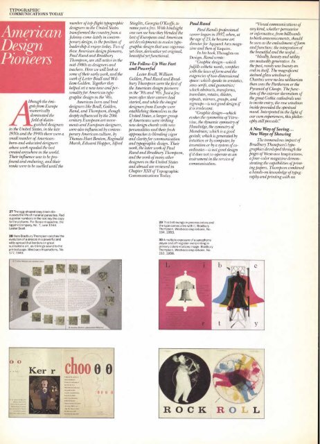
27 The egg-shaped copy block discusses<br />
the life of malarial parasites. Red<br />
superior numbers in the text key the copy<br />
to the pictures. For Scope magazine, the<br />
Upjohn Company, No. 7, June 1944.<br />
Lester Beall.<br />
28 Here Bradbury Thompson catches the<br />
evolution of a sneeze in a powerful and<br />
witty spread that borders on great<br />
surrealistic art, as it brings sound to the<br />
printed page. Westvaco Inspirations, No.<br />
177, 1949.<br />
number of top-flight typographic<br />
designers in the United States<br />
transformed the country from a<br />
Johnny-come-lately in contemporary<br />
design, to the position of<br />
leadership it enjoys today. Two of<br />
these American design pioneers,<br />
Paul Rand and Bradbury<br />
Thompson, are still active in the<br />
mid-1980s as designers and<br />
teachers. Here we will look at<br />
some of their early work, and the<br />
work of Lester Beall and William<br />
Golden. Together they<br />
helped set a new tone and personality<br />
for American typographic<br />
design in the '40s.<br />
American born and bred<br />
designers like Beall, Golden,<br />
Rand, and Thompson, though<br />
deeply influenced by the 20th<br />
century European art movements<br />
and European designers,<br />
were also influenced by contemporary<br />
American culture, by<br />
Thomas Hart Benton, Reginald<br />
Marsh, Edward Hopper, Alfred<br />
Ke chop o o<br />
Stieglitz, Georgia O'Keeffe, to<br />
name just a few. With hindsight<br />
one can see how they blended the<br />
best of European and American<br />
art developments to evolve typographic<br />
design that was vigorous<br />
yet clear, derivative yet original,<br />
beautiful yet functional.<br />
The Follow-Up Was Fast<br />
and Powerful<br />
Lester Beall, William<br />
Golden, Paul Rand and Bradbury<br />
Thompson were the first of<br />
the American design pioneers<br />
in the '30s and '40s. Just a few<br />
years after their careers had<br />
started, and while the émigré<br />
designers from Europe were<br />
establishing themselves in the<br />
United States, a larger group<br />
of Americans were striking<br />
new design chords with new<br />
personalities and their fresh<br />
approaches to blending vigor<br />
and clarity for communication<br />
and typographic design. Their<br />
work, the later work of Paul<br />
Rand and Bradbury Thompson,<br />
and the work of many other<br />
designers in the United States<br />
and abroad are reviewed in<br />
Chapter XIII of Typographic<br />
Communications Today.<br />
29 This bell swings in process colors and<br />
the type comes alive with it. Bradbury<br />
Thompson, Westvaco Inspirations, No.<br />
194, 1953.<br />
30 A multiple exposure of a saxophone<br />
player and off-register overprinting in<br />
primary colors vitalizes image. Bradbury<br />
Thompson, Westvaco Inspirations, No.<br />
210, 1958.<br />
Paul Rand<br />
Paul Rand's professional<br />
career began in 1937, when, at<br />
the age of 23, he became art<br />
director for Apparel Arts magazine<br />
and then of Esquire.<br />
In his book, Thoughts on<br />
Design, Rand wrote:<br />
"Graphic design—which<br />
fulfills esthetic needs, complies<br />
with the laws of form and the<br />
exigencies of two-dimensional<br />
space: which speaks in semiotics,<br />
sans-serifs, and geometries;<br />
which abstracts, transforms,<br />
translates, rotates, dilates,<br />
repeats, mirrors, groups, and<br />
regroups—is not good design if<br />
it is irrelevant.<br />
"Graphic design—which<br />
evokes the symmetria of Vitruvius,<br />
the dynamic symmetry of<br />
Hambidge, the symmetry of<br />
Mondrian; which is a good<br />
gestalt; which is generated by<br />
intuition or by computer, by<br />
invention or by a system of coordinates—is<br />
not good design<br />
if it does not co-operate as an<br />
instrument in the service of<br />
communication.<br />
"Visual communications of<br />
any kind, whether persuasive<br />
or informative, from billboards<br />
to birth announcements, should<br />
be seen as the embodiment of form<br />
and function: the integration of<br />
the beautiful and the useful...<br />
"Ideally, beauty and utility<br />
are mutually generative. In<br />
the past, rarely was beauty an<br />
end in itself The magnificent<br />
stained glass windows of<br />
Chartres were no less utilitarian<br />
than was the Parthenon or the<br />
Pyramid of Cheops. The function<br />
of the exterior decoration of<br />
the great Gothic cathedrals was<br />
to invite entry; the rose windows<br />
inside provided the spiritual<br />
mood. Interpreted in the light of<br />
our own experiences, this philosophy<br />
still prevails:"<br />
A New Way of Seeing...<br />
New Ways of Showing<br />
The tremendous impact of<br />
Bradbury Thompsons typographics<br />
developed through the<br />
pages of Westvaco Inspirations,<br />
a four-color magazine demonstrating<br />
the capabilities qfprinting<br />
papers. Thompson combined<br />
a hands-on knowledge of typography<br />
and printing with an


