

Volume 16–1.pdf
Volume 16–1.pdf
Volume 16–1.pdf

Create successful ePaper yourself
Turn your PDF publications into a flip-book with our unique Google optimized e-Paper software.
adventurous spirit. He wasn't<br />
going to do what had been done,<br />
yet his innovations would be<br />
purposeful, appropriate to the<br />
communication problem. With a<br />
limited budget, he would work<br />
with existing color plates (these<br />
were the great days of letterpress<br />
printing) and cut them apart,<br />
reassemble them, team them up<br />
with tint plates, overprint to<br />
create action and new colors. He<br />
used large shapes for their symbolism<br />
and power, often greatly<br />
enlarged letter forms, blended<br />
old art (such as prints from the<br />
Diderot encyclopedia) with new<br />
color combinations and symbolic<br />
shapes. Pattern, movement,<br />
color, excitement, were combined<br />
and harnessed to reinforce the<br />
message. No obscurity, no blatancy<br />
for its own sake here.<br />
Thompson strove for and<br />
achieved a wonderful blend of<br />
vitality and clarity. He employed<br />
dynamic balance, often avoiding<br />
the usual columns of type. He<br />
did not hesitate to mix several<br />
typefaces when he thought doing<br />
so would strengthen the message.<br />
Page 1<br />
The First Book Moses called Genesis<br />
Genesis<br />
td In the beginning<br />
God created the heaven and the earth.<br />
And the earth was without form, and void:<br />
and darkness was upon the fart of the deep<br />
And the Spirit of God<br />
moved upon the face of the waters.<br />
t And God said.<br />
In there be light:<br />
and there was light.<br />
e And God woo the light, that it was good:<br />
and God divided the light from the darkness.<br />
s And God called the light Day,<br />
and the darkness he called Night.<br />
And the evening and the morning<br />
were the rst day,<br />
6 And God haul,<br />
let there be a firmament<br />
in the midst of the waters,<br />
and let it divide the waters from she waters.<br />
7 And God made the firmament,<br />
and divided the waters<br />
which were under the firmament<br />
from tht waters<br />
which v ere above the firmament:<br />
and it was so.<br />
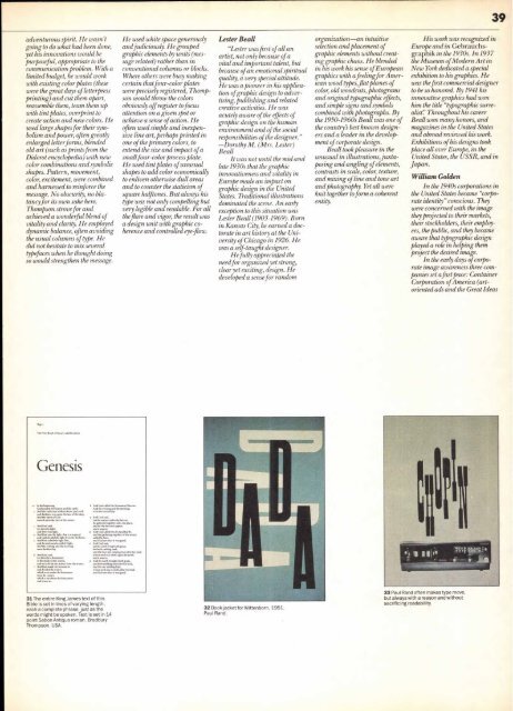
31 The entire King James text of this<br />
Bible is set in lines of varying length,<br />
each a complete phrase, just as the<br />
words might be spoken. Text is set in 14<br />
point Sabon Antigua roman. Bradbury<br />
Thompson. USA.<br />
g And God called the firmament Heaven.<br />
And the evening and the morning<br />
were the second day.<br />
And God said,<br />
Let the waters under the heaven<br />
be gathered together unto one place,<br />
and let the dry land appear:<br />
and it was so.<br />
o And God called the dry land Earth:<br />
and the gathering together of the waters<br />
called he Seas:<br />
and God saw that it was good.<br />
ii And God said<br />
Let the earth bring forth grass,<br />
the herb yielding wed,<br />
and the fruit tree yielding fruit after his kind,<br />
whose seed is in itself, upon the earth:<br />
and it was so.<br />
And the earth brought forth grass,<br />
and herb yielding seed after his kind,<br />
and the tree yielding fruit,<br />
whose wed was in itrtlf, after his kind.<br />
and God saw that it was good.<br />
He used white space generously<br />
and judiciously. He grouped<br />
graphic elements by units (message<br />
related) rather than in<br />
conventional columns or blocks.<br />
Where others were busy making<br />
certain that four-color plates<br />
were precisely registered, Thompson<br />
would throw the colors<br />
obviously off register to focus<br />
attention on a given spot or<br />
achieve a sense of action. He<br />
often used simple and inexpensive<br />
line art, perhaps printed in<br />
one of the primary colors, to<br />
extend the size and impact of a<br />
small four-color process plate.<br />
He used tint plates of unusual<br />
shapes to add color economically<br />
to enliven otherwise dull areas<br />
and to counter the staticism of<br />
square halftones. But always his<br />
type was not only compelling but<br />
very legible and readable. For all<br />
the flare and vigor, the result was<br />
a design unit with graphic coherence<br />
and controlled eye-flow.<br />
Lester Beall<br />
"Lester was first of all an<br />
artist, not only because of a<br />
vital and important talent, but<br />
because of an emotional spiritual<br />
quality, a very special attitude.<br />
He was a pioneer in his application<br />
of graphic design to advertising,<br />
publishing and related<br />
creative activities. He was<br />
acutely aware of the effects of<br />
graphic design on the human<br />
environment and of the social<br />
responsibilities of the designer."<br />
—Dorothy M. (Mrs. Lester)<br />
Beall<br />
It was not until the mid and<br />
late 1930s that the graphic<br />
innovativeness and vitality in<br />
Europe made an impact on<br />
graphic design in the United<br />
States. Traditional illustrations<br />
dominated the scene. An early<br />
exception to this situation was<br />
Lester Beall (1903-1969). Born<br />
in Kansas City, he earned a doctorate<br />
in art history at the University<br />
of Chicago in 1926. He<br />
was a self-taught designer.<br />
He fully appreciated the<br />
need for organized yet strong,<br />
clear yet exciting, design. He<br />
developed a sense for random<br />
32 Book jacket for Wittenborn, 1951 .<br />
Paul Rand.<br />
organization—an intuitive<br />
selection and placement of<br />
graphic elements without creating<br />
graphic chaos. He blended<br />
in his work his sense of European<br />
graphics with a feeling for American<br />
wood types,flat planes of<br />
color, old woodcuts, photograms<br />
and original typographic effects,<br />
and simple signs and symbols<br />
combined with photographs. By<br />
the 1950-1960s Beall was one of<br />
the country's best known designers<br />
and a leader in the development<br />
of corporate design.<br />
Beall took pleasure in the<br />
unusual in illustrations, juxtaposing<br />
and angling of elements,<br />
contrasts in scale, color, texture,<br />
and mixing of line and tone art<br />
and photography. Yet all were<br />
knit together to form a coherent<br />
entity.<br />
39<br />
His work was recognized in<br />
Europe and in Gebrauchsgraphik<br />
in the 1930s. In 1937<br />
the Museum of Modern Art in<br />
New York dedicated a special<br />
exhibition to his graphics. He<br />
was the first commercial designer<br />
to be so honored. By 1941 his<br />
innovative graphics had won<br />
him the title "typographic surrealist:'<br />
Throughout his career<br />
Beall won many honors, and<br />
magazines in the United States<br />
and abroad reviewed his work.<br />
Exhibitions of his designs took<br />
place all over Europe, in the<br />
United States, the USSR, and in<br />
Japan.<br />
William Golden<br />
In the 1940s corporations in<br />
the United States became "corporate<br />
identity" conscious. They<br />
were concerned with the image<br />
they projected to their markets,<br />
their stockholders, their employees,<br />
the public, and they became<br />
aware that typographic design<br />
played a role in helping them<br />
project the desired image.<br />
In the early days of corpo-<br />
rate image awareness three com-<br />
panies set a fast pace: Container<br />
Corporation of America (art-<br />
oriented ads and the Great Ideas<br />
33 Paul Rand often makes type move,<br />
but always with a reason and without<br />
sacrificing readability.


