Volume 16–1.pdf
Volume 16–1.pdf
Volume 16–1.pdf
Create successful ePaper yourself
Turn your PDF publications into a flip-book with our unique Google optimized e-Paper software.
4 A constructed picture that<br />
neither evolves from nor depicts<br />
an object (non-objective).<br />
5 Non-objective, unconstructed,<br />
sometimes accidental,<br />
painting.<br />
Each of the many art<br />
movements around the turn of<br />
the century and since have<br />
influenced designers as well as<br />
artists to see things and to<br />
express themselves in new ways.<br />
Just how each influenced designers<br />
is discussed in detail in Typographic<br />
Communications Today.<br />
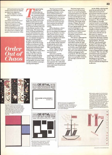
5 Striped, oil with sand on canvas,<br />
1934. Fine-grained painted sand adds<br />
texture to the painting. Here geometric<br />
shapes give way to freer forms in glowing<br />
colors. Rectangular zones contrast with<br />
the overlying curving biomorphic forms<br />
of surrealism. Wassily Kandinsky. The<br />
Solomon R. Guggenheim Museum,<br />
New York.<br />
6<br />
ypography,<br />
after all,<br />
is primarily con-<br />
cerned with aiding<br />
the communication<br />
of ideas and information.<br />
The art movements<br />
of the late 1800s and early<br />
1900s awakened not only<br />
painters but typographic<br />
designers to the excitement<br />
and visual vitality inherent<br />
in the blank canvas or the<br />
white page. But some of the<br />
most exciting and blatant<br />
works of the futurists and<br />
dadaists caused a counterreaction<br />
among non-futurist,<br />
non-dadaist designers.<br />
Many such thoughtful<br />
graphic communicators<br />
sought to blend the newly<br />
rediscovered power of the<br />
printed message with a disciplined<br />
presentation that<br />
might improve message<br />
readability and comprehension.<br />
The object was to<br />
achieve the best of both<br />
worlds: graphic beauty,<br />
charm, excitement that<br />
would command attention,<br />
and graphic structure that<br />
would contribute message,<br />
clarity and impact.<br />
7<br />
:.-----.:. _mil.. 17..1.. . 1.11 rittgrarx<br />
:r:; : emel.., . II =Isms<br />
SW VOORU1 ALI, STUKKEN<br />
LING VOO : WIJD LAN DE MODER. yowl oa AVM.<br />
,:: NE BEELDENDE VAKKEN EN KULTUUR<br />
aora,olsamaria REDACTIE : THEO VAN DOESBUR G. Lctrata,ou.ardo:<br />
,..■■■ C11G MGM.. IINOP113.0CHTTIIN YUMA. 2<br />
GTJXLLAIINIE APOLLINAIRE +<br />
PARIJS. NOVEMBER MM.<br />
rim; ir-1.11<br />
.1<br />
5 5. ..<br />
151,,11,<br />
emso VOOPI r, MAANDGLAO VOOR DE REELDENDE 1■ 11,[01.<br />
VAKKEN. REDACTIE THEO VAN DOES- I::711,7=rj<br />
oaR 111T“ FR BURG. UITGAVE X. HARMS TIEPEN. 00.<br />
6 Piet Mondrian, Composition II. 1929.<br />
The Museum of Modern Art, New York.<br />
The relationship between Mondrian's<br />
painting and Vilmos Huszar's title page<br />
for De Stijl is obvious.<br />
The key movements,<br />
schools and players in this<br />
blending of visual excitement<br />
andformalism in<br />
painting and in applied and<br />
communication art's were:<br />
■Russian avant garde<br />
artists, including the constructivists<br />
and suprematists<br />
and particularly El<br />
(Lazar Markovich) Lissitzky.<br />
■The Bauhaus, where<br />
all the art and cultural<br />
forces emerging throughout<br />
Europe in thefirst two decades<br />
of the century came<br />
together and developed a<br />
coherent platform for both<br />
fine and applied arts.<br />
■The De Stijl movement<br />
in the Netherlands and particularly<br />
the work and<br />
influence of its founder,<br />
Theo van Doesburg.<br />
■New Objectivity in<br />
Germany and its art of<br />
social protest.<br />
■Art Deco and its<br />
expression of industrial<br />
forms. There was nothing<br />
avant gardeist about art<br />
deco. It was, rather, a reaction<br />
against the radicalist<br />
tendencies, an opportunistic<br />
and conformist trend in art<br />
and design.<br />
MUMMER .<br />
8<br />
7,8 Vilmos Huszar, title pages for De<br />
Stijl. Compare this with Mondrian's<br />
Composition. The logo, constructed from<br />
an open grid of squares, was designed<br />
by van Doesburg. Even the text type<br />
forms neat rectangles.<br />
9<br />
Thefirst major movements<br />
to seek clarity and<br />
order in art and in graphic<br />
communications were by the<br />
De Stijl and Constructivist<br />
artists and designers. It is<br />
significant that such leading<br />
painting pioneers as El<br />
Lissitzky, Alexander Rodchenko,<br />
Filippo Marinetti<br />
and Theo van Doesburg<br />
became typographic, poster,<br />
and book designers. As<br />
early as 1917 they understood<br />
that art had a social<br />
function and could be,<br />
should be, used to serve the<br />
welfare of society.<br />
Piet Zwart, although he<br />
knew and met with van<br />
Doesburg, Piet Mondrian<br />
and others of the De Stijl<br />
group was not a member of<br />
the group. His typographics<br />
were freer, more individualistic,<br />
and most influential.<br />
His was a new blend of readability<br />
and typographic<br />
excitement. He also was one<br />
of the first to regard white<br />
space as a graphic element,<br />
not merely a canvas to be<br />
filled.<br />
In the 1920s, side by side<br />
with the growth of the De<br />
Stijl and constructivist<br />
movements and the work of<br />
Piet Zwart, were several<br />
other art movements that<br />
were to influence graphic<br />
designers. The art deco artists<br />
sought to visually<br />
express modern technology<br />
in their work, much of which<br />
was characterized by angularity,<br />
a reduction of natural<br />
images to basic geometric<br />
forms (as cubes, spheres,<br />
and cones) and the use of<br />
flat tones to capture<br />
machine-like sleekness. In<br />
Poland the Mechano-Faktur<br />
artists practiced functional<br />
typographics. Henryk<br />
Berlewi, who founded the<br />
group in Warsaw in 1924,<br />
had met van Doesburg, El<br />
Lissitzky and others in<br />
Berlin and brought their<br />
sense of typographic design<br />
to Poland. This was also the<br />
period of artfor social protest,<br />
the period of George<br />
Grosz, Otto Dix, and Max<br />
Bechman in Germany,<br />
and of Diego Rivera, Jose<br />
Orozco and David Siqueiros<br />
in Mexico.<br />
33<br />
9 El Lissitzky, pages from For the Voice,<br />
1923. Note the die-cut tabs that index<br />
the poems for easy reference. The<br />
poems were written to be read aloud.<br />
The designer comments: "To make it<br />
easier for the reader to find any particular<br />
poem, I use an alphabetical index.<br />
The book is created with the resources of<br />
the compositor's type-case alone. The<br />
possibility of two-color printing... [has]<br />
been exploited to the full. My pages<br />
stand in much the same relationship to<br />
the poems as an accompanying piano to<br />
a violin':<br />
HEADLINE/TEXT: ITC CENTURY BOLD ITALIC


