

Volume 16–1.pdf
Volume 16–1.pdf
Volume 16–1.pdf

Create successful ePaper yourself
Turn your PDF publications into a flip-book with our unique Google optimized e-Paper software.
TYPOGRAPHIC<br />
COMMUNICATIONS TODAY<br />
HE MANY<br />
ACES OF<br />
YPO-<br />
RAPHY<br />
ODAY<br />
ypographic design of<br />
the last several decades<br />
is a reflection of all the<br />
influences discussed in<br />
Typographic Communi-<br />
cations Today. All the different<br />
ways of striving for vitality,<br />
or for clarity, or for some ideal<br />
blend of both, are alive today. All<br />
the influences of the art movements<br />
of the early decades of<br />
this century, of the subsequent<br />
design schools, and of the new<br />
and still evolving technologies<br />
have combined to offer today's<br />
graphic designers a vast arsenal<br />
of approaches with which to<br />
attack a communications problem;<br />
as well as finer tools with<br />
which to execute a chosen solution.<br />
The result today, evolving<br />
since the 1940s, is a broad spectrum<br />
of typographic design<br />
styles, if style is the correct term.<br />
Now let us look at the works of<br />
leading designers from many<br />
parts of the world, to see how<br />
each approaches and solves a<br />
variety of graphic communications<br />
problems.<br />
We don't see any dominating<br />
trends. Perhaps that is<br />
because we see so many trends.<br />
One way to understand and<br />
evaluate the graphic design of<br />
recent decades is to think of a<br />
graphic design grid — not the<br />
Swiss grid discussed earlier, but<br />
an analytical grid in which the<br />
horizontal axis runs from absolute<br />
focus on clarity to absolute<br />
focus on vitality, and the vertical<br />
axis represents the personality<br />
or style of a particular designer.<br />
Of course, many graphic<br />
designers strive for the best of<br />
both worlds, for some ideal<br />
blend of clarity and vitality, and<br />
all good designers are flexible<br />
enough to embrace a segment<br />
of the clarity-vitality axis in their<br />
work, and to flow within that<br />
segment as each job requires.<br />
Consciously or subconsciously<br />
they seek the balance of clarity<br />
and vitality most appropriate to<br />
the problem at hand. In striving<br />
for communication effectiveness,<br />
appropriateness of style<br />
and of the clarity-vitality blend is<br />
crucial. An approach that is just<br />
right for one problem many be<br />
totally inappropriate for another.<br />
Appropriateness<br />
An understanding of the<br />
crucial role of appropriateness in<br />
evaluating the communication<br />
effectiveness of a particular<br />
graphic design leads to an<br />
appreciation of why we have so<br />
many design approaches and<br />
styles today. Neither the Swiss<br />
grid nor the so-called "new wave"<br />
is the answer to all problems,<br />
nor is any other style or blend of<br />
styles. One should look at the<br />
work shown here with these<br />
thoughts in mind. Some are<br />
beautiful. Some are visually<br />
exciting. Some pieces are graphically<br />
quiet. Some are full of<br />
humor and personality, and<br />
others are dry and impersonal.<br />
But graphic designs, to be truly<br />
understood and appreciated,<br />
should be viewed in terms<br />
of how well they convey the<br />
intended message to the audience<br />
at which they are aimed.<br />
After all, that is their reason<br />
for being.<br />
Typographic design is a vital<br />
force in visual communications.<br />
It does not exist for its own sake,<br />
and should not be evaluated as if<br />
it were design for design's sake.<br />
The sheer beauty of a piece of<br />
communication may contribute<br />
to its effectiveness, may distract<br />
or detract from it, or may merely<br />
be irrelevant. The graphic<br />
designer is first and foremost a<br />
communicator, and only within<br />
that framework an artist.<br />
HEADLINE/INITIAL: ITC SYMBOL MEDIUM TEXT: BOOK SUBHEAD: BOLD HEADER: ITC MODERN NO. 216 LIGHT<br />
37<br />
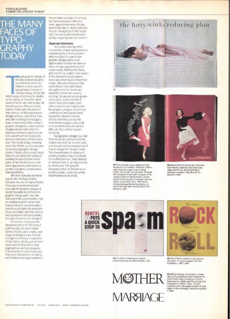
the forty-winlreducing pia<br />
37 One shouldn't use a device simply<br />
because it's in fashion. Perhaps it takes<br />
even more courage to use a visual<br />
cliché, but to use it so very well. Perhaps<br />
the measure of how well it is used, of its<br />
communication effectiveness, is how<br />
well it fits the specific message and how<br />
well it is executed. Here, after years<br />
of shaping type blocks to pictures, is<br />
one of the very best. By Otto Storch for<br />
McCall's. USA.<br />
39 A Sudler, Hennessey & Lubalin<br />
pharmaceutical ad. Herb Lubalin. USA.<br />
M R<br />
MAFIIAGE<br />
38 Remember the Slinky toy? Here the<br />
type literally adds bounce to the message<br />
and the ad, yet everything is<br />
perfectly readable. Otto Storch, for<br />
McCall's. USA.<br />
40 One of Herb Lubalin's many pieces<br />
using the "0" as a receptacle for the<br />
illustration. 1957. USA.<br />
41,42 Symbology, directness, uniqueness<br />
and appropriateness characterize<br />
these Herb Lubalin designs for Curtis<br />
Publications (1966) and Visual Graphics<br />
Corporation (1965). Often, in Herb<br />
Lubalin's work, the graphics don't simply<br />
organize the message, they help express<br />
it. USA.


