

Volume 16–1.pdf
Volume 16–1.pdf
Volume 16–1.pdf

Create successful ePaper yourself
Turn your PDF publications into a flip-book with our unique Google optimized e-Paper software.
The New<br />
Typography<br />
Crosses<br />
the Ocean<br />
21<br />
depth of field? - no camera problem since Sinar exists<br />
volt ?<br />
Ito<br />
w©<br />
EJ) 6 1<br />
.. Amgen Sie unser° elaktroni then F011etand-Meaagerate<br />
for Flassigkeiten and SchOlitgOter in Silos, Bun ern, Tank- and Lagerbehaltern.<br />
Endres.. Hauser GmbH +Co Larrach/ Baden, an dor Int rkama Halle F2 Stand 6149<br />
22<br />
111 he writings of<br />
Tschichold,<br />
the magazine, Neue<br />
Graphik, the exous<br />
from Europe to<br />
the United States<br />
of many leading European<br />
typography designers, and the<br />
influence of the pocket-size<br />
magazine, PM, introduced<br />
American designers to what<br />
was then the best contemporary<br />
design thinking and<br />
practice.<br />
The roster of European<br />
design talent that came to the<br />
United States in the 1930s and<br />
1940s is a notable "who's who"<br />
of that era. Following is an<br />
impressive, albeit partial,<br />
list. It includes just a few who<br />
crossed the ocean more<br />
recently.<br />
The influx of European<br />
designers to the United States<br />
in the 1930s and 1940s worked<br />
in many ways to change the<br />
face of, and the thinking<br />
behind, designs. At first the<br />
-<br />
1d<br />
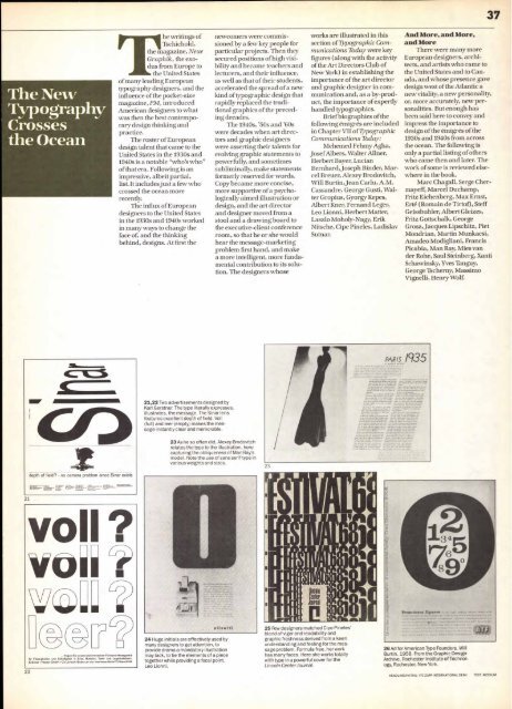
21,22 Two advertisements designed by<br />
Karl Gerstner. The type literally expresses,<br />
illustrates, the message. The Sinar lens<br />
features excellent depth of field. Voll<br />
(full) and leer (empty) makes the message<br />
instantly clear and memorable.<br />
23 As he so often did, Alexey Brodovitch<br />
relates the type to the illustration, here<br />
capturing the obliqueness of Man Ray's<br />
model. Note the use of sans serif type in<br />
various weights and sizes.<br />
24 Huge initials are effectively used by<br />
many designers to get attention, to<br />
provide drama a mandatory illustration<br />
may lack, to tie the elements of a piece<br />
together while providing a focal point.<br />
Leo Lionni.<br />
newcomers were commissioned<br />
by a few key people for<br />
particular projects. Then they<br />
secured positions of high visibility<br />
and became teachers and<br />
lecturers, and their influence,<br />
as well as that of their students,<br />
accelerated the spread of a new<br />
kind of typographic design that<br />
rapidly replaced the traditional<br />
graphics of the preceding<br />
decades.<br />
The 1940s, '50s and '60s<br />
were decades when art directors<br />
and graphic designers<br />
were asserting their talents for<br />
evolving graphic statements to<br />
powerfully, and sometimes<br />
subliminally, make statements<br />
formerly reserved for words.<br />
Copy became more concise,<br />
more supportive of a psychologically<br />
aimed illustration or<br />
design, and the art director<br />
and designer moved from a<br />
stool and a drawing board to<br />
the executive-client conference<br />
room, so that he or she would<br />
hear the message-marketing<br />
problem first hand, and make<br />
a more intelligent, more fundamental<br />
contribution to its solution.<br />
The designers whose<br />
25 Few designers matched Cipe Pineles'<br />
blend of vigor and readability and<br />
graphic freshness derived from a keen<br />
understanding and feeling for the message<br />
problem. Formula free, her work<br />
has many faces. Here she works totally<br />
with type in a powerful cover for the<br />
Lincoln Center Journal.<br />
works are illustrated in this<br />
section of Typographic Communications<br />
Thclay were key<br />
figures (along with the activity<br />
of the Art Directors Club of<br />
New York) in establishing the<br />
importance of the art director<br />
and graphic designer in communication<br />
and, as a by-product,<br />
the importance of expertly<br />
handled typographies.<br />
Brief biographies of the<br />
following emigres are included<br />
in Chapter VII of Typographic<br />
Communications Tbday:<br />
Mehemed Fehmy Agha,<br />
JosefAlbers, Walter Allner,<br />
Herbert Bayer, Lucian<br />
Bernhard, Joseph Binder, Marcel<br />
Breuer, Alexey Brodovitch,<br />
Will Burtin,Jean Carlu, A.M.<br />
Cassandre, George Gusti, Walter<br />
Gropius, Gyorgy Kepes,<br />
Albert Kner, Fernand Leger,<br />
Leo Lionni, Herbert Matter,<br />
Laszlo Moholy-Nagy, Erik<br />
Nitsche, Cipe Pineles, Ladislav<br />
Sutnar.<br />
.44<br />
And More, and More,<br />
and More<br />
There were many more<br />
European designers, architects,<br />
and artists who came to<br />
the United States and to Canada,<br />
and whose presence gave<br />
design west of the Atlantic a<br />
new vitality, a new personality,<br />
or, more accurately, new personalities.<br />
But enough has<br />
been said here to convey and<br />
impress the importance to<br />
design of the emigres of the<br />
1930s and 1940s from across<br />
the ocean. The following is<br />
only a partial listing of others<br />
who came then and later. The<br />
work of some is reviewed elsewhere<br />
in the book.<br />
Marc Chagall, Serge Chermayeff,<br />
Marcel Duchamp,<br />
Fritz Eichenberg, Max Ernst,<br />
Erte (Romain de Tirtof), Steff<br />
Geissbuhler, Albert Gleizes,<br />
Fritz Gottschalk, George<br />
Grosz, Jacques Lipschitz, Piet<br />
Mondrian, Martin Munkacsi,<br />
Amadeo Modigliani, Francis<br />
Picabia, Man Ray, Mies van<br />
der Rohe, Saul Steinberg, Xanti<br />
Schawinsky, Yves Tanguy,<br />
George Tscherny, Massimo<br />
Vignelli, Henry Wolf.<br />
PARIS /935<br />
26 Ad for American Type Founders. Will<br />
Burtin, 1958. From the Graphic Design<br />
Archive, Rochester Institute of Technology,<br />
Rochester, New York.<br />
HEADLINE/INITIAL: ITC ZAPF INTERNATIONAL DEMI<br />
37<br />
TEXT: MEDIUM


