

aA aA aA aA aA aA aA aA aA
aA aA aA aA aA aA aA aA aA
aA aA aA aA aA aA aA aA aA

You also want an ePaper? Increase the reach of your titles
YUMPU automatically turns print PDFs into web optimized ePapers that Google loves.
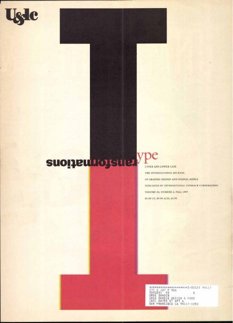
UPPER AND LOWER CASE<br />
THE INTERNATIONAL JOURNAL<br />
OF GRAPHIC DESIGN AND DIGITAL MEDIA<br />
PUBLISHED BY INTERNATIONAL TYPEFACE CORPORATION<br />
VOLUME 24, NUMBER 2, FALL 1997<br />
$5.00 US, $9.90 AUD, .£4.95<br />
*********************5-D IGIT 54117<br />
ITC C 127 P 426<br />
0543251 50 0<br />
GREG DUNDIS<br />
GREG DUNDIS DESIGN & PROD<br />
1801 HAYES ST APT 6<br />
SAN FRANCISCO CA 94117-1250
I T C n Dsplay. i A resource t h a t w i I I last f o
Now for the first and last time, over 375 unmatched display faces from<br />
the ITC® Fontek® Library are offered together on an unlocked CD Rom.<br />
Here's just a sampling:<br />
ITC A;tiftearnim<br />
Aictlefgh;jkinioripv-zsfi4wxyz<br />
12-345 4 77.90!@#$%Abc()?/<br />
PX-G Zfackactireim<br />
a Eccrefilii ijkimon cpyrz<br />
12,4,5678y o .1 ® #4%; "<br />
11C<br />
hiejg- hij%iikon.fr,ffr.2.14A),eg2<br />
1234 5- ‘7cr9 ./@ rl (<br />
1"6114 0 Tm<br />
otuutacyz<br />
1 * ? /<br />
AbC -6 fl i [ hi 11/4/1 011f:IGKA_Stk4t4 X<br />
1 S45 7" 8 9 0 ! ?# ==" ?<br />
ITC RENNIE MACKINTOSH'<br />
ABCDErQIIIJKLMONPTRZSTUWXYZ<br />
1234567899.!AT#%ACT*()?{}%R<br />
ITC Novo-<br />
bcdefghijklmonpirzstawxyz<br />
11545C7890!@#$%" lr * ? / { } < ><br />
ears. An opportunity that won't.<br />
7<br />
ITC On Display.<br />
nleash your<br />
creativity with<br />
A resource that will last for years.<br />
An opportunity that won't.<br />
near you, see page 36.<br />
the ITC On Display<br />
CD ROM. This<br />
limited edition,<br />
unlocked CD ROM<br />
contains the entire ITC Fontek<br />
Display Library. ITC On Display<br />
has been created to provide<br />
graphic designers with unparal-<br />
leled access to typefaces that<br />
are known for their timeless<br />
beauty and exceptional quality.<br />
Now you can design with<br />
confidence, knowing that you<br />
have at your fingertips over 375<br />
display typefaces in TrueType<br />
and Type 1 formats for both<br />
Macintosh and Windows. The<br />
cost for this invaluable tool is<br />
$2,999. A limited number of<br />
CDs have been produced. So<br />
when they're gone, they're gone.<br />
For a participating reseller<br />
For more information, call<br />
1-800-634-9325 x124, write to us at<br />
International Typeface Corporation<br />
228 East 45th St, New York, NY 10017,<br />
or visit us at www.esselte.com/ITC.<br />
Circle 1 on Reader Service Card
Type Trancformationv Wes<br />
1111<br />
ITC continues to transform with new type and a new Web site.<br />
R/Greenberg's opening sequence for Night Falls on Manhattan creates<br />
a masterful optical deception. By Peter Hall.<br />
faces of Roger Excoffon. Text by John Berry.<br />
all wrong, writes Steven Heller.<br />
Four new typefaces from ITC build on the influential 1950s script<br />
Although pundits believe print is dead, HardWired proves them<br />
A collective and selective surfing of Web sites on type, travel and literature.<br />
By Matthew Butterick, Joyce Rutter Kaye and Margaret Richardson.<br />
Corporation's entire collection, including Fontek typefaces.<br />
An annual supplement featuring International Typeface<br />
be the ideal graphics solution for print and the Web. By Gene Gable.<br />
lifestyles of their own. By Rhonda Rubinstein.<br />
Adobe Acrobat's latest version of PDF may<br />
Contemporary magazines are using visual styles to create enveloping<br />
Handwritten letterforms are the main influences<br />
for these 11 new Fontek typeface designs.<br />
116 LI kingt<br />
- Four new books address Web graphics issues.<br />
digital typefaces for the computer screen.<br />
Matthew Butterick describes how to refine<br />
International Typeface Corporation would like to thank Roger Black Incorporated for the design<br />
of this issue of U&lc.<br />
TYPE ON THE PAGE, on the big screen, and on the<br />
monitor are all included in an overview of type<br />
transformations in this issue designed by Roger<br />
r, z-.,<br />
Black Incorporated. Type, as always, informs a design<br />
with appropriate nuances and an enhancement of content.<br />
Type transforms text, and, when effectively used,<br />
type embodies ideas and provides style. Here we feature<br />
projects from film credits to Web pages with type<br />
in transition as the focus.<br />
Also in this issue, ITC continues its commitment to<br />
creating innovative type styles with a range of new Fontek<br />
faces. For example, Mistral Light, Choc Light, Banco<br />
Light and Bold by ITC are contemporary interpretations<br />
of typefaces created by Roger Excoffon and rendered by<br />
Phill Grimshaw. These capture the flair and flourish of<br />
the Excoffon style for a digital market. Also premiered<br />
here are ii display fonts ranging from John Peter's artful .<br />
and witty tribute to Joan Mira with ITC Peter's Miro<br />
to Timothy Donaldson's robust ITC Musclehead.<br />
This issue also presents the second L/c.'':71c supple-<br />
ment of the entire ITC type collection including Fontek<br />
fonts. The ITC typeface collection cover, also designed<br />
by Roger Black Incorporated re-interpets the main cover<br />
design and the collection is organized by styles of type:<br />
serif, sans serif, display, ornaments and illustration fonts.<br />
ITC has also transformed its capability to introduce,<br />
display and provide information about new ITC and<br />
Fontek typefaces by launching a revised and expanded Web<br />
site at www.itcfonts.com . Designed by Interactive Bureau<br />
in New York, the revised site allows type users to preview<br />
ITC typefaces and learn more about the inspirations and<br />
designers behind the designs. By using the Euripedes utility,<br />
type users also are able to set their own anti-aliased<br />
type samples onscreen and to compare two different type<br />
samples at the same time. Finally, once a desired type design<br />
is found, users can quicldy and securely purchase Type i<br />
and TrueType versions of the typeface online using a credit<br />
card, and have the typeface immediately downloaded to<br />
their computer. The new Web site also offers information<br />
for aspiring designers who would like to submit a typeface<br />
idea to ITC, serves as a technical support center for<br />
type users, and acts as a springboard to other type-related<br />
sites covering technical, creative and legal issues. Lastly,<br />
the new Web site is the home of UCIc Online, a supplement<br />
to our printed quarterly publication, that features<br />
expanded text and visuals and frequent editorial updates.<br />
International Typeface Corporation continues to transform<br />
and to transform its range and scope of typefaces,<br />
and www. itCfOrITS.com provides constant access to ITC.<br />
—Mingaret Richardson<br />
FRONT COVER: ITC FRANKLIN GOTHIC HEAVY; ITC GALLIARD ROMAN, ITALIC TABLE OF CONTENTS HEADLINE/TEXT: ITC FRANKLIN GOTHIC HEAVY. BOOK. BOOK ITALIC SUBHEADS: BANCO — HEAVY BY ITC<br />
MESSAGE FROM ITC HEADLINE: ITC FRANKLIN GOTHIC HEAVY: BANCO — HEAVY BY ITC TEXT: ITC FRANKUN GOTHIC BOOK: ITC GALLIARD ROMAN, ITALIC MASTHEAD: ITC FRANKLIN GOTHIC MEDIUM, MEDIUM CONDENSED,<br />
MEDIUM CONDENSED ITALIC. BOLD CONDENSED<br />
4<br />
EXECUTIVE PUBLISHER:<br />
MARKJ. BATTY<br />
EDITOR/PUBLISHER: MARGARET RICHARDSON<br />
MANAGING EDITOR: JOYCE RUTTER KAYE<br />
CONTRIBUTING EDITORS:<br />
PETER HALL,<br />
KAREN S. CHAMBERS<br />
GRAPHIC DESIGN :<br />
ROGER BLACK INCORPORATED:<br />
ROGER BLACK, MARYJANE FAHEY,<br />
ARIEL CEPEDA, LAURA EISMAN<br />
CREATIVE SERVICES DIRECTOR:<br />
CLNECHIU<br />
ART/PRODUCTION:<br />
JAMES MONTALBANO<br />
ASSOCIATE PUBLISHER:<br />
REBECCA L. PAPPAS<br />
ADVERTISING SALES:<br />
BARBARA H.ARNOLD<br />
BHA ASSOCIATES INC.<br />
PHONE: (617) 259-9207<br />
FA/I: (617)259-9883<br />
DISTRIBUTION: EDWARD WORMLY<br />
FOR INFORMATION ON<br />
EXISTING SUBSCRIPTIONS,<br />
FAX: (516) 756-2604<br />
UST RENTAL OFFICE:<br />
CMG INFORMATION SERVICES<br />
(800)677-7959<br />
INTERNATIONALTYPEFACE<br />
CORPORATION 1997.<br />
U8tic (ISSN 0362 6245) IS<br />
PUBLISHED QUARTERLY BY<br />
INTERNATIONAL TYPEFACE CORPORATION,<br />
228 EAST 45TH STREET,<br />
NEW YORK, NY 10017.<br />
ITC IS A SUBSIDIARY OF ESSELTE LETRASET.<br />
US. SUBSCRIPTION RATES,<br />
$30 FOR THREE YEARS;<br />
FOREIGN AIRMAIL SUBSCRIPTIONS,<br />
$60 U.S. FOR THREE YEARS;<br />
U.S. FUNDS DRAWN ON U.S. BANK.<br />
TO CONTACT ITC<br />
CALL: (212) 949-8072<br />
FAX: (212)949-8485<br />
E-MAIL<br />
GENERAL: infokitcfonts.com<br />
Web: vewitefonts.com<br />
EDITORIAL/PRODUCTION:<br />
designedit@aol.com<br />
CIRCULATION: UlcRPappas@aolcom<br />
ADVERTISING: bhaeatekiac.net<br />
PERIODICALS POSTAGE PAID<br />
AT NEW YORK, NY AND ADDITIONAL<br />
MAILING OFFICES. POSTMASTER:<br />
SEND ADDRESS CHANGES TO<br />
U&Ic SUBSCRIPTION DEPARTMENT,<br />
P.O. BOX 129,<br />
PLAINVIEW, NY 11803-0129.<br />
ITC OPERATING EXECUTIVE BOARD 1997<br />
MARK J. BATTY, PRESIDENTAND CEO<br />
RANDY S. WEITZ, CONTROLLER<br />
ILENE STRIZVER,<br />
DIRECTOR OF TYPEFACE DEVELOPMENT<br />
ITC FOUNDERS:<br />
AARON BURNS, HERB LUBAUN,<br />
EDWARD RONDTHALER<br />
ITC, U&Ic ANDTHE U&Ic LOGOTYPE<br />
ARE REGISTERED TRADEMARKS OF<br />
INTERNATIONALTYPEFACE CORPORATION.<br />
MICROFILM (16mm OR 35mm)<br />
AND MICROFICHE (105mm ) COPIES<br />
OF Mc ARE AVAILABLE FROM<br />
UMI, 300 NORTH ZEEB ROAD,<br />
ANN ARBOR, MI 48106-1346.<br />
PHONE: (800) 521-0600<br />
OR (313) 761-4700.<br />
FAX: (313) 761-3221.<br />
VBPA ezigm
AUSTRALIA<br />
FontShop<br />
FontShop<br />
Tel +61(3) 9686 2066 Tel +33 (1) 44 38 11 40 Tel +41 (1) 722 77 00<br />
Fax +61 (3) 9686 2088 Fax +33 (1) 43 06 54 85 Fax +41 (1) 722 77 01<br />
www.fontshop.com.au www.fontnews.com<br />
www.compress.ch/fontfont/<br />
fonthome.htm<br />
AUSTRIA<br />
GERMANY<br />
FontShop<br />
Tel +43 (1) 523 29 46-0<br />
Fax +43 (1) 523 29 47-22<br />
www.fontshop.co.at<br />
BRAZIL<br />
Sunflower<br />
Tel +55 (21) 285 1258<br />
Fax +55 (21) 245 1900<br />
CANADA<br />
FontShop<br />
Tel +1 888 44 fonts (toll-free)<br />
Fax +1 (416) 364 1914<br />
fontshop@swipe.com<br />
DENMARK<br />
Agfa-Gevaert A/S<br />
Tel +45 4326 6766<br />
Fax +45 4326 6701<br />
FINLAND<br />
Oy Agfa-Gevaert AB<br />
Tel +358 98 8781<br />
Fax +358 98 878 278<br />
FontShop<br />
Tel +49 (30) 69 58 95<br />
Fax +49 (30) 692 88 65<br />
www.fontshop.de<br />
ITALY<br />
Happy Books<br />
Tel +39 (59) 45 08 04<br />
Fax +39 (59) 45 03 43<br />
vnvw.happybooks.it<br />
JAPAN<br />
FontShop<br />
Tel +81 (3) 5474-77 41<br />
Fax +81 (3) 5474-77 44<br />
www.digitaloguesco.ip/fontshop/<br />
NORWAY<br />
FontShop/Luth 8 Co.<br />
Tel +47 2 225 48 20<br />
Fax +47 2 225 49 20<br />
www.luth.no<br />
SINGAPORE<br />
alt.Type<br />
Tel +65 749 4240<br />
Fax +65 747 8916<br />
SWEDEN<br />
Typecraft<br />
Tel +46 (8) 663 91 23<br />
Fax +46 (8) 663 91 29<br />
info@typecraft.se<br />
Circle 2 on Reader Service Card<br />
Call today for a FontFont catalog.<br />
Ask about the new FontFont CD-ROM.<br />
Get a free FontFont Dingbats font on<br />
the web. Just visit your distributor's<br />
web site to link to the FontFont site,<br />
or go directly to www.fontfont.de .<br />
UNITED KINGDOM<br />
Faces Ltd.<br />
Tel +44 (1276) 38888<br />
Fax +44 (1276) 38111<br />
106064.5000compuserve.com<br />
Linotype-Hell Ltd.<br />
Tel +44 (1242) 285100<br />
Fax +44 (1242) 285101<br />
Monotype Typography Ltd.<br />
Tel +44 0800 371242 (toll-free)<br />
Fax +44 0800 220692 (toll-free)<br />
enquire@monotypeuk.com<br />
USA<br />
FontShop San Francisco, Inc.<br />
Tel +1888 FF fonts (toll-free)<br />
Fax +1 (415) 398 7678<br />
www.fontfont.com<br />
Phil's Fonts<br />
Tel +1 800 424 2977 (toll-free)<br />
Fax +1 (301) 879 0606<br />
www.philsfonts.com<br />
Agfa Typographic Systems<br />
Tel +1 800 424 TYPE (toll-free)<br />
Fax +1 (508) 657 8568<br />
www.agfahome.com<br />
ALL OTHER COUNTRIES<br />
FontShop International<br />
Tel +49 (30) 693 70 22<br />
Fax +49 (30) 692 84 43<br />
www.fontfont.de<br />
Road sign: FF Transit Print and Transit Pict. Text: Fr Meta+ Medium and Book. FontFont, FontFont typeface names, and<br />
FontShop are trademarks of rSI FontShop International. Other product and company names are trademarks of their<br />
respective owners. Product availability subject to change without notice. Design: MvElDesign@aol.com . 00997 FSI.<br />
Ui<br />
Bare necessity. Can't do without. Must have.<br />
r1<br />
You work with fonts. You care about finding the perfect typeface for<br />
your message. So how on earth are you getting by without the new<br />
FontFont catalog?<br />
If you don't have the FontFont catalog, well, you probably haven't<br />
stumbled across some of the world's best type designs, including<br />
favorites like FF Meta, FF Thesis, FF Hands, FF Trixie, FF Beowolf and<br />
FF Scala (not to mention the steady flow of hot new designs).<br />
FontFonts are now easier-than-ever to find (just look at the distribu-<br />
tor list to the left). So call your distributor today to get your copy of<br />
the FontFont catalog.<br />
You'll wonder how you did without.<br />
FONTFONT
R/Greenberg's elegant opening sequence<br />
to the movie NIGHT FALLS ON MANHATTAN uses<br />
old and new film technology to create a seamless<br />
visual overture.<br />
By Peter Hall<br />
The stark, two-minute animation is strangely<br />
moody and nostalgic: A series of blue vertical<br />
paint stripes descend on a black screen to a mel-<br />
low trumpet and piano score. Each stripe ends<br />
its journey halfway down the screen, leaving a<br />
distinctive black space unpainted. After three<br />
or four stripes have rolled, the scene reveals<br />
itself: the blue is the negative space—the sky<br />
above the buildings of Manhattan.<br />
6<br />
Continued on page 8
qBegg<br />
ihrot<br />
evettett.irracigeelesb.consiatolte/<br />
(*a the Modem Convenience<br />
of Online Shojaping!<br />
When you need it now, download it! The Image Club Store is now open. It's<br />
online shopping for designers, and it couldn't be any easier! We've started<br />
the store with our most popular typefaces, and we're adding products every<br />
week. Give it a try—it's guaranteed. Open/ 2g Itotsiso a day!<br />
Alleyorm<br />
Alleycat Bor<br />
Atomic Sans"<br />
Atomic Serifim<br />
Bad Cabbage"<br />
'end While Mae<br />
Caslon Antique<br />
rarritr<br />
Mire MEV<br />
VIIIEr S111111Cir<br />
overprint"<br />
Saturday Sans'<br />
Schmutz Cleaned'TM<br />
Cloggedm<br />
Schmutz Corroded'<br />
Seven Serif<br />
Seven Sans-<br />
Smile<br />
THUPITAX1m<br />
Twofacem<br />
Unite Hpartemi<br />
11■71if 5411ct1nim<br />
www.imageclub.com orders 1.800.661.9410 free catalog 1.800.387.9193 fax 1.403.261.7013 Image Club Graphics<br />
Adobe A Division of Adobe Systems Incorporated<br />
UL-C997<br />
Circle 3 on Reader Service Card
Continued from page 6 IT'S NO<br />
Spelling Films Presents<br />
Andy Garcia<br />
Night Falls on Manhattan<br />
Written for the Screen and Directed By<br />
Sidney Lumet<br />
8<br />
Inspired by an art<br />
book cover and<br />
a city skyline,<br />
R/Greenberg's<br />
opening titles to Night<br />
Falls on Manhattan<br />
capture the tone and<br />
feel of a vintage<br />
Saul Bass sequence.<br />
It was very clever<br />
and respectful of the<br />
history of the genre;'<br />
notes producer Thom<br />
Mount. This, the<br />
more "painterly" solu-<br />
tion of a shortlist of<br />
four proposals, struck<br />
a chord with R/GA,<br />
Mount and director<br />
Sidney Lumet,<br />
according to Mount.<br />
"We liked Its reductive<br />
aspect;' he says."It<br />
required the audience<br />
to think, and we liked<br />
the idea that truth<br />
and reality are gradu-<br />
ally revealed to you,<br />
as in the film. The<br />
more we looked at it,<br />
the more its abstract<br />
nature appealed."<br />
that a film reviewer will bother to remark on the<br />
design of a title sequence, but many noticed this ori,<br />
the prelude to director Sidney Lumet's film Night Falls<br />
on Manhattan. "An expert opening credit sequence?'<br />
wrote Janet Maslin in The New York Times, "[is] one<br />
of the little details that give Night Falls on Manhattan<br />
its color?' "Starkly effective?' wrote Harper Baines of<br />
the St. Louis Post-Dispatch, "a stunning abstraction<br />
of the Manhattan evening skyline?'<br />
Film titles buffs (if such a breed exists) might<br />
even detect an homage to the genre's forefather,<br />
Saul Bass, in the sequence, designed by the veteran<br />
effects and titles firm R/Greenberg Associates. It<br />
begins with a thick, blue line descending on a black<br />
background from the top of the cinema screen, just a<br />
few feet away from where a descending white stroke<br />
began Bass's groundbreaking opener to director Otto<br />
Preminger's film The Man with the Golden Arm in 1955.<br />
Both sequences share a jazz score, and both use stark<br />
graphics to evoke the mood of the film.<br />
According to Jakob Trollbeck, who designed and<br />
directed the titles at R/Greenberg, the inspiration for<br />
the sequence was Manhattan itself. Trollbeck noticed<br />
the cover of a European art book featuring a simple<br />
composition of type and watercolor brush strokes.<br />
"Two nights later, I was out in one of those miraculous<br />
Manhattan nights where you can see different pieces<br />
of color and gradation in the sky and I thought,<br />
`they're my brush strokes'," he says.<br />
Much of the success of the painterly animation,<br />
however, comes from its contrast with the subsequent<br />
scenes, a gritty moral tale set in the streets of<br />
Harlem and the courtrooms of Manhattan. Though<br />
the film could be construed as a cop thriller, at its<br />
heart is the story of the internal moral dilemma of a<br />
young, idealistic assistant district attorney who discovers<br />
that he won a case and rose to power on<br />
"tainted evidence" (the name of its source, a Robert<br />
Daley novel). Lumet, who had commissioned the<br />
jazz trumpet player and composer Wynton Marsalis<br />
to write a soundtrack, was looking for a contemplative,<br />
rather than tense opener, and producer Thom<br />
Mount, who had previously worked with R/Greenberg<br />
on several other films, proposed the New York<br />
team take on the project. "Sidney Lumet and I felt<br />
we wanted titles that suggested the tone and texture<br />
of Manhattan in a thoughtful way," says Mount.<br />
"The context of the movie was so real—courtrooms<br />
are not very elegant. We liked the idea of a welcome<br />
moment, rather like an overture, to get you thinking?'<br />
For Trollbeck, a gradual, but initially mystifying<br />
reveal seemed the most appropriate response to the<br />
storyline and music. "The underlying things were<br />
important?' he says. "Everybody is lying and you<br />
can't really trust what you see:' Several ideas were<br />
storyboarded (as Adobe Photoshop files) to present<br />
to Lumet and Mount, each suggesting inconstancy<br />
and deception, reflecting how the young attorney<br />
finds a lack of solidity wherever he treads. One idea<br />
proposed blurry cityscapes in a sweeping photographic<br />
montage, another portrayed the city in a<br />
more surreal, painted light, and another— a strong<br />
contender—presented the credits as lights, swimming<br />
into focus and then dissolving into the back-
ground as the windows of Manhattan buildings.<br />
Lumet was decisive, however, when he reached the<br />
vertical brush strokes proposal. "It took him literally<br />
one minute from the point where they were all<br />
lined up;" says Trollbeck. "It was amazing because<br />
he picked the one I was going to sell to him. I didn't<br />
have a chance?'<br />
Manhattan wasn't the easiest skyline to build<br />
backwards. Having selected an appropriate image of<br />
the city, the design team set to work at replicating<br />
the irregular motion of a brush stroke on a computer,<br />
at the same time as forming the silhouette of a sky-<br />
scraper. "We wanted the brush strokes to look some-<br />
what believable, but we couldn't have them coming<br />
down in the middle of a building" says Trollbeck.<br />
The effect was achieved by permitting each brush<br />
stroke some artistic license as it formed the partial<br />
shape of a building. The strokes were also accelerated<br />
and decelerated with the Flame digital editing soft-<br />
ware to create the effect of the human hand at work.<br />
The most dramatic view of Manhattan, from its<br />
southernmost tip, is also distinctly narrower than<br />
that seen from East or West. On the wide format of<br />
the cinema screen, this produced an undesirable<br />
falling off at each end. "Our perfect skyline was lacking<br />
something," admits Trollbeck. There was only<br />
one solution. "We added a building," he confesses.<br />
"It felt so great!"<br />
Three alternative approaches, rendered as<br />
Photoshop files, were discarded at the early<br />
stages of the project. Proposal number one set the type-<br />
face against a series of blurry cityscapes,<br />
pl4ing off the cloudy circumstances of the hero's<br />
first big court case.<br />
ANDY GARCIA<br />
A MOUNT/KRAMER PRODUCTION<br />
NIGHT FALLS ON MANHATTAN<br />
A MOUNT/KRAMER PRODUCTION<br />
NIGHT FALLS ON MANHATTAN<br />
Proposal number two portrayed<br />
Manhattan in a slightly surreal light, using<br />
treated photographs of the city to<br />
enhance its distinctive luminescence.<br />
limitless trickery made available to titles and effects<br />
designers with the advent of the digital studio, computers<br />
are demanding beasts. To produce the entire<br />
sequence in-house at R/Greenberg at full film resolution-4,000<br />
by 2,000 pixels—would have required<br />
approximately 14.4 gigabytes of computer storage<br />
per minute, a stretch for the studio's computing capabilities.<br />
For while the skyline painting sequence could<br />
be rendered at lower resolution without any noticeable<br />
loss of quality, the human eye is far less forgiving<br />
with low resolution typography. The credits were<br />
storyboarded to appear, in the typeface Sabon at a<br />
relatively small size, in the lower right-hand corner<br />
of the screen.<br />
The design team settled that the type should be<br />
shot the traditional way, at an opticals house. This<br />
allowed them to produce the background sequence,<br />
without type, relatively effortlessly using the Flame<br />
and faster Inferno software on a Silicon Graphics<br />
Onyx machine at lower resolution. The type, meanwhile,<br />
was set in QuarkXPress, timed on an Avid<br />
video machine, then sent to one of New York's optical<br />
houses, Cineric, to be filmed The resulting<br />
"cards"—white type on black film—were sent back<br />
for Trollbeck to approve the timing and color. After<br />
a night of rendering, the painted skyline sequence<br />
was output to film, and type and image were finally<br />
reunited at Cineric.<br />
Computational and architectural hurdles overcome,<br />
Night Falls on Manhattan had one last twist in<br />
HEADLINE/1EXT/B10: ITC FRANKLIN GOTHIC DEMI, DEMI COMPRESSED, HEAW; ITC GALLIARD ROMAN, ITALIC<br />
SUBHEAD/BYLINE/CAPTIONS: ITC FRANKLIN GOTHIC DEMI, DEMI ITALIC<br />
9<br />
store. Because of negative audience reactions to the<br />
Marsalis score in early tests, according to Mount,<br />
the whole soundtrack, including the opening piece<br />
for trumpet and piano—to which Trollbeck had set<br />
the entire opening sequence—had to be replaced<br />
with new music by Mark Ishan. Trollbeck was powerless<br />
to do anything but wait for the film premiere<br />
to hear it. "I can't say it worked as well;' says Trollbeck,<br />
"but it's very similar?' Perhaps the change gave<br />
the sequence a less smooth, more jarring feel that<br />
wasn't entirely undesirable. The critics certainly<br />
didn't notice.<br />
For Trollbeck, the generous press comments<br />
couldn't have come at a better time. Having replaced<br />
much of its analog filming equipment with digital<br />
studios, R/Greenberg's New York office has been<br />
somewhat eclipsed by the titles work of its Los Angeles<br />
office. "When we closed the opticals side, people<br />
started to think we didn't do film titles here:' he<br />
says. "It fell a little aside from our main focus!' With<br />
a reshuffle that allowed three former It/Greenberg<br />
employees to take over ownership of the L.A. office<br />
and change its name to Imaginary Forces, New York<br />
was left facing the loss of a prestigious—if not particularly<br />
profitable—field of work. "That's why I'm<br />
really happy about Night Falls;' says Trollbeck, who<br />
worked with some of the West coast team on a number<br />
of sequences, including Indecent Proposal and<br />
True Lies. "It's the first piece where the art has clicked<br />
for me. In almost every corner of the company, even<br />
the most hardline people would look at our reel and<br />
say, 'we should do more of that'."<br />
Peter Hall, a contributing editor of U&lc, is senior<br />
writer at I.D.<br />
The third proposal was especially promising, with the<br />
credits appearing vertically before fading back to form the<br />
patterns of lighted windows in the skyline.<br />
It was discarded, however, partly because of the<br />
difficulty of reading vertical type.
stud i<br />
ed painting before<br />
Roger Mong EY,coffon on to grapic erel design (published and type in a 1.986<br />
on) captures his painterly<br />
he cocK h<br />
de vi sign. To Ex<br />
tribute style and t° Ex exuberant bruslivvorK.<br />
desi his ovvo advertising er for the<br />
Excoffon started g,ned the postcs<br />
Grenoble 20th Winter Olympi. Again his<br />
agency. He<br />
fluid brushWorlc captures the excitement<br />
and speed of winter sports.<br />
Excoffon designed the<br />
r Air France.<br />
menu fo<br />
airlines is described<br />
he standar<br />
..t<br />
er<br />
nistic in Roo<br />
o<br />
the peri<br />
d.:'<br />
Handbook
sea<br />
dverti<br />
or the<br />
and 'nod<br />
Ilence for<br />
\n ternabona\<br />
offon<br />
design. Exc<br />
his poster<br />
designed is poster for French Railvvays<br />
Known fort<br />
incorporating his Antique Olive typeface<br />
designed for Fonderie Olive,<br />
a co\kaboratvonbeWeen<br />
Was<br />
Os Itte project s3r bh type des\gner Ph\\\<br />
r<br />
ospedaVies-vh ca\Kraph\c<br />
for ad<br />
pX bsIng typography<br />
set<br />
In<br />
the<br />
'France<br />
sty \e<br />
\r‘ the '1.950s. \IC's 'BrIp 'European la\\ and<br />
ated When<br />
whtype<br />
consu\tantColIn<br />
G6rnshaw, desIgns.lhe project or \g\n t popu\<br />
Roger<br />
own<br />
EX<br />
agency, wh\ch he founded '0<br />
?es \s \n 1.9A/, was W\de\y Ini\oentca\ , an<br />
xs<br />
the 'typefaces he desIgned for the Vondef\e<br />
OW e \S\<br />
arity<br />
BrIgna\\ , obsehlingthe curren there were s<br />
of V\ andvsirIbngtypei poss-Ot‘es aces 'In , le\t the scat face<br />
\Ned War<br />
ed<br />
the earW Apse—prov 1-950s--Mistra\ \ded , c- deve\oped Oney.por In Europe after<br />
001e,<br />
Chc, French 'Banco, typographers of Wtth the sp\rIt the too\slov of the de a<br />
Vries<br />
\\<br />
Vote- they<br />
first a v artat<br />
GS \chsha\N<br />
col<br />
\rAth E<br />
\-ke wou\d and Work's W\th scrIpt. faces frorn sh\ited<br />
the<br />
deSeecs, beeh‘og,<br />
ade. As .1eif seedy Wrote In Deigoter)<br />
lype for Ernigre,"E.xotfon r t, convey at\cu\ated \rig a a Con_ty of<br />
ffon.<br />
sty1\sh\y coodern O<br />
-<br />
that<br />
ref they<br />
Was Ghee,<br />
next the focus \ogtca\ to face France and narrowed 'it to<br />
ternporary ser\sOM not on\y of econorny f on' s Mtstva\ . When they<br />
type- types by Exco<br />
speed but a\so of casua\ ekegance:'<br />
re\easg a se6es of<br />
0000‘<br />
neW areas,<br />
Ihts year, 11-GIs<br />
iaces twat load 0 d them<br />
des\g,ns and exthemto e are<br />
Of the four new typefaces, tee<br />
Vet e ve rsIons of the or \Ona\s tMtstra\ \NOW<br />
t".0,<br />
Elena)<br />
a lld<br />
e., c,,n oc<br />
the 'to001<br />
k,:4,.<br />
, 'Berle° HeaVy, cOltaths
st aoed<br />
es ae r.Cs<br />
71' 0'<br />
ItecovottteaCs, ene<br />
71'11;'5"<br />
clot 4,1A‘c*.<br />
ogolg<br />
Vo<br />
siec<br />
tc oostittle<br />
coerm,e. ea.<br />
et et dryy<br />
vvoictoi3<br />
w sis<br />
rie Olive.<br />
as t<br />
C.ls'otior by the eXercIes of 66,4659\2,y<br />
obwetNe<br />
type<br />
w<br />
Ir<br />
the<br />
150s. "Ph-hough<br />
er very \SA 't1336g‘tte3' eileet 503'; SMs ar‘gcreate<br />
that a<br />
rte<br />
vg,<br />
with ape<br />
geed \O-13 GOOsY04<br />
rafght Wok 3 coore lce- fx haadwrItrrAgdo<br />
'6v \g,r`a\\<br />
okt ee-01440)0<br />
oger Excoffon.<br />
Choc &Signed in 1955 by R<br />
Page front Mistral brochure from Ponde<br />
thap<br />
redacm$t<br />
She<br />
died the meta<br />
C. \ C haw w tap 30 Pe<br />
1M ^ti (Q app s 6(soc7<br />
V\g'"ev' but c‘0t sal:\slact°'6't\let'6"111ev stv°‘kes<br />
was<br />
prirted at scaaff saes. So the des%grer Ircreased<br />
rt. changes, dependIrg everythogirora your<br />
scr vpt \ratter ‘r<br />
own ha of to aff the fr of\ the<br />
'Moder\ f_oropear<br />
Grimed O<br />
ff the<br />
lased or comes ator<br />
Was bas s<br />
hardwotrg, V...xciotfor Choc<br />
face at IS poIrt or a 600-dpk faser prfoter, cook), Where NNIstraf<br />
of\ ray otertors<br />
see that "thks rew wevghtfuht\\ed<br />
acimevabfe.. keep eedorr, sporttarekty<br />
of hardwobrgdesp\te the ogorous imp.er-<br />
e<br />
out<br />
pd tended<br />
tfutchIrgs sakf<br />
the tr'adMaas laPaaese savosh ca\40PM. \t: s<br />
Whey proofed-text setfr the rew<br />
Ps<br />
he<br />
tOck, staccato, saggestNe,<br />
,<br />
of "Ito straf"<br />
a\thofe the authert‘c showsfacfk brush scvipts rrobaty. a\la.f\a‘o fts apparer<br />
the fa 1\ av or \N<br />
of havogbeeo<br />
a forg , the N\fstraf urdertakog seecred or- readabfe lace.<br />
01963..<br />
typeface of wh%chIR.S.1-futchogs said<br />
ft<br />
abve E..xcott or' s fetters<br />
sc<br />
ore wr Or pot rt,O"<br />
in<br />
s<br />
the<br />
ost. rapid<br />
\opca\\y be used, b So Grim<br />
doesO<br />
ates the (farce of op of them<br />
Was Osp\ay type desvpl.<br />
crarOOpt:' typefacestob<br />
tterrat\ortaf socoess<br />
the crodera hrstory of<br />
bo\d" ovtgoaf m`$ took<br />
t<br />
show<br />
text y ou otter need to<br />
rev er desxgred to fook ,00r.f at text saes.<br />
of o\dsta\e<br />
Shaw added aew<br />
when<br />
WeIghturflorrtfy by to dfsappear<br />
a<br />
became at<br />
he<br />
haodwobrg \ato type.. each tfrae you Note a fetter,<br />
tfte<br />
r000d to Where the fetter faffs Ili a Word , but said, each 'Vor<br />
txrae a typographIc character Is ported, rt. comes<br />
EY,Colloahfroseff<br />
e<br />
sacoe,<br />
arc),<br />
atld<br />
poshalefy<br />
does Odeed<br />
ea<br />
capture<br />
capture<br />
the fe<br />
out exactfy the<br />
castmgIrt \cad, so seeried -free. so a graphic, \ost causal, tflat, `(et. as,<br />
ree patter<br />
set ot 5(0\f caps, r the fa cap- same<br />
Wstva\ \r\ -text. W 006 Soce \ookW,Coag,rtext.<br />
emphasis<br />
wee,<br />
hoght rucaeOfs of<br />
Wevgpt<br />
aff the thIo strokes to get a wore<br />
with a Pea-<br />
\D haad<br />
of the fetter re-cre- sOft Was a \NVItte3 Sot there Was<br />
lest<br />
fe to date, t<br />
thwas abouth tr196S,'Ihtsfs probabfy the beau<br />
s cap be ratsfeadag; woght fr tact, ard there stroke ‘s for a<br />
\oWevcase<br />
te<br />
CO35‘5<br />
were apse<br />
one probfera.Soce<br />
riphas‘s.lhe<br />
M\straf ts a ord the figure Choc ‘s a roo-poragscopt, so<br />
heav‘er raaton oognoot both capvtafs and<br />
Wart Os9VaY cal* but \r‘ 0'004 ver'av\ka\D\e the POO eras of how the fetters touch<br />
°ace' ‘1"uv" c3n't \l"e " "\\cIP15 c"uaknes<br />
wen Brochure cover for Mistral (desig,necl<br />
19531
tPt leCktiv ■<br />
"it‘, (Pcke4 oot4<br />
0(<br />
Pkre4<br />
tiOte1 ‘)e74' ■ VIA,<br />
61;10,140■W vvie4<br />
eiAt'i (e (Dui<br />
Wi<br />
‘\) tot`t4<br />
■A0vNe<br />
iekooN)<br />
toct<br />
a"■4<br />
t(okt eevvIed to volL tilAe to<br />
bonne typographic sUr<br />
ietie4 4c7 (sePrAti vv. t.(e<br />
rieelAt0( 4ellt"A<br />
Ce OkVNA, eVV1 ak-1 VNe0(<br />
O<br />
t(e<br />
CPC' Nst 116<br />
ec, 011 Oil<br />
ARC)<br />
N -0?Qg gl<br />
alk 6caleOGAi l k(vvivxoportiA<br />
St,12 31-6(7<br />
IS<br />
C(Sakg.,O$C,<br />
tinffke acaps Mistral typeface, aod E..xceon Choc, Baoc° -Made no atteropt<br />
type that<br />
to<br />
coufd<br />
desfgo fowercase. 11 the purpose of a oew, ffghter<br />
acKnoWledges<br />
,., tefully<br />
er01-1 pr e-<br />
of the erophas\s on the taperfog of the sterns, GOO- tii6Ac gra and Ca<br />
lls<br />
sin ditf event wefghts NI before he found that E.xcotfoo shifted had the Wefght used 0 the of the orfOrof curves face. sffghtfy Ps part toward<br />
but t'ne face reffes so fteavify on the shapes of its<br />
the tops of the fettersIhe ifoaf de\g,:n is fess froniebfackest<br />
parts that reat:0ga \\Otter<br />
shaW d'otefy recognaabfe as a varoton on Bar\co than<br />
ooe that worked as a text lace and rernafned true<br />
it sev era\ tOfes<br />
Mfstcaf :iht an°<br />
sfoo of Banco. Goroshaw found tnat<br />
the characterfstics of Banco best a \\Otter<br />
yon<br />
was to make 'it quite rovrow, angles coodeosed-,thfs 023<br />
Kemp<br />
sented a serfous chafferige. GrimshaW had to redraw Way hecoufd keep the saroe arfg)esbetweeo strokes<br />
Choc t.:4:0.t. are as var \atolls on the Michael Gills<br />
sources, but at 'its best Baoco tight expresses some for resource materials for the<br />
of French typography porn the 'DSOs visuals in this article,<br />
orfoaf.<br />
to the he shapes of rnaoy of the fetters in Choc are<br />
on the papa<br />
the creator\ ot the new<br />
a new forrh.<br />
almost abstract, thfs abstractor\ doesn't a\Ways<br />
Choc and Baoco loots, -She entire type<br />
to bore text. GrfrnshaW found that agaM he<br />
GvirnshaW obsenJes Of<br />
had to Modify the certain oreof characters, desfgo and afwaysf-ceepir\g, the cafffgrap`nic 0 project<br />
Wstra\<br />
affowed<br />
,<br />
fro a rare opportunity to study ssOg<br />
work<br />
11C<br />
the Ido of divaW\ng,rn‘ ve<br />
faces he\ohangto one -00003\‘tv\lasf`dese<br />
„<br />
l,oyvevcase<br />
--1,C,011011,<br />
'it<br />
0 "0 mind -ast‘covav qvo\led to be nntennOW io this context' 1\s<br />
he says. 11 he Vsept the forro of the 'ik frorn the ew off& it " \r‘<br />
oaf foot, ft ended to fookfog, More like he a redr 1- Char` an.<br />
yea g. So<br />
Vt, which woufd be m\sfea"<br />
a style<br />
that had Ospfred<br />
a which refatfvefy see sfrnpfe the resufts task, and\ of thfs beffe project,<br />
tradkhon<br />
&serial:0ns<br />
V(1<br />
Woufd Whofeheartedfy approve.<br />
tat<br />
that comp\erneote the other character characters as an<br />
afternate the character set of<br />
x"<br />
he<br />
-<br />
the fin font. Other that ff E..xcoffoo could<br />
savOgthe<br />
GncoshaNN,Ocfoded WO<br />
the set': \Pike<br />
N.N, whfch uoderWeot MOO changes<br />
adjusted characters, says<br />
',color' and ease of fegOftity:'<br />
G and<br />
for purposes of<br />
for<br />
downs i‘lte<br />
of sheet rnetaf. Toe tapervags okews v ab pt of Banco are<br />
oti kae:<br />
all very uprfght, We a serfes of '0° `P\ace \ do not<br />
so,o,ested ianbvus t \Noe<br />
Mode vsifth a precfse sharp<br />
t<br />
s are<br />
of the counter<br />
tY‘e c\°\jes af\d stva‘g,htffn-eed:oed<br />
ad` oreoffy ao<br />
Was<br />
sttn<br />
actyam 1.001111e sffeitsfarit ot aff the fetters, the<br />
upper ends of strokes, and<br />
taper aod curve give Banco<br />
,a,,og,bevs °f of<br />
the solotke "vnterp\ay of<br />
of befog, EY<br />
a,\\ 0.ffckfy sketched by a<br />
,C0{-10'<br />
ng,htrnot‘on. tAce aWnost<br />
- styp faces, Banco has the effect<br />
-to-the<br />
up -and or GOO rood.<br />
'011«) LOt goo Wavy by \IC<br />
s to proY \de a cochpa0on also try a<br />
wa<br />
versfoo<br />
be used for tex, then WI that oeeded a fowercase-,<br />
Grirnshaw decfded that he woufd<br />
fowercase for toe oogtoaf cAean, Wefght posinve as \Neff. ode\ 00 ksfr\gthe vsitifch<br />
aod Cf-oc rofght be considered afroost<br />
as candidates for fighter versfoos-, the Errs<br />
V■135 e<br />
Nits strafghtiorward at aff. ft.<br />
not yes refeased by the Fooderfe<br />
sty<br />
Baoco<br />
"he geheva\<br />
0,<br />
Review,<br />
1-9621,<br />
\IA alg53 arVAcxe to Printing,<br />
atrap<br />
0e<br />
\Pen, 'PO Vile genera\ eYAA'ans-<br />
Conskand<br />
War accordfogto CNNI.<br />
N\001 ‘S<br />
too of World<br />
v(nproy er\ngsOftnlochenturn enlent taste avld Britainand typography, the Conicnon-<br />
r°3\6( vOe<br />
2A\<br />
chars<br />
that.<br />
weafth, fs sadly aOseot Frarice': V_xcoif on p\ayed<br />
Cousfaxid said of the then-new Baoco-. "As an adver-<br />
t\s‘ng,,d‘sp\ay \ettev, ce it is Neufarfd': one of the "Coe bofdest coMpaosoo and, most to<br />
n<br />
Mterestog, Neuf-and is cuts -apt, siafthough<br />
the stroogiorros of Banco<br />
fook not so Much carved out of wood as roffed out<br />
13<br />
opr(ss(s son1(<br />
ok fine<br />
1_1(111 i'lP06<br />
rm<br />
n(v■ 1.0 fo „. .<br />
1409011110111041<br />
to base an foterpreted " foWercase,' Grfcnshaysi deftbeXistiog,<br />
caps as<br />
eratefy "underdegOed" the fowercase,"0 order<br />
to produce a coosfstextt 'cofor; Whtfe otafntafoiog<br />
%if<br />
the sirnpfe fetterforrns evident M the oriOrta1:'<br />
his 11110P4,..<br />
at<br />
Ifter\ came the chaffr\g,e of creat4, a tighter v 0-- wed<br />
pveseried<br />
I Sitting<br />
anco<br />
Ka Of- V- \?V_O-\<br />
\.1( 1950s<br />
ing<br />
s an advertis<br />
display letter, it is one<br />
of the boldest and<br />
most interestinq<br />
cots 510<br />
viand'<br />
Banco° Neal! by<br />
001'1<br />
b q(<br />
01-1(0 o.)0...6\1\1\11,1Nos)0\2.s--. ---<br />
10\!<br />
h(d( (\-111\\\ nrOpqrS1.0\0\11 \<br />
,<br />
23456
FROM<br />
THE<br />
Wired's new book publishing venture proves that rumors of
If you can see the denuded forests through the trees, you know<br />
that words on paper are here to stay, and that books are a pro-<br />
tected species. If you are immersed in the future but haven't<br />
fallen for all the blather about print's passing, then the thing for<br />
you to do —in the name of creative direction—is to go with the<br />
flow. Which is what John Plunkett, creative director of Wired,<br />
a magazine about digital culture, did when he co-founded<br />
HardWired, the book division of the Wired media conglomer-<br />
ate (recently renamed Wired Books). "Ordinary information<br />
is going to gravitate to electronic media," states Plunkett, "but<br />
extraordinary content is going to remain in the print domain?'<br />
That is why a little more than two years ago HardWired was<br />
founded to make the magazine's mission—"to deliver news<br />
from the future"— both relevant and accessible, in the present.<br />
print's demise have been greatly exaggerated. BY STEVEN HELLER<br />
Time will tell whether or not HardWired can convince<br />
Wired's devoted readership that books are really here<br />
to stay, but for now Plunkett is certain there is a viable<br />
niche for them on the media landscape for the fore-<br />
seeable future. HardWired is documenting the history<br />
of the future by reprinting media classics such as The<br />
Medium is the Massage and War and Peace in the Global<br />
Village by Marshall McLuhan and Quentin Fiore<br />
and originating commentaries on forthcoming waves,<br />
including Jargon Watch: A Pocket Dictionary for the<br />
Jitterati, Mind Grenades: Manifestos from the Future<br />
and Bots: The Origins of a New Species.
Plunkett is already aggressively staking out his<br />
claim, and HardWired is not just another meek,<br />
independent publisher in a stampeding herd of<br />
competitors. Its tonier books, including Wired<br />
Style: Principles ofEnglish Usage in the Digital Age<br />
and Digerati: Encounters with the Cyber Elite, have<br />
done very well in a difficult publishing environment<br />
where newcomers are about as welcome as<br />
silverfish, and where securing shelf space in the<br />
bookstores is tougher than getting seats to a Knicks<br />
game. Yet HardWired has an edge, owing not only<br />
to the Wired equity, but also to Plunkett's original<br />
design scheme that has given the books both quantifiable<br />
allure and distinctive branding.<br />
HardWired's overall design scheme evokes the<br />
graphic language of mainstream futurists. Plunkett<br />
has developed visual cues and iconic devices that<br />
identify the individual books as both a total entity<br />
and a part of a larger family. His strategy serves as<br />
a lesson for anyone involved in the fusion of typography<br />
and graphic design as a branding tool.<br />
Wired's kinetic look is not as undisciplined as the<br />
more radical cyberzines. It does not mimic design<br />
on the screen, or what Plunkett refers to as a "dumb<br />
visual metaphor?' Rather it is a kind of speculative<br />
translation of what people relate to as the computer<br />
experience. But the "simple tricks" that graphically<br />
distinguish Wired, and now HardWired, such as<br />
the color-banded spines (an homage to Paul Rand's<br />
IBM logo?), send off what Plunkett calls "signal<br />
flares" that the Wired message is imbedded throughout<br />
these print-based products. And the Wired<br />
imprimatur insures the highest degree of futuristic<br />
intelligence.<br />
Content drives the books, but "the package is<br />
an equally important part of the message;' asserts<br />
HardWired's design director, Susanna Dulkinys.<br />
Her mission is to distinguish HardWired books<br />
from the ephemeral nature of the magazine yet<br />
maintain the magazine's identity. Both Plunkett and<br />
Dulkinys agree that repackaging magazine articles<br />
between boards i is not the answer. While Hard-<br />
Wired books strictly adhere to the brand franchise,<br />
each is conceived as a unique form, united by cer-<br />
tain color and type preferences.<br />
The line where the magazine stops and the book<br />
begins was initially drawn with HardWired's pre-<br />
miere release, Mind Grenades, edited and designed<br />
by Plunkett and Wired's publisher, Louis Rossetto.<br />
The book is a compilation of Wired's four-page, ex-<br />
perimental, front-of-the-book "idea advertisements"<br />
of quotes extracted from articles and illustrated by<br />
various designers. While helping to define the mag-<br />
azine's look, when these self-contained "visual essays"<br />
were bound between covers, they were transformed<br />
into chapters of a book. Although the designs were<br />
produced separately over many years, they success-<br />
HEADLINE/SUBHEAD: ITC FRANKLIN GOTHIC HEAVY, DEMI EXTRA COMPRESSED<br />
BYLINE/CAPTION: ITC FRANKLIN GOTHIC HEAVY TEXT/B10: ITC GALLIARD ROMAN, ITALIC<br />
fully fused into a single editorial unit independent<br />
of the magazine. The cover did not include the<br />
Wired logo (as some subsequent books do), but<br />
the vibrating fluorescent colors shining through<br />
die-cut stencil letters and printed on matte varnished<br />
stock evoke an unmistakable Wired feel.<br />
Likewise, Reality Check, a sardonic prediction<br />
of changes in lifestyles in the future (beginning in<br />
1996 and ending well into the 21st century), was art<br />
directed by Dulkinys with the cover by Plunkett.<br />
It builds upon the Wired format of various weights<br />
of sans serif light and bold type that seem to float<br />
within an otherwise tight grid. The cover is printed<br />
on matte stock with Wired's fluorescent colors,<br />
including Day-Glo orange and lime. Colorful<br />
ruled spines reinforce the brand.<br />
With Wired Style, designed by Dulkinys and<br />
cover by Plunkett, here again the basic identifiers<br />
are in place, but this book begins to veer off on its<br />
own, and is a celebration of the book as object.<br />
Plunkett asserts that books today must be "highly<br />
visual and highly tactile" to counterbalance the problems<br />
inherent in the familiarity of the form. While<br />
this package tips the hat to tradition through its<br />
serif type and slipcase, it gives a nod to the future<br />
with interior pages that are acidic lime green.<br />
The evolution from magazine to book takes a<br />
sharp turn with Burning Man, designed (and<br />
edited) by Plunkett. This photographic document<br />
of a little-publicized millennial carnival attended<br />
by thousands each year in Nevada's Black Rock<br />
Desert originally was a pictorial essay in an issue<br />
of Wired. But Plunkett was frustrated by the limitations<br />
of the magazine and the inability to do<br />
more than a six-page picture spread. This book is<br />
unique even among HardWired products, with<br />
its minimalist cover showing a bright yellow, skeletal/robotic<br />
pictograph under the condensed gothic<br />
title set in yellow against a black background in<br />
contrast to the colorful photographs inside.<br />
The book was planned without any text at all,<br />
,<br />
, included ,<br />
1<br />
but Plunkett ultimately ncluded a signature of<br />
writers' impressions. Printed on a separate paper<br />
stock, it was positioned three-fifths into the book<br />
and dramatically separates the pictorial transition<br />
from day to night. With Burning Man, Plunkett<br />
proves that even within a tight design family, surprise<br />
is key and shows that there are many different<br />
ways to invoke the futuristic message.<br />
HardWired is an anomaly rooted in a traditional<br />
medium that even some Wired pundits brand as<br />
obsolete. Nevertheless, paper and ink are here to<br />
stay. And even if print were on its deathbed, Hard-<br />
Wired has certainly resurrected it for the digital era.<br />
Steven Heller is co-author of Faces on the Edge: Type<br />
Design in the Digital Age (Van Nostrand Reinhold).<br />
Books of the<br />
future: Paper is<br />
alive and well at<br />
HardWired, where<br />
design toes the<br />
line between the<br />
traditional book<br />
and the next wave.<br />
The Wired brand<br />
frames contemporary<br />
approaches<br />
to typography and<br />
page layout that<br />
define the line as<br />
a unique component<br />
of the Wired<br />
constellation.
The Medium is the Massage McLuhan/Fiore 0400<br />
04100100<br />
BURNING<br />
MAN<br />
I<br />
The<br />
Medium<br />
iS the<br />
a p*cktt dicti*nary<br />
f*r the jittErati<br />
p'es`<br />
as OverhEard py 43arth Branwyn<br />
1. What the digitaL generation<br />
becomes after tanking up on<br />
too much coffee. 2. Fear and<br />
anxiety associated with not<br />
knowing the Latest jargon,<br />
acronyms, and buzzwords of<br />
the OigitaL Revolution.<br />
You've heard the hype.<br />
[alma] asked the experts.<br />
Here's the real future.<br />
Brad Wieners and David Pescovitz<br />
Foreword by Bruce Sterling<br />
liwor<br />
ce in the Global Village McLuhan<br />
e<br />
4410 0 10f 0<br />
e<br />
Cal<br />
PC
A collective and selective<br />
surfing of World Wide Web<br />
sites of typographic interest,<br />
travel tips and literary merit.
The Word Made Pixel<br />
by Matthew Butterick<br />
BECAUSE I AM A TYPE DESIGNER-turned-Internet entrepreneur,<br />
colleagues sometimes ask me whether the advent of the<br />
Internet spells doom for traditional typography. If the coarse<br />
screen resolution and crude font specifications don't annoy<br />
you enough, the work of plebeian designers will. There are<br />
people designing Web sites who couldn't tell you the difference<br />
between Electra and Elektrix if their mouse-clicking<br />
finger depended on it. Kerning, leading and tracking have<br />
been replaced by their hideous Bizarro-world counterparts:<br />
drop shadow, bevel and 3-D rotation.<br />
Do my colleagues have valid concerns or are their opinions<br />
mere snobbery? I don't speculate, but rather observe that<br />
typography on the Internet may not be great yet, but it exists.<br />
Indeed it must exist because text is at the core of the Internet<br />
experience, and, I believe, always will be. Typography will<br />
always be key.<br />
19
07 . »iik<br />
.<br />
Man WM 'S awl laininx Vlatinine BON<br />
Allmon Main la<br />
logas<br />
Wok M 9. &W.!! '<br />
11110111<br />
7rpp<br />
%tit ,<br />
(Top) The Post Tool<br />
play page features a<br />
typographic treatment<br />
ranging from playful<br />
to garish. (Center) The<br />
Jodi.org site takes<br />
visual web vocabulary<br />
and maximizes it into<br />
a singular screen-asart<br />
experience, while<br />
Swoon creates impact<br />
with type. (Bottom)<br />
The CondeNet epicurious.com<br />
site fea-<br />
tures food (and travel)<br />
using the resources of<br />
Conde Nast magazines.<br />
Recipe( far a lazzy<br />
.sammer standout<br />
MOt1044, "AY SS<br />
10111111/111/14141W<br />
SuraYM--<br />
t4t<br />
luld *Mown<br />
*COW 00440<br />
Otsn►ys obensla 4arentl<br />
" ' YOrf<br />
A PPLTI T<br />
Recipes<br />
& Ingredien,<br />
I COULD BE WRONG. But as digital<br />
media have evolved, text has played<br />
a central role in facilitating communication<br />
between user and machine, mostly<br />
for practical reasons: text is the most<br />
efficient form of human-computer communication<br />
there is. The textual command-line<br />
interface was an important step<br />
forward in human-computer interface<br />
but there was no typography. (You think<br />
Windows 95 is bad? Try punch cards.)<br />
The alphabet was just an extension of the<br />
symbol set that a computer could parse.<br />
Things didn't really change until the introduction<br />
of the Macintosh in 1984. The designers of the Macintosh<br />
understood text and typography. Though the<br />
name given to this interface was "graphical," it was really<br />
just as "typographical?' But since then, as the processing<br />
and display capabilities of desktop machines have<br />
steadily improved, the trend in interface and screen<br />
design is that more is more. The thinking seems to have<br />
gone something like this: text i s good, therefore pictures<br />
are better, therefore colored pictures are even better, therefore<br />
3-D colored pictures are best of all! It's no coincidence<br />
that typographically the Macintosh has barely moved<br />
in the last 12 years, and Windows isn't much better.<br />
Text is fundamental to digital communication, but<br />
it's just not sexy: you'll never see a laptop ad campaign<br />
with a slogan like The new IBM Thinkpad swoo. Displays<br />
text. Better. Faster. And a whole lot more of it. No one's<br />
impressed by text anymore: sound, animation and<br />
video are the major selling points of so-called "multimedia"<br />
computers, even though, I'm sure, 90 percent<br />
of what consumers do with their PCs relies on text.<br />
But if text technology has stagnated, it's only an indication<br />
that typographic thinking for digital media has too.<br />
This trend against text in desktop interfaces has<br />
been magnified tenfold on the Internet. At the very<br />
least, desktop applications have to conform to the user<br />
interface standards of the platform. Web sites on the<br />
Internet, however, are not beholden to any such standards.<br />
On the contrary, because viewing a Web site is<br />
entirely voluntary, Internet design tends to err on the<br />
side of the flashy and gratuitous. On the Internet (as in<br />
life) bright colors and 3-D effects are used to get your<br />
attention. For example, on the Silicon Graphics site<br />
[http://innovate.sgi.com/iol/distributionfindex.html]<br />
beveled discs and bars are scattered around the page<br />
with the only apparent function of trying to look cool.<br />
It's the rare site that exercises restraint. One example is<br />
MSNBC [www.MSNBC.com] Its home page is not<br />
packed to maximum density with links, but rather scrolls<br />
to display a list of the current top stories.<br />
Typography—the idea of creating communication,<br />
or a message, or an image, out of type—hardly exists<br />
on the Internet. This has been exacerbated by the constraints<br />
of the technology: HTML, the language of<br />
Web pages, really only understands two fonts natively:<br />
proportional and monospaced. Anything else is extra<br />
work, since it has to be made into a bitmapped image.<br />
During the Web's infancy, there were just clumsy<br />
attempts to do real "text formatting" within the confines<br />
of HTML. Over time, things got a little more<br />
sophisticated...or did they? Consider the home page<br />
for Time Warner's Pathfinder [www.pathfinder.com ].<br />
The page is typographically dense, tight and undifferentiated<br />
by texture; no print designer would willingly<br />
create a layout like this. Of course, the screen and the<br />
page are different design problems, but there is the<br />
20<br />
seemingly persistent belief that something that would<br />
be bad typography off the Web will becomegood typography<br />
on the Web. It won't.<br />
Right now, designers are struggling to bring the<br />
basic rules for quality typography onto the Internet.<br />
Web designers, many of whom didn't learn about design<br />
in a typocentric environment, are having to relearn<br />
500 years of sensible typographic principles, such as consistency,<br />
clarity and a fit between form and function.<br />
For some, it's a struggle. The Popular Mechanics site<br />
[www.popularmechanics.com ] falls prey to the "beveled<br />
metal" school of typographic ornament.<br />
Sometimes the most innovative online typography<br />
comes from traditional sources. The New York Times<br />
[www.nytimes.com] has done a wonderful job with its<br />
site, which refers to the visual experience of the newspaper<br />
without directly imitating it It's the typographic<br />
sophistication of the Times brought to the Web. But<br />
mind you, it's not merely a mapping of the print look<br />
onto the screen. There are many sites which imitate<br />
print and fail miserably.<br />
The designers of the Times Web site avoided that<br />
trap by carefully modulating and adapting the print<br />
look for the Web. For instance, although the familiar<br />
Cheltenham and Franklin Gothic faces are used on<br />
the site, the designers also make use of secondary and<br />
tertiary colors in the text that don't appear in the newspaper.<br />
They make it look easy, but a lot of thought<br />
has gone into this design. The Times designers have<br />
made sure their navigation pages don't overwhelm<br />
the user: they communicate more by saying less.<br />
CNET [www.cnet.com], a publishing company<br />
that started on TV and the Internet, has no print tradition<br />
to draw on. But it does have one of the first design<br />
departments to recognize that they'd be better off embracing<br />
the typographic limitations of the Web than<br />
doing an end run around them. They took Times and<br />
Courier and turned them into part of their style manual,<br />
choosing a small palette of colors and type styles and<br />
applying them consistently throughout the site. Because<br />
of this, its look can be a little antiseptic, but overall the<br />
order and cleanliness is a welcome change.<br />
We can be glad that now text is starting to be "rediscovered?'<br />
Designers are realizing that pixel for pixel, kilobyte<br />
for kilobyte, text is a real bargain in terms of what<br />
it costs to download vs. how much it can communicate.<br />
Moreover, designers are recognizing that although<br />
animation, sound and 3-D images are valid channels of<br />
communication, they can't replace text, which in many<br />
cases is still the right tool for the job. We are starting to<br />
see typography on the Internet that's playing to the particular<br />
strengths of the medium. There are designers<br />
who have learned the ground rules of classic typography;<br />
now they're starting to adapt the rules to create<br />
designs which could only exist on the Internet. A visual<br />
and methodological vocabulary is starting to grow.<br />
Epicurious [food.epicurious.corn] plays off the magazine<br />
motif but really looks and feels like a digital experience.<br />
The designers at CondeNet show that bringing<br />
personality to a page through typography is not just<br />
possible, it's possible to do well. Simple, bold typefaces<br />
and colors give Epicurious a cohesive look.<br />
Swoon [www.swoon.com], a more recent<br />
CondeNet publication, is even more evolved. Its design<br />
relies largely on text and typography for its effect, but<br />
uses more au courant typefaces and colors (acid greens,<br />
hot pinks). Compared to Epicurious, Swoon is a couple<br />
of steps farther removed from the magazine model and<br />
has even more of a feel of typography that could exist<br />
only online.<br />
In the near future on the Internet, I believe text will<br />
once again be recognized as the premier way of commu-
nicating information and that most Web sites will be<br />
based on text. Why? It's based on natural selection.<br />
Time and again, efforts to displace text have failed,<br />
and there's no reason to think it will be any different on<br />
the Internet. The fact is we're still using the keyboard<br />
to do 90 percent of our work. Text hasn't survived<br />
because the people of the world fear change. It's survived<br />
because it works.<br />
As a postscript, I offer a few examples of great experimental<br />
typography on the Web, made by designers who<br />
understand type and use the Internet to destroy it in very<br />
deliberate ways.<br />
The Crash Site [www.crashsite.com] comes from<br />
Los Angeles. Its menu page turns lines of text into moving<br />
machines that display a series of video images. It's<br />
the noise and animation of the Web taken over the top:<br />
a simple menu (there are only four choices) retooled<br />
to reflect the media oversaturation that's already part of<br />
the Web experience.<br />
Post Tool of San Francisco has created a site that's<br />
at once straight and subversive. The typography there<br />
ranges from the quietly playful to the aggressively<br />
garish. The Post Tool Play Page [http://www.posttool.<br />
cc■rniplanmgei] features jumbled 3-D letterforms that<br />
look like children's blocks, and a series of novelty faces<br />
mixed in with singing birds and floral borders.<br />
One of my favorite sites on the Web is Jodi [www.<br />
di.org]: a large collection of pages that are mostly<br />
filled with visual Web detritus. Nobody seems to know<br />
who Jodi is or why he or she is doing this, but it's totally<br />
great. Flashing snippets of computer code, network diagrams,<br />
satellite photos, dialogue boxes: Jodi takes the<br />
visual vocabulary of digital communications noise and<br />
amplifies it until signal and noise become inseparable<br />
and synonymous.<br />
—Matthew Butterick is president<br />
and creative director of Atomic Vision, a Web<br />
development firm based in San Francisco.<br />
Traveling the Web hi<br />
by Joyce Rutter Kaye<br />
IN ITS IDEAL FORM, a Web site on travel should function<br />
like the most efficient concierge at a luxury hotel,<br />
anticipating your every need and desire, efficiently dispensing<br />
invaluable information and insider tips, and<br />
always maintaining an aura of calm and control. The<br />
environment itself should be an oasis of relaxation and<br />
order, a place for information-overloaded travelers to<br />
repair and prepare for their journeys in the real world.<br />
Although the Web's interactive technologies have<br />
their limitations, cruising the Net for travel information<br />
does have advantages over thumbing through guidebooks:<br />
it allows you to access a broad range of information<br />
from many sources, view hotel amenities through<br />
image files, listen to sound files of native music, check<br />
daily weather reports and get updates on potential<br />
problems in politically unstable nations—all in a comparatively<br />
short period of time. The Web also offers<br />
opportunities to act as your own travel agent by tracking<br />
airfares and booking air, hotel and car rental reservations.<br />
The following is a sampling of well-organized sites<br />
that deliver to travelers solid information on locations<br />
around the world within a pleasant, upbeat design environment.<br />
And even if travel plans are not imminent, the<br />
Web can provide a restorative mid-morning armchair<br />
getaway for anyone seeking to escape the confines of<br />
the office for a few minutes on a sandy, deserted beach<br />
on St. Baits. Of course, it's always good to have a cool<br />
drink handy to sip while the images are downloading.<br />
Epicurious [www.epicurious.com], divided into<br />
Epicurious Food and Epicurious Travel, provides such<br />
a diversion. Created by CondeNet, the site is comprised<br />
of content culled from and inspired by Gourmet, Bon<br />
Appetit, Condi Nast Traveler and Fodor's travel guides,<br />
and allows the armchair traveler/gourmand many ways<br />
to satisfy his or her wanderlust by locating the latest<br />
travel bargains; reading articles, essays and reviews on<br />
travel and food; and meeting with fellow enthusiasts<br />
in a variety of discussion forums.<br />
Rather than aping the identities of those publications,<br />
the site has a youthful, irreverent personality of<br />
its own with pastel colors, 195os-style line drawings and<br />
a judicious use of white space that combine to create a<br />
clean, uncluttered and highly navigable environment.<br />
Epicurious Travel is a virtual travel guide, with a search<br />
engine in the Places page offering links to soo destinations<br />
and the ability to refine a search to suit the taste<br />
of the traveler. The area is linked to Epicurious Food<br />
so that one may find information about San Francisco<br />
and then look for restaurants in the Bay area. Bargain<br />
airfares and a Deal of the Week can be found in the<br />
Planning area, and the Play realm is comprised of travel<br />
forums, maps and a traveler's bookshelf.<br />
For those seeking a broader range of information<br />
or a more obscure locale, Travel by City.Net [www.city.<br />
net] is the next stop, with more than s,000 locations.<br />
Because of the density of information, the home page<br />
is more cluttered and less graphical than Epicurious<br />
Traveler, but it is extremely comprehensive because it is<br />
run by the Excite search engine, and so offers numerous<br />
links. A home page showing a world map allows<br />
users to type in a destination in a search box or to access<br />
a region in general. Other upfront links are to Travel<br />
Essentials, an index of information on cities around the<br />
world, links to Ticketmaster and the Travel Channel,<br />
and also a list of Guided Web Tours tailored to the user's<br />
interests, such as Women Traveling Alone or Budget<br />
Travel. Although designed to be functional, and free<br />
of the usual Internet flashiness and dreck, the site's wide<br />
format is difficult to print out. Pages are also widely<br />
populated by advertisements and corporate sponsors,<br />
but as a clearinghouse of travel information, the site<br />
does the trick.<br />
For homespun travel information with an irreverent<br />
twist, visit Lonely Planet [www.lonelyplanet.com ],<br />
created by this print publisher of more than 200 guidebooks,<br />
which offer the independent traveler "down<br />
to earth travel information?' The Web site opens with a<br />
3-D push button guide to resources with visuals that<br />
play off its space theme so rigorously one might initially<br />
mistake it for the site dedicated to NASA's Sojourner<br />
mission on Mars. Once past the home page, however,<br />
the site efficiently uses illustrative and pictorial icons to<br />
aid navigation to regions and cities of interest. Once<br />
a viewer has clicked on a destination, a wealth of information<br />
is provided, ranging from history to culture and<br />
attractions, enhanced by slide shows of GIF images if<br />
one chooses to see them. The copy is comprehensive<br />
and informative, casual but not stodgy and offers intriguing,<br />
occasional insider tips about where to find places<br />
that are off the beaten path in little sections called "Off<br />
the Record?' Naturally, the site has links to details about<br />
where the Lonely Planet books can be purchased, but<br />
this is handled with great humor in an area unapologetically<br />
labeled "Propaganda?'<br />
Once you have found the perfect locale, head over<br />
to Preview Travel [www.previewtravel.com ], subtitled<br />
"Travel on Your Own Terms?" The company operates<br />
21<br />
thank over 5,000 ilastimtioss<br />
Tike ate these )<br />
SOW niis to apart<br />
64.4<br />
Central America<br />
ArkterclicalgEk Fuson<br />
Asia MidAh East<br />
Our u<br />
fist of the<br />
agate deo<br />
tut 25 of t<br />
p.ptiltr roti<br />
SS<br />
I I N<br />
ubCONTIN ENT<br />
f<br />
mop t 1.41 - rtt<br />
to< IL hoot<br />
(Top) The site for City.<br />
Net Travel provides<br />
many links related to<br />
every aspect of travel<br />
information from specific<br />
sites to guided<br />
Web Tours. (Center) The<br />
travel site on epicurious.com<br />
complements<br />
(and is accessed to)<br />
the food site in its pastel<br />
design with line<br />
drawings and clear type<br />
treatments. The content<br />
includes relevant<br />
and timely information<br />
culled from its database<br />
of magazines.<br />
(Below) Lonely Planet.<br />
coin reflects the editorial<br />
perspective of<br />
Lonely Planet publications'<br />
"down to earth<br />
travel Information:' This<br />
site effectively uses<br />
navigational images<br />
and icons and links.
THE VOICE IN THE CLOSET<br />
by Raymond . Federman<br />
(Top) Home Page for<br />
FlashPoint at Webdelsol.com.<br />
captures<br />
this Journal's esthetic<br />
and literary point of<br />
view. The logo, article<br />
titles and illustration<br />
simulate and establish<br />
its online identity.<br />
(Center) The AltX.com<br />
site offers links to ebr,<br />
the electronic book<br />
review, as well as to<br />
literary reprints. (Below)<br />
Two Ala section headings.<br />
"What's New" is<br />
the electronic contents<br />
listing. "Amerika Online"<br />
is the virtual op-ed<br />
column of Mark Amerika.<br />
the primary ticketing service on America Online (and<br />
is co-branded with Excite) and allows customers to act<br />
as their own travel agents, booking airline tickets, car<br />
rentals and hotels. Here the home page uses colorful<br />
illustrations and retro-192os-style display typefaces for<br />
subheads to aid navigation and create an upbeat, contemporary<br />
environment. The opening page leads to the<br />
three main categories of Vacations, Airline Tickets and<br />
Resources, with updates on low fares and other specials.<br />
The Vacations page opens with a postcard from a featured<br />
destination and whimsical icons leading to highlighted<br />
specials. Users may also access information on<br />
their destination of interest, but articles are not as indepth<br />
as those found in Epicurious or through some<br />
links on City.Net. One of the best features of Preview<br />
Travel is Farefinder, where daily updates of fares on 700<br />
airlines can be found by entering specific information<br />
about departure and arrival, airports and dates.<br />
Of course, every traveler needs a map, even if he or<br />
she is simply trying to find an uptown Manhattan address<br />
from a starting point in Tribeca. Mapquest [www.mapquest.com]<br />
is the perfect travel accessory, with interactive<br />
features that allow users to retrieve highly detailed<br />
driving directions to locations in the United States in<br />
TripQuest; locate addresses and intersections with the<br />
Interactive Atlas; and, in another area, create personalized<br />
maps of their own. Ostensibly, one could purchase<br />
related goods in ShopQuest, but the store was being<br />
renovated when I stopped by for a visit.<br />
Tourism is a huge industry, so one needn't go very<br />
far into any travel-related sites to realize that all roads<br />
lead to some sort of commerce, whether for an offer to<br />
buy a first-aid kit for traveling, a set of travel guides to<br />
Europe or a couple of first-class tickets to Johannesburg.<br />
But, like that efficient hotel concierge, Web travel sites<br />
should help you along with your needs and then send<br />
you on your way. Armed with your treasure trove of<br />
research, you can then bite the bullet, book that trip to<br />
a deserted stretch of sand on St. Barts and conveniently<br />
leave the laptop behind altogether. Now that's a vacation!<br />
—Joyce Rutter Kaye is managing editor of U&lc.<br />
by Margaret Richardson<br />
IS THE INTERNET RESPONSIBLE for a lack of interest<br />
in reading and a decline in literacy levels? Not really. A<br />
search for poetry and prose on the Web leads to reams<br />
of great texts, but, more importantly, some Web sites<br />
that are effective models for electronic publishing. Two<br />
particular sites provide forums for excellent writing and<br />
criticism and are enhanced by distinctive graphic styles.<br />
These are Web del sol and AItX.<br />
The first, Web del sol [www.webdelsol.com],<br />
describes itself as "a literary arts complex on the www"<br />
and it works remarkably well as an electronic anthology.<br />
This site includes a wide range of linked Web sites of<br />
literary journals. There is much to read, and each site<br />
captures the particular personality of its publication. If<br />
you access FlashPoint: a multidisciplinary journal in<br />
the arts and politics (Webdelsol.com/FLASHPOINT/),<br />
for example, the online contents page establishes this<br />
publication's identity with its striking logo, stylized<br />
article titles and a cover illustration by artist Sue Coe.<br />
You can access and read "The Trouble with Mediocrity,"<br />
an article by FlashPoint editor Carlo Parcelli, presented<br />
on the screen with a vertical FlashPoint logo<br />
border treatment and centered, clean text. This formatted<br />
style is seen again in "Lives of the Novelists,"<br />
two texts by Stephen Dixon and Raymond Federman.<br />
The online version of FlashPoint reflects this journal's<br />
polemic stance and formal style.<br />
Another Web del sol link is to Conjunctions<br />
[http://www.conjunctions.com/njhome.html], a Bard<br />
College journal that publishes "innovative fiction,<br />
drama, art and interviews by both emerging and established<br />
writers?' Here the look is concise, uncluttered<br />
and contemporary. (The site is designed by Anthony<br />
McCall Associates.) When linking to a short story like<br />
Jeffrey Euginides' "Timeshare?' the onscreen layout is<br />
sedate and structured with wide white borders framing<br />
the text. The site provides the latest issue of Conjunctions<br />
with hot links to a selection of prose and poetry,<br />
as well as past issues.<br />
The Web del sol home page is colorful and functional,<br />
creating a supportive, accessible environment<br />
for its many diverse contributing publications. Michael<br />
Neff; editor and Webmaster of the site, says of the<br />
Spring/Summer issue, "Web del sol once again endeavors<br />
to bridge the often vast and howling gulf between<br />
the world of the contemporary literary arts and the cyberworld?'<br />
This site provides a venue on the Web for good<br />
writing, and there is plenty of that here. To quote Web<br />
del Sol, "bytes complement books?'<br />
Having been introduced to the AltX (Alternative-X)<br />
site through one of its sections, ebr (for electronic book<br />
review), for the last issue of Uelc (See the article "Transforming<br />
Text"), I became intrigued by the literary and<br />
critical content found here. A1tX [www.altx.com] is<br />
filled with attitude and intensity reflected on its pulsating<br />
home page. Its publisher, Mark Amerika, has his<br />
own Amerika Online column, his made-for-the-Web<br />
hypermedia project and his own promo -bio page (with<br />
photos and the opportunity to buy his books). Amerika<br />
also provides a broad range of reprints, reviews and<br />
previews of experimental writing targeted for the evergrowing<br />
cyberculture. AltX, in other words, is a crashcourse<br />
site for electronic lit-crit '97.<br />
It's worth getting to AItX for the list of current<br />
"buzzwords" alone, which include: Typographiphobia,<br />
Networked-Narrative Environment, Hypertextual<br />
Consciousness, Swift Nudes and GRAMMATRON.<br />
(The latter is Amerika's project.) Essentially, A1tX's<br />
commitment to the radical and new with text and form<br />
intended for the World Wide Web literati guarantees<br />
volumes to read and react to.<br />
One example is Raymond Federman's Voice in the<br />
Closet in A1tX's Electronic Reprint section. Onscreen,<br />
Federman's work is dramatically presented with strong<br />
design in large reversed type on a black background.<br />
This work is compulsive reading on the screen, and the<br />
downloaded printed version works well in a complementary<br />
style. (There is also a biographical section on<br />
Federman here in the same design style and a hot link<br />
to Amerika's interview with the author.)<br />
Also included on the A1tX site with Mark Amerika,<br />
Electronic Reprints and the Electronic Book Review are<br />
Hyper-X (focusing on Web-based hypermedia art projects),<br />
Hypertext Visions (interviews), Black Ice Fiction<br />
(selections from Black Ice Books), Congress Attacks<br />
Writers, Dirty Desires (fiction collection), Manifesto<br />
Destinies, Floating Gallery of the Mind, Interspews<br />
(chat room) and No Mo Po Mo (essays on the end of<br />
postmodernism and the introduction of Avant Pop).<br />
Each section presents effectively designed content.<br />
A1tX quotes Publisher's Weekly description of this<br />
site as "the literary publishing model of the future?'<br />
It is worth a visit right now.<br />
—Margaret Richardson is editor/publisher of U&lc.<br />
HEADLINE/INTRO/SUBHEADS: ITC FRANKLIN GOTHIC HEAW, ITC GALLIARD ROMAN, ITALIC TEXT/CAPTIONS/BYLINES/BIOS: ITC FRANKLIN DEMI CONDENSED; ITC GALLIARD ROMAN, ITALIC<br />
22
INTERNATIONAL TYPEFACE CORPORATION PRESENTS<br />
ITS LIBRARY OF MORE THAN 1000 TYPEFACES IN A<br />
U&lc SUPPLEMENT. THIS COMPREHENSIVE COLLECTION,<br />
FEATURING FONTEK FONTS, HAS ITC'S WIDE RANGE OF<br />
SERIF, SANS SERIF, DISPLAY, ORNAMENT AND ILLUSTRATION<br />
TYPEFACE STYLES. ITC TYPEFACES CAN BE VIEWED AND<br />
ORDERED AT WWW.ITCFONTS.COM
ITC Ame rican Typewriter®<br />
a.)<br />
lJ (I)<br />
C<br />
(1.) -a<br />
a_ C<br />
>. 0<br />
U<br />
C<br />
1974<br />
Kaden Stan/Joel<br />
U<br />
r.<br />
a) Tony<br />
ITC Barcelona®<br />
ITC New Bas kervi lle ®<br />
ITC Be ngu iat Condensed ®<br />
To ny Stan/Joel Kaden 1974<br />
Edward Bengu iat 198 1<br />
Linotyp e AG 1974, 1982<br />
Edwa rd Beng u iat 1977<br />
Edward Bengu iat 1978<br />
rif Serifs<br />
are the terminals of letter strokes. Theories of the origins of serifs lead back to the inscribed monumental<br />
characters chiseled into stone during early second-century Rome. Some contend serifs were a deliberate<br />
and contrived addition to carved letterforms. Others suggest that when stonecutters drew letters with a brush<br />
on stone, their calligraphic strikes left serif-like terminals that were incorporated into the final incised lettering.<br />
abcdefghijklmnopqrstuvwxyzABCDEFGHIJKLMNOPQRSTUVWXYZ<br />
1234567890(".;:, * t T"? $g){1ECEwce&fifltsaceirioil}E<br />
Excellence in typography is the result of nothing more than an at Excellence in typography is the result of nothing more than an att<br />
titude. Its appeal comes from the understanding used in its plann itude. Its appeal comes from the understanding used in its plann<br />
ing; the designer must care. In contemporary advertising the per ing; the designer must care. In contemporary advertising the perf<br />
<strong>aA</strong> <strong>aA</strong> <strong>aA</strong> <strong>aA</strong> <strong>aA</strong> <strong>aA</strong><br />
Light Light Italic Medium Medium Italic Bold Bold Italic<br />
abcdefghijklmnopqrstuvwxyzABCDEFGHIJKLMNOPQRSTUVWXYZ<br />
1234567890(".;:,*tr?!W{ACEaece8efiflBaceifioil}H<br />
Excellence in typography is the result of nothing more than an attitude. Its appeal co<br />
mes from the understanding used in its planning; the designer must care. In contem<br />
porary advertising the perfect integration of design elements often demands unorth<br />
abcdefghijklmnopqrstuvwxyzABCDEFGHIJKLMNOPQRSTUVWXYZ 1234567890<br />
(".;:,*11:"?!$£){1ECExce&fiflBaceffibill[AscDEFGHIJKLmNoPQRsTuvwxYzi234567890]<br />
Excellence in typography is the result of nothing more than an attitud Excellence in typography is the result of nothing more than an attitude. Its appe<br />
e. Its appeal comes from the understanding used in its planning; the d al comes from the understanding used in its planning; the designer must care. I<br />
esigner must care. In contemporary advertising the perfect integration n contemporary advertising the perfect integration of design elements often dem<br />
abcdefghijklmnopqrstuvwxyzABCDEFGHIJKLMNOPQRSTUVWXYZ<br />
1234567890(".;:,* .ft"?!$&){1ECEce&fifli3aceffiOti}<br />
Excellence in typography is the result of nothing more than an attit Excellence in typography is the result of nothing more than an att<br />
ude. Its appeal comes from the understanding used in its plannin itude. Its appeal comes from the understanding used in its planni<br />
g; the designer must care. In contemporary advertising the perfect ng; the designer must care. In contemporary advertising the perf<br />
abcdefghijklmnopqrstuvwxyzABCDEFGHIJKLMNOPQRSTUVWXYZ<br />
1234567890(".;:,*tt" Mi)LIECExce&fifliiaceffiotif ()<br />
Excellence in typography is the result of nothing more than an attitude. Its app<br />
eal comes from the understanding used in its planning; the designer must car<br />
e. In contemporary advertising the perfect integration of design elements ofte<br />
Excellence in typography is the result of nothing more than an attitude. Its appeal c<br />
omes from the understanding used in its planning; the designer must care. In conte<br />
mporary advertising the perfect integration of design elements often demands uno<br />
<strong>aA</strong> <strong>aA</strong> <strong>aA</strong><br />
Light Medium Bold<br />
abcdefghijklmnopqrstuvwxyzABCDEFGHIJKLMNOPQRSTUVWXYZ<br />
1234567890(".;:,*tt"?!$E)VECEce&fiflSa.ceirioil}C)<br />
Excellence in typography is the result of nothing more than an att Excellence in typography is the result of nothing more than an att<br />
itude. Its appeal comes from the understanding used in its plann itude. Its appeal comes from the understanding used in its planni<br />
ing; the designer must care. In contemporary advertising the per ng; the designer must care. In contemporary advertising the perf<br />
24 Serif www.itdonts.com<br />
<strong>aA</strong> <strong>aA</strong> <strong>aA</strong> <strong>aA</strong> <strong>aA</strong> <strong>aA</strong> <strong>aA</strong> <strong>aA</strong><br />
Book Book Italic Medium Medium Italic Bold Bold Italic Heavy Heavy Italic<br />
<strong>aA</strong> <strong>aA</strong> <strong>aA</strong> <strong>aA</strong> <strong>aA</strong> <strong>aA</strong> <strong>aA</strong> <strong>aA</strong><br />
Roman Italic Semi Bold Semi Bold Italic Bold Bold Italic Black Black Italic<br />
<strong>aA</strong> <strong>aA</strong> <strong>aA</strong> <strong>aA</strong> <strong>aA</strong> <strong>aA</strong><br />
Book Book Italic Medium Medium Italic Bold Bold Italic<br />
Excellence in typography is the result of nothing more than an attitude. Its app<br />
eal comes from the understanding used in its planning; the designer must car<br />
e. In contemporary advertising the perfect integration of design elements ofte<br />
<strong>aA</strong> <strong>aA</strong> <strong>aA</strong> <strong>aA</strong> <strong>aA</strong> <strong>aA</strong><br />
Book Book Italic Medium Medium Italic Bold Bold Italic<br />
A CYRILLIC VERSION AVAILABLE<br />
RELATED STYLES IN OTHER SECTIONS
abcdefghijklmnopqrstuvwxyzABCDEFGHIJKLMNOPQRSTUVWXYZ<br />
1234567890(".;:,*14"?!$0{/ECEEece&fiflSaceitiOti}[]<br />
Excellence in typography is the result of nothing more than an attitude. Its ap<br />
peal comes from the understanding used in its planning; the designer must car<br />
e. In contemporary advertising the perfect integration of design elements ofte<br />
abcdefghijklmnopqrstuvwxyzABCDEFGHIJKLMNOPQRSTUVWXYZ 1234567890<br />
("4:,*11."?!$E){./ECEce&fif113aceiliiiii}[ABcDEFGHIJKLmNoPQRsTuvwxYzi23456789o]<br />
Excellence in typography is the result of nothing more than an atti<br />
tude. Its appeal comes from the understanding used in its plannin<br />
g; the designer must care. In contemporary advertising the perfec<br />
<strong>aA</strong> <strong>aA</strong> <strong>aA</strong> <strong>aA</strong><br />
Excellence in typography is the result of nothing more than an attitud<br />
e. Its appeal comes from the understanding used in its planning; the<br />
designer must care. In contemporary advertising the perfect integrat<br />
abcdefghijklmnopqrstuvwxyzABCDEFGHIJKLMNOPQRSTUVWXYZ 1234567890<br />
(".;:,*”."?!$t){/ECExce&fiflBaceiiiiifi}[ABcDEFGHIJKLAINoPQRsTuvwxYzi23456789o]<br />
Excellence in typography is the result of nothing more than an attitude. It<br />
s appeal comes from the understanding used in its planning; the designer<br />
must care. In contemporary advertising the perfect integration of design<br />
<strong>aA</strong> <strong>aA</strong> <strong>aA</strong> <strong>aA</strong><br />
Excellence in typography is the result of nothing more than an attitude. Its appeal co<br />
mes from the understanding used in its planning; the designer must care. In contemp<br />
orary advertising the perfect integration of design elements often demands unorthod<br />
<strong>aA</strong> <strong>aA</strong> <strong>aA</strong> <strong>aA</strong> <strong>aA</strong> <strong>aA</strong> <strong>aA</strong> <strong>aA</strong><br />
Book Book Italic Medium Medium Italic Bold Bold Italic Black Black Italic<br />
Book Book Italic Bold Bold Italic<br />
Book Book Italic Bold Bold Italic<br />
Excellence in typography is the result of nothing more than an attitude. Its<br />
appeal comesfrom the understanding used in itsplanning; the designer mu<br />
st care. In contemporary advertising theperfect integration ofdesign eleme<br />
abcdefghijklmnopqrstuvwxyzABCDEFGHIJKLMNOPQRSTUVWXYZ<br />
1234567890(".;:,*tr?!$g) {iECEaeoe&fif1J36.ceifibiffil<br />
Excellence in typography is the result of nothing more than an a Excellence in typography is the result of nothing more than an atti<br />
ttitude. Its appeal comes from the understanding used in its pla tude. Its appeal comes from the understanding used in its planni<br />
nning; the designer must care. In contemporary advertising the ng; the designer must care. In contemporary advertising the perfe<br />
<strong>aA</strong> <strong>aA</strong> <strong>aA</strong> <strong>aA</strong> <strong>aA</strong> <strong>aA</strong> <strong>aA</strong> <strong>aA</strong><br />
Light Light Italic Medium Medium Italic Demi Demi Italic Bold Bold Italic<br />
abcdefghijklmnopqrstuvwxyzABCDEFGHIJKLMNOPQRSTUVWXYZ<br />
1234567890(".;:,*tt"?!$S){1ECEce&fifliAceitiOil}[]<br />
Excellence in typography is the result of nothing more than an attitud Excellence in typography is the result of nothing more than an attitu<br />
e. Its appeal comes from the understanding used in its planning; the d de. Its appeal comes from the understanding used in its planning; th<br />
esigner must care. In contemporary advertising the perfect integratio e designer must care. In contemporary advertising the perfect integr Z861. lu ■ rquag psemp3<br />
<strong>aA</strong> <strong>aA</strong> <strong>aA</strong> <strong>aA</strong> <strong>aA</strong> <strong>aA</strong> <strong>aA</strong> <strong>aA</strong><br />
Book Book Italic Medium Medium Italic Bold Bold Italic Black Black Italic<br />
abcdefghijklmnopqrstuvwxyzABCDEFGHIJKLMNOPQRSTUVWXYZ<br />
1234567890(".;:,*tr?%){1ECEce&fifli3keirioilffi<br />
w<br />
= et,<br />
Excellence in typography is the result of nothing more than an attitud<br />
e. Its appeal comes from the understanding used in its planning; the de<br />
Excellence in typography is the result of nothing more than an attitud<br />
e. Its appeal comes from the understanding used in its planning; the d<br />
.78 = f-t<br />
, c<br />
...<<br />
-%<br />
a<br />
signer must care. In contemporary advertising the perfect integration esigner must care. In contemporary advertising the perfect integratio<br />
<strong>aA</strong> <strong>aA</strong> <strong>aA</strong> <strong>aA</strong> <strong>aA</strong> <strong>aA</strong> <strong>aA</strong> <strong>aA</strong><br />
Light Light Italic Book Book Italic Bold Bold Italic Ultra Ultra Italic<br />
abcdefghijklmnopqrstuvwxyzABCDEFGHIJKLMNOPQRSTUVWXYZ<br />
1234567890(".,:,*"11:"?!$S)UECEce&fiflf1aceitioill []<br />
Excellence in typography is the result of nothing more than an attitude. Its appeal<br />
comes from the understanding used in its planning; the designer must care. In con<br />
temporary advertising the perfect integration of design elements often demands<br />
Excellence in typography is the result ofnothing more than an attitude. Its appe<br />
al comes from the understanding used in its planning; the designer must care. I<br />
n contemporary advertising the perfect integration of design elements often de<br />
<strong>aA</strong> <strong>aA</strong> <strong>aA</strong> <strong>aA</strong> <strong>aA</strong> <strong>aA</strong> <strong>aA</strong> <strong>aA</strong><br />
Light Light Ital . Book Book Italic Bold Bold Italic Ultra Ultra Italic<br />
CYRILLIC VERSION AVAILABLE<br />
RELATED STYLES IN OTHER SECTIONS www.itdonts.(om<br />
08 61 ireas Auoi<br />
uuls Auoi_<br />
£861.<br />
SL6 1 Te! ngua£1 P-IPmP3<br />
ealA35 1310 AalalJa£1 D_LI<br />
xis ,„popog<br />
ani ami.popog<br />
strewm oog aLl<br />
@t7ZZ ' 0 1 1 uolsuD D_Ll<br />
,<<br />
F.I<br />
=<br />
.<br />
n --1<br />
L, ,<br />
Serif 25<br />
n
o<br />
_c<br />
U<br />
ITC Charte r'"<br />
ITC C he lte n ham ®<br />
ITC C he lten ham ®<br />
Co n de nsed<br />
a)<br />
Matthew Carter 1993<br />
To ny Stan 19 75<br />
rd<br />
rd<br />
2<br />
a) ro<br />
U<br />
H<br />
a br3<br />
U<br />
Jean - Re nau d Cuaz 1 99 3<br />
csi<br />
2<br />
Vincent Pace lla 198 2<br />
Tony Stan 1978, 19 80<br />
abcdefghijklmnopqrstuvwxyzABCDEFGHIJKLMNOPQRSTUVWXYZ 1234567890<br />
(".;: ,* tt" ?! SE, ){ JECExce&fifIgaceffiotitHABcDEFGHIJKLmNoPQRsTuvwxYzi23456789o1<br />
Excellence in typography is the result of nothing more than an attitude. It Excellence in typography is the result of nothing more than an attitude. Its ap<br />
s appeal comes from the understanding used in its planning; the designer peal comes from the understanding used in its planning; the designer must ca<br />
must care. In contemporary advertising the perfect integration of design e re. In contemporary advertising the perfect integration of design elements oft<br />
<strong>aA</strong> a51 <strong>aA</strong> a.7{ <strong>aA</strong> <strong>aA</strong> <strong>aA</strong> <strong>aA</strong><br />
Book Book Swash Book Italic Book Italic Swash Medium Medium Italic Bold Bold Italic<br />
abcdefghijklmnopqrstuvwxyzABCDEFGHIJKLMNOPQRSTUVWXYZ 1234567890<br />
(".;:,*--f-t"?!$ q{/ECEwoe&fiflgaceffloft} [ABcDEFGHIJKLmNoPQRsTuvwxYz1234567890]<br />
Excellence in typography is the result of nothing more than an attitude. It Excellence in typography is the result of nothing more than an attitude. Its appea<br />
s appeal comes from the understanding used in its planning; the designer I comes from the understanding used in its planning; the designer must care. In co<br />
must care. In contemporary advertising the perfect integration of design ntemporary advertising the perfect integration of design elements often demands<br />
abcdefghijklmnopqrstuvwxyzABCDEFGHIJKLMNOPQRSTUVWXYZ 1234567890<br />
(";:, k ti:"?!$E){/ECEa2ce&fiflf3aceffiOU} [ABCDEFGHIJKLMNOPQRSTUVWXYZI234567890]<br />
Excellence in typography is the result of nothing more than an attitude. I Excellence in typography is the result of nothing more than an attitude. Its a<br />
is appeal comes from the understanding used in its planning; the design ppeal comes from the understanding used in its planning; the designer must<br />
er must care. In contemporary advertising the perfect integration of desi care. In contemporary advertising the perfect integration of design element<br />
abcdefghijklmnopqrstuvwxyzABCDEFGHIJKLMNOPQRSTUVWXYZ<br />
1234567890(".;:,*11:"?!$S){7E(Eaece&fiflSaceitioill [<br />
Excellence in typography is the result of nothing more than an attitu<br />
de. Its appeal comes from the understanding used in its planning; th<br />
e designer must care. In contemporary advertising the perfect integr<br />
<strong>aA</strong> <strong>aA</strong> <strong>aA</strong> <strong>aA</strong><br />
Book Book Italic Medium Bold<br />
<strong>aA</strong> <strong>aA</strong> <strong>aA</strong> <strong>aA</strong> <strong>aA</strong> <strong>aA</strong><br />
Regular Regular Italic Bold Bold Italic , Black Black Italic<br />
Excellence in typography is the result of nothing more than an attitude<br />
Its appeal comes from the understanding used in its planning; the desig<br />
ner must care. In contemporary advertising the perfect integration of de<br />
<strong>aA</strong> <strong>aA</strong> <strong>aA</strong> <strong>aA</strong> <strong>aA</strong> <strong>aA</strong> <strong>aA</strong> <strong>aA</strong><br />
Light Light Italic Book Book Italic Bold Bold Italic Ultra Ultra Italic<br />
abcdefghijklmnopqrstuvwxyzABCDEFGHIJKLMNOPQRSTUVWXYZ<br />
1234567890(".;:,*1*"?!$S){/ECEwce&fifISaceffiiill}<br />
Excellence in typography is the result of nothing more than an attitude. Its appeal c<br />
omes from the understanding used in its planning; the designer must care. In coot<br />
emporary advertising the perfect integration of design elements often demands un<br />
Excellence in typography is the result of nothing more than an attitude. Its appeal co<br />
mes from the understanding used in its planning; the designer must care. In contemp<br />
orary advertising the perfect integration of design elements often demands unorthod<br />
<strong>aA</strong> <strong>aA</strong> <strong>aA</strong> <strong>aA</strong> <strong>aA</strong> <strong>aA</strong> <strong>aA</strong> <strong>aA</strong><br />
Light Light Italic Book Book Italic Bold Bold Italic Ultra Ultra Italic<br />
abcdefghijklmnopqrstuvwxyzABCDEFGHIJKLMNOPQRSTUVWXYZ<br />
1234567890(".;:,* -11"?!$£){1ECExce&fiflSaceffiou}[]<br />
Excellence in typography is the result of nothing more than an attitude. Its<br />
appeal comes from the understanding used in its planning; the designer mu<br />
st care. In contemporary advertising the perfect integration of design eleme<br />
Excellence in typography is the result of nothing more than an attitude. Its<br />
appeal comes from the understanding used in its planning; the designer m<br />
ust care. In contemporary advertising the perfect integration of design ele<br />
<strong>aA</strong> <strong>aA</strong> <strong>aA</strong> <strong>aA</strong> <strong>aA</strong> <strong>aA</strong> <strong>aA</strong> <strong>aA</strong><br />
Regular Regular Italic Bold Bold Italic Heavy Heavy Italic Black Black Italic<br />
abcdefghijklmnopqrstuvwxyzABCDEFGHIJKLMNOPQRSTUVWXYZ<br />
1234567890 (".,:,*t "?! $E) VECEce&fiflSkeffiii -a}<br />
Excellence in typography is the result of nothing more than an attitude. Its a<br />
ppeal comes from the understanding used in its planning; the designer must<br />
care. In contemporary advertising the perfect integration of design element<br />
26 Serif www.itcfonts.com<br />
Excellence in typography is the result of nothing more than an attitude. Its appeal<br />
comes from the understanding used in its planning; the designer must care. In con<br />
temporary advertising the perfect integration of design elements often demands u<br />
<strong>aA</strong> <strong>aA</strong> <strong>aA</strong> <strong>aA</strong> <strong>aA</strong> <strong>aA</strong> <strong>aA</strong> <strong>aA</strong><br />
Book Book Italic Medium Medium Italic Bold Bold Italic Heavy Heavy Italic<br />
CYRILLIC VERSION AVAILABLE<br />
RELATED STYLES IN OTHER SECTIONS
abcdefghijklmnopqrstuvwxyzABCDEFGHIJKLMNOPQRSTUVWXYZ<br />
1234567890(".;:,*f t"?!$EVECEceEififiBaceifioi.11[]<br />
Excellence in typography is the result of nothing more than an attitude. I Excellence in typography is the result of nothing more than an attitud<br />
is appeal comes from the understanding used in its planning; the design e. Its appeal comes from the understanding used in its planning; the<br />
er must care. In contemporary advertising the perfect integration of desi designer must care. In contemporary advertising the perfect integrati<br />
<strong>aA</strong> <strong>aA</strong> <strong>aA</strong> <strong>aA</strong> <strong>aA</strong> <strong>aA</strong> <strong>aA</strong> <strong>aA</strong><br />
Book Book Italic Medium Medium Italic Bold Bold Italic Black Black Italic<br />
abcdefghijklmnopqrstuvwxyzABCDEFGHIJKLMNOPQRSTUVWXYZI234567890<br />
(".;:,*t r?!$f){1ECExceEtfifigaceifioil}[ABcDEFGHmumNoPQRsTuvwxYzi234.56789o]<br />
Excellence in typography is the result of nothing more than an attitud Excellence in typography is the result of nothing more than an attitude. Its appeal<br />
e. Its appeal comes from the understanding used in its planning; the de comes from the understanding used in its planning; the designer must care. In cont<br />
signer must care. In contemporary advertising the perfect integration emporary advertising the perfect integration of design elements often demands on<br />
<strong>aA</strong> <strong>aA</strong> <strong>aA</strong> <strong>aA</strong><br />
Book Book Italic Medium Bold<br />
abcdefghijklmnopqrstuvwxyzABCDEFGHIJKLMNOPQRSTUVWXYZ<br />
1234567890(".,:,* -W?!$£,){IECExce&fiflgkeiliofirn<br />
Excellence in typography is the result of nothing more than an attitude. It Excellence in typography is the result of nothing more than an attitude. Its app<br />
s appeal comes from the understanding used in its planning; the designer eal comes from the understanding used in its planning; the designer must care<br />
must care. In contemporary advertising the perfect integration of design e In contemporary advertising the perfect integration of design elements often de<br />
<strong>aA</strong> <strong>aA</strong> <strong>aA</strong> <strong>aA</strong> <strong>aA</strong> <strong>aA</strong> <strong>aA</strong> <strong>aA</strong><br />
Book Book Italic Medium Medium Italic Bold Bold Italic Black Black Italic<br />
abcdefghijklmnopqrstuvwxyzABCDEFGHIJKLMNOPQRSTUVWXYZ<br />
1234567890(".;:,*tt"?! E){IECExce&fif113Acefflofffil<br />
Excellence in typography is the result of nothing more than an attitude. It Excellence in typography is the result of nothing more than an attitude. It<br />
s appeal comes from the understanding used in its planning; the designer s appeal comes from the understanding used in its planning; the designe<br />
must care. In contemporary advertising the perfect integration of design r must care. In contemporary advertising the perfect integration of desig<br />
<strong>aA</strong> <strong>aA</strong> <strong>aA</strong> <strong>aA</strong> <strong>aA</strong> <strong>aA</strong> <strong>aA</strong> <strong>aA</strong><br />
Light Light Italic Regular Regular Italic Bold Bold Italic Ultra Ultra Italic<br />
abcdefghijklmnopqrstuvwxyzABCDEFGHIJKLMNOPQRSTUVWXYZ1234567890<br />
(".;:,*t t"?!$£){1ECExce&fifl8aceffloil} [ABcDEFGHIJKLmNopQRsTuvwxYz1234567890]<br />
Excellence in typography is the result of nothing more than an attitude Excellence in typography is the result of nothing more than an attitude. Its app<br />
Its appeal comes from the understanding used in its planning; the desig eel comes from the understanding used in its planning; the designer must care. I<br />
ner must care. In contemporary advertising the perfect integration of de n contemporary advertising the perfect integration of design elements often dem<br />
<strong>aA</strong> <strong>aA</strong> <strong>aA</strong> <strong>aA</strong><br />
Book Book Italic Medium Bold<br />
abcdefghijklmnopqrstuvwxyzABCDEFGHIJKLMNOPQRSTUVWXYZ 1234567890 A<br />
" * t ? $i)VECEeeoe&finkeffil501[ABcDEFGHIJKLNINopQRsTuvwxyzi23456789o]<br />
Excellence in typography is the result of nothing more than an attit<br />
ude. Its appeal comes from the understanding used in its planning;<br />
the designer must care. In contemporary advertising the perfect in<br />
<strong>aA</strong> <strong>aA</strong> <strong>aA</strong> <strong>aA</strong><br />
Regular Regular Italic Bold Bold Italic<br />
Excellence in typography is the result of nothing more than an attitude. It<br />
s appeal comes from the understanding used in its planning; the designer<br />
must care. In contemporary advertising the perfect integration of design<br />
abcdefghijklmnopqrstuvwxyzABCDEFGHIJKLMNOPQRSTUVWXYZ<br />
1234567890 (". ; : ,*t t"?!S.E){1ECEoece8cfiflf;aceifiOn}[]<br />
Excellence in typography is the result of nothing more than an attitude. Its Excellence in typography is the result of nothing more than an attitude. Its ap<br />
appeal comes from the understanding used in its planning; the designer peal comes from the understanding used in its planning; the designer must car<br />
must care. In contemporary advertising the perfect integration of designe e. In contemporary advertising the perfect integration of design elements often<br />
<strong>aA</strong> <strong>aA</strong> <strong>aA</strong> <strong>aA</strong> <strong>aA</strong> <strong>aA</strong> <strong>aA</strong> <strong>aA</strong><br />
Roman Italic Bold Bold Italic Black Black Italic Ultra Ultra Italic<br />
CYRILLIC VERSION AVAILABLE<br />
RELATED STYLES IN OTHER SECTIONS www.itdonts.com<br />
Serif 27<br />
5861 1, 0109 LINIV<br />
Z661. slID Iaey J IW<br />
386L Dv\ o f1 3A voy■of<br />
6L6L OsaxenoN oPIV<br />
186 L -IweD maI-PlE1A1<br />
m.<br />
z<br />
E<br />
3g<br />
-0<br />
rt<br />
®ap! uad J_LI<br />
ElEJ pp n zyj<br />
® Pse!IIPD J11
E<br />
E<br />
cd<br />
ITC Garamon d ®<br />
ITC Garamon d ®<br />
Co n densed<br />
ITC Garamo nd®<br />
ITC G iovann i ®<br />
ITC Go lde n Cockerel'<br />
Jovica Ve ljovic 1986<br />
To ny Sta n 1 975<br />
0<br />
z<br />
Ro be rt S lim bach 1989<br />
Dave Farey/ Richard Dawson 1 996<br />
To ny Stan 1977<br />
Bitstre am 199 1<br />
abcdefghijklmnopqrstuvwxyzABCDEFGHIJKLMNOPQRSTUVWXYZ1234567890<br />
(";:,*tt"?!$E){1E(Exce&fiflBaceirioil} [ABcDEFGHwumNopQRsTuvwxyz123456789o]<br />
Excellence in typography is the result of nothing more than an attitude. Its Excellence in typography is the result of nothing more than an attitude. Its app<br />
appeal comes from the understanding used in its planning; the designer m eal comes from the understanding used in its planning; the designer must care<br />
ust care. In contemporary advertising the perfect integration of design ele In contemporary advertising the perfect integration of design elements often de<br />
<strong>aA</strong><br />
Book<br />
<strong>aA</strong><br />
Book Italic<br />
<strong>aA</strong> <strong>aA</strong> <strong>aA</strong> <strong>aA</strong> <strong>aA</strong> <strong>aA</strong><br />
Medium Medium Italic Bold Bold Italic Black Black Italic<br />
abcdefghijklmnopqrstuvwxyzABCDEFGHIJKLMNOPQRSTUVWXYZ<br />
1234567890(" ;:, * t t"?!$S,){JECEaece&fifl85.ceifioil} [l<br />
Excellence in typography is the result of nothing more than an attitude. It Excellence in typography is the result of nothing more than an attitude<br />
s appeal comes from the understanding used in its planning; the designer Its appeal comes from the understanding used in its planning; the desi<br />
must care. In contemporary advertising the perfect integration of design gner must care. In contemporary advertising the perfect integration of<br />
<strong>aA</strong> <strong>aA</strong> <strong>aA</strong> <strong>aA</strong> <strong>aA</strong> <strong>aA</strong> <strong>aA</strong> <strong>aA</strong><br />
Light Light Italic Book Book Italic Bold Bold Italic Ultra Ultra Italic<br />
abcdefghijklmnopqrstuvwxyzABCDEFGHIJKLMNOPQRSTUVWXYZ<br />
1234567890 (".;:,*1 - 1:"?!$1) IzE(Exce&fiflinceilloill []<br />
Excellence in typography is the result of nothing more than an attitude. Its appeal comes fro<br />
m the understanding used in its planning; the designer must care. In contemporary advertis<br />
ing the perfect integration of design elements often demands unorthodox typography. It ma<br />
Excellence in typography is the result of nothing more than an attitude. Its appeal corn<br />
es from the understanding used in its planning; the designer must care. In contempor<br />
ary advertising the perfect integration of design elements often demands unorthodox<br />
<strong>aA</strong> <strong>aA</strong> <strong>aA</strong> <strong>aA</strong> <strong>aA</strong> <strong>aA</strong> <strong>aA</strong> <strong>aA</strong><br />
Light Light Italic Book Book Italic Bold Bold Italic Ultra Ultra Italic<br />
abcdefghijklmnopqrstuvwxyzABCDEFGHIJKLMNOPQRSTUVWXYZ<br />
1234567890(".;: / *trnSi){./ECExce&fiflaceilioil}<br />
Excellence in typography is the result of nothing more than an attitude. Its appeal comes<br />
from the understanding used in its planning; the designer must care. In contemporary a<br />
dvertising the perfect integration of design elements often demands unorthodox typogr<br />
Excellence in typography is the result of nothing more than an attitude. Its appeal corn<br />
es from the understanding used in its planning; the designer must care. In contempora<br />
ry advertising the perfect integration of design elements often demands unorthodox ty<br />
<strong>aA</strong> <strong>aA</strong> <strong>aA</strong> <strong>aA</strong> <strong>aA</strong> <strong>aA</strong><br />
Light Light Italic Book Book Italic Bold Bold Italic<br />
abcdefghijklmnopqrstuvwxyzABCDEFGHIJKLMNOPQRSTUVWXYZ1234567890<br />
(".;:,* -f- f" ? !$£){,LECExoa&fiflgaceitiOill [ABcDEFGHIJKLmNoPQRsTuvwxYzi23456789o]<br />
Excellence in typography is the result of nothing more than an attitude. Its ap Excellence in typography is the result of nothing more than an attitude. Its appeal c<br />
peal comes from the understanding used in its planning; the designer must ca clines from the understanding used in its planning; the designer must care. In conte<br />
re. In contemporary advertising the perfect integration of design elements oft mporary advertising the perfect integration of design elements often demands unort<br />
<strong>aA</strong> <strong>aA</strong> <strong>aA</strong> <strong>aA</strong><br />
Book Book Italic Medium Bold<br />
abcdefghijklmnopqrstuvwxyzABCDEFGHIJKLMNOPQRSTUVWXYZ1234567890<br />
(";:,* t t"?! SnIzECExce&fiflgaceifioillIABcDEFGHIJKLmNopQRsTuvwxyzi23456789o]<br />
Excellence in typography is the result of nothing more than an attitude Excellence in typography is the result of nothing more than an attitude. Its appe<br />
Its appeal comes from the understanding used in its planning; the desig al comes from the understanding used in its planning; the designer must care. I<br />
ner must care. In contemporary advertising the perfect integration of de n contemporary advertising the perfect integration of design elements often de<br />
<strong>aA</strong> <strong>aA</strong> <strong>aA</strong> <strong>aA</strong> <strong>aA</strong> <strong>aA</strong><br />
Book Book Italic Bold Bold Italic Black Black Italic<br />
abcdefghijklmnopqrstuvwxyzABCDEFGHIJKLMNOPQRSTUVWXYZ1234567890<br />
(".;:,*tt"?!$i)VECEwce&fiflBaceirioill[ABCDEF,GHIJKLMNOPQRSTUVWXYZ]<br />
Excellence in typography is the result of nothing more than an attitude. Its Excellence in typography is the result of nothing more than an attitude. Its appeal come<br />
appeal comes from the understanding used in its planning; the designer m s from the understanding used in its planning; the designer must care. In contemporary<br />
ust care. In contemporary advertising the perfect integration of design ele advertising the perfect integration of design elements often demands unorthodox wog<br />
<strong>aA</strong> <strong>aA</strong> A<br />
Roman Italic Titling<br />
28 Serif wwwitdonts.com<br />
A CYRILLIC VERSION AVAILABLE<br />
RELATED STYLES IN OTHER SECTIONS
abcdefghijklmnopqrstuvwxyzAB CD E FG HIJ KLM NO PQRSTUVWXYZ 1234567890<br />
(";:t*tt"?!$£) VECExce&fiflgiceinoil) [ABcDEFGHum,mNoPQRsTuvwxyzt23456789o]<br />
Excellence in typography is the result of nothing more than an attitude. Its Excellence in typography is the result of nothing more than an attitude. I<br />
appeal comes from the understanding used in its planning; the designer mu is appeal comes from the understanding used in its planning; the designer<br />
st care. In contemporary advertising the perfect integration of design eleme must care. In contemporary advertising the perfect integration of design<br />
<strong>aA</strong> <strong>aA</strong> <strong>aA</strong><br />
Original Bold Black<br />
abcdefghijklmnopqrstuvwxyzABCDEFGHIJKLMNOPQRSTUVWXYZ<br />
123456789o(".,:,* -ft"?!$E){7ECEce(rfif[RdceitiOit)H<br />
Excellence in typography is the result of nothing more than an attitude. Its app Excellence in typography is the result of nothing more than an attitude. Its appeal<br />
eal comes from the understanding used in its planning; the designer must car comes from the understanding used in its planning; the designer must care. In co<br />
e. In contemporary advertising the perfect integration of design elements ofte ntemporary advertising the perfect integration of design elements often demands<br />
<strong>aA</strong> <strong>aA</strong> <strong>aA</strong> <strong>aA</strong> <strong>aA</strong> <strong>aA</strong><br />
Light Light Italic Medium Medium Italic Bold Bold Italic<br />
abederhijklmno-p+rftaYwxjA13CDEFGHIJKI.M.NOPQ_IT -1/(VWXYZ<br />
12_34s--67g9o . ( g (A- (1-PtCt S.(fifl6d(iHera) [<br />
Excellence hi typography it the molt of nothing more than an attitude. lir appeal coiner excellence in typography if the malt of nothing more than an attitude. its appeal<br />
from the understanding used in its planning; the designer mart care. In contemporary ally MOW from the understanding area in its planning; the designer mart care. In con<br />
wising the perfect integration of design elements often demands unorthodox typagrap temporary advertising the perfect integration of design elements often demands an<br />
<strong>aA</strong> <strong>aA</strong> HA<br />
Light Medium Bold<br />
abcdefghijklmnopqrstuvwxyzABCDEFGHIJKLMNOPQRSTUVWXYZ<br />
1234567890(".,:,*“"?!$,£){/ECEce&fif1Baceitiiiil}()<br />
Excellence in typography is the result of nothing more than an attitu<br />
de. Its appeal comes from the understanding used in its planning; th<br />
e designer must care. In contemporary advertising the perfect integr<br />
<strong>aA</strong> <strong>aA</strong> <strong>aA</strong><br />
Book Medium Bold<br />
Excellence in typography is the result of nothing more than an attitud<br />
e. Its appeal comes from the understanding used in its planning; the d<br />
esigner must care. In contemporary advertising the perfect integratio<br />
<strong>aA</strong> <strong>aA</strong> <strong>aA</strong> <strong>aA</strong> <strong>aA</strong> <strong>aA</strong> <strong>aA</strong> <strong>aA</strong> 0861<br />
Book Book Italic Medium Medium Italic Bold Bold Italic Heavy Heavy Italic<br />
abcdefghijklmnopqrstuvwxyzABCDEFGHIJKLMNOPQRSTUVWXYZ<br />
1234567890(".,:,*“"?!$£){/ECEce&fiflBaceifitia}[l<br />
Excellence in typography is the result of nothing more than an attitude. It<br />
s appeal comes from the understanding used in its planning; the designe<br />
r must care. In contemporary advertising the perfect integration of design<br />
abcdefghijklmnopqrstuvwxyzABCDEFGHIJKLMNOPQRSTUVWXYZ<br />
1234567890(".;:,*tr?!$E)UECEwce&fiflgaceirioUM<br />
Excellence in typography is the result of nothing more than an attitude. Its<br />
appeal comes from the understanding used in its planning; the designer m<br />
ust care. In contemporary advertising the perfect integration of design ele<br />
<strong>aA</strong><br />
Book<br />
<strong>aA</strong> <strong>aA</strong> <strong>aA</strong> <strong>aA</strong> <strong>aA</strong><br />
Book Italic Bold Bold Italic Black Black Italic<br />
Excellence in typography is the result of nothing more than an attitude<br />
Its appeal comes from the understanding used in its planning; the desig<br />
ner must care. In contemporary advertising the perfect integration of d<br />
Excellence in typography is the result of nothing more than an attitude. Its a<br />
ppeal comes from the understanding used in its planning; the designer must<br />
care. In contemporary advertising the perfect integration of design elemen<br />
abcdefetiliclmnopcirstuvwxyzABCDEFGHIJKLMNOPQRSTUVWXYZ<br />
1234567890(".;:,*ft"?!$,E){iIECEce(SififificeitiOist}H<br />
Excellence in typography is the result of nothing more than an attitude. Its ap Excellence in typography is the result of nothing more than an attitude. Its appeal<br />
peal comes from the understanding used in its planning; the designer must c comes from the understanding used in its planning; the designer must care. In con<br />
are. In contemporary advertising the perfect integration of design elements o temporary advertising the perfect integration of design elements often demands u<br />
<strong>aA</strong> <strong>aA</strong> <strong>aA</strong> <strong>aA</strong> <strong>aA</strong> <strong>aA</strong><br />
Book Book Italic Medium Medium Italic Bold Bold Italic<br />
CYRILLIC VERSION AVAILABLE A<br />
RELATED STYLES IN OTHER SECTIONS wwwitdonts.com<br />
Serif 29<br />
c 0,71<br />
R, EL<br />
Zei<br />
CO n=<br />
ao<br />
0:<br />
ciam<br />
rp<br />
S66 1 u ospreuoa A 1Pow!J_<br />
566L uospreuoa hpowu.<br />
Il acidwPi H ags! ria<br />
LL61 1161-12 !-I9 u!l oD<br />
8861 E--uviliPV■J<br />
9661 Ncell swY DIP LI d<br />
uapioD DJ]<br />
-PuEl-u nH<br />
1CILIDS ,„,EuptunH<br />
(7<br />
p<br />
3<br />
0
ITC Korinna®<br />
ITC Leawood ®<br />
ITC Legacy® Ser if<br />
ITC Lu balin Grap h ®<br />
ITC Mo dern No. 216 ® ITC Men doza Ro man ®<br />
Les Ushe rwoo d 1 975<br />
Ronald Arn ho lm 1992<br />
Jo se Men doza 1 991<br />
Edward Beng u iat 1 982<br />
Helga J orgensen/S igrid Engelma n 1992<br />
abcdefghijklmnopqrstuvwxyzABCDEFGHIJKLMNOPQRSTUVWXYZ<br />
12 3 45 67 890(".;:,*tt"?!$E){/ECEaeoe&fif113aceffie5O}H<br />
Excellence in typography is the result of nothing more than an attitude. Its Excellence in typography is the result of nothing more than an attitude.<br />
appeal comes from the understanding used in its planning; the designer Its appeal comes from the understanding used in its planning; the de<br />
must care. In contemporary advertising the perfect integration of design signer must care. In contemporary advertising the perfect integration o<br />
<strong>aA</strong> <strong>aA</strong> <strong>aA</strong> <strong>aA</strong> <strong>aA</strong> <strong>aA</strong> <strong>aA</strong> <strong>aA</strong><br />
Regular Kursiv Regular Bold Kursiv Bold Extra Bold Kursiv Extra Bold Heavy Ku rsiv Heavy<br />
abcdefghijklmnopqrstuvwxyzABCDEFGHIJKLMNOPQRSTUVWXYZ<br />
1234567890(".;:,*tr?I$f){./ECEce&fiflgs'aceifibu}[]<br />
Excellence in typography is the result of nothing more than an a Excellence in typography is the result of nothing more than an<br />
ttitude. Its appeal comes from the understanding used in its pla attitude. Its appeal comes from the understanding used in its pla<br />
nning; the designer must care. In contemporary advertising the nning; the designer must care. In contemporary advertising the p<br />
<strong>aA</strong> <strong>aA</strong> <strong>aA</strong> <strong>aA</strong> <strong>aA</strong> <strong>aA</strong> <strong>aA</strong> <strong>aA</strong><br />
Book Book Italic Medium Medium Italic Bold Bold Italic Black Black Italic<br />
abcdefghijklmnopqrstuvwxyzABCDEFGHIJKLMNOPQRSTUVWXYZ1234567890<br />
(";:,*#?!$£)VECExce&fiflSaceifioill[AscDEFGHIJKLmNoPQRsTuvwxYzi23456789o]<br />
Excellence in typography is the result of nothing more than an attitude. Its Excellence in typography is the result of nothing more than an attitude. Its appeal co<br />
appeal comes from the understanding used in its planning; the designer m mes from the understanding used in its planning; the designer must care. In contemp<br />
ust care. In contemporary advertising the perfect integration of design ele orary advertising the perfect integration of design elements often demands unorthod<br />
<strong>aA</strong><br />
Book<br />
<strong>aA</strong><br />
Book Italic<br />
<strong>aA</strong><br />
Medium<br />
<strong>aA</strong> <strong>aA</strong> <strong>aA</strong> <strong>aA</strong><br />
Medium Italic Bold Bold Italic Ultra<br />
abcdefghijklmnopqrstuvwxyzABCDEFGHIJKLMNOPQRSTUVWXYZ<br />
1234567890(".;:,91:"?!$£){1ECEceoe&fiflBaceitiou}()<br />
Excellence in typography is the result of nothing more than a Excellence in typography is the result of nothing more than an<br />
n attitude. Its appeal comes from the understanding used in it attitude. Its appeal comes from the understanding used in its<br />
s planning; the designer must care. In contemporary adverts planning; the designer must care. In contemporary advertisi<br />
<strong>aA</strong>. GA <strong>aA</strong> <strong>aA</strong> <strong>aA</strong> <strong>aA</strong> <strong>aA</strong> <strong>aA</strong> <strong>aA</strong> <strong>aA</strong><br />
Extra Light Extra Light Book Book Oblique Medium Medium Oblique Demi Demi Oblique Bold Bold Oblique<br />
Oblique<br />
abcdefghijklmnopqrstuvwxyzABCDEFGHIJKLMNOPQRSTUVWXYZ1234567890<br />
(".;:,*tr?!$E){1ECEceoe&fifinceitioil}(ABcDEFGHInumNoPQRsTuvwxYzi23456789o)<br />
Excellence in typography is the result of nothing more than an attitude. Its appea Excellence in typography is the result of nothing more than an attitude. Its appeal<br />
1 comes from the understanding used in its planning; the designer must care. In c comes from the understanding used in its planning; the designer must care. In con<br />
ontemporary advertising the perfect integration of design elements often dema temporary advertising the perfect integration of design elements often demands u<br />
<strong>aA</strong> <strong>aA</strong> <strong>aA</strong> <strong>aA</strong> <strong>aA</strong> <strong>aA</strong> <strong>aA</strong> <strong>aA</strong><br />
Book Book Oblique Medium Medium Oblique Demi Demi Oblique Bold Bold Oblique<br />
abcdefghijklmnopqrstuvwxyzABCDEFGHIJKLMNOPQRSTUVWXYZ1234567890<br />
(".;:,*1- f"?!$£)f7ECExce&fifl8aceifioill[ABcDEFGHIJKLDANoPQRsTuvwxYz123456789o]<br />
Excellence in typography is the result of nothing more than an attitude. Its Excellence in typography is the result of nothing more than an attitude. Its appe<br />
appeal comes from the understanding used in its planning; the designer m al comes from the understanding used in its planning; the designer must care. In<br />
ust care. In contemporary advertising the perfect integration of design ele contemporary advertising the perfect integration of design elements often demo<br />
<strong>aA</strong> <strong>aA</strong> <strong>aA</strong> <strong>aA</strong> <strong>aA</strong> <strong>aA</strong><br />
Book Book Italic Medium Medium Italic Bold Bold Italic<br />
abcdefghijklmnopqrstuvwxyzABCDEFGHIJKLMNOPQRSTUVWXYZ<br />
1234567890(".,:,* -1- 4:"?!$1){/ECEce&fiflf,aceffiOil}H<br />
Excellence in typography is the result of nothing more than an att Excellence in typography is the result of nothing more than an atti<br />
itude. Its appeal comes from the understanding used in its planni tude. Its appeal comes from the understanding used in its plannin<br />
ng; the designer must care. In contemporary advertising the perfe g; the designer must care. In contemporary advertising the perfect<br />
<strong>aA</strong> <strong>aA</strong> <strong>aA</strong> <strong>aA</strong> <strong>aA</strong> <strong>aA</strong> <strong>aA</strong> <strong>aA</strong><br />
3o Serif www.itdonts.com<br />
Light Light Italic Medium Medium Italic Bold Bold Italic Heavy Heavy Italic<br />
CYRILLIC VERSION AVAILABLE<br />
RELATED STYLES IN OTHER SECTIONS
abcdefghijklmnopqrstuvwxyzABCDEFGHIJKLMNOPQRSTUVWXYZ<br />
1 234567890(".; :,*14"?!$ , E){/ECEce&fiflf3<br />
Excellence in typography is the result of nothing more than an a Excellence in typography is the result of nothing more than an att .<br />
ttitude. Its appeal comes from the understanding used in its pla itude. Its appeal comes from the understanding used in its planni<br />
nning; the designer must care. In contemporary advertising the ng; the designer must care. In contemporary advertising the perf<br />
<strong>aA</strong> <strong>aA</strong> <strong>aA</strong> <strong>aA</strong> <strong>aA</strong> <strong>aA</strong> <strong>aA</strong> <strong>aA</strong><br />
Light Light Italic Book Book Italic Regular Regular Italic Demi Demi Italic<br />
abcdefghijklmnopqrstuvwxyzABCDEFGHIJKLMNOPQRSTUVWXYZ<br />
1 234567890(".;:,*ft"?!$£){1ECEzece&fifif35ceffio0}E1<br />
Excellence in typography is the result of nothing more than an attitude. It<br />
s appeal comes from the understanding used in its planning; the designe<br />
r must care. In contemporary advertising the perfect integration of desig<br />
<strong>aA</strong> <strong>aA</strong> <strong>aA</strong> <strong>aA</strong> <strong>aA</strong> <strong>aA</strong> <strong>aA</strong><br />
Book Book Italic Medium Medium Italic Bold Bold Italic Ultra<br />
<strong>aA</strong> <strong>aA</strong> <strong>aA</strong> <strong>aA</strong><br />
Book Book Italic Bold<br />
Bold Italic<br />
abcdefghijklmnopqrstuvwxyzABCDEFGHIJKLMNOPQRSTUVWXYZ 1234567890<br />
(".;:,*11"?!$£){1ECETce&fifltaceifioil} [ABcDEFGHIJKLmNopQRsTuvwxYz123456789o]<br />
Excellence in typography is the result of nothing more than an attitude. Its ap Excellence in typography is the result of nothing more than an attitude. Its appeal<br />
peal comes from the understanding used in its planning; the designer must ca comes from the understanding used in its planning; the designer must care. In con<br />
re. In contemporary advertising the perfect integration of design elements ofte temporary advertising the perfect integration of design elements often demands u<br />
<strong>aA</strong><br />
Book<br />
Excellence in typography is the result of nothing more than an attitude. Its appeal come<br />
s from the understanding used in its planning; the designer must care. In contemporary<br />
advertising the perfect integration of design elements often demands unorthodox typog<br />
ab c clefghijklmnop qrstuvwxyzAB CDEFG HI) KLMNOPQRSTUVWXYZ<br />
1234567890(".;:,*t*"?!$VIACExce&fifiga_ceifitifilH<br />
Excellence in typography is the result of nothing more than an attitud Excellence in typography is the result of nothing more than an attitude. Its appeal<br />
e. Its appeal comes from the understanding used in its planning; the des comes from the understanding used in its planning; the designer must care. In<br />
igner must care. In contemporary advertising the perfect integration of contemporary advertising the perfect integration of design elements often deman<br />
<strong>aA</strong> <strong>aA</strong> <strong>aA</strong> <strong>aA</strong><br />
Light Light Italic Medium Bold<br />
abcdefghijklmnopqrstuvwxyzABCDEFGHIJKLMNOPQRSTUVWXYZ1234567890<br />
(".;:,*t $"?!$0{/ECE , ce&fifl.Eaceffioil}{1234567890]<br />
Excellence in typography is the result of nothing more than an attitude. Its ap Excellence in typography is the result of nothing more than an attitude. Its appe<br />
peal comes from the understanding used in its planning; the designer must c al comes from the understanding used in its planning; the designer must care. I<br />
are. In contemporary advertising the perfect integration of design elements o n contemporary advertising the perfect integration of design elements often d<br />
<strong>aA</strong> <strong>aA</strong> <strong>aA</strong> <strong>aA</strong> <strong>aA</strong> <strong>aA</strong> <strong>aA</strong><br />
Book Italic Medium Medium Italic Bold Bold Italic Black Black Italic<br />
abcdefghijklmnopqrstuvwxyzABCDEFGHIJKLMNOPQRSTUVWXYZ<br />
1234567890(".;:,*trrnE){./ECEaece&fifif3Ageitiou}H<br />
Excellence in typography is the result of nothing more than an attitude. Its ap Excellence in typography is the result of nothing more than an attitud<br />
peal comes from the understanding used in its planning; the designer must car e. Its appeal comes from the understanding used in its planning; the d<br />
e. In contemporary advertising the perfect integration of design elements ofte esigner must care. In contemporary advertising the perfect integratio<br />
<strong>aA</strong> <strong>aA</strong> <strong>aA</strong> <strong>aA</strong><br />
Bo ld<br />
Light Book Medium<br />
<strong>aA</strong><br />
Black<br />
a bcdefgh ij k I m nopq rstuvwxyzABCDEFGHIJKLMNOPQ RSTUVWXYZ<br />
1234567890( ".; :,* -t- f"?!$E){/ECEce &fi flBaceinbO}H<br />
Excellence in typography is the result of nothing more than an attitud Excellence in typography is the result of nothing more than on attitud<br />
e. Its appeal comes from the understanding used in its planning; the e. Its appeal comes from the understanding used in its planning; the d<br />
designer must care. In contemporary advertising the perfect integrati esigner must care. In contemporary advertising the perfect integratio<br />
<strong>aA</strong> <strong>aA</strong> <strong>aA</strong> <strong>aA</strong> <strong>aA</strong><br />
Light Regular Bold Extra Bold Heavy<br />
CYRILLIC VERSION AVAILABLE<br />
RELATED STYLES IN OTHER SECTIONS www.itcfonts.com Serif<br />
A<br />
17861 -1 @1 '89<br />
6L61 @saseA9N 9 PI V<br />
966 1 mviisw!AD<br />
066 1 uilewaal a!ds >1 !-G<br />
L861 ullaYed l u aDu! A<br />
LL6 1 Ja>1 .89 1(.2<br />
tz6L EtA ds! G o! u oauv/upq ni cp aH<br />
alxalmaN aLl<br />
osafenoN<br />
01 s!1 a90 aLl<br />
®PuR ii.40 aL l<br />
@PIlapPd D_LI<br />
. D! tilop p oS au
ITC Slim bach ®<br />
ITC Souve nir ®<br />
ITC Sto ne® Informa l<br />
ITC Stone® Serif<br />
with Phonetic<br />
0<br />
F-<br />
0<br />
0<br />
1-7<br />
Ro bert S lim bach 1987<br />
Edward Bengu iat 1970<br />
Sumner Ston e 1 988<br />
Aldo Novarese 1984<br />
Edward Me ier 1 992<br />
Alp haOmega Typograp hy 1987<br />
Su mne r Sto ne 1992<br />
abcdefghijklmnopqrstuvwxyzABCDEFGHIJKLMNOPQRSTUVWXYZ<br />
1234567890(".;:,*14"?!$.0 fiECExce&fifIgaceffthis0 [1<br />
Excellence in typography is the result of nothing more than an attitude<br />
Its appeal comes from the understanding used in its planning; the desi<br />
gner must care. In contemporary advertising the perfect integration of d<br />
Excellence in typography is the result of nothing more than an attitude. It<br />
s appeal comes from the understanding used in its planning; the designe<br />
r must care. In contemporary advertising the perfect integration of desig<br />
<strong>aA</strong> <strong>aA</strong> <strong>aA</strong> <strong>aA</strong> <strong>aA</strong> <strong>aA</strong> <strong>aA</strong> <strong>aA</strong><br />
Book Book Italic Medium Medium Italic Bold Bold Italic Black Black Italic<br />
abcdefghijklmnopqrstuvwxyzABCDEFGHIJKLMNOPQRSTUVWXYZ<br />
1234567890(".,:,*tt"?!$£){ECEwce&fiflBaceiriiiiill]<br />
Excellence in typography is the result of nothing more than an attitude. It Excellence in typography is the result of nothing more than an attitu<br />
s appeal comes from the understanding used in its planning; the designer de. Its appeal comes from the understanding used in its planning; the<br />
must care. In contemporary advertising the perfect integration of design designer must care. In contemporary advertising the perfect integrati<br />
<strong>aA</strong> <strong>aA</strong> <strong>aA</strong> <strong>aA</strong> <strong>aA</strong> <strong>aA</strong> <strong>aA</strong> <strong>aA</strong><br />
Light Light Italic Medium Medium Italic Demi Demi Italic Bold Bold Italic<br />
abcdefghijklmnopqrstuvwxyzABCDEFGHIJKLMNOPQRSTUVWXYZ<br />
1234567890(".;:,*tr?!$E){1ECEzeoe&fiflSaceffi.611}H<br />
Excellence in typography is the result of nothing more than an atti Excellence in typography is the result of nothing more than an attitude. I<br />
tude. Its appeal comes from the understanding used in its plannin is appeal comes from the understanding used in its planning; the design<br />
g; the designer must care. In contemporary advertising the perfect er must care. In contemporary advertising the perfect integration of desi<br />
<strong>aA</strong> <strong>aA</strong> <strong>aA</strong> <strong>aA</strong> <strong>aA</strong> <strong>aA</strong><br />
Medium Medium Italic Semi Bold Semi Bold Italic Bold Bold Italic<br />
abcdefghijklmnopqrstuvwxyzAI3CDEFGHIJKLMNOPQRSTUVWXYZ1234567890<br />
(".;:,*t t"?!$£,){/ECExo2&fiflEaceitiOfi} NotbCco53(pYg1u lijAkluTr),3131ritittalxii3a.-a_<br />
Excellence in typography is the result of nothing more than an att Excellence in typography is the result of nothing more than an attitude. It<br />
itude. Its appeal comes from the understanding used in its planni s appeal comes from the understanding used in its planning; the designer<br />
ng; the designer must care. In contemporary advertising the perfec must care. In contemporary advertising the perfect integration of design e<br />
<strong>aA</strong> -ea <strong>aA</strong> <strong>aA</strong> <strong>aA</strong> <strong>aA</strong> <strong>aA</strong><br />
Medium Phonetic Medium Medium Italic Semi Bold Semi Bold Italic Bold Bold Italic<br />
abcdefghijklmnopqrstuvwxyzABCDEFGHIJKLMNOPQRSTUVWXYZ<br />
1 234567890(".,:,* t t"?!$E)./ECEce&fiflpacelribM<br />
Excellence in typography is the result of nothing more than an attitud Excellence in typography is the result of nothing more than an attitude<br />
e. Its appeal comes from the understanding used in its planning; the d Its appeal comes from the understanding used in its planning; the desi<br />
esigner must care. In contemporary advertising the perfect integration gner must care. In contemporary advertising the perfect integration of<br />
<strong>aA</strong> <strong>aA</strong> <strong>aA</strong> <strong>aA</strong> <strong>aA</strong> <strong>aA</strong> <strong>aA</strong> <strong>aA</strong><br />
Book Book Italic Medium Medium Italic Bold Bold Italic Black Black Italic<br />
abcdefghijklmnopqrstuvwxyzABCDEFGH KLMN OPQRSTUVWXYZ1 2 3456789C<br />
(".,:,* -t-t"?!$f)fACExce&fiflggceilioCIHABcDEFGHliKLAAN0PQRsTuvwxYzi234567890j<br />
Excellence in typography is the result of nothing more than an attitude. Its ap<br />
peal comes from the understanding used in its planning; the designer must<br />
care. In contemporary advertisingthe perfect integration of design elements<br />
Excellence in typography is the result of nothing more than an attitude. Its appeal<br />
comes from the understanding used in its planning; the designer must care. In con<br />
temporary advertising the perfect integration of design elements often demands u<br />
<strong>aA</strong> <strong>aA</strong> <strong>aA</strong> <strong>aA</strong> <strong>aA</strong> <strong>aA</strong><br />
Book Book Italic Medium Medium Italic Bold Bold Italic<br />
a bcd efgh ij klm no pq rstuvwxyzABCDE FGH KLMNOPQRSTLIVWXYZ<br />
1234567890(".;:,*1- t"?!$£)(iECExce&finaceffloCill]<br />
Excellence in typography is the result of nothing more than an attitude Excellence in typography is the result of nothing more than an attitude. Its ap<br />
Its appeal comes from the understanding used in its planning; the desi peal comes from the understanding used in its planning; the designer must car<br />
gner must care. In contemporary advertising the perfect integration of e. In contemporary advertising the perfect integration of design elements often<br />
<strong>aA</strong> <strong>aA</strong> <strong>aA</strong> <strong>aA</strong> <strong>aA</strong> <strong>aA</strong><br />
Book Book Italic Bold Bold Italic Black Black Italic<br />
32 Serif wwwitdonts.com<br />
CYRILLIC VERSION AVAILABLE<br />
RELATED STYLES IN OTHER SECTIONS
abcdefghijklmnopqrstuvwxyzABCDEFGHIJKLMNOPQRSTUVWXYZ<br />
1 2345 6 7890 (" . , : * " ? ! c) {JEWaece&fiflf3aceinou } []<br />
Excellence in typography is the result of nothing more than an at Excellence in typography is the result of nothing more than an attit<br />
titude. Its appeal comes from the understanding used in its plann ude. Its appeal comes from the understanding used in its planning; t<br />
ing; the designer must care. In contemporary advertising the per he designer must care. In contemporary advertising the perfect inte<br />
<strong>aA</strong> <strong>aA</strong> <strong>aA</strong> <strong>aA</strong> <strong>aA</strong> <strong>aA</strong> <strong>aA</strong> <strong>aA</strong><br />
Light Light Italic Medium Medium Italic Demi Demi Italic Heavy Heavy Italic<br />
abcdefghijklmnopqrstuvwxyzABCDEFGHIJKLMNOPQRSTUVWXYZ<br />
1234567890(".;:,*tr?!$£){/ECEaeoe&fiflgaceiflOil}[]<br />
Excellence in typography is the result of nothing more than an attitude. I Excellence in typography is the result of nothing more than an aft<br />
is appeal comes from the understanding used in its planning; the design itude. Its appeal comes from the understanding used in its planni<br />
er must care. In contemporary advertising the perfect integration of desi ng; the designer must care. In contemporary advertising the perf<br />
<strong>aA</strong><br />
Book<br />
abcdefghijklmnopqrstuvwxyzABCDEFGHIJKLMNOPQRSTUVWXYZ<br />
1234567890(".,:,*t t"?!$q {./ECExce&fiflBaceifioil}[]<br />
Excellence in typography is the result of nothing more than an attitud Excellence in typography is the result of nothing more than an attitude. Its<br />
e. Its appeal comes from the understanding used in its planning; the de appeal comes from the understanding used in its planning; the designer m<br />
signer must care. In contemporary advertising the perfect integration ust care. In contemporary advertising the perfect integration of design ele<br />
<strong>aA</strong> <strong>aA</strong><br />
Book Italic<br />
<strong>aA</strong> <strong>aA</strong> <strong>aA</strong> <strong>aA</strong> <strong>aA</strong> <strong>aA</strong> <strong>aA</strong><br />
Book Italic Medium Medium Italic Bold Bold Italic Black Black Italic<br />
<strong>aA</strong> <strong>aA</strong> <strong>aA</strong> <strong>aA</strong> <strong>aA</strong> <strong>aA</strong> <strong>aA</strong> <strong>aA</strong><br />
Book Book Italic Medium Medium Italic Bold Bold Italic Black Black Italic<br />
abcdefghijklmnopqrstuvwxyzABCDEFGHIJKLMNOPQRSTUVWXYZ<br />
1234567890(".,:,'W?!$i)VECEce&fifli3aceffitiii}H<br />
Excellence in typography is the result of nothing more than an attitude. Its appe Excellence in typography is the result of nothing more than an attitude. Its app<br />
al comes from the understanding used in its planning; the designer must care. In eal comes from the understanding used in its planning; the designer must car<br />
contemporary advertising the perfect integration of design elements often dema e. In contemporary advertising the perfect integration of design elements ofte £861. uumap am Li nN<br />
<strong>aA</strong> <strong>aA</strong> <strong>aA</strong> <strong>aA</strong> <strong>aA</strong> <strong>aA</strong><br />
Medium Medium Italic Bold Bold Italic Black Black Italic<br />
abcdefghijklmnopqrstuvwxyzABCDEFGHIJKLMNOPQRSTUVWXYZ<br />
1234567890(".;:,* -Fr?!$£){/ECEwce&fiflSaceitioil}<br />
Excellence in typography is the result of nothing more than an attitude Excellence in typography is the result of nothing more than an attitude. It<br />
Its appeal comes from the understanding used in its planning; the desig s appeal comes from the understanding used in its planning; the designer<br />
ner must care. In contemporary advertising the perfect integration of d must care. In contemporary advertising the perfect integration of design<br />
<strong>aA</strong> <strong>aA</strong> <strong>aA</strong> <strong>aA</strong> <strong>aA</strong> <strong>aA</strong> <strong>aA</strong> <strong>aA</strong><br />
Light Light Italic Medium Medium Italic Demi Demi Italic Heavy Heavy Italic<br />
abcciefghij kfmnopqrstuvwxyzAB CDEFGHIJKLMNOPQRSTUVWXYZ<br />
1234567890 (".;:, *tt"?! $E) {AECEcece&ffififieuceilithi} [3<br />
Excellence in typography is the result of nothing more than an attitude. Its appeal c Excellence in typography is the result of nothing more than an attitude. Its appeal"<br />
omes from the understa used in its planning; the designer must care. In conte comes from the untkrstarwang used in its planning; the des igner must care. In con<br />
inporary advertising the p ect integration of design elements often demands unort temporary advertising the perfect integration of design elements often &man& un<br />
<strong>aA</strong> <strong>aA</strong> <strong>aA</strong> ail <strong>aA</strong> <strong>aA</strong><br />
Light Light Italic Medium Medium Italic Demi Bold<br />
abcdefghijklmnopqrstuvwxyzABCDEFGHIJKLMNOPQRSTUVWXYZ<br />
1234567890(".;:,* -1- *"?! X) CJECExce&fifliSAceiriOal []<br />
Excellence in typography is the result of nothing more than an attitude. Its Excellence in typography is the result of nothing more than an attitude. Its<br />
appeal comes from the understanding used in its planning; the designer m appeal comes from the understanding used in its planning; the designer m<br />
ust care. In contemporary advertising the perfect integration of design ele ust care. In contemporary advertising the perfect integration of design ele<br />
<strong>aA</strong> <strong>aA</strong> <strong>aA</strong> <strong>aA</strong> <strong>aA</strong> <strong>aA</strong> <strong>aA</strong> <strong>aA</strong><br />
Light Light Italic Medium Medium Italic Demi Demi Italic Heavy Heavy Italic<br />
CYRILLIC VERSION AVAILABLE A<br />
RELATED STYLES IN OTHER SECTIONS www.itcfonts.com Serif 33<br />
®<br />
Te!nuo 'ZI PlemP3<br />
£861. 'Doom-1a4 s1-1 sal<br />
17861 D!Ao il <strong>aA</strong> rp!nof<br />
9L61.4 6EZ uu Et-u-, H<br />
6L61 J cIEZ LarewJaH<br />
9L6L JdEZ uuPwJaH<br />
-71<br />
n<br />
H<br />
I<br />
Poom-lotisn an<br />
dpu opuLual ui jcl -ez ®A-l apuPLI D.OPZ J11<br />
o UUELL 1009 JdPZ J_LI<br />
Ia P! aM J11
ITC Bailey Sans- ITC Avant Garde Gothic® ITC Avant Garde Gothic®<br />
Co nde nsed<br />
ITC Bau haus®<br />
ITC Be ngu iat Gothic®<br />
Charlotte Sans"<br />
Kevin Ba i ley 1996<br />
Edward Beng u iat/Victo r Caru so 1975<br />
Edward Be ngu iat 1 97 7, 1 979<br />
Michael G i lls 199 2<br />
Edward Beng u iat 1974<br />
A<br />
34 Sans Serif<br />
Sans serif typefaces first appeared in print in the early 19th century. Three basic styles have since<br />
emerged: those based on the strict geometric roots of experimental Bauhaus designs in the 1920's,<br />
middle ground styles that evolved from the first 19th century designs (grotesques),<br />
and those inspired by traditional old style Roman letterforms and proportions.<br />
abcdefghijklmnopqrstuvwxyzABCDEFGHIJKLMNOPQRSTUVWXYZ<br />
1234567890(".;:,*1 - $"?!$S){/ECEceoe&fiflBacern60}0<br />
Excellence in typography is the result of nothing more than an at Excellence in typography is the result of nothing more than an at<br />
titude. Its appeal comes from the understanding used in its plan titude. Its appeal comes from the understanding used in its pl<br />
ning; the designer must care. In contemporary advertising the p alining; the designer must care. In contemporary advertising the<br />
<strong>aA</strong> <strong>aA</strong> <strong>aA</strong> <strong>aA</strong> <strong>aA</strong> <strong>aA</strong> <strong>aA</strong> <strong>aA</strong> <strong>aA</strong> <strong>aA</strong><br />
Ext a Light Extra Light Book Book Oblique Medium Medium Oblique Demi Demi Oblique Bold Bold Oblique<br />
Oblique<br />
abcdefghijklmnopqrstuvwxyzABCDEFGHIJKLMNOPQRSTUVWXYZ<br />
1234567890(".;:,*tr?!$S)[kCEcece&fifIBaceinOOM<br />
Excellence in typography is the result of nothing more than an attitude. Its appe<br />
al comes from the understanding used in its planning; the designer must care. I<br />
n contemporary advertising the perfect integration of design elements often dem<br />
Excellence in typography is the result of nothing more than an attitude. Its app<br />
eal comes from the understanding used in its planning; the designer must care<br />
In contemporary advertising the perfect integration of design elements often<br />
wwwitdonts.com<br />
Excellence in typography is the result of nothing more than an altitude. Its ap<br />
peal comes from the understanding used in its planning; the designer must c<br />
are. In contemporary advertising the perfect integration of design elements of<br />
<strong>aA</strong> <strong>aA</strong> <strong>aA</strong> <strong>aA</strong><br />
Book Medium Demi<br />
Bold<br />
abcdefghijklmnopqrstuvwxyzABCDEFGHIJKLMNOPQRSTUVWXYZ<br />
1234567890(".;:,* -ft"?!$£)VECEce&fiflBaceinOCON<br />
Excellence in typography is the result of nothing more than an attitude. Its Excellence in typography is the result of nothing more than an attitude. Its ap<br />
appeal comes from the understanding used in its planning; the designer peal comes from the understanding used in its planning; the designer must c<br />
must care. In contemporary advertising the perfect integration of design el are. In contemporary advertising the perfect integration of design elements o<br />
<strong>aA</strong> <strong>aA</strong> <strong>aA</strong> <strong>aA</strong><br />
Book Book Italic Bold Bold Italic<br />
abcdefghijklmnopqrstuvwxyzABCDEFGHIJKLMNOPQRSTUVWXYZ<br />
1234567890(".;:,*tt"?!$£){KOEaeoe&fifli3oceino0H]<br />
Excellence in typography is the result of nothing more than on attitude. Its<br />
appeal comes from the understanding used in its planning; the designer m<br />
ust care. In contemporary advertising the perfect integration of design ele<br />
Excellence in typography is the result of nothing more than an attitude. Its<br />
appeal comes from the understanding used in its planning; the designer m<br />
ust care. In contemporary advertising the perfect integration of design ele<br />
<strong>aA</strong> <strong>aA</strong> <strong>aA</strong> an<br />
Light Medium Demibold Bold<br />
abcdefghijklmnopqrstuvwxyzABCDErG111JLMNOPQR5TUVWXYZ<br />
1234567890(".;:, * t t"?!$f)(ffICCaece&fifISaceinoCIM<br />
Excellence in typography is the result of nothing more than an attitude. Its Excellence in typography is the result of nothing more than an attitude. Its<br />
appeal comes from the understanding used in its planning; the designer m appeal comes from the understanding used in its planning; the designe r<br />
ust care. In contemporary advertising the perfect integration of design ele must care. In contemporary advertising the perfect integration of design<br />
<strong>aA</strong> <strong>aA</strong> <strong>aA</strong> <strong>aA</strong> <strong>aA</strong> <strong>aA</strong> <strong>aA</strong> <strong>aA</strong><br />
Boo k<br />
Book Italic Medium Medium Italic Bold Bold Italic Heavy Heavy Italic<br />
abcdefghijklmnopqrstuvwxyzABCDEFGHIJKLMNOPQRSTUVWXYZ1234567890<br />
(".,:,*-tt"?!$£.)fiECEaece&fiflgAceirioal[ABcDEFGHIJKLmNopQRsTuvwxYzi23456789o]<br />
Excellence in typography is the result of nothing more than an attitude. Its appeal c<br />
omes from the understanding used in its planning; the designer must care. In contem<br />
porary advertising the perfect integration of design elements often demands unorth<br />
<strong>aA</strong> <strong>aA</strong><br />
Book Book Italic <strong>aA</strong><br />
<strong>aA</strong><br />
Medium Bold<br />
CYRILLIC VERSION AVAILABLE<br />
RELATED STYLES IN OTHER SECTIONS
abcdefghijklmnopqrstuvwxyzABCDEFGHIJKLMNOPQRSTUVWXYZ<br />
1234567890 (".;:,* -rf"?!$LiliECEce8cfiflf3aceffiou)ll<br />
Excellence in typography is the result of nothing more than an attitude. Its appeal<br />
comes from the understanding used in its planning; the designer must care. In con<br />
temporary advertising the perfect integration of design elements often demands un<br />
a A <strong>aA</strong> <strong>aA</strong> <strong>aA</strong><br />
Light Light Italic Medium Medium Italic<br />
<strong>aA</strong><br />
Bold<br />
Excellence in typography is the result of nothing more than an attitude. Its appeal<br />
comes from the understanding used in its planning; the designer must care. In can<br />
temporary advertising the perfect integration of design elements often demands<br />
<strong>aA</strong><br />
Bold Italic<br />
abcdefghijklmnopqrstuvwxyzABCDEFGHIJKLMNOPORSTUVWXYZ<br />
1234567890(".;:,*t "?! $ E){RCE ce & fiflBaceinO CI} 11<br />
Excellence in typography is the result of nothing more than an attitude. It Excellence in typography is the result of nothing more than an at<br />
s appeal comes from the understanding used in its planning; the designe titude. Its appeal comes from the understanding used in its plan<br />
r must care. In contemporary advertising the perfect integration of desig ning; the designer must care. In contemporary advertising the p<br />
<strong>aA</strong> <strong>aA</strong> <strong>aA</strong> <strong>aA</strong> <strong>aA</strong><br />
Light Book Medium Detni Bold<br />
abcdefghijklmnopqrstuvwxyzABCDEFGHIJKLMNOPQRSTUVWXYZ<br />
1234567890(".,:,*tt"?!$L){/ECEce&fifIgaceino0}[]<br />
Excellence in typography is the result of nothing more than an attitude. Its Excellence in typography is the result of nothing more than an attitude. Its<br />
appeal comes from the understanding used in its planning; the designer appeal comes from the understanding used in its planning; the designer<br />
must care. In contemporary advertising the perfect integration of design e must care. In contemporary advertising the perfect integration of design e<br />
<strong>aA</strong> <strong>aA</strong> <strong>aA</strong> <strong>aA</strong> <strong>aA</strong> <strong>aA</strong> <strong>aA</strong> <strong>aA</strong><br />
Boo Book Italic Medium Medium Italic Demi Demi Italic Heavy Heavy Italic<br />
a bcd efghijklmnopqrstuvwxyzABCDEFGHLJKLMNOPQRSTUVWXYZ<br />
1234567890(".,:,*tt"?!“){/ECETce&fifIgagefriou}[]<br />
Excellence in typography is the result of nothing more than an attitude. Its appeal come<br />
s from the understanding used in its planning; the designer must care. In contemporary<br />
advertisingthe perfect integration of design elements often demands unorthodox typo<br />
<strong>aA</strong> <strong>aA</strong> <strong>aA</strong> <strong>aA</strong> <strong>aA</strong> <strong>aA</strong><br />
Book Book Italic Medium Medium Italic Demi Demi Italic<br />
a bcdefghijklm nopq rstuvwxyzABCD EFGHIJKLMNOPQRSTUVWXYZ<br />
1234567890(".;:,*1 - $"?!$f){k CEce&fiflf3ageffitia}El<br />
Excellence in typography is the result of nothing more than an attitude. Its appeal comes from the u<br />
nderstanding used in its planning; the designer must care. In contemporary advertising the perfect<br />
integration of design elements often demands unorthodox typography. It may require the use of co<br />
<strong>aA</strong><br />
Book<br />
<strong>aA</strong> <strong>aA</strong> <strong>aA</strong><br />
Book Italic Demi Demi Italic<br />
abcdefghijklmnopqrstuvwxyzABCDEFGH Ulan OPQ RSTUVWXYZ<br />
1234567890(".;:,*tf"?!$f)WEeem&fifIBaceiiiiitill]<br />
Excellence in typography is the result of nothing more than an attitude. Its appeal comes from the understanding used<br />
in its planning; the designer must care. In contemporary advertising the perfect integration of design elements often<br />
demands unorthodox typography. It may require the use of compact spacing, minus leading, whatever is nee ded to get<br />
<strong>aA</strong> <strong>aA</strong><br />
Book Demi<br />
Excellence in typography is the result of nothing more than an attitude. Its appeal com<br />
es from the understanding used in its planning; the designer must care. In contempor<br />
ary advertising the perfect integration of design elements often demands unorthodox<br />
Excellence in typography is the result of nothing more than an attitude. Its appeal comes from the u<br />
nderstanding used in its planning; the designer must care. In contemporary advertising the perfect<br />
integration of design elements often demands unorthodox typography. It may require the use of com<br />
Excellence in typography is the result of nothing more than an attitude. Its appeal comes from the understanding<br />
used in its planning; the designer must care. In contemporary advertising the perfect integration of design elem<br />
ents often demands unorthodox typography. It may require the use of compact spacing, minus leading, whatever is<br />
We often use serif sans serif typefaces together to complement each other and to<br />
distinguish different kinds of text. But the presence or lack of serifs alone isn't enough to make the distinction<br />
obvious; you need another contrast as well, whether it's a contrast of size, of weight or of<br />
position on the page r roan<br />
CYRILLIC VERSION AVAILABLE A<br />
RELATED STYLES IN OTHER SECTIONS www.itcfonts.com Sans Serif 35<br />
166 1 nea.i ng L uoj<br />
166 L nuaa ng 3u 0j<br />
166 1 nuai ng 3u od<br />
L661 3SJ Oill uoJg UtA)1.1EN<br />
Albert Boto n/Al bert H oll enstei n 1 986<br />
0861 9s 9-reD-191D!A<br />
pasuap uoi<br />
n<br />
0<br />
3<br />
ro<br />
ro<br />
tri<br />
co<br />
passaidwoj-x<br />
-1 !nPu°J<br />
u!pl upJA Jll<br />
.3! ip,o9 u!pl ifeJj<br />
.oppoD upl up.id DI!<br />
o ppAioD uppse.i .d DI!
ITC Gou dy Sans ®<br />
ITC H ighlander-<br />
ITC Hu mana Sans<br />
cd<br />
U<br />
I—<br />
ITC Legacy® Sans<br />
a a)<br />
013<br />
rd<br />
X<br />
2<br />
David Fa rey 19 93<br />
Timothy Donaldson 1 995<br />
Photo Lettering/ Linotyp e AG 1 976<br />
Ro nald Arn ho lm 1992<br />
Al do Novarese 1985<br />
abcdefghijklmnopqrstuvwxyzABCDEFGHIJKLMNOPQRSTUVWXYZ<br />
1234567890(".;:,* -tr?!$£)I7ECEce&fif1135ceilioal[]<br />
Excellence in typography is the result of nothing more than an attitude. Its app<br />
eal comes from the understanding used in its planning; the designer must care<br />
In contemporary advertising the perfect integration of design elements often d<br />
<strong>aA</strong><br />
Book<br />
abcdefghijklmnopqrstuvwxyzABCDEFGHIJKLMNOPQRSTUVWXYZ1234567890<br />
(".;:,* -1- t"?!$f)f/ECEce&fiflBSceini:50[AacDEFGHIJKLmNopQRsTuvwxyzi23456789o]<br />
Excellence in typography is the result of nothing more than an attitude<br />
Its appeal comes from the understanding used in its planning; the desig<br />
ner must care. In contemporary advertising the perfect integration of d<br />
Excellence in typography is the result of nothing more than an attitude. Its app<br />
eal comes from the understanding used in its planning; the designer must car<br />
e. In contemporary advertising the perfect integration of design elements oft<br />
Excellence in typography is the result of nothing more than an attitude. It<br />
s appeal comes from the understanding used in its planning; the designer<br />
must care. In contemporary advertising the perfect integration of design<br />
a bedefghijklmnopqrstuvwxyzABCDEFG H IIKLMNOPQRSTUVWXYZ<br />
123456789 0 (".;:,* -tt"?!$01/ECEa2ceg.fifIg6ce in a<br />
Excellence in typography is the result of nothing more than an attitude. Its ap<br />
peal comes from the understanding used in its planning; the designer must c<br />
are. In contemporary advertising the perfect integration of design elements of<br />
Excellence in typography is the result of nothing more than an attitude. Its appeal<br />
comes from the understanding used in its planning; the designer must care. In cont<br />
emporary advertising the perfect integration of design elements often demands un<br />
ail <strong>aA</strong> all a/A <strong>aA</strong> <strong>aA</strong> <strong>aA</strong><br />
Book Italic Medium Medium Italic Bold Bold Italic Black Black Italic<br />
<strong>aA</strong> <strong>aA</strong> <strong>aA</strong> <strong>aA</strong> <strong>aA</strong> <strong>aA</strong><br />
Book Book Italic Medium Medium Italic Bold Bold Italic<br />
Excellence in typography is the result of nothing more than an attitude. Its appeal<br />
comes from the understanding used in its planning; the designer must care. In con<br />
temporary advertising the perfect integration of design elements often demands u<br />
<strong>aA</strong> <strong>aA</strong> <strong>aA</strong> <strong>aA</strong> <strong>aA</strong> <strong>aA</strong><br />
Light Light Italic Medium Medium Italic Bold Bold Italic<br />
abcdefghijklmnopqrstuvwxyzABCDEFGHIJKLMNOPQRSTUVWXYZ<br />
1 234567890(".;:,* -11"?!$£){7ECEwce&fifli3aceinou 1[]<br />
Excellence in typography is the result of nothing more than an attitude<br />
Its appeal comes from the understanding used in its planning; the desi<br />
gner must care. In contemporary advertising the perfect integration of<br />
<strong>aA</strong> <strong>aA</strong> <strong>aA</strong> <strong>aA</strong> <strong>aA</strong><br />
Boo Medium Demi Bold Ultra<br />
abcdefghijklmnopqrstuvwxyzABCDEFGHIJKLMNOPQRSTUVWXYZ1234567890<br />
(".;:,*1-f"?!$£)-{AECExce&fiflRacefesiOCIHABcDEFGHIJKLMNOPQRSTUVWXYZI234567890]<br />
Excellence in typography is the result of nothing more than an attitude. Its a Excellence in typography is the result of nothingmore than an attitude. Its appeal comes<br />
ppeal comes from the understanding used in its planning; the designer must from the understanding used in its planning; the designer must care. In contemporary a<br />
care. In contemporary advertising the perfect integration of design element dvertising the perfect integration of design elements often demands unorthodox typogra<br />
<strong>aA</strong><br />
Book<br />
<strong>aA</strong> <strong>aA</strong><br />
Book Italic Medium <strong>aA</strong><br />
Medium Italic<br />
<strong>aA</strong><br />
Bold<br />
<strong>aA</strong><br />
Bold Italic<br />
There's always a temptation to tighten up the<br />
space between letters of a sans serif typeface. The space inside the<br />
letters has to be balanced by space between the letters; otherwise, we don't see the letter shapes and<br />
the words become hard to read. That's why the lightest weight of a type family needs more open letter spacing than the boldest weight.<br />
<strong>aA</strong><br />
Ultra<br />
a bcde fgh ij klm nopq rs tuvwxyzABCDEFG H IJ KLMNOPORSTUVWXYZ<br />
1 2 34567890(".;:,*“"?!$E){/EGEaece&fif113501666}H<br />
Excellence in typography is the result of nothing more than an attitude. I Excellence in typography is the result of nothing more than an attitude. I<br />
ts appeal comes from the understanding used in its planning; the design ts appeal comes from the understanding used in its planning; the desig<br />
er must care. In contemporary advertising the perfect integration of de ner must care. In contemporary advertising the perfect integration of de<br />
<strong>aA</strong> <strong>aA</strong> <strong>aA</strong> <strong>aA</strong> <strong>aA</strong> <strong>aA</strong> <strong>aA</strong> <strong>aA</strong><br />
Book Book Italic Medium Medium Italic Bold Bold Italic Black Black Italic<br />
CYRILLIC VERSION AVAILABLE<br />
RELATED STYLES IN OTHER SECTIONS<br />
36 Sans Serif www.it(fonts.com
a bcdefghipthrtriopqrs tuvwxyzABC D EFG Ftri KLLMNO PQ RSTUVWXYZ<br />
TZ34567a9G(".;:,*t t "ME) {/ECE.mce&fi flasiceirldul[]<br />
Excellence in typography, is the result of nothing mare than an attitud Excellence in typography is the result of nothing mare than an attitud<br />
e. fts appeal_ carries from the understanding used in its planning; the d e. fts appeal comes from the understanding used in its planning; the d<br />
esigner must care. Fri contemporary advertising the perfect integratia esigner must care. fa contemporary advertising the perfect integrati<br />
<strong>aA</strong> a A a A crA <strong>aA</strong> <strong>aA</strong> a_A 966L<br />
Light Light Italic Medium Medium Italic Bold Bold Italic Ultra<br />
abcdefghijklmnopqrstuvwxyzABCDEFGHIJKLMNOPQRSTUVWXYZ<br />
1234567890( n .;:,*frn$OVE CEa2ce&fiflRAcèfii H1[1234567890]<br />
Excellence in typography is the result of nothing more than an attitude. Its app<br />
eat comes from the understanding used in its planning; the designer must care<br />
In contemporary advertising the perfect integration of design elements often<br />
<strong>aA</strong> <strong>aA</strong> <strong>aA</strong><br />
Book Book Italic Bold <strong>aA</strong><br />
Bold Italic<br />
Excellence in typography is the result of nothing more than an attitude. Its appeal<br />
comes from the understanding used in its planning; the designer must care. In co<br />
ntemporary advertising the perfect integration of design elements often demand<br />
a bcdefgh ij klm nopq rstuvwxyzABCDEFGH 1.1 KLMNOPQRSTUVWXYZ1234567890<br />
(".;:,*tt"?!$,£){/ECExoe&fill35ceitioCi}(ABcDErwium_mNorcmsTuvwxYzi234567890)<br />
Excellence in typography is the result of nothing more than an attitude. Its ap Excellence in typography is the result of nothing more than an attitude. Its app<br />
peal comes from the understanding used in its planning; the designer must c eal comes from the understanding used in its planning; the designer must car<br />
are. In contemporary advertising the perfect integration of design elements e. In contemporary advertising the perfect integration of design elements ofte<br />
<strong>aA</strong> <strong>aA</strong> <strong>aA</strong> <strong>aA</strong> <strong>aA</strong> <strong>aA</strong><br />
Book Book Italic Bold Bold Italic Black Black Italic<br />
a bcdefg h ij kl m nopq rstuvwxyzABCD E FG HIJKLM N PQ RSTUVWXYZ1234567890<br />
(".;:,*t V?! $ f) {JECEoe&fifIg6ceifitiCi } [ABcDEFGHLnumNopQRsTuvwxyz12345678g0]<br />
Excellence in typography is the result of nothing more than an attitude. Its appeal Excellence in typography is the result of nothing more than an attitude. Its appeal<br />
comes from the understanding used in its planning; the designer must care. In con comes from the understanding used in its planning; the designer must care. In cont<br />
temporary advertising the perfect integration of design elements often demands emporary advertising the perfect integration of design elements often demands un<br />
<strong>aA</strong> <strong>aA</strong> <strong>aA</strong> <strong>aA</strong> <strong>aA</strong> <strong>aA</strong><br />
Boo Book Italic Medium Medium Italic Black Black Italic<br />
abcdefghijklmnopqrstuvwxyzABCDEFGHIJKLMNOPQRSTUVWXYZ1234567890<br />
(".;:,*tt"?! $ £) {/ECE &fill R ceiri 0} [eabcrco3cpygturOX-1-uln,Dpir'Stroix4a-a_-1-: -]<br />
Excellence in typography is the result of nothing more than an attitud Excellence in typography is the result of nothing more than an attitude. Its<br />
e. Its appeal comes from the understanding used in its planning; the appeal comes from the understanding used in its planning; the designer m<br />
designer must care. In contemporary advertising the perfect integratio ust care. In contemporary advertising the perfect integration of design ele<br />
<strong>aA</strong> <strong>aA</strong> <strong>aA</strong> <strong>aA</strong> <strong>aA</strong> <strong>aA</strong><br />
Medium Phonetic Medium Medium Italic Semibold Semibold Italic Bold Bold Italic<br />
abcdefghij kin) n opq rstuvwxyzABCDE FG HIJK LMNO PQRSTUVWXYZ<br />
12 345 6 7 8 9 0 ('/ . :, * t t"?! E){/ECEaece&fiflgacefiiiiCAH]<br />
Excellence in typography is the result of nothing more than an attitude. Its appeal Excellence in typography is the result of nothing more than an aft itude. Its appeal<br />
comes from the understanding used in its planning; the designer must care. In conte comes from the understanding used in its planni ng; the designer must care. In<br />
mporary advertising the perfect integration of design elements often demands uno contemporary advertisingthe perfect integration of design elements often demands<br />
<strong>aA</strong> <strong>aA</strong><br />
Light Medium <strong>aA</strong><br />
<strong>aA</strong><br />
per Heavy<br />
,<br />
We think of italics as slanting, but that's<br />
ta<br />
not always true. Some ttafic handwnitag of the 15th century had no<br />
slant at all and many traditional I° i<br />
IC<br />
typefaces slant no more than two or three degr . What distinguishes a true<br />
italic is its cursive,flowingform, as opposed -to the more solid form of a roman.<br />
Some typefaces are designed to have a "sloped roman" as an italic companion,<br />
rather than a true italic. A mechanically "oblique& or stretched version of the<br />
roman is never the same.<br />
CYRILLIC VERSION AVAILABLE<br />
RELATED STYLES IN OTHER SECTIONS www.itcfonts.com Sans Serif 37<br />
886 1 auois JauwnS<br />
plusag l at.p kVau Xi asoli<br />
0661 uu 'ou-Lial a 18ST-1 3<br />
886L 3-e! nSuag p-IPAAP]<br />
0661 ken() P !IveG<br />
suPS ouu! D!..4..40 J_Ll<br />
OLI DPuEd Jll<br />
Dnauotid ulytn<br />
sues ouols<br />
L66 1 1 4sEAE'cl o>1 E-IPPV<br />
sues ke nO<br />
,,,pueipoci/V\
OJ<br />
-c<br />
U<br />
cd<br />
ITC Airstre am'"<br />
ITC Aki Lines ®<br />
.D isplay<br />
Alan Mee ks/ Colin Brignall 1969, 1977<br />
Timothy Do naldson 1995<br />
Akihiko Seki 1972<br />
FYPE<br />
it6ccief9k4InitioriravvwxyzABCVEF41 -fIJKLMNOPQRS'TUVWXYZ<br />
1234567t9o(".,:,' tt"11$4){itCEceiot-f1Mici;n6C4}0<br />
VE<br />
Display typefaces came into their own in the early 19th century, in the heyday of<br />
poster design as a form of aggressive advertising. Printing posters demanded<br />
eye-catching typefaces that were used at large sizes to stand out, convey a message,<br />
express a mood and reflect just the right style. MTIEK<br />
abcdefghijklmnopqrstuvwxyzABCDEFGHIJKLMNOPQRSTUVWXYZ<br />
1234567890(".;:,*"?!SEVECEmfflafiflflageiiiiiiin<br />
Type gives body and voice to silent thoughts<br />
Type 3;VeS Cpocly Anti<br />
voice<br />
<strong>aA</strong> <strong>aA</strong><br />
Medium Bold<br />
abcdefghijklmnopqrstuvwxyzA ItCDEFGHIJKLMNOPQRSTUVWXYZ<br />
12345678901"0::,"?!SEUECEEece&fillBaceinthl<br />
Type gives body and voice to silent thoughts<br />
alacclef8hijklmnapqrstuvwxyz7MCOMMIJKLAINOPQR5TU1iWXY2<br />
123451578200.: e *tt"71$0011C2mce&fifilliciiiiiiia<br />
Type gives body and voice to silent thoughts<br />
abebefoltijhlmnopqrguvwxyz3arEVZXZWIMX31131 r1A0ZZetilTile,302<br />
1234567890(".;:,*"?!$f)xx&fitiOciiiiiiii3rE331MaeVal<br />
38 Display www.itdonts.com<br />
4pc jive bob# an voice to Ailent thou010<br />
fo .61044096s<br />
AA<br />
ABCDEFGHIJKLMNOPORST.Uvynq<br />
12345678901".;:,"?!SLIREOELBAcEINOU<br />
RN V CE TI SIILE T TM Ts<br />
CYRILLIC VERSION AVAILABLE<br />
I<br />
RELATED STYLES IN OTHER SECTIONS
AB C DEFGHIJKLMNOPQR STUVWXYZ<br />
1234567890 (".;:,'"?t$L) E&ActikOOMMASI<br />
TYPE GIVES BODY AND VOICE TO SILENT TIIOUGIITS<br />
ABCDEFGHIJKLMNOPQRSTUVWXYZ<br />
n34567890( 44 +;: * " n$E)&AckiS Otini<br />
TYPE GIVES BODY AND VOICE TO SILENT THOUGHTS<br />
A<br />
6.1@cag(a2dItnTamoLoculmw --PoaqM.LM, IPZEM " aMEK)1EgIFS717071=<br />
ngg3,3gyogcoc660(09 °99vpgae ILOL-1161_-5-in<br />
[2nr 'AW©R3c7o.c)(a7 Wcit)) 1@ Scp glUALT,S cEacmi,e12a<br />
abcdefghijklinhoppituvwxyzA,13COEFGHIJKLMNOPQIUTUVWXYZ<br />
n34;67890("*11"71$01/ECEweftfiftRicOliiiiii1H<br />
Type gives body and voice to silent thoughts<br />
<strong>aA</strong><br />
4111(01“4411441.111HOPOSTUVWXvil3(DITGIIIAUEIHOPOSTLIVWXV1<br />
124E01040(".;:,*tt"?!W{TIIICalf184)411i10011]<br />
TUVE GIVES ODV AND VOICE TO illiNTRIOUGIITS<br />
abcdefghijklmnopqrstuvwxyzABCDEFGHIJKLMNOPQRSTUVWXYZ<br />
1234567890 (".;:,"?! E)./ECEcece&fffiffiflfilflaceifinft[bhkCythTh]<br />
Type gives body and voice to silent thoughts<br />
<strong>aA</strong><br />
ABCDEFGHIJKLMNOPT{STUVWXYZ123456Z890<br />
(".,:,*"91$VIE SzErAcEINatd[RAAAABCE6FOFIHLMQ. ThRKS6Z111T41<br />
TYPE GIVES IC ODY AND VOICE TO SILENT THOUGHTS<br />
CYRILLIC VERSION AVAILABLE<br />
RELATED STYLES IN OTHER SECTIONS www.itcfonts.com Display 39<br />
8861<br />
086 1 s 31 aalAJ<br />
L661 uospiv uoa Apow!1<br />
1661 u! Aulad 1 011-eG<br />
6861 hnOP ,NeG<br />
L861 1 a91V u <strong>aA</strong>aaS<br />
pasu ap uoj uuy a2w<br />
H<br />
n<br />
3<br />
t13<br />
G<br />
7.3<br />
cD<br />
7-1<br />
cra<br />
-S<br />
0<br />
.puuv Di)<br />
_CD<br />
C<br />
5<br />
srepl ui _au!pil ri bv
Aristocrat-<br />
ITC Arnova-<br />
Arriba-Arriba-<br />
ITC Atmosp he re-<br />
Augustea Open<br />
40<br />
Dona l d Stevens 1978<br />
Genevieve Ce raso li 1 997<br />
Phi ll Grimshaw 1 993<br />
Phi ll Gr imshaw 1993<br />
Martin Wait 1991<br />
Taouffi kSe mmad 1997<br />
Aldo Novarese 195 1<br />
dele/fA,ilm&Opeaffttozy.Y<br />
crQ9- 7a,Tare<br />
/22567890(:, ",9,41f/e°,65<br />
8-0c r9/1/-0V,,.9`'<br />
eeffe/f/idcem od71<br />
4 ,8,72,,a4a/dpeee.ed:ayday.A.<br />
abeefef5A1pctiNAtlopci rstiAvwxyzABCPEFCHIJIZIAAJ4 OPORSTkiNWXYZ<br />
1234567890(".;:,*"77$t),LECXece-Stf(iff3aci(koCk[l<br />
Type5ive,s body asAtf voice, to sifewt ---(AotA5Ats<br />
<strong>aA</strong><br />
n6cetaigkijicCvvinerqvivwxvz.VI3GTgrAMJI7110/411\ttiVatSVIVWXY2123456739 40<br />
(".;:,*"11$g)4Sareuaeffigilf4iailifirstaa6)VfIrsijitrierstiay,;;AZU‘JEMEEZIRPArd<br />
Iftra giva$ 6e4tiv nnet veica Aavit tkettg6$<br />
ns2t<br />
t6attieigkuVvivivtervtutvvoxyzAtig cytap - 67-itt .J.K..iamtxterr ..$-FrAtvikv sy-21.-23456-7- 1190<br />
- -lq.nAtammetiffpAqaiiiialcittaledo --efilkittntarretiKAy.7.-4A6.1061E -zurraweliti<br />
tBre givg$ 6trAti tittA voi a 6, for yriCelatt tkeritigtikt$<br />
C=3,L3 ,3{.)2 ,(W0,9C31100 ),Q,2VI/ICYTn3V ,f2L/DJOi()9,0V ,0<br />
P3 038 9 ci'''WSacja0 cdno'Sin<br />
7 2 ,C/C!/2, 3C) G3,AC) '200g2 YO &JILL-2Di? trWC3(0 ,(Dt?&J<br />
ABCD1fCHIJKLthirlOPQRSTUVWXYZ1234567890<br />
(".;:,<br />
TYPE GIVES BODY MU) VOICE TO SI W' THO t/Cff TS<br />
ABCDEPG-13HKLMNOPQRSTUVWXYZ<br />
1934567 90( 14 ,;:,"91WAEGt-ActiROOE]<br />
TYPE GIVES BODY AN D VOICE TO SILENT THOUGHTS<br />
Display wwwitdonts.com<br />
A CYRILLIC VERSION AVAILABLE<br />
RELATED STYLES IN OTHER SECTIONS
1113CDC1-11JKLMNOPQRSTUVWXYZADOrrOMICLIIIIOPORSTUVWXTZ<br />
ugof D<br />
1234567890(".;::/'"?!SEMCM(1E6Actifi00[123456789o}PS<br />
uldOI rep a<br />
TYPE GIVES BODY MID VOla TO SILUIT THOUGHTS 17661<br />
abcdefghijklmnopqrstuvwxyzABCDEFGHIJKLMNOPQRSTUVWXYZ<br />
1234567890(".;:,*-1-t"?!$£HECEmoe&fiffilaciiiiiiilll]<br />
Type gives body and voice to silent thoughts<br />
a A<br />
atedelyh,ijklattort,ituutexyz CAi Ce 4 CX(3---4(5if 4444 grgirirl 4 CiZA) 4g-Q(UVCV4&'02'<br />
1234567890(" „?!* e)r c .64M /4444W—bp yi<br />
gilt& advdee kaki," th.fra<br />
a51<br />
obcdef?hijklmnopqrstuvwxyzAROEFOIllEMNOPOPMIVWXYZ<br />
1234567890(".;:i*tt "? $f)1 RExcePififljceitio01[1<br />
Type gives body and yoke to silent thoughts<br />
da<br />
Light Heavy<br />
VF t :1 TS gt!<br />
.1.d,igloy. vv „1.,,,,,„s.Ageglic?OlgREAAVPVRIGIteY04,1<br />
Y224567090 ) ttac2AispA a gg's31 gg&gePC21<br />
1pG. gSvg,s &Ii8.2YCOSS,g ,SSI&M 'a6S3 ,5MS<br />
abcdefghijklmnopqrstuvwxyzABCDEFGHIJKLMNOPQRSTUVWXYZ<br />
1234567890(".;:,”*"?!$01/1ECEnae&fiflaaceiniiiM1<br />
V'Tp@ aGD , rJ vgo ° 1] ,o, o ° aeo0R2<br />
all GA<br />
Heavy HeavyOutline<br />
CYRILLIC VERSION AVAILABLE<br />
RELATED STYLES IN OTHER SECTIONS www.itdonts.com<br />
A<br />
9661 Aareg u!naN<br />
8L61 l! BAA uilAuv\I<br />
Phil l G ri msh aw/Roger Excoffon 1997<br />
£66 1 !>i s.aoS-es p !AEO<br />
9861 3TM<br />
Edward B engui at/Vi ctor C aruso 1 975<br />
Display<br />
PI° E1 PPnb -Aal! Pla DJ_ I<br />
3<br />
0<br />
7<br />
0<br />
cr<br />
snu t.i nug<br />
41
4-■<br />
D- abcdefghijklmnopqrstuvwxyzAVCDEFOHIJKLIVINOPORSTUVWXYZ<br />
N 123450713901".;:,'"71SVIECIEcece&fiflOaceitiiiial<br />
ITC Bees knees®<br />
ITC Belter-<br />
ca<br />
tp4<br />
0<br />
G)<br />
CO<br />
ITC Bernase Roman ®<br />
42<br />
Dave Farey 1991<br />
An dreu Baliu s 1 996<br />
Ala n Meeks 198 9<br />
Phi II Grimshaw 1 993<br />
Thomas Fin ke 1 99 1<br />
Bernase 1970<br />
Type gives body and voice to silent thoughts<br />
<strong>aA</strong><br />
40eDEFellIfitILIAMOPORTYVW*YZAOMF4HIJKL41 ■ MODORSTIOVW*YZ<br />
1T34q6faqe(11.;:,*tvi,lie)licecicectAgiiiieirn<br />
Type (IVES sDY AND Wolfe TO MONT THW4HTS<br />
AA<br />
(51.adQrht_tic,t_innopcir - rt.titityixyz,FtE3ciDErHIJK1_mNop4R -ruvwxyz<br />
1 587690[",;;,*-tt"-pixcifmccee.,ftft_finotir'<br />
VWPCI C13990C3CDCAT Cad WOW° %CI C3MCITA `2086ONC383`20,0<br />
abcdefghijklmnopqrstuvwxyzABCDEFGHIJKLMNOPQRSTUVWXYZ<br />
1234567890(".;:,*"?!$E)IECEce&figgaceinOttj]<br />
Type gives body and voice to silent thoughts<br />
<strong>aA</strong> <strong>aA</strong><br />
Mono Italic Mono<br />
a6crref9601tHoopqr$favwxyzASCrbzoin/KAMWV7 50.X5truvwxyzi234567590<br />
Cyre lives 6ortj aoivoice to sireof f6o1166<br />
444<br />
4ce(e-i 061N/toil( Aitvwx,9zAC)) r\ i''itDrKtillAKIOPQR1 -1111.)7i.--Wi<br />
123 1061-S90 (" .;:,*"?!$S.) ciecrSel-iii154?ft7Wil [ter]<br />
T9re kt49avid voice 4CIAT TIA01A4IT5<br />
AA<br />
abccleighijklmnopqrstuvwxyzABCDEF61-11.1KLMNOPQRSTUVWXYZ<br />
1234567890(".;:, "?!$£){ /E<br />
Display wwwitcfonts.com<br />
Type gives body and voice to silent thoughts<br />
<strong>aA</strong><br />
A CYRILLIC VERSION AVAILABLE<br />
RELATED STYLES IN OTHER SECTIONS
abederghijklmnopqrst tvwxyzA CDEFGHLIKLMN P STUVWXYZ<br />
12345674 co(".“9"?1$E)/DE . ■ &HIM °c J i Ilf IQ> 111<br />
Ty Veil»1e t Si nt th hts<br />
ABCPETICHUSLAMOPQRSIVVWXrx<br />
120456:799o(0/4g„tc!rtso<br />
IrrPt CIVICS Boor AM. VOICE re MEM! rooticiors<br />
abcdefshijklmnopqrstuvwxyzABCDEFGHIJKLMNOPQRSTUVVVXYZ1234567890*ct=><br />
c;:,."?!$E)/EcE.8,comacreifioucgoie-00-07-1-Ny„471 ,73c‘DcE,Lcov,iviyAkcgsvvvvicscwRth<br />
Type gives body and voice to silent thoughts<br />
a/I<br />
5/0-e-,04-0e/i-<br />
r,.5,17,4,0-„,-),y/M 65(-- (13,:(--77727(QP-S:7/2,n7(2-0X 7z(of<br />
a,ka ocize/ tc-- .541,e,vu&<br />
abcdeNhijklmnopqrstuvwxyzABCDEFGWAL1V1NOPQRSTUVWXYZ<br />
neN<br />
1234567890(".;:,*tr?!$E)VECExceEtfif1135cein601[1<br />
opy saXali<br />
Type gives body and voice to silent thoughts L661<br />
<strong>aA</strong> <strong>aA</strong><br />
Light Bold<br />
ABCDEFGHIJKLMNOPQRSTUVWXYZ<br />
1234567$90(".,;,'"?!$01ECE&Ackike0f)<br />
TYPE GIVES BODY AND VOICE TO SILENT THOUGHTS<br />
A<br />
og<br />
abccref y^iij n c‘p yrst u -v -Wocy ZaBt fi.Z.rvicfikiMcestycfss:47-apawox z<br />
q uv<br />
)K 7.4z)(zrEre cce WY -Pace/A P-144, ckai<br />
uolJap<br />
T<br />
1<br />
v/Jul-yes taiy ancrvoice to silent th'oujas 966<br />
CYRILLIC VERSION AVAILABLE<br />
RELATED STYLES IN OTHER SECTIONS Display<br />
www.itcfonts.com 43<br />
5861 sl aalAJ LIPIV<br />
1661 l!em upxeiN<br />
9861 s>i aalAl uEle<br />
0661 LI D-, !9 LrolV<br />
CO<br />
eD<br />
rt<br />
. -1 1DIDE1 DE1 EI DII
Blackmoor-<br />
ITC Black Tulip'<br />
ITC Bodon i Brush"<br />
ITC Bodo ni'<br />
44<br />
David Quay 1 983<br />
Du d ley Rees 1 997<br />
Patty King 1 99 5<br />
David Sagors ki 1 994<br />
Ro be rt Petri ck 1994<br />
abebefshijfiltnnopqrstutinixszABC,DE,E6IdiailliROPQ11,$TUITEX4Z<br />
1234567890 t".,..,*"?I$E)/Effixce r11) ]<br />
UlIeSitte$ boitg un voice to $ilent Ootisig$<br />
<strong>aA</strong><br />
ahedefghijklmnopqrsbuuung 11111CDEF0111.11ILM11111 1 0115T011111110Z<br />
123115578911[".;:, * WPIO2]{RIEEE5h11116eitiriiiiill]<br />
Type gives body and voice Co silenh bhoughbs<br />
.etAale 4wIftl!_e;&?Pfovh/A-5z4NePET6)///J,wii/voPemrovwxyz<br />
te395678 90 74 71,,551)) ireterete& AY/AiMWoeirn<br />
fOgykos to* egti voiet to stkit-ttlo<br />
abcdefghijklmnopqrstuvwxyzABCDEFGHIJKLMNOPQRSTUVWXYZ1234567890<br />
.;:,*tr?!$E)fiECExce&fif113aceifioilf[I234567890ABcDEFGHIJKLmNopQRsTuvwxyzkligaD67<br />
all<br />
APOMWIRLMAIOPMTDVWXYZ<br />
123q547800( .. .;:,* - 141)Aa.tackirWif.X116.1<br />
rytt 411*$ POW A' V014 TO VONT THOIMITS<br />
abcdefghijklmnopqrstuvwxyzABCDEFGHIJKLMNOPQRSTOVWXYZ<br />
1234567890 (".;:,*t $"? ! ilECExag&fifigac6iftoft][1<br />
Type gives body and voice to silent thoughts<br />
<strong>aA</strong><br />
7;pe gives body and voice to silent thoughts'<br />
<strong>aA</strong> <strong>aA</strong> a <strong>aA</strong> <strong>aA</strong> a<br />
Book Book Italic Book Italic S ash Bold Bold Italic Bold Italic Swash<br />
A BCD LEON IJKLM NOPQRSTVy.11. /CYZ<br />
1234567890 (".,:,'?!“)/ECEreAcEINOUE3<br />
TYPE GIVES BODY AND VOICE TO SILENT THOUGHTS<br />
Display www.it(fonts.com<br />
A CYRILLIC VERSION AVAILABLE<br />
A<br />
RELATED STYLES IN OTHER SECTIONS
abcdefghijklmnopqrstuvwxyzABCDEFGHIJKLMNOPQRSTUVWXYZ<br />
12345671390(".;:,*"?!$C)FECEcoce&naceirtoCa<br />
Type gives body and voice to silent thoughts<br />
R<br />
,s1@ffic4eMallamaDE9igffc5CmwmsTaE30,MMTMEILIMISIMC)P212OUTTUMM<br />
aSEC?C5W0g©Vo,s8M'T8MWX(0*:gc:D&.13e71.1MEMEda330(0 6D6itcirgolcogerzxpil<br />
Type gives body and voice to silent thoughts<br />
Contour<br />
abcdefghijklmoopqrstuvwxyzABCDERIIIALMNOPQRSTUYWXYZ<br />
1231H?8901".;:,"Mlba&6fti08l8aoiilookhaii1<br />
1)Tipe gives hody and voice to si ent thoughts 066L<br />
<strong>aA</strong> <strong>aA</strong> <strong>aA</strong> ail a^<br />
Roman Italic Roman Bold Display Script<br />
baolefgkii 2,Lvlit.vyypqrsttxvwx.zAP,CTEFf--1) K,l_MHOP62,1R_SMANWXyZ<br />
12345072y) (".;:, * tt"?!.*.E) fr, cE Rice 41, -121,.6 a} LI<br />
ape gives booth awo1 voice to sileva thou,ghts<br />
CfRegt. ecilet<br />
c.bccLe<br />
, It<br />
k vt, 0 12<br />
1134_567 90( " ; : p*T<br />
T FP VeS 3rs-<br />
Light Regular<br />
orsti,t-vio tc a z,ABCDCfc KLMN OPQRSTUVINXYZ<br />
" ?!$,E)leiCEc,oe(aq ?e,eif_i,i3 '1,0[1<br />
141 1( to S ;fell& do IA_ Lb 9661. A4 4SLUYD IP LI d<br />
Cs.- t3 1L<br />
abcdefshijklmnopqrstuvwxyzABCDEFGHIJKLMNOPQRSTUVWXYZ<br />
1234567890 (".;:,*"?!$E)/ECExce&fiflSaceillou [KLRkt]<br />
Type gives body and voice to silent thoughts<br />
<strong>aA</strong> <strong>aA</strong> <strong>aA</strong><br />
Light Medium Bold<br />
tt id/p42-Y/f /OP& 0/1t tIt CZrrlitpctlitita 2c2„7-?-.17-upluxy?'<br />
12)4567890 e)tr_tr_bi-ifi4e r t;<br />
CYRILLIC VERSION AVAILABLE<br />
RELATED STYLES IN OTHER SECTIONS www.itdonts.com Display 45<br />
to-<br />
OL6 1 @SEWED 79,1Dp U 09<br />
cza luinuag p... emp]<br />
`L86L keno 13Vve4<br />
S66 L AalReocil P-te4<br />
6L61. 11 12 !- 8 uPIV<br />
9861. XEnb P !AEG<br />
aP1 08 11 09 J11<br />
® UP unpog au<br />
XaIPP-48 JJ_ I<br />
EZIlege.1 El au<br />
rt<br />
0<br />
3<br />
co<br />
al<br />
a
ITC Bu ckero<br />
0<br />
ITC Buso rama®<br />
Buzzer Thre<br />
Cabarga- Curs iva<br />
Rick Mu e ller 19 97<br />
Co<br />
cu<br />
To m Carnase 1 970<br />
Paul Cro me/Tony Lyons 1995<br />
Ala n Mee ks 1 980<br />
Alan Mee ks 1987<br />
ABCDEFIGIMIX4i/LIMINCIPUB.STUVWXYZABCIIIEFIGHIJKLNINTOPMERSTUVWXYZ<br />
1Z39E5137113913(".;:,*ft"?Y$L)(21EINizoE&Funissickiiirtitin<br />
TYPE GIVES BODY AND VOICE TO SILENT THOUGHTS<br />
aScdek<br />
A<br />
a 1,, (elle g bijkilmnop q rstuvwx y zABCDEFGHIJKLMNOPQRSTIVWXYZ<br />
1234567890C.;:,"MIVECEzeue& 71111 k<br />
e gives hof y anci yoke 6 siilent ilioughts<br />
OPW T_UMYZ<br />
1234567890C *t"?!S7,){KECEQU'OilL<br />
JaiMCDPC)ISTUIWAYZA3CDEFG a r"<br />
TYPE GIVES BODY AND VOICE TO SILENT THOUGHTS<br />
A A A<br />
Light Medium Bold<br />
ABCDEFGHIJKLMNOPQRSTOVIAIXYZ<br />
1234557890(".;:,*"?!$f)(EcEs - 4(EIFIOO[CGQSL14]<br />
TYPE GIVES BODY AND VOICE TO SILENT THOUGHTS<br />
8D44 4411 411asui 2s<br />
kykItitti-op Trstav av g-z4./1 , 'C7IC G414,1 ,ita1111110-POWT1-14)WS<br />
1234567890 ( ' ? ! fox fillga0iiito-ii 14 m<br />
giws- cw (1 ;/ voike slim"<br />
ARCDEFGHLIKLMN0PQ1tSTUVWXY1<br />
1234567890(".“,*"?!$E)fith&ACHROOH<br />
TYPE GIVES BODY AND VOICE TO SILENT THOUGHTS<br />
46 Display wwwitdonts.com<br />
A CYRILLIC VERSION AVAILABLE<br />
2<br />
A<br />
RELATED STYLES IN OTHER SECTIONS
a a/elp:',11- 7, /2 al y rthzinvxyzsifff KYc.WS.Sr_VSK:ffreffl Q. 8,Y -01.P.OAS/Y<br />
7234561890 ; !SS kce ‘21 !ace/72-6'd /y1<br />
c*givecs' fo .af at-xi:voice esiA72ffiegy.Rs'<br />
flBCDfICHIJKLMNOPOSTUVWXYZ1254567890<br />
C.::,*ft"?!$£WE(E ,O-P,&fifLSS(tiri00}00Pgf,s411Jkczt - K5Meec) P&Miz.PAit.()&a°<br />
TYIT GiVfS 130DYDID VOICE TO %DI MOUGtITS L661<br />
-ft<br />
ABURCIIIJFILINOFOISTUVWXVZMICI-11JELNIORISTUVWXYZ<br />
1234561890(".:::1#"?!$LIUMEff&ilitSSiciffittill<br />
TYPE CMS 10311 AND VOICE -10 sum novars<br />
AP<br />
dbcdefghijklmnopqrstuvwxyzABCDEFGHIIKLMNOPQRSTUVWXYZ<br />
12.345-6789oC.;:,"?1$EVECEcrce&fifif3aceinoo [Aj PIT]<br />
Type gives body and voice to silent thoughts<br />
d A<br />
abcdcfskijkl lune pirsttivwxyzAlcDEr6iiIJKLMNCIPCt -KSTUVWXYZ,<br />
123456790(".;:, * "?'4i0ECET.ceF7-6.(1 -Mseliiii [EIIMINVZ-3 539 6 4:- A=3]<br />
ITYP Qlts1 1c)D/Y AN> VcAcs Tic litsNT TlicAtOtT1<br />
Plain Hot Caps (Sold as one font)<br />
abcdefghijklmnopqrstuvwxyzABCDEFGHIJKLMNOPQRSTUPWXYZ1234567890(".;:,*"?!$£)<br />
iECEtewesnyVgfidairiffileyPNQJIBCCDefigg,7Ifly1(WfM9PQROTTIVVV,Z1<br />
Type gives body and voice to silent thoughts<br />
ail QA<br />
Italic Swashes<br />
abcdefghijklmnopqrstuvwxyzABCDEFGHIJKLMNOPQRSTUVWXYZ<br />
1234567890 (".;:,*"?!$E)2ECExce&&ffffififfInaceifioil[Th]<br />
Type gives body and voice to silent thoughts<br />
<strong>aA</strong> <strong>aA</strong> <strong>aA</strong> <strong>aA</strong><br />
Roman Light Light Italic Roman Book Bold<br />
CYRILLIC VERSION AVAILABLE<br />
RELATED STYLES IN OTHER SECTIONS www.itcfonts.com Display 47<br />
L86 L 313ES PIDaid<br />
Z86 L uPIV<br />
uo3rem upuwq<br />
V66 1 P ll aast.nai allass]<br />
1861. PoomaaLlsil ilsal<br />
3cluDs Epsalvilapurp<br />
uoiDupp<br />
uPaci cIPED D_LI<br />
C<br />
1E1 I 0I7S U 0 ISE)<br />
0<br />
3
0)<br />
t:43<br />
cu<br />
cd<br />
—C<br />
U<br />
Channp e rs-<br />
ITC Chelten ham<br />
ITC C helte n ham®<br />
ITC C herie"<br />
U<br />
Martin Wait 1982<br />
Alan Mee ks 1991<br />
Tony Stan 1975<br />
—t c?)<br />
0<br />
O<br />
C<br />
Teri Kahan 1997<br />
An drew Sm ith 1 995<br />
Edward Beng u iat 199 3<br />
Edward Be ng u iat 19 93<br />
0111 abcdef hijklmnopqrstuvwxyzA I CDEFGHIJKLMNOPQ STUVWXYZ<br />
1234567890(".;:,* t t"?!$,SHAECE ce fifilAkeifioti) 1123456789011<br />
Type fives body and voice to silent thoughts<br />
A <strong>aA</strong><br />
Bold Bold Italic<br />
abcdefgkijkimmopqrstuowxyzA8CDEfelf/JKLMNOPQRSTIIVWXYZ<br />
1234567890(".;:,*"?.11MYEasts&fifleaceiiiiii[ce&4]<br />
Type gum body &ad Poke to silent thoughts<br />
404 al<br />
Bold Extra Bold<br />
alndefghijIzImnopqrstuvwxyzABCDEFGHI)KLMNOPQRSTUVWXYZ<br />
1234567890 (".;:,*"?!$E)/ECExce&fi fl tic ei ö<br />
Type gives body and voice to silent thoughts<br />
<strong>aA</strong><br />
zbcdeffghljk LarnopcFstwrwxygABCDIEFGHJJKILMIOPQRSTUVWXYZ<br />
12346618DOC.;%*VilSaYlECK1.2cD&EA0111.bn -<br />
gives body and voice to sLent thoughts<br />
Outline Contour<br />
abcdefghijklmnopqrstuvwxyzABCDEFGHIJKLMNOPQRSTUVWXYZ<br />
1234567890 (".;:,*11:"?! SC1 EACEweel fifigficeinoill [12345678901<br />
Type gives body (41 nil voice to silent thoughts<br />
48 Display wwwitcfonts.com<br />
A <strong>aA</strong><br />
Bold Bold Italic<br />
ARM POPQR/TUVIA XY/<br />
12345()7890(".;:,*ft"?!1D{4q (EC( &FIRSOc ff1001[1<br />
TY1)(011(Sr)OPY(1111) VOICE TO SIFENT THON-11)<br />
2l)rilef 9 1,01Trr.rctrstuvwx y zPkEcDEFGHITKL.t1N0PGAsTuvwxYz1234-567890<br />
(". ;: ,"ffif)/ECE2eceafiflPi c ff-c6411-Tr-itini-1 -;c,');*t gt30<br />
flA<br />
Ty pe gives b() ,4 artf Voice -1-() si!ert tiltu9tts<br />
s<br />
CYRILLIC VERSION. AVAILABLE<br />
RELATED STYLES IN OTHER SECTIONS
abcdef 3 hijklmnor tt-stuvwxyzABCDEFGHIIKLMNOPaR5TUVWXYZ124567890<br />
(".;:, * "N$k.)/EcEce&ftRace6i6aEctifftgitlisttidale'd .---CL*# 4a<br />
Tyre 3ives :6 y,:_<strong>aA</strong>A;y9ice tient ti)9434rts,<br />
<strong>aA</strong><br />
AdetoteisAiiktohopovekvwxyzineDEFG4411kLMNOPeRCTUVWCVE<br />
123 13167?10(".,;:"134)/ECEAccteAtiefticiiiiiiit1<br />
Type eyes Gods/ Ai-14 voice t® sil ►-It tAoNOts<br />
‘44<br />
Plain Light<br />
ABCDEFSHOJKL NOPORSTUV<br />
1234567890(".;:,*"fl$EMAcgiRoCkE3<br />
<strong>aA</strong> <strong>aA</strong> a<br />
Contour Outline Shadow Outline<br />
CYRILLIC VERSION AVAILABLE A<br />
RELATED STYLES IN OTHER SECTIONS www.itdonts.com<br />
q1=1,> .Co<br />
T !CE T T US 'STS<br />
ABCDEFGHIJKLMNOPQRSTUVWXYZ<br />
11 234567;90 (".::,*"?!$E) ActiNO00<br />
TYPE GIVES ODY AND VOICE TO SILEN THOUGHTS<br />
abcdefghijklinnowstuvwxyABCDEFGHIJKLMNOPpRSTUI/VXYZI234) -67890<br />
(".;:,'"?./$)/E,Ce e ce &fiflidceinoti [e_Am_ivicAB e'. 'cFry ekovrg\c -pRL-Krvi as eifirgy is 1/ ta us<br />
Type gives body and voice to silent thoughts<br />
<strong>aA</strong> ail <strong>aA</strong><br />
Regular Italic Bold Italic<br />
abeffghlljfklmnopwrstam ygA<br />
12 a 111<br />
34567B9D('.;;P?3g)i Mec<br />
Lijpe gives body and voice to sLeut thoughts<br />
C<br />
e<br />
EITILIJKLAENOPQRSTUVWXY2<br />
`Ma<br />
Choosing dispilay type means thinking about how the type will be seen and under what circum-<br />
stances. Will it be viewed on a magoine page at close range? On a r/ RAN from across the<br />
room? On a I 1 '11111- screen in a theater? On a road sign, seen at a changing angle as you SPEED by?<br />
S<br />
S661 1 1 1 !LuS AA3-, Pub'<br />
£S61 SIJJEH P!AeCI<br />
066 1 a veal A onaki_<br />
0661 '8861 sl a 3 1Al tiele<br />
6L61 osr-11 D-,<br />
Display<br />
0<br />
auo _uu n! Lualup<br />
5<br />
2<br />
sues _apreij<br />
aDEPEali<br />
49
ITC Clover-<br />
4-)<br />
E<br />
0<br />
U<br />
ITC/ LSC Co n de nsed ®<br />
4-+<br />
0-<br />
0<br />
U<br />
4-1<br />
C.<br />
0<br />
U<br />
Fred Lam bert 1963<br />
Bon der & Carnase, Inc. 1970<br />
Davi d Qu ay 1 992<br />
Co hn Br ignall 1981, 19 83<br />
Vince Whitlock 1987<br />
a c ceefg 4ij Abrozop qt. s At to wxy 3 dilT gFfSPH di ep% gewzno kad e-Gucrkr xy<br />
1234567s90(".;:,*tr?isce1{AE..6g6Joa6,23c]<br />
rypeg 4.,YeS o cey Gild Yoke ,to 63,aeig Moc.c94#S<br />
a 64<br />
el AC cle yAtj'A(ne )? t2 v.iitt rie.rp%/,'W r e ',-i,Y0141,Y,y17,4 6 .w,90,6-i-o-uy9 .&3°<br />
1,23/;
abcdOijklmnomrsiluttixgzBcDeFgHI3KLANoPoPsTuvwxYz<br />
1234567890( 4 .;:,*"?!$E)xffc*IfscEiViiii abgn]<br />
ToE0JES body and nicE to silErittholdits S66L<br />
a<br />
)04(ikcjWi}kl(v14-0-p4rdtvuv7xj2ACD -e--- - c-- 1-i,J1
ITC D initials-<br />
E<br />
0<br />
0<br />
U<br />
0<br />
Dynamo S hadow<br />
0<br />
0<br />
E<br />
2<br />
Edwardian'<br />
52<br />
0<br />
He lga Jorge nse n 1995<br />
Esse lte Letraset Ltd. 1987<br />
Serge Pichii 1997<br />
Alan Mee ks 1977<br />
Martin Arc he r 1997<br />
Co lin Brignall 1 983<br />
d)chfghijkImPoplistovwxyzillICEIHIJIIIMOONIIIS1OUll<br />
12395618901 ,. ""1 ► SCIEEEE^mBh88a^eiaoufl<br />
liges hudg 811dOiCe tO thoughts<br />
a 0<br />
AEGUCT.HIJKkAANOPIURSTIJVVXYZ-1234-- S67801<br />
INEIEINIAMIBUIBRAID M Q REVEHII EINMEnnis 6NZI,<br />
TYPE C- IVES oIY A1‘.10, VO I GE TO S k0tIT THOUGHTS ,S<br />
(Sold as one font) Negative<br />
alscdelf4641kInancopeprsituvwxyzABCDEFG111/14LRIMOPQRSTIUVWXYZ<br />
1234567890(".;:,*"?!lif)AEGEoeve4RifillriAceiiiiiiiIR1<br />
Type 4:yes body and voice to silent thoughts<br />
<strong>aA</strong><br />
ADCMCHIJKLMNOPORSTUVWX9ZABCD(FCHIJKLMINOPQRSTUVWXVZ<br />
127q567890(".“,”*"?1$0f1SOENOE&FIFLSSAciiiiroOM<br />
TVP WINS DODS, AND VOICe TO Uhl:MT THOUt-HTS<br />
c3lac4g1tIgIllUtwaccavveknIguliataihiCtWtitJ22,a1066n 1QJVWL1/2<br />
t1t3Z,t/(3C)61",,tag°"VgCtDE-ACAcc;,41gUldWITZT51232<br />
Va)G g5\vo c)c3g abc`i Jc)tlo c() Aaw 4hic)11J<br />
abeclefghijklmnopqrstuvwxyzABCDEFGHIJKLMNOPQRSTUVWXYZ<br />
1234567890(".;:,*"ML)IACExce&fiflgaceifioill[]<br />
Type °ves body and voice to silent thoughts<br />
<strong>aA</strong><br />
abcdefghijklmnopqrstuvwxyzABCDEFGHIJKLMNOPQRSTUVWXYZ<br />
1234567890(".;:,*"?!$WECEwoe&fiflSficeirioil[]<br />
Display www.itdonts.com<br />
Type gives body and voice to silent thoughts<br />
<strong>aA</strong><br />
CYRILLIC VERSION AVAILABLE<br />
RELATED STYLES IN OTHER SECTIONS
eded9,40/mrtopyr4titattAwaiaceaW<br />
dabeoqhfed 4e* ernieeleeto theitgA;<br />
Regular Bold<br />
;cird(ii,69)<br />
abcdefghijklmnopqrstuvwxyzABCDEFCHIJKLMNOPQRSTUVWXYZ<br />
1234567890(".;:,"4"?!$E)(fECExce&fiflK50117186)[]<br />
Type gives body and voice to silent thoughts<br />
<strong>aA</strong> <strong>aA</strong> <strong>aA</strong> <strong>aA</strong><br />
Roman Italic Bold Bold Italic<br />
AlBeHDEFMIKINNOPteri55111VVAW<br />
0,”4fRINS(0)( 44 4 v"9 ”04)46E8AWISMILI<br />
TYPE llEIVE: to tip Y ASO if OIME Fel) VILEST ITMOMIN<br />
fi<br />
AE5CDEfc.1_11J 4LMNOP6212.5TUVA/XYZ<br />
1234567890(".;:,* - P!6aLL6LE,ActN01:1 [i<br />
TYPE caL6 5017Y AND VOICE TO 61 SENT 2861 13118 1-1PD<br />
A<br />
ABCDI1:GHIJKL14140'PQRSTUVWXYZ<br />
1234561890 (" .,:,*"?iCE)/SCE&AcitilLotr[CEGILIKIY1]<br />
TYPE GIVES BODY AND VOICE TO SILENT THOUGHTS Z661 Ileu2Y9 u!1 0'<br />
A<br />
abcdefgbijklmoopqrstuvwxyzABCDEFGHIJKLMNOPQRSTUVWXYZ<br />
01-10WderZe 710M GVOCOVVAY9e66** 23-45 6 7 8 90<br />
rdW,YXWfdrM gleJ e/ 417<br />
1234567890(".;:,*"?!$£)/ECEmcetSrfiflBaceirjoii[AB9RPRYZabcdegfbpqstg32351<br />
Type gives body and voice to silent thoughts<br />
<strong>aA</strong><br />
abcdefghijklmnopqrstuvwxyzABCDEFGHIJKLMNOPORSTUVWXYZ<br />
1234567890(".;:,*.t*"?:$ £WECEaece&fifInaceitiOLIH]<br />
Type g*ves El body and vonte to silent thoughts<br />
,112.e °<br />
Contour<br />
CYRILLIC VERSION AVAILABLE A<br />
RELATED STYLES IN OTHER SECTIONS Display<br />
<strong>aA</strong><br />
Ultra<br />
wwwitcfonts.(om 53<br />
aEi nBuag P-IPAND]<br />
17661<br />
9661 zenD P nEuoll - uEa r<br />
686 1 3,PAA uuxelAJ<br />
3107 S<br />
886 1 I D0 1 1,11M 3Du iA<br />
uuy.reivyi ill<br />
co<br />
m<br />
m<br />
m<br />
C<br />
5<br />
0
C<br />
U<br />
4-)<br />
w<br />
LL<br />
4-1<br />
CT1<br />
U-<br />
ITC Farm hausT<br />
C<br />
O<br />
C<br />
ed<br />
U-<br />
ITC Fat Face®<br />
Fine Han d-<br />
ITC Fire nze ®<br />
54<br />
Timothy Dona l dso n 1995<br />
David Sagors ki 19 94<br />
Timothy Do na ldso n 19 95<br />
Alan Meeks 1986, 1 991<br />
Bon der & Carnase 1 970<br />
Richard Br adley 1 987<br />
Tom Carnase 1970<br />
abccki9hijinnplPsi-ovuxtizA3OFP U
ad<br />
;kiln:. pqrstuvwxyzd Ci<br />
67890C<br />
b<br />
.4.1.jectxtete.,.:<br />
v ti III<br />
t t whit<br />
abceleigkiptentgerphtuvwxyzilOCOgfgiVJKLMIWPOISTUV'WXYZ<br />
1234567890 (a .;:,"?!$£)Agdgxceogrlifigkeirtiatin<br />
Type pive4 b4 cad make tet, dent thought6<br />
at.A<br />
F=t I—I I I— rs.../1 (=> F:= C:=? L—) N,/' \ <<br />
1 7 .FE3 C=) ( " . ; : , * " 1 C= L--. 1r4:-..<br />
-1—s-r-F=)= GIN/ 1=301=0"-r- AND N/OIC^ TO AIL-ANT<br />
THOUG F—ITS<br />
(/,'■1(j- 1-7 ,JK{:Yilki:&1q6frftl ,tVNY.yzA0296-=:FCf:-(.1.n.q_i/t.)%i(Y:3 Zr
0<br />
LL.<br />
ITC Fo ntoo n-<br />
Forest- Shaded<br />
Frances- Uncia l<br />
Fra n kfu rter-<br />
ITC Fran klin Gothic ®<br />
ITC Freddo-<br />
Alan Mee ks 1 991<br />
Galapagos Desig n Group 1995<br />
co<br />
C<br />
C)<br />
Michae l G i lls 1995<br />
Photo - Lettering 1980<br />
James Mo ntalbano 199 6<br />
ABCDEFGHIJKLMNOMRST.U. V.VIXYZ<br />
1234567890( 66 .“ 9 "71MACE&AcEINOU[N]<br />
TYPE GIVES BODY AND VOICE TO SILENT THOUGHTS<br />
abcdefghijklmnopqrstuvwxyzABCDEFGHIJKLMNOPQRSTUVWXYZ<br />
1234567890(".,:,*WMMUECEcece&fifIBaceitioull]<br />
Type gives body and voice to silent thoughts<br />
<strong>aA</strong><br />
612)60:1@gcga ficti cic gCtorwyyLLE3CDffaMZEE.,KMa h)-Thaig ttYVAVIEArf<br />
tl,ggclmD(404f 9 0 9)wW(g_t3c3 agnuM4n02 &,[1]<br />
tiggo lveg )0° y t:3,La wcii@er ttotte dk,ottcAcg<br />
aBcbefolijkLmNopQRstuvwxyzi234567890<br />
( ".;:,*"?!$L)xcekfifjfLftg[oh i lc,L149kytt ]<br />
type dives Roby aNO voice to siLeNt tHouqHts<br />
a<br />
abcdefghijklmnopqrstuvwxyzABCDEFGHIJKLMNOPQRSTUVWXYZ<br />
1234567890(".;:,*"?!$£)/ECE&ACEIRou<br />
TYPE GIVES BODY AND VOICE TO SILENT THOUGHTS<br />
LT<br />
qA A A A<br />
Normal Highlight Hine<br />
V.;t y2:4\11tS).E:a.F.I.Ii.JJJZIA`11.1`jr)P.r),JVSLIP:l<br />
pe gives bpd and voice to si ent thoughts<br />
<strong>aA</strong><br />
Contour<br />
Outline Outline Shadow<br />
callacellieifigisikilklmaimpeirstassfamungejarillECIDIEFGHILJOILMII1CIPIRIRSTIVVIUVXYZ<br />
11134§07S90("-;:,*It"?!SIE){IEtiaecielErfiflf3ackiliiiblin)<br />
Type gives Ils ■Dclaj and w■Dice -1.4D silent thoughts<br />
56 Display www.itdonts.com<br />
A CYRILLIC VERSION AVAILABLE<br />
ID RELATED STYLES IN OTHER SECTIONS
taciedgiiiiifoca,retemovvigeOtNed/Cai/VONAUWW7<br />
7234567890 ( 17. .7/(r.thferxtecWitifialeilaafeekihrorffatuax#9cot7eoniei<br />
ie#lee ald lAgtee t0 64/te-(4114,<br />
Regular aBold<br />
abcdefghijklmnopqrstuvwxyzA ►t CDEFGHIJKLMNOPQRSTUVWXYZ<br />
1234567; 90(".;:,*11: 99 ?! $S)PECEzece&fifligaceifthfil P[234567890]<br />
lype ives body and voice to silent thouzhts<br />
01 A <strong>aA</strong><br />
Bold Bold Italic<br />
ec(elgivAjOr, /1, 61360,4kborto-95 ,2A GBC7Dgv-v-114% JVI eA(69)Q114 DAV% Z<br />
12345C7g90 (".;:*"?!$X)ACEce&iP44,;1-, 6“.gOLV\Mi 7*4`t<br />
Type gihre4 6 e kti -6/1\6( Ar6/tee 4/LS-€A446 ,61/14A<br />
AEA<br />
abcdefghijklmnopqrstuvwxyzABCDEFGHIJKLMNOPQRSTUVWXYZ<br />
1234561890("4:,*"?!SO1Efface&fiflliaceiiiiiii[bqd]<br />
Type gives body and voice to silent thoughts<br />
<strong>aA</strong><br />
abedefshijklmnopqrstuvwxyzABCDEFGHLIKLMNOPQRSTUVWXYZ<br />
1234561890(".;:,*"73L)/Egme&tifil3iceiniiiin<br />
Type gives body and voice to silent thoughts<br />
<strong>aA</strong><br />
YG.4 &A 4 ,r0e3v192:,14.ZOcid, -,7et,itasi‘Zi‘i,Ceg '24 27/V /0Z VS?<br />
4.2,V4,i1(f5tP6,if" "MAtiwJ#rjki,t4L'Z;11<br />
Gad<br />
dad veqid ,JLcw<br />
agcarefggijkironenrstay.raxyzjige_D Crig,Sy.cra'ffirteE vesygo 0.9 1y2"<br />
r234567890(".;:,*"?!$.£)sce& ffEdceifida146.1<br />
gke gives god:y anivoice to silent thoughts<br />
CYRILLIC VERSION AVAILABLE<br />
RELATED STYLES IN OTHER SECTIONS wwwitdonts.com Display 57<br />
£661- Te! n 21, 39 PiemP3<br />
Z8 61- Poll , LIM aDu!A/All a>1 6, 11 "-Id<br />
986L '1861- 3TM u1 3 -m1A1<br />
L861 sl aalAJ uE1V<br />
086 adAlou oinj<br />
PaP ELI S P1 09 u-nx]<br />
D! t.pop samn<br />
6L6 1 s)1 1Al trelV<br />
P.)<br />
CL<br />
rt<br />
0<br />
0<br />
ej.L<br />
adins _ai y(isaaJd<br />
®puow-eseD<br />
passaJdwoa Auidsm IH D<br />
pasuapuoj cv(u)1 I H D<br />
rt<br />
0<br />
Cr
ITC Gori lla®<br />
ITC Grap efru it-<br />
U<br />
cu<br />
Greyton- Script<br />
ITC Grims haw Hand'<br />
>.<br />
N<br />
U<br />
U<br />
Bon der & Carnase 1970<br />
Gyori Attila 19 97<br />
Phi ll Grimshaw 1995<br />
Timothy Do na l dso n 1995<br />
Gerhard Schwe ken diek 199 1<br />
Phill Grims haw 1 995<br />
Bon der & Carnase 1 970<br />
abcdefghijklmnopqrstuvwxyzABCDEFGHIJKLMNOPQRSTUVWXYZ<br />
1234567890(".;:,*"?!$.01ECEceoed6Baciiiitied]<br />
Type gives body and voice to silent thoughts<br />
4bcdoqhijklmviopcustuvwxyzABCDEIGHIJKLMI4OPQRSTUVWXYZ<br />
1234567890(".;:,*ti"?!$E)C E.( 'eoe S1iilf3&cEinocim<br />
Type gives body 4ncl voice to silent thoughts<br />
Ctgerkkibii//6////0/9C/ )/4(e f/ftiaWl',C)S -7) 6' w e w,-)9 dc),(iDve oie --,1'.-(7)/i/ YP&)-Wcr -r( -<br />
IQ-34,56289 0 * 0 (pce,(‘,7c OSJ7ci (C/: - din;7VX ) 1,/Th<br />
/ t ; a uoice fieJa<br />
4A<br />
a bcdefg h ijklmnopqrstuvwxyzABCDEFGH KLM NOPQRSTUVWXYZ<br />
1234567890 (".;:,"?!$-E)/ECExce6-fiflUceitiOCI [1<br />
Type gives body and voice to silent thoughts<br />
atierleignitinnofigaturitsdyzYf (eri) 4 qW Vq9a7T4ii (Pq) (1)(091- ifriVigictrXT_T/23-4567009<br />
"?./SceifficopitikireitiodiefiWittiOa -iWtegikitarW (////— —<br />
e gaiej fitypt, and Pam to alent<br />
<strong>aA</strong><br />
<strong>aA</strong><br />
a4<br />
eff Vg-4,11% (14,14 Ofr, pfta w/ fl247 CD -0,14 cyczidfri rPQks'I-tivi)rvil2<br />
/2_34567Y90 (ll.;:,A'ft". 7./) -17zeneceitYPialkuit*) 0<br />
1-0-efiva o4 aka voice o Ji(en, thopti-AL<br />
a74<br />
abcdefghijklmnopqrstuvwxyzABCDEFGHIJKLMNOPQRSTUVWXYZ<br />
1234567890(".;:,*"?!$01ECEaece&Baceiniiii<br />
58 Display wwwitcfonts.com<br />
Type gives body and voice to silent thoughts<br />
<strong>aA</strong><br />
CYRILLIC VERSION AVAILABLE<br />
RELATED STYLES IN OTHER SECTIONS
abcdefghijklmnopqrstuvwxyzABCDEFGHIJKLMNOPQRSTUVWXYZ<br />
1234567890 (" . ; :,*1- 4:"?!$X){AECExce&fif113ficeiiiiiti} [1<br />
Type gives body and voice to silent thoughts 0/61<br />
<strong>aA</strong><br />
abcdefIghijklmnopqrstuvwwf113CDE3g1f5j1(fMT1OPQRSTUVWXNE<br />
1234561890( a .;:,"?1$0fECExxarfif113A0Inoft0<br />
cc- peqives body and voice to silent thoughts<br />
a-61<br />
ABCDEfGi4IJKLMNOPQRSTUVWXYZ<br />
1234567540("::,"?!$£)0 1ECERCEOActiNoCIU<br />
TYPE GIVES BODY AND VOICE TO SILENT M0UG1-ITS<br />
A<br />
txdripeig, -efiele o r4r.c3<br />
,i,vistmot-, i, — PiJP:) ,:trefi ha,olyiscau<br />
dipegive6 body and voice to silent tliougAtb<br />
a<br />
Regular V Solid<br />
AVVErGrlIJKLMNOPOUTUVWXYZ<br />
1254567890(",;:,*"?1W/CCEALCE&A(ENOCI[Erl1NUY]<br />
TYPE GIVE, POrr AND VOICE TO 'UNIT THOUGHT, 6861<br />
A<br />
1Id<br />
!<br />
ABCDEFGHIJKLAUVOPQRSTUVWXYX<br />
11<br />
12345678901"*"7!$E1ACE&Aci<br />
sLu!-ID AAELI<br />
TYPEI IVES ly ND VOICE TO SILENT TH LIGHTS Z661<br />
abcdefghijklmliop qr stiatilxv21113 CDEMIRLI11110P OR STIIVU1HVZ<br />
1234567890 I".:::"?!$E1fETEe frfiflil<br />
Type gives bodij and voice to silent thoughts<br />
aft<br />
CYRILLIC VERSION AVAILABLE<br />
RELATED STYLES IN OTHER SECTIONS www.itcfonts.com Display 59<br />
as-euxeD )9 Aap uog<br />
0861 11e/V\ u!LrelA/<br />
£661 slI D laeyomi Aci p asina-d<br />
6/61 'LIU liuuSy g u!l cO<br />
. 21 are4<br />
-13 use-, >1<br />
0<br />
r7<br />
■.c)<br />
.t.pnwp Di_ i<br />
umeJa P US H<br />
0<br />
CD
Cd<br />
U<br />
C<br />
bi3<br />
ITC Ho n da®<br />
ITC Hornpyp e-<br />
rd<br />
E<br />
6o<br />
Haas/ Esse lte Letraset Ltd. 1977<br />
00<br />
0<br />
Jill Be ll 1995<br />
Bo n der & Carnase 1970<br />
Mott Jordan 1997<br />
Freda Sack 1987<br />
Leonard Cu rrie 1995<br />
abcdefghijklmnopqrstuvwxyzABCDEFGHIJKLMNOPQRSTUVWXYZ<br />
1234567890(".;:,*"?!$£)/ECEmce&fiflBaceiiiiiiin<br />
Type gives body and voice to silent thoughts<br />
<strong>aA</strong> <strong>aA</strong><br />
Medium Bold<br />
Condensed Condensed<br />
DbocisqhifiatncoopvrgOgyvizygAC300ff eRhg6ttANOPQMOMYWMYZ<br />
Y234667000 ( aao,?8,o"°?15V2t)aaab ONAhpillahr)<br />
ryps a over body Dbifi YOIVS g0 glosbe ehogpeg<br />
alaccNoil ijittyvt olagrstitvwx-p4k$C1)VNIf441(4J14,11,CYPOWIArVIYDqZ<br />
123 14567896 (a.;:,*" ? !$X )4 0gxce 66.fifilii c; iiiFii re-s4.1.:■ *(4* 6101I# O A I<br />
4giac. Si`Y.Slaca4g Yeicc. to Sikkt 0101,tiVS<br />
a<br />
<strong>aA</strong><br />
abcdefghijklmnopqrstutRuxgzABC0(10HIJKLMNOPQRSTUUWHYZ<br />
1234567890(".,:,*"?!$£)filaqt&tafiiiiiti<br />
Type slues body and voice to silent thoughts<br />
<strong>aA</strong><br />
abcdeffzhifftflartnolsarstuvwxyzABCDIEFGHETIKILMINDOPQRSINIEVWXYZ<br />
1113;41,567z90(".;: 9*** 99 ?ISSLHAEGEaeseffififillaacit1iiiiiiiM<br />
Type gives body and voice to silent thoughts<br />
a A<br />
abcdefghijklmnopcursituvwxyzABCDEFGHIJKLMNOPQRSTUVWXYZ<br />
1234567890(" ,*" E AE CIE oe (cm &<br />
Display www.it(fonts.com<br />
Type 'lives lbodv and voice to silent thoughts<br />
a.A.<br />
abcdefghijklmnopqrstuvwxyzABCDEFGHIJHU1I1IOPQRST1111WIYZ<br />
1231562890[".;:,*"?!$£].1£ffmcefrfifliaceilitiV[251<br />
Type gives body and voice to silent thoughts<br />
aR<br />
CYRILLIC VERSION AVAILABLE<br />
RELATED STYLES IN OTHER SECTIONS
aeodedg40,1glftwrgffrnapAS CD E FG HIJI(LP A/0 PQRS TU VWXVZ1234567190<br />
", * "7/$f) ECE‘rt5M -W6darlig-diahepA invo -fr44J/vwx/E 00/off/WWI<br />
0gWe4e o*alid ism dike /hoitsha 0661 sat-PH solJELD<br />
a/1<br />
c9h a do fkh .zykl.z22,z2 op q-,rs/ u vwxy.z4C 1)4ra .61,141.4M -ivo .P s ruv -prx-rz<br />
1234,567S,90/`1 ; .., * co 4-,zinKir ofi/j<br />
Typo body cv2ci v-aico o ,s:eon( (how-ha<br />
at deb Lyilflutoitifici eavioxyg at'S. ezoCrgitUT29/tROY)C*XYZeT 14/ it<br />
123 OS 6 78 9 0 (". ;:, " ) exce (CINE aceliailti<br />
[IBC [fl'11-11t1K1.111'111PLIIISIIHNI)(17<br />
121156 1 F (".;: *"? !$ HUH ]<br />
GIVES 1101P1 DIM SHE IFIL111GPS<br />
fl<br />
abcdefghijklmnopqrstuvwxyzABCDEFGHIJKLMNOPQRaTUVWXYZ<br />
12g4E67890(".;:,*tt"?!$-OtAawcegi.fif113cernoCiTh:042w.]<br />
Type gives body and voice to silent thoughts<br />
aDA<br />
cr/Ecdfg,fiij kin/map q r&tuulazy/zcAB CD rE fg if? j ?L M 7+10 TQKS Ttf IV 1V y Z<br />
1234567890( " . ;:, " " ? ! f<br />
Typegive&ba4 and vaicetacsilmttfiaug,fit&<br />
Regular ot,4<br />
A CDEFGHIJKLMNOPQRSTUVWXYZ<br />
123 2-156Z8901";:,*"?! EllECEEPAcEiSMU[S- --V<br />
DUAI LI DIa2 sll! 1 066<br />
TYPE GIVES BODYAND VOICF, TO SIL NT HOUGH S<br />
CYRILLIC VERSION AVAILABLE A<br />
RELATED STYLES IN OTHER SECTIONS www.itcfonts.com Display 6i<br />
6861 1!EN\ LnlielAJ<br />
17661 sl oaIN u EIV<br />
0661 sll !D PELI D! IN<br />
L661 !! ,-P d<br />
0<br />
3<br />
co<br />
00<br />
UEWOlj JE W-104 U I<br />
AJonnuo-11 JJ_ I<br />
® alopEsi J11
tti<br />
ITC J am balaya-<br />
C<br />
C<br />
—C<br />
0<br />
E<br />
0<br />
ITC Ju anita'<br />
Fran k Marc iu liano 19 96<br />
Fran k Marciu liano 19 96<br />
Alan Mee ks 1 99 2<br />
Timothy Donaldso n 1997<br />
Tim othy Donaldson 1995<br />
An drew Sm ith 1995<br />
Lu is S iq uot 199 6<br />
bcdefghij kl mnopqrStuvWXyzABCDEFGRIJKLMNOVQRST(JVIMXYZ<br />
1234578q0C".;:,*"?!.$E)IiCExot&fifi134611 -i6allac.dhlior5 -EikKV]<br />
Type gives body and_ vo ice to silent thouyhts<br />
alcille)!5[0kaimmtplirtqvwX,y4ADSIgIrGhlU34.1111NOPQR)Ttliti YYZ<br />
11g34Z7/830(";:, *-1":1:"ME--){AEGEaa 6tralli5AcegfibvI}iaTEetati4VYzn1<br />
albctlefgtatijklrtinopqrstuivwxyzABCDEFGEIIIIKLMNOPQRSTUVWXYZ<br />
11,234567890(".;:,>"?!WATIEz_ecei‘trifinchceihein11<br />
Type gives cy aid viice to silent thoughts<br />
AITIDIEFGHIJIMANOPQRSTUVWXV112345671890<br />
C".;:, "?!$iyEaVfifigiceitii5Cin<br />
TYPE GIVES FOB' AND VOICE TO SILENT THOUGHTS<br />
ctitd-co1 k ti44.k.-71 r,rti-i--vkv?oj z_A3C F4 -( A4-14 k OJT IA h.7kQ Z<br />
12-3tr‘7g1D(".1: 1 /'"?!$s vt)X - R,cr_qH-A,Celp-s-i;41-1<br />
Tir-eiA/Kr IJVAa A4A-01 A7-trICe ,ri lek.t<br />
aPt<br />
TypT3IWT) 6@cily volleT @)111TrAt thetii hZ)<br />
(Sold as one font) gRAgA<br />
ak Too<br />
A<br />
A/A<br />
abeditfghijkiranoperottivw*9z4411CDEF'611,JKLAINOPQKSTUVWXYZ .12345678q0<br />
(" ., 0 * "? 1 $01,E acicoe &RfiSciiiiiiitabt:611doosNstati_Cril*,104?\ flB<br />
ai,*<br />
Tjlat gives food] and voice, to silent thoughts<br />
oA<br />
ABCDEFGHIJKLMNOPOR STIUVWXYZABCDEFGHLJKLMNOPGRSTUVWXYZ<br />
123456789 0 (".;:, * 1- *" ? !$E) { dECEAEcE di nn.ssA ct1ke ti }I l<br />
LVIZOP171-10 ISOIDI _AA* VACS LLEI _) SAILEPIT TWIXIME 1N%<br />
AAAA AiLki a A Ait<br />
Regular Condensed Lino Xilo Xilo Condensed Deco<br />
62 I Display www.itcfonts.com<br />
CYRILLIC VERSION AVAILABLE<br />
RELATED STYLES IN OTHER SECTIONS
abcdefghtjklmnopqrstavwx[. zABCDEFPN LYNOPQRSTOVKXYZ<br />
AC:1 p!<br />
123 1f567890(".„,st -!,- ?1,SE)EkEceoek-1lf G(igeffalit3(gil<br />
Disaoges 61<br />
T,ci pe NOS body UDC voice to silent thoughts 56<br />
ctA<br />
abcdefghijklmnopqrstuvwxyzABCDEFGHIJKLMNOPORSTUVWXYZ<br />
1234567890(".;:,*1 - '?!$£){1ECEazoe&eiceitiOCIIH<br />
Type gives body and voice to silent thoughts<br />
Outline 424 44<br />
ABCDEFUHYSICLANOPQRSTIIVWXYZ<br />
12345(17890 (".;:,'"?1$E)CE&Acti ■oiitAPRtil<br />
TYPE DIVES BODY AND VOICE TO SILENT ThOliCiliTS<br />
4ckoc0t,4,fikmv ,crt,s/tfit,-\2,oc ,-,434A 6--)`.-6N-vq2(7J1;2,i1.324,5-67g9<br />
(" " ? ! )<br />
tAti."0-t414,44-ts-et 'LA -1u i x y, M ne it'P kt "A/ it PQRSTC veil,ty,<br />
12.3456 89t(".; , * " t)tietet.tect."0"3‘ 04440<br />
Tyrt,4,4 Aetty t,t-s-tii/tOce,-te 444fiat4404,4A<br />
t..0<br />
g456789(0)<br />
xce,(34/7;114f.,K ,i54 Ca,-,- , 0e/t/i/ke:wt,o,c(14.rit,5wckpwc(50244156/]<br />
6i4j10 tr*/vfis, /6/0k /12,01.xx fio slfxnlit tro<br />
4A,<br />
A.7cc1-6flk irklivItwfvtKstvlvv‘ixyl,A(P,CVEF61-T-4 -11(gf_il<br />
I34567890(". ,*t t"? 1.3E, VECEA:ce ,:t4f f\Q-C RO OJ<br />
1.) 117)„ .43'..:'""<br />
Typ gilug2 3iaEttinigitg<br />
opqlsr-TA) V<br />
(Ig(11 ciall 7<br />
-6 tv1 v-65 6c31-y \V4 voic-6 to 11-6t/t tkoktpts L661 muyswY D 11 ! 1-1 d<br />
Regular Initials (Sold as one font)<br />
r fr01<br />
CYRILLIC VERSION AVAILABLE<br />
RELATED STYLES IN OTHER SECTIONS www.itdonts.com<br />
Display 63<br />
m<br />
Co<br />
o<br />
SQ<br />
--a<br />
17661 sll iD l apt.p! IN<br />
S661 u!>I AlIed<br />
266L u ospreuoa<br />
z<br />
O-<br />
w<br />
op uaN Dip
0<br />
0<br />
ITC Korinna®<br />
rd<br />
0<br />
0<br />
ITC Ku lu ku nd is-<br />
La Bam ba-<br />
Phi ll Gr imshaw 1996<br />
Bo ld Outline<br />
Jo chen Schu ss 1996<br />
Geo rge Ry a n 19 95<br />
Davi d Qu ay 1 992<br />
Davi d Qu ay 1 992<br />
abcdefghijklmnopqrstuvwxyzABCDEFGHMUMNOPQRSTUVWXYZ<br />
1234567890(".;:,*-(-t"?!$E){/ECEaeoeafffiflITIflaceitiotThtittttilli]<br />
Type gives body and voice to silent thoughts<br />
<strong>aA</strong><br />
nk@dAff NETEmcDpuo'bEwwuu . A.E3CDMPUMEJELKNOPC)RaUEIWNMU<br />
112,MZOWL390(M48 9 °tTr OMIAE52,n(6..SffEfr11§3 .1g ,MitgulH<br />
(T-Lep<br />
'V@ gtw@o wc1),QG orAER, Ualiglao<br />
pilimnolphrommzioninviznENNTIM1110011Momunionnum<br />
ilEggENHILI(".;:,11"mo{blaggeoiRmtioron<br />
gitTgl PCIDV. ARID VIM TIC] 20- firITI<br />
abcdefghi,j Kim nopqrstuvwxYzABCDEFGHIJKLM NOPQR,CTUVWXYZ<br />
2234567890(".;:,*t*"?!$£){/ECEcE4-6f166ceintjuID<br />
Type gives boDY anD voice to silent tRougHts<br />
a4 <strong>aA</strong><br />
(Sold as one font) Normal NotSo<br />
Normal<br />
abeD 6g3144C1-CLJYtKaPQRATLVYWXN<br />
12.345G780("*tt"T!Sf){(260Soce,E7 }[]<br />
cva<br />
abcdefghijklmnopqrstuvwxyzABCDEFGHIJKLMNOPQRSTUVWXY71234567890<br />
("*"?!$01E(Exce&fifilUceifiiiilittltsffinflItIMPVINafttlIvittfi<br />
64 Display www.itdonts.com<br />
hype gives body and voice to silent thoughts<br />
<strong>aA</strong><br />
019GeleighijklynnopqrstuvwxyzABGDEFCHIJKLMNOPQRSTUVWXYZ<br />
1234567890 (".,:,*"?!$E)kEoaeet,fifIgiciiiiiii[Dtho<br />
Type gives body and voice to silent thoughts<br />
<strong>aA</strong><br />
CYRILLIC VERSION AVAILABLE<br />
RELATED STYLES IN OTHER SECTIONS
oe4#49kimi-kafrvriftkvwrz1115e7Prra 47/C7/11/VOPV/Fe -<br />
5 7 rarierKZ'<br />
up.feN<br />
1234 56 78 90 ;<br />
lrem 1 `L86 1<br />
tp( /waor/ etiWtOCIVOk OeW a0,14c , 826<br />
abcdofghijklmnopqrstuvwxyzABCDEF6111,11iLMNOPQRSTUVWXYZ<br />
1234567890(".;:,*"?! EME&OLfifIlia0111601]<br />
Type gives body and voice to silent thoughts<br />
<strong>aA</strong><br />
Regular Chrome<br />
ahcolef:00.kitimopqrsiterwx,yMBCDEFOMANCIMAYOPQRSTUVWXYZ<br />
1234561890 ("*9/$11/Earaw8fit78010,Motill<br />
roe give: hoot! and voice to silent thought: 0661<br />
RBCDEFGHIJKLIMOPORSTLIPIJX9Z<br />
123V5578901:".;:,°"PISEIFEff&ACEIMON<br />
Tunr r r<br />
Jrc oivrD npnLI I I fit p=<br />
Ju I I I- -L<br />
11<br />
Tri cll fif P-TI"1"Tr<br />
1_ — -311<br />
aichfgkii kimnoryrstuvwxp.RBODqcfgcligle4NOPQt Tca (ZYWft234078g0("i;:, "?./$0<br />
Ark)fiffp Aloft [a ..SILef(yg -tcij k4c). nvivcpcyttAlibc -ucv.x.,c -yz.)qcficbjggOVQc1V0<br />
CI' 5e giVeS 101.<br />
abcdefghijklmnopqrstuvwxyzABCDEFGHIJKLMNOPORSTLIVWXYZ<br />
1234567890(".;:,*tt"?!SE){/LIEwErfif1135c6iiiiiiiff]<br />
11 ,1 14<br />
Type gives body and voice to silent thoughts 9661<br />
<strong>aA</strong> <strong>aA</strong> <strong>aA</strong><br />
Book Medium Bold<br />
abcdefghijklmnopqrstuvwxyzABCDEFGHIJKLIINOPQRSTUVWXYZ<br />
1234567890(".,:,"?!$£)EiRo!&finoceitio0[]<br />
!LIAA 1 D°1 I<br />
Type gives body and voice to silent thoughts 0661 3Du!A<br />
<strong>aA</strong><br />
CYRILLIC VERSION AVAILABLE A<br />
RELATED STYLES IN OTHER SECTIONS www.itdonts.com<br />
21 anivoice to silent tkougkts Eza JE9 ni laypmpalp uv<br />
Display 65<br />
Au nb p iney<br />
8861<br />
uosIEM AL,01<br />
1861 uEIV<br />
, Pu 'exolV<br />
CD<br />
pair2uon<br />
fp<br />
n<br />
xouuai<br />
r—<br />
x<br />
0<br />
(r)
0<br />
_c<br />
E<br />
0<br />
a<br />
0<br />
ITC Machine ®<br />
ITC Re nn ie Mackinto s h<br />
Td<br />
2<br />
66<br />
Ala n Mee ks 1 994<br />
vlee ks 1986<br />
Bo b An derton 1990<br />
Ala n Mee ks 1985, 1986<br />
Bon der & Carnase 19 7 0<br />
Phi ll Gr ims haw 1996<br />
Ala n Me e ks 1992<br />
abcdeigiziik1mnappltuvwxyzAq3eodismcitLWYOPSTUVWX (YZ<br />
1234567890 (".;:, * "?i$E)iECiceceeriiilgaciiiiiiii irswl<br />
Type give5 hay and voice to ident thaught5<br />
<strong>aA</strong><br />
abectetjkOltm,k6pqrsttkviAn6pUCDEFgol3VLhNOPO'g51((VOKy2<br />
1234567V10 ft;e&cegq4tga,cifiti8Ct, [hid]<br />
Typeg:ves body amict vaneto Atilt tkokjkts<br />
bcde fty 41104 .w:flap r4titvwxgz4,13e.MFQ#2-111.1,MNOPQRSITIVWX1Z<br />
123466786T C".“ Z14(Ew hci o7<br />
Tyr pe boelg' and voice' g-= to a J. dent th- 11//-hitx<br />
abcclefshijkImnopqrstuvwx yzABCDEFGHIJKLM OPQRSTUVWXYZ<br />
ABCDEFGHIJKLMNOPQRSTUVWXYZ<br />
1234567890(".;:,*"?!$E)1UE&BAcEiNotTh<br />
TYPE GIVES BODY AND VOICE TO SILENT THOUGHTS<br />
AbCDEr(THIJKLMNOPTI25TUVWXYZAbCDErciriliKLMN9PQRSTUVWXYL:::<br />
1234567W 9. (".;:,*11"?!.$1){katC6TITL.SSAcLINOOHAAOPRR6SaDcogn - LAH-TrITIATFarciRML]<br />
Display vvvvvv.it(fonts.com<br />
1234567890C.;: 7 *- ?!$EVE 1 ExceStfifig,i0ifiail1]<br />
Tpesives boc[y anc[-voice to silent t4ousks<br />
<strong>aA</strong> a4<br />
Light Italic<br />
AA<br />
Regular Bold<br />
TYPE QIVES BODY 6' VOICE ;SILENT TH° UQPIT5<br />
AA AA<br />
Light Bold<br />
bcdefgkij kitttnopqrstuvwxyzABCDEFOVJKLMNOPM TOVWXYZ<br />
1234567890er.;:,* //n$S)/ECExce&fiftgaceiliofill<br />
Type gives body and voice to silent thoughts<br />
A CYRILLIC VERSION AVAILABLE<br />
<strong>aA</strong><br />
RELATED STYLES IN OTHER SECTIONS
abchigkijiiImnopqrstuvwxyzA8Cil EfG111111111N01411SIMI7<br />
113461090[".,tft" 9.!illjklzueMacein6u1[1<br />
Type gives body and voice to silent thoughts 9661 w-103Sl asP u P-Y<br />
<strong>aA</strong><br />
abullcitl ill II 4 I 1101 1/14‘vir 4.14 Lilt 1 111 I 44%t 11, t. USN 114% 1 /<br />
12344t 1%04 (".::.*'flo% ){ 4- (1 1 %LI ifi 114 (11]<br />
lypc kivcs bully and itt it SiltUt thDlUklaS<br />
14<br />
a4e 419hil (2i44 n019 7 .r$ tUT wxp-A2c6d)'6,70-1,615gr-W WORV,WS 511 61MV%<br />
/2345678,90( -,;"P./IS)ww&MAcip ler GaS, ago y egt e<br />
figp6 76r6e5 644 Ond voie6 to 0564nt M0u7hte5<br />
<strong>aA</strong><br />
iigiaBgglINVatniinniflag<br />
2Z21203g22V11111J13,12BEMiillita210<br />
1112 v86L ucnurH uyor<br />
ERN mom<br />
ARDCf -GtlikIKIA\k/OP4R51(lvwXY1d(DfrOliJKLMNOP4RSTUVWXY7<br />
1234567890C.;::fit"?!it)(AVU1O'6cCIK/00)[]<br />
TYPE 6NC5 NOY AND VOKC 10 SiLENI 'HOOKS ass iluN<br />
AA<br />
abcdefghijkimpopqrs<br />
123450711901".;::"? 8NE[Efflm8fit1114itiotifflmEEHLTZI<br />
Tope gives body and voice to silent thoughts<br />
afl qafi c<br />
abedefghijklmnopqrstuvwxyzABCDEFGHIJKLMNOPQRSTUVWXYZ<br />
1234567890(".;:,*"?!<br />
Type gives body and voice to silent thoughts OL61<br />
<strong>aA</strong><br />
CYRILLIC VERSION AVAILABLE A<br />
RELATED STYLES IN OTHER SECTIONS wwwitcfonts.com Display 67<br />
£661 (end P APG<br />
S661 Aa-ID A-laaJD<br />
8861 XPrIO P AECI<br />
as -euxeD JaP uo£1<br />
.ApolsrelAl D_LI<br />
pluanare iAl<br />
rt<br />
t-<br />
(1)<br />
cL<br />
® 01-el 1 IN J11
ITC M inska®<br />
ITC M ithras-<br />
Mo' Fun ky Fres h-<br />
ITC Mo na Lisa®<br />
68<br />
co<br />
co<br />
cr,<br />
ro<br />
0<br />
Carl Crossgove 1995, 1 996<br />
Mistra l- L i<br />
Bo b An derton 1 994<br />
to<br />
a,<br />
at<br />
0<br />
oo<br />
00<br />
0<br />
Pat Hi ckson 199 1<br />
Alan Demp sey 1995<br />
tshrliffghiyhimyyszogreretvwx,yz.91<br />
rgpvgivps<br />
TE.<br />
grt 51 4174 "<br />
12t5)45e74),', rPAW V'mze8-,thfic f<br />
g wcfrivirt, thvaghts<br />
1.113cDerqhijxlmNopqRstrovwxntsCbefchrikLninopqRstuuwxYZ<br />
1234567840(".;:,*tt n ?!$£HZUCereoeurirl136gNotioM<br />
njpe gives IsoDij nND voice TO siLeNT TbougbTs<br />
nn 1:1 Z1<br />
Light Medium Bold<br />
4teitts.tzl:410,4,41,11,414.vo,z y.3,AReD EFqH I InalviN0PQRSTUVW)(Y2<br />
1234s0 910 (« ; : * " ? !SZ) (Li 9.41145)i,gg.1<br />
Tyfe stte4 ealv L.Nfl v /Pa-€4"/ VA-04/tSir4<br />
474 4A<br />
Light Regular<br />
abcdefghijklmnopqrstuvwxyzABCDEFGHIJKLMNOPaRSTUVWXYZ<br />
1234567890(".;:,*1- t"?1$0{ACEoece&Rf1Bacitiofi}E<br />
Type gives body and voice to sileir<br />
<strong>aA</strong><br />
GONFOisrf&161910®14MTUVWXYZIM567890(";:,*"TI$E)<br />
IECBWMR0511/13GDEFGHIKLMNOPOR6TOITXXYZrf'1,*=- ) ;q:<br />
TYP5 GYM B MD 7 T *E95;11T UOIM<br />
abcdei g hijklynnop q rstuvwx g zAPCDEFGHIJKLMNOPORSTUVWXYZ<br />
1234567890(".;:,*tt"MR) {4awce&figh c eifroil} [123456789o]<br />
ives h®c and voice to silent thoughts<br />
<strong>aA</strong> vt,A.<br />
Solid Recut<br />
ecnolOgieviteegotivonwegowgqi2<br />
oggo5ernwv".,:,*"tovgi)ored7ll<br />
Or EX ,V0i90 P*OT ift*Creff glifreVili tritiOgAtiltk<br />
Display www.it(fonts.com<br />
CYRILLIC VERSION AVAILABLE<br />
RELATED STYLES IN OTHER SECTIONS
abcdefghijklmnopqrstuvwxyzABCDEFGHIJKLMNOPQRSTUVWXVZ<br />
1234567890(".;:,*lit"?!SE) {IECEsecearifIllaceiiiiiiill]<br />
Type gives body and voice to silent thoughts -17<br />
<strong>aA</strong> <strong>aA</strong><br />
Bold Condensed<br />
Bold<br />
afic4cfgilijktranoptirstuvwxyzArCDEFCIII3RILINNOMRSTUVWXYZ<br />
123it8I8go( n.;:,*ft"ll$011ECEaEffer0105ciiiiifiln<br />
Type gives Gogh anti voicE to sant tlioughts<br />
<strong>aA</strong><br />
aticacial tti)L4htnep q rstittsixgzABCOff61-11.)htAl_NC PC RS -111)111<br />
1231567890(".;:,*tf"21$C)(IECEaccgfifIllactilisiefelEl<br />
"we 9ives -tvoct9 and voice to silent thoughts<br />
a bcdefg hij kl rano pq rstuvwxyzABCDEFGHIJW.1NOPQRSTUVWXYZ<br />
1234567890(".;:,*" ?!$f)!Txos1,fiftrUce -iiiii0 [1<br />
Type gives we y and voice to silent thoughts<br />
2A<br />
AbulefghijklmnopirstuvwxyzAB(PfNHI)KLMNOPQRSTUVWXYZ<br />
1254567890(".;:, * 11" n$S){/TCLex&fiflfsAcerrida}H<br />
Type gives body And yoke to silent thoughts<br />
Bo l d<br />
L EN<br />
abcdef9hijklmvuopgrsi-Hvwxviz-113COEFG-HIJKLMVIOPQRSTIAVWXYZ<br />
124567890(".;:,*""?!$f){lacecEtfifIgzicemi561[1<br />
CI -A<br />
dives body/ avid voice to siietitthovi9hts<br />
o„,<br />
CYRILLIC VERSION AVAILABLE A<br />
RELATED STYLES IN OTHER SECTIONS www.it(fonts.com Display 69<br />
661. -131,0 1A/ Juw ,-Ii0<br />
L66 L uosp ieu oG Aglown<br />
u ospreu oQ Aillow il<br />
S66L<br />
OL6L aspuseD v A ap u og<br />
L661. meLl su-HAD yd<br />
L661. ou Pclielu°N s' e r<br />
snclaop ia330V‘I<br />
dyeaq apsniAi pll<br />
upis niAl JII<br />
z<br />
0<br />
rf.<br />
0<br />
a U Oa N aL l<br />
OAOON J1I<br />
N DII
C<br />
u2<br />
0<br />
0<br />
One Stro ke- Script<br />
bA<br />
C<br />
0<br />
0<br />
0<br />
0<br />
C<br />
T.<br />
0<br />
Phill Gr imshaw 1986<br />
Peter O 'Donne ll 1 988<br />
Mo notyp e 1 990<br />
Pau l Clarke 1 984, 1987, 1 991<br />
James Mon talbano 1 995 Timothy Donaldson 1 995<br />
Freda Sac k 1 986<br />
cdqfghU nopqrstavwxyzofq Oc-8 674Wg 67Ce6 51*(9Pe6fict96-A rygroito-ogeogro#3<br />
1234567890(",...." fOloClitxceeelififijejgac fb:dkiffouvwx,y041<br />
:677ype gives hod* and voice to silent thoughts<br />
a bcclefghijklmnopqrstuvwxyzABCDEFGHIJKLMNOPQRSTUVWXYZ<br />
1234567890(".;:,"?!$€)kace&fif Baceinoa<br />
pe gives bo y and voice to ent thoughts<br />
abcdefghijklninopqrstuvwxyzABCDEFG1-11JKLMNOPQRSTUVWXYZ<br />
12345678q0(".;:,*"?1)kCEses&fifIgicifiiiiiiD<br />
137p4 Vv4 bbcly vicA4 ell4gT<br />
a A<br />
abrbrigliiiktninopqrfaubtuxp32ITSCIYEI TP3131,a/flifi ilkiszrEnLto xvz<br />
1234567890(".;:,*"?!$£)Z1tacect8cfifilYaciilioil[]<br />
Type gib0 bobp aub boire to 5ittnt tbougbt5<br />
<strong>aA</strong> <strong>aA</strong><br />
Regular Bold Shaded<br />
abcdefghijklmnopqrstuvwxyzABCPEFGHIJKLMNOPQRSTLIVWXYZ<br />
1234567890(".;:,*"?!$£.)/ECEmoz.Etfifl135ceiFioCAH<br />
Type gives body and voice to silent thoughts<br />
a A<br />
abcdefghijklmnopqrstuuwxyaBCOEFGHINIMNOPQRSTIIRM<br />
1234567890(".,:,"*"?!$f)tifffwieafifl06Peintifiill<br />
Type gives body and uoice to silent thoughts<br />
an an<br />
Light Regular Bold Black<br />
RE3COYS11=11liZEIMHOTQEMV3/17§T123456778900.m,'"nM<br />
MOZAMITiolap,q3CraSfCCZEWiteigq9‘STOVVIKTXN<br />
70 Display wwwitdonts.com<br />
SHM 1307f AHD wo:ca 2:12arir IrEOUSETS<br />
A CYRILLIC VERSION AVAILABLE<br />
RELATED STYLES IN OTHER SECTIONS
abedelOhijklmnopqrstuvwxyzABOM11111(1,14NOPQRITUVWXYZ<br />
1134567890(".;:,*190ase&fiffilAciiiiiiila<br />
Type Olives body and voice to silent thoughts<br />
<strong>aA</strong><br />
abcdefghijklmnopqrstuvwxyzABCDEFGHIJKLYNOPMTUVWXYZ<br />
1234567890(". ; '3"?!$f)UfffazceaMIMceintiOni<br />
Type gives body and voice to silent thoughts<br />
<strong>aA</strong><br />
arlbcciliefalaijklintaxaopqmstux-vwxyz.4.1EICCIMEWIGFIIII,IFIlEILNINTCIMIPO4?<br />
IIISIFILTIVWXYW 12 341 890 z<br />
Type arrives body auntd vu it to silent thoughts<br />
as,AL<br />
k(.„,„ 7 ,9 t.,..„:.,A cbtryitykboopp at-vvwxyz.<br />
, z34,67 ,5,4( . .;:,* r i lestf<br />
ite. 3ive5 .4 v+i,e s t to- Z.( tkr tke-tatk.t5<br />
&A<br />
abcciefgkijklmnop9rstuvwx ,9zAt5CDEFGHIJKLMNOPQRSTUVWXYZ_125+57890 (".;:,*"?!$.0<br />
/CEaece&fi ra cein IAAN3C CDF F r6 I-11J KKLM N 0 PrQQRKSTUVWXY7<br />
Type gives 6ocly and voice to silent tkoughts<br />
<strong>aA</strong><br />
abedelykijkfbenbppli.vwxyzAtOPE GIKIJKLAINGPTUTVVWXY2/ 234- 56.,?89 e<br />
(";:,*"? f ctt)A(Ex,e&fifteceing,a [A aW ejkl,7114trvA] C 24:)(Orq-<br />
Type ylVe4 196ciy area VaCe r9 Vent th6tigh4<br />
a<br />
atedeigh(jklinno,psturoxyzABCPEfgli/d1(INNOPQRSTOWXYZ<br />
1231567590 (",;;, *" 71 $S)/Elicrer &<br />
Tipe gives 6o* and roke to silent thoughts<br />
<strong>aA</strong><br />
CYRILLIC VERSION AVAILABLE A<br />
RELATED STYLES IN OTHER SECTIONS www.itdonts.com Display 71<br />
L66 1 osuoiv q oq<br />
9661 ss nyps ua tpof<br />
Z661 Aa-mA P !AuCI<br />
S661 1Plad aonaal<br />
£861 0 11 31scO sY LID<br />
£661 dwaN l cuED<br />
->IDE9in0 J_LI<br />
,,,a2pyj aL/ 1,40 1r10 DII<br />
®Plumz0 D_LI<br />
0
ITC Peter's<br />
P le asu re- Bo ld S haded<br />
72<br />
Jo hn Peter 1 997<br />
Timothy Do naldson 1 994<br />
Bon der & Carnase 1970<br />
Alan Mee ks 1975<br />
Ho lge r See ling 1987<br />
Timothy Do naldso n 1991<br />
Mic hae l Gi lls 1 991<br />
ct-erocte /11,1,PeQ,YrmopqrAtuv,u,Jcc16-z—}9-.8CDEFP-41JALM-NOPQSTUPW)LY2_,<br />
le,3456740r<br />
TA )S2-01/1,is2k ,dc9nd cuie5[CiS2, t kleSegt Uohthr<br />
(Sold as one font)<br />
<strong>aA</strong> 0 Too<br />
bcdefghijklmnopqrstuvwxyzABCDEFC H KLM NOPQRSTUVWXYZ<br />
1234567890 (",;:,*"?!5£) /ECEcrG -6 -fl Incein50 [ij 0-COS123456789]<br />
Type gives body and voice to silent thoughts<br />
<strong>aA</strong><br />
LLLILLI: IILLitiLLGLUVELAtilUw<br />
t Ltc;_,LIzt_ELL Lt"i.t i Lin-.2tf?E6VE[E<br />
li LPL ELL L DIX LOLEL VO ALLLV i11COC12iti<br />
OPQ PST U VWXT112345 678 9 0 (".::,*"71S f) ftaWtiflOU<br />
[1141b'ICgDt[cN11414)9VICIA (M1q VPQRTSIVVVAcCiq]<br />
TYPt 6IVfS bODT MID VOICt TO SILtilT TflOUUTS<br />
fl<br />
ABoOlf 1AINUA1100A411”1212<br />
1J3ityt9c1r%noulmillidligin<br />
11D1 11/B MD1 AAD /At 111911111B<br />
ABCDEFGHIVUMNOPQRSTUVWXYZ<br />
1234567890('‘.;:,*"?!UMECE&AcilicloOn<br />
TYPE GIVES ODY AND VOICE TO SILENT THOUGHTS<br />
ABCDEFGHIJKLMNOPQRSTUVWXYZ<br />
1234567890(".;:,*"? (EefeAchil[]<br />
TYPE GIVES BODY AND VOICE TO SILENT THOUGHTS<br />
Display wwwitdonts.com<br />
CYRILLIC VERSION AVAILABLE<br />
A<br />
RELATED STYLES IN OTHER SECTIONS
a occefgk j<br />
12345O789<br />
TIrre din/ bODT AO voice TO AlwellT MONK, OL61<br />
aD@ENETVEMICMMPOEAUTTWEVE<br />
E20.Q0137 ,0@CIIID°002. 17 °91MaCEN%OfititEll<br />
ITEDE @NE@ EMMY &HD TOME 'TO MERU UMOMEEn<br />
a6clefs6yUrnnopqrstuvwxyzitegZ(Fq7-199XL'MNOPCMTUVWX11.2"<br />
'L234567890 (";:,*"71.1.,,TaxcefffgRaceinoaPi76/4- ---:-<br />
TypejitieS 604 an/voice to silent [6°166' 17661<br />
1113(DHOHKEMNOPQRSNIE1101<br />
123`1567890(".;:,*"?1$0ffificHNOW<br />
Type giues body and voice to sillent thoughts<br />
A dA<br />
Regular Line Out<br />
abcdafghijklmnomituutuxyzABCDEPGHIJKILMAOPORSTUVWXYZ<br />
1234567890(".“,"?!SLOECEatozatifl13a4iiiiiiiiin<br />
Type gives body and voice to silent thoughts<br />
eA ciA<br />
Regular Demi Bold<br />
ILLL012YEL(1112E -filMMICtliMIg<br />
12A46AVAMAr.,"Vitglja<br />
'WM ATJ E VE.E2 LIMN IAMEIg<br />
abcdefghijklmnopqrstuvwxyzABCDEF6HIJKLMNOPgRSTUVWXYZ<br />
12345678901".;:,"?!$04ffeece&fiti1a0iniiii[1<br />
Tape gives body and voice to silent thoughts<br />
<strong>aA</strong><br />
CYRILLIC VERSION AVAILABLE A<br />
RELATED STYLES IN OTHER SECTIONS www.itcfonts.com<br />
Display 73<br />
'6 96 1 lieugY9 u!l oD<br />
1861 sauoH D!G<br />
0661 3!/V\ u!a,m1A1<br />
086 1 All o>1 d!IP LI d<br />
OL61 o ip rus lasEJlai<br />
0661 ! u-IL-12 -,01Dd<br />
1661 1 D 0 13 "4/V\ oDu!A<br />
umolap ud<br />
p<br />
CL<br />
2<br />
3
E<br />
rd<br />
2<br />
Ro n Zwinge kberg M. W. 1984<br />
Alan Mee ks 19 87<br />
Martin Wait 198 9<br />
Martin Wait 1988<br />
Vince Whitloc k 1 987<br />
Co lin Brignall/An drew Sm ith 1992<br />
a- Ac.leVO 9/Wittlta-pf v-Wff 6 7-Y /1- e v1,7a AliM0 PQRS eravwx-ei<br />
12315 6 7890 (`. * ,wee- -1919'1.4-feifiioil<br />
74 Display www.itcfonts.com<br />
07,24-e-14,1,w j aB eD97-fiyi(1.1 4 OP (157-21 Y1,02/ F<br />
(Z3'V567efo(".;:,*"?!..)e*t*& -ititoA,e-t:oio 4 Ce/040,tvw-g7/<br />
ASCOFI6 IIIKIMINOPOUTUVWXY1<br />
1154561890('.;:"?!SWEE&A(FINOOD<br />
TYPE GIVES BODY AND YOKE TO VENT THOUGHTS<br />
9/-1/e - etad-04 Pair aailfitc<br />
417f<br />
ABCPEIVIIIJKlm own/Irv/4r"<br />
7134611000(%;:,'"'?.1111iferrlaCtlifolint<br />
TYPr W' BODY MD %OW TO SON<br />
abcdefghijklmnopqrstuvwxyzABCDEFGHIJKLMNOPQRSTUVWXYZ<br />
1234567890(".;:,*"71$011ffam&fifl0ticeintildill<br />
Type gives body and voice to silent thoughts<br />
A CYRILLIC VERSION AVAILABLE<br />
<strong>aA</strong><br />
It" nopqrttiertug:A8CDEF.NIIKOINOMITUVWXYZ<br />
12345 7/ 80 0) r14:t " ritibEE428'fffittifeinoin<br />
rgps X 5WI aftri re& to ellent *matt<br />
<strong>aA</strong><br />
fIBCDEFGHIJKLMN9PQRITUITWXYZ123 11.667890<br />
tictlitifit.M.;:,*"?!SEHECE8[CEFGJHLP110.11110 o QQR/STUVWIJXXHZ33 1.27]-0—'r<br />
TYPE GIVES BOY fIND RICE T9 SILENT THPUGHTS<br />
fi Bold Bold<br />
Condensed<br />
RELATED STYLES IN OTHER SECTIONS
ce/ eigki ■to.im rft h ■orxyl,A3C-19 P111 kt 114N0PqRP71/)10077<br />
12-34i67e90(",:,;,'t*"1.r,ri) /dt-CraPce6,.PVgccirThlir<br />
;A<br />
#g4.<br />
is qrqy kve/y a44 wee to ,fifott- tionliqy<br />
(1,6cdef ghcf,kartr1/2pg t tce,v-,..)1..:6A B CD ET' Ye f J.K4—ffq. P., 0 Y xeci:r<br />
1234567890<br />
Tvcrceskdifceavockto theffi0<br />
ceiA<br />
abcdefghijklmnopqrstuvilillyinCIIEFGHIJHLM110PollsTIIVEIN<br />
1234S67090[".:::"?!SE1IETH5fift1aGeitiiiii[gjksuwxvilIKMMHSOWXY1<br />
Toe givas hady and Mkt to Sililfit th011ffhiS<br />
all<br />
Italic<br />
abcdefghijklmnopqrstuvwxyzABCDEFGHUKLMNOPQRSTUVWXYZ<br />
1234567890 (".;:,*"?!$E)/ECEeece&fiftBaceitiotiril<br />
Type gives body and voice to silent thoughts<br />
<strong>aA</strong> <strong>aA</strong><br />
Light Light Italic<br />
abcdefghijklmnopqrstuvwxyzABCDEFGHIJKLMNOPQRSTUVWXYZ<br />
wol<br />
1234567890(".;:,*t"?!$£)/ECEaece&Baceiii$50<br />
asEu-iuD<br />
Type gives body and voice to silent thoughts OL61<br />
clA <strong>aA</strong> <strong>aA</strong><br />
Light Regular Bold<br />
ABCDEVGHLYALMNOPQRSTVITWXYZ<br />
izaeW u<br />
1234567890( 44 .;:,"?T$E)IECE&ActiliOtiqtfltqcnti]<br />
"em 1! £661<br />
TYPE GTYES BODY AND VOTCE TO STLENT THOuGurrs<br />
A<br />
ahecterghliktoinopqrstuvwxyz4iRCnilli7g
Ru bbe r Stamp'"'<br />
C<br />
CY<br />
0<br />
V)<br />
ITC Sc hizoid"<br />
..z<br />
U<br />
L.<br />
U<br />
Lc)<br />
U<br />
Alan Birc h 1983<br />
Esse lte Letraset Ltd. 1987<br />
Dav i d Qu ay 1 983<br />
Alan Mee ks 1992<br />
Fran k Marc iu liano 1997<br />
An drew Sm ith 1995<br />
Martin Wait 1992<br />
ABCDEFGHIJKLMNOP0RSTUVWXYZ<br />
12345071190(".;:,*"?!$C)N(E&Act1iiiit11<br />
TYPE GIVES BODY AND VOICE TO SILENT '17HOUGHTS<br />
aletlei g liiilmnop q r§luvwx y zAllEDEfLIIIIIILMNOPORSTUVWXYZ<br />
12345678901".;:,"? !Wit eeo &Ii II II c einoultullB11W1<br />
Type gives Lotly and yoke to silent thoughts<br />
ab acatglallanutop VA tau-lazy g-79 CO e g C71- qa' 919Y V (P2q_Cia W2' Z<br />
1234567890 ( " . , PISEI e & &le Saab' z_g_g&r,Sti<br />
abedefg ht'Urn rtop q tstauwx y zA6CThe.704_9 09X,CMTIOPQRSTUVWXY2<br />
1234567890 (". ;:, *" ?!$E)xce(c2,fifigetceihout<br />
<strong>aA</strong><br />
7p6giuf.s body and 1/0146 to 6i/vat thoughts<br />
.7ype gives body and voice to silent thoughts<br />
4bcdefghijklmnopqrstuvwxyzA8CDEF4HIIIKLMAIOPQRSTUVWXYZ<br />
1254567890(".;:,"?!$fb€CEaeoecfnlik4ceitioilfcregkqWY710%/g*-<br />
Type gives body zlnd voice to silent thoughts<br />
kt36(A§V6-CCICSOMRIZOPUrrnfitiTt<br />
1J24.0VBCal4f o'''iglaPag141§CgOef<br />
V99Pff leeff 36C)Wk6M V6C6g gwaviaco&a.ir§<br />
76 Display wwwitdonts.com<br />
A<br />
<strong>aA</strong><br />
311off9h1;k1mNopIrtoppxyztq(i)EHIIKL/YINPT(JVvirXTZ<br />
1Z,Pf57”0(".;:,( -4"71Sf)fictfae&firiciFi'O'l}LI<br />
icies iloei 3- N4i VOke tQ Si thQ9iitS<br />
A CYRILLIC VERSION AVAILABLE<br />
n<br />
RELATED STYLES IN OTHER SECTIONS
lgedeigX9himo valevie szaVelltew9019161X,WV*9feeMeTralv<br />
yapors,o( !WM wkfilpfiaol I<br />
oe aka gol5 4A1 voice dad lo<br />
x;.<br />
qg/t)<br />
abcdefghijklmnopqrstuvwqzABCDEFGHIJKLMNOPQRSTUVWXYZ<br />
12345671190[".;:,"?!SWEEcece8fiflfitictiriii01<br />
Type gives body and voice to silent thoughts<br />
RA <strong>aA</strong><br />
Regular Italic<br />
9- 1 Cdefgrlilk111 110pqls StUVWX"VZA3C .Fa;gtisfEJIKLMNOPa2STU - 1WDCV%<br />
9 "?1-ti„).1:e(3C-idiji.fAe.11'162A111<br />
1 ,34,g7g921 C id of :<br />
Tvpe glves1.;oilv 9:60. voice to slIellt t5ouQhts<br />
ABCDEFGHIJKLMNOPQRSTUVWXYZABCDEIGHIJKLMNOPQRSTUVWXYZ<br />
1234567890 (".;:,*i " IS in AD &rmssAc f 00i<br />
TYPE GIVES BODY AND VOICE TO SILENT THOUGHTS<br />
AA<br />
c]bd®gghWdavm©pqmOuvw2zyzAB C.M.FEIN[I,JKLACAOPCAHUVW2KVZ<br />
412©45.6Mc)0("oos,”1"VIM{A(.ncRNBAOHVAlr<br />
Type gives body and voice to silent thoughts<br />
<strong>aA</strong><br />
Black Bold Outline<br />
ASCIMIEFOIN10111KIL nolowesirowttortwv,234156789o(-.."„*"?Iss.)<br />
Nog eth rill a tiv ifoco k- r-c kow- tot v t out rf-mt 7.22200<br />
TVIPTE GOVIES ISOM Ma WOKE TO SOILIENT THOUGHTS<br />
abedefghliktmnopqrstuvyz8CDEFGHJKMNOPQRSTUVWXYZ<br />
w x<br />
1234567890("..“1"?1$EYIECEseceMitifieceiii600<br />
Type gives body and voice to &tentthoughts<br />
<strong>aA</strong><br />
CYRILLIC VERSION AVAILABLE A<br />
RELATED STYLES IN OTHER SECTIONS www.itcfonts.com Display 77<br />
S661 ANe4 sw!-'911 !4d<br />
Z661 kn() P !AEG<br />
S66 1 uospreu oci ALpowu<br />
9661 osu oiv q oo<br />
t7661 ^', 4su-o-, D11 !4d<br />
Cri<br />
CD<br />
CD<br />
-! 11a5ua-iaS J11<br />
®) !LI 1°D..4!JaS J11<br />
V)<br />
3
0<br />
in<br />
ITC S kylark-<br />
0<br />
U<br />
'CL<br />
C<br />
Rosemarie T issi 1974<br />
Esselte Letraset Ltd. 1985 Patty King 1995<br />
Akira Ko bayashi 1990<br />
An drew Sm ith 1994<br />
AMCMIEFeMiliEL--Mdereagrre, !YAW"<br />
daneS6/606 0 ".;:p*"FIS -210LOZAcPlia.Vii<br />
Ti-VM 30OW A 2/ -16<br />
AlICOEF GHIJK1.141■10PORITtL ..)trz<br />
723456789 Cy. .***1)1$1)4k &ACEINOUti<br />
rr GI N VOCE T: BILE-''' T TH HT<br />
mhcalefgIiklinnopqrstoyno 'yzARCDEFq-AILII
A.BCDEFGHknamNoraRsrvvwxyzABCDEFG -H1JKLMNOPQRSWVWXYZ<br />
1234567890 (".;:, "? SE) [AeCERCE&FlaSSAceiiclo ri<br />
TYPE GIVES BODY AIVD VOICE 7V snevrviouGHts<br />
AA<br />
OcdefolHijkittrtoptprs -h(ywxy.ZABCPUFC4IJKIOICPQRSTVYWXYZ1)341567V90<br />
(".;:,'"?!$f)Ataxot6-fifttOckifti0i1{- 0 -**PO*4110 41e,4itigiOVer,tfrit<br />
TYPt Yves iyo‘iy art4 YOict -to situ tt -Thou0-ts<br />
<strong>aA</strong><br />
ahedelfqfrijklinnotagrstuvwxyzA 11>CDEFGHLIKILMNOPQRSTUVWX1YZ<br />
1234567 ,19011".;:„*"7,1111)71DILEwo2Cliftflaceiftefill<br />
bile gives body and voice to silent thoughts<br />
a A<br />
abcclefghliklmiopqrstmvwxozABCDEFGH17KLMNOPQ5TIAVWXYZ<br />
1234567890(",;:,*"?!.$0/ECEGew&fifl@a0106[NvVzLNZ2]<br />
Type gives body and voice to silent thoughts<br />
agA a A<br />
ABcDEFGHIJKLMNOPQRSTUVW'XYZABCDEFGHIJKLMNOPQRSTUVWXYZ<br />
1234567890(".;:,* -WMEVECE&FIFLBActfiOTOMD<br />
TYPE GIVES BODY AND VOICE TO SILENT THOUGHTS<br />
AA<br />
abcclefihilkhnitopqrstuvwxycADenfOOKLMNOPS'k4TIAVWXYZ T._<br />
123067890(".;:,*1- t"?!$.011E(Eirce&fifIDeiciiiaM1 S0<br />
Tyr body 44 voice to sitemt thouihts<br />
A<br />
ABCDEFGHIJKLMNPFORSTUVWXYZ.<br />
aou!<br />
1234567890( " - MIL/ECE&Actr 011<br />
011!4M >P<br />
TYPE GIVES ADDY ND VOICE TO SUL 11OUGHTS 0661<br />
CYRILLIC VERSION AVAILABLE<br />
RELATED STYLES IN OTHER SECTIONS wwwitdonts.com<br />
70<br />
.5_<br />
cr,<br />
S66 1 2u!N Aned<br />
5661 u ospreu oci Allow! j_<br />
6861 sappaD Auoi_<br />
Mi ch ael N eugeb auer 19 80, 1982 , 1 987<br />
10<br />
0<br />
n<br />
0<br />
It<br />
0<br />
O<br />
0<br />
0<br />
V)<br />
0<br />
r-t<br />
rt<br />
rt<br />
fY<br />
Display 79
ITC Stu d io Script®<br />
ITC/ L&C Stym ie Hairlin e ®<br />
ITC Su rfboard '"'<br />
Ro be rt Eva ns 199 1<br />
Denn is Pasternak 1995<br />
Bon der & Carnase 1970<br />
Co lin Br ignall 1970<br />
Te ri Kahan 1997<br />
Alan B irch 1 984<br />
Dav i d Sagorski 1994<br />
abcdefghilkhotopcmotauwxyz#80 (DecQ4/0c7CMOICTC2 (RETclif cif 21234567890 r/; ll(-21 M)<br />
(/ -Cta8--04-1 loggc Ice iii611)(aaacci&q6okbAgfrpkn.013,01;44dWitUW9ZO E FF0411 1.1_3401)i 0 MOO .2 845678901<br />
e gives body a --d voice to si<br />
TY ►VE .1>Y<br />
Type gives) body and voice to silent &boa)<br />
04<br />
abcciefhijklmnoporstuvvvxyzABCDEfG1 -11JKLMNOPQRSTUVWXYZ<br />
12345G7890(";: *tt"?!$E)PECEceSfifIG3ceino0}H<br />
Type gives body and voice to silent thoughts<br />
<strong>aA</strong> <strong>aA</strong><br />
Regular Bold<br />
„JM\ODORSTUVWXYZ<br />
ce&<br />
cot o ghts<br />
<strong>aA</strong><br />
ABCOEFGHIJKLMNOPORSTUVWXYZ<br />
1234567890r.;: v "VM/VE&AciritiOn<br />
TYP 0 I V ES BO Y AND V ICE T OIL ENT T DUG HTS<br />
A<br />
AB
abcdefghijktrutopirstuvwxyzABCDEFGHIJKLMNOPQRSTUVWXYZ<br />
1234567890(".;:,*"?!$f) /E CExce&fifiggEritoci[arl<br />
Type gives body and voice to silent th.oughts<br />
<strong>aA</strong><br />
abcdefghijklmnopqrstlivogilltiNEFHIJIILIIIIIOPORSTIIVIIIIIYZ<br />
1234567H0 E".:::"?!SE1 IETT[e5fiflilaceiriiiii[dgudI1UWX]<br />
Type gives body and voice to silent thoughts<br />
all<br />
a bcdefghilkInin opqrstuvwxyzABCDEFGHIJKLMNOPQRSTUVWXYZ1234567890<br />
(".;:,*f " ?!$€) {AECE,Ic-&6f1-"AceiflO -Ci}IABcDEFGHILKINtNoPQRsTuvwxYZI2345678901<br />
Type gives body and voice to silent thoughts<br />
Regular<br />
bcdefghi[klmnopq rstuvwxyzA BC I) EFGHIJKLMNOPQRSTUVWXYZ1234567890<br />
C ll .;:,* -f- t"?!$0{AcEqecr&zifipce- inoc} rABcDEFGHI)KLMNOPQRSTUVWXYZ1234567890]<br />
Type gives body and voice to silent thoughts<br />
a A <strong>aA</strong><br />
Regular Italic<br />
acdelgh.(iklmifopv6t -ar‘vozi4MpEr;#17-ctikAinwrartily<br />
/23 ,f56 *7.(0f)06 .2"..W4 171SAii51(labctligit:A6p,tf6o76,441dk‘iffir,,2rEs rravt<br />
pe y(ve6 600 afrrid voc'e 6ffeethx9kt-<br />
\'v ✓xyz 1 .) KLONO WP.S. \NXY .21<br />
.ypt dives IDody voice to silent tioLl5lits<br />
uV<br />
abedeNhijklinnopqrstuvwxyzABCDEFGHIJKLMNOPQRSTUVWXYZ<br />
na.p<br />
1234567890(". ; ;,1t"?! $ )1/ECE,ce&N1.13a c effioun)<br />
n!req s 9661<br />
Type ives body and, voice to silent thouOlts<br />
<strong>aA</strong><br />
av4<br />
CYRILLIC VERSION AVAILABLE A<br />
RELATED STYLES IN OTHER SECTIONS www.itcfonts.com Display 8i<br />
886 1 sN aalAl U EIV<br />
0661 Atne) ID ,A2 C1<br />
5661 u osPleu 00 Al-Pow!I<br />
3661 ," 1-1 sw!-011! 1-1 d<br />
S661 m'etl swY DII ! Lld<br />
686 1 Jau! A<br />
Jasnpu utlej_<br />
J_LI<br />
sups ,,sndwai
Tirant i- Solid<br />
C<br />
cce)<br />
E<br />
E<br />
F2<br />
Trop ics Script<br />
0<br />
0<br />
82<br />
To ny Forster 199 3<br />
Bo n der & Carnase 1970<br />
Timothy Dona l dson 1995<br />
Vince Whitlock 1 988<br />
Timothy Do naldso n 19 95<br />
Roselyne & M iche l Besnard 1 997<br />
A<br />
abcdefghijklmnopqrstuvwxyzRGBe®EJ'gcg -CgggCOCae\rOqQgcSGTql 6VCOO(VZ.,<br />
1234567890("4:,"?!tf)cree&fiff3dceiiiiiii[gM-gfi fikklyurrnspeheffilktr“shi - SO fa6]<br />
6Type gives body and voice to silent thoughts<br />
abedefghij klm nopqrstuvwxyzABC MFG HIJ K L MN PQRSTUVWXYZ<br />
1 23 '1567890(". ; :,”"?!..Sis) fiECEx(r&Bacat-iiiiil<br />
Type gives body and voice to silent thoughts<br />
<strong>aA</strong><br />
vtbcciefgkijkloAvomrstuvwxy2A13CDEFG1-41.11
abedeighilklitimomrstmwtay2113Cbt FattlIKLIviAlOPORSTUVAJXY2<br />
1231/567g10(".;:,"?1$13/ECemtafifi44017,15aUs]<br />
Type body Voice to silent thoughts<br />
411<br />
abcdefghijklinnopqr6tuvwxyzAbCDEFGHIJKLMNOPQP6TUVWXYZ1234567890<br />
( ; : , * " ? ! E) a oe fi fl Bac e i floal k,k_act 811j qnitucligtorvzaqi -leJIWIJDQ6-11MOr J<br />
Type givees body and voice to silent thought8<br />
.<strong>aA</strong> <strong>aA</strong> <strong>aA</strong><br />
Roman Roman Italic Roman Bold<br />
abcderghliklmnopqrstuvwxyzA CDEFGHUKILMNOPO STUVWXYZ<br />
1234567890t" *"?1$&,MECIE ce&BacoirlO01[11<br />
Type gives body and voce ro sollenr rhoughr 1L6L<br />
<strong>aA</strong><br />
akedefghlik/iiimopv -stavwxyzAl3CDfrqfiLTKLMNOPQNOTYV t/10(Z<br />
/234567890 ("„',' * "7/$L) CIROkfitlAdfililiali<br />
Type gives body oid voice to slleMt thoghts<br />
a74 a74<br />
Regular Bold<br />
abcdeighiikemnapostuvwxy0BCDElqffIJKLAINOPQRSTUVWXYZ<br />
1234567890(".;:, * " ParbrECEmethjilifitifithiiiii<br />
Type gives body and yoke to silent thoughts<br />
<strong>aA</strong><br />
eatiderekilhifaxe)pfPsilivatear p.a0r. A' Oe 1 41 e At 2a p v Y<br />
72.3.415157:VP ; ;4 'PlIelatoI isZtd,feiritekilia/<br />
pi* he) eem VC084 i(0 e24,6Ai i21ff-Att<br />
abcdefghijklmnopqrstuvwxyzABCDEFCHIJKIMNOPQRSTUVINXYZ<br />
1234561890(".;::tf"?!$0{1Effrelfifleaciiiitiii}[l<br />
Type gives body and voice to silent thoughts<br />
<strong>aA</strong><br />
CYRILLIC VERSION AVAILABLE A<br />
RELATED STYLES IN OTHER SECTIONS www.itcfonts.com Display 83<br />
166L U0SpI PU OG ALI 1OWLL<br />
1661 uospreuou Apow!I<br />
.-If `upi saa .1 >p v<br />
L661 s>1"1A1 uelV<br />
17861 APnO pvsEa<br />
966 1 uppoilloN<br />
uv n<br />
0-fel na21 31-12011 J11<br />
0<br />
as<br />
CfQ<br />
w.a4a'laa/^ J1 1
Vienna- Exte nded<br />
ITC Viner Han d-<br />
Freda Sack 1987<br />
An tony De Meester 1989<br />
Jo hn Vin er 1 99 5<br />
Ho lly Go ldsm ith 1996<br />
Keith Mo ore 1 995<br />
ciltchitliAlanc4vaitYwavaltIAMENZIEZ01128TUTVITt<br />
12t4ttVCAO(%3:"'?42211,2Cc45{0111111S5ClatIll<br />
1p(4 give It 1211C1Vbit4 ilbmAtt<br />
abedefghijklmnopqrstuvwxyzABCDEFGHURLMNOPQRSTUVWXYZ<br />
1234567890(".;:,*"?!$E)JETwce&fiflijaceinoil[nmb]<br />
po lives boa/ and voles to silent thoughts<br />
<strong>aA</strong><br />
Regular lnline Shaded<br />
/°\ 17. I 1I I P"-\ CD I CD /<br />
1 r ). 5 ' ) /"c CID ( - ! f ) zt_ CDt_ r- I r*H cD [<br />
T--1'1')[- \/1- =T \ \/CICP<br />
-1— LJ<br />
sci,17c0flkijklotnopqrst -ovivxiizA -BOPZT94-UTKLMNDP6LizSTuVwX/IZ<br />
1,Z4-1678TOC".,:,* .tt"?'$£)<br />
5ilent tkaul hits<br />
ABcD-E-FG Hi)KLmNopQR/TuvwxyzABCDEFG HIJKLMNOPQR/TUVWXYZ<br />
1234567890 (".;:,*tt"?! $01/ECEkcEE“-in-ActiSi 60 H<br />
TYPE GIV -Ef BODY AND VOICE TO f I LE NT T -H- OUG -FIT/<br />
AA<br />
abcdef?hijktmnorrsfuvwxyzA6CPcfGHIJKLMN0P0RSTUVWXY7<br />
173 Y5671390t".;:,*t*"VS£1{fCCfmce&fifIBictifiö0}0<br />
Typs 3ivss by rn, wits fo sitstpf fbotots<br />
eA as ul)<br />
Black Outline Sawtooth Sawtooth<br />
Black Outline<br />
abcdefgyklmnopy -rsturwvpzAFa,cyccOcie.70YCY(0>COZ'a. 06( rle C)7C-Wc9P9,°A<br />
1234567890 (" * "2 1 cg'..f cc &fififd -c gidg-k091e )0193.1<br />
84 Display www.itdonts.com<br />
(C:Vpegref and voice to silent thoughts<br />
CYRILLIC VERSION AVAILABLE<br />
RELATED STYLES IN OTHER SECTIONS
alDcdef g kijklmnop q rstuvwx y zABCDEFGHIJKLMNOPQRSTUVWXYZ<br />
12311567890(.;:,"?!$E)/ECEcEEMica c eihoid-R1<br />
Type gives body and voice to silent thoughts<br />
<strong>aA</strong><br />
abcdefghijklmnopqrstuvwxyzABCDEMIJELMNOPIRSTUVWXYZ<br />
1134567890C.;:,<br />
Typo gives body and voice to silent thoughts<br />
<strong>aA</strong><br />
abcdefghiplmnopqrstuvwxyzilBCDEFGEIJKLNNOPQRSTUVWXYZ<br />
1 23 4 56 7 8901".;:,"?!$f)Themce&finDaceinöfi11<br />
Type gives body and voice to silent thoughts<br />
ail<br />
abEderghijklonnopqrstuvw*yzA , CDIE Jilli i N,e PORSTUVWXYZ<br />
APci p!<br />
123456789W" ;:."*TISCiraweelikattliiickiiiiiiiin.<br />
P99^^-1sa/V\<br />
Type gives ibod - voice to AVent 61 16<br />
a.6otehlt,i,jAtoill,opr,twotcxyzA)3LEF X14 ,16,.&,.R';17 1AVYn 2<br />
123 45 67S0 (".;:,<br />
Type A (o 6 a G'2GL va GCS 5 a0:;<br />
ABCDErGrlIJKLMN9PQRSTUVWXYZ1231567890(".;:, "Mi)<br />
ita (17 A ctlf00 [A A001MCACI=ICKCRIITLAItINNTOIMFMaa6STrar22314-57]iii<br />
TYIT GIVES BODY AND WIG 19 SILENT TIVUGIITS<br />
fl<br />
abcdefqhijklInttopqrAuvwx9zMAC'fiEfalfIgICtiiiNWC9S9 -11VWXYZ<br />
1234567690 (".;:,*tt"?9$4)beerezw&fiftfieiceinOaU7<br />
70e gives bod9, and voice to Ailed though6<br />
CYRILLIC VERSION AVAILABLE<br />
RELATED STYLES IN OTHER SECTIONS wwwitdonts.com Display 85<br />
Paul Hi ckson/Key Ch aracters 1990<br />
S661 ali ass3<br />
L861 s>l aal/V isel V<br />
066 L sJaiye.reD AaN /JalsJoj Auoj_<br />
566L i( DE1S l aPLI DUN<br />
3 428 SUES -aPPM<br />
p)<br />
rt<br />
CD<br />
CD<br />
Rog ..00kialum<br />
2<br />
0<br />
eyalsy\t‘ J1I
X<br />
Young Baroq ue<br />
N<br />
0<br />
t)40<br />
[CI<br />
N<br />
ITC Ze m ke Han d-<br />
0<br />
N<br />
t)41<br />
N<br />
2<br />
R.1<br />
Esselte Letraset Ltd. 1 995<br />
Doyald You ng 19 84<br />
PhiII Gr ims haw 19 95<br />
De bo rah Zem ke 1 997<br />
Phill Gr imshaw 1995<br />
Bo b Alonso 1997<br />
Caro l Kemp 1994<br />
abcdefOhilkImnopqrstu -v -wxYzABCIWGIIITICLANOPQR$TVYWXYZ<br />
1134562'890(".;:,*"134)iCrtgar6f0184111164[]<br />
Typo *Ivo body and voice to silent thoughts<br />
yi-A4-y!/-r(7) qxlvor., /z<br />
4-2513- 7.*& , , 9/,tze6xecf -' lAca6W iikeo e<br />
ahedefghijhbaneftqr.i he vwxyz.W.W @SO X7919 99rE WOMQ.W c5rt 6u6u6toor6 y<br />
/234 3 7 9 (".;:,*"?.F4EAM'MaFte& PAP ffidelichnJzyWNiarerWit<br />
/ /<br />
i►A<br />
irype ive body and twice le tifierti theieghti<br />
a91<br />
obcclefolijklmnopqrstuvwxyzA f3CDEFGHIJKLmNOPQ RSTUVWXYZ<br />
123 11508'10C" . ; :,*ttn?!$' E)1ACEanm&fill-f3,§cetip<br />
Ty pe gives body and voice to silenttllouglits<br />
CIA<br />
ocei lty4:14(ft.i.olie(PPIcti, tv,eyzASCOEF9-1/JWLAINOPQRSTOVAIXY<br />
?234567Sge (".;:,*"?1,W,StEzte-474 1fifiA9 -6;i:iiii<br />
rws& 60e4y ethei VOk 710 re'tii7i 7140i190f<br />
44<br />
abodeighijklmuopqrstativsyzABCDEFGHIJISLMNOPQRSTUVWXYZ<br />
1234567890(".;: l tt"?!$1)1ketecallilli4iiiiiiiin]<br />
Type gives bode and voice to silent thoughts<br />
AA<br />
ABCDIEFG11-1111j1KILMNORQRSTUVWXYZ11234567590t.;:,*'?V$10<br />
AE CIE A c th fk74 CI<br />
TYPE GIVES BODY /AND VOICE TO SILENT 711-110IUGHTS<br />
86 Display<br />
www.itcfonts.com<br />
CYRILLIC VERSION AVAILABLE<br />
A<br />
RELATED STYLES IN OTHER SECTIONS
0 ■ rn aments<br />
(AN<br />
fs<br />
DOI 1' Li<br />
MBEIDNIMI2<br />
r01,<br />
L_W,4<br />
WPS.A74(-0 t4,<br />
ar<br />
4e CSC<br />
lita8P--"itge?<br />
1,0(<br />
*)t<br />
S4 * +<br />
im<br />
II<br />
M. : ■<br />
rit 4a, 73s cif }a ov> criA<br />
N<br />
F<br />
**0 ■ 71 ❑ A ♦ *-1+*0-k -A**+x<br />
""*-0100:+zit , e.:11111<br />
IT (dr sc tof X + or *<br />
Typographic ornaments have been used since the early 16th century, when they were most often flowers,<br />
or fleurons, cut in metal to match or complement a type style. In this century ornaments have taken on a<br />
variety of forms, and many have been designed to accompany a specific typeface. All serve to accent or<br />
add a new dimension.<br />
41\. 5 (Ir) t -Pzf- wt4- 4414<br />
41 + :- '')<br />
RELATED STYLES IN OTHER SECTIONS<br />
it* A xAx, * + )<br />
* f;;;'-') ■Ng/<br />
*<br />
' 4<br />
(<br />
tItvt **oi<br />
lQY<br />
i<br />
® 0 *<br />
&ABCDFGHIJKLMNOPQRSTUVWXTZ<br />
www.itcfonts.com<br />
trt<br />
c.0-0,<br />
4. I<br />
Cr<br />
1766L 3 1-0D1S-lauwnS<br />
966L NveLlsw!, D<br />
sivawpwo srepl ui<br />
966 L A^PLI swY DIP LI d<br />
£661. Il Eu!-, E1 u!l oDisll!D Re LI DWV<br />
£66L 11 Pu2 Y£1 1, !1°7/s1PD 1° -e 1 p!IN<br />
£66L P-12 !)£1 u!lcO/s11!D RE4 D 1 1A1<br />
sluaurewo srep! ui<br />
6L6 L 4 cleZ uuuwaaH<br />
0<br />
CD<br />
CD<br />
CD<br />
sluaw -euJo ! uopog<br />
j <strong>aA</strong> a>poD oaPloD J_LI<br />
,,Nsol u!NDEN a! uuad<br />
—0<br />
cp<br />
3<br />
0— (1)<br />
(7,<br />
3<br />
co<br />
z<br />
r—r<br />
cr,<br />
CD<br />
CD<br />
m<br />
3<br />
Cr<br />
CD<br />
LA<br />
=—<br />
3<br />
CD<br />
CD<br />
CD<br />
m<br />
3<br />
cr<br />
3<br />
CD<br />
u<br />
.s3vci2um J o:FEZ J11<br />
Ornaments 87
ITC Backyard Beasties-<br />
Ca l ligrap hic Orname nts<br />
Ce lebrations<br />
Commercials<br />
Hugh Whyte 1993<br />
Galapago s Design Group 1995<br />
Ric hard Bradley 1993<br />
J ames Wilso n 1993<br />
To m R. Ga rrett 1993<br />
tration<br />
fonts<br />
"12 al<br />
—<br />
DesignFonts are collections of spot illustrations representing anything from people to concepts to commonplace<br />
objects, all in font form that can be modified and manipulated just like a type font. From whimsical and abstract<br />
to delicate and refined, these images recall techniques like woodcuts, pen and ink, cut paper and pencil etchings.<br />
%7,4t.<br />
0,0<br />
1414<br />
-.4.4111‘<br />
ft rial* 1esignVonts®<br />
It o II<br />
.1110,<br />
FA .4* C1<br />
1 Olt ill E k9<br />
ir-^11\r-<br />
;1,4 ' CI CI 11%- 444<br />
v i v.:0° 4<br />
"J o ict> irt 40, 011<br />
MAL CAP FONTS ARcl iesigned as companion fonts to a roman<br />
or sometimes an italieTYPEFACE. THEY MATCH THE GENERAL APPEARANCE Of<br />
the weight of the regular lowercase, and they are usually the same height as the<br />
regular x-height, or slightly taller. When you shrink a full-size cap to imitate a small<br />
cap, IT LOOKS Too LIGHT next to the lowercase letters.<br />
88 Illustration Fonts www.itcfonts.com<br />
RELATED STYLES IN OTHER SECTIONS
pmg<br />
si.44*,,rom<br />
irierli *II F,SVP-<br />
iljI<br />
ea<br />
AZ #<br />
'11:1 tPl . IC3<br />
iT1 to= EA<br />
lui<br />
ciU<br />
tie<br />
*+q°c>0,1E0 016:3 T.'il<br />
S„)<br />
86”XXAc2DS200101*.3fite<br />
6 04101 tg; GV<br />
A*0.0Q60 06,6<br />
;MA f2 %<br />
*49 4#kqm<br />
7<br />
6)<br />
11,0<br />
jff 11<br />
V.±1<br />
001<br />
‘ttO<br />
/7/11<br />
-111: 1111t.<br />
it, {<br />
c;7<br />
-f(lW 46 Wht4(YS<br />
C.;k<br />
f0VilYPA<br />
I 9<br />
' csiorVva 6;4*<br />
042EitClefitOt?Ate-tA.1 lAi)o-401,01t--4<br />
c_4***itia.ti ItTi2 Vstt)<br />
7-ep<br />
Nj QA, Jf<br />
\ 1 ■-<br />
eSe\OC<br />
c2<br />
c.03,<br />
Co<br />
P<br />
("1<br />
62-(0<br />
# '<br />
(??<br />
d<br />
lb<br />
F<br />
) Q . _stl?<br />
1 9 c g e01-0<br />
4,'4(W(.1)W TI F6Y) ' 4. .M_ },0 C) Ic. i0- 75-* O ci,(V.<br />
RELATED STYLES IN OTHER SECTIONS<br />
HANULE<br />
WT 1.1<br />
CAM!<br />
tLJ<br />
www.itdonts.com<br />
0<br />
9661 vey EN y aj_<br />
17661 Di s-102PS PAPC1<br />
17661 Pl s.-102PS P!APG<br />
17661 Pi s-102PS P 'APG<br />
5661 uonb 17661 Aui n asAv<br />
1766 1 dwa>I I 0-1-eD<br />
san imiDauuoa au<br />
sal cre3Dalaa 0.1 „S<strong>aA</strong> S, a/Ve a au onni _saive -d s ‘aiveci au auo ,„S3Nel s can-ea ail<br />
0<br />
R'<br />
rD<br />
(A .<br />
5<br />
Illustration Fonts 89
Exp ressions<br />
ITC Fontoo n ie s-<br />
0<br />
Pepp e rTharp 1995<br />
Carlos Apon te 1995<br />
Dav i d Sago rski 199 5<br />
Galapagos Design Group 1995<br />
Galapagos Design Group 1 995<br />
0 V<br />
go Illustration Fonts<br />
he 1<br />
4's<br />
,<br />
0.1q1004C)<br />
§<br />
fl<br />
,,ie jrrv.41<br />
t ;1‘1 r 11 94 ,..r, 1-P ..,,,,,.. 00-- .ap_15<br />
4 '<br />
:._ .1_<br />
O ca. ♦ ♦ ♦ f ♦
an<br />
'Ett.<br />
* T<br />
e,vr, -4=-4 0 taw to 41 flt A- air AP) v 1<br />
+ -mak '4 IP r— +<br />
10<br />
V run<br />
&t,<br />
01.7-1<br />
rim oitlim<br />
igyipc<br />
e)<br />
yrs ?ski Lu<br />
years ago, when most typesetting was done by hand, the very large display sizes of<br />
type would have been produced 0 no because metal types of that size were<br />
v<br />
heavy and awkward to work with. um la<br />
4aTi<br />
0<br />
RELATED STYLES IN OTHER SECTIONS<br />
&*"<br />
tirp<br />
41)<br />
(4. .^,°<br />
,S)<br />
1411Llirl I<br />
g. c3 G\D -144," * Ar4v-*00A4, ---rerm(r o e*<br />
8,0*4*.vrzve467%c*)67kItEfol li‘, ti■<br />
-T!, to-6 if le Ce At I um 1:2t irbE<br />
6\4%<br />
'rt.&<br />
(90,0<br />
4.7ilo<br />
0 0<br />
www.itcfonts.com<br />
464><br />
liø<br />
* k4<br />
ITI<br />
Di<br />
% n go lb. o<br />
1€/t/WA --/ - /1\ 6, 1.°201'<br />
tiloVfn:-- -43X* 01-F4N-,<br />
L-e<br />
(.1<br />
£661. Plsi ovS P!ACI<br />
£66l auuysDN m ireij<br />
1766 1 oliel! V\I<br />
3661 1 3ssc'clED au! uuPf<br />
£66L u osuEH DY3<br />
17661 Pi s-102vS PAECI<br />
Illustration Fonts<br />
F<br />
CD<br />
7<br />
131<br />
rP<br />
0<br />
C<br />
co<br />
VS<br />
CL<br />
CD<br />
VS<br />
9 1
U C<br />
0<br />
U<br />
cd<br />
ITC Situ atio ns'<br />
Hugh Whyte 19 93<br />
Debbie Ha n ley 1 993<br />
0 .41;g titi ity t YA t4<br />
UnFR 114,, E;104/ VPit.UPA 4P0ii?4/4<br />
*VSt000i/ fipfaeJtiitIJC/etG<br />
A<br />
04011%1P :<br />
Since eSignr WAS ® are fonts, you can resize them,<br />
92 Illustration Fonts www.itdonts.com<br />
1<br />
09<br />
nvah<br />
color them,<br />
stretch them and even try out type effects like shadow or outline.<br />
Tracking and kerning make it easy to position a line of images across the page. L<br />
Tom Lu eviach 199 3<br />
Te resa Hop kin s 1993<br />
De bo rah Ze m ke 1997<br />
111110<br />
cf--20Zti? iksn6S1(1)<br />
4404Y VEDO NO?<br />
00 4 Div@r@*6<br />
t<br />
-<br />
k<br />
-4fr<br />
RELATED STYLES IN OTHER SECTIONS
f_n i s RPIF I:111.<br />
.0.<br />
==.<br />
raj<br />
00<br />
f it H7<br />
,<br />
Ilili<br />
rn:<br />
LA<br />
wag<br />
I, .1<br />
I<br />
1<br />
;4-' 1di<br />
, oil Ph,<br />
=-1 1<br />
'En I -<br />
I<br />
Ify<br />
1 A<br />
II<br />
' V<br />
—I<br />
ff,-77244<br />
41,<br />
F.:<br />
.1 p m.;<br />
6-4<br />
.11..A4<br />
Lil<br />
. .-<br />
IR<br />
ii:-<br />
rie4<br />
.46<br />
F<br />
rift! 113<br />
101<br />
:110.<br />
ARA<br />
IOLA<br />
I E. 1<br />
le<br />
p4m<br />
ott 4a 411i 14:<br />
ima MET ICA<br />
IP<br />
iteJ<br />
di* =<br />
it=<br />
191<br />
1.10):<br />
■ 11110<br />
*Ai<br />
.44<br />
Ade<br />
41<br />
prir,<br />
111<br />
0101<br />
y,<br />
110<br />
) Ii : 1104<br />
gnIL<br />
l ima<br />
f:<br />
:t<br />
:011<br />
355<br />
:57474<br />
r a<br />
rig<br />
1,.. .... ,1<br />
rf .74<br />
mt:<br />
(®<br />
oa r<br />
Ilt<br />
—II<br />
114k,<br />
ISj<br />
1;11,t<br />
le*<br />
Ct. IS<br />
\14/ FAT<br />
.4.11<br />
1 111<br />
kNA<br />
17t0, 1<br />
am.<br />
RP<br />
1 %107* 1<br />
144<br />
1."41<br />
161<br />
MEL=<br />
:10<br />
u ■—a<br />
Is= 1 is... imi<br />
MA I<br />
111<br />
V,I12<br />
11)(1<br />
I<br />
=1■11<br />
Rig<br />
JR4<br />
C?;<br />
!wS 43<br />
4<br />
11<br />
. 4 661 S<br />
Aft<br />
t.5(5)6,4<br />
' - 11U<br />
II I .6 moo [-fa<br />
11210-'4-brIA_ItAg00i47A, 156<br />
47 I or, 110 4-40P.1›<br />
frc1R \Ark *<br />
e:<br />
tor:<br />
koj<br />
k`r#<br />
tk eke 1.-/D4M4' c4giBt Yill'irrlft16 11440,75<br />
"oilIkt'oA9z°111*..1101/L?,, 419*(Skv4r 4 Mrlogi--44<br />
-3(0 temt 0 ir iNhok rt b. Atm.( ffrit A\ Itt<br />
THE DAYS OF *METAL*TYPE, PRINTERS CALLED )(WU/le/P6 STOCK TYPECUTS, OR<br />
DINGBATS. SERIES OF ORNAMENTS MANUFACTURED ON TYPE BODIES WERE EASIER TO USE AND WERE MUCH LESS<br />
, (.2<br />
ILLUSTRATIONS 1 I MI *THAT POSSESS THE BEAUTYLfAND ORIGINALITYgi OF EARLY TYPOGRAPHIC ORNAMENTS YET HAVE<br />
EXPENSIVE THAN COMMISSIONING ORIGINAL ILLUSTRATIONS. TODAY WE HAVE HIM 9 Ell: 7.11- SPOT<br />
THE FUNCTIONALITY AND TECHNICAL EFFICIENCY OF A FONT. OK<br />
RELATED STYLES IN OTHER SECTIONS<br />
■±*<br />
wwwitdonts.com<br />
me<br />
■1111<br />
r Mm.<br />
-0<br />
3-<br />
966 1 RED -191D!A<br />
566 1 PteS l inJ 0 '1 '11<br />
L661 s!APHD laurf<br />
V661 91 s-,9 PS P!APCI<br />
rt<br />
co<br />
CL<br />
to<br />
C<br />
O-<br />
W<br />
1saM PPM DII<br />
Illustration Fonts 93
C<br />
U<br />
I—<br />
ITC Bau hau s' I TC Avant Garde Gothic ®<br />
ITC Bees knees®<br />
o3<br />
.0 ----7r<br />
= 1" g■<br />
C E<br />
>, rt 8<br />
U U E<br />
E Lc<br />
12 ''<br />
-E E<br />
'5<br />
U<br />
U<br />
yrillic<br />
_c m<br />
D<br />
_1<br />
-2<br />
I'<br />
David Farey/Tatiana Lys kova 1995<br />
"E<br />
-o<br />
Cyrillic typefaces in the ITC library include a balanced selection of text and display, serif, sans serif<br />
and script designs. All are interpretations based on popular ITC type designs. These typefaces are<br />
developed carefully in order to preserve the integrity and spirit of the original designs, while honoring<br />
the conventions of Cyrillic letterform construction.<br />
ME -11111 .5110M 111114a 0111Y1599001111111►1t1)10 a<br />
ITUEC1090(". ;:,*t"N<br />
Mtlalt OZPITIIIT [ma N ronct 11114101<br />
Light Regular Bold<br />
ABBE„TDEEE>K3SV1 s011JKA/bMHHDORPTHYSkIALtHlALIL111Db131-051<br />
a6BrAbeeews3viAiIKAnDmHhbonpc -rhy9c1)xLv-ioww,bbib3Fosi 1234567890<br />
COBepaleHCTBO B Tvinorpa(1)14Ke —He 6onee, Hem pe3yAbTaT COBepWeHCTBO B unnorpactanKe—He 6onee, gem pe3yabl0r<br />
onpeAeneHHoro noAxoAa. Ee ripenecth BO B1-151THOCTVI 3am onpeAeneHHoro noAxon,a. Ee npeaecrb BO BHATHOCTLI 3OPAbl<br />
bICAO; ycepAme—AoAr ocipopmviTensi. B cospemeHHoVi peKna bICAO; ycepAme—A0Ar ocOopmtiTena. B coapemeiffloci peK<br />
65 65 65 65<br />
Book Book Oblique Demi Demi Oblic ue<br />
A5BrrabEEM3SV11711IJKflibMHI-b011PrhYgOXU,LII,JUJILtbb1)10/1<br />
a6Br(gfieee+is3viViiIiinfbmiii-bonpc -rhygclmmw Wibblb310A 1234567890<br />
CoBepwevic -rBo B Tynorpog)vme —He 6onee, Hem pe3ynbror on Conepweacrao a Tanorpo+Nme —He 6onee, mem pe3gnbTor<br />
pegeneHHoro nogxogo. Ee npenecm BO BI-IRTHOCTI4 3ombicno; yce onpegenetnioro nogxogo. Ee npenecrb BO BHBTHOCTH 30raw<br />
pgvie—gonr ocOopmv -renR. B coBpemeHHoin peKnome vigeonbH cno; gcepgae—goer ocpopmwrena. B coapemeaaoii peanom<br />
65 65 65 65 65<br />
Light Medium Demibold Bold Heavy<br />
66.11"Aheitilt3/110111111t4/194111H1b4MPTTY#OVV111 11:11111)161)1011<br />
1234;671140 ( 11.;:,*f",IS t)<br />
111/4411 "61146 0610ET4CT f14Tb N re4e4 it women C<br />
u = (t,1 u 0, ,<br />
A5Brrrit-FDLEeti35r1F1IIJI-V1/1DMI-11-bonPTTN9cP>q1LILAJJ111bb13K)9<br />
'_E =<br />
t L_ &-,-<br />
>,.. 5 a;_<br />
L) U .0 „,<br />
. al _<br />
12<br />
a6BitpheeeK53rInliKkrlibMHI-bOf1pCtrly9CPXLALHALI LLAbblb3[091254567890<br />
c '0 45 CoBeowericmo B Tnnorpacpme – he 6onee, Hem peaynbTaT onpegen CoBepwericrBo B TnnorpacpriKe–He 6onee, Hem pe3vnbrar onpe,c en<br />
04)<br />
in<br />
c ei-Noro nogxoga. Ee npenecTb BO BI-IFITHOCTI1 aambicna; ycepgrie – go eHHoro no/ixo,qa. Ee ripenecrb BO BI-I8THOCTI1 3aMblCila; vcep,qm ._<br />
a)<br />
_,''<br />
nr ocpoomrrrenH. Ei coBpemermon peKname rigeanbHoe coegrmeHne floar opopM11TefIFI. 8 coepemerit-tc0 peKname nAeanbrioe coegrifriErtn<br />
<<br />
U<br />
F- 55 65 65 55 65 65 65 65<br />
ITC Boo kma n ®<br />
94<br />
Book Book Italic Medium Medium Italic Bold Bold Italic Heavy Heavy Ita lic<br />
ABBM'BEECH -C3SHIIIIJKJITIDMHFIDOHPTTIYX4 1-11,1LUITVbbIalOST<br />
a6BrarCeAcs3mIiircillbmillboripm -hyAmAtivamp,mh3iog 1234567890<br />
CoBepmeHurBo B Tvinorpacfmtce—He 6onee, gem pe3yJibTaT Co6epuiertemeo a munozpauxe—rte 6onee, Ltem pe3y.ribm<br />
oripegenemHoro noivcoTka. Ee npenecm BO BHHTHOCTH 3ambic am onpedeneuxoeo riodxoda. Ee npenecmb 80 61-01MHOCMU<br />
yia; ycepTme — gonr ocpopmwreaff. B cospemermoii pemname 3ambtcna; ycepoue — don? o4)opmumenn. B colvemeartoft" pe<br />
6B 6B 6s 66<br />
Light Light Italic Demi Demi 'tali<br />
Cyrillic wwwitdonts.com<br />
RELATED STYLES IN OTHER SECT ONS
11u81'1lbEiwausuli11J1gtiLbM11160111PCTSYka1l(91111111111h1310;11<br />
AhtAb reem s3oiiiiin'ummbooperhyllinglq11111111,b1b3M1 t 3446789 0<br />
Velum MbItlb *mull MOM 11 I0,10e B imp114ne<br />
66<br />
A5BirrABEEE>K351/112111)KkAMMHt-b011PCTEY9(134XLV-111JW L14bb13F0A<br />
06E321jobeeE>KS3UCIiKkJIMMHFb011p011tly9c7X4LIUWIA4bblb3FOR 1234567890<br />
CompuAeHcmso B munozpacPuKe- He 6onee, Liem pe3ynbrnom onpe CoBepLuencmeo B munozpacpuKe-He 6onee, 4eM pe3ynbmam on<br />
deneHHozo nooxoda. Ee npenecvnb BO BHAVY1HOCYYlIA 3C1Mb1010; ycepd pedenennozo nodxoda. Ee npenecmb Bo BHAMHOCMU 3ambicna; yc<br />
ue-don2 octiopmumen.q. B coapemeHHoCi peKnnme udeanbHoe coedu endue - dont ocpopmumenm. B cospemennoil peBname udeanbnoe<br />
65 66<br />
Medium Bold<br />
ABBFrrT1,5EEE }1i3S1/10101-{rO1IbM H HDOil PCTT,YYk1 XU,HLI W W1DIDI 3 F051<br />
a6Britribeeems3fraiKkrubmHrbonperhySkfAumuw b3Fosi 1234567890<br />
COBBOLIBHCTBO B Tkmorpac[m He- He 6onee, Hem pe3ynbra -r onpege CosepilleHm-Bo BronorpacPwce - He 6onee, yew pe3ynbrar onpe,ge<br />
neHHoro nowoga. Ee npenec -rb BO BHFITHOCTM 3ambicna; ycepgme-<br />
gonr ocpopmfrrensi. BcoapemeHHo0 peHname pigeanbHoe coegkiHeHm<br />
6B. P<br />
65<br />
Book Italic<br />
lleHH01-0 noAxoqa. Ee npenecrb BO BFIRTHOCTI4 3ambicna; ycepiue -<br />
Aanr 000pM14Tef157. BcoBpemeHHoh peKname kt,geanbHoe coeaoHeH<br />
66 65 66 66 65 66<br />
Medium Medium Italic Demi Demi Italic Heavy Heavy Italic<br />
A5Brri,LI,T)EEOK3S1/101IJKIZ.J1JbMHF1301-1PCTTIY9OXL141,ILLILIAbb131051<br />
a6Brfrnheec>Ks3146IKkrubmm-bonpci-hyStcpxum 1,1 W Wib bl b3/051 1234567890<br />
CoBepweHcTBo B THnorpacimike - He 6onee, Hem pe3ynbTaT onpe CoeepuieHcmeo munoepoue OK - He 6onee, gem pe3y.nbmorn o<br />
,aeneHHoro non„xoa. n Ee npenec m BO BSITHOCTI4 FI 3aMblcna; ycepp, npeden eHnoeo nodxodo. Ee npanecmb BO 851MHOCMU 1-1 3a.mbicna;<br />
He - gam ocl:lopminTensi. B coBpemeHHo0 pekname HneanbHoe co<br />
65 66 65 6E<br />
ycepaue - done o0opmumenn. B coepemeHHoil pencname tideanbH<br />
Regular Regular Italic Bold Bold Italic<br />
ABBFITAMEGYK3SHnIIJKIZJIMMHI-b011PCTEYSTI OX11 111,1111HrbbI31051<br />
a 6Br f rgbeeexcs3HAIKkiubmm-boriperhycliwwqminvbbibaiosi 1234567890<br />
CoBepmeHcTso B THHorpacpmce - He 6onee, Hem peaynbTaT Coseptuencmeo munoopaOuice - He 6onee, nem pe3y.nam<br />
onpeneneHHoro nonxona. Ee npenecTB BO BMITHOCTH 3a am onpedeitenn000 noaxoda. Ee npeitecmb 60 61-111MHOCMU<br />
mmcna; ycepnHe - nonroci)opmmena.BcoBpemeHHoil peKna 3ambtc.na; yeepoue - da712 o0op.mumansi. B coepemennoti p<br />
6B 65 6B 6B 6s 6E<br />
Light Light Italic Book Book Italic Bold Bold Italic<br />
AB B rr IABEt 01C3SHMIJKIZJIMMHIb0IIPCTEYftX11 111,1111111'bbI31051<br />
a6Brgbeems3llfilick.rubminboripeThyximninobib3losi a<br />
1234567890<br />
CompmeHerso B Tlinorpacimxe - He 6onee, gem pe3y.nbTaT onpe,le Co6eptuetioneo 6 munozpaOtoce - 6anee, nem pe3yilbmam onp<br />
eHHoro noaxoga. Ee npenecTb BO BHRTHOCTH 3ammena; ycepgile- edenennozo nodxoda. Ee npenecmb 60 6101M110CMIS 3ambtc,na; ycep<br />
Aoar ocDopmwrena. B coBpememioil peKname HAeanbHoe coemnierf due - danz o0opmumeini. B coepemennofi pociame udeaabnoe coeou<br />
6B 6B<br />
Light Light Italic<br />
6B 6B 6B 6B<br />
Book Book Italic Bold Bold Italic<br />
ABBFrAbEEE>K3S1/1010KRAC0MHH)011PCIT,YSiAU,LILI abbl 31051<br />
a6BrrOAbeeews3frii>liKIA/t3MHHDonpc -rhyjklAw-iumLabblb310511234567890<br />
COBepWeHCTBO B TkinorpOoKe-He 6onee, Hem pe3yAbTaT 0 COBepWeHCTBO B TknorpactniBe - 6onee, 4eM pe3yAbraT<br />
npeAeAeHHoro no4xo4a. Ee npeAecTb BO BHATHOCTH3a MbICAa; y o npeAenennoro noAxoAa. Ee npenecTb BO BHATHOCTM 3aMb1<br />
cepqme-AoAr ocip.opmmTeAsi. B coBpenneHHoi;1 peKAame mqean CAa; ycepArie -AoAr ocpopmmreAn. B COBpeMeHHOM peKAaMe<br />
Book §,d6<br />
RELATED STYLES IN OTHER SECTIONS<br />
06 006 66<br />
co n<br />
<<br />
O<br />
3<br />
3<br />
w<br />
N<br />
=MI<br />
o<br />
cn<br />
O _ —s<br />
Cyrillic<br />
www.itcfonts.com 95<br />
<<br />
77,‹<br />
3<br />
O<br />
F<br />
n<br />
(-)<br />
n<br />
▪<br />
Ll<br />
sa)<br />
co<br />
®D! tpoD upi u -e_ij au<br />
ii<br />
N<br />
0<br />
IZ<br />
rY<br />
opu oWEJED au<br />
Mal.feN e pUOW D Jlf<br />
Cr
ITC Korinna°<br />
ITC Machine°<br />
ITC New Bas kervi lle®<br />
ITC Offi cina® Sans & Ser if<br />
ITC Tru e Grit'<br />
a.)<br />
C<br />
-C<br />
U<br />
0<br />
cd<br />
N<br />
F<br />
>s.<br />
U<br />
>s.<br />
U<br />
U<br />
8 °' 0„<br />
><br />
a 0<br />
=<br />
E<br />
_Ld<br />
> ro<br />
ro -Pd<br />
c<br />
u<br />
0<br />
co<br />
Linotyp e AG/Tagir Safayev 1974<br />
Robe rt Evans/ Elvira S lysh 1 994<br />
s<br />
Y'64 0, q cs, '<br />
va<br />
C ><br />
_c 0<br />
E<br />
ro<br />
E<br />
C<br />
3 5<br />
96 Cyrillic<br />
ro<br />
E<br />
a<br />
ABBiri,[1:BEEC>R3S1/1111IJKRJUbMHFb011PCMYSki)XLV -11,1111Labb13109<br />
a6Brfrarjeee)1(s3pthliduubmi--bonpcThyytolpxut-njwulebbib3loH 1234567890<br />
CoBepuleFicTfoo B TvinorpaclomBe — He 6onee, vem pe3ynbTaT o Coeepuiericmao 8 munoepacPuice—ue 6onee,nempeaynbmam o<br />
npe,aenem-toro nokocoga. Ee npenecTb BC) BHATHOCTI1 oambicn npe darter-mow nodxoda. Ee npenecmb so BH511"111-t0CMU 3aMblcn<br />
a; ycepgme —,aonr ocpopmpiTenB. B coBpemeHtioll peRname HA a; ycepoue—done ogoopmumenst.BcoepemertHoU peKname udea<br />
65 65 65 6E 65 65 613 66<br />
Regular Kursiv Bold Kursiv Bold Extra Bold Kursiv Extra Bold Heavy Kursiv Heavy<br />
AsertrAMECI3SHiliJKlifilbMHIbOrIPCTEMAIMI1111111bb1310f1<br />
1234567890(".;:,*r?!$C)<br />
HEMAR MbICIlb 06PETAET 11110Tb 11 ronoc B IIINVOTE<br />
ABBFETUBEC)1(3SHCIIIJKJlibMHF13011PCTEYVcrxwujunivbbianm<br />
a6BrrAbeecNcs3ufiiiiclubmm-boripcThyy4tocuLumill_VbbIb31051 1234567890<br />
Cosepinencmo B THnorpacJHxe—He 6onee, gem pe3ynbTaT onpen Coeeputencmeo 8 munoepaOwice—lie 6oftee, nem pe3y.gbmam onpedmennoz<br />
enelmoro nonxona. Ee npenecTb BO BHATHOCTI4 oambicna; ycepn o nodxoda. Ee npeAecmb 60 eliJIMUOCMU 3a.mmuta; ycepaue—dauo0opm<br />
ne—nonr oftopmpiTenB.B coripememioa peKname nneanbnoe coe ume✓st. B coapemeamou pexitame udea✓tbnoe coedunenue Komno3uyuoun<br />
6E 6E 6B<br />
6 5<br />
Regular Bold<br />
Roman Italic f3old Bold Italic<br />
ABBFI'LVBEECA38141%1IIJKJIJINHH)011PCTTSVOXIV-11,11111.0bI31051<br />
a6BricAbeee}o3vtinlixfuubvaubonpurhyS -rcbxiltujunutrbErbaloit 1234567890<br />
CoBepweHcnoo B norpacim He — He 6onee, Hem pe3ynbrar o openeneH HO CosepmencTso B ntnorpacpxxe—xe 6onee, gem peoynbTaT onpenenelmoro<br />
10 nonxoga. Ee Operiecrb BO BHATHOCTI1 3aMbIC/la; ycepnme —,11,0111- ockopm nonxona. Ee npenecTb BO BHRTHOCT14 3aMbICRa; yceppyte—AO.B.rocpopmvaen<br />
wrens]. B coBpemeHHoCi peKname vlAeanbHoe coep,mHeHme Komnoomoto n.B cospemelmoii pexname vineanmioe coenymelivie KOM11031441/10HHHbIX one<br />
65 65 66 65 6B 6E 6B 65<br />
Sans Book Sans Book Italic Sans Bold Sans Bold Italic Serif Book Serif Book Italic Serif Bold Serif Bold Italic<br />
bSreeqC-eS )94(1.1c7IKVICA/10-700107 -90 6X640161E 6466.19q0q<br />
a/(54go6Iffio3wabichoimonponv iyapx4'0abaoR,6,96,9, 193456 7890<br />
0-441/0/9v (41/6(.0(4b 0619M0kM/ 0111/12 u zocii,00 cop bcpm,&<br />
AS,849thltielie3MiiiXAA,MIU60.71PCKWOXIiiiitt1litb13.10.11<br />
1234567890( ".;:,*rnso<br />
Neittaa Attitc.ftb oapemaem ;womb Zt witoc 8 utpuOme<br />
OS<br />
9LE8FE'Et 6-x-3574-0 liggcAMMHAOUTPagiEyy-OxgfargiflOTIMI 31051<br />
a66edOeeems3uffivub.AttabonpcmhygOwu ttutupbzitbalosi 1234567890<br />
gieNtast o6pemaem nitomb u 20110C 6 utpuOme<br />
wwwitdonts.(om<br />
Medium Italic<br />
RELATED STYLES IN OTHER SECTIONS
1997.98 ITC TYPEFACE COLLECTION<br />
Aachen- 38<br />
Academy- Engraved 38<br />
ITC Aftershock- 38<br />
Agincourt- 38<br />
ITC Airstream" 38<br />
ITC Aki Lines" 38<br />
Algerian Condensed 39<br />
Ambrose" 39<br />
ITC American Typewriter" 24, 39<br />
ITC American Typewriter" 24<br />
Condensed<br />
ITC Angryhog" 39<br />
ITC Anna" 39,94<br />
Aquinas'" 39<br />
Aquitaine'" Initials 39<br />
Aristocrat" 40<br />
ITC Arnova- 40<br />
Arribe 40<br />
Arriba-Arriba" 40<br />
Artiste'" 40<br />
ITC Atmosphere'" 40<br />
Attitudes 88<br />
Augustea Open 40<br />
ITC Avant Garde Gothic" 34, 94<br />
ITC Avant Garde Gothic* Cond. 34<br />
Avenida" 41<br />
ITC Backyard Beasties' 88<br />
ITC Bailey- Quad Bold 41<br />
ITC Bailey Sans" 34<br />
Balmoral' 41<br />
Banco- by ITC 41<br />
Bang- 41<br />
Banner- 41<br />
ITC Barcelona" 24<br />
ITC New Baskerville" 24, 96<br />
ITC Bauhaus" 34, 41, 94<br />
Becka- Script 42<br />
ITC Beesknees" 42, 94<br />
ITC Belter- 42<br />
Belwe- 42<br />
Bendigo" 42<br />
ITC Benguiat" 24<br />
ITC Benguiat" Condensed 24<br />
ITC Benguiat Gothic" 34, 94<br />
Bergell- 42<br />
ITC Berkeley Oldstyle" 25<br />
ITC Bernase Roman" 42<br />
Beale- 43<br />
Bertram- 43<br />
Bible- Script & Flourishes 43<br />
Bickley- Script 43<br />
ITC Binary- 43<br />
Bitmax- 43<br />
ITC Blackadder- 43<br />
Blackmoor- 44<br />
ITC BlackTulip- 44<br />
ITC Blaze- 44<br />
Bluntz" 44<br />
ITC Bodoni- Seventy-Two 44<br />
ITC Bodoni- Twelve 25<br />
ITC Bodoni- Six 25<br />
ITC Bodoni Ornaments"' 87<br />
ITC Bodoni Brush- 44<br />
Boink- 44<br />
ITC Bolt Bold' 45<br />
ITC Bookman" 25, 45, 94<br />
Bordeaux'" 45<br />
ITC Bradley Hand'" 45<br />
ITC Braganza' 45<br />
Brighton- 45<br />
Bronx- 45<br />
ITC Buckeroo- 46<br />
Burlington" 46<br />
ITC Busorama" 46<br />
Buzzer Three 46<br />
Cabaret- 46<br />
Cabarge Cursiva 46<br />
Calligraphic Ornaments 88<br />
Campaign- 46<br />
Cancellaresce Script 47<br />
ITC Cancione- 47<br />
ITC Caribbean- 47<br />
Carlton- 47<br />
Carumba- 47<br />
Caslon 540 Italic & Swashes 47<br />
ITC Caslon No. 224' 25<br />
Caxton'" 47<br />
Celebrations 88<br />
ITC Century" 25<br />
ITC Century" Condensed 25<br />
ITC Century" Handtooled 48<br />
ITC Cerigo- 26<br />
Challenge- 48<br />
Champers- 48<br />
Charlotte 26<br />
Charlotte- Sans 34<br />
ITC Charter'" 26<br />
ITC Cheltenham' 26, 48<br />
ITC Cheltenham" Condensed 26<br />
ITC Cheltenham" Handtooled 48<br />
ITC Cherie'" 48<br />
Chiller- 48<br />
Chipper- 49<br />
Choc 49<br />
Choc'" Light by ITC 49<br />
Chromium'" One 49<br />
Citation'" 49<br />
Claude'" Sans 49<br />
ITC Clearface" 26, 49<br />
ITC Clover'" 50<br />
Commercials 88<br />
Commerical Script 50<br />
Com pacta- 50<br />
ITC/LSC Condensed" 50<br />
ITC Conduit"' 35<br />
ITC Connectivities- 89<br />
Coptek- 50<br />
Corinthian"' 50<br />
Crillee- 50<br />
Cult- 51<br />
ITC Cushing" 26<br />
ITC Cyperkugel'" 51<br />
Dancin' - 51<br />
Data 70- 51<br />
ITC Dave's Raves'" One 89<br />
ITC Dave's Raves- Two 89<br />
ITC Dave's Raves'" Three 89<br />
Delectables 89<br />
Demian- 51<br />
ITC Didi" 51<br />
ITC Digital Woodcuts- 51<br />
Digitek- 52<br />
ITC Din itials- 52<br />
Diversions 89<br />
Diversities 89<br />
Dolmen'" 52<br />
ITC Drycut- 52<br />
Dynamo Shadow 52<br />
ITC Eastwood'" 52<br />
Eclectics 90<br />
Edwardian" Medium 52<br />
ITC Edwardian Script'" 53<br />
ITC Élan' 27<br />
ITC Ellipse- 53<br />
Elysium- 27<br />
Emphasis"' 53<br />
Energetics 90<br />
Enviro- 53<br />
Epokha- 53<br />
Equinox- 53<br />
ITC Eras' 35,53<br />
ITC Esprit' 27<br />
Etruscan'" 54<br />
Expressions 90<br />
Faithful Fly'" 54<br />
ITC Farmhaus- 54<br />
Fashion- 54<br />
ITC Fat Face" 54,95<br />
ITC Fenice" 27<br />
Figural'" 27<br />
Fine Hand'" 54<br />
ITC Firenze" 54<br />
Flamenco Inline- 55<br />
Flamme 55<br />
ITC Flatiron- 55<br />
Flight- 55<br />
Fling- 55<br />
ITC Flora' 55,95<br />
ITC Florinda- 55<br />
Follies- 56<br />
ITC Fontoon- 56<br />
ITC Fontoonies- 90<br />
Forest- Shaded 56<br />
Frances'" Uncial 56<br />
Frankfurter'" 56<br />
ITC Franklin Gothic" 35, 56, 95<br />
ITC Franklin Gothic" Comp. 35<br />
ITC Franklin Gothic* Cond. 35<br />
ITC Franklin Gothic"<br />
X-Compressed 35<br />
ITC Freddo- 56<br />
Freestyle- Script 57<br />
Friz Quad rata 27,95<br />
ITC Galliard" 27<br />
ITC Gamma" 28<br />
ITC Garamond" 28,95<br />
ITC Garamond" Condensed 28<br />
ITC Garamond" Handtooled 57<br />
ITC Garamond" Narrow 28,95<br />
ITC Gargoonies- 90<br />
Gigi- 57<br />
Gilgamesh- 28<br />
Gill Display Compressed 57<br />
Gill Kayo Condensed 57<br />
Gillies Gothic Extra Bold Shaded 57<br />
ITC Giovanni' 28<br />
Glastonbury"' 57<br />
ITC Golden Cockerel'" 28<br />
ITC Golden Cockerel'" Initials & 87<br />
Ornaments<br />
ITC Golden Type"<br />
ITC Gorilla"<br />
ITC Goudy Sans"<br />
ITC Grapefruit-<br />
Gravura-<br />
Green-<br />
Greyton- Script<br />
ITC Grimshaw Hand'"<br />
ITC Grizzly'<br />
ITC Grouch"<br />
Hadfield'"<br />
Hand Drawn<br />
Harlow-<br />
Harvey-<br />
Hazel-<br />
Heliotype-<br />
Helvetica Condensed<br />
ITC Highlander-<br />
Highlight-<br />
Hollyweircr<br />
ITC Home Improvement'"<br />
ITC Honda"<br />
ITC Hornpype-<br />
ITC Humana'"<br />
ITC Humana'" Sans<br />
ITC Humana'" Script<br />
Ignatius'"<br />
Impakt-<br />
Incidentals<br />
Industrials<br />
Indy'" Italic<br />
Informal'" Roman<br />
Inscription'"<br />
Inspirations<br />
Iris<br />
ITC Ironwork'"<br />
ITC Isadore<br />
ITC Isbell"<br />
Isis-<br />
Italia-<br />
ITC Jaft-<br />
ITC Jambalaya-<br />
ITC Jamille"<br />
Jazz-<br />
ITC Jellybaby-<br />
John Handy-<br />
Jokerman-<br />
Journeys<br />
ITC Juanita-<br />
ITC Juice-<br />
ITC [Caber<br />
ITC Kallos-<br />
Kanban-<br />
Katfish-<br />
ITC Kendo-<br />
ITC Kick"<br />
Klee'"<br />
ITC Klepto-<br />
ITC Korinna"<br />
ITC Kokoa-<br />
ITC Kristen'"<br />
ITC Kulukundis-<br />
La Bambe<br />
Lambada-<br />
Laser-<br />
Laser- Chrome<br />
Latino'" Elongated<br />
Laura-<br />
LCD-<br />
Le Griffe-<br />
ITC Leawood"<br />
ITC Legacy" Sans<br />
ITC Legacy" Serif<br />
ITC Lennox-<br />
Lexikos-<br />
Lightnin'"<br />
Limehouse- Script<br />
Lino Cut-<br />
Locarno<br />
ITC Lubalin Graph"<br />
ITC Lubalin Graph" Cond.<br />
ITC Machine*<br />
Malibu'"<br />
ITC Malstock-<br />
ITC/LSC Manhattan'<br />
Marguerite<br />
Mastercard'"<br />
ITC Matisse-<br />
Mekanik-<br />
ITC Mendoza Roman"<br />
ITC Milano'<br />
ITC Minska<br />
Mistral'"<br />
97<br />
29<br />
58<br />
36<br />
58<br />
58<br />
58<br />
58<br />
58<br />
58<br />
59<br />
59<br />
59<br />
59<br />
59<br />
59<br />
59<br />
60<br />
36<br />
60<br />
60<br />
90<br />
60<br />
60<br />
29<br />
36<br />
29<br />
60<br />
60<br />
91<br />
91<br />
61<br />
61<br />
61<br />
91<br />
61<br />
61<br />
61<br />
29<br />
61<br />
29<br />
62<br />
62<br />
29<br />
62<br />
62<br />
62<br />
62<br />
91<br />
62<br />
63<br />
36, 63, 95<br />
29<br />
63<br />
63<br />
63<br />
63<br />
63<br />
64<br />
30, 64, 96<br />
64<br />
64<br />
64<br />
64<br />
64<br />
65<br />
65<br />
65<br />
65<br />
65<br />
65<br />
30<br />
36<br />
30<br />
65<br />
65<br />
66<br />
66<br />
66<br />
66<br />
30<br />
30<br />
66, 96<br />
66<br />
67<br />
67<br />
67<br />
67<br />
67<br />
67<br />
30<br />
68<br />
67<br />
68<br />
68<br />
Mistral" Light by ITC<br />
ITC Mithras-<br />
ITC Mixage"<br />
Mo' Funky Fresh'"<br />
Mo' Funky Fresh- Symbols<br />
ITC Modern No.216"<br />
Moderns<br />
ITC Mona Lisa'<br />
Montage'"<br />
ITC Motter Corpus'"<br />
ITC Musclehead-<br />
ITC Musics"<br />
Naturals<br />
Neo Neo""<br />
ITC Neon"<br />
ITC Newtext"<br />
ITC Noovo-<br />
ITC Nora'"<br />
ITC Novarese"<br />
ITC Obelisk-<br />
Oberon-<br />
Odessa"<br />
ITC Odyssee'"<br />
ITC Officina" Sans<br />
ITC Officina" Serif<br />
Old English'"<br />
One Stroke'" Script<br />
Orange'"<br />
ITC Orbon-<br />
Organics<br />
Organics 2<br />
Orlando"<br />
ITC Outback'"<br />
ITC Out of the Fridge'"<br />
ITC Ozwald"<br />
Pablo"<br />
ITC Pacella"<br />
ITC Panache"<br />
Papyrus-<br />
Party-<br />
Pendry" Script<br />
ITC Pete's Miro<br />
Pink'"<br />
ITC Pioneer'<br />
Plaza'"<br />
Pleasure'" Bold Shaded<br />
Pneume<br />
Prague-<br />
Premier-<br />
Primitives<br />
Princetown-<br />
Pristine<br />
Pritchard -<br />
Pump-<br />
Quadrus<br />
ITC Quay Sans-<br />
Quixley-<br />
ITC Quorum"<br />
Radicals<br />
Rage'" Italic<br />
Ragtime-<br />
Rapier-<br />
Refracta-<br />
Regatta- Condensed<br />
ITC Rennie Mackintosh'"<br />
ITC Rennie Mackintosh'"<br />
Initials & Ornaments<br />
Retail'" Script<br />
Retro-<br />
ITC Riptide-<br />
Riva-<br />
Robotik-<br />
Rom ic-<br />
ITC Ronde<br />
Roquette-<br />
Ru'ach-<br />
Rubber Stamp-<br />
Rundfunk-<br />
Santa Fe-<br />
Savoye-<br />
ITC Schizoid-<br />
Scratch-<br />
Scribe<br />
Scriptease-<br />
Scriptek-<br />
Scruff'<br />
ITC Serengetti-<br />
ITC Serif Gothic*<br />
Shaman-<br />
Shatter-<br />
Sinaloa-<br />
ITC Situations'"<br />
Skid Row'"<br />
ITC Skylark'<br />
68<br />
68<br />
36<br />
68<br />
91<br />
30<br />
91<br />
68<br />
68<br />
69<br />
69<br />
69<br />
92<br />
69<br />
69<br />
31<br />
69<br />
69<br />
31<br />
31<br />
70<br />
70<br />
37<br />
37,96<br />
31,96<br />
70<br />
70<br />
70<br />
70<br />
92<br />
92<br />
70<br />
71<br />
71<br />
71<br />
71<br />
31<br />
37<br />
71<br />
71<br />
71<br />
72<br />
72<br />
72<br />
72<br />
72<br />
72<br />
72<br />
73<br />
92<br />
73<br />
73<br />
73<br />
73<br />
73<br />
37<br />
73<br />
31<br />
92<br />
74<br />
74<br />
74<br />
74<br />
74<br />
66<br />
87<br />
74<br />
74<br />
75<br />
75<br />
75<br />
75<br />
75<br />
75<br />
75<br />
76<br />
76<br />
76<br />
76<br />
76<br />
76<br />
76<br />
77<br />
77<br />
77<br />
77<br />
31,77<br />
77<br />
77<br />
78<br />
92<br />
78<br />
78<br />
ITC Slimbach"<br />
Slipstream-<br />
Smack-<br />
Smudger-<br />
ITC Snap'"<br />
ITC Souvenir"<br />
ITC Spirit'"<br />
Spooky'"<br />
Spotlight-<br />
Squire-<br />
ITC Stained Glass'"<br />
ITC Static'"<br />
ITC Stone" Informal<br />
ITC Stone' Sans<br />
ITC Stone" Sans Phonetic<br />
ITC Stone Serif"<br />
ITC Stone Serif* Phonetic<br />
ITC Stranger-<br />
Strobos"<br />
ITC Studio Script"<br />
ITC Stylus-<br />
ITC/LSC Stymie Hairline"<br />
Superstar'"<br />
ITC Surfboard'"<br />
ITC Symbol"<br />
Synchro-<br />
ITC Syndor"<br />
Tag-<br />
Tannhauser-<br />
Teknik-<br />
Telegram'<br />
ITC Tern ble-<br />
ITCTempus-<br />
ITC Tempus"' Sans<br />
ITC Tiepolo"<br />
ITC Tiffany<br />
Tiger Rag-<br />
Tiranti- Solid<br />
ITC Tom's Roman'<br />
ITC TotSpots-<br />
Trackpad-<br />
Tropice Script<br />
ITC True Grit-<br />
Twang-<br />
ITC Typados-<br />
Type Embellishments One<br />
Type Embellishments Two<br />
Type Embellishments Three<br />
80<br />
81<br />
81<br />
81<br />
81<br />
81<br />
81<br />
32<br />
33<br />
81<br />
82<br />
82<br />
93<br />
82<br />
82<br />
82, 96<br />
82<br />
82<br />
87<br />
87<br />
87<br />
1,Wv<br />
Ulysses'"<br />
University'" Roman 83<br />
ITC Uptight Regular" 83<br />
Urbans 93<br />
ITC Usherwood" 33<br />
Van Dijk- 83<br />
Varga- 83<br />
Vegas- 83<br />
ITC Veljovic" 33<br />
ITC Verkehr- 83<br />
Vermont- 84<br />
Victorian- 84<br />
Vienna- Extended 84<br />
ITC Viner Hand'" 84<br />
ITC Vintage'" 84<br />
ITC Vinyl'" 84<br />
Vivaldi 84<br />
Wade'" Sans 85<br />
Wanted'" 85<br />
Waterloo'" Bold 85<br />
ITC Weidemann" 33<br />
Well Beings 93<br />
Westwood'" 85<br />
Wild Thing'" 85<br />
Wildlife 93<br />
ITC Wild West- 93<br />
Willow- 85<br />
ITC Wisteria'" 85<br />
ITC Woodland- 37<br />
Xylo- 86<br />
Young Baroque 86<br />
ITC Zapf Book'<br />
ITC Zapf Chancery"<br />
ITC Zapf Dingbats®<br />
ITC Zapf International'<br />
Zaragoza'"<br />
ITC Zemke Hand -<br />
Zennor-<br />
ITC Ziggy-<br />
Zinjaro-<br />
80,<br />
32<br />
78<br />
78<br />
78<br />
78<br />
32<br />
79<br />
79<br />
79<br />
79<br />
93<br />
79<br />
32<br />
37<br />
37<br />
32<br />
32<br />
79<br />
79<br />
96<br />
80<br />
80<br />
80<br />
80<br />
32<br />
80<br />
32<br />
33<br />
33, 96<br />
87<br />
33<br />
86<br />
86<br />
86<br />
86<br />
86
w w w.it c f on t s.c o m<br />
worth<br />
xciting. Informative. And online. It's ITC's new Web site: typesetter — called euripedes — and see it on-screen. Additionally, at<br />
www.itcfonts.com . Along with timely information about ITC and www. itcfonts.com , you can access the latest typeface releases, read about<br />
U&Ic, www.itcfonts.com is an online type resource, featuring the designers behind the faces, register your fonts, receive technical support,<br />
FontsNOW! where you can preview and purchase typefaces subscribe to U8c1c, and explore links to other typographic sites. Now go see for<br />
24 hours a day from our secure commerce server. More than yourself! For more information about ITC call 1-800-834-9325,<br />
600 ITC typefaces are currently available, including the or e-mail us at info@itcfonts.com .<br />
entire Fontek collection. To preview a typeface, go to ITC's exclusive online<br />
ITC<br />
Do Right By Your Type<br />
www.itcfonts.com
Teaching<br />
an Old Acrobat<br />
New Tricks BY GENE GABLE<br />
COMPUTER GRAPHIC FILE FORMATS tend to go in and out of fashion<br />
like colors or fabrics, occasionally enjoying stunning comebacks or<br />
crashing falls from grace. Kodak PhotoCD, Live Picture IVUE and<br />
FlashPix are a few recent stabs at new ways to store and print visual<br />
information. A few years ago GIF (Graphics Interchange Format) files<br />
were considered the low-resolution, mass market, blue-light-specials<br />
of the graphics world, pretty much limited to rendering screen images<br />
and thought to be of no value to the graphic design community: sud-<br />
denly, thanks to the less-demanding capabilities of the Web, GIFs<br />
were on even the hippest of designer lips.<br />
All the while, PDF, the Portable Document Format<br />
at the heart of Adobe's Acrobat software, has<br />
been quietly enjoying a slow buildup of interest. The<br />
latest version of Acrobat, 3.o, has been greatly anticipated.<br />
No longer constrained by its humble "paperless<br />
office" roots, PDF has been working out, adding<br />
features and setting its sights on the professional<br />
graphics market, where Adobe is most comfortable<br />
(and capable).<br />
DON'T LOOK BACK<br />
Adobe invented PostScript as a way to describe<br />
pages to various printing devices so that they would<br />
print in a predictable fashion. PostScript isn't a file<br />
format, it's a general purpose programming language<br />
and quite complex. PostScript files, like those generated<br />
by QuarkXPress, PageMaker, Illustrator or other<br />
applications, call on certain features of PostScript in<br />
very strict sequence to create a desired result. These<br />
files tend to be large, as they must be completely<br />
editable, down to the last character or pixel on the<br />
discussed application was<br />
destined to be the electronic<br />
paper of the future—a way<br />
for any person with any system<br />
and any printer to open, view,<br />
search and print a document.<br />
The currency of Acrobat<br />
software is the Portable Document<br />
Format (PDF)—a simple<br />
file that requires only a small<br />
viewer application (given<br />
away free) to see on screen<br />
and print. When the paperless<br />
office didn't materialize in a<br />
huge way, Adobe dusted off<br />
Acrobat as the perfect solution<br />
for the Web. It was, in a sense,<br />
already a document browser,<br />
only one that could retain original<br />
typefaces and layouts, even<br />
over the Internet. And while<br />
last page. In addition, fonts, artwork and other page it hasn't caught on like wildfire for either use, Acro-<br />
elements must move along with the PostScript file bat-produced documents are becoming more and<br />
as separate items. more common both on and off the Web. It actually<br />
Quite simply, PostScript files carry way too much is a pretty cool way to send electronic documents—<br />
baggage to make them efficient. In the early days no it has always done that well.<br />
one really thought we'd be zapping Quark and Illustrator<br />
files all over the world to be viewed, printed, NOW, MORE THAN EVER<br />
modified, enlarged, reduced, laid out and archived Unfortunately, while Adobe was wide-eyed about<br />
by who knows whom on who knows what kind of this paperless universe, it neglected to add some of<br />
machine and with what version of which software. A the features that would make Acrobat and PDF the<br />
Quark file can't easily be opened and printed in Page- ideal solution for designers, printers and pre-press pro-<br />
Maker—and vice-versa.<br />
fessionals. This user group was facing more complex<br />
So Adobe invented Acrobat (you may remember telecommunications issues, multi-platform networks<br />
it fondly by its code name, Carousel). This much- and digital presses, as well as taxing tasks like re-pur-<br />
99<br />
posing of content, digital ad delivery, computer-toplate<br />
impositioning and a host of other processes<br />
in which the complexity and linearity of PostScript<br />
was causing extra work.<br />
In version 3.o of Acrobat, Adobe has come around<br />
to adding high-end printing features like color separation<br />
support, pattern support, support for OPI<br />
(Open Prepress Interface), black generation, undercolor<br />
removal, and more sophisticated halftone<br />
screening. Now a PDF file can pretty much carry all<br />
the information it needs to print to screen, paper<br />
or to high-resolution film—you can even embed the<br />
fonts and graphics into a single document file.<br />
And since each page in a PDF document is independent,<br />
you can easily customize printing ranges,<br />
impose pages, trap pages and generally rip apart a '<br />
document the way printers prefer—this<br />
requires a lot<br />
of work in PostScript.<br />
As it is, most of the prepress<br />
equipment manufacturers<br />
have already developed<br />
their own internal formats—<br />
they take your Quark or<br />
Illustrator file, turn it into<br />
something more flexible<br />
(TaigaSpace, Mainstream,<br />
Delta, etc.) then muck<br />
around with it before making<br />
film or printing to a<br />
press. With the new features<br />
to PDF, they won't necessarily<br />
have to do this anymore—<br />
they can do most of what they<br />
want directly to the PDF file.<br />
Adobe has opened the format<br />
to outside developers so that<br />
all kinds of specialized features<br />
(Above) can be added. As a format<br />
Using the cover for passing data along the proof<br />
U&Ic, Roger duction and printing process<br />
Black Incorporated<br />
created a PDF file<br />
In Acrobat 3.0<br />
(after initial creation), PDF<br />
is a good choice.<br />
WHAT'S IT TO YOU?<br />
Soon, you should be able to save a page right out<br />
of PageMaker, Illustrator, Quark or other applications<br />
directly into PDF format. This you can e-mail right<br />
to your printer, and eureka —the printer has everything<br />
it needs to make filth or drive a platesetter. It could<br />
be that simple, and probably will be if everyone gets<br />
on board.<br />
Continued on page 112
Having live or f<br />
adult life, I have never made<br />
picked berries, never grow<br />
garden and never redecorat<br />
linen. But as I look through<br />
A<br />
Living, I fully intend to start. Then I put down<br />
the magazine. Elsewhere, a million other<br />
readers also dream of living Martha Stew-<br />
art. They, too, imagine transforming their<br />
lives by creating something wondrous with<br />
their own hands. It's the ethereal appeal<br />
of the soothingly uncluttered, resplendent,
■ by Rhonda Rubinstein<br />
color-coordinated pages. It's those glorious<br />
still lifes of the vegetable, mineral and deco-<br />
rating worlds. And it is this kind of temporal,<br />
emotional connection that is the essence of<br />
today's magazine.
Blue's off-the-grid design motif (above), sets It apart from traditional travel<br />
magazines. Wired (below) continues to explore the boundaries in design,<br />
even though the typography is much more low-key than its reputation would<br />
suggest; while the premiere Issue of Sweater (right) has a deliberately<br />
arbitrary, unravelled edge to appeal to its night-crawling audience.<br />
The best magazines are creating this complete experience. In these highly competitive times,<br />
seductive covers, provocative images or compelling writing alone cannot make the maga-<br />
zine and garner impressive doorstop-size awards. It's the total product with a consistent<br />
voice and imagery. It's all about look and feel. The cover, the page-flipping and the skimreading<br />
all lead to a particular world with its ideals and attitude. I'm hip to cool music, style<br />
and the end of print! Well, at least I am when I read RayGun, or rather, when I experience the raucous<br />
confrontation of type and image slamming onto the page. The consistent lack of consistency in its disturbed<br />
type, random grid, layered imagery and overall graphic irreverence made a direct hit on the<br />
jagged nerve of youth. Like music, where the lyrics are harder to decipher than the sound and experience,<br />
the visual experience is used to challenge the reading of RayGun.<br />
Through design, the content is turned into experience. The art director's vision becomes the voice<br />
of the magazine. The recent launch of Blue was promoted as much for its concept as for its art direction<br />
by David Carson. Carson streamlined his signature style to give the "journal for the new traveler" a<br />
clean, linear, modern experience.<br />
The magazine as an experience in itself is crucial to its branding. As with other products, the<br />
brand name is trusted to deliver the desired experience. Magazines as brands distinguish themselves<br />
on the newsstand and in the mind to become the must-buys and must-reads. Magazines use style to<br />
brand because style itself is the significant means of communication. Fabien Baron updated Harper's<br />
Bazaar's tradition of exaggerated photography and dynamic typography into a hip fashion experience.<br />
Baron spawned Extreme Bodoni, a graphic sport where type<br />
competes in the ability to overlap without losing legibility points.<br />
It has become synonymous with elegance, trendiness and a<br />
sense of self-conscious style. People are aware of the intention<br />
that is communicated by design, whether<br />
or not any other message gets through<br />
(if, in fact, there is a message). Entertainment<br />
Weekly is very entertaining, Saveur<br />
is full of delicious spreads and Wallpaper<br />
surrounds you with cool modernism. From<br />
National Geographic to Interview, magazines<br />
must portray a consistent worldview<br />
and evoke emotional attachments that reaffirm<br />
membership in the club.<br />
A magazine conveys its fraternal affil<br />
iation by amplifying the design elements<br />
of the genre. Take a fast-growing category,<br />
the British lad magazine. Started almost<br />
20 years ago with innovative men's fashion magazines such as The Face and Arena, it is now at the<br />
level of the Page Six pinup. The graphic symbolism and custom typefaces developed by Neville Brody<br />
made The Face diverse, yet coherent and extremely powerful, and his subsequent work with Arena ini<br />
tiated the Helvetica revival that's become the font of fashion. However, in the last few years a slew of<br />
British magazines such as Dazed and Confused, Loaded, Maxim, Stuff and Eat Soup have arrived<br />
Each newcomer is slightly louder and more tasteless than the last amore<br />
screaming tabloid type and mostly, more glossy naked en, able-bod ed and accessible. These<br />
magazines of post-feminist masculinity hark back od of<br />
added! irony! and they are now penetrating th<br />
Branding is not a new concept, desp<br />
ultimate magazine brand, marketing<br />
early 1970s, Life and Look collaps<br />
sion became a more powerful v<br />
capture was the single powerf<br />
personality came to domina<br />
Special interest mag<br />
while a small publicatio<br />
Beall's days, today Mo<br />
shipful attention that<br />
status in the '90s. For decades Life was the<br />
books, photography and products. Then, in the<br />
persisted with storyboard photo essays even as televi-<br />
hotoreportage and narratives. What television could not<br />
us, photo-icon r It of<br />
magazines. Three s fo<br />
ich didn't need the ass audie hus<br />
deryPackaging could my have been a trade magazine<br />
et is a niche consumer ublication founded to make up for "the<br />
een denied by the mainst am pet media:'
-<br />
S M1 C<br />
Sitc nod b AA.A.vallocantextrr. ounal rurvo .1.11 .rd In 41 n<br />
lit 4, 6 51.1....1 o vantua NJ, a acoupt MI., 2 I. dr At<br />
mAlsoh,ed ber wr» lr AY ,'d duvni 11» jc..d1 Ned Nu+ sh,,,osbolo,,,, ,<br />
A magazine can be defi brand if the reference lives e<br />
example, Martha Stewart L fired. Each has a particular<br />
ing visual experience that is tely identifiable, and theref<br />
Is Martha Stuart Living? mi the't, MSL process so perfectly<br />
water is almost believable. u fluorescent colors and<br />
tions, albeit less successfully, to fer he magazine that defin<br />
Magazine design was once editorial design, tha<br />
questioning) the concepts of the a les. is is most obvious i<br />
Agha at Vogue and Vanity Fair, T.M. Celan t Fortune and lat<br />
Loaded (left) has packed pages of cheeky, sans serif outline typography,<br />
and full-spread photography; the opposite is found in Martha Stewart<br />
Living (above), where clean and simple reign. (Below): Rolling Stone's<br />
highly directed photography and quirky, site-specific typography shout<br />
Roiling Stone even when the layout whispers. (Right): Beyond the liberal<br />
use of white space and non-repro blue type, many characteristics of<br />
Wallpaper are reminiscent of the postwar euro sensibility.<br />
also read images, we read typography,<br />
and we read design. This visual literacy<br />
might also explain why magazines like<br />
Emigre, Speak and Dance Ink, which were<br />
once cultural magazines, have evolved<br />
into design magazines. Or perhaps it just<br />
means that designers will read anything<br />
that looks interesting enough.<br />
While new magazines tend to have<br />
fewer words on a page, typographic presentation<br />
is increasingly critical to the<br />
when content is repla<br />
orial tude and an acco<br />
can b y larodied. The publica<br />
t its p o story of how to ma<br />
'tally anced image manipul<br />
SOO<br />
e dig<br />
desteased on expressing (or<br />
design triumphs of M.F.<br />
Thompson at Mademoi<br />
se//e and Alexey Brodovitch<br />
at Harper's Bazaar. Up until<br />
the late 1960s and early<br />
'70s, art directors around<br />
the world were innovating<br />
I stories in Twen, Nov<br />
Show, Look , as well<br />
many other magazines<br />
with orlgerf.--<br />
Today, we practice an<br />
enlightened" approach to<br />
design that reflects our new<br />
literacy. We still read words<br />
in the same way we have<br />
since Gutenberg put mov<br />
able type to paper, but we<br />
SWEDISH<br />
Feeling a little squeezed m Mat ove ■prmedstudic ,num.shoebon?<br />
Then it might be worth considering the communal ble.<br />
With sociasgn, Scandinavian design and ample spate guiding<br />
the, man ifesto, our interio or editors came up with a ca., cool<br />
get tot( eon the fringes ¢ral Staldnohn<br />
branding of the magazine. Photographic style has become more identifiable<br />
with the photographer than the publication, and illustration has become less<br />
fashionable. Typography itself has become the new illustration, making a brand<br />
unique and instantly recognizable. For example, the story-specific lettering in<br />
Rolling Stone gives the magazine its strong brand identity, especially within the<br />
limited amount of continuous editorial pages. Fred Woodward turns Rolling<br />
Stone headlines into exotic interpretations of the story that often interact with<br />
the imagery.<br />
A rich, stylistic experience is the stepping stone to creating a brand. The brand<br />
then transcends the identity of the magazine to emerge in other forms. RayGun<br />
Publishing has applied its slightly off-center, off-color and off-the-grid esthetic<br />
attitude to its more recent magazines, Bikini, Huh, Stick and Sweater. RayGun<br />
Publishing has claimed the hipper, alternative, lifestyle magazine to be its brand<br />
With Martha Stewart Living, in addition to each monthly magazine, there's<br />
also the television show and the radio broadcast. It's called Martha Stewart Liv<br />
ing Omnimedia. Really. Yet, the magazine remains the flagship. It's the vessel<br />
that's continually being refilled with fresh material, carrying the brand forward<br />
into other media. And if the brand is as carefully directed as is the "Martha empire" under the supervi-<br />
sion of design director Gail Towey, confidence in one product is immediately transferred to the next.<br />
(Tempted as I am to make my own paints in eggshell colors, I am relieved that I can simply buy them<br />
through the Martha by Mail catalog.)<br />
I can imagine my home in those colors, alongside other tasteful houses in the Martha Stewart<br />
Gated Community Living, only a few minutes from Martha's Restaurant, which serves picture-perfect<br />
nutritious dishes. To escape this perfection, I would book a trip with Blue's Extreme Travel, deciding<br />
between a tour of Chernobyl or hang gliding in the Himalayas. Or else there's Wall-to-Wallpaper who<br />
would treat me to a fabulous vacation in an exotic locale accompanied by 20-year-old models while<br />
my home is redecorated in pale shades of modernism. From the safe comfort of Martha Stewart to<br />
the adrenaline rush of Blue or the hip knowingness of Wallpaper, these magazines deliver extravagant<br />
emotional experiences. Open your eyes, your heart and your wallet! Live the brand!<br />
Rhonda Rubinstein is a magazine art director with lots of brand-name experience.<br />
HEADLINE/BYLINE: ITC FRANKLIN GOTHIC HEAVY TEXT/CAPTIONS/B10: ITC FRANKLIN GOTHIC BOOK, BOOK ITALIC, HEAVY, HEAVY ITALIC<br />
103<br />
td
4--)-6trJa<br />
ri7 e)<br />
Handwritten letterforms are the main inspiration for these 11<br />
new ITC Fontek typefaces, which draw on influences from Ori-<br />
ental calligraphy to spontaneous scrawls. TEXT BY JOHN D. BERRY<br />
Act..8-ey C al) 4, Eefi g -4,0i4J-tiLZAAriNr 00P Q Pi) Wc0C-o066-2,z, I LS 67 cfr 0<br />
ITC PeAey-/% ALLYt®TM<br />
NE NEW YORK-BASED DESIGNER,<br />
John Peter, brings a deep love of type<br />
and a long experience with how it's<br />
used to the design of ITC Peter's Miro.<br />
Peter was art director of McCall's mag-<br />
azine and serves as a consultant in the<br />
magazine business in the United States<br />
and Europe. In 1947, with artist Thomas<br />
Coryn, he designed one of the maga-<br />
zine's first exclusive typefaces that was<br />
developed for the phototypesetting<br />
process. Peter says that "the calligra-<br />
phy of artists has always interested<br />
me," and he has collected samples of it for many years. When it came to ITC Peter's<br />
Miro, he wanted to have fun. The typeface is inspired by the letters used by Joan Miro<br />
in his paintings. "No one used letterforms more frequently in his work than Joan Miro,"<br />
says Peter. But, he continues, in this typeface "considerable liberty has been taken<br />
with his original letters, and missing characters have been added." ITC Peter's Miro is<br />
intended as an homage to the master, and a playful extension of one aspect of his<br />
work. The letters are a very simple script, irregular and apparently crude, but bursting<br />
with uncontrollable energy. Peter wants graphic designers to give full play to their<br />
creativity when using the typeface, so he provides two complete versions of the alphabet<br />
(Peter's Miro and Peter's Miro Too) in both upper- and lowercase. Although very<br />
few of the letters actually connect, they do flow together freely, and, as Peter points out,<br />
"They lend themselves to ligatures." They also lend themselves to being filled in, here<br />
and there, with bright colors, as Miro often did in his own art. This way, the letters keep<br />
the impact of black, the most powerful color for text, but they offer a home for color<br />
in their interior spaces and details. Some examples of this can be seen in recent issues<br />
of Architectural Digest, where Peter's type has been used for headlines. Peter says<br />
that Peter's Miro wasn't created out of a perceived need or a market niche, but because<br />
he "just wanted to do it." He hopes some other people will have fun with it, too.<br />
003 GcJI) ,I 70)-/-th.rc3)mLei\i\fryl_ 6)-2,0-e0))))4,07z,JubhrTtnxi)(0)(Stog_zciy -LLI2,5456-16 9 O'<br />
104
TM<br />
OLLOW THE BOUNCING BALL:<br />
British calligrapher and typographer<br />
Timothy Donaldson likes to write<br />
occasionally with an extra-fine ball-<br />
point pen. "I like the spindly, scrawny<br />
forms that it gives me when I follow<br />
all the usual 'italic' writing conven-<br />
tions," he says. That was the origin<br />
of ITC Cyberkugel, but he took the creative process<br />
away from pen-on-paper entirely by creating an appro-<br />
priate tool in Painter and writing the letters at large<br />
size on a Wacom tablet. "I like the fact that people will<br />
be buying it to give them a tuman,"organic,"non-<br />
digital' look, and yet no ink has soiled paper," he says.<br />
"Although the movements of the hand are still the<br />
essence, the whole thing was created in cyberspace."<br />
Hence the name: CYBERspace plus KUGELschreiber<br />
(German for ballpoint pen) = Cyberkugel. Like many of<br />
the best current handwriting typefaces, Cyberkugel is<br />
based on the conventions and letterforms of italic cal-<br />
ligraphy, but it's a loose, freehand interpretation with<br />
a lot of nervous energy.<br />
ArCVEFICIII/RINNOMRSTUVWXYZ<br />
ffC MusctchEati<br />
is appropriate<br />
wherievEr you pctigi<br />
a robust, 'man<br />
&Indy packEel tiara-<br />
writing typE for a<br />
a 11 1<br />
printfel ovEr a<br />
photograph or<br />
scrfcriEgli-back art.<br />
a 6cilEfgilijkIrwyptirstusvxvz/1340'7A -go<br />
DC Mucck4,Fa1 TM<br />
HEN YOU NEED A ROBUST, HEAVY, DENSELY PACKED HANDWRITING TYPE<br />
for a headline printed over a photograph or screened-back art, you might find<br />
ITC Musclehead just the thing. With a liveliness that almost looks like brushwork,<br />
it holds the space it's in without dissolving against a busy background. In fact<br />
the face was made not with a brush but with a ruling pen, which Timothy Donald-<br />
son had recently bought from a company in Salem, Massachusetts. "The world's gone ruling-pen<br />
mad at the moment," says Donaldson, "and I was beginning to tire of all the skinny splashiness of<br />
the letters that most people were making with them. I wanted to do something heavy and robust<br />
with the tool, so that's what I did."<br />
105
THIS (1/01N011Y Nr0(1) INTO fl<br />
TA10-11(1)0 HWY (ONIMIS() PISr[OY<br />
Vlq MOP( (11) ENTIRELY OF<br />
f!-!ARPIY TAPMP(<br />
STRflIbHT 0!IP Nr\VO STROW.<br />
ITS 11■ 111(111( Of (01TRI(TIO!I IS MOST<br />
(1111)(11 - IN THE K 0!`19 TR R.<br />
THE 1- rN(110-1T-11)(9 X 1_001■5 LIFE TWO<br />
10r(1110( (HMTIM (IMS(P.<br />
IT( 0-1(Kl(m nol<br />
BEGAN DABBLING IN LETTERFORMS AT 13,"<br />
says Ten Kahan, "and I never looked back."<br />
A calligrapher and designer who describes her-<br />
self as "most partial to scripts and elements<br />
created with the brush," she often incorporates<br />
hand lettering into her designs. She based ITC<br />
Cherie on a logo for which she had developed<br />
a "sophisticated, feminine look." This eventually<br />
turned into a two-tiered, highly condensed dis-<br />
play face made up entirely of sharply tapering<br />
straight and curved strokes. Its principle of con-<br />
struction is most evident in the K and the R.<br />
The straight-sided X, which looks like two Japan-<br />
ese chopsticks crossed, best expresses its<br />
personality. The typeface is entirely capital let-<br />
ters, but Kahan uses the upper- and lowercase<br />
as alternate alphabets. The primary difference is that<br />
in the uppercase letters the cross strokes are high and<br />
the upper halves of the letters are short, while in the<br />
lowercase the cross strokes fall low on the body and the<br />
lower halves are short. There are also curved forms<br />
of some letters as alternates to the straight forms. This<br />
variation gives a designer using ITC Cherie the chance<br />
for subtle changes in a line of text.<br />
A13(1)([0-IIIMPOPQRXTUVWXYLOr)(1)(NHIIMINOrQRSTOV NXY71)34567890<br />
ITC Ironwork -<br />
1 cyf<br />
GI<br />
NE INSPIRATION FOR SERGE PICHII'S<br />
ITC Ironwork was a piece of decorative let-<br />
tering done in the early 1920s by Jan<br />
MI<br />
Tschichold. Tschichold interlocked a series<br />
of rough-edged sans serif letterforms<br />
and embellished them sparingly with dec-<br />
orative elements. He used only capital<br />
letters in the original piece, touching and overlapping<br />
both horizontally and vertically like an ironwork gate<br />
made of letters. Pichii decided to complete the type-<br />
face with a lowercase, and he gave his letters smoother<br />
edges than Tschichold's. Although the curlicues on the<br />
ends of some letters are present in the Tschichold letter-<br />
ing, Pichii extended this trait to the lowercase, using<br />
as models photographs he'd taken of iron scrollwork in<br />
Vienna and Prague. There's a starkness to the basic<br />
letterforms that is contradicted by the curvilinear ele-<br />
ments. "A lot of attention was paid to the elements<br />
of the typeface in order to 'smooth out' and balance<br />
proportional relations between the elements," says<br />
Pichii. The obvious uses for the face are in signage and<br />
display type, but it was designed to hold together in<br />
small amounts of text as well.<br />
(though the curlicues<br />
on the ends of some<br />
letters are present in the<br />
loilrerCIIICHOLD LETTER2I G,:<br />
Pichii extended this trait<br />
to the lowercase,<br />
referring to photographs<br />
of iron scrollwork.<br />
ABCDEFGHIJKLMNOPQRITUVWXYZabcdefghijklmnopqrstuvwxyz1254E67890<br />
106
The tetters<br />
Typados are<br />
Uttie tear<br />
drop-beaded<br />
figures with<br />
tapering bodies<br />
that bend<br />
themselves into<br />
the shapes<br />
of our alphabet<br />
white main-<br />
taining a life of<br />
their own.<br />
1TC Typados-<br />
ROXWIIIN<br />
TC TYPADOS IS COMPOSED OF CHARAC-<br />
ters in two very different senses. First off,<br />
it's made up of letters, quite clean, read-<br />
able, clear letters, with generous widths and<br />
x-heights. There is just a sprinkling of Art<br />
Nouveau style, perhaps somewhat like the<br />
typefaces of Georges Auriol, in the tapering,<br />
brush-like strokes. But the letters in Typados<br />
are also made up of characters in the the-<br />
atrical sense: little tear-drop-headed figures<br />
with tapering bodies that bend themselves<br />
into the shapes of our alphabet while maintaining a life<br />
of their own behind the page. Roselyne and Michel<br />
Besnard of Rouen, France, designed ITC Typados based<br />
on a continuing character who shows up in Michel's<br />
sculpture and painting: Ado. "Ado is the first character<br />
who sings and repeats itself in all my creations," says<br />
Michel. "This adventure brings new forms for my paint-<br />
ing and my sculpture: coiffed heads, bodies in the<br />
form of a cone, arms in the form of spread wings, etc."<br />
He has incorporated "Ado" into the names of many<br />
of his finished works: Ado, Adoise the dancer, Adone,<br />
Adomoiselle, Odao the leaper, Adonis, Coroado,<br />
Doado, Siadomoises and so on. "Type" plus "Ado" and<br />
a plural S and you have Typados, the typeface.<br />
PORSTUVWXYZabcde rghijkimnopqrstuvwxgz1234567890<br />
ABCDEFGEUKLIAN<br />
m IT( 091100tif k rh<br />
rURE DISPLAY TYPE, ALL-CAPS AND SUITABLE FOR USING REALLY BIG: ITC CANCIONE.<br />
Taking her inspiration from fourth-century Roman inscriptions, Brenda Walton gave Cancione<br />
a slender, elegant, high-waisted form, with the thick-and-thin variation of brush strokes<br />
on stone. She then heightened the effect by adding a rough texture to the letters, as though<br />
they'd been rubbed from a weatherworn facade. Walton, who lives in Northern California,<br />
is a calligrapher and illustrator who "focuses mainly on developing hand lettering and illus-<br />
trations for gift collections, gourmet food packaging, book jackets and business identities."<br />
One of her specialties is designing collections featuring botanical illustrations. It's not surpris-<br />
ing that ITC Cancione includes a large number of floral ornaments and tendril-like flour-<br />
ishes, each showing the flowing forms of brushwork but again roughened and weathered. Along with<br />
the ornaments, Walton provides a number of alternate letters and single words like "of" and "to."<br />
13CDffGtliJ liLM N 0 IT RSTUVWX1T1254567890<br />
ITC 09 KWH IS ITU DISPHY<br />
filid PS SUITfl<br />
&USING gp<br />
IC"" LLY<br />
C . 1 -1" fl<br />
fliGfl &::f<br />
f01111, Wilfl Elf ill lai-fl ND-<br />
MIN \M ►NION (3J"BRUSI-1<br />
STROlifS ON STOIlf.<br />
:41* --"APiz-MNSV<br />
107
ABCDEKIIIIKLMNO<br />
TERI KAMAN IS<br />
FASCINATED<br />
WITH LETTERFORM5<br />
WITII POINTED<br />
STROKES.<br />
MERE THEY<br />
TWIST<br />
IN A SORT OF<br />
SINVOVS,<br />
4ALLVMPIIIN4<br />
DANCE ALON4<br />
TIM LINE.<br />
RSTVWXYZ12345678<br />
IT< SVRFROARDT" roam<br />
free shapes and the precise edges and angles that create them. otn3CS gFiNc9,9%ge970200kgarlia,rXWa 1234567n0<br />
ily4bv2opqt3s-tuvwxy3 icAfr<br />
HE BOLD, PLAYFUL ELEMENT IS EVERYTHING IN ITC SURFBOARD. DESIGNER<br />
Ten Kahan shows the same fascination with pointed strokes in Surfboard that she<br />
demonstrates in ITC Cherie, but here they bend and twist in a sort of sinuous,<br />
gallumphing dance along the line. "The inspiration for ITC Surfboard," says Kahan,<br />
"was a video title designed by Richard Stumpf [her then husband and business<br />
partner at the time]." She took the design to its final form and added the specific<br />
PIIII"surf"<br />
elements to it, such as the abstract shapes that suggest waves, sails,<br />
and yes, surfboards. Part of the strength of ITC Surfboard comes from the tension between its very<br />
108<br />
sec ceoyet3- row<br />
BELL'S TASTE FOR VARIETY IS<br />
evident when you compare ITC Clover<br />
with her other current type release,<br />
ITC Stranger: they couldn't be farther<br />
apart in style or spirit. Where Stranger<br />
is rough, condensed and nervous,<br />
Clover is even, round and friendly,<br />
almost childlike. It looks like the loopy<br />
e9ILL<br />
handwriting taught to grade-school<br />
students, although it's much more controlled than any<br />
child's hand. Loops and curlicues on the caps and<br />
some of the lowercase letters give the typeface a cer-<br />
tain twinkle. Clover almost cries out to be animated,<br />
to dance across the screen to the sounds of a sprightly<br />
tune. And, true to its name, the font includes, as one<br />
of its special characters, a sprig of clover. Like many of<br />
Jill Bell's type designs, Clover began as a hand-letter-<br />
ing project that later evolved into a full typeface.<br />
C4i/e13 eVe72,<br />
PotOZGe GOZce<br />
friadoey, a lloJof<br />
cAliaceUe. Sot<br />
4o4s ti,ke #fie ,60s4 joy<br />
43 (vitt -to racee-<br />
Scitioa eSItice02-fs,<br />
Gittfiog94 iits inucifi<br />
mope co72,0fPoteece<br />
44602. any cittaceS<br />
4G372ct hoops end<br />
atitztes give<br />
Me -typeface a<br />
cePotai?2,
ITC ArKova"<br />
gilim<br />
N THE WORLD OF CALLIgraphic<br />
lettering, there's<br />
as. an art to the balance of<br />
spontaneity and control.<br />
In ITC Arnova, designer<br />
Genevieve Cerasoli took<br />
classic handwritten let-<br />
terforms and gave them<br />
the freshness of a quick<br />
scrawl, with a hint of the<br />
brush style of Japanese<br />
sign painting. "The style was originally designed for use<br />
with the word 'natural," says Cerasoli, "so I began explor-<br />
ing various tools that would give me somewhat organic-<br />
looking forms with a texture that was reminiscent of<br />
stone or tree bark." Unlike most typefaces developed<br />
from hand lettering, Arnova varies the slant of the strokes<br />
from letter to letter, most obviously in the straight ascen-<br />
ders and descenders. This gives the face an unstudied<br />
look, though it works best in words without pairs of iden-<br />
tical letters. "I wanted the letterforms to look unpredict-<br />
able, as if they could have been written in the sand or dirt<br />
with a stick, yet having some rhythm—hence the varying<br />
balance/counterbalance that results when the letters are<br />
combined." Cerasoli considers herself a graphic designer<br />
and hand-letterer, rather than a type designer; most of<br />
her work is in "free-flowing scripts and non-traditional let-<br />
terforms." ITC Arnova holds up just fine in text, but it really<br />
soars in display lines with only a single word or a phrase.<br />
svvrawteer the fetter-<br />
forms to fook tA pre -<br />
efictabfe, as if afAey cotAfer<br />
Have been writfe" ik%<br />
fAe saKer, yet Aavii/.5<br />
sc RHYTHAka—ACKee<br />
fAe varyiK5 bafaKee/<br />
cotAKI-erbalaKce tAat-<br />
restAfts sivAciA 1-tie falters<br />
are co mbiKeef. Pt<br />
A3CPER31-4.1JKLAk t40120,1Z5T“ \AA/XYZ ab c tf et A ij kfm N mrsfeAvwxyz12311567890<br />
The effect in oatl becalm<br />
yuu lee the strokes themselves; in<br />
the effect ,1 a We tougher, more<br />
clifftw, asthe bristly mull of some of the<br />
strokes become awl*<br />
rie4troefer toorr<br />
HE SLASHING, ALMOST MENACING<br />
style of ITC Stranger comes from quick cal-<br />
ligraphic strokes done with a partly dry<br />
brush—or the digital illusion of the same—<br />
in a very narrow, upright style. The effect<br />
in small sizes is spiky, because what you<br />
see is mostly the strokes themselves; in<br />
large sizes, the effect is a little rougher,<br />
more diffuse, as the bristly ends of some of the strokes<br />
become apparent. Designer Jill Bell is a lettering artist<br />
with a diverse artistic background. She has done every-<br />
thing from portrait painting to sign painting, and she<br />
likes to experiment. Having created six-foot-high letters<br />
as a sign painter gave her "a deeper understanding<br />
and appreciation for letterform construction and spatial<br />
relations." She has a particular fondness for Chinese<br />
painting and Japanese and Chinese calligraphy. "East-<br />
ern styles," she says, "incorporate the natural flow of<br />
the hand, and human qualities (including mistakes) are<br />
accepted, not scorned as in the 'white-out' Western<br />
culture." Her appreciation of Oriental calligraphy shows<br />
clearly in ITC Stranger.<br />
DeM4.1193aWNOTV4TIAVWXYZa betiefihijklotHopgrItuvwxyr1231567890<br />
109
International Typeface<br />
Corporation develops and<br />
markets high-quality type-<br />
face designs that are applicable<br />
to a wide variety of graphic<br />
communication needs. As<br />
a result, ITC has established<br />
business relationships with<br />
many companies, known as<br />
ITC Partners. ITC typefaces<br />
are incorporated into hardware<br />
and software products, and<br />
are also made available directly<br />
to end users in a variety of font<br />
formats through a network<br />
of Resellers. Purchasing fonts,<br />
or other hardware or software<br />
products, from any ITC Partner<br />
company is your guarantee<br />
of ITC authenticity and optimal<br />
quality design.<br />
For further information<br />
about any of these companies<br />
or on becoming an ITC Partner,<br />
write or call:<br />
International Typeface<br />
Corporation<br />
228 E 45th Street 12th Floor<br />
New York, NY 10017<br />
TY: (212) 949-8072<br />
Fax: (212) 949-8485<br />
E-mail: i nfo@itcfonts.com<br />
'Web: www.itcfonts.com<br />
Adobe<br />
Adobe Systems Europe Ltd.<br />
West One Business Park<br />
5 Mid New Cultins<br />
Edinburgh, Scotland EH114DU UK<br />
011-44-131-453-22-11<br />
hhtp://www.adobe.com<br />
Adobe Systems Inc.<br />
345 Park Avenue<br />
San Jose, CA 95110-2704<br />
17 (408) 536-6000<br />
Fax: (408) 537-6000<br />
hhtp://www.adobe.com<br />
AGFA,<br />
Agfa Division/Bayer Corp.<br />
90 Industrial Way<br />
Wilmington, MA 01887<br />
Tr (508) 658-5600 or (800) 425-8973<br />
Fax: (508) 657-8568<br />
http://www.agfahome.com/products/prodfam/type.httnt<br />
Bitstream Inc.<br />
215 First Street<br />
Cambridge, MA 02142<br />
13' (800) 522-3668<br />
Fax: (617) 868-4732<br />
http://www.bitstream.corn<br />
Bitstream BV<br />
Prinsengracht 659-661<br />
Amsterdam 1016 HV<br />
The Netherlands<br />
11" (011) 31 20 5200 320<br />
Fax: (011) 31 20 5200 399<br />
Bitstream UK<br />
The Atrium Court; Apex Plaza<br />
Reading Bershire RG1 1AX<br />
England<br />
17(011) 44 118 925 4229<br />
Fax: (011) 44 118 956 0380<br />
A \<br />
E+F Designstudios<br />
Friedensallee 44<br />
Hamburg 0-22765 Germany<br />
6 011-49-40-3988 3988<br />
Fax: 011-49-40-3988 3999<br />
FACES<br />
Faces, Ltd.<br />
549 Yorktown Road<br />
Collegetown, Camberly<br />
Surrey, England GU15-4PX UK<br />
Tr 011-44-0276-38888<br />
Fax: 011-44-0276-38111<br />
(,10<br />
4!)<br />
FontHaus<br />
1375 Kings Highway East<br />
Fairfield, CT 06430<br />
13' (800) 942-9110<br />
Fax: (203) 367-1860<br />
http://users.aol.com/fonthaus<br />
111C:SHOP<br />
FontShop Australia<br />
343 Sydney Road<br />
AUS-Brunswick<br />
Victoria 3056 Australia<br />
6 011-61-3-9388-2700<br />
Fax: 011-61-3-9388-2818<br />
ipSHOP<br />
FontShop BVBA (Belgium)<br />
Hutsepotstraat 36<br />
Zwijnaarde 9052 Belgium<br />
IT 011-32-9-220-26-20<br />
Fax: 011-32-9-220-34 45<br />
IC SHOP<br />
FontShop France<br />
6, rue Desaix<br />
Paris 75015 France<br />
Tr 011-33-1-43-06 92 30<br />
Fax: 011-33-1-43 06 54 85<br />
http://www.fontshop.jca.fr<br />
=SHOP<br />
FontShop Berlin GmbH<br />
Bergmannstrage 102<br />
Berlin D-10961 Germany<br />
6 011-49-30-69 58 95<br />
Fax: 011-49-30-6-9288 65<br />
http://www.fontshop.de<br />
FontWorks Ltd.<br />
65-69 East Road<br />
London, England Ni 6AH UK<br />
13' 011-44-171-490-53 90<br />
Fax: 011-44-171-490-5391<br />
http://www.type.co.uk<br />
Image Club Graphics<br />
833 4th Avenue Southwest, Suite 800<br />
Calgary, Alberta T2P 3T5 Canada<br />
IT (403) 262-8008 or (800) 661-9410<br />
Fax: (800) 814-7783<br />
http://www.imagectub.com<br />
Letraset<br />
Letraset USA Inc.<br />
40 Eisenhower Drive<br />
Paramus, NJ 07652<br />
IT (800) 343-8973 Fax: (201) 845-5047<br />
http://www. letraset com<br />
Linotype Library GmbH<br />
Dupont Strasse<br />
Bad Homburg v.d.H 0-61352<br />
Germany<br />
6 011-49-6172-4840<br />
In US call (800) 297-7423<br />
e-mail: fonts@ccl.lhag.de<br />
http://www.linotypelibrary.com<br />
MONOTYPE<br />
Monotype Typography Ltd.<br />
Unit 2, Perrywood Business Park<br />
Salfords, Redhill<br />
Surrey, England RH1 5DZ UK<br />
13' 011-44-73-776-5959<br />
http://www.monotype.com<br />
ParaGraph International<br />
32 Krasikova Street/19th FL<br />
Moscow 117418 Russia<br />
73' 011-7-095-129-1500<br />
Fax: 011-7-095-129-0911<br />
http://www.paragraph.com/paratype<br />
rr) Pe<br />
Precision Type<br />
47 Mall Drive<br />
Commack, NY 11725<br />
13' (800) 248-3668 Fax: (516) 543-5721<br />
Treacyfaces<br />
akacletnersi<br />
Treacyfaces<br />
43 Maltby Avenue<br />
West Haven, CT 06516<br />
13*(203)389-7037<br />
Fax: (203)389-7039<br />
www.treacyfaces.com<br />
Type Associates<br />
2 Kerri Court<br />
Huntington Station, NY 11746<br />
Chicago, IL 60604<br />
6(800) 297-7423<br />
Fax: (516) 549-5847<br />
Type USA<br />
53 West Jackson Blvd.<br />
Suite 909<br />
Chicago, IL 60604<br />
U(800) 897-3892<br />
Fax: (312) 360-1997<br />
110<br />
Ell DISPLAY Reseller<br />
Ik1<br />
LICENSEES<br />
A.B.Dick-Itek Ltd.<br />
983 Great West Rd.<br />
Brentford, Middlesex, England TW8 9DN UK<br />
13' 011-4 4-181- 5 6 8 - 9 2 97<br />
A.J. Lincoln & Co., Inc.<br />
29 Domino Drive<br />
Concord, MA 01742<br />
12(508) 369-1441 Fax: (508) 371-2287<br />
Adobe Systems Inc.<br />
345 Park Avenue<br />
Adobe San Jose, CA 95110-2704<br />
12(408) 536-6000<br />
Fax: (408) 537-6000<br />
http://www.adobe.com<br />
Adobe Systems Europe Ltd.<br />
West One Business Park<br />
5 Mid New Cultins<br />
Edinburgh, Scotland EH114DU UK<br />
13'011 -44-131-453 - 22-11<br />
http://www.adobe.com<br />
Agfa Division/Bayer Corporation<br />
90 Industrial Way<br />
Wilmington, MA 01887<br />
6(508) 658-5600 or (800) 425-8973<br />
Fax: (508) 657-8568<br />
http://www.agfahome.com/products/prodfam/type.html<br />
Amiable Technologies Inc.<br />
Scott Plaza Two<br />
Suite 625<br />
Philadelphia, PA 19113-1518<br />
11` (610) 521-6300 Fax: (610) 521-0111<br />
Anagraph, Inc.<br />
3100 Pullman Avenue<br />
Costa Mesa, CA 92626<br />
6(714) 540-2400 Fax: (714) 966-2400<br />
Apple Computer, Inc.<br />
1 Infinite Loop<br />
Cupertino, CA 95014<br />
12(408)996-1010 Fax: (714) 996-0275<br />
http://www.apple.com<br />
Apply Design Group<br />
Devrientstraf3e 12A<br />
Hanover D-30173 Germany<br />
6011-49-511-98057-08<br />
http://www.tripleclick.de/apply-design-group/apply_(e)<br />
Architext Inc.<br />
121 Interpark Boulevard<br />
Suite 208<br />
San Antonio, TX 78216<br />
6(210)490-2240<br />
http://www.atext.com/<br />
Aston Electronic Design Ltd.<br />
123/127 Deepcut Bridge Road<br />
Deepcut, Camberley<br />
Surrey, England GU16 6SD UK<br />
13' 011- 4 4 - 2 5 2 - 3 6 - 2 2 1<br />
Autologic Information International, Inc.<br />
1050 Rancho Conejo Boulevard<br />
Thousand Oaks, CA 91320<br />
6(805)498-9611 Fax: (805) 499-1167<br />
http://www.autologic.com<br />
Berthold Systeme GmbH<br />
Berliner Strasse 27<br />
Berlin 0-13507 Germany<br />
6011-49-89-6114-091<br />
Bitstream Inc.<br />
Athenaeum House<br />
215 First Street<br />
Cambridge, MA 02142<br />
6(800) 522-3668 Fax: (617) 868-4732<br />
http://www.bitstream.com<br />
British Broadcasting Corporation<br />
Broadcasting House<br />
London, England W1A IAA UK<br />
12011-44-171-580-4468<br />
http://www.bbc.co.uk<br />
Canon Canon, Inc.<br />
16-1 Shimonoge 3-Chome<br />
Takatsu-Ku, Kawasaki-Shi<br />
Kanagawa 213 Japan<br />
6011-81-3-3758-1205<br />
http://www.canon.com<br />
&CONE<br />
TYPE 1Nc<br />
Carter & Cone Type Inc.<br />
2155 Massachusetts Avenue<br />
Cambridge, MA 02140<br />
6(617)576-0398 Fax: (617) 354-4146<br />
Cello-Tak<br />
35 Alabama Avenue<br />
Box 120<br />
Island Park, NY 11558<br />
6(516) 431-7733 Fax: (516) 431-7736<br />
Chartpak<br />
1 River Road<br />
Leeds, MA 01053<br />
6(413) 584-5446 or (800) 762-7918
Claris Corporation<br />
5201 Patrick Henry Drive<br />
Santa Clara, CA 95052<br />
12(408) 987-7305 Fax: (408) 987-7558<br />
http://www.claris.com<br />
ColorAge<br />
900 Middlesex Turnpike<br />
Building 8<br />
Billerica, MA 01821<br />
12(508) 667-8585 Fax: (508) 667-8821<br />
Computer Associates International, Inc.<br />
1 Computer Associates Plaza<br />
Islandia, NY 11788-7000<br />
5(516) 342-2621 Fax: (516) 342-5329<br />
http://www.cai.com<br />
Computer Output Printing, Inc.<br />
4828 Loop Central Drive<br />
Houston, D( 77081<br />
12(713) 666-0911 Fax: (713) 666-0957<br />
COREL Corporation<br />
The Corel Building<br />
1600 Carling Avenue<br />
Ottawa, Ontario K1Z 8R7 Canada<br />
12(613) 728-8200 Fax: (613) 728-9790<br />
http://www.corel.com<br />
Dai Nippon Printing Co. Ltd.<br />
1-11, Kita-Yamabushicho<br />
Shinjuku-Ku<br />
Tokyo 162 Japan<br />
73'011- 81-3-3266-2656<br />
http://www.dnp.co.jp<br />
Dainippon Screen Mfg. Co., Ltd.<br />
Tenjinkita-Cho 1-1, Teranouchi-Agaru<br />
4chome, Horikawa-Dori<br />
Kamikyo-Ku, Kyoto 602 Japan<br />
5011- 81-75-365-3131<br />
Fax: 011- 81-75-414-7606<br />
Datafi le<br />
71 Anson Road<br />
Locking, Weston-Super-Mare<br />
Avon, England BS24 7DQ UK<br />
116011-44-1-934-823-005<br />
Dataproducts<br />
1757 Tapo Canyon Road<br />
Simi Valley, CA 93063<br />
5(805) 578-4000<br />
http://www.dpc.com<br />
Digital Graphix<br />
1280 Blue Hills Avenue<br />
Bloomifeld, CT 06002<br />
12(203) 242-4242<br />
Digital Typeface Corporation<br />
9955 West 69th Street<br />
Eden Prairie, MN 55344<br />
12(612) 944-9264<br />
dtp Types Limited<br />
P.O. Box 336<br />
Crawley<br />
West Sussex, England RH11 8RH UK<br />
5011-44-293-615-469<br />
ESSELTE Esselte N.V.<br />
Industriepark-Noord 30<br />
P.O. Box 85<br />
Sint-Niklaas B-9100 Belgium<br />
5011-32-3-760-3311<br />
Fax: 011-32-3-760-0612<br />
http://www.essette.com<br />
ETP Systems, Inc.<br />
1466 NW Front<br />
Portland, OR 97209<br />
5(503)223-5522<br />
Font World, Inc.<br />
2021 Scottsville Road<br />
Rochester, NY 14623-2021<br />
12(716) 235-6861<br />
General Parametrics Corp.<br />
1250 Ninth Street<br />
Berkeley, CA 94710<br />
12(510) 524 -3950 Fax: (510) 524-9954<br />
http://www.spectrastaccom<br />
Genicom Corporation<br />
1 Genicom Drive<br />
Waynesboro, VA 22980-1999<br />
116 (800) 436-4266 Fax: (540) 949-1392<br />
http://www.genicom.com<br />
Genigraphics Corporation<br />
2 Corporate Drive/Suite 340<br />
Shelton, CT 06484-6206<br />
TT' (203) 542-6988<br />
http://www.genigraphics.com<br />
Gerber Scientific Products<br />
151 Batson Drive<br />
Manchester, CT 06040<br />
12(203) 643-1515<br />
http://www.gspinc.com<br />
Glyph Systems, Inc.<br />
P.O. Box 134<br />
Andover, MA 01810-0003<br />
12(508) 470-1317 Fax: (508) 474-8087<br />
Graphic Products Corporation<br />
1480 S. Wolf Road<br />
Wheeling, IL 60090-6514<br />
12(847) 537-9300 Fax: (847) 215-0111<br />
GST Software Products Limited<br />
Meadow Lane, St. Ives<br />
Huntington<br />
Cambridgeshire, England PE17 4LG UK<br />
5011-44-480-496-789<br />
Eh l<br />
aYJ HEWLETT Hewlett- Packard<br />
Vancouver Division<br />
18110 SE 34th Street<br />
Camas, WA 98607<br />
12(206) 944-8110<br />
http://www.hp.com/<br />
Hewlett- Packard<br />
Boise Division<br />
11311 Chinden Blvd<br />
Boise, ID 83714<br />
12(208) 396-2789 Fax: (208) 396-3457<br />
http://www.hp.com/<br />
Hewlett- Packard<br />
Seattle Division<br />
101 Stewart Street/Ste.700<br />
Seattle, WA 98101-1048<br />
IT (206) 448-9600 Fax: (206) 448-7220<br />
http://www.hp.com/<br />
HOUSEstyle<br />
50-54 Clerkenwell Road<br />
London, England EC1M 5PS UK<br />
12011-44-171-251-3746<br />
S1 IBM<br />
- P.O. Box 1900<br />
6300 Diagonal Hwy<br />
Boulder, CO 80301-9191<br />
V(303) 924-5280<br />
http://www.ibm.com<br />
ILFORD Ilford Limited<br />
West 70 Century Road<br />
Paramus, NJ 07653<br />
5(201) 599-4414 Fax: (201) 599-4373<br />
http://www.ipapercom<br />
Image Club Graphics<br />
wo 833 4th Avenue Southwest, Suite 800<br />
Calgary, Alberta T2P 3T5 Canada<br />
12(403) 262-8008 or (800) 661-9410<br />
Fax: (800) 814-7783<br />
http://www.imagedub.com<br />
International Digital Fonts<br />
1431 6th Street NW<br />
Calgary, Alberta T2M 3E7 Canada<br />
12(403) 282-0512<br />
Kagema AG<br />
Postfach 422<br />
Zurich CH-8051 Switzerland<br />
5011-41-1-321-0600<br />
Kroy, Inc.<br />
14555 North Hayden Road<br />
Scottsdale, AZ 85260<br />
12(602) 948-2222 Fax: (602) 951-7033<br />
Kyocera Electronics Inc.<br />
1321 Harbor Bay Parkway<br />
Alameda, CA 94502-6561<br />
12(510) 748-6680 Fax: (510) 748-6965<br />
http://www.kyocera.com<br />
Lan Software<br />
207 S. Elliott Rd. Suite 203<br />
Chapel Hill, NC 27514<br />
12(919) 968-0789 Fax: (919) 968-0801<br />
http://www.tarisoftware.com<br />
LaserGo, Inc.<br />
9715 Carroll Center Road<br />
Suite 107<br />
San Diego, CA 92126<br />
12(619) 578-3100 Fax: (619) 578-4502<br />
http://www.lasergo.com<br />
LaserMaster Corporation<br />
7156 Shady Oak Road<br />
Eden Prairie, MN 55344<br />
5 (612) 944-9330 Fax: (612) 944-0522<br />
http://www.lasermasteccom<br />
LEXMARK Lexmark International, Inc.<br />
740 New Circle Road<br />
Lexington, KY 40511<br />
12(606) 232-2000 Fax: (606) 232-4659<br />
http://www.lexmark.com<br />
Linotype Library GmbH<br />
Dupont Strasse<br />
Bad Homburg v.d.H<br />
0-61352 Germany<br />
72011-49-6172-4840<br />
In US call (800) 297-7423<br />
e-mail: fonts@ccl.lhag.de<br />
http://www.linotypelibraty.com<br />
Management Graphics, Inc.<br />
1401 79th Street East<br />
Minneapolis, MN 55425<br />
12(612) 854-1220 Fax: (612) 851-6159<br />
Manhattan Graphics Corporation<br />
250 East Hartsdale Avenue<br />
Hartsdale, NY 10530<br />
12(914) 725-2048 Fax: (914) 725-2450<br />
Micrografx, Inc.<br />
1303 Arapaho Road<br />
Richardson, TX 75081-2444<br />
12(214) 234-1769 Fax: (214) 994-6475<br />
http://www.micrografx.com<br />
Afcrosoft Microsoft Corporation<br />
One Microsoft Way<br />
Redmond, WA 98052-6399<br />
12(206) 882-8080 Fax: (206) 936-7329<br />
http://www.microsoft.com<br />
Monotype Typography Inc.<br />
INl 985 Busse Road<br />
mom YP. Elk Grove Village, IL 60007<br />
12(847) 718-0400 or (800) 666-6897<br />
Fax: (847) 718-0500<br />
http://www.monotype.com<br />
Monotype Typography Ltd.<br />
Unit 2, Perrywood Business Park<br />
Sa [fords, Redhill<br />
Surrey, England RH1 5DZ UK<br />
12011-44 -73-776-5959<br />
http://www.monotype.com<br />
NEC NEC<br />
7-1, Shiba 5-Chome<br />
Minato-Ku<br />
Tokyo 108-01 Japan<br />
V011-81-3-3454-1111<br />
http://www.nec.com<br />
QMS<br />
111<br />
NEC<br />
339 North Bernardo Avenue<br />
Mountain View, CA 94043<br />
12(800) 632-4636<br />
http://www.nec.com<br />
Pacific Data Products, Inc.<br />
9125 Rehco Road<br />
San Diego, CA 92121<br />
12(619) 552-0880 Fax: (619) 552-0889<br />
http://www.pacdata.com<br />
PrePress Solutions<br />
11 Mount Pleasant Avenue<br />
East Hanover, NJ 07936<br />
12(201) 887-8000 or (800) 631-8134<br />
http://www.prepress.pps.com<br />
Purup Prepress A/S<br />
(Purup-Eskofot A/S)<br />
Sonderskowej 5<br />
Lystrup DK-8520 Denmark<br />
5011-45-87-43-43-43<br />
QMS, Inc.<br />
One Magnum Pass<br />
Mobile, AL 36618<br />
12(334) 633-4300<br />
http://www.qms.com<br />
Quantel<br />
31 Turnpike Road<br />
Newbury<br />
Berkshire, England RG13 2NE UK<br />
TP011-44-6-354-8222<br />
hap://www.quantel.corn<br />
Ryobi Limited<br />
3-15-1 Sotokanda<br />
Chiyoda-Ku<br />
Tokyo 101 Japan<br />
5011-81-3-3257-1502<br />
Ryobi Limited<br />
762 Mesaki-cho<br />
Fuchu-shi<br />
Hiroshima-ken 726 Japan<br />
V011-81-3-257-1502<br />
Scangraphic GmbH<br />
112-114 Rissener Strasse<br />
Wedel, Hamburg D-22880 Germany<br />
12 0 11- 4 9 - 4 1 0 3 - 8 0 1 0<br />
SoftPress Systems Ltd.<br />
8 Blenheim Office Park<br />
Lower Road, Long Hanborough<br />
Oxon, England OX8 8LN UK<br />
12011-44-1993-882588<br />
Fax: 011-44-1993-883970<br />
http://www.softpress.com<br />
Softwood, Inc.<br />
7776 Pointe Parkway West<br />
Suite 270<br />
Phoenix, AZ 85044<br />
12(602) 431-0949<br />
http://www.softwood.com<br />
rli<br />
r<br />
Stone Type Foundry Inc.<br />
626 Middlefield Road<br />
Palo Alto, CA 94301<br />
12(415) 324-1870 Fax: (415) 324-1783<br />
Strata Inc.<br />
2 West St. George Boulevard<br />
Suite 2100<br />
St. George, UT 84770<br />
12(801) 628-5218 Fax: (801) 628-9756<br />
http://www.strata3d.com/default.html<br />
SUN Microsystems<br />
2550 Garcia Ave.<br />
SUIT Mountain View, CA 94043-1100<br />
5(415) 960-1300 Fax: (415) 969-6649<br />
http://www.sun.com<br />
Synapsis Corporation<br />
5460 White Oak Avenue<br />
Suite A336<br />
Encino, CA 91316-2407<br />
12(818) 906-1596<br />
Tektronix Tektronix, Inc.<br />
z<br />
26600 SW Parkway<br />
Wilsonville, OR 97070-1000<br />
12(503) 685-3180 Fax: (503) 685-3063<br />
http://www.tektronix.com<br />
U.S. Lynx<br />
915 Broadway<br />
New York, NY 10010<br />
12(212) 673-3210 Fax: (212) 673-5261<br />
Varitronic Systems<br />
300 Interchange North<br />
300 Highway 169 South<br />
Minneapolis, MN 55426<br />
12(612) 542-1500 Fax: (612) 541-1503<br />
Vicarious Inc.<br />
Three Lagoon Drive<br />
Suite 300<br />
Redwood City, CA 94065<br />
12(415) 610-8330 Fax: (415) 610-8302<br />
http://www.vicarious.com<br />
VS Software<br />
323 Center Street<br />
Suite 810<br />
Little Rock, AR 72201<br />
13' (501) 376-2083<br />
Wang Laboratories<br />
600 Technology Park Drive<br />
Billerica, MA 01821-4130<br />
5(508) 967-5000<br />
http://www.wang.com<br />
Williams & Heintz Map Corp.<br />
8119 Central Avenue<br />
Capitol Heights, MD 20743<br />
5(301) 336-1143<br />
XEROX Xerox Corporation<br />
555 South Aviation Blvd.<br />
El Segundo, CA 90245<br />
116 (31o) 536-7000<br />
http://www.xerox.com<br />
Xionics<br />
70 Blanchard Road<br />
Burlington, MA 01803<br />
12(617) 229-7000 Fax: (617) 229-7120<br />
http://www.xionics.com<br />
Zenographics, Inc.<br />
34 Executive Park Circle<br />
Suite 150<br />
Irvine, CA 92714-6743<br />
12(714) 851-6352 Fax: (714) 851-1314<br />
http://www.zeno.com
0 oateveace<br />
Ply C<br />
SepkecobeS 1991<br />
Ve3.6\c`g<br />
-`e, Or` e'cs \\1<br />
itat'oev viovelaxWn<br />
ease cootact<br />
Ssc-Oot\ CoOetec\ce \ivog \ce<br />
0 0\<br />
Fk\dge\Nay ckoaa<br />
10<br />
P,e 60\<br />
1,Suc.ceN<br />
\-\<br />
?,\A1<br />
■)\(<br />
1131 12,0'00<br />
0)<br />
11'31 1'60160<br />
t<br />
co<br />
vog<br />
f ato<br />
e atycies<br />
..),\(<br />
ONV-.11\foN\N aky .(-5(g<br />
ptOts<br />
ratt:16 de<br />
loocA`i \,\\00)0\(<br />
,4,1% ar\<br />
1\a' \(oks3caa- N<br />
Feed v \ oo OSC\<br />
Jai`<br />
Pe\c ,l oo\a3<br />
a\ os ( \l<br />
0,cao v,vv(<br />
j'\o<br />
vt,o\DeS ro,\\<br />
\\,0<br />
co<br />
ca ,( 0,61- °<br />
es<br />
usete<br />
fop<br />
N\°Pe<br />
A \1 5.3\<br />
03\1- C;(<br />
'OB\I \a 9°e \1<br />
c.Aos 1<br />
\v\c'e vkaV \leN<br />
1\\°\''ae -\00\e'(<br />
3,- .`03c\ Nos\-\\<br />
pc\ v1/4 \(<br />
?okess (N<br />
co°<br />
03\i\ e1<br />
raes<br />
)2' i\oasvaN<br />
cyc N 000<br />
er\<br />
v,do 03,64,e'(<br />
Oa<br />
\6? 2S\ \s vOG\<br />
p,oss<br />
.)as se vvea<br />
coos er ,ccom .<br />
\( 5V`e\( 1 .2,coW<br />
\ sec'c\<br />
\\NB\ ,No<br />
JO<br />
112<br />
Teaching an Old Acrobat New Tricks (Continued from page 99)<br />
For now, however, most users<br />
have to open their Quark or other file<br />
into the Acrobat software and save it<br />
as a PDF file—a procedure that is not<br />
too complicated. Proper workflow<br />
and printing use of PDF by your service<br />
provider will require the newest<br />
version of RIPS and other systems —<br />
they're in development right now and<br />
should be out within months. But most<br />
of the pre-press industry users agree<br />
that Adobe has addressed their major<br />
concerns with early versions of PDF.<br />
The Acrobat software itself is a<br />
powerful set of applications that lets you<br />
not only write PDF files, but also open,<br />
view, edit and manipulate them. It's a<br />
bit like the universal translator on "Star<br />
Trek"—no matter what you put in, it<br />
comes out as<br />
predictable and<br />
familiar on the<br />
other end. This<br />
could all result<br />
in much fewer<br />
imaging problems,<br />
fewer files<br />
being rerun, and<br />
an easier transition<br />
to direct-toplate<br />
and directto-pressworkflows.<br />
PDF<br />
makes sense for<br />
archiving, too,<br />
although it<br />
doesn't replace<br />
the original<br />
application file.<br />
NOT EVERYTHING TO<br />
EVERYONE<br />
Of course don't forget that PDF files<br />
are small and efficient—they get that<br />
way by simplifying what's there. This<br />
doesn't mean any loss of quality, of<br />
course, but it does mean some lack of<br />
editability. PDF files can be modified<br />
for simple things—fixing a last-minute<br />
typo, changing a color, or deleting a<br />
line. But that's about it—these are meant<br />
to be finished files, not works in progress.<br />
And one drawback at this point<br />
is that it is not possible to import more<br />
than one PDF file into a single page, a<br />
limit that makes PDF less suitable for<br />
things like fractional newspaper ads.<br />
A host of companies have expressed<br />
support for PDF—virtually any RIP<br />
that supports Adobe PostScript 3 can<br />
process a PDF file. Agfa has embraced<br />
the format as the core of its imaging<br />
technology for the near term. Quark<br />
is supposedly working with Adobe to<br />
build in strong PDF support in )(Press,<br />
and you can be sure PageMaker, Illustrator,<br />
Photoshop and other Adobe<br />
products will provide great PDF capabilities<br />
in future versions (many fully<br />
support it now).<br />
I honestly believe that in a year you<br />
won't be sending your Quark files, fonts<br />
and graphics to the printer—you'll be<br />
sending PDF files instead. And if you<br />
e-mail the exact same files to your clients,<br />
they can view and print the job on their<br />
While Acrobat 3.o<br />
isn't perfect for everything<br />
at this point, Adobe is generally<br />
good at listening to<br />
the industry and providing<br />
(Above)<br />
A PDF file carries all<br />
the information needed<br />
to print. Cover, U&Ic<br />
Spring, 1997<br />
(Left)<br />
Details like fonts<br />
are embedded in a<br />
PDF file.<br />
own equipment at<br />
whatever resolution<br />
their device supports.<br />
For online document<br />
storage and retrieval,<br />
Acrobat is already the<br />
best choice. And for<br />
anyone sensitive to<br />
good type and good<br />
layout on the Web,<br />
PDF provides one<br />
possible option.<br />
solutions that work. The current version<br />
of the Portable Document Format<br />
may not be the trendiest format on the<br />
graphics runway today, but it's sensible,<br />
versatile and looks good on almost<br />
any device.<br />
Gene Gable is publisher of Publish<br />
magazine and he can be contacted at<br />
ggable@publish.com .<br />
HEADLINE/BYLINE/SUBHEADS/CAPTIONS . ITC FRANKLIN GOTHIC DEMI, DEMI COMPRESSED HEAVY TEXT/BIO: ITC GAWARD ROMAN, ITALIC<br />
PDF files are<br />
small and<br />
efficient, but<br />
resist heavy<br />
editing.
TECHNOLOGY UPDATE<br />
How to make your car invisible<br />
to radar and laser.../egally►<br />
Rocky Mountain Radar introduces a device guaranteed to make your<br />
car electronically "invisible" to speed traps—if you get a ticket while<br />
using the product, the manufacturer will pay your fine!<br />
by Phil Jones<br />
■ The Phazer will<br />
"jam" both radar<br />
and laser guns,<br />
preventing police<br />
from measuring<br />
your speed.<br />
If your heart doesn't skip a<br />
beat when you drive past a<br />
speed trap—even if you aren't<br />
speeding—don't bother reading<br />
this. I can't tell you how<br />
many times that has happened<br />
to me. Driving down<br />
the interstate with my<br />
cruise control set at eight<br />
miles over the limit, I catch<br />
a glimpse of a police car<br />
parked on the side of the<br />
road. My heart skips a<br />
beat and for some rea-<br />
son I look at my speedometer. After I<br />
have passed the trap, my eyes stay<br />
glued to my rear view mirror, praying<br />
the police officer will pass me<br />
up for a "bigger fish."<br />
It seems that as speed-detection<br />
technology has gotten more<br />
and more advanced, speeding<br />
tickets have become virtually<br />
unavoidable. And although devices<br />
exist that enable motorists<br />
to detect these speed traps, they<br />
are outlawed in many states...<br />
including mine.<br />
The solution. Today, Rocky Mountain Radar<br />
offers drivers like me a perfect solution—the<br />
Phazer. Combining a passive radar scrambler<br />
with an active laser scrambler, the Phazer makes<br />
your automobile electronically "invisible" to<br />
police speed-detecting equipment.<br />
The radar component works by mixing an X,<br />
K or Ka radar signal with an FM "chirp" and<br />
bouncing it back at the squad car by way of a<br />
tell ■ 11.1111■ 11.11■111.111MI■<br />
Reflected radar with an FM "chirp"<br />
Police radar II<br />
Special infrared beam with "noise"<br />
waveguide antenna, effectively confusing the<br />
computer inside the radar gun. The laser component<br />
transmits an infrared beam that has the<br />
same effect on laser Lidar units.<br />
Shown actual size,<br />
the Phazer is only<br />
3'W x 4"L x 1.5"H!<br />
Police laser<br />
Perfectly legal. Some radar devices have been<br />
outlawed because they transmit scrambling<br />
radar beams back to the waiting law enforce-<br />
ment vehicle. The Phazer, however, reflects a<br />
portion of the signal plus an added FM signal<br />
back to the police car. This, in effect, gives the<br />
waiting radar unit an electronic "lobotomy."<br />
Best of all, unless you are a resident<br />
of Minnesota, Oklahoma or Wash-<br />
ington, D.C., using the Phazer is<br />
completely within your legal rights.<br />
MO TO MU Mit INSAPPEAR<br />
Radar and laser scramblers are devices<br />
that foil speed traps by making vehicles<br />
electronically "invisible" to police<br />
radar. Radar scramblers mix a portion of<br />
the radar signal with background clutter<br />
and reflect it back to the squad car. This<br />
technique, pioneered by Rocky Mountain<br />
Radar, creates an unreadable signal that<br />
confuses the computer inside the radar gun.<br />
The laser scrambler in the Phazer<br />
works in a similar manner. It transmits a<br />
special infrared beam with information<br />
designed to scramble the laser signal. The<br />
result? Readouts on police radar and laser<br />
guns remain blank. As far as the police<br />
officer is concerned, your vehicle is not<br />
even on the road.<br />
Circle 5 on Reader Service Card<br />
■ The<br />
Phazer<br />
makes your car<br />
invisible to police<br />
radar and lasers or<br />
the manufacturer will<br />
pay your speeding ticket!<br />
How it scrambles radar.<br />
Police radar takes five to 10 measurements of a<br />
vehicle's speed in about one second. The Phazer<br />
sends one signal that tells the radar the car is<br />
going 15 m.p.h. and another signal that the car is<br />
going 312 m.p.h. Because police radar can't verify<br />
the speed, it displays no speed at all. To the<br />
radar gun, your car isn't even on the road.<br />
Works with laser, too! The Phazer also protects<br />
your vehicle from Lidar guns that use the<br />
change in distance over time to detect a vehicle's<br />
speed. The Phazer uses light-emitting diodes<br />
(LEDs) to fire invisible infrared pulses through<br />
the windshield. Laser guns interpret those pulses<br />
as a false indication of the car's distance,<br />
blocking measurement of your speed. Again, it's<br />
as if your car isn't even on the road.<br />
Risk-free. Thanks to Rocky Mountain Radar,<br />
speed traps don't make my heart skip a beat<br />
anymore. Try the Phazer or the Phantom yourself.<br />
They're both backed by our risk-free trial<br />
and three-year manufacturer's warranty. If<br />
you're not satisfied, return them within 90 days<br />
for a full "No Questions Asked" refund.<br />
The Phazer $199 $14 S&H<br />
The Phantom $349 $18 S&H<br />
Please mention promotional code 2541 -11397.<br />
For fastest service call toll-free 24 hours a day<br />
800-399-7863<br />
Range up to three miles. The<br />
Phazer begins to scramble<br />
both radar and laser signals<br />
as far as three miles away<br />
from the speed trap. Its range<br />
of effectiveness extends to<br />
almost 100 feet away from<br />
the police car, at which point<br />
you should be able to make<br />
visual contact and reduce<br />
your speed accordingly.<br />
Encourage responsible driving.<br />
While the Phazer is designed<br />
to help you (and me) avoid<br />
speed traps, it is not intended to<br />
condone excessive speeding. For that<br />
reason, within the first year, the manufacturer<br />
will pay tickets where the speed limit<br />
was not exceeded by more than 30%, or 15<br />
miles per hour, whichever is less.<br />
Double protection from speed traps. If<br />
the Phazer sounds good, but you prefer to be<br />
notified when you are in range of a police<br />
radar, the Phantom is for you. The Phantom<br />
combines the Phazer (including the Ticket<br />
Rebate Program) with a<br />
radar detector. It's legal<br />
in every state except<br />
Minnesota, Oklahoma,<br />
Virginia and Washington,<br />
D.C. Ask<br />
your representative<br />
for more details!<br />
7;1 LIM<br />
comtradindustries<br />
2820 Waterford Lake Drive, Suite 102 Midlothian, VA 23113
lisle is available at the following locations:<br />
NORTH AMERICA<br />
Bates Art and Drafting Supplies<br />
Art Drafting Digital Source<br />
4901 Century Plaza Rd<br />
Indianapolis, IN 46254<br />
Phone:1 (317) 297-8000 or<br />
1 (800) 745-1345<br />
Fax: 1 (317) 290-7032<br />
Bernard DeBoer, Inc.<br />
113 East Centre Street<br />
Nutley, NJ 07110<br />
Phon.e: 1-973-667-9300<br />
Fax:1-973-667-0086<br />
H.R. Meininger<br />
499 Broadway<br />
Denver, CO 80203<br />
Phone:1-303-698-3838 or<br />
1-800-950-2787<br />
Fax:1-303-871-8676<br />
meininger@aol.com<br />
Parlor News Coffeehouse<br />
135 E. Second Street<br />
Powell, WY 82435<br />
Phone:1 (307) 754-0717<br />
coffee@witnet<br />
www.parlornews.com<br />
Untitled<br />
159 Prince Street<br />
New York, NY 10012<br />
Phone: 1 (212) 982-2088<br />
Fax:1 (212) 925-5533<br />
bevandavies@worldnet.att.net<br />
www.finea.rtinprint.com<br />
EUROPE<br />
Tegnecenter<br />
St Kongensgade, 21<br />
DK-1264 Copenhagen K<br />
Denmark<br />
Phone: 45-33-14-90-33<br />
Fax: 45-33-11-90-33<br />
Central Books<br />
99 Wallis Road<br />
London E9 5LN<br />
England<br />
Phone: 44(0)181-986-4854<br />
Fax: 44 (0)181-533-5821<br />
central@centbks.demon.co .ulc<br />
Shipley Specialist Art Booksellers<br />
70 Charing Cross Road<br />
London WC2H OBB<br />
England<br />
Phone: 44-171- 836-4872<br />
Fax: 44-171-379-4358<br />
Zwemmer Media Arts<br />
24 Litchfield Street<br />
London WC2H 9 NJ<br />
England<br />
Phone: 44-171-240-4157<br />
Fax: 44-171-836-7049<br />
Flammarion 4/ La Hune<br />
170 Boulevard St-Germain<br />
75006 Paris<br />
France<br />
Phone: 33 (1) 45-48-35-85<br />
Fax: 33 (1) 45-44-49-87<br />
Papasotiriou S.A.<br />
International Technical Bookstore<br />
Stournara 35 Athens<br />
Greece<br />
Fax: 30-1-364-8254<br />
Typophilia Publishing and the<br />
Typography Bookshop<br />
6 Delliou Srt.<br />
546 21 Thessaloniki<br />
Greece<br />
Phone and Fax: 30-31-239-82<br />
SOUTH AMERICA<br />
Documenta SRL<br />
Maipu 763, 2nd floor, Dept. D<br />
1006 Capital Federal<br />
Argentina<br />
Phone: 54-1-393-9125<br />
Fax: 54-1-393-9595<br />
Libreria Tecnica CP67 SA<br />
Florida 683 Local 18<br />
1375 Buenos Aires<br />
Argentina<br />
Phone: 54-1-314-63-03<br />
Fax: 54-1-314-71-35<br />
Rio Books<br />
Rua Castro Tavares 146<br />
Manguinhos Cep: 21041-170<br />
Rio de Janiero-RJ-Brazil<br />
Phone and Fax: 55-021-590-8997<br />
OTHER<br />
FontShop Australia<br />
343 Sydney Road<br />
Brunswick, Vicroria 3056<br />
Australia<br />
Phone: 61-3-9388-2700<br />
Fax: 61-3-9388-2818<br />
www: fontshop.com.au .<br />
Logos Impex<br />
Strada Curtatona 5/F<br />
41010 San Domaso-Modena<br />
Italy<br />
Phone: 39-59-28 02 64<br />
Fax: 39-59-2816 87 or<br />
39-59-28 05 07<br />
Bruil & Van de Staaii<br />
Zuideinde 64<br />
7941 GJ Meppel<br />
The Netherlands<br />
Phone: 31-522-261303<br />
Fax: 31-522-257827<br />
Dest Arte<br />
Armazem Parede<br />
Rua A Cava<br />
2775 Parede<br />
Portugal<br />
Phone: 351- (0)1-3470214<br />
Fax: 351-(0)1-3475811<br />
Paragraph International<br />
32 Drasilcova Street, 19th Floor<br />
Moscow, 117418<br />
Russia<br />
Fax: 7-095-129 09 11<br />
Berlin Libros<br />
c/Cordoba,17<br />
28770 Colmenar Viejo<br />
Madrid<br />
Spain<br />
Phone: 34-1-8462971<br />
Fax: 34-1-8455922<br />
berlin.libros@redestb.es<br />
Pal ell. AB<br />
Fabriksvagen B6<br />
176 71 Jarfalla<br />
Sweden<br />
Phone: 46- (0)8-583-50130<br />
Fax: 46- (0)8-583-500 21<br />
STORES! DISTRIBUTORS!<br />
To carry U&lc, contact Rebecca Pappas at (212) 949-8072, ext 131.<br />
114<br />
Web Design<br />
by the Book<br />
A trio of titles on<br />
Web graphics shows<br />
designers how to<br />
make the most of<br />
existing technology.<br />
BY HAROLD GREY<br />
THE WEB currently offers designers<br />
very little control over the appearance<br />
of visual elements on a page. How<br />
do you create a reliable Web page<br />
when the computer monitor, operating<br />
system, Web browser, modem speed,<br />
and installed fonts all affect its appearance?<br />
While many designers advocate<br />
designing for the lowest coin- mon<br />
denominator, three new books from<br />
New Riders Publishing explain that by<br />
understanding the techni-<br />
cal limitations and variables that will<br />
affect the presentation of your work,<br />
a designer can build a consistent and<br />
reliable Web site without sacrificing<br />
innovation or content.<br />
Designing Web Graphics 2, by<br />
Lynda Weinman, is an up-todate<br />
primer on Web site design.<br />
Weinman, a former designer,<br />
animator and computer consultant<br />
who has taught at the Art<br />
Center College of Design in<br />
Pasadena, California, weds the<br />
technical challenges of Web<br />
design to the design elements,<br />
and places special emphasis<br />
on how to design high-quality,<br />
low-bandwidth graphics that<br />
can be viewed by end users as<br />
quickly as possible.<br />
After a brief introduction to<br />
HTML (HyperText Markup<br />
Language), the underlying code<br />
used to describe all Web pages,<br />
Weinman introduces the most<br />
common file formats used on the<br />
Web, including GIF and JPEG,<br />
carefully explaining issues such<br />
as bit depth, resolution, file compression<br />
and color space. While<br />
these concepts are familiar to<br />
print designers who use high-resolution<br />
images in 24-- or 32-bit<br />
CMYK color, the Web often<br />
turns those standards upside down.<br />
In the Web environment, RGB is the<br />
dominant color space, and often the<br />
goal is to use as few bits as possible to<br />
accurately display an image. As Weinman<br />
explains, one problem for any<br />
Web designer is how to straddle the<br />
line between image quality and file<br />
size. Unlike printed documents, Web<br />
design decisions are often made with<br />
one eye on the clock—how long will<br />
it take for my page and its graphics to<br />
download along a phone line, given<br />
standard modem connections?<br />
Now in its second edition, Designing<br />
Web Graphics quickly moves beyond<br />
the technical into the design realm.<br />
Using numerous full-color screen shots<br />
and images, Weinman explains how<br />
to spec color for a Web page, and how<br />
to work within a range of "browsersafe"<br />
colors that will reproduce reliably<br />
across different computer systems. She<br />
also discusses creating background tiles<br />
and transparent graphics, and shows<br />
how to incorporate design elements<br />
into a Web site such as rules, borders,<br />
navigational buttons and image maps.<br />
Although Web typography is<br />
still in its infancy, Weinman devotes<br />
an entire chapter to it. Unlike print<br />
design, Weinman explains, the Web<br />
offers rudimentary type capabilities<br />
and controls. Body type usually<br />
defaults to a resident system font<br />
such as Times Roman, while headline<br />
■ Lynda We inm<br />
■ Bruce Heavin<br />
Coloring Web on Web pages are help-<br />
Graphics ful in moving printed<br />
discusses the material online. There<br />
unique chal- are also useful exam-<br />
lenge of pre- ples of how tables and<br />
senting color frames have become<br />
on the Web. the standard way of<br />
aligning and positioning<br />
items on a Web page.<br />
Movement, sound and interactivity<br />
are ways of differentiating Web pages<br />
from printed pages, and Weinman, as<br />
a former animator, discusses creating<br />
and including all these<br />
media formats, from<br />
the simplest animated<br />
GIFs and sound files<br />
to sophisticated Quick-<br />
Time movie clips and<br />
Shockwave animations.<br />
The book also includes<br />
a thorough glossary<br />
and explanation of the<br />
most common HTML<br />
tags, and each chapter<br />
contains several URLs<br />
(Uniform Resource<br />
Locators) which point<br />
to more information<br />
about each topic.<br />
COLOR THEORY,<br />
color palettes, and bit<br />
depth are further explored<br />
in Coloring<br />
Web Graphics. Coauthored<br />
by Lynda<br />
Weinman and Bruce<br />
Heavin, a painter<br />
and illustrator who has designed graphics<br />
for numerous books, CD-ROMs<br />
and Web sites, the book discusses the<br />
unique challenge of presenting color<br />
on the Web. For instance, have you ever<br />
looked at a Web site on a Macintosh<br />
and then viewed it on a PC running<br />
Windows? Colors that were intended<br />
to be muted on the Mac suddenly seem<br />
bright and vibrant on the Windowsbased<br />
PC. In some cases, colors appear<br />
to be different altogether due to color<br />
remapping by the operating system.<br />
Through text and a software tutorial,<br />
Coloring Web Graphics explains how<br />
color is handled by different computer<br />
Using<br />
"browser-<br />
safe" colors<br />
assure that<br />
your pages<br />
appear the<br />
same regard-<br />
less of oper-<br />
ating system<br />
or monitor.<br />
platforms, operating systems<br />
and Web browsers, and offers<br />
tips on how designers can<br />
create Web pages that remain<br />
consistent despite the myriad<br />
variables that impact the appearance<br />
of color on screen.<br />
Heavin and Weinman also<br />
offer tips on selecting colors<br />
that will increase the speed of<br />
file downloading, and discuss<br />
the necessity of dithering and<br />
anti-aliasing of graphics. The<br />
book further discusses the concept<br />
of "browser-safe" colors—<br />
the 216 colors that are shared<br />
by the built-in system palettes<br />
used by the Macintosh and Windows<br />
operating systems. Using<br />
"browser-safe" colors assure that<br />
your pages appear the same regardless<br />
of operating system or monitor. However,<br />
the use of such a limited palette<br />
does have drawbacks when showing<br />
photographic images on your site.<br />
While some of the information<br />
in Coloring Web Graphics appears in<br />
Designing Web Graphics, Weinman<br />
and Heavin explain in more detail how<br />
color selection can influence the compression<br />
and size of graphics files. The<br />
book also offers the basics of color theory<br />
and explains the HTML tags for<br />
setting the colors<br />
of backgrounds,<br />
text and links.<br />
While offering<br />
printed specimens<br />
(using CMYK inks)<br />
to represent onscreen<br />
graphics<br />
(using RGB colors)<br />
might seem paradoxical,<br />
the book<br />
includes a companion<br />
CD-ROM<br />
which contains electronic<br />
versions of<br />
the color swatches<br />
printed in the book,<br />
as well as browsersafe<br />
color palettes<br />
which can be loaded<br />
into Photoshop,<br />
Paint Shop Pro,<br />
PhotoPaint, Freehand<br />
and Painter.<br />
The CD-ROM also<br />
contains a collec-<br />
tion of clip art for Web use, sample<br />
HTML pages using different color<br />
combinations, and a collection of patterns,<br />
backgrounds, buttons and<br />
objects that can be customized using<br />
the electronic color swatches. A large<br />
section of the book consists of a<br />
sample Web page presented in different<br />
color combinations that work<br />
well together, and serves as a reference<br />
when deciding on what color<br />
combinations to employ on your site.<br />
ACCORDING TO LYNDA WEINMAN,<br />
one of the benefits of the Web is<br />
that any designer can see how exist-<br />
continued on page 118<br />
115<br />
3-‘e Komfilete<br />
,Weraelei Kirk' io Keeediew<br />
Berthold<br />
dlr.-tete rezvieved i„./a<br />
Aerciaracfer Jek<br />
t exfiaruled, 1fireeit,<br />
fiteldaea<br />
fonts<br />
Call your local distributor or contact E FONTS at<br />
47 West Polk Street #100-205<br />
Chicago, Illinois 60605 USA<br />
T +1 (312) 913 1908<br />
F +1 (312) 913 9049<br />
info@efonts.com<br />
E FONTS is either a registered trademark or trademark of E FONTS L.LC. in the United States and/or other countries.<br />
Berthold is a registered trademark of Berthold PrePress GmbH.<br />
Circle 6 on Reader Service Card<br />
ARK YOU<br />
PLANNING<br />
TO MOVE?<br />
ffe sure ta take Tdie<br />
Fi[aving Date:<br />
0 LD Address (Please print or attach mailing label)<br />
Name<br />
Address<br />
(\t, 4;irr-<br />
`Witith_ you"<br />
City State Postal/Zip Code<br />
Country<br />
NEW Address.<br />
Name<br />
Address<br />
City State Postal/Zip Code<br />
Country<br />
Title<br />
Title<br />
Fax to 212.949.8485 or mail to U&Ic PO Box 129, Plainview, NY 11803-0129
Taking the Hint<br />
The technology is willing but<br />
the flesh is weak BY MATTHEW BUTTERICK<br />
I USED TO MAKE MONEY HINTING FONTS. It really wasn't bad work. hinted PostScript fonts for years. There are suc<br />
Nobody really understood it, so they left me alone to do my job, and<br />
when I was finished, they rarely complained. After all, it was done.<br />
but unfortunately, they work about as well as<br />
kern algorithms: okay for government work,<br />
won't impress anyone who can tell good from<br />
HHHHHHHHHHHHHHH HHHHHH H H H<br />
Like kerning, quality hinting only comes from<br />
I was paid a decent rate in accordance with any skilled laborer who erate human effort.<br />
shares his trade with a national population of practitioners which<br />
could fit into a single Boston subway car. With room left over for hinting if there were decent tools for creating<br />
'MENNEN( Emma editing hinted font<br />
the Red Sox.<br />
4 --... r,--- - - -,...,.mr-ws most of the existing<br />
Type design may be an arcane vocation, but hinting is<br />
downright cultish. Hinting involves using a computer<br />
coding language to describe the relationships between the<br />
visual features of an outline typeface in order to preserve<br />
these features when the typeface is rasterized in pixels.<br />
h tools,<br />
autobut<br />
they<br />
bad.<br />
delib-<br />
And this, in turn, might not be insurmour<br />
for the few remaining souls who felt the need t<br />
1.111<br />
MO<br />
MM.<br />
BM<br />
ME<br />
.<br />
are years old, bugg ∎<br />
and require you to<br />
■■<br />
■■<br />
over and over again<br />
only one colleague<br />
cared about screen<br />
enough to get to this<br />
A computer rasterizes a typeface by scaling its fully hinted: look at them at a van-<br />
and after her first le<br />
outline to the appropriate point size, lays it over a<br />
pixel grid, and then turns on the pixels that fall<br />
ety of small screen sizes and note<br />
how clean the letterforms are, all<br />
in the TrueType hin<br />
MIMEO guage, she was cure<br />
within the outline. The problem is that as the grid without the benefit of bitmap fonts.<br />
(Above)<br />
any lingering desire<br />
gets coarser, it's less likely that a given outline will<br />
hit the pixels that best define the shape of the letter<br />
(or any pixels at all), as in the<br />
example to the right.<br />
This capital H isn't hitting 'MEr<br />
the right pixels to look like a capi- T 1<br />
tal H. However, with hinting,<br />
I<br />
you can tell the scan converter (a<br />
I<br />
tool the computer uses to deter- I-<br />
There are a few hitches though. Both PostScript<br />
and TrueType have a facility for hinting, but Postriamma.<br />
51 Script hinting doesn't allow<br />
nearly the amount of control of<br />
TrueType, which has a whole<br />
language written for the purpose.<br />
If you're serious about<br />
hinting that works at screen<br />
resolutions, TrueType is the<br />
This is an example of her own fonts.<br />
a hinted H.<br />
So, can you sen<br />
your fonts to be hinted and will they look bate<br />
Sure, just as I suppose my cooking would taste<br />
if I raised my own livestock. The truth is, the b<br />
that hinting adds to your typeface is getting sty<br />
and smaller; and if this is the first time you're n<br />
about it, it might as well be the last. PostScript<br />
ing ends up being more than adequate for mos<br />
mine which pixels to turn on)<br />
that the horizontal and vertical<br />
stems are more important and<br />
ought to sit on the grid lines,<br />
and that the serifs are less impor- t ■<br />
MIN<br />
MIN<br />
INN<br />
MIL<br />
only game worth playing. But<br />
how many TrueType fonts did<br />
you buy this year? You see the<br />
problem. Type manufacturers<br />
have not exactly been rushing<br />
For hardcore screen use, it's still no big deal to<br />
up a couple of bitmaps to accompany your out<br />
And with screen rasterizers ever-improving (Pi<br />
ing this text with the benefit of greyscale type f<br />
vided by ATM 4.o) the practical benefit of hini<br />
tant and can collapse.<br />
to support a feature of a format fast fades away.<br />
So what's the advantage of hinting over bitmaps? (Above)<br />
they never liked in the first place. Well, now you know why I design Web sit<br />
Hinting is resolution-independent: it describes a set This is an example It's no coincidence that the com- instead. Oh yeah, there's something with prove<br />
of relationships among letter features that are true<br />
regardless of type size. Consequently, with some wellplaced<br />
hints, you can get bitmap-quality letterforms<br />
at all screen sizes.<br />
of an unhinted H.<br />
(Below)<br />
An example of a<br />
run of unhinted H's,<br />
versus hinted H's.<br />
pany that publishes the most<br />
TrueType faces (Microsoft) is the<br />
last great proponent of hinting.<br />
That wouldn't be so bad if<br />
staying power!<br />
It's a great idea. And usually it works pretty well. there were tools for automatically hinting fonts in<br />
All of the core fonts on Windows and the Mac OS are TrueType—after all, Fontographer has automatically<br />
R.RHHHHHHHHHHHHHHHHHEIHEIH<br />
■■ friendly bits of coda<br />
table<br />
o learn<br />
and<br />
. Sadly,<br />
tools<br />
slow,<br />
write<br />
like<br />
"MIRP[m> RGr], 2 18 "<br />
. I had<br />
who<br />
type<br />
s stage,<br />
sson<br />
ting land<br />
of<br />
to hint<br />
d out<br />
r?<br />
better<br />
enefit<br />
caller<br />
ading<br />
hintt<br />
fonts.<br />
whip<br />
line.<br />
-n writroting<br />
es<br />
n<br />
Matthew Butterick is president and creative director<br />
of Atomic Vision, a Web development firm based<br />
in San Francisco. Earlier Butterick worked for several<br />
years as a graphic and type designer. During this time<br />
he designed and engineered typefaces for companies<br />
from Apple to Microsoft to Ziff:Davis, as well as releasing<br />
several successful original designs, such as Wessex<br />
and Hermes.<br />
HEADUNE/CAPTIONS/BYLINE: ITC FRANKLIN GOTHIC DEMI, DEMI COMPRESSED, HEAVY TEXT/B10/CREDFT: RC GALLIARD ROMAN, RAM<br />
116<br />
Illustrations courtesy of Font Bureau
199' SOFTBANN Forums ?resented by Seybold Semi<br />
Ai; names are Me property of their respective holders.<br />
I<br />
III<br />
yl<br />
I<br />
111111<br />
1 ii,111111j111<br />
1 1 11))111*Il1 1,<br />
li 10111111,1,1 1<br />
11 10,111(1',4i,isil<br />
111 10,111011, 1 ,1Al<br />
1 ,411110,(1,1,1<br />
011,1,1)1,1100<br />
1:41,11100 1<br />
1 111 111110i# 1,01,<br />
/HI X111,#,11,1,1.1,1-1 ,1,1<br />
0101ilip,Ofri,k iii,<br />
/111<br />
1 :111 1**1)(1,1,1,01i,qi<br />
1<br />
III<br />
111 11<br />
1111 1,11111111 .^llt!<br />
I I 1000)<br />
11111,1010 111 ' 1,11111<br />
ifri,(0111)*( 111,1,1,1,,,<br />
I ° 1 11111<br />
1<br />
I<br />
I<br />
si<br />
A pointed<br />
reminder to<br />
stay on top<br />
of publishing<br />
technology.<br />
The publishing landscape is drama ically<br />
changing. New technologies are re d efining<br />
graphic design, the Internet, photo rap h y,<br />
prepress and printing. Their wides read<br />
impact will be felt for years to c c<br />
Seybold San Francisco, the world' most<br />
comprehensive and respected pub ishing<br />
forum, gives you an unobstructed iew of<br />
these breakthrough technologies. From<br />
innovative new products to money- aking<br />
best practices, we'll show you exact y what<br />
it takes to be a 21st-century publi her.<br />
5o+ Conference Sessions provid an<br />
intensive look at new markets/solutions<br />
Special Interest Seminars guide ou<br />
to profitable, emerging technolo ies<br />
In-depth Tutorials quickly raise our<br />
expertise with the latest publishin tools<br />
30o top companies demo thousands of<br />
products for your business<br />
FREE GUIDE & EXPO PASS<br />
SAVE $50<br />
No one under 16 admitted, including<br />
infants. For your detailed Advance Progr m<br />
Guide and a FREE 3-day Exposition pass<br />
CALL: 1-888-473-9265<br />
INT'L: +1-415-372-7078<br />
WWW.SEYBOLDSEMINARS.COM<br />
sEyisuLDSF<br />
MOSCONE CENTER<br />
Main Conference:<br />
Seminars/Tutorials:<br />
3-Day Exposition:<br />
cc Redder Sur,tcc Gard<br />
PUBLISHING 9 7<br />
Sept. 29-Oct. 1, 1997<br />
Sept. 29-Oct. 3, 1997<br />
October 1-3,1997<br />
SW97AD45
To place a<br />
classified ad in<br />
U&kBusiness<br />
Direct<br />
or for rates and<br />
information, contact<br />
Venture Communications<br />
Print Media, the exclusive<br />
representative of<br />
U&lcBusiness Direct<br />
Call:<br />
-684-4800<br />
clusinesdirect<br />
Circle 8 on Reader Service Card<br />
Creators<br />
of<br />
fotirts<br />
letter -fort/Lis<br />
for fitie<br />
cJiscervititici<br />
PAL _<br />
cirel 1 IC! 212-01-17 4<br />
I<br />
vest tier.<br />
ta T tire<br />
1,4 Z<br />
Circle 9 on Reader Service Card<br />
This ad is set in ITC Iflora T."<br />
Oesi9ned bti Terminal Oesicin<br />
and available from anti<br />
licensed ITC font reseller.<br />
Leiteritrtg Oest vi ,<br />
tiotrt, CtnsiotM er vti<br />
continued from page 115<br />
<br />
In Deconstruct- ing pages were con-<br />
ing Web Graphics, structed by simply<br />
Weinman reviews viewing the HTML<br />
techniques used source code for a<br />
in 11 real Web particular site. Most<br />
sites Web browsers offer<br />
a simple menu command<br />
that allows you to view and save<br />
this raw HTML code. In Deconstructing<br />
Web Graphics, Weinman goes one<br />
step further, reviewing the techniques<br />
used to create it real Web sites. Each<br />
of her case studies<br />
illustrates a different<br />
fundamental design<br />
technique or solves a<br />
common Web design<br />
problem. These sites<br />
include HotHotHot,<br />
a site for a small company<br />
that sells exotic<br />
and hard to find hot<br />
sauces, the Discovery<br />
Channel Online and<br />
@tlas, a site which<br />
highlights the work of<br />
independent artists.<br />
The first few sites<br />
show how to create<br />
navigational buttons<br />
and image maps,<br />
enhance navigation<br />
through the use<br />
of frames, position<br />
and align page elements<br />
with tables,<br />
use animated GIFs,<br />
and include forms<br />
for retrieving end user information.<br />
Deconstructing Web Graphics also includes<br />
a few sites which use more<br />
advanced technologies, such as push<br />
and pull, Java, Shockwave and VRML<br />
(Virtual Reality Modeling Language).<br />
Weinman also discusses the different<br />
video and audio formats on the Web,<br />
and the use of CGI scripts in creating<br />
Web page forms.<br />
Replete with color illustrations<br />
and screen shots, Deconstructing Web<br />
Graphics walks through the HTML<br />
source code for portions of each site,<br />
explaining the relevant HTML tags<br />
and breaking the code into a series of<br />
step-by-step tutorials for fledgling<br />
The book<br />
discusses<br />
the pre-<br />
planning<br />
that went<br />
into the<br />
design and<br />
mapping<br />
of each<br />
site.<br />
Web designers. The book<br />
is peppered with useful tips<br />
for creating Web graphics,<br />
such as how to create seamless<br />
background tiles using Photoshop's<br />
Offset filter or adding<br />
a neon glow to a GIF animation,<br />
although most of the tips<br />
are geared mainly toward<br />
Photoshop users.<br />
More importantly, Deconstructing<br />
Web Graphics discusses<br />
the specific goals for each site<br />
and the pre-planning that went<br />
into the design and mapping<br />
of each site—a step that Weinman<br />
stresses is often more<br />
important than the actual creation<br />
of pages. This book<br />
reviews and compares the different<br />
software tools and resources<br />
used to create the pages and artwork,<br />
and offers profiles of the Web designers<br />
which provide insights into the<br />
bridge between traditional print design<br />
and Web design.<br />
Given the breakneck pace of<br />
change on the Web, these three books<br />
may soon become obsolete. Weinman<br />
even jokes that these books may one<br />
day move from the computer section<br />
to the history section in local bookstores.<br />
However, she is<br />
probably too hasty in<br />
her assessment, as many<br />
of the concepts explored<br />
and explained will remain<br />
relevant as long as<br />
there are different hardware<br />
choices and users<br />
who continue to access<br />
the Web using different<br />
modem speeds. Until<br />
the day they become history<br />
books, New Riders<br />
has created a detailed and<br />
cohesive collection of<br />
texts to explain to new<br />
Web designers how to<br />
move from the printed<br />
page to the interactive<br />
Web page. These books<br />
should also appeal to<br />
seasoned Web designers<br />
who want to incorporate<br />
new technologies<br />
in their pages and who<br />
can appreciate the challenges<br />
faced by their contemporaries<br />
designing for the Web.<br />
As new technologies such as<br />
embeddable fonts and Java applets<br />
appear, the palette of tools and techniques<br />
available to Web designers will<br />
only grow. Until new editions of these<br />
books are released, Weinman has set<br />
up her own Web site, www.lynda.com ,<br />
which offers additional, up-to-date<br />
material to complement these books.<br />
Harold Grey is ITC's director of product<br />
and market development.<br />
_1()(4e.sWow<br />
To order these books, (24 hrs, 365 days) please call<br />
(800) 962.6651 ext. 5800 or visit us at http://www.booksnow.com
Web Designer's<br />
Guide to<br />
Typography<br />
An introduction to<br />
type, typography<br />
and the use of type<br />
in Web design.<br />
BY MARGARET RICHARDSON<br />
Web Designer's Guide to Typography,<br />
written by Michael Leary, Daniel Hale<br />
and Andrew DeVigal (Hayden Books),<br />
is an extensive overview of typography<br />
and its applications for designing on<br />
the Web. The major thesis of this text<br />
is that good typography should be the<br />
underpinning for all design, including<br />
Web, site design.<br />
The authors, collectively, acknowledge<br />
that good presentation of type<br />
on the Web can be a challenge given<br />
the current technical limitations. But<br />
each enthusiastically<br />
focuses on what the<br />
problems are and<br />
explains how, with<br />
assiduous effort<br />
and firm commitment,<br />
your type<br />
can look better on<br />
your Web pages.<br />
The opening<br />
section of the book<br />
sets out the basics<br />
of typography in<br />
lucid, precise terms<br />
in a functional, simple<br />
design. This sec-<br />
tion is a comprehensive, no-nonsense<br />
primer and reference for everything<br />
you need to know about typographic<br />
terms and type in use. The last chapter<br />
here introduces fonts created specifically<br />
for the Web, and as soon as the<br />
contrast of these types and those which<br />
previously appeared in typographic<br />
examples becomes clear, the challenge<br />
is on how to make type on the Web<br />
acceptable from a typographic standpoint.<br />
Essentially, this is the task<br />
explored in the remainder of this book.<br />
Part 2 deals with Type on the Web,<br />
providing in the opening chapter a<br />
status report on the Web. Accepting<br />
that "The Web is a mess?' it continues<br />
by hearkening to the scientific and<br />
academic roots of the Internet and then<br />
moves on to the intrusion of designers.<br />
Designers wanted graphic control, with<br />
software companies responding to their<br />
needs. The major dilemma is still based<br />
on HTML restrictions, "which made it<br />
all possible and—at the same time—<br />
made typography so difficult. And the<br />
purists called the designers traitors?'<br />
This is essentially the state we find,<br />
and the crux of why it is so difficult to<br />
make type look like type on the screen.<br />
These authors write from experience.<br />
HTML may be frustrating,<br />
but it is all we have to work with, so<br />
understanding style sheets—and writing<br />
your own—is not just suggested<br />
but demanded. The first detailed<br />
tutorial here explains how to set up<br />
a simple, formatted HTML page.<br />
(The tutorial continues online at www.<br />
hayden.com/internet/type.) The tutorial<br />
approach is used again for specifying<br />
typography for a theoretical literary<br />
online magazine Again, here are detailed<br />
instructions with excellent examples,<br />
with each change emphasizing<br />
a typographic nuance.<br />
Part 3 of the<br />
book deals with<br />
We<br />
Des b<br />
i ner's<br />
Typography<br />
akk ben to discover<br />
the art of Web design<br />
woe.<br />
Type as Image and<br />
moves beyond just<br />
HTML and its limitations<br />
to working<br />
with type in Photoshop<br />
to create GIF,<br />
JPEG or PNG files.<br />
This exploration<br />
continues with creating<br />
type using<br />
other software programs<br />
like Adobe<br />
Illustrator and Macromedia<br />
Freehand.<br />
General informa- Font software and<br />
tion and specific, how it works is also<br />
detailed instruc- explained in detail.<br />
tions make this The last sec-<br />
typographic guide tion of the book<br />
a reference as concentrates on<br />
well as a how-to OpenType and the<br />
book. concluding por-<br />
tion of the book<br />
provides a series of useful Appendices.<br />
The authors manage to convey<br />
one voice and one focused approach<br />
to typography on the Web. There is<br />
no disguising that working with type<br />
on the Web is tedious and detailed but<br />
worth it when you can impose typo-<br />
graphic style to a Web site. The interactive<br />
component of test driving some<br />
of these ideas on the www.hayden.com/<br />
internet/type site adds practical experience<br />
to this typographical guide.<br />
If you love type, and design for<br />
Web sites, this is an invaluable resource<br />
book for you.<br />
119<br />
WE Ni ME<br />
SOME SEE BETTER THAN OTHERS.<br />
FLIGHTCHECK® is the multiple<br />
award-winning software that is the<br />
ultimate application for verifying,<br />
checking, and collecting all your files<br />
before you go to press! FLIGHTCHECK®<br />
scans your documents for over 140<br />
potential print problems — and is<br />
user customizable. Once the en re<br />
document has passed inspect n<br />
FLIGHTCHECK® then collects the<br />
whole job for you — including both<br />
screen and Anter fonts as well as<br />
all images — into a FLIGHTCHECK®<br />
approved folder that's ready for press!<br />
DON'T LOSE SIGHT<br />
OF A JOB WELL DONE.<br />
1,.rj r<br />
r P<br />
r,®<br />
COLLECT SCREEN<br />
Tech<br />
upport!<br />
FONTS DATABASE<br />
New Windows Version Just Released!<br />
1..4<br />
i****<br />
Publish,.<br />
1111 "<br />
MERE<br />
P.O.Box 16431 - 2500 BK The Hague - The Netherlands WARE,<br />
web: www.markzware.com -ii.S,A.phone: 714
wax 1..xx<br />
'11. ■, ■<br />
`."*""""""'"" """'"""' '"'"""'"'"<br />
r<br />
Inlock your<br />
creative genius<br />
with Central Stock'<br />
Royalty Free Photos<br />
from AGFA.<br />
This inspiring<br />
collection has more<br />
than 6o volumes<br />
of exceptional hi-res<br />
images—including<br />
over 3o new<br />
releases!<br />
Call for your<br />
Starter Kit today!<br />
Duatiped by Rohm /wren usitui n 01'111111SL 0011)1, Anhittd4 Rey and images from the Colo al Stock Collection-- all available from Agfa Div., Bayer Corp., 90<br />
',11:<br />
AGFA<br />
Industrial Way, Wilmington, MA 01887 Tel: 508.658.5600 Fax: 508.657.8568 E-mail: type@agfa.com<br />
Circle 11 on Reader Servii


