

aA aA aA aA aA aA aA aA aA
aA aA aA aA aA aA aA aA aA
aA aA aA aA aA aA aA aA aA

Create successful ePaper yourself
Turn your PDF publications into a flip-book with our unique Google optimized e-Paper software.
07 . »iik<br />
.<br />
Man WM 'S awl laininx Vlatinine BON<br />
Allmon Main la<br />
logas<br />
Wok M 9. &W.!! '<br />
11110111<br />
7rpp<br />
%tit ,<br />
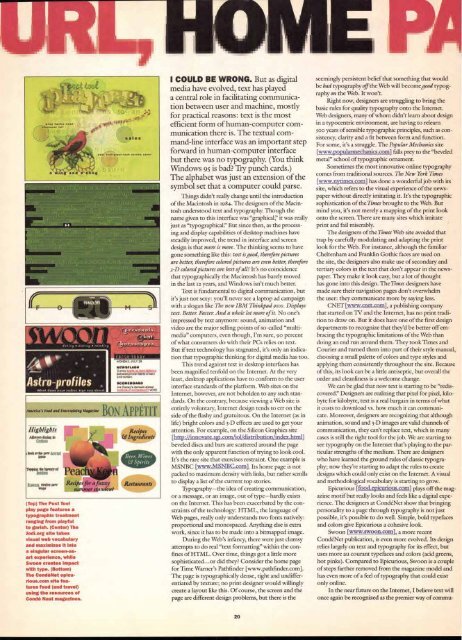
(Top) The Post Tool<br />
play page features a<br />
typographic treatment<br />
ranging from playful<br />
to garish. (Center) The<br />
Jodi.org site takes<br />
visual web vocabulary<br />
and maximizes it into<br />
a singular screen-asart<br />
experience, while<br />
Swoon creates impact<br />
with type. (Bottom)<br />
The CondeNet epicurious.com<br />
site fea-<br />
tures food (and travel)<br />
using the resources of<br />
Conde Nast magazines.<br />
Recipe( far a lazzy<br />
.sammer standout<br />
MOt1044, "AY SS<br />
10111111/111/14141W<br />
SuraYM--<br />
t4t<br />
luld *Mown<br />
*COW 00440<br />
Otsn►ys obensla 4arentl<br />
" ' YOrf<br />
A PPLTI T<br />
Recipes<br />
& Ingredien,<br />
I COULD BE WRONG. But as digital<br />
media have evolved, text has played<br />
a central role in facilitating communication<br />
between user and machine, mostly<br />
for practical reasons: text is the most<br />
efficient form of human-computer communication<br />
there is. The textual command-line<br />
interface was an important step<br />
forward in human-computer interface<br />
but there was no typography. (You think<br />
Windows 95 is bad? Try punch cards.)<br />
The alphabet was just an extension of the<br />
symbol set that a computer could parse.<br />
Things didn't really change until the introduction<br />
of the Macintosh in 1984. The designers of the Macintosh<br />
understood text and typography. Though the<br />
name given to this interface was "graphical," it was really<br />
just as "typographical?' But since then, as the processing<br />
and display capabilities of desktop machines have<br />
steadily improved, the trend in interface and screen<br />
design is that more is more. The thinking seems to have<br />
gone something like this: text i s good, therefore pictures<br />
are better, therefore colored pictures are even better, therefore<br />
3-D colored pictures are best of all! It's no coincidence<br />
that typographically the Macintosh has barely moved<br />
in the last 12 years, and Windows isn't much better.<br />
Text is fundamental to digital communication, but<br />
it's just not sexy: you'll never see a laptop ad campaign<br />
with a slogan like The new IBM Thinkpad swoo. Displays<br />
text. Better. Faster. And a whole lot more of it. No one's<br />
impressed by text anymore: sound, animation and<br />
video are the major selling points of so-called "multimedia"<br />
computers, even though, I'm sure, 90 percent<br />
of what consumers do with their PCs relies on text.<br />
But if text technology has stagnated, it's only an indication<br />
that typographic thinking for digital media has too.<br />
This trend against text in desktop interfaces has<br />
been magnified tenfold on the Internet. At the very<br />
least, desktop applications have to conform to the user<br />
interface standards of the platform. Web sites on the<br />
Internet, however, are not beholden to any such standards.<br />
On the contrary, because viewing a Web site is<br />
entirely voluntary, Internet design tends to err on the<br />
side of the flashy and gratuitous. On the Internet (as in<br />
life) bright colors and 3-D effects are used to get your<br />
attention. For example, on the Silicon Graphics site<br />
[http://innovate.sgi.com/iol/distributionfindex.html]<br />
beveled discs and bars are scattered around the page<br />
with the only apparent function of trying to look cool.<br />
It's the rare site that exercises restraint. One example is<br />
MSNBC [www.MSNBC.com] Its home page is not<br />
packed to maximum density with links, but rather scrolls<br />
to display a list of the current top stories.<br />
Typography—the idea of creating communication,<br />
or a message, or an image, out of type—hardly exists<br />
on the Internet. This has been exacerbated by the constraints<br />
of the technology: HTML, the language of<br />
Web pages, really only understands two fonts natively:<br />
proportional and monospaced. Anything else is extra<br />
work, since it has to be made into a bitmapped image.<br />
During the Web's infancy, there were just clumsy<br />
attempts to do real "text formatting" within the confines<br />
of HTML. Over time, things got a little more<br />
sophisticated...or did they? Consider the home page<br />
for Time Warner's Pathfinder [www.pathfinder.com ].<br />
The page is typographically dense, tight and undifferentiated<br />
by texture; no print designer would willingly<br />
create a layout like this. Of course, the screen and the<br />
page are different design problems, but there is the<br />
20<br />
seemingly persistent belief that something that would<br />
be bad typography off the Web will becomegood typography<br />
on the Web. It won't.<br />
Right now, designers are struggling to bring the<br />
basic rules for quality typography onto the Internet.<br />
Web designers, many of whom didn't learn about design<br />
in a typocentric environment, are having to relearn<br />
500 years of sensible typographic principles, such as consistency,<br />
clarity and a fit between form and function.<br />
For some, it's a struggle. The Popular Mechanics site<br />
[www.popularmechanics.com ] falls prey to the "beveled<br />
metal" school of typographic ornament.<br />
Sometimes the most innovative online typography<br />
comes from traditional sources. The New York Times<br />
[www.nytimes.com] has done a wonderful job with its<br />
site, which refers to the visual experience of the newspaper<br />
without directly imitating it It's the typographic<br />
sophistication of the Times brought to the Web. But<br />
mind you, it's not merely a mapping of the print look<br />
onto the screen. There are many sites which imitate<br />
print and fail miserably.<br />
The designers of the Times Web site avoided that<br />
trap by carefully modulating and adapting the print<br />
look for the Web. For instance, although the familiar<br />
Cheltenham and Franklin Gothic faces are used on<br />
the site, the designers also make use of secondary and<br />
tertiary colors in the text that don't appear in the newspaper.<br />
They make it look easy, but a lot of thought<br />
has gone into this design. The Times designers have<br />
made sure their navigation pages don't overwhelm<br />
the user: they communicate more by saying less.<br />
CNET [www.cnet.com], a publishing company<br />
that started on TV and the Internet, has no print tradition<br />
to draw on. But it does have one of the first design<br />
departments to recognize that they'd be better off embracing<br />
the typographic limitations of the Web than<br />
doing an end run around them. They took Times and<br />
Courier and turned them into part of their style manual,<br />
choosing a small palette of colors and type styles and<br />
applying them consistently throughout the site. Because<br />
of this, its look can be a little antiseptic, but overall the<br />
order and cleanliness is a welcome change.<br />
We can be glad that now text is starting to be "rediscovered?'<br />
Designers are realizing that pixel for pixel, kilobyte<br />
for kilobyte, text is a real bargain in terms of what<br />
it costs to download vs. how much it can communicate.<br />
Moreover, designers are recognizing that although<br />
animation, sound and 3-D images are valid channels of<br />
communication, they can't replace text, which in many<br />
cases is still the right tool for the job. We are starting to<br />
see typography on the Internet that's playing to the particular<br />
strengths of the medium. There are designers<br />
who have learned the ground rules of classic typography;<br />
now they're starting to adapt the rules to create<br />
designs which could only exist on the Internet. A visual<br />
and methodological vocabulary is starting to grow.<br />
Epicurious [food.epicurious.corn] plays off the magazine<br />
motif but really looks and feels like a digital experience.<br />
The designers at CondeNet show that bringing<br />
personality to a page through typography is not just<br />
possible, it's possible to do well. Simple, bold typefaces<br />
and colors give Epicurious a cohesive look.<br />
Swoon [www.swoon.com], a more recent<br />
CondeNet publication, is even more evolved. Its design<br />
relies largely on text and typography for its effect, but<br />
uses more au courant typefaces and colors (acid greens,<br />
hot pinks). Compared to Epicurious, Swoon is a couple<br />
of steps farther removed from the magazine model and<br />
has even more of a feel of typography that could exist<br />
only online.<br />
In the near future on the Internet, I believe text will<br />
once again be recognized as the premier way of commu-


