

aA aA aA aA aA aA aA aA aA
aA aA aA aA aA aA aA aA aA
aA aA aA aA aA aA aA aA aA

You also want an ePaper? Increase the reach of your titles
YUMPU automatically turns print PDFs into web optimized ePapers that Google loves.
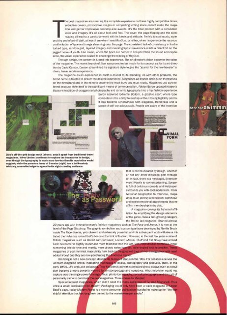
Blue's off-the-grid design motif (above), sets It apart from traditional travel<br />
magazines. Wired (below) continues to explore the boundaries in design,<br />
even though the typography is much more low-key than its reputation would<br />
suggest; while the premiere Issue of Sweater (right) has a deliberately<br />
arbitrary, unravelled edge to appeal to its night-crawling audience.<br />
The best magazines are creating this complete experience. In these highly competitive times,<br />
seductive covers, provocative images or compelling writing alone cannot make the maga-<br />
zine and garner impressive doorstop-size awards. It's the total product with a consistent<br />
voice and imagery. It's all about look and feel. The cover, the page-flipping and the skimreading<br />
all lead to a particular world with its ideals and attitude. I'm hip to cool music, style<br />
and the end of print! Well, at least I am when I read RayGun, or rather, when I experience the raucous<br />
confrontation of type and image slamming onto the page. The consistent lack of consistency in its disturbed<br />
type, random grid, layered imagery and overall graphic irreverence made a direct hit on the<br />
jagged nerve of youth. Like music, where the lyrics are harder to decipher than the sound and experience,<br />
the visual experience is used to challenge the reading of RayGun.<br />
Through design, the content is turned into experience. The art director's vision becomes the voice<br />
of the magazine. The recent launch of Blue was promoted as much for its concept as for its art direction<br />
by David Carson. Carson streamlined his signature style to give the "journal for the new traveler" a<br />
clean, linear, modern experience.<br />
The magazine as an experience in itself is crucial to its branding. As with other products, the<br />
brand name is trusted to deliver the desired experience. Magazines as brands distinguish themselves<br />
on the newsstand and in the mind to become the must-buys and must-reads. Magazines use style to<br />
brand because style itself is the significant means of communication. Fabien Baron updated Harper's<br />
Bazaar's tradition of exaggerated photography and dynamic typography into a hip fashion experience.<br />
Baron spawned Extreme Bodoni, a graphic sport where type<br />
competes in the ability to overlap without losing legibility points.<br />
It has become synonymous with elegance, trendiness and a<br />
sense of self-conscious style. People are aware of the intention<br />
that is communicated by design, whether<br />
or not any other message gets through<br />
(if, in fact, there is a message). Entertainment<br />
Weekly is very entertaining, Saveur<br />
is full of delicious spreads and Wallpaper<br />
surrounds you with cool modernism. From<br />
National Geographic to Interview, magazines<br />
must portray a consistent worldview<br />
and evoke emotional attachments that reaffirm<br />
membership in the club.<br />
A magazine conveys its fraternal affil<br />
iation by amplifying the design elements<br />
of the genre. Take a fast-growing category,<br />
the British lad magazine. Started almost<br />
20 years ago with innovative men's fashion magazines such as The Face and Arena, it is now at the<br />
level of the Page Six pinup. The graphic symbolism and custom typefaces developed by Neville Brody<br />
made The Face diverse, yet coherent and extremely powerful, and his subsequent work with Arena ini<br />
tiated the Helvetica revival that's become the font of fashion. However, in the last few years a slew of<br />
British magazines such as Dazed and Confused, Loaded, Maxim, Stuff and Eat Soup have arrived<br />
Each newcomer is slightly louder and more tasteless than the last amore<br />
screaming tabloid type and mostly, more glossy naked en, able-bod ed and accessible. These<br />
magazines of post-feminist masculinity hark back od of<br />
added! irony! and they are now penetrating th<br />
Branding is not a new concept, desp<br />
ultimate magazine brand, marketing<br />
early 1970s, Life and Look collaps<br />
sion became a more powerful v<br />
capture was the single powerf<br />
personality came to domina<br />
Special interest mag<br />
while a small publicatio<br />
Beall's days, today Mo<br />
shipful attention that<br />
status in the '90s. For decades Life was the<br />
books, photography and products. Then, in the<br />
persisted with storyboard photo essays even as televi-<br />
hotoreportage and narratives. What television could not<br />
us, photo-icon r It of<br />
magazines. Three s fo<br />
ich didn't need the ass audie hus<br />
deryPackaging could my have been a trade magazine<br />
et is a niche consumer ublication founded to make up for "the<br />
een denied by the mainst am pet media:'


