

aA aA aA aA aA aA aA aA aA
aA aA aA aA aA aA aA aA aA
aA aA aA aA aA aA aA aA aA

Create successful ePaper yourself
Turn your PDF publications into a flip-book with our unique Google optimized e-Paper software.
ABCDEKIIIIKLMNO<br />
TERI KAMAN IS<br />
FASCINATED<br />
WITH LETTERFORM5<br />
WITII POINTED<br />
STROKES.<br />
MERE THEY<br />
TWIST<br />
IN A SORT OF<br />
SINVOVS,<br />
4ALLVMPIIIN4<br />
DANCE ALON4<br />
TIM LINE.<br />
RSTVWXYZ12345678<br />
IT< SVRFROARDT" roam<br />
free shapes and the precise edges and angles that create them. otn3CS gFiNc9,9%ge970200kgarlia,rXWa 1234567n0<br />
ily4bv2opqt3s-tuvwxy3 icAfr<br />
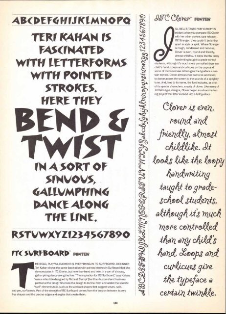
HE BOLD, PLAYFUL ELEMENT IS EVERYTHING IN ITC SURFBOARD. DESIGNER<br />
Ten Kahan shows the same fascination with pointed strokes in Surfboard that she<br />
demonstrates in ITC Cherie, but here they bend and twist in a sort of sinuous,<br />
gallumphing dance along the line. "The inspiration for ITC Surfboard," says Kahan,<br />
"was a video title designed by Richard Stumpf [her then husband and business<br />
partner at the time]." She took the design to its final form and added the specific<br />
PIIII"surf"<br />
elements to it, such as the abstract shapes that suggest waves, sails,<br />
and yes, surfboards. Part of the strength of ITC Surfboard comes from the tension between its very<br />
108<br />
sec ceoyet3- row<br />
BELL'S TASTE FOR VARIETY IS<br />
evident when you compare ITC Clover<br />
with her other current type release,<br />
ITC Stranger: they couldn't be farther<br />
apart in style or spirit. Where Stranger<br />
is rough, condensed and nervous,<br />
Clover is even, round and friendly,<br />
almost childlike. It looks like the loopy<br />
e9ILL<br />
handwriting taught to grade-school<br />
students, although it's much more controlled than any<br />
child's hand. Loops and curlicues on the caps and<br />
some of the lowercase letters give the typeface a cer-<br />
tain twinkle. Clover almost cries out to be animated,<br />
to dance across the screen to the sounds of a sprightly<br />
tune. And, true to its name, the font includes, as one<br />
of its special characters, a sprig of clover. Like many of<br />
Jill Bell's type designs, Clover began as a hand-letter-<br />
ing project that later evolved into a full typeface.<br />
C4i/e13 eVe72,<br />
PotOZGe GOZce<br />
friadoey, a lloJof<br />
cAliaceUe. Sot<br />
4o4s ti,ke #fie ,60s4 joy<br />
43 (vitt -to racee-<br />
Scitioa eSItice02-fs,<br />
Gittfiog94 iits inucifi<br />
mope co72,0fPoteece<br />
44602. any cittaceS<br />
4G372ct hoops end<br />
atitztes give<br />
Me -typeface a<br />
cePotai?2,


