

aA aA aA aA aA aA aA aA aA
aA aA aA aA aA aA aA aA aA
aA aA aA aA aA aA aA aA aA

You also want an ePaper? Increase the reach of your titles
YUMPU automatically turns print PDFs into web optimized ePapers that Google loves.
ground as the windows of Manhattan buildings.<br />
Lumet was decisive, however, when he reached the<br />
vertical brush strokes proposal. "It took him literally<br />
one minute from the point where they were all<br />
lined up;" says Trollbeck. "It was amazing because<br />
he picked the one I was going to sell to him. I didn't<br />
have a chance?'<br />
Manhattan wasn't the easiest skyline to build<br />
backwards. Having selected an appropriate image of<br />
the city, the design team set to work at replicating<br />
the irregular motion of a brush stroke on a computer,<br />
at the same time as forming the silhouette of a sky-<br />
scraper. "We wanted the brush strokes to look some-<br />
what believable, but we couldn't have them coming<br />
down in the middle of a building" says Trollbeck.<br />
The effect was achieved by permitting each brush<br />
stroke some artistic license as it formed the partial<br />
shape of a building. The strokes were also accelerated<br />
and decelerated with the Flame digital editing soft-<br />
ware to create the effect of the human hand at work.<br />
The most dramatic view of Manhattan, from its<br />
southernmost tip, is also distinctly narrower than<br />
that seen from East or West. On the wide format of<br />
the cinema screen, this produced an undesirable<br />
falling off at each end. "Our perfect skyline was lacking<br />
something," admits Trollbeck. There was only<br />
one solution. "We added a building," he confesses.<br />
"It felt so great!"<br />
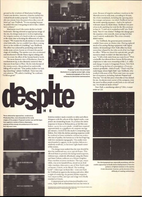
Three alternative approaches, rendered as<br />
Photoshop files, were discarded at the early<br />
stages of the project. Proposal number one set the type-<br />
face against a series of blurry cityscapes,<br />
pl4ing off the cloudy circumstances of the hero's<br />
first big court case.<br />
ANDY GARCIA<br />
A MOUNT/KRAMER PRODUCTION<br />
NIGHT FALLS ON MANHATTAN<br />
A MOUNT/KRAMER PRODUCTION<br />
NIGHT FALLS ON MANHATTAN<br />
Proposal number two portrayed<br />
Manhattan in a slightly surreal light, using<br />
treated photographs of the city to<br />
enhance its distinctive luminescence.<br />
limitless trickery made available to titles and effects<br />
designers with the advent of the digital studio, computers<br />
are demanding beasts. To produce the entire<br />
sequence in-house at R/Greenberg at full film resolution-4,000<br />
by 2,000 pixels—would have required<br />
approximately 14.4 gigabytes of computer storage<br />
per minute, a stretch for the studio's computing capabilities.<br />
For while the skyline painting sequence could<br />
be rendered at lower resolution without any noticeable<br />
loss of quality, the human eye is far less forgiving<br />
with low resolution typography. The credits were<br />
storyboarded to appear, in the typeface Sabon at a<br />
relatively small size, in the lower right-hand corner<br />
of the screen.<br />
The design team settled that the type should be<br />
shot the traditional way, at an opticals house. This<br />
allowed them to produce the background sequence,<br />
without type, relatively effortlessly using the Flame<br />
and faster Inferno software on a Silicon Graphics<br />
Onyx machine at lower resolution. The type, meanwhile,<br />
was set in QuarkXPress, timed on an Avid<br />
video machine, then sent to one of New York's optical<br />
houses, Cineric, to be filmed The resulting<br />
"cards"—white type on black film—were sent back<br />
for Trollbeck to approve the timing and color. After<br />
a night of rendering, the painted skyline sequence<br />
was output to film, and type and image were finally<br />
reunited at Cineric.<br />
Computational and architectural hurdles overcome,<br />
Night Falls on Manhattan had one last twist in<br />
HEADLINE/1EXT/B10: ITC FRANKLIN GOTHIC DEMI, DEMI COMPRESSED, HEAW; ITC GALLIARD ROMAN, ITALIC<br />
SUBHEAD/BYLINE/CAPTIONS: ITC FRANKLIN GOTHIC DEMI, DEMI ITALIC<br />
9<br />
store. Because of negative audience reactions to the<br />
Marsalis score in early tests, according to Mount,<br />
the whole soundtrack, including the opening piece<br />
for trumpet and piano—to which Trollbeck had set<br />
the entire opening sequence—had to be replaced<br />
with new music by Mark Ishan. Trollbeck was powerless<br />
to do anything but wait for the film premiere<br />
to hear it. "I can't say it worked as well;' says Trollbeck,<br />
"but it's very similar?' Perhaps the change gave<br />
the sequence a less smooth, more jarring feel that<br />
wasn't entirely undesirable. The critics certainly<br />
didn't notice.<br />
For Trollbeck, the generous press comments<br />
couldn't have come at a better time. Having replaced<br />
much of its analog filming equipment with digital<br />
studios, R/Greenberg's New York office has been<br />
somewhat eclipsed by the titles work of its Los Angeles<br />
office. "When we closed the opticals side, people<br />
started to think we didn't do film titles here:' he<br />
says. "It fell a little aside from our main focus!' With<br />
a reshuffle that allowed three former It/Greenberg<br />
employees to take over ownership of the L.A. office<br />
and change its name to Imaginary Forces, New York<br />
was left facing the loss of a prestigious—if not particularly<br />
profitable—field of work. "That's why I'm<br />
really happy about Night Falls;' says Trollbeck, who<br />
worked with some of the West coast team on a number<br />
of sequences, including Indecent Proposal and<br />
True Lies. "It's the first piece where the art has clicked<br />
for me. In almost every corner of the company, even<br />
the most hardline people would look at our reel and<br />
say, 'we should do more of that'."<br />
Peter Hall, a contributing editor of U&lc, is senior<br />
writer at I.D.<br />
The third proposal was especially promising, with the<br />
credits appearing vertically before fading back to form the<br />
patterns of lighted windows in the skyline.<br />
It was discarded, however, partly because of the<br />
difficulty of reading vertical type.


