

aA aA aA aA aA aA aA aA aA
aA aA aA aA aA aA aA aA aA
aA aA aA aA aA aA aA aA aA

Create successful ePaper yourself
Turn your PDF publications into a flip-book with our unique Google optimized e-Paper software.
Plunkett is already aggressively staking out his<br />
claim, and HardWired is not just another meek,<br />
independent publisher in a stampeding herd of<br />
competitors. Its tonier books, including Wired<br />
Style: Principles ofEnglish Usage in the Digital Age<br />
and Digerati: Encounters with the Cyber Elite, have<br />
done very well in a difficult publishing environment<br />
where newcomers are about as welcome as<br />
silverfish, and where securing shelf space in the<br />
bookstores is tougher than getting seats to a Knicks<br />
game. Yet HardWired has an edge, owing not only<br />
to the Wired equity, but also to Plunkett's original<br />
design scheme that has given the books both quantifiable<br />
allure and distinctive branding.<br />
HardWired's overall design scheme evokes the<br />
graphic language of mainstream futurists. Plunkett<br />
has developed visual cues and iconic devices that<br />
identify the individual books as both a total entity<br />
and a part of a larger family. His strategy serves as<br />
a lesson for anyone involved in the fusion of typography<br />
and graphic design as a branding tool.<br />
Wired's kinetic look is not as undisciplined as the<br />
more radical cyberzines. It does not mimic design<br />
on the screen, or what Plunkett refers to as a "dumb<br />
visual metaphor?' Rather it is a kind of speculative<br />
translation of what people relate to as the computer<br />
experience. But the "simple tricks" that graphically<br />
distinguish Wired, and now HardWired, such as<br />
the color-banded spines (an homage to Paul Rand's<br />
IBM logo?), send off what Plunkett calls "signal<br />
flares" that the Wired message is imbedded throughout<br />
these print-based products. And the Wired<br />
imprimatur insures the highest degree of futuristic<br />
intelligence.<br />
Content drives the books, but "the package is<br />
an equally important part of the message;' asserts<br />
HardWired's design director, Susanna Dulkinys.<br />
Her mission is to distinguish HardWired books<br />
from the ephemeral nature of the magazine yet<br />
maintain the magazine's identity. Both Plunkett and<br />
Dulkinys agree that repackaging magazine articles<br />
between boards i is not the answer. While Hard-<br />
Wired books strictly adhere to the brand franchise,<br />
each is conceived as a unique form, united by cer-<br />
tain color and type preferences.<br />
The line where the magazine stops and the book<br />
begins was initially drawn with HardWired's pre-<br />
miere release, Mind Grenades, edited and designed<br />
by Plunkett and Wired's publisher, Louis Rossetto.<br />
The book is a compilation of Wired's four-page, ex-<br />
perimental, front-of-the-book "idea advertisements"<br />
of quotes extracted from articles and illustrated by<br />
various designers. While helping to define the mag-<br />
azine's look, when these self-contained "visual essays"<br />
were bound between covers, they were transformed<br />
into chapters of a book. Although the designs were<br />
produced separately over many years, they success-<br />
HEADLINE/SUBHEAD: ITC FRANKLIN GOTHIC HEAVY, DEMI EXTRA COMPRESSED<br />
BYLINE/CAPTION: ITC FRANKLIN GOTHIC HEAVY TEXT/B10: ITC GALLIARD ROMAN, ITALIC<br />
fully fused into a single editorial unit independent<br />
of the magazine. The cover did not include the<br />
Wired logo (as some subsequent books do), but<br />
the vibrating fluorescent colors shining through<br />
die-cut stencil letters and printed on matte varnished<br />
stock evoke an unmistakable Wired feel.<br />
Likewise, Reality Check, a sardonic prediction<br />
of changes in lifestyles in the future (beginning in<br />
1996 and ending well into the 21st century), was art<br />
directed by Dulkinys with the cover by Plunkett.<br />
It builds upon the Wired format of various weights<br />
of sans serif light and bold type that seem to float<br />
within an otherwise tight grid. The cover is printed<br />
on matte stock with Wired's fluorescent colors,<br />
including Day-Glo orange and lime. Colorful<br />
ruled spines reinforce the brand.<br />
With Wired Style, designed by Dulkinys and<br />
cover by Plunkett, here again the basic identifiers<br />
are in place, but this book begins to veer off on its<br />
own, and is a celebration of the book as object.<br />
Plunkett asserts that books today must be "highly<br />
visual and highly tactile" to counterbalance the problems<br />
inherent in the familiarity of the form. While<br />
this package tips the hat to tradition through its<br />
serif type and slipcase, it gives a nod to the future<br />
with interior pages that are acidic lime green.<br />
The evolution from magazine to book takes a<br />
sharp turn with Burning Man, designed (and<br />
edited) by Plunkett. This photographic document<br />
of a little-publicized millennial carnival attended<br />
by thousands each year in Nevada's Black Rock<br />
Desert originally was a pictorial essay in an issue<br />
of Wired. But Plunkett was frustrated by the limitations<br />
of the magazine and the inability to do<br />
more than a six-page picture spread. This book is<br />
unique even among HardWired products, with<br />
its minimalist cover showing a bright yellow, skeletal/robotic<br />
pictograph under the condensed gothic<br />
title set in yellow against a black background in<br />
contrast to the colorful photographs inside.<br />
The book was planned without any text at all,<br />
,<br />
, included ,<br />
1<br />
but Plunkett ultimately ncluded a signature of<br />
writers' impressions. Printed on a separate paper<br />
stock, it was positioned three-fifths into the book<br />
and dramatically separates the pictorial transition<br />
from day to night. With Burning Man, Plunkett<br />
proves that even within a tight design family, surprise<br />
is key and shows that there are many different<br />
ways to invoke the futuristic message.<br />
HardWired is an anomaly rooted in a traditional<br />
medium that even some Wired pundits brand as<br />
obsolete. Nevertheless, paper and ink are here to<br />
stay. And even if print were on its deathbed, Hard-<br />
Wired has certainly resurrected it for the digital era.<br />
Steven Heller is co-author of Faces on the Edge: Type<br />
Design in the Digital Age (Van Nostrand Reinhold).<br />
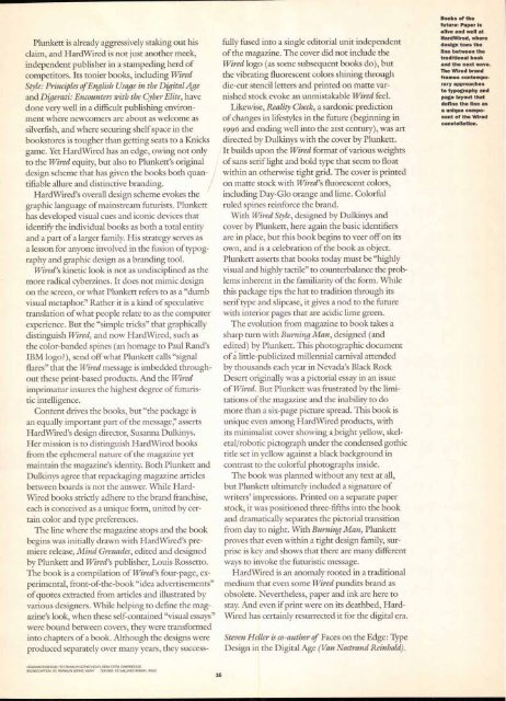
Books of the<br />
future: Paper is<br />
alive and well at<br />
HardWired, where<br />
design toes the<br />
line between the<br />
traditional book<br />
and the next wave.<br />
The Wired brand<br />
frames contemporary<br />
approaches<br />
to typography and<br />
page layout that<br />
define the line as<br />
a unique component<br />
of the Wired<br />
constellation.


