

aA aA aA aA aA aA aA aA aA
aA aA aA aA aA aA aA aA aA
aA aA aA aA aA aA aA aA aA

You also want an ePaper? Increase the reach of your titles
YUMPU automatically turns print PDFs into web optimized ePapers that Google loves.
4--)-6trJa<br />
ri7 e)<br />
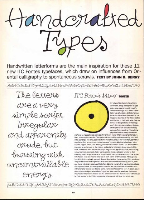
Handwritten letterforms are the main inspiration for these 11<br />
new ITC Fontek typefaces, which draw on influences from Ori-<br />
ental calligraphy to spontaneous scrawls. TEXT BY JOHN D. BERRY<br />
Act..8-ey C al) 4, Eefi g -4,0i4J-tiLZAAriNr 00P Q Pi) Wc0C-o066-2,z, I LS 67 cfr 0<br />
ITC PeAey-/% ALLYt®TM<br />
NE NEW YORK-BASED DESIGNER,<br />
John Peter, brings a deep love of type<br />
and a long experience with how it's<br />
used to the design of ITC Peter's Miro.<br />
Peter was art director of McCall's mag-<br />
azine and serves as a consultant in the<br />
magazine business in the United States<br />
and Europe. In 1947, with artist Thomas<br />
Coryn, he designed one of the maga-<br />
zine's first exclusive typefaces that was<br />
developed for the phototypesetting<br />
process. Peter says that "the calligra-<br />
phy of artists has always interested<br />
me," and he has collected samples of it for many years. When it came to ITC Peter's<br />
Miro, he wanted to have fun. The typeface is inspired by the letters used by Joan Miro<br />
in his paintings. "No one used letterforms more frequently in his work than Joan Miro,"<br />
says Peter. But, he continues, in this typeface "considerable liberty has been taken<br />
with his original letters, and missing characters have been added." ITC Peter's Miro is<br />
intended as an homage to the master, and a playful extension of one aspect of his<br />
work. The letters are a very simple script, irregular and apparently crude, but bursting<br />
with uncontrollable energy. Peter wants graphic designers to give full play to their<br />
creativity when using the typeface, so he provides two complete versions of the alphabet<br />
(Peter's Miro and Peter's Miro Too) in both upper- and lowercase. Although very<br />
few of the letters actually connect, they do flow together freely, and, as Peter points out,<br />
"They lend themselves to ligatures." They also lend themselves to being filled in, here<br />
and there, with bright colors, as Miro often did in his own art. This way, the letters keep<br />
the impact of black, the most powerful color for text, but they offer a home for color<br />
in their interior spaces and details. Some examples of this can be seen in recent issues<br />
of Architectural Digest, where Peter's type has been used for headlines. Peter says<br />
that Peter's Miro wasn't created out of a perceived need or a market niche, but because<br />
he "just wanted to do it." He hopes some other people will have fun with it, too.<br />
003 GcJI) ,I 70)-/-th.rc3)mLei\i\fryl_ 6)-2,0-e0))))4,07z,JubhrTtnxi)(0)(Stog_zciy -LLI2,5456-16 9 O'<br />
104


