

aA aA aA aA aA aA aA aA aA
aA aA aA aA aA aA aA aA aA
aA aA aA aA aA aA aA aA aA

Create successful ePaper yourself
Turn your PDF publications into a flip-book with our unique Google optimized e-Paper software.
-<br />
S M1 C<br />
Sitc nod b AA.A.vallocantextrr. ounal rurvo .1.11 .rd In 41 n<br />
lit 4, 6 51.1....1 o vantua NJ, a acoupt MI., 2 I. dr At<br />
mAlsoh,ed ber wr» lr AY ,'d duvni 11» jc..d1 Ned Nu+ sh,,,osbolo,,,, ,<br />
A magazine can be defi brand if the reference lives e<br />
example, Martha Stewart L fired. Each has a particular<br />
ing visual experience that is tely identifiable, and theref<br />
Is Martha Stuart Living? mi the't, MSL process so perfectly<br />
water is almost believable. u fluorescent colors and<br />
tions, albeit less successfully, to fer he magazine that defin<br />
Magazine design was once editorial design, tha<br />
questioning) the concepts of the a les. is is most obvious i<br />
Agha at Vogue and Vanity Fair, T.M. Celan t Fortune and lat<br />
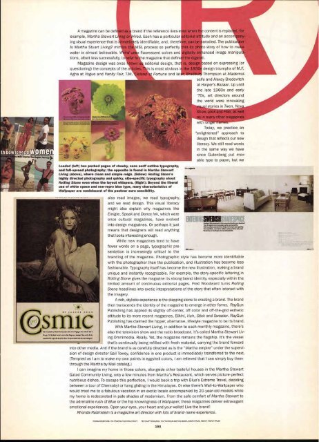
Loaded (left) has packed pages of cheeky, sans serif outline typography,<br />
and full-spread photography; the opposite is found in Martha Stewart<br />
Living (above), where clean and simple reign. (Below): Rolling Stone's<br />
highly directed photography and quirky, site-specific typography shout<br />
Roiling Stone even when the layout whispers. (Right): Beyond the liberal<br />
use of white space and non-repro blue type, many characteristics of<br />
Wallpaper are reminiscent of the postwar euro sensibility.<br />
also read images, we read typography,<br />
and we read design. This visual literacy<br />
might also explain why magazines like<br />
Emigre, Speak and Dance Ink, which were<br />
once cultural magazines, have evolved<br />
into design magazines. Or perhaps it just<br />
means that designers will read anything<br />
that looks interesting enough.<br />
While new magazines tend to have<br />
fewer words on a page, typographic presentation<br />
is increasingly critical to the<br />
when content is repla<br />
orial tude and an acco<br />
can b y larodied. The publica<br />
t its p o story of how to ma<br />
'tally anced image manipul<br />
SOO<br />
e dig<br />
desteased on expressing (or<br />
design triumphs of M.F.<br />
Thompson at Mademoi<br />
se//e and Alexey Brodovitch<br />
at Harper's Bazaar. Up until<br />
the late 1960s and early<br />
'70s, art directors around<br />
the world were innovating<br />
I stories in Twen, Nov<br />
Show, Look , as well<br />
many other magazines<br />
with orlgerf.--<br />
Today, we practice an<br />
enlightened" approach to<br />
design that reflects our new<br />
literacy. We still read words<br />
in the same way we have<br />
since Gutenberg put mov<br />
able type to paper, but we<br />
SWEDISH<br />
Feeling a little squeezed m Mat ove ■prmedstudic ,num.shoebon?<br />
Then it might be worth considering the communal ble.<br />
With sociasgn, Scandinavian design and ample spate guiding<br />
the, man ifesto, our interio or editors came up with a ca., cool<br />
get tot( eon the fringes ¢ral Staldnohn<br />
branding of the magazine. Photographic style has become more identifiable<br />
with the photographer than the publication, and illustration has become less<br />
fashionable. Typography itself has become the new illustration, making a brand<br />
unique and instantly recognizable. For example, the story-specific lettering in<br />
Rolling Stone gives the magazine its strong brand identity, especially within the<br />
limited amount of continuous editorial pages. Fred Woodward turns Rolling<br />
Stone headlines into exotic interpretations of the story that often interact with<br />
the imagery.<br />
A rich, stylistic experience is the stepping stone to creating a brand. The brand<br />
then transcends the identity of the magazine to emerge in other forms. RayGun<br />
Publishing has applied its slightly off-center, off-color and off-the-grid esthetic<br />
attitude to its more recent magazines, Bikini, Huh, Stick and Sweater. RayGun<br />
Publishing has claimed the hipper, alternative, lifestyle magazine to be its brand<br />
With Martha Stewart Living, in addition to each monthly magazine, there's<br />
also the television show and the radio broadcast. It's called Martha Stewart Liv<br />
ing Omnimedia. Really. Yet, the magazine remains the flagship. It's the vessel<br />
that's continually being refilled with fresh material, carrying the brand forward<br />
into other media. And if the brand is as carefully directed as is the "Martha empire" under the supervi-<br />
sion of design director Gail Towey, confidence in one product is immediately transferred to the next.<br />
(Tempted as I am to make my own paints in eggshell colors, I am relieved that I can simply buy them<br />
through the Martha by Mail catalog.)<br />
I can imagine my home in those colors, alongside other tasteful houses in the Martha Stewart<br />
Gated Community Living, only a few minutes from Martha's Restaurant, which serves picture-perfect<br />
nutritious dishes. To escape this perfection, I would book a trip with Blue's Extreme Travel, deciding<br />
between a tour of Chernobyl or hang gliding in the Himalayas. Or else there's Wall-to-Wallpaper who<br />
would treat me to a fabulous vacation in an exotic locale accompanied by 20-year-old models while<br />
my home is redecorated in pale shades of modernism. From the safe comfort of Martha Stewart to<br />
the adrenaline rush of Blue or the hip knowingness of Wallpaper, these magazines deliver extravagant<br />
emotional experiences. Open your eyes, your heart and your wallet! Live the brand!<br />
Rhonda Rubinstein is a magazine art director with lots of brand-name experience.<br />
HEADLINE/BYLINE: ITC FRANKLIN GOTHIC HEAVY TEXT/CAPTIONS/B10: ITC FRANKLIN GOTHIC BOOK, BOOK ITALIC, HEAVY, HEAVY ITALIC<br />
103<br />
td


