

aA aA aA aA aA aA aA aA aA
aA aA aA aA aA aA aA aA aA
aA aA aA aA aA aA aA aA aA

You also want an ePaper? Increase the reach of your titles
YUMPU automatically turns print PDFs into web optimized ePapers that Google loves.
Taking the Hint<br />
The technology is willing but<br />
the flesh is weak BY MATTHEW BUTTERICK<br />
I USED TO MAKE MONEY HINTING FONTS. It really wasn't bad work. hinted PostScript fonts for years. There are suc<br />
Nobody really understood it, so they left me alone to do my job, and<br />
when I was finished, they rarely complained. After all, it was done.<br />
but unfortunately, they work about as well as<br />
kern algorithms: okay for government work,<br />
won't impress anyone who can tell good from<br />
HHHHHHHHHHHHHHH HHHHHH H H H<br />
Like kerning, quality hinting only comes from<br />
I was paid a decent rate in accordance with any skilled laborer who erate human effort.<br />
shares his trade with a national population of practitioners which<br />
could fit into a single Boston subway car. With room left over for hinting if there were decent tools for creating<br />
'MENNEN( Emma editing hinted font<br />
the Red Sox.<br />
4 --... r,--- - - -,...,.mr-ws most of the existing<br />
Type design may be an arcane vocation, but hinting is<br />
downright cultish. Hinting involves using a computer<br />
coding language to describe the relationships between the<br />
visual features of an outline typeface in order to preserve<br />
these features when the typeface is rasterized in pixels.<br />
h tools,<br />
autobut<br />
they<br />
bad.<br />
delib-<br />
And this, in turn, might not be insurmour<br />
for the few remaining souls who felt the need t<br />
1.111<br />
MO<br />
MM.<br />
BM<br />
ME<br />
.<br />
are years old, bugg ∎<br />
and require you to<br />
■■<br />
■■<br />
over and over again<br />
only one colleague<br />
cared about screen<br />
enough to get to this<br />
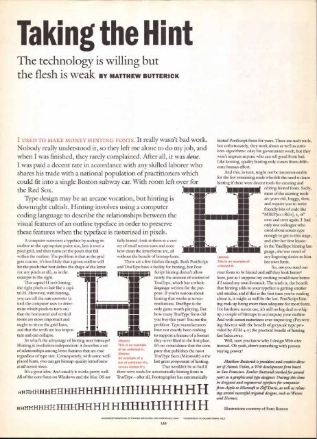
A computer rasterizes a typeface by scaling its fully hinted: look at them at a van-<br />
and after her first le<br />
outline to the appropriate point size, lays it over a<br />
pixel grid, and then turns on the pixels that fall<br />
ety of small screen sizes and note<br />
how clean the letterforms are, all<br />
in the TrueType hin<br />
MIMEO guage, she was cure<br />
within the outline. The problem is that as the grid without the benefit of bitmap fonts.<br />
(Above)<br />
any lingering desire<br />
gets coarser, it's less likely that a given outline will<br />
hit the pixels that best define the shape of the letter<br />
(or any pixels at all), as in the<br />
example to the right.<br />
This capital H isn't hitting 'MEr<br />
the right pixels to look like a capi- T 1<br />
tal H. However, with hinting,<br />
I<br />
you can tell the scan converter (a<br />
I<br />
tool the computer uses to deter- I-<br />
There are a few hitches though. Both PostScript<br />
and TrueType have a facility for hinting, but Postriamma.<br />
51 Script hinting doesn't allow<br />
nearly the amount of control of<br />
TrueType, which has a whole<br />
language written for the purpose.<br />
If you're serious about<br />
hinting that works at screen<br />
resolutions, TrueType is the<br />
This is an example of her own fonts.<br />
a hinted H.<br />
So, can you sen<br />
your fonts to be hinted and will they look bate<br />
Sure, just as I suppose my cooking would taste<br />
if I raised my own livestock. The truth is, the b<br />
that hinting adds to your typeface is getting sty<br />
and smaller; and if this is the first time you're n<br />
about it, it might as well be the last. PostScript<br />
ing ends up being more than adequate for mos<br />
mine which pixels to turn on)<br />
that the horizontal and vertical<br />
stems are more important and<br />
ought to sit on the grid lines,<br />
and that the serifs are less impor- t ■<br />
MIN<br />
MIN<br />
INN<br />
MIL<br />
only game worth playing. But<br />
how many TrueType fonts did<br />
you buy this year? You see the<br />
problem. Type manufacturers<br />
have not exactly been rushing<br />
For hardcore screen use, it's still no big deal to<br />
up a couple of bitmaps to accompany your out<br />
And with screen rasterizers ever-improving (Pi<br />
ing this text with the benefit of greyscale type f<br />
vided by ATM 4.o) the practical benefit of hini<br />
tant and can collapse.<br />
to support a feature of a format fast fades away.<br />
So what's the advantage of hinting over bitmaps? (Above)<br />
they never liked in the first place. Well, now you know why I design Web sit<br />
Hinting is resolution-independent: it describes a set This is an example It's no coincidence that the com- instead. Oh yeah, there's something with prove<br />
of relationships among letter features that are true<br />
regardless of type size. Consequently, with some wellplaced<br />
hints, you can get bitmap-quality letterforms<br />
at all screen sizes.<br />
of an unhinted H.<br />
(Below)<br />
An example of a<br />
run of unhinted H's,<br />
versus hinted H's.<br />
pany that publishes the most<br />
TrueType faces (Microsoft) is the<br />
last great proponent of hinting.<br />
That wouldn't be so bad if<br />
staying power!<br />
It's a great idea. And usually it works pretty well. there were tools for automatically hinting fonts in<br />
All of the core fonts on Windows and the Mac OS are TrueType—after all, Fontographer has automatically<br />
R.RHHHHHHHHHHHHHHHHHEIHEIH<br />
■■ friendly bits of coda<br />
table<br />
o learn<br />
and<br />
. Sadly,<br />
tools<br />
slow,<br />
write<br />
like<br />
"MIRP[m> RGr], 2 18 "<br />
. I had<br />
who<br />
type<br />
s stage,<br />
sson<br />
ting land<br />
of<br />
to hint<br />
d out<br />
r?<br />
better<br />
enefit<br />
caller<br />
ading<br />
hintt<br />
fonts.<br />
whip<br />
line.<br />
-n writroting<br />
es<br />
n<br />
Matthew Butterick is president and creative director<br />
of Atomic Vision, a Web development firm based<br />
in San Francisco. Earlier Butterick worked for several<br />
years as a graphic and type designer. During this time<br />
he designed and engineered typefaces for companies<br />
from Apple to Microsoft to Ziff:Davis, as well as releasing<br />
several successful original designs, such as Wessex<br />
and Hermes.<br />
HEADUNE/CAPTIONS/BYLINE: ITC FRANKLIN GOTHIC DEMI, DEMI COMPRESSED, HEAVY TEXT/B10/CREDFT: RC GALLIARD ROMAN, RAM<br />
116<br />
Illustrations courtesy of Font Bureau


