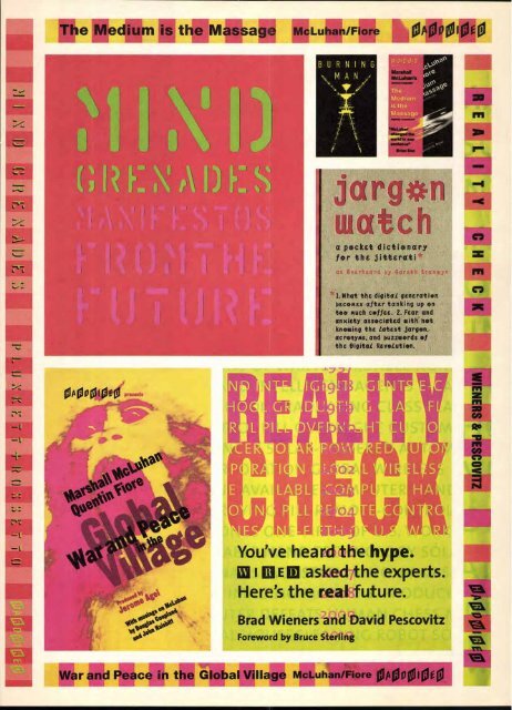
Plunkett is already aggressively staking out his claim, and HardWired is not just another meek, independent publisher in a stampeding herd of competitors. Its tonier books, including Wired Style: Principles ofEnglish Usage in the Digital Age and Digerati: Encounters with the Cyber Elite, have done very well in a difficult publishing environment where newcomers are about as welcome as silverfish, and where securing shelf space in the bookstores is tougher than getting seats to a Knicks game. Yet HardWired has an edge, owing not only to the Wired equity, but also to Plunkett's original design scheme that has given the books both quantifiable allure and distinctive branding. HardWired's overall design scheme evokes the graphic language of mainstream futurists. Plunkett has developed visual cues and iconic devices that identify the individual books as both a total entity and a part of a larger family. His strategy serves as a lesson for anyone involved in the fusion of typography and graphic design as a branding tool. Wired's kinetic look is not as undisciplined as the more radical cyberzines. It does not mimic design on the screen, or what Plunkett refers to as a "dumb visual metaphor?' Rather it is a kind of speculative translation of what people relate to as the computer experience. But the "simple tricks" that graphically distinguish Wired, and now HardWired, such as the color-banded spines (an homage to Paul Rand's IBM logo?), send off what Plunkett calls "signal flares" that the Wired message is imbedded throughout these print-based products. And the Wired imprimatur insures the highest degree of futuristic intelligence. Content drives the books, but "the package is an equally important part of the message;' asserts HardWired's design director, Susanna Dulkinys. Her mission is to distinguish HardWired books from the ephemeral nature of the magazine yet maintain the magazine's identity. Both Plunkett and Dulkinys agree that repackaging magazine articles between boards i is not the answer. While Hard- Wired books strictly adhere to the brand franchise, each is conceived as a unique form, united by cer- tain color and type preferences. The line where the magazine stops and the book begins was initially drawn with HardWired's pre- miere release, Mind Grenades, edited and designed by Plunkett and Wired's publisher, Louis Rossetto. The book is a compilation of Wired's four-page, ex- perimental, front-of-the-book "idea advertisements" of quotes extracted from articles and illustrated by various designers. While helping to define the mag- azine's look, when these self-contained "visual essays" were bound between covers, they were transformed into chapters of a book. Although the designs were produced separately over many years, they success- HEADLINE/SUBHEAD: ITC FRANKLIN GOTHIC HEAVY, DEMI EXTRA COMPRESSED BYLINE/CAPTION: ITC FRANKLIN GOTHIC HEAVY TEXT/B10: ITC GALLIARD ROMAN, ITALIC fully fused into a single editorial unit independent of the magazine. The cover did not include the Wired logo (as some subsequent books do), but the vibrating fluorescent colors shining through die-cut stencil letters and printed on matte varnished stock evoke an unmistakable Wired feel. Likewise, Reality Check, a sardonic prediction of changes in lifestyles in the future (beginning in 1996 and ending well into the 21st century), was art directed by Dulkinys with the cover by Plunkett. It builds upon the Wired format of various weights of sans serif light and bold type that seem to float within an otherwise tight grid. The cover is printed on matte stock with Wired's fluorescent colors, including Day-Glo orange and lime. Colorful ruled spines reinforce the brand. With Wired Style, designed by Dulkinys and cover by Plunkett, here again the basic identifiers are in place, but this book begins to veer off on its own, and is a celebration of the book as object. Plunkett asserts that books today must be "highly visual and highly tactile" to counterbalance the problems inherent in the familiarity of the form. While this package tips the hat to tradition through its serif type and slipcase, it gives a nod to the future with interior pages that are acidic lime green. The evolution from magazine to book takes a sharp turn with Burning Man, designed (and edited) by Plunkett. This photographic document of a little-publicized millennial carnival attended by thousands each year in Nevada's Black Rock Desert originally was a pictorial essay in an issue of Wired. But Plunkett was frustrated by the limitations of the magazine and the inability to do more than a six-page picture spread. This book is unique even among HardWired products, with its minimalist cover showing a bright yellow, skeletal/robotic pictograph under the condensed gothic title set in yellow against a black background in contrast to the colorful photographs inside. The book was planned without any text at all, , , included , 1 but Plunkett ultimately ncluded a signature of writers' impressions. Printed on a separate paper stock, it was positioned three-fifths into the book and dramatically separates the pictorial transition from day to night. With Burning Man, Plunkett proves that even within a tight design family, surprise is key and shows that there are many different ways to invoke the futuristic message. HardWired is an anomaly rooted in a traditional medium that even some Wired pundits brand as obsolete. Nevertheless, paper and ink are here to stay. And even if print were on its deathbed, Hard- Wired has certainly resurrected it for the digital era. Steven Heller is co-author of Faces on the Edge: Type Design in the Digital Age (Van Nostrand Reinhold). Books of the future: Paper is alive and well at HardWired, where design toes the line between the traditional book and the next wave. The Wired brand frames contemporary approaches to typography and page layout that define the line as a unique component of the Wired constellation.
The Medium is the Massage McLuhan/Fiore 0400 04100100 BURNING MAN I The Medium iS the a p*cktt dicti*nary f*r the jittErati p'es` as OverhEard py 43arth Branwyn 1. What the digitaL generation becomes after tanking up on too much coffee. 2. Fear and anxiety associated with not knowing the Latest jargon, acronyms, and buzzwords of the OigitaL Revolution. You've heard the hype. [alma] asked the experts. Here's the real future. Brad Wieners and David Pescovitz Foreword by Bruce Sterling liwor ce in the Global Village McLuhan e 4410 0 10f 0 e Cal PC
- Page 1 and 2: UPPER AND LOWER CASE THE INTERNATIO
- Page 3 and 4: Now for the first and last time, ov
- Page 5 and 6: AUSTRALIA FontShop FontShop Tel +61
- Page 7 and 8: qBegg ihrot evettett.irracigeelesb.
- Page 9 and 10: ground as the windows of Manhattan
- Page 11 and 12: sea dverti or the and 'nod Ilence f
- Page 13 and 14: tPt leCktiv ■ "it‘, (Pcke4 oot4
- Page 15: If you can see the denuded forests
- Page 19 and 20: The Word Made Pixel by Matthew Butt
- Page 21 and 22: nicating information and that most
- Page 23 and 24: INTERNATIONAL TYPEFACE CORPORATION
- Page 25 and 26: abcdefghijklmnopqrstuvwxyzABCDEFGHI
- Page 27 and 28: abcdefghijklmnopqrstuvwxyzABCDEFGHI
- Page 29 and 30: abcdefghijklmnopqrstuvwxyzAB CD E F
- Page 31 and 32: abcdefghijklmnopqrstuvwxyzABCDEFGHI
- Page 33 and 34: abcdefghijklmnopqrstuvwxyzABCDEFGHI
- Page 35 and 36: abcdefghijklmnopqrstuvwxyzABCDEFGHI
- Page 37 and 38: a bcdefghipthrtriopqrs tuvwxyzABC D
- Page 39 and 40: AB C DEFGHIJKLMNOPQR STUVWXYZ 12345
- Page 41 and 42: 1113CDC1-11JKLMNOPQRSTUVWXYZADOrrOM
- Page 43 and 44: abederghijklmnopqrst tvwxyzA CDEFGH
- Page 45 and 46: abcdefghijklmnopqrstuvwxyzABCDEFGHI
- Page 47 and 48: a a/elp:',11- 7, /2 al y rthzinvxyz
- Page 49 and 50: abcdef 3 hijklmnor tt-stuvwxyzABCDE
- Page 51 and 52: abcdOijklmnomrsiluttixgzBcDeFgHI3KL
- Page 53 and 54: eded9,40/mrtopyr4titattAwaiaceaW da
- Page 55 and 56: ad ;kiln:. pqrstuvwxyzd Ci 67890C b
- Page 57 and 58: taciedgiiiiifoca,retemovvigeOtNed/C
- Page 59 and 60: abcdefghijklmnopqrstuvwxyzABCDEFGHI
- Page 61 and 62: aeodedg40,1glftwrgffrnapAS CD E FG
- Page 63 and 64: abcdefghtjklmnopqrstavwx[. zABCDEFP
- Page 65 and 66: oe4#49kimi-kafrvriftkvwrz1115e7Prra
- Page 67 and 68:
abchigkijiiImnopqrstuvwxyzA8Cil EfG
- Page 69 and 70:
abcdefghijklmnopqrstuvwxyzABCDEFGHI
- Page 71 and 72:
abedelOhijklmnopqrstuvwxyzABOM11111
- Page 73 and 74:
a occefgk j 12345O789 TIrre din/ bO
- Page 75 and 76:
ce/ eigki ■to.im rft h ■orxyl,A
- Page 77 and 78:
lgedeigX9himo valevie szaVelltew901
- Page 79 and 80:
A.BCDEFGHknamNoraRsrvvwxyzABCDEFG -
- Page 81 and 82:
abcdefghijktrutopirstuvwxyzABCDEFGH
- Page 83 and 84:
abedeighilklitimomrstmwtay2113Cbt F
- Page 85 and 86:
alDcdef g kijklmnop q rstuvwx y zAB
- Page 87 and 88:
0 ■ rn aments (AN fs DOI 1' Li MB
- Page 89 and 90:
pmg si.44*,,rom irierli *II F,SVP-
- Page 91 and 92:
an 'Ett. * T e,vr, -4=-4 0 taw to 4
- Page 93 and 94:
f_n i s RPIF I:111. .0. ==. raj 00
- Page 95 and 96:
11u81'1lbEiwausuli11J1gtiLbM1116011
- Page 97 and 98:
1997.98 ITC TYPEFACE COLLECTION Aac
- Page 99 and 100:
Teaching an Old Acrobat New Tricks
- Page 101 and 102:
■ by Rhonda Rubinstein color-coor
- Page 103 and 104:
- S M1 C Sitc nod b AA.A.vallocante
- Page 105 and 106:
TM OLLOW THE BOUNCING BALL: British
- Page 107 and 108:
The tetters Typados are Uttie tear
- Page 109 and 110:
ITC ArKova" gilim N THE WORLD OF CA
- Page 111 and 112:
Claris Corporation 5201 Patrick Hen
- Page 113 and 114:
TECHNOLOGY UPDATE How to make your
- Page 115 and 116:
■ Lynda We inm ■ Bruce Heavin C
- Page 117 and 118:
199' SOFTBANN Forums ?resented by S
- Page 119 and 120:
Web Designer's Guide to Typography