

Volume 16–1.pdf
Volume 16–1.pdf
Volume 16–1.pdf

Create successful ePaper yourself
Turn your PDF publications into a flip-book with our unique Google optimized e-Paper software.
cL,<br />
0<br />
Milestones<br />
Jan<br />
Tschichold<br />
a<br />
by<br />
Allan<br />
Haley<br />
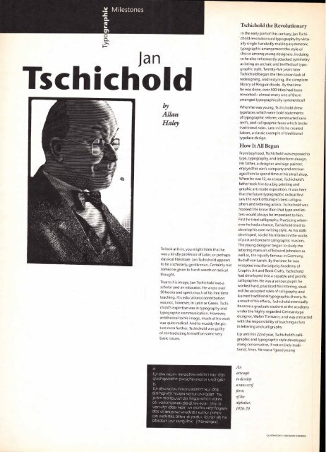
To look at him, you might think that he<br />
was a kindly professor of Latin, or perhaps<br />
classical literature. Jan Tschichold appears<br />
to be a scholarly, gentle man. Certainly not<br />
someone given to harsh words or radical<br />
thought.<br />
True to his image, Jan Tschichold was a<br />
scholar and an educator. He wrote over<br />
50 books and spent much of his free time<br />
teaching. His educational contribution<br />
was not, however, in Latin or Greek. Tschi-<br />
chold's expertise was in typography and<br />
typographic communication. However,<br />
antithetical to his image, much of his work<br />
was quite radical. And to muddy the pic-<br />
ture even further, Tschichold was guilty<br />
of contradicting himself on some very<br />
basic issues.<br />
fUf dEN NEUEN MENSChEN EXiSTiffT NU( dos<br />
glEichgEwich -r zwisc hENNOTUr UNd OfiST<br />
b<br />
fill dEN NOiEN MEN1EN EKSiSTifT NUf dos<br />
qtaihNEviij-r TSVON NOTUf UNTOOiST TSU<br />
JEdEM TSOiTpUIKT clEr fEr9auNhai -rvarEN<br />
alf VOfiCITSJONEN dES °LIEN >NOi abEr fS<br />
Vaf NitT1 >dos< Nal(' Vif OUffEN Nihr fEICySEN<br />
das Vif ON OiNEf VENdE dEf KULTUf fTEhEN'<br />
afll ENdE OLE OLTEN di fOldUl fOLTSIT Slh hir<br />
absolur UNT ENTOULTIK (MONdfiON)<br />
Tschichold the Revolutionary<br />
In the early part of this century, Jan Tschichold<br />
revolutionized typography by virtu-<br />
ally single-handedly making asymmetric<br />
typographic arrangement the style of<br />
choice among young designers. In doing<br />
so he also vehemently attacked symmetry<br />
as being an archaic and ineffectual typo-<br />
graphic style. Twenty-five years later<br />
Tschichold began the Herculean task of<br />
redesigning, and restyling, the complete<br />
library of Penguin Books. By the time<br />
he was done, over 500 titles had been<br />
reworked —almost every one of them<br />
arranged typographically symmetrical!<br />
When he was young, Tschichold drew<br />
typefaces which were bold statements<br />
of typographic reform; constructed sans<br />
serifs, and calligraphic faces which broke<br />
traditional rules. Late in life he created<br />
Sabon, a classic example of traditional<br />
typeface design.<br />
How It All Began<br />
From boyhood, Tschichold was exposed to<br />
type, typography, and letterform design.<br />
His father, a designer and sign painter,<br />
enjoyed his son's company and encour-<br />
aged him to spend time at his small shop.<br />
When he was 12, as a treat, Tschichold's<br />
father took him to a big printing and<br />
graphic arts trade exposition. It was here<br />
that the future typographic radical first<br />
saw the work of Europe's best calligra-<br />
phers and lettering artists. Tschichold was<br />
hooked! He knew then that type and let-<br />
ters would always be important to him.<br />
First he tried calligraphy. Practicing when-<br />
ever he had a chance, Tschichold tried to<br />
develop his own writing style. As his skills<br />
developed, so did his interest in the works<br />
of past and present calligraphic masters.<br />
The young designer began to study the<br />
lettering manuals of Edward Johnston as<br />
well as, the equally famous in Germany,<br />
Rudolf von Larish. By the time he was<br />
accepted into the Leipzig Academy of<br />
Graphic Art and Book Crafts, Tschichold<br />
had developed into a capable and prolific<br />
calligrapher. He was a serious pupil: he<br />
worked hard, practiced his lettering, stud-<br />
ied the accepted rules of calligraphy and<br />
learned traditional typographic theory. As<br />
a result of his efforts, Tschichold eventually<br />
became a graduate student at the academy<br />
under the highly regarded German type<br />
designer, Walter Tiemann; and was entrusted<br />
with the responsibility of teaching a class<br />
in lettering and calligraphy.<br />
Up until his 22nd year, Tschichold's calli-<br />
graphic and typographic style developed<br />
along conservative, if not entirely tradi-<br />
tional, lines. He was a "good young<br />
An<br />
attempt<br />
to develop<br />
a sans serif<br />
firm<br />
of the<br />
alphabet,<br />
1926-29.<br />
ILLUSTRATION © 1988 MARK SUMMERS


