Volume 16–1.pdf
Volume 16–1.pdf
Volume 16–1.pdf
You also want an ePaper? Increase the reach of your titles
YUMPU automatically turns print PDFs into web optimized ePapers that Google loves.
18<br />
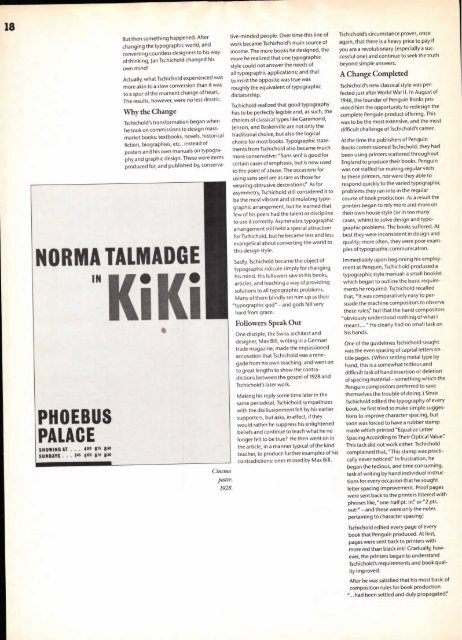
NORMA TALMADGE<br />
I"KiKi<br />
PHOEBUS<br />
PALACE<br />
SNOWING AT . . . 400 $ 15 830<br />
SUNDAYS . . 1 45 4 00 8 15 8 50<br />
But then something happened. After<br />
changing the typographic world, and<br />
converting countless designers to his way<br />
of thinking, Jan Tschichold changed his<br />
own mind!<br />
Actually, what Tschichold experienced was<br />
more akin to a slow conversion than it was<br />
to a spur of the moment change of heart.<br />
The results, however, were no less drastic.<br />
Why the Change<br />
Tschichold's transformation began when<br />
he took on commissions to design mass-<br />
market books: textbooks, novels, historical<br />
fiction, biographies, etc., instead of<br />
posters and his own manuals on typography<br />
and graphic design. These were items<br />
produced for, and published by, conserva-<br />
Cinema<br />
poster,<br />
1928.<br />
tive-minded people. Over time this line of<br />
work became Tschichold's main source of<br />
income. The more books he designed, the<br />
more he realized that one typographic<br />
style could not answer the needs of<br />
all typographic applications; and that<br />
to insist the opposite was true was<br />
roughly the equivalent of typographic<br />
dictatorship.<br />
Tschichold realized that good typography<br />
has to be perfectly legible and, as such, the<br />
choices of classical types like Garamond,<br />
Jenson, and Baskerville are not only the<br />
traditional choice, but also the logical<br />
choice for most books. Typographic state-<br />
ments from Tschichold also became much<br />
more conservative: "Sans serif is good for<br />
certain cases of emphasis, but is now used<br />
to the point of abuse. The occasions for<br />
using sans serif are as rare as those for<br />
wearing obtrusive decorations': As for<br />
asymmetry, Tschichold still considered it to<br />
be the most vibrant and stimulating typo-<br />
graphic arrangement, but he learned that<br />
few of his peers had the talent or discipline<br />
to use it correctly. Asymmetric typographic<br />
arrangement still held a special attraction<br />
for Tschichold, but he became less and less<br />
evangelical about converting the world to<br />
this design style.<br />
Sadly, Tschichold became the object of<br />
typographic ridicule simply for changing<br />
his mind. His followers saw in his books,<br />
articles, and teaching a way of providing<br />
solutions to all typographic problems.<br />
Many of them blindly set him up as their<br />
"typographic god" —and gods fall very<br />
hard from grace.<br />
Followers Speak Out<br />
One disciple, the Swiss architect and<br />
designer, Max Bill, writing in a German<br />
trade magazine, made the impassioned<br />
accusation that Tschichold was a rene-<br />
gade from his own teaching, and went on<br />
to great lengths to show the contra-<br />
dictions between the gospel of 1928 and<br />
Tschichold's later work.<br />
Making his reply some time later in the<br />
same periodical, Tschichold sympathizes<br />
with the disillusionment felt by his earlier<br />
supporters, but asks, in effect, if they<br />
would rather he suppress his enlightened<br />
beliefs and continue to teach what he no<br />
longer felt to be true? He then went on in<br />
the article, in a manner typical of the kind<br />
teacher, to produce further examples of his<br />
contradictions: ones missed by Max Bill.<br />
Tschichold's circumstance proves, once<br />
again, that there is a heavy price to pay if<br />
you are a revolutionary (especially a suc-<br />
cessful one) and continue to seek the truth<br />
beyond simple answers.<br />
A Change Completed<br />
Tschichold's new classical style was per-<br />
fected just after World War II. In August of<br />
1946, the founder of Penguin Books pro-<br />
vided him the opportunity to redesign the<br />
complete Penguin product offering. This<br />
was to be the most extensive, and the most<br />
difficult challenge of Tschichold's career.<br />
At the time the publishers of Penguin<br />
Books commissioned Tschichold, they had<br />
been using printers scattered throughout<br />
England to produce their books. Penguin<br />
was not staffed for making regular visits<br />
to these printers, nor were they able to<br />
respond quickly to the varied typographic<br />
problems they ran into in the regular<br />
course of book production. As a result the<br />
printers began to rely more and more on<br />
their own house style (or in too many<br />
cases, whim) to solve design and typo-<br />
graphic problems. The books suffered. At<br />
best they were inconsistent in design and<br />
quality; more often, they were poor exam-<br />
ples of typographic communication.<br />
Immediately upon beginning his employ-<br />
ment at Penguin, Tschichold produced a<br />
typographic style manual: a small booklet<br />
which began to outline the basic require-<br />
ments he required. Tschichold recalled<br />
that, "It was comparatively easy to per-<br />
suade the machine compositors to observe<br />
these rules" but that the hand compositors<br />
"obviously understood nothing of what I<br />
meant... " He clearly had no small task on<br />
his hands.<br />
One of the guidelines Tschichold sought<br />
was the even spacing of capital letters on<br />
title pages. (When setting metal type by<br />
hand, this is a somewhat tedious and<br />
difficult task of hand insertion or deletion<br />
of spacing material —something which the<br />
Penguin compositors preferred to save<br />
themselves the trouble of doing.) Since<br />
Tschichold edited the typography of every<br />
book, he first tried to make simple sugges-<br />
tions to improve character spacing, but<br />
soon was forced to have a rubber stamp<br />
made which printed "Equalize Letter<br />
Spacing According to Their Optical Value!<br />
This tack did not work either. Tschichold<br />
complained that, "This stamp was practi-<br />
cally never noticed': In frustration, he<br />
began the tedious, and time consuming,<br />
task of writing by hand individual instruc-<br />
tions for every occasion that he sought<br />
letter spacing improvement. Proof pages<br />
were sent back to the printers littered with<br />
phrases like, "one-half pt. in'/ or "2 pts.<br />
out!" — and these were only the notes<br />
pertaining to character spacing!<br />
Tschichold edited every page of every<br />
book that Penguin produced. At first,<br />
pages were sent back to printers with<br />
more red than black ink! Gradually, how-<br />
ever, the printers began to understand<br />
Tschichold's requirements and book qual-<br />
ity improved.<br />
After he was satisfied that his most basic of<br />
composition rules for book production<br />
"...had been settled and duly propagated,"


