

Volume 16–1.pdf
Volume 16–1.pdf
Volume 16–1.pdf

Create successful ePaper yourself
Turn your PDF publications into a flip-book with our unique Google optimized e-Paper software.
ave you ever noticed that the<br />
Tuesday morning meeting which is<br />
supposed to answer everybody's<br />
questions rarely does? This is not a<br />
new phenomenon; it has long been<br />
prevalent in business. Now, unfortu-<br />
nately, it is beginning to creep into<br />
other aspects of our lives. There are<br />
less and less simple answers to ques-<br />
tions like: "Why doesn't my car<br />
startr "Why isn't my report worth<br />
an 'A'r or "What do you mean, you<br />
can't balance the checkbook?"<br />
So it is with the origins of<br />
our alphabet. The seemingly simple<br />
question is,"What's the origin of the<br />
letter 'E'?" Sorry, no simple answer.<br />
Several experts believe that<br />
our "E',' or at least some of the sounds<br />
it represents, was once indicated by<br />
the Egyptian hieroglyph for a house.<br />
Others contend that it grew out of<br />
the sign represented as a window<br />
And others still, attribute the "E's"<br />
ancestry to the Egyptian symbol of<br />
a courtyard. To further complicate<br />
matters, our "E',' one of the most<br />
commonly used vowels, actually<br />
started life as a consonant.<br />
The Phoenician writing sys-<br />
tem is generally credited as the first<br />
step toward the creation of our cur-<br />
rent "phonetic" alphabet. Phoeni-<br />
1:16<br />
cian writers were among the first to<br />
use symbols to represent sounds,<br />
rather than employing different sym-<br />
bols or pictures to signify a particular<br />
word. The Phoenician language<br />
was based on 22 consonant sounds<br />
(vowels were relatively unimportant),<br />
each with a name—and a symbol to<br />
represent that sound in writing.<br />
One of these 22 sound-sym-<br />
bols was the precursor to our "E'.' The<br />
Phoenician which they called<br />
he, and roughly represented the<br />
sound of our "h," was probably the<br />
great-great grandparent of the fifth<br />
letter in our alphabet.<br />
When the Greeks adopted<br />
the Phoenician writing system, they<br />
had difficulty pronouncing about<br />
half of the Phoenician letter names;<br />
and so they modified the trouble-<br />
some characters to bring them into<br />
sync with the Greek language. Some<br />
were altered only slightly, others<br />
drastically, and still others were<br />
dropped altogether.<br />
The Phoenician )■\ was<br />
one of the problem characters. The<br />
Greeks could not pronounce the<br />
first sound of the letter name. Being<br />
pragmatic people, and living in less<br />
complicated times, their answer to<br />
the problem was just to drop the<br />
part of the name that was causing<br />
the difficulty. As a result the Phoeni-<br />
cian "he" became simply "e" —and<br />
thus our most useful vowel was born.<br />
Overtime, the Greeks gradu-<br />
ally simplified the design of the<br />
Phoenician character, and flopped it<br />
so that its arms were pointed to the<br />
right. The end result looked remark-<br />
ably like the E found in typefaces<br />
like Helvetica - or ITC Avant Garde<br />
Gothic!' The final version was given<br />
the name epsilon and represented a<br />
short e sound.<br />
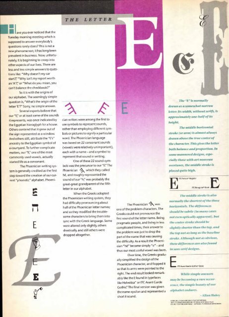
The "E" is normally<br />
drawn as a somewhat narrow<br />
letter. Its width, without serifs, is<br />
approximately one-half of its<br />
height.<br />
The middle horizontal<br />
stroke (or arm) is almost always<br />
drawn above the true center of<br />
the character. This gives the letter<br />
both balance and proportion. In<br />
some mannered designs, espe-<br />
cially those with art nouveau<br />
overtones, the middle stroke is<br />
placed quite high.<br />
FA ITC Fen ice® Regular<br />
The middle stroke is also<br />
normally the shortest of the three<br />
horizontals. The differences<br />
should be subtle (in many cases<br />
not even optically apparent), but<br />
the center stroke should be<br />
slightly shorter than the top, and<br />
the top not as long as the baseline<br />
stroke. Although not as obvious,<br />
these differences are also found<br />
in sans serif designs.<br />
While simple answers<br />
may be becoming a rare occur-<br />
rence, the simple beauty of our<br />
alphabet endures.<br />
ITC Benguiat® Book<br />
E ITC Avant Garde Gothic® Book<br />
— Allan Haley<br />
HEADLINE ITC GALLIARD BOLD ITALIC WITH ROMAN<br />
TEXT ITC STONE SANS MEDIUM. ITC STONE SERIF BOLD ITALIC<br />
BYLINE: ITC STONE SERIF BOLD CAPTIONS: ITC FRANKLIN GOTHIC BOOK


