

Volume 16–1.pdf
Volume 16–1.pdf
Volume 16–1.pdf

You also want an ePaper? Increase the reach of your titles
YUMPU automatically turns print PDFs into web optimized ePapers that Google loves.
TYPOGRAPHIC<br />
COMMUNICATIONS TODAY<br />
ego<br />
10 Piet Zwart's advertisements often<br />
followed De Stijl principles but just as<br />
often departed from them, using diagonals,<br />
curves, circles, freely handled<br />
photographs. He, as did the other De<br />
Stijl artists and designers, preferred the<br />
primary colors of yellow, red and blue.<br />
HEADLINE/TEXT: ITC BAUHAUS MEDIUM HEADER: ITC MODERN NO. 216 LIGHT<br />
verything came<br />
together in Weimar,<br />
Germany, in 1919. A<br />
new kind of school<br />
opened its door<br />
there. It was on interdisciplinary<br />
blending of fine and<br />
applied arts. It was at once<br />
pragmatic and idealistic. It<br />
emphasized crafts and excellence<br />
of craftsmanship. It was a<br />
blend of hands-on, learn-bydoing<br />
workshops and new attitudes<br />
towards artistic expression<br />
of all kinds. In architecture,<br />
pointing, sculpture, product and<br />
graphic design, it sought to<br />
blend order in presentation with<br />
vigor and relevance in expression.<br />
The Bauhaus quickly became<br />
a compelling cultural magnet.<br />
Artists and designers from every<br />
part of Europe journeyed to it and<br />
exchanged ideas and concepts,<br />
then, as teachers or students,<br />
migrated and spread Bauhaus<br />
thinking throughout the civilized<br />
world. Typographic design, one<br />
of the concerns at the Bauhaus,<br />
metamorphosed there, never to<br />
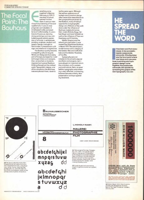
BAUHAUSBCICHER<br />
SOHRIFTLEITUNG<br />
WALTER GROPIUS<br />
L. MOHOLV-NAGV<br />
be the same again. Although<br />
the surface appearance of<br />
today's communication design<br />
often bears little resemblance to<br />
the typographies produced at<br />
the Bauhaus, many of today's<br />
approaches to typographic<br />
design are offshoots of the work<br />
done under the influence of<br />
Bauhaus masters Johannes<br />
Itten, Laszlo Moholy-Nagy, Herbert<br />
Bayer and Joost Schmidt as<br />
well as the influence of Theo van<br />
Doesburg and El lissitzky.<br />
Walter Gropius was the<br />
school's principal when it was<br />
named Das Staatliches Bauhaus<br />
in March 1919. The school was a<br />
modernization and a merging of<br />
the Weimar Arts and Crafts Institute<br />
and the Weimar Academy<br />
of Fine Arts.<br />
Typography was not<br />
included in the school's original<br />
manifesto and program, but it<br />
soon played an important role in<br />
the curriculum, and in posters<br />
and publications. Here, as never<br />
before, typography was achieving<br />
a new, effective, and exciting<br />
balance between orderly, clear<br />
presentation and eye-appealing<br />
treatment.<br />
L. M OHOLY-NAGY:<br />
MALEREI<br />
L. MOHOLY-NAGY,<br />
MAIJERICI,PHOTOGRAPHiE,FILM PH OTOG RAPH I E<br />
8<br />
11<br />
abcdefghijill<br />
mnpqrstuvw<br />
xyzag dd<br />
abcdefghi<br />
jKlmnopqr<br />
s tuvwxyz<br />
a d d<br />
FILM<br />
1,1.16 AAAAAA IMOINCMKR1<br />
11 Title-spread of Painting, Photography<br />
Film. 1925. This was the eighth<br />
volume in the series of 14 Bauhaus<br />
books designed and edited by Moholy-<br />
Nagy and Gropius. At a time when the<br />
Bauhaus still did not have a graphic<br />
design workshop, these books, by their<br />
teaching and by their design, were<br />
creating a Bauhaus style.<br />
12 Simplicity and clarity were being<br />
sought in typefaces as well as in graphic<br />
design.<br />
1 1 x' O<br />
llr.<br />
io(<br />
i n<br />
IQ m<br />
r g<br />
Z m<br />
1(1)<br />
1 ();<br />
1, ,<br />
j<br />
I 111<br />
it<br />
z<br />
in<br />
F<br />
t:\ v.<br />
me<br />
10-<br />
1 '<br />
c<br />
z c<br />
0 0)<br />
HE<br />
SPREA<br />
THE<br />
OR<br />
1<br />
t has been said that every<br />
cause, to be successful,<br />
needs a passionate<br />
advocate. If the Bauhaus<br />
was the focal point where<br />
new ideas and new practices<br />
in painting and typographic<br />
design came<br />
together, the passionate<br />
advocate, the apostle for<br />
spreading the gospel of the<br />
new typography was Jan<br />
)<br />
711/4, ig )<br />
ai<br />
16. owoolomoo<br />
. , 00001600600<br />
mow oty000l000cou<br />
l0000vo wootko (moo°<br />
1 0 60 0110 1 0 007oul onoom<br />
006000lo0X16.)0110..000<br />
10000001000000 1. 016000<br />
100000010000001000000<br />
10000001000000 000000<br />
10000 (*WO! 000n0O<br />
1,000i 1 , d ,<br />
7000000 Mark zahlt die Kasse<br />
derTharingischenStaatsbankdem<br />
ainlieferer dieses Notgeldschel -<br />
nes. — Vom 1. September 1923 ab<br />
nn dteses Notgeid aufgerufen<br />
d gegen Umtausch ,n Reichsbanknoten<br />
eingezogen warden.<br />
Wer Banknotes nachr.r.ac.4 oder verfa.lscht<br />
oder nachgernachte oder verfalschte sick<br />
verschafftund in den Verkehr brine, wird ?nit<br />
Zuchtha us nicht tinter zwei J ahren bestraft.<br />
13 Herbert Bayer, 1923. One of a series<br />
of banknotes designed for the State<br />
Bank of Thuringia. Functional, readable,<br />
and very alive.


