Volume 16–1.pdf
Volume 16–1.pdf
Volume 16–1.pdf
You also want an ePaper? Increase the reach of your titles
YUMPU automatically turns print PDFs into web optimized ePapers that Google loves.
TYPOGRAPHIC<br />
COMMUNICATIONS TODAY<br />
of Western Man series by key<br />
designers), IBM (projecting<br />
itself as the extremely advanced<br />
technology leader), and Columbia<br />
Broadcasting System.<br />
In each case the corporation<br />
head set the tone for the program:<br />
Walter Paepcke at CCA,<br />
Thomas Watson, Jr. at IBM,<br />
and Frank Stanton at CBS.<br />
Stanton initiated the CBS<br />
approach, and in 1937 brought<br />
in William Golden to execute<br />
it. Golden did this supremely<br />
for 23 years.<br />
Golden Words<br />
Perhaps the best way to<br />
understand Bill Golden is<br />
through his own words. He was<br />
as fluent with words as he was<br />
with graphic elements. In April<br />
1959, the Type Directors Club of<br />
New York sponsored a forum,<br />
Typography-USA. Panelistdesigners<br />
contributed statements<br />
to a booklet issued as part of the<br />
seminar. Following are excerpts<br />
from Golden statement.<br />
"Type is to read.<br />
"If there is such a thing as a<br />
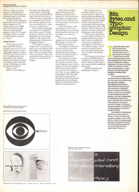
34 The CBS Television symbol as used in<br />
a 1955 trade show. William Golden.<br />
35 CBS trade ad, 1954. William Golden.<br />
`New American Typography'<br />
surely it speaks with a foreign<br />
accent. And it probably talks too<br />
much. Much of what it says is<br />
obvious nonsense. A good deal of<br />
it is so pompous that it sounds<br />
like nonsense, though if you listen<br />
very carefully it isn't—quite.<br />
It is just overcomplicated.. .<br />
"More and more typography<br />
was designed on a layout pad<br />
rather than in metal. Perhaps<br />
the greatest change in American<br />
typography was caused by this<br />
simple act—the transfer of the<br />
design function of the printer to<br />
the graphic designer.<br />
"The designer was able to<br />
bring a whole new background<br />
and a new set of influences to the<br />
printed page. He could 'draw' a<br />
page. There was more flexibility<br />
in the use of a pencil than in the<br />
manipulation of a metal form. It<br />
became a new medium for the<br />
designer.<br />
TARP<br />
HEADLINE/INITIAL/TEXT. ITC NEW 8ASKERVILLE ITALIC SUBHEADS: BOLD ITALIC HEADER: ITC MODERN NO. 216 LIGHT<br />
"Under the twin impact<br />
of the functionalism of the<br />
Bauhaus and the practical<br />
demands of American business,<br />
the designer was beginning to<br />
learn to use the combination of<br />
word and image to communicate<br />
more effectively.<br />
"Under the influence of the<br />
modern painters, he became<br />
aware (perhaps too aware) of the<br />
textural qualities and color values<br />
of type as an element of<br />
design.<br />
"And surely a dominating<br />
influence on American typography<br />
in the pre-war years was<br />
exerted by the journalists...<br />
"The skillful development of<br />
the use of headline and picture<br />
was afar more prevalent<br />
influence than the European<br />
past. The newspaper taught us<br />
speed in communication...<br />
"The magazine communicated<br />
at a more leisurely pace<br />
and could be more provocative<br />
since it addressed a more selective<br />
audience. Because the magazine<br />
dealt more in concepts than in<br />
news it was far more imaginative.<br />
There was more opportunity<br />
here to design within the framework<br />
of the two-page spread.<br />
But still, the devices that bore the<br />
main burden of interesting the<br />
reader were the `terrific headline'<br />
and the 'wonderful picture'...<br />
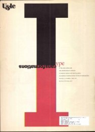
36 Cover design for Design Quarterly,<br />
1984. Paul Rand. USA.<br />
"But what gave it a new<br />
direction and style was not so<br />
purely American. I think it was<br />
men like Agha and Brodovitch.<br />
These importations from Europe<br />
set a pace that not only changed<br />
the face of the magazine and<br />
consequently advertising design,<br />
but they changed the status of the<br />
designer: They did this by the simple<br />
process of demonstrating that<br />
the designer could also think...<br />
"The designer will find that<br />
the most satisfying solutions to a<br />
graphic problem come from its<br />
basic content. He will find it<br />
unnecessary and offensive to<br />
superimpose a visual effect on<br />
an unrelated message... he will<br />
want to be sure that what he<br />
has to say will be clearly understood—that<br />
this is his primary<br />
function...<br />
"I do not argue for the return<br />
to any form of traditionalism. I<br />
do argue for a sense of responsibility<br />
on the part of the designer,<br />
and a rational understanding of<br />
his function.<br />
"I think he should avoid<br />
designing for designers!"<br />
,Haul rant/<br />
micrtio/Lontit<br />
Bits,<br />
Bytes,and<br />
Typo-<br />
graphic<br />
Design<br />
n the first half of the<br />
20th century, the<br />
driving forces that<br />
affected the look of<br />
typographic designs<br />
came from the new<br />
schools of painting, poetry<br />
and architecture. They continue<br />
to influence today's<br />
designers. But since the late<br />
1960s, the influence of the<br />
new technologies on typesetting<br />
and typographic<br />
design has been even<br />
greater.<br />
Of course the fine arts<br />
and new technologies were<br />
not the only forces affecting<br />
typographic design.<br />
Among the other forces<br />
were the work done in private<br />
presses in England,<br />
Europe, and in the United<br />
States, as well as the design<br />
of new typefaces. Private<br />
presses, by their willingness<br />
to experiment and innovate,<br />
affected the courses of<br />
both typeface and typographic<br />
design. (This story<br />
is summarized in Chapter IX<br />
of Typographic Communications<br />
Today)<br />
The design of typefaces<br />
was both a cause and an<br />
affect of other trends in the<br />
graphic design world. (This<br />
story is told in considerable<br />
detail in Chapters X and XI;<br />
over 200 typeface families<br />
are illustrated with full<br />
alphabets. They are


