

Volume 16–1.pdf
Volume 16–1.pdf
Volume 16–1.pdf

You also want an ePaper? Increase the reach of your titles
YUMPU automatically turns print PDFs into web optimized ePapers that Google loves.
CONCERTGEBOUVI,<br />
ammadi dinsdag 6 juni, 20.15 uur<br />
o A I<br />
o PHILHA<br />
ORKEST<br />
KERSJES<br />
LECHN<br />
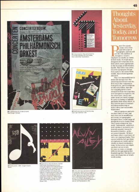
60 A 1978 poster for a folklore event.<br />
Total Design. Holland.<br />
7<br />
W. A. : Pi -unmated*<br />
B. BARTOK: De Houten Prins<br />
M2):2411 C 29 nut 29 et, nos 10-1i art, betstre<br />
Oat try Goa- lickaille0, La 22 9011<br />
63 Opera poster, 1981. Shigeo Fukuda.<br />
Japan.<br />
64 Complexity, distinctiveness. "All that<br />
stuff about revealing structure and<br />
reducing things to their simplest forms—<br />
I couldn't go for that. I guess the revolutionary<br />
thing we did was to take the<br />
position that there is no single voice<br />
capable of expressing every idea, that<br />
romance is still necessary, ornament is<br />
necessary, and simplification is not<br />
better than complexity," Milton Glaser,<br />
1985. Shown here, a page of a 1983<br />
calendar for PM Typography. Milton<br />
Glaser. USA.<br />
N<br />
03<br />
02<br />
Zatthor<br />
Kormverenthes.<br />
(5 4,64,8181 10.Novomb9r,<br />
19 November 1981<br />
12.1898, 22.M8r4<br />
.8.191 1982<br />
Lellung. Edmond de Stoutx<br />
Frew MaartgaiisiNiti<br />
Kmmmere99888b1e del<br />
Tschechachen Y8lbenrorie<br />
19. Dexenber 1981<br />
1.84889. M99429 Venhodo<br />
4 Mari 1'fIr<br />
V94,419 Mrord188<br />
'moque Mrtnes<br />
12. Mo11982<br />
L499 Fronk Gosanann<br />
61 Concert poster. The central motif is<br />
an emblem designed for the theater.<br />
Odermatt & Tissi. Switzerland.<br />
62 California Institute of the Arts view<br />
book. April Greiman. USA.<br />
65 "The client was looking for an identity<br />
for the group, rather than an image of a<br />
single dancer. The name Alvin Ailey was<br />
written figuratively with brush strokes,<br />
thus creating the identity of name and<br />
group. The bottom type suggests an<br />
audience and static order as opposed to<br />
dance': Steff Geissbuhler. USA.<br />
Thoughts<br />
About.<br />
Yesterday<br />
Today and<br />
Tomorrow<br />
for a panoramic<br />
view of the<br />
past 100 years of<br />
typography, and you will<br />
see the ebb and flow of<br />
designers' relative<br />
emphasis on vitality or clarity<br />
in their work. No doubt most<br />
designers feel what they do is<br />
best suited, most appropriate,<br />
to the message problems they<br />
handle. This writer has a bias<br />
towards typographic design<br />
that captures the best of both<br />
worlds, that is both vigorous<br />
and lucid.<br />
True, it is impossible not to<br />
notice the unexpected. But<br />
attracting attention is only the<br />
first step in the communications<br />
process, and if confusion<br />
or obscurity follow, then the<br />
eye-stopping devices have<br />
overpowered the message they<br />
were designed to empower. On<br />
the other hand, clarity and<br />
order alone are rarely enough.<br />
If a piece is boring or indistinguishable<br />
from many others, it<br />
may lack the power to attract<br />
maximum readership or<br />
make a deep and memorable<br />
impression.<br />
Just as speakers and writ-<br />
' ers have tones of voice and<br />
style that can be modified as<br />
necessary, so typographic<br />
designers have a wide range of<br />
design devices to choose from.<br />
They can be whimsical, dramatic,<br />
fashionable, analytical,<br />
bold, subdued, stylized or stylistically<br />
neutral, researchfocused<br />
or intuitive, as the<br />
occasion demands. All these<br />
and many other visual tones of<br />
voice are employed today. They<br />
coexist with the full spectrum<br />
of emphasis on clarity and/or<br />
vitality in visual communications.<br />
In that sense one might<br />
say there are no trends<br />
because so many seemingly<br />
different design approaches<br />
flourish together. But there are<br />
some developments or trends<br />
worth noting.


