

Volume 16–1.pdf
Volume 16–1.pdf
Volume 16–1.pdf

Create successful ePaper yourself
Turn your PDF publications into a flip-book with our unique Google optimized e-Paper software.
TYPOGRAPHIC<br />
COMMUNICATIONS TODAY<br />
Aimed Design<br />
Today's typographic<br />
design, more than ever before,<br />
is carefully aimed to achieve<br />
targeted objectives. Designer<br />
Vance Jonson writes that what<br />
we once called "commercial<br />
art or design" and later called<br />
"marketing or communications<br />
design" should now be thought<br />
of as "strategic communication<br />
design:' Visual and verbal symbols<br />
are at least as crucial to a<br />
message's impact as is the<br />
literal, obvious message. Jonson<br />
regards typographic communication<br />
today as "an art<br />
and a science. It is combative"<br />
and multi-sensory, not just<br />
verbal/visual. Paul Rand, and<br />
many after him, saw the artist<br />
caught between esthetics and<br />
the need to sell. He wrote,<br />
"There is nothing wrong or<br />
shameful in selling... Long<br />
range, the interests of business<br />
and art are not opposed:'<br />
Today's designer has not<br />
only computers and lasers and<br />
software as tools, but also the<br />
new science of marketing.<br />
Aimed design is a must today,<br />
and today's designer must<br />
use it along with the new technologies<br />
and esthetic knowledge,<br />
taste and judgment to<br />
produce the most effective<br />
communications.<br />
Of the Readability/<br />
Excitement Tradeoff<br />
(Excerpt from a speech by<br />
Herb Lubalin at the Type Directors<br />
Club conference, Typography<br />
USA,1959.)<br />
"Through typographic<br />
means, the designer now<br />
presents, in one image, both<br />
the message and the pictorial<br />
idea. Sometimes, this 'playing'<br />
with type has resulted in the<br />
loss of a certain amount of<br />
legibility. Researchers consider<br />
this a deplorable state of<br />
affairs but, on the other hand,<br />
the excitement created by a<br />
novel image sometimes more<br />
than compensates for the<br />
slight difficulty in readability."<br />
The Vocabulary<br />
of Form...<br />
Here are some comments<br />
by Paul Rand on the relationship<br />
of art and craft in design:<br />
"There is an old romantic<br />
idea that intuition and intellect<br />
do not mix. There is an equally<br />
erroneous belief that inspiration<br />
takes the place of industry.<br />
Fortified with such misconceptions,<br />
it is understandable that<br />
we tend to minimize the importance<br />
of learning the rules, the<br />
fundamentals which are the<br />
raw material of the artist's<br />
craft.<br />
"In graphic design, as in all<br />
creative expression, art<br />
evolves from craft. In dancing,<br />
craft is mastering the basic<br />
steps; in music it is learning<br />
the scales. In typographic<br />
design, craft deals with points,<br />
lines, planes, picas, ciceros,<br />
leads, quads, serifs, letters,<br />
words, folios, pages, signatures,<br />
paper, ink, color, printing<br />
and binding.<br />
"The vocabulary of form<br />
(art) includes, among others:<br />
space, proportion, scale, size,<br />
shape, rhythm, repetition,<br />
sequence, movement, balance,<br />
volume, contrast, harmony,<br />
order and simplicity.<br />
"Just as there is no art without<br />
craft and no craft without<br />
rules, so too there is no art<br />
without fantasy, without ideas.<br />
A child's art is much fantasy<br />
but little craft. It is the fusion<br />
of the two that makes the<br />
difference:'<br />
The Designer as<br />
Problem Solver<br />
Ivan Chermayeff offers<br />
these comments on the<br />
designer as a problem solver.<br />
"Design comes from a combination<br />
of intelligence and<br />
artistic ability. A designer is<br />
someone who should solve<br />
problems. He is a borrower,<br />
co-ordinator, assimilator,<br />
juggler, and collector of material,<br />
knowledge and thought<br />
from the past and present,<br />
from other designers, from<br />
technology and from himself.<br />
His style and individuality<br />
come from the consistency<br />
of his own attitudes and<br />
approach to the expression<br />
and communication of a problem.<br />
It is a devotion of the<br />
designer to the task of fully<br />
understanding the problem<br />
and then expressing those<br />
ideas which come from this<br />
search in its appropriate form<br />
that makes him a professional.<br />
"There is a large body of<br />
designers, clients and consumers<br />
who don't really care very<br />
much about very much. The joy<br />
and pleasure of doing a good<br />
job for its own sake has not<br />
been discovered by enough<br />
people:'<br />
Trying Too Hard to<br />
Be Different<br />
(Excerpt from a speech by<br />
Allen E Hurlburt at the Type<br />
Directors Club conference,<br />
Typography USA, 1959. )<br />
"At its best, American<br />
typography features a clarity of<br />
expression and an overall integration<br />
of design that is in the<br />
finest tradition of typography<br />
and its related arts. At its<br />
worst, it represents a sacrifice<br />
of clarity and true personal<br />
expression in favor of a preoccupation<br />
with typographic<br />
fads.<br />
"Like the automotive stylists,<br />
we are frequently all trying<br />
too hard to be different<br />
together, creating shallow<br />
style that can have little lasting<br />
effect on the mainstream of<br />
typographic design. We move<br />
from the ornate to the starkly<br />
plain and back again, and from<br />
wide leading to tightly stacked<br />
type lines, as though each new<br />
method were the only true way.<br />
"This twisted path to conformity<br />
is strewn with the tortured<br />
reminders of the<br />
vagaries of our typographic<br />
taste: Broadway, Agency<br />
Gothic, Cartoon, Corvinus,<br />
Neuland, Signal and Slim<br />
Black, to name but a few."<br />
Of Licentious<br />
Typography<br />
Swiss designer, Max<br />
Caflisch, comments on the<br />
value of experimentation:<br />
"The notion that typography,<br />
in order to be contemporary,<br />
must have an<br />
experimental character is<br />
misleading, even grotesque.<br />
The typographer must learn to<br />
distinguish between good and<br />
bad, meaningful and unmeaningful,<br />
disciplined and licentious<br />
typography. He has to<br />
make his decision with the<br />
reader in mind and in the best<br />
interest of the reader; who as<br />
the final link in the chain determines<br />
the value or lack of value<br />
of a printed piece by being<br />
attracted by it, by reading it, or<br />
by passing it unmoved and<br />
throwing it into the always<br />
present wastepaper basket:'<br />
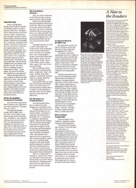
66 Joy with letters. The Igarashi Studio<br />
in Tokyo is concerned with communication<br />
design, environmental design, and<br />
"design for design": Takenobu Igarashi<br />
explains his sculptured aluminum<br />
letters: "My aluminum sculpture series,<br />
AL 070783, was produced in 1983 and<br />
exhibited first at the Mikimoto Flail in<br />
Tokyo and then at the Reinhold Brown<br />
Gallery in New York. Each of the sculptures<br />
is made up of a number of thick<br />
and thin aluminum plates joined<br />
together by screws. For the first time I<br />
used a computer-controlled laser to cut<br />
the plates. A metal brush was used on<br />
the surface to give it more texture:' These<br />
letters are about 51/2 inches tall. Some<br />
of Igarashi's giant letters are 12 feet<br />
high and 20 feet wide, and are intended<br />
for public or corporate environments,<br />
indoors and out.<br />
A Note to<br />
the Readers<br />
We hope that you have enjoyed, been<br />
stimulated by, and perhaps have<br />
learned some things from this synopsis/review<br />
of Typographic Communications<br />
Today. Perhaps these random<br />
selections from the book have whetted<br />
your appetite for more. Of over goo<br />
pictures in the book only about one in<br />
twelve are shown here. And the text<br />
has been even more greatly condensed.<br />
Two chapters with full alphabet showings<br />
of over 200 typefaces and the story<br />
of their development and a chapter on<br />
the influence of private presses<br />
are not included in this U&Ic<br />
synopsis/review.<br />
Five years have gone into the<br />
research, writing and producing of the<br />
book. The four pages of the Selected<br />
Bibliography just reveal the surface of<br />
the research that was done. Most<br />
important were the one-to-one dialogues<br />
I was privileged to hold with<br />
designers all over the world.<br />
First and foremost I must thank<br />
Aaron Burns. As President of International<br />
Typeface Corporation. He, one<br />
day in late 1983, proposed that a work<br />
such as this be written. The general<br />
idea was his and he gave, to the fullest,<br />
all the ingredients one needs to do a<br />
project well: an open-ended schedule,<br />
an adequate budget and a free hand,<br />
plus his confidence, encouragement<br />
and frequent suggestions.<br />
I spoke with many of today's outstanding<br />
typographers and designers<br />
not only about their own work, but<br />
about the tides and waves in graphic<br />
design during the past century. Their<br />
insights, generously shared, add depth<br />
to this study and helped mold its point<br />
of view, so that it is more than reportage.<br />
Just a few, who could not be visited<br />
personally, painstakingly answered my<br />
detailed questionnaires. And still<br />
others, not listed here, kindly sent<br />
samples of their work for inclusion<br />
herein.<br />
Key among them were:<br />
Saul Bass; Fernand Baudin, Herbert<br />
Bayer; Max Bill; Hans-Rudolf<br />
Bosshard; Pieter Brattinga; Max<br />
Caflisch; Wim Crouwell; Louis Danzig;<br />
Willie De Majo; Dr. Magdalena Droste;<br />
Adrian Frutiger; Peter Gabor; Ken<br />
Garland; Karl Gerstner; Andre<br />
Giirtler; Allan Haley; Walter Herdeg;<br />
Oldrich Hlaysa; Armin Hoffman;<br />
Will Hopkins; Max Huber; Yusaku<br />
Kamekura; Mervyn Kurlansky;<br />
Hermann Lampaert; Gunter Gerhard<br />
Lange; Roger Laufer; Olaf Leu; Noel<br />
Martin; Oswaldo Miranda; Bruno<br />
Monguzzi; Josef Mfiller-Brockmann;<br />
Kazumasa Nagai; Siegfried Odermatt;<br />
Michel Olyff; Bruno Pfaffli; Paul Rand;<br />
Roger Remington and The Graphic<br />
Design Archive on Videodisc at<br />
Rochester Institute of Technology;<br />
Klaus Schmidt; Herbert Spencer;<br />
Victor Spindler; Ikko Tanaka;<br />
Bradbury Thompson; Roman<br />
Tomaszewski; Kurt Weidemann;<br />
Wolfgang Weingart; Henry Wolf;<br />
Hermann Zapf; Maxim Zhukov.<br />
Edward M. Gottschall<br />
(For more information concerning the<br />
availability of the book<br />
Typographic Communications Today,<br />
please refer to the beginning of this<br />
article and to the U&lc BookShop,<br />
page 74 )<br />
This section was designed by<br />
Ellen Shapiro<br />
Shapiro Design Associates Inc.<br />
HEADLINE/TEXT: ITC FENICE REGULAR SUBHEADS: ULTRA HEADLINE: ITC ESPRIT MEDIUM ITALIC<br />
CAPTIONS THROUGHOUT ARTICLE WERE SET IN ITC FRANKLIN GOTHIC BOOK WITH BOOK ITALIC AND DEMI TEXT: BOOK WITH BOOK ITALIC


