

Volume 16–1.pdf
Volume 16–1.pdf
Volume 16–1.pdf

You also want an ePaper? Increase the reach of your titles
YUMPU automatically turns print PDFs into web optimized ePapers that Google loves.
Tschichold went on to reform the design of<br />
every Penguin book.<br />
More Choices<br />
First he made sweeping changes to the<br />
typeface repertoire formally supported by<br />
Penguin. For the sake of consistency, and<br />
probably convenience, all previous Pen-<br />
guin books were set in Times Roman.<br />
Tschichold felt that Times was a good<br />
newspaper face (indeed, it was originally<br />
created as such) but that it was somewhat<br />
lacking when it came to book typography.<br />
Not "to throw out the baby with the bath;'<br />
Tschichold did continue to use Times<br />
(about 20 percent of the Penguin books<br />
continued to be set in the face), but he<br />
also widened the composition spectrum to<br />
include faces such as Baskerville, Bembo,<br />
Garamond, Caslon.Even the Penguin<br />
trademark did not escape Tschichold's<br />
attention. After a number of his changes to<br />
the book format, the old trademark looked<br />
out of place. Tschichold's answer to the<br />
problem? Redesign.<br />
Tschichold worked at the Penguin book<br />
project for 29 months. At the end, well in<br />
excess of 500 books were prepared for<br />
printing by his skilled hand —most on a<br />
page by page basis. Tschichold, himself,<br />
stated that his work must have set some<br />
kind of typographic world record! During<br />
the whole process he never wavered from<br />
his standards, and never provided any-<br />
thing less than 100 percent commitment<br />
to the project. And, as a result, was com-<br />
pletely satisfied with the results. Of the<br />
project he wrote,"A publishing firm, that<br />
manufactures books in millions to mil-<br />
lions, has in any case been able to prove<br />
that the cheapest of books can be just as<br />
beautifully set and produced as more<br />
expensive ones, indeed, even better than<br />
most of them!"<br />
Tschichold the Type Designer<br />
In addition to being a teacher, typogra-<br />
pher, book designer, and rebel, Tschichold<br />
was also a typeface designer. While his<br />
mono-case sans was not cast as type, and<br />
only remains in reproductions of his draw-<br />
ings, two typefaces were designed (and<br />
released) in his younger, less conservative,<br />
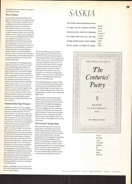
years.Transito is a sans serif in the tradition<br />
of Futura Black and was created for the<br />
Amsterdam type foundry early in the<br />
1930s. It is strictly a display face and saw<br />
little use when first issued—and less con-<br />
tinued popularity. Shortly after the release<br />
of Transito, Tschichold drew Saskia for the<br />
Schelter & Giesecke foundry of Leipzig.<br />
This too, was a sans serif design, but with<br />
much more of calligraphic overtones than<br />
his previous design. in fact, the final ren-<br />
derings for the punch cutters were based<br />
on letter forms Tschichold drew with a<br />
broad edged pen. The completed design<br />
was released in 6 to 60 point type and was<br />
more stylish than practical, and enjoyed<br />
little popularity outside of a small group of<br />
Tschichold's followers. Tschichold also<br />
produced a number of phototype faces for<br />
Uhertype of Berlin, but none survived the<br />
second World War.<br />
Sabon, a typographic tour de force, is the<br />
face which establishes Tschichold's reputa-<br />
tion as a type designer.<br />
In the early 1960s a group of German<br />
printers approached Tschichold with a<br />
decidedly unique and exceptionally dif-<br />
ficult design problem. They sought a type<br />
which could be set on either Monotype or<br />
Linotype composition equipment, or as<br />
hand-set foundry type, with no percepti-<br />
ble difference in the final product. This<br />
meant that all the drawbacks of both<br />
Monotype and Linotype composing<br />
machines, such things as varying point-<br />
bodies, kerning restrictions, different unit<br />
systems, and duplexing character sets,<br />
had to be contended with.<br />
The completed design, released in 1966,<br />
not only solved the imposed design prob-<br />
lem, it is also an exceptionally beautiful<br />
(and useful) design in its own right. Such<br />
that it, unlike his earlier faces, continues to<br />
be used today; in metal —and in photo and<br />
digital form.<br />
Sabon has been called "modern Gara-<br />
mond" which is somewhat misleading.<br />
Actually it's not a Garamond, but its own<br />
design which was patterned loosely on<br />
specimen sheets of the early Frankfurt<br />
printer and typefounder, Konrad Berner.<br />
The story is told that Berner married the<br />
widow of Jacques Sabon (hence the type-<br />
face name) who, it is also said, brought<br />
some of Garamond's original matrices to<br />
Frankfurt (hence the design similarity with<br />
Garamond).<br />
The Teacher's Simple Rule<br />
When Jan Tschichold died in 1974, the<br />
typographic community lost one of its<br />
kindest teachers and most gifted practi-<br />
tioners. Tschichold was an artist and crafts-<br />
person of the highest order, one who<br />
practiced what he preached. He ultimately<br />
demanded only one obligation of his<br />
followers and students: to organize typo-<br />
graphic communication so that it is easy<br />
to read and pleasant to view "Grace in typog-<br />
raphy," he wrote, "comes of itself when<br />
the compositor brings a certain love to<br />
his work. Whoever does not love his work<br />
cannot hope that it will please others'.'<br />
SA SI< IA<br />
frohe Farben in das sonnigeBild des Sommers<br />
zu tragen, und alle modischen PastelltOne<br />
linden die anderen, die fur ihre Erscheinung<br />
eine ruhigere Note lieben. Kurz- oder lang-<br />
drmelige Pckchen werden zu diesen duftigen<br />
Kleidern getragen und haben die Aufgabe,<br />
THE PENGUIN' POETS<br />
The<br />
Centuries<br />
Poetry<br />
BRIDGES<br />
TO THE PRESENT<br />
DAY<br />
"Saskia"<br />
drawn<br />
for the<br />
Schelter &<br />
Giesecke<br />
foundry<br />
in the<br />
early<br />
1930s.<br />
One of<br />
the many<br />
covers<br />
Tschichold<br />
designed<br />
for<br />
Penguin<br />
Books,<br />
1946-48.<br />
HEADLINE: ITC STONE SANS MEDIUM, BOLD TEXT. MEDIUM SUBHEADS. ITC GALLIARD BOLD CAPTIONS' ITALIC BYLINE. BOLD ITALIC<br />
19


