

Volume 19–4 (Low Res).pdf
Volume 19–4 (Low Res).pdf
Volume 19–4 (Low Res).pdf

Create successful ePaper yourself
Turn your PDF publications into a flip-book with our unique Google optimized e-Paper software.
TYPOGRAPHIC MILESTONES<br />
by Allan Haley<br />
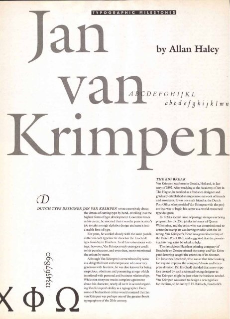
VranDEFGHIJKL<br />
abcd efshijklmn<br />
DUTCH TYPE DESIGNER JAN VAN KRIMPEN wrote extensively about<br />
the virtues of cutting type by hand, extolling it as the<br />
highest form of type development. Countless times<br />
in his career, he asserted that it was the punchcutter's<br />
job to take a rough alphabet design and turn it into<br />
a usable font of type.<br />
For years, he worked closely with the same punchcutter<br />
on each typeface he drew for the Enschede<br />
type foundry in Haarlem. In all his voluminous writings,<br />
however, Van Krimpen only once gave credit<br />
to his punchcutter, and even then, never mentioned<br />
0<br />
the artisan by name.<br />
Although Van Krimpen is remembered by some<br />
00<br />
as a delightful host and companion who was very<br />
generous with his time, he was also known for being<br />
suspicious, obstinate and possessing an ego which<br />
El\ interfered with personal and business relationships.<br />
While not everyone was in complete agreement<br />
("4 about his character, nearly all were in accord regarding<br />
Van Krimpen's ability as a typographer. Even<br />
some of his harshest critics would contend that Jan<br />
van Krimpen was perhaps one of the greatest book<br />
typographers of the 20th century.<br />
THE BIG BREAK<br />
Van Krimpen was born in Gouda, Holland, in January<br />
of 1892. After studying at the Academy of Art in<br />
The Hague, he worked as a freelance designer and<br />
gradually established an impressive network of friends<br />
and associates. It was one such friend at the Dutch<br />
Post Office who provided Van Krimpen with the project<br />
that was to begin his career as a world renowned<br />
type designer.<br />
In 1923 a special issue of postage stamps was being<br />
prepared for the 25th jubilee in honor of Queen<br />
Wilhelmina, and the artist who was commissioned to<br />
create the stamp art was having trouble with the lettering.<br />
Van Krimpen's friend was general secretary of<br />
the Dutch Post Office and suggested that the promising<br />
lettering artist be asked to help.<br />
The prestigious Haarlem printing company of<br />
Enschede en Zonen printed the stamp and Van Krimpen's<br />
lettering caught the attention of its director,<br />
Dr. Johannes Enschede, who was at that time looking<br />
for ways to improve the company's book and letterpress<br />
division. Dr. Enschede decided that a new typeface<br />
created by such a talented young designer as<br />
Van Krimpen might be just what the business needed.<br />
Van Krimpen was asked to design a new typeface<br />
for the firm, to be cut by P. H. Radisch, Enschede's


