Volume 19–4 (Low Res).pdf
Volume 19–4 (Low Res).pdf
Volume 19–4 (Low Res).pdf
You also want an ePaper? Increase the reach of your titles
YUMPU automatically turns print PDFs into web optimized ePapers that Google loves.
venerable punchcutter, and to be cast at the company's<br />
foundry. Van Krimpen eagerly accepted this<br />
commission and quickly produced trial drawings<br />
for the new type. These were approved and followed<br />
up in record time with a set of finished renderings,<br />
and handed over to Radisch, who produced punches<br />
for the hand-set type. In just a little more than a<br />
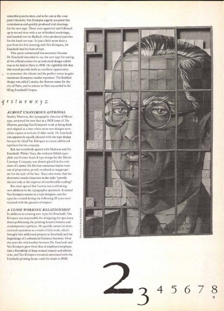
year from his first meeting with Van Krimpen, Dr.<br />
Enschede had his font of type.<br />
This quick turnaround was necessary because<br />
Dr. Enschede intended to use the new type for setting<br />
all the official entries for an industrial design exhibition<br />
to be held in Paris in 1925. He rightfully felt that<br />
this would provide both an excellent opportunity<br />
to announce the release and the perfect venue to gain<br />
maximum European market exposure. The finished<br />
design was called Lutetia, the Roman name for the<br />
city of Paris, and its release in Paris succeeded in fulfilling<br />
Enschede's hopes.<br />
qr s tu v wxy z<br />
ALMOST UNANIMOUS APPROVAL<br />
Stanley Morison, the typographic director of Monotype,<br />
reviewed the new face in a 1928 issue of The<br />
Fleuron, praising Van Krimpen's work as being fresh<br />
and original at a time when most new designs were<br />
either copies or revivals of older work. Dr. Enschede<br />
was apparently equally pleased with the type design<br />
because he hired Van Krimpen to create additional<br />
typefaces for his company.<br />
But not everybody agreed with Morison and Dr.<br />
Enschede. Walter Tracy, the eminent British typophile<br />
and former head of type design for the British<br />
Linotype Company, was almost gleeful in his criticism<br />
of Lutetia. He felt that numerous letters were<br />
out of proportion, poorly rendered or inappropriate<br />
for the style of the face. Tracy also wrote that the<br />
alternative swash characters in the italic "prettify<br />
the text only at the expense of comfortable reading!'<br />
But most agreed that Lutetia was a refreshing<br />
new addition to the typographic spectrum. It earned<br />
Van Krimpen esteem as a type designer, and the<br />
types he created during the following 25 years were<br />
received with the greatest of respect.<br />
A CLOSE WORKING RELATIONSHIP<br />
In addition to creating new types for Enschede, Van<br />
Krimpen was responsible for designing the specimen<br />
sheets publicizing the printing house's historic and<br />
contemporary typefaces. He quickly earned , an international<br />
reputation as a result of this work, which<br />
brought him additional projects at Enschede and the<br />
beginnings of a substantial freelance business. Over<br />
the years the relationship between Dr. Enschede and<br />
Van Krimpen grew from that of employer/employee<br />
into a friendship of deep mutual respect and admiration,<br />
and Van Krimpen remained associated with the<br />
Enschede printing house until his death in 1958.<br />
3 4 5 6 7 8


