

TYPO_Berlin_2013_Touch_ConferenceGuide_01_web
TYPO_Berlin_2013_Touch_ConferenceGuide_01_web
TYPO_Berlin_2013_Touch_ConferenceGuide_01_web

Create successful ePaper yourself
Turn your PDF publications into a flip-book with our unique Google optimized e-Paper software.
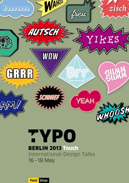
hmm<br />
GRRR<br />
BERLIN <strong>2<strong>01</strong>3</strong> <strong>Touch</strong><br />
International Design Talks<br />
16 –18 May<br />
Font Shop<br />
WOW<br />
SCHNIEF<br />
freu<br />
Brr<br />
YEAH<br />
zisch<br />
1
BERLIN <strong>2<strong>01</strong>3</strong> <strong>Touch</strong><br />
International Design Talks<br />
FINGERSPITZENGEFÜHL<br />
+1<br />
0<br />
-1<br />
HEAD-<br />
PHONES TICKETS WC<br />
INFO<br />
ENTRANCE<br />
<strong>TYPO</strong> Show<br />
<strong>TYPO</strong> Hall<br />
WC<br />
BEER GARDEN & BBQ<br />
LUNCH<br />
Der interaktive Benutzer zwingt Medien, Industrie und sogar die Politik<br />
zum Umdenken. Mit der Spitze unseres Fingers navigieren wir, kaufen wir<br />
ein, starten einen Film oder unterschreiben eine Petition. Für die visuelle<br />
Kommunikation ersetzt der Fingerzeig oft Schrift und Worte. Wie gehen<br />
Designer mit dem <strong>Touch</strong> um? Wie berühren sie, wie lassen sie berühren?<br />
Die <strong>TYPO</strong> <strong>Berlin</strong> <strong>2<strong>01</strong>3</strong> liefert Antworten.<br />
FINGERTIP SENSITIVITY<br />
CAFÉ<br />
The interactive user forces the media, industry and even politicians to rethink.<br />
Using our fingertips, we navigate, go shopping, start a film or sign a petition.<br />
In visual communication, the point of a finger often replaces script and words.<br />
How do designers deal with touch? How do they touch, how do they allow<br />
touch to happen? <strong>TYPO</strong> <strong>Berlin</strong> provides answers.<br />
<strong>TYPO</strong> Stage<br />
CAFÉ<br />
<strong>TYPO</strong> Nest<br />
3
4<br />
16.5. DONNERSTAG THURSDAY<br />
<strong>TYPO</strong> Hall <strong>TYPO</strong> Show<br />
14:00 Ken Garland | E<br />
15:00 Nancy Birkhölzer<br />
Prof. Reto Wettach | E<br />
Alle Macht dem Analogen |<br />
Empower the Analog<br />
16:00 Mitya Kharshak, Peter Bankov | E<br />
Wie gestaltet man eine Design-Zeitschrift |<br />
How to do a design periodical<br />
17:00 Coffee Coffee<br />
18:00 Florian Kaps | D<br />
Das unmögliche Sofortbild |<br />
The impossible instant photo<br />
19:00 Anthony Burrill | E<br />
Hart arbeiten, nett sein: Wie geht das? |<br />
How to work hard and be nice to people<br />
<strong>TYPO</strong> Hall 20:00<br />
Martina Flor & Giuseppe Salerno | E<br />
Lettering vs. Calligraphy live: Martina und<br />
Giuseppe zeichnen und konstruieren Buchstaben<br />
um die Wette. Du kannst deinen Favoriten wählen.<br />
Als Gastmoderatoren: Nina Stössinger,<br />
Yves Peters, Jürgen Siebert und Stephen Coles |<br />
Lettering vs Calligraphy live: Martina and<br />
Giuseppe compete in drawing letters. You can<br />
vote for your favourites. With guest moderators:<br />
Nina Stössinger, Yves Peters, Jürgen Siebert and<br />
Stephen Coles.<br />
Schedule Online<br />
Julie K. Andersen | E<br />
Wenn das Leben mit Zitronen handelt … |<br />
When life gives you lemons …<br />
Daniel Trattler | E<br />
Pädagogische Computerspiele für Kinder |<br />
Educational computer games for kids<br />
Harry Keller | E<br />
Mutig digital: Wir schlagen zurück! |<br />
Dauntingly digital – how to fight back!<br />
Mareike Roth, Oliver Saiz | D<br />
Emotion Strategy. Emotionen designen. |<br />
Emotion Strategy. How to design emotions<br />
Hier findest du mehr Infos und Links zu den Webseiten der Sprecher. |<br />
Find more infos and all the links to the speakers’ <strong>web</strong>sites.<br />
typotalks.com/berlin/<strong>2<strong>01</strong>3</strong>/schedule<br />
Share<br />
Teile deine Eindrücke auf Twitter (@typoBER) und Flickr (#typo13),<br />
den Newsfeed findest du auf Facebook. | Share your impressions on<br />
Twitter (@typoBER) and Flickr (#typo13) and get all latest news on Facebook.<br />
typotalks.com/live<br />
Simultaneous translation<br />
Alle Vorträge in der <strong>TYPO</strong> Hall und<br />
in der <strong>TYPO</strong> Show werden simultan ins<br />
Englische und Deutsche übersetzt.<br />
Eure Kopfhörer erhält ihr auf Ebene 0. |<br />
All talks at <strong>TYPO</strong> Hall and <strong>TYPO</strong> Show<br />
will be simultaneously translated into<br />
English and German. Get your headphones<br />
on Level 0.
<strong>TYPO</strong> Stage <strong>TYPO</strong> Nest<br />
Andrea Schmidt,<br />
Patrick Marc Sommer | D<br />
typoversity 2 | typoversity 2<br />
Julia Kahl, Markus Lange,<br />
Falko Gerlinghoff | D<br />
KUBA – Eine neue Generation |<br />
CUBA – The New Generation<br />
Coffee<br />
David Demaree | E<br />
Das Gewicht des Netzes | The Weight of<br />
the Web<br />
Jamie Neely | E<br />
Typografische Prototypen für das Web |<br />
Typography prototypes for the <strong>web</strong><br />
Andreas Frohloff | D<br />
Kalligrafie- & Lettering-Workshop –<br />
2 Stunden | Calligraphy & Lettering<br />
Workshop – 2 hours<br />
Feedbacks<br />
Wir wollen dein Feedback. Erzähl uns was dir gefallen hat (oder auch nicht)<br />
und welche Sprecher du mal sehen möchtest. Unter allen, die mitmachen,<br />
verlosen wir ein Ticket zur nächsten <strong>TYPO</strong> <strong>Berlin</strong>. |<br />
We are hungry for feedback! Tell us what you liked (or not) and what speakers<br />
you want to see next year. Everyone who returns the online feedback form has<br />
the chance to win a <strong>TYPO</strong> ticket.<br />
typotalks.com/berlin/<strong>2<strong>01</strong>3</strong>/feedback<br />
Ratings<br />
Du kannst jeden Vortrag bewerten. Gib 1 – 5 Sterne ja nach Gefallen |<br />
Show how much you liked a talk by awarding 1 to 5 points.<br />
typotalks.com/berlin/<strong>2<strong>01</strong>3</strong>/speakers<br />
Videos<br />
Als registrierte Benutzer könnt ihr nach der <strong>TYPO</strong> Videos der Vorträge online<br />
ansehen. Benutzt dazu euren My<strong>TYPO</strong> Login mit der E-Mail-Adresse, die<br />
beim Kauf des Tickets angegeben wurde. | Registered attendees can watch<br />
videos of the talks online. Use your My<strong>TYPO</strong> login and the email-address, that<br />
was used for ticket purchase.<br />
typotalks.com/berlin/<strong>2<strong>01</strong>3</strong>/schedule<br />
5
6<br />
17.5. FREITAG FRIDAY<br />
<strong>TYPO</strong> Hall <strong>TYPO</strong> Show<br />
11:00 Carolin Rauen, Max Kuehne | D<br />
You can’t touch this? Und ob – das solltest<br />
Du sogar! | You can’t touch this? Yes you<br />
can. And you should!<br />
12:00<br />
12:30<br />
Grzegorz Laszuk | E<br />
Warum ich die polnische Plakatschule<br />
tötete | Why I killed the Polish School of<br />
Poster<br />
Jacek Utko | E<br />
Print vs. Digital | Print vs Digital<br />
13:00 Lunch Lunch<br />
Alexey Novichkov<br />
Mikhail Simakov | R | E<br />
Infografiken für Moskowskije Nowosti<br />
und RIA Nowosti | Infographics for<br />
Moskovskiye Novosti and RIA Novosti<br />
14:00 Peter Bankov | R | E<br />
Jeden Tag Plakate | Posters every day<br />
15:00 Roland Stieger, Bernhard Senn,<br />
Dominik Hafen | D<br />
Von innen nach außen | From the Inside to<br />
the Outside<br />
16:00 Simon Manchipp | E<br />
Charme in uncharmanten Zonen |<br />
Introducing Charm into Charmless<br />
categories<br />
17:00 Coffee Coffee<br />
18:00 Kate Moross | E<br />
Es gibt keine Mauern | There is no wall<br />
19:00 Ann Bessemans | E<br />
Matilda, ein wissenschafts-basierter<br />
Font | Matilda, a research-based font for<br />
improving reading<br />
20:00 Neville Brody | E<br />
Zu Ebene 2 | Towards Level 2<br />
Design Special: Russia<br />
Alexandra Korolkova | E<br />
Ein Hauch Natives: Kyrillisch<br />
alltagstauglich | Adjusting your Cyrillic for<br />
real use<br />
Daniil Bolshov, Elizaveta Kirilina,<br />
Eugeny Malyshev, Svetlana<br />
Yakovleva | R | E<br />
Junge russische Designer | Young Russian<br />
Designers<br />
Taisiya Lushenko | R | E<br />
Anspruchsvolle Projekte, typografische<br />
Lösungen | Some projects with challenges<br />
resolved with type<br />
Svetlana Landl | D<br />
St. Petersburg – auf der Suche nach<br />
Identität | St. Petersburg – Finding an ID
<strong>TYPO</strong> Stage <strong>TYPO</strong> Nest<br />
Christian Büning<br />
Jakob Maser | D<br />
Der BDG Honorar- und Gehaltsreport<br />
2<strong>01</strong>2 | The German Association of<br />
Communications Designers (BDG) fee and<br />
salary report for 2<strong>01</strong>2<br />
Steffen Fiedler, Jonas Loh,<br />
Stephan Thiel | E<br />
Multidisziplinarität managen | Handling<br />
Multi-Disciplinarity<br />
Lunch<br />
Henning Skibbe | D<br />
Typografie für Zeitungsmedien |<br />
Typography for news media<br />
Van Bo Le-Mentzel | D<br />
Karma Chakhs – nach Crowdfunding und<br />
Crowdsourcing kommt das Crowducing |<br />
Karma Chakhs – after Crowdfounding and<br />
Crowdsourcing now comes Crowducing<br />
Coffee<br />
Ferdinand Ulrich | E<br />
Hunt Roman – <strong>Touch</strong>ing Type<br />
Ashley John Pigford, Tricia Treacy | E<br />
Buchveröffentlichung des „Vista Sans<br />
Wood Type Project“ | <strong>Touch</strong>: The Vista<br />
Sans Wood Type Project Book Release<br />
<strong>TYPO</strong> Stage 20:00<br />
DW / Lupi Asensio, Martin Lorenz | E<br />
Design-Werkstatt Workshop-Präsentation |<br />
Design Werkstatt Workshop Presentation<br />
Andreas Frohloff | D<br />
Kalligrafie- & Lettering-Workshop –<br />
2 Stunden | Calligraphy & Lettering<br />
Workshop – 2 hours<br />
<strong>TYPO</strong> Nest 13:00<br />
FontFont Typeboard live on stage | E<br />
Lasst eure Schriftentwürfe von den Experten loben,<br />
kritisieren und kommentieren. Holt euch Tipps,<br />
wie ihr eure Schriften weiterentwickeln könnt |<br />
Have the chance to get your fonts judged by the<br />
members of the official FontFont Typeboard. It’s a<br />
golden opportunity to gain invaluable advice, tips<br />
and feedback on to how to develop your typeface<br />
further. Mit | With: Erik van Blokland, Stephen Coles,<br />
Andreas Frohloff, Ivo Gabrowitsch, Jürgen Siebert,<br />
Erik Spiekermann<br />
Georg Seifert | D<br />
„Glyphs“: Glyphen zum Anfassen | Get in<br />
<strong>Touch</strong> with Glyphs<br />
7
8<br />
18.5. SAMSTAG SATURDAY<br />
<strong>TYPO</strong> Hall <strong>TYPO</strong> Show<br />
11:00 Andreas Koop | D<br />
Die Macht der Schrift | The power of type<br />
12:00 Gesche Joost | E<br />
Prototypen einer vernetzten Gesellschaft<br />
| Prototypes of a networked society<br />
13:00 Lunch Lunch<br />
14:00<br />
15:00 Manuel Krebs | D<br />
Physiognomie von Schriften | The<br />
physiognomy of typefaces<br />
16:00 Paul Barritt | E<br />
Das magische Kino von 1927 | The Magic<br />
Cinema of 1927<br />
17:00 Coffee Coffee<br />
18:00 Michael Johnson | E<br />
Gitarren und Grafik | Guitars and Graphics<br />
19:00 Jessica Walsh | E<br />
Kreatives Spiel | Creative Play<br />
22:00 <strong>TYPO</strong> Night @ Alte Münze<br />
Molkenmarkt 2, 1<strong>01</strong>79 <strong>Berlin</strong><br />
typonight.de<br />
Gerry Leonidas | E<br />
Wer braucht noch mehr deutsche<br />
Designer? | Who needs another German<br />
designer?<br />
Paul Barnes | E<br />
Die Vergangenheit berühren | <strong>Touch</strong>ing<br />
the past<br />
Albert-Jan Pool | D<br />
Leserlichkeit nach DIN 1450 | Legibility<br />
according to DIN 1450<br />
Sander Neijnens | E<br />
Wie Mrs Trees in die Welt kam |<br />
How Mrs Trees was born and raised<br />
Henrik Kubel | E<br />
Aktuelles Schriftendesign aus London |<br />
Recent type design from London<br />
Wohoo!
<strong>TYPO</strong> Stage <strong>TYPO</strong> Nest<br />
Agata Szydłowska | E<br />
Patrioten oder Hipster? Neue Orte<br />
des polnischen Grafikdesigns |<br />
Patriots or Hipsters?<br />
Marian Misiak | E<br />
Forschung und Entdeckung: Das<br />
typografische Vermächtnis Polens<br />
aus der Zeit des Kommunismus |<br />
Research and discovery – an exploration<br />
of Polish type design heritage from the<br />
Communist era<br />
Lunch<br />
Design Special: Poland<br />
Paul van der Laan<br />
Erik van Blokland | E<br />
Der Rohschriftkocher | Raw TypeCooker<br />
Aleksandra Mizielińska<br />
Daniel Mizieliński | E<br />
Kinder und Eltern unterrichten mit<br />
Design und anderen Medien |<br />
Using design and all means necessary<br />
to teach kids and educate parents<br />
Justyna Burzyńska<br />
Maciej Lebiedowicz | E<br />
Pan tu nie stał: Nicht vordrängeln! | Pan<br />
tu nie stał (You were not standing here!)<br />
Honza Zamojski | E<br />
„How it’s made“ Band 14 | How it’s made<br />
vol. 14<br />
Piotr Rypson | E<br />
Das Überleben von Identität |<br />
Identity Survival<br />
Andreas Frohloff | D<br />
Kalligrafie- & Lettering-Workshop –<br />
2 Stunden | Calligraphy & Lettering<br />
Workshop – 2 hours<br />
<strong>TYPO</strong> Biketour mit Erik Spiekermann:<br />
Nach dem großen Erfolg bei der <strong>TYPO</strong><br />
London 2<strong>01</strong>2 begibt sich Erik am Sonntag<br />
auf eine typografische Reise durch<br />
<strong>Berlin</strong>. Weitere Informationen könnt ihr<br />
am Infostand erfragen. | After last year’s<br />
success at <strong>TYPO</strong> London, Erik will take<br />
off on another typographic tour through<br />
<strong>Berlin</strong> on Sunday. Ask for infos at the<br />
info counter.<br />
9
10<br />
MODERATOREN FACILITATORS<br />
Helena Dell-Kolaschnik relevant-set.com<br />
Helena Dell-Kolaschnik pflegt durch<br />
umfangreiche Vor-Ort-Recherchen<br />
im Rahmen Ihrer Masterthesis an der<br />
FH Potsdam zahlreiche persönliche<br />
Kontakte zu prägenden Designern<br />
in Russland. Mit ihrem Marken- und<br />
Designstudio „The Relevant Set“<br />
entwickelt sie Erscheinungsbilder<br />
und visuelle Kommunikation für<br />
Unternehmen, NGOs und Kulturträger<br />
und ebnet deutschen Klienten den<br />
Weg zum angemessenen und kommu-<br />
nikativen Auftritt in Russland.<br />
Indra Kupferschmid kupferschrift.de<br />
Indra Kupferschmid ist Schriftgestal-<br />
terin, hält Vorträge und Workshops<br />
im In- und Ausland und unterrichtet<br />
Kommunikationsdesign an der<br />
Hochschule der Bildenden Künste<br />
Saarbrücken. Nach vielen Umzügen<br />
über Ost (Weimar), Nord (Hamburg)<br />
und West (Amsterdam) lebt sie, wenn<br />
sie nicht gerade unterwegs ist, in<br />
Bonn und Saarbrücken.<br />
After extensive on-the-spot research<br />
as part of her master’s thesis at<br />
FH Potsdam, Helena Dell-Kolaschnik<br />
has been in touch with important<br />
representatives of the design industry<br />
in Russia. Her branding and design<br />
studio The Relevant Set develops IDs<br />
and visual communication projects<br />
for corporations, NGOs and cultural<br />
institutions. Her mother tongue is<br />
Russian, and for German clients she<br />
paves the way to adequate communi-<br />
cation and representation in Russia.<br />
Indra Kupferschmid works as a free-<br />
lance typographic designer, consult-<br />
ant and writer. She teaches communi-<br />
cation design at the Academy of fine<br />
Arts in Saarbrücken. After moving<br />
around quite a bit from east (Weimar)<br />
to north (Hamburg) to west (Amster-<br />
dam), she now lives, when not on the<br />
road, in Bonn and Saarbrücken.<br />
Alessio Leonardi alessio.de<br />
Alessio Leonardi ist 1965 in Florenz<br />
geboren. Seit 1990 lebt er als Desi-<br />
gner und Schriftentwerfer in <strong>Berlin</strong>.<br />
Seit 20<strong>01</strong> ist er Landesdelegierter für<br />
Italien bei der ATypI. Seine Schriften<br />
werden von FontShop, Linotype<br />
sowie von seinem eigenen Label<br />
BuyMyFonts.com vertrieben. Er redet<br />
gerne auf Konferenzen, schreibt<br />
Artikel, Bücher und ist Professor<br />
für Visuelle Kommunikation an der<br />
HAWK in Hildesheim.<br />
Alessio Leonardi was born in 1965<br />
in Florence. He has been living and<br />
working as a designer and font<br />
designer in <strong>Berlin</strong> since 1990. Since<br />
20<strong>01</strong> he has been the Italian delegate<br />
for ATypI. His fonts are sold through<br />
FontShop, Linotype and, since 2002,<br />
through his own label BuyMyFonts.<br />
com. He likes to speak at conferences,<br />
writes articles and books and he is a<br />
professor for visual communication at<br />
the HAWK in Hildesheim.
Adrian Shaughnessy shaughnessyworks.com<br />
Adrian Shaughnessy ist Autodidakt<br />
und Designer in London. Fünfzehn<br />
Jahre lang war er Creative Director<br />
bei Intro und schon früh im Bereich<br />
digitale Technologie und als Pionier<br />
der Motion Graphics im Grafikdesign<br />
unterwegs. Heute leitet er Shaugh-<br />
nessy Works, eine Consulting Firma<br />
für Design und Editorial-Projekte.<br />
Überdies ist er Mitgründer und Ver-<br />
lagschef von Unit Editions.<br />
Rene Wawrzkiewicz rene.waw.pl<br />
Rene Wawrzkiewicz ist Designer,<br />
Forscher, Manager und Kurator für<br />
Design. Bis 2008 war er als Krea-<br />
tiver, Mitinhaber und Gestalter für<br />
„Mamastudio“, eines der ersten un-<br />
abhängigen Designstudios in Polen<br />
tätig. Wawrzkiewicz ist Gründungs-<br />
mitglied des einzigen polnischen<br />
Grafikerverbandes und Gründer,<br />
Kurator und Manager des ersten pol-<br />
nischen Festivals für Grafikdesign,<br />
der Graphic Knowledge Fair.<br />
Adrian Shaughnessy is a self-taught<br />
graphic designer based in London. He<br />
spent 15 years as creative director<br />
of Intro, which was an early adopter<br />
of digital technology, and a pioneer<br />
of motion graphics within graphic<br />
design. Today he runs Shaughnes-<br />
syWorks, a consultancy combining<br />
design and editorial direction. He is<br />
also a co-founder and director of the<br />
publishing company Unit Editions.<br />
Simone Wolf type-s.it<br />
Die gebürtige Deutsche lebt und<br />
arbeitet seit 2005 in Italien, wo auch<br />
ihr Studio Type*s zuhause ist. Seit<br />
1999 ist sie als Marketingexpertin,<br />
Consultant und PR-Agentin tätig und<br />
organisiert Seminare, Konferenzen<br />
und Events. Simone Wolf hält<br />
Vorlesungen über Marketing, Event-<br />
Management und interkulturelle<br />
Kommunikation an verschiedenen<br />
internationalen Universitäten in<br />
Mailand und Florenz.<br />
Rene Wawrzkiewicz is a designer,<br />
researcher, organizer and design<br />
curator. He co-created, co-owned<br />
and worked as a designer at<br />
“Mamastudio” (until 2008), one of<br />
the first independent design studios<br />
in Poland. He is a co-founder of<br />
the only nationwide association of<br />
graphic designers and the founder,<br />
curator and organizer of Poland’s<br />
first graphic design festival, the<br />
Graphic Knowledge Fair.<br />
Simone Wolf was born and grew up<br />
in Germany. Her studio, Type*s, is in<br />
Italy, where she has lived and worked<br />
since 2005. Wolf has been working<br />
as a marketing expert, consultant<br />
and PR agent since 1999 and organ-<br />
izes seminars, conferences and spe-<br />
cial events. Simone Wolf lectures on<br />
marketing, event management and<br />
intercultural communications at<br />
various international universities in<br />
Milan and Florence.<br />
11
12<br />
DONNERSTAG THURSDAY<br />
Ken Garland www.kengarland.co.uk<br />
<strong>TYPO</strong> Hall<br />
14:00 E<br />
Talk<br />
1963 schrieb und veröffentlichte er<br />
das Manifest The First Things First<br />
„für nützliche und nachhaltige Kom-<br />
munikationsformen“ und forderte<br />
eine „Umkehrung der Prioritäten zu<br />
Gunsten sinnvollerer und dauerhafte-<br />
rer Kommunikiation“.<br />
1962 machte er sich mit seinem<br />
eigenen Grafikatelier Ken Garland &<br />
Associates selbstständig. Er schrieb<br />
zahlreiche Artikel für Designmagazi-<br />
ne in Großbritannien, den USA, Euro-<br />
pa und Japan und hielt Vorlesungen<br />
an Universitäten in aller Welt.<br />
Garland liebt klare Worte – als Per-<br />
son und Publizist. (Foto: Ania Carson)<br />
Ken Garland Ken Garland<br />
Nancy Birkhölzer www.ixds.de<br />
Nancy Birkhölzer ist Managerin und<br />
Partnerin bei IXDS. Sie leitet ein<br />
brillantes Team, das sich engste Ko-<br />
operation mit Auftraggebern bei der<br />
Arbeit an Zukunftsentwicklungen auf<br />
die Fahnen geschrieben hat.<br />
Birkhölzer moderierte <strong>2<strong>01</strong>3</strong> die<br />
National Service Design Network<br />
Conference. Sie hält Vorträge über<br />
Service Design und wurde jüngst von<br />
„Deutschland – Land der Ideen“ als<br />
eine der „100 Frauen der Zukunft“<br />
ausgezeichnet. Sie ist seit über<br />
12 Jahren als Gestalterin digitaler<br />
Dienste tätig.<br />
In 1963 he wrote and proclaimed<br />
the The First Things First manifesto<br />
“in favour of more useful and more<br />
lasting forms of communication” and<br />
demanded “Reversal of priorities in<br />
favour of the more useful and more<br />
lasting forms of communication.”<br />
Garland claims for a ”society that<br />
will tire of gimmick merchants, status<br />
salesman and hidden persuaders”.<br />
In 1962 he etablished his own graphic<br />
design studio, Ken Garland & Associ-<br />
ates. He has contributed many articles<br />
to design periodicals in the UK, US,<br />
Europe and Japan and has also held<br />
lectures at universities around the<br />
globe, always outspoken, in person<br />
and in print. (Photo: Ania Carson)<br />
Nancy Birkhölzer is the managing<br />
partner at IXDS, responsible for<br />
enabling a brilliant team to do hands-<br />
on future development with clients.<br />
Nancy co-hosted this years National<br />
Service Design Network Conference,<br />
frequently teaches & lectures on<br />
Service Design and was recently<br />
recognised as one of the “100 Women<br />
of the Future” by Deutschland – Land<br />
der Ideen. She has more than 12 years<br />
professional experience in designing<br />
digital services.
Prof. Reto Wettach www.ixds.de<br />
<strong>TYPO</strong> Hall<br />
15:00 E<br />
Talk<br />
Julie K. Andersen www.myanimalfarm.dk<br />
<strong>TYPO</strong> Show<br />
15:00 E<br />
Talk<br />
Reto Wettach ist Gründer und Design<br />
Director bei IXDS, wo er die Gestal-<br />
tungsstrategie verantwortet. Er ist<br />
Professor der FH Potsdam, an der er<br />
Physical Interaction Design lehrt und<br />
zu innovativen, körperzentrierten<br />
Ansätzen der Mensch-Maschine-<br />
Interaktion forscht.<br />
Alle Macht dem Analogen<br />
Die Ära des PC prägte eine Com-<br />
puterkultur, in der wir die digitale<br />
Welt durch Screen und Maus gefiltert<br />
betraten. Die Geräte der Nach-PC-<br />
Zeit – Smartphones, Tablets – lassen<br />
uns über viel kleinere Bildschirme,<br />
<strong>Touch</strong>screens und Apps für jede Ge-<br />
legenheit an unserer vernetzten Welt<br />
teilhaben. Aber ist das tatsächlich<br />
alles, was wir von unseren Geräten<br />
erwarten können? Wollen wir Desi-<br />
gner darin unsere Herausforderung<br />
sehen?<br />
Julie K. Andersen ist Berufstänzerin<br />
und auch Datenbank-Programmie-<br />
rerin, Grafikerin, Dozentin, einfluss-<br />
reiche Bloggerin, außergewöhnliche<br />
Handwerkerin und Typografiekünst-<br />
lerin.<br />
Wenn das Leben mit Zitronen<br />
handelt …<br />
Julie K. Anderson spricht über ihre<br />
Ausstellung „Be My Valentine, Bitch“,<br />
eine Serie von in enorm zeitauf-<br />
wändiger Technik handgefertigten<br />
typografischen Objekten.<br />
Wettach is the founder and design<br />
director at IXDS, responsible for<br />
the overall design strategy. He is a<br />
Professor at the University of Applied<br />
Sciences in Potsdam, where he teach-<br />
es “Physical Interaction Design” and<br />
researches innovative, bodily-focused<br />
approaches to Human-computer<br />
interaction.<br />
Empower the Analog<br />
The PC era shaped a computing<br />
culture characterized by funneling the<br />
digital world through a screen and a<br />
mouse. Our current post-PC-devices<br />
– such as smartphones and tablets –<br />
let us participate in our networked<br />
world through smaller screens, touch<br />
interfaces and an app for any possible<br />
need. But is this really all we can<br />
expect from our devices? Do we want<br />
to continue interacting with our world<br />
using two fingers and a restricted<br />
view? Do we as designers even want<br />
this as our design challenge?<br />
Julie is a professional dancer, turned<br />
database programmer, turned graphic<br />
designer, turned associate professor,<br />
turned influential blogger, turned<br />
craftswoman extraordinaire, turned<br />
typographic artist.<br />
When life gives you lemons …<br />
Julie’s talk is about her exhibition “Be<br />
My Valentine, Bitch”. A series of hand-<br />
crafted typographic pieces made with<br />
ridiculously time-consuming tech-<br />
niques, dealing with a bad break up.<br />
13
14<br />
Andrea Schmidt typografie-im-kontext.de<br />
Andrea Schmidt lebt und arbeitet als<br />
Typografin und Designerin in <strong>Berlin</strong>.<br />
Sie lehrte Typografie, u.a. an der<br />
FH Potsdam, an der UdK <strong>Berlin</strong> und<br />
an der CAA Hangzhou (VR China).<br />
Seit 2<strong>01</strong>0 ist Andrea Schmidt Mit-<br />
herausgeberin im Verlagshaus<br />
J. Frank | <strong>Berlin</strong>, das sich interkul-<br />
turellen Literatur- und Illustrations-<br />
projekten widmet.<br />
Patrick Marc Sommer www.designmadeingermany.de<br />
<strong>TYPO</strong> Stage<br />
15:00 D<br />
Talk<br />
Patrick Marc Sommer lebt in <strong>Berlin</strong><br />
und arbeitet als Gestalter mit den<br />
Schwerpunkten Editorial Design,<br />
Typografie und Print-Produktion. Er<br />
ist Mitherausgeber des Magazins von<br />
Design made in Germany – Dmig.<br />
typoversity2<br />
Wie steht es um den typografischen<br />
Nachwuchs in Deutschland? Wie ge-<br />
hen die Studierenden mit Typografie<br />
um? Wie sieht die typografische<br />
Ausbildung in Deutschland und an-<br />
derswo aus? Diese Fragen werden in<br />
typoversity2 beantwortet.<br />
Andrea Schmidt is a typographer and<br />
designer based in <strong>Berlin</strong>. She has been<br />
a lecturer for Typography at FH Pots-<br />
dam, UdK <strong>Berlin</strong> and CAA Hangzhou<br />
(China). Since 2<strong>01</strong>0, Andrea Schmidt<br />
has been a co-editor for Verlagshaus<br />
J. Frank | <strong>Berlin</strong> with its programme<br />
dedicated to intercultural literature<br />
and illustration projects.<br />
Patrick Marc Sommer is a designer fo-<br />
cusing on editorial design, typography<br />
and print production based in <strong>Berlin</strong>.<br />
He is a co-editor of Design made in<br />
Germany – Dmig magazine.<br />
typoversity2<br />
What is the situation of typographic<br />
newcomers in Germany today? How<br />
do students deal with typography?<br />
What is typographic training in Ger-<br />
many and abroad like? typoversity2<br />
will offer answers to these questions.<br />
Andreas Frohloff www.fontfont.com<br />
Andreas Frohloff ist Leiter des<br />
Type Departments bei FontShop<br />
International. Er ist Kalligraf und<br />
Schriftgestalter, veranstaltet seit<br />
vielen Jahren Kalligrafie-Workshops<br />
und unterrichtet an verschiedenen<br />
Schulen.<br />
Andreas Frohloff is Head of the Type<br />
Department at FontShop Interna-<br />
tional. He is also a calligrapher and<br />
type designer, and has been hosting<br />
calligraphy workshops for many<br />
years. Frohloff has been a lecturer at<br />
several academies.
<strong>TYPO</strong> Nest<br />
Thur 15:00 D<br />
Fri 11:00 D<br />
Sat 11:00 D<br />
Workshop<br />
Kalligrafie- & Lettering-Workshop<br />
Grundlagen der Kalligrafie und<br />
des „Lettering“ und vergnügliches<br />
Ausprobieren verschiedener Schreib-<br />
werkzeuge (2 Stunden). Anmeldung<br />
nicht nötig. Begrenzte Platzzahl.<br />
Calligraphy & Lettering Workshop<br />
Participants learn the basics of cal-<br />
ligraphy and lettering using a wide<br />
nib and have fun trying out different<br />
writing tools (2 hours). Places are<br />
available on first come first served<br />
basis.<br />
Mitya Kharshak www.projector-magazine.ru<br />
Mitya Kharshak ist Designer, Foto-<br />
graf, Gründer und Chefredakteur der<br />
Zeitschrift „Projector“ und lebt in<br />
St. Petersburg.<br />
Mitya Kharshak (*1977 in Leningrad)<br />
is designer, photographer and the<br />
founder and editor-in-chief of “Projec-<br />
tor” magazine.<br />
Peter Bankov www.designdepot.ru<br />
<strong>TYPO</strong> Hall<br />
16:00 E<br />
Talk<br />
Peter Bankov publiziert seit 1996 das<br />
[kAk) Magazin, das seitdem zu einem<br />
der wichtigsten Referenzen der rus-<br />
sischen Designerszene geworden ist.<br />
Bankov ist Mitgründer und Creative<br />
Director des Design Depot in Moskau.<br />
Peter Bankov lebt heute in Prag.<br />
Wie gestaltet man eine Design-<br />
Zeitschrift?<br />
Mitya Kharshak (Projector Magazine)<br />
und Peter Bankov [kAk) über den<br />
Prozess der Magazin-Gestaltung.<br />
Since 1996 Peter Bankov has been<br />
publishing [kAk) magazine, which has<br />
grown to be one of the key points<br />
of reference for the Russian graphic<br />
design scene. He is also the founder<br />
and creative director of Design Depot<br />
in Moscow. He now lives in Prague.<br />
How to do a design periodical<br />
Mitya Kharshak (Projector Magazine)<br />
and Peter Bankov [kAk) talk about<br />
the process of producing a magazine.<br />
Daniel Trattler www.eobiont.de<br />
Ursprünglich aus Long Island, stu-<br />
dierte Daniel Trattler Mathematik,<br />
war Performancekünstler, übte sich<br />
in wissenschaftlichen Experimenten<br />
und produzierte Kunstmagazine.<br />
1993 ging er nach <strong>Berlin</strong>, und wagte<br />
als Grafiker den Neuanfang.<br />
2000 gründete er die Agentur<br />
eobiont. Trattler lehrt an der <strong>Berlin</strong>er<br />
Hochschule für Technik und Wirt-<br />
schaft HTW.<br />
Originally hailing from Long Island,<br />
he studied math, created perform-<br />
ance art, did scientific experiments<br />
and made art zines before moving to<br />
<strong>Berlin</strong> in 1993. Wanting to start fresh<br />
he started working as a graphic de-<br />
signer and in 2000 he co-founded the<br />
agency eobiont. He also teaches at<br />
the HTW (<strong>Berlin</strong> University of Applied<br />
Sciences).<br />
15
16<br />
<strong>TYPO</strong> Show<br />
16:00 E<br />
Talk<br />
Pädagogische Computerspiele für<br />
Kinder<br />
Kinder riechen pädagogische Spiele,<br />
selbst wenn diese mit Zuckerguss und<br />
pink farbenen Hippos getarnt werden.<br />
Trotz ihrer lebensgedämpften Sinne<br />
durchschauen aber auch die Eltern,<br />
wenn eine Website für Kinder vor-<br />
gibt, gesunde Werte zu fördern, wo es<br />
eigentlich um nichts anderes als um<br />
die Sucht nach dem Click geht. Daniel<br />
Trattler spricht über diese und andere<br />
Lektionen, die er und sein Team bei<br />
der aktuellen Entwicklung ihrer Web-<br />
site/App StickStar für Kinder lernten.<br />
Educational computer games for<br />
kids<br />
Children smell an educational game<br />
even if it’s camouflaged with marsh-<br />
mallow frosting and purple hippos.<br />
Despite their world-weary senses<br />
parents too can usually suss out a<br />
children’s site pretending to promote<br />
wholesome values when its soul<br />
is really all about point and click<br />
addiction. Daniel will address these<br />
points and other things his team<br />
has learned in developing their new<br />
work-in-progress children’s <strong>web</strong>site.<br />
Falko Gerlinghoff falko-gerlinghoff.de<br />
Falko ist DJ, Handwerker, Fotograf<br />
und Grafikdesigner. Einige Jahre<br />
als Mediengestalter tätig, begibt<br />
er sich ständig auf die Suche nach<br />
neuer Inspiration und arbeitet jetzt<br />
als Freelancer für mehrere kleine<br />
Firmen. Als Spielwiese betreibt er<br />
ein kleines Klamotten-Label für seine<br />
elektronische Heimat.<br />
Markus Lange beyond07.com<br />
Markus Lange studiert seit 2008 an<br />
der Kunsthochschule Burg Giebichen-<br />
stein Halle, Kommunikationsdesign<br />
mit dem Schwerpunkt Editorial<br />
Design. Neben dem Studium arbeitet<br />
er als freier Grafiker und hat 2007<br />
das Streetwear Label BEYOND07.com<br />
gegründet.<br />
Falko is a DJ and a craftsman, pho-<br />
tographer and graphic designer, too.<br />
He used to work as a media designer,<br />
and is always trying to find new in-<br />
spiration. He is currently working as a<br />
freelancer for several small companies<br />
and is also running a small clothing<br />
label for his electronic home.<br />
Julia Kahl www.slanted.de<br />
Julia Kahl ist Grafikdesignerin und<br />
Managing Editor des von MAGMA<br />
Brand Design herausgegebenen Slan-<br />
ted Magazins und Weblogs. Sie lebt<br />
und arbeitet in Karlsruhe.<br />
Julia Kahl is a graphic designer and<br />
Managing Editor of the Slanted maga-<br />
zine and <strong>web</strong>log published by MAGMA<br />
Brand Design. She lives and works in<br />
Karlsruhe.<br />
Markus Lange is studying Communi-<br />
cation Design at Burg Giebichenstein<br />
University of Art and Design in Halle.<br />
Besides his studies he is working as<br />
a graphic designer and founded the<br />
streetware brand BEYOND07.com.
<strong>TYPO</strong> Stage<br />
16:00 D<br />
Talk<br />
KUBA – Eine neue Generation<br />
„Slanted #21: CUBA – The New<br />
Generation“ präsentiert aktuelles<br />
Design, Fotografie, Illustration und<br />
Typografie aus Kuba. Besonderes<br />
Augenmerk wird dabei auf die ku-<br />
banische Plakatkunst gelegt – viele<br />
Arbeiten wurden noch nie außerhalb<br />
Kubas gezeigt.<br />
CUBA – The New Generation<br />
“Slanted #21: CUBA – The New<br />
Generation” presents current design,<br />
photography, illustrations and ty-<br />
pography from Cuba. In focus: Cuban<br />
poster art. Many of the works have<br />
never been shown outside of Cuba.<br />
Florian Kaps www.the-impossible-project.com<br />
<strong>TYPO</strong> Hall<br />
18:00 D<br />
Talk<br />
2005 stolperte Florian Kaps auf<br />
einem Flohmarkt über seine erste<br />
Polaroid-Kamera, verliebte sich in<br />
diese und beschloss, sich künftig aus-<br />
schließlich der analogen Sofortbild-<br />
fotografie zu widmen. 2008 rettete er<br />
die letzte Polaroid-Fabrik, um auch<br />
im 21. Jahrhundert neue Filme für<br />
alte Polaroid-Kameras herzustellen.<br />
Das unmögliche Sofortbild<br />
Zur Überraschung aller wird eine<br />
Erfindung aus dem Jahr 1947 heute<br />
von immer mehr Interessierten und<br />
Faszinierten als das immer noch<br />
magische, aber auch als das vielleicht<br />
innovativste photographische Medi-<br />
um der Jetztzeit entdeckt.<br />
At a flea market in 2005 Florian Kaps<br />
stumbled across his first Polaroid<br />
camera, fell in love with it and decid-<br />
ed, in future, to dedicate himself solely<br />
to analogue instant photography. In<br />
2008, he rescued the last Polaroid<br />
factory so that new films could be<br />
produced for old Polaroid cameras<br />
even in the 21st century.<br />
The impossible instant photo<br />
To everyone’s surprise, an invention<br />
from the year 1947 is seen today by<br />
an increasing number of interested<br />
and fascinated people as still being<br />
the most magical, but also perhaps<br />
most innovative photographic me-<br />
dium of the present day.<br />
Harry Keller www.edenspiekermann.com<br />
Harry Keller ist Web-Entwickler mit<br />
einem Blick für Interaktionsdesign<br />
und Sympathien für Projektmanage-<br />
ment. Seit über zehn Jahren baut er<br />
Websites und Apps. Aktuell arbeitet<br />
er an verschiedenen digitalen Pro-<br />
jekten für Edenspiekermann <strong>Berlin</strong>.<br />
Zuletzt realisierte er die Front-End-<br />
Architektur der neuen, flexiblen<br />
Ableton.com-Website.<br />
Harry Keller is a <strong>web</strong> developer with<br />
an eye for interaction design and<br />
a knack for project management.<br />
He has been building <strong>web</strong>sites and<br />
apps for 10+ years and is currently<br />
working on various digital projects<br />
at Edenspiekermann <strong>Berlin</strong>. His most<br />
recent work includes the front end<br />
architecture of the new, responsive<br />
Ableton.com.<br />
17
18<br />
<strong>TYPO</strong> Show<br />
18:00 E<br />
Talk<br />
Mutig digital: Wir schlagen zurück!<br />
Digitale Produkte und Dienste ver-<br />
wandeln unsere Welt in rasantem<br />
Tempo. Das inspiriert und fasziniert<br />
und macht gleichzeitig Angst.<br />
Archaische Designtools, keine Gren-<br />
zen mehr zwischen den Disziplinen,<br />
täglich neue Technologien und eine<br />
Welt der Multiscreens stellen für<br />
jeden, der in der digitalen Domäne<br />
arbeitet, eine gigantische Heraus-<br />
forderung dar. Um erfolgreiche Lö-<br />
sungen zu bauen, müssen wir Rollen,<br />
Verantwortung und Workflows neu<br />
überdenken. Ich sage euch, wie.<br />
Dauntingly digital – how to fight<br />
back!<br />
Digital products and services are<br />
reshaping the world around us at a<br />
rapid pace. This process is as inspir-<br />
ing and fascinating as it is intimidat-<br />
ing: Archaic design tools, blurry lines<br />
between disciplines, new technologies<br />
emerging everyday and a multi-<br />
screen world are tough challenges to<br />
master for everyone working in the<br />
digital domain. In order to build suc-<br />
cessful solutions we need to rethink<br />
roles, responsibilities and workflows.<br />
Here’s how.<br />
David Demaree www.typekit.com<br />
<strong>TYPO</strong> Stage<br />
18:00 E<br />
Talk<br />
Der Designer und Programmierer Da-<br />
vid Demaree ist seit 2<strong>01</strong>1 im Typekit-<br />
Team bei Adobe, wo er sich vor allem<br />
den Themen Nutzer-Erfahrung und<br />
Data Modelling widmet und ansons-<br />
ten versucht, Kunden glücklich zu<br />
machen. Er leitete mehrere Großpro-<br />
jekte, u.a. die Volltextsuche, Integra-<br />
tion in die Adobe Creative Cloud und<br />
die Lokalisierung des Typekit User<br />
Interface.<br />
Das Gewicht des Netzes<br />
In diesem Vortrag geht es um das<br />
Netz als physisches, durch Bandbrei-<br />
te und die Kapazitäten der Terminals<br />
beschränktes System, das zugleich<br />
ein anpassungsfähiges Medium ist,<br />
in dem unsere Arbeit nicht nur aus<br />
Pixeln und Worten besteht, sondern<br />
auch aus Metadaten und Anweisun-<br />
gen für die plattformübergreifende<br />
Darstellung von Inhalten.<br />
David Demaree is a designer and<br />
programmer on the Typekit team<br />
at Adobe, where he focuses on user<br />
experience, data modelling, and gener-<br />
ally trying to make customers happy.<br />
Since joining Typekit in 2<strong>01</strong>1 David<br />
has led development of several big<br />
projects, including full-text search, in-<br />
tegration into Adobe’s Creative Cloud,<br />
and localizing Typekit’s user interface.<br />
The Weight of the Web<br />
In this talk we’ll consider the <strong>web</strong><br />
as a physical medium, constrained<br />
by bandwidth and device capabili-<br />
ties. But we’ll also look at the <strong>web</strong><br />
as an adaptive medium, where our<br />
work can consist not only of pixels<br />
and words, but also metadata and<br />
instructions for displaying content<br />
across all kinds of devices.
OCCUPY OCCUPY OCCUPY<br />
DRUCKEREI<br />
THE DRUCKEREI<br />
PREMIERE AUF<br />
<strong>TYPO</strong> <strong>2<strong>01</strong>3</strong>:<br />
TERMINE:<br />
ÖKOLOGISCH<br />
SOZIAL<br />
FAIR<br />
DER DRUCK-WORKSHOP<br />
OKTOBERDRUCK AG<br />
RUDOLFSTR. 1-8, 10245 BERLIN<br />
(2 MIN. ZUM U-/S-BAHNHOF WARSCHAUER STRASSE)<br />
KREATIV SEIN<br />
ANMELDUNG:<br />
occupy@oktoberdruck.de<br />
OCCUPY OCCUPY OCCUPY<br />
THE DRUCKEREI<br />
DRUCK-WORKSHOP<br />
1.AUGUSTWOCHE<br />
KREATIV DRUCKEN<br />
www.oktoberdruck.de<br />
16.05.<strong>2<strong>01</strong>3</strong><br />
18.00 UHR -21.00 UHR<br />
<strong>2<strong>01</strong>3</strong> GENAUER TERMIN: occupy@oktoberdruck.de<br />
DRUCKEREI<br />
OCCUPY<br />
WEIHNACHTEN<br />
GESCHENKPAPIER-WETTBEWERB<br />
AUSSCHREIBUNG: OKTOBER <strong>2<strong>01</strong>3</strong><br />
19
20<br />
Anthony Burrill anthonyburrill.com<br />
<strong>TYPO</strong> Hall<br />
19:00 E<br />
Talk<br />
Anthony Burrill hat sich mit in-<br />
novativen Kooperationsprojekten<br />
mit Freunden, Künstlerkollegen,<br />
Designern, Printproduzenten und<br />
Cineasten einen Namen in der Szene<br />
gemacht. Er arbeitet multimedial, un-<br />
ter anderem mit Plakaten, bewegten<br />
Bildern und dreidimensionalen Wer-<br />
ken. Auftraggeber für seine überzeu-<br />
genden, topaktuellen Illustrationen<br />
und Designs sind kulturelle, soziale<br />
und kommerzielle Organisationen<br />
weltweit, von New York über London<br />
bis Tokio.<br />
Hart arbeiten, nett sein:<br />
Wie geht das?<br />
Eine spannende und informative<br />
Reise durch Anthony Burrills aktu-<br />
elle Ausstellungen, Workshops und<br />
Projekte.<br />
Anthony Burrill has gained a following<br />
in the design world for his innovative<br />
collaborations with friends and fellow<br />
artists, designers, print-makers and<br />
film-makers. Burrill works across a<br />
range of media, including posters,<br />
moving image and three-dimensional<br />
work. His persuasive, up-beat il-<br />
lustration and design has been<br />
commissioned by cultural, social and<br />
commercial clients around the world<br />
from New York to London to Tokyo.<br />
How to work hard and be nice to<br />
people<br />
An engaging and informative journey<br />
through recent exhibitions, work-<br />
shops and projects.<br />
Mareike Roth, Oliver Saiz www.hoch-e.com<br />
Mit Leidenschaft und Forscherdrang<br />
führen Mareike Roth und Oliver Saiz<br />
das Studio hoch E – nachdem beide<br />
in verschiedenen Agenturen inter-<br />
nationale Marken wie Volkswagen,<br />
LG, Hilti oder RWE als Designer be-<br />
treuten. Während der gemeinsamen<br />
Arbeit an der Masterthesis entwi-<br />
ckelten beide ein Tool, um Werte<br />
und Emotionen systematisch in die<br />
Gestaltung einfließen zu lassen.<br />
Mareike Roth and Oliver Saiz are<br />
passionate researchers and the<br />
dedicated owners of Studio hoch E,<br />
which they now run, after having<br />
worked with various agencies for<br />
clients like Volkswagen, LG, Hilti, RWE<br />
and other international brands. When<br />
working on their master’s thesis, they<br />
developed a tool to design values and<br />
emotions.
<strong>TYPO</strong> Show<br />
19:00 D<br />
Talk<br />
Jamie Neely typecast.com<br />
<strong>TYPO</strong> Stage<br />
19:00 E<br />
Talk<br />
Emotion Strategy. Emotionen<br />
designen.<br />
Marken, Produkte und das komplette<br />
Corporate Design kommunizieren ein<br />
Spektrum an Emotionen und Werten.<br />
Die gezielte Kommunikation und Ge-<br />
staltung jener, stellt eine besondere<br />
Herausforderung für Designer dar.<br />
Wie kann ich Emotionen besser ver-<br />
stehen und in zielgruppengerechte<br />
Gestaltung transferieren? Welche<br />
Erkenntnisse aus Psychologie und<br />
Verhaltensforschung optimieren den<br />
Designprozess und wie lassen sich<br />
diese in der Praxis anwenden?<br />
Jamie war Mitbegründer und mehr<br />
als 10 Jahre lang Creative Director<br />
der Agentur „Front“, bevor er sich<br />
einer neuen Herausforderung stellte:<br />
Typecast. Er widmet sich jetzt dem<br />
Design neuer Tools, die dabei helfen,<br />
die Typografie ins Zentrum jedes<br />
Web-Projektes zu rücken. Ziel dabei<br />
ist es, das Internet zu einem noch<br />
schöneren Ort werden zu lassen.<br />
Typografische Prototypen fürs Web<br />
Web Designer suchen nach schnel-<br />
leren und kreativeren Abläufen für<br />
ein immer komplexer werdendes<br />
Netz. Gleichzeitig wendet sich die<br />
Web-Community den Inhalten zu.<br />
Daraus resultierend wird Typografie<br />
zunehmend zum neuen Startpunkt<br />
im Designprozess. Ausgehend von<br />
der Lesbarkeit erlaubt uns die Ent-<br />
wicklung typografischer Prototypen<br />
die Kreation von Markenerlebnissen<br />
und von Webfonts, die gut aussehen<br />
und dabei gleichzeitig ihrer jeweili-<br />
gen Umgebung gerecht werden.<br />
Emotion Strategy. How to design<br />
emotions.<br />
Brands, products and the entire<br />
field of CD communicate a spectrum<br />
of emotions and values. Targeted<br />
communication and design have<br />
always been a special challenge for<br />
designers. How can I better under-<br />
stand emotion and translate it into<br />
targeted design? Which findings in<br />
psychology and behavioural research<br />
help me optimize the design process,<br />
and how can I apply this know-how<br />
in practice?<br />
Jamie was co-founder and creative<br />
director at respected agency Front for<br />
over 10 years before starting a new<br />
venture: Typecast. He now spends his<br />
days designing tools that help Typog-<br />
raphy become the centre of every <strong>web</strong><br />
project, with the goal of making the<br />
<strong>web</strong> a more beautiful place.<br />
Typography prototypes for the <strong>web</strong><br />
Web designers are looking for a<br />
smarter and more creative workflow<br />
for an increasingly complex <strong>web</strong>. At<br />
the same time, our community’s con-<br />
sciousness is turning to content. As a<br />
result, typography is emerging as the<br />
new starting point for the <strong>web</strong> design<br />
process. Developing typography pro-<br />
totypes allows us to develop branded<br />
experiences outwards from that key<br />
ingredient — readability — and helps<br />
create <strong>web</strong> type that not only looks<br />
good BUT also behaves well.<br />
21
22<br />
Martina Flor www.martinaflor.com<br />
Martina Flor kombiniert ihr Talent als<br />
Gestalterin und Illustratorin im Zeich-<br />
nen von Buchstaben. Sie wuchs in<br />
Buenos Aires auf und ist Absolventin<br />
des niederländischen „Type & Media<br />
Masters“-Programm. Heute lebt sie in<br />
<strong>Berlin</strong>, wo sie mit dem Schwerpunkt<br />
Schrift, Lettering und Illustration<br />
tätig ist. Sie ist die Gestalterin des<br />
Projekts „Lettering vs Calligraphy“<br />
und Initiatorin der Workshopreihe<br />
„Good Type“.<br />
Martina Flor combines her talents as<br />
both a designer and an illustrator in<br />
the drawing of letters. She grew up<br />
in Buenos Aires and graduated from<br />
the Type & Media Masters programme<br />
in the Netherlands. Based now in<br />
<strong>Berlin</strong>, she works with a focus on<br />
type, lettering and illustration. She is<br />
also known as the letterer behind the<br />
mask on the project “Lettering vs Cal-<br />
ligraphy” and the creator of the series<br />
of “Good Type”.<br />
Giuseppe Salerno calligraphyinberlin.com<br />
<strong>TYPO</strong> Hall<br />
20:00 E<br />
Talk<br />
Giuseppe Salerno ist Grafiker und<br />
Kalligraf. Seit seinem 15. Lebensjahr<br />
studiert er Kalligrafie und baut sie<br />
auch gern in seine Designprojekte<br />
ein. Der Italiener Salerno wuchs in<br />
Turin auf. Heute lebt er in Valencia,<br />
wo er zusammen mit Paco Gonazlez<br />
das Designstudio Resistenza leitet.<br />
Er schreibt für Calligraphi.ca, ein<br />
Gemeinschaftsblog zu Kalligrafie,<br />
und ist Mitbegründer des Projekts<br />
„Lettering vs Calligraphy“.<br />
Lettering vs. Calligraphy live<br />
Giuseppe und Martina präsentieren<br />
zuerst das Konzept von „Lettering vs<br />
Calligraphy“, bei dem beide gegen-<br />
einander antreten. Gleich nach der<br />
Präsentation startet das Live Battle.<br />
Die Zuschauer können für ihren Lieb-<br />
ling mit der Karte abstimmen, die sie<br />
beim Einlass in den Saal bekommen.<br />
Meister ihres Fachs werden die<br />
einzelnen Buchstaben anmoderieren:<br />
Yves Peters, Stephen Coles, Nina<br />
Stössinger, Andreas Frohloff und<br />
Jürgen Siebert.<br />
Giuseppe Salerno is an Italian graphic<br />
designer and calligrapher. He has been<br />
studying calligraphy since the age<br />
of 15 and often integrates it into his<br />
design work. Salerno grew up in the<br />
Italian city of Torino and after moving<br />
to Valencia he founded the design<br />
studio Resistenza together with Paco<br />
Gonzalez. He is also a member of<br />
Calligraphi.ca, a collective blog about<br />
calligraphy and the co-creator of “Let-<br />
tering vs Calligraphy” project.<br />
Lettering vs Calligraphy live<br />
Giuseppe and Martina will present<br />
the concept of Lettering vs. Callig-<br />
raphy with both competing against<br />
each other. Right after the presenta-<br />
tion they’ll start with the live battle.<br />
Attendees can vote with the cards<br />
they’ll get at the entrance. Each letter<br />
will be moderated by a master of<br />
his craft: Yves Peters, Stephen Coles,<br />
Nina Stössinger, Andreas Frohloff and<br />
Jürgen Siebert.
24<br />
FREITAG FRIDAY<br />
Max Kuehne, Carolin Rauen www.paperlux.com<br />
<strong>TYPO</strong> Hall<br />
11:00 D<br />
Talk<br />
Paperlux gegründet: 2009. Fachwerk-<br />
haus. Schanzenviertel. 12 Mitarbeiter.<br />
Leidenschaft. Wertschätzung.<br />
Kooperation. Spaß. Neugier. Freude.<br />
Entdeckergeist. Inspiration. Konzep-<br />
tion. Materialität. Ästhetik. Kunst.<br />
Kommunikation im Raum. Erfahrung.<br />
Mut. Improvisation. Papierfetisch.<br />
Produktion. Werkstatt. Konfektion.<br />
Papiergravur. Umweltbewusst.<br />
Wachstum. Komplimente. Bleibende<br />
Eindrücke.<br />
You can’t touch this? Und ob – das<br />
solltest Du sogar!<br />
Design ist für uns mehr als ein<br />
Layout am Rechner, mehr als eine<br />
Zeichnung auf einem Blatt Papier<br />
oder gute Typografie. Sie beginnt bei<br />
uns mit der Leinwand: das Material<br />
ist der Bote, Grafikdesign der Brief<br />
– ein Liebesbrief. Wir sprechen über<br />
das erste Date, den ersten Kuss, die<br />
ersten Berührungen, den ersten Sex<br />
und natürlich die Zigarette danach.<br />
Wir zeigen Einblicke in unseren All-<br />
tag und warum eine eigene Werkstatt<br />
der ultimative Ort für Verführung ist.<br />
Christian Büning www.bdg-designer.de<br />
Christian Büning ist Präsident des<br />
BDG. Er lebt und arbeitet als freier<br />
Informationsgestalter in Münster,<br />
ist Autor der BDG-Gründerfibel und<br />
Gründer des Plakatverlags.<br />
(Foto: André W. Sobott)<br />
Paperlux: Founded 2006. Timber<br />
framework house. District Schanzen-<br />
viertel. A staff of 12. Passion. Esteem.<br />
Cooperation. Fun. Curiosity. Delight.<br />
Pioneer spirit. Inspiration. Conceptual-<br />
ity. Palpability. Aesthetic. Art. Spatial<br />
communication. Experience. Courage.<br />
Improvisation. Paper fetish. Produc-<br />
tion. Workshop. Manufacturing. Paper<br />
engraving. Environmentally aware.<br />
Growth. Praise. Compliments. Lasting<br />
impressions.<br />
You can’t touch this?<br />
Yes you can. And you should!<br />
Design is more to us than computer-<br />
generated layouts, sketches on a<br />
piece of paper, or good typography.<br />
For us, design begins with the can-<br />
vas. The material is the message, and<br />
graphic design is the letter. A love<br />
letter, for that matter. We talk about<br />
the first date, the first kiss, the first<br />
touch, the first sex and, of course,<br />
the cigarette afterwards. We offer<br />
insights into our everyday lives, and<br />
tell you why your own workshop is<br />
the best place to seduce someone.<br />
Christian Büning is President of the<br />
BDG. He lives and works as a free-<br />
lance information designer in Münster,<br />
is author of the BDG business set-<br />
up guidebook and founder of the<br />
Plakatverlag publishing house.<br />
(Photo: André W. Sobott)
Jakob Maser www.bdg-designer.de<br />
<strong>TYPO</strong> Stage<br />
11:00 D<br />
Talk<br />
Jakob Maser ist im BDG-Report-Team<br />
aktiv und Mitinhaber des Designbü-<br />
ros „neues gestalten“ in Münster. Er<br />
ist Dozent für Projektmanagement<br />
und Lehrbeauftragter an der FH<br />
Münster. (Foto: Kay Domhardt)<br />
Wir müssen mal über Geld<br />
reden: der BDG Honorar- und<br />
Gehaltsreport 2<strong>01</strong>2<br />
Der BDG Berufsverband der Deut-<br />
schen Kommunikationsdesigner hat<br />
bereits zum zweiten Mal nach den<br />
Lebensumständen der Kommunikati-<br />
onsdesigner in Deutschland gefragt.<br />
Die Ergebnisse zeigen ein umfang-<br />
reiches Bild der Branche mit einigen<br />
durchaus erfreulichen teils aber auch<br />
erschreckenden Fakten.<br />
We have to talk about money:<br />
the German Association of<br />
Communications Designers (BDG)<br />
fee and salary report for 2<strong>01</strong>2<br />
The (BDG) has already asked for the<br />
second time about the living circum-<br />
stances of communication designers<br />
in Germany. The results show a com-<br />
prehensive view of the industry with<br />
a few quite positive parts, but also<br />
some worrying facts.<br />
Grzegorz Laszuk www.grzegorzlaszuk.com<br />
Grzegorz Laszuk ist Grafikdesigner,<br />
Organisator von städtischen Kultur-<br />
veranstaltungen und Aktivist. Zurzeit<br />
leitet er das Studio Książki+Strony. Er<br />
realisierte Projekte für das Zentrum<br />
zeitgenössischer Kunst Ujazdowski<br />
Castle, TR Warszawa, die Warschauer<br />
Philharmoniker, das Nationalmuseum<br />
in Warschau und leitet die komuna//<br />
warszawa, eine der besten unabhän-<br />
gigen Theatergruppen in Polen.<br />
Jakob Maser is active in the BDG Re-<br />
port team and co-owner of the design<br />
office “neues gestalten” in Münster.<br />
He is a lecturer for project manage-<br />
ment and a lecturer at the University<br />
of Applied Sciences in Münster. (Photo:<br />
Kay Domhardt)<br />
Grzegorz Laszuk is a graphic de-<br />
signer, organizer of urban cultural<br />
activities, a director and an activist.<br />
He runs the Książki+Strony studio.<br />
In the past he has realised projects<br />
for the Centre For Contemporary Art<br />
Ujazdowski Castle, the TR Warszawa,<br />
the National Philharmonics and the<br />
National Museum in Warsaw. He is<br />
the leader of komuna// warszawa –<br />
one of the best independent Polish<br />
theatre groups.<br />
25
26<br />
<strong>TYPO</strong> Hall<br />
12:00 E<br />
Talk<br />
<strong>TYPO</strong> Hall<br />
12:30 E<br />
Talk<br />
Warum ich die polnische<br />
Plakatschule tötete<br />
Grzegorz Laszuks Vortrag zeigt,<br />
wie bedeutende persönliche und<br />
historische Einflüsse künstlerische<br />
Entscheidungen beeinflussen.<br />
Der Vortrag ist in Form einer<br />
Musikperformance gehalten:<br />
Electro-Punk-Songs kommentieren<br />
die Plakate und wirken als<br />
„Momente des philosophischen<br />
Diskurses“ zum Thema Design.<br />
Print vs. Digital<br />
Wird es noch Printmedien geben?<br />
Und wenn, wie werden sie in ein<br />
paar Jahren aussehen? Können<br />
Zeitungen nur als Zeitschriften<br />
überleben? Welche gestalterischen<br />
und redaktionellen Konzepte<br />
werden funktionieren? Was muss<br />
Web von Print lernen? Welche<br />
Designtrends verändern die<br />
Medienlandschaft von morgen?<br />
Werden App-Designer die Zukunft<br />
prägen? Welche Plattformen werden<br />
sich durchsetzen?<br />
Why I killed the Polish School of<br />
Poster<br />
During his performance, Grzegorz<br />
Laszuk shows how personal life and<br />
major historical events influence<br />
artistic choices. The lecture will take<br />
the form of a musical performance<br />
– electro-punk songs serve as com-<br />
mentary on the posters and provide<br />
“moments of philosophical discourse”<br />
on design.<br />
Jacek Utko utko.com<br />
Jacek Utko ist Design Director bei<br />
Bonnier Business Press International<br />
und verantwortlich für die Publikati-<br />
onen in Mitteleuropa, Skandinavien<br />
und Russland. Er realisierte das<br />
Redesign zahlreicher Printmedien<br />
und Online-Projekte weltweit. Unter<br />
anderem gestaltete er den Relaunch<br />
der Lonely Planet-Reiseführer in<br />
Australien.<br />
Jacek Utko is currently the design<br />
director for Bonnier Business Press<br />
International, and is responsible for<br />
publications in Central Europe, Scan-<br />
dinavia and Russia. He has redesigned<br />
dozens of newspapers, magazines and<br />
<strong>web</strong>sites all over the world. Some of<br />
his other projects include the redesign<br />
of Lonely Planet travel guides in<br />
Australia.<br />
Print vs. Digital<br />
Is print going to die? If not, what will<br />
print media look like in few years?<br />
Are magazines the only salvation<br />
for newspapers? What design and<br />
editorial ideas will work and what<br />
will not? What must <strong>web</strong> learn<br />
from print? What design trends will<br />
change the landscape of tomorrow’s<br />
media? Will application designers rule<br />
in the future? What platforms will<br />
dominate?
Mikhail Simakov www.flickr.com/simakov<br />
Alexey Novichkov novichkov.net<br />
<strong>TYPO</strong> Show<br />
12:00 R | E<br />
Talk<br />
<strong>TYPO</strong> Stage<br />
12:00 E<br />
Talk<br />
Senior Informationsdesigner bei den<br />
Moskowskije Nowosti (Moskauer<br />
Nachrichten).<br />
Kommunikationsdesigner und stell-<br />
vertretender Leiter der Infografik-<br />
abteilung der RIA Novosti (Russische<br />
Agentur für internationale Informa-<br />
tionen), einer der größten russischen<br />
Nachrichtenagenturen.<br />
Infografiken für Moskovskije<br />
Nowosti and RIA Novosti<br />
Multidisziplinarität managen<br />
Designer arbeiten zunehmend an<br />
der Schnittstelle verschiedener<br />
Disziplinen. Wissenschaftliche und<br />
technologische Forschung ist für sie<br />
ebenso Inspiration wie Herausforde-<br />
rung. Oft sind wir Mediatoren eines<br />
komplexen Gestaltungsprozesses.<br />
Wie können wir gewährleisten, dass<br />
in unserer technologiegetriebenen<br />
Welt Menschen aktiv in diese Prozes-<br />
Communication designer and Deputy<br />
Head of the Department of Computer<br />
Graphics at RIA Novosti (Russian In-<br />
ternational News Agency), one of the<br />
largest Russian news agencies.<br />
Infographics for Moskovskiye<br />
Novosti and RIA Novosti<br />
Steffen Fiedler, Jonas Loh, Stephan Thiel www.nand.io<br />
Studio NAND erkundet Interaktionen<br />
zwischen Gesellschaft, Wissenschaft<br />
und Technologie. Design ist das<br />
Medium, das spannende Erfahrungen,<br />
Geschichten und Visualisierungen<br />
generiert. Studio NAND berät und<br />
kooperiert mit privaten Unterneh-<br />
men und der öffentlichen Hand. Es<br />
geht um den innovativen Einsatz von<br />
Design und moderner Technik.<br />
Senior graphic information designer<br />
at the Moskovskiye Novosti (Moscow<br />
News).<br />
Studio NAND explores interactions<br />
between society, science and technol-<br />
ogy using design as a methodology<br />
to craft engaging experiences, stories<br />
and visualisations. They consult and<br />
work with private and public sector<br />
organisations with the aim of identi-<br />
fying new ways of using design and<br />
upcoming technologies.<br />
Handling Multi-Disciplinarity<br />
Designers are increasingly situated<br />
at the intersection of multiple disci-<br />
plines, inspired and challenged by re-<br />
search from science and technology.<br />
Hence, we often act as mediators in<br />
complex design processes. But how<br />
can we make sure these processes<br />
and our work actively engages with<br />
people in our technology-driven<br />
world? Studio NAND will address<br />
27
28<br />
<strong>TYPO</strong> Show<br />
14:00 R | E<br />
Talk<br />
se und unsere Arbeit eingebunden<br />
sind? Studio NAND stellt sich dieser<br />
Frage und diskutiert Prozesse und<br />
Probleme aktueller Projekte aus den<br />
Bereichen Interaktions- und Informa-<br />
tionsdesign.<br />
Peter Bankov www.designdepot.ru<br />
Peter Bankov publiziert seit 1996 das<br />
[kAk) Magazin das seitdem zu einem<br />
der wichtigsten Referenzen der rus-<br />
sischen Designerszene geworden ist.<br />
Bankov ist Mitgründer und Creative<br />
Director des Design Depot in Moskau.<br />
Peter Bankov lebt heute in Prag.<br />
Jeden Tag Plakate<br />
Plakate sind das Genre, das mich am<br />
meisten interessiert. Es ist professio-<br />
nell und unprofessionell, wichtig und<br />
unwichtig, klein- und großformatig.<br />
Alles, was uns umgibt, fließt in das<br />
Plakat ein. Hauswände, Graffiti,<br />
Straßennamen, Meldungen, Nachrich-<br />
ten in den sozialen Medien.<br />
Posters every day<br />
Poster is the genre that is most in-<br />
teresting to me. It is between profes-<br />
sional and non-professional, relevant<br />
and non-relevant, small and big.<br />
Everything that surrounds us flows<br />
into the poster. House walls, graffiti,<br />
street names, information, news on<br />
social networks.<br />
Dominik Hafen, Bernhard Senn, Roland Stieger tgg.ch<br />
Dominik Hafen, geboren 1967, lehrt<br />
nach einer Ausbildung als Grafiker in<br />
Ravensburg und St. Gallen. Bernhard<br />
Senn, geb. 1965, ließ sich zum Textil-<br />
entwerfer ausbilden. Roland Stieger,<br />
1970 geboren, machte eine Ausbil-<br />
dung als Schriftsetzer und studierte<br />
CAS Type Design bei Hans-Jürg<br />
Hunziker und André Baldiger an der<br />
ZHdK. Er lehrt in St. Gallen und gibt<br />
diverse Workshops. Alle drei mach-<br />
ten von 1990–92 eine Weiterbildung<br />
zum Typografischen Gestalter und<br />
gründeten daraufhin 1993 das eigene<br />
Atelier TGG Hafen Senn Stieger.<br />
this question by presenting the proc-<br />
esses and challenges behind recent<br />
projects, spanning the fields of inter-<br />
action and information design.<br />
Since 1996 Peter Bankov has been<br />
publishing [kAk) magazine, which has<br />
grown to be one of the key points<br />
of reference for the Russian graphic<br />
design scene. He is also the founder<br />
and creative director of Design Depot<br />
in Moskau. He now lives in Prague.<br />
Dominik Hafen, born in 1967, is a<br />
trained graphic designer. He teaches<br />
in Ravensburg and St. Gallen. Bern-<br />
hard Senn, born in 1965, is a trained<br />
textile designer. Roland Stieger, born<br />
in 1970, is a trained typesetter. He<br />
studied CAS Type Design with Hans-<br />
Jürg Hunziker and André Baldiger at<br />
the ZHdK, teaches in St. Gallen, and<br />
holds workshops. All three partici-<br />
pated in a further training course for<br />
typographers from 1990 to 1992, and<br />
went to found their studio TGG Hafen<br />
Senn Stieger in 1993.
<strong>TYPO</strong> Hall<br />
15:00 D<br />
Talk<br />
Von innen nach außen<br />
Typisch für ihre buchgestalterischen<br />
Arbeiten: Ausgehend vom Inhalt<br />
definieren sie einige wenige formale<br />
Zutaten und deren Beziehungen,<br />
in die dann der Inhalt „schlüpft“<br />
und unterschiedlichste Formen an-<br />
nehmen darf.<br />
From the Inside to the Outside<br />
Typical for their design work is that<br />
they depart from the content, and<br />
then identify some (few) formal ingre-<br />
dients and their relations, in order to<br />
finally “capture” the content, which<br />
may take very different forms.<br />
Alexandra Korolkova www.paratype.com/Alexandra Korolkova<br />
<strong>TYPO</strong> Show<br />
15:00 E<br />
Talk<br />
Alexandra Korolkova ist Gestalterin<br />
kyrillischer Schriften, Schriftforsche-<br />
rin und Type Consultant. Sie erhielt<br />
Auszeichnungen bei internationalen<br />
Type Design-Wettbewerben, u.a.<br />
für Modern Cyrillic, Granshan, ED<br />
Awards. Korolkova schrieb ein<br />
russisches Buch über Typografie<br />
für Anfänger mit dem (übersetzten)<br />
Titel „Live Typography“. Seit 2009<br />
leitet sie die Design-Abteilung bei<br />
ParaType.<br />
Ein Hauch Natives: Kyrillisch<br />
alltagstauglich<br />
Viele Designer im Westen ergänzen<br />
ihre Schriften heute um kyrillische,<br />
griechische oder andere Zeichen.<br />
Glücklicherweise ist die Zeit des un-<br />
bekannten „Kyrillisch“ vorbei. Heißt<br />
das jedoch auch, dass lateinisch<br />
schreibende Typografen kyrillische<br />
Buchstaben qualitativ gut entwerfen<br />
können? Dieser Vortrag widmet sich<br />
dem Feintuning der Besonderheiten<br />
kyrillischer Schriften.<br />
Alexandra Korolkova is a type design-<br />
er, teacher, and a little bit of a graphic<br />
designer and calligrapher, specializing<br />
mostly in Cyrillic. She has won several<br />
Cyrillic type design competitions and<br />
has written a popular Russian typog-<br />
raphy textbook. Currently she is head<br />
of the design department at ParaType.<br />
Native touch. Adjusting your<br />
Cyrillic for real use<br />
Nowadays, quite a lot of Western<br />
designers add other scripts,<br />
like Cyrillic or Greek, to their<br />
typefaces. Fortunately, the time of<br />
unrecognisable ”Cyrillic” is gone,<br />
but does that mean any Cyrillic<br />
glyphs designed by Latin-writing<br />
typographers are good?<br />
This presentation is devoted to fine-<br />
tuning the Cyrillic part of typeface to<br />
make it really usable.<br />
29
30<br />
Henning Skibbe www.erlerskibbetoensmann.com<br />
<strong>TYPO</strong> Stage<br />
15:00 D<br />
Talk<br />
<strong>TYPO</strong> Hall<br />
16:00 E<br />
Talk<br />
Henning Skibbe (*1979) ist Kommuni -<br />
kationsdesigner und Schriftgestalter.<br />
Er arbeitete zunächst mehrere Jahre<br />
bei Factor Design, bevor er die Agen -<br />
tur 2<strong>01</strong>0 gemeinsam mit Johannes<br />
Erler verließ, um das Bureau<br />
ErlerSkibbeTönsmann zu gründen.<br />
Dort gestaltete Henning Skibbe zum<br />
Beispiel für das Theater Bremen, das<br />
Staatstheater Stuttgart, Rosenthal<br />
und pfm medical. Als Schriftgestalter<br />
entwickelte er die mit einem<br />
TDC2-Award ausgezeich nete Schrift -<br />
familie Haptic, die FF Dingbats 2.0<br />
und zuletzt das neue Schriftensystem<br />
der Süddeutschen Zeitung.<br />
Typografie für Nachrichtenmedien<br />
Henning Skibbe gestaltete mit sei-<br />
nem Büro ErlerSkibbeTönsmann die<br />
Schriftsysteme für die SZ und den<br />
Stern und die dazugehörigen Medien.<br />
Simon Manchipp www.someoneinlondon.com<br />
Als Executive Creative Director<br />
und Mitgründer von SomeOne, der<br />
progressiven, international tätigen<br />
Designagentur aus London, startet<br />
und relauncht Simon Manchipp Mar-<br />
ken weltweit. SomeOne arbeitet für<br />
Telekommunikationsunternehmen,<br />
Hotels, Management Consultants<br />
und Airlines und ist an einigen der<br />
größten und profiliertesten Projekten<br />
der Branche beteiligt.<br />
Charme in uncharmanten Zonen<br />
Simon lädt uns zu einer Achterbahn-<br />
fahrt durch SomeOnes Experimente,<br />
Ideen und Anwendungen, und um<br />
den Einsatz von New Branding als<br />
Henning Skibbe (*1979) is a com-<br />
munication and type designer. After<br />
several years at Factor Design he left<br />
the agency in 2<strong>01</strong>0 together with Jo-<br />
hannes Erler and founded the Bureau<br />
ErlerSkibbeTönsmann. Henning Skibbe<br />
designs for the Theatre of Bremen,<br />
the Municipal Theatre of Stuttgart,<br />
Rosenthal, and pfm medical. The<br />
typographer designed the Haptic font<br />
family, for which he received the TDC2<br />
Award, and FF Dingbats 2.0. His<br />
latest project has been the new font<br />
system of Süddeutsche Zeitung.<br />
Typography for news media<br />
Henning Skibbe of ErlerSkibbe Töns-<br />
mann designed the typography of SZ,<br />
Stern and the accompanying media.<br />
Being the Executive Creative Director<br />
and Co-Founder of SomeOne, the pro-<br />
gressive London-based and interna-<br />
tionally operating design practice, Si-<br />
mon launches and relaunches brands<br />
worldwide. SomeOne is working on<br />
some of the biggest and most high<br />
profile design projects in the sector.<br />
From telecoms to hotels, management<br />
consultants to airlines.<br />
Introducing charm into charmless<br />
categories<br />
Simon will take you through a roller-<br />
coaster ride of his experiments, ideas<br />
and applications where new branding
Weg zu einem anderen Publikum.<br />
Es geht um die Erweiterung des<br />
Repertoires der Marke und um<br />
Erklärungen. Nicht nur das Produkt<br />
der Marke zählt sondern auch,<br />
warum sie genau dieses Produkt<br />
herstellt.<br />
has been employed to touch a differ-<br />
ent audience, expand a brands reper-<br />
toire or better explain not just what<br />
a brand makes, but why it makes it.<br />
Daniil Bolshov postit-awards.com<br />
Seit 2005 ist Daniil Bolshov Ideologe<br />
und Gründer des internationalen<br />
studentischen „Post it Awards“.<br />
2006 entwickelte und realisierte<br />
er das Mode-Projekt FRONTUS und<br />
gründete 2007 die Agentur „Graphic<br />
Productions“, die 2<strong>01</strong>0 als eine der<br />
20 besten Agenturen in Russland<br />
ausgezeichnet wurde.<br />
Elizaveta Kirilina postit-awards.com<br />
Elizaveta Kirilina ist Managerin für<br />
internationale Projekte der Moskauer<br />
Higher School of Economics – Natio-<br />
nal Research University.<br />
Eugeny Malyshev postit-awards.com<br />
Creative Director bei „Graphic Pro-<br />
ductions“ und Promoter des „Post it<br />
Awards“.<br />
Svetlana Yakovleva postit-awards.com<br />
Svetlana Yakovleva ist Managerin am<br />
„Internationalen Forschungslabor für<br />
strategisches Verhalten und Design“<br />
an der Moskauer Higher School<br />
of Economics – National Research<br />
University.<br />
In 2005, Daniil Bolshov founded the<br />
international Post it Award, open to<br />
students only. In 2006, Bolshov de-<br />
veloped and implemented the fashion<br />
project FRONTUS. In 2007 he founded<br />
the agency “Graphic Productions”,<br />
which in 2<strong>01</strong>0 was nominated as one<br />
of the 20 best agencies in Russia.<br />
Elizaveta Kirilina is a manager for<br />
international projects at the Higher<br />
School of Economics – National Re-<br />
search University, Moscow.<br />
Creative Director at “Graphic Produc-<br />
tions” and promoter of the “Post It<br />
Award”.<br />
Svetlana Yakovleva is a manager at<br />
the “International Research Labora-<br />
tory of Strategic Behavior and De-<br />
sign” at the Higher School of Econom-<br />
ics – National Research University,<br />
Moscow.<br />
31
32<br />
<strong>TYPO</strong> Show<br />
16:00 R | E<br />
Talk<br />
<strong>TYPO</strong> Stage<br />
16:00 D<br />
Talk<br />
Junge russische Designer<br />
Beim Stichwort „Russisches Design“<br />
denken die meisten an die berühm-<br />
ten russischen Avantgardekünstler:<br />
Rodtschenko, Lissitzky usw. Dennoch<br />
sind ein paar russische Gestalter im<br />
Ausland recht bekannt: Wladimir<br />
Tschaika, Igor Gurowitsch, Andreij<br />
Logwin, Wladimir Pirozhkow … Der<br />
„Post It Award“ stärkt die Basis und<br />
fördert junge Talente und Newcomer<br />
der Designszene Russlands. Unsere<br />
Ideen und Ergebnisse möchten wir<br />
mit euch teilen.<br />
Karma Chakhs – nach<br />
Crowdfunding und Crowdsourcing<br />
kommt das Crowducing<br />
Einige hundert Chucks-Fans wollen<br />
sich die Skandale über Missstände<br />
und Menschenrechtsverletzungen<br />
von Nike, die Converse vor 10 Jahren<br />
aufgekauft hatte, nicht bieten lassen<br />
und produzieren mit Fair Trade Netz-<br />
werken die Chucks nun selbst. Le-<br />
Mentzel über das Crowducing, eine<br />
neue Form der Produktion, und über<br />
Chancen und Schwierigkeiten beim<br />
Design von Liefer- und Wertschöp-<br />
fungsketten mit gutem Karma.<br />
Young Russian Designers<br />
“Russian Design” is mostly connected<br />
with names of the famous Russian<br />
avangardists: Rodchenko, Lissitzky,<br />
etc. But still there are several people,<br />
who are known abroad as good<br />
designers: Vladimir Chaika, Igor<br />
Gurovich, Andrey Logvin, Vladimir<br />
Pirozhkov. Post It Awards works to-<br />
wards reinforcing the grass roots, fu-<br />
ture talent and fresh blood of design<br />
in Russia. We will share the ideas and<br />
some results of the issue.<br />
Van Bo Le-Mentzel hartzivmoebel.com<br />
Architekt und Erfinder des 1-qm-<br />
Hauses, der Hartz IV Möbel und Her-<br />
ausgeber des gleichnamigen Buches.<br />
Initiator der Karma Chakhs – einer<br />
neuen Form der Massenproduktion.<br />
Architect and inventor of the One-<br />
Sqm-House, furniture for people “on<br />
the dole” and editor/publisher of the<br />
book “Hartz IV Möbel”. Initiator of<br />
Karma Chakhs – a new form of mass<br />
production.<br />
Karma Chakhs – after<br />
Crowdfunding and Crowdsourcing<br />
now comes Crowducing<br />
A few hundred Chucks fans are<br />
unwilling to take the situation of<br />
repeating scandals about serious<br />
deficits and human rights violations<br />
from Nike, who bought over Converse<br />
ten years ago, any longer and started<br />
producing Chucks themselves using<br />
fair trade networks. Le-Mentzel will<br />
talk about Crowducing, a new form<br />
of production and about opportuni-<br />
ties and difficulties when designing<br />
supply and value creation chains with<br />
good karma.
Inspiration pur – jetzt 1 x gratis !<br />
PAGE präsentiert die entscheidenden Trends<br />
in Sachen Konzeption, Gestaltung und Technik.<br />
Testen Sie jetzt eine Ausgabe kostenlos.<br />
Einfach zugreifen: www.page-online.de/testabo<br />
Gleich<br />
zugreifen!<br />
33
34<br />
Georg Seifert glyphsapp.com<br />
<strong>TYPO</strong> Nest<br />
16:00 D<br />
Talk<br />
<strong>TYPO</strong> Hall<br />
18:00 E<br />
Talk<br />
Georg Seifert ist eine schillernde<br />
Figur in der internationalen Type-<br />
Design-Szene. Er studierte an der<br />
Bauhaus-Universität in Weimar, wo<br />
er 2002 mit der Arbeit an seiner<br />
ersten Schriftfamilie begann. Zuletzt<br />
entwickelt er unter dem Namen<br />
„Glyphs“ eine eigene Schriftgestal-<br />
tungs-Software, die seit Kurzem im<br />
Mac App Store erhältlich ist.<br />
„Glyphs“: Glyphen zum Anfassen<br />
Haben auch Sie vor Jahren ein<br />
Schrift-Projekt begonnen und nie<br />
fertig gemacht? Bringen Sie es auf ei-<br />
nem USB-Stick mit! Georg Seifert de-<br />
monstriert live, wie Sie alte Projekte<br />
aus der Schublade holen und mit sei-<br />
ner Schrift-Design-Software „Glyphs“<br />
wieder auf Schiene bekommen.<br />
Es gibt keine Mauern<br />
Kate Moross spricht über die Mög-<br />
lichkeiten, die Illusion kreativer und<br />
professioneller Ängste zu überwin-<br />
den und erklärt, wie man improvi-<br />
siert, um sie hinter sich zu lassen.<br />
Georg Seifert is a dazzling figure in<br />
the international type design scene.<br />
He studied at the Bauhaus University<br />
in Weimar, where he began to work<br />
on his first font family in 2002. Most<br />
recently he developed Glyphs, a font<br />
editor which is available in the Mac<br />
App Store.<br />
Get in <strong>Touch</strong> with Glyphs<br />
Have you also started a type project<br />
in the past years without ever<br />
finishing it? Put it on a USB stick<br />
and bring it along! Georg Seifert<br />
will show in a live presentation how<br />
old projects can be brushed up with<br />
the help of his “Glyphs” type design<br />
software.<br />
Kate Moross www.katemoross.com<br />
Die Londoner Grafikkünstlerin, Art-<br />
Direktorin und Filmemacherin Kate<br />
Moross fasziniert mit dreiseitigen<br />
Formen, unlesbarer Typografie und<br />
Freeform Lettering. Sie arbeitet vor<br />
allem für die Musikbranche und<br />
gestaltet für Tom Vek, Zomby, Hearts<br />
Revolution, EMI, Sony, Island, Warner,<br />
andere Künstler und Labels. Moross’<br />
kommerzielle Kunden sind unter<br />
anderem Nike, Kiehl’s, Glastonbury,<br />
Nokia und Cadbury.<br />
Three-sided shapes, illegible typog-<br />
raphy, and freeform lettering are<br />
the fascination with Kate Moross, a<br />
graphic artist, art director and film-<br />
maker from London. She has worked<br />
prolifically within the music industry<br />
designing for artists and labels such<br />
as Tom Vek, Zomby, Hearts Revolu-<br />
tion, EMI, Sony, Island and Warner.<br />
Kate’s commercial clients include<br />
Nike, Kiehl’s, Glastonbury, Nokia, and<br />
Cadbury.<br />
There is no wall<br />
“There Is No Wall” will look at ways<br />
of breaking down the illusion of crea-<br />
tive and professional fear, and teach<br />
us how to improvise around it.
Taisiya Lushenko www.artlebedev.com<br />
<strong>TYPO</strong> Show<br />
18:00 R | E<br />
Talk<br />
<strong>TYPO</strong> Stage<br />
18:00 E<br />
Talk<br />
Geboren 1981, machte Taisiya<br />
Lushenko ihren Abschluss an der<br />
Hochschule für Grafikdesign Moskau.<br />
Seit 2008 ist sie Grafikdesignerin<br />
für das Art. Lebedev Studio mit dem<br />
Schwerpunkt Logo- und Schriftgestal-<br />
tung. Taisiya Lushenko beteiligte sich<br />
an zahlreichen Projekten des Studios,<br />
darunter das Logo des Bolschoi-The-<br />
aters, das Corporate Design der Stadt<br />
Odessa und die CI von Hedonism.<br />
Anspruchsvolle Projekte,<br />
typografische Lösungen<br />
Stressfrei durch die Moskauer U-Bahn.<br />
Vorher: Ein langweiliger, alter sow-<br />
jetischer Park. Nachher: Begegnung,<br />
Unterhaltung, Kunst. Touristen pep-<br />
pen eine Provinzstadt auf.<br />
Hunt Roman – <strong>Touch</strong>ing Type<br />
Als Austauschstudent in Pittsburgh<br />
hat Ferdinand Ulrich vor drei<br />
Jahren in der Bleisatzwerkstatt der<br />
Hochschule die sagenumwobene<br />
Bleisatzschrift Hunt Roman entdeckt.<br />
Some projects with challenges<br />
resolved with type<br />
Some projects with challenges<br />
resolved with type: How to reduce<br />
stress in Moscow metro. How to turn<br />
a boring old Soviet park into a happy<br />
place for meeting, having fun and<br />
enjoying art. How to help a provincial<br />
town become a more interesting<br />
place for tourists.<br />
Ferdinand Ulrich www.ferdinandulrich.com<br />
Ferdinand Ulrich gestaltet in seinem<br />
<strong>Berlin</strong>er Studio Publikationen und<br />
Schriftmuster, forscht und schreibt<br />
über Typografie und Gestaltung,<br />
arbeitet als Assistent von Erik Spie-<br />
kermann. Seit 2<strong>01</strong>2 lehrt er als künst-<br />
lerischer Mitarbeiter von Prof. Anna<br />
Berkenbusch Editorial Design an der<br />
Burg Giebichenstein Kunsthochschule<br />
Halle.<br />
Born in 1981, Taisiya Lushenko gradu-<br />
ated from the Higher Academic School<br />
of Graphic Design in Moscow. Since<br />
2008, she has been working with a<br />
special focus on logo and type design<br />
at Art. Lebedev Studio. Taisiya Lush-<br />
enko took part in a number of the<br />
studio’s projects, including the Bolshoi<br />
Theatre logo, Odessa city visual<br />
identity, Hedonism corporate identity,<br />
and others.<br />
Ferdinand Ulrich designs publications<br />
and font samples in his studio in<br />
<strong>Berlin</strong>, studies and writes about<br />
typography and design and works<br />
as an assistant of Erik Spiekermann.<br />
Since 2<strong>01</strong>2, he has been a lecturer for<br />
Editorial Design and artistic assistant<br />
of Prof. Anna Berkenbusch at the<br />
Burg Giebichenstein Kunsthochschule<br />
Halle.<br />
Hunt Roman – <strong>Touch</strong>ing Type<br />
Ferdinand Ulrich was a visiting<br />
student in Pittsburgh, when he<br />
discovered the legendary font Hunt<br />
Roman in the hot-metal setting work-<br />
shop of the university three years<br />
35
36<br />
Ann Bessemans<br />
<strong>TYPO</strong> Hall<br />
19:00 E<br />
Talk<br />
Zwischen 1961 und 1962 entwarf der<br />
legendäre Schriftgestalter Hermann<br />
Zapf die Schrift exklusiv für die<br />
weltbekannte Hunt Botanical Library<br />
der Carnegie Mellon University<br />
in Pittsburgh, Pennsylvania. Aus<br />
intensiver Recherche in Archiven<br />
und Sammlungen, Korrespondenz<br />
mit Hermann Zapf und – natürlich –<br />
aus der Auseinandersetzung mit der<br />
Schrift in Satz und Druck, entstand<br />
eine umfassende Arbeit, welche die<br />
verzweigte und labyrinthhafte Ge-<br />
nealogie dieser außergewöhnlichen<br />
Schrift offenbart.<br />
Ann Bessemans ist Grafikerin, For-<br />
schungsassistentin und Dozentin. Sie<br />
verteidigte 2<strong>01</strong>2 ihre Doktorarbeit<br />
mit dem Titel „Typografie für Kinder<br />
mit eingeschränkter Sehfähigkeit“.<br />
Ihre Forschung konzentriert sich<br />
auf die Beziehungen zwischen Bild,<br />
Wort, Typografie, Schriftgestaltung,<br />
Lesbarkeit, Grafik- und Buchdesign<br />
und modularen Systemen.<br />
Matilda, ein wissenschafts-<br />
basierter Font<br />
Ann Bessemans Dissertation betrach-<br />
tet das Thema Leserlichkeit speziell<br />
im Zusammenhang mit Leseanfän-<br />
gern mit Sehschwächen. Ihr Vortrag<br />
wird auf den Designprozess eingehen<br />
und die (vorläufig) fertiggestellten<br />
Fonts zeigen, die Kindern mit einge-<br />
schränkter Sehfähigkeit in den ersten<br />
Phasen des Leseprozesses helfen<br />
sollen.<br />
ago. Between 1961 and 1962, the<br />
legendary typographer Hermann Zapf<br />
developed the hot type exclusively for<br />
the famous Hunt Botanical Library<br />
of the Carnegie Mellon University in<br />
Pittsburgh, Pennsylvania. Ulrich’s<br />
intensive research in archives and<br />
collections, a correspondence with<br />
Hermann Zapf and – of course – his<br />
focus on the font in a setting and<br />
printing context have led to a com-<br />
prehensive study, which reveals the<br />
branched and maze-like genealogy of<br />
this extraordinary type font.<br />
Ann Bessemans is a graphic designer,<br />
research assistant and lecturer. In,<br />
2<strong>01</strong>2, she defended her PhD disserta-<br />
tion entitled “Type Design for Children<br />
with Low Vision”. Her research inter-<br />
ests include the interrelations between<br />
image & word, typography, font de-<br />
sign, legibility, reading graphic design,<br />
book design and modular systems.<br />
Matilda, a research based font for<br />
improving reading<br />
Ann Bessemans’ doctoral research<br />
project in design seeks to shed light<br />
on legibility in the context of visually<br />
impaired beginning readers. Within<br />
this lecture she will explain more<br />
about the design process and the<br />
(provisionally) finished fonts to pro-<br />
vide support for the target group of<br />
visually impaired children in the first<br />
stages of the reading process.
Svetlana Landl dammundlandl.com<br />
<strong>TYPO</strong> Show<br />
19:00 D<br />
Talk<br />
Landl ist Mitgründerin und Part-<br />
nerin von „Damm und Landl“ in St.<br />
Petersburg. Die Agentur arbeitet<br />
an der Schnittstelle von Kultur und<br />
Wirtschaft, realisiert Branding- und<br />
Kulturprojekte für Unternehmen und<br />
Kulturinstitutionen. Zu den Kunden<br />
der Agentur gehören unter anderem<br />
die Regierung von St. Petersburg,<br />
das Committee of Culture St. Peters-<br />
burg, das deutsche Generalkonsulat<br />
in St. Petersburg sowie diverse<br />
Unternehmen, Museen und Theater<br />
der Stadt.<br />
St. Petersburg – auf der Suche<br />
nach Identität<br />
St. Petersburg ist die zweitgrößte<br />
Stadt Russlands, reich an Geschichte,<br />
Architektur und Kultur. Die Stadt<br />
wird „Hauptstadt der russischen<br />
Kultur“, „Venedig des Nordens“ oder<br />
auch „Tor nach Russland“ genannt.<br />
Dies sind nur einige Beispiele des<br />
Stadtimages von St. Petersburg.<br />
Sind der Reichtum, die Vielfalt und<br />
der Ruf der Stadt ein Segen für<br />
die Stadt-Marke? Sventlana Landl<br />
berichtet in ihrem Vortrag über die<br />
Entwicklung der Stadtidentität und<br />
die Marke St. Petersburg.<br />
Landl is a co-founder and partner of<br />
“Damm und Landl” in St. Petersburg.<br />
The agency focuses on the interface<br />
between culture and business and<br />
creates branding and cultural projects<br />
for companies and cultural institu-<br />
tions. The Municipal Government<br />
of St. Petersburg, the Committee of<br />
Culture of St. Petersburg, the German<br />
General Consulate, several companies,<br />
museums and theatres in the city are<br />
among its clients.<br />
St. Petersburg – Finding an ID<br />
St. Petersburg is the second biggest<br />
city in Russia and is called, a<br />
“Cultural Capital”, an “Open-Air<br />
Museum”, labelled “Venice of the<br />
North” or “The Gate to Russia”,<br />
and these are only some aspects of<br />
its urban image. Are the wealth in<br />
resources and reputation a boon for<br />
the city’s brand? Svetlana Landl will<br />
present a transdisciplinary project<br />
dealing with the urban identity and<br />
the branding of St. Petersburg.<br />
37
38<br />
Ashley John Pigford vswtp.org<br />
<strong>TYPO</strong> Stage<br />
19:00 E<br />
Talk<br />
Seit 2003 arbeitet Ashley John<br />
Pigford unter dem Label „Design is<br />
Good For You“ in seinem Studio für<br />
grafische und interaktive Gestaltung.<br />
Er ist Dozent für Typografie, Grafik-,<br />
Interaktionsdesign und Physical Com-<br />
puting an der University of Delaware.<br />
Nach langjähriger Zusammenarbeit<br />
und aus gemeinsamer Liebe zu Ty-<br />
pografie, Buchdruck, digitalen Tools<br />
und Kooperationen, gründeten Tricia<br />
Treacy und Ashley John Pigford 2<strong>01</strong>2<br />
das Vista Sans Wood Type Project.<br />
Tricia Treacy vswtp.org<br />
Tricia Treacy betreibt ein eigenes<br />
Atelier für Design und Druck. Seit<br />
2000 ist ihr Pointed Press Studio in<br />
Swarthmore, Philadelphia, ein Zent-<br />
rum der Kooperation und Kreativität<br />
für Gestaltung, Grafik und Typografie.<br />
Treacy unterrichtet Grafikdesign,<br />
Buchdruck und Buchkunst an der<br />
University of Pennsylvania.<br />
Buchveröffentlichung des „Vista<br />
Sans Wood Type Project“<br />
Ashley John Pigford has been operat-<br />
ing as ”Design is Good For You“, a<br />
graphic and interaction design studio,<br />
since 2003. He is Assistant Profes-<br />
sor at the University of Delaware<br />
teaching Typography, Graphic Design,<br />
Interaction Design and Physical Com-<br />
puting. As long-time collaborators,<br />
Ashley and Tricia Treacy initiated the<br />
Vista Sans Wood Type Project in 2<strong>01</strong>2,<br />
which builds on their shared love of<br />
typography, letterpress printing, digi-<br />
tal fabrication tools and collaboration.<br />
Tricia Treacy has been running<br />
her own letterpress design studio,<br />
Pointed Press Studio – a nexus for<br />
collaboration and creativity in design/<br />
typography/printmaking arenas – in<br />
Swarthmore, PA since 2000. She also<br />
teaches graphic design, letterpress<br />
and book arts at the University of<br />
Pennsylvania.<br />
<strong>Touch</strong>: The Vista Sans Wood Type<br />
Project Book Release
Neville Brody www.researchstudios.com<br />
<strong>TYPO</strong> Hall<br />
20:00 E<br />
Talk<br />
Neville Brody ist Designer, Typograf,<br />
Art Director, Markenstratege und<br />
Berater und hat sich als einer der<br />
produktivsten, innovativsten und<br />
einflussreichsten Grafiker in der Welt<br />
etabliert. Neville ist auch Gründer<br />
der Research Studios mit Standorten<br />
in <strong>Berlin</strong>, New York, Paris, Barcelona<br />
und Tokio. Er redesignte die Zeitung<br />
„The Times“ und die BBC-Website,<br />
zu den aktuelleren Kunden gehören<br />
LVMH, Nike, Nokia und Converse und<br />
mehrere Kunst- und Kulturorganisati-<br />
onen in Großbritannien und Asien.<br />
Neville Brody is a designer, typogra-<br />
pher, art director, brand strategist and<br />
consultant and has established himself<br />
as one of the most prolific, innovative<br />
and influential graphic designers in<br />
the world. He is also the founder of<br />
the Research Studios network with<br />
studios in <strong>Berlin</strong>, New York, Paris, Bar-<br />
celona and Tokyo. Having redesigned<br />
The Times newspaper and the BBC<br />
<strong>web</strong>site, current clients include LVMH,<br />
Nike, Nokia and Converse together<br />
with several art- and culture-based<br />
organisations in the UK and Asia.<br />
Zu Ebene 2 Towards Level 2<br />
Lupi Asensio, Martin Lorenz twopoints.net<br />
<strong>TYPO</strong> Stage<br />
20:00 E<br />
Talk<br />
Lupi Asensio (Saragossa) und Martin<br />
Lorenz (Hannover) begegneten<br />
sich 1999, während eines Erasmus-<br />
Studiums, an der KABK in Den Haag.<br />
Ende 2005 zogen sie zusammen nach<br />
Barcelona, wo sie 2007 TwoPoints.<br />
Net gründeten, um herausragende<br />
Designprojekte zu realisieren. Seit<br />
2005 lehren Lupi Asensio und Martin<br />
Lorenz regelmäßig, seit 2009 leiten<br />
sie den Postgraduiertenstudiengang<br />
„Angewandte Typografie“ der Elisava<br />
School of Design in Barcelona.<br />
TwoPoints präsentieren „Tactile<br />
Systems“<br />
Lupi Asensio und Martin Lorenz<br />
zeigen die Ergebnisse des Design<br />
Werkstatt-Kurses über taktile flexible<br />
Systeme, der vom 13. – 15. Mai in<br />
<strong>Berlin</strong> stattfand.<br />
Lupi Asensio (Zaragoza) and Martin<br />
Lorenz (Hanover) are the founders of<br />
TwoPoints.Net. They met in 1999 at<br />
the KABK (Royal Academy of Art) of<br />
The Hague. At the end of 2005 they<br />
moved to Barcelona and in 2007<br />
founded TwoPoints.Net with the aim<br />
of doing exceptional design work.<br />
Besides commissioned design work<br />
they have been teaching regularly<br />
since 2005 and, since 2009, have been<br />
directing the Postgraduate Degree in<br />
“Applied Typography” at the Elisava<br />
School of Design in Barcelona.<br />
TwoPoints present “Tactile<br />
Systems”<br />
Lupi Asensio and Martin Lorenz show<br />
the outcome of their Design Werk-<br />
statt workshop on tactile systems<br />
which was held from 13 – 15 May in<br />
<strong>Berlin</strong>.<br />
39
40<br />
SAMSTAG SATURDAY<br />
Andreas Koop www.designgruppe-koop.de<br />
<strong>TYPO</strong> Hall<br />
11:00 D<br />
Talk<br />
Seit 1995 leitet Andreas Koop ein<br />
Designbüro in Rückholz im Allgäu (D).<br />
Nebenbei engagiert er sich als Autor,<br />
Dozent und Designforscher. Dabei<br />
bewegt er sich im Spannungsfeld von<br />
Zeitgeschichte, Gesellschaft, Politik<br />
und Design. Die Arbeiten der design-<br />
gruppe Koop wurden vielfach natio-<br />
nal und international ausgezeichnet.<br />
Die Macht der Schrift<br />
Schrift ist mehr als ein ästhetisches<br />
Phänomen – sie ist zugleich Aussage.<br />
Faszinierend und unerwartet ist<br />
dabei, wie stark Traditionsstränge<br />
wirksam werden. Dies zeigen die<br />
historischen Herrscher eindrucksvoll.<br />
Analytisch, komparativ und experi-<br />
mentell wird die Rhetorik der Schrift<br />
und das Zeremoniell der Typografie<br />
untersucht, aber auch das Bild des<br />
Staates heute und die Gegensätze zu<br />
Macht.<br />
The power of type<br />
Type is more than an aesthetic phe-<br />
nomenon. It is a statement, too. The<br />
impact of tradition is, however, fas-<br />
cinating and surprising, as historical<br />
rulers clearly show. The rhetoric of<br />
type becomes analytic, comparative,<br />
and experimental. The presentation<br />
discusses the ceremony of typogra-<br />
phy, the image of the state, and the<br />
contradictions of power.<br />
Gerry Leonidas leonidas.org<br />
Gerry Leonidas ist seit 1986 im Beruf<br />
und erlebte insofern die Verände-<br />
rungen, die Desktop Computer für<br />
die Design- und Druckbranche mit<br />
sich brachten. Er erwarb diverse<br />
Qualifikationen von eher peripherer<br />
Relevanz, bis er 1994 am Department<br />
of Typography der University of<br />
Reading ein Zuhause fand. Dort lehrt<br />
er Typografie und Schriftgestaltung<br />
und organisiert Wissenstransferpro-<br />
jekte. Seit 20<strong>01</strong> leitet er das Master-<br />
Programm Typeface Design.<br />
Andreas Koop has managed his own<br />
design agency in Rückholz/Allgäu<br />
since 1995. He is an author, lecturer,<br />
and design researcher, and always<br />
navigates at the interface between<br />
modern history, society, politics and<br />
design. Projects by the designgru-<br />
ppe Koop designgruppe have been<br />
awarded numerous German and<br />
international prizes.<br />
Gerry Leonidas started working in<br />
1986, spanning the transition that<br />
desktop computers brought to the de-<br />
sign and print industry, while gather-<br />
ing qualifications of mostly peripheral<br />
relevance. In 1994 he found a home<br />
in the Department of Typography<br />
at the University of Reading, where<br />
he teaches typography and typeface<br />
design, and is heavily involved in<br />
knowledge transfer projects. Since<br />
20<strong>01</strong> he has been running the MA<br />
Typeface Design programme.
Wohoo!<br />
Yeah!<br />
@ALTE MÜNZE<br />
18 May, Start: 22:00, Molkenmarkt 2<br />
www.typonight.de<br />
41
42<br />
<strong>TYPO</strong> Show<br />
11:00 E<br />
Talk<br />
<strong>TYPO</strong> Stage<br />
11:00 E<br />
Talk<br />
Wer braucht noch mehr deutsche<br />
Designer?<br />
Dies ist eine der ersten Fragen, die<br />
Gerry Leonidas jungen Type Design-<br />
ern stellt. In der Regel reagieren diese<br />
überrascht. Doch Type Design ist der<br />
Bereich, in dem der Verlust regionaler<br />
Identität in der Gestaltung (in ihrer<br />
traditionellen Form) am offensich-<br />
tlichsten ist. Wir müssen uns also den<br />
Fragen zur Typografie und zu unserer<br />
Rolle im Design stellen. Und das ist<br />
eine spannende Auseinandersetzung.<br />
Patrioten oder Hipster? Neue Orte<br />
des polnischen Grafikdesigns<br />
Dieser Vortrag präsentiert Arbeiten<br />
der jüngsten Generation polnischer<br />
Grafiker und setzt sich kritisch mit<br />
ihrer Begeisterung für die neue Loka-<br />
lität auseinander.<br />
Who needs another German<br />
designer?<br />
This is one of the first questions<br />
Gerry asks aspiring typeface design-<br />
ers, and is usually met with the<br />
sound of jaws hitting the floor. Yet<br />
typeface design is the most obvious<br />
area where design is losing any re-<br />
gional identity it had (such as it was).<br />
In the process, it confronts us with<br />
questions about typography, and our<br />
roles in design. It also makes things<br />
really exciting.<br />
Agata Szydłowska design-crit.pl<br />
Agata Szydłowska ist Designkritike-<br />
rin und Kuratorin in Warschau, Polen.<br />
Ihre Arbeit konzentriert sich auf die<br />
soziale und politische Dimension von<br />
Design. Dabei betrachtet sie nicht<br />
nur die etablierte Produktion von<br />
Design, sondern auch originäre und<br />
alltägliche Varianten. Szydłowska<br />
ist Mitglied der Redaktion der pol-<br />
nischen Vierteljahreszeitschrift für<br />
Gestaltung „2+3D“. Die ehemalige<br />
Mitarbeiterin des Polnischen Gra-<br />
fikerverbandes betreibt heute ihre<br />
eigene Plattform für Designkritik.<br />
Agata Szydłowska is a design critic<br />
and curator based in Warsaw, Poland.<br />
In her work she focuses on social<br />
and political dimensions of design<br />
exploring not only established design<br />
production, but also the vernacular<br />
and the quotidian. She is a member<br />
of the editorial board of Polish design<br />
quarterly “2+3D”. She has collaborated<br />
with Polish Association of Graphic De-<br />
signers and now runs her own Design<br />
Critique Platform.<br />
Patriots or hipsters? New local in<br />
Polish graphic design.<br />
In this presentation, works by the<br />
youngest generation of Polish graphic<br />
designers will be presented, and<br />
there will be an attempt to critically<br />
interpret this fascination with the<br />
new locality.
Gesche Joost www.design-research-lab.org<br />
<strong>TYPO</strong> Hall<br />
12:00 D<br />
Talk<br />
Gesche Joost ist Professorin für<br />
Designforschung an der UdK <strong>Berlin</strong>.<br />
Seit 2005 leitet sie das Design<br />
Research Lab an der Universität<br />
der Künste <strong>Berlin</strong>. 2009 erhielt sie<br />
den Nachwuchs-Wissenschaftspreis<br />
des Regierenden Bürgermeisters<br />
von <strong>Berlin</strong>. Gesche Joost ist Vor-<br />
standsvorsitzende der DGTF e.V. und<br />
Vorstandsmitglied der Technologie<br />
Stiftung <strong>Berlin</strong>.<br />
Prototypen einer vernetzten<br />
Gesellschaft<br />
Was haben interaktive Quilts,<br />
lebendige Handys und taktile<br />
Handschuhe miteinander gemein?<br />
Sie sind Prototypen dafür, wie heute<br />
Forschung gestaltet werden kann.<br />
Das Prototyping selbst wird zum<br />
grundlegenden Prinzip, die Öffnung<br />
zu einer vernetzten Gesellschaft zur<br />
maßgeblichen Struktur. <strong>Touch</strong> ist<br />
dabei gleichzeitig Interaktionsprinzip<br />
und beschreibt die Begreifbarkeit<br />
einer Technologie.<br />
Gesche Joost is Professor for Design<br />
Research at the University of the Arts<br />
<strong>Berlin</strong>. Since 2005 she has headed<br />
the Design Research Lab at the<br />
University of the Arts <strong>Berlin</strong>. In 2009,<br />
she received the Science Award of the<br />
Governing Mayor of <strong>Berlin</strong> for Young<br />
Researchers. She is the founding<br />
board member of DGTF e.V. (Ger-<br />
man Society for Design Theory and<br />
Research) and board member of the<br />
Technology Foundation <strong>Berlin</strong>.<br />
Prototypes of a networked society<br />
What do interactive quilts, living<br />
mobile phones and tactile gloves<br />
have to do with one another? They<br />
are prototypes of how research is<br />
designed today. Prototyping itself has<br />
become a fundamental principle and<br />
the opening towards a networked<br />
society has become a decisive struc-<br />
ture. Here, touch is a principle of<br />
interaction and at the same time it<br />
describes the comprehensibleness of<br />
a technology.<br />
Paul Barnes commercialtype.com<br />
Paul Barnes ist Grafikdesigner und<br />
spezialisiert auf Lettering, Typogra-<br />
fie, Schriftgestaltung und Publikati-<br />
onsdesign. Zusammen mit Christian<br />
Schwartz leitet er die international<br />
renommierte Typefoundry Commer-<br />
cial Type. Barnes wirkte als Berater<br />
für Wallpaper*, Harper’s Bazaar, Frie-<br />
ze und viele andere Publikationen.<br />
Seine Schriften spiegeln sein Interes-<br />
se an Tradition und Moderne wider.<br />
Paul Barnes is a graphic designer spe-<br />
cializing in the fields of lettering, ty-<br />
pography, type design and publication<br />
design. He is a partner with Christian<br />
Schwartz in the internationally ac-<br />
claimed typefoundry, Commercial Type.<br />
Barnes has also been a consultant on<br />
numerous publications, notably Wall-<br />
paper*, Harper’s Bazaar and frieze. His<br />
interest in the modern and vernacular<br />
is encompassed in his type design.<br />
43
44<br />
<strong>TYPO</strong> Show<br />
12:00 E<br />
Talk<br />
Die Vergangenheit berühren<br />
Die meisten Menschen fragen sich<br />
ab einem bestimmten Alter – und<br />
manchmal geradezu obsessiv: Woher<br />
komme ich? Das gleich könnten wir<br />
fragen, wenn es um Schrift geht:<br />
Woher kommen die Zeichen, die wir<br />
nutzen? Und wie können sie uns hel-<br />
fen, unsere Zukunft zu gestalten?<br />
Paul Barnes machte sich auf die<br />
Suche nach seiner Familie auf den<br />
Friedhöfen Cornwalls, und entdeckte<br />
die Buchstaben der Vergangenheit<br />
und wie sie die Form unserer heu-<br />
tigen Schrift prägen. Und er fand<br />
die Inspiration für mehrere seiner<br />
Schriften: Dala Floda, Dala Moa und<br />
Chiswick.<br />
<strong>Touch</strong>ing the past<br />
Most people get to an age when they<br />
become intrigued (and even obsessed)<br />
by the question; where did I come<br />
from? The same can be applied to<br />
letters; where do the forms we use<br />
actually come from? And how can<br />
they help us form our future? Paul<br />
Barnes went looking for his family<br />
in the graveyards of Cornwall, but<br />
ended up finding out a lot more about<br />
the letters of the past and how they<br />
inform our current letter forms. But<br />
he also found the ideas behind sev-<br />
eral of his typefaces; Dala Floda, Dala<br />
Moa and Chiswick.<br />
Marian Misiak timelinesystem.com<br />
<strong>TYPO</strong> Stage<br />
12:00 E<br />
Talk<br />
Marian Misiak studierte Soziologie an<br />
der Universität Warschau und Type<br />
Design an der University of Reading<br />
(GB). Zunächst war er für Neville<br />
Brodys Research Studios in London<br />
tätig, später wurde er Mitarbeiter<br />
mehrerer Zeitschriften, Zeitungen<br />
und Kultureinrichtungen in seiner<br />
Heimat Polen. Multiscript-Typedesign<br />
und die typografische Geschichte<br />
Polens faszinieren ihn.<br />
Forschung und Entdeckung: Das<br />
typografische Vermächtnis Polens<br />
aus der Zeit des Kommunismus<br />
Dieser Vortrag konzentriert sich<br />
auf die spannenden Phänomene<br />
der jüngsten Geschichte der pol-<br />
nischen Typografie in der Zeit des<br />
Kommunismus. Präsentiert werden<br />
Straßenschilderschriften, Polens<br />
Marian Misiak studied sociology at<br />
the University of Warsaw and type<br />
design at the University of Reading<br />
(UK). He worked at Neville Brody’s<br />
Research Studios in London before<br />
collaborating on a number of<br />
maga zines, newspapers and cultural<br />
institutions in his native Poland.<br />
Passionate about multi-script type<br />
design and the history of Polish type<br />
heritage.<br />
Research and discovery – an<br />
exploration of Polish type design<br />
heritage from the Communist era.<br />
This presentation introduces a collec-<br />
tion of intriguing stories concerning<br />
Polish type design during the times<br />
of the Iron Curtain. Research that is<br />
currently being done has uncovered<br />
some often shocking facts. Viewers
Erik van Blokland www.typecooker.com<br />
Paul van der Laan www.boldmonday.com<br />
<strong>TYPO</strong> Stage<br />
14:00 E<br />
Workshop<br />
erfolgreichster Font New Zelek und<br />
einige typografische Kuriositäten.<br />
Die Betrachtung der lokalen visuellen<br />
Kultur des Landes und der Blick zu-<br />
rück auf dieses ganz besondere Erbe<br />
stellen weitere Aspekte des Vortrags<br />
von Marian Misiak dar.<br />
Erik van Blokland ist Co-Entwickler<br />
von robofab und UFO. Er arbeitet<br />
außerdem als Schriftgestalter und<br />
Programmierer und ist Dozent des<br />
Type & Media-Kurses der KABK in<br />
Den Haag<br />
Paul van der Laan ist Gründer und<br />
Partner von Bold Monday. Der<br />
Schriftgestalter und Typograf arbei-<br />
tet in einem Studio nahe der Küste in<br />
Den Haag. Seit 2003 ist er Professor<br />
für Type Design im Masterstudien-<br />
gang Type & Media der KABK. Er<br />
entwarf zahlreiche Fonts und arbei-<br />
tet an Hauschriften für Auftraggeber<br />
weltweit.<br />
Raw TypeCooker<br />
Die Schriftköche Van Blokland und<br />
van der Laan blanchieren, filetieren<br />
und schneiden nach Rezepten der<br />
Konferenzteilnehmer. Gute Entwürfe<br />
bekommen Sternchen und Auszeich-<br />
nungen. Schlechtes Design wird<br />
gegrillt. Reicht eure Skizzen vor dem<br />
Vortrag ein!<br />
will become acquainted with such<br />
stories as the long-ago creation of<br />
the New Zelek typeface, used for<br />
lettering on Polish road signs – one<br />
of the most widely used fonts in the<br />
history of Polish lettering design, as-<br />
sociated with the railway system and<br />
Communist propaganda.<br />
Erik van Blokland is codeveloper of<br />
robofab and UFO. He is also working<br />
as a typedesigner, programmer and is<br />
lecturer at the TypeMedia course of<br />
the Royal Academy in The Hague.<br />
Paul van der Laan is founding partner<br />
of Bold Monday, and works from a<br />
studio near the seaside in The Hague<br />
as designer of type and typography.<br />
Since 2003 he has been professor<br />
in type design at the Type & Media<br />
masters course at the Royal Academy<br />
of Art (KABK) in The Hague. He has<br />
designed numerous typefaces and<br />
worked on custom type for worldwide<br />
clients.<br />
Raw TypeCooker<br />
Typecooks Van Blokland and Van der<br />
Laan will quickly blanche, filet and<br />
slice the recipes sketched by <strong>TYPO</strong><br />
guests at the conference. Hand in<br />
your drawings before the talk.<br />
45
46<br />
Manuel Krebs norm.to<br />
<strong>TYPO</strong> Hall<br />
15:00 D<br />
Talk<br />
Manuel Krebs gründete 1999<br />
zusammen mit Dimitri Bruni das<br />
Grafikstudio NORM, das Bücher und<br />
Schriften gestaltet und verlegt. Das<br />
Buchdesign beinhaltet selbstinitiierte<br />
Forschungsprokekte und Zusammen-<br />
arbeit mit Museen und Künstlern.<br />
Zuletzt erarbeitete NORM mit dem<br />
Louvre Paris und Sanaa Architects<br />
die Signaletik des Louvre-Lens.<br />
Physiognomie von Schriften<br />
Ein Vergleich von Schriften, deren<br />
Charakter und der Absicht hinter<br />
dem jeweiligen Entwurf, anhand der<br />
Beispiele „Simple-Köln-Bonn“, den<br />
Corporate Typefaces für Omega und<br />
Swatch sowie der „Replica“.<br />
Albert-Jan Pool www.fontfont.com/designers/albert-jan-pool<br />
Albert-Jan Pool wurde 1960 in<br />
Amsterdam geboren und studierte<br />
Grafikdesign und Typografie an<br />
der KABK in Den Haag. Er lebt und<br />
arbeitet seit 1987 in Hamburg, zuerst<br />
bei Scangraphic und URW, danach<br />
selbstständig und zwischendurch<br />
Mitinhaber des Designbüros FarbTon,<br />
am liebsten ist er aber Schriftgestal-<br />
ter: FF OCR-F, FF DIN, JET, Freenet,<br />
C&A, HEM, usw. Seit 1995 unterrichtet<br />
er Schriftgestaltung an der Muthesius<br />
Kunsthochschule in Kiel.<br />
Manuel Krebs established together<br />
with Dimitri Bruni the graphic design<br />
studio NORM in 1999, with a focus on<br />
designing and publishing books and<br />
typefaces. Book design includes self-<br />
commissioned research in the field of<br />
type and graphic design and numer-<br />
ous collaborations with museums and<br />
artists. Norm was recently working<br />
with the Louvre Paris and SANAA<br />
architects on the signage and com-<br />
munication of the Louvre-Lens.<br />
The physiognomy of typefaces<br />
A comparison of fonts and their<br />
character and intention behind each<br />
design – explained based on the<br />
examples of Simple-Köln-Bonn (for<br />
Cologne/Bonn Airport), the corporate<br />
typefaces for Omega and Swatch as<br />
well as the Replica.<br />
Albert-Jan Pool was born in Amster-<br />
dam in 1960, and studied Graphic De-<br />
sign and Typography at KABK in The<br />
Hague. He has lived and worked in<br />
Hamburg since 1987, first with Scan-<br />
graphic and URW, later self-employed.<br />
He was a co-owner of FarbTon design<br />
agency for some time. But being a<br />
typographer is what Pool loves best:<br />
FF OCR-F, FF DIN, JET, Freenet, C&A,<br />
HEM, and other fonts. He has been<br />
teaching type design at the Muthesius<br />
School of Art in Kiel since 1995.
<strong>TYPO</strong> Show<br />
15:00 D<br />
Talk<br />
Leserlichkeit nach DIN 1450<br />
Die bisherige DIN 1450 empfahl den<br />
Einsatz von Groteskschriften für<br />
alles, was weder Buch, Magazin noch<br />
Zeitung ist. Ein krasser Gegensatz<br />
zu den Erkenntnissen derjenigen,<br />
die sich mit der Typografie von<br />
Lesetexte befassen. Albert-Jan Pool<br />
schlägt eine Brücke zwischen den<br />
scheinbar gegensätzlichen Welten<br />
der Wegweiser und Printmedien und<br />
zeigt wie diese Idee die Neufassung<br />
der Norm prägt. Diese soll neben<br />
Autofahrern auch dem Leser von<br />
Literatur, Beipackzetteln, Infotafeln<br />
usw. nützlich sein.<br />
Legibility according to DIN 1450<br />
DIN 1450 so far has recommended<br />
grotesque type for everything but<br />
books, magazines or newspapers,<br />
which clearly contradicts the find-<br />
ings of experts dealing with the<br />
legibility of type. Albert-Jan Pool<br />
suggests building a bridge between<br />
the seemingly incompatible world of<br />
signage systems and print media, and<br />
shows how this idea influences the<br />
revision of the standard. This should<br />
help car drivers as well as readers<br />
of literature, package inserts, panels<br />
and others.<br />
Aleksandra & Daniel Mizieliński www.hipopotamstudio.pl<br />
<strong>TYPO</strong> Stage<br />
15:00 E<br />
Talk<br />
Die beiden polnischen Grafiker und<br />
Autoren – Aleksandra und Daniel<br />
Mizieliński – sind Gründer des<br />
Hipopotam Studio. Aus ihrer Feder<br />
stammen H.O.U.S.E., What Will Be-<br />
come of You?, Maps sowie die Wel-<br />
come to Mamoko Serie. Ihre Bücher<br />
erschienen in zwanzig Ländern und<br />
wurden, wie einige Internet-Projekte<br />
der Autoren, mit mehreren Preisen<br />
ausgezeichnet.<br />
Kinder und Eltern unterrichten mit<br />
Design und anderen Medien<br />
Im echten Leben, frisch auf dem<br />
Markt, direkt nach dem Studium, ist<br />
man nicht wählerisch. Man nimmt,<br />
was die Welt einem bietet. Und das<br />
Erste, was man uns anbot war die<br />
Gestaltung eines Kinderbuchs über<br />
moderne Architektur. Schnell er-<br />
kannten wir, dass das Gestalten von<br />
Kinderbüchern das Beste ist, was ein<br />
Designer tun kann.<br />
Aleksandra and Daniel Mizieliński are<br />
graphic designers and book authors<br />
from Poland. They are both the found-<br />
ers of Hipopotam Studio. They are the<br />
authors of such books as H.O.U.S.E.,<br />
What Will Become of You?, Maps, and<br />
the Welcome to Mamoko series. Their<br />
books have been published in twenty<br />
countries. They have won numer-<br />
ous awards for books and Internet<br />
projects.<br />
Using design and all means<br />
necessary to teach kids and<br />
educate parents<br />
In real life, as a fresh designer just<br />
one month after graduating from<br />
college, you’re not too picky. You will<br />
take what the world throws at you.<br />
And the first thing that hit us straight<br />
in the face was a commission for a<br />
book for children about contemporary<br />
architecture. We quickly discovered<br />
that making books for children is the<br />
best thing that a designer can do.<br />
47
FF Dora<br />
FontFont.com<br />
Originally drawn as a graduation project at the Type and Media masters course at<br />
the Royal Academy of Art in The Hague, FF Dora was designed by editorial and<br />
book designer Slávka Pauliková. It is a strong-willed type family consisting of five styles:<br />
Regular, Regular Italic, Bold, Bold Italic, and Display.<br />
49
50<br />
Paul Barritt www.19-27.co.uk<br />
<strong>TYPO</strong> Hall<br />
16:00 E<br />
Talk<br />
<strong>TYPO</strong> Show<br />
16:00 E<br />
Talk<br />
Paul Barritt ist Animator, Filmema-<br />
cher und Leiter des 2005 von ihm<br />
zusammen mit Suzanne Andrade<br />
gegründeten Theaterensembles 1927.<br />
Das magische Kino von 1927<br />
Ein Vortrag über 1927 und<br />
den Versuch, die Magie der<br />
Cinematografie über den Zauber<br />
der frühen Tage des Kinos wieder<br />
lebendig werden zu lassen.<br />
Wie Mrs. Trees in die Welt kam<br />
Seit 2007 betreiben der Dichter<br />
Nick J. Swarth und Sander Neijnens<br />
On-site Poetry. Sie kreieren Gedichte<br />
im öffentlichen Raum, die einen<br />
spezifischen Ortsbezug haben. Für<br />
die „Poesie vor Ort“ entwickelte<br />
Sander eine eigene Schrift: Mrs. Trees<br />
hilft, mit Objekten (Äpfeln, Blumen,<br />
Grablichtern …) zu schreiben. Mrs.<br />
Trees ist Inspiration und bewegende<br />
Typografie.<br />
The Magic Cinema of 1927<br />
A talk about how 1927 are attempt-<br />
ing to re-enchant the cinematic form<br />
with the magic of its earliest begin-<br />
nings.<br />
Sander Neijnens www.letterbeeld.nl<br />
Sander Neijnens lebt und arbeitet als<br />
Grafikdesigner in Tilburg, Niederlan-<br />
de. Neben Auftragsarbeiten schreibt<br />
und publiziert er Bücher, beispiels-<br />
weise über die Gestaltung von Zahlen<br />
auf T-Shirts und den bezaubernden<br />
Klang des Giulietti-Akkordeons.<br />
Paul is an animator and filmmaker.<br />
He is also the managing director of<br />
the theater company 1927 which he<br />
founded with Suzanne Andrade in<br />
2005.<br />
Sander Neijnens lives and works as<br />
a graphic designer in Tilburg, the<br />
Netherlands. Besides commissioned<br />
work he writes and publishes books<br />
about specific subjects like the design<br />
of shirt numbers and the enchanting<br />
sound of the Giulietti accordion.<br />
How Mrs. Trees was born and<br />
raised<br />
In 2007 poet Nick J. Swarth and<br />
Sander Neijnens started the project<br />
“On-site Poetry”. They create poems<br />
in the public space that are related to<br />
the specific location. For this project<br />
Sander designed the typeface Mrs.<br />
Trees as an aid to ‘write’ with objects<br />
(e.g. apples, flowers, grave lights).<br />
Mrs. Trees is a source of inspiration<br />
for touching typography.
Justyna Burzyńska, Maciej Lebiedowicz pantuniestal.com<br />
<strong>TYPO</strong> Stage<br />
16:00 E<br />
Talk<br />
„Pan tu nie stał“ ist das polnische<br />
Modelabel einer Soziologin und<br />
eines Grafikers: Justyna Burzyńska<br />
und Maciej Lebiedowicz beschlossen<br />
2006, ihre Privatsammlung polni-<br />
scher Grafiken – aus der Zeit des<br />
Kommunismus – in einem Blog zu<br />
präsentieren. 2008 eröffneten sie<br />
einen Online-Shop mit den ersten<br />
PNTS-Produkten: T-Shirts mit Aufdru-<br />
cken im Retro-Design. Heute ist ihr<br />
Unternehmen eine der angesagtesten<br />
Jugendbrands.<br />
Pan tu nie stał: Nicht vordrängeln!<br />
Ästhetische Inspiration des Desig-<br />
nermodelabels „Pan tu nie stał“ sind<br />
die grauen, von Knappheit geprägten<br />
kommunistischen Jahre in Polen und<br />
die gehaltvollen Konzepte – Illustrati-<br />
onen, Poster, Verpackungen –, die<br />
vor diesem tristen Hintergrund umso<br />
brillanter schienen.<br />
Pan tu nie stał is a Polish fashion<br />
label run by Justyna Burzyńska – a<br />
sociologist and Maciej Lebiedowicz<br />
– a graphic designer. In 2006 they de-<br />
cided to set up a blog presenting their<br />
private collection of Polish graphic<br />
designs from the communist era. In<br />
2008 they opened an online shop<br />
with first productions made for PTNS<br />
label: t-shirts with prints resembling<br />
the past design style. Now they run<br />
a business which has become one of<br />
the trendiest brands for the young<br />
generation.<br />
Pan tu nie stał (You were not<br />
standing here!)<br />
The aesthetics of the “Pan tu nie stał”<br />
designer clothing brand was formed,<br />
on the one hand, by the gray tedium<br />
and shortages of the Communist era<br />
in Poland, and, on the other, by the<br />
high-quality designs which stood out<br />
against this mundane background –<br />
the illustrations, books, posters and<br />
packaging that were created during<br />
this period.<br />
Honza Zamojski honzazamojski.com<br />
Honza Zamojskis Projekte sind von<br />
unterschiedlichen, oft widersprüch-<br />
lichen Konzepten inspiriert: Zufall,<br />
Ordnung, Wiederholung, Vergänglich-<br />
keit. Ihn interessieren die kleinen,<br />
fast trivialen Dinge, die in seinen<br />
Arbeiten zu Schlüsselelementen<br />
werden. Zamojski ist Mitgründer der<br />
STARTER Association and Gallery<br />
(2005–2<strong>01</strong>0) und leitet aktuell einen<br />
kleinen Verlag namens MORAVA.<br />
Überdies kuratierte er zahlreiche<br />
Honza’s works are inspired by a<br />
number of complementary concepts<br />
such as chance, order, repetition and<br />
temporariness. He also looks for the<br />
small, almost trivial things which in<br />
his works then become key elements.<br />
In addition to his work as an artist,<br />
he was a co-founder of STARTER As-<br />
sociation and Gallery (2005–2<strong>01</strong>0) and<br />
now he runs a small publishing house<br />
MORAVA and is a curator of many<br />
exhibitions. In 2<strong>01</strong>1 for the publication<br />
51
52<br />
<strong>TYPO</strong> Stage<br />
17:00 E<br />
Talk<br />
<strong>TYPO</strong> Hall<br />
18:00 E<br />
Talk<br />
Ausstellungen. Für sein Buch „Jak<br />
jsem potkal dábla“ erhielt er 2<strong>01</strong>1 auf<br />
der Leipziger Buchmesse eine Bron-<br />
zemedaille im Wettbewerb um „Das<br />
schönste Buch der Welt 2<strong>01</strong>0“.<br />
„How it’s made“ Band 14<br />
Mittels eines archaischen Geräts –<br />
dem Overhead-Projektor – beschreibt<br />
der Künstler, Kurator und Verleger<br />
Honza Zamojski in seinem „Wie funk-<br />
tioniert das“-Vortrag den Betrieb des<br />
Morava Verlages in den vergangenen<br />
drei Jahren.<br />
Michael Johnson johnsonbanks.co.uk<br />
Michael Johnson und sein Studio<br />
johnson banks arbeiten im Bereich<br />
Branding der vier Cs: cities, coun-<br />
tries, culture und charities. Zu seinen<br />
Auftraggebern zählen die britische<br />
Regierung, Kunstzentren in Philadel-<br />
phia, Paris und ein Weltraumobser-<br />
vatorium in Japan. Für China entwarf<br />
er bilinguale Schriften, in London<br />
ist er für das Science Museum und<br />
– ganz neu – für seine erste Airline,<br />
Virgin Atlantic, aktiv.<br />
Gitarren und Grafik<br />
In einem dreißigminütigen Mix aus<br />
Vortrag, Performance und Theater<br />
streift Michael Johnson 100 Jahre<br />
Grafikdesign und Gitarrenspiel. Lässt<br />
sich beides zu völlig neuer Kunst und<br />
Musik verbinden? Mit zwei Gitarren,<br />
einem Verstärker, einer großen<br />
Effektleiste und einem Computer prä-<br />
sentiert Johnson Design, Geschichte<br />
und Musik auf eine andere Art. Es<br />
könnte gut werden. (Oder auch eine<br />
Katastrophe.)<br />
“Jak jsem potkal dábla” awarded a<br />
bronze medal in the competition for<br />
the ‘Most Beautiful Book in the World<br />
in 2<strong>01</strong>0’, which accompanied the<br />
International Book Fair in Leipzig.<br />
How it’s made vol. 14<br />
During the “How It’s Made” lecture,<br />
with the help of an archaic piece of<br />
equipment, the overhead projector,<br />
Honza Zamojski (artist, curator and<br />
publisher) will describe and discuss<br />
the specific way in which the Morava<br />
publishing house has operated for the<br />
past three years.<br />
Michael Johnson runs johnson banks,<br />
which has long had an interest in<br />
branding the 4c’s – cities, countries,<br />
culture and charities. He’s worked on<br />
many projects for the British Govern-<br />
ment, art centres in Philadelphia and<br />
Paris, a space observatory in Japan<br />
and bilingual typeface in China. In<br />
London, he’s just done the Science<br />
Museum and his first airline, Virgin<br />
Atlantic.<br />
Guitars and Graphics<br />
Part speech, part performance, part<br />
theatre, in thirty minutes Michael<br />
Johnson explores 100 years of<br />
graphic design and 100 years of<br />
guitar playing. Do the two things<br />
ever combine and create art and<br />
music that we’ve never heard before?<br />
With two guitars, an amp, a large<br />
pedal-board and a computer this talk<br />
mixes design, history and music in a<br />
completely different way. It could be<br />
great. (It could also be a train wreck).
Henrik Kubel a2swhk.co.uk<br />
<strong>TYPO</strong> Show<br />
18:00 E<br />
Talk<br />
Piotr Rypson<br />
A2 ist ein unabhängiges Studio für<br />
Design und Typografie, dessen Phi-<br />
losophie besagt, dass jedem neuen<br />
Projekt eine neue Schrift gebührt.<br />
A2/SW/HK wurde im Jahr 2000 von<br />
den frisch graduierten Absolventen<br />
des Royal College of Art Henrik Kubel<br />
und Scott Williams in London gegrün-<br />
det. Zu den Kunden des Unterneh-<br />
mens zählen MoMA, Penguin Press<br />
NYC, NY Times Book Review, Harvard<br />
University Press, V&A Museum, The<br />
Body Shop, Wallpaper* Frieze Maga-<br />
zine und seit neustem auch Aperture<br />
in New York.<br />
Aktuelles Schriftendesign aus<br />
London<br />
Kubel wird über die „New Transport“<br />
– seine jüngste Schrift-Zusammenar-<br />
beit mit Margaret Calvert – sprechen<br />
sowie über seine Arbeit für das<br />
Aperture Magazine und das Projekt<br />
„Ungewöhnliche Geschichten über<br />
gewöhnliche Dinge” für das Design<br />
Museum London.<br />
Piotr Rypson promovierte in Litera-<br />
turwissenschaft und ist Stellvertre-<br />
tender Forschungsleiter am National<br />
Museum. Er lehrt an verschiedenen<br />
Universitäten und Colleges in Europa<br />
und den USA. Neben seiner Professur<br />
für Curatorial Studies an der Fakultät<br />
für Kunstgeschichte der Universität<br />
Warschau wirkte er von 1997 bis<br />
2003 als Gastprofessor für Grafikde-<br />
sign und Visuelle Kommunikation an<br />
der Rhode Island School of Design in<br />
Providence, USA. Zwischen 1990 und<br />
A2 is an independent design and<br />
typography studio with a core<br />
philosophy of drawing new type for<br />
every project they take on. Kubel<br />
co-founded A2/SW/HK in London with<br />
Scott Williams in 2000 upon gradua-<br />
tion from Royal College of Art. Clients<br />
include: MoMA, Penguin Press NYC,<br />
NY Times Book Review, Harvard Uni-<br />
versity Press, V&A Museum, Afterall,<br />
The Body Shop, Friends of the Earth,<br />
Wallpaper* Frieze Magazine and most<br />
recently Aperture magazine in NYC.<br />
Recent type design from London<br />
Henrik Kubel will talk about “New<br />
Transport”, his recent font collabora-<br />
tion with Margaret Calvert as well as<br />
his work for Aperture Magazine and<br />
the project “Extraordinary Stories<br />
about Ordinary Things” for the De-<br />
sign Museum London.<br />
Piotr Rypson is Deputy Director for<br />
Research at the National Museum in<br />
Warsaw and holds a PhD in literary<br />
studies. He is guest lecturer at various<br />
universities and colleges in Europe<br />
and USA; visiting professor of graphic<br />
design and visual communication at<br />
Rhode Island School of Design, Provi-<br />
dence, USA (1997 – 2003), as well as<br />
curatorial studies at the Department<br />
of Art History, University of Warsaw.<br />
Between 1990 – 2009 he curated<br />
numerous exhibitions of contemporary<br />
53
54<br />
<strong>TYPO</strong> Stage<br />
18:00 E<br />
Talk<br />
<strong>TYPO</strong> Hall<br />
19:00 E<br />
Talk<br />
2009 kuratierte er zahlreiche Aus-<br />
stellungen für zeitgenössische Kunst<br />
und Designgeschichte.<br />
Der Fortbestand der Identität<br />
In einer temporeichen Präsentation<br />
der Drehungen und Wendungen des<br />
polnischen Grafikdesigns im 20. und<br />
21. Jahrhundert passieren die stilis-<br />
tischen und historischen Trends der<br />
Branche Revue.<br />
Jessica Walsh www.sagmeisterwalsh.com<br />
Jessica Walsh ist Designerin & Art<br />
Director in New York City. Sie ist<br />
Partnerin des New Yorker Design-<br />
studios Sagmeister & Walsh. Für ihre<br />
Arbeiten erhielt sie zahlreiche Preise,<br />
darunter Auszeichnungen des Type<br />
Director’s Club, Art Director’s Club,<br />
SPD, Print und Graphis. Computer<br />
Art verlieh ihr den Titel „Top Rising<br />
Star in Design“, der Art Director’s<br />
Club feierte sie als „Young Gun“ und<br />
für das Print Magazine ist ein „New<br />
Visual Artist“.<br />
Kreatives Spiel<br />
Es geht um den Wert des Spiels und<br />
seine biologische und historische<br />
Bedeutung. Spiel steht im Zentrum<br />
jedes kreativen Prozesses. Kreative<br />
Prozesse bedingen Innovation. Wie<br />
kann man sich in den Zustand des<br />
Spiels versetzen? Das ist die Frage.<br />
Spielen war extrem wichtig für meine<br />
Entwicklung, und ich erzähle, wie es<br />
meine Karriere beeinflusst hat und<br />
einige unserer aktuellen Projekte bei<br />
Sagmeister & Walsh inspirierte. Ich<br />
verspreche: Es wird (auch) lustig :)<br />
art, design history, artists’ books and<br />
visual literature, etc.<br />
Identity Survival<br />
Fast-paced presentation of turns and<br />
twists of graphic design in Poland<br />
in the 20th and 21st century is an<br />
attempt to provide stylistic and his-<br />
torical context to the developments<br />
in this area.<br />
Jessica Walsh is a designer & art di-<br />
rector working in New York City. She<br />
is a partner at the New York-based<br />
design studio Sagmeister & Walsh.<br />
Her work has won numerous design<br />
awards from the Type Director’s Club,<br />
Art Director’s Club, SPD, Print, and<br />
Graphis. She has received various cel-<br />
ebrated distinctions such as Computer<br />
Art’s “Top Rising Star in Design,” an<br />
Art Director’s Club “Young Gun,” and<br />
Print Magazine’s “New Visual Artist”.<br />
Creative Play<br />
Jessica Walsh will speak about the<br />
value of play, and it’s importance<br />
biologically and historically. She<br />
discusses how play is at the heart of<br />
any creative process which requires<br />
innovation, and how one can enter<br />
a state mind in which you are at<br />
play. Play was crucial to her own<br />
development, and she’ll share how<br />
it influenced her career path as well<br />
as some of the recent work at Sag-<br />
meister & Walsh. She’ll promise a few<br />
laughs, too!
design<br />
lesen<br />
subscribe: www.form.de<br />
55
56<br />
WOHIN IN BERLIN? WHERE TO GO?<br />
Cafés Cafés<br />
Bonanza Coffee Heroes €<br />
Oderberger Straße 35<br />
Prenzlauer Berg<br />
www.bonanzacoffee.de<br />
Mo – Fr 8:30 – 19, Sa+So 10 – 19<br />
Espresso-Cappucino-Café<br />
Latte-Eldorado. Sympathischchaotisch<br />
eingerichtet vom<br />
holländischen Designer<br />
Onno Donkers. | El Dorado<br />
for Espresso-Cappuccino-Café<br />
Latte. Charmingly chaotic<br />
interior design by Dutch<br />
designer Onno Donkers.<br />
Essen Food<br />
Burgermeister €<br />
Oberbaumstr. 8 (Unter U1),<br />
Kreuzberg<br />
www.burger-meister.de<br />
Mo – So 11 – open end<br />
Genialer Burger-Imbiss auf<br />
einer Verkehrsinsel unter der<br />
U-Bahn-Trasse. Die perfekte<br />
Basis für das nächtliche Bar-<br />
und Club-Hopping rund um<br />
das Schlesische Tor. | Great<br />
hamburger joint on a traffic<br />
island beneath the subway line.<br />
The perfect starting point for<br />
bar and club hopping in the<br />
area around Schlesisches Tor.<br />
DUDU €€<br />
Torstraße 134, <strong>Berlin</strong>-Mitte<br />
www.dudu-berlin.de<br />
Mo – Fr 12 – 0, Sa + So 14 – 0<br />
Vorzügliche vietnamesisch<br />
inspirierte Fernost-Küche<br />
in einem schön gestalteten<br />
Laden. Mittags entspannt,<br />
abends laut und voll. Sehr<br />
<strong>Berlin</strong>-Mitte! | Excellent Vietnamese<br />
cuisine in a beautifully<br />
designed restaurant. Relaxed<br />
lunch, dinner noisy and crowded.<br />
Very <strong>Berlin</strong>-Mitte!<br />
Salon Schmück €<br />
Skalitzer Str. 80, Kreuzberg<br />
www.salon-schmueck.de<br />
Mo – Fr 9 – 14, Sa 10 – 17,<br />
So 10 – 14<br />
Gemütliches Kreuzberger<br />
Kiez-Café. Mit ehrlicher<br />
Flohmarktliebe eingerichtet.<br />
Sehr gutes Frühstücks- und<br />
Kuchenangebot. Abends Bar. |<br />
Cosy Kreuzberg café. Lovingly<br />
decorated with flea market<br />
finds. Very good breakfast –<br />
and cakes. Bar in the evenings.<br />
Café am neuen See €€<br />
Lichtensteinallee 2, Tiergarten<br />
www.cafe-am-neuen-see.de<br />
Mo – Fr ab 8, Sa + So ab 9<br />
Wunderschöner Biergarten<br />
„Münchner Art“ unweit<br />
der <strong>TYPO</strong>-Location. Gute<br />
bayerische und italienische<br />
Spezialitäten. Fifties Café mit<br />
großen Panoramafenstern. |<br />
Beautiful “Munich style” beer<br />
garden close to the <strong>TYPO</strong>location.<br />
Good Bavarian and<br />
Italian specialties. The large<br />
windows of the 50’s café<br />
afford panoramic views.<br />
I Due Forni €<br />
Schönhauser Allee 12<br />
Prenzlauer Berg<br />
Groß, chaotisch, voll. Die<br />
ruppige Art der Punkrock-<br />
Kellner einfach ignorieren,<br />
denn die Pizzen sind grandios.<br />
Weitere Läden in Kreuzberg<br />
und Friedrichshain. | Big,<br />
chaotic, always full. Look<br />
beyond the rough nature of<br />
the punk rock waiters, because<br />
the pizza is terrific. Further<br />
locations in Kreuzberg and<br />
Friedrichshain.<br />
The Barn €€<br />
Auguststraße 58, <strong>Berlin</strong>-Mitte<br />
www.thebarn.de<br />
Mo – Fr 8 – 18, Sa + So 10 – 18<br />
Coffee-Geeks aus<br />
Brooklyn zelebrieren den<br />
perfekten Cappucino, dazu<br />
gibt es Quiches, frisch<br />
belegte Sandwiches und<br />
hausgemachte Kuchen. |<br />
Coffee geeks from Brooklyn<br />
celebrate the perfect<br />
cappuccino, also quiches,<br />
freshly made sandwiches and<br />
homemade cakes.<br />
Long March Canteen €€<br />
Wrangelstraße 20, Kreuzberg<br />
www.longmarchcanteen.com<br />
Mo – So 18 – open end<br />
Angesagtes, lässig<br />
eingerichtetes chinesisches<br />
Restaurant. Man sitzt an<br />
langen Tischen und genießt<br />
die umtriebige Stimmung<br />
und die gute, modern interpretierte<br />
chinesische Küche. |<br />
Hip, casually decorated<br />
Chinese restaurant. Guests<br />
sit at long tables and enjoy<br />
the bustling atmosphere and<br />
a modern interpretation of<br />
Chinese cuisine.<br />
Lokal €€<br />
Linienstraße 160, <strong>Berlin</strong>-Mitte<br />
www.lokal-berlinmitte.de<br />
Mo + So ab 17, Di – Sa ab 12<br />
Guter Mittagstisch. Abends<br />
sitzt das kreative <strong>Berlin</strong> an<br />
massiven Holztischen und<br />
speist modern interpretierte<br />
Deutsche Küche. | Good lunch<br />
menu. In the evenings <strong>Berlin</strong>’s<br />
creative set sit at massive<br />
wooden tables to enjoy modern<br />
interpretations of German<br />
cuisine.
Bars & Clubs<br />
Prince Charles €<br />
Prinzenstraße 85 F, Kreuzberg<br />
www.princecharlesberlin.com<br />
Mo – Sa ab 19<br />
Eine lange Rampe führt in<br />
den schönen alten Teil des<br />
Hauses zu einem beleuchteten<br />
Innenhof. Der innenliegende<br />
Pool ist heute ein Club, der<br />
auch Lesungen, Konzerte und<br />
andere Kulturveranstaltungen<br />
bietet. | Set in a beautiful old<br />
house, a long ramp leads you<br />
through to an open courtyard<br />
with neon-lit seating areas<br />
for chilling, whilst inside the<br />
old pool-house has been<br />
transformed into a club,<br />
that also features readings,<br />
bar nights and other more<br />
culturally-attuned affairs.<br />
Ä €<br />
Weserstraße 40, Neukölln<br />
www.ae-neukoelln.de<br />
Mo–So ab 17<br />
Begründete den Neuköllner<br />
Bar-Boom der vergangenen<br />
Jahre. Immer noch die erste<br />
Anlaufstelle am Abend für<br />
das eher junge, studentische<br />
Publikum im Reuterkiez.<br />
Begründete den Neuköllner<br />
Bar-Boom der vergangenen<br />
Jahre. | Founded the Neukölln<br />
bar boom of recent years.<br />
Still the first port of call in<br />
the evening for the rather<br />
young, student crowd around<br />
Reuterstrasse.<br />
Impressum | Imprint<br />
Kater Holzig €€<br />
Michaelkirchstr. 22,<br />
<strong>Berlin</strong>-Mitte<br />
www.katerholzig.de<br />
Mo – Sa ab 19<br />
Nachfolger der legendären<br />
Bar 25. Ekstatisch feiern und<br />
richtig gut essen in einem<br />
genial-trashigen Ambiente<br />
an der Spree, dass es so nur<br />
in <strong>Berlin</strong> gibt. | Successor<br />
to the legendary Bar 25.<br />
Ecstatic celebration and really<br />
good food in a super-trashy<br />
ambience on the banks of the<br />
river Spree. Very <strong>Berlin</strong>! The<br />
party never stops.<br />
Luzia €<br />
Oranienstraße 34, Kreuzberg<br />
www.luzia.tc<br />
Mo–So ab 12<br />
Tagsüber kann man entspannt<br />
das Treiben auf Kreuzbergs<br />
Alternativ-Boulevard<br />
Oranienstrasse beobachten.<br />
Abends hipper Treffpunkt. |<br />
By day you can relax watching<br />
the goings-on in Kreuzberg’s<br />
alternative boulevard<br />
Oranienstrasse. In the evenings<br />
a hip venue.<br />
Ritter Butzke €<br />
Lobeckstraße 30 –35,<br />
Kreuzberg<br />
www.ritterbutzke.de<br />
Fr + Sa ab 24<br />
Berghain, Watergate und<br />
Weekend sind allseits<br />
bekannt. Eine gute Alternative<br />
ist der Kreuzberger Electro-<br />
Club in einem ehemaligen<br />
Industriekomplex. | A good<br />
alternative to the better<br />
known Berghain, Watergate<br />
and Weekend, this Kreuzberg<br />
electro club resides in a former<br />
industrial complex.<br />
Würgeengel €€<br />
Dresdener Str. 122, Kreuzberg<br />
www.wuergeengel.de<br />
Mo – So 19 – open end<br />
Klassiker in <strong>Berlin</strong>. Schöner<br />
Laden mit Patina, entspannten<br />
Barkeepern, guten Drinks und<br />
leckeren Tapas. | A <strong>Berlin</strong><br />
classic. Beautiful place with<br />
patina, relaxed bartenders,<br />
good drinks and delicious<br />
tapas.<br />
Herausgeber | Publisher: Jürgen Siebert, FontShop ag Deutschland<br />
Redaktion | Editing: Franziska Parschau, Achim Klapp, Wilhelm Nöldeke<br />
Übersetzung | Translation: Lilian-Astrid Geese, Lindsay-Jane Munro, comunicada.de<br />
Gestaltung | Design: studio adhoc GmbH<br />
57
58<br />
LONDON <strong>2<strong>01</strong>3</strong> Roots<br />
International Design Talks<br />
18th October<br />
Let’s face the facts: Type based communication is more important<br />
than ever and words are still the primary tool of communication<br />
and dissemination. The roots are alive.<br />
First speakers con rmed: Peter Biľak, Hamish Muir & Paul McNeil,<br />
Fraser Muggeridge …<br />
typotalks.com/london
Mobile Bar / Café Global<br />
An den Bars und im Café erhalten Sie<br />
eine Auswahl an Snacks und Drinks,<br />
wie Donuts, Cupcakes, Kuchen und frisch<br />
belegte Sandwiches.<br />
Enjoy a selection of snacks, drinks, doughnuts,<br />
cupcakes, cakes and homemade sandwiches<br />
at the bars and in the Café.<br />
Wir freuen uns auf Sie!<br />
We are looking forward to serving you!<br />
Beer garden & BBQ<br />
Bei gutem Wetter täglich ab 15:00 Uhr.<br />
If the weather is fine daily, from 3 p.m.<br />
<strong>TYPO</strong> LUNCH<br />
Ab dem zweiten Tag lädt die <strong>TYPO</strong> Sie ein zum täglichen<br />
Lunch & Get2Gether zwischen 13:00 und 15:00 Uhr in unserem Restaurant<br />
From the second day on, <strong>TYPO</strong> will invite you to a daily Lunch & get2gether<br />
in our restaurant between 1 and 3 p.m.<br />
Freitag | Friday<br />
Surf&Turf vom Hähnchen, Garnelen & Gemüse in Curry-Sauce, dazu Kartotten-Kartoffel-Püree<br />
und Rostzwiebeln oder Karotten-Kartoffel-Püree mit Brokkoli, Mandeln und Selleriecreme<br />
Surf&turf: chicken, shrimps & vegetables in a curry sauce with mashed carrots and potatoes,<br />
and roasted onions or Mashed carrots and potatoes with broccoli, almonds and celery cream<br />
Samstag | Saturday<br />
Brasilianisches Feuerfleisch mit Paprika, Brokkoli und Sprossen, dazu Duftreis<br />
oder Curry-Penne mit feurigem Vesuvio<br />
Brazilian grilled meat with peppers, broccoli and sprouts.<br />
Side dish: Jasmine rice or Curry penne with spicy Vesuvio<br />
<strong>TYPO</strong> CAFÉ<br />
Täglich 17:00 Uhr auf der Dachterrasse | Daily at 5 p.m. in the roof garden<br />
Kaffeepause & Get2Gether | Coffee break & get2gether<br />
CATERER @ HAUS DER KULTUREN DER WELT<br />
Restaurant<br />
EVENTS & RESTAURANT<br />
auster-berlin.com<br />
Im Restaurant erhalten Sie außerhalb<br />
des Lunchs unsere á la carte Speisen und<br />
Getränke, Eiscreme und hausgemachte<br />
Kuchen und Torten.<br />
Order from our à la carte menu at our<br />
Restaurant (not at lunch times) or<br />
enjoy drinks, ice-cream, homemade cakes<br />
and gateaux.<br />
Schauen Sie vorbei und genießen Sie die<br />
wunderbare Atmosphäre auf unserer<br />
Restaurantterrasse: direkt an der Spree,<br />
zwischen Kunst, Kultur und Politik!<br />
Drop by and relax on the wonderful terrace<br />
of our restaurant, right next to the Spree river,<br />
between art, culture, and politics!<br />
59
60<br />
MACH DIR NOTIZEN TAKE NOTES
THANKS TO OUR<br />
PARTNERS<br />
SPONSORS<br />
MEDIA PARTNERS<br />
EVENTS & RESTAURANT